#friend of the studio
Explore tagged Tumblr posts
Text
The Schweizer Guide to Spotting Tangents
A fantastic resource from friend-of-the-studio @schweizercomics, who wrote this guide back in 2011. Read on for a goldmine of information (and visual examples) about avoiding tangents in your work!
Comic art is, as a general rule, a line-based medium. I know, I know, there are plenty of artists whose work is painted, or who depict their subject in ink using solely light and shadow. But these folks are unquestioningly in the minority, as the history of printing technology originally dictated the use of line to depict form in the early days of comics. This became a stylistic expectation, and it’s an expectation that I enthusiastically embrace, as have many others. But using line to draw the world invites chances for that cardinal sin of composition: the tangent.
A tangent is when two or more lines interact in a way that insinuates a relationship between them that the artist did not intend. It can create confusion on the part of the audience as to what it is that they’re looking at. It can cause the spatial depth that one attempts to cultivate through the use of planes to become flattened. Most of all, it creates a decidedly unwelcome aesthetic response: tangents are just plain ugly. There are a lot of different types of tangents, as least according to the way I define them. In order to make it easier on my students when giving critiques, I’ve categorized them and named them. This may have been done before, but I’ve not encountered it. My hope is that, by making this “spot-the-enemy” guide, fewer artists will fall into the tangent trap by knowing what to look for.
1. The Long Line

The long line is when a line from one object runs directly into the line of another. This is the tangent that everybody knows. The one that’s easiest to spot, easiest to avoid. For a lot of folks, this is the only thing meant when one refers to a “tangent.” Even in the work of the very best comic artists, a vigilant eye can find the occasional tangent. Even when a cartoonist is constantly on the lookout, a tangent can slip through. But, as each of strive to better ourselves and the quality of our work and our medium,
2. The Parallel

The parallel tangent is when the containing lines of two objects run alongside each other. This causes one of two negative outcomes. Either one object becomes “lost,” as the other overpowers it (figure 1), or one object feels strangely contained by another (figure 2). This can be avoided by ensuring that any object that COULD run alongside another is angled at least 45 degrees from the first. The next two are REALLY tough to spot, and most artists have fallen victim to them before.
3. The Corner

The corner tangent is when two lines in an object meet in a way intended by the artist, but another (accidental) line runs directly into the place where they meet.
4. The Bump-Up

A bump-up tangent is when the containing line of one object “bumps up” against the containing line of another object. When these two lines touch, it creates a bump-up tangent (and even when they don’t technically touch, if it’s close enough to raise eyebrows, they might as well). The bump-up gives the impression of containment. In figure 1, it seems as though her ponytail is physically unable to enter the space occupied by the pole. In figure 2, it feels as though her elbow is unable to LEAVE that space.

Also, be careful not to let elements of the drawing bump up against your panel borders! Either give them room to breathe or decisively crop them.
5. The Directional

A directional tangent is basically just a long-line tangent that’s been broken by empty space. Now, this one isn’t always bad – it can, on occasion, be used to draw the reader’s eye through the image on a specifically determined path.
6. The Panel-to-Panel

This one is exactly the same thing as the directional (in fact, I shouldn’t even classify it as its own thing), save that instead of empty space dividing a long-line it’s a panel gutter. My gutters are crazy wide, but with normal-sized gutters this can be a real problem. One more thing… This ain’t a tangent, but it is a compositional no-no.
Fake Panels

Comics generally have panel borders, so readers are used to having images contained by straight lines. Some artists don’t allow gutters between their borders. Though I believe that, as a rule, this can make it harder for new comics readers to follow the story (and new readers are always important), it’s done with enough regularity that we must expect the audience to feel comfortable with gutterless pages. What does this mean? It means that we can’t draw a straight line in any panel, either vertical or horizontal, without having some object overlap it. If we do, readers may think that it is a panel border, incorrectly breaking one moment into two.

See how the overlap of the elbow causes there to be no question?
That's it for Lesson #1!
#chris schwiezer#making comics#tangents#how to make comics#friend of the studio#comics#tangent#drawing#how to draw comics#craft
115 notes
·
View notes
Text

sometimes self care means giving your doppelganger sloppy.
#I sprung out of bed and doodled this in twenty minutes#I promised my friend I'd draw girls kissing before midnight#yes she's the girls#furry#anthro#anthro art#furry art#furry fandom#hyena#furry girls#female furry#anthropomorphic#digital illustration#character art#girls kissing#self love#queer furry#lgbt furry#romance#my art#digital art#clip studio paint#artist on tumblr#guzzyart
10K notes
·
View notes
Text

mithrun 🌞
#dungeon meshi#mithrun#objectively an awkward pose but its not the point. i just wanted to draw his face and hair at that angle. the rest is small potatoes.#shoutout once again to clip studio paint asset ID 2031117 “liquid” brush which made it much easier for me to plan & line his hair <3#“liquid” brush is my new best friend.
18K notes
·
View notes
Text

put this bitch in an ao dai i know itll make them worse
#the draws#isat#in stars and time#if they had billowing sleeves and flowing dresses i know they wouldve been 300% more dramatic#anyways pintrest continues to feed me ideas#also playing around with this clip studio auto tool a friend recommended#i need to fiddle with it some more
3K notes
·
View notes
Text
Me showing my f/os to my followers again for the millionth time

#self insert talk#jane journals#silly#self insert#self ship#self shipping#self insert x canon#oc x canon#fictoromantic#just throwing a bunch of tags here cause im funny#also JUST WATCHED THE NEWEST WALLACE AND GROMIT#ive honestly been going thru a little mini-fixation on it#me and ruby watched ALL of the existing wallace and gromit shorts before this one and godddd i love them!!!#theyre so fucking charming!!#makes sense that the same studio produced arthur christmas hehe#i still love arthur very much btw!!!#my friend said i should draw arthur in the traditional aardman style a while back and i still gotta!!!#idc if its february 😤😤😤
2K notes
·
View notes
Text

concerning love triangle moment
#gravity falls#book of bill#fiddauthor#FIRST AND FOREMOST#then#billford#so like#anyway#post one of many i’m making moves chatting with old friends over here#clip studio paint#commissions open#gravity falls fanart#LOL#toxic yaoi#stanford pines#fiddleford mcgucket#bill cipher
3K notes
·
View notes
Text
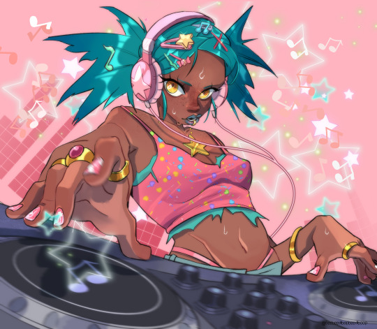
Art I did for the csp contest with a music theme :)
#artists on tumblr#art#illustration#character design#music#digital art#csp#clip studio paint#my friend dj showed me his dj set for reference lmaooo
5K notes
·
View notes
Text


Team Dark Week Day 6 - We love a good view at the end of a hike~
Prev Next
#teamdarkweek#team dark week#sonic#team dark#shadow the hedgehog#rouge the bat#e 123 omega#my art#doodles#comic#we're all just going to ignore the lack of omega's arm in that first panel#as much fun as I think them going for an honest to god hike would be I also think they would Not Do That lma o#ulterior motives are a girl's best friend so we can two birds with one stone this#man the lack of spell check with clip studio really does kneecap me a;lsdkjf#we're just gonna hope these are spelt right for now
2K notes
·
View notes
Text
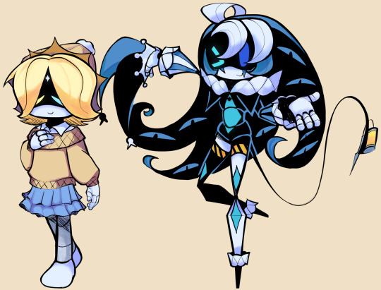
who up murdering they drone
#i drew this for my friend who forced me to watch murder drones#i triieddd to do pv's og outfit but it literally didnt work so we had to change it#cookie run#cookie run kingdom#crk#murder drones#pure vanilla cookie#shadow milk cookie#vanilla milkshake#shadowvanilla#pureshadow#my art#clip studio paint#2025#1k
1K notes
·
View notes
Text


dont ask how i come up w this. they started as trad doodles but i really think theyre cute. i did genbends of the critters a while ago but didn't think id use the designs again bc they were originally silly jokes but fuck it theyre honestly so fun to draw.. (there's also not much to design lol) i might post those at some point idk. anyways here
originally was just the critters dressed up but this being a school au is cute too?? im not sure tbh either is fine, im not fussed i just wanted to draw them in cute clothes and acting silly😭
#artists on tumblr#fanart#digital art#clip studio paint#commissions open#sketch#smiling friends fanart#smiling friends#genderbend#cw genderbend#smiling friends pim#smiling friends charlie#smiling friends alan#smiling friends allan#smiling friends glep#pim pimling#charlie dompler#allan red#glep#kogal#alternate outfit#au??#kogal fashion#so yuriful#pam pamling#ally red#gleb
2K notes
·
View notes
Text

#where can i join the fuck lance stroll club?? asking for a friend#esteban ocon#lance stroll#lesteban#f1#formula1#digitalart#illustration#art#doodles#clip studio paint#fernando alonso#strollonso
546 notes
·
View notes
Text
youtube
MY DEAD FRIEND ZOE is now available to watch from the comfort of home! So if you didn't have a chance to catch this award-winning film while it was in theaters (or you just want to watch it again) — now's your chance! AMAZON APPLE

#legion m#my dead friend zoe#ed harris#sonequa martin-green#natalie morales#utkarsh ambudkar#gloria reuben#morgan freeman#dark comedy#kyle hausmann-stokes#radiant media studios#travis kelce#movies#veterans#mental health#dealing with grief#inspired by a true story#ptsd#feature films#military veterans#military#grief#Youtube
576 notes
·
View notes
Text

i still haven't emotionally recovered from wiege
and that comic was just like twisting the knife
#art tag#my art#binkyfishyart#alnst#alien stage#hyuna#luka#hyuluka#mentally i am ill#shoutout to my friend for hyping me through drawing this#I AM UNWELLLL#alnst hyuna#alnst luka#i think hyuna is my fav ughhhh shes perfect#im sobbing#wiege#clip studio#i used like 2 layers for this because i am insane
876 notes
·
View notes
Text
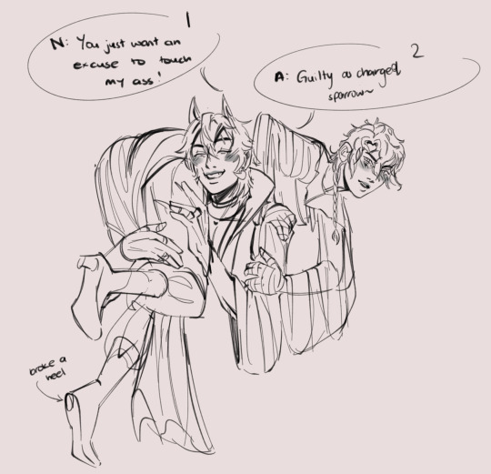


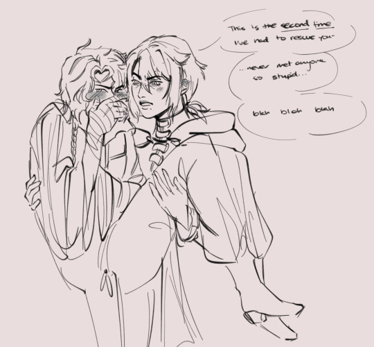
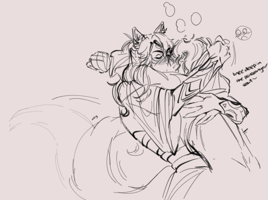
it’s MY self insert/touchstarved OC and I get to choose the SELF INDULGENT SCENARIOS
#my art#red spring studio#touchstarved#touchstarved game#touchstarved fanart#leander touchstarved#ais touchstarved#vere touchstarved#mhin touchstarved#kuras touchstarved#touchstarved oc#can you guess who my favourites are LMFAOOOOO#ais and noel are like banter flirters#noel and gana (friend’s oc) are besties for life. rotten brothers in arms if you will.#leander is my least fave i am sooo sorry#KURASSSSS GRRGRGGRGRGR#Noel cannot make the first move to save their life with him#same with mhin I fear#vere and noel…#it’s casual (by chappell roan).
559 notes
·
View notes
Text
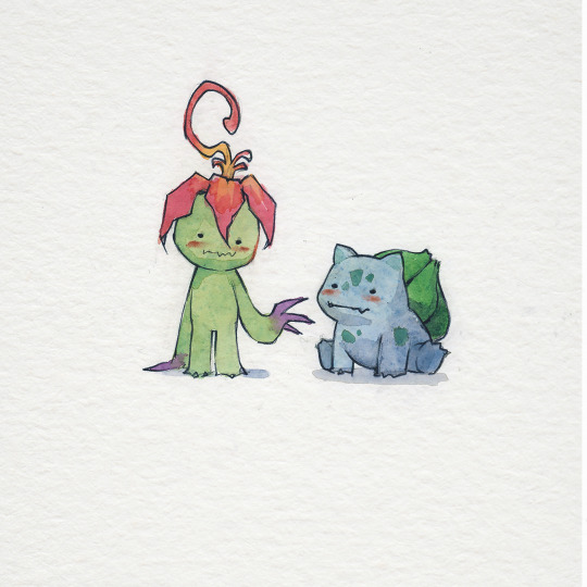

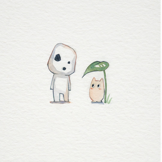
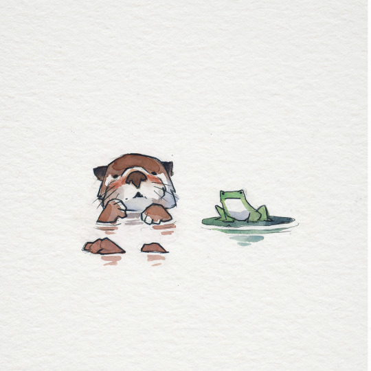

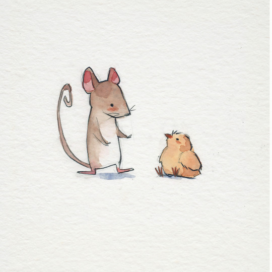

'i hope we're friends in every universe'
#brbchasingdreams
prints | tutorials
#brbchasingdreams#art#illustration#drawing#painting#artists on tumblr#watercolor#traditional art#artist#sketch#friends#friendship#fan art#anime#manga#digimon#palmon#ghibli#spirited away#miyazaki#studio ghibli#totoro#my neighbour totoro#cute#art style
2K notes
·
View notes
Text
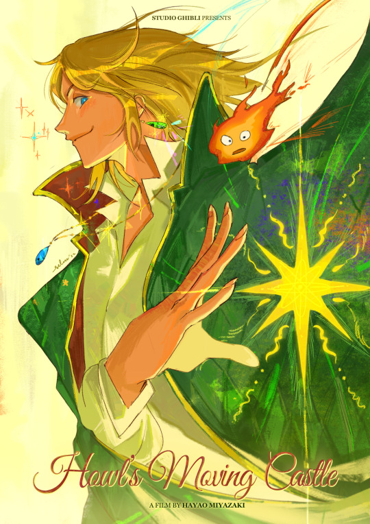
Howl's Moving Castle (2004) poster reimagined 🏰
#howl's moving castle#howl no ugoku shiro#howl pendragon#artists on tumblr#studio ghibli#ghibli#ghibli fanart#this was a piece i did for a friend's zine! <3#.art
5K notes
·
View notes