#for the hues
Explore tagged Tumblr posts
Visit Tumblr Blog
Explore Tumblr blogs with no restrictions, modern design and the best experience.
Last Seen Tumblr Blogs


Fun Fact
Tumblr has a low social media market share in South America.
Text
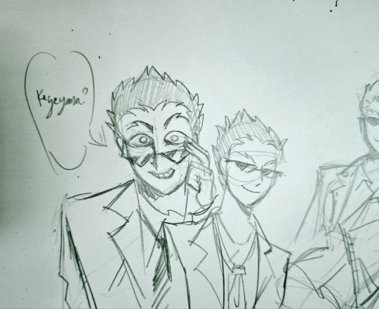
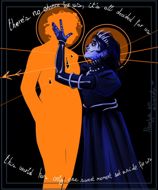
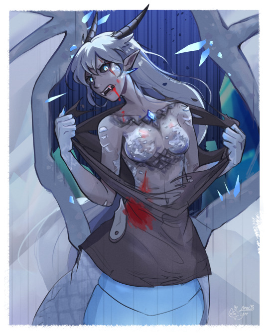
doodles ageswap shou for The Illnesses
#in pathologic plague district green#fallout 3 ass green#for the hues#the ILLNESSES#Mp100#mob psycho 100#shou suzuki#mp100 ageswap#suzuki shou#suzukis tag#yikes original tag#yikes art tag
64 notes
·
View notes
Text
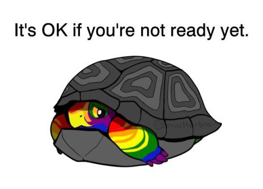
Pride Month is upon us again and so it is time to repost my little guy, Hue! I’m wishing everyone a safe, supportive, positive, and enlightening Pride, whether you’re all the way “out” or not!
#My art#Hue#pride turtle#My most uncredited piece of art ever so if you repost please use this image#lgbtq+#Pride
54K notes
·
View notes
Text

All of them together!
Prints available 🌿
#art#nature#each individual piece is in my gallery in case you mised it#the only hue combo breaker is the purple one but im satisfied with the overall look#they group nicely as pairs!#edit: updated a link to my shop!
5K notes
·
View notes
Text
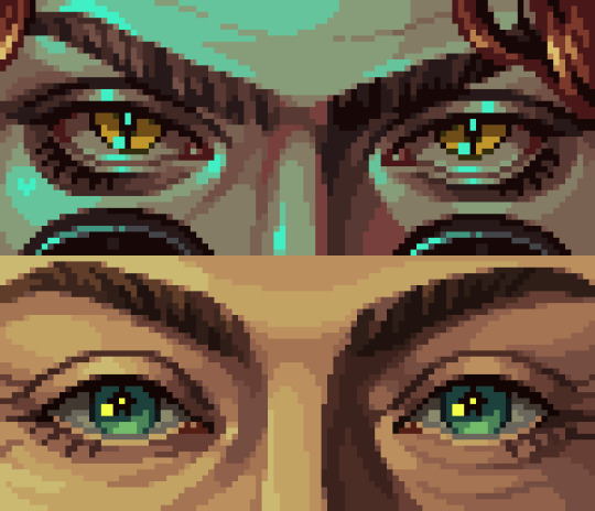
⭐ Pixel Art Fundamentals - Hue Shifting
This technique is not uniquely specific to pixel art, but it's a very common term to hear when starting out watching those "dos and don'ts" videos. So what is hue shifting?
Hue shifting basically means to change the hue when making your shade darker or lighter. In this context, 'hue' = colour!
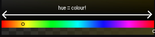
You may hear 'you need to hue shift more' when getting feedback on your art, but what does that mean really? Here are some examples:
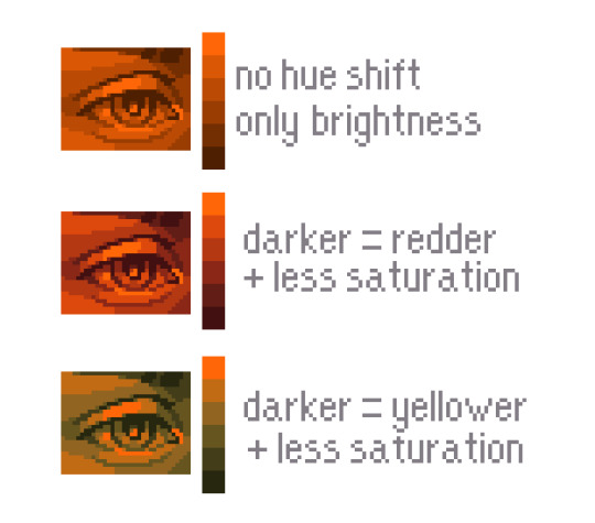
We can see even with just a bit of hue shifting, we have quite a different vibe for each drawing. In warm / daylight settings, no hue shifting can sometimes look a bit muddy or grey.
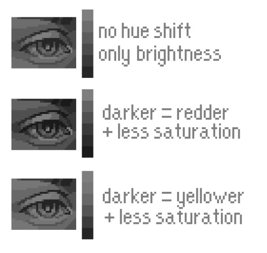
If we swap the image to grayscale, you can see that they look much the same:
As long as the hue shifted colours have a brightness that makes sense, they usually will work. You can get quite wacky with it.

But is hue shifting always good? Not necessarily.
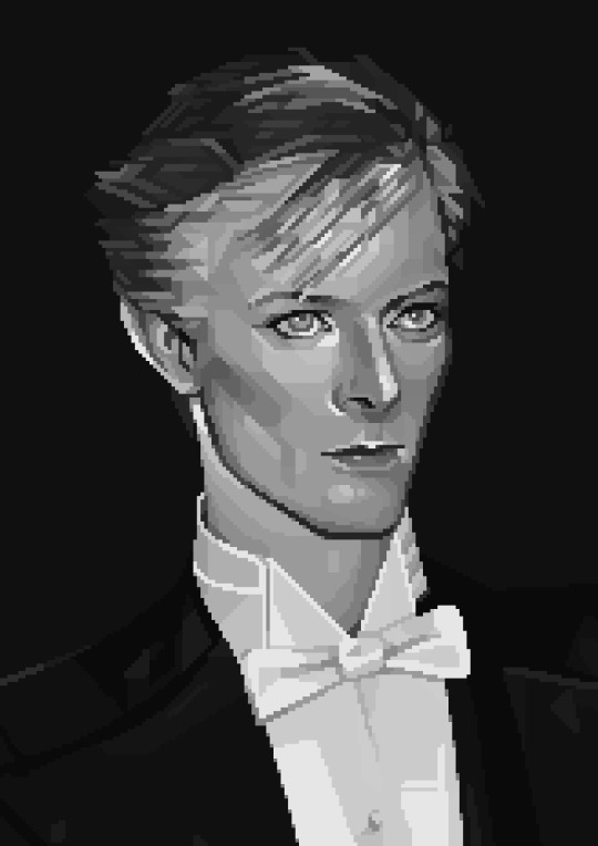
Below is some of my art where I intentionally didn't hue-shift at all. You can see it gives them an uncanny, digital, or photographic kind of look. As always, techniques are about your intention, or personal style.
I recommend trying different hue shifting methods! I especially love to use a cool blue or teal for the lighter shades.
Thanks for reading and I hope this helped a little! Have fun with it!!
⭐ Read my full pixel art guide here!
#pixel#pixelart#pixel art#pixel art tutorial#tutorial#art tutorial#colour theory#color theory#hue shifting#art#illustration#pixel illustration
5K notes
·
View notes
Text

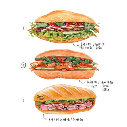


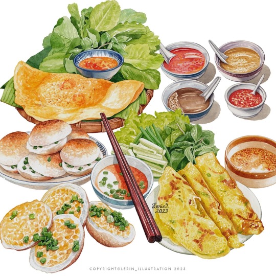
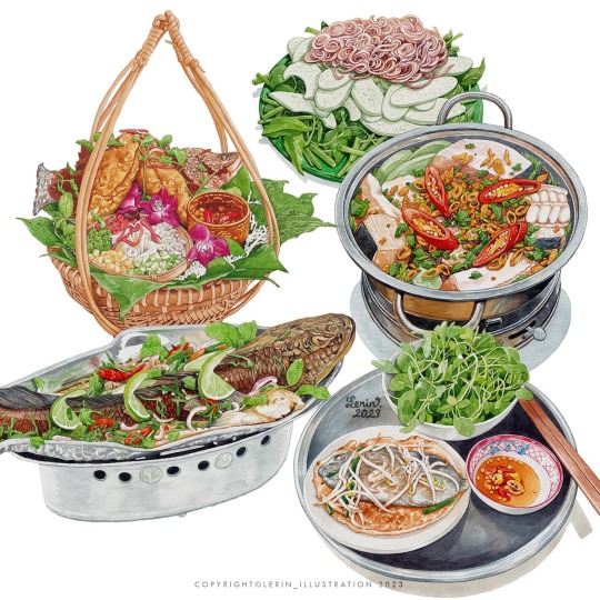

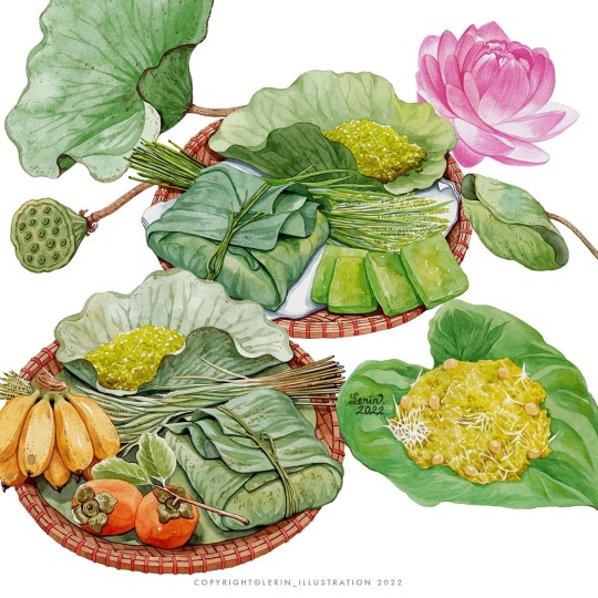

Illustrations of Vietnamese food. Credit to Le Rin.
#vietnam#vietnamese#culture#travel destinations#cuisine#vietnamese food#asian food#illustration#food illustration#digital art#artwork#art#banh mi#lunar new year#spring rolls#rice cakes#condiments#hot pot#hanoi#hue vietnam#saigon#digital painting#paintings#painting#drawing#digital sketch#watercolour sketch#sketch#healthy food#looks tasty
12K notes
·
View notes
Text

I forgive him for being french on account of swag
#disco elysium#kim kitsuragi#disco elysium fanart#kim kitsuragi fanart#fanart#DE#proud of this one guys#though not entirely sure about rhe colors but weeeehhh its fine#i am yet to experiment with hues more#so this is good#my art
4K notes
·
View notes
Text
Who wants to love forever when love must die
I deeply dislike how harrow turned out but I'm not gonna redraw 💀
Song by Queen

#who wants to live forever queen#gtn#gtn spoilers#htn#harrow the ninth fanart#harrow nonagesimus#harrowhark the first#gideon the ninth fanart#gideon nav fanart#gidoen nav#the locked tomb#tlt#the locked tomb fanart#tlt fanart#griddlehark#griddlehark Fanart#saphic art#lgbt#lesbian characters#should've used a different hue of blue so it was that particular oranges complement but it looked ugly when i did so
2K notes
·
View notes
Photo


Art by Hue Teo
7K notes
·
View notes
Text


Hand placement✨✨✨
#my art#cherik#charles xavier#erik lehnsherr#erik lensherr x charles xavier#x men first class#x men fanart#digital art#his ass is NOT listening ‼️‼️#leaned more into purple hues this time#kinda made them look like they r in prom lolll#unintentional but it reminds me of that kinda lighting yk
1K notes
·
View notes
Text
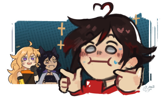
internal screeching
#ruby rose#weiss schnee#blake belladonna#yang xiao long#whiterose#white rose#derg AU#rwby#my art#tw suggestive#tw blood#ha#hehe#hue#going a lil feral#a lot actually#👉👈#explodes very violently#got a bunch of people mentioning dungeon meshi so might as well amirite#gay panic ruby is so funny help her#like same#also a bunch of mistakes in em#may or may not fix them#probably not#lazee#edit: think this might be considered as suggestive so might as well tag it in case
3K notes
·
View notes
Text

Marilyn Hue by Don Lim
1K notes
·
View notes
Text

egem portrait for @empiropediazine
#AWESOME ZINE GUYS GO CHECK IT OUT!!!! It was SO much fun to work on :oD#art#fanart#geminitay#empires smp#alice.art#esmp#esmp s1#empiresblr#Tried to go for a LOT of hue variation to give the piece a more magical feeling... i hope it came thru lol
1K notes
·
View notes
Text
Reblog if you or someone you know is ace… I’m trying to see something
#hues-of-purple#just for fun#trying to see something#lgbtq#lgbtqia#queer#asexual#ace#greysexual#demisexual#Reblog if
14K notes
·
View notes
Text
You know how Flamingos are pink because of the shrimp they eat. That's also why Fig's skin is pink. It's not her fiendish heritage. It's her sheer shrimp intake. Yeah, she's a fiend. A fiend for shrimp.
#dimension 20#d20#fantasy high#fig faeth#figueroth faeth#that flamingo fact is only sorta true btw#they're actually pink because of the algae they eat#the same algae the shrimp eat#so yes they eat shrimp but if you really trace the root of their hue it's the algae#they metabolize the carotenoid pigment in the algae and brine shrimp#and that turns their feathers pink
2K notes
·
View notes
Text

Winter, kissed by the Sun
patricksvisuals
935 notes
·
View notes