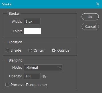
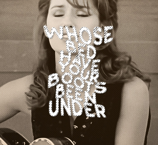
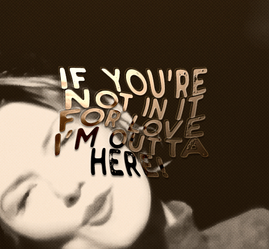
#first time using the gradient text!
Explore tagged Tumblr posts
Visit Tumblr Blog
Explore Tumblr blogs with no restrictions, modern design and the best experience.
Last Seen Tumblr Blogs


Fun Fact
There are dozens of funny blogs to kill time on Tumblr.
Text


where are you @b-ubbleberry ?


i wanna step out with you; 1
more time in this world..


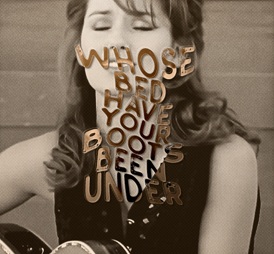
#first time using the gradient text!#best friends berry-event#aesthetic moodboard#cute moodboard#messy moodboard#moodboard#aesthetic#kpop bg#beige moodboard#kpop boys#kpop edit#mey6loom#&team aesthetic#&team moodboard#&team nicholas#&team#&team ej#&team euijoo
41 notes
·
View notes
Text

In my sight I was born To bring death at the footsteps of your home
#invidia hort sketch#invidiatech art#invidia hort art#baldr kh#khdr spoilers#kh baldr#kh dark road#kingdom hearts dark road#khdr#kh dark road spoilers#messing with using the lasso tool for thumbnailing + gradient stuff so nothing concrete#also first time i've drawn baldr like. Ever i think.#quote is from 'day of the baphomets' from mars volta lmfao#described in alt text
121 notes
·
View notes
Note
omg omg i love the new theme !!!
AHH thank u sm rylie ! ! <333
0 notes
Text
Everlasting Trio DPxDC Nobody Knows Au Pt 3
Parts 1 and 2
They both fall silent and stare.
That's an answer to one of many questions they've been asking themselves for years, isn't it?
Their best friend disappeared, and it wasn't abduction or murder. It was an escape.
“You guys don't have contact with Jack and Maddie, do you?”
Tucker swears there's a record scratch in his brain.
Sam gapes. “You mean your parents?”
Danny smiles, small, grim and humorless. “Jack and Maddie.”
Jesus Christ.
Sam glances over at Tucker and they exchange a look. Tucker knows they've been feeling a shared guilt for a long time, feeling like they didn't do enough. They had suspicions about something fucked going on in Danny's home life since the beginning of freshman year, but they never blew the whistle about it.
Rationally they know it wasn't their responsibility. All of Amity had suspicions - someone should have called CPS, and it shouldn't have been a couple of kids. A goddamn adult should have stepped up.
It doesn't keep either of them from feeling like they failed their childhood best friend.
“Considering I've spent the last four years suspecting they killed you and chucked your body into the portal to hide it? Hell fucking no, Danny,” Sam asserts.
The set of Danny's shoulders relaxes significantly. “Good,” he breathes. “Good. Please keep it that way.”
“What the fuck was going on in that house, man?” Tucker asks, a little sick to his stomach. He knows right away he shouldn't have asked.
Danny's expression shutters into something polite and pleasant to hide discomfort, and he immediately starts ‘casually’ gathering his papers and computer into his bag.
“Listen, I'm really happy to see you guys - seriously. I really should get going though, I-”
Sam reaches out and snatches him by the scruff of his shirt before he can even stand up all the way, yanking him back down into his chair.
His dumbfounded expression makes Tucker snort a laugh, so familiar and puppy-like. Danny is still all big blue eyes and nearly visible question marks when taken off guard. Tucker missed that face.
“You're not going anywhere until we get your phone number,” Sam argues, not a hint of wiggle room in her face or tone. “We'll get lunch or something, all three of us. Go to the mall. We're living in the same city, you know I'll hunt you down.”
When Danny hesitates, her face and tone melt into something softer.
“Please, Danny. We miss you.”
Danny melts a little, sighing and smiling. “...yeah. Yeah, I missed you too. I've missed you guys so much.”
“So?” Sam prompts, holding her hand out.
Danny huffs a little laughing breath and fishes around in his pocket, unlocking his phone and plopping it into her hand.
His nails are black and green. Gradient.
Tucker doesn't know much about nails, but he knows there's a difference when Sam paints them and when she splurges for acrylics.
“Are those professionally done?” he asks, bemused. Danny had never expressed an interest in that kind of thing as a kid. It's kind of cool to see signs that he's, like…growing into himself.
Danny shrugs, and it feels good to see that he doesn't even seem to consider Tucker might give a shit in a bad way.
“I'm on my hot girl shit,” he deadpans, and Sam nearly drops his phone with the force of her startled laugh.
Tucker snorts. “Oh, well about time.”
“Hey!” Danny protests, offense fake and eyes dancing. “What's that supposed to mean?”
“Nothing, nothing! You had a glow up is all.”
Danny snickers and kicks him gently under the table.
“Okay, dick.”
It's like they never parted at all for a moment.
“Here, Mr. Hot Girl Shit,” Sam says, handing Danny his phone back. “I put our numbers in and sent a text in a group chat so you can't forget to reach out. I'm serious, Danny. We missed you, don't disappear. It was scary enough the first time.”
Danny grimaces, at least looking genuinely apologetic. “I know. I'm sorry. I really do need to get going today, though. I've got an appointment.”
“What kind of appointment?” Tucker asks.
The grin Danny gives him is mischievous and has a few teeth sharper than he remembers there being.
He breezes past them and out the door with an impish response of, “Hide and seek with furries.”
Part 4
Masterpost
#everlasting trio#danny phantom#tucker foley#sam manson#dc x dp#this has decided independently that its going to have dead tired vibes#if not genuinely dead tired#bats soon#tim pov next
1K notes
·
View notes
Note
Hi ! Can I request a famous cook reader with Kurapika,Killua,Gon and Feitan?
HXH W/ a FamousCook!Reader
Characters: Gon Freecs, Killua Zoldyck, Kurapika Kurta, Feitan Portor Type: Headcanons, Gn!Reader
I FIGURED OUT HOW TO MAKE GRADIENT TEXT OH YEAH
Warnings: none

Gon Freecs & Killua Zoldyck
these kids literally beg you to cook for them all the time
they both can eat a LOT; they're growing boys and your food is good so you can't blame them
every time you are available there is a new food request and you would be evil to tell these sweet boys no especially when they ask you so nicely >:(
if Killua actually liked his family he'd hire you to be a personal in home chef
the white haired boy probs likes to brag about you to Leorio (or anyone else who will listen, really)
he just likes the eating part but Gon on the other hand can be a big help
he will go out and find the freshest ingredients for you every time he has a request because he is such a sweetheart
you need fish? he will go catch some for you. you need a very specific herb that only grows on the side of high cliffs? gear up Killua, they're going rock climbing
Kurapika Kurta
he never really cared much about cooking and saw it more as a chore if anything
before meeting you that is
he's not the best cook and knows enough to get by and survive; meaning he doesn't really pay much mind to taste
but when he tries your cooking for the first time; a well renowned PROFESSIONAL; he cannot go back
like no wonder why your famous this shit is DELECTABLE
he may ask you politely to cook for him every blue moon but he usually waits until you offer or show up with something new for him to try
since you both are usually busy with work, most of the time when you use him as a guinea pig for new recipes its in your restaurant's kitchen, way after closing
it's almost like it becomes your guys' weekly date night ^__^
Feitan Portor
another one who only cooks for survival and still barely knows what he's doing..
pls don't let him anywhere near the kitchen he will burn the entire building down
he is only allowed to watch from a safe distance. do not let him near any kitchen appliance.
if he REALLY wants to help though maybe he can chop veggies or something
the guy really knows how to use a knife...
you probably have to cook for him all the time if you care about him getting enough nutrition because this guy probably just survives off of packaged stuff
#hxh 2011#hxh x reader#hunter x hunter#hxh#gon x reader#gon freccs#gon hunter x hunter#gon hxh#killua#gon freecss#hxh gon#gon freecs#killua hxh#killua zoldyck#hxh killua#killua hunter x hunter#killua x y/n#killua x reader#kurapika hxh#kurapika#kurapika kurta#kurapika headcanons#kurapika x reader#kurapika x you#kurapika hunter x hunter#feitan x reader#feitan#feitan portor#phantom troupe#feitan hxh
359 notes
·
View notes
Text

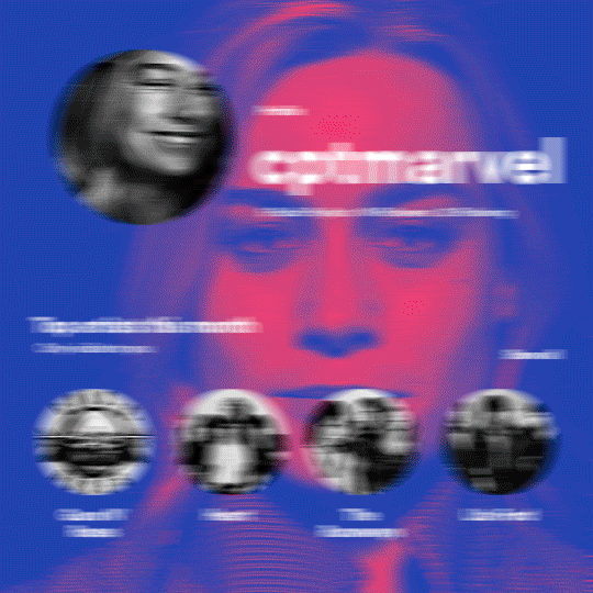
hi! someone requested me to do a tutorial based on this gifset!
this tutorial requires an intermediate knowledge of gifmaking. i won’t teach you how to do gifs from scratch, there are other tutorials for that out there.
[tutorial under the cut]
THE BASICS
AN INTRODUCTION
first off, the gifset in question is based on this gifset by @/eddiediaaz and i got permission from them to explain the process. i won’t be sharing the template because it’s a near replica of theirs (that isn’t shared to the public) and i don’t feel comfortable doing so, but you can recreate it by yourself just like i did!
also, ESL, so please pardon any mistakes.
THE FONT
Circular ST (Medium & Black). download it here & here.
CLIPPING MASKS
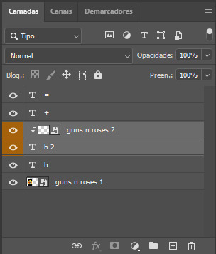
clipping masks are the way i put images and gifs inside of shapes. i used that method in the first and second gif of the Spotify gifset as you can see here. what does a clipping mask do? basically, it links two or more layers together in a way it follows the “shape” of your base layer. ie, everything that is shown follows the “shape” of your main layer and nothing more. your base layer can be anything: a shape, an image, a gif, a text, an adjustment layer, really everything. let’s see an example:
CLIPPING MASKS & SHAPES

the original image (Gun 'n' Roses logo) is intact, as in, it’s not cut like a circle, something that cannot be undone. instead, everything outside the limits of the blue circle is just hidden. if i delete the base layer (the circle layer), the original image will appear as it originally is, as an rectangle. talking about layers, let’s see my layers panel (some things are in Portuguese, but i think you can understand):
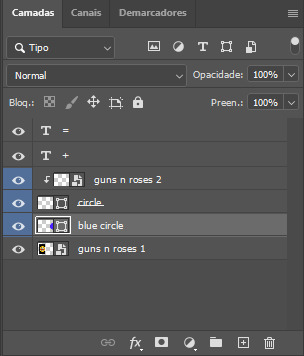
notice the little arrow pointing downwards to the “circle” layer. that is the clipping mask symbol. the base layer always needs to be below what is being clipped. if the base layer is deleted, the chain is broken and every layer clipped will now act independently and have its original shape. you can have as many clipped layers as you want. you can also have multiple chains going on in a .psd, each one with its own base layer. to clip a layer, you just need to press ctrl+alt+G or cmd+option+G while having the layer you want to clip selected (NOT your base layer). or, you can go to LAYER > CREATE CLIPPING MASK.
CLIPPING MASKS & TEXT
let’s see the same example, but with text instead:
A TIP
because adjustment layers are clippable, you can completely gif by using clipping masks. this is very useful when you have more than one gif inside a canvas and don’t want an adjustment layer to affect everything besides a certain layer/element.
let’s take my first gif of the Spotify gifset as an example.
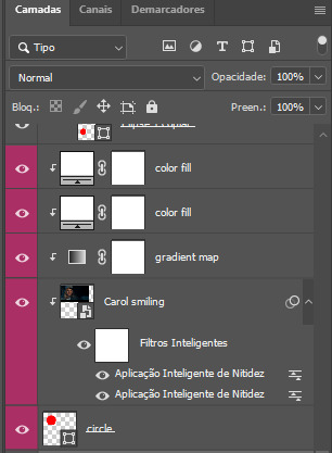
the circle is the base layer. the “Carol smiling” layer is my gif converted to a smart filter. above that “Carol smiling” layer, there is a black and white gradient map and two color fills of white so i can achieve the coloring you see. all those layers are clipping onto the circle layer, making my now b&w gif have the shape of a small circle as well. those layers are in a folder in the .psd of my first gif, so i don’t have multiple files sitting on my PC to assemble just one gif. i could have giffed that small gif separately and pasted it onto my canvas as well, but i like to do this way so i can adjust everything i want in real time instead of redoing a gif over and over every time i want to change something.
HOW TO MAKE EACH GIF
all gifs are 540x540px.
THE FIRST GIF
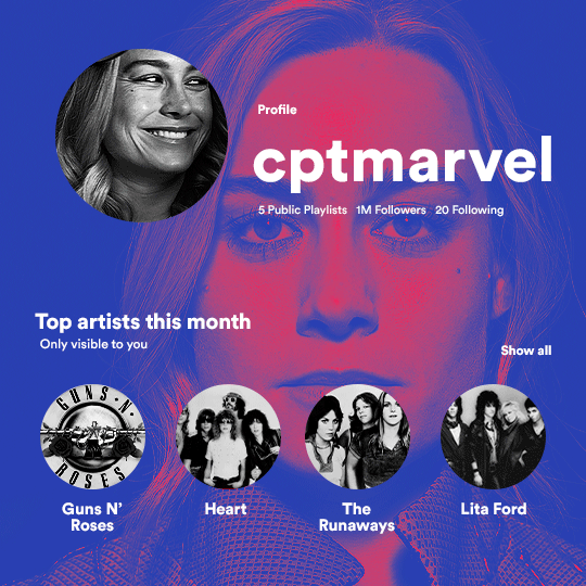
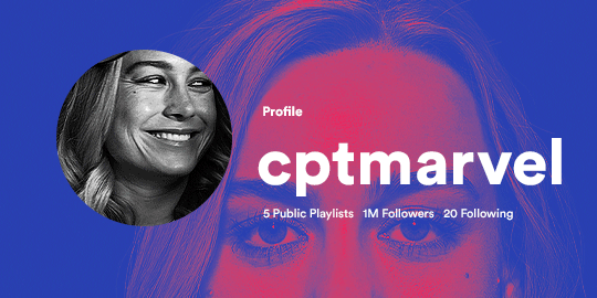
the first gif has 6 elements. the elements are: a big gif serving as a background (a close-up of Carol), a smaller gif inside a circle (a b&w gif of Carol smiling) as a profile picture and four static images for the featured artists. i giffed as i normally do (loaded screencaps, resized the gif, sharpened the gif, etc) for my background gif. to achieve the coloring, i’ve added a gradient map (layer > new adjustment layer > gradient map) purple to pink. to the profile picture, i made a 160x160px circle in the top left corner. the color of it doesn’t matter. the next step is a matter of taste: i giffed the smaller gif in the same .psd thanks to clipping masks that i explained earlier, but you can do it in a separate canvas too. for the featured artists, i made four circles with 98x98px each. for the images, i had to check Spotify for their selected PFPs. after that, i googled “[band/artist] spotify” to find the images. the PFP of bands and artists in the Spotify app are displayed in black and white, so you might have to make them b&w if you happen to find them only in color. to make the artists PFPs pop a bit more, i transformed them into smart filters and added a bit of sharpening to them (intensity 10 x radius 10). you can adjust the colors and the brightness if you want, too. the sizes of the texts in the gif are: 58px (username), 20px (top artists of the month), 15px (name of the artists), 12px (only visible to you + show all + profile) and 11px (following and follower numbers).
SECOND GIF
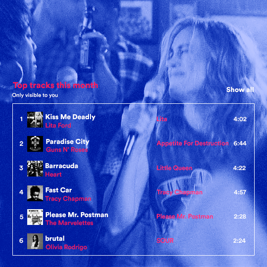
for the chart, i created a black rectangle (490x308px) that i set its blending mode to lighten (thus making it transparent) and i added an internal white stroke. i added the text and the little squares next to the top 6 numbers. the font sizes are: 17px (top tracks this month), 11px (only visible to you), 14px (song title, show all, top 6 numbers), 13px (artist/band, album title, length of the song). i added the album covers — that i made b&w — by clipping images onto 32x32px squares. for the coloring, i added a gradient map (dark purple > light purple).
THIRD GIF
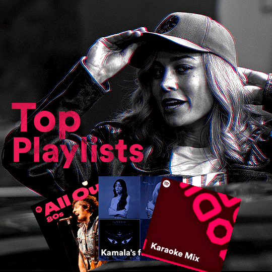
there are three types of playlists in this gif: a Spotify original playlist, a playlist made by a user and a Mix. you don’t have to follow this formula if you don’t want to, but in the case you do, here’s how i did it: browse Spotify for an original playlist of theirs. chances are, if you google the playlist’s name, you can find its cover on Google Images. at least, i found the “All Out 80s” cover that i used in my gifset. you can also create your own. for the user playlist, just pick four songs and find their (album) covers, also on Google. create a square canvas on Photoshop and make four squares, each in one quadrant of the canvas. paste your images onto your canvas and clip the images to each square. then, add a gradient map (black + whatever color you want) to all those images and title your playlist (font size: ). save that collage as a PNG and load to your gif canvas or merge all the layers+transform into a smart filter and drag the smart filter layer onto your gif canvas. now, the trickiest one. while you can invent your own Mix, i wanted to use a real one, but i had no idea on how to find them. thanks to reddit, i discovered that, if you search “made for you” on Spotify, you will find their Mixes! some of them are very whacky and specific! i just picked the Mix that made the most sense for Carol from that (gigantic) list. before doing the next step, i would advise you to google the name of the Mix you picked to see if you are able to find the cover of it with good quality. i wasn’t able to find mine (Karaoke Mix), so i just screenshotted my Spotify app, pasted that screenshot into Photoshop and cut the Mix cover and pasted that onto my canvas. the quality wasn’t great, so i transformed the cover into a smart filter, added a bit of gaussian blur and then sharpened it (intensity 10 x radius 10). the color wasn’t what i wanted either, so i used Hue/Saturation to change the hue. because the original image for the Mix was smaller than i wanted and i stretched it to make it bigger, the quality of the text and the Spotify logo was botched. i painted over the Mix cover and created a text with the font i linked earlier to replace its now pixelated title. i also painted over the little Spotify logo, found a logo in the internet and pasted over the Mix cover about the same size of the original logo. to achieve the “3D effect” of the gif, i made my b&w gif, the base. then, i duplicated all layers and added a gradient map (black > pink) and merged all the layers of that duplicate. i made a second replica of my gif, now with a different gradient map (black > blue). i set both replicas to the ligthen blending mode. you will notice that the replicas will "disappear" and only the original b&w gif will remain. if you move the replicas a bit, that colored border will appear. this doesn't work much in very bright gifs without a lot of dark areas, btw.
FOURTH GIF
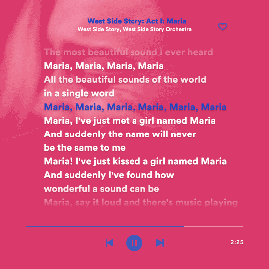
this gif used an altered (by me) version of this template. (i changed the fonts to match the rest of the gifset, too.) for the color text effect, you will have to gif with the timeline bar. take your gif’s length and do the math to find how many frames are ⅓ of it. take your lyrics’ layer and cut it into three equal parts or close to it by using the scissors icon in the timeline panel. in each third, change the color of just one line, line by line. when you play your gif, the colors of the lyrics will change like in Karaoke. you can do the same thing with frames iirc, though. i explained the timeline method because that’s the one i used in this gifset and use in general gif making. for the coloring, i added a gradient map. to make the colors pop a bit more, i add two gradient maps: the first one is in black and white, the other is in color. that adds depth to the blacks and darker colors of the gif.
FIFTH GIF
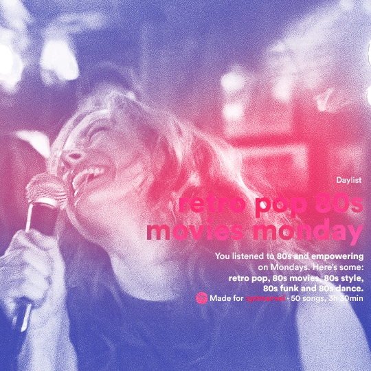
like in the Top Playlists gif, i wanted for my Daylist to be real as well. to achieve that, i listened to my Carol Danvers companion playlist (that you can listen here) for a long time until my Daylist refreshed itself. (Daylists refresh in certain times of the day — don't worry, Spotify will tell you when.) then, i just copied what it told me — the title and the genres i listened to generate such a Daylist, plus the genres i should check it out. you can invent your own Daylist if you want, but because it is generated by AI, i find very difficult to mimic its crazy titles, but you can try! you can also search in the web for other people’s Daylists if you want, but usually people don’t tell you what they listened to to get those playlists and nor what was recommended for them to listen to and i, at least, find that information important for the gifset. be aware that Daylists aren't available for every country yet (like in mine), but i found a way to work around that. the browser Opera GX offers a free "VPN" — not exactly a VPN, but it works close enough — so you can set your location to the US and listen to in-browser Spotify. i recommend not log into Tumblr while using Opera's VPN as there is a myth (that could easily be true!) that Tumblr terminates people's accounts that use a VPN. font sizes: 43px (daylist title), 13px (text), 12px ("daylist" & "made for"). for the flare effect, i searched for flare overlays on YouTube and downloaded one of those videos with 4K Video Downloader, a free software. i loaded the overlay into Photoshop and added a gradient map (purple > pink) over it, thus changing its color. i pasted the overlay onto my b&w gif and set its blending mode to screen. voila!
that's it! i hope you liked it and that i was able to express myself well. if you have any questions, feel free to contact me, i love helping people about their gifmaking questions! 💖
#*#*tutorials#gifmaker tag#dailyresources#usergif#completeresources#alielook#userairi#userhallie#userbess#userrobin#usershreyu#userzaynab#tuserju#tusermalina#tuserheidi#usertina#userabs#userbuckleys#usermagic#userjoeys#antlerqueen#userarrow#flashing gif tw
354 notes
·
View notes
Text
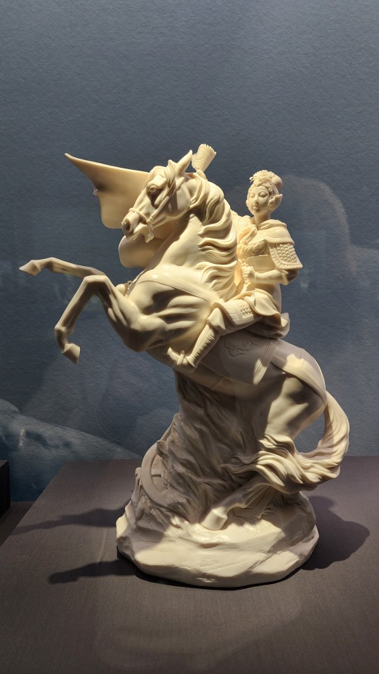
April 20, Beijing, China, National Museum of China/中国国家博物馆 (Part 2 - Dehua white porcelain exhibition/德化白瓷展 continued):
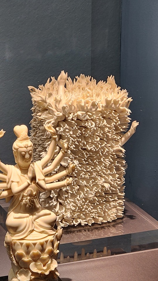
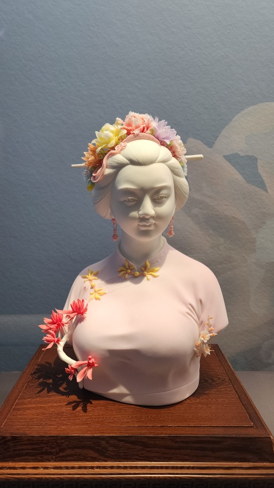
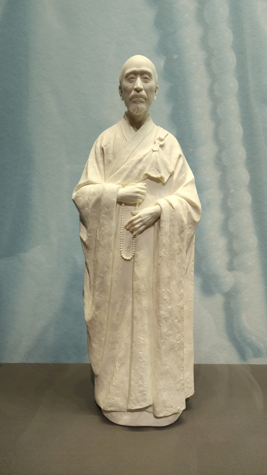
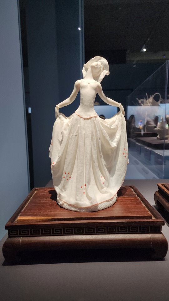
This was actually the very first piece I encountered at the entrance to the exhibition, a gigantic basket of flowers (probably over 1 meter tall and over 1 meter wide?), the entire thing made of porcelain.
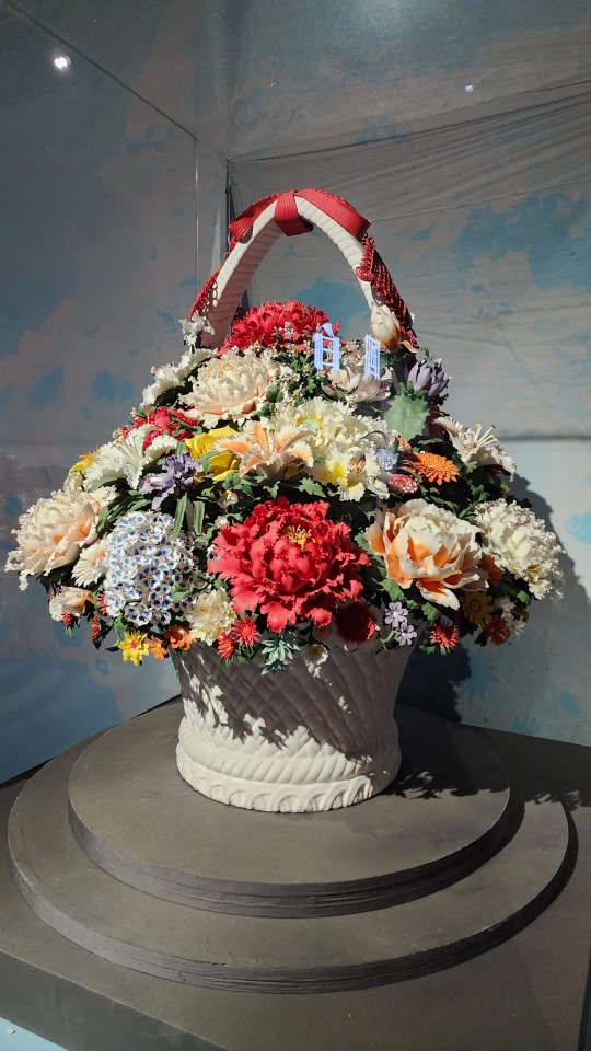
And to reiterate, every part of every piece is porcelain. Though I will say that despite the ultra-realistic shape of the flower petals and leaves, the only detail that hinted at these flowers being made out of porcelain was that the painted colors weren't as vibrant as real flowers. That's it. If you don't examine it up close you really can't tell that it's all porcelain.
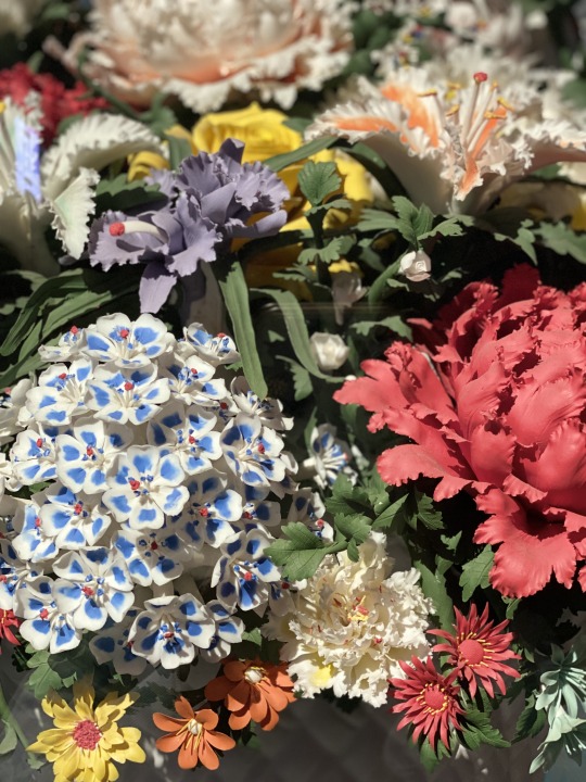
This is a good place to roughly introduce the technical side of Dehua white porcelain. The color of Dehua white porcelain mainly comes from the clay it uses, which is a special kaolin clay (gaolingtu/高岭土 in Chinese) found in Dehua. The clay mineral used naturally contains sericite and quartz, both of which are silica minerals and may have contibuted to the almost translucent look of the finished pieces; it also contains comparatively high amounts of potassium oxides, while the amount of iron oxides present is low. Due to the intricate designs of the pieces, the firing success rate may be very low. All those pieces involving super thin parts representing fabric or paper or flower petals? They may bring the success rate down to about 5%. Which means many of these pieces may be the 15th-20th try that finally survived firing. For people who are more interested in the chemistry of Dehua white porcelain, this paper goes into depth about it. There's also a great book in Chinese that goes into depth all about Dehua porcelain. (link goes to the first chapter only)
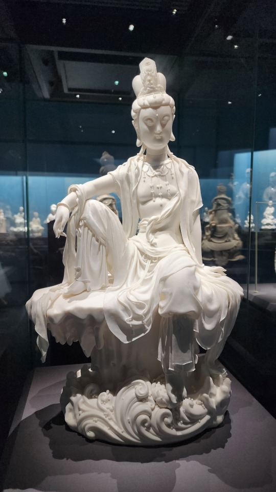
Continuing on, this is one of many Guanyin/观音 (Avalokiteśvara) statues at the exhibition, again with light clothing made out of porcelain:
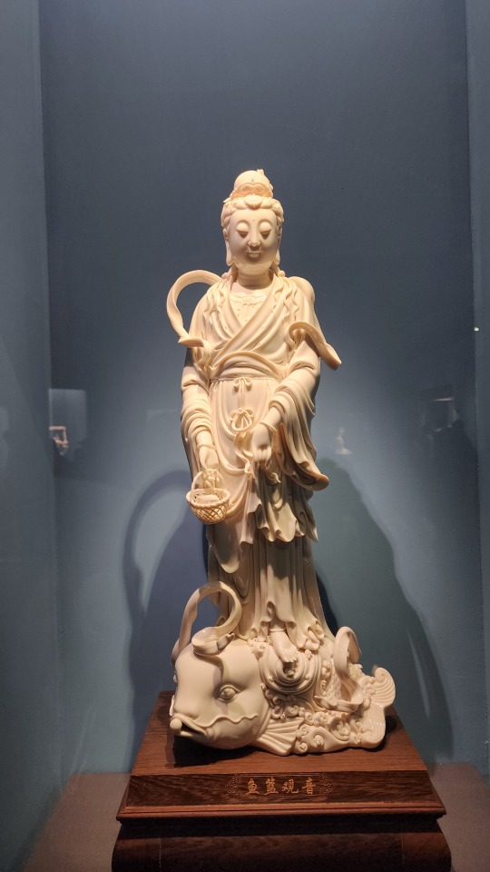
More Guanyin statues in various classic depictions/forms, of which there are 33 total. This particular form is called Yulan Guanyin/鱼��观音 (鱼篮 means fish basket), and comes from a legend where Guanyin transformed into a beautiful female fish vendor in order to guide mortals.
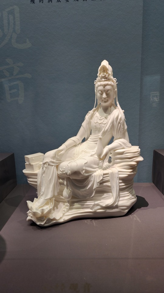
I believe the text here reads 持经观音 (Guanyin holding scripture)? The Guanyin here is holding a vase instead of a scroll though.
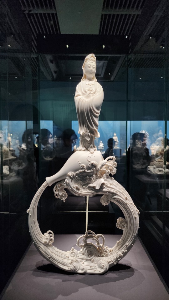
This is a classic depiction of Guanyin with a little bit of a modern-ish twist? Guanyin is often depicted with a vase of divine water, but here it forms a circle.
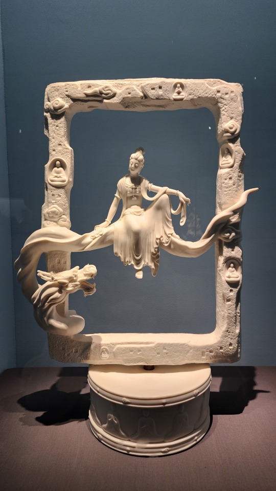
Despite some of the Guanyin statues having the amazing ceramic "clothing", this one remains my favorite, just because of the sense of space and serenity that this simple "frame" design creates:
And this very literal take on "thousand arm Guanyin" (千手观音). It's giving me that "biblically accurate angels" vibe:
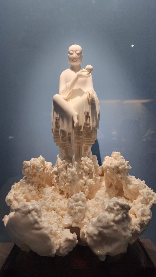
Buddha floating atop.......idk what that is but the texture is amazing:
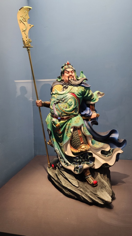
A fully painted statue of Guanyu/关羽. The gradient and detailed patterns on his robes is amazing:
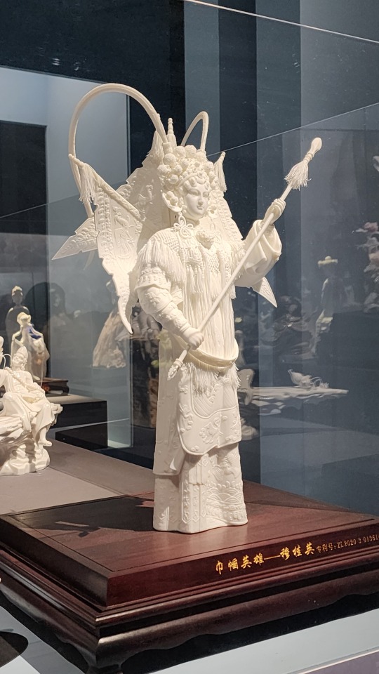
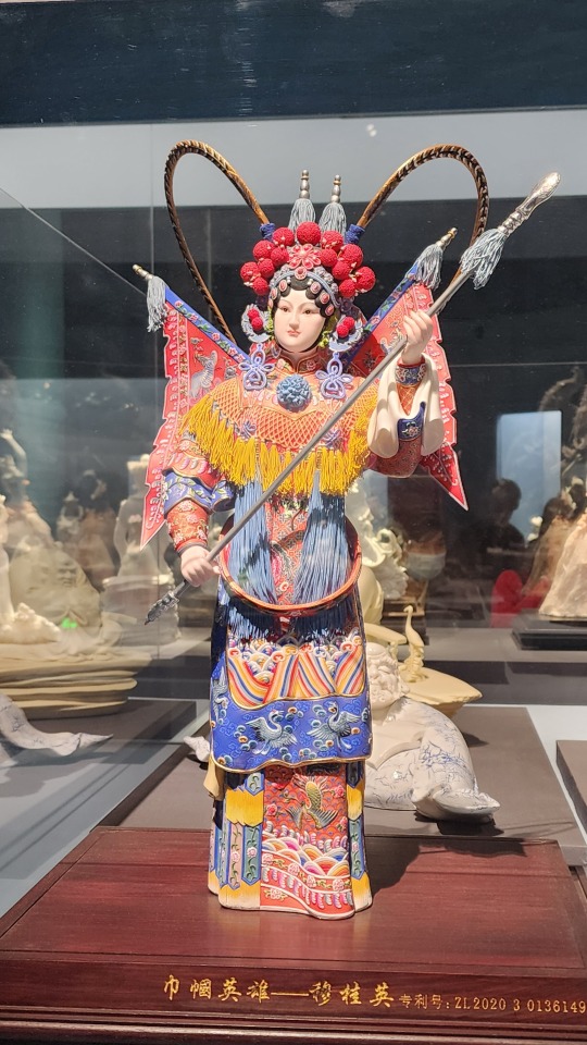
Two identical (I think?) statues of the daomadan/刀马旦 (female commander archetype) character Mu Guiying/穆桂英 as she would appear in Chinese traditional opera, one painted and one unpainted. The word 巾帼英雄 in the title means "hero in women's headscarf", which is a term used exclusively in reference to female heroes. There's also the phrase "巾帼不让须眉", which roughly means "those in women's headscarves aren't inferior to those with beards and thick brows"
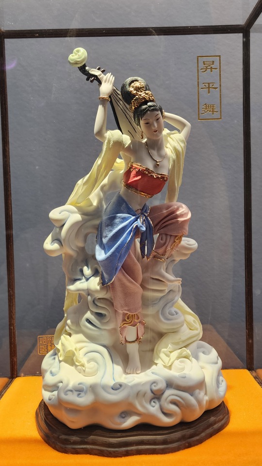
Porcelain depiction of Dunhuang's famous feitian/飞天 figures, in the classic pose of playing pipa in reverse (called 反弹琵琶). The clothing on this figure is made of porcelain, but this time also painted:
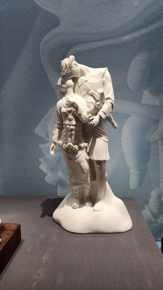
A porcelain statue of a couple in traditional Lhoba/Luoba/珞巴 clothing. The Lhoba/Luoba people are one of China's 55 少数民族 who mainly live in the south-eastern region of Tibet Autonomous Region, and as of 2019, it is the 少数民族 with the smallest population
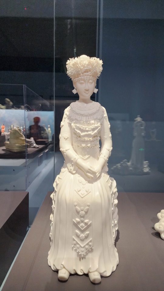
A porcelain statue of a woman in traditional Miao/苗 clothing. I love how the artist recreated the traditional Miao silver crown in porcelain.
Painted porcelain bust of a woman wearing the Xunbu/蟳埔 "flower crown", named a zanhuawei/簪花围. The town of Xunbu in Fujian province is known for its tradition of zanhua/簪花, or wearing flowers in one’s hair.
Porcelain statue of a Buddhist monk wearing a zhiduo/直裰 (the robes on the inside) and a jiasha/袈裟 (काषाय/kasaya; the garment on the outside that drapes over the left shoulder). From its looks, one can tell that zhiduo originated from hanfu, but with some minor changes (sidenote, this is not the same as the zhiduo of Ming-era hanfu). Jiasha evolved from the clothing of Indian Buddhist monks, but there appears to be a lot of influence from Central Asia and ancient Greece as well (link goes to pdf; this article is in Chinese).
Some modern-themed pieces. Look at those dresses omg
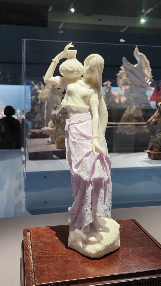
A porcelain statue of Hua Mulan/花木兰, the character from traditional Chinese literature and opera that inspired the Disney character. I will say though this pose reminds me of someone else.......
#2024 china#beijing#china#national museum of china#dehua porcelain#blanc de chine#porcelain#chinese art#chinese culture#art#culture#buddhism#guanyin
200 notes
·
View notes
Text
It's Just a Game, Right? Pt 4
Masterpost
"Okay, so like. We start with this video." Bernard says, bumping Tim's shoulder lightly. Huddling over a laptop together is a familiar experience; before they actually started dating they both regularly used laptop videos as an excuse to get close. It's a memory that Tim sort of cringes at, because now it seems so silly to be scared of Bernard not liking him back, and yet now he finds himself thinking back to those early days. The thrill of huddling together to solve a mystery is a little different from the thrill of being around your crush, but there's something there, a sort of excitement in questions yet to be answered.
"All right, hit me." And as Tim leans into Bernard a little harder, his boyfriend presses play.
The video is definitely weird. That much is immediately obvious. It seems to be a slideshow of pictures, complete with audio, but the pictures just seem off in a way that Tim can't describe and the audio is - it's a little sticky, but that is definitely Space Oddity, only it sounds kind of wrong like somebody's playing certain notes off key.
"Oh, that is definitely a Caesar cipher, huh?" Tim mutters. There's a line of text written beneath every photo in the little slideshow, but they're all garbled nonsense - it would seem entirely random, but Tim can already see a touch of pattern, some of the letters definitely appearing more common than others.
"Spy phase, huh?" Bernard teases. "I should've known you would already be on this stuff."
Tim grins and does his best to pretend he's not blushing. He's never been more grateful for his tendency to go overboard with his interests. The last thing he needs right now is Bernard asking questions about why he knows so much about code-breaking. Sure, he wants desperately to tell him all about Red Robin, but it's complicated with the rest of the family being implicated in your own identity.
The video continues in the same line for the whole duration of the song, then abruptly cuts off the second the last note of the song plays.
"Well, my first thought is that it seems kind of basic." Tim offers, at Bernard's expectant look.
"Right? Like when I first watched it I was kind of like what's the hype even about? But like, every video follows this general format, but the gradient of apparent code just keeps increasing, and it's like. What if there's more here and nobody ever realized they needed to look for it?"
"Okay well, the text has already been deciphered, right? So what does it say, and how'd they decode it."
"Here," Bernard switches tabs, to a document with screenshots of the various images. The first image was a simple photograph of a man, with the translated text reading Jonathan, January Thirteenth. The next photo, which was of an empty street, dusted with snow, read Hawthorn Way, Johnny's birthday. The rest of the photos followed in the same line. Simple labels describing who or what the photo showed and when they had been taken. None of the information seemed odd or suspicious, just the kind of photos that a family might take.
"Okay, it's a Caesar cipher, but each time the alphabet is being shifted a different amount."
"Yeah. And I already tried writing down the amounts in order to see if that meant anything but like.... No luck." Bernard gestures to his notes, where there is indeed a long number sequence.
"Okay, but how'd you solve it? Did anybody look for a clue to imply the shift or did they just brute force it?"
"I mean, there's literally websites that will run it for you, so I think people just did that." Tim hums, tapping his pen against his ear. The number sequence Bernard had shown him -
"None of the shifts are greater than eleven." Tim says. Bernard blinks, and glances back over his list.
"Huh. You're right, but what does that mean?"
"Means we need to figure out what's eleven." Tim reaches out and switches back the video and starts it again. The music still seems weird to him. He's no expert musician by any means, but he did take piano lessons for a bit when he was little, and more than that, he trusts his instincts. "There's only seven notes in a scale so it's not that..."
"A scale? Do you think there's something in the music? I mean other than it just being creepy?" Tim stares at Bernard.
"Bernard, you literally told me that you think it's all been more intentional than anyone realized. If that's true then the music definitely means something."
"Huh. Yeah, that is. Oh, we definitely needed new eyes on this, huh?" Bernard's huffs, then leans into Tim. "Okay well some the notes in the song are just straight up rank so maybe it's something to do with that?"
Tim hits play on the video again, focusing on the music. Six seconds in, a note hits, sounding very off.
"See?" Bernard says hitting pause. "It does that sometimes. Just plays a wrong note. I thought it was just to fuck with us, make us on edge, but maybe it means something?"
"We need the sheet music on this."
"Yeah? Do you know how to transcribe it?"
"Not reliably enough. But I know how to find someone who can."
"Babe, you're doing it again." Bernard laughs. "That could not have sounded more like Mafia energy if you tried."
"Oh my god, shut up."
#dp x dc#the one where the amity parkers make an arg#aka Tim dives headfirst into a new obsession#he gets to have fun with it... for now...#next up: probably still gonna be tim and bernard going over clues#i am. definitely still figuring out both of their voices so forgive me lol
173 notes
·
View notes
Text

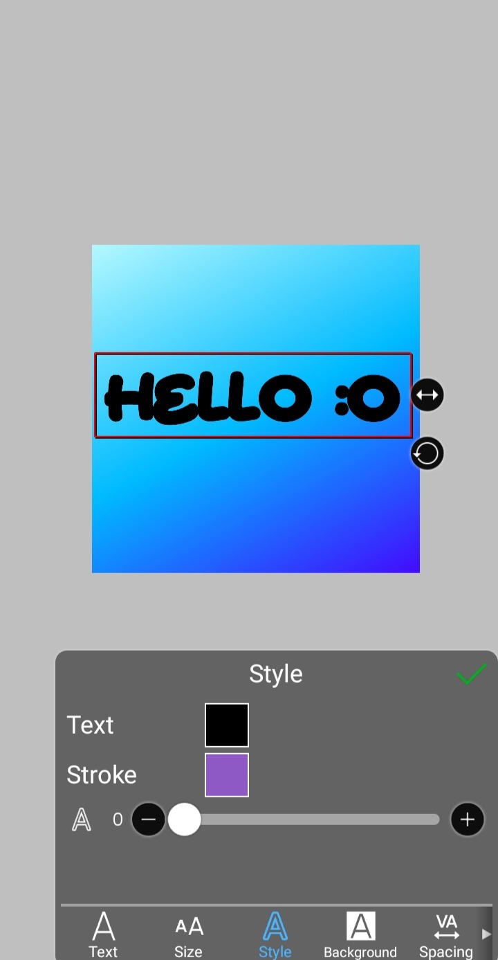
jelly text tutorial! (works with shapes as well)
what you need: ibis paint x, premium or free version doesnt matter
step 1: color
yes we're starting with color! I highly suggest using multiple colors for a prettier finish. I prefer parallel gradiation but as long as its blurry anything should look nice. pick analogous colors for the best result.

step 2: write the text or draw/import the shape.
as it says! if youre drawing it, make sure its on a new layer above the gradient! I suggest using rounder, bubblier fonts/shapes, one of my favorites to use is starborn on all uppercase. the color you use does not matter as it will be the background color in a short bit
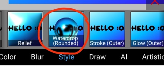
step 3, the jellificationing
this little friend called "water drop (rounded)" in effects under style is your best pal. its here to help you and make the process so much easier.
so just press it and fiddle around with it until you're happy with the result.
step 4 (optional): refracting
to help it make look more 'realistic' I tend to add another layer of the water drop. to do this I simply copy the previous one and go do the same effect on the top layer
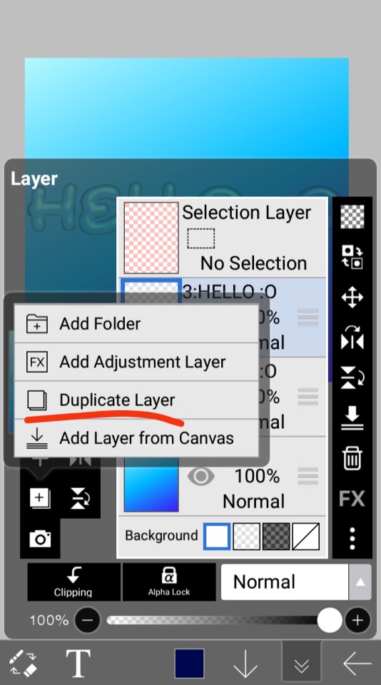
step 4.5: tips
you need to make sure the refractive index for the second one is turned down all the way, or itll look weird, streaky, etc. make sure the highlight and highlight size settings are lower than the previous time you used this effect. and make sure the little sun symbol (the light source) is on the edge of the opposite direction of the previous time you used the effect. so if the first layer of jelliness had the light source coming from the top right, the second layer should br on the very edge of the bottom left.

step 5: begone, background
yeah, we're done with that, this will also be the big reveal of the final image

and then you just crop to fit and then save as a transparent
bam! heres the final thing!

I dont know how good I am at explaining but I hope this helped! if youre confused dont be afraid to ask!
#🌫️ i know what you dread | creations#rentry#rentry inspo#rentry resources#editing resources#editing#editing tutorial#edit tutorial#edit resources#rentry decor#rentry graphics#carrd resources#web graphics
534 notes
·
View notes
Text
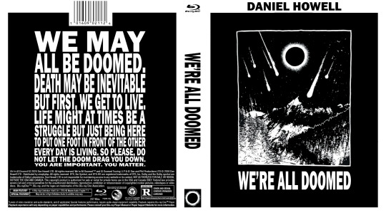
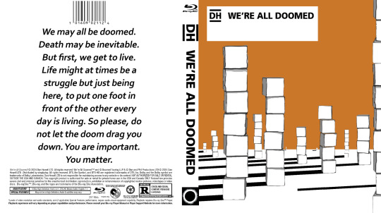
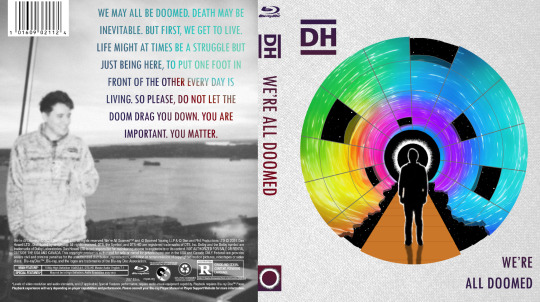
WAD: Cover Art
dan is still working on selling the distribution rights for We're All Doomed! so i decided to make some DVD/Blu-ray disc jacket art!
this is my attempt at a traditional jacket design! none of the images used are mine, but i did create the concept and design:

as i was making the first one for myself, i was struck by the fact that 'well, it's for me, so it doesn't have to look like a stereotypical jacket cover' which led me to be more artsy in my approach for the next one:
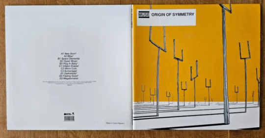
i was really enjoying the creativity and space to explore, so i went looking for more inspiration for a third design. this led me to dan's favourite Muse album: Origin of Symmetry, which i paid homage to:
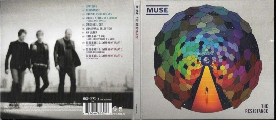
after the first Muse album, i looked at their catalogue to see if there was more inspiration there. i was just thankful dan's favourite was easy stylistically to mimic, unlike say, 2009's The Resistance...
thank you @danielhowell for the inspiration!
nerdy stuff & reference pics below the cut!
General notes
i don't know how to use photoshop! i entirely brute-forced my way through the whole project, and the only tutorial i looked up was for the gradient text in the 4th cover
this wasn't even the original project i was working on! you'll eventually get to see that though
and this one also inspired art for the disc itself so stay tuned 👀
i will do anything for authenticity so these are Full of intentional details
matching fonts is a nightmare
the traditional cover
took the longest, as it was the first.
the barcode numbers are the date of the first video he uploaded on dinof, and the last tour show date (in m/d/y)
i changed 'iceland' to 'poland' on the front cover, as he never actually went to iceland, and poland wasn't ever on the list even though he did go there
the orange may look a little off-center in the front, but these designs need to include space for a spine between the front and back cover, i promise it's right 😂
the black and white cover
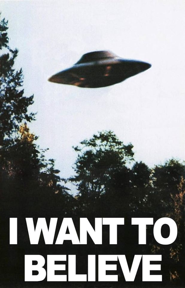
inspired by the 'i want to believe' aliens poster
the cover art comes from his metal band merch shirt design
i had to manually shrink the text, line by line, and ensure it all lined up on the back!
i even made the logos on the back greyscale
the Muse: Origin of Symmetry cover
a shockingly perfect style for a WAD cover. i'm so glad i used the cubes, even if they couldn't be orange.
there's some versions of the art online where the sky is even more orange and it baffles me how i haven't seen any parallels like this before
the Muse: The Resistance cover
this cover was never supposed to see the light of day! i meant it when i said i was grateful i didn't have to try to adapt this complex design... and yet, i tried anyway.
i did all the grid lines by hand, including the jagged/broken edge parts, shading each section, and then drawing every star.
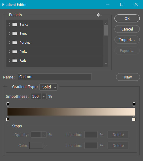
the hardest part was getting the gradient on the back text to cooperate. photoshop's gradient settings are surprisingly limited
gotta shout out @amazingphil for being the reason i knew what this cover looked like--it's the only muse album i knew the art of before embarking on this quest!
obligatory sob story:
i've been extremely and suddenly ill for 6 months. it is difficult to function moment to moment, but especially in doing little things just for me. this is the first and only art project i've been able to feel inspired to not only work on, but to finish, and despite the pain and long hours, i enjoyed every minute of it. thank you, dan, for creating this space for me to explore, and thank you, everyone here, for being wonderful support during this time 💞
#it's finally here!! i hope you all love them as much as i do#dnp#c.text#dan and phil#daniel howell#phan art#hey phil look at this#we're all doomed#wad#c.art#word#heydanandphil
338 notes
·
View notes
Text

GIRLS LIKE BOYS LIKE ME !
how would enhypen prepare for their first date with you!
🩷 now playing - on melancholy hill by the gorillaz
🩷 contents - includes kissing! no gendered terms used but makeup is mentioned in Jake's. enha as losers who are trying their best™ on first dates
🩷 a/n - unlocked how to make gradient text im basically unstoppable now. this is my first time writing a headcanon sort of thing!! so I hope it's good. pls do reblog and leave comments - I would love to hear from readers :)
masterlist

HEESUNG would be the type to try and play it cool and then lose his mind then play it cool again like an on and off switch. He would ask Jay fashion advice super nonchalantly, but Jay would be able to see through his shit IMMEDIATELY lmao. But like the good friend Jay is, he helps Heesung pick out a cool yet not over-the-top fit. Definitely picks up flowers on the way so that they're fresh, and maybe even spritzes a bit of mouth freshener before ringing your doorbell because of course he ate onion rings before leaving the house out of nervousness •́‿,•̀
I feel like he'd take you to an arcade for a first date - not only because it gives you both bonding time while playing games, but he also gets to show off his shooter skills in those lcd zombie games (the playing league all night is coming in clutch for him right now). Definitely also the type to stand at the claw machine for half an hour trying to get you a toy. "Seung it's always rigged, come on we can play another round of ice hockey instead." "It's not about being rigged anymore Y/N. It's a matter of pride and courage. Life or death." Like boy T-T it's never that serious king. Would walk you home while you clutch a GIGANTIC bear plushie that he may or may not have bribed some poor arcade worker for while pretending he won at the totally not rigged claw machine, which was concerning, but also very sweet. Sweet enough to warrant a kiss on the cheek by the end of the date ;)
JAY would literally be the most perfect, gentleman-ly guy and just drop dead gorgeous and AHDJKD sorry my first date feels for Jay are RAGING right now. Definitely would be jittery for sure, but is calm and level-headed. I feel like he's the type to ask you out on a date very traditionally after harbouring feelings for a while, watching from afar kind of like the XO music video you know, with the flower shop? Bouquet with red or white roses are a MUST and he'd extend his arm out for you to hold while he takes you out of your house (definitely the type to charm your parents that has them pushing you out the door because that boy is PERFECT)
He would probably take you out to a restaurant or OR hear me out - an in home date where he's kicked his members out somehow and has the living room set up like a restaurant with a table with some candles and dim lighting, food he prepared (house-husband material. wife him up right NOW.) so that he could show off his cooking skills. Wonderful date, would drop you off home as well. Honestly I don't see him kissing you on the first date because of all that chivalry you know, but don't worry he's just building it up to the more perfect moment to be your perfect boyfriend.
JAKE, this happy puppy would be so SO excited he'd be counting seconds up to when he would meet you :( He's so ADORABLE he would literally tell everyone knows about how he's scored a date with the finest person alive and then would proceed to spend a whole week just grinning in happiness cuz he's going on a date with you!!! I think more than flowers, he'd get you some sort of trinket or some chocolates as a gift :D and he'd be skipping along the way. TONS of compliments about your makeup and your outfit and just you in general.
I feel like he'd have a picnic-park sort of date thing setup, bonus if you have a dog because you best believe he'd be bringing Layla along. He'd ask his mom for help and pack the most scrumptious picnic ever, and just spend a day basking in the sun with you. The evening might even end up with you both walking hand-in-hand by the riverside, just chitchatting because this boy is a pro-yapper, and just enjoying each other's presence. Wonderful date that would end in a kiss wink wink ;) because he's just so so enamoured by you that he will literally lose his mind if he lets this shot go.
SUNGHOON is a loverboy at heart - as cool and chill he may seem on the outside you best believe he's giving that smile that makes his eyes crinkle while escorting you to your date. He's sharply dressed and has received the apropos speech from his sister about first date etiquettes even though he's quite a mindful man with great manners already. I see him getting white or pink tulips for the date.
He'd take you to a - I know it's a cliché, but an ice rink!! Because it's his element, and that confidence is what he wants to show you. That he's the one for you, or at least who he's trying to be. Sunghoon may seem like a player or someone who doesn't do serious attachment but with you, it just feels different. Giggling along with you and pushing you along gently, guiding you around the contours of the ice rink has his own heart doing pirouettes. And of course as clichè this is heading already, the date concludes with an accidental kiss that happens when you slip on the ice, bringing him down with you. You're both laughing at your hopeless nonexistent skating skills and all he can do in that moment is give you a small peck on the lips that makes his pale cheeks blush violently.
SUNOO is such a sweetheart, I have a feeling you would have already been friends for a while and that his feelings for you had been garnering for a while, until he just had to tell you. And so here he is, dressed down to a tee with the help of Jay's good fashion sense, and of course adding his own personal touch to it. This smitten cutie would be going all out with the gifts, trust. With a medium sized bouquet, he would also get a box of chocolates for you and maybe something else, like a scrunchie or a charm bracelet you'd mentioned you'd been eyeing for a while to him before.
Sunoo, in my mind, seems like such a pottery date kind of guy to me. He adores creativity and spending that time to do something a bit artsy with his favourite person just sounds so cute. He would maybe make a dish bowl sort of thing for him to keep at his sink for his skincare or balms or even vitamins, while you would make a key holder or a soap box. And he'd help you out with your paints, giving you ideas on what you could make, and listening to your inputs as well. Since you both were already friends before, it's a comfortable and secure environment around you both, that just makes this sunshine boy beam more than ever possible around you. "Sun that looks great!!", you'd encourage him, as he'd just wipe away whatever flecks of paint had gotten on your hand, basking in your praise. He might even take the opportunity to hold your hand, to which you of course had no complaints.
JUNGWON is panicking and Jay and Heesung are trying their best to call him down. Panicking because he overslept on his nap to freshen up for his date. But fear not, because this is where Efficient Wonie comes in and saves the day. It's like everything that must be done becomes natural to him - it's in his second nature to buy you flowers and ring up your doorbell, flashing that all so sweet grin of his. And after calming down the raging butterflies in your stomach, you both set off on the date he's meticulously planned.
I see Jungwon as a multi-activity date kind of guy, you know? Why not get the best of all the worlds with this guy? He has the date planned in his head for months now, considering how long he's been itching to ask you out. He starts the date off with a nice, cozy cafe visit where you both can pick up some beverages to set yourselves right. Following would be a movie, something he'd find meaningful enough for a first date. And he's trying his best to focus on the movie instead of the fingertips brushing against yours inside the popcorn bucket because he needs to know the plot for the next part of the date!! Which is taking you to a small diner after the movies to talk about what you both found interesting about the film - whether it was good or bad, characters and the theme. And just from there the conversation would flow. Jungwon would be so easy to converse with that you wouldn't even know where the time has gone, until you find yourself in front of your house with him, hours past in a blink. And with how adorable his dimples look under the street lamps as you bid him goodbye, you can't help but place a sweet kiss on them as you depart, leaving him lovestruck on the street.
RIKI wants to have a bit of fun on dates. Sure movies and arcades and picnics are fun. But this boy is a ball of energy when he's around the people he likes - if it isn't obvious from the way he's around his members and their comfort. And that's how you made him feel as well, comfortable in his own skin. So much so that it warranted a date with the dance prodigy, who couldn't get you off his mind at all. He'd definitely be much more confident in this date than the others for sure, but that doesn't mean he isn't a bit nervous!! But sweet boy is more nervous about making sure you have a blast tonight with him. And with the way you're laughing and accepting the flowers he got you, placing them in a vase, those worries fade almost immediately.
Riki would take you to a town carnival or an amusement park sort of setup for a date! This teasing little shit would totally use this opportunity for poking fun at how you would scream on the faster rides like the rollercoaster, and would claim how he would "protect you" if anything did happen (like dawg this is not a fight for honor it's legit just a rollercoaster). He'd win you some prizes from the side stalls, and you'd both share a large cotton candy. Would whine about the animal ears you insisted that he wear during the duration of the date, which you had bought from a concession stand. But he would also complain when you said he doesn't have to wear it if he doesn't like it like T-T bro. The date reached its final note on the Ferris wheel, and it's not like you were scared of heights, it's just that you'd severely underestimated how high the ride went. "You can hold my hand if you're scared", Riki says jokingly. But you take the offer instantly, tightly clutching his hand as your eyes are wide and looking around as awe starts replacing the terror in your eyes. And despite the view, Riki could only look at you. Feeling his gaze on you, you turned your head around to only find yourself encaptured in a sweet and romantic kiss, surrounded by cool air miles above the ground.
#enhypen#enhypen x reader#enhypen fics#lee heesung#park jongseong#sim jaeyun#sim jake#kim sunoo#nishimura riki#yang jungwon#park jay#lee heesung x reader#lee heeseung#park sunghoon x reader#park jay x reader#park jongseong x reader#sim jake x reader#sim jaeyun x reader#kim sunoo x reader#yang jungwon x reader#riki nishimura x reader#nishimura riki x reader#enhypen headcanons#enhypen fluff#enhypen fic#enhypen reactions
143 notes
·
View notes
Text

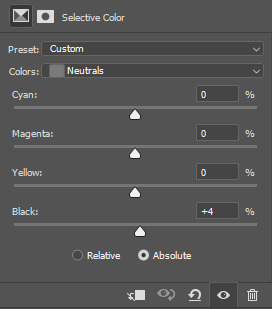
There is a mechs x TMA AU bouncing about in my head. So have mechanized Melanie where she becomes The King In Yellow and commits heinous acts. Also pretty much my first time using gradient maps, so yay. Click for better quality.
Closeup with no text:

#Melanie king#melanie king tma#the magnus archives#tma podcast#the mechanisms#tma fanart#the mechanisms fanart#tma x the mechs
80 notes
·
View notes
Note
H-hi! I hope It's ok if my first request is not a smutty one? Yakuza men and what makes them feel loved? Thank you in advance!
yakuza men and the things that make them feel loved !
❀ pairing - ��kazuma kiryu, goro majima, taiga saejima, shun akiyama, y0!akira nishikiyama, daigo dojima, ryuji goda/reader (all seperate)
❀ tags - fluff, angst, gender neutral reader, probably sloppy character analysis, these men all really need therapy, love languages, alcohol/smoking mentions
❀ a/n - of course non-smut requests are welcome!! stares at my college degree on the wall that focused almost entirely on how people's experiences, relationships and environments affect them and their inner wounds/ways they want to be loved... i am so ready to break these down hehehehe (also i learned how to use gradient text are u guys proud of me)

kazuma kiryu ❀ spending time with him
deceptively simple, kiryu feels the most loved when you decide to just exist near him
oftentimes he feels like he's undeserving of company or that his mere presence is a danger to his loved ones, so frankly your insistence on being close to him is going to freak him out at first
he might even start avoiding you in the early stages of a relationship - don't take it personally, it's just that he loves you so much that he's anxious about hurting you
the more and more you stick by him, the more he realizes that he doesn't have to do everything on his own
in fact, he likes not doing everything on his own, a wave of relief every time he remembers that he has someone he trusts and admires deeply at his side
it slowly heals that deep emotional wound he carries that for someone to love him means for them to be hurt
the reason i hesitate to use the word 'quality time' with him is that he doesn't even really need you to be doing something with him
just being in the same room as him, focusing on whatever you both are working on separately
he's never been one to be comfortable expressing himself in words, the silence between the two of you like a warm blanket instead of awkward
i could get into my hc that he's autistic so it's a form of parallel play to him, but i digress
if you look over at him, you'll see that there's a rare soft smile on his lips
wordlessly will walk over to you and pull you flush to his side gently, pressing a tender kiss to your forehead
"i like when you're here," he'll grumble softly to you - which in kiryu-isms, really means 'please stay by my side like this forever'
goro majima ❀ letting him vent/talk about his feelings
oh boy i have so many thoughts about majima and how hard of a time he has accepting love
he's a master at self-sabotage - he doesn't know how to process feelings of love or affection, nor does he really feel that a piece of shit like him deserves it (see: how often he tells others that they'd be better off without him)
so he often chooses to bury his feelings instead of doing something about it
it was much the same when it came to you - he loves you so much, painfully so, but there was always that annoying voice in his head that told him that that you had better things to do than spend time on a mongrel like him
he'll keep his conversations surface-level with you at first, but ask him how he feels about everything and validate what he says
it'll catch him off-guard at first, and he might even try to put up a front and say he doesn't like talking about that sappy shit
but he'll eventually start giving in, going on long rants about all the crap he had to deal with that day or his 'tragic fuckin' backstory' while you listen intently
the more you wrench his ribcage open and force him to expose his real heart to you, the more he starts falling helplessly for you
not only are you letting him acknowledge and let out the emotions he keeps bottled up close to his chest, but you're seeing every ugly, rotten part of him and you still love him
now, that doesn't mean don't hold him accountable when he's kinda being a dick
praising everything he does will just make him feel like you're putting him on a pedestal or seeing some idealized version of himself you made up in your head
which will give his brain an excuse to run out on you before he eventually disappoints you
so don't let him run - from his feelings, from accountability, from you
the mad dog doesn't like to be collared, but for the person who looks past every facade he puts up and lets him just be goro majima - he'll happily put himself on a leash if it's you who's holding it
taiga saejima ❀ giving him physical affection
for most of his life, saejima was treated like a dangerous beast due to his size and that perpetual scowl on his face
it only got worse after the ueno seiwa hit - shackled like a circus tiger as he was dragged from jail to jail, never able to escape whispers of 'the man who slayed eighteen' and 'the stone-cold hitman' that make him sound more like an urban legend monster than a man
saejima has his own pride in his strength, and for the longest time he just accepted that he was the untouchable, scary beast that everyone made him out to be
it's not until you come into his life and start to subjecting him to little casual touches of affection that he realizes how touch-starved he is
grab his hand, cuddle him, catch him off-guard with kisses to his weary face - it makes his chest tighten in a way he doesn't understand just yet
he feels silly that such small, soft things are affecting him this much at first, but every casual little touch you give him makes him feel less like the boogeyman and more like a person
the fact that you trust him enough and feel safe enough to him to attach yourself to him... he feels like he could cry
it takes a while for him to start returning your touches, but when he does he suddenly turns into the biggest teddy bear
every time he holds your cute little face or holds you protectively against his chest at night, he's taught that his hands can do more than just inflicting pain
he'll never, ever admit it out loud but he loves it the most when you hug him, your arms barely able to wrap around his thick torso but trying your best regardless
he can't help but chuckle as he feels your body meld against his, patting your head and wrapping his arm protectively around your shoulders
he knows people would gawk if they saw how cuddly he gets with you, but he can't really bring himself to care
he's not a monster, a beast, stone-cold, or a killer when he's in your arms - just a big, soft tiger
shun akiyama ❀ taking care of his physical needs
akiyama SUCKS at taking care of himself, often relying on other people (i.e. hana-chan's scoldings) to remind him to eat or get his work done
it's not like he's completely helpless, he insists - he at least keeps himself clean and well-groomed
but being homeless for as long as he was, he eventually just forgot how to attend to his needs
even now, with all the money in the world, he's still unlearning how he had to just suppress his hunger pangs when food was an uncertainty and sleeping on a regular schedule when shelter wasn't always guaranteed
his body does it unconsciously now, often attending to his paperwork for hours on end without even noticing that he's hungry or tired
he feels embarrassed when you start slipping him bentos here and there when he's so wrapped up in his work, often giving you an apologetic smile and profuse thank you's
but the fact that you cared enough to notice, and cared even more to go out and get him something to eat makes him remember why he fell for you in the first place
he might protest weakly when you pull him away from his work when you notice his eyes are getting sunken and his body's lagging behind
or roll his eyes with a smirk when you snatch a cigarette from between his lips and smush it in the nearby ashtray, reminding him that he was whining about needing to quit smoking just yesterday
but he's truly, genuinely thankful that you're forcing him to take care of himself, the fact that you're invested enough in his wellbeing to scold him
he'll be damned though if he becomes one of those boyfriends that treats you like his mother, though - he may call himself a bum, but he's not THAT much of a bum
expect to be taken care of in equal measure, akiyama insisting to pay for your meals and run your errands for you to show with his actions, not just his words, how cared for you make him feel
akira nishikiyama ❀ praising him
yeahhh i couldn't not talk about nishiki's inferiority complex and how damaged his self-esteem is
his cool-guy bravado very thinly covers up a mountain of insecurities
he doesn't really feel like he does much of anything right, too pathetic to be a scary yakuza and too cowardly to stand up for himself or what he believes in
so anytime you genuinely praise him and tell him he did a good job with something, the high he gets from it is strong enough that he could probably quit nicotine, he thinks
he preens when you compliment how stylish he looks or how well he styled his hair - he takes a LOT of pride in his appearance, probably one of the few things he doesn't really have insecurities about
he can't help but grin ear to ear when you cheer for him at karaoke, or clap and whoop when he gets a strike at the bowling alley
he admires you so, so much, and that verbal affirmation that you think just as highly of him soothes that little boy inside that never thinks he's good enough for anything or anybody
every time you compliment him, he gets so giddy that he'll grab you by the waist and start pressing kisses all over your face
"i did that for you, baby," he'll claim proudly, his eyes shining with affection
the first time he cried in front of you, he was shocked that you didn't call him a crybaby or told him to man up
you just held him gently and wiped away his tears, whispering that he did the best he could and that you were so proud of him
he absolutely crumbles when he hears that, hugging you close and crying even harder :(
it kills him (in a good way) that even when you see him at his most vulnerable, you don't think he's pathetic or weak, just someone who needs the reassurance and comfort he's been deprived of his whole life
i'm not saying you'll fix him, necessarily - but perhaps the entirety of 1 could have been avoided if someone just told him he was doing a good job
daigo dojima ❀ letting him be weak
from the moment daigo was born a dojima, he was expected to be as strong, proud, and cold as the rest of his family
even when he left the tojo clan after the ryuji incident to not have to carry that expectation anymore, he still had a gang of people who started to follow him and put them on a pedestal as their leader
and now, as the sixth chairman, he has even less opportunities to let his guard down, not with thirty thousand people looking to him as an example and his enemies lurking at all times
daigo's resolve is strong, having long since accepted his lot in life as a leader - but he can't deny that he just gets so exhausted sometimes
so when he can come home to you, who doesn't expect him to be the sixth chairman, a dojima, or hell, even a yakuza, just daigo, is when he feels the most loved
sometimes just lays his head on your lap when it's just the two of you on the couch in the living, the feeling of your fingers threading gently through his jet-black hair and just being able to relax making the stress in his muscles melt away almost instantly
his greatest peace is when you both lay down to sleep at night, holding him in your arms and whispering to him about how hard he works and to get all the rest he needs
he hums softly and nuzzles into the crook of your neck, not saying anything back as he revels in the feeling of your fingernails scraping against his scalp as your digits comb through the tresses of his hair
there's no expectations, no danger, nobody expecting him to make a decision on the spot or suppress his personal feelings for the good of many
just his darling lover who sees him for who he is, feelings and weaknesses and all, and still loves him
he knows that there's a long list of things he has to do tomorrow and put on a strong face again, but for now he lets himself cuddle in your grasp, letting your words and gentle touches soothe him to sleep
ryuji goda ❀ when he gets to show off for you
a very... simple method of affection for a very straightforward man
he's just got some somewhat dated ideas about what it means to be a man in a relationship, and a lot of them revolve around flexing how strong and skilled he is to you
nothing makes him more satisfied than seeing your eyes shine with awe when he helps you move an insanely heavy piece of furniture or when he shows you just how much whiskey he can knock back in one go
it's less of the showing off itself that makes him feel loved - he's confident in his strength and his skills so he needs no reassurance in that department
but your cutely surprised reactions and the fact that you're so openly proud to call him your boyfriend that you'd let him strut his stuff out in public to show the world how cool and strong he is... yeah, that's what makes him happy
he gets so determined to show off for you that he sometimes gets in way over his head about things he usually wouldn't give a shit about
for example, when he tried to get you the cute stuffed animal that you wanted from the ufo catcher
ryuji scoffed and told you to step aside, confident that he would get it first try
until he didn't. and didn't on the second, third, fourth, fifth tries-
he let out a string of colorful curses as he watched the claw uselessly pinch at the round little sparrow, his jaw tensed in concentration as he shoved another coin into the machine's slot
ignores your reassurances that he really didn't need to do this for you, retrying until he eventually gets the damn thing to drop in the hole
he feels stupid until he hands the round bun-chan toy to you, your eyes wide and a smile on your lips
as soon as you hug him with a squealed thank you, he laughs, patting your head and telling you that it wasn't a huge deal
ryuji's not one to usually lie, but your praise and admiration is, unsurprisingly, the BIGGEST deal to him
as he wraps his arms around your waist to walk the streets of sotenbori, showing off both you on his arm and the little plushie he won you, he knows he would move both heaven and earth if it meant it would make you proud to call him your lover
#kazuma kiryu x reader#goro majima x reader#shun akiyama x reader#taiga saejima x reader#akira nishikiyama x reader#daigo dojima x reader#ryuji goda x reader#yakuza x reader#yakuza fluff#rgg x reader#rgg fluff#ryu ga gotoku x reader#ryu ga gotoku fluff#yakuza#rgg#ryu ga gotoku#kazuma kiryu#goro majima#taiga saejima#shun akiyama#akira nishikiyama#daigo dojima#ryuji goda
76 notes
·
View notes
Text
gif tutorial
i was asked to make a tutorial for this set i made, so let's get right into it!
first things first, i downloaded the music videos from youtube in 1080p using 4k video downloader. unfortunately, the quality of youtube videos always seems... not great, to put it simply. plus these music videos are from the 90s, so they've been upscaled to 1080p after the fact. all of this works against us, but i've definitely worked with videos of lesser quality than these, so at least there's that!
when i gif, i import video frames to layers rather than screencapping. this comes down to personal preference. after everything has loaded, i group all my layers together and set the frame delay to 0.05. i then cropped my gif to 540x500.
the next step in my process is sharpening. i did play around with my settings a bit given the quality of the footage and the dimensions of the gif. i compared both @hellboys low-quality video gif tutorial to my regular sharpening action and my vivid sharpening action and in this case, i preferred my normal vivid sharpening action. i used this tutorial to create the action for myself, and you can find other sharpening tutorials here. this action converts my frames to video timeline and applies sharpening.
once my gif is sharpened and i'm in timeline, i begin coloring. i wanted to simplify the amount of colors used in these gifs, again because of the video quality -- i knew it wasn't going to have the crispness i would normally like for my gifs. here are my coloring adjustment layers and their settings (not pictured: my first layer is a brightness/contrast layer set to screen) (explanation in alt text):

all of these layers and their settings will vary depending on your footage and its coloring (and obviously, feel free to make the gradient map whatever colors you like if you aren't going for this exact look).
pretty basic coloring, especially with just slapping a gradient map on top (my beloved), but at this point, i still didn't like the quality of the gif, so i added a couple textures/overlays.
i put the left one down first and set the blending mode to soft light and the opacity to 8%. depending on what look you're going for, you could increase or decrease the opacity or play around with different blending modes. i like using this texture with lower quality footage because even when it's sized up a bit, it adds some crispness and makes things feel more defined. for the second texture, i set it to overlay and 75% opacity. we love and respect film grain in this house.
now for the typography! sometimes i really enjoy typography and other times it's the bane of my existence for the sole reason of just how many fonts i have installed. anyway, here are the settings i used for this set:
make sure the color of your font is white and then set the blending mode to either difference or exclusion. i can almost never see a difference between the two, but for this set, i used exclusion. below are the blending options (double click on your text layer to bring up this menu or right click and select blending options).
now we have to add the warp effect. with your text tool still selected, click this icon at the top of your screen:

from the dropdown menu, select twist. these were my settings, but feel free to play around with different warp options and their settings. the ones i use most often are flag, fish, and twist.
this last step is completely optional, but it's an effect i use in most of my sets with typography. duplicate your text layer (select the layer and ctrl+j), turn off the layer effects (click the eye icon next to effects), and set the blending mode to normal. right click on the layer and select rasterize type. right click on the layer icon itself and choose select pixels.
at this point, you should see the moving black and white dotted line showing that only your text is selected. then go to edit > stroke. here are the settings i almost exclusively use.
this is what your text should look like now:
using ctrl+T, move the layer off the canvas so you can't see any of the text anymore. you should be left with only your outline. click anywhere on your canvas to de-select the text we just moved. use ctrl+T again as well as your arrow keys to nudge the outline over to the left 2px and up 2px. this is personal preference as far as the positioning, but i almost never move it any other way. you can leave it like this, which i sometimes do, or you can set the blending mode to soft light like i did for a more subtle effect.
and that's it! rinse and repeat for each gif in your set or use a different warp effect on each gif to switch it up! if you have any questions about this tutorial or would like me to make one for anything else, please feel free to ask any time!
#gif tutorial#my tutorials#gifmakerresource#completeresources#dailyresources#chaoticresources#userdavid#coloring tutorial#typography tutorial#tutorial#photoshop tutorial
228 notes
·
View notes
Text
Okay so I think there is something weird going on with Lenore
And it's not what you think. Well I'm not sure what I'm even thinking; tbh it feels like I'm pulling on a thread that's not meant to be puled yet but well hear we are.
So I think there is something about Lenore that is fundamentally different than the other students, and it's not just the prior bond she has with Annabel. It seems like, and this is going to sound completely insane, that she has some connection to nevermore, or something about her is closer to the entities that inhabit it.
Hear me out.
Warning: this is unhinged.
Upon entering the grounds of the academy she had that weird eldritch vision.
A vision Annabel didn't seem to have.


A vision the Deans knew she had.

And then there it the thing with the orbs. In chapter 45 Poppet stats them to be insentient, but they don't seem to act that way. They talk, and even try to protect Lenore.


Now it's unclear weather Annabel can hear what they are saying, as this feels like it's from Lenore's pov but I wanted to include it any way. These orbs feal sentient to me, maybe not sapient, but it feels like a weird thing for a teacher, do get wrong, or knowingly mislead us with.
And then there is the Raven. The mother fucking Raven. He is the first character we see Lenore with.
He states that the only reason that he talks to her is that she addressed him first. Something that no other student has done.

And then there is this.


Why would his curiosity about Lenore be destructive!? Like, Lenore is the person he'd said he would eat if she tried to escape. It cant be Merry and Mourn that pose a threat to him since he's snooped around the academy grounds before.
Now what I'm going to say next is going to enter thumb tacks and string territory but...
I think Lenore and the Raven have some weird connection.
First off, there's the obvious, Lenore has a bird motif, ravens specifically, and well she befriends a raven.
Then there is their mutual association with the color red. Lenore with her, well, everything, and the bird with his speech bubbles. And said speech bubbles seem unique. At first glance they seem like the speech bubbles we see with characters specters, but something about them seems different, and it's not just the colors. They seem more blotchy.
Now this is what character thoughts normaly look like


White text, with a colored gradient around them. But you wanna know what Lenore's thought's look like after she talks with the raven for the second time?
Red and blotchy, just like the ravens speech bubbles.
Now this is the only time her thoughts appear like this but I still felt like mentioning it.
Also you wanna who Lenore and the Raven's dynamic kinda reminds me of?
Merry and Mourn!
But like a Merry and Mourn that don't know each other well yet.
There is something going on here, but I have no clue what it is.
@blacknedsoul-blog Look you're one of the best meta writers in the nevermore fandom, and I feel like I'm going insane. HELP!
#im unhinged#nevermore webtoon#lenore nevermore#annabel lee nevermore#the raven nevermore#merry nevermore#mourn nevermore#the deans nevermore
247 notes
·
View notes
Text
NNN day 3 | Skin Deep Scars


summary: you’ve been born into a rich controlling family, always having to stay on top and never cross the line. You tried to please your mother but never could be enough for your mother’s standards, your father was mostly at work and away at business trips so both of you hardly ever interacted with each other. That’s until you got into an argument about your new friend chris who was the polar opposite of you, what do you think will happen next?
warnings: ANGST, !parental abuse!, arguing (again ik), family issues, swearing, manipulation, controlling mother figure, !burning skin!, slight fighting, crying, !mentions of childhood trauma! And this contains sensitive topics for many (even me) so please I advice to read this with caution and knowingly what you’re consuming.
authors note: day 3 is behind us now, thank yall so much for all of the love on the past fics I seriously rlly appreciate it. Yall can drop some ideas for future days and fics outside of this in my inbox and I’ll be happy to write them, I don’t have my computer with me rn so I’ll make the gradient text when I’m at my computer again, hope y’all enjoy this one
no nut november | masterlist | guestlist

Escalated screams and yells fill the large space of the room, making my ears want to fall off as foul words continue to fall from my mother’s mouth. It’s not the first time my mother has yelled at me for the most stupidest bullshit ever known to mankind and this is one of them, somehow it never turned psychical between us which could be a shocker for some of the others considering how loud she is screaming and shouting that you would think she’d hit me by now or at least threaten to.
“You are bringing such shame to this family! It’s unacceptable!” She shouts, her face contoured with pure anger. I might as well see smoke coming out of her ears by now, rolling my eyes as I feel my own anger rise inside of me at how ridiculous she is being right now. “I bring shame? What about you sleeping around behind dad’s back, huh?” I argue back, not letting her bring me down and standing my ground. She gasps dramatically as if I insulted her whole bloodline, pressing her hand to her chest to make her seem more like a victim.
“Don’t you dare speak of that! This isn’t about my mistakes, it’s about yours!” She attempts to defend her name but fails miserably, thinking if she raises her voice higher than me she’ll have the high ground and take the upper hand in this argument. “You’re the one that’s hanging out with that street rat and even dare to invite him to this house!” My blood boils to high temperatures at her insult targeted towards Chris, well she isn’t very fond of him and his lifestyle or he of how she treats me from all of the stories I’ve previously told him.
Summarizing that thought, their hatred is mutual towards themselves. “Don’t bring him into this, he has nothing to do with this! It was one lower grade, mom!” I yell defensively, the level of my irritation rising with each second of just breathing in the tense air in the room. “That he caused by the influence he has on you! I just want the best for you, honey.” She tries to twist her tone into a softer one but I can feel the fakeness radiating off it the minute it comes past her lips, how pathetic.
“You aren’t convincing anyone with that fake tone, that’s for sure.” I state annoyingly as she attempts to move closer to me but when she sees me backing away she just gives up with trying to convince me into doing anything she wants with the same old method and decides on a newly invented one. “Fine, maybe I wont convince you at least but your father is pretty gullible and he’ll do anything I ask him to do. Even if i feed him a couple lies involving you and that little skank.”
I narrow my eyes at her, not believing her words at first until she shoots me a specific look which informs me she isn’t playing around, raising her eyebrow and slightly dipping her chin just always has her whole bitchy personality written all over her face in that moment. My face normally would drop in color but at this point I didn’t care, she brought Chris into this who has nothing to do with this and shouldn’t be assumed as the cause of my lower grade. It was one of the hardest exams this semester and even when I studied harder than ever and got the highest grade in my class, she still doesn’t appreciate my hard work.
My head decides its the perfect time to bring up the first time I got a lower grade, being only at the age as young as seven she was already pressuring me into being perfect and didn’t even allow me to have a normal childhood only filling me with more work and mental pressure I often was too tired to do anything the next morning after studying all night in hopes to attempt to please my mother but no matter what I did, she never fully appreciated it and always found something bad to point out.
Start of Flashback
I excitedly run into the living room with my test clutched in my head, my dress flowing in the slight breeze coming from the window. A proud smile spread on my face as I reach the living room where mommy resided in sitting on the couch, holding up my paper for her vision to see the teachers red mark saying ‘79/100’ in the corner of the paper. “Look mommy, my teacher said I got the highest grade in my class on the test!” I exclaim proudly, waiting for my applause but was met with silence. Tilting my head to the side to glance at my mommy confused on why she is quiet but she had only a disgusted and an unimpressed look shadowing her face.
She notices my confused expression and finally speaks, turning her head away from me and back at the tv “Honey, that’s not good enough for this family. Study harder next time.” She states without any sympathy in her voice as she goes back to her activity like nothing happened, my eyes slightly start to water. Why am I not good enough for mommy? Why isn’t mommy proud of me and saying nice words like my teacher was? My arms drop down to my sides with the paper still clutched in my small arms.
“What do you mean, mommy?” I ask curiously, my voice becoming slight wobbly as shaky breaths enter an exit past my lips. “My teacher said I did great and even gave me a lollipop!” I add, now my sadness being evident and that’s when mommy looked at me and sees me upset. “Oh baby, you know what I told you about eating too much sweets. And a 76 isn’t high enough for the reputation our family has.” She says in a reassuring voice, seeming as if she wanted the best for me and me being the gullible and innocent child, not realizing she’s manipulating me into doing whatever her heart desired and shaping me into a perfect little toy to play in her game.
“I just want the best for you honey and you know that, I would never do anything to hurt you, ever.” She calmly assured in a soft tone, she walks over to me and wipes my tear-stained cheek with her thumb and looks at me with fake sympathy mixed with fake remorse. “Now go to your room and study for the next test, mommy has to go attend to some things, okay?” I nod my head yes and ran off into my room, the paper flying out of my hand and landing in the floor. My body immediately jumping onto my bed and bury my face into the nearby pillow as I clutch my favorite stuffed animal to my chest…
End of Flashback
I remember crying the rest of the night and thought it was normal and everyone’s mother was pressuring them into being better than every other kid and always perfect to upkeep the family’s ‘perfect’ reputation. Now that I’ve grown up and caught onto my mother’s manipulative acts, letting me have the upper hand in some regards. “You’re pure goddamn evil, I can’t believe you’re trying to scare me with dad out of all people.” I huff, feeling my body become more tense by the second before adding. “Better than one of the guys you cheated on dad with.” After the words leave my mouth, she immediately darts towards me and gets impossibly closer to my face. Glaring at me as if she wanted to strangle the shit out of me.
“I said, don’t you dare bring that into this situation, young lady!” She warns, her voice completely shifting from fake sympathy to rage and evilness. One of her hands raises and she sticks out her finger, getting it in my face as if to try and scare me further but I only laugh in her face. “One more word out of your mouth and I make one call to your father, singing like a bird to him about all of the things you’ve said to your own mother.” She wipes imaginary tears off from under her eyes, pretending to be upset and hurt as if she’s the victim here. “You’re such an ungrateful brat, I’m surprised we haven’t kicked you out the house yet. You always disappoint us and bring total shame to the family.”
An evil laugh rumbles in her throat, I don’t see her as a loving mother I thought I had. No, I see her as the worst and most controlling mother ever known to mankind and I feel ashamed being in the proximity of her and letting her walk all over me like a doormat. She takes a few steps back and finally puts some distance between our bodies, I sharply inhale the tense air surrounding us as the following words fall from her mouth that I was just waiting for her to speak.
“I regret you were even born, more with every passing minute. Me and your father never wanted a girl, but a boy and at one point were debating to put you in an orphanage or give you away, another decision I regret making.”
Before my mother could say another word, I deliver a slap across her face and throw the words out of her mouth. She looks up at me, completely livid and fet up with this little cat fight between us. “That’s it, you’re getting punished hardly this time.” She angrily exclaims and roughly grasps my arm, dragging me into the kitchen by pure mad force. I try to escape her vice grip but it only makes it tighter, the feeling of pain and a bruise coming in spreads across my whole body as I see her walking towards the stove.
I start to get more desperate to escape, almost beginning to scream for her to stop and don’t do what I know she’s about to do. She did it before when I talked back to her ever and looks like today her strings popped too much, we get to the stove and she ticks it on, the flame blooming to life as she forces my arm above it. “Please, mom dont do this…” I weakly plead as the burning sensation starts to hit my skin, spreading across my whole arm. I cry out in pain and pleads for her to stop, quiet curses falling from my lips as she only glances at me sternly. Tears prick my eyes and burn down my cheeks, she continues to hold my arm over the flames and brings it closer.
My body starts squiring around, my pleads getting more and more desperate as more tears fall from my eyes. “Stop! Please, mom I’m begging you stop!” Shaky breaths fill the air and accompany the growing cries and pleads to my mother. “Stop moving around, you brat! Are you going to still be disobedient towards me now?” She asks mockingly as I think she’s going to burn my skin off, someone pushes her off me and I immediately fall to the ground in pure agony. The uncontrollable cries continuing to fall from my mouth, my eyes landing on the severe burn mark left behind on my arm, my eyes start to burn themselves from the amount of tears filling them at once
“What in the actual fuck is happening here?” I hear a familiar voice yell out as I don’t think about who it could be until they kneel down next to me and I realize it’s Chris, I forgot I invited him over today. I can’t believe he’s seeing me in this state right now, he glances at my arm and immediately grasps it gently into his hands. “Jesus Christ, we need to get you some serious help, cmon we gotta go to the hospital.” He calls out and helps me get up and stand on my feet, rushing me out of the house and looking around for something to quickly get me where I severely need to be right now. “You got a private driver here somewhere?” He questions and I nod negatively, there aren’t any available unless you ask for one beforehand.
‘Fuck, umm- okay then let’s just take.. your car!” He exclaims nervously, pointing towards one of the cars in the driveway. Quickly running over to it and rushing me inside of it, getting into the drivers seat and trying to start the car. When he finally gets a hang of the functioning of the car he quickly presses down on the gas and speeds out of the driveway and towards the hospital…

Guestlist!
| - @sturnioloblues - @sturnsxplr-25 - @strnzzvsp - @luvvs4chriss - @sturniolosweetheart33 - @pussypie456 - @choclatestarfishwithahat - @venusxsturnio - @bagsbyclair0 - @sturnstvs - @dykes4chris - @hoe4matt - @cayleeuhithinknot - @strnilolover - @marrykisskilled - |
#✰ ! 𝐕’𝐬 𝐍𝐨 𝐍𝐮𝐭 𝐍𝐨𝐯𝐞𝐦𝐛𝐞𝐫 ! ✰#✰ 𝐯𝐞𝐫𝐚 𝐰𝐫𝐢𝐭𝐞𝐬 𝐬𝐡𝐢𝐭 ✰#angst#read with caution#parental abuse#sensitive topics#family issues#manipulation#controlling mother#childhood trauma#argument#burning flesh#sturniolo triplets#matt sturniolo#chris sturniolo#nick sturniolo#matthew sturniolo#christopher sturniolo#nicolas sturniolo#sturniolo#sturniolo fandom#sturniolo fanfic#sturniolo x reader#sturniolos#sturniolo angst#chris sturniolo angst#matthew bernard sturniolo#christopher owen sturniolo#nicolas antonio sturniolo#angst fic
113 notes
·
View notes