#figuring out image compression on here :(((
Explore tagged Tumblr posts
Text
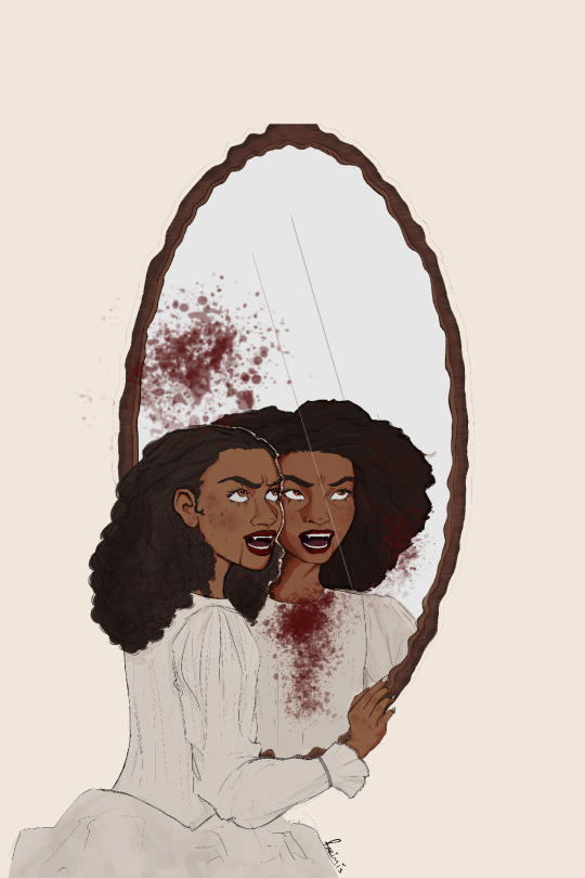
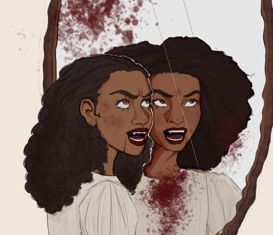
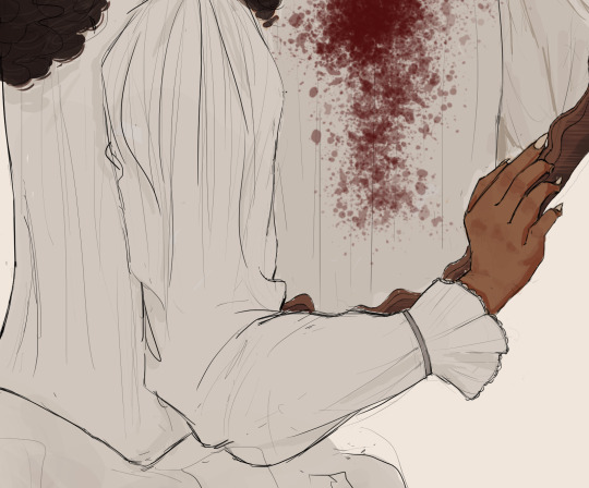

why have one murderous princess when i could have two ?
#iwtv#iwtv 2022#amc iwtv#claudia iwtv#iwtv fanart#iwtv amc#interview with the vampire#bailey bass#delainey hayles#art#digital art#krita#figuring out image compression on here :(((#i wanted to draw my girl#and then i wanted to draw her twice#anyway#yeah#so excited for#iwtv s2#need it yesterday
505 notes
·
View notes
Text


simply? oc posting?? again??? no it couldn't be....
#simply's sketches!#here's my tron oc again whoops#next to do on my list is figuring out how to get better quality images of my art#damn you tumblr image compression#artists on tumblr#oc art#tron
47 notes
·
View notes
Text
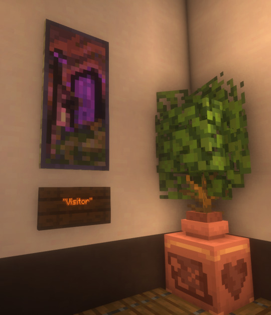
I finally finished a NEW CUSTOM MAP ART!!! "Visitor," a portrait of an enderman, is extra exciting because it's my first full-palette map painting, meaning I used block height to access all the highlight and shadow colours available!! More on the full process under the cut, but the short version of what this means is:
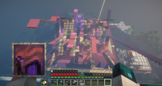
ITS A VERY COMPLICATED CONSTRUCTION. I created the art, then planned and built this manually, without any mods or schematics for construction. Huge props again to everyone else in the server for helping me gather all the materials to make this absurd thing possible!!!
This was the original art I made for it! I'm a huge fan of the "compressed" look of the vanilla paintings, so I've been starting with a large image and shrinking it down, though there were a lot of pixel tweaks to get it to read well. After shrinking it to 16x32 (for an art made of two maps), I convert it to a limited palette that I've set up to match the colours minecraft actually has available:

The map palette is actually tremendously limited, so figuring out a painting that will still look good with that constraint is a challenge in and of itself!
Anyway, the way minecraft maps work, a block that is Taller than the block to the north of it shows up with a slightly lighter colour, and a block that is Lower than the block north of it shows up on the map with a slightly darker colour. So when making a key for this one, I marked all the squares with a little arrow if it's the lighter or darker version:
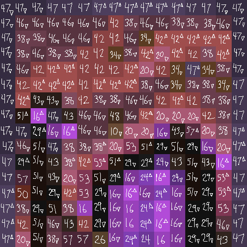
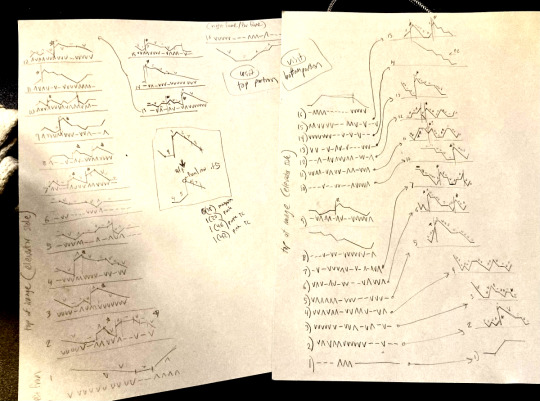
Each "pixel" here is a full stack of blocks on the mapped area: 64 blocks, 8 rows of 8. In order to achieve the affect of every block in a given pixel being taller or shorter than the block to the north of it, dark and light shades need to staircase either up or down. Because staircasing downwards in survival sounds even worse than this madness, I did some planning to make sure each of the "downwards" staircases would touch the ground, so I could simply staircase up from south to north instead. This involved figuring out how many up and down movements were in each individual column and planning out 32 little layouts:
It's worth noting that if you look up minecraft map art on Youtube, most of what you'll find is either, the simple realisation that placing blocks allows you to make custom map art, or an explanation of how to use a generator that will let you plug in any picture and then produce a schematic for you. It's very cool that these exist, but I wanted to do full palette art myself, without an auto-generated schematic, and at the time THERE JUST WEREN'T ANY TUTORIALS FOR HOW TO DO ALL THIS?? Now, having the experience of finagling all this, i think perhaps the reason is that this is a mad undertaking.
ANYWAY: PROGRESS SHOTS!!
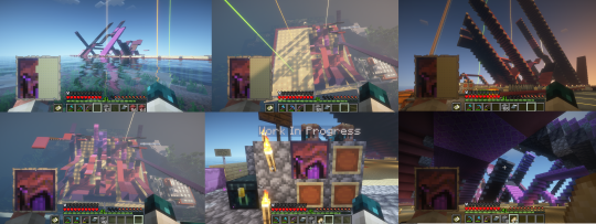
I actually love how the staircases look..... its like some kind of modern sculpture
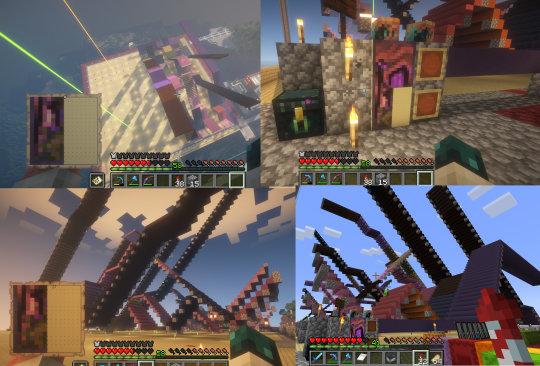
Fewer shots of the second half since I did it on call with friends; the last screenshot is one Thren took of me activating the new locked map to use for the gallery.
Once these paintings are done, I lock the finished maps, make copies, and stock them in the art gallery so other friends on our server can also put these paintings in their homes! It's a lot of work, but really rewarding to see my art decorating various buildings around the server. ;u;
I have one more custom full-palette painting I've done the art for and gathered all materials for; I still need to do the full key and plan staircasing for it before I can start, but HOPEFULLY if my resolve doesn't waver there'll be at least one more of these!!
#minecraft build#minecraft screenshots#minecraft#block game liveblogging#minecraft map art#GENUINELY SO PROUD OF THIS ONE#bsl shaders#im so tempted to make some sort of tutorial on doing this by hand sometime. you shouldnt do it by hand. but a tutorial should exist!!
431 notes
·
View notes
Text
Room Secrets
Tw: Smut/Sexual content
(Hii this is my first tumblr post/writing I hope whoever reads this enjoys. I thought this man was toooo fine, and needed more stories, if there are any spelling mistakes I am sorry english is not my first language. I also appreciate feedback just please don't be mean!!)
Kwon Jae-Sun, ever since my team Miyagi do & I got to the Sekai Taikai he was a prick. He was Cobra Kai's captain so of course he'd be an ass. Any chance to try and start a fight he'd take it, any chance for a snarky remark he'd take it, he was an asshole, and to piss me off more he'd make flirtatious comments, and send me winks here and there, but I never took him seriously. I hated him, hated his team, hated how he fought, hated how he always had a stupid smirk on his face, hated his attractive accent, hated how his hair was cute, spiky, and perfectly framed his face. I hated his face, his really good looking face that was hard to look away from. I hated him, but it was hard to deny, and say that he wasn't hot cuz God was he hot.
After all teams had been announced they told us to gather at the aquarium for something like a "field trip" so we'd all get to know each other and make "friends". Did they think that would actually work when all we want is to rip each other's heads off? It was so boring, but eventually everyone could depart. I'm walking around, and hear a couple of cheers and laughs, as i'm about to walk in, the crowd dies down, and people start walking out. I decided to wait for my team to walk out since everyone was leaving, and lucky me to see Kwon walk out and walk up to me.
"Hey princess if you need place to sleep feel free to come knock on my door now that I have your friend's room" he said it with a dumb grin on his face. "What are you talking about?" you asked annoyed and confused written all over your face. "Ask your loser teammates who can't kick" he starts walking away but right before that, he leans into your ear, you feel his breath on your cheek sending a shiver down your body as he whispers "and i'm not joking about the room sweetheart" you could hear the dumb smirk in his voice. "In your dreams" you say with a snarl, "every night" he whispers again, with that he walks off with a wink and smug look on his face. You start to picture some questionable images with what Kwon said, but you know you shouldn't, and quickly stop yourself, you bite your cheek and start looking for your friends.
You walk up to your defeated looking team in a small huddle. Robby looking the most disappointed and Miguel having an "I told you so" face. "Hello?? what happened, and why is Kwon walking out with your room keys??" You glare at each of them searching for an answer. Demetri speaks up "Robby here gambled our room over a stupid kicking competition". "I'm sorry okay!" Robby exclaimed defeatedly. "Okay well whatever happened get over it no distractions, you can stay in the girls room, just don't be idiots next time, c'mon" I tried to be positive but hated that now i'd have to share a room with four extra people.
It was time to sleep now after the guys brought in their things, found a way to fit themselves on the floor, and had an argument that made me want to kick their heads off. I lay awake in bed, I couldn't sleep, thoughts and nerves racing through my mind. There was something else though, I was trying my hardest to ignore it, my hardest to shake it out of my mind. That spiky hair, those bold black eyes, him in that compression shirt that hugged his figure. "Stop it" I thought to my self, it wasn't right to think about him like that, he was on the rival team, he was in Cobra Kai.
I get up and walk to the restroom, my eyes sting a bit from the brightness, I put cold water on my face trying to ignore every thought. I know I won't be able to sleep, and suddenly I remember something from earlier. "If you need a place to sleep feel free to come knock on my door". "No I can't do that" I thought to myself. Plus he was joking, then you remembered his words "and i'm not joking about the room sweetheart". No there's no way, he couldn't actually be serious...right? I mean we hated each other.
I hated myself for what I was doing, I knew this was wrong, I wanted to punch myself for this, but I couldn't get myself to stop or turn around, or even think right about what the hell I was doing. Maybe I should just go back to my room, but I was too close and tired to go back now. I'm standing in front of his door, or what I hoped was his since he won both. I prayed that I wouldn't embarrass myself more if his teammate was in this one.
I lightly knocked on the door, after a few seconds I convinced myself that maybe he or whoever was behind the door was asleep. Plus my fear was telling me that I should just go back, as I'm about to turn I hear the door knob move. I almost shit myself as the door opens, and there I see him, black sweats, red shirt, wet hair, God looking hot as ever. Water was dripping from his neck into his shirt sticking to his chest, and the water dripping down his veiny buff arms were not helping my imagination either, he honestly looked lick-able.
"I'm so stupid why am I here"?? I mentally yelled at myself. "Hey princess my bad I was getting out of shower when you knocked". "It's okay I was about to go back, I figured you were asleep since it's late" I say with a light smile. He returns a really faint smile saying " No, I practiced with Kreese for a few extra hours that's why". "Oh okay, well I should go, you must be tired, and I'm sorry if I bothered I just-". He cuts me off and with a smirk says "I wasn't joking when I said you could come to the room you know?, so don't worry. I am not tired, I train hard everyday, harder than your team could ever imagine". I scoff and roll my eyes, God he is always a cocky asshole, "okay well if you weren't joking I do need a place to sleep, I can't seem to shake any thoughts and nerves away". "Why princess you can't stop thinking of me"?, I scoff "Yeah you wish, now can I come in before somebody sees us".
"Yes ma'am" he says with a light chuckle opening the door wide enough for me to walk in, God I hated him, but I can't deny that made me feel something. I'm walking in and surprisingly it was really neat, I feel his eyes burn holes into my back as I keep walking. He closes the door and I hear it lock, I start feeling nervous, it gets quiet, but not awkward. I walk to the bed on the right, I get on the side to the nightstand, and set my phone down. I turn to ask him a question, not realizing how close he was, our bodies basically pressing together. My breath hitches, we make eye contact and I instantly look away trying to remember what I was going to ask "Um s-so-" he leans in and I feel his breath on my face as he towers over me. "What's wrong are you nervous"? he smirks and whispers as if we're not the only ones in the room.
I try to keep my composure but it's so difficult when he's only a few inches away from my face. "N-no" God why'd I have to stutter, I mentally palm my face. I look up at him and he knows I'm nervous, I want to wipe that smirk off his dumb hot face, he starts talking "Okay well we should go to sleep" he starts to turn. I know I shouldn't, I know it's dumb, and we're rivals, but I couldn't help myself. We were here, alone, no one had to know so why not. I hated him, but I couldn't deny how attractive he was, and the things he made me feel.
Before he makes a full turn I grab the edge of his sweatpants and lightly pull him back, "wait". He looks at me with a blend of curiosity, and confusion on his face. "Is something wrong"? he asks. I slowly let go of his sweats "Um no I was just thinking that um, I don't know uh" I was trying to get the confidence to say it but it was too hard to think with him staring at me waiting for my answer. "Whatever you need to say, say it" he says with a hint of concern. "Why'd you invite me to come here? I mean we've both been nothing but rude and snarky to each other. We basically hate each other" I say it with concern, and speed trying to get it all out without getting nervous.
He chuckles, and gets even closer to me, he grabs my chin making me look up at him, "I do not hate you, not one bit, yeah I like to mess with you, because it is cute to see you get all mad at me". I open my mouth to say something but he cuts me off "I invite you here because we can be alone, no senseis, no teams to bother us. Of course if you want to sleep then we will, and if you want something else we can do that too" that last sentence was laced with something else like he wanted me to pick the something else. I wanted it yes, but I was too afraid to say it, and yes we're alone, but part of me felt like I was betraying my team.
I ignored my thoughts, and quickly worked up a bit of courage "I want the something else" I whispered with not as much confidence as him, "okay, and what would that be"? he said it like a question, but I knew he knew. "Our senseis and teams would kill us you know"? I reminded him, but honestly I wasn't sure if I cared anymore. He moves his hand from my chin and cups my cheek "You think I care what they do? I've wanted you since I saw you walk in to the Sekai Taikai, I needed you since then". Hearing him say that made me snap, in that moment all my fear, and all thoughts about karate disappeared. "Kwon kiss me" I grip the collar of his shirt, and he grabs my hips with his other hands. Our lips clash, the kissing is slow at first, gentle, his lips are soft and I don't want to ever stop . Slowly we start to speed up, breathing is getting harder but neither of us wants to stop first. We pull apart for a second, our foreheads against each other's, we start to catch our breaths he looks at me and whispers "are you sure you want to do this?" "I'm sure".
With that we press our lips back together, he picks me up my legs wrap around his torso, I grab the back of his hair and tug a bit. He moans and slips his tongue in my mouth, he's holding both my legs with his arms and moves us to his bed. I'm now straddling him still playing with his hair, he moves his hands to the end of my shirt and slowly pulls it off of me. I move a bit back admiring him as he pulls off his red shirt. His biceps flexing as he pulls his shirt fully off of his head. I can feel him hard underneath his sweats, and I start to grind on him, I hear him groan as he starts unclipping my bra and helps me take it off. He flips us over and cups my cheek, he looks at me with a sweet, and hungry look in his eyes "you're so beautiful" he whispers to me and gives me a peck on the lips, he starts to kiss on my neck sending shivers down my body.
I had no idea what to say, he looked so good, and I wanted him to destroy me "thank you" he then stops and says "if you ever want to stop say it okay?" "okay I will". He starts to lick and kiss down my stomach, while making eye contact with me. I look away getting nervous. "Look at me, if you don't look I stop" his accent, the way he was looking at me God I could feel myself getting wetter. He licked right above where my underwear starts, Kwon grabs my legs opening them wider, and licks my pussy through my underwear. He chuckles "You're so wet I can taste it through your underwear", he comes back up and starts kissing me aggressively, I taste myself on his tongue. I feel him grind on me through my underwear, I want to feel more of him so I start tugging on his sweats signaling him to take them off. He starts kicking them off, and I return to running and tugging my fingers in his hair, I pull him closer, I feel his dick through his boxers, and it's lightly grinding on my throbbing clit through my underwear. "Fuck" is all I'm able to muster taking a quick second to breathe before he pushes his lips back onto mine. One of his hands plays with my nipple pinching and rolling it in a fast motion, while the other starts to pull my underwear down, I pick my hips up so he's able to fully slip them off.
We pull away to catch our breath, "P-please Kwon" I'm basically begging him he knew what I wanted, but he wasn't going to give it to me so soon. He's still rolling my hard nipple getting me wetter, I'm probably leaking on his bed, he starts sucking on my right boob and licking my nipple while looking into my eyes. All of a sudden I feel Kwon open my legs and he starts going down again, but not before he sucked on my left nipple, and rubbed on the other, it felt so good I picked my hips up grinding on him, "You are so cute, so needy". He pushed my hips down and started to kiss around my pussy sucking on my thighs, and then sucking on my pussy lips. "Mmm" I start to whine, "Kwon I need more please", "You'll get what you want princess be patient" I can feel him smirk into my pussy.
I'm about to whine again when I suddenly feel his tongue inside me. I gasp "oh my god Kwon", he starts to move his tongue in and out, "d-deeper please" I whine, and he does just that, I start to grind on his face while he's tongue fucking me. He starts hitting my g-spot and I can feel my legs start to tremble. Kwon pulls out his tongue and moves up to my clit he slowly starts to lick, and suck on it. I hear and feel him moan into my pussy, it sends a vibration through my body, he goes back to sucking on my clit, slowly teasing me when he knew what I wanted. "Look at me and tell me what you want", he then gets his two fingers and starts circling my pussy hole, I can feel his fingers playing with my wetness. "I-I want m-more, I want you to make me cum". His eyes turn dark and he smiles with a look of confidence, "Yes ma'am" he starts to slowly stick his two fingers in my hole, stretching me, it felt so good, I could feel my legs starting to shake again.
With his other hand he grips my thigh and widens it more "look at this pussy taking my fingers so well" he chuckles and starts to go faster curling his fingers, he then moves down bringing his tongue to my clit circling it. I feel him start to slowly suck on my clit while his fingers continue to abuse my hole, he's making eye contact with me as he continues to suck. I start to grind on his face, he starts to suck faster, my legs, are now on top of his shoulders, my legs start shaking, and a knot starts forming in my stomach. I can feel him smirk while he sucks, and I can't help but squeeze his head with my thighs. That doesn't make him stop as he starts to finger me harder, he's groaning into my pussy, the knot in my stomach only growing stronger.
I open my legs again, Kwon pulls his face away from my clit, switching his gaze between my eyes and my pussy. I'm grinding on his fingers as he starts going even faster, my pussy clenches on his fingers, and he knows that I'm close. My back starts arching, I can't control my body anymore, I'm shaking, I can barely form a sentence let alone a word. "K-kwon I'm so c-close oh my god" I feel so out of breath, and my voice is shaky I can't control myself. Kwon gets his other hand and grips my neck, the knot in my stomach almost snaps. "I know you are close, c'mon princess don't be shy". He curls his fingers adding a third, and going even faster, I moan so loud I pray these walls are sound proof. "HOLY SHIT" my whole body starts shaking and Kwon is still gripping my neck forcing me to keep my eyes on his, he shows no signs of stopping.
I feel the knot in my stomach snap, it all feels so good, I start seeing stars, my legs are shaking, I try my hardest to calm down, but it's all so much and Kwon is still going. "I'm not stopping till you let it all out" he pulls me in and starts kissing me. I try to kiss back but he's winning and I can barely move my lips, the kiss is sloppy and heated. He hasn't stopped his fingers, and I keep moaning, I feel another release as he lets go of my neck and starts rubbing circles on my clit. I feel myself finishing again but this time it's messier as I'm squirting and all my juices are landing all over his stomach, all on his arm. Part of me was embarrassed and wanted to stop but it felt too good, and I could tell Kwon was really enjoying this. I feel the shaking start to slow down, my breathing slowly going back to normal. Kwon starts to pull his fingers out, and gives me a light kiss, he then gives me a small smile and asks "are you okay?". I slowly catch my breath and return a smile "I've never been better", he gets up and goes to the bathroom getting a towel so we could both get cleaned up.
When he returns we start to clean, and I put my pjs back on with his help, as I'm about to walk to the other bed he stops me by picking me up. He carries me to the other bed even tho it was only like 3 feet away. I simply laugh as he sets me down, and hands me a bottle of water, "It is a good thing I beat your friends and got the extra room so we could have this bed to sleep in". I laugh and roll my eyes "I guess it was", we both start to get cozy and settle under the covers, I use his arm as my pillow. Before going to sleep and turning the lights off we talk for a bit, both our voices start to get low, and we could feel the sleepiness taking over. "If our teams ever find out we're dead" I told him followed by a yawn. "I know, but I do not care" said with a hint of seriousness and playful tone. Before deciding it's time to sleep you look at him and say "goodnight Kwon, and good luck tomorrow cuz I'm kicking your ass, you better not go easy on me" you give him a light smile as you start to settle and close your eyes.
As you feel yourself fading into your sleep you hear Kwon give a light chuckle and reply "Goodnight princess, you too" he gives you a small kiss on the forehead, and with that turns the light off.
#cobra kai#kwon jae sung#kwon#miyagi#karate#oneshot#short story#imagine#imagines#smut#spicy#miguel diaz#hawk#eli moskowitz#robby keene#ralph macchio#johnny lawrence#william zabka#daniel larusso#gravity falls#artists on tumblr#cats of tumblr#tv shows#shows#writers on tumblr#tumblr girls#poets on tumblr#tumblr fyp#entertainment#so hot and sexy
215 notes
·
View notes
Text
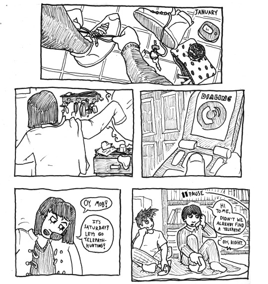
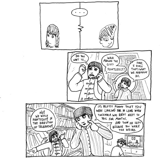
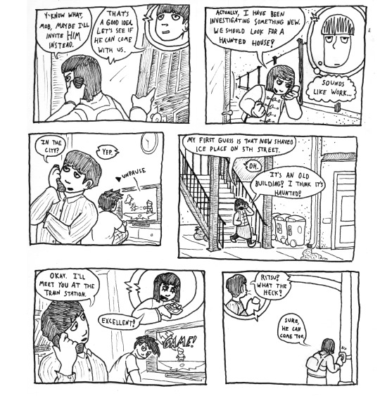
please clic for larger images, tumblr compression made these look all blurry. id below the cut
here i am still making mp100 comics in april of 2024. its just such comfort food. im highly normal about mob and tomes friendship
ID: three pages of black and white comics about Mob and Tome from the anime Mob Psycho 100.
panel 1: a leg and an arm extend from out of panel so that the hand on the arm can tie the shoe on the leg. lying on the ground is the other shoe, a cell phone, a keyring, and a polka dot carrying case. on the carrying case rests a sphere with a strange pattern on it. in the top right it says "January."
panel 2: a figure (its tome) pulls on a jacket. visible in front of her are a cabinet and a wall-mounted rack, all messy.
panel 3: with a door in the background, a closeup of tomes hand on her flipphone. the screen says "dialing."
panel 4: tome shrugs on her jacket and, holding her phone against her ear with her shoulder, smiles and says, "Oy, Mob! It's Saturday! Let's go telepath-hunting!"
panel 5: ritsu and mob sit on a blanket on the floor in front of a bookshelf. a little "pause" label extends from off-panel. both of them are holding controllers. ritsu leans against his hand, looking bored, as mob holds his cellphone to say "Hi Tome. Didn't we already find a telepath?" tome responds, "Oh, right."
panel 6: tome and mob dont really know what to say next. they both look cartoony and stupid. "..."
panel 7: tome, looking pained, curls a hand in the air in front of her and says, "Do you want to... walk around the city? Pointlessly?" mob says, "Sure, I guess that's what we normally do."
panel 8: tome looks mad. "No! We walk pointedly! In the direction of telepaths!" she points, pointedly. mobs eyebrows go a little down as he scratches at his face. "It's pretty funny that you were looking for so long when Takenaka was right next to you. For months. And then he left because you were too weird."
panel 9: tome, opening her front door, says, "Y'know what, Mob, maybe I'll invite him instead." Mob says "That's a good idea. Let's see if he can come with us."
panel 10: now exiting onto the walkway in front of her apartment, tome says, looking excited, "Actually I have been investigating something new. We should look for a haunted house!" mob thinks to himself, "Sounds like work..."
panel 11: mob looks skeptical and asks, "In the city?" tome responds, "Yep." behind mob, ritsu unpauses the game (ssb brawl) and starts thrashing mob (ritsu mains lucas, mob mains kirby)
panel 12: tome walks down the stairs of her apartment building to a concrete sidewalk with a row of trashcans nearby. she says, "My first guess is that new shaved ice place on 5th street." mob responds, "Oh." tome says "It's an old building! I think it's haunted!"
panel 13: mob, contented, says, "Okay. I'll meet you at the train station." pleased, tome responds, "Excellent!" ritsu looks back at mob with a mean smile on. the tv screen says "GAME!"
panel 14: mob yells, "Ritsu! What the heck!" tome, at a stoplight, replies, "Sure, he can come too." she presses the walk signal button. "BIP."
End ID.
making this comic i learned that you cant just put masking tape over your mistakes and re-ink on top of it bc the masking tape looks too dark when its scanned in. i guess ill just have to warm up more and be more deliberate when i ink like some kinda loser. or i could become truly insane and start gluing on little pieces of bristol
#mp100#mob psycho 100#fan comic#tome kurata#mp100 fanart#mp100 mob#shigeo kageyama#mp100 tome#fanfic#mp100 fanfic#ritsu kageyama
478 notes
·
View notes
Text
GIFMAKING TUTORIAL: PHOTOPEA (for Windows)
Screencapping
Gif Width/Size Limit/Ezgif
Loading Frames
Cropping and Resizing
Rasterize/Make Frames
Sharpening
Coloring (not detailed. Links to other tutorials included)
Exporting
Obligatory Mentions: @photopeablr ; @miwtual ; @benoitblanc ; @ashleysolsen Definitely check out these blogs for tips, tutorials and resources, they're a gold mine. Finally I recommend browsing the PHOTOPEA TUTORIAL / PHOTOPEA TUTORIAL GIF tags. DISCLAIMER: English is not my first language and I'm not an expert on what I'm going to discuss, so if anything's unclear feel free to drop another ask.
1. SCREENCAPPING -> PotPlayer (the one I use) or MVP or KMPlayer
INSTALL PotPlayer (tutorial)
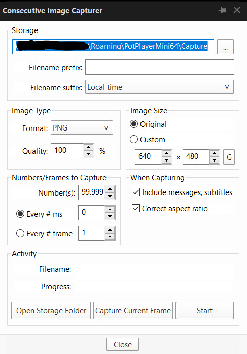
Play your movie/episode and press Ctrl + G. The Consecutive Image Capturer window will pop up. Click Start to capture consecutive frames, Stop when you got what you needed.
Where it says "Image Type -> Format" I recommend picking PNG, for higher quality screencaps.
To access the folder where the screencaps are stored, type %appdata% in windows search, open the PotPlayerMini64 folder (or 32, depending on your system) and then the Capture folder. That's where you'll find your screencaps.
Admittedly MVP is a lot faster but I prefer Potplayer because it generates (at least in my case) higher quality screencaps. MVP kind of alters the hue and it made it harder for me to color my gifs. Still, if you're interested in how to use it, I recommend this tutorial.
As for KMPlayer, every tutorial out there is outdated and I couldn't figure out the new version of the software.
2. GIF WIDTH/HEIGHT, SIZE LIMIT, EZGIF OPTMIZER
At this point you should already know how big your gifs are going to be. Remember the ideal gif width(s) on tumblr are 540 px / 268 px / 177 px. These specific numbers take into account the 4 px space between the gifs. No restrictions on height. Here are some examples:


You can play around with the height (177x400, 177x540, 268x200, 268x268, 268x350, 268x400, 540x440, 540x500, 540x540 etc) but if you go over the 10 MB limit you'll either have to make your gifs smaller/delete some frames.
OR you can go on ezgif and optimize your gif, which is usually what I do. The quality might suffer a little, but I'm not really (that) obsessed with how crispy my gifs look, or I'd download photoshop.

Depending on the gif size, you can decrease the compression level. I've never had to go over 35. It's better to start at 5 (minimum) and then go from there until you reach your desired ( <10mb) gif size. Now that I think about it I should have included this passage at the end of the tutorial, I guess I'll just mention it again.
3. LOAD YOUR FRAMES
File -> Open... -> Pick one of your screencaps. The first one, the last one, a random one. Doesn't matter. That's your Background.
File -> Open & Place -> Select all the frames (including the one you already loaded in the previous passage) you need for your gif and load them.
(I recommend creating a specific folder for the screencaps of each gif you're going to make.)
WARNING: When you Place your screencaps make sure the Crop tool is NOT selected, especially if you've already used it and the width/height values have been entered. It will mess things up - I don't know why, could be a bug.
You can either select them all with Ctrl+A or with the method I explained in the ask: "when you want to select more than one frame or all frames at once select the first one, then scroll to the bottom and, while pressing Shift, select the last one. this way ALL your frames will be selected".
WARNING: Depending on how fast your computer is / on your RAM, this process may take a while. My old computer was old and slow af, while my new one can load even a 100 frames relatively fast, all things considered. Even so, I recommend ALWAYS saving your work before loading new frames for a new gif, because photopea might crash unexpectedly. Just save your work as often as you can, even while coloring or before exporting. Trust me, I speak from experience.
Now you can go ahead and delete the Background at the bottom, you won't need it anymore.
4. CROPPING AND RESIZING
Right now your screencaps are still smart objects. Before rasterizing and converting to frames, you need to crop your gif.
Technically you can rasterize/convert to frames and then crop, BUT if you do it in that order photopea will automatically delete the cropped pixels, even if you don't select the "Delete Cropped Pixels" Option. Might be another bug, unclear. Basically, if you crop your gif and then realize you cropped a little too much to the left or the right, you can go ahead, select the Move Tool (shortcut: V) and, after selecting ALL YOUR FRAMES, move them around on your canvas until you are satisfied. You won't be able to do this if you rasterize first and then crop, the excess pixels will be deleted. I don't know why, I found out by accident lol.
CROPPING
(Cropped pixels: the gray/opaque area outside of the selected area. That area disappears once you press enter and crop, but the pixels are retained, so you can move the frames around and reposition them as you like. In this case I could move the frames to the left and include Silver's figure [curly guy in the foreground] in the crop)
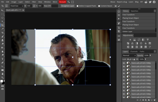
After deleting the Background, you will need to select all your frames (using the Shift key), use the C shortcut on your keyboard to choose the Crop tool. Or you can click on it, whatever's more convenient. Once you do that, a dropdown menu is going to appear. You need to select the "FIXED SIZE" option, as shown in the following screencap.
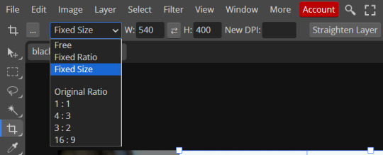
Once you do that, you can type in your desired width and height. Do not immediately press enter.

Your work area should now look like this. Now you can click on one of the white squares and enlarge the selected area until the edges are lined up. You can then move it around until it covers the area you wish to gif.
WARNING: to move the big rectangle around, you're gonna have to click on a random point of the work area, PREFERABLY not to close to the rectangle itself, or you might accidentally rotate it.
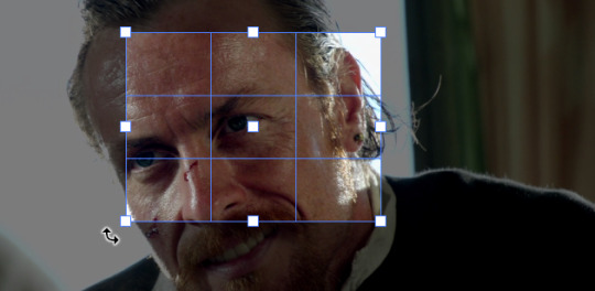
See? When your cursor is close to the selected area it turns into this rotating tool. Move it away until it reverts to your usual cursor, then you can start moving the rectangle. Press Enter when you're satisfied with the area you selected.
RESIZE
This isn't always necessary (pretty much never in my case) - and it's a passage I often forget myself - but it's mentioned in most of the tutorials I came across over the years, so I'd be remiss if I didn't include it in mine. After cropping, you'll want to resize your image.
IMAGE -> Image Size...

This window will pop up. Now, should the values in the Width and Height space be anything other than 540 and 400 (or the values you entered yourself, whatever they might be) you need to correct that. They've always been correct in my case, but again. Had to mention it.
5. RASTERIZE & MAKE FRAMES
Now that your screencaps are cropped, you can go ahead and convert them.
LAYER -> Rasterize (if you skip this passage you won't be able to Sharpen (or use any filter) on your frames at once. You'll have to Sharpen your frames one by one.
Photopea doesn't feature a timeline and it's not a video editor, which makes this passage crucial. When you select all your smart objects and try to apply a filter, the filter will only by applied to ONE frame. Once you rasterize your smart objects and make them into frames, you can select them all and sharpen them at once. Unfortunately this also means that you won't be able to - I don't know how to explain this properly so bear with me - use all smart filters/use them in the same way a photoshop user can. For example, you can sharpen / remove noise / add noise / unsharp mask... but you can't act on those filters in the same way a photoshop user can. When you work on smart objects you can change the blend mode - which is critical if you decide to use a filter like High Pass. If you simply apply a high pass filter on photopea you won't be able to change the blend mode and your gif will look like this (following screencaps). Or rather, you will be able to change the blend mode by clicking on the little wheel next to "High pass" (circled in green in the 2nd screencap), but you'll have to apply the filter to each frame manually, one by one.

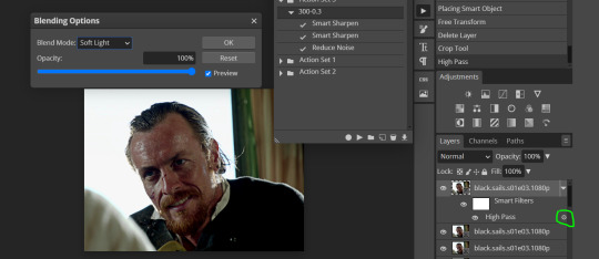
Then you can rasterize/make into frames, but it's extremely time consuming. I did it once or twice when I first started making gifs and it got old pretty soon haha.
Layer -> Animation -> Make frames. This passage will add "_a_" at the beginning of all your frames and it's what allows you to make a (moving) gif. As I said in the ask, if you skip this passage your gif will not move.
6. SHARPENING
Some people prefer to color first and sharpen later, but I found that sharpening filters (more or less) dramatically alter the aspect of your gif and already brighten it a bit (depending on your settings) and you may end up with an excessively bright gif.
Now, sharpening settings are not necessarily set in stone. The most popular ones are 500/0.4 + 10/10, which I use sometimes. But you may also need to take into account the quality of the files you're working with + the specific tv show you're giffing. I've been using different settings for pretty much every tv show I gif, especially in the last couple months. Some examples:

followed by
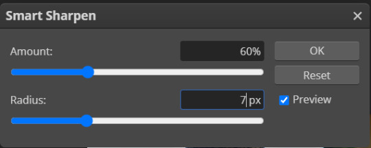
OR
AMOUNT: 500% RADIUS 0.3px followed by AMOUNT: 20% (or 10%) RADIUS 10px
You'll just need to experiment and see what works best for your gifs.
Some gifmakers use the UNSHARP MASK filter as well (I think it's pretty popular among photopea users?) but it makes my gifs look extra grainy, makes the borders look super bright and it clashes with my coloring method(s), so I use it rarely and with very moderate settings. Something like this:

Again, depends on the gif and on what you like. I've seen it used with great results by other gifmakers!
REDUCE NOISE
Sometimes - and this is especially the case for dark scenes - your gif may look excessively grainy, depending on how bright you want to make it. Reducing noise can help. Keep it mind, it can also make it worse and mess up the quality. BUT it also reduces the size of your gif. Obviously, the higher the settings, the more quality will suffer.
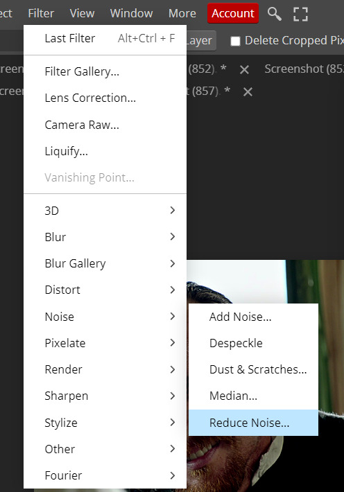

These are my standard settings (either 2/70% or 2/80%). It's almost imperceptible, but it helps with some of the trickier scenes.
ADDING NOISE
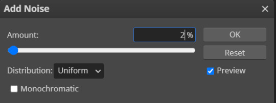
Adding noise (1% or 2% max) can sometimes help with quality (or make it worse, just like reduce noise) but it will make your gif so so so much bigger, and occasionally damage the frames, which means you won't be able to load your gif on tumblr, so I rarely use it.
You'll also want to create ACTIONS which will allow you to sharpen your gifs much faster.
HOW TO CREATE AN ACTION ON PHOTOPEA
The Action Button (shaped like a Play button as you can see in the following screencaps) may not be there if you're using photopea for the first time. If that's the case click on the magnifiying glass next to "Account" (in red) and type "actions". Press Enter and the button should immediately show up.
Once you do that, click on the Folder (circled in yellow)

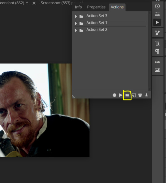
and rename it however you like.

now click on New Action (circled in red). now you can press the Recording button (circled in green)
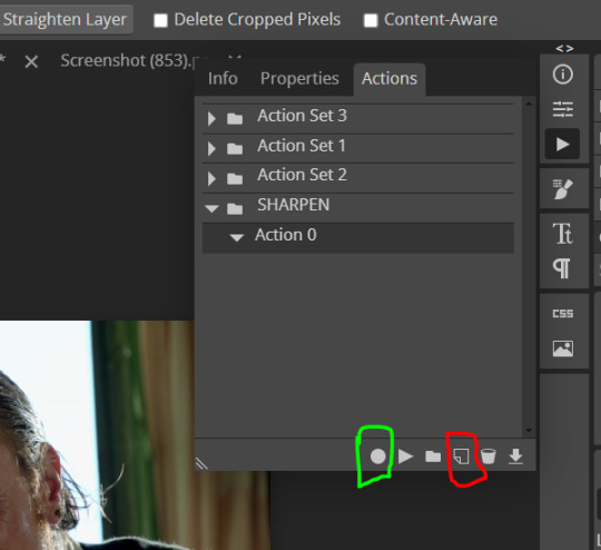
Now
FILTERS -> Smart Sharpen
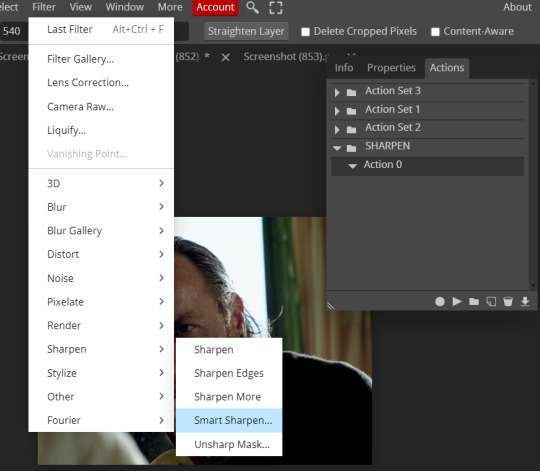
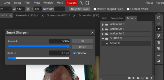
and you can enter your values. Then you repeat this passage (WITHOUT pressing rec, WITHOUT pressing new action or anything else, you just open the smart shapen window again) and, if you want, you can sharpen your gif some more (10%, 10px, or anything you want.)
Maybe, before creating an action, experiment with the settings first and see what works best.
When you're satisfied, you can PRESS STOP (it's the rec button, which is now a square) and you can DOWNLOAD your action (downwards facing arrow, the last button next to the bin. Sorry, forgot to circle it) .

You need to download your action and then upload it on your photopea. When you do, a window will pop up and photopea will ask you whether you wish to load the action every time you open the program. You choose "Okay" and the action will be loaded in the storage.
When you want to sharpen your gif, you select all your frames, then you click on the Play button, and select the Action, NOT the folder, or it won't work.

Actions can also be created to more rapidly crop and convert your frames, but it doesn't always work on photopea (for me at least). The process is exactly the same, except once you start recording you 1) crop your gif as explained in step 4, 2) convert into frames. Then you stop the recording and download the action and upload it. This won't work for the Rasterize step by the way. Just the Animation -> Make Frame step.
7. COLORING
Now you can color your gif. I won't include a coloring tutorial simply because I use a different method for every tv show I gif for. You normally want to begin with a brightness or a curve layer, but sometimes I start with a Channel Mixer layer to immediately get rid of yellow/green filters (there's a tutorial for this particular tool which you will find in the list I mention in the link below)
[Plus I'm not really an authority on this matter as my method is generally... fuck around and find out. Two years of coloring and I still have no idea what I'm doing. 70% of the time.]
Simple Gif Coloring for Beginners -> very detailed + it includes a pretty handy list of tutorials at the bottom.
8. EXPORTING
Now you can export your gif. Some gifmakers export their (sharpened) gifs BEFORE coloring and then load the gifs on photopea to color them. I'm not sure it makes any difference.
FILE -> EXPORT AS -> GIF
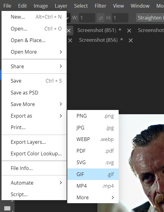
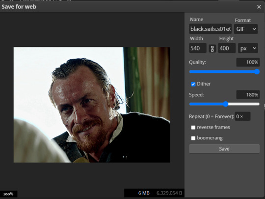
(not colored, just sharpened)
As you can see, unlike photoshop the exporting settings are pretty thread bare. The only option available is dither - it sometimes help with color banding - which, and I'm quoting from google for maximum clarity:
"refers to the method of simulating colors not available in the color display system of your computer. A higher dithering percentage creates the appearance of more colors and more detail in an image, but can also increase the file size."
SPEED
When you export your gif, it will play at a very decreased speed (100%). I usually set it at 180/190%, but as for every other tool, you might want to play around a little bit.
GIF SIZE/EZGIF OPTIMIZER (See Step 2)
And that's it.
P.S.: worth repeating
Save your work as often as you can, even while coloring or before exporting.
#photopea#my inbox is open if you have any questions <3#image heavy under the cut#photopeablr#tutorials#gif tutorial#allresources#photopea tutorial#completeresources#gifmaking
417 notes
·
View notes
Text
How I met your mother (Simon Ghost Fic)
A/N: This is the same You (Y/N) as "Midnight Snack Mystery". And this is the story of how You and Simon first met ;) Parks and Rec! Reader (LOL, Cause you're a gamekeeper) Gamekeeper! Reader Groundskeeper! Reader Ex-MI5! Reader Shy! Reader Possessive! Simon 'Ghost’ Riley Fluff! Simon Riley
This idea was also inspired by this work of art from @p1nkmic;

Coz well.... do you see that? Yeah, that’s Simon’s torso. Keep that image in mind . Go ahead, use it as your mental image while you read. Trust me, it makes everything more...better!! Warning: A little charged. Please dehydrate a bit, and have a glass of water. A bit of Simon's Dirty Mind, and his innuendos.
----------
The rain wasn’t heavy, but it was enough to keep most people indoors. The steady drizzle pattered against the leaves, mixing with the rhythmic sound of Simon’s feet pounding the muddy trail. He jogged with the same methodical pace he always kept, the familiarity of the nature reserve surrounding him, the calm he found in the solitude of these early mornings. His running shoes, worn but reliable, gripped the muddy path beneath him as he pushed forward, each step sure despite the wet ground. He ran with the steady pace of someone accustomed to the solitude of early mornings—time to think, time to sweat, time to forget. He always jogged here, not far from his new house, which was still very much a project.
The house had been cheap—too good to pass up, even with the renovations it required. And the area? Quiet. Peaceful. Safe. Just what he needed after weeks, or even months, away on short deployments. A place to come back to, to recharge, and perhaps… put down roots, if only a little. And it was just a less-than-half-an-hour drive to the base, which made it even more ideal.
He passed the familiar bend in the trail where he’d seen her countless times—the gamekeeper. She was crouched on the ground, her petite frame hidden beneath a dark green raincoat, hood pulled up to shield her from the drizzle. Gloves on, boots heavy with mud, and a cart full of foraging supplies beside her. She was always here, quietly gathering mushrooms or tending to the wildlife, and plants, focused, purposeful. Simon would catch glimpses of her when he passed by, but they exchanged little more than a brief nod. She wore a mask, and although he’d caught the hint of her features beneath it, he’d never pressed for more. It was the same for him; he kept to himself, respecting the unspoken distance they had.
Today, though, something was different. As Simon neared the bend, he felt the rain pick up, droplets falling harder against his skin. He slowed his pace, glancing up at the grey sky before wiping his face with the back of his hand. The moisture clung to his forehead, sliding down his chiseled jaw. With a frustrated sigh, he pulled off his mask and yanked up the bottom of his compression shirt to wipe his face. He wasn’t expecting anyone to be around, no one had been in days. He figured it was safe, so he revealed his face, wiping the sweat and rain away, exposing his muscular torso as he tugged the fabric up.
He was just about to lower his shirt when he saw her. She was standing a few feet away, wide-eyed, frozen in place. For a moment, time seemed to stand still, the rain falling softly around them. Her gaze moved from his chest to his jaw, lingering for just a beat longer than Simon expected. When her eyes met his, there was a flicker of surprise—and something else. The way her cheeks flushed beneath her hood made something stir inside him. She didn’t look away, her eyes locking with his, and for a brief moment, they both felt the charged tension in the air.
Simon cleared his throat, breaking the silence. “Didn’t think anyone would be out here in this weather,” he said, his voice gruff, yet not unkind. He put his mask back on, trying to hide the faint smile that tugged at the corner of his lips.
Y/N stood still, staring at him for a long moment, her gaze lingering on his exposed torso and the way the rain traced down his chiseled body. Her breath hitched, but she didn’t look away. The tension between them was palpable, thick with something neither of them had expected. She remained silent, the tiny shovel in her hand still as she seemed lost in the moment.
Simon noticed the lingering silence and waved a hand in front of her face, a playful smirk tugging at his lips. “Oi, you alright there, love?” Simon called, a teasing edge to his voice as he waved a hand in front of her face. “Bit of a daydream, are we?”
Y/N blinked, shaking herself out of her daze. Simon’s faint smile lingered, not just playful but knowing—he was well aware of the effect his presence had. He wasn’t just the tall, imposing figure who commanded attention; he was also Ghost, and he knew how easy it was to come off as a monster. But right now, that smile held an unspoken challenge, a quiet confidence that didn’t need to be loud to be felt.
Y/N quickly cleared her throat, shifting uncomfortably. “Right. Well… good luck with the run,” she said, her voice a little quieter than usual.
He took a step closer, his tall frame casting a shadow over her, but there was still that unspoken space between them, a distance that he respected. His voice was low, with that quiet curiosity, as if he genuinely wanted to know. "What’s your name then?" It wasn’t the usual question, not for him. There was something different about her, something that had him asking more than just the basics.
Y/N paused for a beat, still a little flustered, her cheeks betraying her as she glanced up at him. She was used to being invisible, to hiding behind her mask and keeping to herself. But maybe, just maybe, it was time to drop the act. "Y/N," she replied, her voice softer than she intended. "And you are…?"
"Simon," he answered simply, his lips curling up in a small, quiet smile. It wasn’t much, but it was enough. His eyes, though, were a different story—sharp, taking in everything as if he was reading her. "Nice to finally meet you properly."
She gave a small nod, trying to ignore the way her pulse was racing. "Likewise." She held his gaze, trying not to feel too out of place under the intensity of it.
Just as the words hung in the air, the rain slowed to a drizzle, and then, as if the weather had been waiting for the right moment, a beam of sunlight broke through the trees. It lit up the clearing, casting a warm glow over them, as if nature itself was nodding along with the newfound connection between them.
Simon had been in countless situations, under countless masks—literally and figuratively. As Ghost, he was an enigma, a terrifying shadow that no one dared to truly look at, let alone scrutinize with anything resembling genuine interest. People were afraid of what he represented, of what he could do. He was the monster lurking in the dark, the face hidden behind a mask, eyes cold, emotionless, distant. It was how he kept things, how he stayed safe.
But with her, it was different.
Y/N had looked at him in a way no one ever had. It wasn’t fear, wasn’t caution. It was something else—something, softer, hungry even, deeper, like she was trying to dig past the layers, beyond the mask, to understand him. Her gaze wasn’t just focused on the man in front of her; it was like she was trying to reach into him, pull something out from the depths he kept hidden. It made him feel exposed, vulnerable in a way he wasn’t used to.
It unsettled him in the best way. No one had ever looked at him like that. Most people kept their distance from Simon Riley, the ghost, the monster, the soldier. But not her. She looked at him as though she was trying to figure him out, to understand what lay beneath all that.
He didn’t know if he could trust it, but the curiosity she’d sparked in him was undeniable.
"See you around, Y/N," Simon’s deep, raspy voice broke through the air, and he turned, his muscular frame disappearing into the mist as he walked off to cool down.
"Sure…" Y/N managed, though the word barely escaped her lips. She stood there frozen, heart pounding like a drumbeat that echoed in her chest. Her mind was on fire, replaying that moment over and over. The tall, imposing figure she’d seen on her runs for months—that man—had now been standing right in front of her, his eyes locked onto hers with an intensity that was almost too much to handle.
She’d never felt that hot under the collar just from a simple conversation. It was like her brain short-circuited, and all she could think was, I would very much like to climb that mountain of a man. She shook her head, trying to clear the thoughts that were running a marathon in her head, but damn, his body was like a walking, breathing fantasy.
“Focus, Y/N,” she muttered to herself, still standing there as if glued to the spot, watching his broad back disappear into the mist.
----------
The sun filtered through the dense canopy of the nature reserve, casting dappled light across the forest floor. The air was crisp, and the morning held a serene quietness, save for the occasional bird call or rustle of leaves. Simon had just finished his usual jog, his body slick with a faint sheen of sweat. He slowed to a stop, his breathing steadying, and tugged off his shirt, wiping his face and neck with the damp fabric.
Unbeknownst to him, Y/N was nearby. She was crouched on a patch of grass just off the trail, wearing her usual dark green jacket, mask, and gloves. A sturdy net was slung over her shoulder, her boots caked with mud from trekking across the reserve. She had been searching for a fox cub that had somehow gotten out of its enclosure. But her focus shifted the moment she caught sight of Simon, his shirt now slung over his shoulder, muscles defined and rippling under the sunlight.
Her reaction was instant. Her eyes widened, betraying her surprise and—despite herself—a hint of intrigue. She froze, one hand clutching the handle of the net, as though caught in a moment she wasn’t supposed to witness. Her face might have been partially hidden beneath her mask, but her eyes said everything.
Simon’s gaze flicked toward her. He noticed the widening of her eyes, the way she stood so still, like a deer caught in headlights. A small smirk tugged at his lips as he took in her figure—small and focused, even when startled.
“See something you like, luv?” His voice was deep, tinged with a playful lilt that betrayed his usual stoic demeanor.
Y/N blinked, pulled out of her reverie, heat rising to her face beneath the mask. Her fingers fidgeted with the strap of her net as she cleared her throat, utterly flustered and completely at a loss for words. She glanced down, trying to look anywhere but at him, but the image of him standing there, shirtless and confident, was already burned into her mind.
Y/N blinked, feeling the heat rise to her face beneath the mask. Her hands scrambled at the net strap on her shoulder, as if it might anchor her in the moment. “Uh... I—I’m here for the... wild—you’re loose!” she blurted, immediately cringing at her own words. “I mean—the wildlife! Loose wildlife!”
Simon arched a brow, his lips twitching as he fought back a smirk. “Am I now?”
“No!” she squeaked, the pitch of her voice betraying her panic. “Not you—you’re not wild! I mean, not that kind of wild! Just the—the other wild!” She gestured vaguely, her brain clearly abandoning her as she clutched the net tighter.
Simon chuckled then, low and warm, crossing his arms over his chest. The movement only made him look even more effortlessly put together, and Y/N realized she’d just dug herself into a verbal hole she had no hope of escaping.
“You sure about that, luv?” he teased, his voice laced with amusement. “Sounds like you’ve got me pegged as the wildlife.”
Y/N’s mouth opened and closed, but no words came out. Mortified, she turned abruptly, muttering something incoherent about “nets” and “loose things,” before practically speed-walking away, her boots crunching against the dirt trail.
Simon stood there, grinning as he watched her retreat. “Wildlife, huh?” he murmured to himself, the chuckle still rumbling in his chest.
For Y/N, her only saving grace was the mask hiding her face, though her mortification was probably written all over her posture. If only the ground could have swallowed her whole.
----------
It had been weeks since Y/N last saw Simon, and honestly, she had mostly gotten used to the quiet of the park. The wildlife was her focus, not the joggers who happened to come and go. As usual, she was out early in the morning, rifle in hand, ready to deal with the wild boar that had strayed too close to the public.
The tranquilizer rifle was a heavy piece of equipment, but it wasn’t the weight of it that made her nervous—it was the idea of taking down a wild boar with a dart, a calculated decision, one she couldn’t afford to mess up. The last thing she needed was an animal running loose with a bunch of park-goers nearby.
She was adjusting the strap on the rifle when the sound of footsteps caught her attention.
Y/N’s heart gave an involuntary skip. Her gaze shot up—and there, as if he were summoned by the thought of her, was Simon. Out of nowhere. Just jogging along the path. His grey t-shirt clung to his chest, each muscle highlighted as if the universe was conspiring to remind her of exactly why her pulse was already racing.
Great. Just great. Focus, Y/N. Focus.
Y/N didn’t flinch, her grip steady on the rifle in her hands. She was used to this—she’d handled firearms enough times to know exactly what she was doing. But her heart? That was racing, and not because of the job at hand. It had been weeks since she’d seen Simon, and here he was, jogging along the path, looking sweaty, fit, and entirely too distracting.
Simon slowed as he spotted her, his easy stride coming to a stop. “Well, well. If it isn’t the wildlife wrangler,” he teased, his voice laced with that familiar mischief.
Y/N didn’t flinch, but her grip on the rifle tightened, fingers adjusting instinctively to keep it steady. She gave him a quick nod, trying to remain focused on the task.
Then, she fumbled—just a tiny twitch in her finger, and the rifle made a loud click as she set the bolt for the tranquilizer dart. It was a small sound, but it felt too loud in the quiet morning. Her heart skipped a beat, and she shot Simon a quick glance.
Simon raised an eyebrow, clearly amused. “You alright there, love? Don’t tell me I’ve made you nervous?”
“No! I mean—no, it’s not you,” she stammered, shaking her head quickly. “I—uh, I was just… making sure the rifle was… you know... cocked,” she finished, cringing the moment the words left her mouth.
Simon’s lips curled into a smirk, his eyes twinkling with amusement. He took a casual step closer, clearly enjoying her discomfort. “Cocked, huh?” he drawled, voice low and teasing. “Now, that’s an interesting choice of words.”
Y/N’s face went bright red under her mask, and she couldn’t help but shift her weight awkwardly. “I didn’t mean—I mean, cocked the dart, not… not anything else!” She fumbled again, trying to fix the mess she’d made. “The dart’s loaded, not—I’m not talking about…” She trailed off, wishing she could disappear into the ground.
Simon chuckled, his grin widening as he leaned in slightly. “You sure you’re not just cocking something else, love?” he teased, his voice thick with playful innuendo. “You’re looking a little flustered there.”
Y/N swallowed hard, trying to get a hold of herself. “I—I need to take care of the wildlife. A wild boar,” she said quickly, hoping to change the subject. “It’s loose, I need to get it back under control.”
Simon’s grin turned even more playful. “A wild boar, huh? Thought you’d be handling that with a little more finesse.” He motioned toward the rifle. “You sure you know how to handle that thing?”
Y/N’s mind was racing. She was so not prepared for this. “I know what I’m doing!” she blurted out, though she couldn’t help the nervous energy buzzing in her voice. “I’m just trying to keep the park safe. It’s not that big of a deal,” she muttered, more to herself than to him.
Simon chuckled again, clearly relishing the moment. “Well, if you’re planning on pulling the trigger, love,” he said with a sly grin, “you should at least buy me dinner first.”
Y/N’s brain froze for a second. She blinked at him, unsure of how to respond, her face flushed a deep shade of red. “I—I don’t... I mean, it’s not payday yet,” she stammered her excuse, desperately grasping at straws. “I don’t even know what you like to eat. Or, you know, where you go for dinner... Not that I’d know.” She quickly added, “I don’t really like crowded places. But, uh, I can cook for you? I can definitely cook... If you’re into, like, home-cooked meals and—"
Simon raised an eyebrow, his grin turning smug as he took a step closer. “Home-cooked, huh? You gonna cook me something wild? Because I’m partial to game. Or maybe you’ve got something else in mind that’s more... well, you know, meaty?”
Y/N blinked, flustered beyond belief. “I—I can hunt for you! What kind of meat do you like?” she asked, her voice trailing off as she realized just how badly she was digging herself into the hole. “Like, if you want wild boar, or duck or pheasant, I can definitely get you some... or something else—uh, more wild?”
Simon’s smirk deepened, leaning in just enough to make her heartbeat quicken. “Oh, you’re offering to hunt for me, love? Now that’s a real treat. I think I could get used to that.”
Her eyes widened as she realized exactly what she was saying. “No! Wait, no! I mean, not like that,” she stammered, backing up a little, trying to save herself. “I’m just... I gotta take care of the wild boar... I’ll just... focus on that.” She pointed at the rifle like it was her only escape.
She could feel the ground shift under her feet as the words tumbled out of her mouth, each one worse than the last. She wanted to dig a hole and crawl right into it. Or at least disappear into the ground. Hell, at this point, she’d settle for vanishing completely.
Simon was clearly enjoying every moment of her discomfort, his grin turning into something downright devilish. “Well, well, love, looks like I’ve got you all worked up,” he teased, his voice low and thick with innuendo. “You sure you’re ready to handle that wild boar? Because it’s not the only thing that needs taming around here.”
Y/N couldn’t take it anymore. Her grip tightened on the rifle as she exhaled a deep sigh. “Yeah, I’ll just—” She waved the rifle in a half circle, “—deal with the wild boar, alright? You stay here, keep being your handsome self.”
She immediately wanted to smack herself for saying it, but it was too late now. Without waiting for his reply, she turned sharply and began to walk away, desperate to escape. She could feel Simon’s stare burning into her back, the weight of it lingering long after she was out of earshot
A/N: And we end for this part here. You can consider this finished, until—or unless—I get another idea again. LOL!
#Ghost#Simon 'Ghost' Riley#Simon Ghost Riley#Ghost COD#Ghost Call of Duty#Ghost x Reader#Ghost x Wife! Reader#Ghost x You#Ghost x Y/N#Ghost x OC#Simon Riley x Reader#Simon Riley x You#Simon Riley Imagines#Simon Riley x OC#Simon Riley x Y/N#Ghost Fan Fic#Ghost FanFic#Simon Riley FanFic#Simon Riley Fan Fiction#Simon Riley FanFiction#Simon Ghost Riley x Y/N#Simon Ghost x Reader#Simon Ghost x You#Simon Ghost Riley x You#Simon Ghost Riley x OFC
140 notes
·
View notes
Text
FFWAD 24 - Sins of the Father by @selfproclaimedunicorn
For my first foray into this yearly celebration with @renegadeguild, I picked the brilliant and fantastic story, Sins of the Father by @selfproclaimedunicorn. Misa has taken the fantastic AU premise 'What if Daemon Targaryen and Rhea Royce had kids?' and has run with it in the most delicious and satisfying way. The story isn't complete, but the first 'arc' has a good stopping point at a whopping 160k words, which made for the chonkiest book you could imagine.
This was the twelth book I've bound (both fic and rebinds of old favorites) and I tried several new techniques for it including rounding and backing the spine. I also stretched my legs in the formatting department and went all in with the interior. That meant ordering some special springhill paper to do these fantastic maps for the endpages. Full details behind the cut!
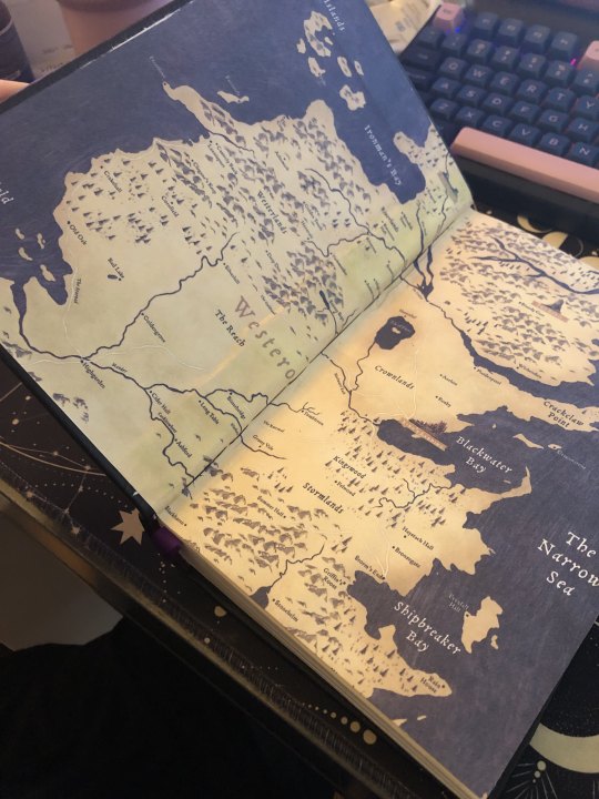
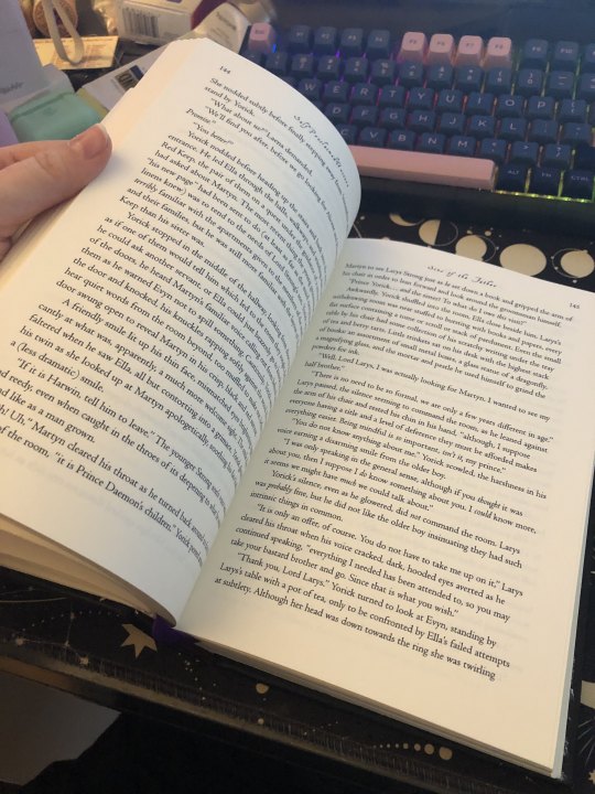
Typesetting: Normally I've kept my settings pretty minimal as I got used to the ins and outs of InDesign (during this, I did purchase Affinity Publisher and might end up moving to that, but I'm finally getting the hang of ID and you can pry it from my cold hands). I really wanted to mimic some of the interior of Fire & Blood for this, so I hunted down the fonts used and took an image of the decorative banner you see on the sides to use for the chapter openers. I also wanted to include timelines and family trees in true historically inspired fantasy tradition.
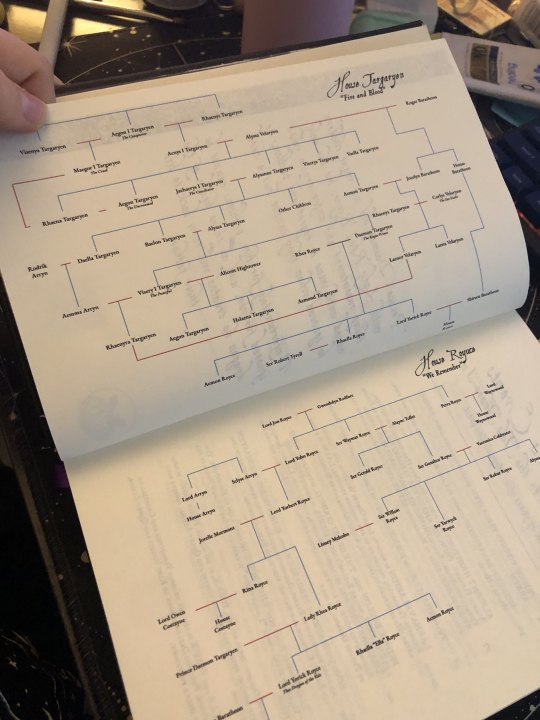
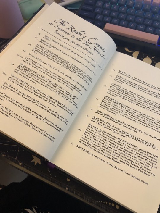
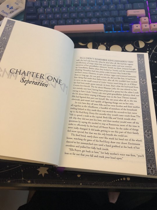
The family tree was created based off of the author's spreadsheet in Google Drawing, which I found to be the easiest thing to use when it comes to creating chaotic family trees like this (In the past I'd used lucid chart for a printable version, but google worked better here).
the timeline is honestly my favorite thing and I learned how to use tables in ID for the first time. I'm incredibly pleased with it. The formatting is based upon the line of kings in the source. The timeline covers the events of the first arc as printed in this particular story.
The chapter openers are some of my favorite! As the children are proud to be House Royce, I wanted to reflect that. The runes you see behind the Chapter number and title are the Floki font and name the character whose the POV for each chapter.
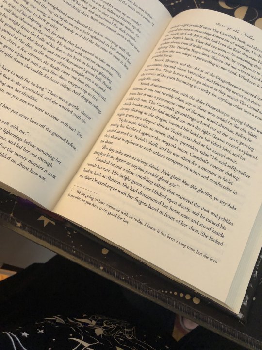
Since there's plenty of High Valyrian spoken and the author doesn't include the translations within narrative, it was the perfect moment to set up footnotes. I'll absolutely be doing this for my own story when I bind it!
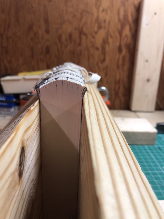
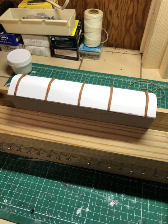
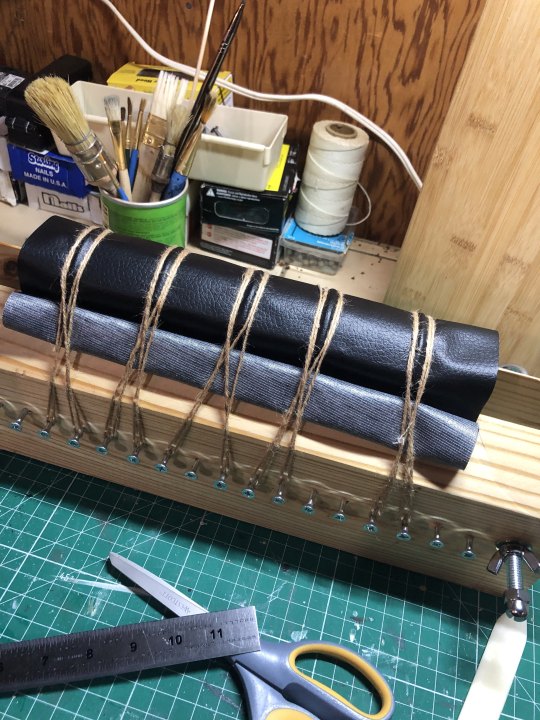
Rounding and Backing: So this was a total adventure, but I really wanted the old book feel. I made the mistake of pressing the book for too long and lost a lot of the swell in the spine to round but it worked out AND I managed to back it a little bit. Since I wasn't doing cord tapes for the spine (this was a version of the three piece bradel), I had to troubleshoot. I ended up cutting strips of the leather cord I bought from michaels and laminating those pieces together and placing them on the oxford hollow on the spine (given how thick the book is, I wanted to give it as much structural strength as possible). The 'leather' covering you see is actually the craft leather (polyester) from Dollar Tree and it's pretty awesome but definitely has difficulties staying put with glue. I followed the normal procedure and slathered both sides up and used twine to compress the bookcloth along those leather pieces. there's a little gaping in some places which I think would help if I'm able to properly apply backing paper to the polyester.

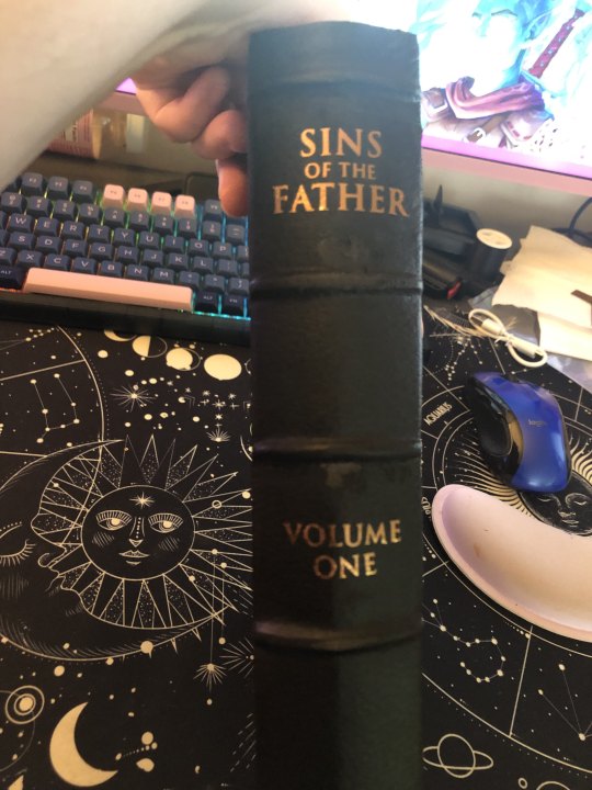
HTV do's and don'ts: Hi! don't be me and forget to apply your teflon sheets before applying the HTV because then you fuck with the polyester but it's not too bad. The other pro-tip is to gently apply the iron to the cover so it's warm before applying the HTV so it can start to stick. I had to apply the front cover in three pieces and do the title twice. Also, it's really difficult to apply HTV to a rounded spine so I'll have to figure out how to set up the spine and cover before applying (since there's a certain amount of stretching the bookcloth over the spine). The spine might end up having to be regular adhesive vinyl for that. Also, it's stupidly hard to find metallic HTV in bronze.
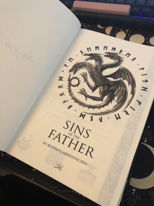
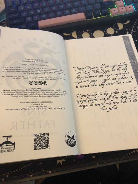
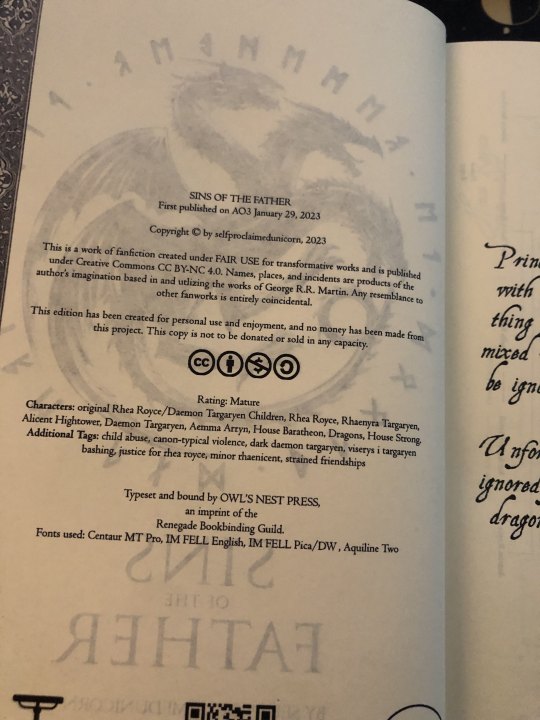
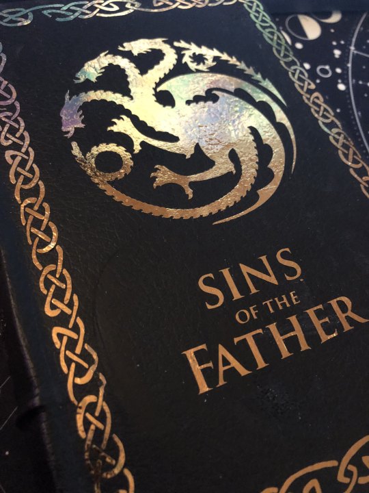
Front matter and final thoughts: The bronze dragon was a lucky find through an extensive google search, and the runes surrounding it are 'we remember with fire and blood', a combination of House Royce and House Targaryen's words. Seems fitting four Yorick, Ella, and Aemon! The copyright page is mimicked off the source's style, including the AO3 information, the creative commons and fair use information, the guild stamp, a QR code to the AO3 page, and my own press stamp! The summary is pulled from AO3 as well.
All in all, I made this book twice and I loved it and learned so much every time.
I'm so happy with this project and I'm so excited to do the next arc! Thank you so much for sharing your wonderful story, Misa!
160 notes
·
View notes
Text

I couldn't fit the tutorial on a reply lmao, here's a full post explaining my process :]]
STAMP TUTORIAL (TF2 edition, but works for everything)
99% of the process is done on the website ezgif. Ezgif carries the stamp-making process lmao
1. Get your GIF
Tenor: Ok place to grab your GIFs. Average quality of the GIFs is good enough, and looks ok when resized to the size of the stamp. You'll find like 1 normal GIF every 4 buff characters GIF tho.
GIPHY: Average quality of the GIF is better (I don't think the web compresses the GIFs that are uploaded)… If you find what you're looking for. You'll have to SCROLL before finding what you're looking for because there are always non-related GIFs on the top of your searches or the same GIF multiple times, it's crazy.
makeagif: You will find cool GIFs, but the quality is pretty low (I think the web itself compresses the GIFs a lot). It looks bad even when resized down. And it has a watermark, which I recommend cropping because it's not even visible when resized, it just looks like a gray blob on the corner.
Google: Best option by far, quality is pretty good and the ratio of “things I was looking for/things I actually find” is SLIGHTLY in favor of “things I was looking for” (and most of “things I actually find” are just the characters rotating, not NSFW, so that's only a nice change from Tenor). You won't have to scroll much to see different and interesting GIFs. JUST REMEMBER TO FILTER BY GIFS.

You search whatever > Images > Tools > Type > GIF
Make it on your own: Aka, you download your video, go to ezgif's “Video to GIF” (then you can crop it, CUT IT. THIS IS IMPORTANT, YOU DON'T NEED TO GO ANYWHERE ELSE TO CUT YOUR CLIP, YOU CAN DO IT ON EZGIF ITSELF). Ok, I lied, it wasn't Google, this is the best oftion by far. You get exactly what you want, the best quality if you don't compress it much until after the GIF has been resized into the size of a stamp… It's just super time-consuming, and you'll have to spend like an entire hour just watching a video to find the clips.
OK, I HAVE MY GIF NOW
Hehe, his legs go pipupipu
2. Resize
Go to ezgif, this is where the fun begins (if you weren't on ezgif already). You download your GIF, or copy the link and insert it, or you'll have it there if you made it yourself.
A STAMP MAKES 99px × 56px
THE INNER PART OF THE STAMP MAKES 91px × 47px
I RECOMMEND MAKING YOUR GIF 92px × 48px
BTW, THESE MEASURES ARE FOR THE TEMPLATE I'LL GIVE YOU LATER. If you use another template, just go to an image editor and see what the inner size of the stamp is.
So, you set your GIF's width to 92px.

Then crop it, so your height is 48px.

Or you can resize it so it's directly 92px × 48px, but the crop will be in the center, and SOMETIMES YOU DON'T WANT THAT.
For example:

It's a vertical GIF whose area of interest is not in the center, so if we resize it directly-

oops-
ANYWAY
Once you have your GIF resized:
IMPORTANT: BEFORE THE NEXT STEP, REMEMBER TO CONVERT TO GIF IF THE FILE YOU'RE WORKING ON ISN'T A GIF ALREADY
Sometimes you'll be working with a webp without even noticing (EW, I hate webp) and transparencies don't work particularly well with that extension.
3. Overlay

Click on this icon.
Ok, now that that's fixed:

Extend the size of the canvas.

Select your template and Upload image!

This is the template, btw.

Then move the overlay around until it contains the GIF nicely, or just set Left to 43, Top to 20 and Generate image! (I have these numbers memorized, it saves you like 20 seconds lmao)
Also, again, these numbers work on MY template, if you use another one, you'll have to figure it out yourself.
4. Crop

THIS OPTION IS A TIME-SAVER FR
5. Optimize (optional, highly recommend)

I always set my optimization method to Lossy GIF and level 10 because I find that there is no quality loss, and the file size might drop by 30%-70% (actually crazy). These percentages don't change much in higher compressions, even though you'll start seeing a drop in quality around level 35 of compression (the default).
6. Save

YIPPE!!! Your stamp is done :D
You can save it and look at it and place it on your profile or website.


Here it is btw, in case someone wanted it :]] The Sniper GIF but correctly cropped and made into a stamp as well.
Now do that another… eleven times, and you'll have a stamp pack to make into a Tumblr post... Oof TT
There's no website that lets you make stamps faster lmao (I wish)
@sir-broken-bones (I'm @ them so they actually see it, I made this tutorial for them after all lol)
#team fortress 2#tf2#tf2 scout#tf2 sniper#stamps#da stamps#tutorial#graphics#old graphics#neocities#old web graphics#old web
134 notes
·
View notes
Note
hi hi! Long time fan of your blog—and It’s really inspired me to write my own Bruno fic, any tips for a first time bruno writer?
HELLO!!! 💕
First of all, I just want to say thank you so much!!! Your kind words have made my day—no, my month. 😭🩷 AHHH I LOVE THIS QUESTION!!!

Okay, so I have a big tip for writing Bruno, (or anyone, really,) and I learned it in Araki’s book, Manga in Theory and Practice. This is a technique he uses to make sure his characters are always acting “in-character.”
Every time Araki creates a new character, he fills out a character history sheet for them. It’s a basic sheet containing all sorts of important stuff such as their personality traits, dreams for the future, forming childhood experiences fears, etc., and he uses that sheet to figure out how his character would react to any given situation. In Manga in Theory and Practice, Araki includes a blank Character Sheet and an example of what a filled-out one may look like.
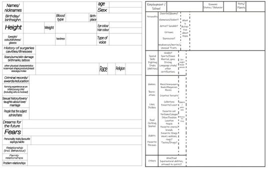
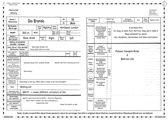
(this isn’t actually the original Dio character history sheet—Araki lost the OG. This version was made from memory. I don’t know if the original was actually this blank.)
Since Araki hasn’t released one for Bruno, I decided to make my own.
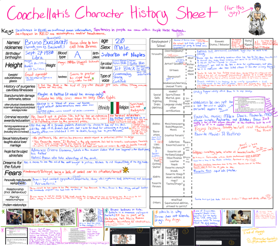
(This image is huge. HUGE. 6232 x 5519px!! Unfortunately, tumblr compressed it so you can’t read all the tiny writing :( can you tell I was an overachiever in school? Here’s a link to the uncompressed photo in Google Drive!!)
You are welcome to use this sheet if you’d like! (Anyone reading this is free to use it.) This sheet contains canon information as well as my assumptions/headcanons since Araki hasn’t given any kind of answer to some of these questions. You don’t have to agree with them. After all, everyone has their own interpretation of Bruno Bucciarati—this is just the way I see him.
Here’s how my process goes: whenever I put Bruno into a situation where I’m not sure how he’s going to react, I consult the character history chart.
For instance: what if Bruno is in a situation where he catches reader smoking weed?
This is something I haven’t always been sure as to what he’d do—I’ve changed my opinion on this multiple times. Weed is legal in many places, after all. However, after looking at my filled-out character sheet, I now have a more solid idea of how he could react.
Canon information: Bruno’s dad (his only immediate family) became injured because he witnessed a drug deal. (Which ultimately led to his death.) The way Bruno sees it, drugs killed his father. He also can get very worked up over matters that are personal to him, such as when Diavolo attempted to kill Trish, or when he caught Passione peddling drugs.
Using this information, I believe that Bruno is probably going to be very angry at reader, even if it is legal nowadays. It wasn’t very legal in 2001, and Passione likely trafficked weed on top of everything else. Sure, weed isn’t cocaine, but it was still a very stigmatized drug at the time.
(so yeah. Bruno would not be very thrilled about my love for Mary Jane… I’d quit for him. Also, this is just my assumption—it’s okay if you don’t agree with me. There are infinite ways to interpret a character, and your opinion is just as valid as mine.)
My advice to you is to fill out your own character sheet! Here’s a version that has no headcanons/assumptions if that helps :) (Unless you want to use mine, lol. But I know my word isn’t gospel, and you likely have differing opinions on him.) If you want to reword it entirely, here’s a full-res blank version!
Another reason I recommend this because you’ll really get to study his character. Being forced to think about his strengths/weaknesses, forming experiences, the relationships he has with others, or hell, even where he was born can really help form an idea of the character you’re writing. Through this exercise, I feel like I’ve gotten closer to Bruno. When it’s a character you love, filling this out feels like you’re spending time with them.
I’d also like to note that this character history chart is ever-evolving. As I continue studying Bruno's character, my opinions and mental images of him become clearer. It feels like I'm a sculptor carving a statue out of marble, gaining a more defined picture with each detail I learn. The sheet above reflects my view of him at this current moment in time, and it will likely change in the future.
Another tip I have for you relates to writing his dialogue. Bruno can be a little weird. For instance, he often speaks quite eloquently:
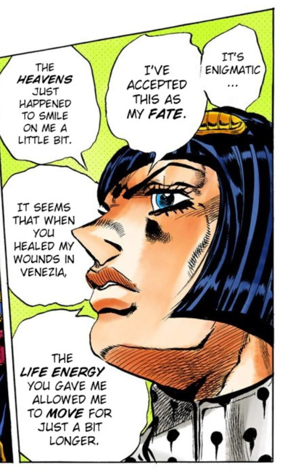
He’s very self-assured:
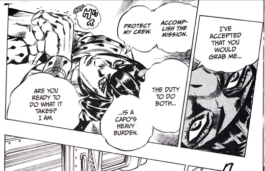
But then, there’s moments like this:
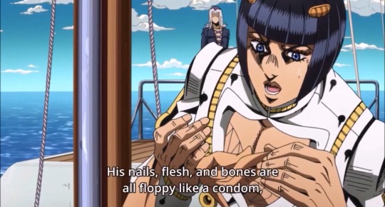
I recommend studying his speech patterns. Hell, I’m always learning more about the way he speaks.
I’ll leave you with this: In the end, there is no “right” or “wrong” way to write Bruno. How you write him is up to you, and your interpretation is just as valid as anyone else’s. Don’t worry about what others may think about your version of him—just do what feels right for you. Write Bruno the way you see fit. :)
I hope this helps!!!! Don’t forget to have fun. 💕

thanks for the ask!! <3
#bruno bucciarati#bruno buccellati#jjba x reader#vento aureo#bucciarati#jojo’s bizarre adventure#jojo no kimyou na bouken#my asks#vento aureo x reader
59 notes
·
View notes
Text
Context-Full Patent Art
Every now and then I see people in the comments who seem to genuinely want a better idea of what one of the posted bits of art here was supposed to be patenting. Giving that context myself doesn't seem in the spirit of the blog, but I absolutely want to encourage people to do the legwork to go sniffing around for original sources.
It's something I have to do a lot in my day job, something I've learned to enjoy, and the thing that led me to start Context-Free Patent Art a dozen years ago in the first place.
Let's start with today's post, which is a perfect example of art that raises more questions than it answers.
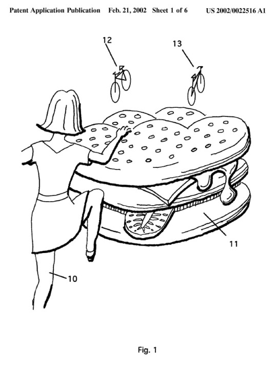
Almost every post on this blog has a header detailing the date of the patent or application and the number, which you can find on the top right. In this case, this image is from Patent Application # 20020022516.
Longtime Context-Free Patent Art fans might remember this image from when it was first featured here over a decade ago. I figured that a lot of the people following the blog now haven't seen some of the gems from years ago, so I'm going to be doing re-runs of some of my favorites this week. There's a bunch more I think would be good to bring back, so I'll use the vintage cfpa hashtag in the future so you know when a duplicate post is intentional (as opposed to me just forgetting I've posted a thing before, which happens a fair bit).
Back to the matter at hand though, if you're ever curious, the US Patent and Trademark Office has a super-handy patent search function. It's pretty easy to find from their main site (uspto.gov), but you can also just bookmark this link to the basic search form:
Check out the search results, click on the link for the .pdf, and you'll get the complete patent/application to peruse at your enjoyment.
In this case, you'll find the patent being applied for covers a method of "Advertising inside electronic games" and you'll learn that:
In FIG. 1, girl 10 is climbing onto a hamburger 11 like one sold at a fast food restaurant. However, in the displayed image, hamburger 11 is as large as girl 10. The person playing the game will therefore perceive hamburger 11 as fantastically large. That unusual scale will help to burnish the image of hamburger 11 in the player's memory as well as draw his attention to it while he plays the game.
Not shown in FIG. 1 are other characteristics which electronic games could apply to hamburger 11 which cannot be shown in unanimated line-drawings. Hamburger 11 will compress as girl 10 steps or pushes on it. That action will be accompanied by squishing and slurping sounds...
Yeah, the explanations are weird too, sometimes.
Sorry for all the words, I just wanted to make it as clear as possible to people that if they're ever curious about stuff they see on Context-Free Patent Art, it's usually pretty easy to find out what the deal is.
142 notes
·
View notes
Text
Since I was recently tagged on making CC in milkshape, I figured I'd copy and paste what I know from my other blog, rather than just forwarding the page here for ease of viewing. It’s the FAQ page for creating CC under the read more.
What do you use to make mods?
S3PE is used to export snippets of the code to edit to make tuning mods. If you wanna make some yourself, HERE is the tutorial to learn how.
What do you use to make objects/clothing/hair?
This one has a few answers depending on what you mean specifically.
TSRW mainly for cloning and editing objects. It also lets me export the files in simpack and package formats.
If you want the version of TSRW BEFORE the sims 4 versions, you can get that HERE. This is important to note because some other programs used for CC creation aren’t fully compatible with the newer version of the TSRW’s WSO files.
If it’s an object that needs a fourth channel added, but it isn’t supported, Texture tweaker by Ignes Jones is what gives the object that channel to work with.
For meshing I use milkshape, and I’m currently working on learning how to use blender instead, since it’s freeware and has a lot more that can be done with it. However, it seems like the plugins from TSRW no longer work with blender, but there are plugins to have blender import geoms HERE that are best used with blender version 2.8-2.9.
There are some additional plugins for Milkshape that makes working in it much easier. There is an align normals plugin set by Demon 432 HERE, and the Unimesh plugins by Wes Howe found HERE. Lastly, to make UV editing easier in Milkshape there’s the CatofEvilGenius UV plugin HERE. They also have a UV flipper too.
For editing textures I personally use Photoshop and here’s how to add DDS usage to it with a link already there in it to download the necessary files. If you use Gimp instead, you can get the DDS files for it HERE. Installation should be similar to PS’s, just look for the file formats.
HERE is a link to the faces and scalps for when I need to model hair or jewelry, since doing it right on the head is much easier. Teens and elders aren’t in here because they aren’t that much different from the adult head.
Is that everything you use?
No there’s also:
Delphy’s Dashboard – Used to make sure my package files aren’t corrupt and won’t make sims implode. It’s also good for checking if anything you already have may be corrupted (a lot of it out there sadly is through no fault of the creator. It just happens during creation sometimes)
S3OC – Another program that lets you clone files, save unlike TSRW it can clone interaction objects, like toothbrushes, game controllers, bowls, plates, and other things that only appear for certain situations. The downside is everything mostly appears in strings with few images, but most of the names make sense for the items. Just sort by name and get to scrollin.
Compressorizer – This compresses simpack and package files in order to help keep the game running smooth. Due to some of its functions, remember to back up your CC and games before using the program.
MeshToolKit – This one is indispensable for creating custom content if you’re adjusting meshes just a bit, or using it to give completely new weight assignments (what makes it move and work like a sim body part) and morphs (the thin to thick range, pregnancies included). Thornowl also made an updated version that can be downloaded HERE.
Normal/Bump map plugins – They’re necessary for any CC you make, as most art programs don’t natively have the ability to make them. Now there are a couple different sets you can download and use depending on your art program of choice.
You can get the ones for GIMP HERE, with the link to the downloads on that page.
The ones for Photoshop can be gotten HERE, and this is a mediafire link because I personally had difficulty using NVIDIA’s newer exporter
And I THINK that’s everything, if I think of or get asked anything else I’ll edit this as needed.
#thesims 3#sims 3#the sims 3#s3cc#ts3 cc#least I think that's everything#If there's anything anyone thinks should be added let me know
34 notes
·
View notes
Note
Hello! I have a question, how do you draw lineart weight? that is, how do you understand where to make the line wider and where narrower? I've been trying to figure this out for about 2 years now lol. (Sorry for bad english)
hiya!!!
I touched on this in a previous ask here !
I am...not an expert and am very much still learning ;; I ocassionally have little revelations but as I go to write them down or share them I then realise that it fundamentally breaks another 'rule'...so in order to explain one little revelation you need to explain the rule. I tie myself in knots over this Saying that, lineart weight TO ME is fundamentally all about 'rhythm'. human eyes love contrast...lines being thick in one area and then thin in another area is very 'stimulating' (or has high levels of 'appeal', to use the proper term). there are a few rules or guidelines you can use to help you determine where to place your thick and thin such as: - thick lines represent shadow or occlussion...therefore place them on the underside of objects or planes - by an extension of that logic...thick lines can represent gravity or weight or contact between objects (ie: if someone is sitting on the chair...make their bum line thick to represent the 'gravity' of their arse against the chair**). Likewise it feels more natural to render a feather in delicate thin lineart vs super chunky thick lineart - thick lines can represent movement / action / force - thin lines can represent something distant....almost blinking out of the capabiltiy of your eyesight. this means you can use thicker lines to make the object feel closer to the camera **this is actually the rule i've learnt most recently you can really break. if you're drawing a heavy rock on the ground...it makes sense to go 'okay the underside of the rock is shadowed and the rock itself is heavy so i'll draw a nice thick line on the bottom of the rock against the thin lineart of the ground'. BUT maybe....the rock is SO heavy that it is literally compressing its own lineart meaning that you get a thin line between the rock and the ground??? maybe...the THINNEST line?? as it's so heavy that the rock and the ground are almost becoming one? bah sorry i should really be providing images with these concepts Even in consistant-width lineart styles there's still a respect for the concept of 'rhythm' although it becomes the rhythm and harmony between high density and low density areas of detail. Moebius and other 'ligne claire' style artist are often really great examples of this :) learning by studying is always the best though! i spend a lot of time just looking at art i like and trying to understand what is providing the appeal / rhythm within the image and why. my favourites at the moment are: Grant Alexander, Esther Morales, Kerascoet, Hergé and a lot of mid- -century-modern illustrators haha hopefully...this vaguely helps...it's a long path that we're both on but we can do it!
#asks#tutorial#bah tagging this as tutorial just in case anyone ever goes through my blog#i hate spelling rhythm!#everytime i write it i have to whisper 'rhythm has your two hips moving'....little mnemonic for you all there
115 notes
·
View notes
Text
well it's been almost six months which I think is long enough to break my posting embargo, so, uh: guess what! I got liposuction lol. specifically hip/thigh lipo to quell some pretty wicked dysphoria that stemmed from having such a feminine silhouette… and I have to say I'm really, really pleased with the results.
tbh my initial plan was to keep things under wraps for good which is why I haven't said anything about it yet (and even as I'm typing this up I keep debating whether to post it or trash it)—partly because I was/am worried people might Act Weird about it and partly because I get a little embarrassed talking about bodygendershit in general. but here we are. one reason I do feel compelled to finally share, other than being super happy about how everything went, is that I haven't encountered a lot of discussions about body sculpting as a possible avenue of gender-affirming care (although, to be fair, maybe I just haven't been looking in the right places) and I figured at least one person out there would be interested to learn about what I did and where I've ended up so far.
anyway. pics/details under the cut—nothing even remotely risqué (or yucky), I just know that body image stuff is fraught + not everyone is eager to hear surgery talk.
to be precise: I got tumescent liposuction of the inner and outer thigh, plus this ultrasound thing to help the skin shrink. a different surgeon who I consulted (but ultimately did not go with for a number of reasons) said that even if I got the results I wanted from lipo, which he claimed was unlikely, the affected skin would look loose/baggy/weird forever... and that surgeon was wrong on both counts lol. my elasticity was great bitch!!!!
they didn't take out that much fat overall, only eight pounds or so, but it's way more about the Where than the How Much. my actual surgeon (who kicks ass btw) said lipo isn't that great for weight loss per se, and what it's really good for is sculpting targeted areas—so basically exactly what I did. six months post-op I actually weigh about the same as what I did pre-op, but the distribution has held steady; more weight goes to my stomach now and less, proportionally, goes to my hips since there are fewer fat cells in that area now. so my silhouette retains its new shape!
the overall change is admittedly on the subtle side, since I'm pretty short and have wide hip bones (and you can't change your literal skeleton) but it's still gone a looooooong way. the main thing I requested from my surgeon was "I want to fit in men's pants" and boy did he deliver.
also a good place to note that if you're in the las vegas area looking for a plastic and/or cosmetic surgeon—this guy is board-certified in both btw—then I absolutely have the guy for you. feel free to DM me for details. lipo is clearly his specialty (and it shows!) but he also does a lot of breast revisions/mastopexy (i.e., fixing implants that other surgeons did a bad job putting in), regular implants, and face work (particularly facial feminization surgery). one thing that sold me on this guy was an enthusiastic yelp review from a local stripper who said he hid the incisions for her breast lift in her armpits so none of her clients would notice that she'd had work done... a true master of his craft
okay you've scrolled enough so I'll give you what you're here for lol. I don't have many pre-op pics because I was obviously unhappy with how I looked and was not taking full-body selfies on a regular basis, but here's a few I took ~2 weeks beforehand:
these super thin men's joggers were my go-to dysphoria pants, to the point where I bought five pairs in different colors, but now they're so baggy on me that they have the opposite effect and make it look like I have wider hips than I do. so I retired them from my wardrobe...
...except not immediately because I had to wear compression garments 24/7 for the first three months post-op and these joggers were just loose enough to comfortably wear a medical girdle underneath them at all times, 110° degree temperatures be damned. (not that I was going out much for the first month since I was soooooooooooo fucking bruised and sore lol.) here's a few post-op pics in the same style pants:

(first pic is less than 24 hours post-op, about to go to my follow-up appointment, looking greasy as fuck because I wasn't allowed to shower yet; second pic two days post-op and also post-shower, thankfully; third pic is about a month post-op.)
so, like, CLEAR improvement already. I will not be posting pictures of my black-and-blue-and-swollen-all-over legs but considering how puffy I was from getting internally pummeled with a cannula it's wild that I still saw improvement literally as soon as I came home.
recovery was obviously not a blast in the moment but I got off easy, all things considered. I was supposed to get drains put in and was Not looking forward to that at all lol. the first thing I asked when I woke up after surgery was "how many drains?" because they weren't sure if I'd end up needing two or four, but it turned out the answer was zero. no drains!!!
I did have to lie with my feet elevated for the first two weeks straight, and had major bruising that receded over the first month (you could barely see my regular skin underneath all the mottled spots), but little to no nerve pain, no weird complications, and I was more or less back to normal after six weeks. also noelle took very very good care of me and was brave about injecting me with blood thinners so I wouldn't get clots and die :)
when I went into it I was fully expecting to get huge vertical scars up and down the sides of my legs (and had made peace with it!) but instead I wound up with four tiny incisions like this, each less than two inches long:

what's totally crazy is that the scars are basically Gone now. like even when I'm trying to find them I struggle to locate the ones in the front. I joked to noelle that if someone did an autopsy on me they might not figure out that I'd had cosmetic surgery, especially since the skin on my thighs is back to its normal color and texture. (in this scenario I like to imagine that it's dana scully giving me the autopsy and I'm in an x-files plot where instead of regular lipo I got alien lipo and mulder figures it out purely by accident.)
with lipo it can take up to a year to see the full results but I already feel so much fucking better in my body that seeing old pre-op pics throws me for a loop. and I can absolutely wear men's pants now—pants for short and stocky men, to be fair, but actual regular men's pants and not exclusively Pants For Men With Huge Butts And Legs. which is the only style I could even hope to fit in before. and even then it was a stretch.
big pic dump of shitty mirror selfies taken over the last few months:
:)
(also I really debated sharing this one but I already included it in the yelp review I left my surgeon so fuck it: here's a tasteful before-and-after in my undies where you can see my bare legs for easier comparison. left pic is one week pre-op, right pic is about five months post-op. including it as a link instead of embedding it in the post in case your boss happens to be reading over your shoulder at this very moment. also this is the one and only time you will ever see me stripped down on tumblr dot com so don't get used to it lol.)
147 notes
·
View notes
Text
More Komaeda sprite discussion...and something about Kamukura
Title says it all, lol.
So! If you keep up with my sprite posts, you may recall how I proposed a theory about a three-step plan in Danganronpa sprite making.
Yeah...about that...
So, we all know about the beta smirking Komaeda sprite, yes? I've talked about it at length. Earliest Komaeda "neutral" sprite we know of.

Then, we have the final sprite:

Cool. So...what about this sprite?

I know it might be hard to tell at first. But that's what .gifs are for!
On the left is a comparison of this "middle" sprite (so I'll call it) with the final one, and on the right, it's a comparison with the earliest "smirking" beta.


You can clearly see it's different from both sprites.
At first, since this is a Danganronpa S sprite and is only used in DRS game-wise, I figured it may actually just be a case of his mouth looking weird due to the Switch's file compression.
But take a look at this piece of merch, which would not be confined to being pixelated.
It's obviously the same sprite. To prove it, here's a chart I made:

You'll have to zoom in to see it. But it does show these are different versions.
Okay, so...what does this all prove?
Well, there's two theories I have in mind.
Theory one is that my three-step design phase is more like a four or five step phase, with some characters getting more alterations than others. Which honestly leads into my second theory that doesn't even contradict theory one: we know Komaeda's sprites were especially redone late into development. Therefore, he may have more minor tweaks done to his sprites than any of the characters.
I don't really have many thoughts on this...other than damn, I wonder what OTHER Komaeda sprites have had extremely minor changes made to them. This I will investigate when I look closer into DRS sprites.
Okay, so onto Kamukura. Same merch line, too.
Two photos just for extra reference, but I think the difference is obviously clear. His eye color is the same as Hinata's.

Reference gif just to cover all my bases, and I found something interesting. The first fold of clothes, right next to his collar on the left, is lined differently. It's thicker and the extra, very thin line is missing.
This would indeed indicate an earlier version of the sprite, and is in fact the same one used in UTDP and DRS.


I think what's funny is that Kamukura's eyebrows are colored in on this merch, but in the DRS/UTDP sprites, they aren't. Funny oversight I guess, but that honestly makes me wonder what the deal is with this image used for the merch.
The lack of color in eyebrows in the UTDP/DRS sprites suggest that they are earlier versions of this one used in the merch. But the biggest question becomes why would a stage 2 of 3 (in this given timeline) not have the red eyes if the others do? Either Kamukura was originally meant to have Hinata's eye color, or it was changed solely for this merch. Which...would be weird. They've never done that before, I don't think.
The other option is the early Kamukura sprites used for DRS/UTDP in fact did NOT have red eyes and they had to manually re-color them. But at that point, they would know these were beta sprites and not the final version. Did they not have access to the final version anymore, then? Or only the shadowed version?
Furthermore, I just noticed Kamukura's pupil in the UTDP/DRS sprite is misplaced...while the pupil is in the same spot in the SDR2/the merch sprite. Also his eyelash no longer peeks out from over his hair.

This is all giving me a headache so I'm going to bed lol.
Anyways, strange stuff.
34 notes
·
View notes
Text
I'm working on a website for a comic (those who know, know) and it gives me a good opportunity to talk about the modern web innovation that's #1 most reviled on here: webp.
I was working on image quality. See, the author made the pictures high-quality, and since they're hand-drawn it's absolutely worth it — but it means we're talking ~2500x1100px PNGs. Which means ~2-3MB per picture.
Since on the actual website they'll be displayed at 1000px width, smart old me figured a pretty quick fix to save on readers' bandwidth would be to reduce the image size to 1000px width (after all, that's over 5x smaller than the original!).
The issue though: quality surprisingly suffered. Specifically there was a notable impact to the text (but also the colours and texture, if you look closely).

So I started wondering how exactly one could get a cleaner output from my image downsizing.
Which I spent the next 5 hours trying to crack. Turns out it's not easy.
On the other hand, there is another approach: simply finding a better way to store the image. On JPEGs and PNGs you can play with various compression settings which might help you reduce that file size without compromising quality (I tried a bunch, no dice!), but you could also switch to another format. For example, you might consider webp.
Here's what it brings to the table.
"-original" files are the HD originals, "-large" files are the blurry resized ones, "-optimized" are the webp ones.
They are 13-15 times lighter at the same size. This makes them even lighter than the 1000px-wide ones. (2 to 3 times lighter! despite being 5x bigger! that's insane!)
And the output:

I couldn't tell you which capture I took from which version.
And like, damn, that's p cool.
78 notes
·
View notes