#;danganbetasprites
Explore tagged Tumblr posts
Text
Just found out while replaying SDR2 that there's an oversight in the PSP version similar to the DR1 oversight, that later gets fixed in the Vita port.
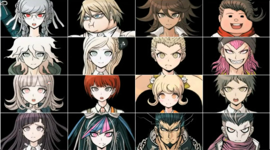
These images I pointed out last post from the commercial, these beta ones? They're mistakenly used in the student handbook.


I just took a photo of Hajime and Nagito, but this goes true for everyone.
To compare, here's the vita version (aka the version resold for PS4, Steam, Xbox, iOS, etc...):


I know some people may have a hard time noticing the difference. For Hajime, the seam line on the shoulders of his shirt is not present in the PSP version. For Nagito, his smirk was changed to a smile, and you can see the neck lines were heavily reduced in line weight.
So, of course, I ripped them.


The PSP has very small image quality. And the sprites for the handbook were made with the purple color and tile already as a part of them. But, if we layer them...


The tile is actually just transparency. The only sacrifice to layering them is some thicker outside outlines...but we'll deal. And, with some color-layer magic...


It's kind of incredible, actually. It's almost like having these sprites for real!
So, of course, I did this for everyone...and made some comparison gifs while I'm at it. If you're interested, please click read more! (gif warning!!)


It's so weird "having" the beta Komaeda smiling sprite after talking about it so much...but here we are, I guess.
Okay, so to start with Hajime. The shoulder seams were added, but also his left shoulder was made bigger. Some minor hair details were changed, including adding a longer spike of hair next to his ahoge. Also his right ear was touched up.
Nagito's hair was thinned out a little in line weight, along with his neck lines. Eyebrows were thinned out, nose redone, and his smirk changed to a regular smile.


Fuyuhiko was changed quite a bit. Head reshaped in some areas, hair retextured, and they even moved his neck. The sizing is wonky because they obviously resized/moved some parts around, which I didn't want to mess with for the sake of comparison. One thing I love is his little pout. I'm so sad they got rid of it! It's so cute...


Kazuichi's is interesting for multiple reasons. 1, I genuinely did not see any differences until I recolored it, which leads to 2: his shirt was going to be grey?? Some of these sprites have minor color differences, but I chalk that up to recoloring a purple sprite. I think some minor differences in color here and there is going to happen. But this isn't a minor difference - it was clearly going to be grey originally. I wonder why that was changed? They easily could have left it as is, but I guess they cared enough to change it to white...
Otherwise, some minor changes to the face were made, as well as his jawline.
Gundham on the other hand is also one I didn't catch until I did the comparison. The right side of his head was entirely redrawn to have more volume, along with his ear. His jawline was puffed out a little, and his hair line cleaned up a bit.


Since looking at the original commercial and seeing the beta sprites, Mahiru's stuck out the most to me. Her eyes made her look a lot more disinterested than her final sprite, and I do maintain that. Her beta sprite had narrower eyes, a lower nose, smaller mouth, and overall thicker outlines. Her left sleeve also lacked its emblem.
Hiyoko, I can't find any big differences...the ones I do see may just be a result of two different photo resolutions making stuff seem off. Her smile may be different, but that's about it sadly.


Much like Fuyuhiko, I actually prefer the beta Mikan sprite. Her mouth was once more nervous, and her gaze was more upwards and slanted than forwards. I think it's super duper cute and I wish they kept it!! Otherwise, her hair outlines are thicker, including the hair in the back being a little bigger. Her neck was thinner, too.
Peko got minor changes. Her neck was slightly enlarged, her left ear was made smaller, and her eyelashes were reduced. A part of her bangs was modified as well.


Some of Ibuki's shirt folds around the chest area were erased, and her frown was changed to a neutral look. Her nose was also unsharpened a bit.
Chiaki's bangs were fiddled with in their line art. One line of hair in the back was reduced, and the curly hair under her chin was also modified at the tip. Looks like her nose was also softened and her eyes were made smaller.


Most of Nekomaru's changes are very small and in the face, making it hard to see at this resolution. Thankfully, V3 erroneously reuses his beta sprites, so we have an easy way to look at them in better quality (which I will touch upon in my UTDP post). Otherwise, his eye lightning is much brighter in the beta. As for Mechamaru, I could find no differences...


Imposter's is one I'm really happy to see, because we rarely ever see beta Imposter sprites. I theorize this is due to the fact he was one of the first characters ever finalized in SDR2, so likely not much beta content of him exists...but we have this thankfully!! Some changes were made to his eyes but the most noticeable difference is the resizing of the sprite. His head was made smaller and his body bigger.
Teruteru has minor changes. His necktie was made slightly bigger at the end of it, and the hair by his ear was erased a little. I can't tell if his eyebrows/mouth are slightly different or if that is again the result of the image quality.


Sonia's is super interesting because it throws my beta sprite workline theory into a doozy. See, it looks almost identical to this beta Sonia we see on the official SDR2 promotional wallpaper. But there's noticeable differences. Her eyebrows are lowered, her right eye has most than one difference in its eyelashes, and her nose/smile seem different. Again, these are the differences between this beta and the one on the wallpaper. I can't for the life of me tell if these are ACTUAL differences or, again, the product of photo quality pixelating everything...
As for Akane, hers are also very small. Some lines on her hair, her mouth, and her boobs were changed. A bit of shading around the collarbone, too.
And that's everyone!! Really amazing stuff...I might have to investigate DR1's student handbook to see if there's any differences there. Who knows, we may get super lucky again.
#hajime hinata#nagito komaeda#chiaki nanami#kazuichi souda#gundham tanaka#sonia nevermind#akane owari#nekomaru nidai#fuyuhiko kuzuryuu#peko pekoyama#ibuki mioda#hiyoko saionji#mahiru koizumi#mikan tsumiki#teruteru hanamura#byakuya twogami#dr#;noxiatalksia#;danganbetasprites
71 notes
·
View notes
Text
This is all really cool info!! If you don't mind, I want to add some stuff.
A bit ago I watched this trailer, which is the first SDR2 trailer I believe. This one was posted in April, while the one linked in OPs post is from July of that same year. This also has some really cool details.


It's hard to notice at first glance, especially because of the low quality, but this is a beta sprite.
You can compare the black outlines on Komaeda's throat and collar bone and see that the one used in the video is noticeably thicker. Beta Danganronpa sprites usually have noticeably thicker outlines. His nose also looks a little stubbier and his mouth is more like a smirk than a smile.

Also this part, which shows the prologue scene but with the Island Mode textbox. Perhaps Island Mode's intro was going to be extended. I find it hard to believe the original UI was going to look like this since it appears in the same trailer (as seen with the Komaeda screenshot).

Also! Beta hanging Monomi + art ref being used as a placeholder for portrait art (they did the same thing in DR1's development).

We can also see Monomi was going to have outlines around her cheeks. This is somewhat left in the game as in the Dangan Island intro they use countless beta sprites, including one of Usami right here:

Also, beta Komaeda's sprite is here, too! But he's flipped, so it's hard to tell at first.


It's much easier to see this way.
Speaking of, the reason Komaeda seems to have so many beta sprites to the point some were left in the final game, may have to do with the fact it was likely all his portraits were redone very late into development. From the Danganronpa 2: Goodbye Despair Official Setting Art Book:

A hollow, handsome young man. Initially, Komaeda was styled to be very similar to Naegi from the first game. He would have been much shorter, wear glasses, and have a black, demon-styled hoodie to give the impression that he was "like a Naegi who fell to the dark side". Later, While wrapping up the designs for all 16 students, he was changed to be taller and more handsome to give a "anti-hero" sort of vibe, landing him where he is now. Traces of his being self-aware of his own smarts lingers in his design, and the jagged hem of his jacket is also derived from the devil tail in his original design. Komaeda also has many different complicated nuances in his facial expressions. We were inspired by Oogata-san's performance and repeatedly made changes which dramatically improved him overall. I really like how his hair moves, flickering like a flame. (Rui Komatsuzaki)
All very cool stuff.
I just watched this old trailer of Danganronpa 2: Goodbye Despair and I found some neat oddities in it.

This trailer was uploaded to YouTube on July 12th, 2012. Two weeks before the release date, July 26th 2012.
First off, the trailer shows the first class trial. What's notable is that the Ultimate Imposter is still alive and present at it.

I google translated a few lines from the trial in the video and the ones I did were identical to what was said in the final game. So I believe that the first trial in this trailer is largely the same as in the final game, only difference is that they swapped Imposter's death portrait with his actual sprite so to not spoiler that he is the victim.
Next, several CGs from the final game are seen in this trailer but only for a few frames. I'll show off the most interesting ones.


This CG from Chapter 1. It shows Mikan eating sausages. In the final version of the game, this CG was edited so Mikan isn't eating anything.

Funnily enough, this isn't the first time a CG of the party was edited to not have someone eat food. This CG with Hiyoko in it shows her with a drink but an older version of this same CG shows Hiyoko holding a plate of food.

Remnants of this CG is still in the final game. Maybe they were included in by accident by someone on the dev team not paying close enough attention to which CGs they need to insert.
This old CG is seen in the credits.

And in this truth bullet for the party food.
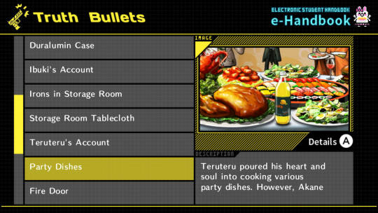

The reason why these edits are made is becuase in the trial, it's said that only Peko and Akane have eaten the food. If any other character is seen eating food in the CGs, that would make a plothole.
This does show that during the development of DR2, the CGs were competed first before the trials were fully completed, since the CGs had to be edited in order to fit one of the debate topics for the trial.
Next up, the trailer shows an old version of the Jabberwock Island Guidebook for a single frame.


And then later on in the trailer, there are several frames showing off end game stuff. Stuff that would be massive spoilers if you had context for them.
Like the Ultimate Imposter's Student Profile.


Neo World Program and The Tragedy of Hope's Peak Manga.


And this CG of the survivors entering the Graduation Exam Site.

This last one is special as this CG isn't even in the final game but the assets for this CG are still included in the files.

I tried my best to recreate this CG using the files. It's not 100% accurate but it's very close.
And finally, the trailer shows a few frames of the Pre-Class Trial Portraits. There's no cropping applied to the character portraits so they overlap one another.
I will compare the trailer screenshots with images of the trial portraits from this 4gamer article.


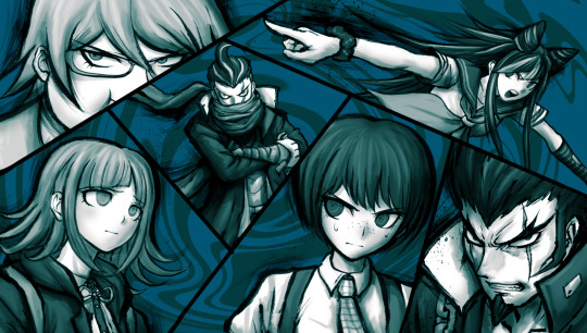

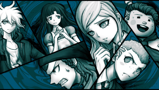

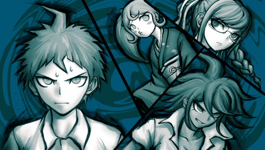
And that's it. Pretty cool stuff.
212 notes
·
View notes
Text
Danganronpa Trigger Happy Havoc Beta Sprites found in the Demo
I always lamented about the lack of THH beta sprites as opposed to SDR2. It just seemed there were very little out there. And while true that SDR2 has far more easily-obtainable beta sprites, it turns out I was just being a little short-sighted.
I looked in places that I looked for SDR2 beta sprites. Old gaming articles, other games that mistakenly use beta sprites (like UTDP or DRS), merchandise...and found nothing (much).
But you know what THH has that SDR2 doesn't? A demo version.
Somehow, it never crossed my mind! I had always passively known about the PSP demo version - you know, the one where Hagakure dies - but never thought to actually check there. Until now.
And wouldn't you know it, a number of the sprites used in the demo are beta renditions!
So, preamble over. I will be covering all I know about beta THH sprites so far...from the Demo version.
As always, this post exceeded 30 images, so for the part two covering the full body sprites, please click here (it's a reblog).
If you want to look at these sprites without the GIFs, or have them for yourself, I uploaded them all here on the Spriters Resource!
Also, something I can't share over text so I took a video. The sound effects in the beta version are different, for what it's worth.
You can already tell Fujisaki looks weird, right?
Okay, for real. Let's get started.
Firstly, I'm going to go in alphabetical order by last name. I'm also going to only cover the sprites that are for sure different or might be different. Sprites where I found 0 difference whatsoever will not be shared, of course. Some characters lacked any sprites with differences.
Also, sorry for the small image quality in advance. PSP sprites, you know how it is.
Asahina Aoi
While none of Asahina's sprites are changed, her testimony truth bullet is a different story.

Overlaying her final sprite, it's like night and day. Her eyes were made smaller, her eyelashes lessened, hair bigger...clearly, while her in-game sprites remain the same as they do in the final version, this truth bullet slipped through the cracks.
Interestingly, this oversight slipped through into the final game.
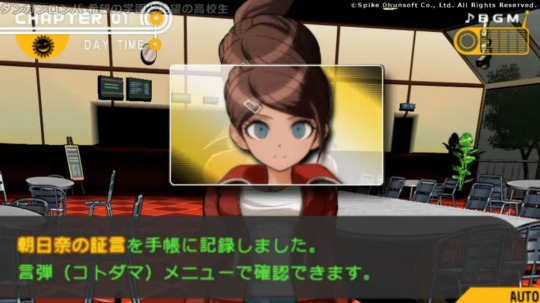
However, it was correct in the Vita re-release.

The Vita version would go on to become the base version of the game for North American players and every subsequent re-release (Steam, Xbox, etc.) in other words, this oversight can only be found on the original Japanese PSP release.
This is not uncommon. SDR2 has its fair share of PSP oversights and glitches, as I've discussed here. DR1 has another one which I talked about here. I will also be speaking about PSP oversights in another post soon.
Enoshima Junko (Ikusaba Mukuro)

Enoshima has one sprite that is different from the final version, and it is extremely minor. Look at her nails. Yeah, that's it.
However, this small change has an interesting background.
In the Demo version, they were originally going to be tipped white to match the red-and-white bow on her head (likely). The final sprite has her nails be a solid, bright red.
To get a better look, here's a higher-res version of the sprite from the Vita, which uses the final PSP sprite:

Full red nails.
Now, here's the full-body of that same sprite, again used in the Vita, PSP version, and Demo:
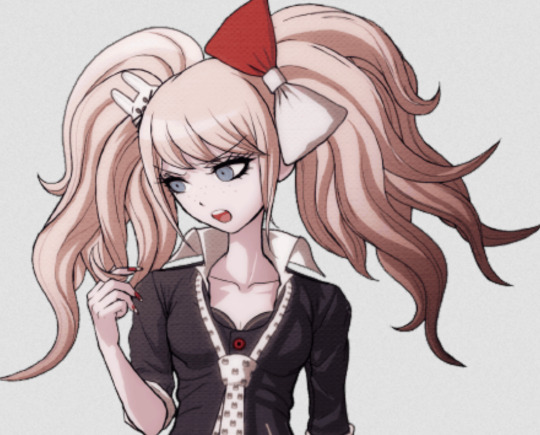
White tips!
It looks like they forgot to go back and fix it for the full-body as well, so the change only persists for the half-body sprites.
All of Enoshima (Ikusaba's) full-body sprites have white tipped nails.
What's even funnier (and cool!) is that I found that DRS not only uses PSP sprites that were then fixed/changed in the Vita release of THH, but also uses beta sprites. Up until now, I thought this was only true of a select few SDR2 characters, but I have found many incorrect sprites for Kirigiri and Kuwata specifically.
And for Enoshima...

The white-tipped nails make a return!
BTW, this is true of all Enoshima/Ikusaba sprites. Seriously, go compare any sprites where she has her nails showing from THH to DRS...


Sorry, I went on a tangent. I can't help it with these things.
If you're wondering why it was changed, my only guess is, because of the PSP's poor resolution, the team thought it would look too confusing to put so much detail into such a small area. So, they just made them solid red in the end. I doubt bringing them back for DRS was intentional, as so many beta sprites are used in that game that it makes my head spin, it was probably on accident like the rest of them. To be fair, most people wouldn't realize they grabbed the wrong sprite with a detail this small.
Fujisaki Chihiro
Fujisaki is a very interesting case. For one, all of his demo sprites are shorter than the final version. Because of this, in the comparison GIFs, the beta sprite will have an empty gap below it. I suppose they wanted him to be taller in his final sprites, so they moved him up a little.
But because of this - and because it looks like they did some color adjustments - it was impossible to perfectly sync them up. The colors are just processed differently. Because of how small PSP sprites are, it's hard to tell if very minor differences are real differences, or just pixelation differences caused by the sprite being compressed and are unintentional.

This first GIF highlights this well. Obviously, the demo sprite adds a softening affect to the colors and outlines, whereas the final sprite lacks these and appears brighter and more bold. It is then hard to tell if many of the differences are a result of this, or are actual tangible differences.
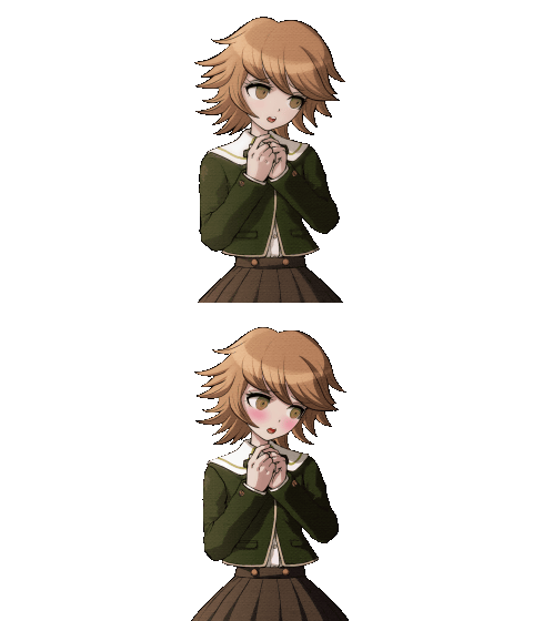
This one is much more noticeable and verifiably different. And...I actually really prefer the demo version over the final sprite. The bigger arm looks nice on him, but most of all, I like the sort of demure but disinterested look he has without the blush. It's so much cuter to me!!

Unlike above though, I think the final sprite is much better here. The demo version looks unfinished and kind of goofy. They slimmed his face down, reworked the mouth, and made the shading darker. The blush is a bit overkill in my opinion, but overall I like the look of the final sprite more. It's so fascinating to see these beta sprites and see how they decided to go about reworking them into their final versions. Sometimes, the direction the beta was in may look better to you. Other times, you're so glad they decided to go back and change it.

Only 3 differences I can spot with this one (that for sure aren't a result of the compression): his left eyebrow was moved down a little, his shirt collar was edited a tad, and they forgot to make the space between his neck and right hair strand transparent, which they fixed in the final sprite.
If you're using dark mode, you won't be able to catch that last one. Change your Tumblr theme to a lighter color (white would be best) and then look - it's very clear then.
Ishimaru Kiyotaka
You know what's funny? Ishimaru has the opposite problem to Fujisaki. His final sprite was lowered instead of raised. So, in these comparison GIFs, the one with a transparent gap below it is actually the final sprite, as I had to raise it up to match the demo sprite.
Again like with Fujisaki, some differences may be caused by compression.

His right shoulder button was raised in the final sprite, and his mouth was made into a thin line. His eyes were also flattened at the bottom more, overall giving him a sterner look. It seems his uniform collar was also raised and straightened out. I feel these very small changes did a lot over all. The amount of flat, straight lines added really hit home with giving Ishimaru the upstanding, straight-laced feeling his final character has.
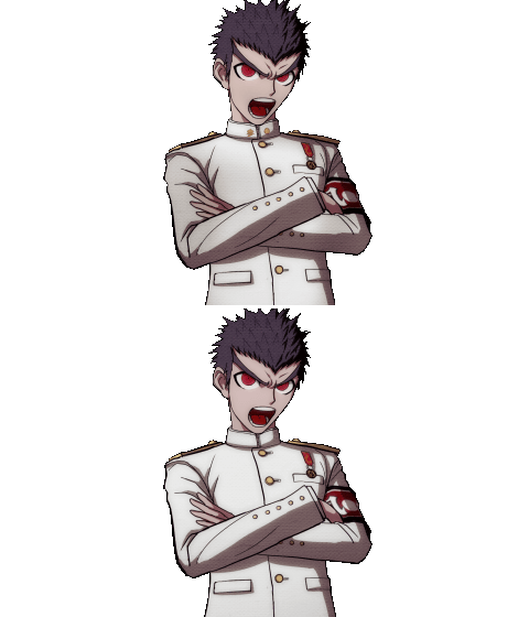
This one is interesting, because it's one of those things you don't notice until it's pointed out. The final version has this sort of dusky air brush affect around the clothes, while the demo version is completely white. I never noticed that until doing this comparison. It seems a strand of hair on the right side of his head right next to his eye was shortened, and the buttons on his collar were forgotten in the beta sprite, but fixed in the final.
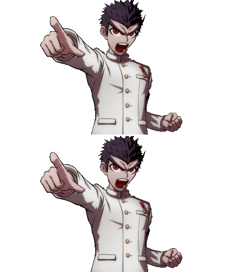

I'm grouping these two together as they're very similar sprites with similar differences. Both sprites had the right side of the uniform collar shaved off a bit, and they also had the button threads rounded to better fit the curvature of his chest. It seems the top sprite also had a thicker thumb in the original demo sprite.

While the right shoulder button is made smaller in the final sprite, the biggest difference here is Ishimaru's left eye. The outline was much thicker in the demo sprite, and was erased a bit for the final sprite.

Lastly, this one probably has the least amount of differences. The shoulder pad&buttons were modified just slightly, and maybe the hands were changed too? But it's hard to tell if it's genuine or just the image compression.
Kirigiri Kyouko
Firstly, I want to point out that a majority of Kirigiri's sprites were off-center in the demo. Here's the comparison before I centered them:

Here is the corrected (as best as I could) comparison:

It seems with the exception of her mouth being moved down like, one pixel, it's largely the same.

The beta sprites are also generally taller for Kirigiri, hence the weird cut off. Anyhow, the main change here is her mouth and nose, which were redrawn significantly closer to the middle of her face.

In this sprite, her whole face and jawline was reworked to be less tilted.

You gotta admit, this one is pretty funny. A comparison GIF between the two sprites makes it look like she's bopping to some music, haha.
But anyways, a lot was redone here. Her entire head - hair and all - was redrawn to be more tilted. She also wears a more thoughtful expression in the final instead of appearing like she's asleep. Her shirt collar was also touched up to fit the new head tilt.
Still, I really like this sprite. It's different enough to the point that it feels like it could be an extra sprite for Kirigiri. I think that's really, really cool.
Kuwata Leon

It's pretty obvious to see why this one got changed. The left side of Kuwata's face is somewhat asymmetrical, and so it was redrawn to be fixed. He used to have a cute eyelash, but it got removed. His grin also used to be a little wider.

Yet another one you'll have to turn off darkmode to see! For some reason, the beta sprite has this weird black dot hovering by Kuwata's right fist. No clue why, and it was removed come time for the final game.
Maizono Sayaka

Maziono has a similar edit made to her that Fujisaki did. Her beta sprite lacked a noticeable blush, so it was upped in the final version. Her face shape was also made fuller, and her right eye edited a tad.
Togami Byakuya

For Togami, they made his eyes less narrow, his nose longer, and his mouth more clearly a frown.
Yamada Hifumi

As you can see, Yamada's hairline was fixed on the left side of his head. His mouth was given minor touch-ups, the details on the glasses were also reworked, and most prominently, they added a shadow over his face in the final sprite.
Alright, so that's it for the half-bodies. In Part 2, I'll look at the full-body sprites, as some characters have unique sprites that are only used in the trials (like Naegi!). So please check that it!
#makoto naegi#kyoko kirigiri#sayaka maizono#chihiro fujisaki#byakuya togami#kiyotaka ishimaru#aoi asahina#hifumi yamada#mondo owada#leon kuwata#mukuro ikusaba#danganronpa#dr#;danganbetasprites#dr1#;noxiatalksia
47 notes
·
View notes
Text
Talked about this briefly when discussing those Komaeda/Kamukura pins, but merch is sometimes a prime way of finding beta sprites.
For example, this Komaeda pin:

While true that this beta sprite is seen in DRS for Komaeda's swimsuit sprite, I cannot find one for his regular sprite (with jacket). This pin is all we have.
Take also this post card:

Though edited so they're having fun, all 3 sprites are using betas as bases. In fact, I have yet to find the unedited version of all 3 sprites.

I used the earliest versions of each sprite I have on hand for comparison. For Hinata and Nanami, this is the final sprites used in SDR2. For Komaeda, it is a beta sprite mistakenly used in DRS.
Even with Komaeda, it is clear whatever sprite that was used for a base was an even earlier version.
I'm willing to bet for both Komaeda and Hinata here, these are the earliest version of their sprites used as bases based on the lack of line weight anywhere. Hinata's earliest sprites also had spike outlining in his hair, which seems to have been removed in most sprites.
Nanami in the sprite used here looks a little too polished for me to call it the first version, but it could be. Shrug.
Finally, another post card:

For those who can't read it, here is the text:
TANAKA: Behold! The storm of clouds that moisten this earth are departing for respite! Now, it is time for hellfire to reduce all things, earth and heaven alike, to smoldering ash! KOMAEDA: Yep, that's right! Looks like Spring is coming to a close and Summer will be on its way. TANAKA: Come, season of unending heat! Burn everything to the ground! Leave naught but ash! Thence we shall rejoice! KOMAEDA: But your hamsters wouldn't like to be caught in such hot weather, right? Let's take care to avoid getting heatstroke!
It's cute, but also very helpful in my research!
Firstly...the card for Komaeda in UTDP uses a beta sprite.

(I will be going more in depth into the UTDP cards soon...)
But the sprite used in this post card is actually even earlier!

I believe this sprite used in the post card is the same one we see in the SDR2 PSP manual, which is fairly low res.

You can see the outline of his ear on the left go into his hair, much like the sprite used on the post card.
And it's not just Komaeda! I did some color-editing so the Tanaka comparison wouldn't be as jarring.

Quite a few changes here, too. Especially the left hand.. I feel this may be the earliest version of this Tanaka sprite we have.
Anyways, this is all to say that if you're interested in this stuff like me, please keep a look out when you see any Dangan merch using sprites! They very well may be beta versions. I'd say earlier merch is more prone to it, but considering DRS itself - the newest DR game - uses beta sprites, I'd say that's not the case.
(And if you find any...send it to me of course)
30 notes
·
View notes
Text
More Komaeda sprite discussion...and something about Kamukura
Title says it all, lol.
So! If you keep up with my sprite posts, you may recall how I proposed a theory about a three-step plan in Danganronpa sprite making.
Yeah...about that...
So, we all know about the beta smirking Komaeda sprite, yes? I've talked about it at length. Earliest Komaeda "neutral" sprite we know of.

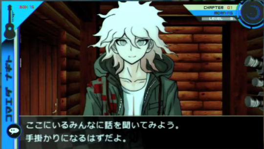
Then, we have the final sprite:

Cool. So...what about this sprite?

I know it might be hard to tell at first. But that's what .gifs are for!
On the left is a comparison of this "middle" sprite (so I'll call it) with the final one, and on the right, it's a comparison with the earliest "smirking" beta.


You can clearly see it's different from both sprites.
At first, since this is a Danganronpa S sprite and is only used in DRS game-wise, I figured it may actually just be a case of his mouth looking weird due to the Switch's file compression.
But take a look at this piece of merch, which would not be confined to being pixelated.
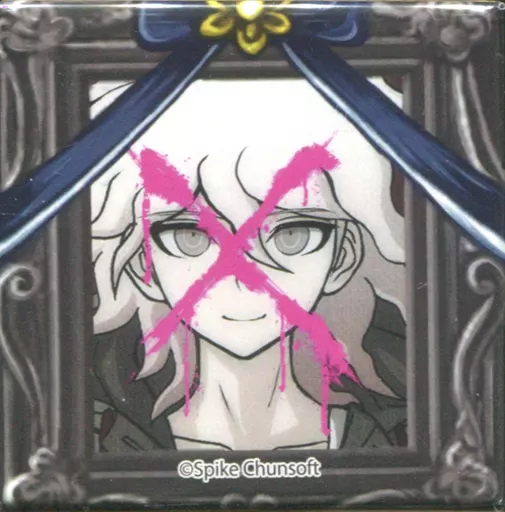
It's obviously the same sprite. To prove it, here's a chart I made:

You'll have to zoom in to see it. But it does show these are different versions.
Okay, so...what does this all prove?
Well, there's two theories I have in mind.
Theory one is that my three-step design phase is more like a four or five step phase, with some characters getting more alterations than others. Which honestly leads into my second theory that doesn't even contradict theory one: we know Komaeda's sprites were especially redone late into development. Therefore, he may have more minor tweaks done to his sprites than any of the characters.
I don't really have many thoughts on this...other than damn, I wonder what OTHER Komaeda sprites have had extremely minor changes made to them. This I will investigate when I look closer into DRS sprites.
Okay, so onto Kamukura. Same merch line, too.
Two photos just for extra reference, but I think the difference is obviously clear. His eye color is the same as Hinata's.

Reference gif just to cover all my bases, and I found something interesting. The first fold of clothes, right next to his collar on the left, is lined differently. It's thicker and the extra, very thin line is missing.
This would indeed indicate an earlier version of the sprite, and is in fact the same one used in UTDP and DRS.


I think what's funny is that Kamukura's eyebrows are colored in on this merch, but in the DRS/UTDP sprites, they aren't. Funny oversight I guess, but that honestly makes me wonder what the deal is with this image used for the merch.
The lack of color in eyebrows in the UTDP/DRS sprites suggest that they are earlier versions of this one used in the merch. But the biggest question becomes why would a stage 2 of 3 (in this given timeline) not have the red eyes if the others do? Either Kamukura was originally meant to have Hinata's eye color, or it was changed solely for this merch. Which...would be weird. They've never done that before, I don't think.
The other option is the early Kamukura sprites used for DRS/UTDP in fact did NOT have red eyes and they had to manually re-color them. But at that point, they would know these were beta sprites and not the final version. Did they not have access to the final version anymore, then? Or only the shadowed version?
Furthermore, I just noticed Kamukura's pupil in the UTDP/DRS sprite is misplaced...while the pupil is in the same spot in the SDR2/the merch sprite. Also his eyelash no longer peeks out from over his hair.

This is all giving me a headache so I'm going to bed lol.
Anyways, strange stuff.
34 notes
·
View notes
Text
I discovered this the other day and while I should probably cover it in the Dangan Island part of my 4 part post, it's killing me enough that I need to talk about it now.
So, in this post I talked about how Danganronpa S and Danganronpa UTDP use beta sprites and they were the only Danganronpa games to used beta sprites (besides the Dangan Island opening in SDR2).
I was wrong.
Because not one, but five of Komaeda's beta sprites are used constantly in SDR2. And I never noticed until the other day when I was replaying trial one and saw one of his beta sprites and went, that's not right!!

This is from the PSVita version of SDR2, not the PSP original, so it's not like this was an oversight that was patched out.
If you're confused, this is the final sprite:

Which may be hard to tell at first glance, but let me do a gif comparison for you:

The reason these beta sprites only show up during the trials and not during normal game play is because the trials use their fullbody sprites and not the half-portraits. It seems that the team fixed the half-portraits but forgot to go back and replace the fullbody sprites with these new updated ones before releasing the game.
Below are all the beta fullbody sprites I caught (excluding the one I just showed). I won't be doing a comparison gif for all five because DRS actually uses all of these beta Komaeda sprites and more, so I'll do it when I get around to making that post. But here are the sprites in question:


As far as I can tell, Komaeda is the only one who's fullbody sprites weren't updated...but there's a very good chance that I could pick out other characters if I combed through every fullbody sprite.
47 notes
·
View notes
Text
On: Sprite Files Inside SDR2
Specific characters have repeat sprites within their sections. The reason for this is unknown, but I have to assume these sprites are used as placeholders, either in place of sprites that were once meant to be made but never were and so pre-existing sprites were saved over, or perhaps for specific coding purposes. Either way, I will list them out in order.
First: how the sprites are listed. They are all named bustup_[character numer]_[sprite number]
For example, this is bustup_00_00

This is bustup_00_01

So on and so forth.
Character numbers: 00: Hinata Hajime 01: Komaeda Nagito 02: Togami Byakuya (Imposter) 03: Tanaka Gundam 04: Souda Kazuichi 05: Hanamura Teruteru 06: Nidai Nekomaru 07: Kuzuryuu Fuyuhiko 08: Owari Akane 09: Nanami Chiaki 10: Sonia Nevermind 11: Saionji Hiyoko 12: Koizumi Mahiru 13: Tsumiki Mikan 14: Mioda Ibuki 15: Pekoyama Peko 16: Monokuma 17: Monomi/Usami 18: Enoshima Junko 19: Nidai Nekomaru (Robot) 20: Naegi Makoto 21: Kirigiri Kyoko 22: Togami Byakuya (DR1) 23 Does not exist (may be the narrator; aka green text in game) 24: Alter Ego (NWP)
Onto the oddities, in order.
Komaeda (01)
bustup_01_29 and bustup_01_30 are repeats of bustup_01_00.

Togami (02)
bustup_02_15 is a repeat of bustup_02_00.

Kuzuryuu (07)
Though none of Kuzuryuu's sprites are repeated in the files, there do exist a version of each sprite with and without an eyepatch, even if that version is never used in the final game.


Nanami (09)
bustup_09_23 is a beta version of bustup_09_22 still left in the game files. Oddly, the sprite is low quality despite every other sprite's resolution being upped to match the PC port. This isn't due to the fact that the sprite goes unused, as the anti-piracy message screen is also upped in quality in the PC port, despite the fact it has never been used outside of the original PSP version and thus can only be found by looking through the games files.


This beta sprite is not lost in a HQ, however, as it is mistakenly reused for a character card in UTDP.

Pekoyama (15)
bustup_15_21 is a beta version of bustup_15_00 that goes unused in the files. Like Nanami, it suffers from low quality. I have yet to find an HQ version of this sprite used anywhere else, sadly.


Here is a comparison gif:

It can be a little hard to tell but please direct your attention to her left ear. The beta sprite has much more volume to the ear than the final sprite. This is the same one mistakenly used in the Student Handbook in the PSP version of the game (also low quality). If you locate a piece of merch, section in a game or anywhere else that has a HQ version of this beta sprite please let me know!
Monokuma (16)
bustup_16_40 through bustup_16_53 are all un-shaded, slightly bigger versions of bustup_16_00.


(if you want to be technical, it's actually an un-shaded version of DR1 Monokuma sprites, as SDR2 Monokuma has an added outline to the black part of him that DR1 lacks.)
Monomi/Usami (17)
bustup_17_22 through bustup_17_29 are all beta, uncolored and slightly bigger versions of bustup_17_00. This was back when Monomi's cheeks had black outlines, which was a staple of her beta sprites.


And yeah, that's about it.
14 notes
·
View notes
Text
Beta Hajime Hinata Sprite Analysis
So I have yet to make part 2 of my big beta sprite post but I want to make this post because...why not.
So, a little context. Today I'll be talking about this sprite:

Because out of all the Hajime sprites that I currently have knowledge on, it's the one with the most complex history.
I won't bore you with reiteration if you've seen my Part 1 post, so please go read that if you want extra context on the existing beta SDR2 sprites. But basically, in a nutshell, DRS used quite a few beta sprites for their swimsuit sprite sets. As such, this is the sprite used for Hajime in this pose, a comparison gif included:


Fun fact about comparing these sprites, is that Danganronpa commonly will change the line art of their sprites, but not fix the coloring layer.
For example, since Hajime's eye was moved further left, the...general prohibition sign, I guess, in his eye is no longer dead center like it was obviously meant to be.

You can see the blue area fluctuates in width on the final sprite (left) while in the original sprite, it was as intended. This is very common. Several other Danganronpa character have this issue. Off the top of my head I can name Nagito, Kauzichi, and Junko who have this kind of color error in one or several of their sprites.
That, aside, please now look at this picture from the Japanese SDR2 PSP manual (which I scanned and uploaded myself - you can find the full manual here).

This sprite is even earlier than the one shown in DRS. Sadly because of the manual's printing quality, it's hard to make out details, but...with a bit of computer magic (blurring the photo and Hajime's sprite) we can better do a comparison.


So, here's what we can tell about the facial differences: his eye was longer, his hair was sharper (including extra black outlines), his mouth was slightly more slanted, his ear was bigger (un-detailed ears are a telling sign of a Danganronpa beta sprite) and his eyebrows looked meaner. In general, I've found many of Hajime's earlier sprites to have been designed to look meaner, likely because conceptually, he was always meant to be a more "assertive" and "masculine" protagonist to counter Makoto, who spoke rather casually but politely in the Japanese version. Hajime on the other hand speaks much more roughly (his rudeness is more akin to how Byakuya talks. This detail was lost in translation though...) so it makes sense his sprites were originally planning to reflect this "meaner" protagonist image.
For fun I attempted to edit Hajime's DRS sprite and put together what this theoretical early beta may have looked like.

Far from perfect but it gives an idea. I also found through editing the sprite that Hajime's torso was sized down in the final sprite. I really only focused on editing his face so some minor details on the shirt were largely ignored.
I promise I'll make that part 2 post sometime this month...maybe.
27 notes
·
View notes
Text

The SDR2 artbook, where we get a look at beta interfaces, uses a Makoto beta sprite. This is noteworthy because we basically have 0 beta sprites for DR1.
It's a full bust-up version of the beta sprite seen in the DR1 PSP screen:

(I talk about this more here)
for comparison, this screen was updated for the 1・2 Reload Vita release, and thusly all English releases. (therefore this beta would only be seen by Japanese players on the original PSP version)

The easiest way to tell is Makoto's right bang. On the beta sprite, you can see the whites of his eyes to the left. But on the final sprite, his bang is bigger, covering his eye more.

Despite the bad quality, we can see the whites on Makoto's eye on this scan. This is likely the same beta used in the DR1 PSP startup screen.
Also if you're curious about the text, all three images show the textbox as being ヒナタ ハジメ speaking (Hinata Hajime). The text itself is just the vowels あいうえお or a i u e o.
Curious to note that the background in these screenshots does not appear in the final game. It may have been an early version of the beach or Jabberwock park. Or, it was a mock-up never intended to be used as a final background at all.
17 notes
·
View notes
Text
I was browsing Nicovideo trying to find this old Danganronpa animation someone made eons ago that I remembered when I stumbled across this. I clicked it right away because I could tell that it was a beta Monomi sprite in the thumbnail (one I hadn't seen before!)
It's a commercial for SDR2.


early beta Monomi sprites are easy to tell, because her cheeks are outlined.

Almost every sprite here is a beta version in some regard...granted, a lot of the differences are very small, and unless you're someone like me who is actively looking at this picture with the knowledge of beta sprites in mind, you probably wouldn't even realize it.

These are the ones i know for sure are off in one way or another just by looking...
When it comes to beta Danganronpa sprites...the work timeline of how the sprites are developed continues to elude me. But I have a working theory so far.
1: draft sprite. This is the sprite that first gets put into the game. Ranges from very poor quality to close to phase 2, but both version lack line weight.
2: clean-up sprite. These are the beta sprites that we sometimes see, because they are accidentally re-used. If you aren't paying attention, they can be often mixed-up with the final sprites.
3: final sprite. As the name would suggest, this is the sprite we see in the final game.
Here is an example of a sprite which we have all 3 phases of:


The first phase is the hardest to find images for, for obvious reasons. It's usually very obviously not finished, so it's never released into the wild. The fact we have that first image there is honestly a miracle.
Sometimes, though, phases 1 and 2 can look very similar - or phases 2 and 3 can look similar.


I've talked about the "smirking Komaeda" beta sprite in the past. But believe it or not, those first 2 images there are different (I'm 90% sure at least). It's just the changes made between phases 1 and 2 were so minor it's almost impossible to tell. That, and the image's bad quality makes it tough.
That being said, Komaeda's hair does have some line weight to it in the draft sprite, so it was either done from the get-go or that is actually phase 2, meaning there's an earlier sprite...but I kind of doubt it. But, I don't know for sure.
Anyways, I will elaborate on all of this at a later date because we do have at least one draft sprite for the majority of the characters thanks to a Japanese gaming site talking about when the game was first announced. Right now though, I wanted to share this with you all.
9 notes
·
View notes
Text
im starting to believe i may have to comb through ALL of DRS/UTDP sprites more carefully...........at first, i thought it was just hinata/komaeda who had their beta sprites reused. in DRS that seems to be the case so far.
but checking UTDP, not only do we have that case with Nidai (all his sprites are beta versions) but i JUST found out its the same for Monomi!?!?


example: beta (left - UTDP) vs final (right - DRS/SDR2). Note the way the sweat is drawn. It's clearly different (among other things like shading and the cheeks being more prominent in the beta)
It's so bizarre the implications of all of this. Not only does the Dangan development team keep prior versions of sprites on hand, but they routinely get mixed up in future game releases. WHAT does the work environment look like!? What is their organization method? Clearly, they don't have one...
I mean don't get me wrong. Because of their mistakes I can access beta sprites I otherwise wouldn't be able to. But ohhh my how does this happen...
10 notes
·
View notes
Text
Exciting news! Another Makoto beta sprite has been unearthed! In the SDR2 artbook again of all places.

Any color differences is simply the result of the paper being scanned digitally, and thus the color balance is off.
The sprite is instantly noticeable as being a beta since Makoto's hair lacks any lighting.
In this sprite we can see his face was once rounder, his eyebrows a little more sharp, and his neck a little thinner. His bangs were partially redrawn along with his ear, and his nose was moved up. Also, his pointing hand gained more detail and a button on his jacket was moved slightly.
18 notes
·
View notes
Text

ENGLISH/日本語 OK
日本語でメッセージを送ってもいいよ。
I love language/linguistics. You have permission to come into my DMs/Inbox unprompted and lecture me on any language you know.
I have a website where I upload my sprite rips, sprite edits, games I make, translation posts, and other fun stuff.
I tag media in any given post so you can filter anything out. If you have a problem with something I reblog, filter it or just unfollow. I do not tag spoilers so if you don't wanna be spoiled on something I'm reblogging or posting about you gotta filter it.
I don't have a DNI; I just block whoever whenever.
Feel free to always send me asks relating to anything I post or whatever else :>
Currently very into talking about Danganronpa beta sprites & translation.
not now Mr. President more important matters are at hand.
Art blog: @dew-creek


CARRIAGE WEBSITE (FLASHING LIGHTS)


#;noxiatalksia#;noxiatalks2ya#;noxiasmovingpictureserials#;shortstory#White Happy#Anata Kraken#Rain and Petra#Planet Masshirake#Dance of Venus#Panopticon#Hamster Dance#carriagecore#watchmojo top 10 moments before account deactivation#;noxiasmildlyimportantstuff#;danganbetasprites#;translationtalk
7 notes
·
View notes
Text


The original PSP version of Danganronpa: Trigger Happy Havoc (Japanese only) seems to use a beta sprite of Makoto on the title screen. Furthermore, whenever you boot up the game, no matter what, the character who will appear besides Makoto will always be Celestia.
When the Japanese versions of Danganronpa 1 and 2 got ported to the PSVita as "Danganronpa 1・2 Reload", minor graphical changes were made. Notably, the title screen for Danganronpa was updated to use the correct sprite for Makoto, as well as the character selected for the side profile being truly random this time.
The English versions of Danganronpa: Trigger Happy Havoc and Super Danganronpa 2: Goodbye Despair are built off of the PSVita re-release versions of the games, but sold separately like how they were in Japan on the original PSP. Going further to mimic the "sold separately on first release, sold together on second" pattern of the Japanese originals, the second time English Danganronpa was ported to a Sony console, that being the PS4, it was a straight port of Danganronpa 1・2 Reload, but with the PSVita English patches for both games placed in. As a result, the only way to experience any of the original glitches or visual oddities of the first two Danganronpa games is to play the original Japanese PSP versions, as there exists no official English port of those specific releases.
As an aside: the well-known, used-to-be universal fan-translated patch for both Danganronpa games were of the PSP versions. These fan projects are the only way to play the games in English.
#danganronpa#dr:thh#makoto naegi#celestia ludenberg#dr#;noxiatalksia#;noxiasmildlyimportantstuff#;danganbetasprites
12 notes
·
View notes
Text
I want to amend something: I made a mistake.
Nidai's sprite was not changed!! I was using UTDP's sprites in these comparison gifs because, as far as I could tell, they were the exact same as SDR2's sprites. Plus, UTDP's sprites are a much higher resolution than the SDR2 sprites, and worked better when making a gif comparison that hinged on picking out visual differences.
The sprite of Nidai shown in the wallpaper is actually the finalized sprite used in SDR2. For some unknown reason, UTDP actually used a beta sprite of Nidai. DRS does not use a beta version for that Nidai sprite. I have no clue why UTDP did this. I am just as confused as the rest of you.
As a rule of thumb: when comparing two of the same Danganronpa sprites and trying to figure out which one is the beta, the one with less detail in the ears and/or with thicker line art is the beta one. I can't believe I didn't catch this.
If any of you notice any more mistakes I made please point them out. I think this is the only one. I will reiterate this in my official UTDP post when I make it.

Here is the proper version. As you can see, Nidai's sprites (or this sprite, at least) were finished at this point in time.
So, when Danganronpa S was released (and V3's UTDP but I'll get to that later...) Hinata and Komaeda were given noticeably different versions of their pre-existing sprites for their swimsuit versions:
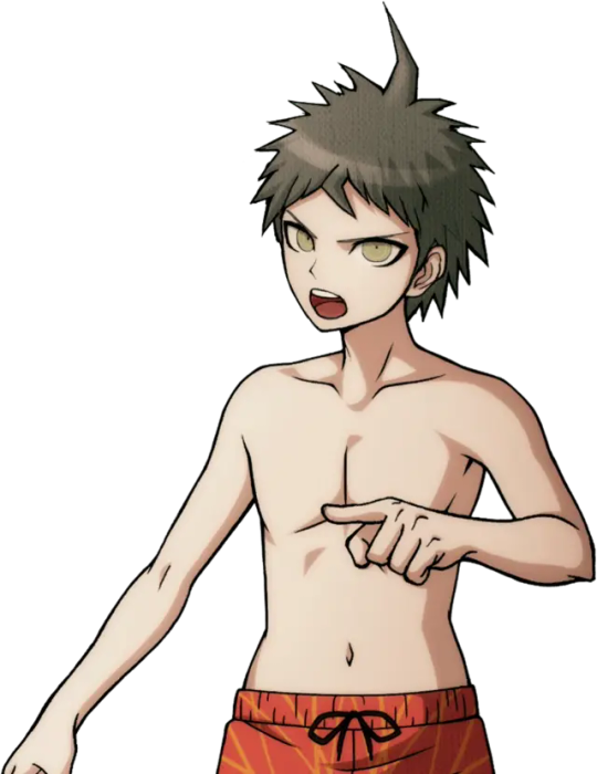
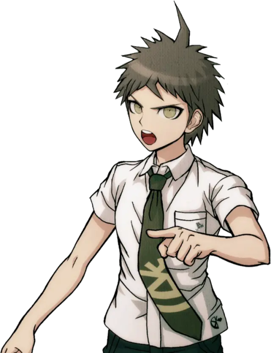
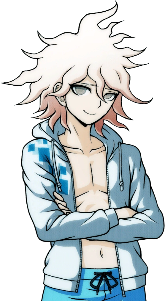
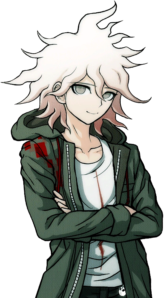
If you struggle to see a difference, note Hinata's wider mouth in the swimsuit ver., and Komaeda's narrower eyes and more outlined smirk in his swimsuit ver.
I, along with many people, always wondered, why? Why change these already perfectly fine sprites and, honestly, make them worse? What gives?
Then, I stumbled across something. Back in 2012, before the Japanese release of Super Danganronpa 2, you could play an online monomono machine to win little goodies like desktop backgrounds and profile pictures. Please note these pre-release desktop backgrounds for Hinata and Komaeda:
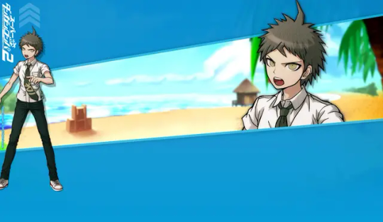
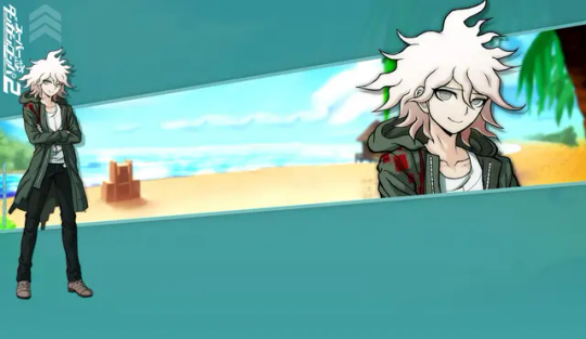
...So, wait a minute. The sprites used in Danganronpa S aren't new edits, but beta sprites? Older than the ones featured in the original SDR2? Turns out, this website features desktop backgrounds using beta sprites for nearly every character that otherwise never saw the light of day.*
I'm going to go through them one by one, gif comparisons included. This won't be the only post, either! UTDP also has some very interesting likely beta art used in it, too. As well, some of the other sprites featured in Danganronpa S may also be reused beta sprites!
As such, this log will be broken into three parts. This is part 1.
[Part 2 - UTDP (not made yet!)] [Part 3 - DRS (not made yet!)] [Part 4 - Dangan Island (not made yet!)]
*with the exception of UTDP in some cases, as well as some other things I will get to in Part 4.
As said, semi-flashing gifs will be included in this post. They are meant to swap between the beta and final sprites at a fast pace to illustrate the differences (2 frame, half a second each). Be cautious if you have epilepsy.
Also, because of Tumblr's stupid image limit, this post will have a reblog with the rest of the sprites! So please check this post's reblogs, it should be the first one!
Firstly, how do we know these are actually beta sprites? These images are sourced from the Danganronpa fandom wiki, and while I generally trust the wiki's credibility, it's always imperative to fact-check. So, I went ahead and searched Danganronpa's old website on the Wayback Machine and uncovered this:

A character intro page for Hinata, using this same beta sprite. Now, granted, the only capture of this page is from 2015. Still a year before V3 and a few more before S, but still, it's not the 2012 original. That said, a character intro page for Mioda circa early 2014 looks exactly the same, including the usage of her beta sprite.
And, when you click on the button that says スクリーンショット(Screenshot)...
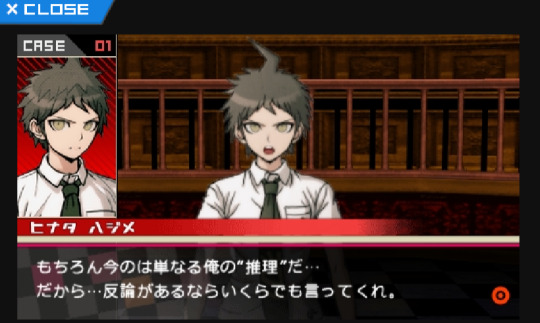
You're offered a very obviously beta trial shot. As is common with Danganronpa trials, in development, the actual character portraits are not put in until later, and to substitute, their art reference photos are used, as seen on the left.
With that out of the way, I think it's safe to say these sprite we are about to look at are indeed betas.
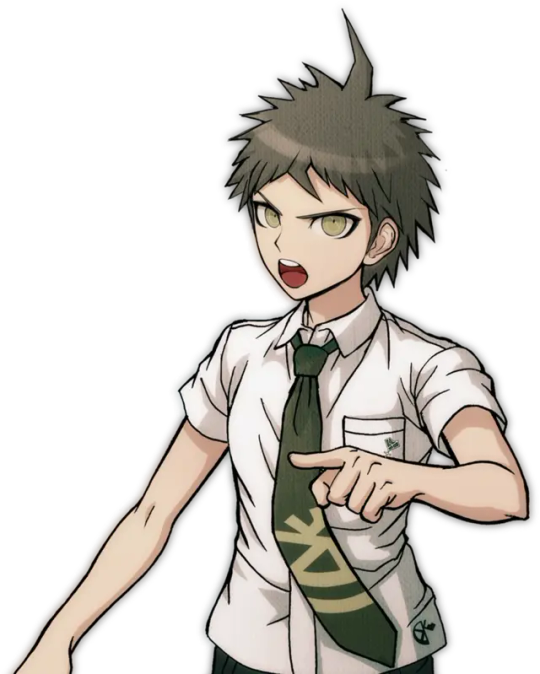

It's only fair, then, we focus on Hinata first.
(Please note for all the comparison gifs I had to manually size the final sprites to get them as close as possible in aspect ratio. Very minor size difference between sprites is likely a result of this and not an actual detail change.)

A lot is revealed with a simple gif. Hinata's entire face shape was changed (including ears), not just his mouth. In fact, not just the shape of his face, but the face itself is drawn very differently in the end. The neck of his shirt was raised, as well as tie being redrawn (you can actually see where the new part begins somewhat sloppily). Less notable but still apparent are his bangs being redrawn and shaded differently.
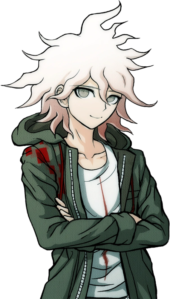

Keeping with consistency, let's check out Komaeda next.
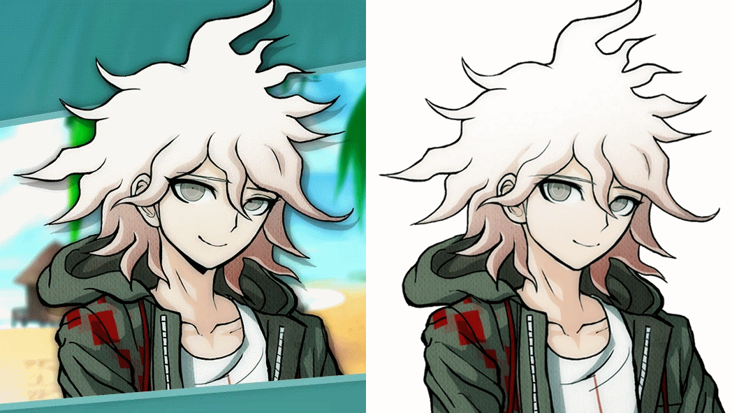
Yet again, the differences are striking when flipped back and forth. Komaeda's face shape and ear was redone much like Hinata, but not to nearly the same dramatic extent. As well, his entire face was redrawn, notably erasing the black shading under his chin and shortening his eyelashes. Less noticeable, the hair touching his neck is shortened a bit, and the crease line on his hood is more well-defined. They also slightly changed the line art for the first fold in his shirt, the neck at the back of his shirt, as well as his leftmost bang. Interestingly, they either forgot or didn't care to fix the shading to reflect the new placement of these lines. His jacket also has some changes in line art weight.
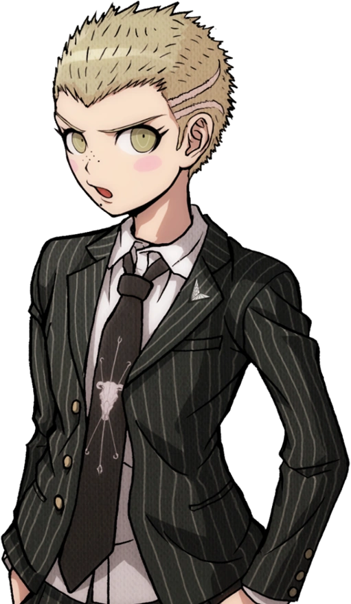
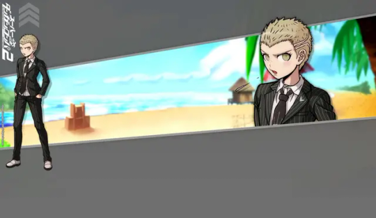
With Hinata and Komaeda out of the way, let's touch on Kuzuryuu.

This one honestly shocked me. Besides the added detail of him spitting, I didn't notice any difference right off the bat until I overlayed the images, but the differences are night and day. His eyes are made to be less mean and more skeptical. His mole was shrunk and his nose is more 3-dimensional. Extra detail is added to his ear while his hair is redrawn in whole, including it being slightly shorter. What's most interesting is the fact the body was sized up and moved down several pixels, I imagine to change the perspective. Some minor line changes are made to the white undershirt of his suit.
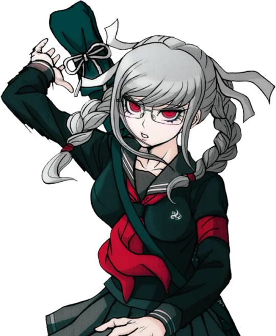
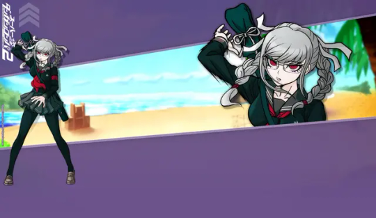
It would be improper not to do Pekoyama next.

Again, just like Kuzuryuu, I didn't notice half of these changes at first. Pekoyama's whole face is slimmed. The outer outline of her hair remains the same, but almost every outline inside of it, including her bangs, changes. (Although, her right twin-tail has a slightly longer end to it.) Her outfit receives minor touch-ups, including a clothes fold on her breast and darker shading by her collarbone. Speaking of, her neck muscles and such have been redrawn. Most interesting to me is the fact Pekoyama's outline is noticeably thicker with action lines in the original beta sprite, but lack them in the final sprite as if somebody used the magic wand tool to edit the background out, editing away some of the jagged black lines in the process. She is the only character where this happens.
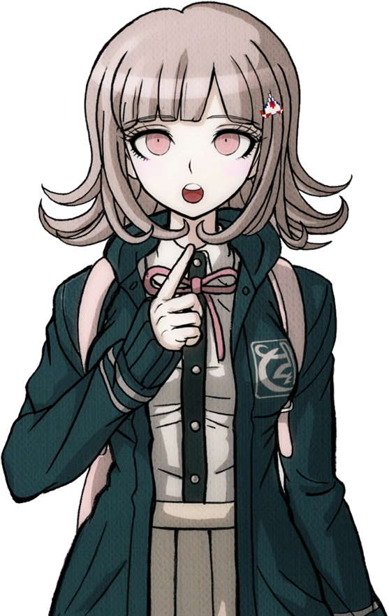
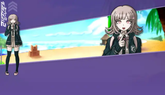
Since she is a major character, let's do Nanami now.

I wasn't surprised to find Nanami has virtually no difference about her. Her design was pretty much set in stone early on. That said, it's not entirely the same. Though very minor, the thickness of her left eye was increased at the top. As well, shading across her pinky finger was removed. There is also a chance her body is slightly bigger, but that's more likely to be a result of me failing to perfectly match up the two images.
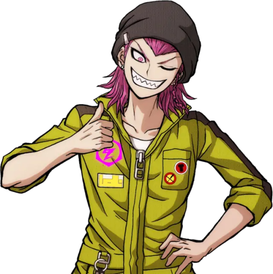
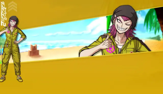
I want to focus on Souda now as he was the first one I did this test with.

You know, when I first played SDR2, I thought Souda looked kind of scary. His beta is even scarier looking! I can see why they changed it...Every detail on his face is redrawn including his chin, notably his pupil was enlarged and his eyebrows were quirked. Funnily, it seems the clip on his beanie was redrawn, but like Komaeda, they didn't edit the color layer to match the new outline. Some minor line art changes were made to his back hair. The lines for his neck and collarbone were lessened, and the jacket zipper is made more three dimensional. His thumb was fixed too, as well as the lines on his hand.
Also, here's a fun little thing I noticed while replaying SDR2 just a few days ago!

The sprite used for Souda in the Dangan Island opening is the exact same as the beta sprite! This would be the only time Westerners would catch a glimpse of some beta sprites until UTDP, as keep in mind, these wallpapers were exclusive to the Japanese Danganronpa website.
In fact, Souda isn't the only one with a beta sprite in the Dangan Island opening. I will also be covering that in part 4.
Moving on...
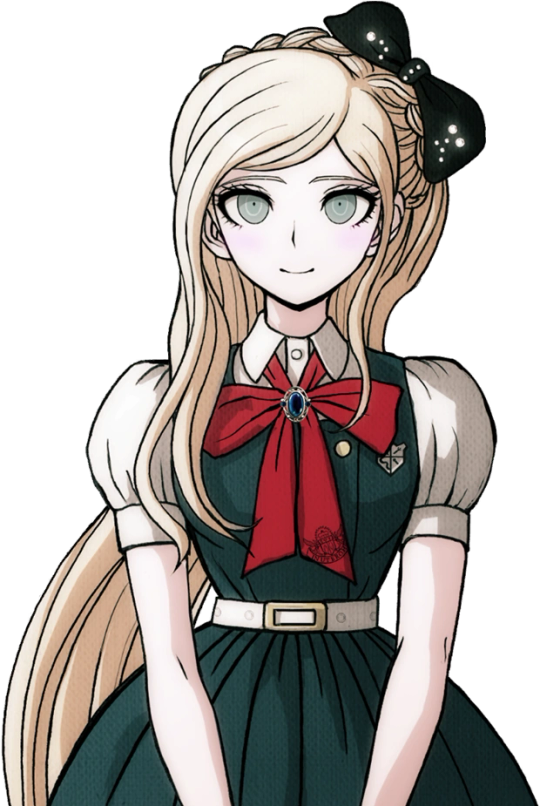
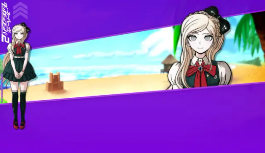
I guess it's only natural we look at Sonia's sprite next.

Changes like these ones are very interesting to me, because if you did not do a side-by-side like this, you may never see how many minor details were changed. A lot of Sonia's line art was redrawn to be more detailed, such as more lines in her hair, thinner outlines for her braid, and redrawn creases in her shoulders and bow (as well as a redrawn button). Her face is interesting as some very minor changes were made. Some detail is added to both ears (thicker outline on the right, changed line art on the left) and her left eyebrow is slightly edited. She was also given extra eyelashes on both sides. When it comes to such minor changes, it makes you wonder why they bothered at all. I wonder what the development looked like.
Anyways, please check the reblog for the second part! That's where the rest of the characters will be!
#;noxiasmildlyimportantstuff#;danganbetasprites#hajime hinata#nagito komaeda#fuyuhiko kuzuryu#peko pekoyama#chiaki nanami#kazuichi souda#akane owari#sonia nevermind#gundham tanaka#nekomaru nidai#mahiru koizumi#hiyoko saionji#mikan tsumiki#byakuya twogami#teruteru hanamura#ibuki mioda#danganronpa#sdr2#;noxiatalksia#dr
112 notes
·
View notes
Text
btw retroactively went back and added special tags to my danganronpa beta sprite posts & danganronpa translation for easier access. ;danganbetasprites and ;translationtalk
1 note
·
View note