#my bookbinding
Explore tagged Tumblr posts
Text


Kuroshitsuji volume 3, rebound in red paisley cotton with acrylic edge painting, metal corners, and stick on endbands made from scrap fabric.
#my bookbinding#it looks good but not great. i haven't done it for a while to be fair#bookbinding#kuroshitsuji#black butler#would Grell be proud? i hope so
143 notes
·
View notes
Text


It’s been a minute since I made a book, but I’m finally done with this copy of The Grindr Logo Doesnt Even Have a ‘G’ In It, an Aziraphale/Crowley fic by @indieninja92 ! This story has fucking everything. It’s achingly tender, funny, hot, and heartwrenching by turns, and I can’t recommend it highly enough.
(Tumblr mobile refuses to let me paste links for whatever reason, but it can be read on AO3.)
I had a hell of a time figuring out a design forthis one. Instead of designing a dust jacket like usual, I opted for a paper label/cover and I think it turned out really well! The silk moire was a real bastard to work with and was more finicky with the glue than I like, so I’ll be sticking to cotton-based bookcloth in the future. The iPhone text headers were fun to play around with though! 😄
Technical details ➡️
Book cloth: Silk moire in platinum from Hollander’s
Endpapers: Chiyogami fireworks from Hollander’s
Fonts: SF Rounded (title) and Sabon (body)
Designed in Photoshop and Canva
‼️ My binds are not for sale. Authors and artists can request gift copies. Keep fanfiction free and legal! ‼️
Tagging @goodomensafterdark for visibility
#bookbinders of tumblr#my bookbinding#bookbinding#bookbind#fanbind#fanbinding#fanbinders of tumblr#ficbind#ficbinding#good omens#good omens fandom#good omens fanfiction#good omens fanart#ineffable spouses#ineffable idiots#ineffable husbands#aziraphale x crowley#aziracrow fanfic#aziracrow
251 notes
·
View notes
Text


Had so much fun binding still need your teeth around my organs for the Renegade Tiny Book Bang this summer!
Typeset (and photos) by @just-a-pollicle.
This fic is gorgeous and set in a swamp, the main character has purple eyes, and the trio ship is called Bouquet, so I had so much to visually work with. I kept picking it up and going "what if I add just one more thing..."
Materials/techniques below the cut
Bookcloth Duo Lagoon. Edge and title paintJaquad Lumiere Halo Violet Gold. Cover paper by Southwest Pattern House.
Some of my earliest sewn endbands, and my first Oxford Hollow! Title was stenciled on, which I would not do again at this size on a rounded spine. Edges were power sanded to smoothness before being painted.
150 notes
·
View notes
Text


Don’t Let Them See You Cry by @daisyapples 🦋
Finished working on this fun birthday present for @speaching and I’m obsessed with how it turned out! Bookbinding is such a fun hobby, I really can’t explain how satisfying it is to create an idea and then get to have your favorite stories in your hands with your own work and love put into it. 10/10 hobby, would recommend! The art on the dust jacket is by @ mohishko on Instagram! They were very kind to let me use it for this project and I feel like it ties the whole thing together 😌
Please do not buy or sell fanfiction! This was all made entirely by hand for the purpose of gifting to a friend, it is illegal to buy or sell fanfiction 🖤
#bookbinding#fanfiction bookbinding#my bookbinding#my art#in a way#not the dust jacket though#jason todd#bucky barnes#fic rec#fanfiction recommendation#bucky barns fanfiction#jason todd fanfiction
93 notes
·
View notes
Text
FFWAD 24 - Sins of the Father by @selfproclaimedunicorn
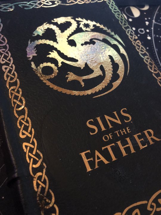
For my first foray into this yearly celebration with @renegadeguild, I picked the brilliant and fantastic story, Sins of the Father by @selfproclaimedunicorn. Misa has taken the fantastic AU premise 'What if Daemon Targaryen and Rhea Royce had kids?' and has run with it in the most delicious and satisfying way. The story isn't complete, but the first 'arc' has a good stopping point at a whopping 160k words, which made for the chonkiest book you could imagine.
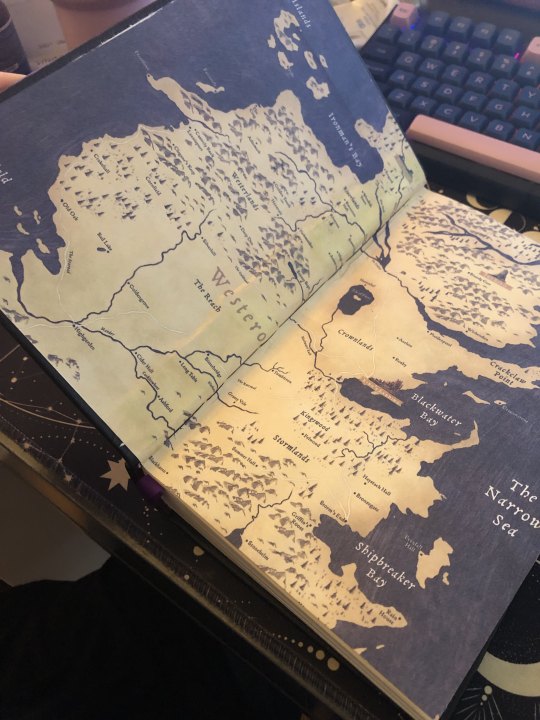
This was the twelth book I've bound (both fic and rebinds of old favorites) and I tried several new techniques for it including rounding and backing the spine. I also stretched my legs in the formatting department and went all in with the interior. That meant ordering some special springhill paper to do these fantastic maps for the endpages. Full details behind the cut!
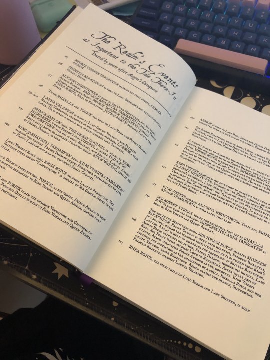
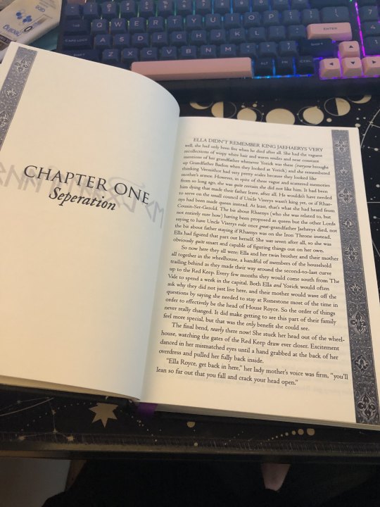
Typesetting: Normally I've kept my settings pretty minimal as I got used to the ins and outs of InDesign (during this, I did purchase Affinity Publisher and might end up moving to that, but I'm finally getting the hang of ID and you can pry it from my cold hands). I really wanted to mimic some of the interior of Fire & Blood for this, so I hunted down the fonts used and took an image of the decorative banner you see on the sides to use for the chapter openers. I also wanted to include timelines and family trees in true historically inspired fantasy tradition.
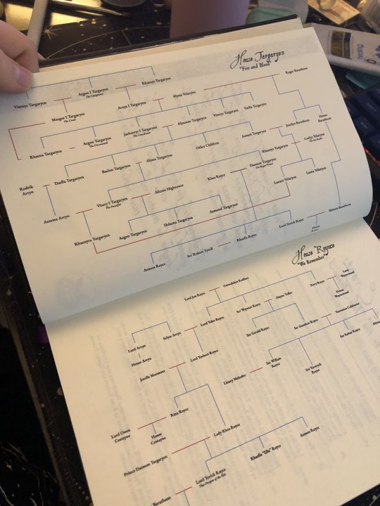
The family tree was created based off of the author's spreadsheet in Google Drawing, which I found to be the easiest thing to use when it comes to creating chaotic family trees like this (In the past I'd used lucid chart for a printable version, but google worked better here).
the timeline is honestly my favorite thing and I learned how to use tables in ID for the first time. I'm incredibly pleased with it. The formatting is based upon the line of kings in the source. The timeline covers the events of the first arc as printed in this particular story.
The chapter openers are some of my favorite! As the children are proud to be House Royce, I wanted to reflect that. The runes you see behind the Chapter number and title are the Floki font and name the character whose the POV for each chapter.
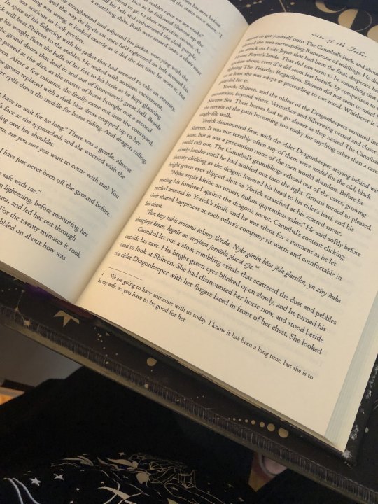
Since there's plenty of High Valyrian spoken and the author doesn't include the translations within narrative, it was the perfect moment to set up footnotes. I'll absolutely be doing this for my own story when I bind it!
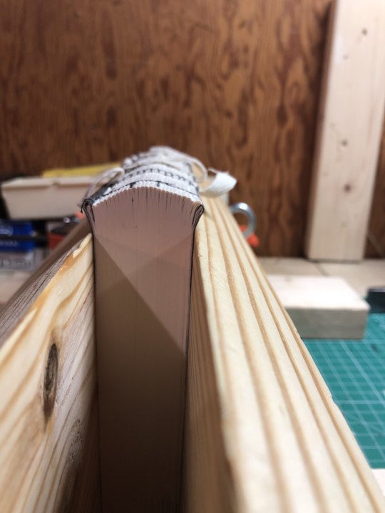
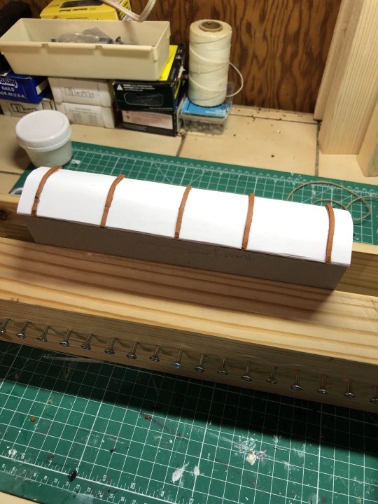
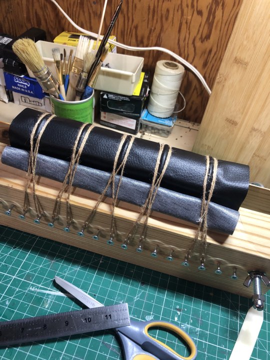
Rounding and Backing: So this was a total adventure, but I really wanted the old book feel. I made the mistake of pressing the book for too long and lost a lot of the swell in the spine to round but it worked out AND I managed to back it a little bit. Since I wasn't doing cord tapes for the spine (this was a version of the three piece bradel), I had to troubleshoot. I ended up cutting strips of the leather cord I bought from michaels and laminating those pieces together and placing them on the oxford hollow on the spine (given how thick the book is, I wanted to give it as much structural strength as possible). The 'leather' covering you see is actually the craft leather (polyester) from Dollar Tree and it's pretty awesome but definitely has difficulties staying put with glue. I followed the normal procedure and slathered both sides up and used twine to compress the bookcloth along those leather pieces. there's a little gaping in some places which I think would help if I'm able to properly apply backing paper to the polyester.

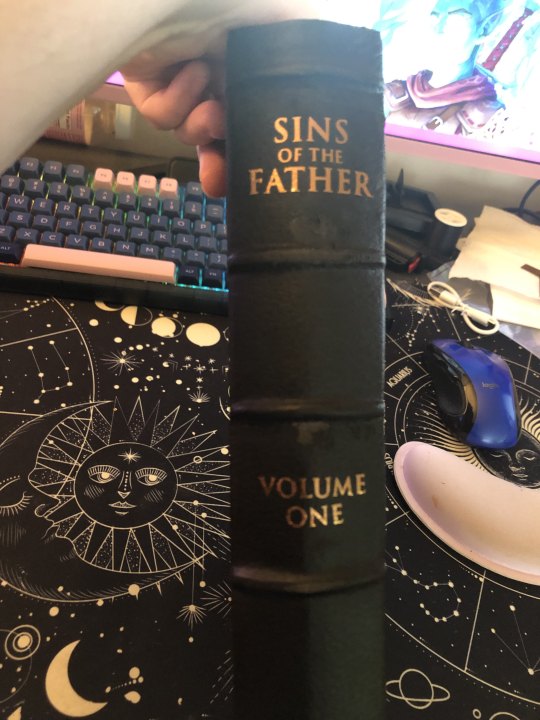
HTV do's and don'ts: Hi! don't be me and forget to apply your teflon sheets before applying the HTV because then you fuck with the polyester but it's not too bad. The other pro-tip is to gently apply the iron to the cover so it's warm before applying the HTV so it can start to stick. I had to apply the front cover in three pieces and do the title twice. Also, it's really difficult to apply HTV to a rounded spine so I'll have to figure out how to set up the spine and cover before applying (since there's a certain amount of stretching the bookcloth over the spine). The spine might end up having to be regular adhesive vinyl for that. Also, it's stupidly hard to find metallic HTV in bronze.
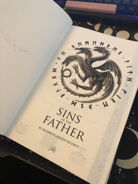
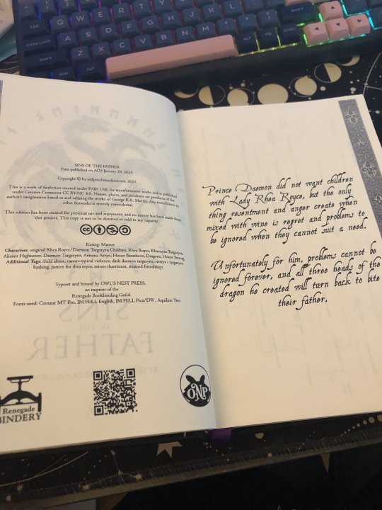
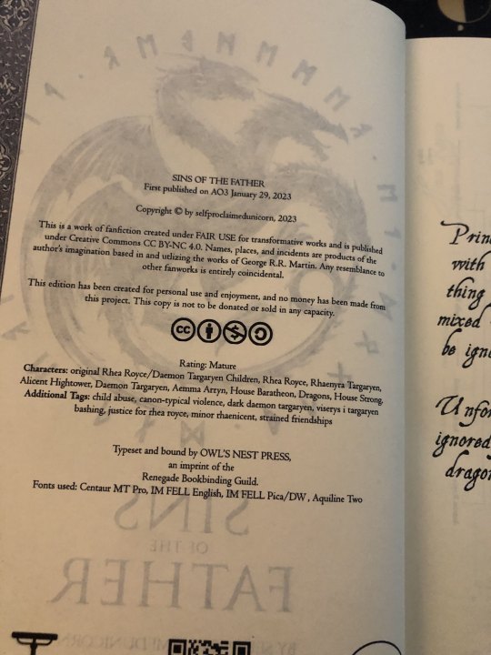
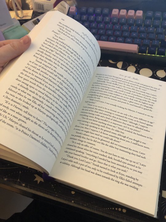
Front matter and final thoughts: The bronze dragon was a lucky find through an extensive google search, and the runes surrounding it are 'we remember with fire and blood', a combination of House Royce and House Targaryen's words. Seems fitting four Yorick, Ella, and Aemon! The copyright page is mimicked off the source's style, including the AO3 information, the creative commons and fair use information, the guild stamp, a QR code to the AO3 page, and my own press stamp! The summary is pulled from AO3 as well.
All in all, I made this book twice and I loved it and learned so much every time.
I'm so happy with this project and I'm so excited to do the next arc! Thank you so much for sharing your wonderful story, Misa!
160 notes
·
View notes
Text
Did just a little bookbinding project this weekend. A few days ago, I came across this prayerbook from 1895 by Lilian Montagu, an important figure in turn of the century Reform Judaism. It's a fascinating primary source and piece of ephemera - written for the needs of busy, young working-class Jewish women, with prayers for things they would expect to deal with such as going into service, having to work on the Sabbath, and getting engaged. The final prayer is for facing antisemitic persecution.
I really love trying to match historic typesets. I retyped this largely in Century Schoolbook, with the numbers in the publishing date and table of contents in Bembo Std in order to get them oldstyle, not on the baseline. (The back copy is also in Bembo Std. I don't know how I obliterated the Renegade Bindery logo.) The blackletter font in 2001 Rotunda Formata, which was the closest match to the original I could find, although it's still unsatisfyingly different in a few ways. And one little ornament on the cover from Sughayer Separates, a very very useful group of fonts for historical typesets.
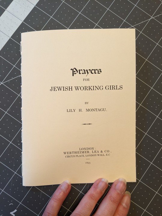


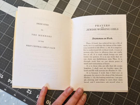
Unfortunately I'm just noticing now that I messed up the cover! Forgot about the border and the "Price Twopence." But in general, I think this looks quite a lot like the original - a credible piece of late Victorian ephemera.
Because the original is in a nonstandard page size - very tall and thin - I decided to make this version out of a nonstandard page size. I used some paper I'd had cut down to "executive" size a while back ... although I'd forgotten that my printer gets stupid with smaller page sizes, and messes up the margins. Annoying.
113 notes
·
View notes
Text


"...the opportunity of defeating the enemy is provided by the enemy himself."
The second official tiny book bound by Almost Zenith Bindery!
The Art of War by Sun Tzŭ Typeset by Clever Pattern Press @simply-sithel 188 pages long (though technically, I added in 4 pages so that I could glue the end pages to the first and last pages, so 192-ish)
Bound as a sextodecimo, despite the typeset being made for a "mini" on the imposer. One day I'll do mini books, but not yet.
This was bound months ago, but with how busy life and work have been, I haven't gotten around to taking pictures or posting anything about it until now. Whoops. In this one, I still didn't quite manage to get the case the size I wanted, so it's a little tall and wide, with some extra space above and below the pages, but I'm working on doing better in the future. All of the end paper that I buy seems to no longer be sold on Amazon anymore, but I do like the way that this looked with the rest of the book - black/white/gold marbling seems to fit.
Simple design for the cover, but it's exactly what I wanted. Made of little squares, like a blocky, golden crown... ;) The pink book cloth is the same I used for A Little White Lie, and I've still got enough for another one or two books, if not more.
Another big thanks to @renegadeguild for the wonderful discord server full of tips, help, and plenty of cool ideas, and to @simply-sithel for creating this awesome typeset. I've wanted to bind The Art of War since I learned about bookbinding, and this typeset is just beautiful.
20 notes
·
View notes
Text
Ficbinding: The Inexhaustible Silence of Houses by Askance


The fic: SPN, Castiel/Dean Winchester, T, 31.8k I've been trying to read more longfics* this year in order to get my brain used to reading again, and I've followed rec lists to do so. That means I'm only now discovering the big classics and popular authors of the fandom, and I'm having a great time. This fic is a beautifully crafted horror story that gripped me and that I didn't want to let go. I rarely read Cas POVs but this worked great on me. This story has everything that makes horror great: an unreliable narration, an oppressing atmosphere, and hints you catch too late.
*With my attention span, "longfic" starts at 25k words.
The bind: After several books that were a little complex or eccentric, I wanted to do something simple. I used my beautiful dark green cloth (my camera murdered the true color of it) because the story is set in a forested area. Dean and Cas settle in an old house, so it seemed fitting to use that magnificent magnolia endpaper that could be a wallpaper in a house like that. I used pale pink headbands and ribbon because 1) I've never used pink in a bind and 2) it's charming and I really wanted to represent that atmosphere of coziness the start of the fic has. Dean and Cas try to settle down and make a home of their own in the fic, and I thought that these colors would call to mind an old house fairly well.
I didn't use a lot of decorations this time, I kept the typesetting plain, like I imagine the books that Cas collects in the fic are. I put a house on the title page and a house in flames at the end of the book, iykyk. The only notable thing is that I used a serif font, which I wouldn't normally do for Supernatural. That's because most fics I read are in Dean's POV, and he's a sans serif guy, unlike Cas. Obviously. Anyway, I looked for the fonts that would be the easiest to read in a small book (A6 format, final size 12,6cm x 9,5cm).


Craft specifics to add?
Everything went very well this time except for the trimming of course. I think I played it too tight, I wanted to trim too little and the signatures twisted in the guillotine, so I ended up with an uneven textblock. I reprinted it all, trimmed by hand, sanded the edges (I'm still perfecting that technique) and I was good to go. There are little imperfections because I sanded before I sewed, but I like them.
I'm really proud of the spine, it ended up nice and round. I didn't let the glue dry for as long as usual before I took a hammer to the spine. Should do it again.
The corners are good and this cloth with paper backing took to the grey board like they were making love. It feels so tight and clean.
I used new tools I'm incredibly happy with: a rotary cutter and a quilting ruler.
Fonts: Optimus Princeps (title and author name), Garamond (chapter titles), Gentium Book Basic (text). All free on Dafont.
Materials: Green cloth from Schmedt, 2mm grey board, 80g/m² ivory-colored paper, synthetic bookmark and headbands. Endpaper from Schmedt.
Feel free to ask me more about materials and fonts (or whatever), it won’t bother me at all to tell you what I used, I just can't think of anything else right now.
46 notes
·
View notes
Text


Another addition to my "not perfct" collection. As always, I like it with all it's imperfections.
The traveller by Somigliana.
I read this story in Ashwinder eons ago and have always liked it. (If you know what Ashwinder is, you've been in this fandom a long, long time).
"Hermione has deviated from an obvious life. She has moved down a challenging and divergent, but ultimately lonely, path. She meets Severus Snape by chance one day, and she has some difficult choices to make"
Bound in the south of the world. Cardboard cover, exposed spine with French stitching.
I liked the idea of using shells and stones slowly worn by the sea. I wanted to place them as stepping stones, as a way to make reference to the time jumps Hermione makes in this fic. The photos are not very good, but they show the beautiful place where I was able to make this book. The shells and stones were collected by me in an area where pre-Hispanic people used to shellfish (obviously, I did not collect stones from that time, but newer ones).
#my stuff#my bookbinding#my workshop#fanbinding#ficbook#ficbinding#fic binding#fic binders#fanbind#fanbook#fic books#bookbinding#fanbound#ficbooks#ficbind#fan binders#fan bound#fan binding#fic book#fan fic binding#fanficbinding#fanfic bookbinding#fanficbookbinding#fanfiction#book binding#fanfiction binding#fan art#fanfic#bindingfanfiction#binding fanfic
16 notes
·
View notes
Text
First time doing a fully printed paper cover instead of bookcloth. I also threaded red string along the backs as part of the design.
I definitely need to figure out some kind of protective coating for the paper if I want to do this again, there's already smudges! But overall it really works just as well as bookcloth, and allows me to do more intricate designs.


126 notes
·
View notes
Text

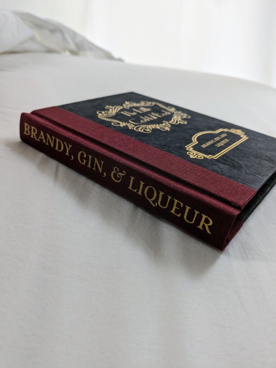
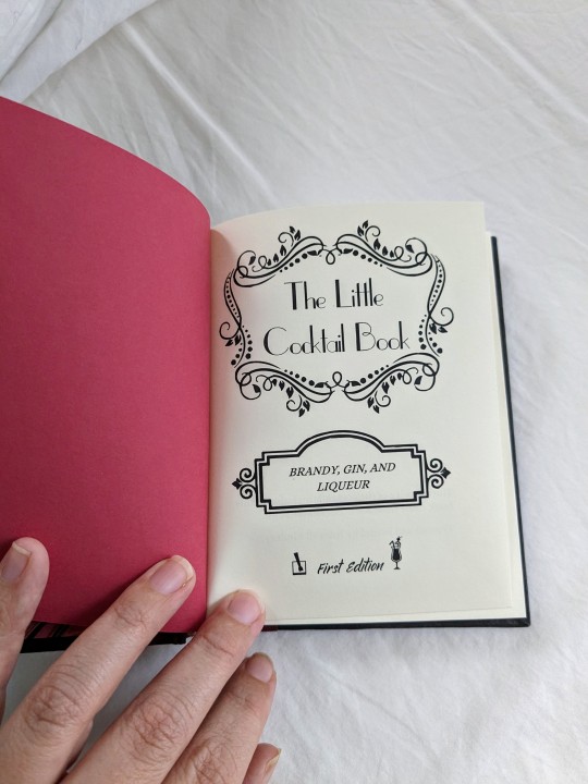
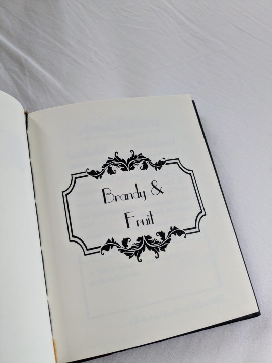
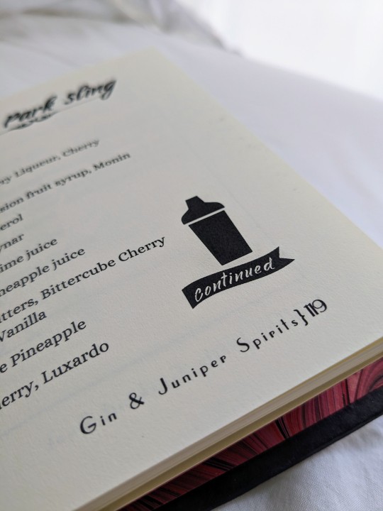
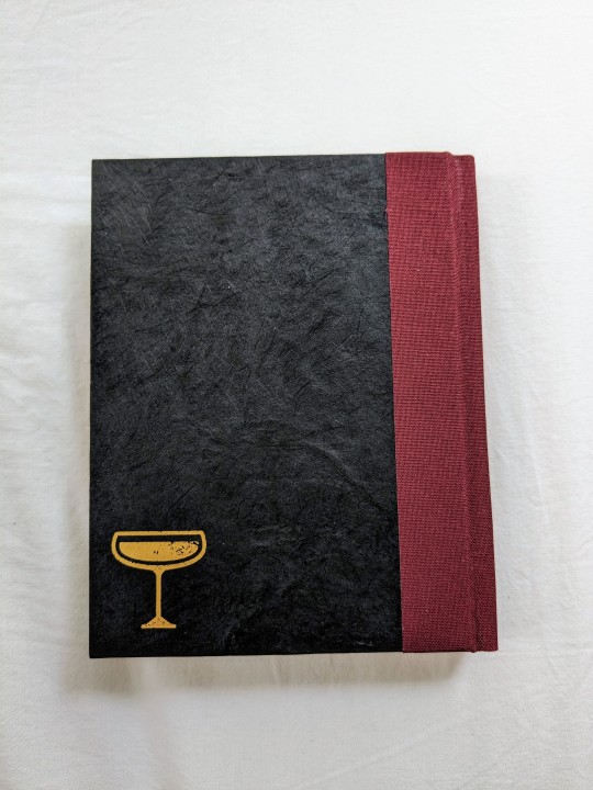

Years and years ago, my brother got into mixing cocktails and, over that time, we have acquired a very large collection of favorite recipes, most of them coming from KindredCocktails.com. When I started getting into bookbinding, my bro thought it would be a fun thing if I put our favorite internet recipes into a physical book.
The initial plan was for these to be in a single volume and, after nearly two years of transferring and formatting the recipes, I realized that the book would be too big and I feared it being unwieldy. Plus, I like the idea of adding in new discoveries and binding new editions. If it was already massive, there wouldn't be room to grow.
So I made a new document and pretty much started over. I realized that I wanted to change a few aspects of the design, so it was only a painful return to start for a few days. lol

(The drink Harry orders in A Deathly Visit because I can't help myself)
I'm making three copies of each volume. One for us, and the other two will be Christmas gifts to my sister and to one of my aunts -- both cocktail lovers. The endsheets are my own marbled paper. Here are the endsheets on the other two textblocks:

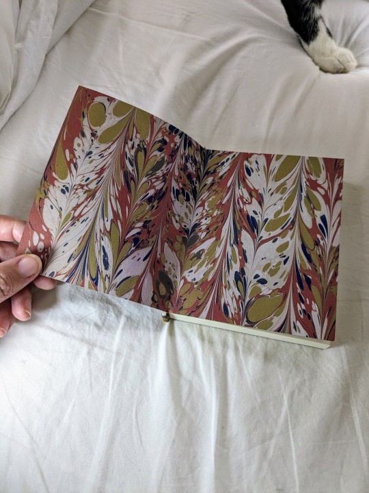
To say that I am proud of these little books is a massive understatement. Fingers crossed that the other two will finish up as nicely as the first one did.
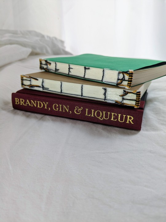

32 notes
·
View notes
Text
Finally my target storybook rebind is complete! This is my most elaborate rebinding project yet, featuring an edge painting and hand-woven endbands.

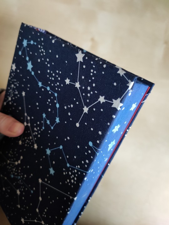
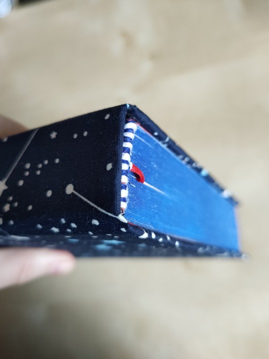

And the best part?

The accompanying bookmark made from the original spine :) featuring my favourite doctor :):)
Process under the cut!
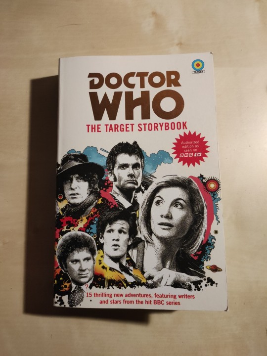
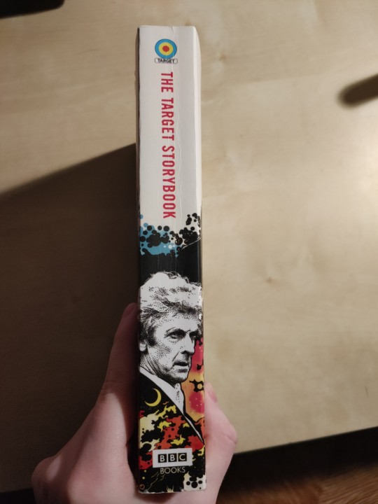
This is what it looked like before I started.
I made the case before I did the rest since the final dimensions were already decided, and I was waiting for my new book press to arrive so I could do the edge painting. I made the case with the constellation fabric I already had in my stash as book cloth, with a bit of iron-on interfacing.


Then I did the edge painting, and after that I glued on the ribbon bookmark and wove the endbands. Then just casing in!
This was my first edge painting, and I am surprised by how simple it was to get it to work. I was worried I wouldn't be able to get the layer of paint thin enough! But when it dried it wasn't too hard to separate the pages. The red endpapers were mainly inspired by the twelfth doctor's iconic red lined coat (can you tell i'm obsessed with him?), and provide a really cute contrast against the rest of the predominantly blue binding. The endbands look quite nice, though they are not exactly long enough and don't go right up against the case. The kind of thing only I would notice!
67 notes
·
View notes
Text


So excited to share my latest bind! This is a Good Omens fic called Pray for Us, Icarus by Atalan/@brightwanderer 💐
I went a little nuts with the floral designs in this one. The cover was so much fun to put together, and I somehow managed to match the bookcloth color to the headband color perfectly. I also made the chapter headers look like Aziraphale was gathering his bouquet from Crowley throughout the years:


I can’t add another photo on mobile, but Part 7 has two wine glasses with apple slices 🥰
Technical details follow ➡️
Fonts: Glamore (title) and Sabon (body)
Cover material: Allure bookcloth in Mudpie
Dust jacket image: Abraham van Beijeren, Creative Commons usage
Endpapers: Renato Crepaldi
Text block: Hammermill 70lb Ivory
Designed in Canva and Procreate
The fic can be read at http://archiveofourown.org/series/1448647
❗️My binds are not for sale. Authors can request gift copies.❗️
#good omens#aziracrow fanfic#aziracrow#aziraphle/crowley#aziraphale x crowley#azicrow#Gomens#good omens fic#good omens fanwork#good omens fandom#good omens after dark#good omens art#gomens edit#bookbinding#ficbinding#fanbinding#book binding#bookbinders of tumblr#my bookbinding#pray for us icarus
281 notes
·
View notes
Text


My 2024 Renegade Bindery Bound Fic Exchange book, Howl's Twisted Castle by Winrywieldswrenches!
Details under the cut.
Very pleased with the title/drop cap font, Protest by 177 Studio.
Bookcloth is a mysterious red from a group auction buy. It has a funny texture but worked nicely.
Paper on the cover was hand marbled by me!
First time doing edge sprinkling, and first time decorating edges without sanding. I'm very pleased with how it came out! I did have to spend several minutes scrubbing my floor for wild paint sprinkles.
Hand sewn endbands with DMC embroidery floss.
Endpapers (not pictured) are Craft Consortium Ink Drops.
Used Bitter Melon Bindery's casing-in method from this video and it went swimmingly with cardstock endpapers.
Just noticed I typoed the author's name on the title page 🫠
The author is not on Tumblr but was record fast in okaying her fic to bind, and very lovely when I sent photos!
85 notes
·
View notes
Text


June fanbinding - Sneak
Only half a month over schedule but oh well! A bind of Sneak, book one of the Alliance Trilogy by @ink-splotch, using Secret Belgian binding pretty much purely because it amused me given the theme of the book about secrets and sneaking around.
86 notes
·
View notes
Text


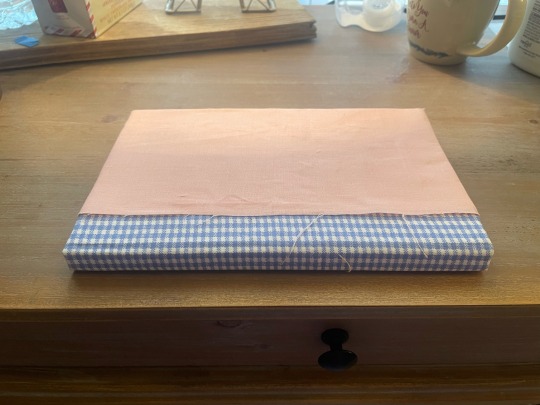
My finished bookbinding project: Chapters 1-11 of @leucisticpuffin’s we will make this place our home! (Not showing the endpages because they’re a mess.)
It’s not nearly as neat or professional as I wanted (I couldn’t find the bookcloth I swore I still had, and had to make do with Elmer’s School glue and stiffening the cotton fabric by gluing printer paper to the back) but for not having made a book in two years and paying way more attention to the details than I have in the past, I’m pretty happy. I’ve learned a ton and hopefully will be able to make some better books in the future.
22 notes
·
View notes