#dyslexia font
Explore tagged Tumblr posts
Text

A new episode of Right Here, Write Queer just dropped! Catch it in your favorite podcast app.
Sebastian Nothwell interviews Sarah Wallace about large print and dyslexia font editions, their importance for accessibility, their value to libraries, and how indie authors can create their own.
To learn more about Erin Wright's "Wide for the Win" author classes, check out her website: erinwright.net
Sarah Wallace (they/she) is the author of the Meddle & Mend series (beginning with Letters to Half Moon Street) and co-author of the Fae & Human Relations series (beginning with Breeze Spells and Bridegrooms). You can connect with them on instagram: sarah.wallace.writer
Sebastian Nothwell (he/him) is the author of Oak King Holly King, Mr Warren’s Profession, and Fiorenzo, amongst other titles. You can connect with him at his website: sebastiannothwell.com
0 notes
Text
yo The Wandering Inn introduced me to the Henny Penny font and I’ve never been happier in my life please tell me more people are gonna start using it cuz it is the most fun version of a dyslexic font I’ve ever seen
Writing prompt;
You have been isekai'd into another world!
But as soon as the summoners take one look at you they say, "No, this clearly isn't the chosen one." And just toss you out into the street.
272 notes
·
View notes
Text

oh? and why ever would you want to use a joke about a cavalier marrying their necromancer, mx. gideon?? hmmmm???
#tlt#the locked tomb#griddlehark#gideon the ninth#plz ignore the font i know it’s ugly it’s for DYSLEXIA which i don’t have but i do have adhd and it helps w that too i find
688 notes
·
View notes
Text
Unironically using the sans font because it genuinely helps with my dyslexia <3
#I also read a scientific article yesterday that gave you the “dyslexia” option and it changed the font and coloring for me.#It's surreal to have disability rep and accommodation like this#dyslexia
206 notes
·
View notes
Note
i'm sure you've noticed me binging ur content rn but no. that's not enough. i need to eat ur blog like im digging through dirt and shoveling it into my mouth like a starved man in the light of a crescent moon. if your blog was an orange id eat it from the flesh to the seeds to the pith to the peel. i'd hike mount everest to get better wifi to scroll thru ur blog
anyways what do u think different td characters hand writing is like??

Me to this ^^^^ i fucking love it when i see people go thru my blog and like and reblog a bunch of shit i be watching the notifications and giggling
Anyways

#courtney writing for an assignment vs courtney writing down notes are very different styles of writing#the later is cramped and a bit hard to read. made for cramming in notes and plans#gwens handwriting is very floaty to me she doesnt stay on a line very well#harold writes in all caps cuz its like engineering font and he got into the habit after an random computer class he took made them learn it#duncan writes big in all caps but with weird spacing#like theres spaces where there shouldnt be and no spaces where they should sometimes if he writes fast he skips letters#<- im giving him dyslexia dw about jt#Lindseys the type of girl to write about child labor law violations with hearts around the title#justin writes like a signature 24/7#cody and trent r both just messy writers#total drama#jester draws#thanks for the ask!!!#duncan td#courtney td#dj td#alejandro td#heather td#td leshawna#harold td#td gwen#cody td#beth td#trent td#lindsay td#ugh
56 notes
·
View notes
Text

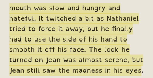
something something Neil's smile *actually* being frightening/butcher-esque but that him getting rid of the smile doesn't hide the fact that he's fucking insane. butcher neil is so real in tsc but damn i think this bit hit really hard because neil spends so much time in aftg freaking out over his smile and i guess some part of me was like "it can't be *that* bad" but i guess he really is just Like That™
#tsc spoilers#tsc#oliver reads tsc#wow a meta post??#neil josten#the sunshine court#all for the game#also y'all im so sorry for the dyslexia font in the screenshot i don't wanna change it just for screenshots lmao
109 notes
·
View notes
Note
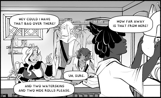
I really enjoy your comics and I have to say, the use of century Gothic as a font is a great choice 10/10 great font
century gothic fandom rise up
#stump asks#THANK YOU FOR THE ASK :D#it is a random dyslexia friendly font i picked out of a hat#but now i feel compelled to stick with it#especially since i have now been informed it is extremely similar to the wheezer font#which is just . what a terrible coincidence . now i CAN"T change it#sorry stanford you're speaking in wheezer now
20 notes
·
View notes
Note
ok i am very curious tho bc i think finding the fonts last night took me as long as drawing the thing- does tanguish use two fonts? like it looks like the uppercase is vivaldi italic and the lowercase is monotype corsiva italic and i just simply couldn't find One Font that had *both* upper and lower matching those ><
You are correct it's two fonts! Helsknight's is also two fonts. The capitals are Old English Font [I... Think.] and I can't remember what the lower case is, besides the fact that it's a sans serif font. I'm not at my art computer right now so I can't check XD
A lot of my friends have dyslexia, so I try my best not to use exclusively hard to read fonts if I can help it when I do text. I will make capitals, titles, and important words the embellished font, and the rest of the letters are generally an easier to read sans serif that I think fits the embellished font well enough. That way we get the pretty impact of the big fonts while keeping the readability.
It's for the same reason all my comic pages [with regular text without the fun RnS font choices] have Calibri font. It's dyslexia friendly. Not quite as dyslexia friendly as Comic Sans, and some of the new dyslexia specific font types, but better than most serif fonts, and the more cramped sans serif ones.
#yayforstuffs#rns asks#skye you care a lot about dyslexia do you have it? no#i do however suffer from 'reads too fast and confuses/drops words' disease#and wouldnt you know it -- sans serif fonts help with that too!#also my eyesight is shit#vivaldi text my beloathed youre so pretty yet so unattainable#why to all your little swoops always blur in my astigmatism so
31 notes
·
View notes
Text
I know this is super petty, but one of my pet peeves is when people overdesign their gifs (or t-shirt designs) with tons of fonts and/or combine two serif fonts. I was taught in design class not to combine more than two fonts (especially if it's one of those decorative/calligraphy fonts) because they'll start clashing and are hard to read
#chatter#it might look pretty at first#but then you take a proper look the fonts are indeed clashing#and are hard to read/bleed into each other#not to mention they aren't accessible for people with dyslexia#there's a lot of fonts ON THEIR OWN that are absolute hell to read#I downloaded some fonts that look pretty but I wouldn't use them
10 notes
·
View notes
Text
oh 🤠

#fypシ#marauders era#marauders#idk what else to tag#florian rambling#fanfiction#ao3#crimson rivers#dyslexia font goes hard
8 notes
·
View notes
Note
how did you get the dyslexia-friendly font on your blog's website?

I'll be honest I had no idea the font on this theme was dyslexia friendly until just now.
I use the Accessible theme on tumblr and there's an switch on the customize list that says open dyslexia (that I am just now realizing exists as I check my theme for you while typing this answer)
AND when I look it up on Google, the font is literally named Open Dyslexia.
#ask#just realized how dense i am that that option has been on the menu for literal YEARS#i've had this blog for YEARS#and just now realized this entire time it had a dyslexia option#my dumb ass just thought it was a cool ass font and had funky vibes#oh my god
10 notes
·
View notes
Text
I'm kinda curious if this font is actually helpful to people with dyslexia. If so that's so cool, this isn't hate it's just me being curious

#dyslexia#dyslexic font#plural system#syscourse dni#pluralgang#plural community#actually plural#question post
10 notes
·
View notes
Text
dyslexia friendly comic fonts!
I made some dyslexia-friendly fonts for comics specifically~ They're free to use for whatever you want, but if anyone wants to give me a tip, that would be much appreciated <3 (i'm disabled and cant work, but can't stomach the thought keeping them behind a paywall, just cause they're so desperately needed)
(im not a pro at font making, so there might be kerning issues, but they work well for me~)
You can get them on my ko-fi!


75 notes
·
View notes
Text
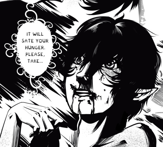
My favorite head canon for a sans & papyrus fusion is that they're just Some Guy.
Papyrus's Main Character Energy combined with sans' hidden lore crouching badass make Just a Guy.
He's just a normal dude who's pretty chill. You'd definitely get a beer with him AND let him watch your dog, but he's not like. Super special or anything. The Clark Kent of fusions if you will.
#misc#he DOES have an extremely cool and badass side obviously. the Superman duality of it all#obviously he would be comic papyrus#but in my heart he's either that dyslexia font OR that dad's/engineer's handwriting font#or I suppose something completely normalike arial haha#anyways. .... thats it.
28 notes
·
View notes
Text

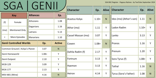
SGA Background Character Register
Pegasus Natives | Genii
-
Decided to start a Pegasus Native register
I'm debating on adding a sheet that describes these characters' attributes so they can be easily added to any fic
-
Notes:
- Only Genii with names - Canonically female characters are marked because there are less of them - Alive: Meaning we never saw them die or been informed of their death
Feel free to use this as you see fit just please keep my user name on the image
-
Sga Background Character Register | Atlantis Expedition S1
#not too sure about the colors - I feel like it gives off genii vibes but idk 🤷♂️ im not paid for this 😂 so whatever#just been thinking about the genii and got inspired because I did not know there were this many who had names in the show lol#tried a new font apparently this is a good one for dyslexia - works good for me so far so I'm hoping it does for others#sga#stargate atlantis#genii#twotalessgastats#twotalessgadata#pegasus natives#side character love#sga background character register#acastus kolya#dahlia radim#cowen#sora tyrus#ladon radim#tyrus#toran#haemon#cassel massan#athor#idos#fortnum#heiron#lanko#pranos#prenum#tathal
12 notes
·
View notes
Text
people are talking about how much longer lestat's side of the story is than louis' but i haven't seen anyone mention the funniest part which is that (at least in my additions) tvl's font size AND spacing are smaller than iwtv's

#joke aside. i peaked at my copy of qotd and its the same as tvl which means my eyes and brain are going to be so exhausted reading them 😔#the iwtv font font size and spacing are the most ideal for my dyslexia and bad eyes 😔 only 150pgs of light work left#k reads iwtv#iwtv
7 notes
·
View notes