#digital illustration tutorial
Explore tagged Tumblr posts
Text
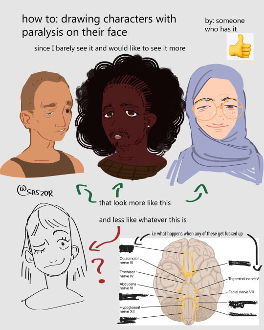

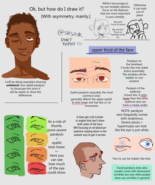
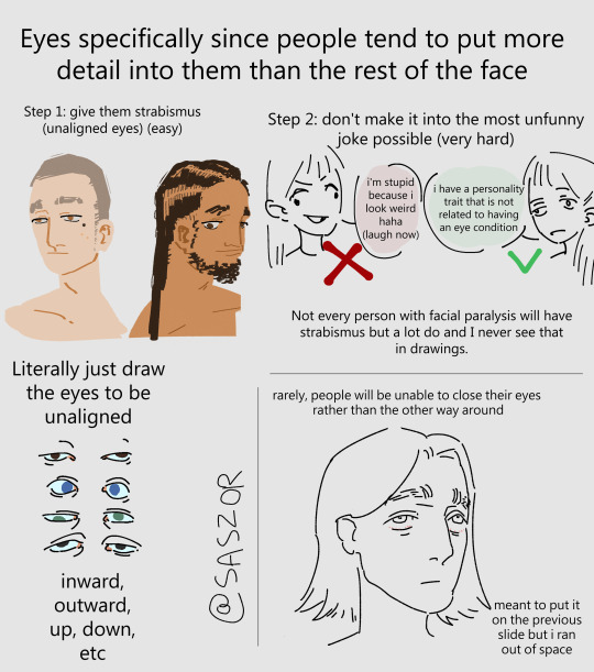
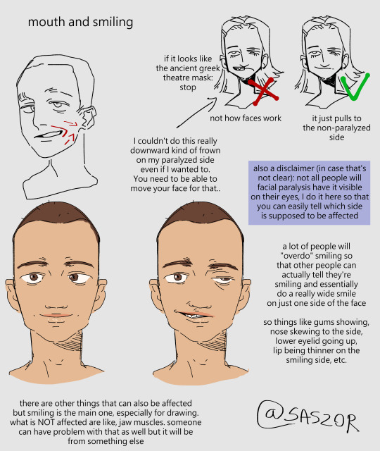
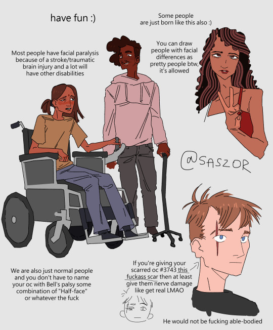
[ID in alt]
Tutorial on drawing characters/OCs who have some sort of facial paralysis. It doesn't cover all possible variants because I was using mirror as my main reference lawl
Keep in mind that this is an introductory drawing tutorial and has some generalizations in it, so not every “X is Z” statement will be true for Actual People 👍
Consider supporting me on ko-fi if you find this to be helpful.
#No 'omg mithrun dungeon meshi' notes that's not even what he has.#my art#artists on tumblr#disabled artist#digital art#id in alt text#art tutorial#drawing disabled characters#facial difference#disabled representation#disabled characters#digital artist#artwork#art on tumblr#art#body positive art#character art#disabled art#original art#personal art#illustration#drawing
23K notes
·
View notes
Text
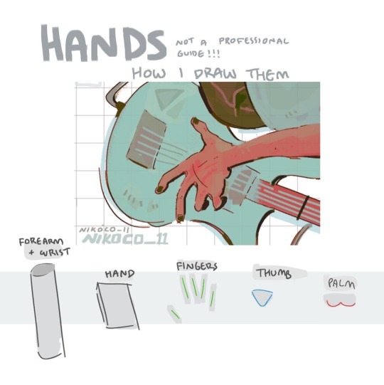


my recipe for drawing hands!
(small note that this is a shortcut that is more abt style and ease than anatomical accuracy. it helps to take time to really properly study hands, makes it easier to bend the rules a bit like this and have it still look good!!)
(learn rules b4 u break them or whatevah)
#qna#tutorial#guide#drawing tutorial#digital art#illustration#drawing#artists on tumblr#my art#clip studio paint
59K notes
·
View notes
Note
I absolutely adore the works of @hansoeii so I’m soooo happy to get this.
Colors and light are still something I struggle with. 😭
Hullo! I’ve been watching a bunch of your Timelapses and I was wondering how do you always come up with the colours for your pieces? They’re always so cohesive and pleasing to look at (I almost exclusively work in greyscale so if I’m using colour it’s always a lucky guess and it never looks quite right)
Hey there!
I have to be honest that most of the time I don't actually know what I'm doing and that I have no idea how most of my pieces are gonna turn out. My work process is usually based on "Fuck around and find out", haha. I'm happy to know that it apparently doesn't come across that way, though.
A lot of it comes very naturally to me simply because I've been drawing non-stop for so long, but I can give you some small tips that really help me:
1. Have as many references as possible!
Here's what my reference sheet looked like for the Jayvik piece:

It helped me a lot to understand the overall color scheme I wanted to convey. Lots of very cold tones, pinks and very light blues and greens. These colours sorround Jayce and Viktor throughout all of season 2 and I wanted to keep them, especially since in my piece they are lying in the glowing hexcore.
Don't shy away from using references, get as many as you possibly can! Look at other poeple's art too and try to understand how they work with colours.
2. Work with complementary colours!
Since I paint a lot of romantic illustrations I want them to look pleasing and comforting, which I can accomplish by using complementary colours! You see this a lot with couples that are blue and red coded, for example. And I wanted to do the same thing in the Jayvik piece! For that I used the highlights in their hair!


Viktor's highlights are a soft pink hue.


While Jayce's are a soft blue hue.
The colour wheel works perfect for figuring out if two colors compliment each other because they are literally right across from one another!
3. It doesn't have to be true to life.
Pretty self-explanatory, but I thought I'd add it in here anyways. It's important to understand how colour and light works, but you don't always have to follow the rules. Does the rim light look cool but it makes zero sense? Who cares! Keep the cool rim light! Just have fun and fuck around.
4. A little trick to make your life easier!
I'm not excatly the best at colour theory, I still struggle with it quite a bit, but here's a little trick I like to use from time to time:
If you want all your colours to look coherent, take one specific color as your flat colour. Choose a hue that you would like your piece to have. Like this:

Now you choose whatever colours your characters have and paint them in. For example, here are the skin colours I chose for Jayce and Viktor:

Looks off, right? These colours don't fit the overall piece at all. So what do we do?
Turn down the opacity! It's that easy, wahoo!

I went from 100 Opacity to 72 for this specific illustration. And look at that!

It's so much nicer already! Now you know what colours to use as your actual flats! Just repeat this with every other part of your illustration and you'll have a great starting point. :)
I really hope this was helpful! I'm not an actual teacher and I don't have a proper illustration degree, so some things might not be completely accurate, but I thought I'd try my hand at this anyways!
#art process#art tutorial#color tutorial#tips#illustration#colouring#digital art#digital illustration#digital illustration tutorial#digital painting tutorial#baby artist#beginner artist#colours tutorial#art is hard
776 notes
·
View notes
Text
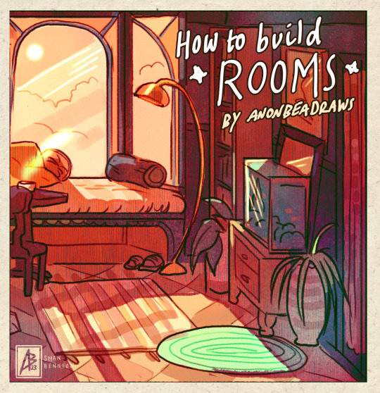
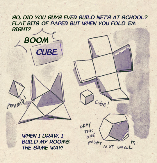
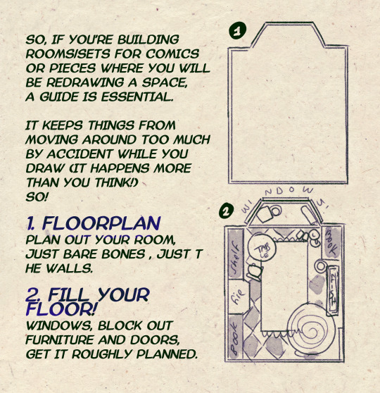
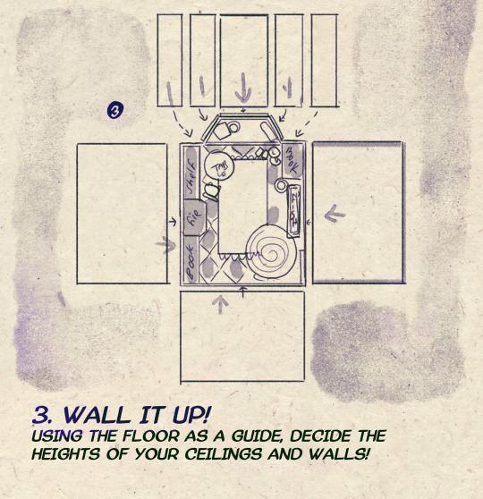
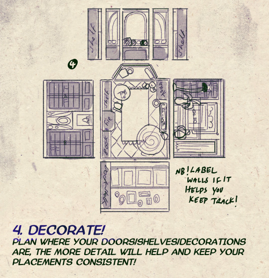
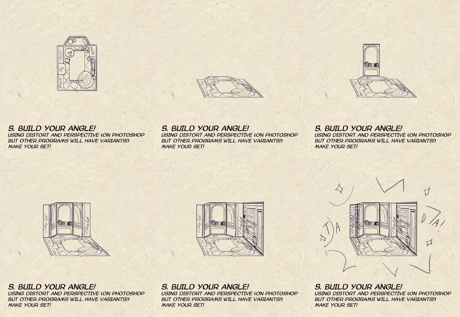
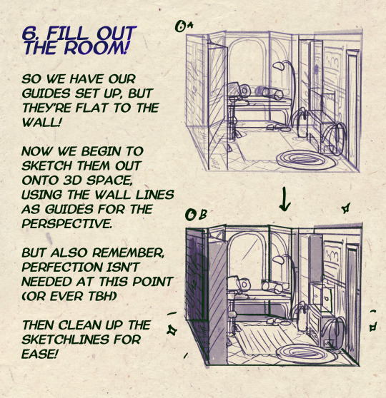

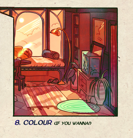
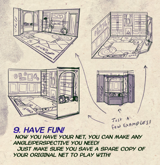
I made a Room Building tutorial! Lemme know if it helps! 🧡
Tip me here| Commission info here!
#anonbeadraws#digital#art tutorial#tutorial#room building#room design#illustration#gif#digital art#digital tutorial#art help#art resource#let me know if it helps!#tried to make it as simple as I could
41K notes
·
View notes
Text
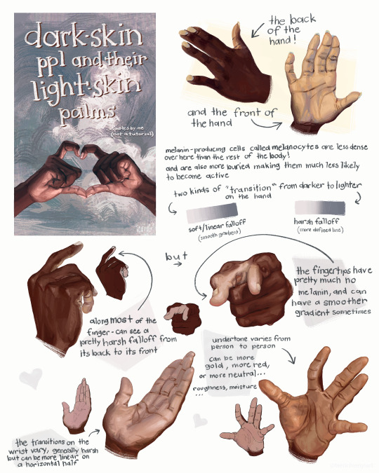
this is not a tutorial this is just me rambling
#art#art study#reference#painting#hands#digital art#illustration#bipoc#poc#black#black art#dark skin#information#art tutorial#art non tutorial#artists on tumblr#art tips#sketched this in january so its gotta leave my head someday
27K notes
·
View notes
Text
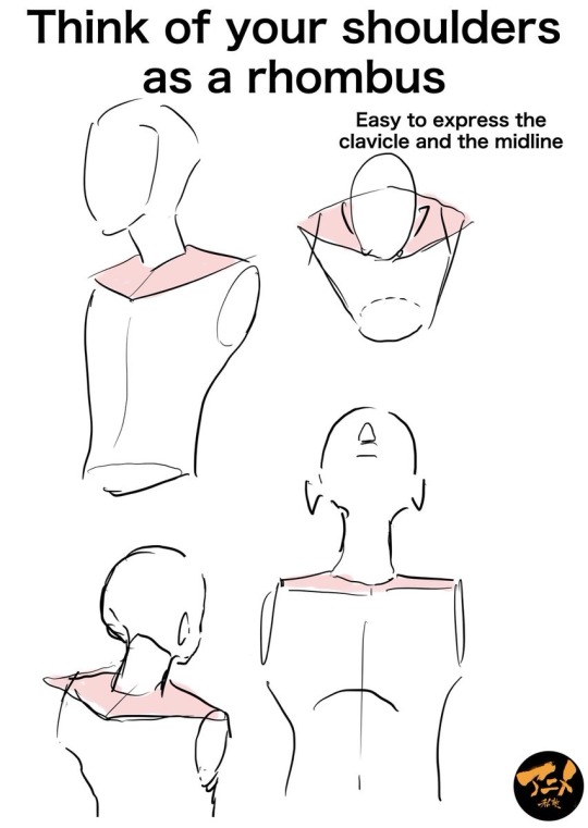
“Think of your shoulders as a rhombus”
Source: privateanime on twitter
#art tutorial#digital art#art reference#tutorial#drawing anatomy#human anatomy#drawing tips#illustration#art tips#drawing torso#drawing shoulders#clavicles#clavicle
5K notes
·
View notes
Text
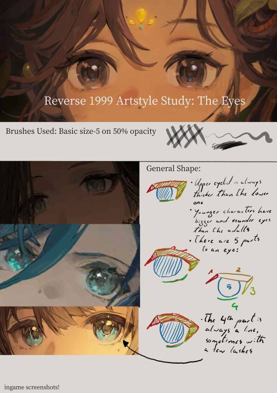
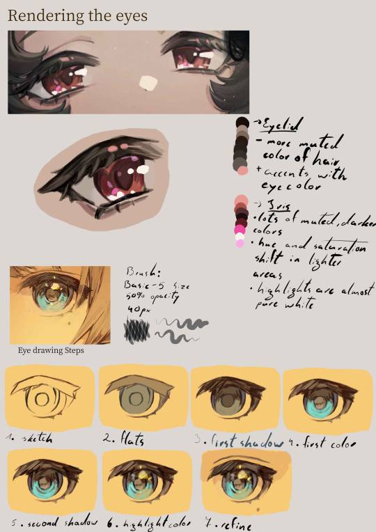
Disclaimer: I do not actually know how they paint the eyes,this is just me guessing their process purely from observations
Transcript:
General Shape:
- Upper eyelid is always thicker than the lower one
- younger characters tend to have bigger and rounder eyes than the adults
- there are five parts to an eye: 1. the upper eyelid corner(towards the nose) ; 2. the upper eyelid main part ; 3. the upper eyelid corner at the back ; 4. the lower eyelid ; 5. the iris
Eyelid:
- more muted color of the hair + accents with saturated eye color
Iris:
- lots of muted darker colors
- hue and saturation shift in lighter areas
- highlights are almost pure white
Eye drawing Steps:
sketch
flats
first shadow
first color
second shadow
highlight color
refine
#art style#art study#eye#eyes#anime eyes#godofart#r1999#r1999 fanart#reverse 1999#drawing guide#guide#art guide#art tutorial#drawing tutorial#fanart#art#digital art#illustration
2K notes
·
View notes
Text
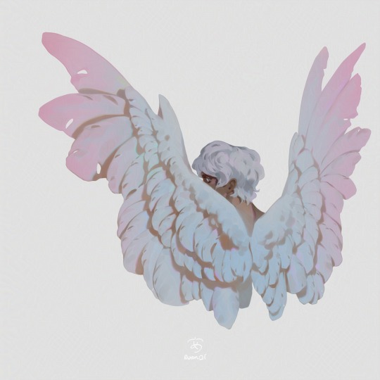
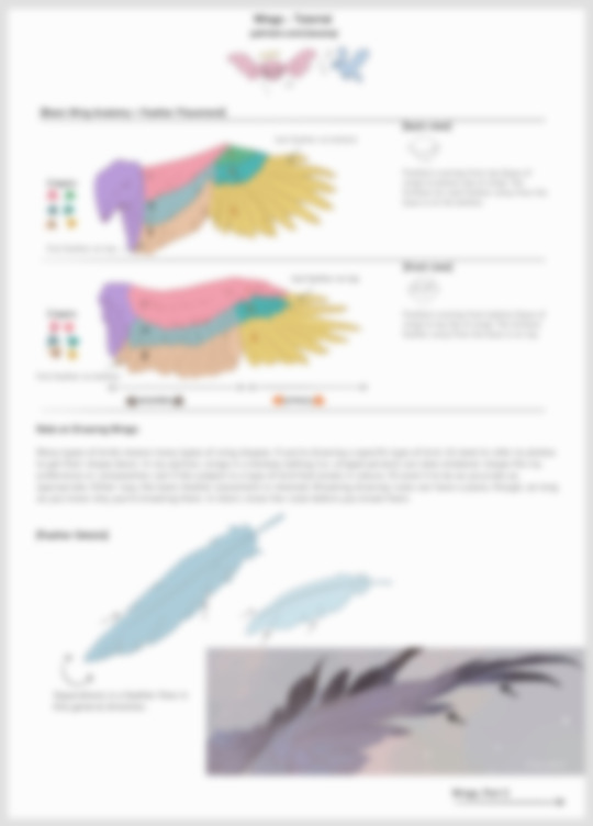
Wing Tutorial is HERE 🦅, now available on my Patreon✨ It includes full speedpaints, a step-by-step of the painting process, drawing tips + more!
2K notes
·
View notes
Text
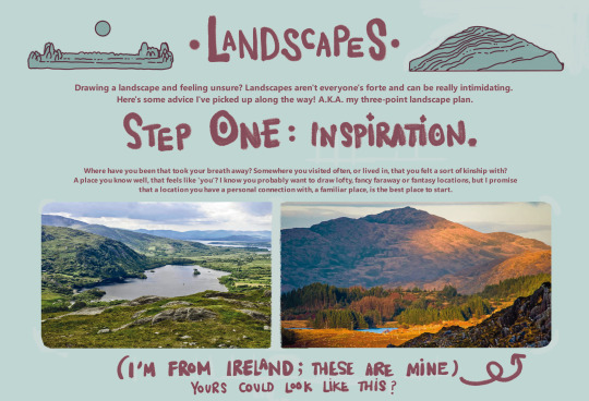
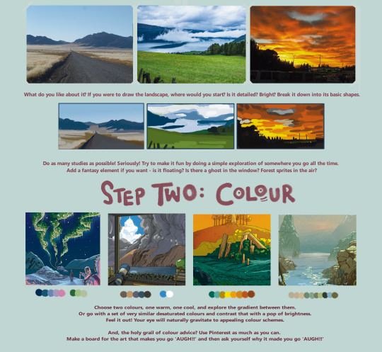

here's a landscape tutorial!
i focused on natural environments for this one, if you find it helpful I'll be back with how I learned to draw buildings.
let me know if it helps! and have fun drawing ✨
#this was really fun to put together actually hehe#tutorial#art#illustration#digital painting#digital art#artists on tumblr#digital artist#digital illustration#radarplz#sketch#my art#bethfuller
19K notes
·
View notes
Text
a guide to the exoparia
the presence of the exoparia doesnt actually change much for the way we reconstruct most dinosaur groups, however, it changes some minor things for two of the most well known dinosaur groups that should be taken into account:


link to paper: onlinelibrary.wiley.com/doi/full/10.1111/joa.14242
#paleoart#digital art#paleontology#digital artwork#artists on tumblr#palaeoart#digital illustration#sciart#id in alt text#dinosaur#alt text#guide#tutorial#exoparia#tyrannosaur#ceratopsian#scicomm#science communication
789 notes
·
View notes
Text
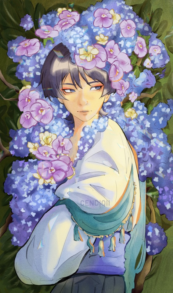
indigo
#art#fanart#genshin impact#illustration#my art#wanderer#genshin#genshin impact fanart#genshin imagines#genshin impact art#genshin scaramouche#scaramouche#scara#kunikuzushi#kuni#原神イラスト#原神#illust#illustrator#illustrative art#digital art#genshin fanart#art tutorial#art tips
1K notes
·
View notes
Text
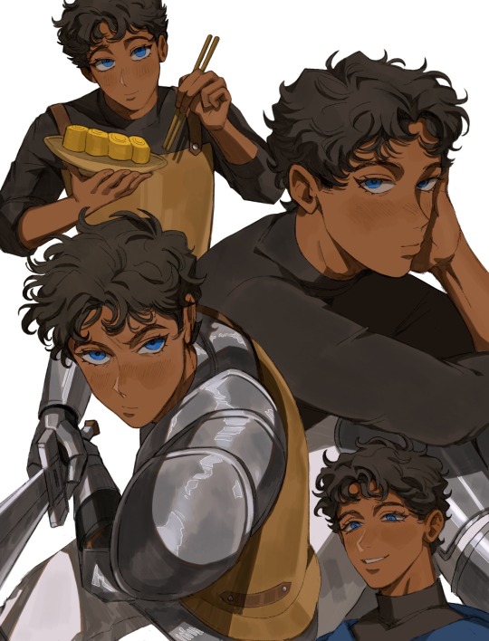
Getting better at drawing Kabru. This guy is def not easy to draw (especially if you want to draw him in your own style).
I’ve compiled some observations:
🍅 Hair: By far the most challenging part. He actually has a middle part as observed from numerous manga panels but it can be hard to notice because his hair is so short.
I also broke his hair down into approximately 5 different areas (because his hair is layered) so I can see the flow of the hair better:
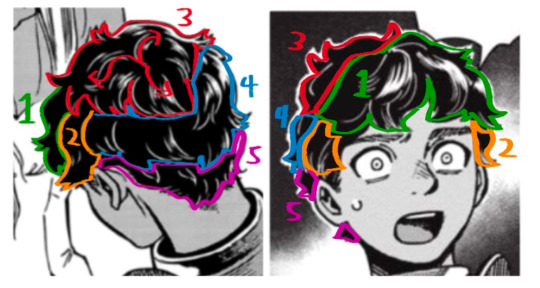
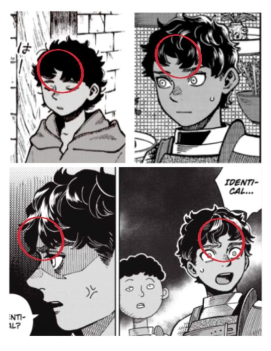
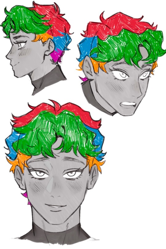
🍅 Face: His face is like a cat’s face 🐱. Thinking about a cat’s face helped me a lot.
His face generally wide and round but also has a sharp, narrow chin. I’m more used to drawing older characters so this was a struggle to me.
🍅 Brows: I never noticed this until I bought the Daydream book but his brows are actually thicker at the ends and angled downwards.
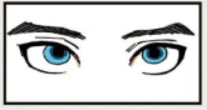
Also sharing my lineart (lowkey like this a lot):
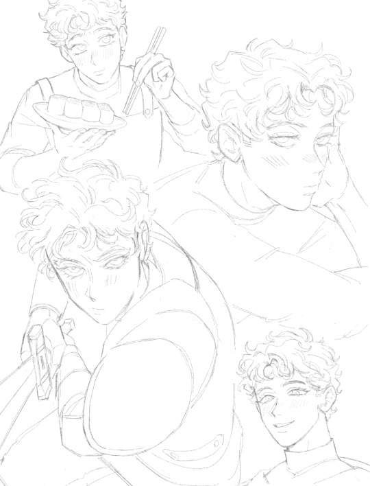
#digital illustration#procreate#delicious in dungeon#dungeon meshi#kabru#迷宮飯#kabru of utaya#喀布爾#digital painting#my art#gomigo_dog#tutorial
887 notes
·
View notes
Text
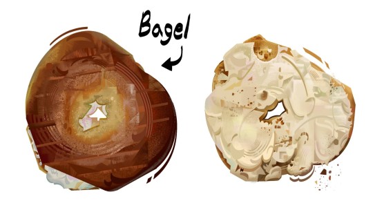
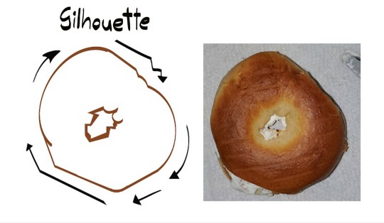
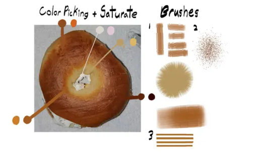
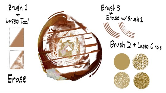
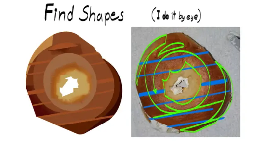
Painted a Bagel
#digital art#digital painting#digital illustration#illustration#visdev#bagel#food art#art study#tutorial
2K notes
·
View notes
Text
Here’s a 5 Min video showing how I usually color hair as requested by Anon (●’◡’●)ノ!
I’ve tried my best to shorten the clip while making sure it isn’t going too fast, so if there’s any questions please feel free to ask me! 😆
230 notes
·
View notes
Text


A rough process for my warm ups, as best I can explain! If you give it a try, I'd love to see!
312 notes
·
View notes
Note
Hey there! Your actually one of my inspiration for art! I really like how realistically shaded the backgrounds are and everything! Do you have any tips for shading in digital art?
Hey, I appreciate it, thank you! There are lots of things that go in to making a good background but this is the main idea that made backgrounds click for me:
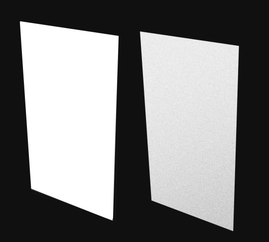
Hopefully you'll agree that of these two shapes, the one on the right feels more 'real', despite the fact neither of these shapes are meant to represent anything. The shape on the right just has a noise filter and a faint light-to-dark gradient from top to bottom. Those two things create movement on a small scale (the noise) and on a large scale (the gradient). The presence of that sort of movement is what gets your brain to register something as real.
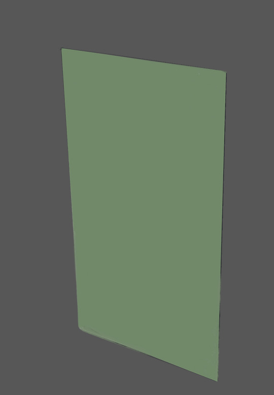
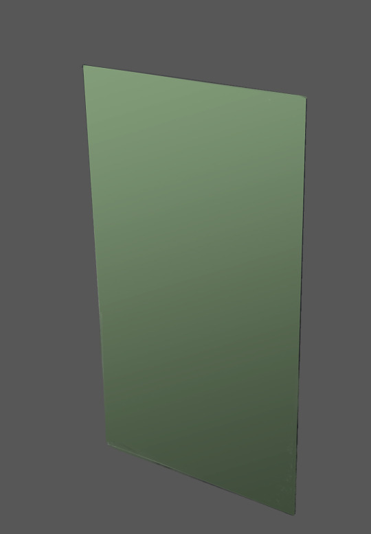
Here I've taken the shape and given it a new environment, a colour and then a gradient. The shape with the movement feels a little more natural in its environment, I think.
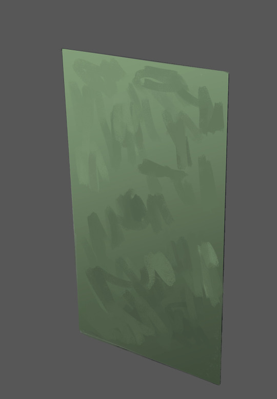
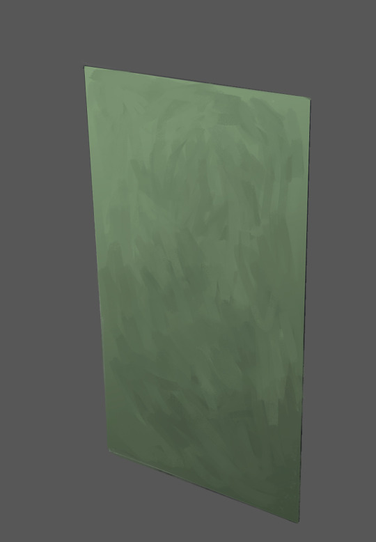
Then directly on top of that, I can start creating small scale movement, like the noise, through brush strokes. At first (on the left) the brushstrokes look quite out of place and unnatural. But as you work in to the surface more, creating more and more overlapping brushstrokes of various sizes and directions - all while trying to maintain the sense of that gradient - the strokes will start to more naturally integrate in to each other, creating a bed on to which other elements will lay naturally.
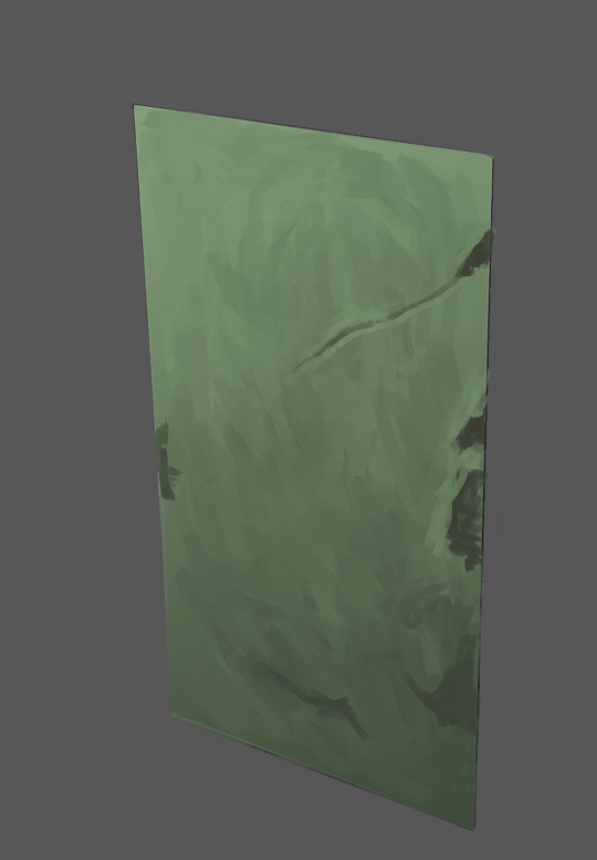
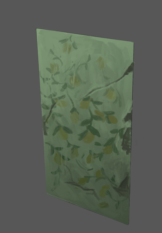
Here I give this abstract shape some context by painting some cracks and decay on it. These new elements create movement by giving our eyes more shapes to latch on to and jump between. I then added a pattern to it. This pattern adds more movement and reinforces the light effect by adhering to the gradient (getting darker at the same rate the wall does).
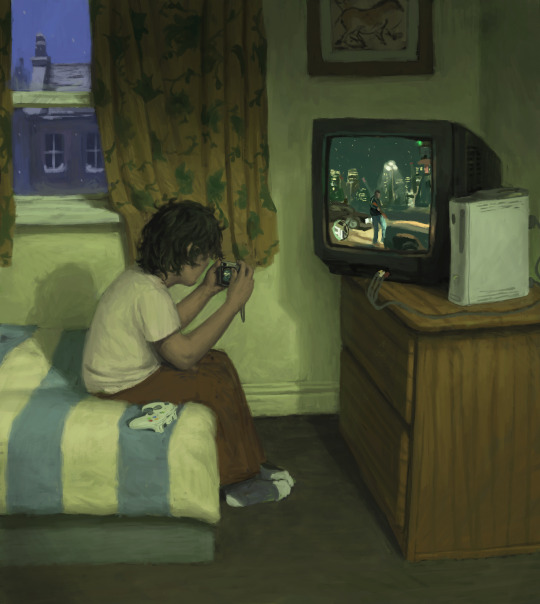
You can see I use this idea all through this picture. I make sure in any section there is always some kind of movement of light, whether its left-to-right, or top-to-bottom, corner-to-corner etc. Patterns like the woodgrain on the drawer or the textile of the curtain create additional movement and reinforce the dimensions of their respective forms by adhering to them. Bit rambly but I hope there's something useful in there!
1K notes
·
View notes