#digital painting tutorial
Explore tagged Tumblr posts
Visit Tumblr Blog
Explore Tumblr blogs with no restrictions, modern design and the best experience.
Last Seen Tumblr Blogs


Fun Fact
Tumblr was created by web developers David Karp and Marco Arment.
Text


a short/mini digital painting tutorial by yours truly 🫡
a lot of people really like how i painted kaveh in that short hkvh comic so i thought i'd share a quick painting tutorial! I hope this can be helpful to yall ^_^
#also if you'd like a more in-depth understanding of light & shadow i highly suggest Angel Ganev on youtube#dude explains so well and i like how he respect people's art styles as he improves their art#art tutorial#drawing tutorial#digital painting tutorial#digital art tutorial#artists on tumblr#my art
516 notes
·
View notes
Text
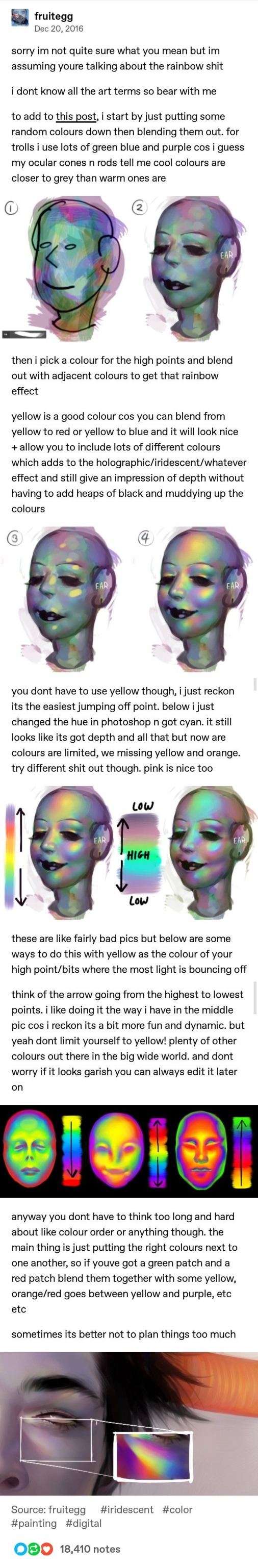
Iridescent Skin Tutorial by Fruitegg
#art#digital art#iridescent#iridescence tutorial#painting iridescence#how to paint iridescent#digital painting tutorial#fruitegg#rainbow effect tutorial
776 notes
·
View notes
Text
Here, take my industry secrets.
I don't want people to spend their money on art school when I can make resources for free for them.
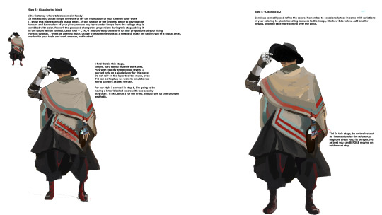
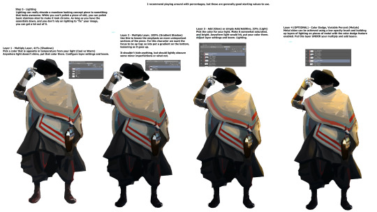
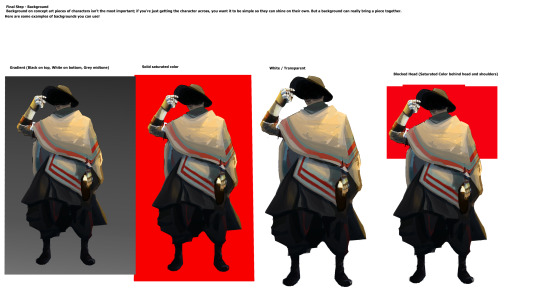
Hey here's a step-by-step guide to making concept art pieces using the industry "Collage > Painting" pipeline. It's how artists pump out a shit ton of concept work for their bosses at record speeds. Intended for newer artists!

For more stuff join my discord! I'm a transfem streamer who makes art stuff!
#art#artist#digital art#illustration#digital painting#digital artist#tutorial#art tutorial#digital art tutorial#digital painting tutorial#painting tutorial#concept art#concept artist#concept art tutorial#transfem#transfem artist#trans artist#transgender artist#transgender
177 notes
·
View notes
Text
Hi, skykids and artists alike!
WARNING: THIS IS LONG. I can't stop yappin'.
I was taking a series of screenshots of my art process for my own reference (to review later, see how my process has changed, etc. I’m not much of a timelapser) and figured I’d share my process and show off how much the game Sky: COTL has DRAMATICALLY improved my art (and also have a post to show people in the very, hopefully, unlikely chance anyone ever doubts that I draw my own art). I also have seen a lack of written out with screenshots explanations of art, as video format becomes more popular across not only Youtube, but Instagram and Tiktok as well. This is not a learning style I jive with, so this is something for all the artists out there looking for this kinda thing.
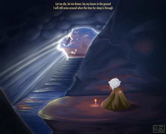
For reference, here is my FIRST EVER Sky digital painting compared to my most recent (before the one used for this lil infodump). <3 This is CSP specific as far as brushes go, but I’ve seen people make amazing art in freaking PowerPoint, so if I can do it, you can do it.
F’real. This is the process of a VERY LAZY artist with hand tremors and hecked up wrist ligaments as a result of an autoimmune disease.. I’m talking, drawing in bed in a blanket nest watching vodcasts and cuddling cats.

(May 2024) -----> (January 2025)
Added info - the pic on the left is exactly why I wanted to do this. I'm even a little embarrassed by it, now, but when I had originally posted it on another platform, I was questioned and disbelieved that I was able to draw a background at all. This was the start of me taking digital painting seriously (versus general character/creature design) with lineart and a cell shading style. That disbelief from someone who knew me IRL hurt a lot, and I often have the concern of that happening again. This is me alleviating that anxiety once and for all, so I can finally move past it. YAH, FRIENDO, THIS IS MY THERAPY SESSION.
Anyway; I’m nowhere near new to art, but it’s always been a hobby for me so I never sought to actively improve with proper studies -- but wanting to create lore for my silly lil skydude forced my hand. With a semi-open world game that’s genuinely gorgeous made collecting references easy, and the Sky community here on Tumblr has not only inspired but encouraged me to keep going despite 2024 being a very rough year. This game has brought me joy, and I hope you find this lil doodad helpful. 🕯️
Now on with the show! This piece will be a part of a little series I’m working on that will include lyrics to a song that gives me the biggest Sky vibes (To Thus Onto Tyrants by The Oh Hellos).
The brush that did the heavy lifting (“spread pencil”) seems to be either very elusive or no longer available. Everything else is listed here :)
What I could find:
Turnip Pen - Default brush in CSP
“Crunchy” - Specifically the second to last one in this brushpack
“Hard Round V1”
“Hard Round V2”
“YN Soft Round” (Not free, sorry ): )
“Pecas” - for sparkleys
“Toothbrush” - For more sparkleys
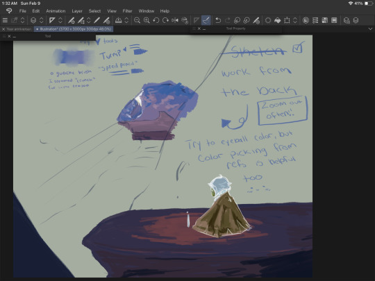
So the first step is to gather references. They’re a MUST HAVE and DON’T LET ANYONE ELSE TELL YOU OTHERWISE. Use references, redline, and yes - EVEN TRACE. I may make a lil thingy about how to do these things ethically, but for now, just art process. Let’s see what references I used: self harvested!
Shout out to the Skykid screaming in the background.
I also used this for a reference for the moth that I grabbed off the interwebs-
For this, I wanted to try and recreate what it felt like as a moth (but after getting at least one starboi lol). Isle of Dawn will always hold a very special place in my heart. The first impression was impactful, even though I was incredibly confused on what I was doing. I knew I wanted the temple, but there’s something so calming and melancholy about that first cave. Putting these references together, I got the most hot garbage sketch I’ve ever done - but it’s okay! We’re not doing any lineart, so we WANT messy. The more you work on a sketch at this stage, the harder and more intimidating it will be to get to the next step. You’ll become too attached to those details and things you sketched, that if you have to go over them later it will be devastating. Just using this to work out composition :)
Currently, I have two main layers (CSP makes an automatic background and I just leave that one alone and do not count this as a layer)
Top - moth sketch
Bottom - everything else
Moving forward, we’re working in three main sections. Background, midground, and foreground. I show a screenshot of how I organized these layers later.
The next step is to block in colors. Layer styles are VALID and AMAZING, I do not use them much. They have their time and place, and I prefer to keep those for finishing touches. For now, I’m just doing my best to eyeball colors I like from the reference photos. Color picking is amazing and helpful too, but I’ll add a little note* at the end about why I try to avoid doing that too often from my reference.
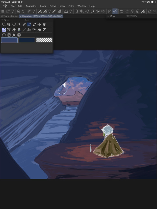
I put the colors on their respective layers (Four to start with. One for each mentioned above, and another for the moth). I try to block out shading and lighting but I keep it sloppy because it’s likely to change a LOT. This is just planning and fiddling, seeing what colors look good together.
(Spread Pencil is the one brush I couldn’t find >: at this point, this is the ONLY brush I’ve used. Don’t be tempted by blending things yet. Be sloppy.)
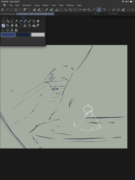
Once I get the general idea of what I want, I WORK FROM THE BACK. I hid any layer that would be ‘blocking’ that section and allow myself to go ‘outside the lines’ a bit. The overlap is helpful when making changes to the ‘front’ elements later. Remember, we’re still being SUPER MESSY.
I kept the moth/foreground visible so I can still check that the general color theme was working.
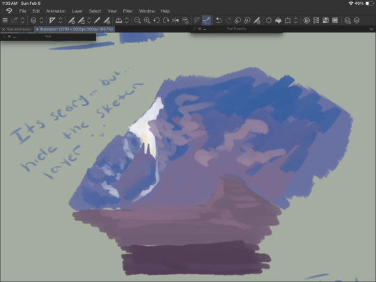
Hide the sketch layer. Do it. We’re painting, not doing lineart. You gotta. I believe in you. Look at this slop. Beautiful.

Alright, now we’re cooking! The layers are in the following order going from top (front) to bottom (back):
-Moth sketch (will be hidden later)
-Moth colors
-Background sketch (will be hidden later)
-The rock the moth is sitting on and that little rock section on the bottom left
-The rock behind the moth (hidden in this screenshot)
-The rest of the cave
-The temple
At some point around here I used “Crunchy” on the clouds to blend em a bit.
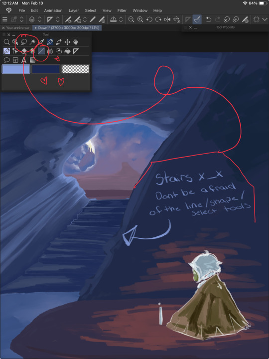
NOW IS THE FUN PART. RENDERIIINNNGGGGGG. I started with the stairs because they looked annoying. USE YOUR LINE/SHAPE AND SELECTION TOOLS. These will help you keep your lines straight and achieve crispiness if you desire. More on the stairs in a moment, but while you’re doing this, remember to
ZOOM THE HECKIE OUT. Make it thumbnail sized and squint. Can you still tell what you’re painting? Evaluate. Are the colors working well together? Is there enough contrast? How’s that composition doing? Zooming out rocks.
After taking a moment to zoom out and squint, I came up with the following notes:
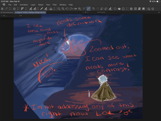
Do this regularly throughout your process, even if you’re in the middle of something mundane like drawing stairs. A LOT more contrast is needed, and taking a moment to notate this will help prevent you from doing TOO much that you’ll regret later when you end up covering it up to fix these issues you missed earlier.
Back to the stairs.
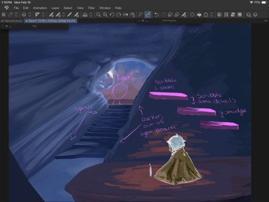
I blocked things in with the line tool and the turnip pen, then scribbled it around using ‘Hard Round V2”. When I say scribble, I mean literally. Scribble. It’s fun and freeing. We’re not trying to be precise or make anything hyper realistic. We just gotta get those colors down yknow.
Good luck.
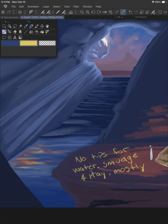
Water is weird, and I don’t understand it. We guess and hope for the best. Remember that water is clear, and for the most part you’ll be able to see through it, so unless you have a blue toned drawing (like this one), the water itself may not be blue. I generally color pick the areas around it and lighten/darken it based on those. I also knew there’d be a light beam in this area, and the reflection from the moth’s candle so some bright oranges and yellows were nice to add, as well. Don’t forget reflections/highlights if the scene calls for it!

Time for the part that actually requires a shred of skill. Thankfully, this pose is very simple and the moth’s design is, well, a moth. Don’t be afraid to toggle that sketch layer on and off for this. The moth is the main focus, and should be clear and easy to read as such - requiring a bit more work for colors and shape language.

Don’t work on one single thing for long. The moment your brain goes “im getting annoyed/frustrated/bored”, move to another piece of the painting. If you notice your character has a horrible tangent with a background piece and it’s just really bothering you - stop working on the character and fix that background area. Give it a bit more bulge (or less), shift things around. Paint over stuff.
“But I drew this really well, and it would be a shame to cover it up if I won’t be able to do it that well again!” You may ponder, anxiety filling your chest at the very thought of redrawing a hand or that one rock that just looks really, really good somehow.
And to that I ask - why won’t you be able to do it again? You did it once before, CLEARLY you have the skill and ability. If you’re worried, draw over it on a new layer so if you have to fall back on the old thing, you can. ART IS FUN. Don’t let it stress you out too much. The moment you look at that canvas and go “you know what, I CAN do it again”, you will be able to do it again.
Trust me.

With some more scribbling done, we can start detailing things that aren’t stairs. Yay! Let’s work from the back again.

LITERALLY. SCRIBBLE.
You can start blending around now, too, though. We’re getting there, and look at all we have to show for it! I tried to mimic the clouds as best I could from the screenshot because like water - they are weird and wonky and yah, hard. Cloud brushes can be helpful, but give you significantly less control IMO, but to each their own and whatever works for you, works.

BG looking good, but remember ZOOM OUT. I can see the contrast of the temple/background elements looks a bit better now, and now that I’m bored with that, I wanna bounce to that midground area, and fix up the moth a bit more. I also used an ADD (GLOW) layer to messily test some different ways to paint light beams and to find a nice color. I settled on the same yellow I used on the candle flame. I didn’t work too hard on this just yet, since there’s a lot of elements that will hit that light that I haven’t even thought about yet.
I fiddle with the main cave texture a LOT. Painting over it entirely MULTIPLE TIMES to find something that sticks. What you see here is not it. I also added some details to the ‘moth rocks’ but this also changes a little as we go.
Painting/art is a lot of push and pull. You add some darkness, take away some. Add some light, take away some. Add an element, remove one. Go with the flow and trust yourself. Turn on an audiobook or a movie and turn off your brain while you plop colors here and there. An artist I VERY MUCH look up to (Julia Lepetit of Drawfee and Secret Sleepover Society) said, “Zoom in and zone out”. It’s time to turn off that brain and paint.
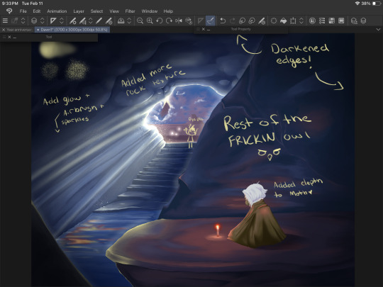
I zoned out too hard and stopped taking screenshots because oops. On the top left shows the YN Soft Round, Pecas, and Toothbrush, in that order going from the top and counter clockwise.
I darkened up the cave quite a bit and finally settled on a look for those upper rock formations. I used a MULTIPLY layer to darken up the moth’s shadow a bit, then merged the layers and used those same colors to blend it with the rest of the rock. I also deleted and added a new ADD (GLOW) layer and fixed up that lighting. This is where we get to darken shadows and add highlights and bounce light to things. Anything in bright, direct light has its original color showing through (from the original layer it’s colored on, that wonky light blue area by the stairs). Rim lighting is a great way to separate elements like this (the different rock edges) without having to use a gajillion different shades/values of the same boring blue to make it stand out.
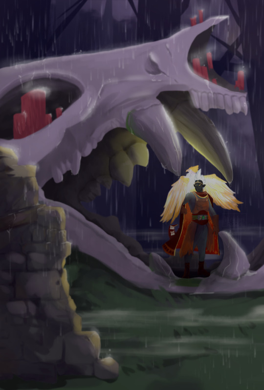
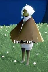
Details on the moth are also done now - mostly in the hair. A few hair strands, ESPECIALLY in Sky with the white hair we all have - looks incredible in a painty style IMO. I also SHOULD HAVE added the star on the moth’s cape at this point, but BOIIS, GORLS, AND CRYPTIDS, i forgot until I saved/exported it and had to go back and fix it. But anyway, so you don’t have to scroll up, here’s the finished piece again:
Thank you for reading, if you did! I hope it was helpful, or at the very least served me in the future like this post is intended to do!
And I will leave you off with the promised note* about color picking -
Color picking from a reference can be really cool and easy and tempting, but you know what makes that NOT work? Color theory. When you blend your colors (this goes for real life, too), there's a LOT more grey and diluted tones than you'd expect. A lot of these bright colors aren't ACTUALLY bright, save for the details on the candle light and the ADD (GLOW) layers. The orange reflections on the rocks and water are actually quite dark and diluted, but because it contrasts so well with the darker blues - it looks a lot brighter. Blending these colors together allows for a more natural soft light. This is also why I try to work on so few layers for pieces like this that are relatively simple. I can easily take a bright color and use a softy kind of brush - the hard round v1 brush is GREAT for this, a little bit of pressure over the colors you already painted down will blend them together with some minor elbow grease and mindfulness. It gets a more natural transition between your lights and darks.
Where as if you zoom in on your reference and color pick - look at it. Look at it all zoomed up, I BEG you. Make it super pixely, and you will see how much that 'one' color varies in that entire area. Unless you're color picking pixel by pixel, which at that point you're not really drawing/painting at all, it's just not going to work out and help you recreate that reference.
My personal preference is to color pick for base colors to get me started with a vibe, and then once I have a few colors down, I'm eyeballing it all the way baybee.
#doodle#digital painting tutorial#digital art tutorial#tute#art tute#painting process#digital art#digital painting#sky children of the light#sky cotl#scotl#sky children fanart#a rambling mess that's mostly for me but maybe it will help someone idk#it's 3am#im throwing this in my queue and going to bed good night ilu tumblr <3
12 notes
·
View notes
Note
could you give a tutorial on how you draw/shade water? Its so good the way you draw it
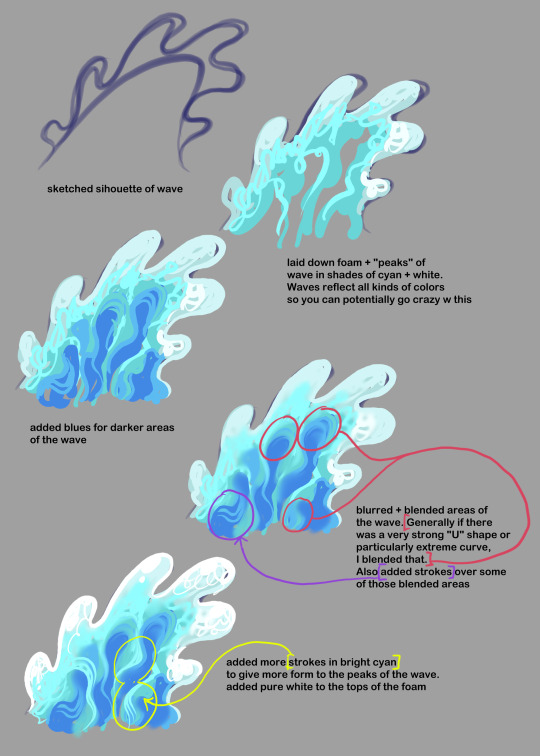
this is as quick + basic as i could describe it! Though in my last illus with the wave in it, i also did dip more extremely into colors as well (some shades of light green and purple were used).
123 notes
·
View notes
Text
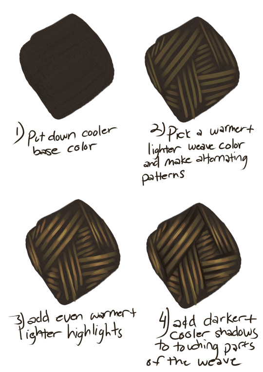
here have the quick and dirty step by step of how I paint the desert tenakth weave (or any weave really). made for someone on the visual novel project and thought it might be useful to someone else 🤷
112 notes
·
View notes
Text
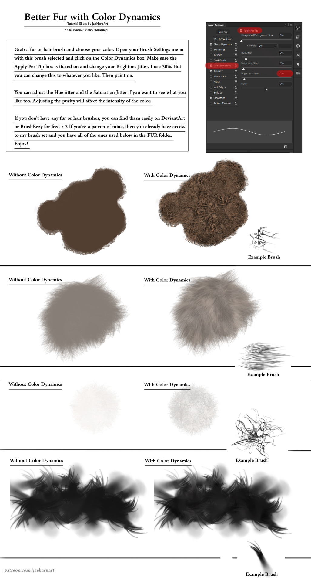
I was going to record a short YouTube video for this but I really don't have the energy right now so here's a sheet tutorial for now. If you'd like to help support my art, Patreon: https://www.patreon.com/JaeHaruArt/about If you'd like to follow it elsewhere, LinkTree: https://linktr.ee/jaeharuart
12 notes
·
View notes
Text
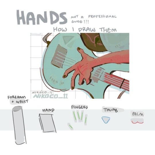


my recipe for drawing hands!
(small note that this is a shortcut that is more abt style and ease than anatomical accuracy. it helps to take time to really properly study hands, makes it easier to bend the rules a bit like this and have it still look good!!)
(learn rules b4 u break them or whatevah)
#qna#tutorial#guide#drawing tutorial#digital art#illustration#drawing#artists on tumblr#my art#clip studio paint
59K notes
·
View notes
Note
I absolutely adore the works of @hansoeii so I’m soooo happy to get this.
Colors and light are still something I struggle with. 😭
Hullo! I’ve been watching a bunch of your Timelapses and I was wondering how do you always come up with the colours for your pieces? They’re always so cohesive and pleasing to look at (I almost exclusively work in greyscale so if I’m using colour it’s always a lucky guess and it never looks quite right)
Hey there!
I have to be honest that most of the time I don't actually know what I'm doing and that I have no idea how most of my pieces are gonna turn out. My work process is usually based on "Fuck around and find out", haha. I'm happy to know that it apparently doesn't come across that way, though.
A lot of it comes very naturally to me simply because I've been drawing non-stop for so long, but I can give you some small tips that really help me:
1. Have as many references as possible!
Here's what my reference sheet looked like for the Jayvik piece:

It helped me a lot to understand the overall color scheme I wanted to convey. Lots of very cold tones, pinks and very light blues and greens. These colours sorround Jayce and Viktor throughout all of season 2 and I wanted to keep them, especially since in my piece they are lying in the glowing hexcore.
Don't shy away from using references, get as many as you possibly can! Look at other poeple's art too and try to understand how they work with colours.
2. Work with complementary colours!
Since I paint a lot of romantic illustrations I want them to look pleasing and comforting, which I can accomplish by using complementary colours! You see this a lot with couples that are blue and red coded, for example. And I wanted to do the same thing in the Jayvik piece! For that I used the highlights in their hair!


Viktor's highlights are a soft pink hue.


While Jayce's are a soft blue hue.
The colour wheel works perfect for figuring out if two colors compliment each other because they are literally right across from one another!
3. It doesn't have to be true to life.
Pretty self-explanatory, but I thought I'd add it in here anyways. It's important to understand how colour and light works, but you don't always have to follow the rules. Does the rim light look cool but it makes zero sense? Who cares! Keep the cool rim light! Just have fun and fuck around.
4. A little trick to make your life easier!
I'm not excatly the best at colour theory, I still struggle with it quite a bit, but here's a little trick I like to use from time to time:
If you want all your colours to look coherent, take one specific color as your flat colour. Choose a hue that you would like your piece to have. Like this:

Now you choose whatever colours your characters have and paint them in. For example, here are the skin colours I chose for Jayce and Viktor:

Looks off, right? These colours don't fit the overall piece at all. So what do we do?
Turn down the opacity! It's that easy, wahoo!

I went from 100 Opacity to 72 for this specific illustration. And look at that!

It's so much nicer already! Now you know what colours to use as your actual flats! Just repeat this with every other part of your illustration and you'll have a great starting point. :)
I really hope this was helpful! I'm not an actual teacher and I don't have a proper illustration degree, so some things might not be completely accurate, but I thought I'd try my hand at this anyways!
#art process#art tutorial#color tutorial#tips#illustration#colouring#digital art#digital illustration#digital illustration tutorial#digital painting tutorial#baby artist#beginner artist#colours tutorial#art is hard
768 notes
·
View notes
Text
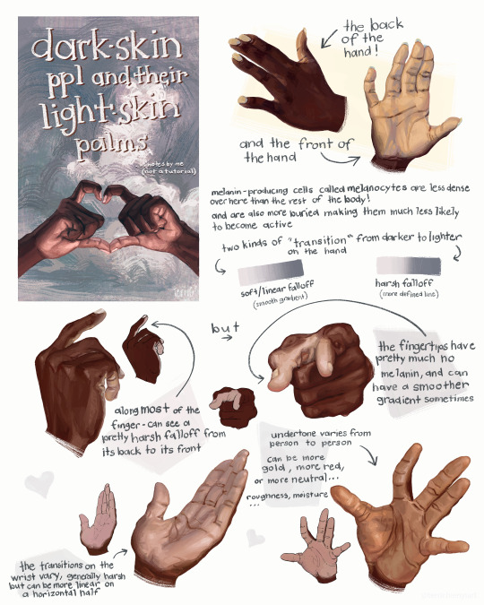
this is not a tutorial this is just me rambling
#art#art study#reference#painting#hands#digital art#illustration#bipoc#poc#black#black art#dark skin#information#art tutorial#art non tutorial#artists on tumblr#art tips#sketched this in january so its gotta leave my head someday
27K notes
·
View notes
Text
One of my long time patrons requested a space painting tutorial with a focus on how to make the stars shine and the colors vibrant. So I recorded a speed paint I made under 10 minutes of how to paint the Milky Way. I hope it helps!
You can find free downloads of the brushes I used right here YuumeiArt.com/space-tutorial It contains a brush set for Photoshop and another set for Clip Studio (converted by Arcane Halo)
Music is Tree Soul by Kentdow
2K notes
·
View notes
Text
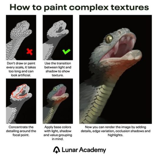
Excellent painting tutorial. In case you don't know the terms in the last description, "edge variation" means having "hard" or "soft" edges, where hard edges are crisp and good for high-detail, and soft edges are more blurry/smudged and are good for giving objects the appearance of receding in distance. In the painting above, the snake's eye uses hard edges, and its teeth and underside of the jaw use softer edges. "Occlusion shadows" are the absolute darkest parts because they are the areas where no light reaches, not even reflected or ambient light. They tend to be small and are used sparingly. Above, there's an occlusion shadow around the snake's eye. However, the shading of the eye was probably exaggerated to make it stand out more, since it's the focal point.
2K notes
·
View notes
Text
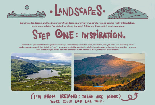
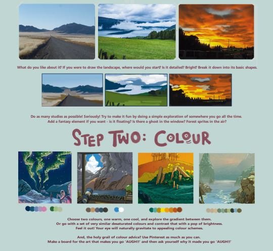

here's a landscape tutorial!
i focused on natural environments for this one, if you find it helpful I'll be back with how I learned to draw buildings.
let me know if it helps! and have fun drawing ✨
#this was really fun to put together actually hehe#tutorial#art#illustration#digital painting#digital art#artists on tumblr#digital artist#digital illustration#radarplz#sketch#my art#bethfuller
19K notes
·
View notes
Text
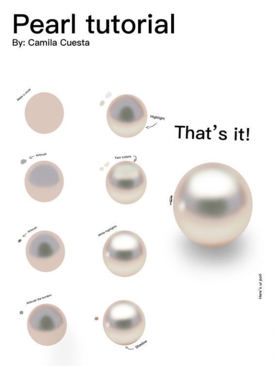
“Pearl painting process by Camilla Cuesta applies to hand-painted gameart texture painting too!”
Source: Twitter at artofjeffp
3K notes
·
View notes
Text
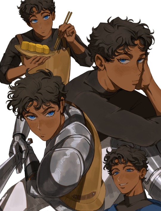
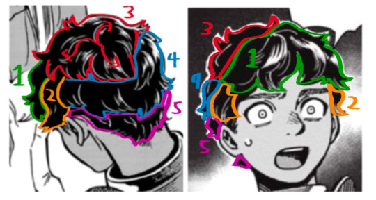
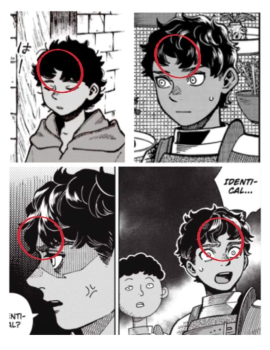
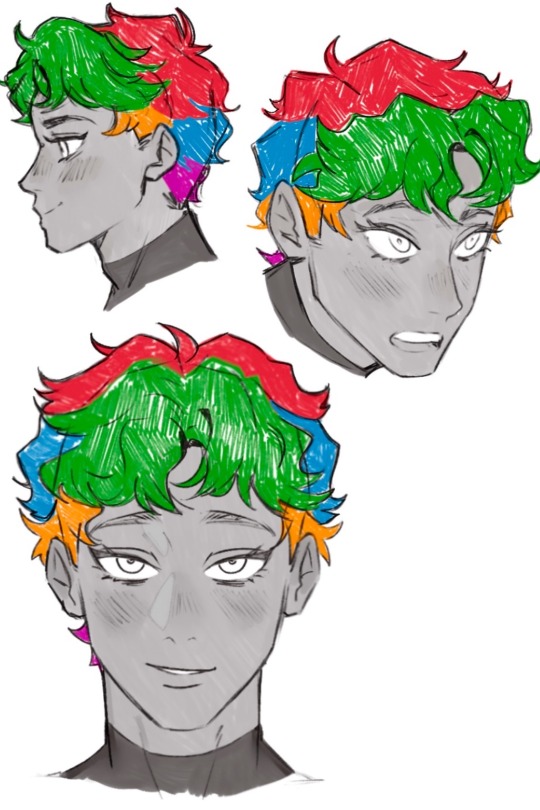
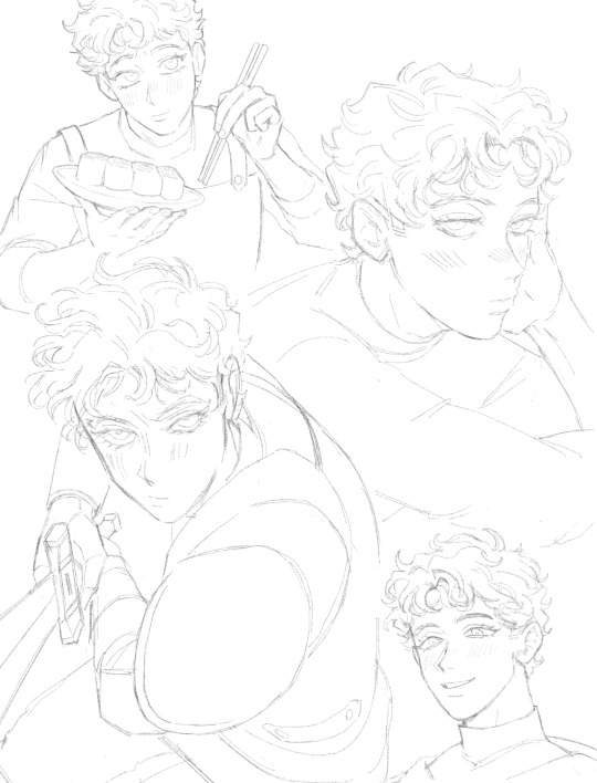
Getting better at drawing Kabru. This guy is def not easy to draw (especially if you want to draw him in your own style).
I’ve compiled some observations:
🍅 Hair: By far the most challenging part. He actually has a middle part as observed from numerous manga panels but it can be hard to notice because his hair is so short.
I also broke his hair down into approximately 5 different areas (because his hair is layered) so I can see the flow of the hair better:
🍅 Face: His face is like a cat’s face 🐱. Thinking about a cat’s face helped me a lot.
His face generally wide and round but also has a sharp, narrow chin. I’m more used to drawing older characters so this was a struggle to me.
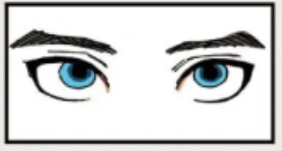
🍅 Brows: I never noticed this until I bought the Daydream book but his brows are actually thicker at the ends and angled downwards.
Also sharing my lineart (lowkey like this a lot):
#digital illustration#procreate#delicious in dungeon#dungeon meshi#kabru#迷宮飯#kabru of utaya#喀布爾#digital painting#my art#gomigo_dog#tutorial
840 notes
·
View notes
Text
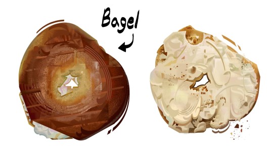
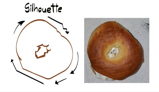
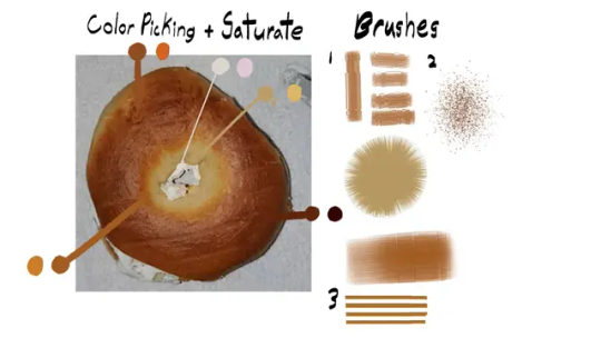
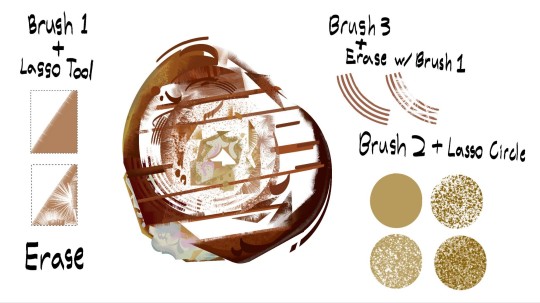
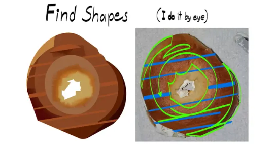
Painted a Bagel
#digital art#digital painting#digital illustration#illustration#visdev#bagel#food art#art study#tutorial
2K notes
·
View notes