#design challenges
Explore tagged Tumblr posts
Text

boy toys 🎾
16K notes
·
View notes
Text


It is done (enough)!
I would hype it up more but this is really really simple. It randomly generates a set of symbols, colors, and a word, and then the expected thing to do with those is you draw some sort of character based off the result you get. So it's just an art challenge toy thingy.
There are also some practical features like you can lock parts of the result in place to rerandomize the rest, or hide parts of the generation you don't care about (like if you want to pick your own colors or hate the words being there)
You can try it out over on itch.io!
It should run in browser, but there's also a downloadable version for Windows if you want to use it offline. (No mac/linux versions for now, because I don't have appropriate computers to test those on and I...don't want to deal with mac's developer accounts or whatever their problem is...)
Here's something I made from one of the results I got for the sake of example:

(It's a bit of a rushed drawing sorry I just wanted to get the actual generator out there)
I hope everyone has fun with it :]
#my art#art challenge#Man I have no idea how to tag this I'm just going to hope people find it on their own.#oc#original character#character design#<- these tags included due to my friend's advice.#mypost
16K notes
·
View notes
Text
Apple's iPhone 17 Air Faces Design Challenges Amid Battery Development Issues
Apple’s forthcoming iPhone 17 Air may not achieve the previously speculated slimness. Reports indicate that the company has encountered obstacles in developing a high-density battery essential for maintaining a sleek design. The production of the advanced battery has proven costly, with a notable scarcity of defect-free units. Consequently, the iPhone 17 Air is expected to exceed 7mm in…
#apple#Apple&039;s iPhone 17 Air Faces Design Challenges Amid Battery Development Issues#battery development#design challenges#device thickness.#high-density battery#iPhone 17 Air#market competitiveness#OLED ProMotion display#Samsung Galaxy S25 Slim#ultra-thin design
1 note
·
View note
Text
CTS B | Week 11. Compulsory Question 1.

In Week 11, the class and I delved deeper into the manifesto topic and were able to create our own manifesto in group work (Figure 1). At the beginning of our work, we thought for a long time about how to show the transformational path of a designer and the importance of landmarks at each stage, which allow us to build on them and grow at the same time. Based on this, we decided to create a board game as the embodiment of the idea that every path is a game, and in order to reach the end, we need not only motivation, but also reference points in the form of manifestos that help the designer feel confident in his movement, and at the same time become an incentive for growth and development.

In my version of the manifesto, I interpreted it as a roller coaster, since this image is more similar to my path in design. (Figure 2) I visited both the top of the slide and its bottom, from where I slowly climbed with great effort to my goals. Each stage was difficult and interesting in its own way. Career as a designer is not a linear path, but a dynamic adventure full of unexpected twists and exciting moments that sometimes look scary, but when you overcome them, they no longer look so extreme. She reminds me of the importance of staying resilient and enthusiastic even in the most difficult times, because every descent is invariably followed by a new ascent, opening up new opportunities for creative and professional growth.


For example, in the first semester of study in the subject “Studio”, working in pairs became a real challenge for me. I have always worked only on a freelance basis. However, the new experience of working together on branding for the festival turned out to be not only difficult, but also incredibly valuable for me. I had to learn not only to balance my ideas with my partner's opinion, but also to adapt to the dynamics of group work. This required the rapid development of communication skills (Figure 3), the ability to listen and find compromises, which undoubtedly became a significant test and also a point of growth (Figure 4).

To summarize, I would like to turn to the thought: "So, as we embark on this journey through the power of "yes" in design, let us remember that it's not just about saying "yes" to ideas; it's about saying "yes" to transformation." This phrase perfectly captures the essence of our manifesto and my personal experience in design and training. By saying yes to new ideas, challenges and opportunities, we open the door to transform not only our work, but also ourselves as professionals with the help of new learned skills. (Figure 5)
(462 words)
References:
1. The Collective Web-Page, "The Yes Manifesto for Designers: Unleashing Creative Revolution". October 3, 2023. https://www.madebythecollective.com/conversations/the-yes-manifesto-for-designers-unleashing-creative-revolution. (Accessed November 1, 2024)
2. The Harvard Gazzete Web-Page, "If it wasn’t created by a human artist, is it still art?", Liz Mineo (Harvard Staff Writer), August 15, 2023. https://news.harvard.edu/gazette/story/2023/08/is-art-generated-by-artificial-intelligence-real-art/. (Accessed October 26, 2024)
3. Medium Web-Page, "Design Manifesto: A Mindset", Tye Obrien, May 1. https://medium.com/@tyeobrien/my-design-manifesto-943bf73be74. (Accessed November 1, 2024)
#critical thinking#personal growth#my manifesto#creative process#transformational design#design challenges#continuous learning#self improvement#self development#soft skills
1 note
·
View note
Note
It might be a little abstract, but could you draw a telephone pole dragon? With the wires and lights I think it may be cool

#141 - 電線 (diàn xiàn / electric line) - Better not touch this telephone pole! ⚡⚡⚡
#ask and you shall receive :3#daily dragon drawing#dragon#art#dragons#chinese artist#dragon art#year of the dragon#artists on tumblr#art challenge#illustration#chinese dragon#dragon oc#daily drawing#daily dragon#dragon a day#zodiac#drawing#creature design#telephone pole#electric line#electric pole#electric dragon#electricity dragon
9K notes
·
View notes
Text
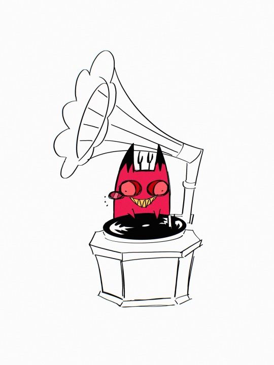
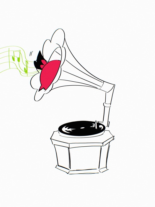
@/coma_0423’s cursed cat alastor will bring you happiness ♥️
Lulu scolds the cat
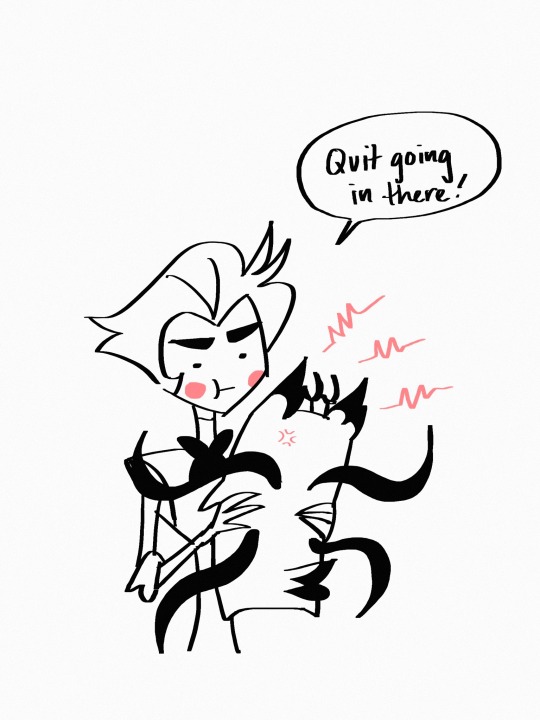
#I could’ve sworn I posted this doodle#I took a break from drawing stuff to doodle this lol#I’m learning clip studio paint! it’s very exciting but challenging so things are moving slow#rn I’m working on the anthology comic#but then back to my bullshit#but school starts next week#hnggg#im sure I’ll find time to slack off tho and draw#also unrelated to that but related to this post#is it weird that it’s so important to me that everyone knows cursedcatalastor’s author#he really became a sensation#which is cool as hell#but idk I just like the thought that people know who designed this lil guy#ESPECIALLY WHEN PPL TRY TO MONETIZE UGH THAT MAKES ME SO UPSET#anyway lemme go make brekky sorry for rambling#tho if you’re reading this#why do u read all my tags im literally an insane person#okay gtg bye ily#hazbin hotel#my doods#hazbin hotel fanart#alastor#cursed cat alastor#liked by creator#forgot that one#lol it’s what reminded me to post this here in the first place
3K notes
·
View notes
Text
What is Creativity?
View On WordPress
#Action#Business#Calmness#Creative Problem-Solving#Decision Making#Design#Design Challenges#Design Talks#Design Thinking#Fashion#Francesca Macri#Graphic Design#Hurry#Philosophy#Reflection#Time#Time Management
0 notes
Text
Key Strategies for Graphic Designers to Conquer Creative Blocks
Learn innovative solutions to design challenges and reignite your creative spark in the dynamic world of UI/UX. Visit the link for more details.
0 notes
Text

Oh alice..you would have loved Tim pls don't end up like him <3
#design might change as we go on!!!#also “jonathan sims pls stop writing hot women challenge”#he is losing#my trashy art#tmagp#tmagp fanart#the magnus protocol fanart#the magnus protocol#alice dyer#alice dyer fanart#alice tmagp#alice tmagp fanart
12K notes
·
View notes
Text
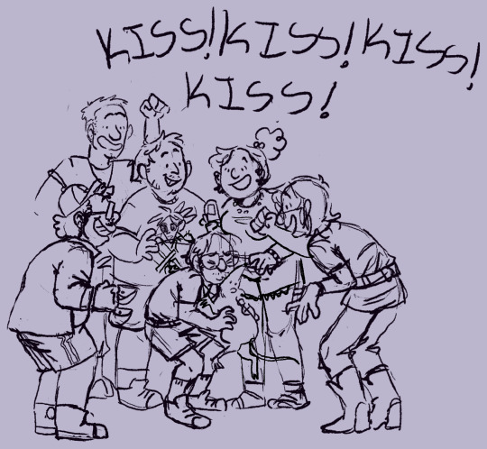

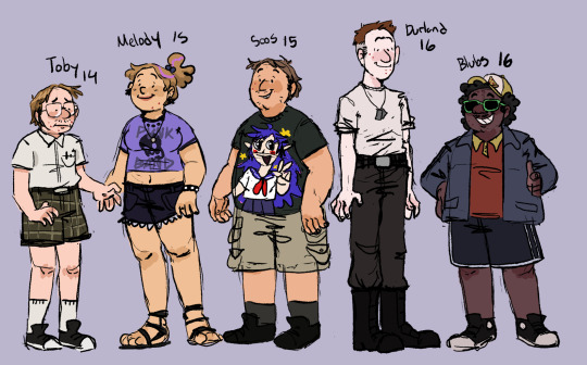
relativity falls but fidd is a member of the losers club or something
#i like them a normal amount#i love you stephen kings it#gravity falls#relativity falls#fiddleford mcgucket#stanford pines#ford pines#stanley pines#stan pines#toby determined#melody gravity falls#jesus alzamirano ramirez#soos remirez#sheriff blubs#deputy durland#character design#myart#tumblr please see my not shitposts challenge
5K notes
·
View notes
Text


ron and hermione photographed on the steps of their first home together makes it into the Prophet

#(this is a draw this in your style challenge over on my instagram…. if you wanna hop over there and join the challenge…)#romione#harry potter#ron weasley#hermione granger#golden trio#the golden trio#ronmione#ron x hermione#hermione x ron#rita skeeter#the daily prophet#daily prophet#harry potter fanart#hp fanart#hp art#harry potter art#my art#artists on tumblr#character design#vis dev#visual development#in a just world where i didn’t have any self preservation skill and didn’t care about myself i would’ve animated this but alas..#i care about my wellbeing
2K notes
·
View notes
Text


the stones are in order
#mcsm#minecraft story mode#mcsm fanart#mcsm petra#mcsm olivia#mcsm axel#sopuuart#my doodles#finally got their designs down properly!! specifically liv and axel bc i don’t draw them enough argh#in other words i challenged myself to draw a full post without any jesse or lukas#i failed btw. they are kissing in the draft layers <3
3K notes
·
View notes
Text

Persian Miku!?
In traditional Mazani clothing from persia!
More info⬇️⬇️
Mazandaran province is one of the 31 provinces of Iran. Its capital is the city of Sari . Located along the southern coast of the Caspian Sea and in the adjacent Central Alborz mountain range.Mazandaran is a major producer of farmed fish, and aquaculture provides an important economic addition to traditional dominance of agriculture. Another important contributor to the economy is the tourism industry, as people from all of Iran enjoy visiting the area.
Language: The population is overwhelmingly Mazandarani, with a minority of Gilaks, Azerbaijanis, Kurds, Georgians, Armenians, Circassians, Turkmen and others, Mazandarani people have a background in Tabari ethnicity and speak Mazandarni.
Culture( literature) : In the Persian epic, Shahnameh, Mazandaran is mentioned in two different sections. The first mention is implicit, when Fereydun sets its capital in a city called Tamishe near Amol:
بیاراست گیتی بسان بهشت.................... به جای گیا سرو گلبن بکشت
از آمل گذر سوی تمیشه کرد .............. نشست اندر آن نامور بیشه کرد
And when Manuchehr is returning to Fereydun's capital, Tamisheh in Mazandaran (known as Tabarestan), after his victory over Salm and Tur.
Arash the Archer is a heroic archer-figure of Iranian mythology. According to Iranian folklore, the boundary between Iran and Turan was set by an arrow launched by Arash, after he put his own life in the arrow's launch. The arrow was traveling for days before finally landing on the other side of the Oxus on the bark of a walnut tree hundreds of miles away from the original launch site atop a mountain
Music and dance:
Music in this region relates to the lifestyle of the inhabitants, and the melodies revolve around issues such as the forests, cultivation or farming activities and herding. The most famous dance of this area is the Shomali dance, not forgetting the stick dance that the men perform. Popular music in the province, known as the Taleb and Zohre, Amiri Khani and Katuli.
Cuisine :
The cuisine of the province is very rich in seafood due to its location by the Caspian Sea, and rice is present in virtually every meal. Mazandarani cuisine is diverse between regions; the cuisine of coastal regions is different from mountainous regions, as people in the Alborz usually use the indigenous herbs and coastal people use the dishes of fish and Caspian Mazandaran rice with vegetables.
#art#design#anime#fashion#fanart#miku#hatsune miku#vocaloid miku#miku fanart#persian#ancient persia#mazani clothing#twitter#artists on tumblr#my art#illustration#vocaloid#traditional clothing#traditional costume#miku challenge#international miku
2K notes
·
View notes
Text

Finally finished this after ages ಥ‿ಥ
☆Twitter Version☆
Original Template by @popipurin
#literally procrastinated for months#missed the point of the challenge too#my designs for The Gang#scum villian self saving system#scum villain#svsss#svsss fanart#mxtx#mxtx fanart#shen qingqiu#shen yuan#luo binghe#luo bingge#shang qinghua#mobei jun#liu qingge#yue qingyuan#liu mingyan#sha hualing#ning yingying#ming fan#tianlang jun#su xiyan#zhuzhi lang#gongyi xiao#shen jiu#moshang#bingqiu#drawing meme#draw svsss from memory
4K notes
·
View notes
Text
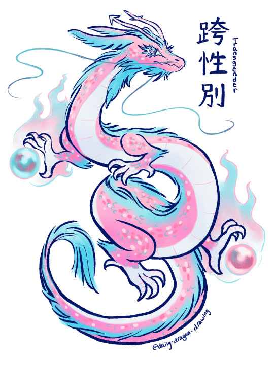
#111 - 跨性別 (kuà xìngbié / transgender) - A dragon that transes your gender?! 🏳️⚧️💙💗🤍⚧️
#send me pride dragon requests plz!!#daily dragon drawing#art#art challenge#artists on tumblr#chinese artist#dragon#dragon a day#dragon art#dragon oc#dragons#daily drawing#daily dragon#chinese dragon#drawing challenge#drawing every day#drawing#illustration#year of the dragon#fantasy creature#creature design#zodiac#dragon illustration#pride#lgbt pride#queer#queer pride#lgbt#lgbtqia#pride dragon
18K notes
·
View notes
Text
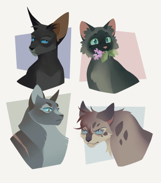
get these guys some brown contacts
3K notes
·
View notes