#denton designs
Explore tagged Tumblr posts
Text

UK 1987
71 notes
·
View notes
Video
youtube
Console Sports Games of 1993 - World Class Rugby
Developed by British developer Denton Designs and published by fellow British company Audiogenic Software. World Class Rugby was released in 1991 for the Amiga, Atari ST, Commodore 64, ZX Spectrum and Amstrad CPC to coincide with the Rugby World Cup that took place the same year.
The game was then licenced out to Japanese publishers Imagineer Co and Misawa Entertainment with a port to the SNES being developed and released in 1993, a release in Europe would also happen in 1993.
World Class Rugby's main mode is the world cup mode with a full 16 team competition like the real thing. A league mode is also included as is a friendly mode.
1. Intro 00:00
2. Gameplay 00:15
3. Outro 10:56
Twitter (Gaming & AI Art)
https://twitter.com/zero2zedGaming
Instagram (AI Art)
https://www.instagram.com/random_art_ai/
For more sports game videos check out the playlists below
Console Sports Games of 1993
https://www.youtube.com/playlist?list=PLFJOZYl1h1CEhIf6hohng9T2IPLCpzn7o
#youtube#world class rugby#sport#rugby#1991 rugby world cup#rugby world cup#sports#snes#sports game#90s games#90s gaming#classic games#retro games#imagineer co#misawa entertainment#denton designs#audiogenic software
0 notes
Text
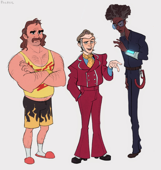

my take on the steeplechase trio (and montrose’s mask variants)
#my art#taz#taz steeplechase#since beef is an arm wrestler im kinda entertained by the idea that he keeps it casual from the waist down#but all of his shirts are branded beef punchley shirts#i like to think that all of montrose’s clothes are slightly too big for him because he buys them himself#but doesn’t have the money/resources for a tailor#and he can’t go to dentonic bc his uniform is supposed to be something totally different#i kinda struggled with his mask#but i like the idea that it really is a human face but you can see the edges. the metallic parts of the mask. the little glitches#his skin color is always ever so slightly off#also griffin described his actual face as ‘plain’ so imagine he looks like just some guy. a little babyfaced#while his ‘neutral’ mask is just generically handsome#and i didnt draw that but i think it glitches out sometimes and his face goes all wonky#sorry griffin i took over your boy#emerich was probably the easiest to design he just sprung into my head fully formed#i don’t remember if the give-a-ghost projector is actually supposed to be on his arm#but it is now .#also i would like everyone to think about montrose talking about jesus in that dumbass clean job mask please. thank you
752 notes
·
View notes
Text
Postin m' fuckass Denton design b'fore I forget.
(he doesn't deserve another eye. (I didn't wanna draw th' other eye.))

A little Denton headcanon I have is that he has synesthesia, which goes hand-n-hand wit his masochism a bit.
Being in pain makes him see explosions of colors in his head!! N loud sounds like drills, or yellin or.. other things, make him see color too. What a freaky lil guy!
(Orin's voice makes him see a dark navy blue wit sparks of red—especially when he's drillin.)
Now have this fuckass mini-comic I made based on headcanon I saw somewhere on Tumblr a while ago that I added a bit more onto.

Basically summary of the headcanon is that:
Denton n Orin keep runnin into each other out in public. Denton is always excited t' see his (new) favorite dentist, n always shouts at him from across th' street.
Orin, however, hates these interactions. He doesn't like Denton, n is actually pretty freaked out cus they keep running into each other. It's happened so much that he's convinced Denton is stalkin him.
#that masochistic fuck from lsoh#i hate him#I'd kick him but I'm afraid he'd enjoy that#lsoh#little shop#little shop of horrors#lsoh headcanons#headcanons#Arthur Denton#Arthur Denton lsoh#orin lsoh#orin scrivello#orin scrivello dds#art#queer artist#lsoh designs#host post#💜#- Dr. P#- Arthur Denton!!#dr pepper collective#i really hate dentorin#im not sorry#1 dentorin hater
27 notes
·
View notes
Text
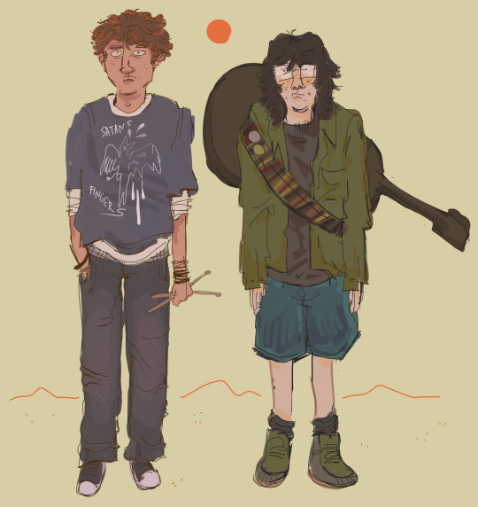
Also Mountain Goats fanart if that means anything to anyone
#tmg#the mountain goats#best ever death metal band out of Denton#all hail west texas#tmg fanart#digital art#my art#illustration#character design
125 notes
·
View notes
Text


When I first drew that JC reference like three months ago, I didn't really expect that I'd turn it into a full *project,* but here we are anyways lol. I also didn't expect to draw Alex, let alone redesign her! But that's a long-ish story. All of them are relatively janky looking in their own right, but they're all just personal reference points so who cares.
Since this isn't exactly a *thrilling* artwork and I'm a little low on ideas for funnier/more engaging stuff, I think I'll do a little analysis on each design. Some cross between analysis and personal interpretation. Also explaining the intention behind the Alex redesign, since it's a departure from the original.
FOR PAUL;
Most of the visual interest in his design comes from the trench coat. Most evident when you *take* it from him. He looks almost bare without it. A lot of it may be the lack of the purple in his design; my hypothesis is that his design manages to be so eye-catching through a relatively successful triadic color scheme. Purple, green, and orange (brown, but it's a dark orange, in this case). Usually, triadic schemes are best used for their sharp contrast, but that's not the case for Paul. His design may not be outright *eye catching* but it is unique and will draw the eye, mostly due to the low saturation of his color palette. The colors don't fight or pop out too much. They share emphasis.
A funny side note- Paul's eyes are not the same as JC's, which I didn't realize until I colored him in properly. His eyes sit on a darker blue base- the bright blue, which IS the same as JC's, takes the place of the pupil. Meanwhile, JC's pupil is an even lighter blue.
Drawn at approximately 5'11.
FOR JC (male);
JC's outfit is undeniably a ripoff of Blade (1998), therefore, the best means to distinguish the two is through color palettes. JC gets to have his cold, moody colors, but they're not completely *dark.* Where Blade wears black, JC wears blue. Dark blues (mostly), but still blues nonetheless.
I took a few liberties with JC. I didn't quite like the look of the leg straps (and then I gave them to Alex- oops) so I replaced them with leg pouches instead. Better for storage & the tactical look JC is going for.
I also toyed with the idea of changing his hairstyle to a short one, but thought I'd keep the slicked back hair because I like the idea of him taking inspiration from his older brother. After all, the Deus Ex Bible said he admired him greatly when he was younger; the whole secret agent deal. I like to attribute the very 'action hero' look to that idealization as well. JC as a character is very idealistic, almost- if not outright- naive. His picture of the world is more fiction than reality until the events of the narrative rip it from him- or at least, that's what I interpreted. Compare him to Paul, who has a much simpler, more practical design. Aside from the embellishments on the trenchcoat, Paul looks extremely normal. Meanwhile, JC sticks out quite a lot.
The boots were fully improvised. I had no clue what was going on in the texture and couldn't find a reference I liked.
Headcanon name for him is James Chris because I like how it sounds. :) I only remembered that James Bond exists AFTER I thought of it and couldn't find a name I liked better.
Drawn at approximately 5'11.
FOR JC (FEMALE)
Drew her shortly after I played the Lay D. Denton mod for the first time. I was so inspired that I *had* to make my own design for her. I love the idea of a female JC.
I did take some liberties from the mod's design, though. I returned her widow's peak, for one. One of the odd tidbits I remember from biology class was that widow's peaks are a dominant genetic trait, so even if she *wasn't* a clone of Paul, the chances of her having one would still be 50% at minimum. As for her hairstyle overall, I thought I'd let it be loose but still slicked back- reminiscent of her male counterpart. JC struck me as the type to keep her hair short rather than put it into a bun or ponytail. More convenient overall. Not a buzz cut- since male JC didn't get one either- but still above the shoulders.
I also removed the nail polish. It's an idea I love for a secret agent of her type, but I just don't get the idea that she'd wear it from her personality (+ refer to the bit about JC's 'tactical look'). It would suit someone like Navarre better in my opinon, showing efficiency in her job- that she's so good she wouldn't need to worry about chipping a nail as well as the fact that she has time to re-paint them. Unfortunately, Navarre has cybernetic arms. Maybe she can paint her nails anyways- don't know.
Ditto for the lipstick.
I removed the stiletto heel- though that's not the fault of the mod. They had to use a generic model & re-texture it for her design, after all. I did, however, let her have about a ~2 inch heel. Nothing *too* obscene. More of just a reference.
The vest is modeled on one I saw online that I liked the look of.
Headcanon name for her is Joan because I've loved the name 'Joan' as long as I've been listening to Joan Jett's music. Kept Chris because I like the sound of it as a gender neutral name.
Drawn at approximately 5'6, with 2 inch heels to make her 5'8.
FOR ALEX:
Hers is somewhat of a story.
I was considering making this into a full Denton lineup- as I now have- but thought it would be incomplete without Alex. Issue is that I don't especially like Alex's design all that much, male OR female, but female especially. That's when I thought to redesign her. Side note, I went w/ female Alex because I liked the voice performance better + I just like the idea :)
It spiraled from there, starting as a design more consistent with the other Dentons (one of the gripes I have w/ the original design), into a rewrite. So I wouldn't say that this is by *any* means the same Alex as Invisible War.
Given that it's relevant to the design, the premise is as follows; rather than being Alex 20 years in the future, this Alex would instead be the one found in Area 51, the one who was retconned out of the story. The intention behind that setpiece in the level always interested me a lot, whether or not it was later retconned. The idea of accelerated clone growth + memory implantation also caught my eye, and I wanted to use her to explore all of those things a little more. Therefore, that would be her function. The Dentons are prototypes, after all. She exists in an alternate world, a take on the scrapped UNATCO route everyone wonders about, though it would differ in the sense that it only happens if JC fails the Lebedev mission. Paul goes fully MIA, and Alex is deployed early to fill the empty space. Without having led a full life & full outside control over her memories, she'd be a complete UNATCO zealot; what MJ12 wanted JC to be. There's more detail than that, but that's about what's necessary for the design to make sense.
It's a blend of the other Dentons & prominent UNATCO figures. She has the same physical features as her siblings- same face, same approximate build, same nanoaugmentations, so on. Her clothes, however, are meant to resemble the mech-augs more than it does the Dentons. Where the Dentons wear looser clothing, Alex's is more form fitting, akin to Anna Navarre & Gunther, even if she has no cybernetic joints that loose fabric could get caught in. It's meant to reinforce the idea of her loyalty to UNATCO rather than anything else.
The jacket is meant to resemble the Dentons, however. Even then, it's cropped because she wouldn't necessarily be a "full" Denton (for lack of a better term) or share a true connection with them beyond genetics.
As for color scheme, it follows that pattern. She relies on a black base more than her siblings do, again akin to the mech-augs. The prominent blue is meant to be similar to JC's, but it's also worth mentioning that JC and Paul (Paul especially) have much more of a green tint than what I selected for her. Alex's is more metallic, once again to mimic Navarre & Gunther. Still, she is a Denton, fully manufactured or not, so the blue of her design is meant to be more prominent & full than it is with the mech-augs.
The hair gave me some trouble. It's meant to be the same-ish style as the Alex of Invisible War, but I'm ngl I was struggling to draw it. I had also wanted to give her some kind of facial accessory- Paul has a beard, JC has his sunglasses, but I couldn't find something for Alex. I didn't like the look of a facemask or gasmask- I also considered goggles, but they would be too reminiscent of JC's shades while also being made redundant by her augmentations. In the end, I left her face as-is.
Drawn at approximately 5'6, with 1 inch heels to make her 5'7.
Anyways, I made an Invisible War version of the lineup too for fun, and because I wanted to see what the Alex design would look like with the original purple look. :)

isn't character design fun
#deus ex#dx1#jc denton#paul denton#alex denton#maybe#kind of a redesign#and kind of a rewrite#so maybe it counts more as oc#i dunno really lol#some design analysis? perhaps?#god i love talking color schemes lol
9 notes
·
View notes
Text
My take on the Dentonic logo/pin from the first Steeplechase heist :)
#TAZ#the adventure zone#taz steeplechase#the adventure zone steeplechase#Dentonic#the mcelroys#art#concept art#animated gif#digital art#digital animation#animation#logo design#justin mcelroy
193 notes
·
View notes
Text


Great little set from Shock Treatment (1981)
#shock treatment#1981#denton#jeremy newson#betsy brantley#wendy raebeck#set design#movie sets#1980s film#80s movies#musical#comedy#jim sharman
3 notes
·
View notes
Text
More about my Newsies au prt 6
prt-5
This is prolly be the last part. These are characters who aren't newsies and one who's not alive lol.
Tobi Dawson: (he/him) (Denton alt)
16 years old
5'5
even though he's so young he's one of the more experienced reporters
helped with the same war that Denton canonically did
he's very straight forward
He works with Brook
acts way older than he is
Brook(Brooklyn) Plund: (She/her) (Katherine alt)
5'4
17 years old
wooooo Katherine/Brook
Journalist
related to the Pulitzer alt yes yes
she's also awesome
She and Noah still do kiss in that one scene but she and he quickly realize that he's got eyes out for someone else
works with Tobi
she's better at journaling than Tobi is
Mini(Minerva) Aria: (she/her) (Medda alt)
22 years old
5'3
I don't really know what to say for her, she's Medda
Plunds: Pulitzer alt
Vic: Wiesel alt except he's nicer to some newsies
Calc: (she/her)
Former Queen of Brooklyn
she was 16 when she died
5'10
She had an eye on Snap for a while before she died and he became King
and now I prolly have another series planned thats actual writing and not just lists about my characters lol, yippee!
#92sies#newsies#oc#character design#more stuff about my newsie au#newsies broadway#denton newsies#katherine newsies#medda larkin#original character
3 notes
·
View notes
Photo

5 notes
·
View notes
Text

UK 1987
88 notes
·
View notes
Photo

Pool - Transitional Pool Photo of a massive transitional backyard fountain with an infinity pool
#mike farley#sirius solid denton#luxury pools#dron shot#asymmetrical design#graphite air slate#black tile
1 note
·
View note
Photo


McDonald’s at the Denton House - New Hyde Park, NY (year unknown)
Designed by Haverson/Rockwell Architects
Scanned from the book, Restaurant Style
998 notes
·
View notes
Text
i truly hate to be the one to Correct people having fun but i might go insane seeing all the posts insisting the costumes in the newsies votes video are fully undeniably canon 10/20-years-in-the-future designs for the newsies. they’re definitely not, and your least favourite fashion historian is here to explain!
the actors wearing the costumes may be older now, but they’re still definitely costumes of the children in the show, at the time of the show. katherine is still dressed in undeniably 1899 fashion, a floor-length petticoatted skirt and a striped blouse with puff sleeves and a stand-up collar, a corsetted silhouette, the picture of the era. crutchie is dressed distinctly like a child in the 1890s - he’s wearing knee pants, children's clothes, which he absolutely would not be wearing as an adult. (one reason i’m a little riled up about this is the implication that adult crutchie would still be dressing like a child, when this fandom has such a history of infantilising him).
they wouldn’t all be wearing newsies caps as adults. they’re holding a newsies rally! and the camera denton uses is near identical to the ones used in the show/movie, in 1899.
the suffragettes’ fashion (and history) skews a little later, notably the narrow skirts and shorter hemlines, but we’re definitely playing a little fast and loose with the timeline here because the suffs musical takes place in the 1910s. clearly, the video isn’t meant to have a strict timeline or canon considering all the conflicting details — most of the extras’ costumes aren’t historical at all!
it’s just an unofficial, for-fun bonus video, for a good cause. no canon designs, and definitely not canon adult designs.
#this isn’t to say you can’t have fun with your future headcanons you absolutely can and ive loved seeing them#but the ‘omg canon future designs’ ‘weve unanimously agreed these are official’ 'omg them as adults!' have worn me down#fashion means things and history is important!#newsies#livesies
44 notes
·
View notes
Text
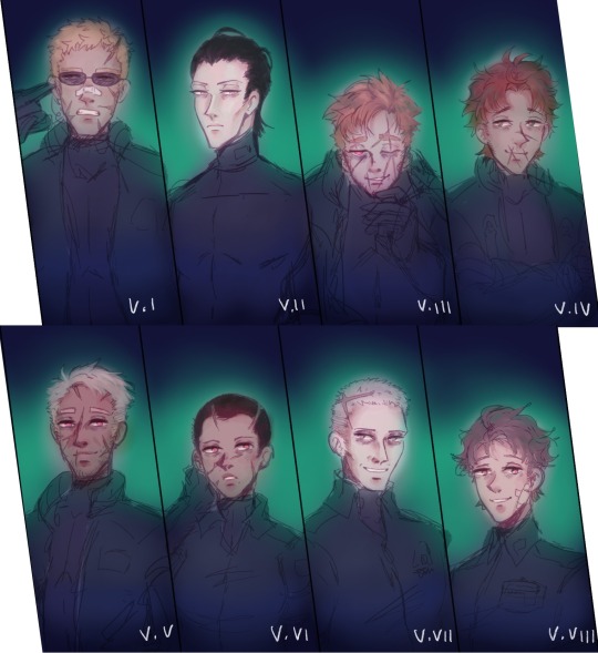
Full vesper lineup that I super gave up on u_u I’ll finish it one day…
Some Design Notes under the cut
I did these before really looking at the SVT data log. I do what I want no one tells knuckles which way is north
I need to make Rusty’s hair less orange but I fucked around too much with the colours and I have no idea how to fix it anymore
Everyone is tired and has been fucked up from previous sorties. Except for Snail because he's on so much augment juice.
I need to properly design their body glove suits but they’d be made of a surprisingly thick material- probably made of some crazy patent material that’s protective and can store and purge heat well so it can be worn in all climates.
Since they looked kinda naked with just the skin suit on I liked the idea that they can put a jacket or coveralls over it when not piloting. So all those regulars don’t have to be looking at their caked or cakeless squad leader
Freud- Has the JD Denton sunglasses because my bf just imagined Freud looking like him.
Snail’s getting his own post. Snail containment, but also I draw him as a middle aged man who looks like a 30 year old twink because that’s funny.
O’Keeffe crumpled and old. I also draw him as a trans man but I’m not brave enough to post old man coochie yet…
For Rusty, I originally focused his scarring around the mouth to fit with the muzzled wolf thing, with him using an oxygen mask while piloting as well.
Hawkins dilf. That’s it.
Maeterlinck shaved head because I’m no coward
Swinburne should be giving Patches but I couldn’t make him bald… bro looked like an adult baby…
Pater small. Normal lad :)
#abandoned wip#armored core#ac6#vespers ac6#v.i freud#v.ii snail#v.iii o'keeffe#v.iv rusty#v.v hawkins#v.vi maeterlinck#v.vii swinburne#v.viii pater#my work#armored core vi#the gang's all here#rusty ac6#my art#digital art
57 notes
·
View notes
Text
LSOH x TADC AU designs!!
Ye ye some designs for my lsoh x tadc au I talked about a while back lol :3 btw I won't spoil but tadc ep 3 was pretty good IMO!! I can't guarantee I'll get back into tadc since I feel like the main reason I did after ep 2 was for Ribbun mostly lol but hey who knows? Speaking of, I don't ship them in this AU personally but idgaf what y'all ship with them, preferably not Pomni n Caine tho since this is going by the 1986 version of the movie where Mr. Mushnik acts more like a dad to Seymour.

First up, we have Pomni as Seymour and Queenie as Audrey 2!! I like to think she starts to abstract as she is "dying" of starvation :]
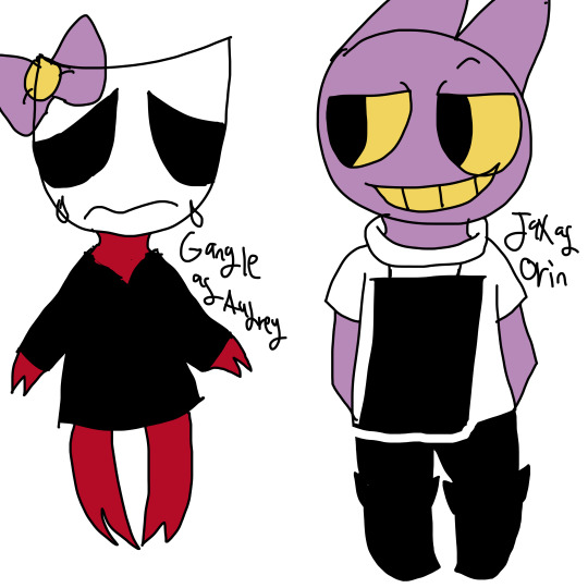
Next up we have Gangle as Audrey and Jax as Orin because OH BOY are they toxic...also added the bow cuz I didn't wanna give Gangle hair but I wanted to give her..something..so ye

Next up we have Bubble, Sun and Moon as the Chiffon girls cuz...idk. My only real thought is Bubble, Sun and Moon are all paired together for the Animiz figure & they're all just talking objects so..yeah

Then we got Caine as Mr. Mushnik and Ragatha as the radio host person thingy that Seymour talks to! For Caine, I decided to take more inspo from Mr. Mushnik's design from the cartoon Little Shop just to differnate this from regular Caine as much. For Ragatha, idk I wanted to make her look like a typical 80s' girl lol

Last, but not least, we got Kaufmo as Arthur Denton!! :3
Also, I didn't feel like drawing them cuz they would play such minor roles but I think Gummigoo would be the first guy to come in and notice Audrey 2 and buy a dozen roses(or two dozen..? i cant remember lol) since that guy already talks a bit like an NPC lol. And then Zooble would be the nurse that just wants to get the hell out of there during the Arthur Denton scene lol.
But yeah, lmk what y'all think!! :3 /nf
#lsoh#little shop of horrors#crossover#crossover au#lsoh x tadc au#tadc x lsoh au#pomni#queenie#gangle#jax#bubble#sun#moon#caine#ragatha#kaufmo#pomni tadc#queenie tadc#gangle tadc#jax tadc#bubble tadc#sun tadc#moon tadc#caine tadc#ragatha tadc#kaufmo tadc#tadc#the amazing digital circus#artists on tumblr#lucyartz
23 notes
·
View notes