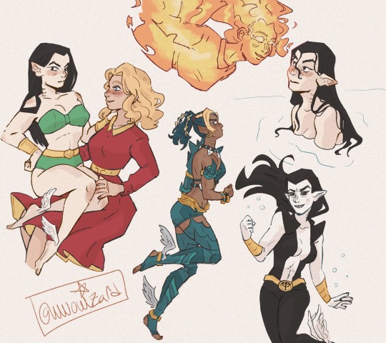
[She/they/any, minor] I write, make digital art, and voice act sometimes. It's pretty neat. Not sure how frequently I post but it will be a collection of stuff that I like. B)
Don't wanna be here? Send us removal request.
Text
New tomorrow
~
PYLOT feat. Polarity, Sleepless-Nights - Breathe
43 notes
·
View notes
Note
trick or treat?
Nice costume, Simons! Not sure if I understand... what it is... but you can have some of, uh...
Hang on.
Um.
...Hope you like it?
Don't mind the seal, please. Or the sell-by date. No zyme in it, I promise. I don't hide drugs in............ candy?
(Hey, for what it's worth, there's a decent hairdresser just down the street. Maybe they're giving Halloween discounts? It's worth checking out.)
2 notes
·
View notes
Text
"Hall of Mirrors" (2024)
My entry for @fr0gery's Hallowe'en Deus Ex art collab! To alleviate fr0gery's concern that they might be the only active Walton Simons fanartist around lately, I decided to pick him for the collab and dress him up as a vampire (good luck in the hall of mirrors)... For the collab, we also decided we would focus more on the original Deus Ex instead of the prequel characters as we found out there was a lack of art for it. Please check out the other contributions too (linked above), they're wonderful. Looking forward to doing another one of these in the future! I had so much fun working on this that it has invigorated my interest in art, so I'm going to try my best to adhere to my commitment to being more active - I've since made a Bluesky account, you are welcome to follow me there @criminalelements.bsky.social
18 notes
·
View notes
Text
Time's up!
~
In my every drawing it's Halloween, so nothing special and unique. xD
This is a full-length drawing made for a collaboration organized by dx comrades led by @fr0gery. Go to this guy and see the work of others. You will please them.
41 notes
·
View notes
Text
the halloween collab is concluded! here are the results!
big thank you to all who have and wanted to participate! i hope you enjoy the works of these artists:
@or-echo
@insanesanityme
@criminalelementsart
@code1r15
@fedorasaurus
@raynerberg
@fr0gery
@hc-svnt-dracones95
now here are their full works!
38 notes
·
View notes
Text
two-year-old stupid comic/edit featuring shephard and calhoun.
580 notes
·
View notes
Text
Same as it ever was.
#HOW DO I WORK THIS#WHAT IS THAT LARGE AUTOMOBILE#THIS IS NOT MY BEAUTIFUL HOUSE#THIS IS NOT MY BEAUTIFUL WIFE
529 notes
·
View notes
Text
ladies
little doodles for face practice. maybe i will do more another time
18 notes
·
View notes
Text
bro you gotta kill your barber or something.
#deus ex#dx1#jc denton#walton simons#im not really happy with how i drew simons but maybe it will be better next time#i may have to change out the delicate eyebrows to make his features look sharper#side note that hairstyle is like the bastard child of a mohawk and a bowl cut i am so sorry simons#also jock shoutout. i love jock#lay d denton
28 notes
·
View notes
Text
When I first drew that JC reference like three months ago, I didn't really expect that I'd turn it into a full *project,* but here we are anyways lol. I also didn't expect to draw Alex, let alone redesign her! But that's a long-ish story. All of them are relatively janky looking in their own right, but they're all just personal reference points so who cares.
Since this isn't exactly a *thrilling* artwork and I'm a little low on ideas for funnier/more engaging stuff, I think I'll do a little analysis on each design. Some cross between analysis and personal interpretation. Also explaining the intention behind the Alex redesign, since it's a departure from the original.
FOR PAUL;
Most of the visual interest in his design comes from the trench coat. Most evident when you *take* it from him. He looks almost bare without it. A lot of it may be the lack of the purple in his design; my hypothesis is that his design manages to be so eye-catching through a relatively successful triadic color scheme. Purple, green, and orange (brown, but it's a dark orange, in this case). Usually, triadic schemes are best used for their sharp contrast, but that's not the case for Paul. His design may not be outright *eye catching* but it is unique and will draw the eye, mostly due to the low saturation of his color palette. The colors don't fight or pop out too much. They share emphasis.
A funny side note- Paul's eyes are not the same as JC's, which I didn't realize until I colored him in properly. His eyes sit on a darker blue base- the bright blue, which IS the same as JC's, takes the place of the pupil. Meanwhile, JC's pupil is an even lighter blue.
Drawn at approximately 5'11.
FOR JC (male);
JC's outfit is undeniably a ripoff of Blade (1998), therefore, the best means to distinguish the two is through color palettes. JC gets to have his cold, moody colors, but they're not completely *dark.* Where Blade wears black, JC wears blue. Dark blues (mostly), but still blues nonetheless.
I took a few liberties with JC. I didn't quite like the look of the leg straps (and then I gave them to Alex- oops) so I replaced them with leg pouches instead. Better for storage & the tactical look JC is going for.
I also toyed with the idea of changing his hairstyle to a short one, but thought I'd keep the slicked back hair because I like the idea of him taking inspiration from his older brother. After all, the Deus Ex Bible said he admired him greatly when he was younger; the whole secret agent deal. I like to attribute the very 'action hero' look to that idealization as well. JC as a character is very idealistic, almost- if not outright- naive. His picture of the world is more fiction than reality until the events of the narrative rip it from him- or at least, that's what I interpreted. Compare him to Paul, who has a much simpler, more practical design. Aside from the embellishments on the trenchcoat, Paul looks extremely normal. Meanwhile, JC sticks out quite a lot.
The boots were fully improvised. I had no clue what was going on in the texture and couldn't find a reference I liked.
Headcanon name for him is James Chris because I like how it sounds. :) I only remembered that James Bond exists AFTER I thought of it and couldn't find a name I liked better.
Drawn at approximately 5'11.
FOR JC (FEMALE)
Drew her shortly after I played the Lay D. Denton mod for the first time. I was so inspired that I *had* to make my own design for her. I love the idea of a female JC.
I did take some liberties from the mod's design, though. I returned her widow's peak, for one. One of the odd tidbits I remember from biology class was that widow's peaks are a dominant genetic trait, so even if she *wasn't* a clone of Paul, the chances of her having one would still be 50% at minimum. As for her hairstyle overall, I thought I'd let it be loose but still slicked back- reminiscent of her male counterpart. JC struck me as the type to keep her hair short rather than put it into a bun or ponytail. More convenient overall. Not a buzz cut- since male JC didn't get one either- but still above the shoulders.
I also removed the nail polish. It's an idea I love for a secret agent of her type, but I just don't get the idea that she'd wear it from her personality (+ refer to the bit about JC's 'tactical look'). It would suit someone like Navarre better in my opinon, showing efficiency in her job- that she's so good she wouldn't need to worry about chipping a nail as well as the fact that she has time to re-paint them. Unfortunately, Navarre has cybernetic arms. Maybe she can paint her nails anyways- don't know.
Ditto for the lipstick.
I removed the stiletto heel- though that's not the fault of the mod. They had to use a generic model & re-texture it for her design, after all. I did, however, let her have about a ~2 inch heel. Nothing *too* obscene. More of just a reference.
The vest is modeled on one I saw online that I liked the look of.
Headcanon name for her is Joan because I've loved the name 'Joan' as long as I've been listening to Joan Jett's music. Kept Chris because I like the sound of it as a gender neutral name.
Drawn at approximately 5'6, with 2 inch heels to make her 5'8.
FOR ALEX:
Hers is somewhat of a story.
I was considering making this into a full Denton lineup- as I now have- but thought it would be incomplete without Alex. Issue is that I don't especially like Alex's design all that much, male OR female, but female especially. That's when I thought to redesign her. Side note, I went w/ female Alex because I liked the voice performance better + I just like the idea :)
It spiraled from there, starting as a design more consistent with the other Dentons (one of the gripes I have w/ the original design), into a rewrite. So I wouldn't say that this is by *any* means the same Alex as Invisible War.
Given that it's relevant to the design, the premise is as follows; rather than being Alex 20 years in the future, this Alex would instead be the one found in Area 51, the one who was retconned out of the story. The intention behind that setpiece in the level always interested me a lot, whether or not it was later retconned. The idea of accelerated clone growth + memory implantation also caught my eye, and I wanted to use her to explore all of those things a little more. Therefore, that would be her function. The Dentons are prototypes, after all. She exists in an alternate world, a take on the scrapped UNATCO route everyone wonders about, though it would differ in the sense that it only happens if JC fails the Lebedev mission. Paul goes fully MIA, and Alex is deployed early to fill the empty space. Without having led a full life & full outside control over her memories, she'd be a complete UNATCO zealot; what MJ12 wanted JC to be. There's more detail than that, but that's about what's necessary for the design to make sense.
It's a blend of the other Dentons & prominent UNATCO figures. She has the same physical features as her siblings- same face, same approximate build, same nanoaugmentations, so on. Her clothes, however, are meant to resemble the mech-augs more than it does the Dentons. Where the Dentons wear looser clothing, Alex's is more form fitting, akin to Anna Navarre & Gunther, even if she has no cybernetic joints that loose fabric could get caught in. It's meant to reinforce the idea of her loyalty to UNATCO rather than anything else.
The jacket is meant to resemble the Dentons, however. Even then, it's cropped because she wouldn't necessarily be a "full" Denton (for lack of a better term) or share a true connection with them beyond genetics.
As for color scheme, it follows that pattern. She relies on a black base more than her siblings do, again akin to the mech-augs. The prominent blue is meant to be similar to JC's, but it's also worth mentioning that JC and Paul (Paul especially) have much more of a green tint than what I selected for her. Alex's is more metallic, once again to mimic Navarre & Gunther. Still, she is a Denton, fully manufactured or not, so the blue of her design is meant to be more prominent & full than it is with the mech-augs.
The hair gave me some trouble. It's meant to be the same-ish style as the Alex of Invisible War, but I'm ngl I was struggling to draw it. I had also wanted to give her some kind of facial accessory- Paul has a beard, JC has his sunglasses, but I couldn't find something for Alex. I didn't like the look of a facemask or gasmask- I also considered goggles, but they would be too reminiscent of JC's shades while also being made redundant by her augmentations. In the end, I left her face as-is.
Drawn at approximately 5'6, with 1 inch heels to make her 5'7.
Anyways, I made an Invisible War version of the lineup too for fun, and because I wanted to see what the Alex design would look like with the original purple look. :)
isn't character design fun
#deus ex#dx1#jc denton#paul denton#alex denton#maybe#kind of a redesign#and kind of a rewrite#so maybe it counts more as oc#i dunno really lol#some design analysis? perhaps?#god i love talking color schemes lol
9 notes
·
View notes
Text
deus ex hyperfixation. sorry devoid days you know i love you.
your wip just called. hey man your wip just called. its asking where you've been man.
11K notes
·
View notes
Text
long time no see, huh
no guarantees i'll start posting consistently again, just need to start drawing again after a big string of mental health issues😔
october theme: oc in a halloween costume~
5 notes
·
View notes
Text
his vision is augmented
the existence of the vision enhancement augmentation means that the light augmentation has to be an *actual* light. obvious when you think about it, but i had to think about it i suppose. provided a funny image in my mind.
#I AM SO MAD I FORGOT TO DRAW THE GODDAMN SUNGLASSES#they were supposed to be pushed up on his head so it doesnt matter TOO much (after all emphasis is on the eyes)#annoying. but i will simply pretend that they're in a pocket or something.
58 notes
·
View notes