#dark photo presets
Explore tagged Tumblr posts
Text
Unlock the Moody Charm: Masterful Dark Photo Presets for Stunning Visuals
Enhance your photography with our premium collection of dark photo presets. Achieve stunning and moody effects with just a few clicks. Explore our best-selling dark photo presets to add a touch of elegance and drama to your images. Elevate your photography to the next level with our selection of professional-grade dark photo presets.
#dark tone lightroom presets#dark preset lightroom#dark lightroom preset#dark lightroom presets#lightroom dark tone presets#dark photo presets
0 notes
Text
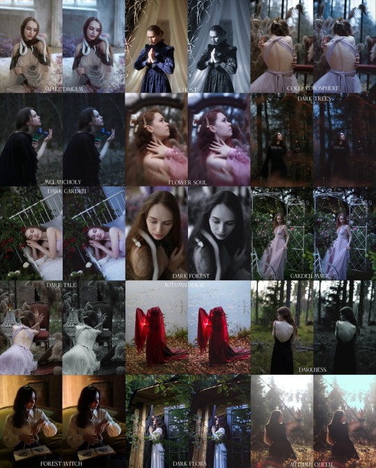
Melancholy Presets Lightroom
Pack from 16 presets of colour correction I created for my photoshoots and usually use when editing my photo series.
Available on my Boosty page:
Melancholy Presets
Feel free to contact me with any questions about processing when using presets.
#natalie ina photography#portrait#photographers on tumblr#photography#dark photography#natalie ina#presets#Presets Lightroom#lightroom#lightroom presets#lightroom preset#colour#colour correction#LR preset#lightroom editing#lightroom mobile#vintage photography#photoshoot#art photography#dark photo
9 notes
·
View notes
Text
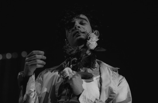
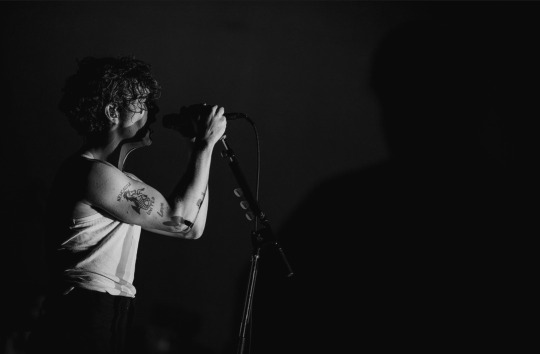
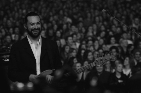
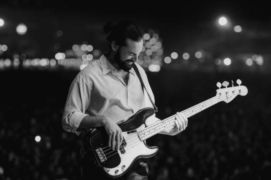
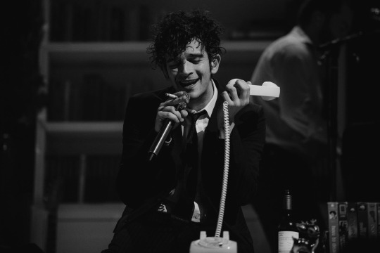
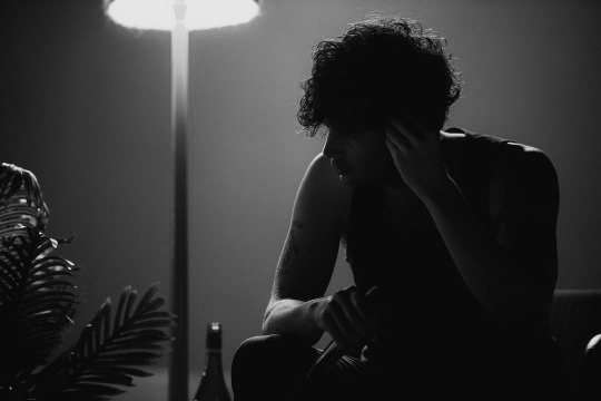
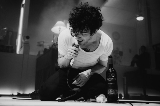
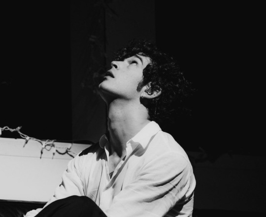
// black and white - atvb //
#in light of recent arrivals to this site#did some dark edits recently for some planned creative work ♡#i really liked the lighting in these and knew immediately they'd be perfect for my Lr profile presets#planning to work with them a bit more in the near future for some other edits#the 1975#matty healy#ross macdonald#not my photos - but my edits#ry.exe
38 notes
·
View notes
Text

That Girl CAS Background
I decided to make a CAS background that I feel matches my 'That Girl' trait I have recently made and I am obsessed!
Available in one swatch (beige) as I imagine this is the aesthetic of 'that girl', in my own head anyway. I do plan on at some point making a pink version and also a dark wood one with some sage green tones thrown in
I have been desperate for a CAS background to fit my aesthetic and the type of sims that I make, so of course I chose to make one
Available for free over on my patreon page here
Below is a full CAS photo with and without my personal Gshade preset on so that you can have a better look at it


#ts#thesims#ts4#the sims 4#ts4 custom content#the sims custom content#ts4 screenies#ts4 screenshots#the sims screenshots#the sims 4 cc#the sims cc#ts4 cc#ts4cc#my cc collections#sims 4 mods#sims 4 cc
349 notes
·
View notes
Text

Amanda | Not WCIF | 18+ (Sometimes NSFW)
Find me on YouTube: Here Main series on YouTube: The Aspiring Artist | Rotational Gameplay All posts related to The Aspiring Artist can be found here. Casual gameplay posts on my blog are separate from the storyline on YouTube. All of my Sims 4 posts | All of my reblogs CAS Mods Cas background | Cas lighting (Studio flat) | Controlled Position Mod | More Cas Columns (6 columns) Game Lighting Mods In-Game Lighting (Dark) | Sunblind Gshade/Reshade I make my own Gshade presets. They are not available for download. However, here are some that I would recommend if you are looking for a preset: Boho dreams (Neecxle) | Birdie (Sforzinda) | Lithium (Gunthermunch) | Luminescent (HazelMine) | Raices (Folkbreeze) | Almond (Glimersims) | Kaleidoscope (Okruee) | White Willow (Tianaberrie) | Serenity (Misslollypopsims) | Neapolitan (Midsummermoon) Photo Resources I use SRWE for a lot of my screenshots. I take some of them on a higher resolution monitor without hotsampling. I use Krita for photo editing and sometimes Canva. I usually crop my photos and resize them for faster uploading. Check out this tutorial if you're new to hotsampling. Video Resources I use OBS to record my videos and Filmora to edit. I also recommend Davinci for a free editing alternative. I use this mic for narrated episodes. Essential Gameplay Mods I don't use a lot of mods because I strongly dislike updating them. But these are the ones that I consider essential for my game: Basemental Drugs (21+) | Wicked Whims (18+) | MCCC I do have other gameplay mods installed, but I don't consider most of them to be necessities. MCCC and WW handle nearly all of the background "tuning" in my game. Other Mods These are mods that I don't necessarily need, but they're nice to have: UI Cheats Extension | RPO (I only use modules 1,7, and 14) | Utopya Romance Mods | Somnik and Severinka Custom Foods | Control Any Sim (Use with caution, this mod is rarely updated) | No Zzz | No Music Notes | Steady Sit | Let's Get Fit | Hidden Highlight | Tool | No Romantic Satisfaction Decay I vey rarely add new mods to my game, so this list probably won't change. I do remove these mods if they start causing issues. Defaults/Overrides My current default skin can be found here , default eyes here, default feet here, and default teeth here. I mostly use these skintones. Default phone | Default phone two | Toothbrush | Headphones | Male animation replacer (18+) I don't use custom loading screens, menu/map overrides etc. Also, I usually answer asks privately unless it's one of those chain-mail things.💓
45 notes
·
View notes
Note
I love your coloring style! I struggle so much with painting color, do you have any advice for cohesive color schemes, or how you go about picking what colors and values to use? Do you always use references?
Yes!!! Ok so for a long time I struggled with color too, I would get stuck and give up on whatever I was working on because color just didn't make any sense
truth is, I don't think you can get very far with figuring out color without first figuring out VALUES
So when we color first and then desaturate the left pic, we get a very boring, flat pic, limited values. Middle pic and right pic are 2 examples of grouping values by foreground, midground, and background to create more contast & dynamic layouts.
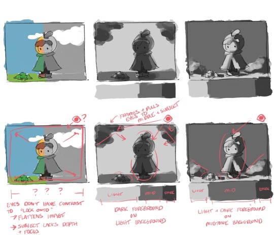
Case in point; contrast shows our eyes where to go. Our eyeballs like having clear focal points, it makes a good drawing that much more satisfying to look at within its borders.
2 layouts for values that I personally like are dark foreground on light background, and light/dark foreground on midtone background.
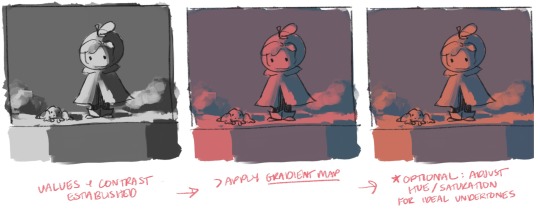
once I have a value study I like, I start laying color in by applying a gradient map. Drawing programs will have presets, but I highly recommend learning to build your own gradient maps. From there I'll tweak the hue around until I find undertones I like (more on that later)
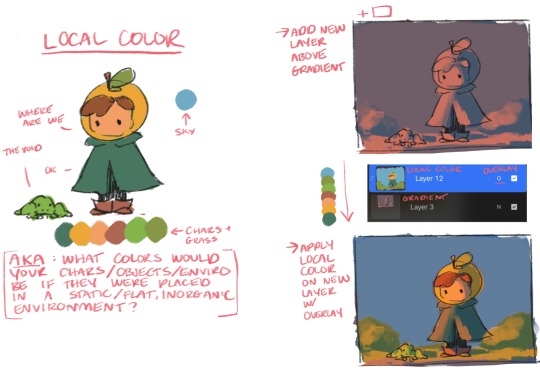
NOW LETS TALK LOCAL COLOR. I define local color, aka "flats" as the color your character is "made out of." Basically ask yourself what colors are your character, if your character was sucked into a vacuum where there was no organic source of light/shadow/sun/etc that would influence the local colors.
Once I have local colors, I use a new layer set to overlay and "lay" the local colors over the gradient. Local colors we want + gradient undertones + dynamic values = cohesive colorssssss
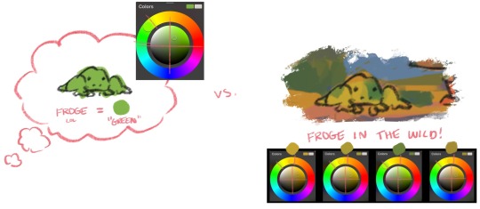
Now one thing I want to mention about color in general is, when I started doing digital art, my brain would "icon-ify" colors and pick colors based on an object's "information" (e.g. frogs are green). As a result, I'd pick a lot of saturated colors in the upper right quad of my color picker, and this would limit my color pallets quite a bit.
Now that I'm more well-versed with values, I've intuitively gotten better at picking local colors in other quads and on parts of the color wheel that go against object "info." In general, I like picking local colors that are warm & earthy.
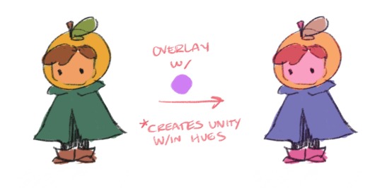
Additionally, you can always use overlay to create cohesion if you're trying to go for a certain look/feel that's tricky to manually pick out on the color wheel!
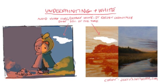
Last 2 things I'll mention are I avoid using a large amount of default digital "white" in artwork. This white literally does not exist in nature, it's like a vacuum to the point where these "clouds" just look like holes in the pictures here. I highly recommend looking at examples of traditional underpainting & using undertones, this was a gamechanger for me since I learned how to carry a traditional technique into digital art and it greatly improved my digital art
References I always use references, for 2 reasons: 1) I have a tough time conceptualizing whole ideas in my head and can't draw most things from memory (womp womp). 2) I legit do not practice anything ever, oops, I am usually learning at least 1 new thing every time I draw, so basically it'll be like "ok time to learn how wolves work" and this requires references lol. I'll use photos or hostages (ie my partner lol) for anatomy & poses, pinterest & posemaniacs are fantastic for this.
Anyway that's every silly little thing I could think of to say lol. I've done digital art for 10ish years, I'm fully self-taught, take that as you will lol. Thanks for asking this, hope it was helpful! :+)
#hope tumblr doesn't make these too blurry#can't believe I know things thats crazy#i was so resistant to learning all this stuff but I'm so glad I did and glad I can explain it in ways I wish someone told me!
25 notes
·
View notes
Text
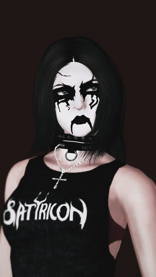
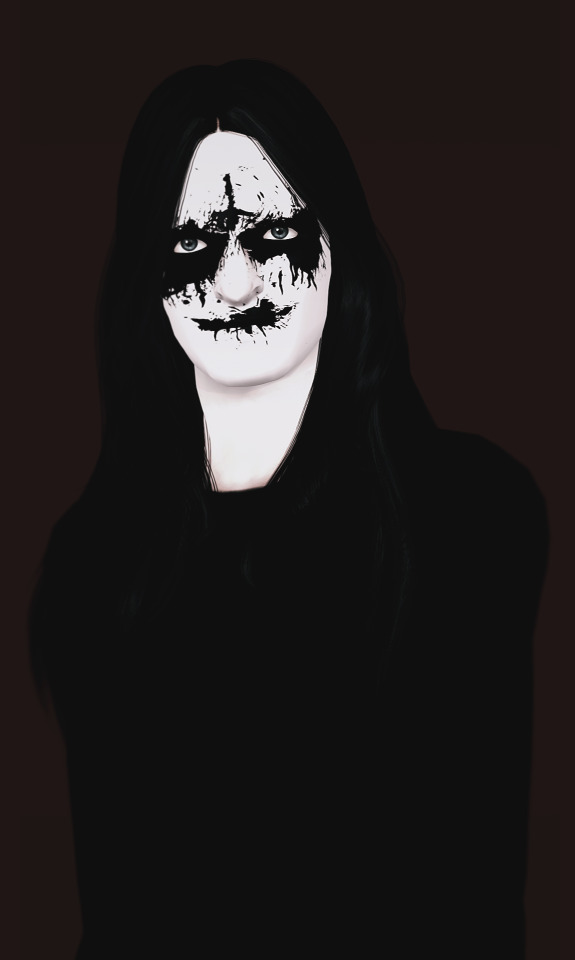

Corpse paint is a style of black and white makeup used mainly by black metal bands for concerts and band photos. The makeup is used to make the musicians appear inhuman, corpse-like, or demonic, and is perhaps "the most identifiable aspect of the black metal aesthetic." ©Wikipedia
It's supposed to be a stuff only for my personal use, but someone is asking about them in my WCIFs, so why not to share it. I'm not sure that this will against original creator TOU, just because they doesn't have any TOU and wasn`t active for years. ¯\_(ツ)_/¯
Info:
Credits: Dark Rituals, @aroundthesims (face mask texture).
Teen-elder, both genders.
What I've done: cleaned small unwanted pixels, filled empty space in the eyes, made whole texture generally more smooth.
Everything is recolorable now (2 channels for all face paints except Huul, it has 3rd channel for mouth, but it still barely recolorable), Separates have 1 channel.
Eyes separates in eyeshadow category, lips in lipstick and forehead cross are in blush. Separated all swatches except Huul (11) Satinae Ma (18-19) (they just not too interesting and was annoying to separate them :/) and King Diamond (14) (I found this after I extracted and partly edited all other paints and come back to the site for making post for cc finds.)
Known issues: some paints (especially the cross one) may look really wonky depending of the sim's facial features.
1k textures.
Package format, compressed (but file size is still big because of the amount of presets). Separates have merged package and pick and choose version.
Swatches:

Recommended downloads: Mask/Masque by ats3, Simply Kitsch`s Dark Stain Tattoo (I also made version with additional preset with only neck paint: here), Kat Bodypaint by @venusprincess-ts3 Bonus tip: If you want to use ats3 mask for your black metalhead/goth/alt/geisha/rococo sims makeup, but it overlapping over all eyeshadows/eyeliners, open them in s3pe, choose CASP resource, then press to "Grid" button, replace the numbers on OverlayPriority tab from whatever you have to 0x00000064 or 0x00000082.

DOWNLOAD | ALT (Mediafire) | SIMBLR.CC

@katsujiiccfinds @nightoccfinds @satellite-ccfinds @pis3update @kpccfinds @bloodys-s3ccfinds @ispys3cc @sssvitlanz
#my cc#my edit#the sims 3#sims 3#sims 3 custom content#ts3#ts3cc#s3cc#alt simmer#simblr#ts3 simblr#sims 3 simblr#sim: ingrid
193 notes
·
View notes
Text
how to start living in your “it girl” era | 2023 🍸 pt. 1
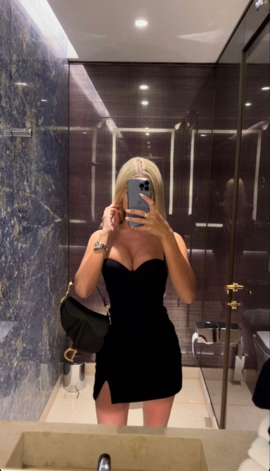
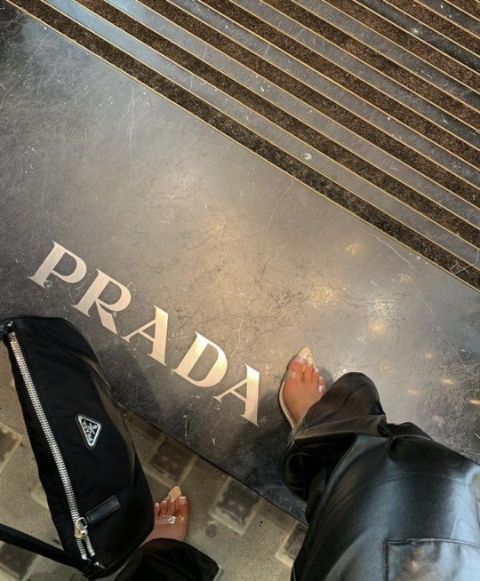
this is just a fun, random list. feel free to start implementing these ideas into your life to make you feel more like you’re in your “it girl” era 🤍 again: this is meant to be fun. no negativity please.
i. when at lounges, casinos, cocktail bars, nice restaurants, etc.
if you’re of age, try ordering more “upscale” beverages at the bar like classic cocktails (the manhattan, negroni, martini, etc.), wine, or champagne.
it’s also more fun to go during the downtime, late night hours on the weeknight (monday-thursday… even though thursday might start getting busy). unless you want to be in a louder environment where everyone and their mom is on top of each other, ordering over your shoulder because the bar is packed, then go at more quieter times. dressing up nicely, going to a nice establishment, and ordering a nice drink when it’s dimly lit, upscale, and there’s only a few people in there is such a vibe.
if you can, try ordering an uber luxe/premium to the restaurant or valet your car. ***make sure to tip***
ii. when at home
lounge in nice quality pj’s. silk/satin shorts and a sleepy shirt work very well. if it’s cold, opt for longer sleeves and pant legs.
drink water or any beverage you have in a glass, not the bottle or the can it came in.
of course, keep your place smelling good and clean. burn a high quality candle (i find that the expensive candles are definitely worth the money). for a home fragrance, lean less towards scents like vanilla, and more towards scents that are more perfume-like.
if you’re in the process of adding decor to your place, a lot of luxe interior designers like to add those random “art” pieces like sculptures, bowls, paintings, and other random decor around. but they like to keep the furniture minimal. the ambience is almost always natural sunlight during the day, and dark, dim, moody lighting during the evening.
iii. your social media
remain mysterious— posting several times a day, everyday is a bit much. unless you’re an influencer, limit posting to a few times a week, if that. “oh she posted again” doesn’t necessarily scream that you have a life.
keep your photos of similar quality with one another. using the same filter or preset keeps everything uniform if social media matters to you.
refrain from posting when you’re not at your best. refrain from posting you venting about something. be mindful of what you post. does it represent you as a person?
iv. your attitude (to others and yourself)
don’t be a rude person. don’t be bitter. don’t be resentful. don’t be negative. don’t gossip about others. don’t participate in the weird trend of self-deprecating “humor”. you should know you’re that girl, and you should move like her too. you should act in a way that you won’t accept nothing but the best, but still remain humble enough to know that it might take a bit of work on your part. raise your standards with men, raise your standards with friends, raise your standards with yourself. don’t compare your journey or yourself to others, even if they’re on a similar journey. be kind, be loving, and keep it moving on a positive note at all times
again, this was just a FUN post. if you wanna implement some of these ideas, perfect. if not, that’s fine too. love you lots xoxo

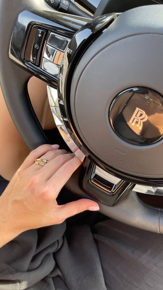
#leveling up#hypergamy#luxury#femininity#level up journey#level up#hypergamous#hypergamous dating#high value dating#high value woman#dream girl#self help#self development#self love#self care#self improvement#levelling up#leveled up woman#leveling up journey#it girl#it girl energy#it girl aesthetic#coquette#self care aesthetic#clean girl#green juice girl#pink pilates girl#pink pilates princess#vanilla girl#advice
412 notes
·
View notes
Note
What is a good beginning camera for someone? I want to be able to take my own photos to paint and draw.
For what you're doing, anything within your budget is a good camera.
Point and shoots are good! I still use my Nikon Coolpix and my dad uses Canon Powershot. These ones are more for people who are playing around with it and don't necessarily need to shoot in Manual, but the Powershots on the high-end do have manual settings if you're interested in learning how to use it.
(I like cameras with Manual options because now that I know how to shoot in Manual mode it gives me a lot of creative freedom that auto and presets do not have. But if you don't know Manual and want to learn, there is a rather frustrating learning curve that a lot of people struggle to get over. Just be prepared for that.)
If you're interested in learning photography and want something a little above the point and shoots, my first DSLR was a Canon Rebel (I think it was a Rebel 3). It still has presets and auto functions, but its the middle ground between beginner and pro.
You might get a good deal on DSLR cameras soon because most companies are going mirrorless and the mirrored cameras are becoming obsolete.
I'm going to tell you this: the cheaper the camera, the worse it will be at shooting dark scenes. That's pretty much where most of the money goes towards in development.
So if you're looking to take pictures outside or in well-lit places or with an built-in flash, then you may be happy with a point and shoot.
If you're looking to be in more challenging places, like indoor places that aren't terribly well lit, then a DSLR might be a good place to start. The Rebel I used to use was great for doing candids inside schools. You can also use an external flash with DSLR cameras, if you're feeling ambitious.
Anything priced higher than that is going to be able to do all of these things AND be able to take photos in poorly lit bars. My Canon Mark II just about struggles in dark places, but you can still get some cool looks if you know how to work your exposure settings (-grumbles in photographer-)
40 notes
·
View notes
Text
I was asked by @x-littlemoth how I do my VGP and I explained the basics here! This is a continuation of that tutorial with my own personal methods! For this tutorial you'll need this mod (in addition to the ones mentioned in the last post):
CharLi This is an excellent lighting mod that allows you to spawn individual lights and adjust their color, brightness, rotation, etc.
And here are some other mods I recommend, though they aren't necessary!:
Additional Portrait Presets I can explain more about why adjusting FOV or rotating the camera 90 degrees is useful below, but these presets save you the effort of tweaking yourself! Photomode Expression Megapack No tutorial needed, this just adds extra facial expressions you can select in photomode! Works exactly the same as the vanilla one and doesn't replace anything.
Appearance Creator Mod (ACM) I won't cover this one here because there is already a wonderful tutorial by PinkyDude who explained it way better than I ever could which you can check out right here! Briefly, this allows you to swap/toggle clothes, accessories, etc. on NPCs.
If you'd like any additional suggestions for pose mods, clothing mods, etc. or wants to know any mods I'm using I am very WCIF (where can I find) friendly so anyone can free to ask me any time! Additionally, if anyone would like a tutorial on my editing process, I pretty much just use my phone and a free app (and sometimes a paid app but that's not necessary) feel free to ask, I'd be happy to share :)
Let's get into the tutorial under the cut! ^^
Okay, let's continue editing our photo of Viktor and V using CharLi! So, open your CET menu and look for the CharLi menu and open it up. First thing I tend to do is go over to the settings tab (the gear) and shut off chromatic aberration and volumetric fog. This is all up to personal taste though, so do what looks best to you! Now, return to the main tab (click the light bulb) and let's spawn a light! Personally I always prefer to start with 1x as the others tend to be way too bright for most scenes. Play around with choosing whichever type of light you like.
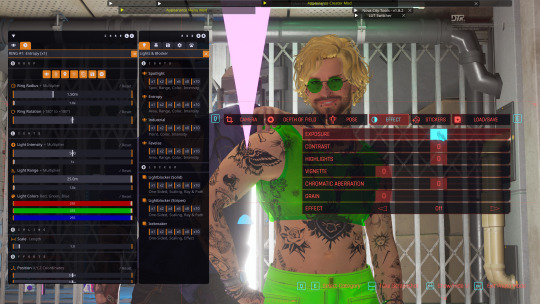
In the end, I went with the type called Favelas as my main light source. Go ahead and play around a bit with the rotation, intensity, and other sliders.
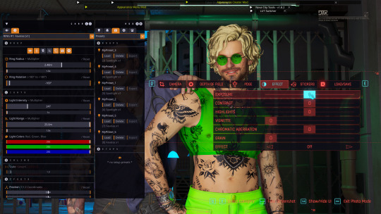
Here's what I ended up settling on! I try to make sure that the character's aren't washed out or too dark and I try to make my first light light the characters fairly evenly. Now, for depth and flavor, let's add a second light! This time I chose spotlight and I adjusted the colors until I achieved a relatively blue color.
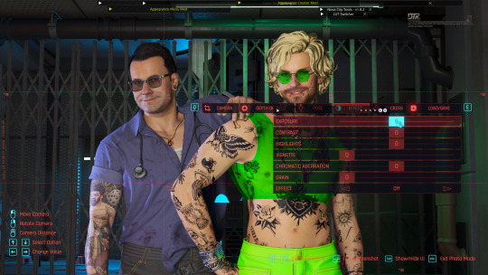
One last thing, for each of your lights go ahead and toggle these two badboys off. That will hide both the physical light object and the pink tracker so they don't clutter up your photo.

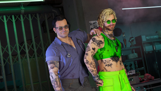
Adjusting the angles a bit more to my own tastes, here's what I'm left with without any external editing!
Now, let's try and outdoor photo! Following the steps in the last tutorial, I am going to teleport to my location of choice (I am using a teleportation preset found in PinkyDude's Roadtrip Through The Badlands AMM location addon). While here, I switch my Nibbles replacer to Fem because I'm gonna take some pics with Panam! Now that I'm here, I notice that the lighting out here could be better! I tend to adjust my weather and lighting outside of photomode because it doesn't always shift correctly in it. To make sure everyone is lit correctly, I tend to pick the character with the darkest skin or clothing that will be in my scene and spawn them from the spawn tab. I'll choose Panam, of course!
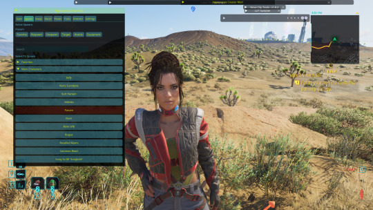
Note: Going to the tools section and selecting freeze target can help keep your spawned companion from walking away but I forgot to do that here lol For weather conditions, I like to choose light clouds. This makes the sky look nice and it also softs harsh shadows. This is up to personal taste and the mood of your scene though! Additionally, if you want more weather states and deeper control, you can use the Nova City mod. For now, let's just play with the vanilla weather settings.
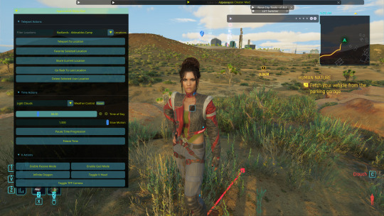
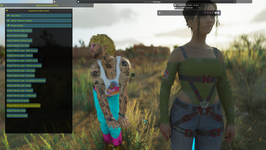
I tend to prefer the look of early morning the best, but again this up to taste! I would definitely recommend avoiding middle of the day though as the harsh lighting can greatly overexpose your image while also muting colors. Now that we've got all that set up, let's banish her just like we did Viktor in the first tutorial. Unlike Viktor, this Panam clone won't respawn (the real Panam is safe and sound, this won't affect her). Now let's return to photomode (and ignore my boy's goofy Us Cracks pose). Follow the steps to set up your replacer just like in the first tutorial. Now that I have my replacer swapped out to Panam, I am going to remove her jacket using one of the built-in presets (for swapping outfits with ones not listed in AMM see the AMC tutorial linked above). To do this I am going to go to tools > target replacer > scan and then scroll to the drop-down and list and pick the one I want to use. Let's keep the harness but remove her jacket!
From here, choose whatever poses you like, set up CharLi however you wish, and now let's try taking a portrait shot! This is where those presets come in handy. If you downloaded them, go ahead and flip through to the portrait ones at the end and select the one you like best. Otherwise, let's set this up ourselves! To do this, I will go to Camera tab in photomode and set my rotation to either 90 or -90 degrees. This allows you to fit more into the shot while also allowing your portrait to be higher quality because it fills up the whole screen instead of being a tinier image with a lot of empty space on the sides. Next, I'm going to adjust the field of view. The lower the field of view, the less your image is distorted. While distortion can be nice for some styles and atmospheres, I tend to prefer a lower FOV for my portraits. I tend to prefer to set my FOV lower then 20 but higher than 10. Here I've chosen 15!
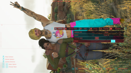
Now you can play around with the angles and take your photo! Here's the unedited one I got in the end:
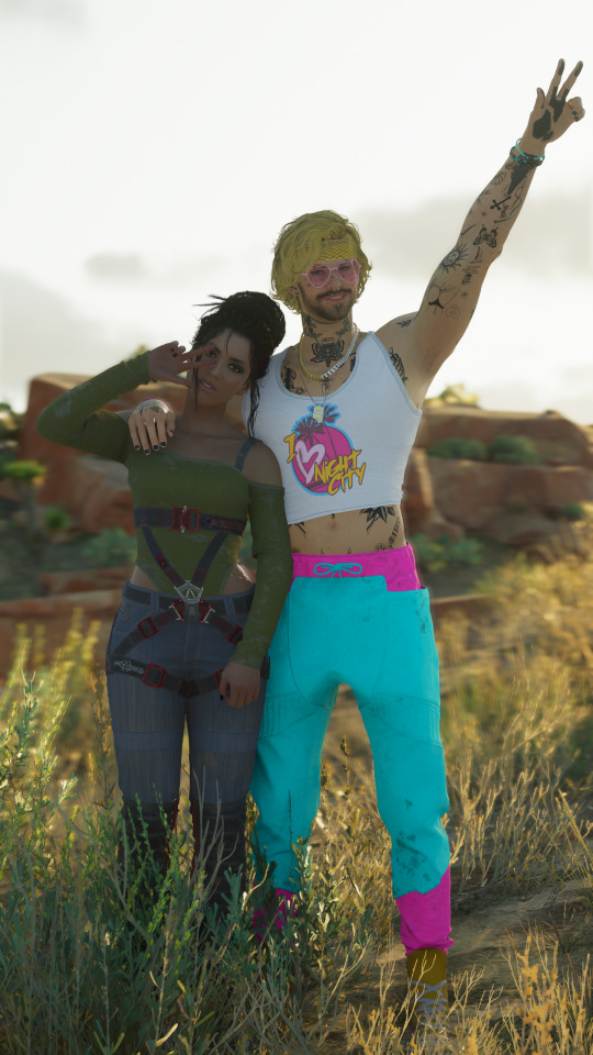
If you have any questions definitely feel free to ask! This is certainly not the only or even the "best" way to do it, this is just my personal way :) Have fun!
19 notes
·
View notes
Text
#apply preset to all photos lightroom#how to apply preset to all photos in lightroom#lightroom presets download#preset lightroom#presets to lightroom#presets for lightroom#dark lightroom presets#best presets for lightroom#best lightroom presets
0 notes
Note
Do you use photoshop to edit your pictures? Their so crisp and clean and I just got 4k res on my pc.
If so, can you maaayyybbee give us a brief tutorial on how you enhance these for previews for tumblr. Because they always come out so clean even in the preview images.
hiii!!! omg sorry almost didnt see this! congrats on getting 4K!!! it's truly life changing *tears up*. and thanks for such a high compliment 🥹🥹🥹
i do edit my photos yes, but i don't do it in photoshop, but rather in mobile apps so i can just do it during time i cant do other stuff like on the subway so, yes, i can give a tutorial, but it's going to be general steps and guidelines :) sorry i can't give anything like photoshop specific! and i know you're only asking for editing advice but i'll go over the whole process for anyone else who wants to read this as well, so please bear with me. (and please don't take my advice too seriously, i'm only an amateur hobbyist too)
1. The base photo
So firstly, I think it's important that the base picture itself looks good when you capture it in game. With a good photo straight out of the game you can avoid a lot of further editing down the line.
One common mistake I see a lot is that the field of view will be left unadjusted to the default value, which is good for landscape shots, but for portraits it will have a wonky fisheye effect. For portraits you'd typically want to zoom in a lot so the character doesn't look super thin and distorted. In photo mode this is the "lens" option, I typically just zoom in to the max, and tweak what fits into the frame with the freecam. Here's a pic with good FOV for a zoomed in character shot vs. one with the default FOV (his whole face is skewed, as well as pupper):


Also, the in game environment is important for setting up a good shot. You'd typically want some kind of light vs. dark contrast to make your subject pop out, especially against any background. I like to use Rampage Trainer to tweak the in game time and weather and freeze them for better lighting and atmosphere, and sometimes spawn an extra light source but that's a rare case. For example, okay vs. not very okay lighting that's impossible to salvage even with editing:


I also like to blur the background and foreground in the game, with either the focus tab of photo mode or with depth of field reshade presets, because it's a big hassle to blur those during editing. It's quite subtle most of the time but really helps focus the shot on your character, especially if the background is so messy it can swallow your main subject (trees, I'm looking at you).


The photos in this section aren't edited; my point is that with good lighting, composition etc in game, your base vanilla photo can already look pretty good :D This is RDR2 after all.
2. Cropping
I typically crop my images at 3/4 or 2/3 ratio, depending on what looks better. But I think a general rule of thumb is that you want to crop your image so that the contents look balanced; I don't know how to explain this in concrete terms... Basically the same way centering your subject or cropping it by the rule of thirds serves to balance an image. All these pics are more or less 'balanced' in different ways, even though they're not straight smack centered. It's an eyeing process but I think with time it will be easier to tell how to balance your photo...

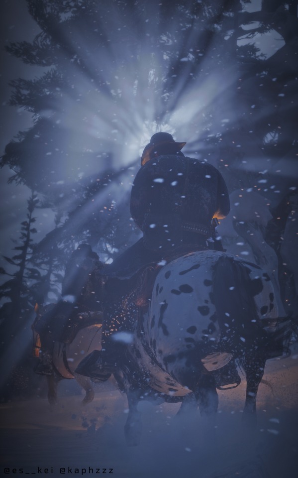
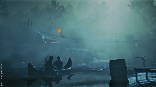
3. Editing
So! Editing!
Editing I think is just a lot of fine tuning based on what you have with the base image. Me personally, I used to do a lot of colour and lighting editing, but more recently since figuring out that you can just make your base image look good right out of the game, the editing has become a lot lighter. The game can definitely do the heavy lifting, but still editing is important.
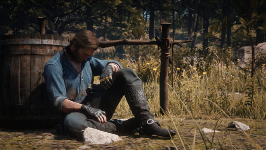
I'll demonstrate with two images (hello my babygorls *kissy noises*):
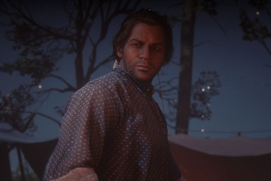

So these two images obviously need some work. Firstly, I'll tweak the lighting, so that dark and light areas aren't too extreme, and also improve the definition/contrast, not too much, but just enough so that the subject is more defined. For Arthur's image the lighting is too murky so I used RGB curves to sort it out a bit.
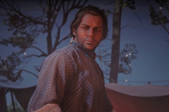

Then I will colour grade it a little by tuning the warmth and the tone (not touching filters yet). For Charles, it's at night so I've made the tone a little colder for the blue, and for Arthur a little warmer, as well as some custom light patches just to make his face stand out a little more against the background. Some other mild adjustments.


Then if I think the background is still too attention stealing I'll blur it out a bit more. Again, I try to just blur it enough in game, since manually blurring is faulty and annoying.


Then if I think overall the lighting and colour is fine, I'll go through the filters the app offers to see if I can improve it a little more. Since I focus on portraits (pretty bois how could I not) and not do really cinematic/dramatic scenes I tend to stick to the more natural looking filters that just harmonise the colours a bit more.


And that's pretty much it for the editing.
On a side note, contrast is a good thing, but not limited to contrast in lighting, and not necessarily in lighting either. Contrast can be in the colour of your subject and in the back/foreground, or in the conplexity of your subject and blankness of everything else. I think for especially atmospheric photos you'd actually want less contrast for that softer feeling, and not like super hard silhouettes. So yeah, the editing process depends a lot on the image itself and what kind of emotion I want it to have.


4. Other miscellaneous things that help
Besides using mods to customise lighting and props and character pose etc. to your liking, reshade is definitely also a big help. It has a lot of presets that can help your photo to have better colours or add blur. I don't really have a recommended list since I don't remember how I set up my Reshade, but I think a lot of the most popular or built in ones work really well, just play with it and see what you like.
A mod I sometimes use for colour grading in game is the 'Seasons' mod. I don't like too much green so I often set the season to Autumn for that warmer tone to the grass and trees. The other seasons also have different colour tones so it's good for trying different tones! Without vs. with the mod set to Autumn (ignore the quality on those they are from ages ago):

5. Most importantly! Do what you think suits your visual preferences and taste!
So personally I think this is definitely the most important point! I think while you should look at others' work for inspiration and analyse what they're doing well, you should also definitely always prioritise your own preferences on what you like to see in your own pictures :D I think it's important to just do what you like in the moment instead of worrying about what's necessarily right or wrong, or looks good to others.
For example for me my style changed a lot over the past year and a half, and there was definitely a learning and realisation process along the way but I think my more recent preference isn't necessarily better and how I used to do things wasn't necessarily wrong either, it's just different taste.
Hope this was helpful!! :D
Please ask me if you've got any more questions or would like me to explain anything else <3
27 notes
·
View notes
Note
a gifmaking tutorial would actually be super appreciated :)
Okay, this is gonna get long and it might not be great but I will do my best to make it understandable.
Put under a read more cause we're not forcing anyone to look at all this.
We're gonna make this gif:

First of all you'll need 3 software programs downloaded.
4k downloader (to download videos)
Gomplayer (to get the frames from the videos)
Photoshop (I pay for it but there are other ways)
Some things to keep in mind
better quality video = better quality gifs
if you want videos in 4k you have to download them in MKV format as MP4s can't be 4k.
gifs can only contain 256 colours so gifs with a lot of different colours might get grainy.
if you use low quality videos or upscaled videos they sometimes have duplicate frames which will make the animations look weird, but you can easily remove those extra frames.
tumblr only accepts gifs under 10mb in size so all gifs have to be less than that (photos less than 20mb)
you can put up to 30 gifs/images in one post
ok here we go
Step 1: Download video
Step 2: Get the frames from the video
You will play the video using Gomplayer
Find the part you want to GIF
Press CTRL + G to bring up this menu

I haven't experimented much with these settings but you'll want to choose the place you want your frames to end up so you can find them later
4. Have the Capture all frames box checked (unless it's 60fps then do 0.03). You can capture up to 999 frames in one go.
5. Press "burst capture" and it will start getting the frames (video has to be playing) it will look like this.

6. Great you have your frames.
Step 3. Making a GIF
Open Photoshop
Load Files Into Stack

This will open the folders on your computer so navigate to where you put your frames and select the frames you want by clicking on the first and holding shift while clicking on the last.
3. Wait for PS to load the frames
4. Once it's all loaded the first thing you'll do is crop it. Press 'C' on your keyboard. There are a couple presets you can use or you can 'clear' that and crop however you wish.

I always crop out at least a little of the top and bottom cause there can be dark lines there.

5. Resize: for optimal quality on tumblr there are three sizes to keep in mind.

For sets like this with 3 gifs next to each other the width should be 177p, height does not matter.

For sets like this with 2 gifs next to each other the width should be 268p

And for a set like we're doing today with just 1 gif it's 540p
You'll want to memorise these numbers for future use.
177p, 268p or 540p will be the width of your gifs.
To open the resize menu you press CTRL + ALT + i

Change the width to in this case 540p (p as in pixels)

It will auto match the height to keep the same proportions.
Click OK and wait until it's done.
6. Make sure you have the 'timeline' window up at the bottom of your photoshop

7. Click 'create frame animation' (button might say video timeline but change that by pressing that little arrow next to it)

8. Press the button with three lines in the top right of the 'timeline' window and press 'make frames from layers'

9. The frames will have loaded in in reverse order so open the same menu and click 'reverse frames'
Step 4. Blurring the logo/text (optional)
Since we have a logo in there I will want to blur it but you might not have one or you don't care if there's a logo or text in your gifs.
First we have to make the gif into a smart object.
Select all layers by pressing CTRL + ALT + A
Convert into a 'video timeline' by pressing the button in the bottom left of the timeline window

3. Right click on your layers and click on 'convert to smart object'

4. Press Z to switch to the zoom and zoom in on your logo/text.
5. Press L to switch to the lasso tool and select your logo/text

there should now be a line where you selected.
6. Open 'Gaussian Blur'

7. Click OK
Now we have to get our GIF back to the frame timeline.
8. Click 'flatten frame into clips' using the timeline menu

9. Press 'delete' once to remove the smart object

10. Convert back to frame animation

11. Make frames from layers

No need to reverse this time. But now your logo/text is blurred, as long as it doesn't move but that's a topic for another day.
Step 5: Sharpening
If you didn't have something to blur let's go over smart objects again.
Select all layers by pressing CTRL + ALT + A
Convert into a 'video timeline' by pressing the button in the bottom left of the timeline window

3. Right click on your layers and click on 'convert to smart object'

5. Camera Raw Filter (Optional)
I use this for base editing of colours and the overall clearness of GIFs, it's not made for that tho it sometimes gets buggy. Works best on photos.
Press CTRL + SHIFT + A to open this.

It's best to do as little as possible in here as it can bug out.
I mostly mess with the effects, light and detail settings in here, don't touch the sharpening though cause we will use smart sharpen for that.
6. Smart Shapening
Most people have a sharpening action they use, including me. But you can also do it manually. You can find my actions in here.
To do it manually and make your own settings. This is how you open smart sharpen.

If you use my sharpening action remember it can be a bit much sometimes, in that case hide the second layer

Use an action or mess around to find a sharpening setting that looks good on your gif, usually don't need much.
Now we have to get our GIF back to the frame timeline.
7. Click 'flatten frame into clips' using the timeline menu (I'm low on images to use check the blur section for images)
It might take a minute since it has to process the new settings.
8. Press 'delete' once to remove the smart object
9. Convert back to frame animation
10. Make frames from layers
11. Select all your frames to set the framerate

You can click on any frame for this. Click 'other' and set it to 0,06.
12. Press CTRL + SHIFT + ALT + S to open 'Save for Web'

these are my save settings.
Click save and name and place it wherever you want it saved.

Congrats you've made a gif.
Step 6: Colouring
Now we have a problem cause there's already 30 images in this post.
For colouring I have a psd I use and adjust to the individual set. It's in my google drive you can find it here along with my actions.
If you're making several gifs from one video you'll want to adjust to the first and then copy that over to keep things matching.
We can go more in depth on this but that would have to be a different post since I can't put more images in this one.
Step 7: Watermark (optional)
A lot of GIF makers have watermarks these days as there's a lot of people who repost GIFs without credit. Make your own so people know the GIFs are yours even when posted elsewhere.
Step 8: Post
Post your hard work on your tumblr, use a bunch of tags so people have a higher chance of seeing it.
I hope this post was understandable and clear, let me know if you have any questions and if you want a proper colouring post.
29 notes
·
View notes
Text
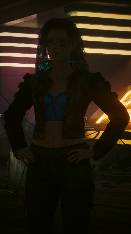


I saw someone recently ask why their shots weren't turning out how they wanted them to despite being able to support the highest graphical settings, so I thought I could share a little behind-the-scenes tidbit re: my approach to lighting and post-editing in VP in case it's useful.
And for my money, lighting is one of the most important factors in getting a shot that I'm happy with. Yes, a high-end graphics card can absolutely help, but that's just one tool of many that can make a difference.
(This info is probably most relevant to folks who can mod their game, but the overall principle can also be applied to vanilla photomode, too. You'll just have to find good in-game light sources since you won't be able to spawn your own, and it might require a little more finagling with the vanilla photomode exposure and contrast settings. Here are some 100% vanilla shots I took recently that I think turned out pretty decent even with those limitations, just to give you some ideas if that's what you're working with.)
Lighting & Exposure
So referencing the photos above, from left to right:
A purely vanilla shot with ray-trace enabled but no lighting tools
The same shot with lighting tools on Valerie
The same shot with lighting tools + some Lightroom editing
Beefy graphics cards can certainly make a difference here since they'll be able to render more nuanced light and shadows, but as you can see in the purely vanilla shot, that ray tracing on its own ain't doing much when it comes to lighting Valerie. The neon lights in the background are pretty, but she's barely even visible in that dark ass street.
In the second shot, Valerie is in the exact same location but has multiple light sources on her. I mostly use CharLi lights these days, which is a free suite of lighting tools available on Nexus, and the customizable ambient lights in AMM, also free on Nexus.
I didn't think to screencap my exact lighting setup, but I'm pretty sure it was something like this:
CharLi spotlight on the left and right of Valerie, tinted pink/magenta
CharLi spotlight on the upper right, tinted teal
(I think I might have had an orange CharLi spotlight too, but it wasn't visible from this angle)
2 CharLi white spotlights directly on Valerie
Probably 1 or 2 AMM customizable point lights on her face (I like using the point lights at very low brightness to accentuate faces and give them a nice glow)
Now putting all these lights on a character could end up way too bright at the default vanilla exposure, especially if you aren't using any kind of major Reshade overhaul (which I do not).
Instead, I just use the vanilla photomode exposure settings to make a scene really dark and then light it back up with my own tools. (This is also a great way to shoot in areas that might have weird lighting effects, and it can be done indoors or outdoors and at all hours of the day.)
Just a simple example of that in these shots:

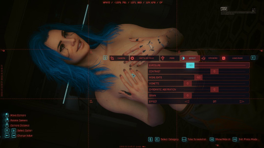
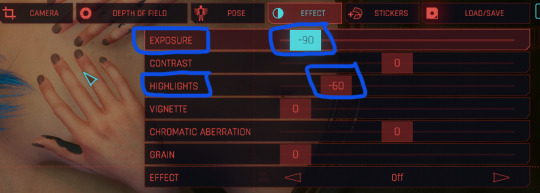
On the left, Valerie has a spotlight on her face and chest--It's pretty bright, too bright for my tastes. On the right, she has the same spotlight, but the overall exposure has been dropped down to -90 and the highlights have been dropped to -60 (now it's a little too dark for my taste--If this was gonna be a real shot, I'd build up more lights, but just wanted to show how much altering the exposure can affect a shot).
Post-Editing
As for making further adjustments to colors, shadow levels, sharpness, etc. of a shot, I know a lot of folks prefer to do that with Reshade presets, but... I don't, haha. I did make a basic shader to reduce the green tint of the game, and I use the Cinematic DOF and Real Long Exposure shaders to get a nice depth of field and reduce hair pixelating. Otherwise, all other adjustments I make are in Adobe Lightroom (or Photoshop if I need to make more precise adjustments).
And it's just a personal preference here. I just don't like having to mess with too many mods and menus in-game--I feel like it increases the chance of something freezing or crashing or me accidentally closing out of photomode. It also helps to give me a new perspective to see the shot outside of the game, especially if it's a portrait-oriented shot. Plus, I just like the process. Gives me one more reason to stare at the blorbos for a little while. :3
I adjust each Lightroom preset as needed depending on the color and exposure of the shots I'm working with, but these are some of the more common settings I modify:
I almost always finetune the exposure and shadows/highlights.
I like to do a global increase for saturation and vibrance.
A lot of my presets increase the saturation of reds and blues and decrease the saturation of yellows and greens, but this can vary; e.g. i like the greens to be vibrant if it's a nature shot.
I also usually make the white balance a little cooler.
I love tinkering with the global curves settings to "flatten" the shadow levels.
And I like really crispy shots, so I always increase the sharpness, and I'll usually bump the texture and add some noise, too.
These are all things that can be done in other similar programs/apps or even with Reshade. If you're just starting out, I think using pre-made presets and filters is a great way to go, and as you get more comfortable with the tools, you can start to make little tweaks and edits to personalize the style.
So anyway, there's some of my process! Everyone's got their own, and what works for me might not work for you--Don't feel like you have to take any of this as gospel or work exactly the way I do. But maybe this will... shed some light (ha ha, I'll see myself out) on how to get started with some VP tools. <3
43 notes
·
View notes
Text

Hi there! Here is a list of all my Reshade Presets for Star Stable Online!
Some of these are older, but I will try my best to playtest and update this list often :)
You can find updates, WIPs & similar things right here!
If there are any issues, requests or questions, please never hesitate to shoot me an ask! If you use any of them, please tag #lila presets so I can see your posts! ♥
All my Presets are done & tested in the most recent Reshade version :)
◈━◈━◈━◈━◈
➝ NOX

Notes: Foggy, Dark and spooky to make the ingame night feel more like night! With some pretty bloom for atmosphere and a cursor flashlight :)
Status: Tested, Updated & Functional!
〈DOWNLOAD〉
◈━◈━◈━◈━◈
➝ CHRYSANTHEMUMS
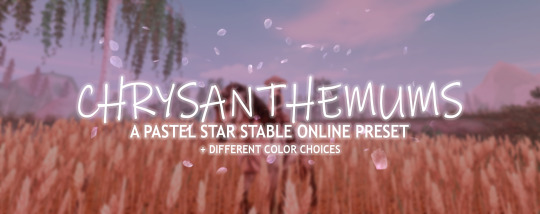
Notes: Pastel preset with an easy hue toggle!
Status: Tested, Updated & Functional!
〈DOWNLOAD〉
◈━◈━◈━◈━◈
➝ MAY
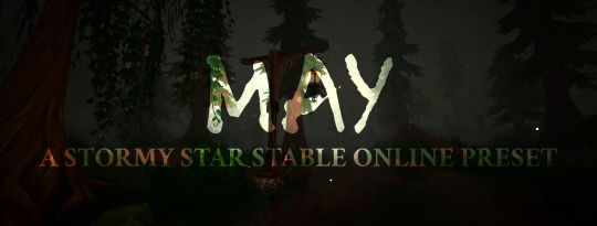
Notes: A rainy vibe with various versions to match your PCs strength! It's meant to feel like a thunderstorm rather than a cozy rainfall!
Status: Tested, Updated & Functional!
〈DOWNLOAD〉
◈━◈━◈━◈━◈
➝ APRIL
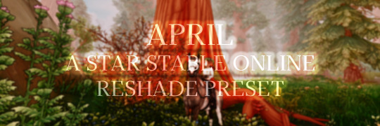
Notes: Warm, Summery feel with toggle-fog & comic outlines!
Status: Tested, Updated & Functional!
〈DOWNLOAD〉
◈━◈━◈━◈━◈
➝ WINTER VILLAGE
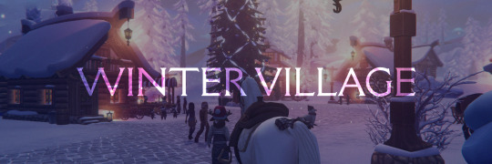
Notes: Wanted to keep the cozy feel of the Village but enhance the magic! Cold, soft & glowy preset :)
Status: Possibly Broken! I can't test it properly until the event!
〈DOWNLOAD〉
◈━◈━◈━◈━◈
➝ GOLDEN HILLS
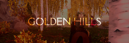
Notes: Outdated and not how I would go about things nowadays, but a very high saturation preset with some dreamy glow!
Status: Old, Rework planned - Could be partially broken!
〈DOWNLOAD〉
◈━◈━◈━◈━◈
➝ DINO VALLEY
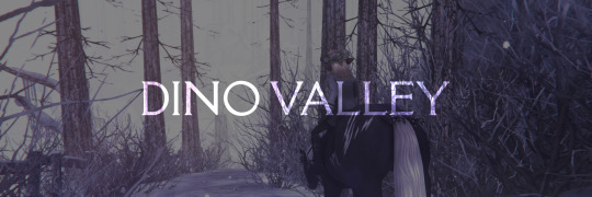
Notes: Outdated and not how I would go about things nowadays. Made to make the Dino Valley look more cold & magical!
Status: Old, Rework ongoing - Could be partially broken!
〈DOWNLOAD〉
◈━◈━◈━◈━◈
➝ KELPIE FOG
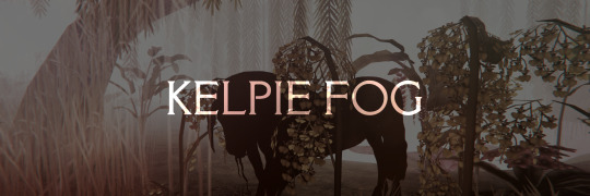
Notes: Outdated and not how I would go about things nowadays. This was A VERY specific preset made JUST for photos! Not gameplay friendly at all.
Status: Old, Rework planned - Could be partially broken!
〈DOWNLOAD〉
◈━◈━◈━◈━◈
Reshade Taglist! Reach out to be added or removed :)
@foggy-milk @starsonline
59 notes
·
View notes
Text
Tutorial: Transforming wsp. Files into png. Files in TSRWorkshop
Simmerit ask me if it's possible to export wsp. files as image files to use in photo editing softwares, and while I was telling them that it's not possible to do with a program or plugin (to the best of my knowledge), I remembered that, once upon a time, I made png. files from wsp. files. However, the method I applied is kind of a workaround that has to be executed in the Textures tab in TSRW. It's quite easy to do as well, but as I suck at explaining things with words, I sat down to do a little photo tutorial. It presumes that you already know how to work with TSRWorkshop!!!

Step 1: Select a random object, the plainer the better. I've chosen the room divider from 'Town Life Stuff' because it has no Overlay and Specular textures, which is convenient because I don't have to make these textures empty myself. It's also recommended that the textures of your chosen mesh are in a square format and that TSRW exports the diffuse map in a 512x512 resolution image.

Step 2: Export the Mask texture, fill it with red color in your photo editing software and import it again. Do the same with the Multiplier texture, just fill it with grey color.
Please note: By lightening or darkening the grey of the multiplier, you can affect the color temperature of your pattern, meaning that if the grey is very dark, your pattern will be very dark as well.

Step 3: Select the pattern you like to export. I've picked the crackled paint.

Step 4: Apply the pattern in the Pattern tab, but only to the first pattern group, Pattern A.
Please note: In most cases, it's best to keep the preset tiling of your chosen object to get the "basic look" of the pattern.

Step 5: Set all of the other patterns in the tab to false. The object itself might look weirdly shaded now, but that doesn't matter. All that I care about is exporting the crackled paint pattern. ;)

Step 6: Export the diffuse map as usual by selecting the folder you want to put it in.

Step 7: Assign a name to the file.

Step 8: Et voilà! The crackled paint is ready to start its career as a png file.


--- Edited to add footnotes to Step 2 and Step 4 and to add three examples of the crackled paint pattern depending on the grey tone of the Multiplier and the tiling of the pattern . ---
Disclaimer: This is my first tutorial. If I left out an important step, I apologize. If I didn't use the correct technical terms, I apologize. If there is already such a tutorial, I apologize. Feel free to straighten out any errors. Feel free to get back to me if there are any other problems.
44 notes
·
View notes