#coloring the lineart is always my favorite part
Explore tagged Tumblr posts
Note
can you do a breakdown on how you color? i find interesting how you mix many textures and colors in a piece
Ofc! Color is my favorite thing about drawing. :D
I made like a very brief rundown with the technique I use for a majority of my drawings but ofc it still varies a little.
Usually the only cases my process diverges is in the rendering. The color jitter (can be applied to most brushes in most Programms though the water color 6 brush is like my special angel child) makes a rlly big difference during the rendering due to there already being a lot of texture and Color variation and is something I always do.

After step 4 I usually only stick to either the textured ink for a lot of control, to the velvet for a lot of texture and depth or the classic soft for a more soft gradual end product where the color jitter only shines through.

With the first and third the key word really is color picking.


An example for the third brush. I here I made the overlay extremely faint and used the underpainting peeking through as a way to separate the parts of the coat rather than the lineart (at least from the first to the second picture). Using hue as contrast without making a clear dark-light contrast can be a bit difficult if it‘s done solitarily in a painting but due to color having different depth-perceptions (cool colors seem further away, appear darker even if they have the same value) it is fun to play with esp in combination!
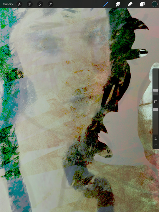
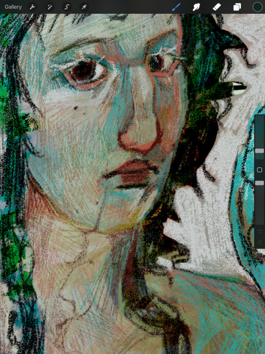
Using the velvet brush is my favorite atm. You can use really vibrant colors and apply them similarly to how you would with ballpoint pens or coloured pencils. It‘s really easy to draw subtle changes in hue without having to be too particular about having the right color and building up the colors leaves you with both a direction that signals to the form of the subject and a rich multitude of different colors that appear completely different than a flat color can.
For this I recommend starting either darker or lighter in order to build up the color in one direction of the other!
Another tip is also to use blur to reduce the sheer amount of color variation of the color jitter if you‘re going to redefine most of the shapes anyways.
Here‘s a speedpaint where I use most of the things I‘m talking about. Flash warning for the sheer amount of color adjustment making the screen flicker at the beginning.
I also didn‘t mention gradient maps yet. Very useful for further color adjustment and in order to bring a very busy composition together color-wise!
Color still is a very individual thing I feel like. There isn‘t one way to color and the way my process is right now is very much fit to my understanding of it. I feel like the decisions you make when rendering; experimenting with colors you thought wouldn‘t go together, breaking the rules you have, figuring out how relative colors are simply because they cannot be isolated. It‘s trial and error but also learning practical lessons that make color make sense to you as you go along.
I hope this makes sense! Color is so fun and I‘m always excited when I get an ask about it. :‘D
Also the jittery water color 6 and Textured Ink brush is free I believe. The bottom two are from a paid brushpack from a creator on instagram. I‘d say only the water Color 6 brush really is something that I find uncommon. The other three can be easily swapped for any other brush that has similar properties. (Pressure sensitivity + texture for the first two and flat marker + texture for the last). I‘ll repost this with a link if anyone‘s interested!
#art#art process#coloring#color theory#artwork#starling‘s art#Ask#flash warning#for the speedpaint#Just to be safe!
20 notes
·
View notes
Text

little alice :3
#coloring the lineart is always my favorite part#that whisk was my worst enemy and it will always be#alice in wonderland#alice's wonderland bakery
54 notes
·
View notes
Text
my second claim for the @sanjiartcollab !! outfit 345!!

i definitely took the concept and ran with it lol (like it’s def the same outfit but u can tell i had waaayyy too much fun with it xD)

closeups on my favorite details:
his entire head/face
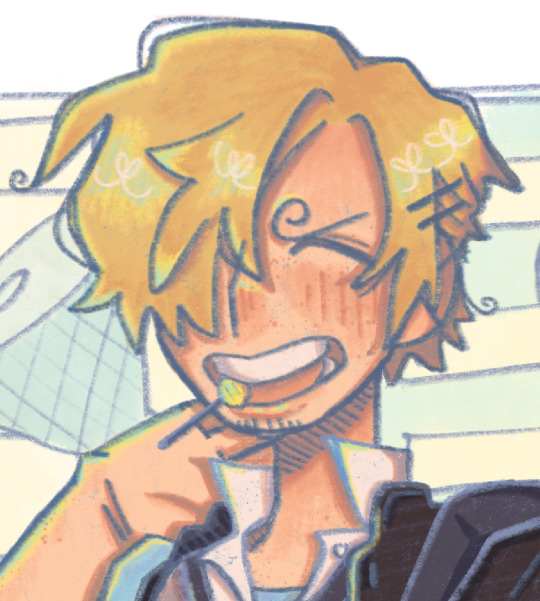
i don’t know if it’s immediately obvious but i made his face and neck flushed as if he were a little embarrassed. i think it has a nice gradient :)
also very proud of the hair shape i came up with. i originally tried referencing a buuuunch of different artists i like, but coming up with my own style more directly based off the outfit ref worked a lot better
(btw i didn’t forget his pubestache i just don’t like drawing it lol)
the school bag keychains (there was gonna be a merry keychain too, but i wasn’t sure where to put it :/)
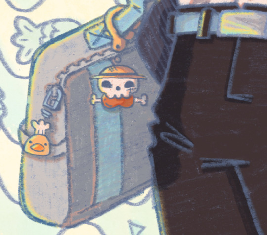
uniform id/nametag
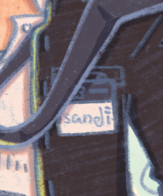
not part of the actual outfit, but when i was looking for references for a gakuran jacket there were some with ids pinned to them, so i thought it’d be a good opportunity to add sanji’s official signature on it. which btw, how tf does one make a kiss mark done in pen??? does this guy just smudge ink on his lips???
furoshiki wrapped lunch box (sanji made pirate lunch boxes for everyone :D)
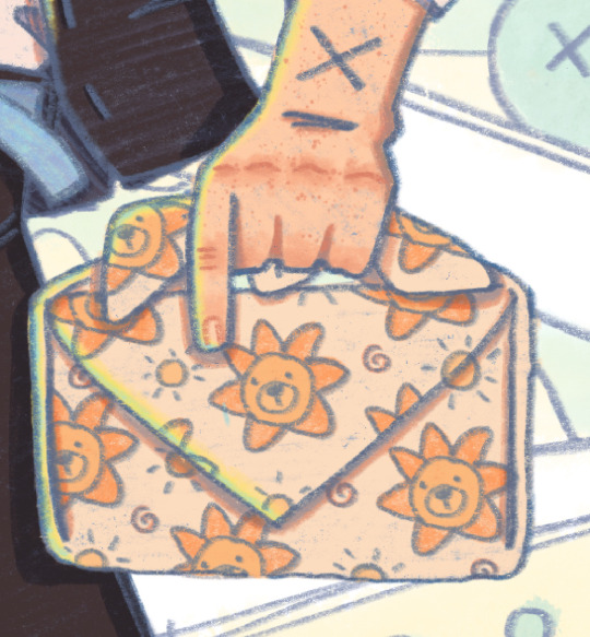
east blue crew!! they’re like cute lil stickers :] (def inspired by @michelmims ‘s art)

+ just sanji and the lineart!


the comic/lunchbox panels all have each character’s favorite food! (meat on a bone for luffy, fish and chips for usopp, seafood pasta for sanji, onigiri for zoro, and mixed fruits for nami)
also i would like to thank god himself, eiichiro oda, cause if i hadn’t studied his art so heavily in my last collab piece i wouldn’t have realized the power of halftones in shading! also also, watching op fan letter helped me figured out how to pick good shadow colors (basically; cool colored shadows on warm colors, and warm shadows on cool colors!) my shading’s not perfect but it’s definitely not flat anymore :D
is it obvious i really like this piece lol xD
AS ALWAYS PLEASE CHECK OUT THE COLLAB SERVER!! EVERYONES SO NICE AND COOL AND THERES GONNA BE NEW OUTFITS TO CLAIM IN JANUARY!!!
#also i worked waaayy too hard on those yellow-blue highlights pls appreciate them#sanjiartcollab#sanji art collab#black leg sanji#blackleg sanji#vinsmoke sanji#one piece#one piece fanart#art collab#one piece art collab#sproouts.jpeg#artist on tumblr
231 notes
·
View notes
Note
Could you talk about the new animatic you're doing? I just recently followed you here so idk if you've talked about it other than the one lineart post I saw but I would LOVE to know literally anything about it you're willing to share, including but not limited to the main focus/themes and just ramblings about the process of making it so far etc etc.
I love your works of art sorry for the block of text!! And it's cool if you'd rather it all be a surprise I am just very interested :)
Thank you dear anon!!! I love blocks of text please go on
There are some things that I can tell right now!
It is an animatic about Saint's campaign and the most important thing that I want to put in is probably my opinion about ascention of FP and LTTM. So I kinda lied when called it "Saint animatic", Saint have maybe 50% of time
By the way I really struggle with drawing iterators. Their proportions are always shifting from frame to frame... you just should know I TRIED make it look ok
For the Tiny Alien lineart I used brush sized 9 and for this one animatic I use 3. I want it to look less cartoony this time. It made lineart even harder and longer 😭

Fortunately it is over, now for the flat colors, my absolutely favorite part of any drawing. Then shading and lighting. This is annoying part of work but makes things look cool :D

There's not much new here, you're right, I don't want to tell a lot now, let it be a secret :)
61 notes
·
View notes
Note
Whats your process like for making the pages/script/comic in general? any advice you could give?
Hii:D
I'm gonna ramble about this a lot, so I'm adding this read more <3
That way this post won't be super long on the main page
If you DO want to see everything go ahead!
So! Right now I work on the pages from monday to saturday :]
I divide work like this:
Monday-Tuesday: Script, storyboard and dialogue bubbles!
Wednesday-Thursday: Lineart for the 4 pages! 2 pages each day
Friday-Saturday: Color the 4 pages! 2 pages each day
Talking about writing
I don't have the full script ready yet because I realized
I SUCK AT WRITING, NOT IN A "My writing is so bad way" BUT IN A "I can't write words without getting confused" WAY
That's one of the reasons why it took me SO long to start this thing! Because I wanted the script to be fully ready! And I couldn't do that because whenever I'm writing I get super confused😭😭I don't know how to explain it but I NEED visuals ??? I need to see how the dialogue I'm writing is gonna look???
So now, whenever I'm writing, I'm also drawing at the same time! AND FOR SOME REASON THAT WORKS, AND SUDDENLY I CAN WRITE
I REALLY DON'T KNOW WHY THAT IS BUT, UH, IT WORKS FOR ME!!! THAT'S ALL I NEED!!
This does NOT mean I'm improvising the story! I do have the full story ready and outlined! I'm following that outline :]
I realized having everything ready might work for some people, but it wasn't working for me D:
So, uh, my advice for writing is to trust yourself and to try different methods! You'll find something that works for you :]
I DO recommend having an outline of the story before beginning!! You don't need to know everything from the beginning but you need to know what NEEDS to happen and a basic idea of how it should end :]
Now about the making of the comic pages
Pls look for references constantly!! Very important!!
There's many different ways to make comics!
I always look in pinterest for panel layout/color pallete inspiration
I use clip studio paint to make everything, it's super useful cause it has a LOT of features that make the process MUCH easier (vector layers, a paint bucket that actually works, special comic configurations, a panel tool, 3d viewing which is super fun, predetermined speech bubbles, the story editor, etc.)
It takes me like?? Approximately 2 and half hours to make one page?? Some more and some less
But I'm also an easily distracted person so sometimes 2 hours turn into 3 because I spent 1 hour getting distracted with other stuff 😭
Uhhm, so yeah!! I think the layout is my favorite part, my least favorite part is adding the speech bubbles...ESPECIALLY if I have to add Wingdings
Andd I think that covers most of it? If you all have more specific questions let me know because there's a LOT of stuff that goes into making these😭😭but I get better and faster each time! My first pages took me like 4 hours on average...some would take me 6 hours...THAT WENT DOWN A LOT :D
#i don't know what to add here in tags hehe#answered ask#making a comic is great but oh my god does it take time to get used to it ....and to build a schedule that actually works....
72 notes
·
View notes
Note
Hello! I love your art and your use of colors; I was wondering if you'll ever post a process video or a step by step to show how you approach your art?
hi!! thank you, im always glad people like my sense of color cause it's my favorite part :-) it's a bit hard to show process videos because i tend to work on multiple drawings within a same file, at the same time, so it looks very confusing. but i made this one for that! it shows my process from sketch to finish, and i'll also add some thoughts under the cut
the steps to my art are usually :
sketch, always in color (i dont like sketching in black, it doesn't work as well for me). i did this step on another file so you don't get to see it, but it did happen at some point
set the lines to black, or to whatever color i want the final lineart to be (to make sure the colors work well with whatever lineart i want to have ; if i changed it at the last second, it would look weird)
add very rough colors : here, making the background orange and the character dark blue. if you draw on a white background and try to change it at the last second when everything else is done, it might not work with the colors that well
i work from these basic colors to pick the actual shades. i usually start with skin and hair, then clothes. the idea is to find a color that evokes whatever color i have in mind without clashing with the base tone. so a character who has a bright red base tone, and has blue eyes, i will use very desaturated grey to give the illusion of blue, not actual blue. that would clash too much!
once all the colors are done, i start cleaning the lineart. i usually start with the face, and do that part pretty carefully, but then forthe rest of the body, i might erase the whole rest of the lineart and draw it from scratch. i alternate between cleaning the lineart and refinining the shapes on the other layer, giving them nice clean edges
i think that's about it! i hope this was helpful in some way :-) thank you for your kindness !
109 notes
·
View notes
Text
line art. i draw all the time, line art is always my favorite part of all my drawings but i feel like the colors i use overshadow the lines so uhm, heres a post of some of my favorite line art :3


full bodies have so much less detail, especially my designs fbs bc i dont want ppl getting confused w/ all my lil lines, so thats why its all head/busts. I can add as much as I want to the lineart :3
#little lines make me happy#yes two of these are unfinished#do you care?#probably not#do I care?#no. no I dont#art#my art#digital art#dragon#fluffy dragon#dragons#oc#artists on tumblr
49 notes
·
View notes
Note
Hey, so I really love Lore Rekindled, and the art is one of my favorite parts! The style, the coloring, the background, all of it is just so… smooth! I don’t really know how to describe it. Recently, I’ve been trying to replicate it, and I was hoping you would give me a few pointers. What brushes do you use for line art? How do you decided what to line, and what to leave blank? What about coloring brushes? Do you use smudge brushes? Whats, like, the step by step process? You don’t have to answer if you don’t want to! But any tips or answers would be great!
Ah thanks so much!!!
Here are the brushes! They're .abr brushes, so they should work in Photoshop, Clip Studio and Procreate :) (they don't work in Krita or other software that utilizes PNG brushes though, sorry ; ; )
There's also a tutorial included with that file that breaks down my process layer by layer! That said, there are a couple things that have changed in my process since doing that tutorial:
I mostly use the Hard Square Pastel brush now for all of that 'crispy' lighting that often happens along the edges of characters' shoulders and heads, such as seen here:

I now do an extra step of applying a 'blur' layer, where I essentially merge all the layers into a new layer on top of everything, set it to Overlay, and then Gaussian Blur by about 60%. This is how I get that 'dreamy' look that's been present in a lot of the more recent episodes!
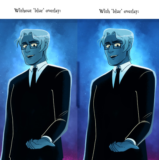
It's subtle, but really effective in making the glow effects and deeper colors really pop!
As for the more nuanced stuff like lineart, it's kinda just something I do by feel! Sometimes I'll shade something in and realize the lineart doesn't need to be there, so then I'll go in and erase, other times I have to be a bit more excessive with it esp if two similar colors are up against each other. I'm actually trying to use less lineart going forward to get more of that authentic LO look but it's hard, I'm very used to doing lineart-heavy drawings so it's forcing me to draw in a way that I'm not used to! 😆 I usually always start with flat colors first though, meaning I start by 'shaping' out the character poses and then lining them in afterwards!
You can see an example of this process in my END OF PERSEPHONE time lapse here:
youtube
I also usually stream work sessions of Rekindled over on my Twitch, but I'm currently on hiatus from streaming due to technical difficulties (OBS just... decided it was gonna stop working, sigh). Go give it a follow anyways tho so you can be notified when I start streaming again! I'm thinking in the meantime until I can get my Twitch going again I might start doing some screen sharing sessions in Discord. So keep your eyes peeled for that if you ever wanna catch me working! I'm always happy to talk about and demystify the process <3
93 notes
·
View notes
Note
What are your thoughts on the 25th anniversary pet colours?

As a whole, I really like the 25th anniversary colour. I have a few gripes with some more technical things, which I'll touch on momentarily, but I think it's a fun colour that stands on its own.
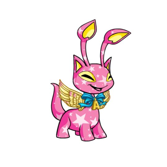
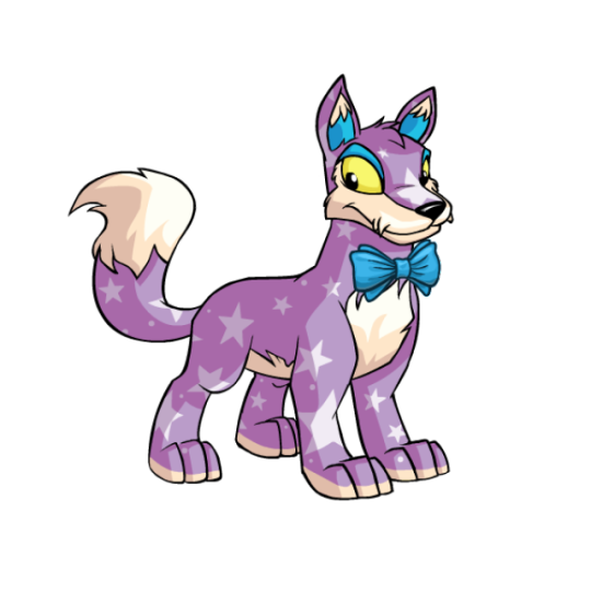
Visually, I think it manages to nail the three big aspects: base colour, individuality, and customization. For the base colour, the semi-opaque stars are a great nod to the Neopets brand that also happen to look "celebratory", and it makes sure the base isn't too similar to any plain colours. I've heard some argue that 25th anniversary is too close to starry as a colour, but I disagree; sure, they both have stars, but one is always blue with yellow stars and no wearables, while one is... not that. Like, you're never going to confuse the two.
I also think the colour works in terms of both overall coherency and and individuality. Each pet has a simple main hue for the base with stars, and then a few small celebration-y items for custimization. However, the base color is different for each pet and the wearables also vary, so each pet still feels unique. The wearables are also a nice touch because they add a little something and are unique to this colour, but are completely optional. It reminds me a lot of valentine in execution, which is a good thing.
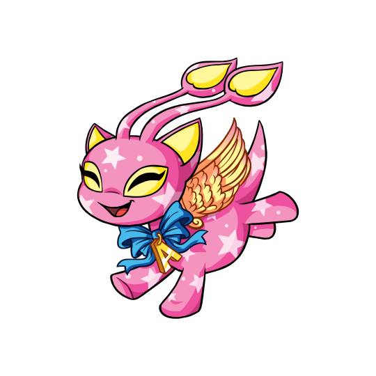
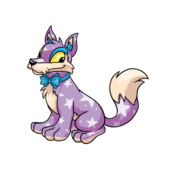
The colour also comes in "celebratory" styles. The styles are variable in quality; some of them have really fun poses and good shading, while others look very flat and have very thin linework or strange proportions. However, I'm not quite as picky with these because they're all-new styles not based on any actual pre-customization art, unlike something like the recent dynamic Halloween and Ghost styles. Either way, I do like the styles and I think they add some life.
My only issue with this colour is that we only have, like, five pets in it. Don't get me wrong, it's normal to only get a handful of pets in a given colour when it debuts... but the reason is that each species needs to be designed, whereas here, we know most species already have a 25th anniversary design thanks to promo materials. It probably would bother me less except we have way more pet styles than we do non-styles, which feels kind of gross; almost like part of the colour is paywalled for certain species until further notice.
Also, my other minor beef is that "25th anniversary" is a very clunky pet name; not only is it a mouthful, but it doesn't make sense in-universe (the 25th anniversary of what, exactly?) and makes it weird to release 25th anniversary pets on any other anniversary, which they're apparently planning to.
Favorite Species:
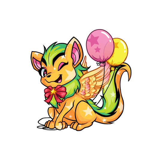
Xweetok: Unfortunately there's no NP colour for this one yet, which like I said above I'm really not a fan of as a practice. However, this is a really 25th anniversary pet regardless. It comes decked out in a bow, wings, and balloons, and uses a pink/green/orange palette that really shouldn't work and yet somehow does. The winking pose for this one is also very fun and adds a lot of personality.
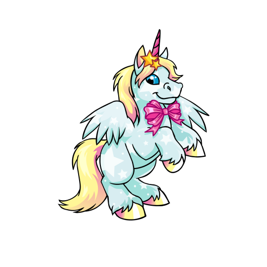
Uni: I don't know why I like the Uni so much; maybe it's just the nice rearing pose, or maybe it's just that I like the light blue, yellow, and pink palette. Regardless, it's very pretty, and that's coming from a person who normally isn't huge on Unis. My only beef with it is that the hair clip stars and the bow have colored lineart for some reason, and the bow is stapled directly on the body without a ribbon around the neck—a weirdly common problem with 25th Anniversary pets for reasons I don't quite understand.
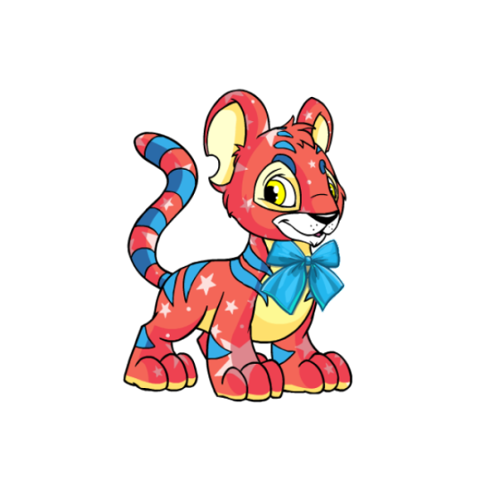
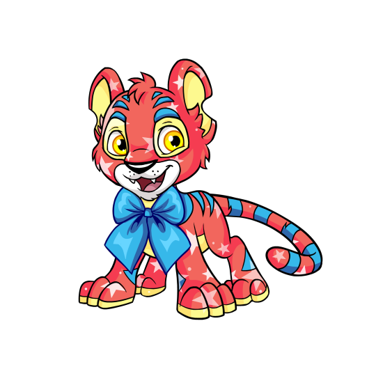
Kougra: Of the five pets to currently have both a NP option and a style, the Kougra has a very fun base color; a mix of red, blue, and yellow that's kind of similar to the base red Kougra but also not at all. There's not a whole lot of wearables, but the Kougra's fairly complicated default design combined with the colours makes it kind of work, seeing as it would likely look too busy otherwise. My only issue with the customized version is, similar to the Uni, the stapled-on tie with colored linework, though at least you can remove it here. The style is nice, more expressive but not over-exaggerated; proportions are a bit off (the head is way too big, and the body's a little too skinny), but that's not a huge deal.
38 notes
·
View notes
Note
TIBBY IM SOOOO HAPPY YOU WERE APART OF THIS ZINE! Your part was literally my favorite I was so excited to reach your section. I adore how you draw cub like always and the entire part was so well put together and easy for me to read. Thr coloring on the skulk is gorgeous and lineart is so clean
So good just wanted to tell you you did an amazing job and I loved seeing your part
THANK YOU SO MUUUCHHH you have no idea how many hours we all put into this. you can ask my friends about all the times they wanted me to hop on mc but i was too busy being in the Comic Mines™…
line art is my favorite part of the process so i’m so glad you liked it!!! tysm :D
49 notes
·
View notes
Note
Sorry to come out of nowhere but I just wanted to say that your art is so warm and so colorful and so ROUND in all the best ways and your style really captures my favorite things about Kirby! I've always found it really inspirational!
Also, I love the way your line art looks?! I have to ask (you don't have to answer though) is there a specific brush or technique you use to get that soft, multi-layered effect?
Either way, wishing you a wonderful day!
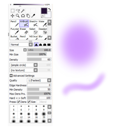
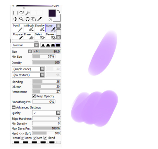
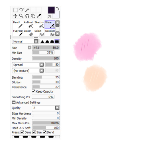
Thank you so much for your nice message, it means a lot!! I've been wanting to make a small tutorial about how I make my Kirby art, so I guess your question came right on time hehe ^^ As I'll be explaining all of my process, I'll also answer your question about my line art! Btw my art program is Paint Tool SAI and I'll also be showing the brushes I use as well as their settings (i made up most of them a long time tho).
So first here's the brush that I use for basically anything, whether sketch or lineart!
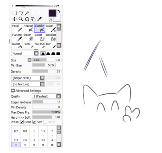
It took me a while to understand what you meant by multi-layered effect, but no the brush doesn't do that, that's actually my way of doing "lineart" (ig it's not really lineart cus I just do sketches that I clean later on).
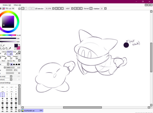
I then clean up everything, add the details and block by using a grey color.
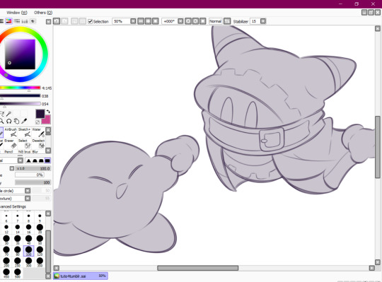
Afterwards I add the flat colors! I already have my own made up color palette, but otherwise I always use a purple color as overlay.
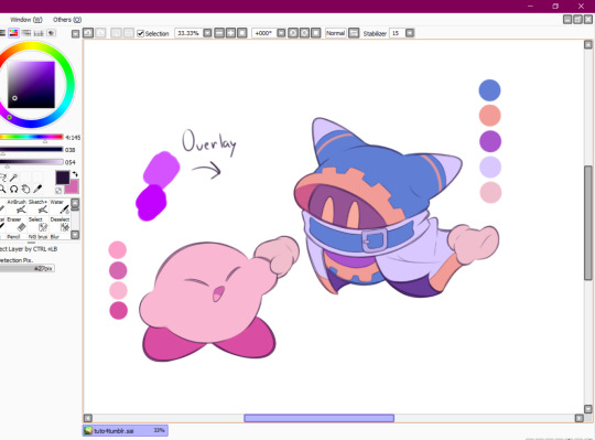
And I also use that same shade to color the lineart!

Next comes the fun part, shading! Here's THE brush that gives that soft effect to all of my drawings ^^ It's the same setting as my eraser too!
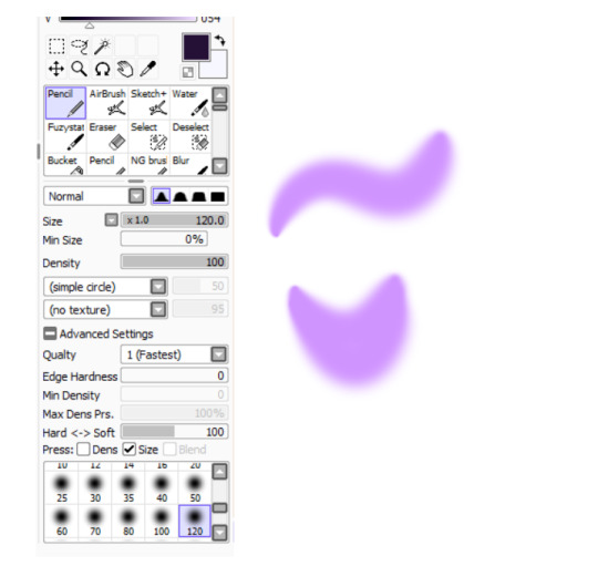
And yeah I also shade with light purple lol
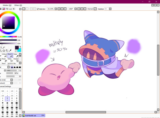
There's also some other brushes that I use for more effects, like the airbrush! (I don't think I've touched the settings that much) I mostly use this one for lighting effects.
And finally the water brush! I sometimes use it for blending or for quick backgrounds,
but you can also see that when put it to "Spread" it also becomes the one that I use for my blushes hehe
Aaand I believe that's all of the brushes I use for my art! I do have more, but I only use those for other specific stuff like animation or pixel art.
Adding some details AND VOILÀ!!

Now you know how I make my Kirby art! (but this also applies for all of my art) I sometimes redraw on the contours to give that "pop up effect" a bit like what they did in rtdldx lol ^^
I really hope it was easy for everyone to understand cus this is my first time making a tutorial! And to Desultory Novice, I hope I managed to answer your question too!!
Thanks again and have a great day :D
260 notes
·
View notes
Text
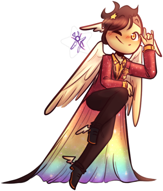
THE MAP IS OUT!! Here's my individual part for it, along with my credit image! I'm so happy to have been able to work with such cool collaborators on this project, this was so fun! :D <33
WIP and fun facts below the cut!
First pass of my part!

General Notes: - All of us had a cut-off frame so Sammy (our MAP host!) had space to transition shots! the stick in my cut-off is my oc Lixy <3 - As always, I don't have an actual animation program. Each frame of this was individually drawn in Clip Studio, saved as PNGs, and meticulously arranged in a video editing software. it took a while and a headache. the software crashed 4 times hdkjh </3 - The process was sketching, lining, then compiling it all together! Line art took the most time (because i don't like lineart hkjdh) - Fun fact, all of the sketches (seen in the wip above) were all drawn on my first plane ride ever :> <3 - The background is Alan's animation program that I took from a screenshot from AVA 6 :> I didn't want to do anything too complex for it ;w; <3 - All of the slide transitions were done manually! It may look like tweening, but I don't have a program that can do tweening lmao :'> <3 Each of the slidings was individually 3-6 frames of moving them across the frame, a single frame of stretch for movement, then a settling frame before the next stick slid in. - Green is doing air guitar as they slide in :3 <3 - My Blue design has a hat that can magically change into a Witch hat (when potion making), Chef hat (when cooking) or Sunhat (when gardening <33 - Purple looks nervous after he crashes into everyone, like they're expecting to be in trouble, but smiles and laughs when everyone else does. You can see Blue with their hands up, reassuring Purple. - Originally Yellow didn't move as much in the final laugh scene, but I saw the first frame of the person after me (@/sleptonce!) which had Yellow in a little crouch :> i adjusted Yellow to match the next frame a little better! - Also Yellow's hair is flipped from the way I usually draw it because I felt it worked better this way hgkjh <3 - (I totally didn't forget my Second's design has green eyes and had to edit those frames very quickly hfkjh <33) - The only colors that aren't the stick's original colors are when Blue's hat falls on Purple, and Red's yellow bandana <3 (These are also the only movement animation in the blinking sequence!) - Adding Alan's cursor was a literal last minute decision, he was never in any of the sketches, I literally added him in 15 minutes before submitting my part hgkjh <33 I think after my shot, Alan helps gently pick them up <3 - My suit in the credits is mostly red and orange, because my favorite sticks are Red and Second! <3 The rainbow cape reflects how I enjoy the color gang the most though hkjdh <33
Thanks for reading!! :D <33
#Alan Becker#Animation Vs Minecraft#Animator Vs Animation#AvM#AvA#my avm art#avm red#avm second coming#avm orange#avm yellow#avm green#avm blue#avm purple#starlight originals#lixy
183 notes
·
View notes
Note
Hi! I wanted to ask for advice on finding an artstyle, I've been drawing for sometime but I still dislike my style.
Thank you in advance :D.
Hi hiii
Whenever my artstyle gets kinda boring to me, I try asking myself questions to figure out what exactly is it about my artstyle that I don’t like. Things like what is it about my art that feels boring to me while this other’s artist’s work excites me? What makes me most insecure about this piece? What do my favorite artists do in their artworks that I don’t do?
This isn’t to put yourself or your work down, make sure to go out of your way to still note anything you like or are particularly proud of in any of your artworks, you work hard on your art and that deserves to be appreciated, even if your artstyle isn’t quite at where you want it to be yet! But this is mainly what I do to try to address reasons my artstyle isn’t giving me as much joy, and what changes I can make that might make me happier. Most of the time I can’t really put my finger on what it is that I dislike about my art, so I keep these questions in the back of my mind while I try experimenting through doodles and messing around with my style in each one. Have some doodles dedicated to things you dont normally try in your artstyle. Varying eye sizes and distance from each other, some doodles with different ways of stylizing noses, trying varying levels of realism vs cartoonishness when drawing characters, and trying different brushes if doing this in digital art. If any specific doodles jump out to you as kinda neat, take note of whatever you did in that doodle and try it more often!
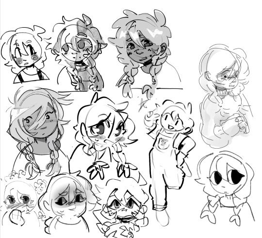
(Sorry i was doing this in a hurry but definitely couldve utilized more full body shots, varying poses, face at more side angles, coloring styles, would 100% reccomend experimenting with that too. But this is mostly what those batches of experiment doodles usually look like for me)
As always, it doesn’t hurt to also study other artists’s whos stuff makes you so happy and figure out what it is about their art style that excites you so much. Whatever that may be, think about if its something you want in your own art style and try replicating and practice doing it if you do want to take your art in that direction.
Quick example from me but november 2023 i remember starting to feel super uninspired with my artstyle. I asked myself what felt like the most unrewarding part of the process for drawing and realized the answer was my lineart. At the time I was seeing a lot of @/bixels ‘s artwork of drawing mlp characters as humans from the 1920’s americana and was so delighted by their lineart. I kept experimenting with brushes in my doodles and realized that using the gel pen reminded me somewhat of bixels’ art, so I took that and ran. It was a neat change after a while of having thicker lineart and actually having fun with pressure sensitivity and how the brush is able to taper.
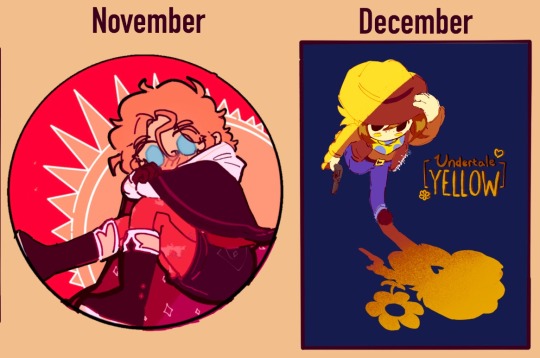
This is what i found works for myself so im not sure how well it applies to other people or if i worded everything well, but I hope its at least a bit helpful in some way!
#tldr main tactic for is asking myself questions on how i feel about my art and why i think i feel the way that i do#asks#moth talk#love u abi. she is one of my oldest oc’s and usually the one i draw for art experiments
46 notes
·
View notes
Text


i dont think i ever posted this one except as part of a bigger more involved graphic so here she is on her own. if theres anything i take pride in it's the fact that this outfit goes extremely hard and im bummed i didnt draw this as a fullbody shot because it comes with a stylish pair of shoes.


in my time drawing comics ive come up with a handful of quality dyke outfits for Reah but this one is my favorite so far. it feels like ive peaked.
i almost feel a little ashmed to say the main inspiration for it was that ive been trying for years to make a character design that has the same kind of visual mouth-feel that Booker DeWitt's getup from Bioshock Infinite gave me when i was first playing that game in 2013... it only took me a full decade and several duds to figure it out!
about the main images!
to the left: my own flat colors. i dont usually color my own art because while i might have an eye for colors that work (or i might not), i have no process for applying color to lineart that i enjoy. when i do color, it almost always ends up being for the sake of establishing a color palette i can show to other artists.
to the right: digital colors and shading by @arthropodrespecter who at this point could turn anything of mine into an absolute masterpiece with her colors.
29 notes
·
View notes
Note
Hey !! I just wanted to say your art is CRAZY good and I was wondering if you had any tips on picking color palettes?
Sorry for taking forever to respond, but hi!!! Thank you so much!!! wahh always wild when I am percieved, makes me v happy :)) As for color, your ask got me really excited since it my favorite part of the artistic process!
The long and short of it is that I like to use color theory (complimentary, analogous, triadic colors, etc) to minimize the amount of color in my work while using a variety of saturation and value to create the variation! Complimentary being colors across eachother on the color wheel, analogous are the colors next to eachother, and triadic are colors equidistant from each other,,, triangularly.
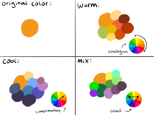
I typically don’t like starting out with a rigid number of colors of specific shades when I do my work cause it feels really limiting, and I enjoy adding color when it feels right. However, when I do color pick, I like to get a main big overall color scheme in mind then start placing various shades and saturations within that minimized pallete. The important part for me is not to stray too far from my pallete without some intent.
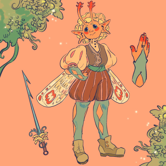
For example, when creating my character Peter, my goal was to make her a very warm colored character. To do that, I used an analogous color scheme of oranges and yellows with green sparingly. By minimizing the amount of different colors used, it helped the piece feel far more cohesive, but the amount of saturated and desaturated forms of the color created a lot more energy. And even though the colors I used were all next to eachother on the color wheel, the green provided a cooling contrast that I used in the eyes and portion of her costume to connect the two and emphasize. I also tried to use saturation and value to separate her from her outfit. Her skintone, hair petals, and markings are all very bright, while the outfit is desaturated tones. This made the seperation of the two more apparent to the viewer that this is body and this is clothes. I also like throwing in multiple color schemes to create even more visual interest. For example, for the lineart I used a deep saturated blue since blue is the complimentary to orange, her main color. This caused the lineart to stand out against her even more so than black lineart would.

To the upper right I also sketched out a different costume for her while maintaining the motif of orange and green (though some of the colors I’m not necessarily happy with).
Here are examples of some of my other stuff to show the “main colors” of the work. And as a secret, if a color isn’t matching my scheme, I like putting a color from my color scheme over it with a lower opacity and color pick from there ;) helps with melding it into it.

Of course these rules are not set in stone and I break them when I gotta, but this is generally how I like to find my colors. Anyways,, I hope this made some sense!! I really enjoy color :)
66 notes
·
View notes
Text
How I color manga panels: a tutorial
I'm no expert at doing recolors, I'm simply an artist who's occasionally too lazy to do my own lineart, and uses that of my favorite mangaka's so I can focus on other styles to simply have fun with my colors. I always try and choose panels or pages that are high quality, to avoid too much pixelization. Often I end up sourcing these from scanners or google images.
As far as programs, I use Krita (a free software). This all can be done with the standard brushes and tools that come with the software. But for some of the coloring, I have brushes from brush packs i like to use, as well as a few brushes I have customized myself. The main ones I use are from David Revoy, so if you want a recommendation for a great free brush pack, that's mine.
For this example I'll be using this panel from Chapter 58 of Moriarty the Patriot (I believe this would be Volume 15 of the manga) that I posted earlier here.

I'm not including the step where I crop the image, but I personally chose to remove some of the white borders that are needed for a traditional volume's page borders. Since I'm doing digital art, I don't always include them.
My next step is always to outline and fill the individual base layers. This includes the speech bubbles, each character, any independent props, the panels themselves and the backgrounds. There's no correct way to do this, but personally I use a brush to outline the object, then fill tool to well. Fill it, as well as the rectangle tool for the panels or straight lines I need to do.
For layers, I usually put all of these color base layers in a single group that's set to multiply, and change the opacity of the base panel so that I can fill the blacked out areas with a solid color easily, here you can see I was working with the base panel at 50%, but honestly i just kind of turn it down to whatever I think looks good.
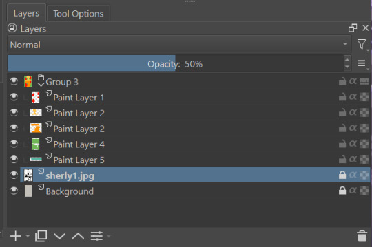
The colors I use for this step are usually brightly saturated rainbow colors so it's easy to tell the different elements apart from each other. So you end up with something that ends up looking rather horrific like this:
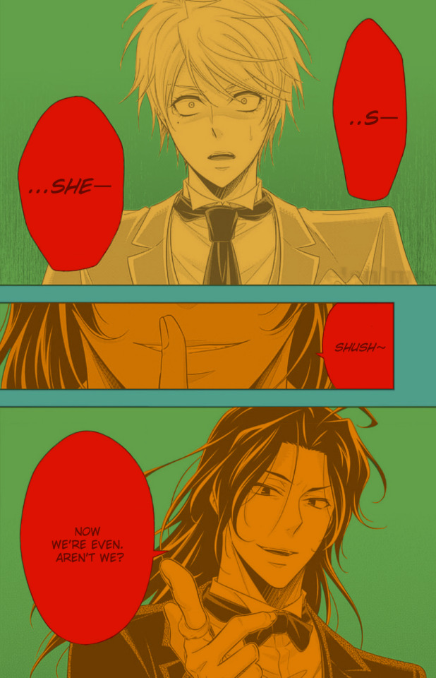
From here, I usually create a copy of the base panel to put over the top of the colors. This way I can have transparency for the colors on some of the blacked out parts, but don't loose some of the nuance of the shading entirely. Moriarty the Patriot is a very black heavy cell style, which is the style I find the "panel above, panel below" method works best on. However as I work on the colors, I tend to toggle between having it on or off.
It's about here where I start doing my coloring. Of course this will depend on your coloring style and art habits, however personally, I like to start with the characters. I use those colored layers as the base layer I can clip my coloring layers to.
I will often turn off the layers that I'm not currently using so I don't have to deal with eyestrain, and will change the base layer to something more suitable (often a grey or light tan) so my color theory doesn't get all messed up. The bright colors in previous steps are to make sure they're visually separate. Now they've been established, I don't have to worry about that.

I don't usually label my layers, but for the sake of the tutorial I have to make it clearer which layer grouping is which.
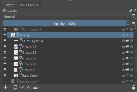
I find in this step because of the multiply layer the colors can be a bit washed out, so I tend to either use much more saturated colors than I usually do, or switch to another layer style like Linear Burn of the overall color group to make the colors pop more. Ultimately though this comes down to personal preference. If your coloring style is very de-saturated, you might not have any problems with it. (I do suggest making your base color white, so the coloring of the base panel isn't off, you'll see in the screenshots above I forgot to when working on Sherlock. Ignore my mistake)
For the parts of the image where it's primarily blacked out (such as Sherlock's hair or coat) I don't bother shading at all, and only do the highlighting, as the black takes care of the darkest tones anyways.
During my coloring, I also add a separate grouping above everything for adding rendering and details above the panels. This includes things like the eye highlights (which I always do in pure #000000 white) and making certain parts of the heavily blacked out areas pop more.
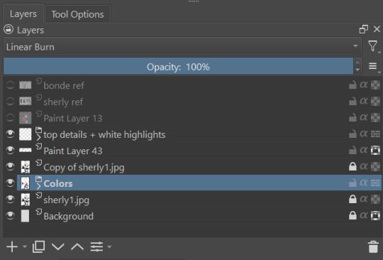
(those refs and paint layer 13 are what I'm using to color pick off of, and keep the shading colors consistent throughout the piece. There's probably a better way to do it, but I just paste them directly into the image and then delete them at the end, paint layer 43 is a color dodge layer, and so has to be outside of the layer grouping to work)
Comparison of the art without:

And with the top details and white highlights:

It's a pretty subtle difference, but I find it's the little things that truly make the piece. Especially with the strands going over the face, they need just a bit more to make them really pop. I also just really like my fancy eyes which is hard to do without the top layer.
Insert several hours of coloring here, and about another hour just trying to figure out what gradient to use for the background, and you end up with the the base colors. From here I usually mess with overlay layers as well to get the colors to all look fancy and nice together without having to do color theory (pro tip /lh).
I forgot to grab screenshots while doing the background, but for the top panel I essentially just used the [deevad 5c screentones] brush and a transparency mask to add a screentone gradient, and totally didn't google "splatter overlay" or something like that and picked something off of google, and added some borders.
Because both the base manga panel and manga panel over the top are both not at full opacity, if there is text in the page or panel (such as this one) I like to copy the just the text part of the panel and add it as full opacity in the "colors" folder to make sure it's legible and matches up the rest of the colors.
And after all that, its basically done. I'll sometimes continue to mess around with certain aspects to make sure I like how it look, but that's essentially it. This is when I add my signature, and then it's queued to post!

#krita#long post#eyestrain#art tutorial#tutorial#digital art#my art#manga recolor#manga edit#manga pannel#manga coloring#sherlock moriarty the patriot#moriarty the patriot fanart#yuukoku no moriarty#moriarty the patriot#james bonde#james bonde mtp#artists on tumblr#art resources#art help#art tips#drawing tips
78 notes
·
View notes