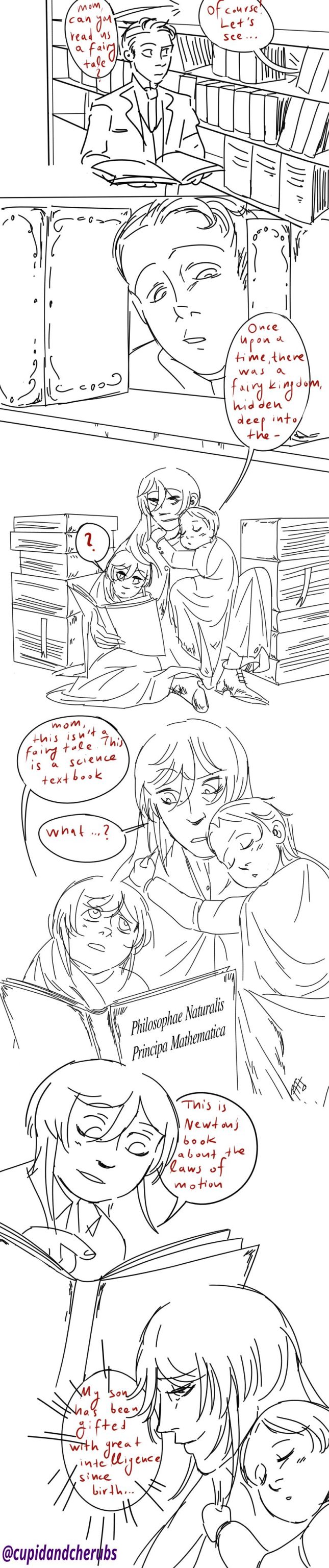
#moriarty the patriot fanart
Explore tagged Tumblr posts
Visit Tumblr Blog
Explore Tumblr blogs with no restrictions, modern design and the best experience.
Last Seen Tumblr Blogs


Fun Fact
Tumblr Inc. is using 66 technologies for its website.
Text

It hurts me to think about how unironically married they are
#sherliam#Moriarty#moriarty the patriot#yukoku no moriarty#憂国のモリアーティ#Sherlock#Sherlock Holmes#william Moriarty#sherlock x moriarty#liam moriarty#Moriarty the patriot fanart#commissions open#commissions welcome
1K notes
·
View notes
Text

Domestically zesty Sherliam are the reason I get up in the morning.
#sherliam#sherliam fanart#yuumori#yuumori fanart#yuukoku no moriarty#yuukoku no moriarty fanart#moriarty the patriot#moriarty the patriot fanart#william james moriarty#william james moriarty fanart#william moriarty#william moriarty fanart#sherlock holmes#sherlock holmes fanart#moriarty the patriot sherlock#yuukoku no moriarty sherlock
869 notes
·
View notes
Text

Sherlock is either invested in the conversation, or just VERY invested in what Moriarty has to say
#sherliam posting finally#i havent talled enough about the obsession ive gained with yuumori#and sherliam obviously#AND LOUIS JAMES MORIARTY‼️‼️‼️#but hes not here right now. so 🙁#moriarty the patriot#yuukoku no moriarty#sherlock holmes#mtp sherlock#william james moriarty#mtp william#yuumori#moriarty the patriot fanart#yuukoku no moriarty fanart#sherliam#fanart#art#my art#digital art#key art tag
321 notes
·
View notes
Text


I have a lot of pictures in my 'random stage plays' folder. So here's some stuff from Moriarty the Patriot. Cause I can. And yes. I am avoiding my colouring responsibilities, but lineart is so much quicker~
:)
#moriarty the patriot#william james moriarty#hehehe#sebastian moran#i think#its been a while#since i watched this#but it was cool#definitely gonna do some other stuff from this at some point#but that depends on how much time i have#other things have been consuming my brain~~~#:D:D:D#moriarty the patriot fanart#moriarty fanart#YEYE#HEH#there were some moments in the stage plays#that had me dyin-#there was this whole 'watson don't burn the house down yet- adler's onto us-'#which watson completely misinterpreted-#it was Hilarious.#XD#dunno the actors names#but this is from one of the stage plays#:)
205 notes
·
View notes
Text
Click on the image for better quality!
this was going to be coloured but procrastination said no
#moriarty the patriot#moriarty's patriotism#yuukoku no moriarty#william james moriarty#louis james moriarty#yuumori#moriarty the patriot fanart#artists on tumblr#my artwork#small artist#digital art#william james moriarty x reader
66 notes
·
View notes
Text

4/1 • William Through The Years
#HAPPY FAKE BIRTHDAY WILLIAM 🎂🥳🫶💗💗💗#LOVE YOU BABYGIRL MY LITTLE GUY#barely made it in time on here 🫡🫡🫡 i had only 1 hour left until it'd be after his birthday#anyway#yuukoku no moriarty#yuumori#ynm#moriarty the patriot#yuukoku no moriarty fanart#yuumori fanart#ynm fanart#moriarty the patriot fanart#william james moriarty#william james moriarty fanart#my art
382 notes
·
View notes
Text

Eppy boy!!! ^^
#digital drawing#digital art#digital artwork#cute drawing#cartoon#moriarty the patriot#yuukoku no moriarty#william james moriarty#Og William james Moriarty#chibi#chibi art#i have bad taste in characters xD#i haven’t posted in a while#sorry not sorry#Moriarty the Patriot fanart#fanart#chibi artwork
17 notes
·
View notes
Text
The Lord of Crime

#william james moriarty#moriarty the patriot#yuukoku no moriarty#moriarty the patriot fanart#mtp william#mtp fanart#yuumori
48 notes
·
View notes
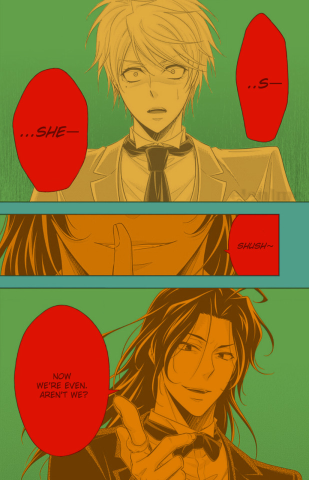
Text

Redrew this old banger with three years worth of art improvement, oof. Three years and they’re still my favourite ship of all time. Don’t even mention them near me, I will go rabid.
Original:
#im never escaping the sherliam hyperfixation guys#for those who followed me for my yuumori content dont worry ill still deliver#sherliam#sherliam fanart#yuumori#yuumori fanart#yuukoku no moriarty#yuukoku no moriarty fanart#moriarty the patriot#moriarty the patriot fanart#william moriarty#william moriarty fanart#william james moriarty#william james moriarty fanart#sherlock holmes#sherlock holmes fanart#moriarty the patriot sherlock#yuukoku no moriarty sherlock
300 notes
·
View notes
Text

Guess what I became obsessed with in the past 4 days
#i havent read the manga yet but the anime had me hooked instantaneously#which makes sense since mtp is basically bsd's cousin 😕#okay now uhh how do i tag#moriarty the patriot#yuukoku no moriarty#william james moriarty#that feels like when you tag the bsd characters and it all gets thrown together with the actual authors- am i missing something here#moriarty the patriot fanart#yuukoku no moriarty fanart#augghd i shouldve researched tags first#fanart#art#my art#digital art#key art tag
83 notes
·
View notes
Text

{clik on the image for better quality}
I really love Albert :))
#my art#my drawing#art#digital art#digital sketch#my digital art#my digital drawing#my digital painting#digital drawing#digital painting#artists on tumblr#small artist#moriarty the patriot#albert moriarty#albert james moriarty#yuumori#yuukoku no moriarty#albert moriarty fanart#yuumori fanart#moriarty the patriot fanart#my fanart#anime fanart#manga fanart
134 notes
·
View notes
Text
How I color manga panels: a tutorial
I'm no expert at doing recolors, I'm simply an artist who's occasionally too lazy to do my own lineart, and uses that of my favorite mangaka's so I can focus on other styles to simply have fun with my colors. I always try and choose panels or pages that are high quality, to avoid too much pixelization. Often I end up sourcing these from scanners or google images.
As far as programs, I use Krita (a free software). This all can be done with the standard brushes and tools that come with the software. But for some of the coloring, I have brushes from brush packs i like to use, as well as a few brushes I have customized myself. The main ones I use are from David Revoy, so if you want a recommendation for a great free brush pack, that's mine.
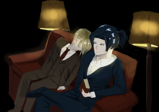
For this example I'll be using this panel from Chapter 58 of Moriarty the Patriot (I believe this would be Volume 15 of the manga) that I posted earlier here.

I'm not including the step where I crop the image, but I personally chose to remove some of the white borders that are needed for a traditional volume's page borders. Since I'm doing digital art, I don't always include them.
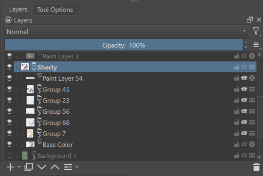
My next step is always to outline and fill the individual base layers. This includes the speech bubbles, each character, any independent props, the panels themselves and the backgrounds. There's no correct way to do this, but personally I use a brush to outline the object, then fill tool to well. Fill it, as well as the rectangle tool for the panels or straight lines I need to do.
For layers, I usually put all of these color base layers in a single group that's set to multiply, and change the opacity of the base panel so that I can fill the blacked out areas with a solid color easily, here you can see I was working with the base panel at 50%, but honestly i just kind of turn it down to whatever I think looks good.
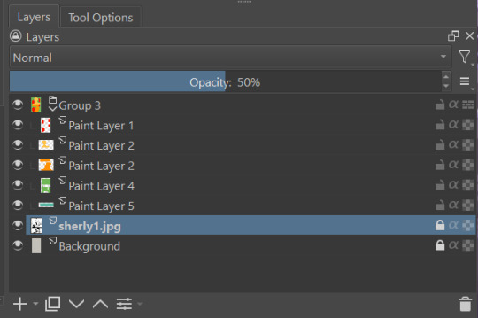
The colors I use for this step are usually brightly saturated rainbow colors so it's easy to tell the different elements apart from each other. So you end up with something that ends up looking rather horrific like this:
From here, I usually create a copy of the base panel to put over the top of the colors. This way I can have transparency for the colors on some of the blacked out parts, but don't loose some of the nuance of the shading entirely. Moriarty the Patriot is a very black heavy cell style, which is the style I find the "panel above, panel below" method works best on. However as I work on the colors, I tend to toggle between having it on or off.
It's about here where I start doing my coloring. Of course this will depend on your coloring style and art habits, however personally, I like to start with the characters. I use those colored layers as the base layer I can clip my coloring layers to.
I will often turn off the layers that I'm not currently using so I don't have to deal with eyestrain, and will change the base layer to something more suitable (often a grey or light tan) so my color theory doesn't get all messed up. The bright colors in previous steps are to make sure they're visually separate. Now they've been established, I don't have to worry about that.

I don't usually label my layers, but for the sake of the tutorial I have to make it clearer which layer grouping is which.
I find in this step because of the multiply layer the colors can be a bit washed out, so I tend to either use much more saturated colors than I usually do, or switch to another layer style like Linear Burn of the overall color group to make the colors pop more. Ultimately though this comes down to personal preference. If your coloring style is very de-saturated, you might not have any problems with it. (I do suggest making your base color white, so the coloring of the base panel isn't off, you'll see in the screenshots above I forgot to when working on Sherlock. Ignore my mistake)
For the parts of the image where it's primarily blacked out (such as Sherlock's hair or coat) I don't bother shading at all, and only do the highlighting, as the black takes care of the darkest tones anyways.
During my coloring, I also add a separate grouping above everything for adding rendering and details above the panels. This includes things like the eye highlights (which I always do in pure #000000 white) and making certain parts of the heavily blacked out areas pop more.
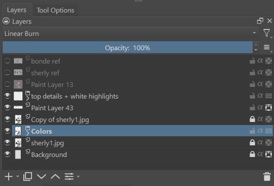
(those refs and paint layer 13 are what I'm using to color pick off of, and keep the shading colors consistent throughout the piece. There's probably a better way to do it, but I just paste them directly into the image and then delete them at the end, paint layer 43 is a color dodge layer, and so has to be outside of the layer grouping to work)
Comparison of the art without:

And with the top details and white highlights:

It's a pretty subtle difference, but I find it's the little things that truly make the piece. Especially with the strands going over the face, they need just a bit more to make them really pop. I also just really like my fancy eyes which is hard to do without the top layer.
Insert several hours of coloring here, and about another hour just trying to figure out what gradient to use for the background, and you end up with the the base colors. From here I usually mess with overlay layers as well to get the colors to all look fancy and nice together without having to do color theory (pro tip /lh).
I forgot to grab screenshots while doing the background, but for the top panel I essentially just used the [deevad 5c screentones] brush and a transparency mask to add a screentone gradient, and totally didn't google "splatter overlay" or something like that and picked something off of google, and added some borders.
Because both the base manga panel and manga panel over the top are both not at full opacity, if there is text in the page or panel (such as this one) I like to copy the just the text part of the panel and add it as full opacity in the "colors" folder to make sure it's legible and matches up the rest of the colors.
And after all that, its basically done. I'll sometimes continue to mess around with certain aspects to make sure I like how it look, but that's essentially it. This is when I add my signature, and then it's queued to post!

#krita#long post#eyestrain#art tutorial#tutorial#digital art#my art#manga recolor#manga edit#manga pannel#manga coloring#sherlock moriarty the patriot#moriarty the patriot fanart#yuukoku no moriarty#moriarty the patriot#james bonde#james bonde mtp#artists on tumblr#art resources#art help#art tips#drawing tips
82 notes
·
View notes
Text

A little late but
HAPPY BIRTHDAY BOND!
#yuumori fanart#yuukoku no moriarty#yuukoku no moriarty fanart#yuumori#moriarty the patriot#moriarty the patriot fanart#my art#ynm james bond#james bond#james bonde
127 notes
·
View notes
Text

some semi-old sherliam art
69 notes
·
View notes
Text

Two versions
click for better quality
#yuukoku no moriarty#moriarty the patriot#william james moriarty#mtp william#mtp sherlock#mtp fanart#moriarty the patriot fanart#Moriarty the patriot Sherlock#mtp sherlock fanart#sherliam#mtp William fanart#winter1234art#sherliam fanart
35 notes
·
View notes
Text

that one Fyolai anthology art except it’s Sherliam
#moriarty the patriot#bungou stray dogs#fyolai#sherliam#yuukuko no moriarty#moriarty the patriot fanart#calculating mastermind x silly but dangerous#might be my favorite type of ship
88 notes
·
View notes