#clicking from frame to frame with the arrow keys
Explore tagged Tumblr posts
Text
Someone needs to make an Utena AMV to Penelope Scott's "Papayawhip (God or whatever)" or my editing-software-illiterate ass is going to have to do something unspeakable
#revolutionary girl utena#shoujo kakumei utena#rgu#sku#honest to god I have been considering making an animatic#but everything about trying to make it in Krita and sync it to the audio terrifies me#so the way I would go about doing that is to use PowerPoint's screen recorder#clicking from frame to frame with the arrow keys#and singing the damn song MYSELF#I'm a good singer but the audio quality would be so horrible please someone stop me
6 notes
·
View notes
Text
℘ ࣪₊ bleeding blue ࣪₊ ㅤㅤ℘


MASTERLIST
synopsis: after destroying her hair, billie turns to you, her fiancé, in hopes of you being able to fix it.
genre: fluff
pairing: cosmetologist fem!reader x billie eilish
wc: 10.8k
warnings: slight cussing
authors note: i know y’all see how long this is, if there is any spelling mistakes or continuity errors ignore it, i was up for 2 days. enjoy x 💋

the hair salon is quiet now, the hum of blow dryers and chatter replaced by a peaceful stillness. the sunset pours through the large glass window, casting a golden haze over everything it touches. soft amber and pink rays stretch across the polished floors, catching on stray hair strands and scattering delicate reflections off the mirrors and the chrome edges of styling chairs. shadows of tall ferns and succulents perched on the counter sway gently, their movements dappled by the fading light. the air still carries the faint traces of shampoo and hairspray, mingling with the rich warmth of the evening, as if the room itself is exhaling, releasing the weight of the day into the tender embrace of the setting sun.
your last client had left over an hour ago, leaving you with just enough time to clean up and dream of how good your bed will feel once you finally sink into it. now, in the corner of the room, you’re sitting under the hooded dryer—not because you need it, but because it’s your favorite chair in your booth. its worn leather hugs your body, offering a secluded cocoon, perfect for resting after a long day of standing.
you lazily scroll through your phone, the cool screen contrasting with the slight ache in your hands. you tap open the messages app, clicking the second most recent contact—it pulls up your fiancé’s profile, her name sitting at the top in bold letters.
you: almost done, cleaning up and i’m omw home. 💗
a small smile tugs at your lips as you glance at the text, thumb hovering before tapping the blue arrow to send it. you’re about to switch over to instagram when the soft creak of the front door opening cuts through the silence.
your eyebrows knit together, your smile fading into a frown as confusion prickles at the edges of your mind. instinctively, your eyes flick toward the entrance, words already forming on your tongue, ready to tell whoever it is to leave and come back tomorrow.
but then, there she is.
billie stands in the doorway, framed by the last lingering rays of sunlight that sneak through the glass. she’s wearing her oversized tour zip-up, her name stitched neatly on the chest. the royal blue thread contrasts sharply with the heavy yellow fabric, the colors a loud declaration against the soft, muted tones of the salon. her thumb grazes her bottom lip, the tip of her nail caught lightly between her teeth as she crosses her ankles.
the lanyard of her car keys hangs outside the pocket of her sweats, a bold red and black that sways slightly as she shifts her weight. the key fob itself is tucked away neatly, hidden. her star beanie is tugged low over her head, barely peeking out beneath the hood of her sweatshirt, which is pulled up and cinched just enough to hide all of her hair.
“hey, baby,” she says, her voice syrupy, dripping with a softness that only she could manage. the corners of her lips press together in a tight, almost apologetic smile, but there’s a flicker of amusement there—a twitch of mischief that she just can’t seem to hide.
her wide, doe-like eyes dart toward you, then quickly away, like a child caught red-handed. guilt and playfulness swim together in her gaze, her cheeks tinged faintly pink. she bites her bottom lip, the expression teetering between sweet and sheepish, her fingers fidgeting at the hem of her hoodie as though it’ll keep her hands from giving her away.
it’s the kind of look that says: i know i messed up, but come on—you can’t really stay mad at me, can you?
you straighten in your seat, eyes narrowing as you take in her stance, her tone, her very presence in a place she knows she shouldn’t be after hours.
“what did you do?” you ask, your voice sharp with suspicion but softened by the ghost of a grin tugging at the corners of your mouth.
“okay, so please don’t be mad,” she says, stepping further inside, her voice carrying that sugary lilt she always uses when she knows she’s done something questionable. her fingers clasp loosely together at first, but then they start to fidget, her thumbs tracing uneven circles over each other—slow, deliberate, and trembling. the motion falters, sometimes smooth, other times jerky, betraying the nervous energy humming beneath her calm façade. with each rotation, her thumbs press a little harder, as if the movement alone could ground her spiraling thoughts. even when her hands shift positions, the circling doesn’t stop, the weight of her tension held in that small, silent gesture.
“billie,” you warn, your tone light but firm, enough to let her know you’re not in the mood for whatever nonsense she’s about to throw your way.
her feet shuffle as she moves quickly across the room, closing the gap between you with a hurried urgency. before you can say another word, she’s on her knees in front of you, her hands reaching to cradle your own. the cool press of her engagement ring brushes against your skin—a sharp but gentle reminder of the promises you’ve both made, the weight of forever between you.
“first of all, i love you,” she whispers, her voice careful, the words wrapped in precision as she tilts her head up to meet your gaze. her expression teeters on the edge of vulnerability, her wide blue eyes swimming with a confession she’s not quite ready to say aloud.
your eyes narrow as suspicion prickles up your spine. “billie.” the repetition of her name carries a sharper edge now, though it’s softened by the flicker of a smile tugging at the corners of your mouth.
“and second…” her voice trails off as she reaches for her hood. slowly, she pulls it down, followed by the star-patterned beanie covering her head. when her hair finally comes into view, the mess of it hits you like a freight train.
your jaw drops. the usual cascade of silky brown strands is now a disaster—a patchy, uneven palette of brassy yellows, burnt orange streaks, and sections so dark they seem almost untouched. the back looks half-finished, with random tufts sticking out like stubborn weeds refusing to blend.
in shock, you reach out, your fingers lightly grazing her damp hair before cupping her jaw to turn her head from side to side. the light from the window catches the chaotic patches, making the disaster even more glaring. your brows knit together as disbelief bubbles out in a soft, incredulous laugh.
“billie. what the hell is this?” you finally manage, your tone caught between amusement and horror.
she winces, the sheepish grin on her face growing wider. “i tried to do it myself,” she admits, her voice a hurried tumble of words. before you can respond, she’s already jumping to defend herself. “it was a box dye, okay? it looked so easy, but it wasn’t. now it’s a hot ass mess. save me, please.” her hands clasp together, fingers intertwining as she looks up at you with a desperate, pleading expression.
you groan, the ache in your feet from the long day suddenly feeling heavier. “of course, you would try to dye your hair at home,” you mutter, leaning back in your chair. your eyes scan the spotless, freshly cleaned station you’d been so close to leaving behind.
“but billie, i just cleaned everything,” you complain, dragging the words out with a soft groan.
“i’ll buy you dinner,” she interrupts quickly, her lips curving into a hopeful smile.
your eyebrow arches, unimpressed. “you buy me dinner all the time. you’re gonna have to try harder than that.”
without missing a beat, she grabs your right hand—the one adorned with the diamond ring she gave you—and presses a kiss to your palm. the warmth of her lips lingers as she trails kisses upward, along your wrist, the sensation leaving a soft buzz in its wake.
“and dessert,” she murmurs, her lips brushing against the sensitive skin of your wrist before working their way up your arm. her kisses grow slower, more deliberate, each one sending shivers racing down your spine.
“i’ll get you anything you want,” she whispers as her mouth grazes the curve of your neck, her words melting into the skin there.
your resolve wavers, her lips trailing a path of heat along the sweet spot of your neck until she finally stops, pulling back just enough to hover inches from your face. her thumb rubs soothing circles along the back of your hand, her eyes wide and shimmering as they lock onto yours. “baby, just please help me fix this,” she pleads, her voice soft and breathless.
you sigh, your gaze trailing over her disheveled form. she’s on her knees, hair an absolute wreck, begging you to fix it with promises of whatever you want. the vulnerability in her voice tugs at you, her cute, flushed face making it nearly impossible to say no.
“fine,” you relent, passing her your phone. the tension in her shoulders melts as she exhales a breath she didn’t realize she was holding. slipping your phone into her pocket, she stands, her fingers brushing against yours as you lead her to the salon chair.
“thank you so much,” she whispers, her voice soft as she peppers kisses over your knuckles. her lips are warm, reverent, each touch delicate and lingering, like a silent apology.
you grab the back of the sleek black chair, spinning it around so billie can face the large vanity mirror. the gold and white accent jibbitz on your black crocs catch the light as your foot pumps the chair’s pedal, raising it to your height.
the soft buzz of the hvac fills the quiet salon, mingling with the faint sounds of a reality tv show playing faintly in the background. you move toward the cabinet, the cool metal handle pressing against your fingers as you open it to retrieve what you need.
you gather the essentials—sectioning clips, brushes, bowls, dye bottles in various shades of blue, shampoo, and conditioner—all of it placed into a plastic tub. setting it on the counter in front of billie, you grab a cape and apron from the nearby rack, the fabric smooth and familiar against your fingers.
slipping the apron over your head, you tie it behind your back before draping the cape over billie’s shoulders. the velcro tabs fasten snugly around her neck, securing her for what you both know will be a long evening ahead.
billie digs into the pocket of her sweatpants, pulling out her phone with the lazy precision of someone buying time. her fingers swipe absently across the screen, scrolling through apps and notifications, but her focus drifts as you step behind her. instinctively, her head tilts back, her damp, tangled strands crumpling slightly against your stomach. the warmth of her resting there is an unspoken intimacy, one that almost softens your irritation—almost.
“did you at least put vaseline on your edges like i told you to?” you ask, already knowing the answer but holding onto a sliver of hope.
her scrolling halts. there’s a pregnant pause as she processes your question, her eyes darting to the side in the way they always do when she’s been caught. she sucks in a breath, her teeth grazing her bottom lip as she stares anywhere but at you, as if the walls themselves might save her.
“billie,” you whine, dragging her name out as your eyes instinctively roll toward the ceiling.
reaching for your hand on her shoulder, she turns her head just enough to press a quick, placating kiss against your knuckles. “i’m sorry,” she murmurs, her lips curving into that small, crooked smile designed to melt you.
“now when you start turning colors, i don’t wanna hear it,” you shoot back, exasperated. “how many times do i have to tell you to put some kind of protectant on your skin?” your voice lilts into an exaggerated dramatization because, without it, she’d never listen.
“i know, baby,” she coos, her tone dripping with faux contrition, and you can’t decide if you want to kiss her or strangle her.
with a heavy sigh, you let your fingers trail through her hair, the strands coarse and uneven as you assess the damage. the texture of her missteps lies in your hands, and though it’s a disaster, it’s a familiar one.
you exhale slowly, grounding yourself for what’s ahead. “okay, let’s see what we’re working with.” gently, you sift through her hair, pulling at a patch near the crown.
“girl…” you say, drawing the word out, “…what the fuck is this?” holding the brassy streak up for her to see, you tilt her head toward the mirror.
“i think that’s where i started,” she admits, her grin a sheepish curve that wavers as her eyes meet yours in the glass.
you shake your head in disbelief, spinning her chair so she’s facing you now. “do you know what that means?”
her brow arches in a silent question, waiting for your inevitable proclamation.
grabbing her hand, you guide her toward the shampoo bowl. the porcelain is cool against her neck as you ease her into position, your touch firm but gentle. your fingers cradle the base of her neck, their warmth grounding her as you lift her hair into the bowl.
“it means deep conditioning. lots of it,” you declare, the finality in your tone leaving no room for debate. “you better make peace with the dryer cap at home because it’s about to be your best friend.”
she groans, the sound low and dramatic, but she doesn’t argue. her resignation is written in the soft slouch of her shoulders as you step away, the sound of your footsteps echoing lightly in the quiet salon.
at your station, you grab what you need—a clarifying shampoo, a paddle brush, and a bottle of conditioner that promises miracles. your fingers graze the cool metal of the sink knobs as you return, twisting them to find the right temperature.
you test the water first, letting it pool in your palm before flicking a few drops toward billie’s face.
“hey!” she yelps, her head jerking slightly as she blinks up at you, mock offense written all over her face.
“what was that for?” she blinks rapidly, her blue eyes wide with mock betrayal, mouth slightly agape as if the water had shocked her soul awake.
“that’s because some people think it’s okay to be hardheaded and ruin their hair,” you retort, your tone sharp yet laced with teasing sass, the kind she secretly adores.
you grin, a mischievous edge tugging at the corners of your lips as you lean over her. “alexa,” you call out to the speaker perched in the corner, “resume my music.”
the soft strains of r&b flow through the air, warm and rich, filling the space between you. the song’s melody wraps around you both, threading its way into the moment as your fingers move to her hair.
“you better thank me for this later,” you tease, a hint of fondness creeping into your voice despite yourself.
her lips curl into a small smile, her eyes fluttering shut as you begin to work, the rhythm of the music syncing with the gentle movements of your hands.
you reach for the sprayer, its chrome gleaming under the soft light, and begin to rinse her hair. warm water cascades over her scalp in soothing waves, like liquid velvet flowing through each strand. the gentle pressure massages away the chaos of the day, and you can feel her body melt a little further into the chair.
leaning over her, your movements are both skilled and tender, the natural grace of someone who has done this a hundred times before but still finds joy in the ritual. you grab the red paddle brush, its bristles catching the light like a promise of transformation, and begin working through her damp hair. the knots resist at first, but the brush glides through with practiced ease, pulling softly, releasing each tangle like it’s freeing her from some invisible weight.
casting the brush aside, you reach for the clarifying shampoo. “this’ll strip as much of the box dye out as possible,” you explain, your voice a gentle melody against the background hum of water. “after that, i’ll tone it to fix the brassiness.”
the bottle makes a soft squelch as you squeeze a pearlescent glob into your palm, its silky texture catching the light. the faint, floral scent rises, intertwining with something sweet and clean, filling the air between you. rubbing your hands together, the shampoo blooms into a rich lather, and you hum softly along to the music as you work it into her hair.
your hands move with precision, starting at her roots. the pads of your fingers glide over her scalp, your acrylic nails grazing just enough to send a shiver down her spine. then you press a little harder, your movements circular and deliberate, coaxing the stubborn dye out while soothing her with each motion. the faint jangle of your bracelets punctuates the rhythm of your work, the charms clinking softly as you rub small, methodical circles along her forehead, her baby hairs curling as water meets skin.
at the nape of her neck, your pinkies trace gentle arcs, ensuring no dye lingers where her hair meets her skin. the suds build, thick and creamy, clinging to her strands like clouds ready to drift away.
you’re lost in the focus of your task until you feel her gaze on you, steady and soft, like she’s committing every detail to memory. glancing down, you meet her blue eyes, their depth catching you off guard.
“you okay?” you whisper, your voice low and warm, the question carrying more than just concern—it holds affection, reassurance.
her tattooed hand slips out from under the cape, inked angels adorning her skin as her thumb brushes against your forearm. her touch is light but insistent, pulling you closer until your arms rest against the sink’s edge, caging her in. her head tilts slightly, her smile soft and content as she hums a quiet acknowledgment.
you feel the weight of her trust in that moment, her complete surrender as her body relaxes under your hands. each movement of your fingers, each stroke through her hair, feels like an unspoken promise: i’ve got you. let me take care of this.
“i’m sorry. for real,” she murmurs, her voice barely above a whisper, but the sincerity in it wraps around you like a warm embrace.
you pause, your fingers still tangled in her hair, your brows furrowing. “for what, baby?”
her lips press into a pout, their natural blush deepened by her vulnerability. “for messing up. i didn’t want to make you have to work again, but… i panicked.” her free hand finds your thigh, resting there gently as if to anchor herself in the moment.
“oh, do not apologize, my love,” you reassure her, resuming the slow, soothing massage of her scalp. “it’s my job to fix these kinds of things. besides, i like doing your hair. i was just fussing to fuss, okay? it’s okay to make mistakes—especially when you’ve got me to help you out.”
you lean in closer, your voice softening as your fingers thread through her hair, combing through the strands with care. “you know i’d do this for you any day, right? so don’t worry about it. just sit back, relax, and let me work my magic.”
a small hum of contentment escapes her lips as she nods, her pout still evident. you lean down, closing the space between you, and press a soft kiss to her lips. her lashes flutter against your cheeks, her lips parting slightly as she tastes the faint mix of her mint chapstick and your strawberry gloss mingling together.
her hands find your back, tugging gently as if she can’t quite get enough of your closeness. a quiet laugh escapes you, light and airy, as you pull back, planting one last peck before returning to your work.
turning the water back on, you tilt the sprayer toward the base of her scalp, the warm stream washing away the thick suds. swirling ribbons of old dye and shampoo trail down the bowl, the colors melding into a soft pastel kaleidoscope before vanishing down the drain. the water flows smoothly through your fingers, its warmth lingering as you work through her hair, strand by strand, washing away every trace of her mistake.
and in the quiet intimacy of the moment, the rhythm of your work and the softness of her gaze make everything else fade away.
her eyes flutter closed, a soft breath escaping her lips as she melts into the sensation of your hands moving with steady intent. you cradle her head gently, guiding the stream of water with care, ensuring no spot is left untouched. your free hand parts the damp strands, fingers slipping through them like silk as you coax out the stubborn dye that clings to the ends, reluctant to let go.
as the water runs, the colors begin to bleed away, the once cloudy liquid shifting to clear, signaling the start of something fresh, something new. your nails graze softly against her scalp, soothing and purposeful, like a gentle caress that lingers, making sure every trace of dye is gone. the motion becomes rhythmic, almost hypnotic, and you can’t help but smile at the way billie’s body relaxes, her posture softening under your touch.
“see? all clean,” you murmur, your voice a gentle whisper, comforting and warm as you turn off the sprayer. the water runs from your hands like the last traces of tension, and you brush a damp strand of hair from her cheek with the same tenderness.
once the water runs clear, you set the sprayer aside, your fingers still lingering in her hair, smoothing through the damp strands as they fall into place. with practiced grace, you gather the hair in your palms, squeezing gently to coax out the excess water. the droplets fall softly into the basin, their rhythm steady and soothing, like the quiet pulse of a heartbeat. your hands move with an almost reverent precision, mindful not to tug, only wringing out enough water to keep the hair from dripping too much.
you extend your arm toward the counter, reaching for a fresh, warm black towel that rests nearby. the heat still clings to it from the dryer, and as you drape it over billie’s head, you cup your hands around it, tucking the edges securely. you press the towel softly against her scalp, the warmth radiating through the fabric, soaking up the last of the moisture, comforting her like a quiet embrace.
“there,” you say, a smile pulling at your lips as you step back for a moment, surveying the work. “all rinsed and wrapped up. ready for the next step, love?”
with a gentle nod, she follows you back over to the chair, her presence still relaxed, her smile a soft echo of the comfort you’ve given. you walk over to the coffee table, grabbing the remote and handing it to her as you turn her away from the mirror. she flips through the categories, her fingers tracing the screen as you move to the black bar, retrieving your supplies from the black tub and setting them on the counter in their familiar, ordered arrangement.
the first bottle to emerge is the black dye, cool and smooth in your hand, its cap unscrewing with a satisfying twist. you squeeze a measured amount into a mixing bowl, the thick, inky substance pooling at the bottom with a weight that feels satisfying, as if it holds all the potential for the transformation ahead. next, the developer, creamy and faintly metallic, pours in a controlled stream, the contrast between the jet-black dye and the pale developer stark, almost artistic, like night meeting day.
grabbing your dye brush, you begin to stir with slow, deliberate movements, folding the two substances together. the black streaks through the white, at first marbled and uneven, then gradually blending into a glossy, midnight-colored cream. you lean in closer, making sure the mixture is smooth, scraping the sides of the bowl with the brush to gather every last drop of product.
next, you grab the smaller bowls for the blue dyes, each one its own vibrant hue. you pour the colors in, no need for developer, knowing these are semi-permanents, their vibrancy untouched by the need for mixing. the blues swirl together, each one vivid and intense, and you can feel the excitement building—ready to blend them with the deep, dark base.
the rhythm of the mixing is calming, a ritual you know by heart, each movement of your brush a practiced, soothing motion. the anticipation swells in your chest as you prepare to bring together the perfect blend for billie’s hair.
when the dyes are perfectly mixed, you turn back to billie, positioning yourself behind her once more. you shake the towel before gently unraveling it from her head, the fabric slipping off her hair with a soft rustle. her hair—now long and wavy—falls freely, cascading in fluid, graceful waves over her shoulders like liquid midnight. you take in the beauty of the moment, before reaching for your parting comb. you move with practiced ease, carefully dividing her hair into six sections, the comb gliding smoothly through each strand, as if the strands themselves are eager to fall into place.
you begin by clipping the top half of her hair, then sectioning the lower half into two parts, ensuring that the color will apply evenly, without hesitation. the clips snap into place with precision, each movement deliberate. slipping your gloves on, you start applying the dye to the roots, your hands steady and deliberate. the dye meets her scalp, each brushstroke a quiet promise, ensuring that every strand is perfectly coated. the comb moves through effortlessly with each section, your touch confident and fluid. billie can feel you behind her, though she can’t see what you’re doing. yet, there’s a trust that hangs between you, a deep and unspoken understanding that makes your heart swell with quiet affection.
“you’re so good at this,” billie murmurs, her voice low and admiring, watching as the color sinks in effortlessly.
“you can’t even see what i’m doing, babe,” you chuckle softly, setting the bowl of dye down. you lean over, placing your elbows on the chair as you spin it, bringing her face to the mirror so she can watch your every move.
“okay, but i know you, and i know you’re good at what you do. i swear, i’m never doing my own hair again.”
her compliment lingers in the air, a sweet echo, and you smile as you pick up the bowl once more, moving behind her with a sense of purpose. billie flinches slightly as the cold dye touches her scalp, but you smooth it out with gentle strokes, your acrylics gliding through her hair, the sensation soft and calming. you focus entirely on the application, taking your time to make sure each section is perfect. “it takes years to perfect,” you whisper, as the color settles into her strands, dark and even.
the tv show hums softly in the background, but you’re not really paying attention to it. billie’s eyes flicker between you and the mirror, her gaze never straying far from your hands, which move with precision and care.
“are you excited for the tour?” you ask, keeping the conversation flowing, your voice a steady current as your hands continue their work.
billie nods slowly, the slightest furrow of concern crossing her brow. “yeah, but… it’s also nerve-wracking. i mean, i haven’t toured in a while, so i’m a little anxious.”
you glance at her, surprised. “why are you nervous, baby?”
your hands pause, the brush hovering mid-stroke as you meet her gaze in the mirror. her eyes dart away, a subtle shrug rolling through her shoulders, hidden beneath the cape. “i don’t know,” she admits softly, her voice carrying a faint edge of vulnerability. “i guess… i’m worried people won’t connect with the new stuff, or that i’ll mess up. it’s been a while, you know?”
you set the brush down in the bowl, wiping your hands on a nearby towel, then moving to stand beside her. one hand rests gently on her shoulder, your fingers grazing the curve of her collarbone, your thumb moving in slow, reassuring circles against the fabric of her shirt. “billie, you’re amazing,” you say, your voice warm, but firm. “you’ve got nothing to prove to anyone. you’ve worked so hard on this, and i know it’s going to blow people away. plus,” you add with a playful smile, “if anyone’s got the nerve to doubt you, i’ll just have to handle it.”
she meets your gaze in the mirror, her eyes softening, a small, grateful smile tugging at the corners of her lips. “thanks,” she whispers. “it helps hearing that from you.”
you kiss the top of her head lightly, mindful of the dye, before stepping back to your place behind her. “anytime, love,” you say, picking up the brush again. “now hold still—i’m almost done.”
as you finish applying the dye, billie’s expression softens, her earlier tension slowly giving way to a quiet sense of ease. the warmth of her trust fills the room, wrapping around both of you, and for a moment, the low murmur of the tv fades into the background, leaving only the sound of the brush smoothing through her hair, each stroke a quiet act of care.
“what’d you wanna eat?” she asks, breaking the silence, her voice light.
“um…” you pause briefly, considering. “it’s whatever you want.”
she rolls her eyes, a playful glint lighting her expression. “you always say that,” she teases, her tone affectionate but laced with knowing. “but then when i pick, you’ll complain about it.”
you chuckle softly, setting the brush down and giving her hair a final once-over to make sure the dye is even. “that’s not true,” you counter, your grin betraying your words. “okay, maybe sometimes. but i promise, i won’t complain this time.”
she tilts her head slightly, her eyes flicking up to meet yours in the mirror, a smirk tugging at her lips. “mmhmm. so if i say vegan sushi, you won’t pull that face you always do?”
“no…?” you trail off, narrowing your eyes playfully.
“if you say so,” she laughs, leaning back in the chair, her shoulders relaxing at last. she pulls out her phone, the light from the screen flickering against her face as she pulls up the website to order food.
you grab your comb once more, your hand settling gently on the back of her head, tilting it slightly so you can part the back. the metal end of the comb glides smoothly through the mid to low portions of her hair, creating an even part with ease. gathering the spare hair in your hand, you bend slightly, reaching for a clip and securing it with careful precision.
turning back to your station, you pick up the light blue dye, starting to apply it about three inches down from the roots. the color glides on with a vibrant pop against the black, a striking contrast that’s already beginning to take shape. you feather the dye carefully, blending it seamlessly into the black, creating a smooth, ombre transition. billie’s hair is thick, and you take your time, moving with quiet intention, combing through each section to ensure the colors blend perfectly. with gloved fingers, you work the dye into her hair, making sure it’s just right, the blues flowing into the black in perfect harmony. you repeat the process with the other two shades of blue, each one vibrant, intense, creating a masterpiece of color with every stroke.
the atmosphere is calm now, the warm glow of the lights spilling across the polished surfaces, casting soft reflections that shimmer like a quiet symphony. every little moment between you two seems to stretch longer, the air thick with the deepening connection, the space between your souls growing closer with each passing second. you finish the blue ombré, your hands steady as you apply the final touches, then grab a plastic cap, gently placing it over billie’s head to let the dyes process. the room is silent, save for the low hum of the tv and the rhythm of your breathing, until a knock on the door breaks the peace.
you remove your gloves with a practiced motion and make your way to the door, finding a delivery man holding a bag labeled “take out.” with a soft smile, you reach into your back pocket, pulling out ten dollars for his tip, exchanging it for the food as you offer a quiet thank you. the door closes behind you, the warmth of the room welcoming you back in.
you retreat back inside, removing the black cape from billie’s shoulders, followed by your apron, tossing them carelessly into a corner, the fabric settling like memories discarded in haste. crouching down, you sit cross-legged on the floor by the coffee table, billie mirroring your movement beside you. you open the boxes of the chinese takeout, the aroma instantly filling the air—soy sauce, garlic, and something sweet and tangy all blending together, making your stomach rumble in eager anticipation.
the fluffy carpet beneath you contrasts against the cool, smooth hardwood of the salon, the softness of it grounding you in the moment. you open the boxes slowly, careful to not spill any of the steaming food. inside, the noodles glisten, their texture tender and inviting. the spring rolls are crispy, their golden brown crusts promising a satisfying crunch, and the stir-fried veggies glisten, coated in a savory sheen, the light catching each vibrant color like jewels in the dim room.
handing billie a pair of chopsticks, you take your own, your fingers easily finding their grip. you dive into the food, the two of you settling into a rhythm—eating, talking, and occasionally laughing at the little moments between bites.
“this is so much better than sushi,” you joke, nudging her lightly with your knee as you twirl some lo mein onto your chopsticks.
billie rolls her eyes, grinning. “you’re lucky i was in the mood for chinese. otherwise, you’d be starving right now.”
you laugh, taking another bite. the savory flavors burst across your tongue, comforting and satisfying, grounding you in the simplicity of the moment. “guess i owe you one, huh?”
billie raises an eyebrow, a playful glint lighting her eyes. “oh, you definitely do. next time, i’m picking. no arguments.”
“i told you to pick, but deal.” you say around a mouthful of food, earning a mock look of disapproval from her, but you both laugh, the sound of it rich and warm, like music in the quiet room.
the tv continues to play softly in the background, but neither of you are truly paying attention, too lost in your easy banter, too caught up in the gentle rhythm of being together. every so often, you catch her stealing a glance at you—her expression soft, her gaze full of unspoken things—and your heart swells with something quiet and content. you can’t help but smile back, the warmth in your chest blooming as if it’s something you’ve known all along.
as you twirl the noodles onto your chopsticks, the sharp bite of a voice from the tv slices through the air, pulling both of you from the comfortable rhythm you’d settled into.
“you know what? i don’t need this energy from fake ass bitch like you of all people!” a woman yells, her tone dripping with venom, and you both freeze mid-bite. the camera cuts to her, hurling a drink across the room, the liquid splashing like a violent cascade as gasps rise from the background.
“ohhh shit.” you gasp out, sounding like a toddler on the verge of telling on someone.
“wait, what the fuck jus’ happened?” billie asks, sitting up straighter, chopsticks suspended in the air like a moment frozen in time.
you squint at the screen, fingers reaching for the remote to turn the volume up, the faint hum of the tv now louder in your ears. “hold on—what’re we watching right now?”
billie shakes her head, a laugh bubbling out as she points to the screen. “i don’t know, but that was—did she just—was that a margarita?!”
“oh yea, most definitely,” you confirm, a grin tugging at your lips as you set your box of food down on the coffee table, the subtle thud of it breaking the silence. “who even does that?”
“apparently her,” billie says, gesturing to the woman storming off-screen, her heels clicking sharply against the floor like a declaration of finality.
you both watch, eyes wide, as the scene cuts to a confessional, the same woman ranting with a voice full of venom. “she thinks she can talk about me behind my back? please. i’m not the one with a cheating ass boyfriend.”
simultaneously, you and billie gasp, grabbing onto one another in shock at the confession, and then burst into laughter. the sound of it warm and effortless, a shared joy.
“oh my god,” billie says, leaning back onto her hands, her eyes dancing with amusement. “she’s so real. i kind of love it.”
you nod, picking up another spring roll, letting its crisp warmth settle in your hand as you sink deeper into the moment. “you’re so messy. like, look at you encouraging violence,” you tease, giving a light kiss of your teeth as you shake your head.
the two of you continue watching, caught in a tangled mix of laughter and genuine debate, the absurdity of the show now grounding the conversation. billie leans in closer, her chopsticks tapping absently against the edge of her box, the sound soft but rhythmic.
“okay, but listen,” she says, her voice animated, a new layer of thoughtfulness pulling at her tone, “i get why she’s mad, but did she have to throw the drink? i’m not gonna lie, that’s just embarrassing for her.”
“nah, i don’t know,” you counter, your voice playful but threaded with a hint of consideration. “if someone called me a fake ass bitch on camera, i’d probably snap too. but maybe i’d throw something less sticky.”
“like what?”
“water? a smoothie? i don’t know—something that doesn’t smell like tequila,” you answer with a smirk, the edge of your voice soft and teasing.
billie laughs, shaking her head with mock exasperation. “remind me never to cross you.”
you nudge her playfully with your knee, the motion light and easy. “just don’t talk shit, and we’ll be fine.”
by the time the episode ends, both of your food containers are empty, the remnants of your meal scattered across the coffee table like the final traces of a good time. you’re fully invested now, the show pulling you in deeper with every outrageous twist. you glance at billie, eyes flicking to the next episode’s preview, torn between indulging in another round or letting the dye process take center stage. billie grabs the remote, already clicking through, her focus sharpening as the screen changes, the night stretching on.
“one more,” she says, her eyes glinting with mischief, a sly smile curling at the corners of her lips. “just to see if they make up. we have time, right?”
“definitely,” you agree, but you get up from your place on the floor, your fingers lightly tapping her knee as you stand. “but we do need to get this dye out of your hair, so come on.” you move toward the corner, pulling her cape from the pile where you had tossed it earlier, and she follows you, reluctant but amused.
“fine,” billie grumbles, dragging her feet in mock protest as she moves toward the wash bowl. “but if i miss something, it’s your fault.”
you laugh, shaking your head, the sound light and free. “girl…you’ll survive. besides, you don’t want to leave the dye in too long. trust me, it’s not cute.”
billie settles into the chair with a long sigh, tilting her head back into the basin, the soft curve of her neck exposed in the dim light. “you’re the expert,” she says, teasing but soft, her trust in you woven into the words.
“damn right,” you reply, pulling the wet cap from her head, the colors leaving faint imprints on the plastic before you discard it, the faint hiss of it hitting the trash can like a small exhale. slipping on a fresh pair of gloves, you turn on the water, testing the temperature against your wrist before letting it cascade over her hair, the black and blue dyes swirling together in a quiet, colorful dance. the stream flows over her scalp, soft but persistent, coaxing a small hum of contentment from her, and you smile to yourself, pleased by the soothing rhythm.
“feel good?” you ask, your fingers gently massaging her scalp as you check to make sure all the dye is rinsed away, the soft friction of your touch making her relax even more.
“so good,” she murmurs, her eyes closed now, her body sinking further into the chair as the warmth of the water works its magic.
you can’t help but admire the way the rich black fades into the striking blue, the ombré already catching the light in delicate flashes, as if the colors themselves are in conversation. once the water runs clear, you turn it off and reach for a towel, gently squeezing out the excess water from her hair, your hands careful but purposeful.
“hold still,” you whisper, wrapping the warm towel snugly around her head. she lets out a soft sigh as the heat seeps into her scalp, the tension melting from her, her lips curling into a small, content smile.
“you really spoil me, you know that?” she says, her voice soft but sincere, the words a gentle confession.
“someone’s gotta keep you in line, besides if not me then who?” you tease, helping her rise from the chair, your fingers brushing lightly over her arm as you lead her back to the station. you turn around, your mind already shifting to the next step, reaching into your closet for the next set of tools—heat protectant, blow dryer, round brush, scissors, leave-in conditioner, straightener, parting comb, and clips, all free of dye.
you place your items on the countertop, moving with practiced ease as you quickly dispose of the dying supplies, along with your gloves, and dumping the bowls into the sink with a quiet clink! you grab the bottle of leave-in conditioner, squeezing a generous dollop into your palm. the creamy product is cool against your skin as you rub your hands together, warming it up before stepping behind billie. your fingers slip gently through the damp strands, working the conditioner in from roots to ends. her hair feels soft, pliable, and just slick enough as the product absorbs, and you take your time, your movements slow and deliberate, each touch soothing, grounding, and tender.
“gotta make sure this stays healthy after all that dye,” you murmur, the words soft, half to yourself, half to her, as your hands glide over her hair in slow, steady strokes. your nails graze her scalp occasionally, sending soft tingles down her spine, a delicate reminder of the connection between you.
once the conditioner is evenly applied, you plug in the blow dryer and straightener, the soft hum of the machines filling the space as they heat up. your hand rests lightly on her shoulder, a quiet comfort. “alright, let’s get this dried and looking perfect,” you say, your voice low as you grab the blow dryer and a large round brush.
the warm air begins to flow, a gentle wave of heat that seeps into her scalp, contrasting with the coolness of the conditioner. you work methodically, sectioning her hair, rolling it around the brush with a careful precision. each pull of the dryer tightens the strands, smoothing them, while the brush’s bristles tug gently, almost coaxing her hair into submission. the heat locks in the shine, giving it a soft, glossy finish, and your movements are rhythmic, like a quiet dance—the steady hum of the blow dryer blending with your occasional quiet remarks about the netflix show still playing on the screen.
for her, the process is a symphony of sensations—gentle tension from the brush, the comforting warmth of the dryer’s air, and the soothing, skilled touch of hands that know her hair better than anyone else. each stroke of the brush feels like a small act of love, a silent promise wrapped in care, leaving her hair light, fluffy, and full of life, as if it’s been reborn under your hands.
once the hair is dry, you set the dryer down with a soft click and pick up the flat iron, adjusting the temperature with a practiced flick of your wrist. “okay, babe, i need you to be absolutely still,” you say with a grin, wagging the iron lightly in the mirror so she can see that you’re serious. you section her hair once more, your hands steady, not wanting to risk burning her, knowing how delicate the process is.
you spray the heat protectant over her hair, the thick mist settling over the strands, a silent shield against the heat. then, with a steady hand, the flat iron glides through each section, releasing a soft, sizzling sound, like a whispered promise. the heat smooths the strands into sleek perfection, each pass making her hair feel even silkier, even smoother. she can feel the warmth of the iron passing through her hair, not too hot but just enough to make her scalp feel cozy, like a gentle caress. with every pass, her hair becomes more unreal to the touch, soft and straight, as though it belongs to someone else, someone who knows exactly how to treat it.
as you finish, you run your hands over the newly straightened hair, letting the strands slip between your fingers like liquid silk, smooth and soft. “there we go,” you murmur, stepping back to admire your work, the faint shimmer of the pretty blue peeking out from beneath the jet black hair, catching the light in the most subtle way.
your fiancé tilts her head slightly to get a better look at her sleek hair in the mirror, and you grab your shears and a fine-tooth comb, the tools gliding through your hands with ease. “let’s add a little shape, yeah? just some light layers to bring it all together,” you say, your voice warm and reassuring, a soft promise of perfection.
sectioning the hair again with clips, your movements are fluid, practiced—each step a dance of familiarity. picking up a strand, you comb it straight, the fine-tooth comb catching the light with every pass before snipping carefully. the soft snick of the scissors echoes in the space, each cut precise, deliberate. the loose pieces of hair fall away like delicate threads, spiraling softly to the floor, almost weightless in their descent. your touch is gentle, yet purposeful, your head tilting slightly as you examine the angle of each layer, making sure it’s exactly right.
the r&b music playing softly in the background shifts, slowing down to something older, smoother, soulful. without thinking, you start whisper-singing along, your voice low, raspy but sweet, a sound that carries the tune effortlessly as you work. “oh my gosh, this is my song,” you murmur with a small smile, not stopping your quiet singing even as you shift your position to trim the next section, your hands steady and sure.
billie watches you in the mirror, her gaze fixed on you, captivated by the way you hum and move in sync with the music. your lips form the words to a song that feels like comfort, like nostalgia, a piece of your soul woven into each note. it’s intimate—your voice barely audible over the sound of the scissors snipping, but the harmony of it all feels like a private concert just for her, the world outside fading away.
when the cutting is done, you set the scissors down with a soft click and reach for the flat iron again, the familiar weight of it in your hands grounding you. “now to finish it off,” you say softly, your voice still laced with the quiet energy of the song. as the flat iron glides through the freshly trimmed layers, you move slower, almost mesmerized by the way the hair falls perfectly into place, each strand a work of art under your touch. the song plays on, and you hum the last verse under your breath, your hand following the rhythm as you smooth out the ends with expert care, the warmth of the iron leaving the hair sleek, as smooth as your voice.
once the final section is done, you spray a fine mist of finishing spray, the light scent filling the air as it locks everything in place, giving her hair that glossy, healthy shine. stepping back with a soft smile, you run your comb through her silky layers, the strands gliding effortlessly, almost weightless. “there. perfectly layered, silky smooth, and bone straight,” you murmur, brushing a few stray strands away from her face, your fingers lingering just a moment longer than necessary. “what do you think?”
billie turns her head slowly from side to side, inspecting the smooth jet-black color that bleeds into a bright, vibrant blue at the back, the contrast stunning against the sleek, rich darkness. she smiles, her eyes lighting up, a quiet satisfaction dancing in her gaze. “wow. you really pulled it off. i look… amazing.”
grinning, you wipe your hands on a towel, the soft fabric absorbing the last of the dampness. “i told you i could fix it.” pride blooms in your chest, warm and content. your fingers reach for the back of her neck, gently undoing the velcro tabs, removing the cape with a practiced motion, shaking off any excess hair that clings to the fabric. as you lean her body back in the chair, billie tilts her neck, her eyes locking with yours. a soft, playful smile forms on her lips as she puckers them, her gaze full of quiet affection. a small giggle escapes you, and you meet her in a tender kiss, your lips lingering, a momentary pause where everything else fades.
a sleepy smile tugs at the corners of her lips as she whispers between kisses, her voice soft and sincere, “thank you.”
“always. i’m not gonna let you walk around looking crazy, you know that.” you plant a soft kiss to her forehead, the warmth of your lips lingering for just a beat before you gently guide her to a chair, where she can relax while you finish up.
moving around the salon, you begin to clean up your station, tidying the space where you’ve spent the last several hours. the air hums with the low, steady sound of the television playing in the background, switching from the show you’d been watching earlier to a late-night talk show filled with random jokes and light chatter. billie sits in the corner, her eyes still sparkling as she admires her hair, now glowing softly under the warm, inviting lights of the salon. she pulls out her phone, capturing a few pictures of her new look, turning her head from side to side, caught in awe of the transformation.
as billie scrolls through her pictures, you wipe down the counter, returning your tools to their places with careful precision. but you can’t help but notice the subtle shift in her energy. her usual spark, that lively brightness, seems to dim as she leans back in the chair, her eyelids fluttering as exhaustion starts to settle in. the day has been long, and you can see it catching up with her.
with a soft, knowing smile, you hurry to finish the last of the cleaning—sweeping the floor, wiping down the counters, making everything neat. each motion is quick, purposeful. you want to get billie home, tucked in, where she can unwind after the whirlwind of the day. the thought of resting together, of the quiet comfort of home, fills you with a quiet urgency.
when you finish, you grab the remote, clicking off the tv with a soft sound, followed by the gentle hum of the alexa, music fading into silence. you gather your things from the rack behind the door, zipping up your jacket, slinging your purse over your shoulder. you walk over to where billie is softly dozing in the corner, and with careful fingers, you reach into her pocket, fishing out her car keys and your phone. her body stirs as she feels your light touch, but she remains blissfully unaware.
lifting her hand gently, you help her up. “come on, let’s get you home.” you turn off all the lights, the soft click of switches echoing in the quiet space, before locking the door behind you. the cool night air of LA greets you as you step outside. with a press of the key fob, the porsche unlocks, and you slide into the driver’s seat, feeling the weight of the day settle into your bones. billie slips into the passenger seat beside you, curling up in her spot, her head leaning against the window. the car roars to life with the press of the ignition, and you begin the drive home, the rhythm of the road steady and comforting as billie’s eyelids grow heavier with every passing moment.
the drive back is peaceful. the soft hum of the car engine creates a gentle lullaby, accompanied by the occasional sound of tires gliding over the smooth asphalt. the streetlights flicker in rhythmic succession, casting brief, golden glows that sweep over the streets in the night’s embrace.
your gaze drifts over to billie every now and then, catching glimpses of her peacefully dozing off, her features relaxed in the quiet of the car. the streetlights spill through the windows, bathing her face in a soft, warm glow that makes her look even more serene. it’s a perfect, tranquil moment, and your heart swells with a quiet affection. she looks so at peace, safe and calm, wrapped in the comfort of the night.
the car slows to a gentle stop as you approach a red light. the warm glow from the traffic light washes over billie’s face, painting her delicate features in a soft, crimson hue.
a smile tugs at your lips, tender and full of love, as you glance at her once more. billie’s lashes flutter softly, stirring ever so slightly, but she doesn’t wake. your hand moves away from the wheel, fingers grazing across her cheek before cupping her jaw. she leans into your touch instinctively, a quiet sigh escaping her lips. the connection feels like a fleeting, yet eternal, moment, a promise of care and warmth.
as the light turns green, you pull your hand back, placing it gently on the steering wheel. you continue the drive home, the rhythmic flicker of streetlights through the windows adding to the serenity of the moment. billie stays curled in her seat beside you, her soft breaths the only sound accompanying the steady hum of the car.
as the familiar sight of your shared home comes into view, you ease the car into the garage, the low rumble of the engine settling into stillness. putting the car in park, you turn it off, nudging billie softly as she stirs awake, her eyes blinking open slowly. you reach for your keys, her hand slipping into yours as you unlock the door to the house. the quiet of the night surrounds you as you lead her inside, slipping your shoes off before guiding her to your bedroom.
once inside, you cross into the adjoining bathroom. billie leans gently against the doorframe, watching as you crouch down, rummaging through the cabinets beneath the sink. you pull out two shower caps, the simple task feeling comforting in the stillness of the moment. you place hers on her head, tucking each strand of her black and blue hair under it with careful hands. then you repeat the process for your own hair, your movements slow and deliberate. once the caps are securely in place, you turn on the shower, adjusting the temperature to the perfect warmth.
turning back to her, you both begin shedding your clothes, each piece falling softly to the floor like whispered secrets. the air is thick with warmth and steam, and as you step into the shower together, the water cascades down in soothing rivulets, wrapping you both in its embrace. billie leans against the cool tiled wall, letting the steam unwind her body, and you quickly wash yourself, the soft sound of water splashing around you almost meditative.
“you okay over there?” you ask, your voice low, careful not to break the peaceful silence between you. you glance over at billie, her eyes barely open, her face softened in the steam.
without a word, she steps behind you, her warmth pressing against your back as she rests her head in the crook of your neck. the dewy droplets from the shower roll onto her skin, adding a shimmer to her closeness as she wraps her arms around your waist. her thumbs draw light, absentminded circles on your skin, the motion gentle and soothing.
the water flows steadily over both of you, its warmth sinking into your muscles, loosening any lingering tension. billie’s embrace is a gentle weight, her body leaning into yours as if trying to melt into you completely. you tilt your head slightly, allowing her to settle more comfortably in the curve of your neck. in that moment, everything else fades away—the world outside the shower, the thoughts swirling in your mind—all that’s left is the quiet intimacy between you, like a soft blanket wrapping you both in its warmth.
“you’re gonna fall asleep like this,” you whisper, though there’s no reprimand in your voice—only tender amusement, the rhythm of your breaths matching hers.
billie hums softly in response, her voice muffled against your damp skin, “can’t help it. you’re too comfy.”
your lips twitch into a smile, a soft sigh escaping you as you reach for her rag on the side. you grab the body wash next, squeezing it onto the cloth, and then rubbing it together, watching as the lather builds. the air fills with the fresh scent of citrus, mingling with the warmth of vanilla, a fragrance that blends perfectly with the steamy space around you.
“come here,” you murmur, your voice soft, as you gently turn her so her back faces you. your hands begin at her shoulders, moving in slow, deliberate motions, the soap spreading across her skin like silk, tracing the curves of her swirl tattoo as it slides down her back. each touch of your fingers against her skin sends a wave of relaxation through her muscles, the tension unwinding as you move down her arms, then back to her spine. the steady rhythm of your movements is mirrored by the soft patter of water on the tiled floor, the sound like a quiet lullaby that wraps around you both.
“you’re spoiling me,” billie murmurs, her voice soft, almost lost beneath the sound of the water.
“always,” you reply with a quiet laugh, your hands trailing down to her sides, making sure not to miss a single inch of her skin, your touch tender and precise.
turning her back to face you, her half-lidded eyes meet yours for a brief moment before fluttering closed, surrendering to the warmth and intimacy of the moment. you begin washing her front, your touch light, like a feather brushing against her collarbone, down her shoulders, and across her arms. she exhales softly as your hands dip lower, brushing against her stomach, her body swaying gently as the warmth of the water and your care lull her deeper into relaxation.
“all done,” you whisper, your voice barely audible over the water, guiding her under the spray to rinse away the suds. your hands move with care, ensuring that every trace of soap is gone, leaving only the warmth and comfort of the moment lingering between you.
you place a hand on her back, your palm gently meeting the light droplets still clinging to her skin, the soft scratch of your acrylic nails trailing across her damp flesh as you lean in to turn off the tap. the water’s rhythmic trickle fades into the background, and with a fluid motion, you slide open the glass door, stepping out into the steamy air. reaching for the towels hanging nearby, you wrap one around each of you, the plush fabric absorbing the last of the warmth from your skin. you remove your shower caps, stepping onto the soft mat, her damp body leaning into you as you guide her back toward the bedroom.
once there, you grab two band tees, one for you and one for billie, slipping them on as you moisturize your skin, the cool scent of lavender and vanilla mingling with the steam still lingering in the air.
you help billie into her pajamas with slow, careful movements, making sure every action is deliberate, your touch gentle as you rub lotion into her arms and legs. the scent of the lotion fills the space between you, wrapping around you both like a comforting embrace.
“i hope you know this is going into your girlfriend tax,” you say, your voice light and playful as you massage lotion into billie’s hand.
“don’t you mean wife?” a smirk dances across her lips, her hand pulling you lightly by the waist, her engagement ring catching the soft light from the bedroom as she tugs you closer. a small giggle escapes you, a sweet reminder of what’s to come. you reach behind you, taking her hand from your hip and guiding her over to the vanity.
you pull out the stool for her to sit, your fingers grazing her shoulder as you remove her shower cap, the remnants of water flinging away with the movement. grabbing a comb from the table, you part her hair carefully, your fingers soft and deliberate as you begin to weave two french braids. the light taps of rain against the windows add a soothing rhythm to the quiet room, the sound merging with the gentle flow of your touch, easing billie further into relaxation.
when you’re done, you reach into the drawer, pulling out a silky brown scarf. you open it with a delicate flick of your fingers, folding it into a neat triangle. aligning the longer side with her forehead, you tie it gently, making sure the knot is firm enough to stay in place, but soft enough to not cause discomfort. it rests just so, a quiet gesture of care before the night settles in around you both.
billie scrambles to your bed, her movements quick as she throws herself under the duvet with a soft sigh, sinking into the softness like she’s finally found her place. you shake your head softly, smiling to yourself as you grab a scarf, pulling it over your hair with the same practiced care. you make your way over to the bed, the quiet click of the lamp turning off filling the space before you slide in next to her. the weight of the day seems to lift in the darkened room, the only sound the gentle tap of rain against the windows.
reaching into your bedside drawer, you slip off your ring, placing it carefully in its box, the cool touch of the metal against your skin a reminder of the bond you share. you stretch your hand back toward billie, palm facing up, and she mirrors the gesture. the coolness of the .48-carat diamond meets your touch as she slides her ring into your hand. you place both rings in their box, closing the drawer softly, the faint sound of the wood settling a quiet punctuation to the moment.
billie drapes her arm over your torso, pulling you closer, her warmth seeping into your skin as your limbs tangle together, two bodies finding comfort in one another. your thumbs trace soft, lazy patterns on her arm, the motion slow and deliberate, a silent promise of peace. she buries her face in the crook of your neck, her breath warm against your skin.
outside, the rain continues its melodic tapping, the rhythm a lullaby as billie’s breathing slows. her body relaxes completely, her embrace a cocoon that shields you from the world.
as she drifts off to sleep, you press a soft kiss to her palm, the touch tender, a quiet act of love. your own eyes grow heavy as the night wraps itself around you both, cocooning you in its warmth. the sound of the rain serenades you into dreams, its rhythm guiding you to sleep, where you rest together, the world fading away.

astrc’s tag list: @zendayasredbottoms @bilsdillldough @billiesrighthand ; hit my asks saying “add to taglist” if you want to be on my regular taglist for all billie content!
#billie eilish x reader#billie eilish#billie eilish fanfiction#billie eilish fic#billie eilish gf#billie eilish imagine#billie eilish x fem!reader#billie eilish x you#billie eilish x black girl#billie eilish smut#billie eilish x y/n#billie eilish x female reader
613 notes
·
View notes
Text
Somewhere, We Do Ch. 6
JJK x Reader Nanami x Reader
Masterlist
MDNI! // 18+ // NO SPOILERS ARE OFF LIMITS!
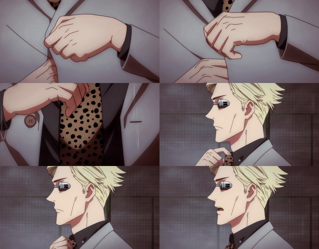
GIF by chososleftboot
Ch. 6 Warnings: Oh they fuckin! We have arrived at the smut yall. Oral sex, vaginal sex, protected sex, fingering, squirting, pillow talk, sucking tits, making out, showering... have fuuuuun!
Words: 11.1k+
SAVOR THIS EVENING
Nanami Residence : 6:01pm : Nishishinjuku
It had been a couple of days since you made New Year’s Eve plans with Nanami. This was gonna be good. Another date, and a new year. It was an understatement to say you were excited.
The plan to look incredible tonight was nothing short of executed. You decided on a sleek black dress. The way it clings to your curves is like it was poured on and molded for you. The neckline plunges just enough, framing your collarbones and showing off a nice portion of cleavage. Long sleeves that add a little mystery, and a high split to show a bit more skin. Your hair is in an intentionally messy updo, but honestly, even the most stray looking strands were all deliberately placed.
Your date didn’t miss a beat either. Crisp white button down with the top three buttons undone. He knew what you liked to see. Sleeves rolled up to his forearms in a way that was casual as you were staying in, but still very well put together. Well fitted black slacks, sleek leather belt to match, and on his wrist glints a watch that could undoubtedly cover a couple months worth of rent. All of that mixed with that clean smelling cologne he wore…
To keep it short, you both played to each other’s weaknesses.
Nanami had so generously picked you up from your apartment and drove you to his place. Even though you said you didn’t mind taking a cab, he insisted he drive you. He was a gentleman like that.
The drive was comfortable. It was filled with that easy conversation that you loved. It just flowed so well between the two of you. More than anything though, you were excited to see how this salaryman was living, and certainly you were not disappointed.
You stepped into the lobby of his building, and your breath was taken away. Tall ceilings that stretched impossibly high—adorned with hanging light fixtures that shimmered like champagne bubbles. A gentle waterfall trickled over polished black stone on the back wall.
The space was modern but warmed. It was lined with massive indoor trees and sleek sculptures. Minimal but bold. The seating area alone was better than anything you owned. Cushioned velvet lounges, fresh floral arrangements in gorgeous vases—This was quiet luxury that spoke for itself. This was wealth.
You did your best to refrain from gasping, but it was so hard. This was so nice, and it was just the lobby area!
Nanami offered you his hand as he’d guide you over to the elevators. You’d take it- fingers lacing with his in such an easy manner.
“This place is very nice.” You spoke, craning your neck to look around as you were guided by him. “A shame you don’t get to see it very often since you’re always shackled behind your desk.”
He’d stop before the elevator door and press the up arrow. The sleek grey doors opened, and he’d release your hand to place on the small of your back- guiding you in.
Nanami swiped his key card and pressed the button for the 15th floor. “That is an unfortunate part of the job.”
You shook your head, “It shouldn’t be.”
Before you could say more, Nanami brought your now rejoined hands up and pressed a kiss onto your knuckles.
Your heart was pounding as the elevator doors opened. The hallway was silent. The carpet up here was expensive! It was the kind that muffled all footsteps, both hard and soft as to not disturb the residence. There were only a few doors on this level, which meant each unit must be massive.
Maybe Kaya was right. He is rich. The fuck?!
Nanami led you to the last door at the very end of the hall. He’d enter his passcode before the lock released with a soft click. He’d open the door for you and step aside.
Okay, you couldn’t hold it anymore. You had to gasp.
The space was stunning. Floor to ceiling windows lined the far wall. Tokyo’s skyline glittered in the background as the curtains were pulled all the way open. Gentle snowflakes fell, and it was like a scene right out of a movie- no, a fantasy.
His apartment was as modern and pristine as you imagine it’d be, but not in a museum way. It definitely felt lived in. Warm overhead lighting, sleek black and cream colored furniture. Shelves lined with books instead of pointless decor.
What really caught your eye however, was the dining setup. A beautifully set table for two, right near the windows, bathed in the glow of soft candlelight.
As you went to take off your shoes, you noticed a smaller pair of pink slippers. Definitely way too small for Nanami.
“Where is she at? Because there’s no way.” You looked at him, doing your best to hide that smile of yours.
“I have socks for you too if you’d like.”
You removed your heels and placed them aside before slipping in the warm slippers. Fuck! They were so cozy! There was no way! How did he know your shoe size? You never told him! He bought slippers for you in advance?! Who the fuck raised this man?! Who?!
“Thank you, Kento.” You reached up, caressing his freshly shaven face.
“Come.” He’d continue to guide you to the table.
Upon arrival, you saw a single rose rested atop a folded piece of parchment. Nanami stepped behind you, his hands slipping to your waist.
“Have a seat.” He pulled out your chair, and you sat down in absolute awe.
You reached for the letter, unfolding it carefully. His handwriting was so neat and perfect, just like he was.
It is an honor to welcome you to my home.
Tonight, I will take care of you, and I take great pride in that.I have prepared everything with you in mind.
I hope by the end of the night you will know how deeply I admire you.
Savor this evening—savor this time, because I fully intend to savor you.
Your breath caught. Jaw dropped as you slowly looked up at him. “Kento. How the fuck am I supposed to keep my clothes on under these conditions?!”
He chuckled at your response before leaning down to kiss you. “I never set a dress code for you.”
“You’re trying me, Kento.”
He pulled away with a slight smirk, “I’ll get the food.”
As he turned away toward the kitchen, your mind was racing. It was the second date and he did all of this?! He was incredible. There wasn’t a stone left unturned.
It didn’t take long for him to retrive the food. The scent of butter, seared wagyu, and truffle filled the space. It was rich. It was decadent. It was like the kind of indulgence only reserved for special occasions. Guess it was New Year’s Eve.
Your stomach clenched with anticipation and the aroma alone made you almost salivate. You could see him in the kitchen from where you were sitting. Nothing rushed, but nothing unnecessary.
Even the way he brought the food to the table felt like an act of devotion. When he lifted the silver cloche, a delicate cloud of steam billowed out, revealing the most exquisite plate of food.
A perfectly seared wagyu steak, glistening under a coat of black truffle butter sat in the center. The marbling was insane, so intricate it looked like art. Beside it, silky mashed potatoes, whipped to absolute perfection, a delicate drizzle of butter pooling in the center. Then, there was the asparagus, bright green, still holding onto its crispness, dusted with flaky sea salt and crushed black pepper. Mmm!
Everything was plated with care, not a single element out of place.
“Kento! This is so beautiful!”
Your eyes moved to his as he poured a glass of red wine. The deep ruby liquid would certainly pair nicely with such a meal.
He’d lean down and kiss you once more, “I hope you like it.”
You’d not dig in right away. You waited for him to put the cloche’s away and take a seat across from you. Only then, when he settled in, did you finally cut into the stake… if cut is what you’d call it.
The knife slid through the meat so easily. It was like silk. Upon bringing the piece to your lips, you’d open wide and taste the best steak you ever had. It melted the moment it touched your tongue.
Juicy, buttery, rich beyond words. You moaned, “Mmm, this is so incredible. Why would I ever go to a restaurant again? You are too modest for all the talents you have.”
Nanami nodded, pleased, “I’m glad you like it.”
You shook your head, “Like it? No, I love it. The letter too. This is the most romantic thing anyone has ever done for me.”
His brows lifted, “Really?”
“Yeah.” You rolled your eyes playfully, cutting into another bite, “I had a mean streak for getting involved with shitheads, so I kind of just stopped dating like midway through college.”
“Stopped?”
“Mhmm.” You took a sip of the wind. “After my last boyfriend cheated on me with Kaya’s friend from Yale, I didn’t really date anymore. Kaya still beats herself up over it to this day. I never blamed her though. It’s all water under the bridge. I mean, even outside of the cheating, there were a lot of factors that made the relationship impossible to move forward with.”
Nanami was silent for a moment before speaking again. “Was your only serious relationship in college, or did you date someone before that?”
A slow, mischievous smile crept across your lips. “Are you asking if I dated anyone while I was at Kyoto Jujutsu High?”
He exhaled a quiet laugh, “Didn’t think you’d admit that so soon into the date.”
“Me either.” You leaned forward slightly, resting your elbow on the table now. “That is how I met Utahime. She was a mentor while I attended. She was from a previously graduated class, but she wasn’t teaching quite yet… I knew I couldn’t hide this part of myself from you for long… especially after I gave you-”
“A cursed tie?” He finished your sentence before you could.
You snorted, “So you knew?”
“Why do you think I laughed?”
You quirked up an eyebrow, “Because it was really ugly?”
“I laughed because you gave me a cursed tie. At first, I wasn’t sure if you knew, but after seeing you out with Utahime, it all but confirmed it.”
You let out a dramatic sigh, “Whelp, we better knock this part out before things start getting good.”
Nanami set down his glass, amused expression on his face, “Getting good?”
You smirked, before eating a bite of mashed potatoes. "Mhm. I don’t want this dinner to take a turn in the right direction only for you to pause in the middle and ask me why I stopped being a sorcerer."
You chewed slowly, savoring the silky texture of the potatoes before pointing your fork at him, “You aren’t off the hook either by the way. I’ll tell you my deal, but you better answer for yourself too.”
“That’s only fair.” His gaze was unwavering, settling on you with undeniable curiosity. “What grade sorcerer were you?”
You nearly choked on your wine, “Damn Kento! Don’t just jump straight into the juicy questions!”
"Fine.” He conceded, slicing effortlessly into another piece of his steak. "Then, what is your cursed technique?"
Your jaw dropped. "Kento!"
He tilted his head slightly. "Still too juicy?"
You groaned, setting your utensils down. "Yes!"
He sighed, slightly entertained by your desire for order. "Fine, then tell me in the order you want."
“Alright, I guess there’s no real order to these things, so I’ll just tell you.”
You exhaled, considering for a moment. Then, with a small nod, you reached into your purse on the floor, fingers brushing against cool metal. From it, you pulled out a wax seal stamp.
Ancient. Ornate. The handle was worn smooth, the surface engraved with an unfamiliar sigil. The weight of it felt familiar, grounding.
You held it up. "This is the weapon of my choice."
Nanami studied it. "A wax seal stamp?"
You’d nod, “A wax seal stamp.”
He lifted a brow, “I’ve seen a lot of cursed weapons, and that’s not one of them. I don’t mean to be crass, but why is it so unremarkable? Of course I’m only speaking of the energy. It’s a very beautiful seal.”
“I’m glad you asked.” You looked at the small seal, “It’s a weapon that can only be used by yours truly. If it’s not obvious already, my technique is called Seal. I have five of them that I can alternate. The main three are strength, speed, and tilt.”
“Tilt?” Nanami rose an eyebrow.
“It’s an equilibrium thing.” You tapped your fingers against the table as you tried to think of the simplest way to explain. “Think of my techniques like stats. I can use my technique on myself or others, and I can stack up to five seals at once. Five strength means’ I’m knocking your head clean off with no effort. Or maybe I wanna mix it up. Two speed, two strength, one tilt. Balance. Both strength and speed can also be reversed.”
“Versatile.” Nanami nodded, listening intently.
“Yup. Strength can weaken, and speed can slow. Tilt doesn’t reverse, but if you stack five, that could be enough to knock someone out of a fight- depending on the opponent of course.” You paused for a moment, “Based on that alone, I was deemed a Grade 2 sorcerer.”
Nanami’s eyebrows rose. “That’s very impressive, especially for a first year. You must have been a force.”
You exhaled slowly, “I was a Grade 2 until I got a handle on my last two seals and got reassessed.”
“Right. You said there are five.”
Your voice dropped slightly, “There’s the Decree of Auto Life that negates a fatal blow- not a reversible technique.”
“As in-?” He wasn’t really asking a question, though he did want to hear an explanation.
“If someone lands a strike meant to kill me while the seal is active, I won’t die. Doesn’t mean I’ll come out on the other side unscathed, but I’ll survive. It works once per activation. I can reapply it to myself or others as many times as I want, but if I do, all my other seal’s will be reset. So say someone pierces my heart with the auto life on, and four stacked slow seal’s on my opponent. I’ll survive, but if I want to reapply the Decree of Auto Life I’ll have to release those slow seals to do it.”
“I imagine reapplications wouldn’t be too difficult.”
You shrug, “Again, it depends on the situation.”
You sighed as you looked at your weapon of choice. You hadn’t even mentioned this technique in years. It felt like if you spoke the words a headhunt would start all over again.
“Then there’s the last one… the one I use on myself every day… the one that deemed me a Special Grade sorcerer… no recommendation required.”
Nanami’s eyes widened just a hair more. That was a massive leap from Grade 2 to Special Grade. Yes, auto-life was incredibly strong, but not exactly Special Grade strong. Then again…Nanami never saw you fight.
“It’s the Seal of Absolution.” The silence felt heavy as you spoke it. “Should this seal touch your skin, it will lock away all of your cursed energy for as long as my technique is active. That’s why you never sensed my cursed energy. I have a seal on myself, and therefore I can blend in.”
His eyes narrowed, “Even now you’re downplaying your abilities. You’re incredibly strong. You speak so casually, but a Special Grade rank is not handed out.”
“Well, those two techniques and my domain expansion really seemed to impress.”
“Do tell.”
You shrug, “It’s just a library. Nothing too crazy.”
His gaze lingered. He knew there was a vital piece of information missing. Maybe if you didn’t say it he could at least feel it for himself. “Would you lift your seal?”
You blinked, “Right now?” You laughed, “Absolutely not. I am trying my best to do some freaky shit tonight, and I don’t need every curse and sorcerer in the area fucking this up for me.”
Nanami choked on his wine. So caught off guard by your blunt words. “Well, when you put it like that.” He’d take a moment to regain his composure. “Why did you quit? Being a sorcerer, that is?”
“Why did I quit being a sorcerer?” You repeated his words, attempting to buy yourself some time. “Umm… people wanted to use me for the wrong reasons… There were people who heard of my technique. My Seal of Absolution. I became like some urban legend. Stories about my power grew legs, and they weren’t wrong, but they didn’t know me.”
“Stories like what?”
There was something so comforting about Nanami’s presence that allowed you the peace to ever retell this story. Kaya already knew the details of it, and you wouldn’t even wanna repeat it to her. But for Nanami, you’d open up.
“Take this with a grain of salt, okay? One rumor became very popular amongst sorcerers. Theoretically, if I could stack five Seals of Absolution onto Gojo—this is what they say—it’d nullify his Infinity technique. It would only seal that one ability since it’s not touching his skin, but it would leave him wide open. Enough for a very powerful sorcerer to kill him.”
Not many things were shocking to Nanami, but this- this was pretty jarring. “So… would that really work?”
“I never tried it.” You smiled softly, “I never even met Gojo until our first date… but knowing how the Seal of Absolution works… I wouldn’t need all five.”
Nanami’s gaze darkened just slightly, “A power like that—many people would kill for, I’d imagine.”
You nodded, “Too many people, actually, and it wasn’t just because of the Seal of Absolution, though that was the most popular reason. It was for my entire arsenal. Some wanted me for government work. Others wanted me for less noble causes.” Your jaw flexed just slightly, “One guy even tried to get me to join his cult.”
“A cult?” He sounded floored, but not exactly shocked.
You hummed, “Yup. He was very good at talking too. He almost had me.” You sigh, “It was a really strange relationship during my third year. He wasn’t a student though. We’d just meet up. Have lunch together. Share the same bento, pass around the same melon drink, and talk about nothing that would change either one of our lives.”
“And things got serious?” He asked in a way that was slightly perceptive, and curious.
You snorted, “What did I tell you about my track record with shitheads? We hung out every day. Talked about nothing every day. And after all that, he, out of the blue mind you, pitches me this fucked up idea to join his cult. I was like hell no.”
“Smart choice.” Nanami huffed.
“I just felt like if someone so close to me could try to use me for my ability, then I don’t know who to trust anymore. I flew back to the States, went to Duke, became a Lambda Phi sorority girl, and decided that returning to Japan would mean sealing my energy so no one could disturb me anymore. That way I could know that my relationships were authentic… or at least hope.”
“If you’re wondering if this is real-”
“I’m not.” You cut him off. “Kento, a lot of stupid shit that happened in the past has shaped how I move today. I know this is real, because you pulled me out of something dark when you met me. I told you that. But hell, if it’s not real- just let me dream a little longer.”
The words you spoke were unwavering. Real. Nanami knew that, and that’s why your words were met with his precious smile. Like a little ray of sunshine.
Your past was ancient history now, all of that, but it wasn’t quite as simple as you put it. You chose to be brief however, because the details no longer mattered. It was probably the most stressful time of your life, and not something you liked thinking of very often.
“Anyway, that’s the brief version. I’m still curious about you though. What grade, and why did you stop?”
He got serious when you asked. Like really serious. You saw it in the way his posture stiffened. The way his eyes sharpened. How his breaths deepened.
“I was a Grade 1, and the story of the reason why I quit would put a damper on this evening.” He nodded politely, “I don't want to do that. Especially since I dedicated tonight to pleasing you.”
Nanami was surprisingly open with you every time you spoke. He may hesitate or pause, but still speak truthfully. If he wasn't telling you outright, then that was because he was still hurting. The wound from whatever made him quit in the first place wasn't fully healed yet.
You nodded, “Of course. I totally understand. Let's stop talking about old us anyway. Let's talk about the present. Like this dinner for example.”
“Let's talk about it.”
“I mean, first of all- can you even hear me way down there?” You teased.
He knew what you were doing. If the table were any smaller, your plates would be overlapping. Big enough for a lovely dinner, yes, but small enough for two.
“Huh? I can barely hear you.” He leaned back in his seat- eyes locked onto yours. His legs spread just enough to look inviting. “Come over here.”
Yes, sir!
He was humoring you.
You bit your lip, grabbing your plate as you made your way over to his side of the table. “That's what I thought.”
It was as if you couldn’t get over there fast enough. He made enough room between himself and the table that you could fit easily, but he made sure to leave it just tight enough so that you’d feel the weight of his proximity.
Nanami exhaled, deep and pleased, the moment you settled into his lap. Sitting with your legs to the side, you made yourself right at home. His grip was immediate—one hand firm over your waist, his touch searing through the fabric of your dress.
His cologne wrapped around you—deep sandalwood, a hint of bourbon, and something distinctly him. He switched it up tonight. This wasn’t his normal scent, but still so intoxicating.
You took another bite of food, deliberately ignoring the way his palm shifted lower.
His voice was smooth, low in your ear. "I know I said it before, but… I really like this dress."
You swallowed, smirking. "Oh? You like me a little more covered up?"
His fingers traced a slow, path down your hip. "Not necessarily." He’d pause. “...I just think this fabric would look nice pooled on my floor."
You nearly choked. "Kento!"
His eyes and his touch were steady. He didn’t waver. Didn’t flinch. Didn’t break eye contact.
The air between you crackled, so thick with tension that your entire body felt hyper-aware of where his hands rested, how solid and strong his thighs felt beneath you.
"Prove me wrong.” He followed up with a very bold challenge.
Kento! Fucking! Nanami!
Your fingers traced the sharp lines of his jaw, moving up to the back of his neck, slipping into the soft undercut of his hair.
You tugged—just a little. "Stop making me horny. I at least wanna make it to dessert."
His fingers pressed into your waist. "You can have your dessert, and I can have mine too."
A sharp shiver ran down your spine.
"Fuck." Your breath hitched. "How am I supposed to keep my dress on with you looking at me like that?"
Nanami’s fingers dug in a little more, just enough to feel. "I’m not passive in this moment. We are two adults who know what we want. There’s no need to beat around the bush."
You leaned in, speaking against his lips. "I see what you’re doing."
Nanami’s eyes glimmered knowingly. "Oh?"
"Trying to pull a fast one on the universe before she fucks this up for us."
He smirked before leaning in to kiss you. "You know me so well."
It started slow—firm, like he was memorizing the way you felt against him. Your fingers tightened against the back of his neck, and his hand slid lower, gripping the curve of your ass.
The kiss deepened. His tongue slipped past your lips, warm, tasting like wine and something richer, deeper. You moaned softly into the kiss, and his grip tightened.
His other hand found your breast, his thumb brushing over your clothed nipple. A sharp, pleasurable jolt shot straight through you.
You pulled back, breathless. Nanami’s lips glistened slightly, eyes dark. He’d maintain eye contact for as long as he could as he leaned down.
His mouth opened, and he’d bite your nipple through the fabric. A soft nibble that made you very aware of this man's capabilities.
A sharp gasp left your lips. "Kento—"
His tongue followed, pressing slow circles over the fabric, the heat of his mouth making your body arch. The material of your dress was by no means thin, but it wasn’t thick either. It was just enough that you felt everything he was doing to you, with the desire for skin to skin building up underneath it all.
Your grip tightened in his hair. You could already feel it. The way your body was burning, aching, desperate for more. There would be no distractions tonight. You couldn’t wait to finally have him.
"Do you still want dessert?" Nanami’s voice was low, velvety, his hands firm where they rested against your waist.
You exhaled, your mind still fogged with desire from the way he kissed you, the way he touched you, the way his presence alone was enough to leave you aching.
"Is that a trick question?" You teased, though your voice was breathless.
Nanami tilted his head slightly, a slow, knowing smile tugging at his lips. "Not at all."
Before you could question his intentions, he scooted back his chair, smoothly lifting you into his arms as if you weighed nothing.
A startled laugh escaped your lips. He carried you with steady, confident strides toward the kitchen, the air between you thick with a tension so palpable, it felt like the entire room was buzzing.
When he set you down on the cool marble countertop, you watched as he moved toward the fridge. You took the moment to catch your breath, taking in how effortlessly he commanded the space.
The way the light in the kitchen illuminated the sharp angles of his face, the way his dress shirt clung to his broad shoulders, sleeves rolled up just enough to expose the strong definition of his forearms.
Then he turned, carrying a gold-rimmed porcelain plate, and carried it over to you with pride- revealing an artful arrangement of Mont Blanc Chestnut Verrine. Layers of silky vanilla bean mousse, delicate chestnut cream, and a rich, buttery sable biscuit at the bottom.
You blinked, stunned.
"Whoa." Your eyes flickered between the dessert and Nanami. "You made this?"
He nodded once. "I did. I saw how much you liked that mont blanc when we first met, so I thought I’d make it for you this time... Enjoy."
He handed you a spoon, and you narrowed your eyes suspiciously. "Why did you say it like that?"
His gaze was steady, unreadable—but there was a flicker of something devious there. "Say it like what?"
You scoffed. "You're up to something."
Nanami simply tilted his head, his lips twitching at the corners. "No. I just want you to enjoy it."
Your suspicion deepened, but you weren’t about to turn down a dessert this beautiful. As soon as you scooped the first bite into your mouth—something shifted.
Nanami lowered himself in front of you onto one knee, moving with silent, deliberate intent.
Your spoon froze mid-air. "Kento—?"
"Enjoy your dessert."
His hands found your ankle first, strong thumbs tracing slow, methodical circles over your skin.
You swallowed hard as he pressed a lingering kiss to your ankle. He’s slide your slippers off so he could delicately massage your foot. Then he’d press another kiss to your shin… your calf... Then higher.
Oh!
The spoon almost slipped from your fingers.
Each kiss was scalding—deep, reverent, unbearably slow. His lips branded a path up your leg, tracing the sensitive skin of your inner thigh.
Your breath hitched. "Kento, I—"
Your voice faltered completely when he spread your knees apart, positioning himself between them. He rose a bit more on his feet so he could be where he needed. Not too high. Not too low.
The warmth of his breath ghosted over your skin. You clenched the spoon between your teeth, eyes locked onto him. The way his broad frame filled the space between your thighs was almost overwhelming.
His lips pressed onto your thigh, inching agonizingly close. One low. One kiss in the middle. One kiss at your upper thigh. All you could do is watch—almost paralyzed by his touch.
His eyes—dark, molten, hungry—never left yours as he leaned in again, placing a kiss right over the thin lace of your black panties.
Your body jerked slightly at the sensation. "Oh, my God."
“You wore these for me?” He asked rhetorically. “I like them.” He’d lean in to plant another kiss.
You gasped sharply, fingers gripping the marble counter edge, trying to ground yourself.
He made sure to maintain eye contact as his tongue drew a stripe right over your already soaked panties.
"You taste so good already." He murmured against the fabric. “But I want a little more.”
“Fuck, Ken-”
You could swear that your vision was blurring. You needed his touch. It felt almost painful just to wait for it. He knew he needed to relieve you. He wanted to.
You bit your lip, already unraveling, already dizzy, and you were certain that whatever restraint you had was seconds away from snapping.
And yet—Nanami was still taking his time. Still drinking in every reaction. His hands slid up, fingers hooking into the delicate lace. And when he finally slid it aside—you couldn’t keep in your gasp.
He exhaled slowly, a soft smile on his face now. "So pretty." He’d use his fingers to spread your pussy open just enough to see that slick arousal that was already prepping your body for him. “So wet for me. I suppose that deserves a reward.”
His fingers pulled back, and his tongue slid against your folds, hot and silken, tasting you inch by inch. Your entire body arched sharply. The spoon clattered against the countertop.
Nanami didn’t stop. His hands gripped your hips, pulling you closer, tilting you just enough to let him devour you properly.
“Shit!” You exhaled, leaning back so that your forearms were flat against the counter.
His tongue flicked against your clit, slow and torturous. Your fingers tangled into his hair, hips rolling instinctively, desperate for more.
"Yes—Kento, just like that—"
He groaned softly against you, the vibration shooting pleasure straight through you. Your moans spilled freely, the sounds almost too loud in the quiet kitchen. You were a little scared to make so much noise, but he wasn’t going to have that.
"Let me hear it.” He murmured against your skin, voice dark, deep, commanding. "Don’t hide it."
Oh, fuck. Of course he notices.
His tongue moved lower, circling your entrance before slipping inside—deep, firm, relentless.
Your thighs trembled and your back arched. “Ah! Yes Kento!”
Your entire body tightened, pulsing, the pleasure coiling dangerously close. "Kento, please—"
You were so close. He continued at his pace. You could feel his thick, hot tongue inside of you, and it felt so intimate. Beyond just the pleasure of it all, it felt like something so insanely deep and personal.
Your hand on his hair gripped tighter, and you could feel it coming. Yes! That deep wave of pleasure rushed your body. Nanami kept up with his mouth on you. Pleasing your body just right so that you could ride this high for as long as the wave went. How was he this good?
His head lifted slightly as your body came down from its high. His hazel eyes locked onto you. "You still have dessert."
You blinked hazily. Your brain barely registered the words. "Yeah?"
Nanami dragged his tongue over you, slow and sinful. "Finish it."
Your entire body shuddered. "I can’t eat when you make me feel like this—"
He chuckled, the sound low, amused—deadly. “I’m sure you can make some headway.”
You were certain that he wouldn’t be satisfied until he wrung every last bit of pleasure from you. He didn’t give a shit about this dessert. He just wanted to see you struggle.
Nanami’s breath was warm against your skin, his lips pressing kisses into your thighs once more.
He parted your legs further before placing his hands firm on your waist- pulling you to the absolute edge of the counter. You felt the heat of his touch, the way his fingers kneaded into your skin, claiming you in ways words could never quite convey.
Then, his teeth. You gasped as he bit down—just enough pressure to make your thighs tremble. The sharp sensation sent a delicious jolt through your core, and you could do nothing but arch into him, wordlessly begging for more. He wanted to leave your thigh with a little souvenir.
“Kento!” You breathed, gripping the strands of his golden hair.
His tongue soothed the bite, his lips working tenderly over the spot as if to mark you with something else—to brand you, to make sure you’d remember this touch long after the night was over.
When he pulled back, his gaze flicked up to yours. Dark, knowing, utterly insatiable.
His fingers lifted to his lips, coating them with his own saliva, and then they were back on you—tracing, teasing, exploring. Not that your pussy needed any help getting lubricated, but hey, he was a generous lover.
The first touch was devastating. The slick glide of his fingers over your sensitive nerves made your breath stutter. Slow, purposeful strokes. Each one igniting something deeper, something dangerous. Then—lower.
His fingers toyed with your entrance, teasing the edge of something far more consuming. With little resistance, he pushed in. One thick finger at first. You gasped, body instinctively clenching around him. Then another.
“You like how that feels?” He asked, already knowing.
Your fingers tangled into his hair, gripping harder, guiding him deeper.
“Oh my God, Kento—yes! I like how that feels!”
He let out a pleased hum, his fingers moving with measured precision—not too fast, not too slow. Just enough to ensure you’d never forget how he made you feel.
His mouth found you again, tongue circling, flicking, tasting your clit. His lips parted just enough to take you fully against his tongue, and you cried out. His fingers curled as they explored. He was going to find the right…. spot.
Your thighs shook, your breath coming quicker, shallower. He felt it. He knew.
“You’re close again.” He spoke pleased against your skin. His voice gravelly and controlled.
Your body tightened around him, the pressure rising, burning, breaking. “You aren’t supposed to know that!”
His pace quickened. Your grip tightened, and then everything shattered. The pleasure rushed through you once more. Raw and unstoppable. Your body arched sharply, a cry leaving your lips as you drowned in the feeling of him.
Somewhere beneath the haze of your high, you felt him hold you tighter, his lips dragging over your skin, whispering something so soft, so reverent, you weren’t even sure if it was real.
By the time you finally caught your breath, your body was trembling—not from the cold, not from exhaustion, but from him.
Nanami was still there, still watching you, still taking in the sight of you in your most vulnerable state.
When you managed to speak, your voice was hoarse—breathless. “…I’m not finishing this damn dessert.”
Nanami huffed out a quiet laugh, standing back to his full height, licking your slick from his lips. His eyes never left yours. “That’s okay.”
Nanami’s fingers were still buried deep inside you, working slow, deliberate circles that had your breath coming in quick, shallow gasps. His name left your lips in a breathy moan, your hands gripping the edge of the counter like it was the only thing tethering you to reality.
“Kento.” You managed, “I will not let you unravel me on this counter.”
His movements slowed, but he didn’t pull away immediately. You could feel his gaze on you, heavy and dark with desire. A silent challenge.
Then, finally, he withdrew his fingers. You exhaled, but the loss of his touch only made you ache more. Your body already missed him.
You watched, mesmerized, as he brought his fingers to his mouth. His tongue flicked over them, tasting the slick evidence of your arousal. A slow, deliberate drag of his tongue as he savored the remnants of you.
Then his gaze locked onto yours, sharp and smoldering. “Where would you like to be unraveled?”
Well… damn.
You certainly weren’t expecting that question. Since he asked, it was only fair to give him an answer though.
“Let me see the bedroom. Show me.”
He pulled you from the counter with ease, and you instinctively wrapped your arms around his neck, your legs winding around his waist. His body was so firm, so solid beneath your touch. His scent wrapped around you like a spell.
You kissed him deep, your tongue slipping past his lips, tasting yourself on him. It was unforgettable.
His hands slid down, fingers digging into the soft curve of your thighs as he carried you through the dimly lit apartment. You barely registered how beautiful his home was—all dark wood and modern accents, sleek lines and understated luxury. A space that was undeniably his.
Then, you were in his bedroom, and the mood changed completely. Not your mood, no. The mood of the room. When people say this is where the magic happens, they are talking about rooms like this.
A king-sized bed dominated the space, adorned with dark, luxurious sheets that looked soft enough to sink into forever. A single lamp cast a golden glow across the room, catching on the subtle sheen of your skin.
Nanami set you down, his lips trailing the length of your jaw before he pulled back.
“Will you help me out of my dress?” You whispered, your voice sultry, teasing.
You turned around slowly, pressing yourself back against him, your ass deliberately pressing against his confined cock. The hard, undeniable proof of his size made your heart race. Not that you could ever forget anyway.
You bent forward slightly, hands resting on the bed for balance, arching your back just enough to make the movement intentional.
His hands landed on your hips, firm and possessive, fingers tracing the delicate material of your dress before gliding higher.
You could feel the warmth of his breath against your shoulder as his fingers found the zipper.
A slow pull, and the fabric peeled away inch by inch, exposing the delicate lace beneath.
The cool air kissed your skin as the zipper reached the small of your back. Nanami’s lips met your spine. A slow, reverent trail of kisses, each one more searing than the last.
You let out a quiet, shuddering sigh, eyes fluttering closed. God, he was going to change your life. Shit, he already has.
“What’s this?” You felt Nanami’s thumb run across your lower back.
It was the size of a quarter with words that were too small to read, and not in any language he knew. A tattoo? Or a brand? It looked like a welt mark maybe?
Your eyes widened a bit as you had almost forgotten. “That is the Seal of Absolution. Had to put it in a place no one would look…”
You turned, watching as he took in the full sight of you. The dress slipped from your shoulders, pooling at your feet. You stood there, adorned in black lace lingerie meant to be looked at.
A sheer, delicately embroidered bra, with intricate lace framing your curves, leaving just enough to the imagination, but not much. It was paired with a black thong that was barely there, but sat on your hips so nicely.
You bit your lip softly, “If the sight of my seal bothers you I can always lift it. Have a few curses ruin our good time.”
You were playing games. You knew damn well that he was not looking at that seal. It didn’t bother him at all, and even if it did, there was no way he’d be able to focus on it with a woman like you in front of him.
His breathing changed. The muscle in his jaw ticked as he raked his gaze over you, absorbing every inch, every detail. “Shit. You look, incredible.”
“Thank you, Kento.” You kept your voice steady. Stepping closer, your fingers traced the buttons of his shirt. “You are right though. My dress does look good on your floor.”
His hands moved before he spoke, unbuckling his belt with slow precision. His gaze never left yours.
His voice was deep, rough with hunger. “I need to be inside you.”
Your breath caught. Your pulse hammered. He was quite candid when horny. Noted.
You lowered yourself onto the bed, reaching behind you to unclasp your bra. The lace fell away, exposing your bare breasts to the cool air.
You leaned back, resting on your elbows, your lips curling into something sinful. “Come on then.”
His hands were already at the buttons of his shirt. You watched, completely enthralled, as he discarded it. The sculpted lines of his chest, and fine edges of his abs were something to behold. It was as if someone plucked this man from your deepest fantasies and carved him to perfection.
Your eyes dropped lower. The belt slid from its loops. His pants loosened. You swallowed hard, your throat dry, your pulse erratic.
You already knew. You had felt it, but now, you were about to see it. Maybe it was dramatic, but you knew you would never be the same again.
He stopped just short of revealing himself to you. He noticed the way your demeanor changed just a little bit. How you were still building up the nerve to take him on.
Nanami’s hands were firm yet reverent as they traced down your thighs- fingers skimming over the delicate skin before hooking beneath the band of your black thong. The last article of clothing you had left.
His eyes met yours, dark and heavy as he pulled the fabric from you. You’d lift your hips to help him just a little bit. As he pulled away you could feel the fabric cling to you from the very obvious wetness. The cold air now sending a shiver down your spine.
“You’re nervous.” His voice was smooth, rich, but impossibly gentle as he placed your underwear on the floor.
Your lips parted slightly, caught between the steady rise and fall of your breath. “Maybe a little.”
You weren’t scared, but you were overwhelmed by the sheer presence of him—by the way he looked at you, by the weight of this moment, by the knowledge that this was about to happen… and he saw it all.
Nanami leaned forward, capturing your lips in a slow, unhurried kiss. His mouth was warm, precise in its devotion- coaxing every ounce of tension from your body with every deep, lingering press of his lips.
“Don’t be nervous.” He whispered against your mouth.
Nanami pulled back, letting his gaze trail over every inch of your bare skin. The way his chest rose and fell heavier now, the way his jaw tensed—it was everything.
“You’re gorgeous, you know that?” He backed up so he was back on his feet.
He’d continue to work on his pants again. They were already unfastened and now he began to push it down, along with the black boxer briefs that separated you from seeing him in full.
You could hear the expensive fabric and the clink of his belt hit the ground. Your eyes were so tuned in that all of your other senses nearly faded into the background for a moment.
When he stood before you, bare and undeniably commanding, your eyes widened slightly. This only confirmed every suspicion you had. Thick, long, flushed, and veiny. Now you knew, without a doubt, and it was kind of scary, but at the same time, he was so well groomed that it was kind of pleasing to the eyes. The way it curved upwards just slightly told you that this man was built for your pleasure. Fuck. You were so horny.
Nanami saw the way your breath hitched, the way your gaze lingered a little too long.
A low chuckle rumbled in his chest. “Don’t look at me like that.” His voice deep and dangerously smooth.
Your tongue ran across your lips as your eyes looked back up at him. “Like what?” You asked feigning innocence—even though he could see right through you.
Nanami exhaled slowly, shaking his head as he reached toward his nightstand. You watched, entranced, as he pulled out a condom, tore it open, and rolled it down over his cock with surprising ease.
His eyes returned to yours, piercing, unyielding. “Like you don’t think you can take it.”
Your stomach tightened. The air between you grew thick, unbearably charged. Your fingers curled against the sheets, your body alight with anticipation, your heart hammering wildly against your chest.
“Well let’s see then.” You spread your legs nice and wide for him to fit between them.
He’d take that invitation- lowering himself onto the bed. His body weight caused the bed to dip around you as you felt purely at his mercy.
Nanami’s body pressed flush against yours, the weight of him grounding you, holding you perfectly in place. His lips found yours as if he was trying to set you at ease while simultaneously unraveling you completely.
His hand slid between your thighs, fingers teasing your slick folds, preparing you for him, coaxing every last bit of anticipation from you. His lips ghosted over your jaw, his breath warm against your skin.
“Relax for me.” He kissed the shell of your ear.
Then—a shift, a slow roll of his hips—and you felt him.
A moan tore from your lips as the thick head of his length pressed against your entrance, spreading your wetness and inching inside—slowly, carefully.
Nanami groaned, deep and strained as your walls stretched to accommodate him.
“Shit.” He exhaled
Your breath hitched, your nails dragging against the sculpted muscles of his back as he pushed deeper. The stretch was incredible, overwhelming—a perfect mix of pleasure and pressure.
Your head fell back against the pillows, your lips parted in a moan. “Yes Kento.”
His lips found your neck, kissing, sucking, murmuring against your skin. “You’re so tight. So warm. You feel so good.” His voice was low, hoarse.
Another slow, deliberate thrust, and he was fully sheathed inside of you.
A sharp, blissful jolt ran through your body, your thighs trembling around his hips as you gasped at the sensation. You could feel everything—every pulse, every twitch of his cock inside of you, and how perfectly he filled you.
Your breath came in shallow, desperate pants, and when you shifted slightly, the movement sent a wave of pleasure rolling through you so intense, your body reacted on instinct.
A cry escaped your lips as your walls fluttered, gripping him so tight, so wet—and then—you felt it. A rush of warmth between your thighs, a slick, involuntary gush of arousal.
No way. No WAY! Your body didn’t succumb to him that easily did it? He bottoms out for the first time and you’re already squirting on his bed sheets?!
Nanami froze, his breath hitching, his grip on you tightening.
His head dropped to your shoulder as he exhaled sharply, his voice a low, strained groan. “Fuck—that was sexy.”
He pulled back slowly, only to thrust forward again, deeper this time.
Your body arched into him, your moans louder, unrestrained, and he moaned low in your ear in response. His hands gripping the duvet by your head as he set a slow, devastating rhythm.
“You feel so good.” He murmured against your ear, his voice thick with lust.
His movements were calculated, controlled—like he was savoring every second of this, every desperate moan he pulled from your lips.
Your fingers tangled in his hair, your lips brushing against his ear as you whispered, “Harder, Kento.”
He stilled for half a beat, his grip tightening. Then, he obliged.
The next thrust was deeper, rougher, more intense—forcing your breath from your lungs, making pleasure bloom across your entire body.
Over and over, he filled you, stretched you, each roll of his hips sending another shock of pleasure up your spine. Your name left his lips like a prayer—his jaw clenched as he felt you tighten around him.
“You like that?” His lips now traced down your throat.
You whimpered, arching into him, fingers digging into his back.
He thrust again—deeper. Your body tensed. That overwhelming rush, a deep, euphoric sensation crashing into you all at once.
Your moans turned to cries as your body trembled beneath him, the pleasure spilling over, unstoppable.
Nanami groaned, his lips capturing yours in a desperate, consuming kiss, swallowing every breathless sound as he followed right after you—his body tensing, his rhythm faltering, lost completely to the moment.
When he finally stilled, his forehead pressed against yours, his breath ragged, heavy.
For a long moment, there was nothing but the sound of your breaths intertwining, the heat of his body against yours, the lingering sensation of pure, unfiltered pleasure.
“You okay?” He spoke before his lips pressed against yours.
You nodded, a lazy, satisfied smile curling at your lips. “Do you really need to ask?”
Nanami chuckled softly, shifting so you two were in a spooning position. Face to face with your leg over his, and so deeply intimate.
“You up for another round?” He asked with a lifted eyebrow that was almost, almost mischievous.
“I thought we were fucking until the new year, Kento.”
He looked down at the watch still attached to his wrist. “It’s 8:27pm. You think you can handle three and a half more hours?”
Your eyes widened, “Me?! Can you?!” You voice lowered… “You can, can’t you? What the hell are you made of?”
“I think you lasting that long would be more impressive than me.”
Your eyebrows knit slightly, “Hmm, that’s sounding a bit like a challenge. I’ve never had sex with a man for like four hours straight, but I might be willing to let my pussy suffer a little bit just to prove to you that I can.”
“No, you don’t need to do that.” He leaned in to kiss you, “Maybe for that you might want to use a couple of power seals.”
You laughed at his remark, “First of all, that’s not how that works. If I used a couple of power seals, that wouldn’t be fun for you!” You exhaled, your hand reaching out to caress his face. “Kento… is it annoying that I wanna finish my dessert still?”
“Not at all. Come on.”
Nanami Residence : 11:43pm : Nishishinjuku
You initially left the bed to eat your dessert that Nanami made, but as fate would have it, you both ended up going at it for another round. Then another after that.
Maybe you two wanted this really badly. Maybe you were cherishing the moment of peace and quiet without interruption. Maybe it was a combination of both.
Either way, after three additional rounds after that, you found yourself in the shower. Not alone. Oh, of course not.
You were here with Nanami washing off the sixth round of sex from your body before the new year's ball dropped.
The hot water cascaded over your skin, steam curling around the two of you in Nanami’s gorgeous separated shower. The air is thick with warmth, the scent of eucalyptus filling your lungs with every breath. The showerhead rains down steadily, the sound of water mingling with the faint hum of your breathing.
Your muscles ache in the most satisfying way, a reminder of the way he touched you. His arms are around you, his broad chest flush against your back, the strength in his embrace making you feel both delicate and completely safe. His hands glide over your body, smoothing over every curve with a kind of reverence that makes your stomach flutter.
“You’re covered in marks.” He murmurs against your ear- his deep voice reverberating through your body. His fingers trace over the evidence of his earlier affection—soft love bites along your shoulder, gentle bruises down your waist where his grip had been unrelenting. “Did I go too hard on you?”
You shiver, not from the cold, but from the way his lips graze the spot just beneath your ear.
“Not at all. I like them.” You turned your head a bit, “How’s your back?”
What you referred to were the red lines going down his back. Yes, the ones that certainly couldn’t have felt good under this hot water. Then again, maybe they did.
“You took it easy on me.” His voice was somewhere between teasing and serious.
“I didn’t want to show all of my cards tonight.” You grinned.
His strong hands roamed your skin, tracing along your waist, up your ribs, before settling at your breasts. His thumbs circled your nipples with featherlight strokes, sending delicate sparks of sensation shooting through you. His mouth followed suit, lips brushing against the damp curve of your neck, a mixture of soft kisses and teasing bites that made you shiver despite the heat of the water.
You exhaled a quiet, breathy moan, leaning further into his touch as one hand slid lower, gliding over your stomach and down to the ache between your thighs. Your head lolled back onto him- the slick warmth of his skin against yours making you feel consumed. Worshiped, even.
“You’re supposed to be helping me get clean.” Your voice was thick with satisfaction but edged with playful accusation.
His low chuckle vibrated against your skin, lips pressing one more slow, possessive kiss at the curve of your jaw before he finally reached for the bottle of body wash. “I am.”
You turned your head slightly in his arms, catching his gaze—that dark, honeyed stare, still heavy with unspent desire but softened now, gentler. He squeezed the body wash into his palms, rubbing them together before massaging the lather over your shoulders, down the curve of your spine, and along your arms. His touch was reverent, careful as he worked over the marks he’d left earlier, as if making sure you felt nothing but comfort under his hands.
Your eyes fluttered shut, savoring the sensation as he washed away the remnants of the night. The press of his fingers over your skin felt like something more than cleansing—like an unspoken promise, a lingering claim.
As his hands roamed lower, smoothing over your thighs, you turned in his grasp, facing him fully now. Water trickled down his jaw, over the slope of his collarbone, down his strong chest—he was breathtaking, even under the soft glow of the steam-fogged light.
You reached up, fingertips trailing through his damp hair, tugging gently at the strands before pressing a kiss to his lips. It was slow, lingering, full of gratitude, adoration, a quiet hunger that never seemed to settle between you.
Nanami exhaled against your mouth, his hands gripping your waist. “You’re going to make it very hard for me to behave.” He spoke low and husky.
“You haven’t behaved all night. Why start now?”
Well, that was the only invitation he needed. He’d grab your waist and turn you back around so you were facing away from him like you were before.
One palm cupped your breast, his thumb rolling over your sensitive nipple, teasing, slow, knowing. His other hand moved lower.
Fingers ghosting over your stomach, tracing the curve of your hip before settling between your thighs. The sensation was so sudden, so overwhelming, that your body instinctively arched into his touch.
You gasped, gripping his forearm as his fingers found your heat, spreading you open, easing inside.
“Let me take care of you one more time.”
Your lips parted in a soft moan as he pushed his fingers deeper, curling them just right.
He kissed your neck, your shoulder, your pulse—each press of his lips making your skin burn hotter than the water.
He moved his fingers faster, harder. His teeth grazing your jaw, his other hand squeezing and kneading your breast. “Just want to enjoy you a little longer.”
The pleasure was building fast.
Your walls clenched around his fingers, your thighs shaking, your breath stuttering. You gripped his wrist, trying to steady yourself as waves of bliss started crashing over you.
“Kento, fuck—” His name fell from your lips like a plea.
His fingers moved faster, deeper, relentless, until you felt it—that intoxicating pressure, that sharp snap of pleasure.
You gasped, your back arching against his chest, your entire body trembling as your orgasm hit you hard.
Nanami held you through it, whispering in your ear, kissing the side of your face, grounding you.
Your knees almost gave out, but his arms were strong, steady, unyielding.
His lips found yours, capturing your breathless moans in a deep, unhurried kiss. Your tongue brushed against his and you could feel the heat radiating from his skin—the unspoken words between you.
When he finally pulled back, his thumb traced over your lower lip, his eyes dark and filled with something dangerously addictive.
“Alright.” His voice was laced with amusement, as he removed his fingers from you and reached for the shampoo. “Let’s clean up.”
Nanami grabbed his loofah and lathered his bourbon and oak body wash into it. It smelled like him. It was so intoxicating and nice.
He ran the loofah over your skin, slow and thorough. Getting the day off of you… Getting the night off of you.
His touch was gentle but firm, making sure not a single inch of your body was left unattended. He started at your neck, trailing the warm lather down your shoulders, along the curve of your back. His lips followed in the loofah’s wake, pressing soft kisses in between it all.
Your breath hitched as he massaged the soap into your skin, his big, capable hands moving lower—over your hips, the dip of your waist, down your thighs, your calves.
There was nothing hurried about it. No urgency, no teasing. Just care.
“You spoil me.” You murmured, tilting your head as he slid the loofah along your collarbone.
Nanami hummed, his lips pressing against your shoulder. “Good.”
Once he was done, he turned you around and rinsed you off, cupping warm water over your shoulders, your chest, watching every drop slide down your glistening skin. The tenderness in his gaze made your heart ache.
When he was satisfied, he grabbed the biggest, fluffiest towel you’d ever seen, wrapping it around you and pulling you into his chest, rubbing slow circles over your back.
“Warm enough?”
You nodded, smiling. “I feel cozy.”
He dried himself off and slipped into a pair of deep blue cashmere pajamas. He left a few buttons open, for your pleasure certainly. He’d then run a towel through his damp, tousled hair before putting it in the nearby hamper.
“Put this on.” Nanami handed you one of his oversized black shirts, his scent woven into the cotton, along with a thick, plush robe.
You slipped the shirt over your head, and the fabric drowned you, falling a little above your mid thigh.
Now that you got a chance to really look at it- his bathroom was quite immaculate.
Clean, sleek, minimalistic but still undeniably luxurious. The double sink was flanked by dark wood cabinets, and above them hung a massive mirror framed with soft lighting.
Nanami opened a drawer, pulling out a collection of neatly arranged skincare products. He twisted the cap off one bottle and held it out to you.
“Cleanser?” His voice low, tender. “I suppose I should get some products that are better suited for you, but in case you’d like some in the meantime...”
“Thank you, yes.”
Your heart melted as he took a small dollop of cleanser in his hands, rubbing it between his fingers before gently spreading it across your cheeks. His fingers were slow, careful, tracing over your skin like you were so precious and delicate.
You sighed, leaning into his touch. “You’re going to ruin me for other men, Kento.”
He smirked. “I didn’t know you were still on the market.”
“I—” You were at a loss for words, “Definitely not.”
Once your face was cleansed, you returned the favor.
You grabbed the bottle and motioned for him to lean down. He did without hesitation, his gaze never leaving yours as you massaged the cleanser over his strong jaw, his sharp cheekbones.
Your fingers traced his features with reverence.
“You’re really beautiful, you know that?” You grinned, “People typically reserve the word beautiful for women, or scenery, but no. I wanna use that word correctly. You are beautiful, Kento.”
Nanami froze for a second. You found a soft spot that perhaps both of you didn’t know was there.
“Thank you.”
Once the skincare was done, the two of you stood side by side, watching each other in the mirror.
Your arms looping around his waist as you peeked past his broad frame. “It’s almost midnight.”
“You’re right.” He offered you his hand, and you’d take it before guiding him out.
The soft padding of your slippers against the pristine floor was the only sound as you walked back into Nanami’s bedroom.
You passed the bed—now stripped, the bedding already tumbling in the washing machine. The faint scent of fresh linen and something undeniably him still lingered in the air.
Nanami trailed behind you, watching as you moved with an ease that hadn’t been there before. You belonged here.
This relationship truly was a sprint, but if both of you agreed to the terms, then fuck what anyone else thought. No, fuck what you thought. Trying to get into your own head.
When the two of you entered the living room, the glow from the massive flatscreen illuminated the dim space. Floor-to-ceiling windows stretched along the far wall, still showcasing the breathtaking Shinjuku skyline.
Nanami took a seat on the couch, his legs spreading comfortably. Without a word, he grabbed you and pulled you into his lap. His arms wrapped around you, anchoring you to him.
You exhaled, practically melting against him.
The television flickered, displaying the New Year’s Eve countdown. Less than five minutes until midnight. The numbers ticked down in the corner of the screen as bright images of people celebrating filled the broadcast.
“So…” Nanami started, adjusting you so that your back pressed against his chest. “Any resolutions?”
You pursed your lips, thinking for a moment before leaning your head against his shoulder.
“I want to be more open.” You admitted. “I feel like I spent so much time just... existing. Avoiding things. Telling myself I didn’t want them when I really did. I’m sick of being scared. So this year I’m just throwing caution to the wind and going for it. Whatever that it may be.”
Nanami’s grip around you tightened slightly.
You sighed. “I also want to be happy. I want to figure out what that even means for me. I want to take more risks, try new things. I want to be open to love, open to failure. I want to make choices because they excite me—not because they feel safe. I want to say yes, even if it scares me...”
Nanami nodded against your hair, absorbing every word. “That’s a good resolution.”
You smiled. “What about you?”
He was silent for a moment, as if he hadn’t expected the question to be turned on him so quickly.
“Three things.”
You turned slightly in his lap, looking up at him. “Three?”
He nodded, shifting you so that his arms rested comfortably around your waist.
“First, I want to stop letting my job define me.”
Your fingers traced lightly along his forearm, listening.
“I’ve let my life revolve around my work for too long. I thought of nothing but money. Getting money. Making money. Spending money. There has to be some middle ground, and I’m determined to find it.”
He took a breath before continuing. “Second. Just like you, I want to allow myself to be happy.”
You blinked at him. “You say that like it’s something you’ve never done before.”
He was quiet for a moment. “It hasn’t exactly been a priority.”
You placed your palm against his cheek, your heart aching for him. “It should be.”
The television screen flickered, the countdown ticking down to the final minute.
“And the third?” You whispered.
Nanami was silent for a beat, his thumb tracing slow circles against your palm.
“I want to treat this relationship with care. I want to put real effort into it and see where it takes us. Nothing half assed.”
Something in your chest stirred. “Let’s both do that.”
You were both standing on the precipice of something new, something terrifyingly beautiful. For the first time in a long time—you weren’t afraid.
The final seconds of the countdown began.
10…
Nanami cupped your face, his eyes searching yours.
9…
8…
You leaned into his touch, your fingers curling into pajama top.
7…
6…
The city lights outside flickered like stars.
5…
4…
Your breath mingled with his.
3…
2…
1…
Midnight.
Nanami pressed his lips against yours, slow and deep, like a promise.
“Happy New Year.”
You smiled. “Happy New Year, Kento.”
Somehow, you could just feel it. This new year was going to be something special. It was going to bring you the happiness you both deserve, and honestly, you were ready for it.
- - - - - - - - - - - - - - - - - - - - - - - - - - - - - - - - - - -
Wanna be tagged? Let me know:
@emoedgylord @enhasrii @totallygyomeiswife @bornconfvsed
#jujutsu kaisen#jujutsu kaisen nanami#jjk#jjk x reader#jjk x you#jjk nanami#nanami kento#nanami x reader#nanami x you#nanami fluff#kento nanami#kento nanami x reader#kento nanami x you#nanami jjk#romance#fanfiction#fanfic#eventual smut#fluff#jjk smut#jujutsu kaisen smut#nanami smut#kento nanami smut#jjk fluff#jujutsu kaisen fluff
62 notes
·
View notes
Text
Haunting at Arrow House: Chapter 2
Thomas Shelby Masterlist
Masterlist
Summary: The mysterious door is finally opened and unfamiliar face enters the mix.
Warnings: Some weird sounds and touches from the resident ghostie woahstie, tension, rising fear and paranoia
Pairings: Thomas Shelby x reader
A/N: Another fic I can finally get rid of after almost 2 years of sitting inside my drafts and head.
—
I made my way to the kitchen, thoughts of last nights events playing on a loop in my head—the thumping noise from behind the walls, the cold that had seemed to seep up through the very floor, and that unmistakable scent of whisky and cigarettes that had hung in the air, long after I’d searched for its source. None of it made sense. I tried to reason with myself. It had been a long day of unpacking and moving in. My mind was tired, overwhelmed by the unfamiliar. It wasn’t unusual to imagine things when you’re that exhausted.
But the thoughts persisted, swirling in the back of my mind like shadows refusing to settle.
As I moved around the kitchen, making coffee and preparing breakfast, my gaze kept straying to upstairs, where the large oak door taunted me—the one Jake had pointed out was stubbornly locked. I hadn’t given it much thought yesterday, too focused on unpacking and settling in, but now my curiosity had been fully piqued. What could be behind that door? A forgotten storage room? An old office? The more I tried to push it out of my mind, the more it called to me, an unanswered question hanging heavy in the air.
For now, I shook the thought away and focused on the tasks ahead. The day promised to be productive, and after breakfast, I threw myself into organizing the rest of the house. Arrow House, with its high ceilings and large windows, had a strange beauty to it, despite the dust and the echoes of age that clung to every corner. By midday, the kitchen was neatly stocked, and the living room had begun to take on a cozy warmth. I had even found a place for the old typewriter Anne had been so spooked by. I set it on a vintage desk I’d discovered tucked away in the attic, its keys silent, waiting.
As I moved through the rooms, tidying, arranging, and trying to settle into this new life, the hours slipped by quicker than I expected. Before I knew it, the sun had moved high in the sky, casting long shadows through the windows. That’s when the doorbell rang, the sound sharp and sudden, pulling me out of my thoughts.
I opened the door to find Jake standing there, toolbox in hand, his smile warm and easy. He looked out of place against the looming backdrop of the house, like a spark of life in an otherwise forgotten world.
“Ready for round two?” he asked with a grin.
“Absolutely,” I replied, returning his smile. “I’m dying to see what’s behind that door.”
We walked together down the hallway to the oak door, its worn surface and heavy frame feeling more imposing now than it had before. Jake set his toolbox on the floor and knelt to inspect the lock. As he worked, I kept busy with small tasks, arranging books on the shelves and straightening the pillows on the couch, but my mind was elsewhere. My ears strained for any sign of progress.
After a few minutes, I heard the faint, satisfying click of the lock disengaging.
Jake turned to me with a triumphant look. “We’re in business,” he said, standing up. “Let’s see what this door’s been hiding.”
With a slow, deliberate motion, he pushed the door open. It creaked loudly, as if protesting the intrusion after years of silence. I peered inside, my breath catching in my throat. The room was dimly lit, with only a thin beam of sunlight filtering in through a small window on the far wall. Dust hung thick in the air, disturbed by our movements.
The space was sparse—a large mahogany desk sat near the center, an old leather chair behind it, and bookshelves lined the walls. Most of the books were hidden beneath layers of dust so thick I could hardly read their titles. The air inside felt stale, as if the room had been sealed off from the rest of the house for decades. The silence in here was different from the rest of the house. Heavier. More oppressive.
Jake stepped inside first, his footsteps leaving imprints in the dust on the floor. “Looks like it hasn’t been touched in years,” he remarked, running his hand over the desk. His fingers came away gray with dust.
I followed him inside, my eyes scanning the room. I couldn’t shake the feeling that something was off. The hairs on the back of my neck stood on end, though I couldn’t pinpoint why. I pushed the unease aside, focusing on the task at hand.
We started clearing away the dust, opening drawers and sifting through papers. There wasn’t much to find—old invoices, receipts, and correspondences from the previous owner.
Jake’s voice cut through the silence, “Hey, check this out,” he called from one of the bookshelves.
I hurried over to find him crouching by the bottom shelf. He had discovered a hidden compartment, cleverly disguised behind a row of old, forgotten books. Inside, we found a small collection of photographs and documents. Some were of the house itself, its once-pristine exterior gleaming in the sun. But others were of people—people I didn’t recognize.
One photograph, in particular, caught my eye. It was a faded image of a man standing in front of Arrow House, his face set in a stern, almost grim expression. There was something eerily familiar about him—the sharp jawline, the piercing eyes. He looked so much like Thomas Shelby, though younger and maybe harder in some way.
I held the photo out to Jake. “Does this man look familiar to you?”
Jake studied the picture for a moment, his brow furrowed. “That’s definitely a Shelby,” he said slowly, “but it’s not one of the brothers I know. Could be a relative, maybe from way back.”
A cold chill ran through me as I looked at the photograph again. There was something about the man’s eyes, something that unsettled me deeply. I could almost feel them watching me, even from the faded image.
As the afternoon stretched on, the sense of unease in the room grew. I could tell Jake felt it too, though neither of us said anything. There was something about this house—something lurking just beneath the surface, waiting to be uncovered.
Jake finished up his work and packed away his tools. “We’ve found enough for one day,” he said with a grin, though there was a tightness to his voice. “I’ll come back soon if you need any more help.”
I thanked him and saw him out, but my thoughts were still racing. The typewriter, the photograph, the hidden room—it all felt like pieces of a puzzle, but I didn’t yet know how they fit together.
That night, as I climbed into bed, I couldn’t shake the feeling that the house was watching me. The silence felt alive, like it was listening. I pulled the blankets tighter around me, hoping the warmth would chase away the chill that seemed to settle in my bones.
But sleep didn’t come easily. Every sound felt amplified—the groaning of the old timbers, the distant rustle of the wind against the windows. Shadows seemed to shift and move on their own, flickering just at the edge of my vision. I lay there, eyes wide open, staring into the darkness, until finally, exhaustion began to pull me under.
Just as I was on the edge of sleep, I felt it—a soft touch on my shoulder, so real it jolted me fully awake. My heart pounded in my chest as I turned my head, but the room was empty.
“Hello?” I whispered into the darkness, my voice shaky.
No response. Only silence. The kind that presses in from all sides.
I reached out, my hand brushing over the spot where I had felt the touch. Nothing. But I knew what I had felt—it had been too real, too tangible to be my imagination. I sat up in bed, scanning the room, but all was still.
It took a long time for my racing heart to calm, and even longer before sleep finally claimed me again. And even then, my dreams were restless, filled with half-formed images of the house and its secrets.
tag list: @mysticalpandora @ultimatreality @lovecleastrange @watercolorskyy @rockerchick05 @lyarr24 @queenlondyn @sl-ash-er er @literishdegree99 @kimi01985 @literishdegree99 @psychadelichues @embystarr-blog
#peaky blinders#peaky blinder imagine#tommy shelby#tommy shelby imagine#tommy shelby x reader#tommy shelby x y/n#fanfic#cillian murphy fanfiction#cillian murphy#thomas shelby fic#thomas shelby fanfic#spooky#build up
53 notes
·
View notes
Note
Hi! I was wondering if you’d be up to share how you made the before and after slider on this post:
https://www.tumblr.com/freckleslikestars/780305824654540800/before-after-gif-colouring-challenge
It’s really cool! Thank you!
Aww thank you so much! I literally had a dream about doing this two weeks ago, and when @sophsun1 tagged me I was like "oh my gosh lets try it!"

Now, before we start, I'm going to assume basic knowledge of gif making, colouring, etc. I'm using Adobe Photoshop 2025, but you should be able to adapt the steps for pretty much any software that has a timeline and allows for vector masks.
Once you understand key frames and vector masks, it's super easy to do!
First, we're going to open our gif in video timeline view, with our colouring already done. (My colouring is all in "Group 1")

Next, I converted the footage to a smart object, leaving the colouring as it's own independant group. This isn't technically necessary, but I do this to a) apply sharpening and b) so my layers tab is less cluttered. This is normally also where I'd make sure my image size is correct (I do 540X400 pixels) but I forgot so I did that later on this one.
At this point, I turned some guides on and, using the rectangle tool, drew a rectangle that was around the size of the canvas, clicked to the last column on the right hand side.

The next step is to turn it into a vector mask. With command held down on a mac (I think it's alt on windows, but don't quote me on that) drag the rectangle layer onto the colouring group layer. It will fill in the whole canvas with colour.

Delete the rectangle layer, so that you're just left with the gif itself and the colouring layer with the rectangle vector mask over the top.

Next we're going to animate it, so you need to open the dropdown for the colouring layer on the timeline, and you'll want to scroll down to where it says Vector Mask Position

Making sure your playhead is at the very beginning of the gif, click on Vector Mask Position and drop a keyframe. Then, move your playhead to the very end of your gif and drop another keyframe - at this point you don't need to move the vector mask at all.


The next thing you need to do is find the middle of your gif - this doesn't need to be overly precise, particularly with longer gifs, but the precision means that the vector mask moves at the same spead both ways. Drop another keyframe there.
With the playhead over the keyframe, select the vector mask on the layers panel and using the move tool, move it across to the first column on the left. I personally prefer to use my arrow keys to just nudge it left, rather than faffing about with clicking and dragging.

If you were to export it at this point, it would be perfectly fine, you'd get the moving vector mask to show the before and after, which has a pretty cool aesthetic all of it's own. But lets add some details to make it look like a before and after sample image.

I started by adding the BEFORE and AFTER - I used Adobe Clean as my font, but font choice is really personal preference. I just centred them in the bottom left and right squares of my guidelines. I then drew a white line, using the line tool, down where the divide is, added a couple of rounded arrows (and lowered their opacity), and merged the three of them together (keeping the text separate).
Then I simply followed the same steps to add key frames to the line in the same places as I did with the vector mask, making sure that the centre one was nudged to the location for the vector mask on the centre key frame.
Export as usual and et voila!

Something to note is that this effect works better with longer gifs. As you'll see, this X Files gif was a touch too short, and so the slider feels a little too rushed:
Also, if you're wanting all of the sliders to move at the same time/speed, you're going to want to make sure all of your gifs are the same length, which I didn't do because I'd had a long day and I was procrastinating from postgrad work for an assessment I have tomorrow. Which is incidentally what I'm also doing right now.
Anyway, there you have it! Super simple when you know how! If you have any further questions, don't hesitate to ask! :)
#my gifs#gif tutorial#I genuinely love the colouring of that Abbott gif. The X Files one pisses me off because it started off so dark#that when you don't see the comparison it looks like i did absolutely nothing. but the comparison makes it slightly better
13 notes
·
View notes
Text
Blender: Which Buttons Do I press? (Part 1)
There are a lot of tutorials where you already need to know how to "do the basics" like "maneuver the camera." So this tutorial is focusing on the Buttons- not on the sculpt or the object, just on the buttons and shortcuts that I personally use in Blender.
Note: You will need a mouse with 3 buttons / scroll wheel for this.
Before we start, I'm going to explain which shortcuts I use in this, but, not to make myself redundant, there's a shortcut for seeing shortcuts: Press Spacebar + Shift to see all available shortcuts in each mode.
I'm using Blender 3.6 for this tutorial. I recommend you use the same. It's completely free and has a lot of great features! For this tutorial though, 3.4 will likely work as well.
Click "General" under New File.
Your screen should look like this. There are 3 default objects in the file: Camera, Cube, and Light source.
3. This bar indicates that you are in Object mode. This menu will allow you to go into other modes depending on the object you have selected.
4. Lets talk about shortcuts. You can zoom, rotate, and move the screen using buttons at the top right, but I haven't marked those because I will teach you a better way. Feel free to click them all and see what they do, but I assume you're here because you don't want to explore every button in this godforsaken program the hard way.
Below, the Left and Right buttons are marked as a reminder as well as the Middle button which is also the scroll wheel (press down to click it)
Left click: Select an Object Left click and drag: Selects multiple objects Scroll Wheel: Zoom in and out Middle Click and drag: Rotate your view Shift + Middle Click and drag: Move your view Right click: Brings up a menu that won't be relevant here. Shift + Right Click: Moves the 3D cursor. Not important for this tutorial, but I do it on accident a lot. Hit Shift + C to reset the cursor and also to reset the viewer position to see all objects at once.
Move the viewer around as practice! You're gonna need to do it a lot while modeling. If you have a keyboard with a Numpad (the calculator-looking thing on the right side, says Num at the top) you can use Numpad 1-9 to automatically adjust the view to front, left, right, backwards, and different angles. If not, test out the rotate tool at the top right which does something similar.

There's a helpful menu I use to switch between Modes (if you hit the dropdown menu where it says "Object Mode" you can do this without the shortcut); click Preferences to enable it.
Hop over to the Keymap section and check "Tab for Pie Menu"

And then close the window. No "Save" button is needed.
Now that you have the shortcut enabled, select your box with Left Click, hit Tab and Left click "Edit Mode"
And yes, this is just like the Animal Crossing tool ring:
Now that you're in Edit Mode (You can swap back anytime by hitting Tab -> Object Mode), click arrow at the top right to open a menu where you can check the "X-ray" box. You'll be able to see through your cube. As a reminder, Spacebar + Shift will show you the available shortcuts in this mode, but I'll go over the important once momentarily.
What is a 3D object made out of?
This box is made out of vertices, and each face of the cube has four vertices at each corner- a triangle with three vertices also works, but we'll stick with squares for this tutorial. Moving the vertices will change the shape of the box, like a piece of stretchy fabric over a wire frame.
From now on, I'll be calling the vertices dots, because I hate reading and typing the word vertices over and over again.

5. By all means you can fiddle with the buttons over here but I'm gonna show you the shortcuts I use and the buttons you'll actually need. Don't get intimidated by the amount of buttons. Also press the T key and the toolbar will go away!
(Seriously, though, feel free to play around in this section as much as you want to, but we'll go over the shortcuts a few at a time with examples. at the end of this section will be a summarized list.)
6. Left Click one of the dots and press the G key. You'll see below a whole bunch of additional shortcuts show up at the button. Here are the ones I use:
G key: Grab and move around the dots
R key: Rotate two or more dots*
S key: Size two or more dots*; if two dots are selected, the distance between the dots will change but the angle between them will stay the same.
*Left Click and drag to select multiple dots!
CTRL + Z to Undo edits.
When you move a dot with the G key, imagine that the dot is against a piece of glass at a fixed point ahead of your viewer. The dot will not move farther or nearer to you, but will instead move parallel to your view.
As an example, if you press Numpad 1 and view the object from the front (The -Y green circle will be at front and center in the rotate tool), the dot will only move left and right (X axis) and up and down (Z axis). It will not move farther or nearer on the Y axis by default.
Play around with the G, R, and S tools before moving on.
This little X button at the top right will turn on symmetry. You don't need to use this, but it can be useful.
Left Click and drag so that an entire face (flat square) is highlighted and then press the E key to extrude. Extruding will add another set of dots that are automatically connected to the first set.
Ctrl + R adds a loop cut. This will divide the existing faces into two and add more dots. You can also drag loops to slide them to different positions.
The 3 key (not on the Numpad) will switch your Select Mode to Face Select. This is useful for extruding. Essentially it is simply selecting all the dots at the corners of the squares.
The 1 key will switch back to Vertex Select (or Dot Select) mode and the 2 key will switch to Edge Select (the least useful of the three, to me)
Before we go wild, there are a couple of additional things to know. For the tutorial, focus on working with faces, not vertices. If you accidentally pull a single vertex, select it and press the X key to delete it.
If you want to add shapes, I recommend sticking to cubes for now. Ctrl + A will open the Add Mesh menu and you can add a cube. Feel free to have complete cubes overlap for this tutorial.
Double Left Click will select a series of dots connected in a loop, and can be helpful for selecting areas all at once.
Ctrl + B is the bevel tool, and when a loop is selected it can turn it into two.
Here is a summary of all of the Edit Mode shortcuts:
G key: Grab and move around the dots R key: Rotate two or more dots* S key: Size two or more dots* *Left Click and drag to select multiple dots Double Left Click will select a series of dots CTRL + Z to Undo E key to extrude faces Ctrl + R adds a loop of dots Ctrl + B splits one loop into two X key -> Vertices to delete dots (vertices) 1, 2, 3 keys to switch Select mode Numpad 1-9 to move viewer automatically Ctrl + A to add a shape
Go play with them. See you back here in a while.
7. I used a single cube to make this figure. It's still very blocky, but that's fine. Loop cuts created additional faces which were extruded to create arms, legs, and a neck. Definition to the face was added by selecting individual dots. Remember, Ctrl + Z (undo) is your friend!
Once satisfied with the shape you made - a boxy figure or object is fine- continue on.
8. Press Tab -> Object Mode. Turn your attention to the right hand bar and make sure the Wrench button is selected. Note the Add Modifier Button.
There are a heck of a lot of buttons here that you don't have to worry about- just select Remesh.
Change the number under Voxel Size to .05m by Left Clicking and typing it (there is a slider, but I find this causes lag). Then, apply the remesh by clicking the down arrow and selecting Apply.
Your figure should be shaped similar to before, but have a slight "graininess". If you have added multiple cubes, it will seamlessly merge them into one. The smaller the Voxel Size you put, the more dots will make up your object. However, I suggest starting with something in the .03-.06 range. We will refine this later.
Press Tab and select Sculpt Mode.
This is a mode where I actually use the tool bar for modifying my sculpt, as there are a lot of brushes . The icons show roughly what the brushes do using small icons (note on adjusting this below)
9. Observe the Radius and Strength bars, which will adjust the... well, the size and radius. Note that although the "brush" looks like a flat circle, the affected area is actually a sphere. Select a brush with Left Click and Left Click and drag on the sculpture.
10. This is the smooth tool. I have smoothed out the right side of this figure. Note that I turned off symmetry to do this, but i usually have X-axis symmetry selected.
Although I am used to the small buttons, there is a way to change them. Hover near the toolbar to Left Click + Drag so you can see the names. Hold Ctrl + Middle Mouse button and drag to resize. You will be able to make the size of the menu much larger. This goes for many of the menus in Blender.
The above arrows point to the symmetry button (Top right) and Grab brush (bottom left). The Grab brush uses the shortcut G Key.
The lines point to which tools were used for each part of the sculpt. The Draw Sharp tool was used to mark out eyes. Clay strips made the hair texture. Round cheeks were added using the Inflate tool and a nose (and buns) were added using the Blob tool. The aforementioned Smooth and Flatten tools were used judiciously to remove sharp edges.
I don't have a shortcut list for you here, but here are all the tools I use the most:
You can hold the Ctrl key while using the brush to reverse its effects. For example, if you hold the Ctrl key while using the Inflate brush, it will deflate the shape instead, creating a concave shape.
As you can see, my figure is getting a little grainy. So, we're going to remesh this model again and add more dots and therefore detail.
This time, we're putting the Voxel Size to .01m. Apply the remesh as before. Now we have more dots to work with and we're just repeating the process, smoothing, and sharpening the lines.
I was going to add a bit about how to take a photo of your sculpt, but I ran out of photo space. I will add a reblog with this information.
I came up with this little lamb character on the spot because the clay strips created a nice texture. She's by no means perfect, but she did turn out pretty cute so i might make a cleaner version later on.
63 notes
·
View notes
Note
https://eddiediaaz.tumblr.com/post/720106767343878144/lgbtqcreators-bingo-challenge-35-headcanon
How did you get the lyrics to move and the sound bar to move if you don't mind me asking?
Such a cool effect makes it so much better!
ahhhh thank you!!
first of all, all credits go to Tiny for this amazing template! i just tweaked it a little to animate the lyrics and sound bar with position keyframes. here are the steps i've taken to animate the lyrics in this gifset (under the cut).
I. editing the template
first, you want to move the layer mask from the lyrics to a new group. to do so, select the LAYER named lyrics, and put it in a new group. i've renamed mine rolling lyrics. then, while holding CTRL, click on the layer mask's thumnail (what i circled in red). you'll see a selection appear (the "animated marching ants")
with layer mask selected, make sure the rolling lyrics group is also selected, and click on the add layer mask icon at the bottom of the layers (circled in red). your layers should look like that:

now you just gotta remove the layer mask on the lyrics layer. to do so, simply right click on it and go "delete layer mask". it should look like that:
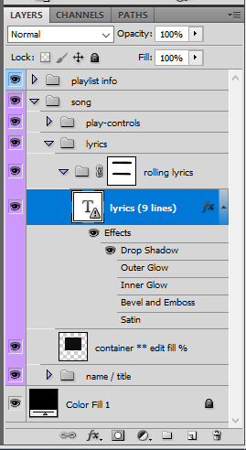
II. lyrics
for this template, there are about 9 lines of lyrics that you can make fit. for the rolling lyrics effect, you want to add a bit more. 2 to 5 more lines of text should be enough, depending on the length of the gif and the animation speed you desire.
so put all your lyrics in there, and make sure that when you are on the first frame in the timeline, the lyrics are what you want. keep in mind that the first line of lyrics will be gone quickly since it'll be animated from the start.
III. keyframes
animation time! still on the first frame in timeline mode, go to the lyrics LAYER's animation panel and click on the position timewatch (circled in red) to activate the animation and create the first keyframe.

then go to the end of the gif, select the lyrics LAYER, and with the move tool, make the lyrics go up with your keyboard's arrow key. it should create a keyframe automatically, and if you play your gif, you should see the text being animated and rolling up. it's that simple!

IV. refinements
so it's possible that you see lyrics peek at the top and bottom of the layer mask. to do so, simply brush some back with the brush tool onto the rolling lyrics group's layer mask until you don't see any lyrics peeking through.
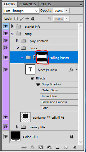
also, if you want a quicker or slower animation, go to that last keyframe's position on the timeline and move the animation up or down with the arrow keys. if you right click a keyframe you can delete or duplicate it.
V. sound bar
for the sound bar it's a very very similar process to the lyrics. put the two song position bar layers in a new group (i renamed mine sound bar), make a layer mask so the shapes don't show up on the edges of the gif, and then use position keyframes to move the white bar around, like i showed for the lyrics. my layers look like this:

and that's it! :) i hope i was clear enough haha, i always feel like i babble too much in these
208 notes
·
View notes
Text
Toji fushiguro x F!Reader
(Secret agent au) part 1
Requested by @whyaretoxicmen31
Context - You've finally woken up in an unknown room but because of your reluctance to answer questions they decided to get someone else to force the information out of you.
CW - edging, oral (f.recieving), spanking, Unprotected sex, creampies, heavy degradation and name calling, toji being mean asf, manhandling, (not proofread)

"Fuck you." You spat, glaring at the masked man in front of you.
You didn't know how you'd gotten tied to this chair, faded memories of the events of the night prior floating through your thoughts. Toji had definitely brought you here, alarm bells ringing when you saw your clothes had been changed once more.
The man in front of you was visibly annoying him, his tone becoming more threatening.
He continued to question you but you just shook your head, getting the stranger even more mad, so much to the point where he raised a hand to you. He would've stroked if it wasn't for the large metal door opening.
Both you and the stranger were shocked to see him. Toji in all his glory.
You hid your relief of his entry when his eyes landed on you, instead looking down at your lap.
Toji just silently walked behind you, large hands undoing the ropes that binded you to the chair, letting you rub your wrists.
"The hell are you doing fushiguro?" The stranger questioned.
"Boss could tell you weren't getting anywhere. So. I'm questioning her." He explained, grabbing one of your hands and placing a cuff around it before doing the same to the other.
The stranger complied, allowing toji to pull you up and out of the chair easily, guiding you out of the room. A minute passed and now you were being pushed into an elevator, toji pressing a key card against a sensor that closed the doors, the screen showing an arrow with text displaying 'T.F'
You glanced at toji to see his stoic expression fixated on the metal doors, arms folded as he rested against the elevator bars.
"Don't stare at me. It's creepy." Toji sighed, his eyes moving to look down at you.
You rolled your eyes, looking down at your cuffed hands.
"Ironic."
"Shouldn't you be a little more thankful? Took some convincing to let them allow me to interview you."
You scoffed. "I'd rather die."
Silence passed through the elevator as the doors finally opened, revealing a huge office, probably bigger than your former bosses.
"Who's office is this?" You questioned, walking into the area, admiring the polished dark oak tables and huge l shaped sofa.
"Mine."
Your head whipped round to face him, a small smirk on your face. "Don't make me laugh."
Toji rolled his eyes behind your back before walking over to you, pushing you down onto one side of the couch, sitting down a meter away.
"Alright. So are you going to comply or do you want to get killed off early?" Toji questioned, relaxing into the plushness of the couch, his eyes never leaving you.
You just rolled your eyes. "As if you'd kill me off. You guys need me for whatever those dumb questions were."
Toji just clicked his tongue before humming, a hand beckoning you forward. You hesitated before shuffling closer, toji's thighs spreading further. Before your reflexes could react, toji pulled you forward, pulling you over his lap, a large hand moving over your ass, pulling down your panties and the sweatpants that had been put on you. Before you could question him, a hand swatted down harshly against your rear, making you yelp out in surprise, pain surging through you.
"Wanna be a smart ass, hm?" Toji scoffed, watching your small frame writhe underneath him.
"Toji -! You bastard-" you screamed out once more when more slaps landed onto your ass, tears prickling at your eyes.
This was more than humiliating. You, a grade A agent being spanked like a child by your enemies hired assassin. Maybe you should've let toji kill you.
You were brought from your thoughts once you realised you'd been too zoned out to hear toji's question, causing more hard slaps to land against your ass.
You cried out, staring at the marble flooring as blobs of tears fell from your eyes, followed by your small sniffles.
Toji hummed, rubbing your ass that was now becoming a delicious shade of crimson. So delicious that he wanted to sink his teeth into you. But, toji had to contain himself. For now.
"Zoning out on me? You want more spankings?" Toji asked in a threatening tone, a hand moving to roughly grab at your hair.
He swore he felt his dick twitch when he saw your pretty face, tears streaming down your puffy cheeks whilst you glared at him from your beautiful lashes. You were making it so hard for him not to swallow you whole.
You avoided toji's gaze, not wanting him to see you so vulnerable.
"Don't be rude, little thing. Apologize to your elders." Toji spoke in almost a parental tone now. "Want another punishment?"
You quickly shook your head the most you could with toji's grip on your hair.
"-sorry! 'm sorry, please," you whimpered, humiliation surging through you painfully.
Toji smiled harder, letting go of your hair, your scalp finally getting relief.
"nice apology..." Toji hummed, pushing you off his lap to lay you on your stomach. "But, I'll take a better one."
You looked back slightly confused, a small moan leaving your lips when toji's thumb glided through your folds.
"Toji-" you mumbled, eyes moving from him to the elevator, scared that anyone could just walk in.
"Shut up." Toji stated, and your mouth shut immediately, instead biting your bottom lip and turning to face forward, hands gripping into the cushions as toji applied pressure to your clit.
Toji chuckled from behind you. "Got so wet from a few little slaps. Bet you'd cum if we were walked in on..."
You hated how your body responded to him so easily, your hole clenching around nothing at his lewd words, the thought of someone catching you turning you on more.
Toji raised your hips so your ass was faced up, not waiting for you to question him and instead focusing on your wet cunt, his tongue pressing firmly against your clit. You whined in unison with his moans, your front half pressing further into the couch as you called out his name. Toji ignored your calls for him, instead focusing on lapping at your wetness only stopping after you tried pushing your hips closer to his face.
"Still a fucking whore. If you want more then you're gonna have to comply." Toji huffed, rubbing a hand over the fat of your ass.
You stupidly shook your head. You weren't gonna give in that easily. "No way,"
You took in deep breaths, toji's silence frightening you more than anything. Luckily, that didn't last too long because you heard the sound of clothes moving. You peered behind you to see Toji, eyes locked on your dripping cunt whilst pumping his cock, beads of precum leaking from the tip.
"Since you don't wanna cooperate.." Toji began to line himself up with your entrance, bottoming out after with no warning, making you scream in pain. "I'll just have to make you more honest again."
"Toji-" you gasped, feeling almost all the air in your lungs leave. "Wait,"
But it's Toji we're talking about. He didn't let you adjust at all, instead thrusting deeply into your heat, saliva pooling in your mouth as toji ruthlessly pounded your hole.
"Fuck, you're tight- loosen up a bit," toji moaned, struggling to even pull out with how hard you're pussy clamped down on him.
You just whined in response, not able to do anything more than endure the abuse Toji was enforcing on your deepest spots whilst clawing at the couch.
The more you managed to relax the deeper Toji seemed to go, only when you felt his hips meeting yours, your arousal making the sounds even filthier.
"Shit... You're sucking me so good, slut." Toji moaned, his hands tugging you back onto his cock to meet his mean thrusts.
You on the other hand couldn't even talk, drool dripping onto the expensive couch, only moans and grunts leaving you as Toji's cock forced its way through your pussy, bullying your velvety walls. It felt amazing to you but you couldn't keep up with how roughly toji was pounding you.
"Toji, toji, toji, please," you whimpered, the overwhelming rush of your orgasm pooling in your stomach.
Toji just chuckled heavily, noticing how you greedily sucked him in. "Already, not having my dick for a day turned you into a cock hungry whore hm?"
You mindlessly nodded, your thoughts turning to mush as toji continued roughly fucking you. You were almost there. So, so, so close. But obviously Toji wasn't gonna let you cum that easily. He quickly pulled out and you cried at the feeling of your orgasm being denied.
Toji just laughed at your state, lazily pumping his cock.
"You really thought I'd let you cum? Stupid slut."
You felt tears saunter, threatening to spill as your orgasm depleted, leaving you uncomfortably unsatisfied.
"Quit your whining. You asked to be punished." Toji dismissed, pushing back into you without warning, your toes curling at this.
Toji's thrusts became ruthless and harsh to the point where your orgasm began to build up faster, but it was just hanging off the edge. You whimpered loudly, your ears ringing as you focused on the feeling of your neglected clit.
"Toji- please," you moaned, trying to focus on your impending orgasm.
Once again, you were ignored. The only sign of Toji actually listening being his hand moving to rest heavy against the nape of your neck, keeping you pressed down against the couch.
You could barely take it anymore, you wanted your release so bad. It was right there, taunting you. But anytime toji sensed you were about to cum he'd slow his thrusts, groaning deeply against your ear before laughing at your fucked out state, tightening the grip he had on your neck, causing your vision to blur.
"Shit-" toji grunted, "Gonna cum in this needy pussy. Bet you'd like that, hm, you fucking slut."
You shook your head, hips needily moving back onto his cock in hopes of chasing after your orgasm. Toji caught on quickly, this time pushing your hips down so you were flat on your stomach, using your pussy like you were a sex toy to him.
"Please please, pleasee-" you repeated, tears spilling uncontrollably as you finally felt your orgasm swelling in your stomach once more.
You were almost there. So close. But Toji wouldn't let you reach your release so easy. He came after a few deep thrusts, your body shaking at the feeling of his thick cum flowing into your pussy, toji's larger frame casing yours as he relaxed.
He chuckled mercilessly, pulling out of your heat slowly, watching the way his seed poured out of your twitching body.
"You're....a dickhead," you stammered, another orgasm ripped away from you.
"Well, I'm not the brat." Toji scoffed, large hands grabbing your waist to turn you over so you were flat on your back.
You narrowed your eyes at him, face blazing at how vulnerable you felt. Barely covered with his cum seeping out of your abused hole.
"Good sluts get to cum. Bratty sluts don't. You should be happy you got my cum at all." Toji panted, smirking at your unsatisfied expression.
"It's alright, princess. Just be good and answer a few questions. Then you'll get what."
❤︎❤︎
#smut#jjk smut#toji x black y/n#toji x y/n#jjk toji#toji fushiguro#toji x reader#fushiguro toji x reader#jjk fushiguro
224 notes
·
View notes
Text

some quick info: ↳ this is specifically for the screencapping method. i use mplayer osx extended to get my caps, but there are a few other programs you can use as well. i’ll specifically be going over mplayer here. ↳ i’m using ps 24.4.1 on a 2020 m1 macbook air
[tysm to @kyubinz for looking this over and adding some things ily]
☆ feel free to send me an ask/message with any questions you have! ☆
「 setup 」
1. finding videos
one big thing to remember is that the overall file size of your video will impact the quality of your gif. the larger, the better. i almost never use anything below 1080p, and try to use 2160p whenever i can. 4k video downloader is the program i use for downloading videos from youtube, it’s free to install and works great! because of how large some files can be, i always store any media on my hard drive. i highly recommend using one if you plan to keep lots of files on hand.
.mkv files are best, but .mp4 works fine as well (.mkv files are usually bigger aka better quality).
2. getting your screencaps
after downloading mplayer, go to the top bar and click file > open. open the video you’ll be screencapping.
you can either drag the little time indicator or using the arrow keys on your keyboard to move to the spot you want to capture. the > key can also be used to move forward frame by frame. to start capping, pause the video and press shift + cmnd (ctrl if you’re on windows) + s to take a screencap. i usually just hold it down until i’ve gotten all the screencaps i need.
by default, screencaps go right to desktop. you can set up a folder for them to go to automatically by going to settings > general and then selecting a spot in the menu under “interface”, but i just let them go to desktop and then sort them into individual folders so they’re easier for me to find while i’m giffing. in general, i try to stay under 80 frames so my gifs fit into tumblr’s 10mb image size limit.
3. importing screencaps into photoshop
to import your caps into ps, go to file > scripts > load files into stack. this window should open:

click browse, and navigate to the folder with your caps in it. select all of the caps you want to import, and then click open.
click ok to create a file with your caps, and then wait until it’s finished loading your caps into the layers tab. once they’re loaded in, this is what your screen should look like:

(if you aren’t seeing the timeline at the bottom of your screen, go up to the top bar and go to window > timeline)
click create frame animation, then go to the hamburger menu at the top right of the timeline and select make frames from layers. once your frames have loaded in, select the same menu again and click reverse frames. play through your gif to make sure everything looks good.
if you were to save your gif at the speed it’s set at now, it would be way too fast. to fix this, you have to set the frame delay. do this by selecting all your frames in the timeline using shift click, and then clicking (on any frame) where it says “0 sec”. select other from the menu that comes up, and you should get this popup:
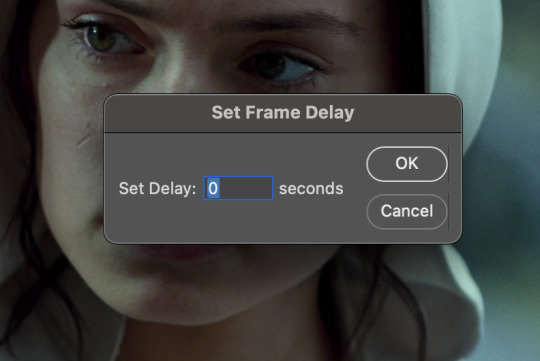
the general rule of thumb for gif frame delay is 0.05 seconds. there are some cases — certain animated movies or video games, for example — where other delays are best, but for the most part, 0.05 is what you want to use (0.05 can slightly slow gifs, and sometimes using 0.04 better matches the clip's original timing. this is really a "train your eyes" thing, and picking the best delay gets easier as you gif for longer). you can set this by typing the number into the text box and then hitting the ok button or enter on your keyboard.
at this point, i’d go ahead and save your file. you can go to file > save in the top bar, or just hit cmd/ctrl + s on your keyboard.
「 making your gif 」
1. sizing
after your frames are ready, the next thing is to size your gif. to crop your gif, press c on your keyboard to open the cropping tool. white borders will show up around your gif.
before doing anything, i would suggest making sure “delete cropped pixels” is unchecked. this will allow you to drag your gif around later if you want to reposition. you can find this option at the top of your screen. drag the borders on either side until you have the area you want selected. mine looks like this:
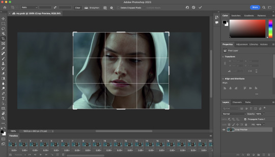
once you’re happy with your selection, hit enter on your keyboard to finalize it.
the tumblr image guidelines require gifs to be 540px across (here’s a post detailing this). to change your gif’s image size, go to image > image size in the top bar. you’ll get this popup:

instead of setting the width right to 540, i’ll be setting it to 544, and then trimming down the edges using canvas size. this makes the quality just a little better, and also prevents any weird borders being made around your gif on the off chance photoshop decides to add them. this isn’t necessary at all, you can absolutely size right to 540, but i just like doing this. if you choose to do this, open canvas size right after you set image size (image > canvas size in the top bar), and trim your width down to 540 and your height down a few pixels as well.
2. sharpening & other filters
sharpening is essential for good-quality gifs. the first step to this is converting our timeline from frame animation to a video timeline. select this little icon in the bottom left of your screen:
this is what your timeline will look like now:

you can use the little slider with mountains on either side to change the width of your frames in the timeline for easier access when editing. now that we’ve got all this set up, we can sharpen! i use this action pack to sharpen my gifs in addition to a few of my own settings (here is a video on how to install actions into photoshop). go to window > action in the top bar if you aren’t seeing the action tab.
i’ll be using the sharper action from the pack. to use an action, select it from the list and press the little play button at the bottom of the panel to apply it.
in addition to this, i usually also add unsharp mask at 50% amount with a 0.5px radius:


there are a few other filters than can be helpful when giffing:
a. add/reduce noise noise (aka grain) can be added with “add noise”. go to filter > noise > add noise.
these are the settings i usually use, but the amount depends on the gif (i don't ever go over 3.5 for the most part):
(if you want a grain effect but moving noise doesn't work for the gif, you can also add a grain overlay and then mess with blending mode and layer opacity until it looks how you want)
reduce noise can be used to remove some of the pre-existing grain on a clip. go to filter > noise > reduce noise. here are my settings:

leaving reduce noise on its own at 100% is a bit too much, so double click this icon and change the opacity (i usually do around 45):

b. gaussian blur if your clip is a bit pixelated, gaussian blur can help with smoothing it out a bit. go to filter > blur > gaussian blur. my settings are 1 pixel radius w ~20% opacity (this changes based on the gif).
3. coloring
time to color! i want you to keep in mind during this section that everyone likes different colorings, and this is just my process! please don’t feel pressured to follow exactly what i’m doing, the best way to find what you like is to just mess around and experiment!
i like to start off with lighting adjustments: brightness/contrast, levels, exposure, and curves.
a. brightness/contrast i usually start out with this first, just because brightening the gif right away helps me start thinking about how i want to color! here are my settings:
b. levels/curves levels and curves can either be used interchangeably or together. i usually use levels to adjust lighting and curves to adjust color values, but i’ll go over using both for lighting as well as using curves for adjusting color values.
for both of these adjustments, i use the eyedropper tools to pick out white and black points. for levels, the top eyedropper tool to the left of the graph is used to pick out a black point. i do this first. use the tool to pick a spot on your gif that you want to be the base for black values. for me, that’s the shadow inside rey’s hood. the bottom eyedropper tool picks white point. use the tool to pick a spot on your gif that you want to be the base for white values. i chose the outside of rey’s hood. make sure you’re doing this on a new levels adjustment layer.
now, on to curves. you can either use the same eyedropper method or manipulate the graph directly. using the eyedropper is the same as levels, so i’ll just go over graph manipulation.
shade lightens as you move to the right along the x-axis of the graph — black is the far left, white is the far right, middle is the midtones. generally, i don’t work with midtones.
i’m going to use levels for this gif’s lighting, and curves to adjust color values. here’s how to do that:
curves can be used to adjust the amount of a certain color in different lighting areas of a gif. for example, i can specifically decrease the amount of green in the gif’s whites. to edit these values, select the rgb drop-down menu and adjust them one at a time. here are my final graphs:


c. exposure this one’s pretty straightforward. the exposure slider adjust general exposure. the offset slider adjusts how dark your dark points are, and gamma correction can be used to lighten/darken scenes as a whole. here’s my settings:

d. color balance color balance is used to adjust overall tint of a clip. this is in general pretty simple, but i do want to point out that using the shadow and highlights tabs in addition to just the midtones can really help. here’s my settings:

e. channel mixer channel mixer is one of my favorite tools in ps, especially for coloring scenes that are a pain in the ass without it. to avoid taking up too much space, here’s a great tutorial covering channel mixer. here’s my settings:


[at this point, i’m noticing my gif is still a bit darker than i’d like it, so i’m adding just a bit of brightness/contrast to fix it. there’s also a patch of blue over one of rey’s eyes, so i’ve used a hue/saturation layer to get rid of that bit and masked it to her eye. i’m not going to go over masking here, but there are lots of great tutorials out there!]
f. selective color selective color can be used to adjust the amount of specific colors within a color. for example, if i were to go into the red tab and take out cyans, the reds would become more red. if i were to add yellows, the reds would become more orange, etc etc. this can be especially good for color manipulation. for this gif, i’d like to make the background more blue, so i’m going to use selective color to do this. here’s my settings:

g. color lookup color lookup uses 3dlut files to remap gif colors (it’s a preset — think instagram filter or something similar). i don’t always use these, but when i do, i almost never leave them at 100% opacity. color lookup is great for giving gifs a film-type look if you want to do that, it’s got loads of different options. here’s my settings (adjustment layer is set to 20% opacity):

atp i’m pretty much done with coloring! i usually end up doing a few extra little lighting adjustments at the end. for this gif, i added some brightness/contrast at +8. i’ve also noticed that my gif’s looking a bit grainy, so i’ve added some noise to lean into it. this is usually the way i fix it, but you can definitely do reduce noise/gaussian blur as well if you don’t want a grainy look.
here’s my fully colored gif + a process gif (fast images warning):


「 saving gifs 」
1. frame rate
one thing you may have noticed is that my gif is looking a bit choppy. photoshop has a tendency to mess with frame delay after gifs are converted to video timeline. here’s how to fix that.
select all of your layers and convert them to a smart object (right click > convert to smart object). next, click on the hamburger menu in the top right of the timeline and go to convert frames > flatten frames into clips. now we need to change the timeline from video timeline to frame animation. click the little 3 boxes symbol in the bottom left corner of the timeline:

go to the hamburger menu again and select make frames (this is the same one you used earlier), then go through your frames and delete any duplicates. the first frame usually needs to be deleted specifically. once you’ve done that, set the frame delay back to 0.05 the way you did earlier.
2. exporting
once you’re happy with how your gif looks, go to file > export > save for web (legacy).
these are my export settings, but feel free to experiment with the menus where i have selective and diffusion selected, different settings work best for each gif. in general, most gifmakers only use selective/adaptive and diffusion/pattern because they generally work the best for tumblr. before saving, make sure your looping option is set to forever:

gif size for tumblr has a 10mb limit. my gif is under this, so i don’t need to make any changes, but if yours is over, you can either delete some frames from the beginning/end of your gif and/or adjust the height of the gif (width needs to stay 540px so your gif doesn’t get stretched/compressed on tumblr, but height is fair game).
here's my final gif!

happy giffing, and please don’t hesitate to send me any questions you have! ♡
#*mine#gif tutorial#tutorials#allresources#usertheos#userzesty#userzaynab#usershreyu#rogerhealey#userabs#userhekaates#usermaria#userraffa#usermorgan#uservivaldi#tuserheidi
360 notes
·
View notes
Text
Tidbit: Placronym Pixelation

So you got this fresh placroynm that you don't want engraved with a sophomoric name? Not a problem. You can reject that stupid shit with a pixelize/pixelate filter.
Photoshop
First, you will have to make two more duplicates of your name text layer, so three text layers in total. One for when it's first displayed, one for the first frame of pixelation, and one for the second frame.
With your first duplicate layer selected, go to Filters>Pixelate>Mosaic..., which is a terrible name for it, but hey, I'm no Photoshop developer. Set the cell size to 11.

For the second duplicate layer, set it to 14.
GIMP
Pretty much the exact same steps as in Photoshop, this time the filter is located under Filters>Blur>Pixelize...


I would suggest right-clicking on the text layer and choosing Composite Space>RGB (perceptual) instead of the default (Auto), or going to the top-right corner of the Layers tab and switching the group of blend modes from Default to Legacy. Basically, doing so will make the semi-transparent pixels as dark as they are in Photoshop, otherwise they will appear too light.


Check out the read-more link below for bonus information on easily animating the name being typed out in Photoshop.
ADDENDUM
Typing animation (Photoshop)
Photoshop's frame animation timeline makes doing this a breeze. First, add a layer mask to your text layer. This will add a white box next to the layer's thumbnail.
With that layer mask selected (click on it and it will be highlighted in the layers tab), use the marquee tool to make a rectangle selection around the text, then use the paint bucket tool to fill it in with the color black. This will make the text invisible until the layer mask is moved.

Go to Window>Animation if you do not already have the animation timeline open. Click on the little sticky note icon to duplicate the first frame. In newer versions of Photoshop, you will probably first have to click on a button that reads "Create Frame Animation", and the duplicate frames button icon is the "+" in a little square.
Making sure you still have the layer mask selected and not the entire layer, use the move tool and arrow keys to move it all the way to the right, revealing the text on the second frame you've just made. Don't move it too far off now.
Move the typing cursor layer to the right as well, except you don't have to move it all the way at the end, only where it will be last seen.
Make the typing cursor layer visible on the first frame, and not visible on the second.
Select the first frame the animation and click on the tween button. This will add all of the frames in between the first and the second one for you. Make sure you only have "Position" checked under "Parameters". For the numbers of frames to add, here's a neat trick for finding the right amount: count the amount of letters in the name. "ZOOSMELL POOPLORD" is 16 letters, so add 16 frames.
Most of the work is already done, though there might be a couple frames that will need some minor tweaks. Just use the move tool and arrow keys again to finetune the layers' positioning.
This is why it was important to not move the layer mask too far to the right away from the end of the text. Tweening the position spaces it out linearly, evenly, so the farther away the end goal is, the more space each frame will use. Thankfully the font this panel uses is mostly monospaced, and I got a little lucky with my positioning, so I needed to only adjust three or four frames. Way less tedious than having to create each frame of animation myself, at least.

To change the frame delay (the time duration each frame takes up) of the newly created frames, click on the first frame you want to retime, hold down the Shift key, and then click on the last frame. This will make a selection spanning all frames in between. Click on the little dropdown arrow and select 0.1 seconds (100 milliseconds).

Here's the original panel:
And here's my recreation:

Here's the PSD, too.
81 notes
·
View notes
Text
Poe's Giffing Tutorial (From One Beginner to Another)
Hey, everyone! So, I've been thinking about this for a while, and decided to finally make it happen. This post aims to be a giffing tutorial that isn't a bunch of technical jargon that nobody except experienced giffers understands. This is for the person that I was when I first started out: someone who wants to make gifs, for free, without having to learn the entirety of a new program. As such, if you're already familiar with the basics, this probably won't be super helpful to you.
In this, I'll cover the basics of actually capturing a gif, the how-to of color correction (though without getting into the nitty-gritty detail of it), some basic text effects, and some more decorative effects like overlays and ~fancy coloring. I'll also show you the program I use to resize gifs.
I don't have a fun quip to lead us into the next part, so, uh, let's just dive in.
Tools*:
A PC capable of handling heavy processor loads (I use a mid-range gaming laptop; it's a little slow sometimes, but it works)
Whatever you're giffing (obviously...)
ScreenToGif (a free, basic screencapture program)
Photopea (a free, in-browser Photoshop dupe)
RedKetchup (a free file resizer/converter)
*Note: These are not the end-all, be-all of gifmaking. They may not even be the best tools for the job! But they're free, they work well, and they're relatively intuitive.
Step 1: Capture your gif.
I'm going to use ScreenToGif for this. The first thing I do is open the program and click Recorder, which opens the recording interface.

I click and drag (or manually input dimensions in the boxes next to the recording button in the lower right corner) to set my dimensions, and then I press record. The red "Record" button will change to a blue square that says "Stop," and a timer will appear in the upper right corner, showing how many seconds your gif is.
Generally, I'll pause the video 5-10 seconds before my desired start time, to give myself a buffer (you'll be able to delete those frames later), start the recording, and then start the video. You'll probably find a system that works for you once you do it a few times.
Once the scene that I want to capture is done, I'll click the blue "Stop" button, and the overlay will close itself. A few seconds later, depending on how long/complex/large your gif is, the program will pop up with a new window where you can edit. Here's what it looks like:
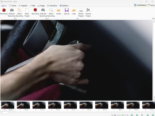
You can do a lot with ScreenToGif, but we'll be using the dead simple stuff today. Click the "Edit" tab, fourth from the left, and this will show up.

"Delete All Previous" and "Delete All Next" are our friends here. Go to the FIRST frame that you want in your gif, using either your arrow keys or just dragging the slider, and select it. Then hit "Delete All Previous." This will make that frame the first frame of your gif. Then, go to the LAST frame of your gif, and hit "Delete All Next." This makes the last frame of the scene that you want the last frame of the gif. You can also use the "Delete" option to delete frames by selecting them with your cursor if you want a more manual option.
Now you have your raw gif! Go to the "File" tab, the first one on the left, and select "Save As" from the menu. You want to make sure that it's saving as a .gif file, not an .mp4 or .apng --- you can check this up at the top. Don't worry, though, as .gif is the default, so unless you change it, you should be golden. Select whatever folder you want to put it in, name it, and save it.
You could absolutely stop here. It is by no means required to color your gifs or slow them down or any other number of things associated with giffing. But if you want to, here's how I do it.
Step 2: Edit your gif.
Head on over to Photopea. You'll see this:
What we want is the "Open From Computer" option. Click it, and your File Explorer will show up. Navigate to whatever folder you saved your gif in and select it by double clicking or clicking once and hitting "Open."
It'll open in a new workspace that looks like this.
You may be saying, "Gee, Poe, that sure looks a lot like Photoshop!" Yes, it absolutely does. If you're familiar with Photoshop, you will most likely be able to find your way around Photopea just fine, and can probably go from here. But if you're not familiar with Photoshop, here's the basics.
First thing's first: gifs are frequently pretty fuzzy/blurry. Luckily, sharpening them is easy.
Select all your frames (the list on the right with all the numbered layers) by clicking one end, scrolling up/down, holding Shift, and clicking the other end. Then go up to the tabs and do Filter > Sharpen > Smart Sharpen. This will automatically sharpen each frame using a percentage; the default is, I believe, 150%, and this is usually what I use because I am fundamentally lazy.
If you don't select all your frames, only the one that you're currently on (the one highlighted in a lighter color) will get the effect applied to it. This goes for basically anything you do, so it's good to get in the habit of selecting all.
Now that it's sharpened, we can color it. Go up to the tabs again, and go to Layer > New Adjustment Layer > [whatever you want to adjust]. Most commonly in Escape the Night, you'll have to adjust brightness, because there's a lot of dark, moody scenes; Season 3 is also especially yellow/orange tinted, so you'll probably want to color correct it, too, using the Color Balance adjustment layer. This is a total guessing game based on the exact scene you're doing and my method is just selecting random things and adjusting sliders until it looks good (remember: fundamentally lazy). Honestly, I'm not an expert in coloring gifs, so I won't pretend to be — especially since people can and do write entire posts just dedicated to it. For this gif, I'm just lightening it a little.
And if this is all you want to do — no text, no effects — you're done! Go to File > Export As > GIF. It will take a few moments to load, so don't panic when your page freezes. A new window will pop up that allows you to do things like set looping, time, etc. but you can also just "Save" and you're done!
But let's say you want something fun. Maybe you'd like to overlay a quote or make it a cool color. If that's the case, continue on...
Step 3: Make your gif shine.
Three parts in this: text, fun colors, and overlays. You can combine these three to do some awesome things, and they're all very simple to do, once you know what you're doing. Think of them less like steps and more like a mix-and-match deal. You can use one, two, or all three!
So, here we go.
Option 3a: Add some text.
The easiest option of the three, this one works exactly like you think it does. The uppercase T symbol on the sidebar will create a new text layer where you can type something and set a font, size, and color.

I'll spare you the lecture on typography that I could give you — you can find better ones than I could make. Generally, though, you have a decorative/display font for headings and emphasis, and then a different, more generalized font for subheadings and other things. In this, the display font is Heavy Heap, which was used on the Season 3 tarot cards, and the general font is a relatively generic serif font.
(Sidenote: you can load fonts into Photopea! Just go to a font website like Dafont, download the font you want, and then open it as you would any other file by going to File > Open and selecting it from your files. You should get a message that says "Font [Your Font Name Here] Loaded," and then you'll be able to use it in your design. That's how I got Heavy Heap in there.)
You can change size and color with these, which will show up at the top when you select the text tool. Keep in mind that if you're making changes after you type something out, you will need to select (highlight) the text you want to change — it won't do it automatically.

I will admit that Photopea's text editor is not the cleanest, simplest, or nicest to use, especially at first. I came from Canva where it was much faster and easier. The downside, of course, is that Canva is highly limited with what you can do.
There are also ways to warp the text, change the blending, and do outlines, but I'll leave that for another time as to avoid making this any longer than it already is.
Option 3b: Make it a cool color.
You have a couple different ways to do this. Probably the most intuitive is to go to Layer > New Adjustment Layer > Photo Filter. Select the color box, pick the color you want using the picker or a hex code, select your desired density, and click OK. Boom, color over your gif.
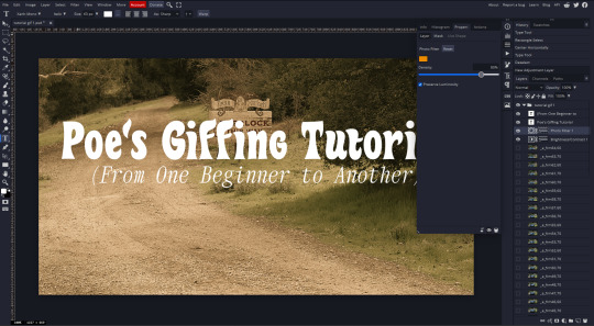
It defaults to this vintage-y orange, but you can pick whatever color your heart desires.
However, I usually use a different method using Gradient Maps. This is also pretty easy; Layer > New Adjustment Layer > Gradient Map. If you leave it black and white, by the way, you get a B&W gif (you can also just select the Black and White option in the Adjustment Layer menu). Click on the gradient, select the white square on the right side of the gradient line, and then select the square down at the bottom of the window and change it to whatever color you want.

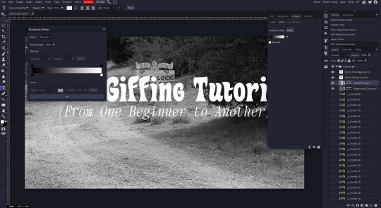
For this gif, I'm leaving it B&W.
(You can have a lot of fun with gradient maps. Play around with them!)
Option 3c: Overlay another gif on top.
Ooookay, so, this is the most advanced and tedious of effects to do (at least of the ones documented in this post), but it's worth it, I promise. For this, you'll need at least one other gif. I usually use a base gif that's relatively neutrally colored, oftentimes B&W but sometimes just faded or pastel, plus one (or more than one) colored, brighter gif. These are, of course, just guidelines — combine whatever gifs you want. The only real requirement, per se, is that they have the same amount of frames. If they don't, it'll look weird. (But if you do end up with two gifs that have different amounts of frames, you can delete the difference right in Photopea, so I don't stress about it too much.)
You also generally want to add text after this step, so if you're planning on doing this, save the text for last.
First things first: color your gifs the way you want and then save both of them. Then re-open them both in Photopea. Yes, this is annoying. I did say it was tedious.

So now I have both of them in my navbar, labeled as "tutorial base" and "tutorial overlay."
Go to your overlay gif and right-click on the gif folder. This is the top layer with a little arrow and folder icon next to the name of the gif.

Select "Duplicate Into" and then pick your base gif in the popup. In my case, it's named "tutorial base."

Now you'll click over to your base gif, and you'll see that your accent has been put on top of your base. Now you get to have fun with blending!
Right click on the overlay gif's folder again. Then, select Blending Options, which is the first menu item. It'll bring up a popup with all sorts of options for styling your layer.

The default setting is Pass Through, which is what we see here. If you want, you could just change the opacity to get your desired effect.
You could also play around with blending options such as Overlay, Color Burn, Lighten, and Screen. Every gif is different, and every gif will look different with different options, so experiment and see what looks best! You may have to go back and recolor it a few times, so I recommend just keeping the project open in your navbar for easy access.
For this gif, I think I'll go with Darker Color at 67%.
One last step, and then you're done with blending!
Go to Layer > Animation > Merge. This will merge each frame of your animation (the gifs) with each other, meaning that they'll play at the same time. If you forget this step, as I do frequently, you'll go to save your gif and find that it plays as a sequence.
Once you've merged your gifs, you can add texts, more effects, PNG overlays, whatever you want! Congrats! You did it!
Step 4: Resize your gif (if necessary).
Maybe you've made a gif, and it's beautiful, and it's amazing, and you wanna show everyone...but it's five million megabytes and you can't send or post it anywhere. Tumblr's max file size is 10 MB, while Discord's (standard) max file size is..7 MB, I think? Either way, if you try to upload something bigger than that, you'll get an error message and the familiar taste of disappointment.
Never fear, Redketchup is here!

This is Redketchup, and it's super simple.
Go to "GIF Resizer" under Animation Tools. Upload your gif, then scroll until you see the Resize GIF section. Input the percentage you'd like to reduce it by (presets are 25%, 50%, and 75% smaller, but you can set it manually, as well).
This is also the step where you can slow it down if you desire if you didn't do it in Photopea — it's in the next section down. Set the speed, if you'd like, and then go down to the bottom and hit Download.

It'll take you to a preview tab where you can check if your gif is small enough. If it is, hit Download again up in the top left, and that's that! Go share your gif with the world!
Conclusion:
Thank you for reading! I am by no means an expert gifmaker, but I want to spread the love and give other people the option to do it. I wouldn't know any of this stuff without the people who taught me, and I'll put a list of tutorials down at the bottom that I referenced when I was first learning to make gifs.
At any rate, if you use this post to make a gif, feel free tag me or send it to me so I can see! And for those of you who are on the fence about learning or starting to gif...
Do it. I double-dog dare you.
:)
References:
Blending Gifs by @the-mother-of-lions
Photopea Coloring Tutorial by @heroeddiemunson
Merging in Photopea by @bellamyblakru
And, though not a specific reference, I frequently browse @usergif for inspiration (they have tutorials there, as well, but I haven't checked them out yet).
#gifset#giffing#gif tutorial#how to gif#how to make a gif#photopea#escape the night#etn#I wrote this instead of socializing at my family's thanksgiving dinner#because that's just who I am
143 notes
·
View notes
Note
hello! im a newby gimaker and i want to follow your tutorial on sharpening but i dont know how you got to the photoshop page you started from where it looks like a video timeline. can you tell me how you got there? <3
Hey!!
Welcome to the wonderful world of gifmaking <3 yes i can lead you through to that point. I have a mac so this might look different for you, but all the steps stay the same - I just shifted from windows to mac so i know this xD
I'm going to show you how to do this on this gif:

I prefer to use screenshots for my gifs (I also don't know how else to make them), so I use Mplayer for that. I used to use MPV player but that stopped working with my new computer system.
First, you want to make sure that you're using a high-quality file. If 1080p is available to you, use 1080p at the very least. This will make sure your gifs are crisp and sharp.
Open your file with Mplayer. Then find the bit that you want to gif. I sometimes search forward by frame by using the ">" key. Once you're at the start point of your desired gif, pause the video. Then, Cmd/Ctrl + Shift + S to start screenshotting. The video will start to play slowly as the screenshots are captured. (They go to the desktop automatically but you can change that in interface settings).
The rest of the tutorial is under a cut:
Once you get your screenshots, you're going to go Photoshop. File > Scripts > Load Files Into Stack.

You're going to get a dialogue box. Click Browse and load the screenshots that you want. This is what that looks like when you finish:
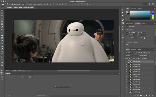
Next, you're going to crop your gif, using the crop tool. You can press C on your keyboard for this or use the tool with this icon in the sidebar.

For this, I'm using an aspect ratio of 540 x 400:

Click that checkmark to crop. Once you do, we're going to resize the image. Use the Cmd/Ctrl + I function to bring up this box. For tumblr gifs, you want to change the width. The height doesn't really matter but if the width doesn't match up, Tumblr is going to fix it for you and it'll look funky. Per row:
1 gif , we use 540px
2 gifs, 268px each
3 gifs, 177, 178, 177 px
We're just doing one, so I'm using 540px.

Now, you want to make sure you can add the timeline. In the top bar, go to Window > Timeline
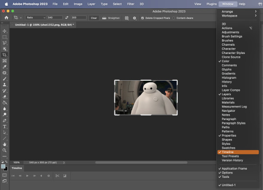
This will bring up the timeline.

From there, click "Create Frame Animation" (you might have to press the arrow in the timeline bar first.)
It's going to look like this:

We're going to use those three lines in the corner of the picture above. The first option we'll select is "Make Frames From Layers"
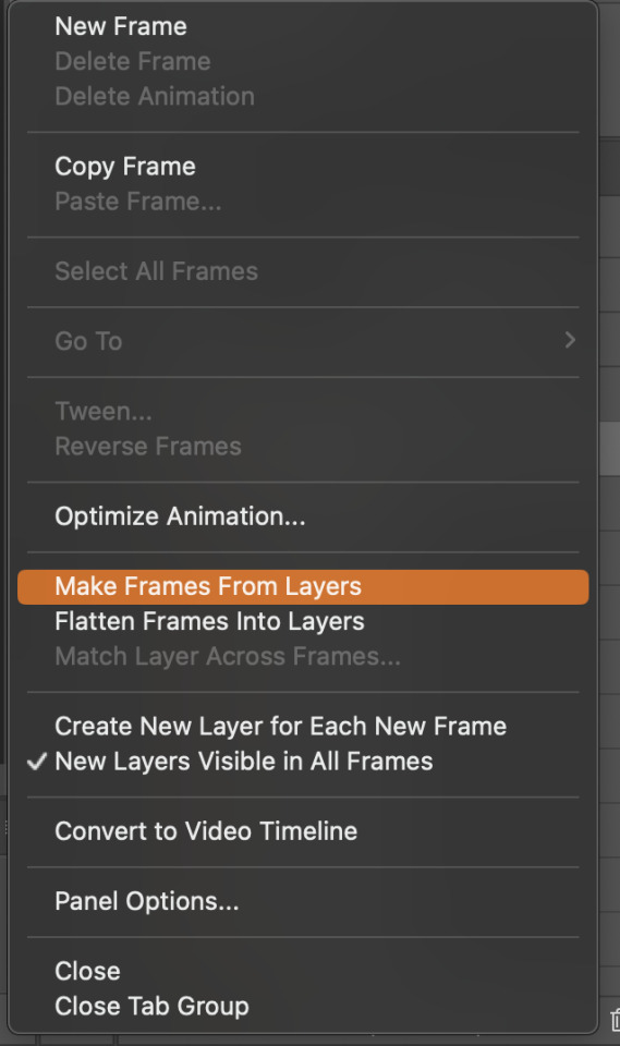
That looks like this:
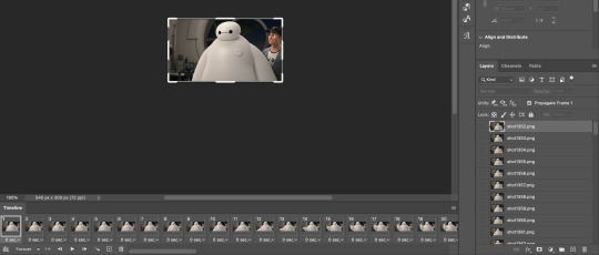
Now, when these load in, you may notice that they're all in reverse. To make them go back in order, we're going to go back to that menu and click "Reverse Frames."
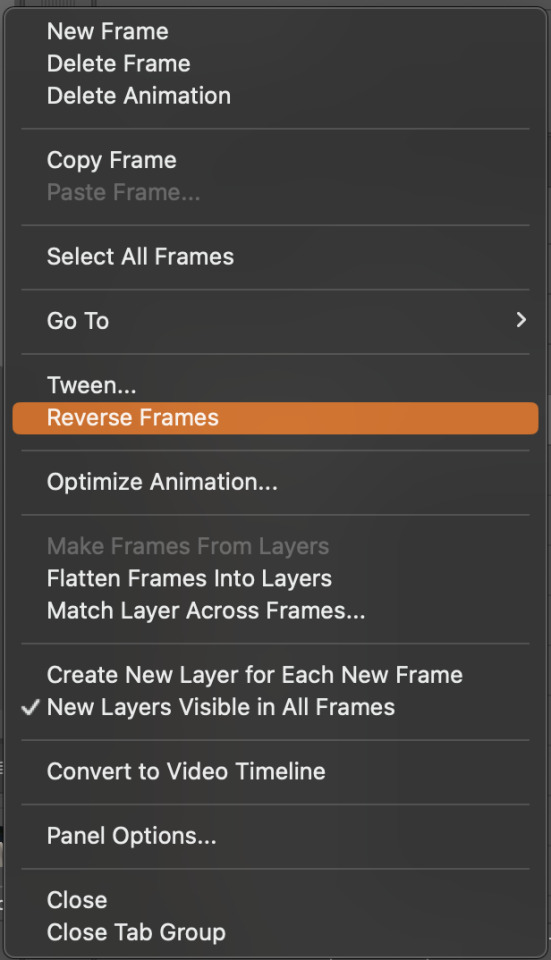
Then, in that same menu, click "Select all Frames." We're going to change the animation speed. You want to make sure you have the first frame selected. We're going to click the arrow next to the "0 sec"
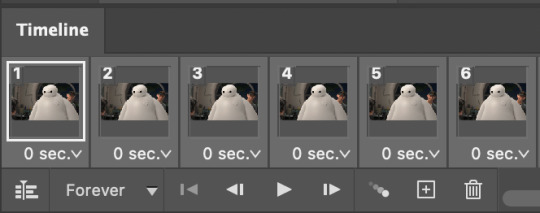
When you click that, it will give you a menu. Click, "other..." You should get a dialogue box that says "Set Frame Delay", just like the one below.
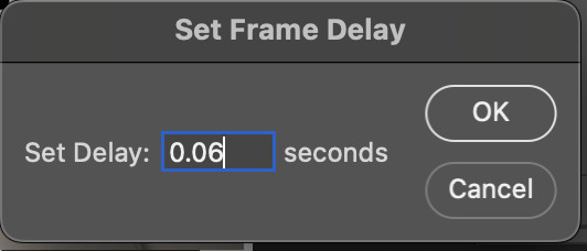
You want to use anywhere between 0.05-0.1 seconds. I find that anymore more is just too slow, so I prefer 0.06. This is fully changeable at the end of my sharpening tutorial, and you can use what you want, but that's what I prefer.
When you do that, it'll change the frame speed of all the gifs.
Now, go back into that little menu, and click, "Convert to Video Timeline."
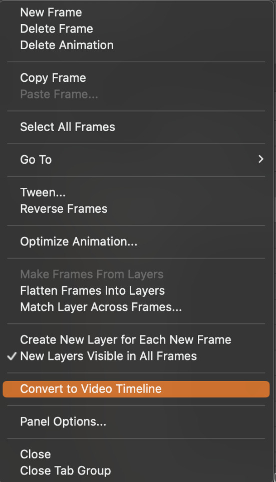
This is what it'll look like:

Now we're going to select all the layers in the right-hand pane. Once we do that, right-click and select, "Convert to Smart Object."
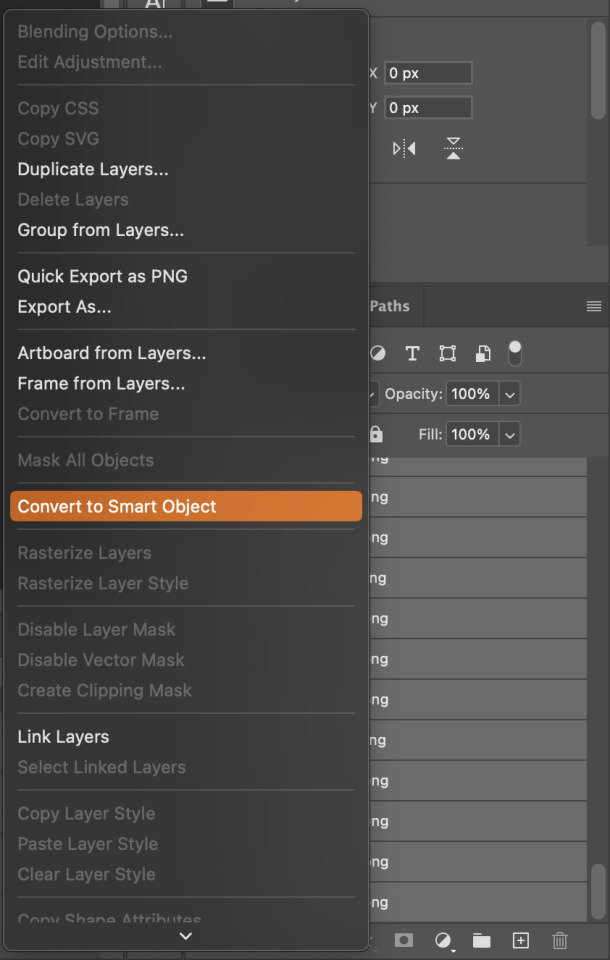
And you're there! Now you can use the sharpening tutorial to your liking.
Pro tip: Make an action with all these steps so you don't have to do them by hand with every single gif you make.
Hope this helps and it wasn't super long winded. Let me know if you have any questions <3 Happy giffing!
#zee answers#zee's tutorials#sharpening#gif creation#tutorials#gif tutorial#photoshop tutorial#resources#ps help#dailyresources#userphotoshop#completeresources
44 notes
·
View notes
Note
sorry if this was has been asked b4 but how did you do your Raika Hojo pixels/blinkies? I wanna learn how to do ‘em :D

og post: https://www.tumblr.com/chichirid/767910269177528320/raika-hojo-pixels-and-blinkies-20x20-and-30x30
this is a tutorial on photopea, and its kind of vague so feel free to lmk if you need specific steps rather than a general process / if you dont understand anything :3

hiii so for the blinkies i used this dotted border, and this rectangle border i made (dont credit me, i traced it from blinkie cafe 😳)


i forgot which font i used.. sorry!! but i found a sampler online and typed "special for princess" and "raika hojo" then screenshotted it like the image below. then i removed the bg and was only left with the black text. then in photopea i selected the pixels of the layer so it only selected the text, and then i very carefully traced over the letters using the brush tool. (btw i colour-picked the colours from their logo image). i used the screen layer setting & a stroke setting of one pixel.
i just used a cursive font and tried to imitate a ribbon myself through colouring ><

for the raika pngs i screenshotted some sprites then copied them in. idk how to use symmetry so i placed one png at one side of the blinkie, and found what X coordinate it was at. (ie 205px) and then subtracted that from my blinkie template's total X width (730px). then manually typed the X coordinate of the other png based off that formula (so to get a png symmetrical to an image at 205px, the X coordinate of the png would be 730 - 205px.)

for the flashing dots i made two frames:


then i combined these in ezgif "gif maker". the lower the delay time the faster the gif will go.
to make these two frames i used that earlier dotted border. essentially i used a gradient map on the dotted border's layer where the black was the red colour used and then the white. (like this image below as an example, both colours are set at 50% and 50% to get an even split). this makes one frame. to get the other i just clicked "reverse gradient".


to make the pixels, i saved some raika pngs using the enstars wiki, and then opened a new canvas in photopea with the dimensions of 30x30. (30 width, 30 height). then i opened the pngs and sized them how i wanted. important for this step: CLICK ENTER ON YOUR KEYBOARD ONCE FINISHED SIZING! this will make the pngs go blurry rather than pixelated, which will result in a more legible image when viewed from far away. its really up to you but i like making my images blurry. example:

on the left i havent hit enter on my keyboard, on the right i have. save this basic png without the background layer
then just "ctrl + alt + t" again and either tilt the image, size it up, or use the arrow keys to move it sideways or up. save this moved image and once again i used ezgif gif maker to combine the two frames and make a pixel. oh also click "dont stack frames" when making the gif. here i moved the basic image 7 degrees to the left and used a delay of 30. hope this helped ^_^


4 notes
·
View notes
Note
How do you make gifs?
Hi! The process I use is done completely online using several websites (which will be attached here). In fact my process probably makes things a bit more complicated than it really should but tbf I don't know how else to do it pff
First of all, you'll need to download whatever you want to make gifs from in a mp4 format. If you're grabbing a video off of YouTube there are plenty of YouTube to mp4 websites available online. However, if you were to download from a different website (such as Newgrounds, for example) then you'll likely have to install a browser extension to download videos. For example, since I use Firefox I use the Video DownloadHelper extension.
Once I have the video I need I drop it into Canva, though any video editing website/software works. All you need is a program that allows you to crop videos and export them in a gif format. If not then you can export the cropped video in an mp4 format and use a website/program that allows you to convert mp4 files to gif. I recommend the following sites: Ezgif CloudConvert FreeConvert
However, I'm going to use Canva for this tutorial since it's how I work.
First of all, you gotta upload your video to Canva (it will appear beside the blank 'canvas').
Once you've uploaded the video(s) you want to make gifs with, all you need to do is drag and drop them onto the blank canvas. It should automatically fit it to fill the whole canvas if you drag the video to the edge of the canvas instead of the middle.
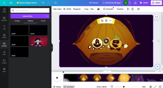
All you have to do from here is figure out which part you want to crop out! The great thing about Canva (and some other programs, though not all) is you can search through the timeline frame by frame with the arrow keys to make sure you get the exact part you want (just make sure you click on the timeline before you start touching the arrow keys, because if the video is still selected you'll just end up moving the video across the canvas pixel by pixel).
Once you've cropped out the part you want, all you have to do is export it as a gif. You do this by going to 'share', 'download', and choosing gif under the 'file type' dropdown.
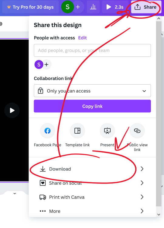

(Once you select the gif option, don't worry about adjusting the size of the video.)
Once you have your gif you can stop there! Unless you want to crop the gif to focus on a specific character or section of the scene, for example. If you plan on making a gifset just remember to keep the same aspect ratio for each gif.
I use Ezgif to crop my gifs. It makes the process extremely simple and has several presets for the aspect ratio too!!
And yeah! That's about it! I hope this tutorial makes sense,, it's my first time making one qwq but if you have any questions just lmk!!

11 notes
·
View notes
Note
Hi, i have a question, how did you make the animation in Photoshop? It's awesome how you made animation, I want to try my hand at animation now too 😎👍
(sorry for my bad English, it's not my first language 😅)
I'm not good at explaining, I'll try to show how I do it a little bit, but if you really want to learn, I advise you to look it up on Youtube, as that is how I learned. I'll put my quick explanation under the cut to not make the post too long.
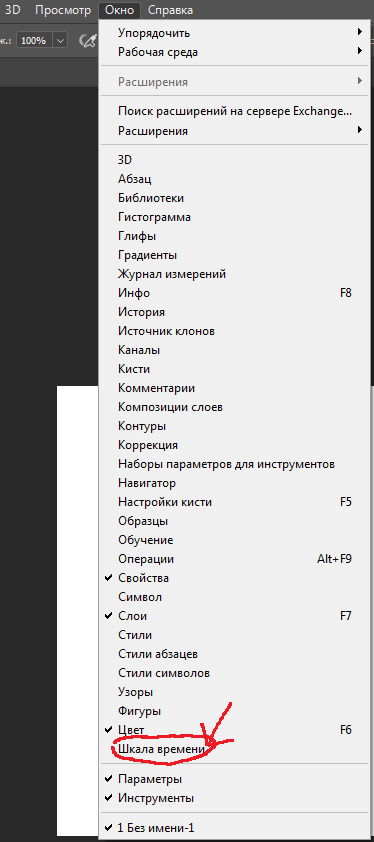
First, in Photoshop, go to the line at the top of the screen and press "Windows", at the bottom there should be a button saying "Time Scale" or something like that. I don't remember what these are called in english, as my Photoshop is in russian. Then, a block of grey will appear at the bottom, and you should click the long button in the middle of it, it should say "Create time scale for video" or something similar.
See the three small lines in the top right corner of the video bar? Click it and set your FPS - Frames Per Second. If you decide to change your FPS after making video layers it gets a bit complicated, I keep forgetting how to do it myself, but I think I saw a Youtube tutorial for it too.
Now that the FPS is set, go back to the bar at the top, go to "Layers", then to "Video layers" and to "Create empty video layer". That's the layer you can animate on, it has frames. You can also use regular layers, to make backgrounds, or still frames.
There are a lot more things I didn't talk about, but mainly the "Onion Skin" that you can turn on or off in the little three-line menu where the FPS is, and being able to move from frame to frame with the arrow keys on your keyboard. To play the video, just press the triangle left and up to the block with blue and purple layers. Saving is harder, I only know how to save gifs, but you can save your project as a regular PSD file while you figure out other formats, it saves all the layers.

This is not really a tutorial, again, there are better explanations on Youtube, I just didn't want to answer this ask with "Look it up yourself". Overall, Photoshop is really not a good program for animating, but I have nothing better, so it works.
6 notes
·
View notes
Text
Styrax Dev Diary #3: Me and U(I)
Back during the first iteration of Button Man-- back when it was strictly a point and click adventure game via Adventure Game Studio-- the UI needs were fairly 'find and replace'. Point and Click Adventure audiences are not averse to change per se, but over the 40 year lifespan of the genre, some standards were expected. A semi-diegetic inventory screen which swipes into and out of shot, a cursor which changes shape or accompanying icon according to context, and a dedicated text description area for showing the names of objects/characters the player's cursor hovers over. But since the beginning, we also knew we wanted combat in Button Man. As a new team, the combat existed in a sort of theoretical space, which we would 'get to when we get to'. Pretty quickly, we got to it. So we started with a semi-turned based system, with icons surrounding the player which you would press via mouse click. Punch/ Block/ Use Item. But our ideas started to flow, and the combat became more interesting and intricate, but also became more... unrelated? It's one thing to marry Point and Click trappings to a modern combat system, but its another to require a whole new control scheme and frame of mind when switching between the two modes. But how to solve this combat conundrum? Coincidentally, for reasons I may get into another time, this moment of head scratching was followed by the first major shift in development: Side Scrolling.

The place where games are (sometimes) made You see, also at the start, the story and thematic elements were pretty set-in-stone. But what we did not have was a standardized art style. Much of the early artwork was strictly practical; a bench was a bench, there was no specific style applied. The breakthrough was the decision to establish an old pulp-comic style, in the image of Smilin' Jack and TinTin. With that style, it began to make sense to change the visual angle a bit, which in turn made a restricted horizontal movement style make more sense.
With that, we realised it also made more sense for the player to explore the world a bit more directly, via keyboard controls. WASD/Arrow key movement would add a sense of tactile immersion (you know, as far as these things go with a keyboard and a named character on screen).
And with THAT revelation... we arrived at the obvious answer for our combat-- Beat 'em up side scrolling. It fit perfectly with our protagonist, Bruce McKenzie, who is a former junior boxer and all around tough guy, and comics have no shortage of "BAM", "POW!", and "SMACK!" images called to mind. With a change to artwork and keyboard controls, the migration to a side scrolling adventure game inspired by point and clicks was complete.

Original Bruce, followed by the first pass at a comic Bruce.
Which brings me to the present moment. The road to the current look and feel was long and winding, as the Lead Designer (me) learned 3 separate engines during this time and spent a good portion of the last year trying to catch up to our Lead Developer's abilities and knowledge of Unity. I'm happy to report that I am competent and comfortable in the Unity environment now, but that means I'm now sweeping up after myself in the wake of all the education. So many factors and components were created as temporary measures; placeholder dialogues, placeholder location teleporters, placeholder animations, and placeholder UI. All of these components have had their own evolutions and iterations, as I learned what we are capable of producing. We now have an elegant character teleportation system, and excellent Dialogue Manager which is overloaded with functionality, and now its time to fully shift the UI away from the Point and Click to one befitting a side-scroller.

what a lovely gait
First and foremost, our artist, Sam Mameli, worked hard to make the locations look great-- lets not hide them with bulky, persistent UI elements! Today I am creating the animations to hide away icons when not in use.
We've also removed the Description bar from the bottom of the screen, which tells the player who or what they are about to interact with.

Instead, the interactable which the player is about to activate will animate or highlight, allowing the player to plainly see that they are going to speak with a character, for instance, without revealing their identity.
Next up, I'll be shifting our dialogue box from the wide format, bottom of the screen style, to one which emerges from the right side of the screen, creating a square on the left side of the screen in which to center the conversation. This means that the camera will have a clean, unobstructed view of the characters and the backdrop.

(The background artwork is outdate in the above image, but you can see the UI components which are about to be updated)
I hope to finish this all up in the next few days, so that our artists can go in and replace the placeholder artwork sooner than later, bringing Button Man one step closer to being Gamescom ready!
2 notes
·
View notes