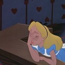
#character design goals tbh
Explore tagged Tumblr posts
Visit Tumblr Blog
Explore Tumblr blogs with no restrictions, modern design and the best experience.
Last Seen Tumblr Blogs


Fun Fact
There were a total of 171.5 billion posts on Tumblr in 2019.
Text
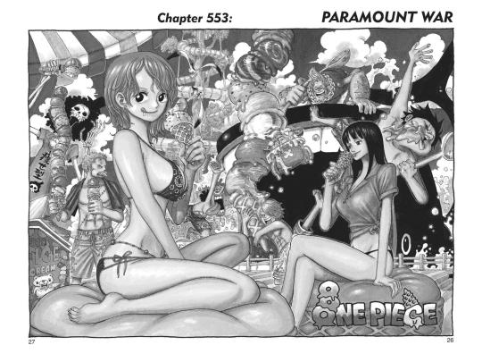
#one piece#sanji#black leg sanji#everysanji#summit war saga#ch553#ft. luffy#ft. zoro#ft. nami#ft. usopp#ft. chopper#ft. robin#ft. franky#ft. brook#thinking abt that one blog that is kinda going around rn does it hate/love women or whatever#and even tho as of queueing this i havent seen op on there i dont think you could do a hard and fast yes or no for op#since i think there are a number of women that are loved by the series and oda does actually give women diverse body types#and not all of the good women are stereotypically attractive (lola and charlotte come to mind whenever i think about this)#and a lot of the women do have established goals and wants and needs that are validated through the narrative#even pudding is a well written character tbh <- needs to reread wci dont ask me to go into details quite yet#but then you look at some of the other character designs. and how some characters do just fall flat#or arent well written. given that its such a long series though that is so expected and it holds up a lot better than say...#naruto. or bleach. in this regard but i wish we did get more fights with nami and robin sometimes u know.#i do really enjoy the ones we get and i'm excited to get back to wano for robin's fight with black maria#bc i did see some screencaps from that and ik fights arent the only thing to showcase a character's worth#but this is a shounen series so to some extent fights are a staple of the genre.#idk where im going with this its 10pm for me and i'm very tired t-t#i'm so lighthoused out. and they're redoing the roof on my house this week which is so augh
30 notes
·
View notes
Text
the grip these had on me as a kid... actually peak. book covers that instantly grab your eyeballs if you were a small child searching for good shit at the library


#goddess girls#i still think the character designs slay like athenas owl like face proportions. its obv not aiming to be historically accurate#the stylisation is so good. i should draw fanart now that ive skills i didnt have as a kiddo#also i think the way curly hair is drawn here definitely influenced how i drew curlt hair for a long ass time#like this was art goals. still is in a way tbh now that i can appreciate it with a more learned eye
51 notes
·
View notes
Text
my desire to draw the cast in an increasingly different way than theyre designed in canon because its fun to play around vs my desperate desire to be as canon compliant as possible
#jax is the most extreme ive gotten and i cant tell if i want to push it further. w any of them#i mean i could just experiment sometimes and draw them how i want to draw them in a given moment#cus tbh consistency is irrelevant..#but also i get finicky . i looove when other ppl play around but whenever i try to#i get hung up on the fact that i dont actually know what the end goal is for the design and scared of changing something#in a way that will bother me. and then i just draw them how i always draw them#i get worried abt accidentally imposing rules upon myself so much that i impose more arbitrary rules on myself#but i wanna play around...#i also LIKE to test the limits of a characters already existing character design#and get worried that ill change smth or change smth too much that prevents me from doing that. urggg#rn im rly just unsatisfied w how i draw pomni in particular. idk why but it just feels like smths missing...#i mean its not like i hate it and i still like drawing her. but i need to change smth and i just cant place what...#anyway. whatever . shoots a psychic beam
15 notes
·
View notes
Text
I finally finished Dungeon Meshi!!! Very fun read and amazing charaters!! The hype i have for the anime now is unreal!
#dungeon meshi#im talking#i have so much to say...but idek where to start#delicious in dungeon#Im gonna put spoilers in the tags so :) warning ig#delicious in dugeon spoilers#EVERYTHING With Laios tbh he is a Himbo through and through#like kind of heart dumb of ass and strong as hell🥰🥰🥰🥰🤤#he was cute at the end with a bit of a tummy#Ryoko Kui just played D&D with herself for 97 chapters but damn what an phenomenal story she told#All the characters felt so fleshed (lol) out and had goals and fears of their own#Senshi was another favorite of mine🤤🤤🤤🤤 need that man ASAP#I want Senshi so bad-----oop who said that :O#Marcille was also very cute and i liked her motived#her final boss dress was v cute i liked it a lot and i wanna draw it#Chilchuck🥺🥺🥺🥺 hes my dad now actually. the dad who left for milk but got a new family ig#AND IZUTSUMI!!!!! MY GIRLIE!!!!😍😍😍 shes so adorable ugh i love her.#OVERALL: this was one of the best series ive read in a while!!!#10/10 i recommended!!! amazing art. amazing story. fantastic charater designs!!! yup!#I also forgot to mention Laios curse being that monsters wouldnt get near him too😭💔💔 im sorry king
14 notes
·
View notes
Text
Belphagor character critique and redesign
These redesigns are based on Vivs original intentions for the seven deadly sins. That being circus themed princes of hell.
Do I think I’m a better designer then viv? Yes.

Rewrite/world building ideas:
I think swapping Lust and Sloths roles in hell would be smart, with lust [or greed tbh] having the healthcare systems/medicine and Sloth having the innovation/technology.
Sloths ring would be the least hellish as she wants to focus on comfort and efficiency. Lower classes would be the means of keeping the comfort, but the ring is far easier to live in then any other. It's also the most progressive ring when it comes to rights, equity and other societal factors. It isnt much, seeing as it is hell though

I'm fascinated by the sin of Sloth. Sloth and Laziness is so misunderstood by society. Often "laziness" is often labeled on people who are disadvantaged, disabled or simply have different values for cleanliness or life goals.
For a different idea on what laziness and sloth is, I def suggest looking at those "free home cleaning" videos.
Also the original [christian] idea of the sin, sloth was inherently anti progress and innovation. Chrisitans didnt want society to progress, they didn't want life to become easier or "lazier".
So thats some food for thought.
#vivziepop critical#helluva boss critical#hazbin hotel critical#vivziepop criticism#helluva boss criticism#hazbin hotel criticism#helluva boss redesign#impperfect art#impperact critiques#hazbin hotel redesign#redesign#concept art#character design
180 notes
·
View notes
Note
Sorry to set discourse on your doorstep, but I’m curious: How do you feel about genderbending characters? I’ve seen some people say it’s transphobic but tbh I’m not totally sure if I agree. What do you think, if you don’t mind my asking?
Genuinely don't think gender bending is transphobic and I think coming at the idea of gender bending in the most bad faith way possible is the only way u can really say it's transphobic. Gender bending characters is like....a time honored tradition among fans and it's fun to design someone with the opposite presentation in mind. Like, what stays the same? What changes? How can I keep this recognizable while still showing the character is different in some way or another? These are fun design ideas and goals and it's only if you rigidly subscribe to the idea that gender and sex are the same does that become an issue. like, I guess I can see how it can potentially be transphobic, but like? I feel like it does far more good in terms of making people wonder about gender expression and playing with it? Like, does my Big Macintosh comic count as gender bending? I took a pre-established character and designed her to be a trans woman, and I thought about what that might look like should the character go in that direction. And I've gotten tons and tons of heartwarming comments talking about how much that comic helped them! I'm a trans person, I think we should be doing more fun play with gender and shit.
#my posts#asks#anon#I'll reread this in the morning to see if i said anything dumb i don't agree w when im awake
1K notes
·
View notes
Text
Apparently unpopular opinion, but what I can judge from the screenshots we got today, the Capital is not just St. Petersburg, it’s more of a melange between St. Petersburg and Moscow. (Tbh, we got just one shot of the capital, so any opinion here is not really objective, but whatever)
Okay, so there is this:
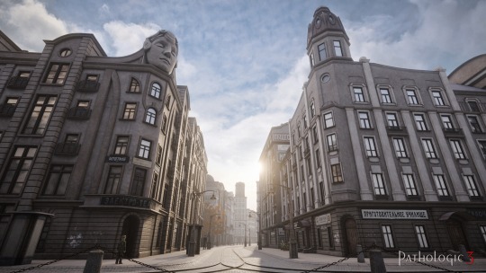
My first thought was “wow is that inspired by Nevsky or by Tverskaya?”. (i. e. Nevsky Prospect in St. Petersburg and Tverskaya Street in Moscow). Consensus on Twitter is that this photo stinks of Nevsky vibes, however, I would like to point out several things, e. g. there are no sunny days in St Petersburg from architecture of the two Russian capitals to game design decisions made to create an atmosphere of a certain time period.
1) Architecture
I recall some people seeing the picture above and instantly suggesting Nevsky as an inspiration behind. I would like to point out, especially to the people who’d never been to either of the cities, that Moscow and St. Petersburg partly resemble each other (dear people of St. Petersburg - I know, sacrilegious of me to compare you with greedy Muscovites, no I’m not sorry).
Moscow is not only the Seven Sisters and modern skyscrapers. Petersburg is not only 200-300 y.o. buildings. Both cities underwent major changes during 19th and 20th centuries, both cities eventually adopted a somewhat similar style, a mix of late empire (1910s) and early soviet rule (1920s-1930s). Moreover, in many cases, these are even the same buildings, with a ground level from say 1913 and other floors from e.g. 1927. I’ll do you one better, if you compare historical districts of major cities of former Russian empire (e.g. Kyiv or Minsk), you’ll see the same thing. Yes, they’re not identical, but you can clearly see this specific architectural style of 1910-1920s.
Coming back to our screenshot above, I definitely can see Nevsky Prospect influence. However, when I saw those little decorative towers, they immediately reminded me of Tverskaya. I did some digging, and hey, there is actually something similar there:
Yes, not identical, but again, imo design of the Capital is done with goal to remind you of something you saw, not a copy, but close enough to understand the influence, to get the atmosphere of the city.
2) Historical aspect
Okay, from now on it’s my deluded gibberish, but hear me out. Considering the technologies presented in Pathologic (antibiotics, that massive ass artillery gun from P1 which honestly suspiciously looks like Schwerer Gustav), the game can be placed somewhere vaguely in 1920s-1930s. Taking into account what kind of language characters speak (for instance, Dankovsky speaks in a very specific manner, such Russian is more found in literature, than in actual spoken language. The same applies for most of the Utopians), lack of soviet-specific abbreviations and vocabulary, we can say that apparently October Revolution never happened. To be honest, Daniil wouldn’t survive the Revolution or early Soviet rule (read about repressions against intellectuals or the infamous Philosopher’s steamer)
You can argue: “but hey, isn’t Pathologic just a theatre play where such details don’t matter?”. Yes and no. Because it’s a theatre play, many otherwise important details are omitted. However, developers drop hints here and there, to set the tone and visually convey what kind of country and society they’re talking about. No offence to non-russian-speaking fans, but I’m still convinced that IPL still considers russian-speaking countries their primary audience. This leads to certain design choices, including architecture of the Capital.
In my opinion, IPL had to mix visuals of Moscow and St. Petersburg in order to convey a certain vibe. You see, since it’s somewhat suggested that revolution didn’t happen, developers have to utilise aesthetics of 1910s culture to show that we are talking about “Russia” from works of Gorky, Chekhov, and Bunin. At the same time, IPL have to add elements of early soviet culture, so the game world doesn’t look like weird 1910s with antibiotics and far too much advanced technologies.
How’s that connected to the Capital? Russian capital in late empire was St. Petersburg. In later years - Moscow. Moreover, if we are talking about Dankovsky as a character, his design (among other things) is heavily influenced by works of Bulgakov. But in Russian mindset Bulgakov is tightly associated with 1920s Moscow, you just can’t escape it. So, consequently, IPL decide not to sacrifice one for another, and just mix the two capitals, stylistically, in order to create the desired impression on the player.
We’ll see if all that is at least partially true from P3. Hopefully, even from the upcoming demo.
#also note the pre-reform orthography!!#and the electrotheatre right there#do you know what’s also on Tverskaya?#you guessed it! Stanislavsky Electrotheatre!#pathologic#pathologic 3#daniil dankovsky#даниил данковский#мор утопия
106 notes
·
View notes
Text
I need to talk about Ness and how much and how unexpectedly I love him.
I think it’s one of the best paced character’s introductions in bllk thus far and I am amused how he turned from a level’s boss’ sidekick to such an interesting character.
At first we meet him as a Kaiser’s +1 and tbh from his design he doesn’t look like a lot. Other guys from BM are even more interesting.
Then he is more of a comic relief with “yellow cards” and “Kaiser’s boy toy” until it all becomes pretty ugly.
With the drink thrown at him, that lip-biting panel we all remember (and want to forget), knee sliding for Kaiser’s goal I was going back and forth between feeling sorry for him and being borderline disgusted.
But then his backstory drops and it turns out to be such a beautiful story. Not only was he an adorable little boy, but he was imaginative, creative, sensitive and so lonely. I like how his backstory has very little to do with football, but with his longing for magic, emotions, acceptance, wonderful things and how football was the first wonder that he found irl. That words “unexplainable feelings, unexplainable sadness” did something to me 😭
It seems like Kaiser represents all this magic he was longing for and their relationship seems sincere and genuine at that point.
Then his profile drops and i feel even more sorry for him. Aside from Kaiser nonsense he wants to go back to his younger self and tells him it’s okay to be himself. Gosh… And his favorite movie is a love story.
His backstory and his profile show him as a beautiful well rounded person with a lot of interests who is different from all other characters. It also provides with space for head canons.
Ok, and then Kaiser’s backstory drops and we learn that from his side it was all bs from the very beginning and that he used Ness dirty. Thank you. Ness, my poor boy.
Thank you for listening to my rant. I will be okay. 🫂
121 notes
·
View notes
Note
I love the octodeck SO SO MUCH, would you be willing to share your design choices?? Like I would've expected the noble/rogue classes to be the basis for separation by suit, on top of the black/red divide between octo 1 and 2 characters
sure! i’ll actually go card by card and explain all my choices tbh, so strap in for a long post

first up, spades! my girlfriend was the one who suggested the games be the split between red and black suits, so starting from there we hashed out out placements for suits. honestly, we didn’t choose for much reason other than vibes, so the design choices weren’t much about classes/gameplay. spades is the higher ranked suit, as well as having a symbol with a sharper motif. for this, it felt like olberic and primrose were good fits, with olberic being the oldest/most battle hardened of the OT1 cast, and primrose having a sort of rightful queen motif (and she’s dangerous with a dagger.) with ophilia and tressa being chosen for jack, we decided to put tressa as spades (this one is very slightly gameplay related, she is kind of the best so we gave her the higher suit) and therion got the ace. i explain a lot about the card placements here, so following this paragraph i’m not gonna rehash it too much.
anyways, now here’s some of the design thoughts about these guys!
Tressa: for these earlier spades cards, which were the first suit i sketched, they definitely started with the lightest backround elements. i went in on a second pass and added some more detail, but tressa was the first card i drew and she had no backround at all at first. decided that a pirate ship/sea and treasure were good motifs for her
Primrose: i absolutely loved drawing her card, but then again i love drawing primrose in general. for primrose, i decided her backround elements would be birds and petals. birds are a prevalent symbol in her story, with the crows being her enemies, and primrose herself is a kind of caged bird. initially, i wanted to give her an asymmetrical card that had one half with 3 black birds (crows) while the other half had white birds (freedom). i didn’t end up liking any of the sketches for the black birds, so i decided to just do the white birds instead. still really love this card!
Olberic: olberic was a tough one to pick a backround for. i ended up going for just some vaguely mountainous shapes, but also decided to add in the gate of finis, since it’s located in hornburg. my goal with this card was to make him look regal without looking royal. i think the sword also came out really good, i really like the way the mirroring on this card came out
Therion: Therion was the first ace i drew, and i decided that since ace cards aren’t face cards, i have free rein to do whatever i wanted. and what i wanted was to not have to worry about the mirroring. so all of the aces ended up with this kind of “guy floating in space” idea, which i think is pretty fun without being overly complex. i didn’t want to over complicate the ace cards, since typically they’re pretty minimal looking. my original idea was to have each of our aces holding or interacting with their suit symbol in some way to make it interesting. the spade kind of looks like a dagger, if you stretch it out, so my original idea was to have him wield it as such. however, none of my sketches read clearly, so instead opted to have them instead present their suit as a kind of compromise. since ace cards are not face cards i also opted not to define their faces.

here’s the clubs! when i was getting to the coloring stage, what i decided to do to make things interesting visually was to use a different palette for each suit, while still keeping it clearly black suit/red suit. for the black suits, Spades got the cool grey palette, and clubs got the warm gray pallete!
as for individual notes…
Ophilia: oh boy she gave me a lot of trouble. this was mostly due to the lighting on her lantern, and trying to convey it in grayscale. i think i did a pretty decent job!
H’aanit: decided linde counted as a backround element for the hunters. i don’t have too much to say about this card other than it took me a while to grayscale it so that everything was silhouetted to an acceptable degree to me lol
Cyrus: i had a lot of trouble picking out a backround for him. i thought maybe a library or something similar, but i ended up going with this pretty generic sunny pathway to represent the bright lands in general. the big chunky brush makes rendering small details in the backround difficult (not impossible) so simpler is better if i can swing it.
Alfyn: going back to the interacting-with-suit-symbol idea, my original idea was that the clubs symbol kind of looks like a clover, so alfyn could be kind of inspecting it like an herb or something. however, the pose i first drew was too similar to cyrus, and again the symbol did not read clearly, so i scrapped it lol.
one fun thing about the way we ended up sorting the suits was that each set had 2 pairs that had team up attacks in the ot2 extra battles (olberic/tressa, therion/prim for spades, alfyn/ophilia and cyrus/h’aanit for clubs.) this was by complete accident.

now we reach the red suits! for hearts, i opted to use warm/orangey shades. onto the individual notes!
Agnea: i wanted her braid to be nice and visible in the composition, so i kept her backround elements light. just fluttering petals to fill some space i just love drawing agnea in general tbh
Partitio: i got a good way through coloring this one and decided i absolutely needed to make his coat yellow. it’s too iconic to the design. luckily, the warm red pallete accommodates it pretty well. it’s definitely a more orangey shade but with all the red it reads quite yellow. i gray/redscaled everyone specifically to avoid having to figure out color palettes for everyone that were cohesive and read well, while also making clear distinctions between suits, but partitio had to be a little bit of the exception. i did decide on warm red for hearts for him specifically perhaps….
Ochette: this was the first card i actually executed an asymmetrical design on! one side has akala in the background, the other side has mahina. they’re both right side up, but they can’t coexist. thought it was fun! this is also one of my favorite cards now that it’s finished. i did NOT like it at the lineart stage, but loved it after the color!
Osvald: osvald as the ace of hearts has been a fav placement according to my sources (tumblr tags, comments, etc) my original idea was to have him more ready to start blasting one true magic love super mega laser with the heart at the center of that, but i think having him hold/present it a little more gently is also fitting. maybe like it’s more fragile, even tho being the ace makes him the strongest card of his suit (love can make you blast lasers)

diamonds! these guys got the cooler red/pink palette.
Throné: i’m sure the snake motif needs no explanation, but the idea here was that she was entangled by the snake, like it’s holding her down.
Castti: castti also got a unique color added to her card, though it’s much less noticeable than partitio. the raindrops in her card are purple! (uh. should i exclamation point that? three cheers for horrifying evil super mega toxic rain?) i added clouds to go with the rain, but also a vine that deteriorates or recovers as it goes, whatever way you want to look at it.
Hikari: another asymmetrical card. one side hikari, one side his shadow self. i also offset the mirroring on this card a lot more, and allowed the drawings to extend down into each other more than than the other cards in this way, hikari and his shadow self intersect, but aren’t quite mirror images as much as the other cards. (does that make sense?) as for his backround, i put the castle town of ku. this one was difficult to get to read right, but i think i got it pretty decent.
Temenos: my original idea for this one would be that temenos is interacting with the diamond like the mirror shard, but again, i scrapped that idea. instead, he presents it like the other aces. not too much to say here

jokers! i got a couple suggestions for what to do for jokers, (kit, al, lyblac, oboro, arcanette) but definitely most common was people saying to incorporate caits/octopuffs in some way. i liked this one the best because jokers are wild cards, and they’re also kind of silly, so making them villains or major story characters didn’t quite feel right. with these cards, i decided that i could use any colors i had previously used to color them, so they get to be both gray and red tones. due to the variety of warm and cool tones, i actually had a ton of color to work with, and they almost even look like didn’t i gave myself color limitations on them!
for the cait card, i stared with a more accurate orange cait, but decided that i’d rather make it gray since the octopuffs were gonna be orange (or pink). besides, the cultured cait is gray so it’s fine. as for the octopuffs, i ended up just picking two that i liked and using those. i tried adding more smaller ones as backround elements, but didn’t end up liking how it looked.

and then finally, the backing! there’s a couple things going on here, and this was definitely super fun to draw because doing something more ornamental like this is outside of my usual wheelhouse. i started with the concept of the circle with the 8 base class symbols, in OCTOPATH order of the first game. in the middle is 4 flames, like the 4 that protect solista in OT2. on either side i drew octopuses, because. octo. i ended up giving them the little horns too, making them massive octopuffs. then, to round it out, i added little chubby caits to the corners, and then a smattering of stars to fill out the space, since i liked the way it looked. surrounding the flame, the stars indicate night, a sort of subtle nod to the nightfall endgame in OT2, while the stars being out imply that at least for now, it’s a normal night. the chubby caits have some teeny tiny jewels and treasure surround them, and the sparkles ended up looking like more stars, so i just added more. as the the border, it’s basically just random ornamentation lol.
and that’s it! (for interesting cards, at least. doubt anyone cares about the unchanged number cards) hope you liked the long read, i just like talking about drawing lol
54 notes
·
View notes
Text
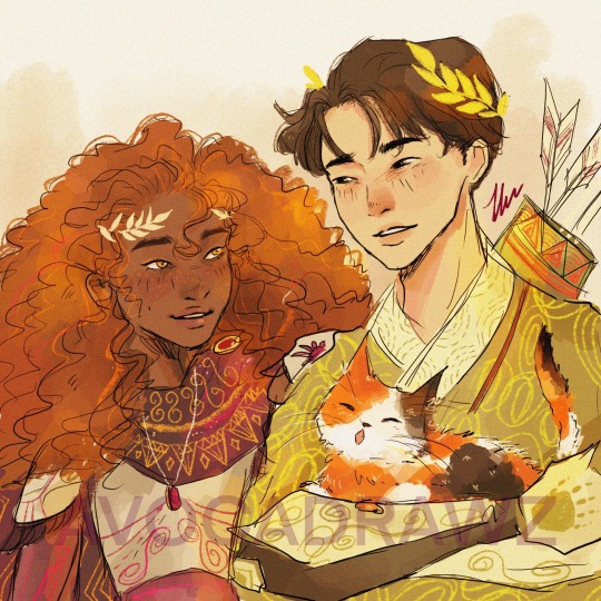
Frankie boi and hazelnut are so underrated it pains me! 🐻🌰
They are the cinnamon rolls of the Argo II☀️
And tbh I think if Frank was a gen z, this central parted hairstyle would be more realistic of him.
As for Hazel, her hair is always fun to draw and design. I just love the cinnamon-y shades and the lighting that you could play with. (As a straight asian hair girlie, getting curly perm is definitely one of my life goals. 💇🏻♀️ ) I think in the next piece I may try different updos and looks on her because, to me, her character materials, palette, and vibe make one of the most interesting character designs from the book.
#art#illustration#fanart#comics#annabeth chase#percy jackson#demigods#percabeth#pjo#riordanverse#artists on tumblr#digital art#frank zhang#hazel levesque#camp half blood#frazel#cat#camp jupiter
271 notes
·
View notes
Text
The biggest problem with most portrayals of hetero ships in media is the laziness of making them work. Particularly in shows like invincible, shows centered around male main characters, superhero stories, etc. we will see the main guy and the main girl get together but there is no real buildup. If there is buildup, it’s falsified in the form of the characters being in other relationships. Typically these relationships are only treated as obstacles to the main goal, they are either framed as unhealthy or toxic, possibly missing something or they portray it as meaningful by doing that one great writer son of telling rather than showing.
For instance: Amber in invincible is a pretty girl, she’s sweet and caring but predominantly we see her angry and frustrated with mark for various reasons. Resentful he’s not around more or whichever which is absolutely valid (aside from that first bit where she actually got mad at him for not just telling her his secret? That was dumb) now I can understand that writing a female character angry is not the end of the world but the first and only time I see a relatable, meaningful reaction from amber is when she is threatened by that evil viltrumite lady. That was interesting, mark trying to comfort her after was interesting.
In the instances where they are being loving to each other, amber and mark only say that they like each other, that they care about each other. There’s no other real signs shown in body language, or interactions. No meaningful arcs where there is fun tension. If they weren’t together I would barely consider them close friends.
Now with Eve, she is much better characterized, she has development but she is very much given the same treatment when it comes to bonding with mark. The girl characters are treated like rewards to the male characters, like hot accessories for being so cool.
Part of the issue I see is that mark doesn’t get frustrated with amber or Eve enough. There’s no equality in the relationship, he doesn’t laugh with them or seek them out to hang out with aside from dating. It’s a frequent issue I see with many het ships and even some side queer ships (which are usually either used for representation brownie points or just poorly done)
Mark and Rex, or mark and William make a better ship given the complexity of their characters and the equality and banter between each of them. They are written like friends which should be the baseline for any written couple.
I will also mention that the relationship between William and his boyfriend is also incredibly dry. The design in my opinion is very poorly done for a character who is supposed to be “super hot” he looks like a generic muscle dude. Him and William do the same “I care about you” routine instead of anything that feels more real. There is the arc where wills boyfriend does go through the cyborg angst thing but even that felt a bit dry.
The girl characters are frequently not allowed the same personhood a man would be, which seems to be coming less from an outright misogynistic perspective and more from an attempt to be politically correct. The girls are only allowed to be angry and content. They are superheroes so they don’t get scared, they don’t get needy, they are just these vehicles of feminism. I don’t think I even know any of their hobbies aside from ambers activism and eves bigger activism. Mark is into comics and nerd stuff, Rex is an asshole (his hobby), will could use a hobby tbh but he is opinionated and has what i would call a more distinct personality.
What is ambers personality? She is nice? Sure. She likes to help people? Okay. What are her quirks? Flaws? Interests outside of helping people? She was dating mark for a while and the audience doesn’t know any of this. I’m aware that she was a place holder character but that is a cheap tactic to make Eve and marks relationship seem like it has build up. It feels unnecessary and those scenes with amber should have been interactions between Eve and Mark, building their friendship, sharing their worries and thoughts. Disagreeing with each other, compromising, etc.
27 notes
·
View notes
Text
I have pretty mixed feelings about the undertaker, and I can’t quite bring myself to really like…LIKE him.
I like his character and the role he plays in the over all story of Kuro. I think he’s got a great design. He is a fitting and formidable antagonist that poses a real threat to the main characters, which I appreciate.
But I can’t bring myself to enjoy his character outside of those things. Because I just can’t view him as being anything other then just a bad guy. Like…he’s evil.
And I don’t mean that in an “oh he opposes/stands in the way of our main characters goals. I only wanna see Seb & Ciel succeed UT is such a meanie 😖” kind of way.
The Undertaker has done (and we’ll most likely find out abt more that he’s done) some pretty fucking terrible things. He has caused the deaths of so many innocent people.
I mean the Campania arc combined with all the blood collection operations. The GOD damn ORPHAN BODY PARTS IN JARS.
I don’t really get the fandoms perception of him being this silly goofy man who plays tricks and is only after a laugh. He’s absolutely batshit insane. We don’t know why he’s doing all this, there may not be some grand emotional reason behind it, it could very well just be for shits a giggles.
People complain about Sebastian begin mischaracterized as ‘to nice’ and that he’s an evil narcissistic sadist (I’m not disagreeing), but why don’t people have the same energy towards UT?
Tbh in my eyes, not one of them is more evil then the other.
#this is just my opinion and I want to clarify that I’m not an UT hater#I just feel like as the current arc progress I kept having more and more reason not to like him#black butler#kuroshitsuji#undertaker#sebastian michaelis#ciel phantomhive#black butler season 4#black butler analysis#undertaker black butler#rant post#my post
139 notes
·
View notes
Note
Hello! I just wanted to ask (sorry if this has already been answered) what is one favorite thing you love about soundwave and Rodimus? What is one thing you dislike (if any) about them both? Additionally, how do you think your soundwave sees shockwave. In transformers prime their relationship seemed.. mutual? Like, you do your job and I do mine kind of thing. If another shockwave came aboard would their relationship be similar to that?
Hi anon!
One thing I love about SW and Rodimus... their designs. Rodimus has a very, shall we say, conventionally attractive silhouette. Soundwave just looks freaking alien and magnificently glowy. I love those things. But if you'd like an answer beyond the superficial... the Rodimus in the comics is a pretty big jerk with a heart of gold, and tbh I don't love that too much, but his speech at the end of LL was absolutely fantastic. SW's competence was a delight in TFP and I really enjoyed writing his pre-emotional self in TEG.
As for Shockwave, hmm. It's hard to recall their interactions in TFP (because overall I think Soundwave had very few interactions with the other characters. he was usually just Working). I feel like SW approved of Shockwave's work, in so far as it aligned with Megatron's desires. A TEG Soundwave would be extremely aware of Shockwave's competency and alignment- like Soundwave himself in TEG (post realization), Shockwave is motivated by his own pursuits. Like Brainstorm: he wants to do science and he won't let anyone stop him. If his goals happen to align with yours, lucky you. In TFP I think Shocky realized he needed to align with Megatron for survival and grant money (basically, lol), but as soon as/whenever he was able, he did his own thing.
TEG SW would view a boarded Shocky with a lot of suspicion. TEG SW's loyalty is to Rodimus and the ship, and he would see Shockwave as a possible threat, due to his intellect and competency. SW would recognize this, but not really want to be the one to do anything about it, lol.
That said, I think a Shockwave on TEG LL would find himself in the same sort of position - obliquely - as he was in under Megatron. He'd be beholden to the ship for sustenance. I think the co-captains would recognize this right away and encourage a "we'll let you do your thing, as long as it's not Evil, in exchange for room and board," and then hope that Shocky comes around to valuing the crew beyond a means to an end. I don't think Shockwave is literally emotionless. I'm not sure what kind of arc would be needed for him to become a happy, sociable crew member: I'd have to rewatch his TFP scenes and think about it for a while. I think appealing to his sciencey side would be the trick.
Whereas Megatron was sent to talk to Soundwave after his bluescreen moment, Perceptor and/or Brainstorm would be sent to Shockwave.
Welp I'm outta time before work to cogitate on this. Hope you liked the answer :)
34 notes
·
View notes
Text
~•~•~•~•~•~•~•~•~•~•~•~•~•~•~•~•~•~•~•~•~•~
FOR MINORS:
This blog is more directed towards adults. While I do allow minors to interact with me, there are certain things I am not comfortable talking about:
• Heavy gore
• Sexual topics/nudity of any kind
• Relationships between characters if the mod is a minor
Subject to change.
- - - - - - - - - - - - - - - - - - - - - - - - - - - - - - - - - -
Hello, lovelies! My name's Reed. Head of the costume design department!
I'm a costume designer! And a makeup artist! And... And an embalmer... And a mortician- Ah, many things! But my goal is to make ya beautiful in life and in death.
I'm a multi ghoul with more of a focus in quintessence, but I do not do that on my own choice. Just not my cup of tea!
I used to be a human living in Germany, where in my spare time, I sashayed around those parks in full drag regalia, baby! Those were the days. That life was alright until I died in my sleep. I'm unsure of what...
Anywho! I didn't spend a lot of time in hell, only maybe two or three earth years before I was summoned by Secondo. He wanted to be a pretty little princess so he got someone to do that job for him. Poor Primo got the RAGS.
18+ asks are allowed!
❤🖤
- - - - - - - - - - - - - - - - - - - - - - - - - - - - - - - - - -
Basic info
��� he/they
• Preference for men, unsure of true sexuality
• Open relationships (rp opportunities tbh)
• 5'10
• about 25 in human years
• Beautician/cosmetologist/mortician
• High functioning ADHD
• Insomniac
• Confident
• Very flirty
• Workaholic
• Sounds like plankton from Spongebob I think. has a thick german accent
• More in depth character sheet
• Voice claim (regular Mr. Lawrence voice)
- - - - - - - - - - - - - - - - - - - - - - - - - - - - - - - - - -
Mate list:
• Chain

~•~•~•~•~•~•~•~•~•~•~•~•~•~•~•~•~•~•~•~•~•~•
Me again ( @puuuders ) you silly goobers. I'm gonna edit this over time I'm lazy
Other blogs:
@ask-miasma-ghoul
Tags
#reed speaks - random stuff
#ask reed ghoul - beginnings of rps and asks
~ = ooc
#ghost roleplay#ghost rp#nameless ghoul oc#nameless ghoul rp#nameless ghoul roleplay#ghost#the band ghost#ghost oc#ghoul oc#SoundCloud
37 notes
·
View notes
Note
saw you mention gender for a bit - i wonder why grian is feminized so much? it's of course because of the feedback loop of fanon but how did it snowball so much? it would be funny if it's from him using the alex player model
I'm probably not the guy to ask for this just to be clear right off the back. I love observing fandom trends but I'm just not keeping an eye on Grian stuff more often than not. Grain (lol) of salt, blah blah blah.
So first off I think we should tackle what "feminized" means in this context because I can see that argument being made for both the default-ish generic young anime guy grian I have in my head when I think "fanon grian" and. well. arianna griande and the like (I'd argue cuteguy falls into this latter category)
I'm gonna start with the first one and use my own Grian as an example because I think he's pretty much as standard as you can go in the former category, and that's more or less on purpose. Pictured here in all of his tiny anime twink glory (next to Joel and Cleo who are also meant to be pretty short!)
So while I can't read the minds of other Grian artists, I can offer what went through my head when I designed mine and try to have a guess at how much other people thought the same.
First things first I do think this specific brand of Grian is "feminized" -- if you compare him to the CC. The goal at least for me was more to communicate youthfulness than femininity, but those traits tend to go hand in hand with male characters due to them having pretty much the same features (no facial/body hair is a big one).
Artists in this fandom tend to swing on the younger side, and people tend to base their designs unconsciously (or consciously tbh) on themselves or media they like, the latter being very likely to be media aimed at their age group and thus having a cast of characters around their age. Doesn't help that most popular animated things are made for younger audiences, so chances are most people are basing their art styles in media where the casts age range is 12-25.
For me I do think most of my designs have a little bit of added in youthfulness/femininity unless I Really want to get across age/masculinity. It's a lot easier to separate the 30 year olds from the 40 year olds if the 30 year olds look a bit closer to 20, doubly so when most of the stuff I like (and thus reference from purposefully or not) has casts full of 15 year olds. Alot of this also applies to the other younger men in my designs aside from Grian, like Joel who's next to him.
But Joel is still drawn with stubble and a bit taller than Grian, so what gives about Grian specifically?
For me personally, I draw everything with the Life Series in mind, especially Third Life in Grian's case. And the character who Grian plays off the most in that series, especially in Third Life, is Scar.
While I do think the aforementioned age factor also impacts a lot of Scar designs (as well as younger artists' tendency towards shyness when drawing muscles), I think most people see Scar's masculinity as a key trait of his. I think I'm kind of unique in that I take descriptions of their appearances ingame as somewhat canon (e.g. Scott being canonically referred to as "handsome") but Scar really lays it on thick with "Hot Guy" and the abs and so on that it's pretty much screaming for acknowledgement when you're designing him.
Grian is also short irl and this even gets mentioned by Joel in the first WL episode, so it made enough sense to me that should be something exaggerated with Desert Duo's designs to make them look better next to eachother.
This is also maybe getting a bit into headcanon territory but when I think Grian I don't necessarily think predator or brute force, I think of him setting his traps and giggling maniacally and manipulating what he wants out of people with his words instead of his sword. And him just being like. a little gremlin thing compared to his Big Strong Man partner in crime whilst also, actually being arguably the more dangerous of the two feels harmonious.
If we do a layer deeper into headcanon land, I've also always seen him as more frail and physically weak due to Martyn's concern for his safety and his own more anxious nature in 3L as one of the first players to really consider having to defend himself -- if you're dropped into a death game arena and you're the smallest one there, you would naturally be a lot more nervous than the big guys and come off as more "insane" for wanting to set up seemingly unnecessary defenses or striking first. (<-- this is why I don't talk about Grian much btw all of my thoughts regarding him are seeped in headcanons lol)
Alot of Grian artists are also Desert Duo artists and while they might not be operating by the same logic I am I have to assume there's some common points.
I've seen this meme used a lot when people make fun of other peoples DD art and it's almost always people with very little self-awareness. it's funny to me (and this probably could be its own discussion about queer tropes and xenophobia, but whatever haha funny it's literally them so true so true.)
One final note on this is I think this specific brand of twink Grian might be dipping in popularity? I've been seeing a lot more Grians that are chunkier or entirely throw out his anime-main-character-ness by making his glasses or curly hair heavily exaggerated. Which is cool I especially loveeee the more cartoony puff ball grians that have gotten more popular. Idk if it's necessarily in response to the anti-twink-propaganda or if it's just a new stage in Grian design development as we get further away from the Third Life Desert Duo meta, but it's fun and I think speaks the feminizing not really being an intentional trait and more of a consequence of other things.
As for CuteGuy/Griande I can't really offer as much insight since I don't really get the appeal either lol except that I think it's fun in the way drag is fun.
I think what a lot of people need to remember when they ask for more masculine designs is that masculinity irl is often synonymous with less customization. Alot of it is practical (like short hair obviously you can't style like long hair) and especially outside of queer circles a lot of it is just gender roles -- alot of men will refuse to wear literally plain mens t shirts if it's an eye-catching colour.
There's a great Derek Guy interview where he talks about how men tend to misunderstand what "fashion" is and how most cishet men actually care deeply about fashion. He makes the example of offering two pairs of jeans -- one is a regular pair of blue jeans that costs fifty dollars and another is free of charge but happens to be pink, and how most men despite "not caring about fashion" will go for the fifty dollar blue jeans.
If you want an example of mens fashion and its "boring" aesthetics made more to fit into a crowd than to stand out, just go on instagram and look at pictures of the Empires CCs together and watch the guys get absolutely mogged. This isn't me calling the men badly dressed (in fact I've actually noticed before that CC Joel is like. super well put together) but more of a statement on how womens clothing is designed vs how mens clothing is designed.
I know where my eyes go first, at least. (self indulgent note: Pearl is kind of an exception to the rule for reasons but I cannot say lest I betray my own moral code. however my eyes go to her first anyway because she is stunningly beautiful she could wear a potato sack and it'd work)
And while I don't agree with this sentiment (I actually loveee menswear deeply it's. a thing), in the world of fandom artists who typically are big fans of the gay gay homosexual gay and more into high-decorative, sexier stuff, clawing at any ounce of femininity that these men exhibit is probably an opportunity hard to pass on. This also happens with Jimmy on occasion I think, with stuff like the maid dress. And Ariana Griande is like Drag Drag, not just a dress but a whole persona, so that in combination with feeding into yaoi tropes for popular ships like Scarian and Grumbo, I'm not surprised there's such a gap between actual screentime and fanmade content.
Also is Griande even like. That popular anymore? I also don't think I've seen CuteGuy all that much unless it's DDVAU stuff specifically.
I'd be interested to hear my artist friends comment on this too since again I feel like I'm not the right person to ask lol. Take this as an invitation to yap I would be fascinated hearing your perspectives.
I also think his popularity and younger audience might be playing a big part in this especially in conjunction with the first point about drawing characters younger-looking but this is getting fairly rambly already lol
Go follow the menswear guy (@/dieworkwear) on twitter if you're interested in menswear btw he's very insightful and funny
49 notes
·
View notes
Text
Sugarplum Cafe FAQ
I held an AMA about my upcoming game Sugarplum Cafe on Instagram and figured these Q&A's would be helpful for you to know as well!
If you have questions of your own, my inbox here is open!
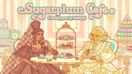
Q: What is Sugarplum Cafe? A: Sugarplum Cafe is a merge crafting game that I'm solo developing! In this game, you run a sweets cafe and make desserts for fashionable ladies inspired by sweets. I wanted to make a game with frilly pastel shoujo aesthetics, and yes, there will be tea parties!
Q: What platforms will Sugarplum Cafe be on? A: The goal is to publish on PC and mobile (Apple included), but PC will come first because it's easier to fix bugs on PC.
Q: When will this game be out? A: Not for a few years, it's still pretty early in development. But paid members on Patreon can play an early version of this game now with about three hours of content! Support starts at $2 USD/month.
Q: How good do I have to be at games to enjoy this game? A: Sugarplum Cafe is meant to be a super casual game, so you can be the worst gamer in the world and still play this haha. It's more about collecting pretty ladies than any sort of strategy or skill.
Q: How many characters will there be? A: At least 50 Ladies! I have ideas for about 70 Ladies, but whether I get to all of them depends on interest in the project. So 50 feels like a good benchmark.
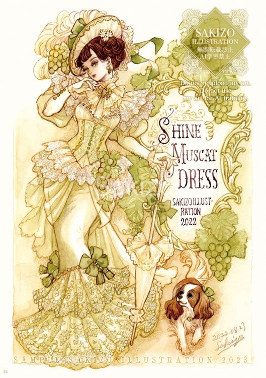
Q: What are your inspirations for this game? A: For one, The Nutcracker Ballet of course! Aside from that... For the longest time I was obsessed with Cookie Run: Ovenbreak because they had so many clever character designs! I don't play as much anymore (the UI is too cluttered now and I don't love the new characters as much) but I want to recapture the spark I felt when I used to play. I also really love Sakizo's illustrations of Victorian/Rococo sweets-inspired ladies, and I wanted to capture her aesthetics while mixing in my own fashion sense so I'm not ripping her off entirely haha

Q: Will you still be drawing fashion? Are you moving to gamedev permanently? A: I don't know about a permanent pivot, but this game will be my main focus. TBH I wasn't very happy with just drawing stuff and I'm really excited to build my own world where my designs can live. I will still be designing fashion, but it will just be part of something bigger. My goal is to make the world of games a little more fashionable! I may still draw the occasional illustration though, so never say never!
Q: What game engine are you using? A: Sugarplum Cafe is made in Godot! It's a free open-source game engine and I highly recommend it for 2D games. I think the scripting would be easier to learn than something like Unity. There are a few quirks but the community is so active that it's easy to find answers to your questions. I am using Godot 3.5 - I believe the latest version is Godot 4, but I heard 3.5 was better for porting mobile games. Will let you know how true that is!
Q: Can I cosplay/draw fanart of characters from Sugarplum Cafe? A: YES PLEASE!! Please tag me if you share cosplay or fanart! And if you need to know details of certain characters' designs, please don't hesitate to ask.
#nutcracker#the nutcracker#girl gamer#cozy games#girly gamer#sugarplum cafe#askings#faq#gamedev#indiedev
38 notes
·
View notes