#cartoon tutorial
Explore tagged Tumblr posts
Visit Tumblr Blog
Explore Tumblr blogs with no restrictions, modern design and the best experience.
Last Seen Tumblr Blogs


tskautocadtrainingcourses-blog
AUTOCAD TRAINING COURSES IN RAWALPINDI ISLAMABAD PESHAWAR LAHORE
6 posts


Fun Fact
The total number of visits Tumblr.com received during January 2021 is 327 million.
Text

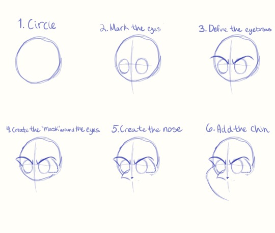
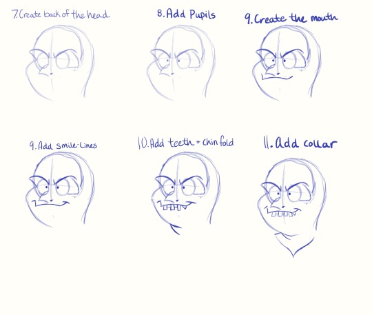
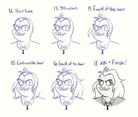
I made a thing! :V this is my first attempt at a tutorial so I hope it is helpful! if anyone has any questions or suggestions for other tutorials feel free to leave them in the comments and I will do my best to answer them!
#tutorial#art tips#ducktales#ducktales 2017#darkwing duck#disney#artists on tumblr#ninjadoodleduck#duck#duckverse#beak#beak tutorial#drawing tutorial#cartoon characters
667 notes
·
View notes
Text
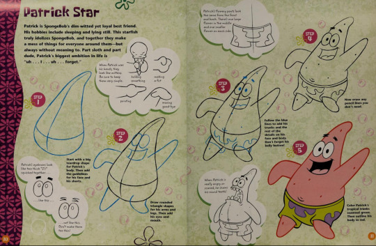
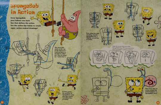
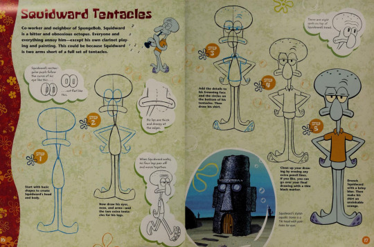
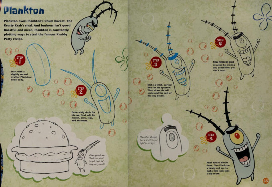
Around 2002, a SpongeBob artist by the name of Heather Martinez done a “How to Draw” book called How to draw SpongeBob SquarePants. My verdict, it’s really informative!
#animation#cartoons#art#book#books#how to draw#drawing tutorial#spongebob squarepants#2000’s#2002#heather martinez#reniassance age of animation
219 notes
·
View notes
Text
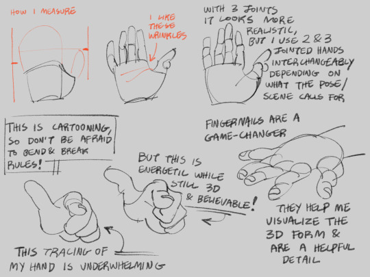
idk if i ever posted this? quick notes on my thought process while drawing cartoon hands.
#no id#giddly’s art#i learned a LOT from drawing wallace and gromit / arrdman fanart#because the claymation hands are chunky and 3d so i could easily study their forms while watching#just add fingernails and bing bang boom. believable cartoon hands!#art tutorial
254 notes
·
View notes
Text
("Sonic") Hands Study
I get asked a lot how I draw hands, and particularly how I draw hands in the "Sonic" style. Let me preface by saying I am mostly self-taught, so please do your research and study what techniques work best for you. The following demonstration is what I personally use to help me draw hands in general and–more specifically–how I draw “Sonic” hands. This is less of a tutorial and more of a series of observations.
*And remember, there are always exceptions to the rules!*
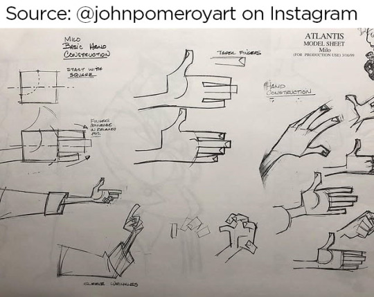
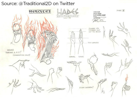
I personally believe before you can go about stylizing hands, you have to understand how to draw hands in the first place. Afterall, I think you have to know the rules before you can best bend/break them. Think about super stylized hands in animation like the characters from Atlantis or Hercules. Even though these hands are unlike what we see in real life, they still look and feel ‘natural’ because the artists understand how hands function and are able to bend the rules while still demonstrating proper anatomy.
Sources: [x] [x]
I highly recommend studying the anatomy of a hand. It’s educational and fascinating! There are plenty of free resources online!
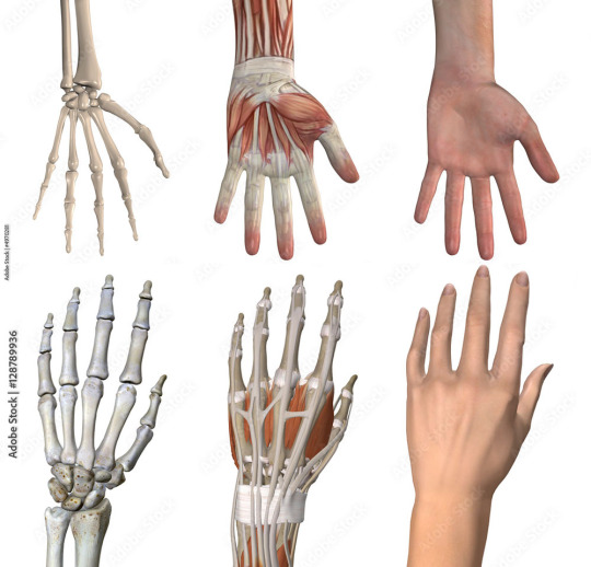
I understand many people find hands intimidating to draw, but the best way to learn how to draw anything is by breaking it down into shapes. Everything is made up of shapes.


3 is the magic number
In simple terms, our hands can be seen in patterns of 3. Your palm can be broken into 3 segments that can move semi-independently. Your fingers are composed of 3 segments each (proximal, middle, distal). There are 3 phalangeal joints per finger. The average shape a person’s fingertips make when aligned is a triangle (a 3-sided shape), with the middle finger being the highest most point of the triangle and the other fingers cascading down (there are exceptions to this rule). Keeping the number 3 in mind will help you remember how hands/fingers articulate.
Everything is connected
Even though elements of your hand can move somewhat independently, every movement influences the other segments of the hand. Notice when you put one finger down how (most likely) at least one other finger moves slightly? Or notice how you can only do certain gestures with the assistance of your other fingers or sections of your palm? Keeping in mind how segments of the hand affect the others will help make your drawings feel more organic and less stiff.

I usually start with the palm (or back of the hand) first and that determines where everything else falls into place.

Once you grasp how hands work, that’s when I believe you can determine how stylized you want to get. There is a very large range of drawings hands from super realistic to very simplistic.

If you’re wanting to emulate a certain style, you have to study it and learn how it works.
"Sonic" hands
As far as Sonic hands go, it depends on which version you’re best hoping to emulate. Notice how the styles vary even throughout the franchise?
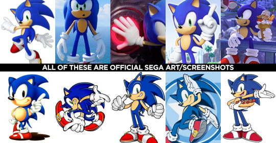
In the 3D video games, Sonic characters tend to have what I classify as more ‘cartoon-y’ hands while in illustrated media, it often leans more towards realism. (Note I said ‘leans towards,’ not full realism). How and why is that?
Let’s break it down into shapes again, Sonic Style! Pt 1
In many of the 3D rendered media, the characters’ fingers are made of more round shapes. The models also don’t conform to realistic proportions. The tips of the fingers are usually larger than the segments closer to the palms (the middle and proximal phalanges), and this helps to deviate them from a more realistic look. Speaking of proportions, the hands overall tend to be disproportionately larger than the rest of the characters’ bodies. This also makes it feel more like a cartoon, even without resorting to a super simplified, 3-fingered hand like Mickey Mouse or Bob Belcher.

Breaking down shapes, Sonic Style! pt 2
Illustrated samples vary depending on the artist/studio, but I’ve noticed that in general, illustrated Sonic characters’ hands tend to have more square/rectangular shapes. The phalanx proportions often resemble what we see in real life, with the fingertips tapering down in size compared to the segments closest to the palm. The overall size of the hands in proportion to the body are still larger than that of real humans, but they tend to be closer in proportion compared to their 3D counterparts. This is why in illustrations, the characters are more capable of crossing their arms, interlacing their fingers, or making other natural hand gestures.

Also, notice in these examples, there’s more detail to the hands than what you’d find on a Looney Tunes character? There are often folds in the material of the gloves, some knuckle definition present, more natural bends to the fingers. However, the hands are almost never as detailed as that of say, a Dragon Ball character where you’re seeing muscle tendons, veins, definition of each finger segment, finger nails, etc.

Sources: Dragon Ball Z, The Looney Tunes Show
MY STYLE
With all that in mind, I happen to find the sweet spot for the Sonic character style right in this range:

Everyone has their own preferences and it’s up to you to decide what you like best, but this is what I prefer.
MY STYLE - Cont’d
I use a blend of the two previous Sonic styles I mentioned, Cartoon-Round + SemiRealistic-Square. I like to go with a more “Squoval” shape (rounded squares) to the fingers. I try to keep the fingers in a naturally proportionate scale with the ends tapering down in size, but the overall size of the hands are still bigger than what you’d see in real life. I like to add a bit more detail when warranted, but I personally rarely resort to definition in the tendons/veins or complex wrinkles in the bends of the fingers (unless it suits a specific character or emotion).

Like I said, this is less of a tutorial and more a series of observations. But perhaps looking at hands in the way that I do might help you with your own drawings! You should absolutely do your own studies to find what works best for you. But I hope you found this helpful in some way!
#study#art study#hands#drawing hands#cartoons#sonic#reference#long post#advice#tutorial#sth#sonic the hedgehog#sonic trash
122 notes
·
View notes
Text


A knight and friends.
#art#digital art#original character#character design#2d animation#animation#oc#animated gif#cartoon#tutorial#art tutorial#animation tutorial#how to#knight#medieval#steed#horse#bird#pet#quest#adventure#dnd#d&d#fantasy#king arthur#arthurian#derp#derpy#equestrian#armor
87 notes
·
View notes
Text
Using Vidu to Make Character Turnarounds
Disclosure: I am in the Vidu Artist Program.
Having (at the very least) front and back reference greatly improves the quality of character image prompting. And very often, one finds that they were lazy and only got a couple of bits of character reference. Or they have tons of it in the wrong art style.

A character like Wally Manmoth requires some good reference to work right.
Now, it's not that hard to prompt up something that matches close enough and then modifying the stuff manually until it works, such as I did with TriceraBruce and DeinoSteve:


You can tell Steve's the bad boy because he's got a cool rip in the back of his jacket.
But for Wally, I decided to try out Vidu as a means of getting turnaround frames.
So I loaded Wally's front-view pic (above) into the image-to-video feature, and prompted with:
vintage traditional animation scene (1985) humanoid mammoth/furry elephant wearing a red hawaiian shirt and blue shorts, by filmation and sunbow productions, 90s colors, friendly on green background, streamlined black line art with cel shaded vintage cartoon color, official media, character design fullbody shot on green background. The mammoth-anthro starts facing the camera, turning around to face away from the viewer, providing a view of his back.
I gave it two shots at the 720x quality setting (12 points per, total of 24), and got:


Huh. Weird it happened twice, etc.
This demonstrates both that the tech is viable for this use, and the reason you'd want to have that multi-view reference. The robot clearly assumes that a luau shirt would have a large print on the back, whereas wally's is a more basic print. That's ultra easy to fix, though.
I started by exporting the last frame of each (or close to it, picking the one that looks cleanest)

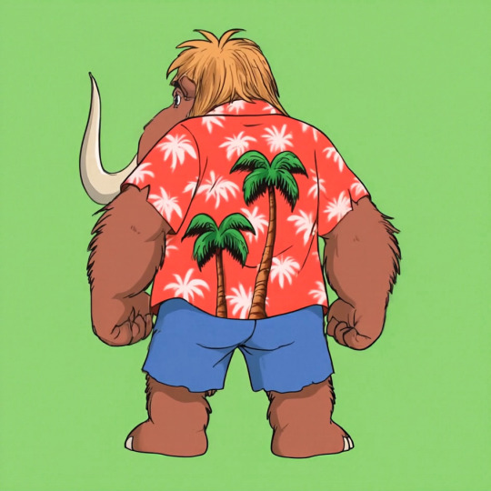
While its image editing features and often touch-and-go, one thing the Midjourney edit feature has going for it is it's utility as an upscaler. You load the image in, make your tweaks (just a little bit of background if you're just upscaling) and then upscale and at the very least you have 2048x2048 worth of resolution.
I used the midjourney edit process, that got those two images to the following state, as a test.


The results are good, but getting the large trees to erase-and-replace out took several attempts, and just doing it in photoshop then using the editor to upscale would have been faster.
This is why we do tests.
I went with the slightly-at-an-angle one for the main reference sheet. I'll be keeping the straight-on-back-shot in case it winds up being useful for specific scenes down the line.

In photoshop, I touched up the shirt print, made sure the colors where consistent, and simplified the hair coloration to something more period-plausible.


No more giant trees on the back! On the other hand, I think the feet sprouting toes on the heel is going to be something I'll be fixing frame-by-frame until there's another revision.
Human characters will induce these issues less often. I just stick with my genre of choice.

Midjourney was not cooperating with TyrannoMax (it really doesn't like giving him the proportions I like, preferring to make him a weird big-head salamander), so I went the same direction, resulting in this stage 1 front/back:

Only Midjourney refused to work with it, at all. Declaring everything that came out of it too lewd for its internal censor. Apparently, this hunky relative of cheesasaurus rex is too sexy for general consumption. Nevermind that it's a cartoon lizard in a shade tangello orange.
The workaround is too dumb for words.
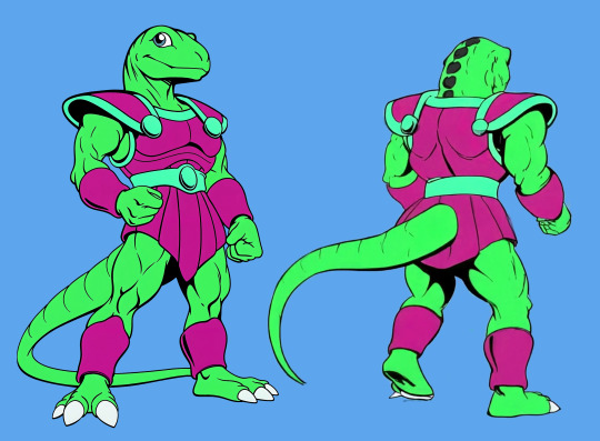
Slam the hue slider until it's off anything that could be perceived as a human skintone.

Then make the modifications. Here I had to rework the leg several times, and do a lot of tweaking to remove-overinking. Then I popped it back out, droped it back into lineart, re-colored it, and and composited it back together:

And voila, a front and back for Max. I shortened his tail, as the longer tails have been causing problems with confusing the image prompting systems. The armor skirt has scallops to accommodate the tail, which looked better more consistently than the flaps folding around the tail.


The results are, thus far, encouraging.
Of course, if the back of your character has any unexpected details, you're going to have to add those in after the fact or include them in the prompting, and you're going to be making a lot of edits regardless (as you should).
Oh, and Max has a sword now.

A blade of amber crystal with a fossilized femur grip and a faceted dino-eye that should be far enough away from the Eye of Thundera for safety. A roleplay-toy friendly trademark weapon, usually a sword, was a must-have for 80s action-adventure lines despite the fact that you'd never see it used on anything that wasn't a robot, living statue, or skeleton.
Thus the sword's gimmick is it cleaves through non-living matter with ease but anything BS&P doesn't want subjected to a stabbin's is encased in amber crystal: locked in place if partially encased, put into suspended animation if fully encased. A nice, nonlethal use for a magic sword.


It's proportioned like a gladius, but is generally interpreted as larger, approaching a broadsword, in keeping with the generally ridiculous blade sizes of kidvid fantasy. They're just more fun when they're stupidly huge.
Is "Sword of Eons" too on the nose?
#tyrannomax#tyrannomax and the warriors of the core#vidu ai#midjourney v6#niji journey#animation#cartoons#retro#fauxstalgia#unreality#ai tutorial#vidu tutorial#vidu speed
60 notes
·
View notes
Text
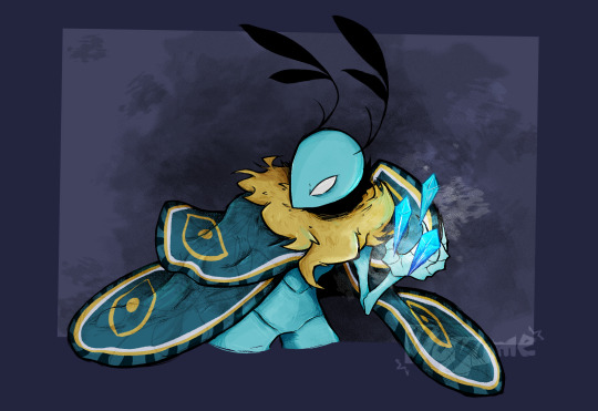
Rendering practice. Cooler shades just happens to be easier for me to work with, that and I figured out how to do it in black and white first then play with layer filters.
This really allowed me to focus on shades rather than color, so getting in those extra details that I would've missed is refreshing.
Leif was also a good subject since I was already in the mood to draw bugs, he has a nice mixture of textures.
Progress GIF's undercut.
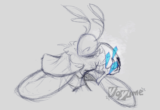
#That crystal tutorial I came across was very good. I usually spend a decent amount of time coloring those.#At some point I questioned how the fuck his wing anatomy worked but just shook it off as cartoon logic#Not sure if it was a coincidence but I found out that Leif inverted is literally red so that was a neat realization#lol sorry for the Leif focused stuff lately he's real easy subject to mess around with#vio.txt#vio.png#bug fables#bf leif#gif
150 notes
·
View notes
Text
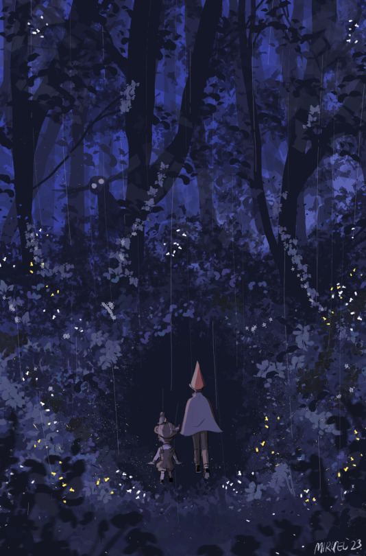
«Somewhere lost in the clouded annals of history,
Lies a place that few have seen.
A mysterious place, called The Unknown.
Where long-forgotten stories are revealed to those who travel through the wood.»
(I followed a tutorial by this precious artist
https://instagram.com/derekdomnicdsouza?igshid=MzRlODBiNWFlZA== )
#over the garden wall#otgw#wirt over the garden wall#greg over the garden wall#the beast#the beast over the garden wall#Elijah wood wirt#cartoon network#cnetwork#myart#digital#experiment#i followed a tutorial for the bg#procreate
407 notes
·
View notes
Text
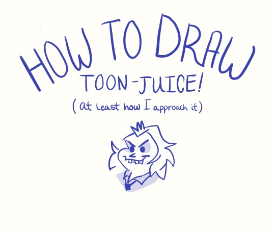
Not sure if anyone needs this, but this is something I really could have used in the past. It’s also my very first tutorial… Hooray!
#What an achievement! I’ve wanted to make something like this for years.#If anyone sees this and happens to be experienced with making tutorials#please give any feedback/tips you can!#Even if you haven’t- let me know how I can make these more useful!#toonjuice#beetlejuice#beetlejuice cartoon#tutorial#art tutorial#beetlejuice fanart#bettyjuice#my art#procreate#drawing tutorial
332 notes
·
View notes
Text
Art Advice: The Misconception Behind "Study Realism"
Most people who draw anime/cartoons have, while asking for ways to improve, at one point or another been told to "study realism." A common response to this is, "But I don't want to draw realism!"
But, did you know that the purpose behind this suggestion is NOT so that you draw realism? They're not suggesting you change to a more realistic style. What, then?
Let's look at this through an analogy:
Say you don't know music yet and decide you want to learn how to play the Happy Birthday song. You're not interested in playing anything else, just the HB song, and you haven't started learning anything related to music at this point. OK, that's fine, and now we have our situation set up. Once you've decided this, you set yourself to learning the sequence of notes to the HB song. You practice and practice, and, after a while, you can play it really well without a hitch. After a few years, it starts feeling bland to you, and you ask, "How can I make my HB song better?" And someone tells you, "Learn all the other music notes," and "Study classical and other genres of music." And you reply, "But I don't want to play that type of music; I want to play the HB song!" (And that's FINE! It's valid; it's what you want to do.[*Footnote 1]) But without having learned all the other notes and other types of music, you can't make a remix of the HB song, or an "epic version," or a hip-hop-fusion version; you've capped at the end of the first paragraph of this story.
So drawing anime or cartoons is like playing the HB song, or any one song in our example.
And here's where our misunderstanding comes in:
"Study Realism" DOES NOT MEAN "Draw Realism"
Yes, you'll have to draw it to study it (not only your brain, but also your hand needs to learn the skill), but it doesn't mean that's what all your artwork will look like. It is meant to give you more tools to make your anime and cartoon work stronger, more appealing, and more unique.
How will it do that? The more music notes you know, the more types of music you understand and can play, the more original a remix /version of the Happy Birthday song you'll be able to make - and it will be unique. Because you will be able to take all that diverse knowledge and apply it to your song, making it stand out, and the next time you play the HB song, people will go, "Wow! This is a really cool version!"
So now we can be clear: There is a difference between learning something and performing it. You can perform whatever you choose, but by learning all the things, your performance of your "Thing of Choice" will be stronger.
What, Exactly, Will Studying Realism Teach You, Then?
I. VALUES
If you learn how to paint/shade with a full range of values (by learning realistic shading) that properly depict both volume and lighting, you will have no trouble simplifying that to cel-shading or gradient-shading in your anime or cartoon drawings, because you will at once spot when something is undershaded or the shadows are in the wrong spot.
On the other hand, if you try to do cel- or gradient-shading first, you are way more likely to a) undershade, and b) have an inconsistent light source. And when these things happen, you won't be able to tell *why* your drawing looks "off" or bland.
II. COLOR
By studying realistic coloring, you'll be able to learn how color varies across an item (say, a shirt) that is a "solid color." Example: you're drawing a character with a pink t-shirt, standing in the sun, at the end of the school day. The t-shirt is solid pink, however, the colors on it will vary from orange-ish to purple-gray, with some areas almost a bright red (and that's not even considering items around the shirt that would bounce light back onto the shirt and change its color). But you'll only know this (and how to do it) if you study realistic coloring.
Then you can apply that knowledge to your stylized artwork and make it stand out more.
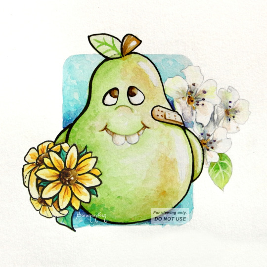
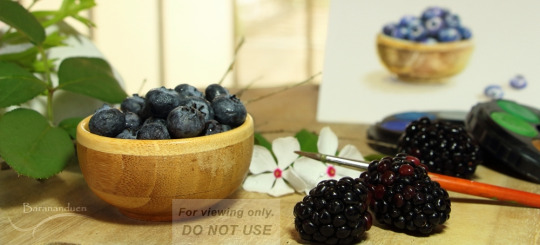
Painting of a stylized pear, where I studied real pears to understand their coloring and texture. See how studying realism can enhance your cartoon work.
III. MAKE BETTER STYLIZED ANATOMY
By studying and learning realistic anatomy, you will be able to make stylized art that, for example, doesn't have one arm longer than the other, because you will have learned how to measure proportions, even if you don't draw realistic proportions. So that if you decide you want to draw unrealistically long legs (eg: Sailor Moon), you'll be able to make them look good and keep them consistent.
You will also be able to draw figures in any position, because you will have learned how body parts are made up and how they move, as well as foreshortening/perspective. Then, when you go to draw a pose you haven't drawn before, it will be WAY easier.
IV. UNDERLYING SHAPES
Although this is one of the least-mentioned aspects of art-learning, it is, in my opinion, one of the most important, because when you learn to see underlying shapes (the quasi-geometrical shapes that build up a figure), coupled with learning how to measure a form using other parts of the same form as reference (measuring the length of one body part by the number of times another body part fits in it, as mentioned in Section III, above), you will be able to DRAW. (Period.) You won't be able to draw just people. Or just wolves. Or just cats. You will be able to break down a new subject into its building blocks and come up with a very reasonable likeness. And whatever's different, you'll easily be able to make relative measurements to spot why and fix it.
Once you learn to identify underlying shapes and how to measure proportions in anything, you will also be able to pick up and reproduce any existing style without much trouble.
[link to Tumblr post with this artwork]
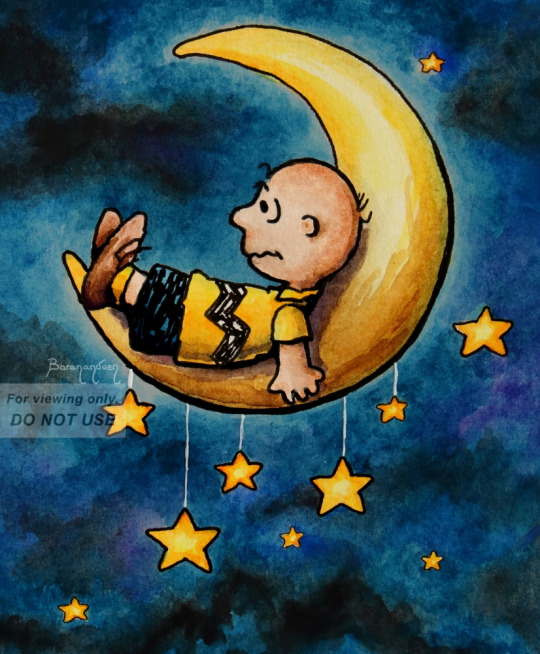
For example, this was my first time drawing anything Peanuts. I didn't have to do practice sketches for it (though there's nothing wrong with doing that). But I knew, from realism, that to achieve a good likeness, you need to measure body parts relative to other body parts, so I looked at Schulz's drawings and was able to determine: OK, Charlie Brown's head is roughly this shape, his body is so many heads tall, his eyes are this % of the head, the ears are this far in, the arms reach down to here, etc. I knew what to look for.
V. FOR THOSE WHO WANT SEMI-REALISM
If you want to do "semi-realism," you'll have a way easier time of it by learning realism and then stripping it down as much as you like, than by starting off with "100% anime" and trying to build it up without knowledge of realism. People think the latter is easier, because it *seems* less intimidating, but it's like trying to drive to a store you've never been to without knowing its address: you'll be driving around forever trying to find it, and it will be frustrating. What people call "semi-realism" is stylized realism, and you can't really hit it without knowing how realism works.
CLOSING NOTES
It also doesn't mean you should stop drawing anime/cartoons and focus solely on realism for X amount of time - you can do both concurrently. In fact, the most fun way to study realism is to do so on your favorite subjects; you can even turn your reference into your favorite character!
Studying realism is also one of the best ways to help develop your OWN, unique style; one which, when people look at it, say, "Oh, that's [your name]'s work!"
[*]Footnote 1: It is fine as long as you are drawing for yourself. As soon as art is a job and you're drawing for an employer, you have to draw in the style they tell you to. So, in this case, it's to your advantage to be flexible.
I hope this was helpful and helps clear up a common misunderstanding people go through when receiving feedback. 💞
MORE ART ADVICE ARTICLES
You can find the index to all Art Advice Articles [here] including:
How to Deal with Art Block
How to Have a Positive Outlook
How to Develop Your Own Style (coming soon!)
etc.
#art advice#art tips#art help#art resources#art learning#artists on tumblr#art#how to#art tutorial#anime art#cartoon#semi realism
91 notes
·
View notes
Text
youtube
LOOKING TO COSPLAY AN OLD MAN NAMED STANFORD PINES? I made a makeup tutorial for that! It's essentially a run-down of what my personal process is for Ford Pines cosplay makeup that I've tested in different ways over the past 6 years of cosplaying him and now have a definite process for!
Plus if you feel like supporting a cosplayer trying to start some youtube vids, that's also cool of you lol
With the whole Tiktok thing going down, I'm concerned about what could potentially happen to all the memories and videos I've made over the past 5 years on there, as well as all the people who have supported me in that journey along the way. But I've been wanting to do youtube for a while now, anyway, so what better time than now?
#gravity falls#gravity falls cosplay#ford pines#ford pines cosplay#ford pines makeup#stanford pines#stanford pines cosplay#stanford pines makeup#cosplay#cosplayer#cartoon#disney#makeup#cosplay makeup#tutorial#gravity falls cosplayer#gravityvstheforcesofrick#that's my cosplay and pinterest name lol#I use whinkx for pretty much everything else#billford#toxic old man yaoi#I CAN OFFICIALLY MAKE BILLFORD CONTENT AND NOT GET HOUNDED LIKE I DID YEARS AGO LOLOLOL#Youtube
29 notes
·
View notes
Text
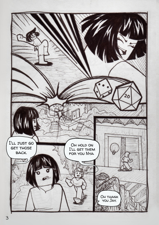
How I make comics

Plan Out The Comic
The first thing you want is an idea. Start with something simple. Write it down or sketch it out really fast. As long as you got your idea down somewhere to guide you. I recommend writing yourself a script. It you have dialogue (talking) in your comic, typing it up on a device will be a big help. This will help with spelling checks.
Script
Here is an example of how my scripts look. You can write yours in anyway you want as long as you understand it. This is just how I do mine.
_______________________________________________
Panel 1#
Nya tells Jay that Lloyd isn’t playing. We see a little mud monster figure jammed into a pipe.
Dialogue:
Nya: Um Jay Lloyd's out of the game. His character got sucked down the drain pipe of eternal woe, remember?
Jay: Oh yeah. Well it's his fault for picking to play a mud monster.
_______________________________________________
Paneling
Panels are the boxes that make up the comic. There are a lot of ways to do them. You’ll have to play around with them and see what you like. Starting out don’t worry about this too much. I encourage you to just make your comic and not worry about all the technical stuff yet. Just have fun with it. Be goofy and just let your imagination guide you.
A few things to keep in mind when planning paneling.
The average comic page has 5 to 6 panels. You can do less or more, it’s up to you. How many panels there are on a page effects how the comic reads.
1. More panels on a single page can make it feel Fast or Chaotic. Like a lot is happening very fast.
2. Fewer panels can make things feel slower. It also makes the things happening in the panels feel more important. These are things you want your readers to notice more.
3. A Splash page is when you fill a page with just one image. These are for really important maybe shocking things. These can also be used when there is a new location. This is called an establishing shot. You could use this for when a new character comes in too. Anything you really want to stand out, use a splash page.
Splash Page Examples
First one is Location aka the establishing shot. The next one is for a shocking moment.

Gather References
Now that you know what your going to be making you’ll need references. Images of the characters, backgrounds and or props you’ll be drawing. If you’ve made sketches or character sheets use them too. You can always jump right in without references if you know your subject really well but its a good idea to have them on hand if you need them.
Canvas size
You’ll want to decide your canvas size. Pick what ever works for you. The shape is more important. I normally use rectangle for mine. You can take a screen shot of your phone screen and use it for your canvas size. It should fit your screen nicely.
Boarders
You can add boarders to your canvas. You could have the boarders at the very edge of the canvas or in the middle. Like a big rectangle. This leaves you with some space outside your panels. If your drawing it out on real paper, this can give you some space for your hands to work. It can also give a place for your word balloons to spill out if you forgot to make space for them in your panels.
Examples
Border on the edge. Border in the middle.
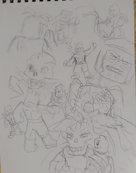
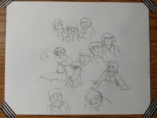
Sketch it out
It’s time to draw your comic. I do this in a few difrant ways. One of the ways is what I call the brainstorm page. I’ll draw out the whole comic on one or two pieces of paper. This can be really rough and sketchy or pretty clean. It’s just the characters mostly. The backgrounds I leave out unless it’s important. I’ll then take a picture of them with my tablet. I’ll put it into my drawing program. I use ibispaint. I then use the select tool to drag the images where I want them. Remember when arranging them to make room for the wordballoons.
If I’m drawing the comic right on the paper, start to finish then I do things differently. I put the panel gutters down first. (The gutters are the lines that separate the panels.) I sketch it as cleanly and as close to the finish as possible. Basically with this I want to be looking at a pencil version of the comic.
Brainstorm pages examples
Messy: needs lots of clean up. Clean: ready to be inked.
Example of how it looks when I've arranged the sketches how I want them

Rendering
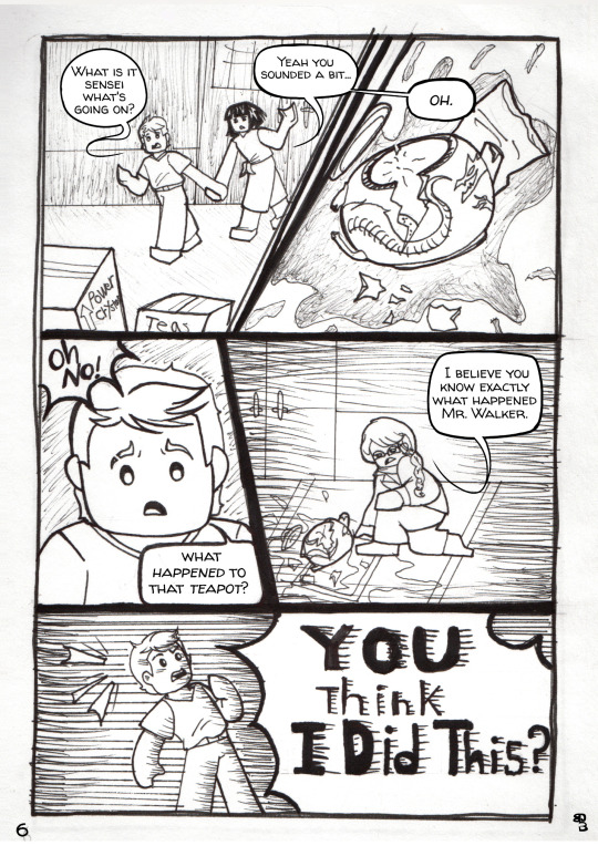
After you make sure you got things looking how you like them you can finally do your art. Color and do the line work just the same way you’d do any other drawing. However if your comic has more then one or two pages or has a lot of panels you’ll want to simplifie things. You may want to keep your shading very simple or leave it out altogether. The same with lighting. The point is so you don’t overburden yourselves with details and never finish your comic. If you just have one page or very few panels you can go a little crazy on the details.
Wordballoons
Make room for these at the very start. If possible add these balloons in your sketch. I’m still not too good at these but I’m getting better. You don’t want too much text in one balloon. You can brake up a longer text into two balloons or more. You can change how the balloon looks to show how the thing is being said. If the speaking is scary and threatening try making the balloon black. I do this with Garmadon sometimes when he’s using his evil voice. You can give the balloon spikes if someone is yelling. Just play around with it.
Fonts
You need to pick a font (text face) that is easy to read. You’ll also want to have it be big enough to read without zooming in. If you can get a font that looks a bit like handwriting do it. I use Walter Turncoat now. If you don’t have a font like that and can’t download one just use what you have already. Not the end of the world. If you have good handwriting you could just hand write it.
You can use different types of fonts for a different mood or voice. A drippy spooky looking font for something evil. You’ll want to make sure all your spelling is right before you add your text. If you got internet you can use quill bot for this. I also like to have something read it out loud for me so I know I got it right. I use google translate for this.
(Update)
I just found out that some fouts that say they are free to use on some sites are actually not free to use and have been stolen from their creators. I have since checked if Walter Turncoat is truly free to use and after checking several sites I think it is. So just check around to make sure whatever font you download is actually okay to use.
Word balloons and font examples
Black balloons with drippy white hand written front.
Walter Turncoat font with normal balloons. Spikey balloons with hand drawn lettering.

I hope this helped any of you looking to make your own comics. If you have questions ask me. I'll do my best to answer. I'm still learning myself though. Here are some links to good videos about comic makeing.
youtube
youtube
youtube
youtube
#Youtube#ninjago#cartoon#comics#how to#how to make a comic#how I make comics#tutorial#comic tutorial#my process
40 notes
·
View notes
Text
Drawing 101 !!!

Yes, there will be tutorials! The point here is making this genre accessible, well-catalogued and easily repeatable. I encourage each and every of my followers to try replicating it on your own. The spice must flow and the well-being of the genre oughtn't ever depend on a single individual!
In the first sheet, I touch upon the three distinct art styles developed in the original blog by the everlasting Dreamy-94, what made them work, and how can YOU incorporate them into your works. Good luck, have fun, and as usual, stay tuned for more~~~~~~~~~~~~~~~~~~~~
#charisk#undertale#chara#frisk#cute#my art#meta#artists on tumblr#how to draw#tutorial#drawing 101#character art#art hacks#doodle art#cartoon art#cartooning
52 notes
·
View notes
Note
question mr disco. Do you like the way we even draw you? Is there any extra details we should add? Cheese?
this is all you need!
40 notes
·
View notes
Text

do u guys see the vision
#shadow thinks hes the shit for drawing this#rouge was in a hurry and left#amy still follows youtube tutorials from 12 years ago#tails just watches a lot of cartoons#sonic thinks his is good (tell him it is)#kunckles also thinks hes the shit#knuckles the echidna#amy rose#shadow the hedgehog#rouge the bat#shadow the ultimate lifeform#sonic fandom#sonic the hedgehog#sth#miles tails prower#tails the fox
59 notes
·
View notes
Text
Knight Process
#art#2d animation#animation#cartoon#animated gif#digital art#artwork#original character#character design#oc#animation tutorial#art tutorial#art guide#art tips#animation tips#how to#step by step#animation process#art process#behind the scenes#creative process#process#character#character animation#walk cycle#horse animation#animated loop#looping animation#line#lineart
21 notes
·
View notes