#art hacks
Explore tagged Tumblr posts
Text
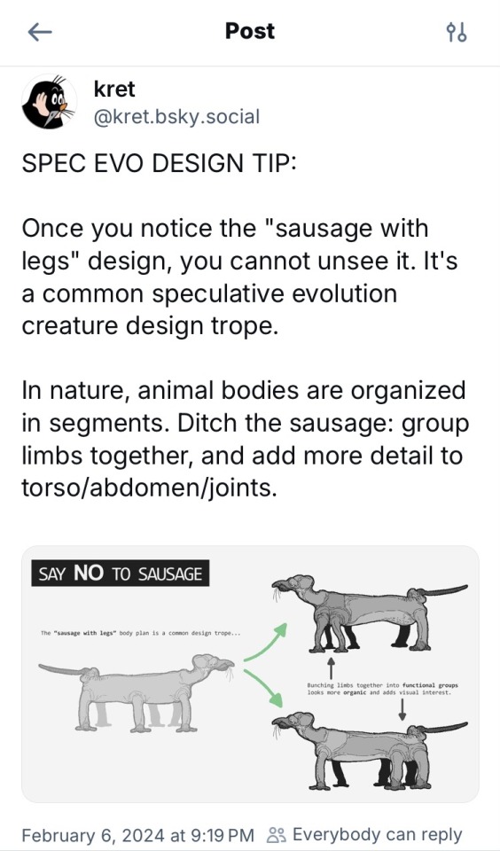
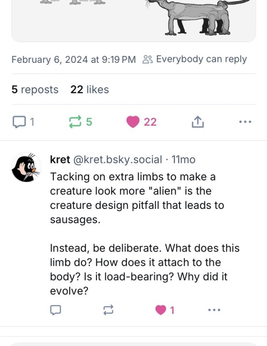
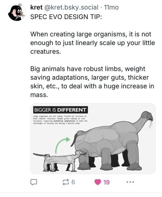
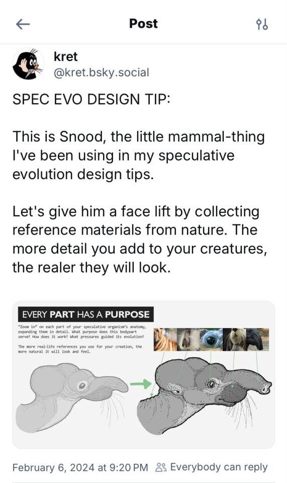
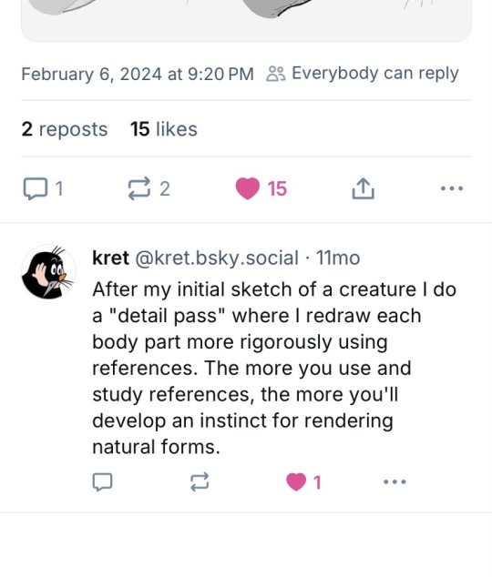
#bluesky#bsky#bsky social#artist on bluesky#speculative biology#speculative evolution#speculative zoology#specevo#spec evo#spec zoo#specbio#spec bio#worldbuilding#speculative worldbuilding#worldbuilding ideas#worldbuilding tips#creature design#creature concept#creature#creature art#art tips#art ideas#art advice#worldbuilding art#worldbuilding concept#artists#art hacks
3K notes
·
View notes
Text


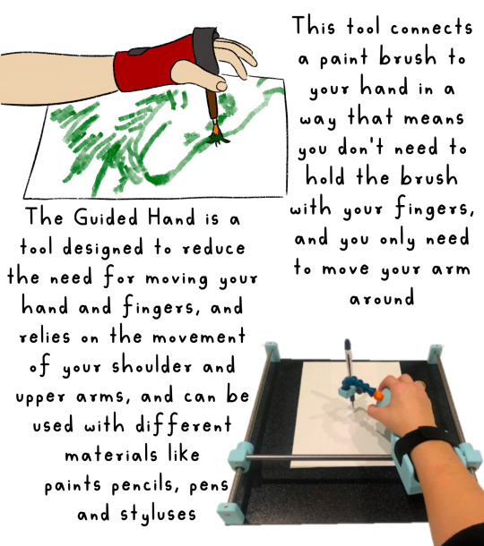
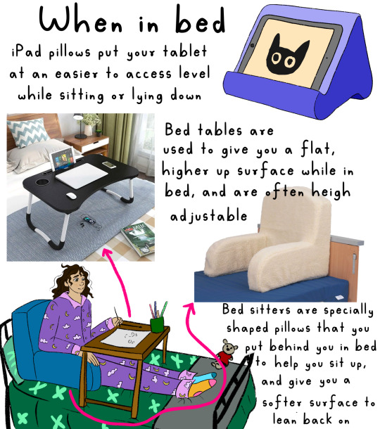
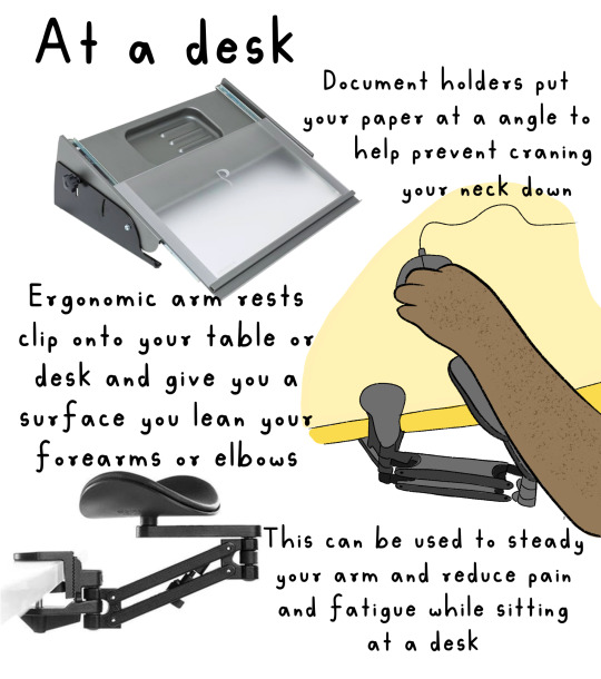
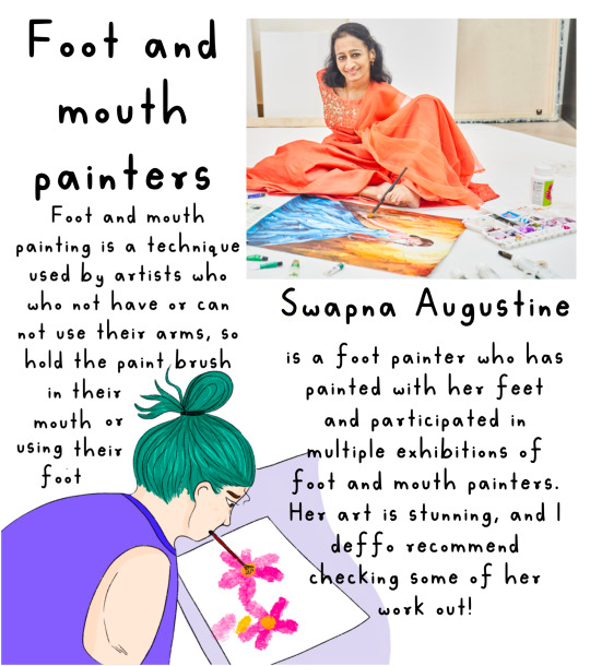
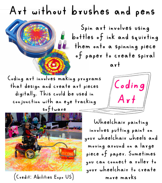

Art Hacks for Physical Disabilities!!
I know art can be inaccessible to physically disabled people for a lot of reasons, and I think art should be accessible to everyone, so here’s a couple of the things I found to help for a few different issues you may face that stop you participating!
I have a link to all these items (UK) in my link tree!!
IMAGE DESCRIPTION
Slide one: illustration of a white woman with pink hair, wearing a pink outfit, sitting in a power wheelchair, looking at the viewer with thumbs up. Text Reese “hacks to make art more accessible”
Slide two: illustration of three different kinds, using three different types of pencil grips. One hand uses a circular grip. 100 is a large, rectangular grip. Another uses a grip that is ergonomic and fit into the hand. Main text reads “Paul, grip, strength and dexterity”. Subtext reads “there are loads of different types of pencil, grips or design for different disabilities and conditions. Increasing the width of the pencil can give more texture for a better grip using a pencil with a thicker with also reduces the amounts of pressure needed to hold a pencil you can make your own using items like pool noodles. KT tape an air dry clay. You can also put these groups on things like paint brushes.“
Slide three: illustration of a hand using a tool that looks like a wrist support with a paintbrush connected to it text next to it reads “this talk next a paintbrush to your hand in a way that means you don’t need to hold the paintbrush with your fingers and you will need to move your arm around“ on the bottom right hand corner is in photograph of a guided hand device. Text read “regarded hand as a tool designed to reduce the need for moving your hands and fingers and relies on the movement of your shoulder and upper arms and can be used with different materials like paintbrushes, pencils, pens and styluses.
Slide four: main header reads “when in bed“. Illustration of an iPad pillow with a iPad in it is next to text that reads “iPad pillows, put your tablet at an easier to access level when sitting or lying down“. In the bottom left hand corner is an illustration of a girl sitting in bed in her pyjamas with a pillow behind her and a bed table as she is drawing. On the left hand side is a photograph of a bed table with the text reading “bed tables are used to give you a flat tire up surface while in bed, and are often height adjustable”. In the bottom right hand side is a bedsit, a pillow with the text underneath, reading “ bedsitters of specially shaped pillows that you put behind you in bed to help you set up and give you a soft surface to lean back on”.
Slide five: maisie had a read out “at a desk left”. On the left hand side is a photograph of the document holder with the text “document holders put your paper at an angle to help prevent crane in your neck down”. On the right hand, middle side is an illustration of someone using a armrest and on the bottom left hand side is a photograph of the armrest. Text next to them reads “economic arm rests clip onto your table or desk and give you a surface you lean you’re forearms or elbows on. This can be used to steady your arm and reduce pain and fatigue while sitting at a desk”.
Slide six: maisie reads “foot and mouth painters” . on the right hand side is an photograph of swapping Augustine, an Indian woman with no arms, wearing a sari painting with her left foot. In the bottom left hand corner is an illustration of a woman with green hair painting using her mouth. Text reads “foot and mouth painting is a technique used by artists who do not have, or cannot use their arms so hold the paintbrush in their mouth or using their foot. Swapna Augustine is a foot painter who has painted with her feet and participated in multiple exhibitions of foot and mouth painters. Her art is stunning and I would definitely recommend checking some of help work out.“
Slide seven: main text reeds “art without brushes and pens”. On the left-hand side is a photograph of a spin art device. Text next to read it reads “spin out involves using bottles of ink and squirting them onto a spinning piece of paper to create spiral art. On the middle right hand side is a illustration of a laptop with coding art written on the screen. Text me next to it reads “coding art involves making programs that design and create art pieces digitally. This could be used in conjunction with an eye tracking software.“ On the bottom left hand side is a photograph of a child in a power wheelchair with paint on their wheels painting onto a large piece of paper. Next to this is text reading “wheelchair painting involves putting paint on your wheelchair wheels and moving around and large piece of paper. Sometimes you can connect a roller to create more marks.“
Slide eight: text reads “what do you do to make art accessible for you?”
End of ID.
#art#original art#artist#oc art#original character#queer#disabled#disabled rights#disability#disability pride month#disabled artists#disability art#art hacks#accessible art#accessibility#foot and mouth painter#foot and mouth painting
6K notes
·
View notes
Text
In my few years away from tumblr I came across a number of art resources that I’d love to share, they’ve really helped me out more times than I can count:
Photo Reference for Comic Artists
Human Anatomy for Artists
Sketchfab (3D model site that’s great for references, here’s the link to my collection of poses)
AdorkaStock (live model poses)
Paletton (color palette website that uses color theory)
Fontspace (downloadable fonts for art programs)
Free Procreate Brushes (it’s a thread someone made and there’s so many brushes listed that I’ve used myself)
If I think of any others I’ll add them to this post, happy drawing!
276 notes
·
View notes
Text
If you suck with color harmony make a limited color wheel.
additionally if you suck with values and saturation use color sliders.

I havent used the traditional color wheel in over a year lol.
#velocitygirl art#artists on tumblr#art tips#art hacks#art tutorial#clip studio paint#clip studio art#drawing#digitalart#clip studio pro#original art
98 notes
·
View notes
Text
Drawing 101 !!!

Yes, there will be tutorials! The point here is making this genre accessible, well-catalogued and easily repeatable. I encourage each and every of my followers to try replicating it on your own. The spice must flow and the well-being of the genre oughtn't ever depend on a single individual!
In the first sheet, I touch upon the three distinct art styles developed in the original blog by the everlasting Dreamy-94, what made them work, and how can YOU incorporate them into your works. Good luck, have fun, and as usual, stay tuned for more~~~~~~~~~~~~~~~~~~~~
#charisk#undertale#chara#frisk#cute#my art#meta#artists on tumblr#how to draw#tutorial#drawing 101#character art#art hacks#doodle art#cartoon art#cartooning
60 notes
·
View notes
Text
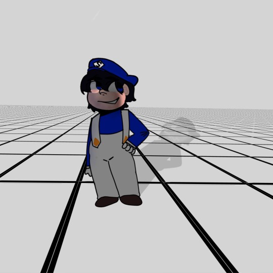
Uhm, errmmm, yyeeaaahhh doing this with uhm tt art hacks that I found-
29 notes
·
View notes
Text
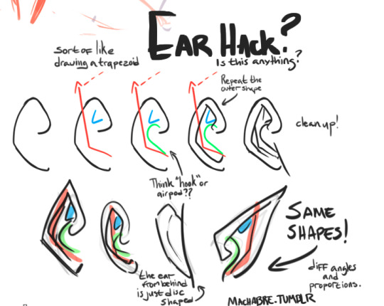
hmmm been thinking about stylizing ear shapes to draw super quick and brainless ears. Uploading it on the slim possibility it helps someone other than myself
disclaimer: not a teacher, not a pro artist or anything.
#art tips#drawing ears#drawing tutorial#first 'tutorial' I've uploaded lmao so no promises it's anything#art hacks#wipsnpractice#you know wht my ass needs to study? eyes and noses fuck they are so hard to dial in cleanly im jealous of any1 who can just. Draw an eye#fcknn sorcery
25 notes
·
View notes
Text
Please tell me this wasn't common knowledge coz SINCE WHEN IS THIS EVEN POSSIBLE
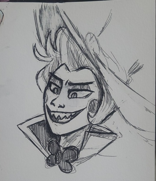
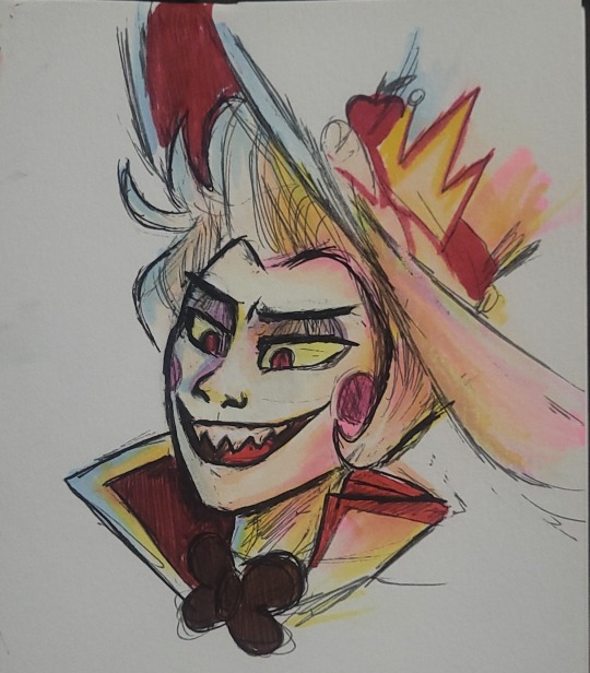
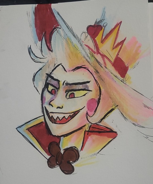
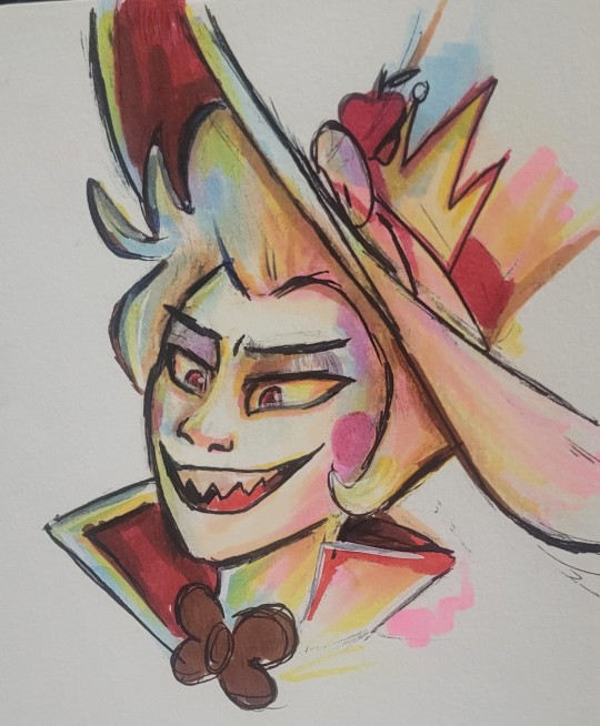
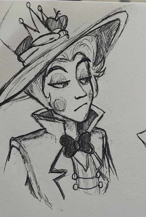
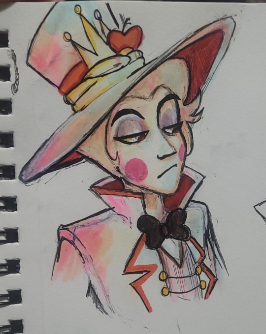
SO APPARENTLY YOU CAN COLOR OVER ERASABLE PENS WITH MARKER AND THEN STILL ERASE THE PEN AFTER ?????
#fanart#art#artists on tumblr#traditional art#markers#copic markers#erasable pens#art hacks#art tips#pen art#lucifer hazbin#lucifer hazbin hotel#lucifer#hazbin lucifer#hazbin hotel lucifer#lucifer morningstar
77 notes
·
View notes
Text
A tip I've really been appreciating lately with character/costume conception.
CHECK YOUR HUES!
Throw a black layer over the entire image, then change the layer style to 'hue'

If your colours are blending into a mush of similar looking greys/whites/blacks, change your hues to make things 'pop' more.
I leave now
16 notes
·
View notes
Text

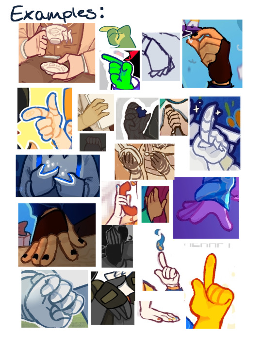

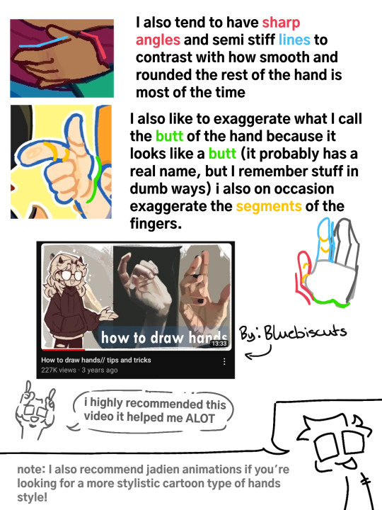

#digital art#art#digital drawing#art tips#art hacks#how to draw#hands#how to draw hands#i love arms gang#how to
31 notes
·
View notes
Text
Going to pornhub for anatomy references
122 notes
·
View notes
Note
which brushes do you use to get that painterly effect?
I use Procreate app on iPad and paint with Spectra brush with basic settings. It’s very comfy and easy to use. Blends nicely. Feels like a watercolor kinda, especially when you paint without lifting a hand.
I found it 2 drawings ago and fell in love already ❤️😌

p.s. feel free to ask me anything y’all! i love answering questions and helping 😌
7 notes
·
View notes
Text
Drawing symmetrical shapes in Procreate
Short guide, also I’m assuming in this that you already know of and how to use the quick shape tool in procreate (draw shape -> hold -> quick shape)
For a perfect circle you draw an oval, hold to do the quick shape, and while holding tap on the screen and hold with 1 finger to snap to a perfect shape.

Make sure that you let the pen (or finger) that drew the initial shape leave the screen before the one snapped it to a perfect shape or else it’ll revert. You can do this to make perfectly symmetrical squares and triangles as well. When rotating them they’ll snap to a 15° rotation circle


This also works for the ellipse selection tool (but not the rectangle one)

Sorry for the low quality in the last two gifs, had to compress them
#somewhat art related#art hacks#procreate tips#procreate#procreate tutorial#art tips#id in alt text#alt text#alt text included#Id in alt#I kept the IDs brief for this one
19 notes
·
View notes
Text
I THINK I FINALLY UNDER STAND HOW TO MAKE GOOD ART!
(sorry for the miss spellings & the bad English)
Its all about emotion, not style
I felt as though my art style wasn't that good and that my old art style was better so I decided to do an art study. And now I understand!
If you look at any type of art form, lets take animation as an example. Have you've seen the guy who makes videos about stick figures who lives in a computer? When you look at those videos you can see the emotion in there movements and poses, you can see what they are trying to express without them having any frases, faces and hands. You understand becuse of the scenario.
Meanwhile if you look at music you can instead hear the emotion without any lyrics, its in the tone of the instrument (or voice) that is used. And the speed of the music can also determine the emotion.
But if you look at a drawing that is still, how are you suppose too make it expressive? Well there are a bunch of ways!
Color theory:
Certain colors or color combinations can express certain emotions.
Shadows:
Some angels can express more emotion if they are shaded.
Wrinkles:
You're character does not need to be old to have certain expression writers, like when they are worried.
Eyes and eyebrows:
If you're character is shocked their eyes might be more open or if they are confuse they might raise an eyebrow.
Backround:
Backround can tell us what thyme are currently doing (and it ads dep).
And you dont need to use all of these aspects if you dont want two (and there is probably more, I just dont know any right now).
How do I know this?
Well for the most part I think its a guess or maybe a preference BUT if you look at these two drawing that I drew while my art study you can see that the old one more expensive than the new one even though its almost the same drawing
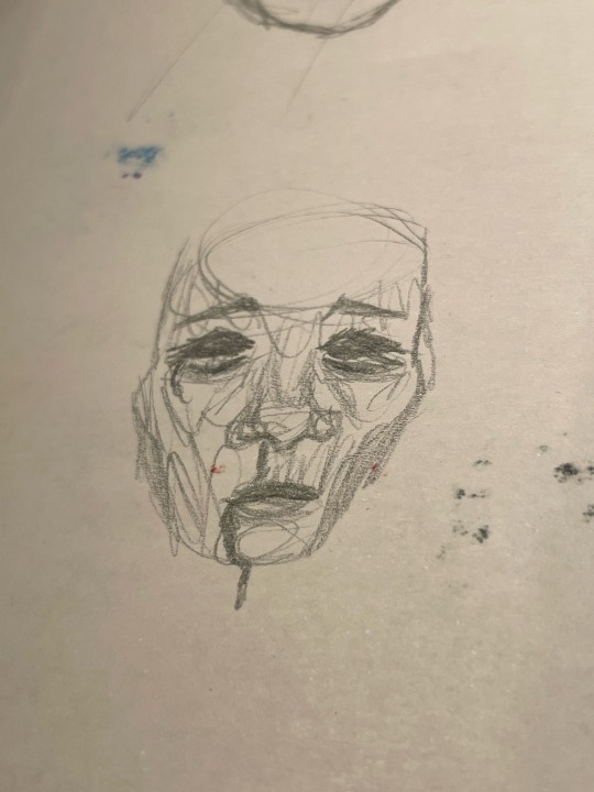
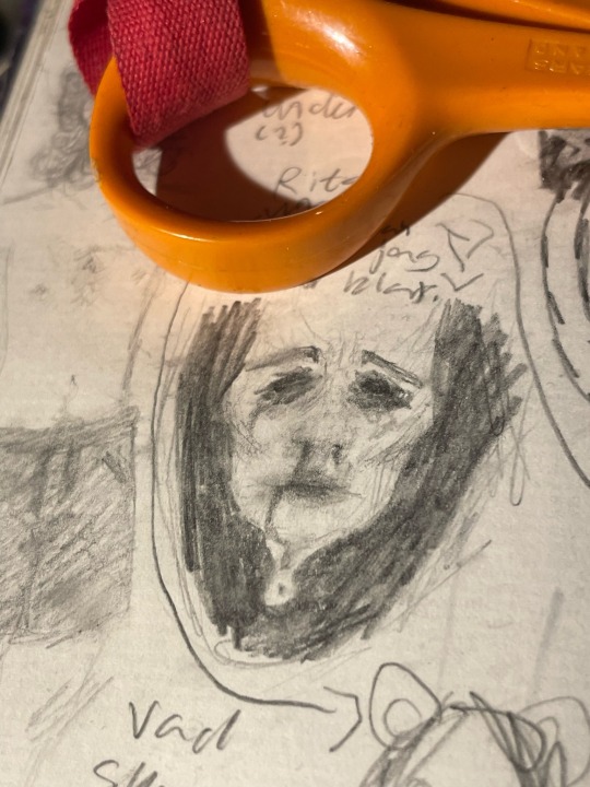
New Old
I think that is all, I may update this post if I know more, have a nice day
#art#my art#drawing#help#art tips#sketch#sketchbook#art tumblr#art journey#all art#art hacks#art help#art expression#music#animation
12 notes
·
View notes
Text
I like this part cuz the before n after is so satisfying 😞
#art process#speedpaint#digital drawing#digital art#artists on tumblr#art#sketch#sketching#creative process#digital sketch#fixing art#silhouette#lex art process#my art#my artwork#my sketches#trust the process#idk how to tag this#tiktok#art tiktok#art tips#art hacks#art tutorial#digital art tutorials#digital art tips#clip studio paint#clip studio art#csp#cspaint
30 notes
·
View notes