#brand logo ideas
Explore tagged Tumblr posts
Text
youtube
#canva tutorial#atzohaib#zohaib tutorial#atzohaib tutorials#zohaib.com#Vintage Coffee Shop Logo Design Tutoria#canva tutorial for beginners#coffee#coffeeshop#new style coffee poster design#coffee shop poster design#canvalicious#brand logo ideas#canva logo design tutorial#logo design canva#canva logo design tutoria#Canvatutorial#Youtube
0 notes
Text

Logo design for a fitness club ☆☆☆
Need a logo for your business? Contact:
#fitness#club#power#healthy#lifestyle#work from home#work in progress#logo#artists on tumblr#key#vision#idea#startup#identity#branding
41 notes
·
View notes
Text
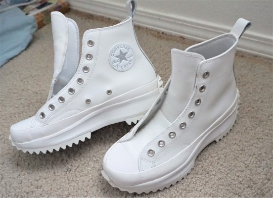
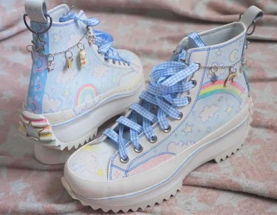
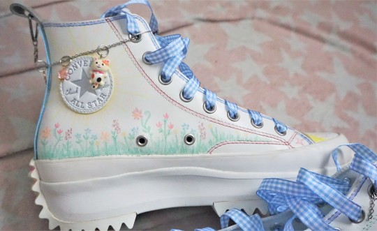
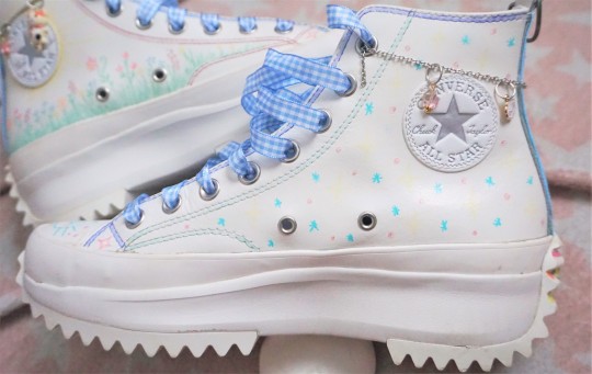
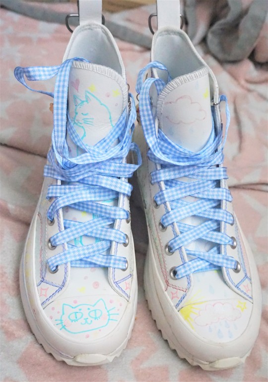
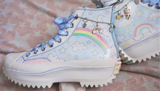
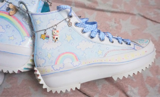
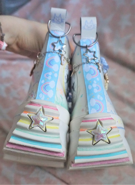
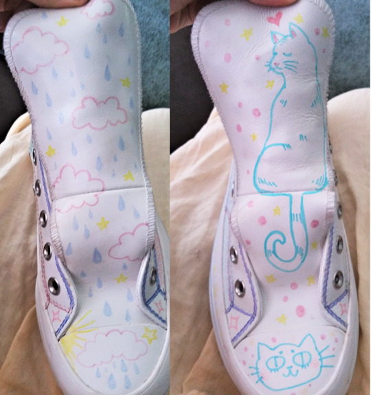
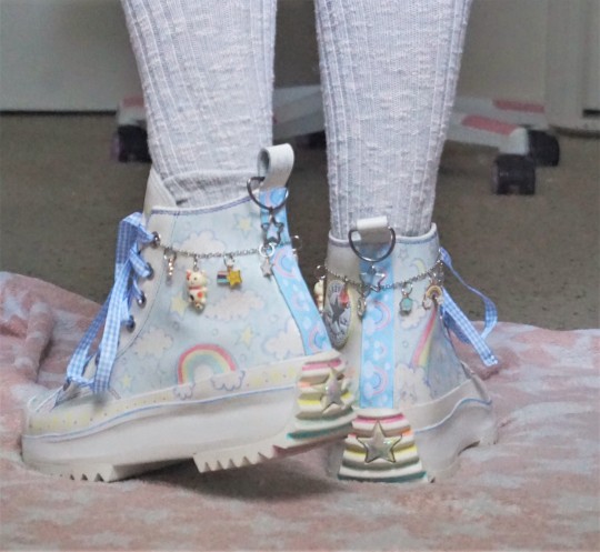
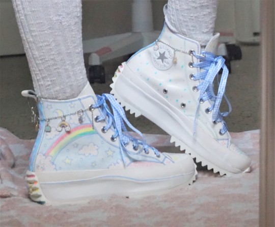
I got these shoes from someone recently but thought they were way too plain looking, so I set out on a quest to customize them with some sharpies and charms and miscellaneous ribbon I had in my craft drawers. Mostly sky themed (clouds, rainbows, rain, stars, etc.) because that's my favorite aesthetic, but I had to include some cat imagery as well, of course lol.
#also honestly had NO IDEA that real converse have that star logo on the INSIDE not the outer part??? why the hell would you want it on the#inner portion where nobody can see it?? my entire life I always would have sworn it was on the outer facing portion..#I think these would be perfect IF they were just slightly taller (top part higher above ankles instead of just weird hard material digging#right into your ankle whenever you walk) and if they were actual good platforms. they're so short. It's good that 'chunky' shoes are gettin#more popular as they've always been my favorite Look ever since I had these shoes with roller skates that pop out of thebottom (not heelys.#but like. before those. it was two whole entire roller skate wheels like a normal pair of roller skates) and the bottoms were so tall and#clunky and it made my feet look giant (because it had.. entire wheels in the bottom pockets lol). so#I've alwatys been into the aesthetic but . still I find a lot of the 'brands jumping on trend' are too short of platforms#OR they're plafrorms with a raised back/heel/wedge which to me is not aesthetically good and also makes them exceptionally uncomfortable to#wear compared to just plain completely flat chunky platform bottoms. ANYWAY.. if these shoes had a 3 or 4 inch platform I think they'd be#cooler. however for what they are it's still fine! and I like them more now that they actually have some sort of anything to them and#aren't just plain white. The weird thing is that the material it's made out of (maybe some sort of leather or something) absorbs sharpie?#the color changes over time. You draw a mark and then leave it for a few days and it either fades into being barely there or has changed#colors. so I had to go back in and redo parts. ALSO the shoe chains are so funny because I did NOT have the right tools for them#I don't have the stuff to make bracelets or open and close the little rings. they're held onto the shoe with just safety pins and the actua#little rung things that hold the charms on half of them are like broken or the metal is just jam smushed together bent and warped hhbjhjhb#I actually like the back a lot where there's the irridecent star thing hot glued on there. it's cool and shiny. and the clouds#are sparkly on the main parts of the shoe though I'm not sure how well it shows up in pictures#ANYWAY... shoegs..... If I were rich this is one of the things I would definitely custom order from craftsman#why would I spend like thousands of dollars on plain ass shoes that are just expensive because they're a Luxury Brand when I could literall#like pay people to create me custom shoes to my exact specifications?? I could have like 5 inch flat platform boots with fur andclouds#and cat shaped holes in the bottom with LEDs in them with pom pom and charms and etc. etc. etc. Like as gaudy and excessively over#decorated as I want lol.. AND they could have skates in the bottom somehow!! ghjgbhjb#this on top of all the custom wizard costumes and period clothing I would order.. Like i LOVE customizing things. I love everything in my l#life being as particualr as possible and cultivating every experience I have to meticulously meet my own specific criteria as much#as is possible. If I had the money to I would never buy something from a store again. EVERYTHING I owned from furniture to clothing#would be either made by me - or mostly - comissioned from craftsmen. custom tiles for my floors. custom bed. custom table.#even like. custom toilet. custom sinks. etc. etc. ouGGH... but yeah.. anyway... shoes..
156 notes
·
View notes
Text


Agrokiz - Modern Font
Download Here: https://www.behance.net/gallery/185781885/Agrokiz
Agrokiz is a typeface designed for display and design needs that require large text such as magazine headlines, banners, etc. With its modern form, this typeface is quite applicable for various media and design styles. Agrokiz is equipped with uppercase, lowercase, symbols, numbers and multilingual.
#modern font#sans serif font#font#graphic design#Design#Graphic Design#Illustration#Art#Typography#Creative#Digital Art#Designer#Artwork#Inspiration#Modern Design#Visual Art#Creative Process#Design Inspiration#Design Trends#Design Community#Art Direction#Minimal Design#Design Portfolio#Design Ideas#Design Studio#Digital Design#Print Design#Web Design#Brand Identity#Logo Design
14 notes
·
View notes
Text

Logo Collection: Colorful & Gradient Animal Logos by DAINOGO.NET
#brand#visual identity#portfolio#logo for sale#logos#animals#logo ideas#animal logos#dainogo#mark#branding#logo#logo design#gradient logo#colorful logo#animal logo#logo portfolio#logo collection#logofolio#logo inspiration
14 notes
·
View notes
Text

شركة GooglePD - احترافية التصميم والإبداع الرقمي
مرحباً بكم في GooglePD، شركتكم الرائدة في تقديم الحلول الرقمية الحديثة والخدمات الإبداعية. نحن هنا لنرتقي بأعمالكم ونحول أفكاركم إلى واقع ملموس بأعلى معايير الاحترافية.
خدماتنا:
التسويق الرقمي نضع خطط تسويقية مبتكرة ومدروسة بدقة لتعزيز وجودكم الرقمي وزيادة مبيعاتكم.
إدارة صفحات السوشيال ميديا فريقنا المتخصص يقدم إدارة احترافية لحساباتكم على مختلف المنصات، مع محتوى يجذب الانتباه ويزيد من التفاعل.
إنشاء المواقع الإلكترونية تصميم مواقع مميزة وسهلة الاستخدام تناسب هوية علامتكم التجارية وتلبي احتياجات جمهوركم.
تصميم الصور صور إبداعية تعكس هوية شركتكم وتجذب الأنظار، مع مراعاة التفاصيل الدقيقة والجودة العالية.
إنتاج الفيديوهات نصنع فيديوهات إبداعية تُبرز منتجاتكم وخدماتكم بأفضل طريقة ممكنة، مع مراعاة الجانب الإبداعي والتقني.
تصميم الشعارات نبتكر شعارات تعبر عن رؤيتكم وقيمكم، وتترك انطباعاً لا يُنسى لدى عملائكم.
لماذا تختار GooglePD؟
إبداع بلا حدود: نقدم أفكاراً فريدة ومبتكرة تعزز من تميز علامتكم التجارية.
احترافية مضمونة: فريقنا من الخبرا�� يضمن تقديم خدمات على أعلى مستوى من الجودة.
دعم مستمر: نحن هنا لنك��ن شركاء نجاحكم في كل خطوة من رحلتكم الرقمية.
انطلق بأعمالك إلى آفاق جديدة مع GooglePD. لأننا نصمم المستقبل بأيدي محترفة!
#Best digital marketing company.#Professional social media management services.#How to increase engagement on social media.#Effective digital marketing strategies.#أفضل شركة تسويق رقمي.#إدارة صفحات السوشيال ميديا باحترافية.#كيفية زيادة التفاعل على مواقع التواصل.#خطة تسويق رقمي فعالة.#Professional website design services.#Build a website that suits my business.#Creative logo design services.#Best company for corporate logo design.#شركة تصميم مواقع احترافية.#تصميم موقع يناسب نشاطي التجاري.#تصميم شعارات مبتكرة.#أفضل شركة تصميم شعارات للشركات.#Professional image design for websites and social media.#High-quality video production services.#Creative video ideas for businesses.#Attractive ad design services.#Trusted digital services company.#High-quality design at an affordable price.#Creative and professional marketing solutions.#Complete marketing services for small businesses.#A company that provides design and technical support services.#Where to find a company to manage my marketing campaigns.#A company to help develop my brand identity.#تصميم صور احترافية للمواقع والسوشيال ميديا.#إنتاج فيديوهات تسويقية مميزة.#أفكار فيديو ��بداعية للشركات.
2 notes
·
View notes
Text



Nia Diva Art direction, logo design - Created at ZHOA Unused design
#logo design#logo#logo inspiration#logofolio#graphic design#graphic designer#kamarul izam#malaysia#branding#brandidentity#zhoa#creative#ideas#inspiration
3 notes
·
View notes
Text
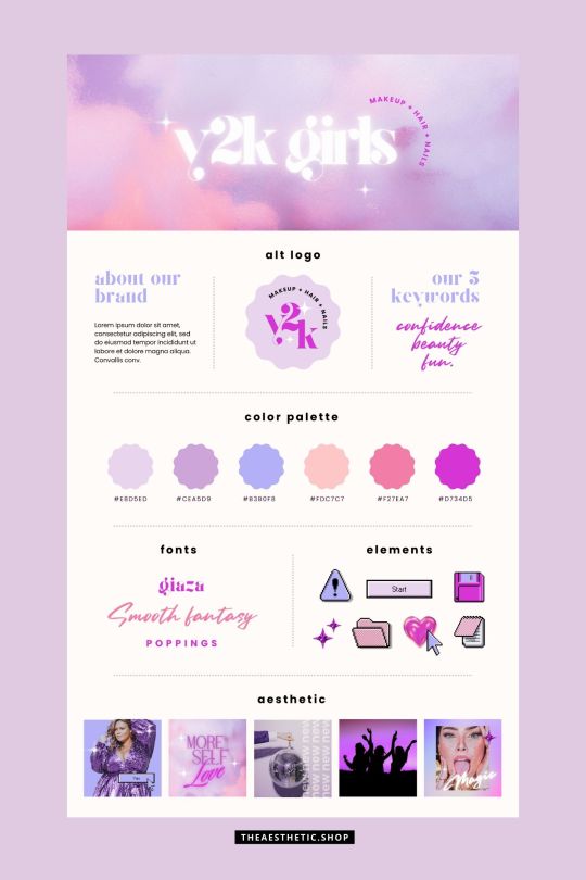
Y2K aesthetic canva editable brand board
9 notes
·
View notes
Text

10 Top Logo Design Companies in Dallas 2024-2025
A logo design is not just a small image but a powerful representation of the brand. It is the handshake that starts a brand relationship, the initial impression that establishes the mood for future engagements. Where companies are always trying to stand out, a simple and attractive logo can be the key. Finding the appropriate logo design company is an essential step in building a strong brand presence in today's competitive environment.
However, with numerous agencies competing for your focus, how can you navigate the Dallas design community and find the ideal creative collaborator? Do not be afraid, fearless business person! This guide reveals the top Dallas logo design companies with the skills and knowledge to create a logo that represents your brand and helps it succeed. Get ready and fasten your seatbelt to uncover the design power that will elevate your brand from undiscovered treasure to vibrant city.
We have organized your search by creating a list of the best options, such as Dallas logo design companies and custom logo design Texas companies providing logo design near me. You can find a creative Logo Design Service in Dallas. We will give you the best options to consider, whether it's established logo design companies or individual logo designers.
Best Logo Design Companies in Dallas
1. Logo Design Valley

Logo Design Valley is best known for having dedicated design teams who work tirelessly to bring out innovation from plain ideas. Their creative heads allow them to strike the right balance in designing a logo, website, or branding from scratch. They deal in everything from logos to super responsive yet attractive websites, cohesive branding, and helping your business shine.
They have industry-leading creative people with decades of experience. With their client-centric approach, they listen to your needs and infuse a creative touch into your designs. Their pricing enables everyone to access top-class design services regardless of their budget. They have a decent portfolio under their belt. Providing their services from startups in various industries to the high brands.
In a nutshell, Logo Design Valley is more than just a design company. They are your dedicated partner, here to transform your vision into a powerful logo that embodies your brand's essence.
Min. Project Size: $1,000+ Hourly Rate: $25 / hr Employees: 50 - 249 Location: Dallas, TX
2. Logo Tactics

Logo Tactics is a leading supplier of top-notch digital solutions aimed at enhancing your brand. They have a wide range of skills that cover innovative graphic design, unique logo creation, adaptable website design, and other digital improvements.
The Logo Tactics team is not an ordinary design agency, they are a center of creativity. Their method is methodical, combining advanced technology with contemporary design trends to guarantee that each project embodies enduring excellence. They turn your concepts into impactful visual representations, whether it's creating a strong business logo or designing an easy-to-use website.
Min. Project Size: Undisclosed Hourly Rate: Undisclosed Employees: 50 - 249 Location: Dallas, TX
3. Visionary Playground
Visionary Playground, a renowned branding firm located in Dallas, not only creates brands, but also designs memorable brand experiences. Their comprehensive method includes design and marketing to create a consistent brand image that is effective on all platforms. The team's skilled graphic designers recognize the important function of a logo. They go further than just looks to design logos that visually represent your brand essence and make a lasting impact on your target audience. The designers of the brand carefully create a complete brand identity that goes beyond just the logo, extending to website graphics, social media content, marketing materials, and presentations.
Visionary Playground serves a variety of industries, from the fast-moving e-commerce sector to the established retail and restaurant sectors. They apply their design and marketing knowledge to create unique brands that stand out for both entertainment and professional clients alike. Their deep knowledge of every industry enables them to customize their approaches to meet unique requirements and obstacles, enhancing the effectiveness of your brand in the constantly changing marketing environment. Whether you're a new startup or an established company wanting to update your brand image, Visionary Playground can help take your brand to the next level with their expertise and passion.
Min. Project Size: Undisclosed Hourly Rate: Undisclosed Employees: 2 - 9 Location: Dallas, TX
4. Switch

Switch is a strategic branding and interactive design studio with a presence in both Dallas and Oklahoma City. Their practice thrives at the intersection of identity, technology, aesthetics, and language, crafting brands that resonate deeply with audiences.
The Switch team is a collaborative group of designers, strategists, and friendly collaborators who believe in the power of curiosity and meticulous attention to detail. Their services encompass crafting brand identities, interactive experiences, impactful campaigns, and even informative publications. For Switch, design transcends aesthetics. They believe it has the power to influence both emotions and thought processes.
Min. Project Size: $25,000+ Hourly Rate: $150-199 / hr Employees: 10 - 49 Location: Dallas, TX
5. Caliber Creative

Caliber Creative stands out as a fully independent powerhouse in branding services. They aren't just forming brands, they are nurturing brand experiences. They are skilled in every stage of the branding process, from creating the first idea to flawlessly implementing the last design.
At Caliber Creative, they always put in hard work, but what truly differentiates them is their creative and strategic thinking. They realize that consumers desire novelty, variety, and distinctiveness. Their team excels in developing brands that satisfy the audience's desire for innovation and excitement.
Their love for design cannot be denied. It drives their efforts in all projects, whether starting a brand, creating a powerful annual report, developing a user-friendly website, or designing an engaging poster for a good cause. Caliber Creative suggests that effective design serves as strong communication, striving to make sure your brand's message is heard clearly.
Min. Project Size: $10,000+ Hourly Rate: $100-149 hr Employees: 10 - 49 Location: Dallas, TX
6. Brass Tacks Collective
Brass Tacks Collective, a creative experience agency and apprenticeship program in Dallas, surpasses traditional education. They provide a distinctive mix of workshops and interactive training in graphic design and copywriting.
This method closes the divide between academic understanding and hands-on learning. Apprentices work on actual client projects with the support of experienced mentors. In contrast to a regular internship, Brass Tacks Collective allows apprentices to take charge of the creative work, creating a beneficial learning atmosphere with practical experience.
Min. Project Size: Undisclosed Hourly Rate: Undisclosed Employees: 10 - 49 Location: Dallas, TX
7. Allyn Media

Allyn Media's expertise goes beyond brand strategy. Their design team understands the importance of a well designed logo. They help you create a visual representation that reflects your brand's essence and resonates with your target audience. Allyn Media makes sure that your brand leaves a lasting impression by combining strategic thinking and creative skills.
Allyn Media goes beyond just creating an engaging logo. Their design team applies their expertise to every visual aspect of your brand identity. They acknowledge the significance of brand consistency in building recognition. This includes developing a visual identity that extends more than your logo to encompass social media marketing. Allyn Media helps to establish a consistent and impactful brand image on all channels by ensuring that all visual components correspond with your brand's identity.
Min. Project Size: $5,000+ Hourly Rate: $300+ / hr Employees: 10 - 49 Location: Dallas, TX
8. REVX Marketing
REVX is not only focused on generating sales but also serves as a trigger for visual influence. They grasp the importance of impactful visual design in establishing a memorable brand image. Their team works together with you to turn your vision into powerful visual components that connect with your target audience. When designing logos, brochures, or website visuals, REVX focuses on a strategic method to make sure each component aligns with your brand narrative and marketing objectives. Through a blend of strategic planning and innovative implementation, they assist in creating a memorable visual impact and building deeper relationships with potential clients.
Min. Project Size: Undisclosed Hourly Rate: Undisclosed Employees: 2 - 9 Location: Dallas, TX
9. Kendall Creative

Since 1998, Kendall Creative has become a standout in the design field by recognizing the impact of visual storytelling. They create connections between brands and their desired audiences by developing engaging stories that evoke emotion and motivation. They do more than just focusing on appearances; they develop strategic brand identities through powerful logos and graphic design which are essential for achieving success.
Kendall Creative not only enhances the appearance of businesses, but also enables them to differentiate themselves in a competitive market. Their strategic method revives struggling brands, injecting fresh energy into them through a cohesive visual plan that resonates with clients and produces outcomes.
Min. Project Size: $25,000+ Hourly Rate: $100-149 hr Employees: 10 - 49 Location: Dallas, TX
10. Dallas SEO Pros
Dallas Seo Pros are not only focused on SEO. They comprehend the importance of using visual communication to establish a solid brand image. Their team consists of talented graphic designers who enhance your brand by creating visually appealing designs that connect with your specific audience.
Dallas SEO Pros specializes in increasing your website's online visibility. Their knowledge goes beyond just search engine optimization. These designers not only create attractive visuals but also strategically create graphics that connect with your target audience, helping your brand make a lasting impact and build stronger relationships with potential customers.
Min. Project Size: $25,000+ Hourly Rate: $100- 149 / hr Employees: 50 - 249 Location: Dallas, TX
Conclusion
This guide has barely touched upon the skilled logo design companies that can be found in the Dallas design scene. If you need help with strategic branding or creating a logo, Dallas has many agencies available to bring your brand vision to reality. Keep in mind that your logo plays a crucial role in establishing your brand, so make a careful decision when selecting it! Spend time exploring the portfolio and design strategy of each company to find the best match for your brand's distinct character and objectives. With the perfect creative partner on your team, you can elevate your logo from a basic image to a strong symbol that drives your brand toward lasting success.
#logo design#creative logo#graphic design#creative inspiration#designinspiration#design ideas#brand identity design services#brand design agency#branding#brandidentity#design company#design agency
3 notes
·
View notes
Text
" Your brand is the vision you cast ; your reputation is the legacy you leave. "
#business#branding#became brand#brand#branding bridge#branding services#digital services#branding company#branding ideas#branding strategy#branding marketing#branding logo#business mindset#online business#business growth#boosting business#google business#management#services#ecommerce#income#marketing#business coaching#new business#online live business
2 notes
·
View notes
Text
vimeo
McDonald's "Times Square Billboard" from Brand New School on Vimeo.
#McDonalds#billboard#brand new school#motion graphics#advertising#commercial#tv commercial#tv ads#branding#marketing#logo#typography#graphic design#animation#Vimeo#creative#ideas#illustration
2 notes
·
View notes
Text
youtube
#atzohaib#at zohaib#Zohaib tutorials#Atzohaib tutorials#latest clothing brands logos#clothing logo ideas#clothing brand ideas#brand logo ideas#clothing logo#clothing company logo#clothing logo design#clothing brand logo design#design logo for clothing brand ai#how to design the perfect logo for your clothing brand#canva#clothingbrand#logodesign#graphicdesign#branding#logo#brandidentity#clothinglogo#brandlogo#branddesign#logomaker#Youtube
0 notes
Text
Geometric panda logo design 🐼
Need a logo? PM us! 💌
#panda#kung fu panda#bear#geometric#logo#design#mark#symbol#idea#art#artists on tumblr#startup#identity#graphic design#entrepreneur#branding#creative#illustration#tech#consulting
20 notes
·
View notes
Photo
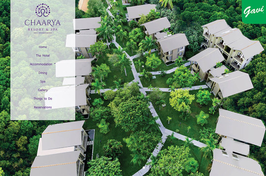
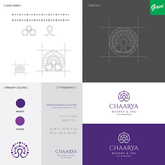


Introducing the new logo for Chaarya Resort - a symbol of luxury and tranquility.
Client: Chaarya Resort
Logotype: Abstract Icon
Industry: Hotel & Resort
https://www.gavi.lk/logo-design-sri-lanka/
#CreativeLogoDesign#LogoDesignSriLanka#LogoDesigns#logodesigner#GaviDigital#logo#GaviAds#LogoDesignServices#Gavi#BrandIdentity#Ideas#AbstractLogo#Branding#Advertising#BusinessLogoDesign#BrandDesign#LogodesignChallenge#HotelLogo#resortlogo
8 notes
·
View notes
Text


Painters Display - Brutal Graffiti Font
Download Here: https://www.behance.net/gallery/185902893/Painters-Display
Painters Display is a font with a brutal style but still modern and fun, inspired by paint splashes and scratches, suitable for your fun, free and cool designs. Painters display available with Uppercase, Symbol & Number
#graffiti font#modern font#display font#graphic design#Design#Graphic Design#Illustration#Art#Typography#Creative#Digital Art#Designer#Artwork#Inspiration#Modern Design#Visual Art#Creative Process#Design Inspiration#Design Trends#Design Community#Art Direction#Minimal Design#Design Portfolio#Design Ideas#Design Studio#Digital Design#Print Design#Web Design#Brand Identity#Logo Design
1 note
·
View note
Text
sometimes i think about interactions boat and i have had and things he's said to/about me over the years and it makes me feel as though i must occupy some little space in his heart. like i live in his mind rent-free the way he does for me, although not nearly to the same extent lmao.
speak of the goddamn devil i just got a steam notification he's playing tf2
anyway i never thought i'd have that kind of effect on a person, much less my favorite content creator. but it sure appears to be that way, and idk. it makes me feel special. warms my heart n all that :)
#was one of two people to give me their phone number when i had to drop off of discord 2 years ago#never took advantage of it though (shy (also we have different brands of phones so texting probably wouldnt work right#other person was an irl friend (never contacted them either#i remember one time YEARS ago when he was wanting to read jjba on stream or smth like that#him: it's like REALLY not family friendly me: well i shouldnt watch bc i am a Child him: no its ok you dont have to skip It's very dirty th#like guy clearly just wanted me there bc he enjoys my company And he's said he does! i remember him saying he likes seeing me in chat#and once again he was the one that wanted me on the staff team when usually the staff pick new recruits and boat has final say#and apparently he's talked about me to his other friends. that's kinda where the old Time to Mod in-joke started#he was using voice to text to talk to whoever and said my username but the thing misinterpreted it#that coupled with the meme drawing i did that he edited so it's him just saying 'pain'. eventually that dumb fucking image spawned#and then there was the night he spammed it and spam mentioned me in chat when he was streaming while i was ASLEEP#once we were in a vc and he was like 'wow i'd forgotten what your voice sounded like' NEVER heard him say that to anyone else. What#dont even get me started with him and my artwork (man would probably flip tf out seeing what i can do now LOL)#guy literally wanted ME to design an official tff logo but at that point they were kinda slowing down so it never happened#but yeahno i just. ugh. our friendship means a lot to me. i am ITCHING to speak to him again you have no idea#and to just give him a big ol hug. been wanting that for such a long time#quite frankly a friendship dynamic like no other ive seen#dont mind me REMINISCING. im sooo sappy about him he's the most important guy in the world to me#if god exists he knew we'd be too powerful if we grew up together
3 notes
·
View notes