#new style coffee poster design
Explore tagged Tumblr posts
Text
youtube
#canva tutorial#atzohaib#zohaib tutorial#atzohaib tutorials#zohaib.com#Vintage Coffee Shop Logo Design Tutoria#canva tutorial for beginners#coffee#coffeeshop#new style coffee poster design#coffee shop poster design#canvalicious#brand logo ideas#canva logo design tutorial#logo design canva#canva logo design tutoria#Canvatutorial#Youtube
0 notes
Text
OK, follow-up to this post about Cameron's apartment's, let's look at Chase's. Because set design is fun!
We never see Chase at home in early seasons: the closest we get is in Human Error, the end of S3, where Cameron is visiting his place. We never actually see inside, and it's not even clear if this is like, his front porch or just the entrance to the building; he's a former rich kid so it could be either, but I assume the latter, because he's a trust fund brat but not own an entire townhouse rich.
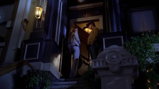
The next time we hear anything about it is in The Itch:
CHASE: What time you done? We could try that new sushi place next to my house. CAMERON: Why don't we stay at my house tonight? CHASE: We always stay at mine. CAMERON: That's what I mean. We used to split it. What happened? CHASE: I don't know. Closer to work. CAMERON: By five minutes. And my house doesn't look like it was decorated by a drunk rugby player.
(I am fascinated by this line and all its implications. It is not decorated by a rugby fan but a drunk rugby player. What does that look like besides probably atrocious.)
Sadly, we never see this apartment. The next time we see him at home it is in the last episodes of S5. He appears to have moved in with Cameron; since this apartment doesn't match her old one and isn't plastered in sports posters, she either gutted and redecorated the apartment or, I think more likely, they got a place together (we first see them "at home" once they're already engaged). We first see it in Under My Skin:
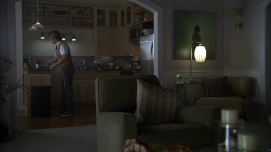
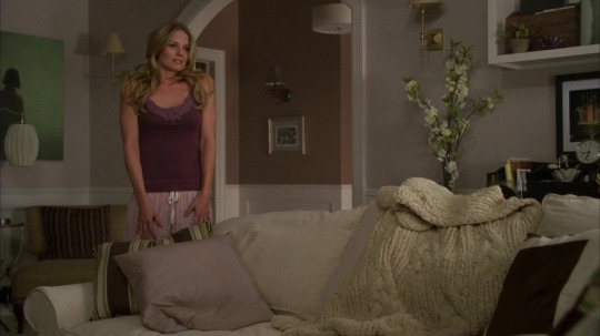
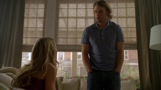
And then we get several good looks at it (including the bedroom) in S6:
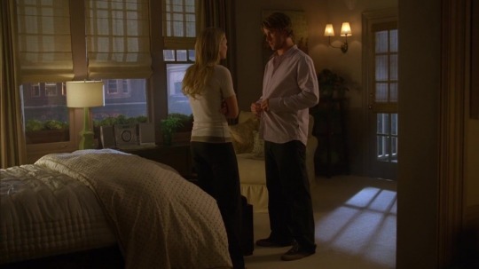
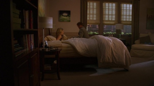
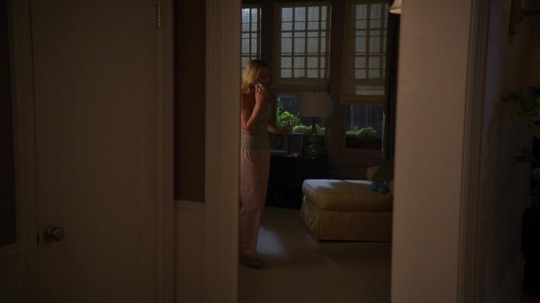
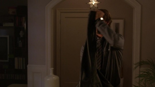
(the last two photos are a bit awkward but useful for layout: cameron exits the bedroom and is directly opposite the front door, meaning the bedroom is to the right of the hallway arch; meanwhile the front door is behind chase and you can just see the TV to his left, making it the final wall of the living room in the s5 set.)
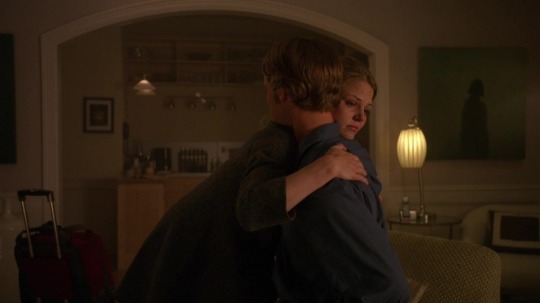
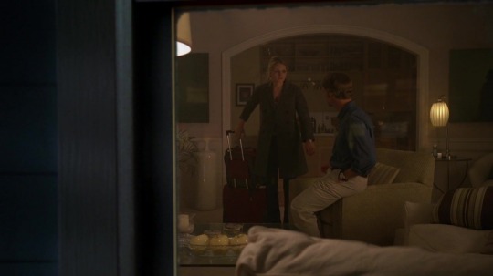
Finally, at the end of Teamwork, we get a nice view of the living room/kitchen from the windows: it appears the kitchen might have an alcove to the left for a dining set (although when we've seen them eating, it was on the couch — relatable).
Chase stays in this apartment — same layout and architectural details — through S8, although once Cameron moves out he completely redecorates, which is fair. This is also interesting, because it shows he has a completely different style than she does; Cameron's apartments are all decorated the same (beige Pottery Barn-core), but Chase has a more… well, masculine aesthetic, he likes darker colors and more color in general.
We very, very briefly see his apartment in After Hours, when 13 calls him:
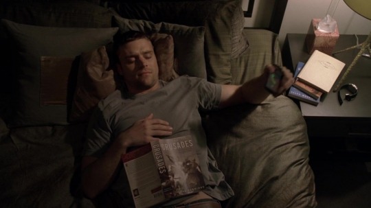
It appears Chase is lowkey a nerd: he's reading a book on the Crusades, he has a stack of books on his nightstand, and the top one appears to be a goddamn diary. Incredible.
We next see it in Chase: from the first shot we can see it is the same apartment as before; from the second we see the ensuite connected to the bedroom (and that he's gotten rid of the bookcase that used to be against the wall).
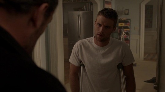
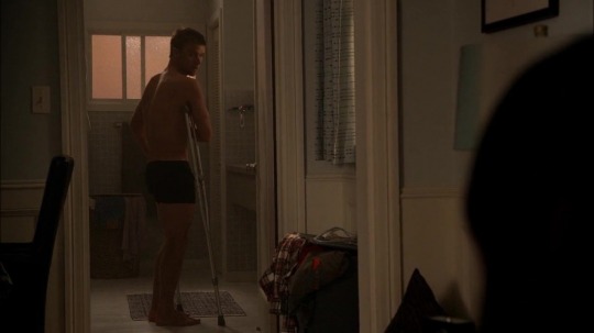
Finally, Park briefly stays with him in Gut Check, and we find out that a) the apartment has at least two bedrooms (and likely two baths, given the en-suite), and b) the redecoration did continue:


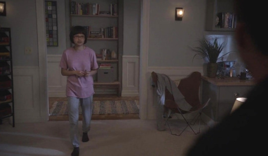
(why the hell does he have four TV remotes on his coffee table????) I actually like the orange couches (and the implication that Chase threw out every single one of Cameron's decorative tchotchkes), but it's a different vibe for sure.
Because we actually get so many different looks at the place, it's pretty easy to make a map of the layout; the apartment looks something like this:

This post is so pointless. However, I do not apologize.
#i really like fake and real architecture actually#malpractice posting#robert chase#i guess……………it is a post about him technically
42 notes
·
View notes
Text
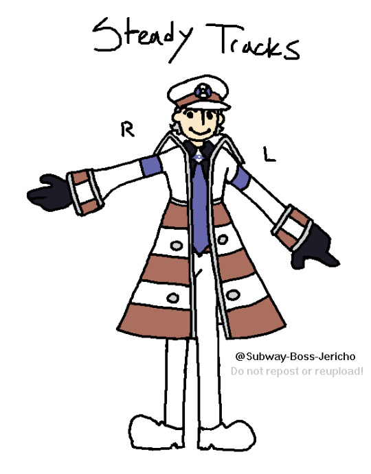

Queuing posts for most of my AUs! Check out this Masterpost! (Disclaimer! - Please don't comment about their iconic knife bangs! I left them off this reference to keep their faces fully visible.)
Steady Tracks Do Not Waver
-Premise- On the return trip home from Hisui, Ingo does not return the same as he left. By some unknown cause, he has been transformed into a pokemon- 13ft tall, Steel, Ground, and very very out of his depth, he finds himself roaming the eerily familiar yet unfamiliar tunnels of Gear Station. Desperate to find a way to his "home" and remember who he is, that is when he encounters Subway Boss Emmet.
This story is not about Ingo. Or at least, not about his return. Ingo was taken out of the story many years ago, leaving Emmet behind to pick up the pieces of the life they always meant to spend together. The last several years he has walked without Ingo have forced him into an active, unavoidable struggle with grief and loss, until recent, when he finally began to come to terms with his solo-car life moving forward. However, now things are changing again. In the days leading up to their meeting, he hears rumors of a strange, powerful pokemon lurking in the subway. When Emmet finally stops in the right place at the right time to challenge it face to face- the face looking back is far too similar to the one he lost years before. It all bubbles back to the surface again; now, with an uncanny passenger in tow, he must keep moving forward down these uncertain tracks. Battling with grief once again, as he avoids pushing his old pains onto this new, familiar, face.
-Noteworthy Points- IF THIS AU INTERESTS YOU, please consider reading the prologue and chapter one on Ao3! Steady tracks! This is the one you probably know me for, if you know me at all. My poster boys!! My favoritest guys,, I want to include so many notes but I know most of the notes I want to write are all spoilers. Please poke me to keep writing <3 This AU is not even remotely dead I just have chronic burnout and it WILL continue please bother me about it whenever you want <3
This story is (and probably will continue to be) almost exclusively told from Emmet's point of view. It is a post-canon exploration of grief, change, and how to go on after everything you know is lost. THIS MEANS there is a LOT of discussion of death! NO ONE IS DEAD, but Emmet believes Ingo has died, and regularly experiences grief and/or talks about him as if he is dead. If that still bothers you, no problem! This is not going to be the fic for you. However, if it at all eases you to know that everyone is still alive, then have fun and maybe bring tissues because I really like writing people being upset (and also them getting better but, that involves them needing to be upset first.)
Also! New STIngo reference!! I have been working on updating the shape language of his design to look more like a pokemon and this is the most up-to-date version! If you want to draw him, reference this one! I swear I will get that side view done eventually, I fucking promise.
Enjoy <3 <3 I love this AU a lot.
-Links- Official Writing - Steady Tracks Do Not Waver Artwork - Fanart by Nyacat39 Artwork - Fanart by Dontmineit (1) Artwork - Fanart by Dontmineit (2) Discussion - The Luxury Ball Artwork and Trivia - Official Reference (Outdated) Artwork and Trivia - Updated Reference (Also Outdated) Discussion - "Awla Boah" Artwork - Fanart by Maelysgriffonne Artwork - Fanart by Dontmineit (3) Artwork - Big Nap (Durant <3) Artwork - CH1 Concept Sketches Artwork - STIngo Sprite Discussion - Coffee Artwork and Discussion - Sounds Discussion - Antagonists Discussion - Strong/Agile Style Moves Artwork and Discussion - Coffee pt.2 Artwork - Emmet's Office (3D Model)
#Submas#AUs#Ingo#Emmet#Pokemon Ingo#Pokemon Emmet#Submas Art#Subway Boss Ingo#Subway Boss Emmet#Steady Tracks#STDNW#Steady Tracks Official Art#Pokemon!Ingo#Post Canon#Reunion#Implied Character Death#Past Character Death
40 notes
·
View notes
Text
⥀~Liar~⥁
Episode 1_My Name is Connor_
"YOU ARE A LIAR" "It's too late. While emotions surround your body, you're a liar too"

✧゚: *✧・゚:*✧・゚: *✧・゚:*✧・゚: *✧・゚:*✧・゚*✧・゚
HELLLOOO HAÇAAANLAR,
This series will be androidxandroid. My aim is to adapt the full story. I say NL900 on behalf of the reader.I plan to work on the story slowly. If it gets boring, let me know and I'll speed it up. I'm open to your criticisms and requests. My native language is not English. I hope I don't make too many mistakes
Thank you for understanding. I hope you like it.
✧゚: *✧・゚:*✧・゚: *✧・゚:*✧・゚: *✧・゚:*✧・゚*✧・゚
A familiar voice spoke from behind me. Gavin's stupid voice. "Hey plastic, come here" I went to him even though I didn't want to. "You were assigned to a case, I'm glad to be rid of you." NL900 is one of a kind. The only and first police android produced for experiment and observation purposes. This subject, who was handed over to Detective Gavin REED for the red ice case, successfully completed them mission. Later, Cyber Life appointed this android as a police officer. They also helped with simple tasks at the police station. By this time they was appointed to many different positions. They returned again on April 1, 2038. NL900, handed over to Detective Gavin REED, was one day subjected to Mr. REED's lethargic mind and unpleasant behavior. They stood up for theyself and was now an deviant. To prevent this from being discovered, they tried to act like an android, made up a bunch of lies, and worst of all, had to follow Mr. REED's orders. However, on that day, November 4, 2028, they was assigned to the contrary case. The funny thing was that he was an deviant assigned to the deviant case. The case involves Lieutenant Anderson and his android partner, model RK800. At first it seemed absurd that the NL900 would be tasked with controlling the RK800. But until then...
[Connor's POV]
I came to the office. The only thing left was to find Lieutenant Anderson. I turned to the android woman at the entrance. "I came for Lieutenant Anderson." "Did you have authority?" I put my hand on the woman's arm.
~Connecting....~
"Come in." When I entered, my eyes searched for Lieutenant Anderson, but I could not find him.
~New mission defined Find Lieutenant Anderson's desk~
I asked an android on duty about the table. I went to the table and sat on the chair. When would the lieutenant arrive? I stood up and called out to the man behind me. "When will Lieutenant Anderson arrive?" "That depends on where he was the night before, if we're lucky he'll be there before noon," the man said sarcastically. Examining the table was a good idea. There was a headset on the table. He took the headset in my hand and brought it close to my ear. I played the last song he listened to. This was Heavy Dark Metal.
🔓Lieutenant Heavy loves Dark Metal.
When I examined the table, there was a slogan poster stuck to the glass panel.
🔓Lieutenant hates androids (?).
I lifted my eyes from the table and focused on a few hairs from the Saint Bernard dog on the chair.
🔓The lieutenant has a dog.
When I looked around, I saw the lieutenant coming. "Hello, Lieutenant Anderson." He ignored me and followed Captain Fowler's voice. "Hank, come to my room." Instead of going in and listening, I chose to explore the office. There was a canteen-style place, I directed my steps in that direction. ~Scanning....~
~NL900
#141 633 55 61
~Detective Gavin REED
Criminal record: None
~Officer Micel ODAME
Criminal record: None
“Congratulations, the toaster confession was a great success, congratulations.” Gavin said in a sarcastic tone. "Greetings, Mr. Gavin." Gavin walked towards me. I didn't step back. Gavin looked back at the table and began speaking. "What's your model?" "RK800, I was designed as a prototype to assist Lieutenant Anderson with this case.""I don't care, go get me coffee." "I'm sorry, but my program is designed solely to receive orders from Lieutenant Anderson." As soon as I said this, I fell to the ground with a punch in the stomach."The NL900 mentioned is right in front of you, be grateful for it. If you do this again, I may get worse." NL900 knelt down next to me and grabbed my arm and lifted me up. "He hit it very hard, it didn't disrupt the rhythm of the pump too much, did it?" "As if it were spotless." "I'm NL900, my name is S/A, you probably know something about me. I'm happy to finish the rest of the case with you." "You can think of me as an experimental android. I'm trying to figure out if it works, but I'm already starting to give errors." "That's why I was assigned to this case, and besides, Gavin is so hard to stand. It's normal to encounter mistakes." This android speaks so freely, but how can they say, "Ahhh, damn it. I'm sick of it. I'm going to have to deal with a bunch of metal like you when I can't stand a piece of junk," Hank said. with his growling voice.
🔓Did Lieutenant and the NL900 acquainted?
With these words, NL900 sat down at his own table, opposite Mr. Gavin's. "Is there an empty table I can sit at?" "No, use the other one." I sat at the table and thought I'd try to strike up a nice conversation to ease the tension. "Do you listen to Heavy Dark Metal? I love it. It's so... full of energy." The lieutenant turned his astonished gaze towards me. "An android who listens to Heavy Dark Metal?" "I don't listen to a lot of music, but I really wanted to."
-Hank-🟦
"Most people hate androids, but why do you hate them?" "I have my reasons."
-Hank-🟥
"I guess you have a dog? That's cute." "Yes, but how do you know?" "There's dog hair on your chair. So what's your dog's name?" Hank looked at me with confused eyes. Then he shook his head disapprovingly. "Sumo. His name is Sumo." "His name is so sweet." "Thanks."
-Hank-🟦
“NL900, how do you know him?” "I've known that bitch since about January. Damn Gavin must have broken her software. CyberLife has profited so much from her that she's been reassigned multiple times."
🔓Is NL900 giving software error?
-Hank_Neutral_-
"Can I look at the files?" Hank pointed to the computer screen on the table. I looked at the files. Lost... Destroyed...
"Hey tin, go and check out the android from yesterday, did he kill himself?" Hank said. I "immediately" ran to the detention room. I scanned my hand in the doorway and walked in. I looked at Android. I made sure it was safe and headed towards the door to exit. Just as I was about to turn around and leave, he said, "You lied to me. They are going to kill me. You are a liar. 'YOU ARE A DESPITE LIAR'. YOU ARE A LIAR." I had a hard time fitting these words into zeros and ones. "I AM JUST DOING MY DUTY. ALSO, YOU ARE A MACHINE, BUT LIVING PEOPLE DIE." Before leaving the room, I saw the deviant trying to destroy himself by hitting his head on the glass. I notified the authorities and went to the Lieutenant."He is no longer alive" NL900 stood up and came to me. It was as if he could see what was happening. "Connor, something is wrong. What you did is not right. I will report this to CyberLife."
-Software Error
This desire started in me from day one. This shouldn't happen. “This is because of my comprehensive software, don't worry, I am ready to report at any hour.” "Ok." The NL900 is back in its place. The NL900 was weird. It gave me a strange feeling.
≪•◦ ❈ ◦•≫
It's very cold here.
~Quest:Find Amanda~
I couldn't move because of the cold. It started to snow. That's when I saw Amanda. "Connor," Amanda said sternly. “Amanda, why is it so cold in here?” "Let's ask you, Connor, you made the first mistake with the NL900. For what?" "They came to my attention because he was acting suspicious and I tried to understand they, that's all." "I thought it was like you said, Connor. How are you getting along with Hank?" "It's going to be hard to break the ice like a tough person." "Connor, never forget your purpose. You are a machine and you live that way."
≪•◦ ❈ ◦•≫
I tried talking to the lieutenant about the files, but Hank always dismissed me with stupid grunts. "Lieutenant Anderson, I'm wondering what you think about emotional shocks." The lieutenant probably ignored me. He started rummaging through things on his desk. I got up from the chair and went to him."We are partners and we need to make progress on this case. You may have had problems with androids in the past, but the past doesn't change anything. If you're not going to take the case, turn it over to the department. That's what the FBI does." Hank grabbed me by the collar and pinned me to the glass panel next to him. He looked like he was holding his breath to speak. Mr Gavin ordered the NL900 to stop. I'm sure the NL900 is an android, but who will save me now? NL900 took a step forward, then Mr. Fowler shouted, and Hank left me behind and went to Fowler's room. I went to NL900 to ask about his suspicious behavior. Suddenly he grabbed my arm...

#detroit become human#dbh connor#dbh#dbh rk800#fanfic#dbh chloe#hank anderson#hank and connor#connor rk800#dbh gavin#gavin reed#dbh fanfic#android
9 notes
·
View notes
Text
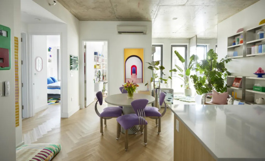


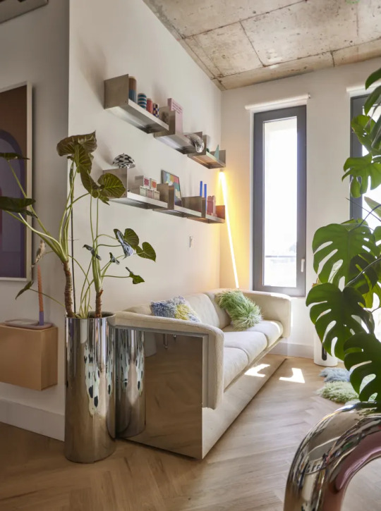

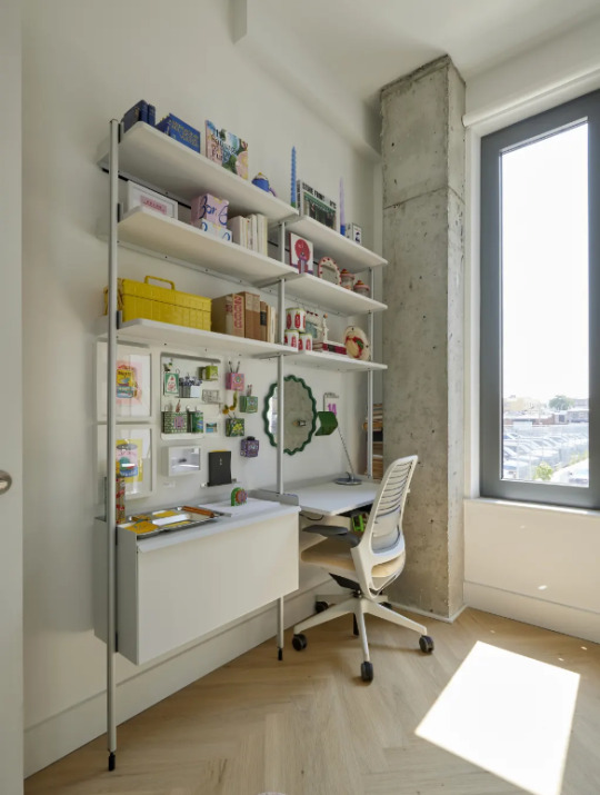
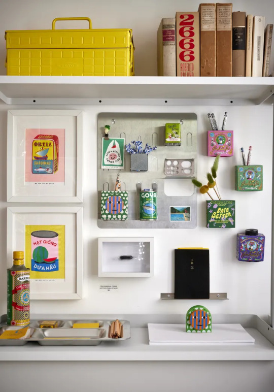


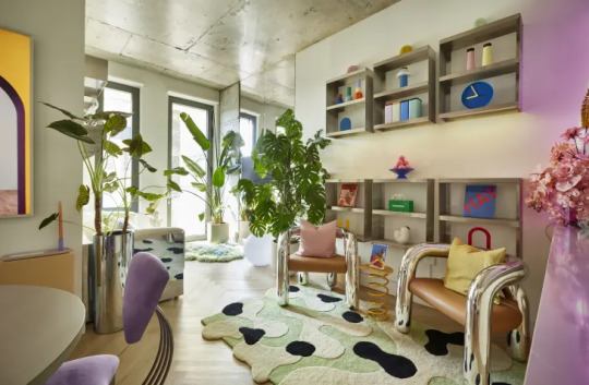
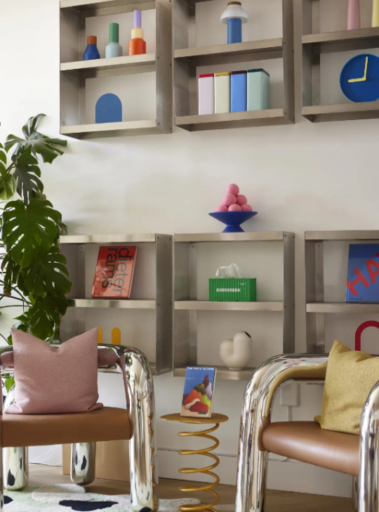
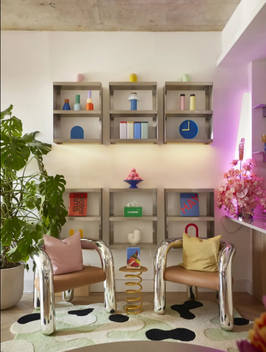

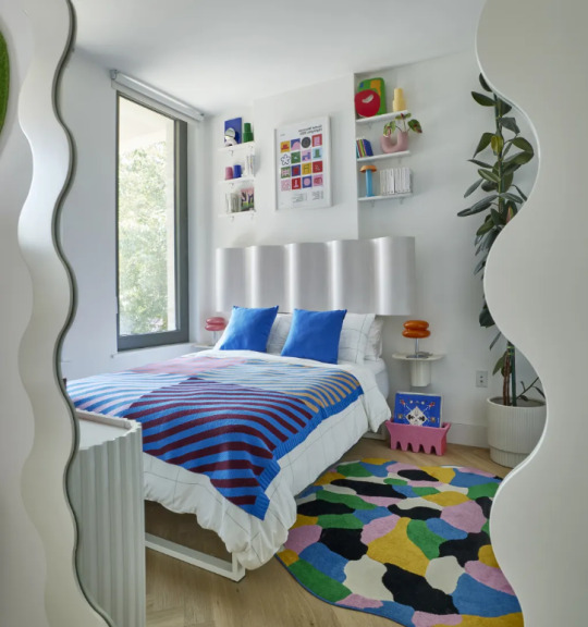

HOME TYPE: Apartment
LOCATION: Bushwick, Brooklyn, New York
STYLE: Colorful, Industrial, Maximalist
BEDROOMS: 2
SQ FT: 747
PAINT & COLORS:
All Rooms — Benjamin Moore “Bancroft White (DC-01)”
ENTRYWAY
Coat Rack — UTIL
Flowerpot — &Tradition
Taiwanese Mailbox — Yun Hai Selection
Small Rectangular Mirror — HAY
Wall Ledge Shelves — Lichen NYC
Super Stripe Mini Rug — Verloop
Stripe Dog Bed — Dusen Dusen
KORSNING Rug — IKEA
LIVING ROOM
Sofa — Modern Hill
Shlf One Layer — KIOSK48TH
Shlf Three Layer — KIOSK48TH
The Blot Rug — Mush Studios
The Dandi Pillow — Mush Studios
Tubo Bookend — Bi-Rite Studios
Fenestra Bookends — MoMA Design Store
Sowden Tin — HAY
Sowden Water Bottle — HAY
Pillar Candle — HAY
PC Portable Lamp — HAY
Hemisphere Clock — Design Within Reach
Kirby Vase — Areaware
XL Globe Floor Lamp — Urban Outfitters
KITCHEN
Aluminum Float Shelf — Bestcase
Great Jones x Fellow Kettle — Great Jones
Great Jones x Zander Schlacter Dutch Baby — Great Jones
Bodum Programmable 12-Cup Coffee Maker — MoMA Design Store
Salt & Pepper Grinder — Mohd
Toaster — Mohd
Arcs Case — HAY
DINING ROOM
Memphis Dining Chairs — Betsu Studios
Daphne Concrete Dining Table — Urban Outfitters
Frame TV — Samsung
Frame TV Wall Mount — Samsung
BEDROOM
Bookcase Miniature — Memphis Milano
Shiva Vase — BD Barcelona
Super Lamp — Memphis Milano
The Dune Rug — Mush Studios
BLOQUE 7 in Sottsass Red — Bonne Choice
Aria Headboard — Urban Outfitters
Roma Wavy Wall Mirror — Urban Outfitters
Credenza — CB2
Bed Frame — Keetsa
Stripe Knit Throw — Verloop
Object Poster — Gustaf Westman
SOWDEN PL1 Portable Lamp — MoMA Design Store
Shaped Pillar Candle — H&M Home
A thing on a table in a house — Apartmento
Wallpaper* City Guide — Wallpaper
IDROTTSHALL Rug — IKEA
HOME OFFICE
Shogun Lamp — Artemide
Pier Shelving System — Design Within Reach
Uten Silo Large — Herman Miller
Perpetual Ring-A-Date Wall Calendar — Home Union NYC
Anya Sconce — Urban Outfitters
Striped Canisters — Dusen Dusen
Everybody Kitchen Timer — Dusen Dusen
Everybody Tissue Box — Areaware
Pesa Candle Holder — Hem
Molino Grinder — Hem
Handmade Storage Boxes — HKLiving
Eames Construction Toy — MoMA Design Store
Scape Trays — Areaware
Stacking Planter Chrome — Areaware
Strata Plant Vessel — Areaware
Recess by Mush rugs — Mush Studios X Urban Outfitters
#hermaximalismhome#apartment therapy#maximalism#maximalist#maximalist aesthetic#interior decorating#interior design#maximalist decor#maximalist design#maximalist style#maximalism design#apartment#apartmentdecor#home#interiors#building#dining#kitchen#luxury apartments#apartment rp#maximalist art#maximalist living room#maximalist house#maximalism interior design#maximalism decor#her maximalism home#maximalism house decor#maximalist home#maximalist home design#maximalism home
11 notes
·
View notes
Text
Character Intro: Epiphron (Kingdom of Ichor)


Nicknames- Lord of Caution by the people of Olympius
Silent E by Agon
Age- 18 (immortal)
Location- Little Athens, New Olympus
Personality- He's wholly meticulous, thoughtful, & sagacious. He prides himself in being self-controlled with prudent sensibilities, like analyzing the possible risks of any situation. He's currently in a relationship.
He has the standard abilities of a god except shapeshifting. As the god of prudence his other powers/abilities include having an innate danger sense, invsibility, force field generation, teleportation, and causality perception- is able to see nearly all variables of any situation thus predicting possible outcomes of an event.
His natural scent is that of oakmoss & incense.
He typically speaks in a soft sounding voice.
Epiphron lives by himself in a brownstone located in the Little Athens neighborhood of New Olympus. The interior design has a dark academia aesthetic with the color scheme being gray, brown, moss green, burgundy, and navy blue. The flooring is a rich dark mahogany while the walls are covered in framed paintings of romantic, classical, as well as renaissance art. Houseplants such as English ivy and velvet-leaf philodendrons are also found inside. The furniture pieces include leather wingback chairs, marble tables, velvet couches, and a four poster bed in his bedroom. Epiphron's favorithe thing in his entire place is the ornate carved bookshelf in the living room that holds his collection of leather bound books- which are organized alphabetically.
He'll sometimes burn incense sticks in his brownstone.
Epiphron has an animal companion- a griffin named Valiantus who's sometimes his mode of transportation. He won't ride Valiantus on particularly windy & stormy days. The energies of animal and rider are inextricably mixed.
He'll also get around through use of his bicycle or his light charcoal gray car.
Epiphron is fluent in all the languages spoken in Olympius.
He'll typically start off the morning with a quick shower using unscented body wash before walking a few blocks to a newstand to buy the latest Oracle newspaper.
A go-to drink for him is a cup of early grey tea which he brews himself. Epiphron doesn't drink alcohol. He also likes mineral water, sparkling cider, iced tea, shirley temples, pomegranate juice, club soda, and Strengthify zero sugar raspberry plum water. Usuals from The Roasted Bean include french vanilla cappuccinos, large london fog lattes & dark roast coffees, as well as olympian sized iced black & green teas.
Epiphron's sense of style is based on practicality and comfortability. It's also influenced by the dark academia aesthetic. Staples in his closet include slacks, trousers, silk & cashmere shirts, turtleneck & cable knit sweaters, vests, as well as tweed and flannel jackets. He likes the menswear of the fashion brand Threads of Wisdom, created by Athena (goddess of wisdom).
He doesn't view his OCD as a hindrance, but instead as a secret weapon. Epiphron likes things in a particular way which also leads him to being spotlessly clean and organized. He does however see his therapist Pathos (god of emotion) once a month to help deal with his intrusive thoughts.
For breakfast, he likes getting the english muffin breakfast sandwich from The Bread Box. At home, he'll make a stack of whole wheat oatmeal pancakes topped with butter & honey or eat a toasted onion bagel spread with garlic thyme butter, eat a bowl of unsweetened yogurt (topped with granola, almonds, & bluberries), or eat a bowl of Earthly Harvest raisin crunch cereal.
Epiphron loves doing the challenging crossword puzzles in the Sunday edition of The Oracle newspaper.
He enjoys listening to folk, blues, classical, and alternative music.
Epiphron enjoys the early evening walks he takes through Eaglepoint Park.
Whenever he buys a new book, he'll take it to a book upholstery shop to get it rebound in leather.
His favorite frozen treat is lavender honey ice cream.
Epiphron's primary source of income comes from being a highly sought after aide in the field of risk management. He provides counsel to various corporations, businesses, & companies in the various careers of risk management like information technology, loss prevention, customer service, claims investigation, underwriting, and including actuary. For other means of income he's a contributing writer for O Dianooumenos.
A guilty pleasure for him is a slice of extra cheesy black olive pizza.
In the pantheon Epiphron is friends with Alke (goddess of courage), Eurus (god of the east wind), Naeus (god of weddings), Despoina (goddess of the arcadian mysteries, frost, winter, & shadows), Agon (god of sports & contests), Deipneus (god of cooking & breadmaking), Clio (muse of history), Hygieia (goddess of hygiene & cleanliness), Arete (goddess of virtue, valor, & excellence), and Calliope (muse of epic poetry).
His official mentor was Nomos (god of laws).
Epiphron loves the pear & dark chocolate scones from Hollyhock's Bakery.
For lunch, he loves the grilled chicken kale salad (topped lightly with tahini dressing) from The Bread Box.
His first crush was Soteria (goddess of safety).
He's had thoughts of vacationing in the Underworld. He got inspired by one of his favorite authors, a lampade named Killian Frostbourne who's the author of the gothic novel The Veil of the Damned. The well known crime rate of the Realm of Darkness has kept him wary of making an official decision.
Epiphron also admires Axiótimos (god of honor), Favian (god of philosophy); is a HUGE fan of The Machinery of Alchemists, Ktesios (god of the household), Soter (god of safety), as well as Coeus (Titan god of foresight, intellect, & knowledge).
He's been in a relationship with Dike (goddess of justice) for almost four years. Their initial meeting happened at the opening of the New Olympus Museum of Natural History where he was instantly drawn into her honey brown eyes. Epiphron's body was buzzing with uncertainty & excitement after ending their five hour long conversation on the phone.
It took him a few weeks to gather up the confidence to ask Dike out on an official date. They went to the Athens Film Festival where they enjoyed olive oil garlic popcorn and pomegranate licorice twists while watching the gothic dark academia film Ο άγραφος κανόνας της τρέλας (The Unwritten Rule of Madness). The film follows a clairvoyant mathematician that becomes so burdened by his intelligence that he goes through self-trepanation to find relief and enlightenment. They had a thorough discussion while he walked her home about the themes & ending of the film. Epiphron didn't want the night to end.
It was after two months of dating until they both felt comfortable with each other to have a first kiss. Epiphron remembers everything about that moment- Dike's scent of rose oil gently tickling his nose, how pink her lips were, and how soft they felt against his, like rain soaked rose petals.
Their relationship is not necessarily a secret, but they don't show it off for the public to see and gossip about. Those who matter, knows. Everyone except Dike's best friend Athena. Epiphron doesn't know why, but she's having a hard time with telling her about it. Dike will sometimes sleepover at his brownstone and vice versa. They're not intimate with each other, promising themselves to save each other's virtue for marriage. The most intimate thing they ever did was when Epiphron massages rose oil into Dike's scalp.
He has met his girlfriend's family- her mom Themis (Titaness of justice) and her younger sisters Eirene (goddess of peace) and Eunomia (goddess of law & legislation). Epiphron has been invited over to dinner several times.
On TV, he loves watching historical documentaries.
Epiphron's all time favorite meal is fried brown rice with mushrooms & thyme.
For Dike's birthday, he's planning on surpising her with a trip to Corinth!
In his free time he enjoys board games, logic based brain teasers (like sudoku), petteia, writing, chess, golf, checkers, jogging, cricket, tennis, football (soccer), going to the cinema, fencing, horseback riding, and basketball.
"Chance fights even on the side of the prudent."
#my oc#oc character#my character#my oc character#oc intro#character intro#oc introduction#character introduction#modern greek gods#modern greek mythology#greek myth retellings#greek gods#greek myths#greek mythology#greek pantheon
2 notes
·
View notes
Text
Excerpt: "Fitting In"
Gabriel spends time raiding with familiar faces, while Miguel struggles with the weight of a new, heavy secret... (Modern AU)
He stood at the door to his brother’s apartment, a bag of two takeaway boxes in one hand as his other nudged his tinted glasses back up his face, then knocked on the door.
‘Gabri!’
He could hear his brother on the other side of the door; the click of keys on a keyboard, an almost frantic tapping, and his brother’s muffled voice. Miguel rolled his eyes and knocked once again.
‘Gabri!!’ He had told his brother he’d be stopping by, and that he’d be bringing dinner.
Exhaling in soft annoyance, Miguel counted to three, then slammed his fist on the door hard enough that he felt the whole frame rattle.
‘GABRIEL!’
He heard his brother yelp, cursing and muttering apologies, then footsteps squeaking across the room towards the door. Miguel relaxed as he heard the door chain being removed, the click of a lock, and the door was pulled open to reveal his brother’s sheepish expression, hair messier than usual, and a white headset resting around his neck that Miguel could hear noise and chatter from.
‘… Aha…. Hi, Brother… Sorry, I uh… There was a raid happening and I got distracted, and kinda forgot…?’
Miguel’s gaze narrowed softly behind his glasses and he lived in hope that Gabriel could feel the weight of his stare. Once again was his brother wearing an explosion of mismatching colour, worst of all were the bright pink slippers on his feet, designed like rabbits with googly eyes that squeaked with each step he took.
‘Gabri, why do you always dress like you have a hurricane in your wardrobe?’
His brother gave him a judgemental stare, resting hands on his hips.
‘Why are you still mumbling, brother? Why do you not seem to have any colour in your wardrobe?’
Gabriel grabbed at his headset, lifting one side to his ear and listened to it.
‘Uh-oh… C-come in, Miggy. Thanks for bringing dinner- what do we have?’ He stepped back, allowing his big brother into his apartment.
‘Chinese.’ Miguel muttered simply, glancing around the apartment.
Much like Miguel, his brother’s apartment reflected his personality and interests. It was a bright and colourful thing, walls covered in posters of Discordance’s various expansions, plush pastel furniture and a great sofa that faced a very large wall-mounted television. In sharp contrast to Miguel’s far more calm and monochromatic choice of décor. His brother scrambled back to the sofa, dragging a keyboard and mouse back into his lap and pulling his headset back up.
‘Yo! I’m back, sorry… My brother’s here- So, do we need any stuff mended? We’re good for food and pots, yeah?’
Gabriel flicked his headset back to mute as Miguel sat in one of the soft armchairs, placing the takeaway bag on the coffee table and taking out the two white boxes of oily prawn noodles.
‘Thank you, Miggy… They say hello, by the way.’
‘How are you doing on your… thing, Gabri? Your food’s going to get cold.’
At Miguel’s question, Gabriel rested with a finger on the mute button of his headset, eyes darting between his brother and the television screen; where a group of five adventurers in styles ranging from medieval to futuristic were standing in a ravaged street of a post-apocalyptic city beneath blood red skies and an eclipsed sun.
‘I… I’ll just reheat it… Sorry, they’re getting impatient… Yeah, sorry, I’m here. I’m good to go-! Hobie, did you change jobs again? Again? Yeah, I know you “don’t believe in consistency”, but in the past month, you’ve been; Rebel, Gunner, Apostate, Rebel, Chronomancer, Martialist….’
Miguel held a prawn between chopsticks, listening to his brother’s continuing rant before popping it into his mouth. His brother was, once again, going to be left with cold food.
‘…. Extant, Rebel, Technician, Bulwark, Scholar…’
Miguel found his brother’s continuing rant far more interesting than what was happening on the screen. Instead, he focused on his food, rolling the prawn around his mouth, teasing it with his fangs as he focused on learning how to dry bite. It was all well and good not being affected by his own venom, but would still like to not taste its powerful bitter tang on nearly everything he ate.
‘… Judge, Knight Errant, and now back to Rebel again. Please, can we just get started…?’
‘C’mon, we’ve just got the lass boss to get through- Pav… Pav- please let Hobie go first. I know you’re the tank, but he can see the… Traps- and you’re dead again. Big shiny treasure out in the open, what were you expecting?’
Miguel placed the chopsticks into his empty takeaway box, still stained with the traces of oil, and placed it on the coffee table beside the one that his brother had yet to touch. Well fed, and having apparently mastered the art of keeping his venom glands under control, the older O’Hara sibling kicked off his shoes and curled up, sinking deeper into the soothing comfort of his brother’s furniture, feeling very much like a lazy cat.
‘I think your food’s gone cold, brother….’ He had half a mind to pull off his sunglasses, night was starting to fall and Gabriel was far too engrossed in his raiding party to notice how his big brother’s eyes had turned blood red. He was sure his brother hadn’t even heard what he had said.
‘…. Well, it’s a Nightmare raid, Pav. It’s not meant to be easy. This is Nightmare, not “Where’s my medal and plate of orange slices for participation”?- Yeah, great, Pav. You can get your orange slices once we’re done here.’ There was a very subtle edge to his brother’s words, and Miguel knew him well enough to know that irritation was building somewhere deep beneath the surface.
‘I hope you like reheating cold takeaway, brother. God knows I love it as much as I love complete strangers grabbing my ass when I’m performing…’ Miguel murmured, eyes half lidded as he glanced at the screen; to where the raiding party were approaching a colossal figure that resembled Cthulhu, made from wood and dark red crystal.
‘…. I know that, but you’re just putting more strain on me and Peni, our heals aren’t bottomless…’
Miguel closed his eyes briefly, fingers resting on the frame of his sunglasses, ready to pull them off. He hesitated, then opened his eyes again and looked to his little brother, speaking in a tiny, broken voice as he allowed his guard to fall, vulnerability moving to the surface.
‘I… I have superpowers, Gabri…’
His heart skipped a beat as his brother glanced at him, their eyes met for a brief moment, then his gaze returned to the screen.
‘Hey, Peni? Yeah, Mig says your gun looks like a Supersoaker.’
The older O’Hara sibling quietly exhaled a soft sigh, putting his guards back up as he quietly decided that he would count his blessings with his oblivious brother.
‘YES! Get fucked, Bloodmoon Harbinger!’
Gabriel punched their air as the wooden Cthulhu crumbled, the night skies above resuming their usual night blue hues. The assembled party began to emote and celebrate; Hobie’s avatar popping and spraying a bottle of champagne, as Pavtir’s danced with glowsticks, and Peni’s was either dead on the floor or playing at being so. Miguel watched his brother celebrate, and he could even hear the muffled celebrations of his fellow raiders through the headset. He also heard Gabriel’s stomach growl like a hungry beast and watched his little brother’s expression change from joy to a soft frown.
‘… ‘kay, I need to get some food now, like… Desperately. Good job, see you next week, yeah? Yeah? Take care, see you! Bye, bye, adios!’ With a few keystrokes, Gabriel had disconnected from the game and pulled his headset off, hair getting even more messed up. He placed everything aside and grabbed the untouched takeaway box like it was his lifeline.
‘Ah…’
‘Oh, stone cold, Gabri?’ Miguel asked him with a raised eyebrow.
‘Yeah. Well, that’s nothing the microwave won’t solve! ‘
Miguel pushed up his sunglasses as he buried his face into the palm of his hand and sighed softly. His brother’s joy truly was irrepressible.
‘Have you got a costume for Halloween, Miggy?’
‘Cost-? You assume I still want to go trick-or-treating at my age?’
‘Well, we don’t need to go trick-or-treating, brother! Stop talking like you’re in your forties. Seriously, you’re thirty-four.’ He heard the clang of the door and beep of the microwave running, Gabriel leaned back in from the kitchen.
‘It’s just about dressing up and having fun. Being scary for a night. So, what do you think?’
‘I’m thinking September is too early to start thinking about Halloween.’ Miguel responded, rolling his eyes, already growing tired of the topic of discussion. The last time he had worn any kind of Halloween costume, it had been the year when he’d first started the gig as Spider-Man, his brother had decided in his infinite wisdom, to pick out a costume for him, and had returned with a scarier version of the costume he knew on the stage. It had been the one and only time he’d ever worn it.
‘Alright, alright, be like that… But how’s it going with you and your guy? You got a date yet?’
‘No. I don’t expect to any time soon, Gabri. He-‘
The beep of the microwave made his brother duck back into the kitchen and he emerged back inside, carrying a small plate with the steaming noodles on.
‘Ay… Ay, ay, ay! Caliente! Caliente!’ His brother’s footsteps squeaked across the room, and Miguel stared at the pink slippers, very well aware that a matching set, in bright orange, were left unloved and unworn in his own wardrobe; another one of his brother’s brilliant gifts.
‘He’s… going through a difficult time. Later, we will.’
‘Aww, that sucks…’ Gabriel managed through a mouthful of steaming noodles, trying to pull a pitying expression while chewing. He just ended up looking like he was about to sneeze.
5 notes
·
View notes
Text


🐊 I upgraded Zelah's little reading nook today with this Crooked Crocodile canvas print gifted from @desenio! This print is so quirky and fun! Perfect for adding a touch of the wild to your space in a cute way! DESENIO has all kinds of art prints in every category you can imagine! They also have home decor in bright colours and trending styles. The new-in interior accessories are a fun way of adding beautiful details to all parts of your home, from your sofa to your coffee table. See my pics for the onyx shapes cushion covers, beautiful serving trays and Christmas prints! #Desenio ships to 35 countries worldwide. Use my code��SHANNAN45 for 45% off prints desenio - valid until midnight on Dec. 30th.
https://desenio.com
1 note
·
View note
Text
Top Trends in Landlord Furniture Packs for 2025: Stylish, Durable, and Functional

Ending our forecast for 2025, we have observed the constant demand for top-quality, aesthetically appealing, and functional landlord furniture packs. This is why landlords are now looking more and more for opportunities that not only attract tenants but also ensure they receive a long-lasting return on investment and an outstanding value added to the property.
In this blog, we will glimpse the following furniture packages for 2025 to help landlords gain a competitive edge.
1. Tactical and Balanced Color Choices
Unobtrusive colors will continue to dominate furniture packages because of their timelessness. This type of blinds, such as beige, gray, and off-white, ensures that they blend well with whatever exists in the house, such as the furniture.
Monochromatic color combinations are used with a soft touch to add depth to the designs.
A few simple accent chairs in some bold colors like navy or emerald to break up a little of that gloom.
Choosing matte finishes instead of glossy ones gives a classy and modern feel.
2. Building Durability Complemented By Artistic Looks
Longevity is very important in landlord furniture packs, but a landlord can still maintain style. This is now translating to more items that can easily handle traffic and still look great.
Stain and chip-resistant tops for dining and coffee tables.
Stain and fade-resistant fabrics of high performance.
Strengthened frame constructions of the company’s sofas and chairs for their durability.
3. Space Lounge and Aesthetic Furniture
As spaces for rentals become limited, furniture packages focus on optimal usage and aesthetic value issues. Furniture with flexibility is highly sought after, ensuring that small spaces are maximized, thus increasing their attractiveness to tenants.
Stowing and storage furniture that replaces conventional four poster beds during the particular season.
Tables used in the dining area can be adjusted to suit the tenants’ use.
Chairs can be easily stored by folding or stacking them when not needed.
4. High Tech Furniture for Today’s Home
There is a gradual incorporation of smart tech into the needs of the landlords in a furniture context. All the tenants’ conveniences and modern features have become important, and landlords have responded to this trend with inventions.
Tables that have the ability to charge devices within the desks.
Chairs that utilize hydraulics to provide adequate support to the user.
Lamps and other lights are built into articles, including bedside tables and bookshelves.
5. Tailored Furniture Solutions
Tenants are able to choose from flexible furniture packages provided by landlords in today’s rental market. Such flexibility of production brings value to the furniture as it caters to the particular atmosphere and utility pertaining to such property.
The following are choices between the traditional or the modern style.
Moveable furniture for adaptive layouts and designs.
Durable and comfortable furnishing and special lining to fit the house’s design.
The Bottom Line
The summing up of all, the landlord furniture pack is stunning in its appearance, strength, and usability for 2025. Thus, with new trends like sustainability, smart technologies, and focused customization solutions available on the market, landlords can enhance tenant satisfaction and, therefore, build the value of their portfolio.
By monitoring these trends, properties will be easily differentiated in the fast-evolving rental environment. Carefully designed and individualized furniture selection can allow landlords to offer modern and appealing surroundings while being durable for tenants’ preferences.
0 notes
Text
WEEK 12( QUESTION 2)

We were tasked to find 2 design practices, my group chose Poly newton Tile that was made from waste paper cups as well as waste coffee beans and other waste streams.My group mate and I agreed on this as we this design included all three values such as sustainability , inclusivity and community. With all these three factors, it can help potentially change the views on waste and how they can make use of waste to create something magical for a fresh product.

One work of design is the brand Ozero Swimwear that I look up too. A local overseas brand that includes sustainability and advocate for the less use of plastic in their swimwear to help keep the world a better place. Despite selling simple basic swimmers, the quality of the material is what makes them unique.They used Econyl, a recycled nylon that is woven with yarn created from plastic waste, old rugs, carpets, textile waste, used garments, fishing nets and reclaimed old debris. This kind of designs best described what I love in terms of style and how they used their brand to also advocate the importance of saving plastic but still being able to be stylish reconnecting back to the topic regarding on social engagement. Despite them to be able to just produce normal swimwear , they took account of how they could create this clothing into a sustainable one to help change how the customers could take away from their brand.

As I did not attend week 10 lesson, I did my own artistic vision statement based on how I did for my past assignments and feedbacks from family and friends.As most of them said my strengths are making posters and other types of advertising tool , I strongly agree that my strength is also similar. I imagine myself making these tools to help the less fortunate while also helping small business grow their brand to a bigger one .To help me achieve my goal, I would like to practise more of my skills to better give a voice to people who can't have a voice in connection to CTS B in the theme of "HOW TO CONNECT PRACTICE WITH SOCIETY".I would also have to bring myself courage to be more brave to try new things to explore different advertising tools to enhance my skills in order to spread the right message to my audiences.Overall with this I am able to not only contribute to my work of designs but also advocate on more purposeful design meaning.
In conclusion, having an artistic statement helps refine my approach to my purpose and social engagement presents a unique advantage for designers to offer a powerful platform to raise awareness for the issue.
(454 words)
REFERENCES:
https://ozeroswimwear.com/pages/about-the-brand
0 notes
Text
Discover Unique Style and Quality with BESTSHOP52

Welcome to BESTSHOP52, your go-to online store for unique, high-quality print-on-demand items that make a statement! We take pride in offering a wide range of carefully crafted products that are not only stylish but also reflect the personality and interests of our customers. Whether you’re shopping for home decor, apparel, or accessories, BESTSHOP52 has something special for everyone.
Why Choose BESTSHOP52?
At BESTSHOP52, we’re all about quality and creativity. Each product is crafted with attention to detail, ensuring that what you receive is made to last. Here are a few reasons our customers keep coming back:
Top-Notch Quality: We partner with Printify to deliver products printed with precision, using premium materials.
Unique Designs: Our team curates and creates designs that cater to a variety of tastes—bold, minimalist, quirky, or classic.
Eco-Friendly Options: We’re committed to reducing our footprint. Many of our products are made with sustainable materials, perfect for conscious shoppers.
Product Highlights at BESTSHOP52
Here’s a glimpse into some of our bestsellers that our customers love:
1. Trendy T-Shirts & Hoodies Our apparel is more than just clothing—it’s a way to express yourself. With a range of prints, from inspirational quotes to intricate art designs, our tees and hoodies are as comfortable as they are eye-catching.
2. Stylish Home Decor Transform your space with our wall art, posters, and home accents. Our unique designs add a personal touch to any room, whether it’s a cozy living room or a modern office.
3. Mugs and Drinkware Start your day right with our beautifully designed mugs and tumblers. They make fantastic gifts and come in various designs that reflect your personality, whether you’re a coffee enthusiast or a tea lover.
4. Accessories for Every Style From tote bags to phone cases, our accessories are designed to complement any look. They’re perfect for those who love adding a bit of flair to their everyday essentials.
Why Print-On-Demand?
One of the benefits of shopping with us at BESTSHOP52 is that all our products are made on demand. This means less waste and a more sustainable way of delivering what you need, exactly when you need it. When you order, our partner Printify creates each item just for you—this way, you’re getting something unique, and we’re minimizing overproduction.
Shop With Confidence at BESTSHOP52
We aim to make your shopping experience seamless and enjoyable. With secure payment options, responsive customer service, and easy returns, BESTSHOP52 ensures that every step of your journey is smooth and satisfying. Plus, with regular updates to our catalog, there’s always something new to discover!
So, why wait? Dive into the world of BESTSHOP52 and find the perfect item that matches your style. We’re here to bring you closer to products that are more than just items—they’re pieces of art, expressions of individuality, and, most importantly, crafted just for you.
GET IT FROM HERE

#BESTSHOP52#PrintOnDemand#UniqueDesigns#QualityApparel#HomeDecorEssentials#CustomMugs#EcoFriendlyFashion#ShopSmallBusiness#CreativeGifts#ExpressYourStyle
0 notes
Text
Y2K Aesthetic: A Nostalgic Trip Down Memory Lane
The Y2K aesthetic, a revival of the late 1990s and early 2000s pop culture, has made a comeback in recent years. This nostalgic trend has influenced various aspects of fashion, music, and technology, and it's now making its mark on home design. Y2K home decor blends elements of futuristic minimalism, vibrant colors, and playful patterns, creating a unique and eye-catching aesthetic.
Key Elements of Y2K Aesthetic
Bold Colors: Vibrant colors like hot pink, neon green, and electric blue are essential elements of the Y2K aesthetic. These colors create a sense of energy and excitement.
Futuristic Elements: Incorporate futuristic elements like chrome accents, geometric shapes, and sleek lines. Think of sci-fi movies and video games for inspiration.
Playful Patterns: Experiment with playful patterns like tie-dye, animal print, and polka dots. These patterns add a fun and whimsical touch to the space.
Nostalgia: Embrace nostalgic elements like retro furniture, vintage toys, and old-school technology. These items can create a sense of nostalgia and evoke fond memories of the past.
Minimalism: While Y2K aesthetic often involves bold colors and patterns, it also emphasizes minimalism. Keep your space clean and uncluttered to avoid overwhelming the senses.
Incorporating Y2K Aesthetic into Your Home
Color Blocking: Use bold color blocking to create a visually striking effect. Paint walls in different colors or use colorful furniture and accessories.
Retro Furniture: Incorporate retro furniture pieces like bean bags, bubble chairs, and acrylic furniture. These pieces add a nostalgic touch and create a fun and playful atmosphere.
Neon Lights: Neon lights are a signature element of Y2K aesthetic. Use neon signs, neon lamps, or neon-colored light bulbs to create a vibrant and energetic atmosphere.
Vintage Technology: Display vintage technology like old-school computers, boomboxes, and video game consoles. These items can serve as decorative pieces and spark conversations.
Graphic Patterns: Use graphic patterns like checkerboard, plaid, or herringbone for wallpaper, flooring, or textiles. These patterns add a playful and energetic touch to the space.
Y2K Aesthetic in Different Rooms
Living Room: Create a Y2K-inspired living room with a colorful sofa, a retro coffee table, and neon lights. Add vintage video game consoles or a boombox for a nostalgic touch.
Bedroom: Paint the walls in a bold color like hot pink or neon green. Decorate with retro bedding, vintage posters, and neon lights.
Kitchen: Use colorful kitchenware and appliances to create a vibrant and playful kitchen. Consider adding a retro-style refrigerator or a neon light fixture.
Balancing Y2K Aesthetic
While Y2K aesthetic is about embracing bold colors and patterns, it's important to maintain a sense of balance. Too much of a good thing can be overwhelming. Consider using neutral colors for the base of your design and then adding pops of color with accessories or accent pieces.
Conclusion
Y2K aesthetic offers a fun and playful way to decorate your home. By incorporating bold colors, futuristic elements, and nostalgic touches, you can create a unique and stylish space that reflects your personality. Whether you're a fan of the 90s or simply looking for a new design trend to try, Y2K aesthetic is sure to inspire you.
0 notes
Text


🌏☕ Calling All Coffee Lovers and Art Enthusiasts Worldwide! ☕🌏
Whether you're an aficionado of Japanese culture or simply love starting your day with a perfectly brewed cup, these one-of-a-kind coffee-inspired designs are sure to speak to your soul. 🌸✨
🌐 Why stop at one? Collect all three designs for a unique coffee-themed wardrobe! Available in t-shirts, hoodies, mugs, and more, these artworks are the perfect blend of style and relaxation. Whether you're in Tokyo, New York, Paris, or anywhere in between, let these designs bring the world of coffee and Japanese art to your closet.
🛒 Shop Now at Global City Tees! Don't forget to tag us in your photos using #CoffeeArtTees so we can share the coffee love with the world! 💖
Sip, wear, and enjoy!
#JapaneseCoffee#CoffeeLovers#MountFujiArt#ZenVibes#LatteArt#KoiFishDesign#CoffeeKarma#CozyAesthetic#CoffeeCulture#GlobalCityTees#KoiFishArt#TranquilDesign#WhimsicalArt#ArtisticTshirts#CoffeeEnthusiast#JapaneseInspiration#UniqueTshirts#CoffeeArt#AroundTheWorld#ArtAndCoffee
0 notes
Text
Discover Unique Custom Gifts and Apparel at Latest Trading: Your Creative Hub for Personalized Products"
Welcome to Latest Trading: Your Destination for Unique Custom Products
Welcome to Latest Trading, your one-stop-shop for unique, customizable products designed with creativity and quality in mind. Whether you're looking for personalized gifts, home décor, apparel, or office supplies, Latest Trading on Zazzle offers an impressive range of items perfect for any occasion.
Our mission is simple: to bring you an eclectic collection of products that stand out for their originality and design. Whether you're shopping for yourself or looking for the perfect gift, our store offers an array of customizable items that suit all tastes and preferences.
Discover the Collection: Personalized Gifts for All Occasions
At Latest Trading, we believe that every gift should be personal. That's why we offer a wide range of customizable products that make for perfect, one-of-a-kind gifts. Whether you're celebrating a birthday, anniversary, graduation, or any special event, you'll find a product that can be tailored to reflect the recipient’s style and personality.
Here are just a few of the categories you’ll find in our store:
Apparel: From trendy t-shirts and hoodies to tank tops and leggings, our apparel line offers a range of sizes, styles, and customizable options. Whether you want to add a personal message or choose from one of our pre-made designs, each piece is made to order, ensuring top-quality prints every time.
Home Décor: Looking to spruce up your living space? Our home décor collection includes wall art, pillows, and even customizable clocks. You can turn your favorite memories into art or choose from our wide range of creative designs.
Office Supplies: Bring some flair to your workspace with personalized office products like notebooks, planners, and business cards. Perfect for professionals who want to add a personal touch to their work environment.
Accessories & More: We also offer a variety of accessories including custom phone cases, bags, and drinkware. Whether you need a stylish new phone case or a personalized water bottle, we’ve got you covered.
Why Choose Latest Trading?
When it comes to finding a product that’s unique, creative, and personal, Latest Trading stands out for several reasons:
Customization Options: Our store allows customers to personalize a wide range of products with their own designs, text, and images. From creating a one-of-a-kind t-shirt to designing custom stationery, the possibilities are endless.
High-Quality Materials: We take pride in the quality of our products. Each item is made from premium materials and printed with state-of-the-art technology to ensure long-lasting prints and durability.
Sustainability: At Latest Trading, we understand the importance of sustainability, and many of our products are made from eco-friendly materials. We are committed to offering environmentally conscious choices without compromising on quality or design.
Gift Ideas: Struggling to find the perfect gift? Our customizable items make great presents for any occasion. From personalized mugs for coffee lovers to custom-made cushions for home decorators, we offer an array of options that will make any recipient feel special.
Top Trending Products
Here are some of our top-selling categories:
Custom T-Shirts and Hoodies: Our collection of t-shirts and hoodies is perfect for fashion enthusiasts who love unique designs. Whether you prefer bold graphics, witty quotes, or personalized messages, you’ll find a design that fits your style.
Personalized Drinkware: Choose from a variety of customizable drinkware items, including mugs, water bottles, and tumblers. These are perfect for both personal use and as thoughtful, practical gifts.
Wall Art and Posters: If you’re looking to make a statement in your home, our custom wall art and posters are a great choice. Choose from artistic prints, personalized photos, or create your own design.
Custom Phone Cases: Protect your phone in style with our range of customizable phone cases. Whether you're an iPhone or Android user, our cases are made to fit your device perfectly while showing off your personality.
Customer Satisfaction is Our Priority
At Latest Trading, customer satisfaction is our number one priority. We want you to have the best shopping experience possible, which is why we offer easy-to-use customization tools, high-quality products, and fast shipping. Here’s what some of our happy customers have to say:
“I ordered a custom t-shirt from Latest Trading, and it turned out exactly how I wanted! The colors are vibrant, and the material is soft. I’ll definitely be back for more!”
“The custom wall art I bought for my living room is stunning! I was able to upload my own design, and it looks amazing on my wall.”
“Love my personalized notebook! The design was so easy to create, and the quality is fantastic. I use it every day at work!”
We believe in building strong relationships with our customers, which is why we offer a 100% satisfaction guarantee. If you’re not completely happy with your purchase, we’ll make it right.
Eco-Friendly and Sustainable Practices
In addition to offering customizable products, we are also committed to sustainability. Many of our items are made with environmentally friendly materials, and our print-on-demand process helps to reduce waste. When you shop at Latest Trading, you can feel good about your purchase, knowing that you’re supporting a brand that values the planet as much as you do.
Stay Connected
Stay updated with the latest products, designs, and promotions by following Latest Trading on social media. We regularly share new items, special offers, and customer stories. Be sure to tag us in your photos—we love seeing how you style and use your custom products!
Shop Now
Ready to start shopping? Visit Latest Trading on Zazzle and discover a world of creative, customizable products. Whether you're shopping for yourself or looking for the perfect gift, we’ve got something for everyone. Browse through our extensive collection and personalize something special today.
Please Click
https://www.zazzle.com/store/latesttrading123
#LatestTrading#CustomGifts#PersonalizedProducts#ZazzleShop#CustomTShirts#CustomMugs#EcoFriendlyProducts#SustainableFashion#WallArt#CustomPhoneCases#UniqueGifts#CustomApparel#CreativeDesigns#GiftIdeas#HomeDecor#LatestTradingShop#FastShipping#QualityProducts
0 notes
Text
Phish Summer Tour 2024 Stanley Tumbler Cup

Product link: https://inspirdg.com/product/phish-summer-tour-2024-stanley-tumbler-cup/ Store link : https://inspirdg.com/
Phish Summer Tour 2024 Stanley Tumbler Cup: A Vibrant Tribute to a Legendary Band
The Phish Summer Tour 2024 Stanley Tumbler Cup is a delightful blend of artistic expression and practical design, capturing the essence of the iconic band Phish. Known for their eclectic musical style and devoted fan base, Phish has made a lasting impact on the music world. This tumbler cup not only celebrates their legacy but also provides fans with a unique and functional keepsake.
Artistic and Colorful Design
The design of the Phish Summer Tour 2024 Stanley Tumbler Cup is a visual feast for fans and art lovers alike. The vibrant colors and intricate graphics reflect the band’s playful and psychedelic style. On one side, the cup features an elaborate underwater scene with a whimsical assortment of sea creatures, reminiscent of Phish’s album artwork and concert posters. The band’s name is prominently displayed in a creative, wavy font that perfectly matches the aquatic theme.

Superior Craftsmanship and Functionality
Crafted by Stanley, a brand known for its high-quality drinkware, the Phish Summer Tour 2024 Tumbler Cup combines superior craftsmanship with functionality. Made from durable stainless steel, this tumbler is built to last and withstand the demands of daily use. The double-wall vacuum insulation ensures that your beverages stay hot or cold for hours, making it perfect for enjoying your favorite drinks during long summer concerts or road trips to see the band.
The tumbler features a sturdy handle and a spill-resistant lid, providing convenience and ease of use. Whether you’re at a Phish concert, a music festival, or simply enjoying a day outdoors, this tumbler ensures that your drink stays secure and at the ideal temperature. The large capacity means you can stay hydrated throughout the day, reducing the need for frequent refills.
Celebrating the Phish Experience
Owning the Phish Summer Tour 2024 Stanley Tumbler Cup is more than just having a piece of drinkware; it’s about celebrating the unique experience of being a Phish fan. Each use of this tumbler is a reminder of the band’s electrifying live performances, their innovative music, and the vibrant community that surrounds them. It’s a wonderful way to bring a piece of the Phish experience into your everyday life.
This tumbler also serves as a fantastic way to express your love for Phish and their music. Whether you’re a longtime fan or new to their sound, this tumbler allows you to showcase your passion in a practical and stylish way. It’s a perfect conversation starter and a delightful addition to any music-themed collection.
Versatile and Stylish
The Phish Summer Tour 2024 Stanley Tumbler Cup is designed to be versatile, making it suitable for various occasions and settings. Its artistic design makes it a standout piece during concerts, festivals, or casual gatherings. The tumbler’s vibrant colors and detailed graphics are sure to brighten up any setting, whether you’re enjoying a morning coffee, an afternoon tea, or a late-night drink.
The tumbler’s large capacity ensures that you have plenty of your favorite beverage to keep you hydrated and happy. Its easy-to-clean design means you can quickly rinse it out and refill it, ready for your next adventure. Whether you’re at a Phish concert or relaxing at home, this tumbler is the perfect companion.
Conclusion
The Phish Summer Tour 2024 Stanley Tumbler Cup is a perfect blend of style, quality, and musical tribute. With its vibrant design, superior craftsmanship, and versatile use, it stands as a celebration of Phish and the spirit of their music. Whether you’re a dedicated fan, a music enthusiast, or someone looking for a unique and stylish tumbler, this limited edition cup is a must-have. Embrace the magic of Phish, celebrate the music, and enjoy your favorite beverages with a touch of artistic flair.
0 notes
Text
10 Vintage decor Ideas for Your Home

Incorporating vintage decor into your home is a delightful way to infuse your space with charm, character, and a sense of nostalgia. Whether
If you're a fan of retro furniture, antique accents, or classic textiles, there are countless ways to create a vintage-inspired aesthetic. Here are ten vintage decor ideas to help you transform your home into a stylish, timeless sanctuary.
1. Retro Furniture
Vintage furniture is the basis of every house with a retro design. Look for classic examples of mid-century modern furniture, like old leather sofas, Eames chairs, or teak sideboards. These pieces serve as useful, eye-catching focus points in your living area in addition to adding style. Incorporating a Kids Bunny Chair into your child's room can also add a whimsical, retro touch, blending seamlessly with other vintage pieces.
2. Antique Accents
Little things can have a significant effect. Consider antique photo frames, rotary phones, typewriters, and clocks. You may create a unified vintage vibe in your house by using these elements everywhere. An antique Kids Coffee Table, can provide a charming centerpiece for your living room or play area, combining function with nostalgia.
3. Vintage Art and Prints
Your decor's overall tone is greatly influenced by the art you choose. Seek out old-fashioned posters, prints of botanicals, or monochrome images to decorate your walls. Original works can be found at flea markets, while superior reproductions can be found online. Putting these on display in traditional frames will add to the retro vibe.
4. Classic Lighting
Lighting is another crucial element in vintage decor. Opt for fixtures that evoke a bygone era, such as chandeliers, industrial pendant lights, or antique table lamps. For a whimsical touch in a child's room, consider a Marine Bunny Chair paired with a vintage-style lamp to create a cozy reading nook.
5. Nostalgic Textiles
Textiles can significantly influence the ambiance of a room. Use vintage-inspired fabrics for curtains, cushions, and upholstery. Floral prints, paisleys, and gingham patterns are excellent choices. A Kids Rocking Chair upholstered in a vintage fabric can add both comfort and style to a child's bedroom or play area.
6. Repurposed Furniture
Giving old furniture a new lease on life is a sustainable and stylish way to decorate. Consider repurposing an old dresser as a bathroom vanity or transforming a vintage ladder into a bookshelf. For a unique seating option, a Kids Eggshell Sofa can be a charming addition to a playroom or nursery, offering both comfort and a touch of vintage flair.
7. Vintage Rugs and Carpets
A well-chosen rug can anchor a room and tie together your vintage decor. Persian rugs, kilims, and other hand woven pieces are excellent choices for adding warmth and texture to your floors. Look for rugs with classic patterns and rich colors to enhance the nostalgic vibe of your space.
8. Decorative Mirrors
Mirrors not only add light and the illusion of space but also serve as beautiful decorative elements. Look for mirrors with ornate frames, such as gilded, carved wood, or wrought iron. A large vintage mirror can become a stunning focal point in a hallway or above a fireplace, adding elegance and depth to your decor.
9. Vintage Storage Solutions
Incorporate vintage storage solutions to keep your home organized while maintaining its nostalgic charm. Antique trunks, vintage suitcases, and wooden crates can be used for storage and as decorative elements. A Kids Moon Chair paired with a vintage storage trunk can create a cozy reading corner in a child's room, combining functionality with style.
10. Old World Kitchen and Dining
Bring a touch of vintage elegance to your kitchen and dining areas with retro appliances, enamel cookware, and classic china. Open shelving displaying vintage glassware and crockery can add charm and practicality. A vintage dining table paired with mismatched chairs can create a welcoming and eclectic dining space, perfect for family gatherings.
Conclusion
Incorporating vintage decor into your home can create a unique, timeless atmosphere that blends the old with the new. From retro furniture and antique accents to nostalgic textiles and classic lighting, there are numerous ways to infuse your home with vintage charm. By carefully selecting pieces and thoughtfully arranging them, you can transform your space into a stylish haven that celebrates the beauty of bygone eras. Whether you're decorating a living room, kitchen, or a child's bedroom, vintage decor offers endless possibilities for creativity and expression.
#Kids Bunny Chair#Marine Bunny Chair#Kids Rocking Chair#Kids Coffee Table#Kids Eggshell Sofa#Kids Moon Chair
0 notes