#bc I made this design as a way to draw myself
Explore tagged Tumblr posts
Text

[WIP, tho almost done anyways] I'm bringing back this fucker, n finally they got a name of their own that isnt... my username lol
#illirae#garnet art#wip#has felt weird for a while#bc I made this design as a way to draw myself#but it escalated into an actual character#so its just strange to talk about them as a character while having the same name i go by#they are still a vessel for myself as a creator and a funny lil mascot#but more of their own thing now too
63 notes
·
View notes
Text
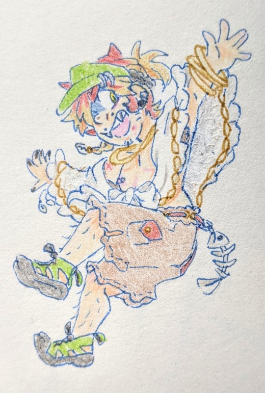
MOE. SUMMER ALT‼️‼️‼️‼️‼️
BIGGEST thing about Moe history is that for Literally Actual Years. I have been trying SO hard to get a beach outfit for it Right. I always had some aspects of it in mind (the white cover-up -- initially sheer, but I like the idea that it's a light shawl kinda like Lyon's, here). But a lot of my designs felt too feminine. Moe is about Balance. Moe is about Mishmash. Moe is about The Silly Factor. It's also unexpectedly practical and loves questionable fashion choices.
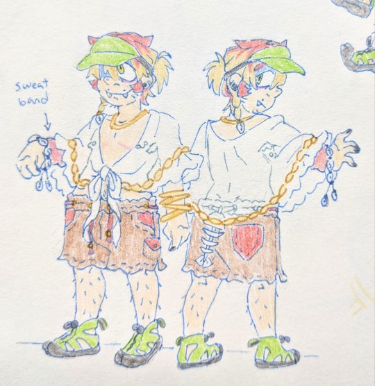
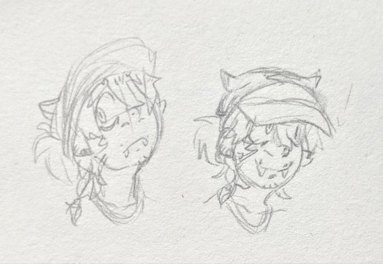
All this in mind! I think its Look really came together when I decided to give it some sporty touches. I esp love the wet shoes... and the visor works so well on it?? The little fish skeleton is a handmade accessory (not actual bones.), like its "tail" in its everyday outfit. I imagine it's jointed/maybe chain linked, so it has some movement to it! The skeleton adds a bit of edge it always has, and ALMOST. Gives a manta ray silhouette paired with the shawl (most noticeable in the topmost art! Didn't set out to do that, but when I noticed this I ran w it LMFAOO)
And. Some doodles
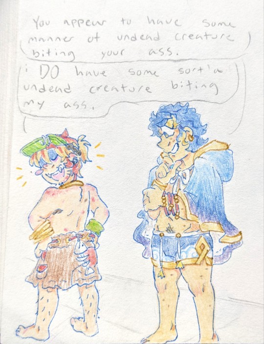
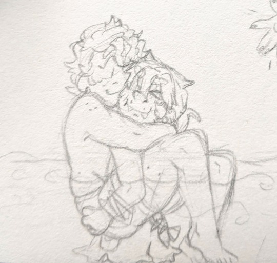
#fire emblem#feh#RETURN. OF MY SUMMER ALFONSE DESIGN.#like i said though this moe design gave me so much trouble. esp tragically the top pic where i FELT. I GOT IT JUST RIGHT#and then i added details impulsively in pen and the design got too busy. it really needs to be simple.#so what did i do? painstakingly scratch off the pen with a knife.#it's such a small drawing... but it was so perfect.... perfectly capturing everything i wanted to capture w a summer moe...#another thing is that i think sometimes you have to make sacrifices. like. a lot of my prev designs#made a point to show moe's top scars and ESP. its nipple piercings. but like. nothing seemed to work.#i think also bc i have to ask myself 'would moe feel comfortable wearing that?' both gender and autism wise#the sheer cover ups looked so uncomfortable. and i also think about what parts of moe's body#is it most uncomfortable with. thighs ranking first. its shorts always have to be around knee length#i think in second would be its waist/hips. not so much that it Can't be shirtless esp w top surgery#but enough that like. a cozy cute shawl might be nice.#little things change between each drawing too LMFAOO like changing the wristband color from red to green#NONE OF THIS FELT FINAL. all of it feel like I'M GETTING. SO CLOSE. SO FUCKING CLOSE#another scrapped idea was having a fishing lure dangle from the hat. but that would be So Fucking Annoying to wear LMFAOOO#and ESP annoying to draw w moe specifically. the way either eye is visible at any given time.#ANY WHICH WAY. THROWS THIS AT YOU#moe tag#summoner oc#fe alfonse#my art
15 notes
·
View notes
Note
omg i literally love wheelbitten as a comic and ur art is amazing
random question but how long have u been drawing as an artist and do u have advice.............
thank uuuu and I've been drawin my ass off since I could hold a pencil and I'm 24 (25 next month) now so this shit wasn't overnight by any means lmfao idk the way i did it was have A Thing that you like drawing and just draw the fuck outa it and eventually you'll get better for sure whether it be the desire to get better at drawing said thing makes you do research and study something to become better at it or just literal muscle memory from drawing said thing so much. I had lil spouts of taking time to get better at specific things like anatomy, shading, ect. by studying it but overall i just subconsciously got better by mentally picking up new things everytime i draw and analyzing the world around me. Even recently i got to see that with drawing tactical gear (that ive never really drawn before and never wanted to draw in my life) soley bc i just REALLY fukkin love Ghost and Konig

i went from being terrified and intimidated of drawing tactical gear (even trying to put a gun in front of it as if that was any better lmfao) it used to be vague as hell and my brain would shut down just trying to look at the references(i remember having a ''shit man am i even gunna be able to draw these characters???'' moment of dread the first time i was drawing Konig pffft) to absolutely loving drawing tactical gear and seeing how much more detailed i can make it with every new drawing, so a complete 180 but that's bc im just totally obsessed with the characters and drawing is how i express that sO thats mainly what i mean by just have a thing that you love and want to draw and the rest should follow with time, patience, and practice. I think it's about training your brain and motivation to pick up on details or a certain way something looks in lighting (or lack thereof) bc my brain is probably wired a certain way after art being like a centerpiece of my development to the point to where drawing is just What I Do and at this point if i dont draw for even a few days i start getting vaguely antsy and fidgety it's crazy lmfao SO idk if this is worded like i need it to but yeah art and the act of drawing can be frustrating as hell but it should be enjoyable and rewarding above all else at the end of the day!
#i drew bc the piece of shit im unfortunately biologically related to drew a lot when we were kids so id just copy her#then i drew winged wolves and dragons and the occasional horse for like 7 years then The Axel obsession started#where i drew axel from kindom hearts literally all the time and had 870000 aus for him where i would draw for all of them#when i tell you the obsession for him was catastrophic u best believe but it kept me drawing like a motherfucker until i made my monster oc#which was around the age of 15 is when i started consistently drawing humanoids#OH YEAH i had a whole lion king phase too in 2011 where i would strictly draw lions all the time and my first record of drawing online was#on the lion king fanart archive (which i still visit to look back its like visiting an old janky friend:') )#but yeah then my heart was stolen by my ocs and all the potential designs i could make them#and thats where i am now aside from the festering COD masked men obsession boiling over in the corner AHA#so basically latch onto an obsession and pick up that damn pencil#even as a kid if i liked anything the immediate connection was trying to draw it#didnt matter how weird to draw or undrawable it was my ass would be in that notebook bc its the only way i know how to express myself lmfao#this is long as fuck but NOW im out peace skskksk
45 notes
·
View notes
Text
#warriors#warrior cats#poll#brightheart#i am like 90% sure this is gonna be a blue sweep#but there is SOME difference in designs#and also i just want to know that i'm not the only green-eyed brightheart truther out there#my last design for her has/had heterochromia#but whenever i redesign her i'm probably gonna go back to just both green#bc i really only did the heterochromia because i felt weird for being one of so very few people that draw her with green eyes#even tho i still made the blue one be the one she lost so it like. doesn't even matter#but yeah i'm gonna stop being like that with my designs#if i don't see them that way even if that's the most popular design/canon design for them. i'm not gonna design them like that#gotta stay true to myself!!!#also like longtail's eyes this isn't really discourse. at least i don't think it is!#i could be wrong tho. it might be
23 notes
·
View notes
Text
.
#;ooc#(i will admit i've been somewhat anxious to be on tumblr here bc i feel like.......sort of a failure in a way)#(i feel like im not producing enough art or fics or edits or memes or gifsets and it stresses me out when its silly!)#(ive been in the sharpe fandom for 7 years now when it was mostly just me and sam so its definitely like oh god. what do i have to show for#it)#(i dont have to /prove/ i love this series by making all these things. i think abt teresa and the sharpe series every goddamn day)#(i can do things at my own pace but lord it takes too long)#(i need to go back and fix my old fics bc i want to fix characterizations- i want to post my current art#(i want to post all my gifsets currently in my drafts)#(i love seeing everyone's stuff on the dash but ive avoided a lot of tumblr so im not ignoring anyone!! just being too mean to myself tbh)#(adhd and chronic fatigue and depression make it all the more difficult but i shouldnt let that stop me)#(in the meantime i finished a mockup of one of teresa's dresses- very excited with how lovely it came out)#(i've also made significant process on my drawings of teresa's outfit lineups!! new and old designs)#(and i just started a piece yesterday that i'm really loving so far- my favorite spanish ladies all together)#(i also have some sharpe and antonia doodles that i was working on...)#(anyways. just wanted to get that off of my chest)#(and also FINALLY started working on three different fics that i've had as ideas for literal YEARS)#(they're not that far in but. PROGRESS!)#(anyways......ignore me sdfsdfgsdf)
6 notes
·
View notes
Text
Personally of the belief that live action fans who go onto animanga posts uninvited like 'I DESPERATELY NEED YOU TO KNOW THAT I THINK THE ART STYLE IS UGLY EVEN THO THIS OPINION IS IRRELEVANT TO THE POST' should be hit with a big rock. We already moved past this ten years ago, get with it or get lost. Swallow the hunger inside of you that demands everything be palatable to you. Maybe you could stand to be a little uncomfortable for a while
#Keep ur trashy comments to yourself#It's not even ugly! It's just not the conventional anime style so you deem it ugly. That's so fucking sad of you#You're the type of person who sees a piece of art and is like OMG WERE THEY ON DRUGS?!?!?!?!?!#Idk I think the art style is very fitting for the gigantic world Oda has built#People are allowed to be ''ugly'' because not all of us were born to be models. Shock and horror I know#(this is NOT aimed at the ppl who critque the way Oda draws women (to a degree...) bc I agree he could've done the same for women as he doe#The men by giving them way more diverse features and body shapes)#No this is aimed at the ppl who think the style as a whole is ugly and demean it bc it doesn't suit their tastes#Meanwhile their taste is the most conventional cookie cutter bland pretty boy/girl bullshit out there#(I say to a degree up there bc I think ppl go way too far with the criticisms like the one person who posted the Charlotte family identical#Sisters and went LOOK HOW SIMILAR THESE WOMEN ARE ODA SUCKS when they were MEANT to look similar)#^ yes that is an actual post I saw in like 2018 or 2019 when WCI was reaching its end in the anime and it made me die laughing#There are dozens of other examples you could've given but no. You intentionally chose the triplets (quintuplets? It's been a hot minute)#Rebecca and Nami and Vivi and Shirahoshi all having the exact same face with different hair? No I will use the identical twins as proof#What a unique way to undermine your own argument bc I was with you up until that#Anyway yeah the more I think abt the more I think the live action sucks actually for getting rid of Sanji's eyebrows bc they'd 'look bad'#Who cares? It's part of his design. You are cutting off parts of his character. Same w/ Usopp's nose.#Who fucking cares if it would have looked 'bad' or 'ugly'? Is that all you guys really care about? Keeping up appearances???#I'm so sick of the shit I like getting 'remade' to appeal to people who will never actually appreciate why stuff looks the way it does#It's so shallow I hate it#<- yes I'm still bitter about what they did to my boy WW in the three guns reboot iykyk#And Livio and Razlo for that matter. What the FUCK was that about#Idk maybe it's cuz it's something I recognized in myself and attempted to squash so it's frustrating seeing other ppl do it#And again obvs Oda isn't perfect w/ this either as he draws evil women as fat old hags and his protags as skinny and beautiful#Or how he thinks not following ur dreams will make u ugly and fat and following ur dreams will make u conventionally attractive#I get it. Storytelling method. But u can do better. Use colorschemes instead of physical attributes or something like Veneer does
3 notes
·
View notes
Text
reasons why terzo needs to come back to life (bonus points if he comes back wrong and fucked up) include 1. he needs to sing life eternal 2. he needs to do the cirice thing again 3. he deserves to have 500000 outfits 4. i want nihil & sister & copia to shit their pants 5. it would be a cool story or whatever
#i don't. think it will happen. and i don't 100% Want it to happen. like 70% want it but not the point#but i HAVE been drawing him in a comes back (wrong?!) scenario and#i'm single handedly sparking joy for myself#so i want him back Maybe but only if it's exactly the way i'm imagining it if not he can stay in the dirt idc#oh nay#i also want vindication for when he moves his foot like it drives me INSANE THAT HE MOVES HIS FUCKING FOOT! AND FOR WHAT!#THERE BETTER BE A POINT TO THAT!#anyway i'm making him wear the vampire fucker outfit from the first draft of his design. i'm giving him horns & pointy ears. sexy neck scar#Of Course. he gets fangs. permanent claws. permanent blood from the scar. both eyes fucked up potentially. you know how it is#considering to make him look a liddol bit ghoul-ish bc In My Vision he made a deal w someone of them. possibly omega bc i am biased#make him come back singing pro memoria he'd be soooo sexy <3<3<3<3<3#tobias call me for your next brain storming session buddy for you i am dropping out of uni. anyday u need me i'm there for u bestie hmu
3 notes
·
View notes
Text
I might be gettin more autistic over my proseka fan unit than my actual vn project . that is a wee bit of a problem
#i havent made ocs just for the sake of makin ocs in actual Years#all my ocs have been part of a bigger more serious narrative that i plan on (or hope to) turn into a game#i dont Have a lil guy to grab and think hmm lemme put him in situations. or perhaps a cute outfit#dont get me wrong my fan unit still got a big narrative they re workin w but they re much more slice of life cuz thats just how proseka is#l1f3l#and i can also take their designs less seriously if that makes sense. they re simple skinny anime boys the pinnacle of my comfort zone#maybe thats why i find them so relaxing to draw. i ve been rly pushing my bodies lately and drawing stuff im not good at#so its nice to just turn off my brain and draw some basic anime boys#in a way im tryin to stick to proseka s design principles bcs i know i ll draw them in the prsk artstyle soon enough#and i wanna make things easy for myself. i want this project to be fun and simple#mm i think ima download live2d tmrw..
1 note
·
View note
Text
Trying to remember your skills you've accidentally picked up through fandoms and hobbies is difficult when you don't think they're actual skills because you're self taught in them all is so fun.
#I know they're skills that can help me but their origins are what make me think eh I don't need to put that down#Yes you do bitch - if you want a job you better but down that skill or so help me#Anyway I also forget that because I was always so indecisive about what career I wanted I tried out a lot of things to see if I'd like it#I technically have experience in teaching - had my own class despite being in eighth grade - but didn't like it#I designed games levels through a website where they give you the basic tools bc I was bored#And had my family try and test them as a way to revise if they were too difficult or confusing#I've made several websites that I completely forgot about bc they were for school projects lol#And I always forget that I used to design clothes for years and would make those designs on a small scale for dolls#I also had to remind myself that I can use my experience in writing - which can extend to editing#And I always forget I know how to draw#Like am I am expert at any of these? No#But can I do these things? Yes#And that's a good starting point#And I'm sure there's other things I'm forgetting because I don't deem them as an important skill I have#Like the fact that I helped run a suicide prevention through my church in eighth grade#Where I was a spokesperson - I was in charge of advertising it - created posters fliers and had to talk to multiple people#I had to update my school on it bc it was a heavy project for school that they weren't sure if I could handle#I was in all the meetings with my church and would bring their ideas to spread the word to life#We raised money mostly through food sales - I would prep the food and there I helped with concessions#Fuck I forgot how much I did for that project#Because we sorted through a lot of donations - and had to organize by sizes#Like how did I forget about all that#I remember the project bc it's something really close to home but it didn't feel like enough so when I think about it#I don't remember how much work I genuinely put into it bc of how much the church held us back bc it was ''too much work' '#Anyway I do have valuable skills but I feel like an impostor in all of them so I forget I can put all of those down
1 note
·
View note
Text


Finally got around to doing this, here are some rough sketches of my idea of how Lester looks each book! Some books are more different than others, like I don't think much changed between books 1 and 2, but I had fun doing this! Look under the cut for some notes about things I added for each design.
Book 1: Not much changes from how he's described in the books. All of the clothes he borrowed from Percy are a bit too big for him, but the flannel he borrowed from Will fits pretty well, only being slightly too long (I think Will has like, an inch over Lester)
Book 2: Basically the same as book 1 Lester. He keeps the flannel Will gave him, but it gets pretty beat up over the course of this book so he has to switch it out before book 3 :(. Hair is just a lil bit longer, and he gets clothes that fit a bit better. Headcanon time bc if Rick won't give me substantial Thalia and Apollo interaction I'll make it myself: Thalia gives Lester archer's gloves at the end of TDP, which he wears for the rest of the series. He didn't even think to wear gloves bc as a god he wouldn't need them, but Thalia noticed his beat up to shit hands at the Waystation and went "bestie... bestie no...." and gave him a pair.
Book 3: Will's flannel has been swapped for a big coat and Lester get his iconic pink camo pants. His hair is long enough to start getting weighed down a bit, and also way messier bc he's been in the labyrinth for like a month. The beat up sneakers he was wearing in books 1 & 2 get replaced with much more reasonable boots. Eyebrow scar shows up, a reminder from one of the many concussions this poor man has suffered. Also another HC time! Georgie gives Lester a little handkerchief that he wears for the rest of the series (I was gonna use Paolo's handkerchief, but Lester canonically gives that back so boo)
Book 4: The Lester looks like shit book /j. His hair is now long enough that he should really be doing something with it but he is not. He has a zip up hoodie now to cover up all his fun purple veins. Just more beat up in general honestly. Also I hc that Apollo actually lost some weight here (both bc he wasn't really eating well before getting to New Rome bc of stress/grief, and bc he got really sick and continued to not eat well while that was happening) But it obviously doesn't do anything to help his self-esteem or mood in this book. Kind've a visual way of being like "the superificial flaws Apollo clung to in the first book weren't the real issue, he was just hyperfixating on them to distract himself from what he was really upset about, so when the superficial issues get solved he doesn't even notice bc he's grown enough as a character to cut the bullshit and focus on what's really bothering him." or idk something like that. I like to contrast this with a hc I've mentioned before about the time between books 4 and 5, which is that the physical flaws Apollo whined about in book 1 (i.e. the acne and his weight) get "worse" throughout the road trip from California to New York, but Apollo truly just does not care that much about that shit anymore and that's why it doesn't come up in the narration.
Book 5: Final Lester! It's been over a month since the last book so I'm taking liberties and saying Lester's hair is long enough to pull up now bc I want him to be able to do that goddammit. Final outfit is borrowed from Percy again, so that's why it's so big. He also has a pendant that Lavinia gave to him bc they're besties. Also I forgot to mention it, but his shoulders are slightly broader here (and have been getting broader throughout the series) bc he's been working those muscles so much with the constant archery.
Also I didn't draw his quiver bc honestly I forgor, but I like to imagine he's been getting little pins and bobs from a lot of his friends that he's been sticking on his quiver strap. A few examples that come to mind are:
Kayla: A classic hot topic pin with a sun with sunglasses on it.
Leo: A pin made of scrap metal with the alchemical symbol for fire carved in.
Agave: Pinned a clover to Apollo's quiver for good luck. It didn't stay on there long, but it was the thought that counted.
Hazel: A piece of citrine decorated with metal cords.
Lavinia: Another classic hot topic pin, this one is heart shaped and has a picture of Hatsune Miku on it.
Jason: One of the monopoly houses he'd been using to mark the positions for the temples. A lot of the little houses had fallen off the diorama during the car crash at the beginning of TTT. The night after, Apollo asked Reyna if he could make sure the diorama was fixed. Reyna agreed, and he put it back together based on what he remembered. He spent an hour or so gluing on houses and hotels for Mars, Somnus, Fons, Salus, and on and on, until he got to the last one. A red hotel meant to show where the temple of Apollo would go. Apollo poked a little hole in it, and fastened it to his quiver with a bobby pin. It's nestled close to where the strap meets the quiver itself, so it's less likely to fly off.
Meg: Pinned a rose petal to his quiver right before he went to fight Python. It lasted for even less time than Agave's clover did, but again, it was the thought that counted.
#sunny speaks#long post#trials of apollo#toa apollo#lester papadopoulos#apollart#fun fact: all of the colors I used for these were color picked from the covers of the books they came from!#oh and i forgot to mention he also get more freckles as the series goes on bc he spends so much time outside
201 notes
·
View notes
Text

this took. way longer than it shouldve anyways i was tired of not knowing how much leg to draw each unit with in relation to each other so i made this. i eyeballed heights and took a couple liberties with the designs but its fine
also eule elster and ara are in low pixel hell bc i just scaled them up from a previous drawing and did not want to reline them LMAO i made this as a ref largely for myself anyways
#signalis#signalis fanart#my art#a few of the others also have pixely details from me resizing things oops#shoutout to adlers fivehead you can play a mean game of tic tac toe on that thing#i originally wasnt going to include him but i was bullied into it#elster is 3 cm taller than adler btw. important information
316 notes
·
View notes
Text
how i make color palettes of my ocs before i pick one, an art tutorial?
hello, whenever i made a new design for myself i found a way to make lots of color palettes and pick one! i see this method more in paintings and rendering but not much on character designs? here are some examples i used that on.
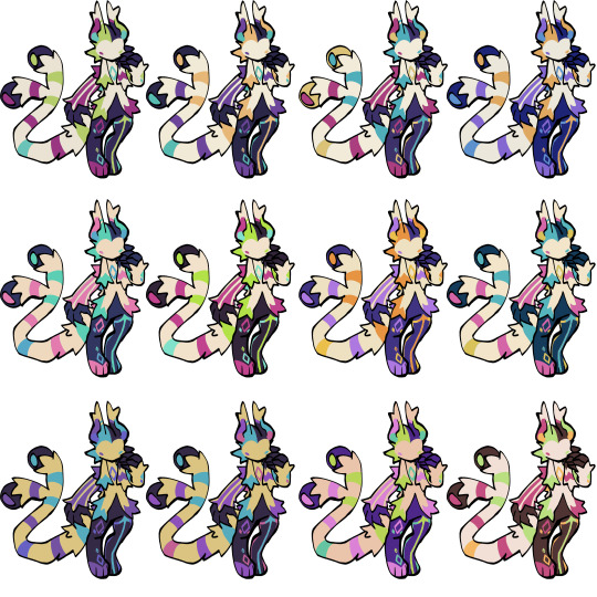
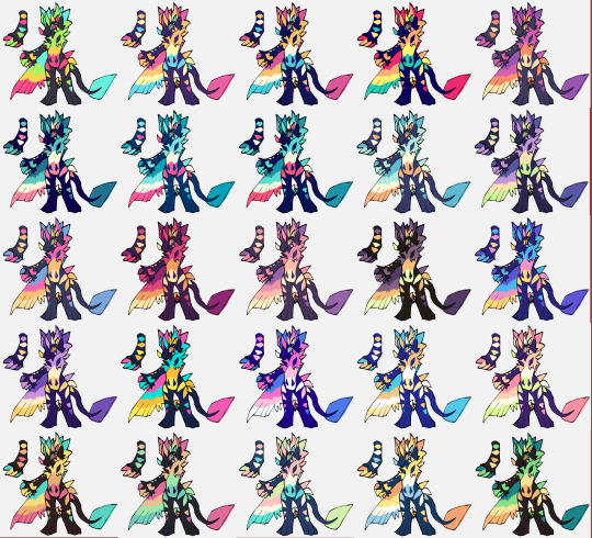
it helps me so much when i feel experimental with colors. here are what you need
a wip character design. sketchy or pixel art works better since the colors can have some anti aliasing issues
a program with gradient maps. i'm using clip studio paint but ik photoshop also has it. like i said this is used more on photos or paintings
and here's what you do!
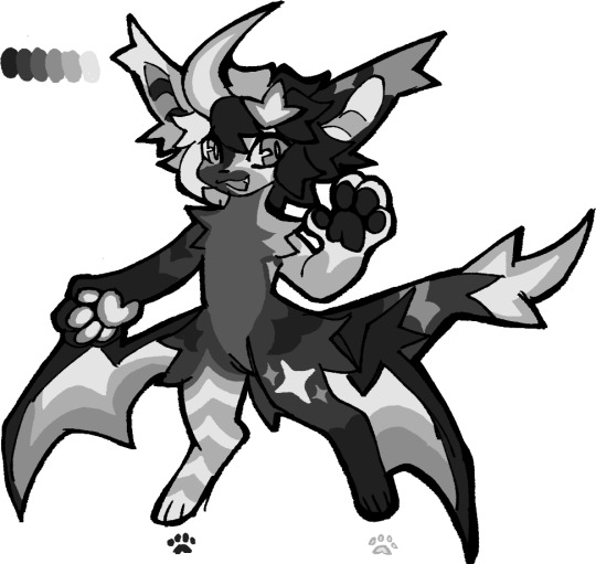
draw your character. i'm making a new fursona for myself but anything should work.
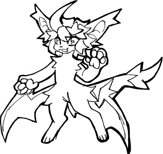
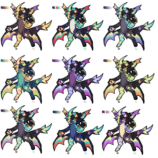
2. decide on their markings/color placement in grayscale. i recommend doing grayscale so you can easily see the values. split your grays into however colors you want. i like doing 5-6 the most. i reccomend duplicating the color layer if you wanna try multiple palettes.
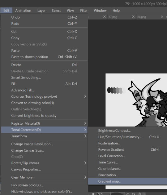
3. this part is program dependent but in csp's case go to edit > tonal correction > gradient map.
4. i made a few default 5 color gradient maps but if don't use gradients like me i reccomend making the graph like this so they become solid color. split the map into however many colors you used. i'll add a color to the red-orange one bc my character has 6 grays.
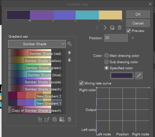
5. replace the colors by clicking below specified color. it all depends on your creativity and what you want. experiment til you like it.
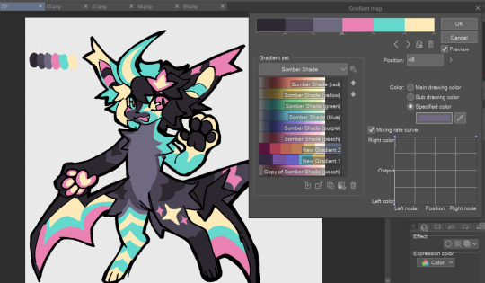
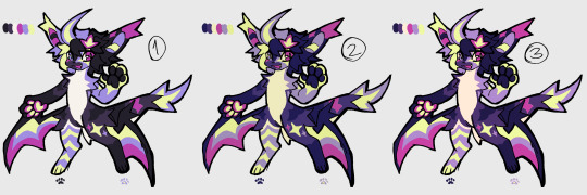
6. fuck around, try stuff, put them together to see if you like any of em. i made 9 to see if i can focus on one of them and i actually ended up loving the bottom right. it really makes them shiny
7. (optional) if you like a palette you can further and play with colors while keeping the palette. you can use color balance (in the same menu as gradient map in csp) or layers to mess around, have fun!
also a color tip because people seem to compliment that a lot in my art: digital art has millions of colors! don't be afraid of using wacky tones unless you're going pantone. if you want to get something physical i recommend being open to alternative colors as they tend to be more limited. i know whoever is doing it will try their best to keep the colors close.
color theory is something i don't...care much about mostly because this is something i'm doing for fun. i'll consider it in professional work.
#artists on tumblr#digital art#ika's showtime#ikarnival#art tutorial#art tips#drawing tips#art resources#clip studio paint
388 notes
·
View notes
Text

cross posting yesterday's rambling thread for posterity and because tumblr lets me edit things. anyway this is a sorta long thing and i might add things i forgot to mention in the twt thread
i tend to draw on-model canon because im a coward + just personal preferences. but the way i convert the canon designs into my artstyle is that i take the distinct features oda gives them and then combine it with personal headcanons to complete what should look like a unique human. Starting with Trafalgar Law, who is unfortunately a bland-ass conventionally pretty boy
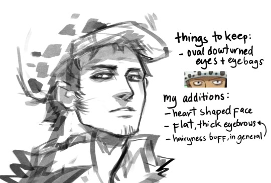
someone commented a while ago the law hat drawing tutorial i made a while ago didn't make much sense and i realize its bc of the specific way i draw law's face: heart shaped (ba-dum-tss). That meaning, a narrow chin widening into a mild defined jaw, wide cheekbones, and up to his know-it-all brain dome.
given that, the pudgy guitar pick shape of his head i mentioned here should make a lot more sense.
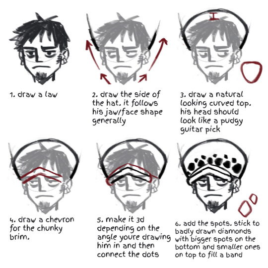
i don't think this design point is unique to me, as most conventional pretty anime boy gets given jaws like this. a lot of law artists tend to veer into this head shape. just how life be sometimes. other points: flat, thick eyebrows is bc im a hairy gal and i need to feel better about myself.
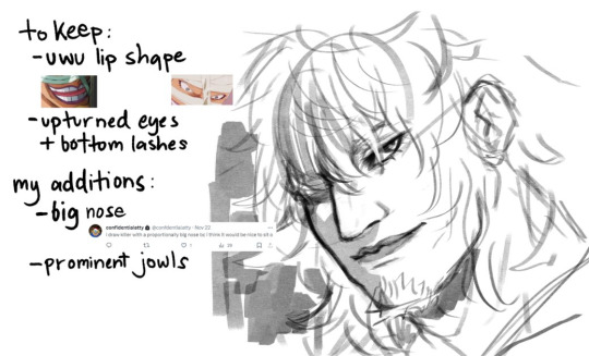
Killer gets to be more interesting, because he shouldn't be considered conventionally attractive. my idea behind killer's is that those individual features is smth he would be insecure with enough to hide himself in a helmet but i draw him with all the love in the world actually. i'd like to think its how kid sees him or yknow, law, bc he's my kin assigned blorbo and maybe you ship lawkill as a guilty pleasure too i mentioned before (and ruined people's days) when i said whenever i draw killer he looks like griffith before i put on his goatee. the upper half of his face is distinctly feminine, with the lower half kinda over compensating. other than that uhh...idk. stan killer
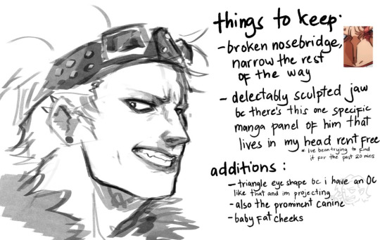
Kidd is the bane of my existence, i feel like i can never draw his face consistently. yet at the same time he's so damn fun to draw everyone gotta try it.
my problem with kidd is that this mf does have eyelids. most kidd painters out there interpret this as him having deep set eyes (think Matt Smith or jeffrey star) . and yeh skill issue on me i should practice that. other notes, i try to make him younger than canon makes him look. he is my babygirl and he deserves to look cuddly. my band au kidd version has the honor of being allowed some chubs. he's just tries to look older and more menacing with edgy makeup. also i try to give him dimples when i can because, well i can.
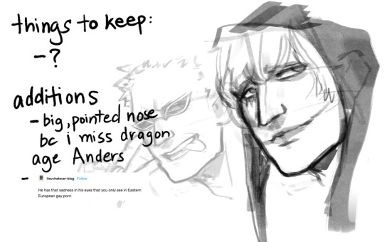
Rosinante last bc i lost steam after kidd. the thing abt cora is that aside from not having eyebrows, everything is structured with the generic one piece man template. which means i gotta do everything myself doffy is there bc the way to figure out how to draw these two is to give them minor differences from each other, that being doffy gets slightly sharper features. in canon, these two are also rly wide boys (more of an oda style feat tbh) but i make them long. though bigger brained donquixote artists know that of these two brothers, doffy should be the wiry-er built. anyway that's it. in conclusion, i need to draw more girls actually i feel like im becoming misogynistic by osmosis from oda's style and now i draw girls all looking the same too.
#one piece#trafalgar law#eustass kid#eustass kidd#op killer#massacre soldier killer#donquixote rosinante#donquixote corazon#donquixote doflamingo#was gonna do robin and perona too at least but like...i have a job and stuff
360 notes
·
View notes
Text

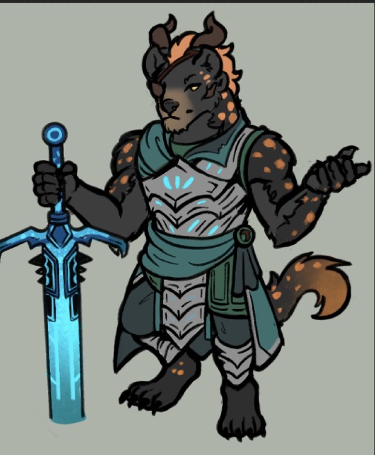
Tribune Echowatcher (Ls1)
My design musings below
Literally only doing this bc I love Leo soooo so so so so so so much. I also in general just love character design So!
1st. I Know I wanted to push the limits of what Charr Look like, I know theyre big ""cats"" but whenever I design ocs I like to push boundaries and play with what aesthetic restrictions exist.
Hyenas came to me (i think, it was 6 years ago when I originally made him so my memory is foggy) because I saw Hyenas around Ascalon and thought, what a fun concept to play with.
I knew I really wanted the very clear shape of hyena ears to stay while also keeping the charr 2 ears, my only choice was to kind of shift the horn placement around. You can see that his ears cover half of the horns, and that theyre a further back on his head in general asba result. I really didnt want to limit myself with the shape of charr ears bc even though I love them, having a character with very clear rounded Hyena ears was too charming of a concept for me to drop.
2. I inverted the colors of a Hyena! Hyena cubs are actually born with black fur and then get a lighter shade as they grow as with many animals, but I thought it would just be a fun way to play with a more unique color scheme, a primary black/gray fur with orange highlights than simply keeping a more realistic and usual color pallet.
3. Spotted Hyenas have some shaggy fur! Its so cute! Its thinner around the neck which I thought was another key feature of the animal that I wanted to translate onto Leo.
4. His armor is definitely not what I consider to be super unique, I needed a ls1-HoT quick armor to draw him in, so I just threw shapes together. I did however want to keep his color coded: Green. Originally I was trying to find some huge complimentary color to add to his outfit but realized that the orange of his mane and spots was already complimentary enough that adding a different color or more to his outfit would feel like Too much. Thus I went with homogenous green/blues and silver for the metal color.
5. His nose...his head shape...his more "Canine" Features I guess are just huge charmpoints to me. Yes this is me just gushing about my love for my own character but if you clicked read more thats ur own doing. Ive said this before but Leo is Heavily Mexican coded, this plays into both his design and lore in a lot of ways.
Xolotl is the Nahuatl god of death, hes a dog! Dogs being a bit of a symbolism for companions in the afterlife and guides was really important to me, so its why I do really adore what canine features Leo does have (I know Hyenas arent canines but you can see the same kind of shapes.)
Id gush more but thats the big ones....
Leo became a Tribune of the Blood Legion, because bangar wanted one of his own reporting back on the growing power of the Pact and the Pact Commander that was less of a loose canon than Rytlock, especially as theyre investigating draconic threats with the underlying ulterior motive. For now, hes playing along.
51 notes
·
View notes
Text
Ok so, I heard viv added a bg character in the new ep that is based off of her critics, and it was this guy
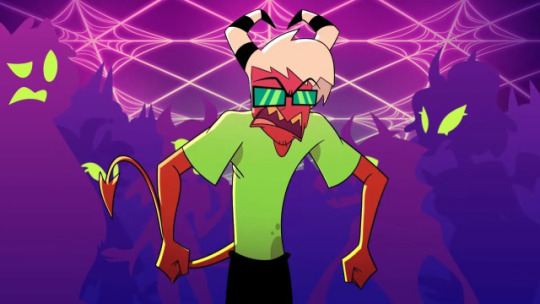
And bc of that, I thought I’d make a redesign and a lil rewrite of him and stuff, I remember showing it to a few friends so, I thought I’d show it here!
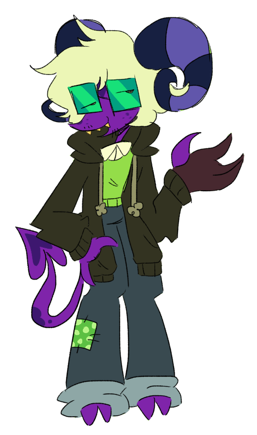
Meet, Ernie! Or what everyone calls them (including me), Rem!
So, when I first saw this guy (that being in a screenshot of another hh/hb critic post of this guy), I actually kinda think the design was nice and simple, though I kinda thought it was too simple personally, so I thought I’d add a lil more to it!
I thought I’d base this guy’s design off of those geek characters from the 2000s since I think that’s what viv was going for based off of the glasses and facial hair she gave him, so that’s what I did! (And also bc I think those kind of designs are really silly)
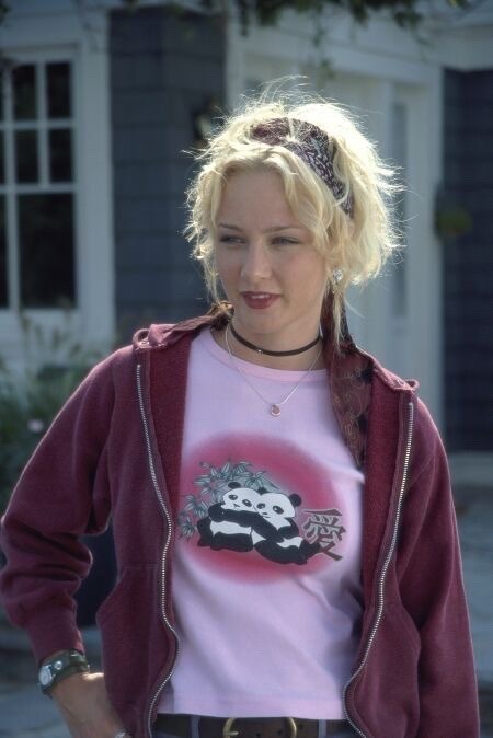
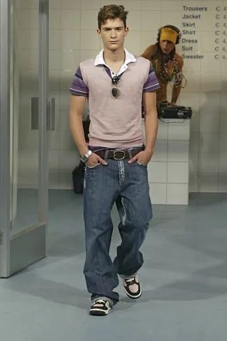
And I also based this guy’s hair off of rodrick’s hair from diary of a wimpy kid!
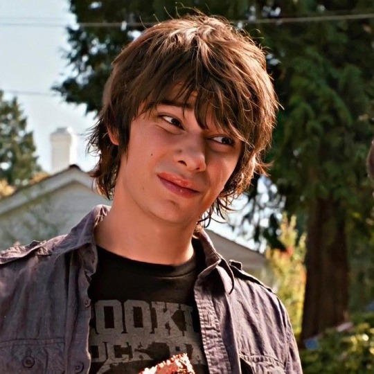
I also thought I’d give him more facial hair bc the lack of characters having facial hair, wrinkles, etc etc is insane. I also made his skin purple to compliment the green in his color palette too! (And also bc I have lust imps have purple ish’ skin to in my au rewrite of this series to represent they’re from that ring!)
And I gave him those gloves ppl use to draw on those tablets to represent they’re an artist bc since viv is basing this guy off of the hh/hb critic community that prob includes artists too bc the majority of that community DOES have artists in it (like myself) after all!
Ok! Now for the rewrite of this guy, based on the design (bc I haven’t fully watched the episode yet) , I assumed that since is apparently supposed to be based off of viv’s critics and also noting the fact viv can’t handle criticism, I assume he’s gonna have some incel ish’ personality. So because of that, that is what motivated me enough to rewrite him!
In this rewrite rem is basically just a very normal guy. People usually bully him because he looked like a stereotypical nerd in appearance but in actuality he holds surprisingly strong morals and beliefs for an imp who is born in hell!
He became very critical on upper class (that being the the sins themselves) because of the way they treat imps and hell hounds (especially characters like fizz and blitzo)!
So bc of that, he is trying to unite a bunch of imps to protest against the upper class for imps to be treated better! :-]
So in other words, thank you vivziepop for making this character for the critic community so I can rewrite and redesign them! He’s such a silly guy
[ EDIT: Apparently this guy was based off of lincar rox, someone who viv dealt with, not her critics. I do apologize about spreading misinformation about who creepzo was based off of, I should’ve done more research instead of assuming he was based off just that. ]
#helluva boss critical#anti vivziepop#vivziepop critical#helluva boss rewrite#helluva critical#hazbin critical#helluva boss#helluva boss criticism#helluva boss critique#vivziepop criticism#vivziepop critique#hazbin hotel
337 notes
·
View notes
Text
I color coded them and you can't do anything about it :]
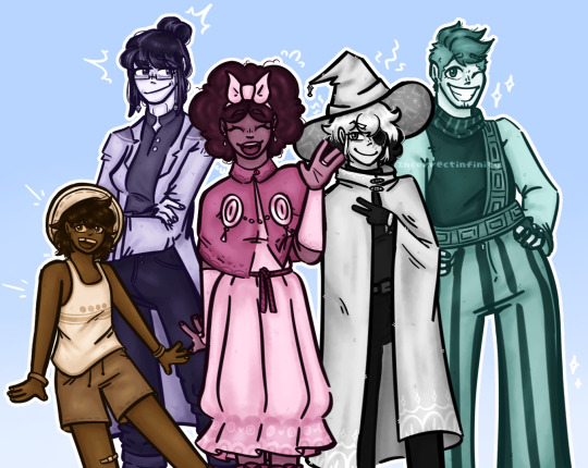
Reblogs appreciated <3
Elaborations for my color choices under the cut!
Siffrin, grey: ok this is probably the color choice with the least amount of meaning. One pattern in particular that I have noticed within the fandom is that with headcanon colored designs for the cast Sif always manages to still be in black and white. I, like a normal person, find this to be hilarious. You give these characters wonderful new pallets except poor Siffrin who remains in the emo dimension, brilliant. Keep doing this.
Mirabelle, pink: I love Mirabelle so so much of my gyoddd. I chose pink (plus my heart motif) for two reasons.
1. I like pink and I like lovecore
2. I like characters whose designs contradict their personalities in small ways
As a feminine aroace person myself I really really resonate and see myself in Mirabelle, like to a sort of crazy degree. So why not take her feminine traits and amp them up a bit? Why not allow myself to relate to her more? I can have fun around here! Also she is incredibly magical girl coded to me and she is technically the leader of the group so pink was just the only possible choice I could make.
Isabeau, mint/teal: so Isabeau is such a ginger to me. There is no other possibility in my mind this man is GINGER. And I associate orange with teal colors because that color combo goes crazy hard, so bam! Teal Isa was born! Also I think the color fits well as he is the most masculine character in the party.
Bonnie, orange/tan: this one is simply due to the fact that I associate both childhood and cooking with sepia tones. Do not ask me why, I couldn't explain if I tried. Also I gave them some freckles bc they deserve them.
Odile, purple: MY BELOVED ODILE!! Ok this one has a few reasons. Besides Sif her pallete is the most muted of the bunch signifying both her age and the fact that she is not from Vaugarde. I associate purple with magic, maturity, regalness, and gemstones which are all things that fit Odile well. I've shown off this coloring choice in the drawing I made for her birthday, actually, which is the piece that inspired this whole color coding ordeal anyway.
Btw Loop is red (🙂), Euphrasie is yellow (gold, high ranking in the House), and The King is blue (sadness, memory)
Anyways thanks for sitting through all that have your bonus
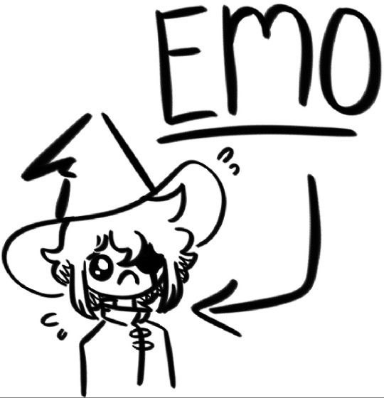
It's midnight I'm tired
#isat#in stars and time#isat siffrin#isat isabeau#isat mirabelle#isat odile#isat bonnie#SORRY IF ISA DOESN'T LOOK GREAT I CANNOT DRAW HIM TO SAVE MY LIFE AND I'M SAD ABT IT
71 notes
·
View notes