#artist guide
Explore tagged Tumblr posts
Note
Mind showing us how you draw skulls/skeletal characters?

Heya Anon, this is a good question because I've never actually thought about it, and I'm pretty inconsistent with them haha
I have different styles that I fluctuate through, depending on how serious I am about the project: Doodle (Seen above) Polished (The Cover Redraws) and a secret third option thats kinda halfway between the two I guess (the difference is usually the nasal cavity and teeth) Soooo

The Short answer: Trial and error, the 'delete all' button, spite, and the magic of bullshittery. In all honesty for every 'good' skull I come up with, there were like nineteen scrapped drafts and probably some laying on the floor in frustration xD
The Long answer:
Overall Steps-
Usually I start with either the nasal cavity or the cheekbones first
Jawbones before the overall skull shape
eye sockets are either the second step of the second to last
teeth are almost always last
Here's a really bad timelapse of just me doodlin skulls because tbh trying to explain is much harder than just.. showing you. This video is sped up x5, these four skulls took me about 8 minutes.
It's also worth noting that I personally change skulls depending on the character.
I usually give Skulduggery Pleasant very square aspects, most notably his cheekbones and the shape of his head. He also has a very distinct nasal cavity, almost lobsided.
Aztec on the other hand - aside from being blue - has more rounded aspects, with a nasal cavity resembling an upside down heart, and a more rounded head.
Here is a mass attack I did for Art Fight this year. I'll point out unique differences:


One last trick up my sleeve if I get really stuck (because honestly sometimes you just Can't Do It and thats ok) This is Obby, a volcanic rock skull my father got for me in Mexico :]


He sits on my bookshelf (next to Rosa and Tiny the Duck) and in case of emergencies I can angle him however I need, take a picture (optional) and use him as a reference for my art. I usually do this when I want a skull facing alllmost sideways but not quite, as that's the most difficult orientation for me. - Obviously gotta use him with a grain of salt because as you can see he isn't anatomically accurate but its a good base
And remember! Getting caught with human remains is generally frowned upon! Find a good hiding spot :]
#stylus answers#skeleton#skeleton art#skulls#skulduggery pleasant#aztec#guide#how to draw skulls#how to#artist guide#timelapse
51 notes
·
View notes
Text
How I draw: Triumvirate!
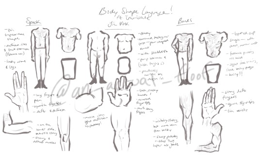
excuse my handwriting
I wanted to share how I draw these three and body features/shapes I like to give them! I think body shapes and definition can do a lot for characterization so I like to incorporate it when I can
(written out version of my notes can be found below the cut!)
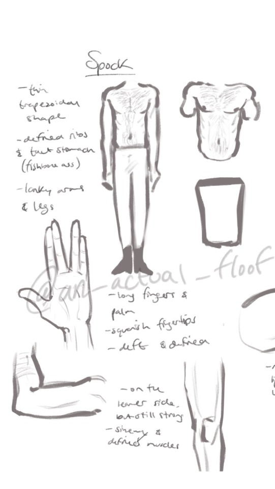
Spock:
- thin, trapezoidal shape
- defined ribs and taut stomach (fishbone ass)
- lanky arms and legs
- long fingers and palm
- squareish fingertips
- deft and defined
- on the leaner side but still strong
- sinewy & defined muscles
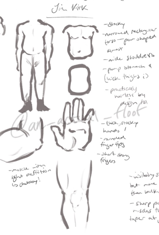
Jim Kirk:
- stocky
- narrowed rectangular torso — pear shaped almost
- wide shoulders
- plump stomach and thick thighs ;)
- practically hairless by design lol
- thick, stocky hands
- rounded fingertips
- short strong fingers
- muscle with light definition -> chubby!!
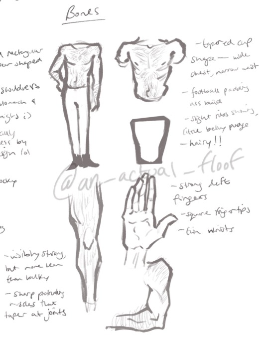
Bones:
- tapered cup shape — wide chest, narrow waist
- football padding ass build
- slight ribs showing, little belly pudge
- hairy!!
- strong deft fingers
- square fingertips
- thin wrists
- visibly strong, but more lean than bulky
- sharp, protruding muscles that taper at joints
#lemme know if u wanna see this for any other characters! star trek or otherwise lol#i’ve been drawing them (and their bodies 🫣) a lot lately so I thought I’d share this little study lol#star trek#star trek tos#star trek the original series#spock#james t kirk#jim kirk#s’chn t’gai spock#bones mccoy#leonard mccoy#leonard mccoy star trek#mcspirk#triumvirate#bones star trek#captain kirk#artists#artist tutorial#artist guide
30 notes
·
View notes
Text
2 notes
·
View notes
Text
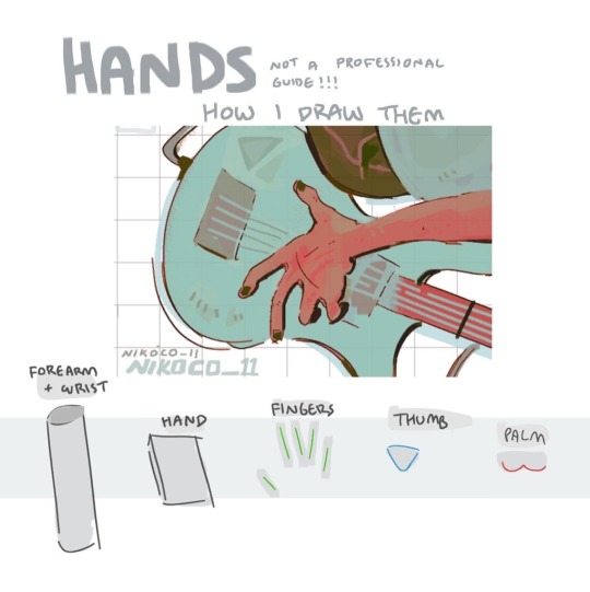


my recipe for drawing hands!
(small note that this is a shortcut that is more abt style and ease than anatomical accuracy. it helps to take time to really properly study hands, makes it easier to bend the rules a bit like this and have it still look good!!)
(learn rules b4 u break them or whatevah)
#qna#tutorial#guide#drawing tutorial#digital art#illustration#drawing#artists on tumblr#my art#clip studio paint
59K notes
·
View notes
Text
Unlock Your Artistic Flow: Effective Tips
As an artist, I constantly seek ways to improve my art and tap into my creative flow. I strive to create meaningful and impactful work, but sometimes due to stress, lack of inspiration, or self-doubt, I feel stuck. However, I can break through these barriers and unleash my full potential by embodying my highest self. Here are some tips on how to do just that: Connect with your…
#art#art blog#art coach#art journal#art lessons#art mentor#art practice#artist guide#Artistic#blog#flow state#journal#purpose#self-reflection
0 notes
Text
RESOURCES FOR POSES
Line of Action

JustSketch.Me

PoseManiacs

Human-Anatomy-For-Artist.com

MagicPoser
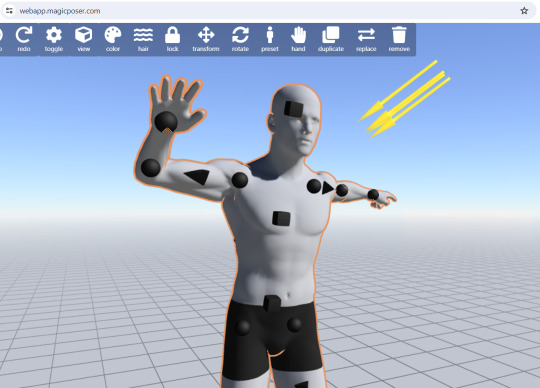
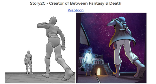
MIXAMO

Pose Archives

Bodies in Motion

Posemy.art
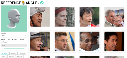
ReferenceAngle
CroquisCafe
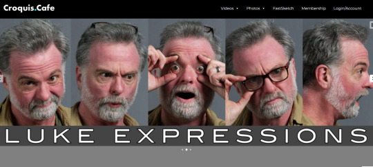
#reference#tutorial#art reference#anatomy#art#poses#artist#art resources#resources#web#pages#help#guide#action#line#figure#body#muscles#human#animal#animation#photography#3d model#angles#views#expressions#faces#emotion
28K notes
·
View notes
Text
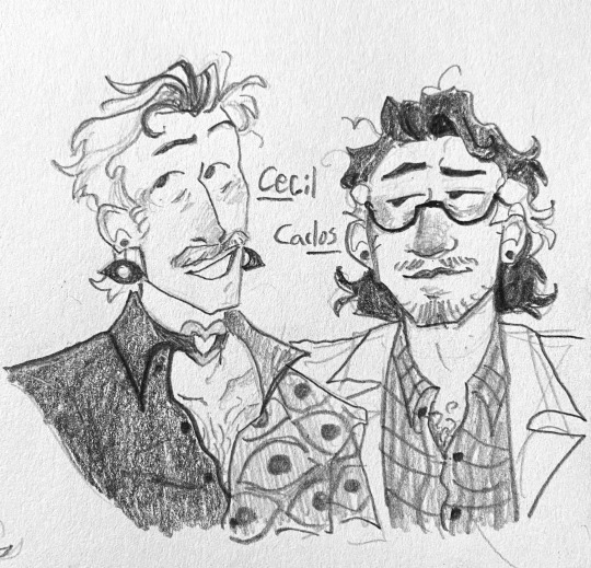
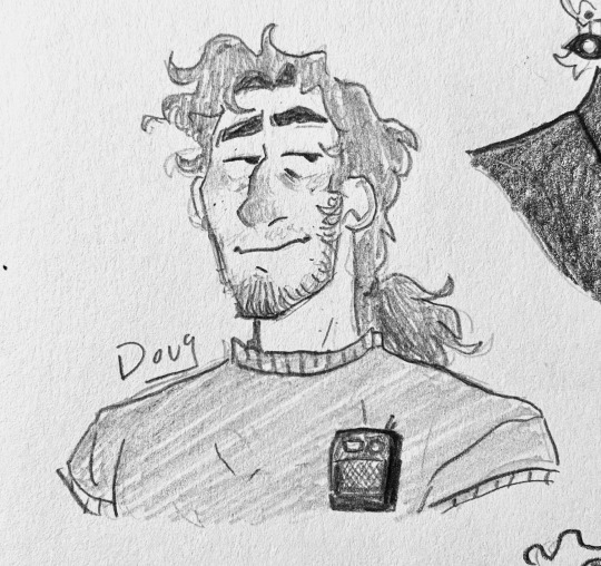
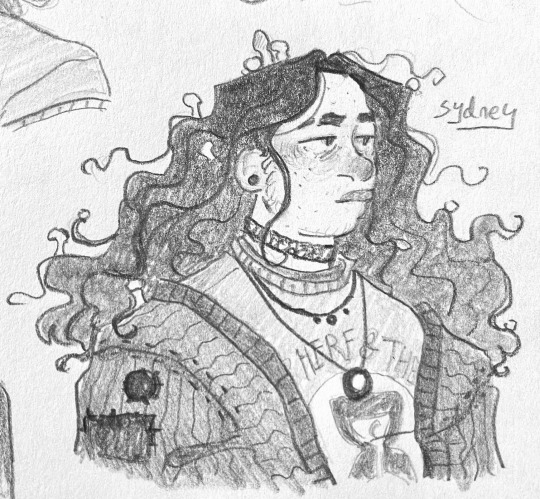
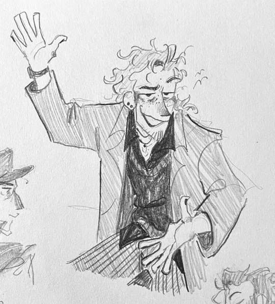
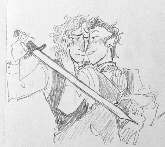
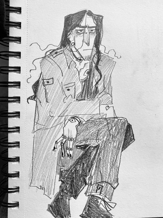
An assortment of non-malevolent doodles as a palette cleanser
#CECIL AND CARLOS HUBBA HUBBA TAKE ME TO YOUR BEDROOM PLEASE#sorry anyway#artists on tumblr#welcome to night vale#wtnv#cecil palmer#carlos the scientist#wolf 359#doug eiffel#camp here and there#sydney sargent#hitchhiker's guide to the galaxy#h2g2#ford prefect#discworld#william de worde#otto chriek#the magnus archives#tma#gerry keay#really love that pic of Sydney teehee#william and otto….. woaugh..
2K notes
·
View notes
Note
Hello! I love your art. I just have one question. How do you draw drones?


idk tbh i just wing it
1K notes
·
View notes
Note
i has a question.
how do you manage to make pixel art fit with the drawn parts of the art pieces? i think you're amazing and i love your art style, but it's amazing how you manage to make it feel like they fit in the same universe even being different styles (being pixel and drawn parts)
you are amazing <3
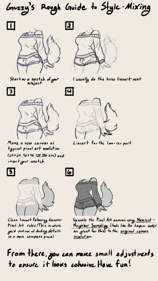
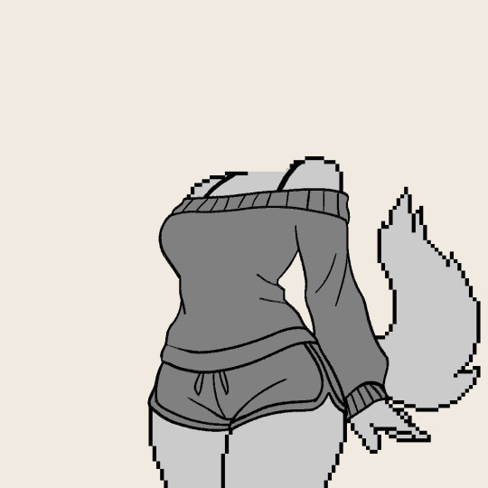
Thank you so much, I think you're super amazing :3 this is just a rough guide mostly on how to achieve the mixed resolutions, I hope it's at least interesting!!!
#pixel aesthetic#pixel artist#pixel art#furry#furry artist#sfw furry#furry art#furry oc#anthro#anthro art#mixed media#guide#style guide#tutorial#art tips
2K notes
·
View notes
Text
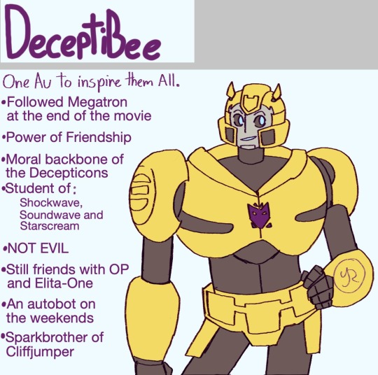
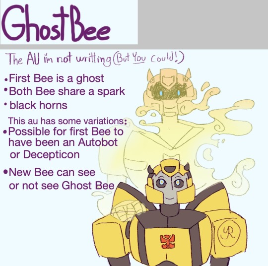
Here we have the BOARD ALLMIGHTY! Which regroups all of the delicious AUs you may encounter on this blog C:
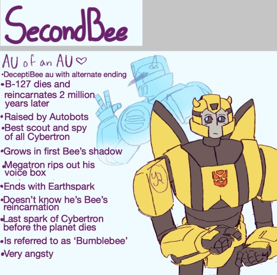
Some of them have fics in the works by me. Some don't. The ones above do. Those bellow don't
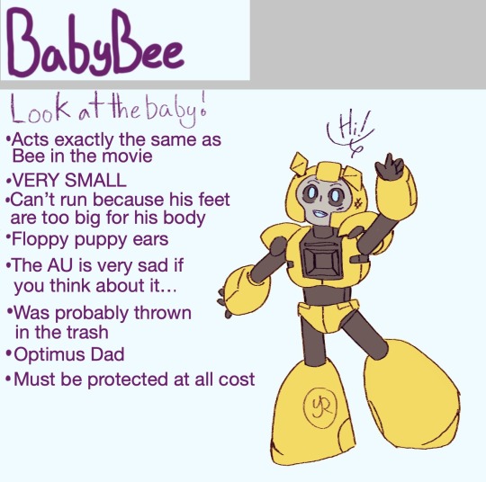
Some of these aren't original- none of them are actually. But at least you have a guide to look to when I post something and you wonder 'what is this about?'
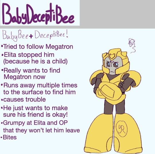
It's mostly cute stuff- and kind of headcanons. Theres a few people that have started their own versions of these AUs inspired by my art/headcanons... And that kind of things is encouraged! Create away! (just pin me if it is inspired by me- I wanna see all of it)
There are other variations of Bee you might see on this blog- But they aren't really AUs- at least not like the ones on this post. It could be art for a fic i'm writing or fanart of someone Else's AU like the examples bellow.
Fic art for "A Bee See Dee" and "A Bee's Last Sound" on AO3
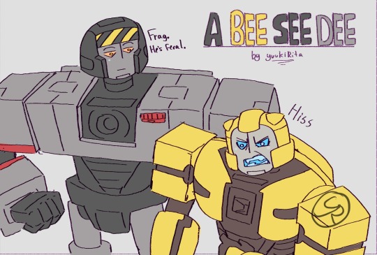
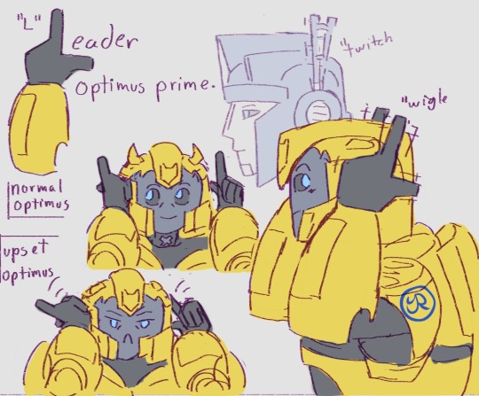
Bee's design varies according to the story he's in- If it's not from an au then it'll be in the tags! I try to tag the fic name if I want to draw a lot of art for it.
Oh and- example of art from someone else's Au. The Bodyguard!B-127 Au from @whalemleck that I LOVE. (someday I'll write something with it...)
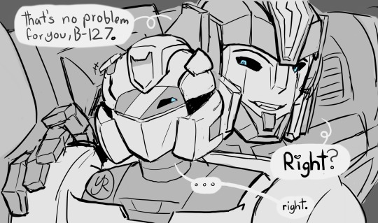
Of course I don't draw JUST B-127. You'll find a lot more other Cybertronians here. And my art style changes depending on the days... But I hope this post will Help some of you keep up with the AUs :D I'll update this post when needed.
#transformers one#deceptibee au#secondbee au#babybee au#babydeceptibee au#ghostbee au#bodyguard!b127#art#digital art#b 127#bumblebee#maccadam#artwork#artists on tumblr#my art#tfone fanart#tfone fanfiction#too many AUs#megatron#sentinel prime#Board#Master Post#guide post
2K notes
·
View notes
Text

Trying to work out how I see these kids aging! (With some Grunkles for reference)
#still v wip. I'll probably iterate on the designs every time i draw them. Especially the older ones#Gotten pretty attached to the teen/young adult designs. Haha.#I want their jaws to square out dang it! and I like the idea that both their noses droop down as they age#but still keep the pointing up & pointing down distinction from the production guide. So Dipper's just drops while Mabel gets a fun curve#Gravity Falls#Fan art#Dipper Pines#Mabel Pines#Stanford Pines#Stanley Pines#Older Mystery Twins#adult mystery twins#older dipper pines#older mabel pines#fanart#Artists on tumblr#My art
2K notes
·
View notes
Text
theseus' guide chapter 8 spoilers !!!
an overly dramatic visualization of the chapter finale that i got way too ambitious with enjoy
#if this doesn't follow the exact description of what's happening it's because i can't read </3#fr tho just tried to make it match the music as best as i could#and maybe.. sometimes i visualise stuff without actually processing whats written down... who knows#also i am doing so great after all of that yep so normal. normal human behavior#gf theseus' guide#gravity falls#stanford pines#bill cipher#billford#fanart#art#digital art#animatic#artists on tumblr#hummise art
1K notes
·
View notes
Text

There was a lot of things I could have done with my day, but this is what I did.
Oh no, not again.
Fans of Hitchhiker's Guide to the Galaxy will enjoy this new design and you can find it on Redbubble and Teepublic.
#art#artists on tumblr#sperm whale#the hitchhiker's guide to the galaxy#hgttg#42#don't panic#agrajag#the life the universe and everything
2K notes
·
View notes
Text
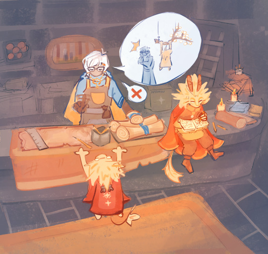
#i actually never draw backgrounds so im really proud of this#sky cotl fanart#art#artwork#digital art#sky children of the light#artists on tumblr#sky cotl#sky cotl art#digital#cozy art#that sky game#nesting guide#nomsart#oc: lion
3K notes
·
View notes
Text
Embrace Your Unique Style: Shifting Your Mindset
As an artist, it can be easy to fall into the trap of constantly seeking validation from others. From time to time, I seek validation to feel accepted and valued. Seeking validation from others can be a never-ending cycle and hinder my creative process. If you too constantly see validation, it’s time to shift your perspective and focus on creating for yourself, rather than for the approval of…
1 note
·
View note
Text
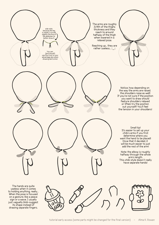
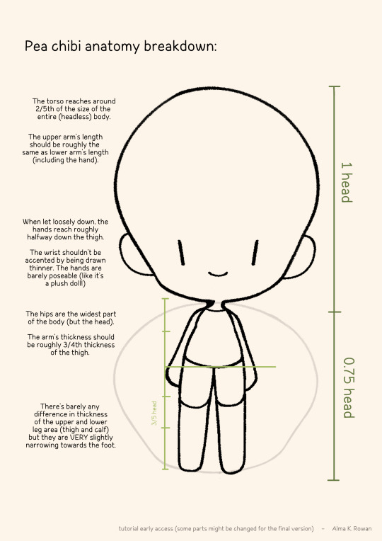
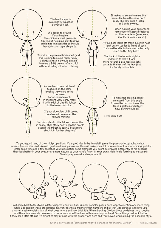
Here are the chibi tutorial so far, I'm going to be updating it in the future~ 🤗 ENJOY! INTRO

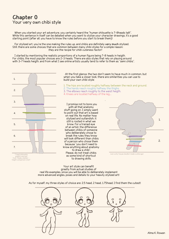
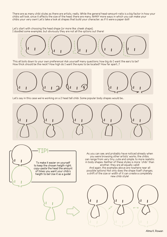
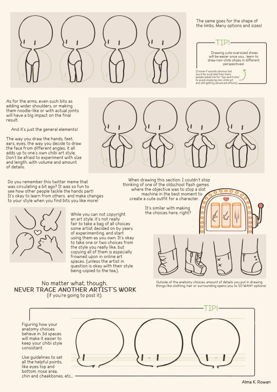
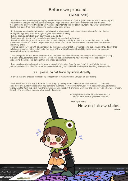
PEA CHIBI
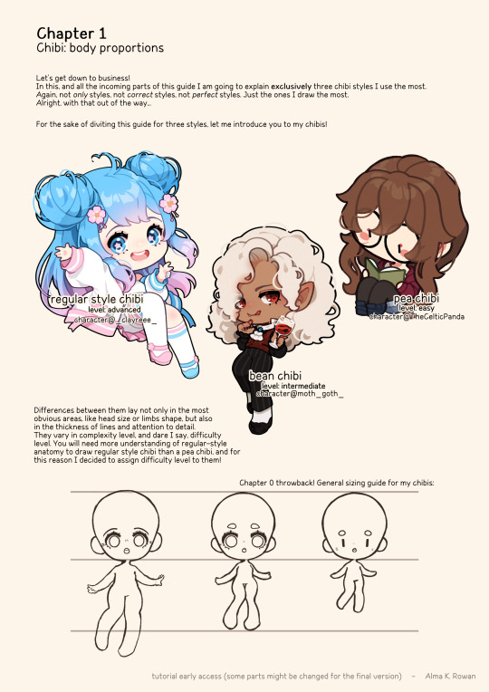
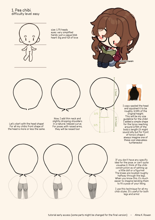
BEAN CHIBI
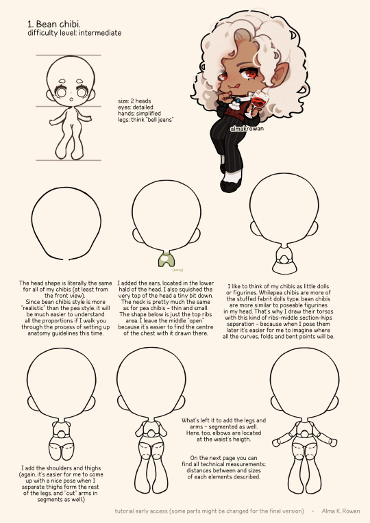
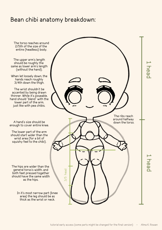
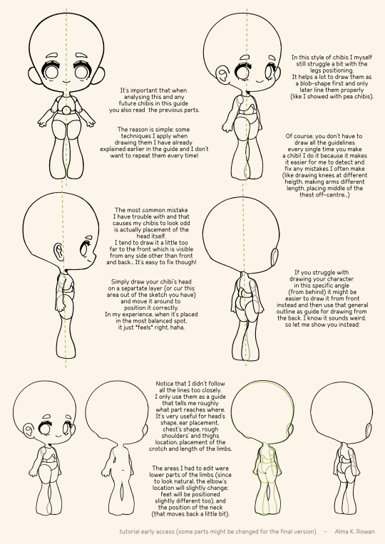
(tbc...)
#almakrowantip#how to draw#chibi#tutorial#art tutorial#digital art#art resources#artists on tumblr#how to draw chibi#chibi guide#chibi styles#sorry for the typos
4K notes
·
View notes