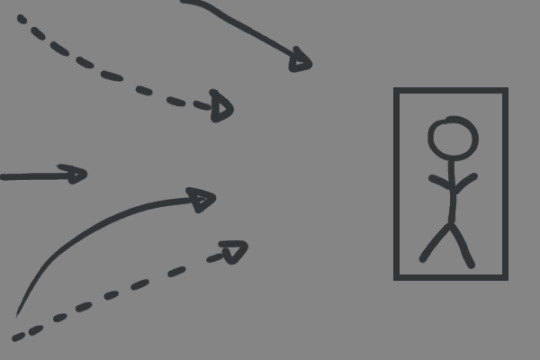
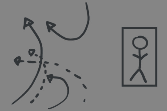
#art composition tutorial
Explore tagged Tumblr posts
Visit Tumblr Blog
Explore Tumblr blogs with no restrictions, modern design and the best experience.
Last Seen Tumblr Blogs


Fun Fact
Mobile Tumblr US users spend an average of 4.04 minutes per session on the app.
Text
youtube
#art#art tutorial#art tips#art help#foudo#art advice#composition#composition tutorial#gestalt theory#scaffolding#art composition#art composition tutorial#Youtube
66 notes
·
View notes
Text
for all the artists out there, here are my favorite resources i use to learn!
Files
The Complete Famous Artist Course
Art Books and Resources
Art, Anatomy, and Color Books
PDF Files of Art Books
Internet Archive
YouTube
My YouTube Playlist of Tutorials
How to Draw Facial Features
Drawing and Art Advice
Drawing Lessons
Art Fundamentals
Anatomy of the Human Body
2D Animation
Perspective Drawing
Websites
Pinterest Board for Poses
Another Pinterest Board for Poses
Pinterest Boards for References
Reference Angle
AdorkaStock
Figurosity
Line of Action
Human Anatomy
Animal Photo References
Humanae - Angélica Dass
Fine Art - Jimmy Nelson
Character Design References
CDR's Twitter Account
iamagco's Twitter Account
taco1704's Twitter Account
takuya_kakikata's Twitter Account
EtheringtonBro's Twitter Account
Drawabox
Color Wheel
Color Palette Cinema
Free Images and Pictures
Free Stock Photos
FILMGRAB
Screen Musings
William Nguyen Light Reference Tool
SketchFab - 3D Skeleton Model
Animation References - sakugabooru
Animation References - Bodies in Motion
#art#art resources#art books#anatomy#composition#painting#art tips#art help#art tutorial#perspective#color theory#art reference
35K notes
·
View notes
Text
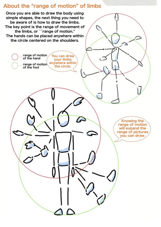
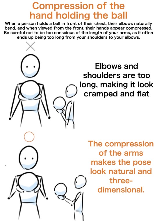
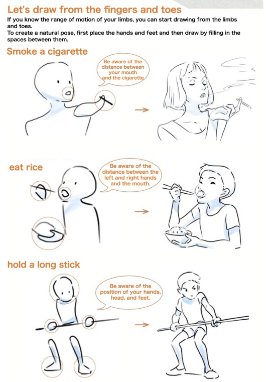
“The limbs are connected, so draw them in order starting from the body...This will result in poor balance.”
“The limbs can be positioned freely as long as they are at the appropriate distance from the shoulders and hips.”
Source: PrivateAnime on Twitter
#art tutorial#digital art#art reference#tutorial#art tips#drawing anatomy#human anatomy#drawing hands#drawing arms#composition tutorial
472 notes
·
View notes
Text
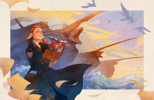
NARRATIVE STORYTELLING + COMPOSITION
First thing I always think of before doing ANY drawing is: what’s the story I want to tell? What’s the mood/emotion it should give off?
For The Visionary, I wanted to capture that feeling of seeing your hard work and creations finally come to life. It’s that satisfaction as artists, engineers, and creators we feel after seeing our hard work finally bear the fruits of our labor. It’s an exhilarating feeling and we feel a sense of pride.
I can pick out some key words from those descriptions: pride, excitement, satisfaction. Now, how do I depict that in the illustration + what compositional tools can reinforce that feeling and therefore story?
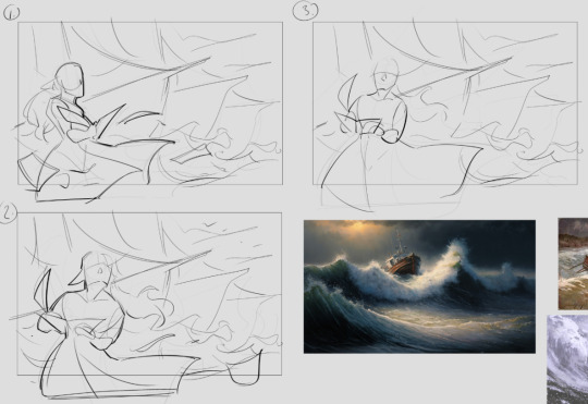
I also knew I wanted to draw my character, Kala. To reinforce the feeling, I wanted to think of his action and, in general, what he would be thinking in the illustration. I did a few thumbnails like below and figured to have him writing in his book and depicting boats in the background, almost like he’s drawing them at the moment and they’re appearing in the background.
Action: writing in his journal, almost as if making the background come to life -> gives a sense of pride and excitement.
This forms the basis of my composition. Everything from here on out (every decision in the illustration) relates back to this.
When thinking of your own illustrations and what you want your characters to do, try this simple template (do this for each of your characters in the scene):
<character> <action> -> gives <mood/emotion> e.g. The rogue flees from the castle guards -> gives a sense of urgency. A witch backs away from her cauldron -> gives a sense of fear.
Kala’s placement is important as well. I purposely made him stand on one of the fourths of the canvas at the far left to make him feel almost like one of the boats (one of his creations). You know those scenes in pirate movies (or even just Navia Genshin Impact) where the character stands next to all their soldiers or a series of cannons? Yeah, I wanted to do something similar here.
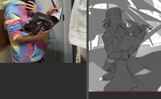
After thumbnailing, I’ll start refining the drawing and getting the structure right before doing anything else. Often, I’ll take reference photos like this and put them together in Photoshop. This helps not only get more accurate drawings but you can even put yourself in the shoes of your character. Imagine how they’re feeling in your illustration and act it out. Your pose—and therefore, your character’s pose—might change depending on how you do it which can help with your drawing.
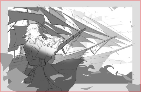
The boats get lighter in value as they recede to the background. I fix this later on in the composition, but since Kala is the focus, I had to make sure that he had the greatest amount of contrast. So I put a hint of light near his face so that his silhouette would pop well against the darker boat behind him. I later enforce this contrast through differences in color saturation which I will show soon.
I felt the boats weren’t grand enough + the mast shapes were too busy, and therefore didn’t support the story as strongly as I wanted to. And to further add contrast + give Kala more focus, I made the boats a bit larger, drawing them more from a low angle to further emphasize their grandiosity and the pride Kala feels in his work. It’s great when something works both compositionally well and enforces the story:

General lines of action of objects for flow. The boats specifically are all angled differently, converging towards Kala, to draw the eye towards him more + not feel static. It creates a sweeping motion to draw the eye towards him, along with the placement of papers and the shape of his coat further adding to the flow.
In general, you can strategically place objects in your drawing to follow certain lines of flow that go back to your focus. This helps guide your viewer around your piece while also giving a sense of motion and energy.

Every artistic decision you make should reinforce the story in some way. Even the tiniest things like the line art style. This idea came after looking through the Across the Spiderverse concept art book, specifically reading about the art style choices of Nueva York. Constructional lines and architectural diagrams are seen throughout the city and I wanted to bring a bit of that into this piece.
It further enforces the idea that Kala is creating the background behind him while also making the boats recede into the background due to atmospheric perspective. Depth of field is determined by how refined the boat’s sketch is, so the boat furthest away is still in pure constructional lines while the one closest to him is fully rendered. I thought that was a big brain idea and I’m glad I went with it >:)
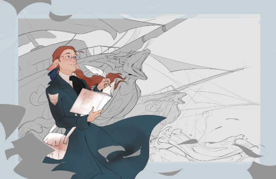

To add a bit of texture, I added a grid pattern off in the distance to help with the feeling of the background being drawn in. I also added sketches of engineering diagrams into Kala’s blue coat for a bit of visual interest. These further add to the fact my character is an engineer and is almost drawing the background himself. Plus, it just looks cool.
Quick breakdown of some visual choices + how they show the story:
large value range: the values go from very dark to very light -> deeper contrast gives sense of drama and overall intensity to the image -> reinforces feelings of epicness
strong warm vs. cool color contrast: shows the sunrise lighting, gives the character more focus (red is a very intense color) -> gives of sense of pride
sketch-y depth of field: objects further away have a more sketch-y, drawn look -> helps with atmospheric perspective and shows that the character is an engineer. contrast with more refined foreground and character.
character pose: Kala is standing tall while also writing in his journal with a very satisfied look ->
flowing papers in the foreground: intentionally placed to aid in the overall flow of the piece -> also enforces the idea that the character in question is very experienced + shows his hard work to get to where he is now
These are all my personal choices for the illustration based on my own experiences and intentions. But every choice, from the character pose, the value range, or whatnot was intentionally done to support the story I wanted to tell in the piece. You or another artist may have different choices given the same prompt, and that’s cool! It’s these kinds of intentional choices based on one’s own experience and emotions that make art awesome and inherently human.
Let me know if you like posts like this and I’ll do more, breaking down the process and my thinking in some of my other pieces!
#nis talks art#tutorial#art tutorial#art walkthrough#my art#1k+ words of nis rambling on about art#idk if i even made sense but I did my best to describe some of my decision processes in regards to composition#composition#steamworks family#art
64 notes
·
View notes
Text
Art Advice: Composition pt. 1 - Leading Lines and Focal Points
Composition is a vast topic that would take a long time to talk about in full, so I'm breaking it down into parts of more manageable size. This article is for people who draw/paint and for photographers.
In this issue, we will talk about guiding the viewers' eyes using: I. Leading lines II. Focal points
Every artpiece (drawing/painting or photograph) has visual pathways that guide the viewer's eye from one point to another in the piece, whether you intended to include them or not. It's important to be aware of them and learn how to use them to your advantage.
I. LEADING LINES
One way to guide the viewer's attention through a piece is by using explicit and implicit lines. An imbalance in these can cause your drawing to appear lopsided. (Imbalance, however, can also be used to your advantage; we'll talk about that later in this article.)
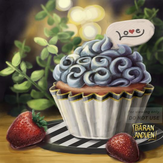
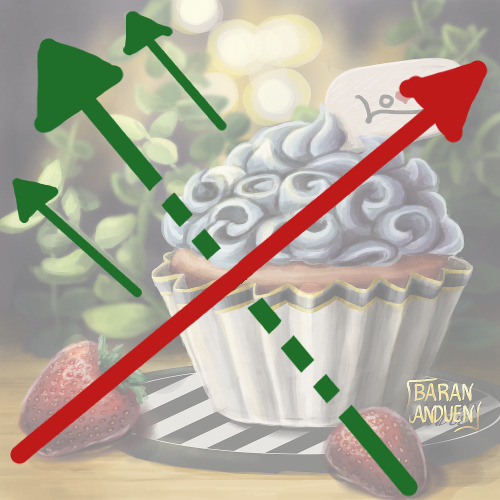
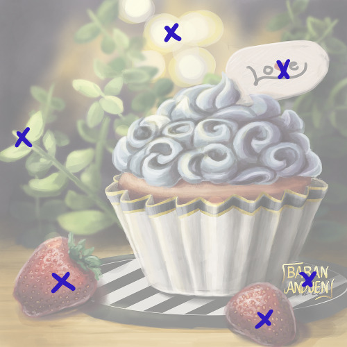
"Cupcake Love" [link]
Explicit lines are easier to identify: they're actual lines in your drawing. Here, we have three explicit sets of lines:
The sprigs of greenery: the two main ones are shown by the solid green lines on the diagram on the right. Here, they have a top left ↔ bottom right motion;
The black and white lines on the coaster, running in the opposite direction; and
The creases on the cupcake paper, fanning out from bottom to top.
Implicit lines are harder to spot, but your subconscious does catch them, so it's important to train yourself to see them. Here, there is an implicit line, marked on the diagram by the red arrow, that goes from the strawberry on the bottom left (notice its alignment) to the "Love" sign on top of the cupcake (notice that the "L" also forms an arrow that points back to the strawberry).
There is also another implicit line (shown by the dotted green arrow) going from the strawberry on the bottom right and connecting with the explicit lines formed by the sprigs on the top left.
🌱Tip! For people drawing: While training yourself to see implicit lines, a good way to spot them more easily is to flip your canvas. When working traditionally, you can use a mirror or take a photo of your work (make sure you paper is straight/not bent, and that your camera or mirror is perpendicular to your paper). You may not notice where the implicit lines are, at first, but you're more likely to spot a skew/slant this way.
The "red" and "green" lines here are perpendicular to each other, giving the painting a balanced appearance, despite the cupcake being off-center. You may have noticed that, if we were to remove the "Love" sign, we would still have more bottom left ↔ top right lines, from the sprigs behind the sign. So there is not just one bottom left ↔ top right line; there are more, and this also contributed to the sense of balance.
II. FOCAL POINTS
Another way to guide the viewer's eye across the canvas, or make them pay attention to a specific area, is to use focal points smartly.
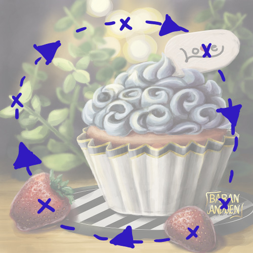
Here, I've marked with Xs the secondary focal points of the painting (the main focal point being the cupcake). These are the points on which a viewer's eye will rest (after spotting the main subject first).
Like with leading lines, you want to use these to guide the viewer's eye around your piece in the way YOU want. This visual pathway can vary from piece to piece. You can try to arrange them in such a way that you keep the viewer's eye within your drawing, as opposed to leading it off the canvas. In this painting, they form a circle, but they can have any number of shapes.
IMBALANCE CAN WORK FOR YOU...
So far, we've talked about maintaining a balanced composition and keeping the viewer's eye from wandering off the canvas, but there are situations where you may want to do the opposite, to achieve a certain effect. For example:
To create a sense of bigness of smallness, or of open spaces
To cause an uneasy feeling in the viewer
To guide the viewer's eye in a specific direction
Let's look at some examples:
from my photography account: @barananduen-photo
These two compositions have very strong bottom left → top right leading lines (explicit), and nothing bringing the viewer's eye back. The focal point(s) are also all clustered toward one end of this line (in these cases, they're in the bottom left). This is done intentionally to create a feeling of open-ness.
You could also use a group of leading lines all pointing toward one focal point off to one side, to create a feeling of both isolation and focus/stress on said figure ("all eyes on..." type of concept). On the other hand, keeping the focal figure on one side, but, instead of lines pointing toward it, using curves leading away from it, can create a feeling of exclusion or loneliness for the figure.
So, you can use imbalance in composition in different ways to convey different messages.
...OR AGAINST YOU
"Christmas Chocobo" [link]
This (the painting by itself), on the other hand, has pretty bad composition. I have one leading, explicit line: bottom right ↔ top left. If you take away all the stuff I placed on and around the sketchbook, that composition is not really doing anything for me. The subject is centered, and there's nothing in the spaces around it, so it's not creating a pleasant sense of open-ness. It just looks skewed. There's a weak implicit "swoop" in the feathers on the bottom right, but it's not enough. The figure balances off a little bit because it's very bottom-heavy, so the body of the bird is like a horizontal mass.
The photo as a whole is more balanced out, because there is an implicit line going from bottom left ↔ top right, from the orange/reds paint wheel, through the bird, and to the paints on the top right (and this line is top-heavy). There are also various items forming a circle around the painting. Also, the darker leaves on the top left blend more into the background, keeping the bottom right ↔ top left explicit line of the painting from extending farther (therefore not diminishing the effect of the bottom left ↔ top right implicit line mentioned before).
🌱So the important takeaway is: Learn to identify leading lines and focal points, and arrange them to suit your purpose, whether it be creating balance or breaking it, and experiment to see when breaking it is good and when it is not.
CLOSING
Composition is a very important skill for both drawing/painting and photography, but the way each of these two types of artists goes about it is usually the opposite: While, when drawing, you start with a blank canvas and fill it up, when making (I prefer this term, used in German, over the English "taking") a photograph, you usually (unless you're doing still life, etc) start with a whole scene that you have to figure out how to fit into the frame.
For this reason, I'd like to encourage both types of artists to try each other's medium as an art exercise in training your sense of composition, because changing your approach often leads to you discovering new things you can use.
For people who draw: Take your phone (or camera if you have one) and try to frame things "artistically," taking into consideration the things we've discussed in this article.
For photographers: Try making little stick-figure doodles (for drawing/painting, this is called "thumbnailing") of what you'd like a scene to look like. This is something you can use in the planning stage before a photo session, sort of like a "wishlist."
And, like I said, there are more topics in composition, but this is a good chunk to digest in one sitting, so we'll leave the other topics, including other ways to guide the viewer's eye, for future Art Advice Articles.
I hope you found this helpful, and see you next time! 💗
MORE ART ADVICE ARTICLES
You can find the index to all Art Advice Articles [here] including:
How to Deal with Art Block
How to Have a Positive Outlook
Advancing in Art: The 3 Ps
The Misconception Behind "Study Realism"
How to Develop Your Own Style (coming soon!)
How to Photograph Traditional Artwork (coming soon!)
etc.
#composition#art advice#art tips#art help#art resources#artists on tumblr#photographers on tumblr#art#photography#how to#art tutorial#photography tips
32 notes
·
View notes
Text
How to use the rule of thirds
#art blog#art appreciation#tiktok#how to#how to draw#composition#art composition#art help#art resources#art practice#tiktok video#drawing#drawing tips#drawing advice#art tips#art advice#video#proko#proko tv#proko art#art tutorial#artists#pencil art#advice for artists
26 notes
·
View notes
Text
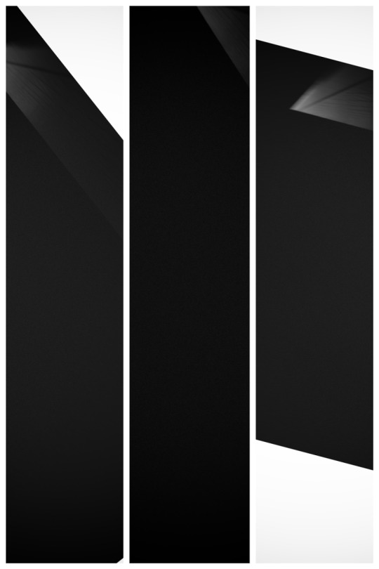
The thing about critics…..
I once received a comment about my images, suggesting that perhaps I should consider making them brighter, as they appeared too dark to the viewer’s eye. It’s not the first time I’ve heard such feedback, and it likely won’t be the last. The question arises: have I ever contemplated heeding this advice? The answer is a simple yes. But do I actually make my images brighter in response? No. Why? It…
View On WordPress
#architecture#Black & White#black & white architectural photography#black and white#black and white photography#Fine Art#fine art and photography#fine art architectural photography#fine art architectural photography tutorial#fine art architecture London#minimal architecture#minimal composition#minimal fine art photography#minimal photography#Photography
22 notes
·
View notes
Photo

idk if this is helpful but I made a thing✨
#leafie draws#art advice? artvice? hhhghng#composition is just the power of suggestion babyyy#I like sharing art tips I'm just bad at explaining things LOL#about art#art tips#tutorials
209 notes
·
View notes
Text
I figured out how to kinda draw in r1999 style
I'm a GOD
#maybe I should do a tutorial#yeeeeah I'll do one for the eyes#the eyes in r1999 are so pretty#but their composition and storytelling?#holy sweet arcana that shit SLAPS#fanart#holostars#citrine nation where ya at?!#drawing the stinky wizard#and will add a meme to it when I'm done lol#art#digital art#vtuber#holostars en#godofart
10 notes
·
View notes
Note
Your Mustsumi piece is really stylish! How did you do the backgrounds and come up with the composition?
Thank you so much! :-) I feel it's appropriate to respond to this ask on Mutsumi's birthday hehe. Forgive my weird wording btw (if it seeps in) as I am unfortunately strange like that (and feel free to ask away any questions!)
Summary: Modify already existing patterns, the darker your white is the better (trust), focus on the focal point, and Man I fucking love triangles.
First on the background (with a hint of color theory):
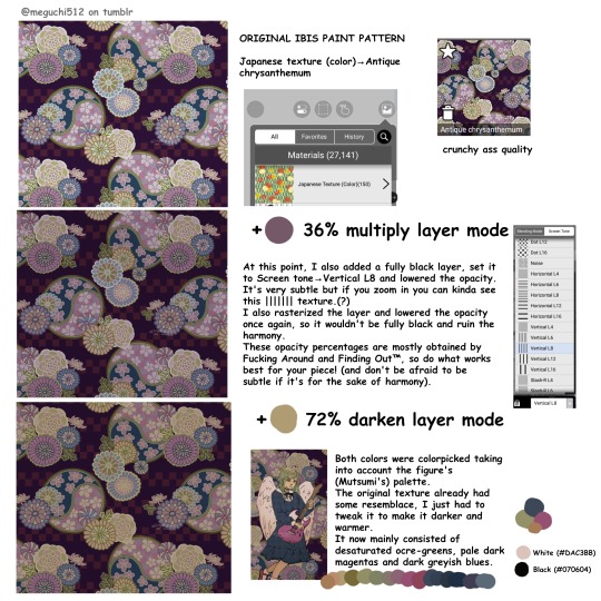
I took it from the Ibis Paint X image-archive-thing (???). It's actually a nice resource for stuff like this. If you use a different drawing platform try looking for your own in-app/in-program archive or consider searching online. In Ibis Paint X, not all patterns are available for non-premium users but personally it's not much of an issue (especially since non-premium versions of these textures tend to exist, with different colorings).
There are tons of these available by looking into the Japanese Texture (Color), Cloth Patterns (Color) and Patterns (Color) sections. Personally I prefer to alter the already colored ones as they are easier to work with, while the Gray/B&W ones require more retouching with blend mode layers. However, feel free to experiment and use whatever works best for you.
I was lucky to find one with a similar color palette to my drawing, but there's still some tweaking to be done to make it darker and warmer (as stated in the image). In this drawing it was relatively straightforward, though I've previously had to make more detailed modifications in other ones to make everything blend in naturally (mainly painting over different elements and particular shapes).
There's no rule for the specific blend modes –as in, they don't necessarily have to be multiply + darken, and there's no need to restrict yourself to solely 2 layers either. The same could be said about the opacity. It's merely situational. Instead, try playing around with them and/or learn how each one works to be able to pick them quicker.
For example, once I had applied the multiply layer something still felt off: there was a lack of ocre tones, which had been cancelled by the purple-ish color I painted it all over with. I especially wanted the darker colors to lean towards purple, while making the lighter ones lean towards green, so I applied a green darken layer which mainly affects the tones closer to white.
On a separate note: Color theory yay!! I freaking love color theory!!! As you can see in the bottom corner, I didn't use (and don't tend to ever use) pure white (#FFFFFF) or pure black (#000000). Actually, some artists will strongly advise against doing so, saying it looks beginner-like and muddy. I slightly disagree with this, or at least I think it's a bad way to put it (I mean, have you seen comic art? Pure black shading can look great when done well).
However, it's true that beginners won't be great at using pure black/white and it's greatly beneficial to experiment with off-white and such. Adding a slight tint to your neutrals makes a nice difference, and IMO the greater you can make it stray away from its original tone and still make it look convincing, the better!
By the way, notice how there's no "white" or "black" in the background? I reserved these contrasting tones for the figure. This is to draw your attention towards her, instead of adding more contrast to the background and making it all overwhelming.
Anyways, here are some other drawings in which I also used modified preset Ibis backgrounds:
• These KanaMafu drawings. It's the same pattern in both drawings, just flipped vertically and with inverted colors.
• This Kanade drawing.
Now, moving onto composition:
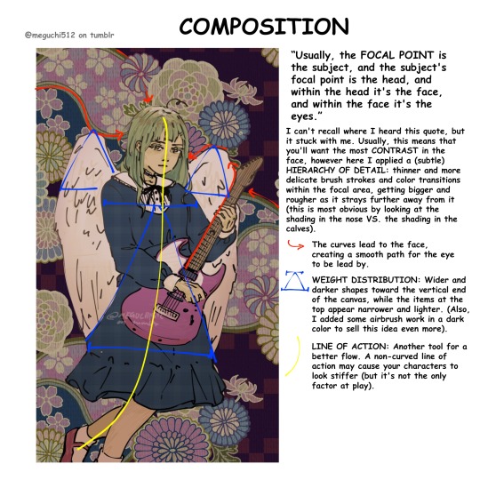
Not gonna lie, this was all a pretty subconscious process. I actively had to look for the principles I had applied, because honestly "figure in the center of a vertical canvas" seemed simple enough for a composition, but there's more to it!
I honestly feel like this is very self-explanatory as shown in the image, but if it isn't please ask me to elaborate B-).
Note: regarding the "airbrush work" mentioned, I meant I slightly painted over with a dark airbrush towards the bottom of the canvas and then lowered the opacity. Again, the whole thought process here was Closer to the focal point = lighter colors, smaller shapes and more detailed brush strokes.
But! There's more!!!:
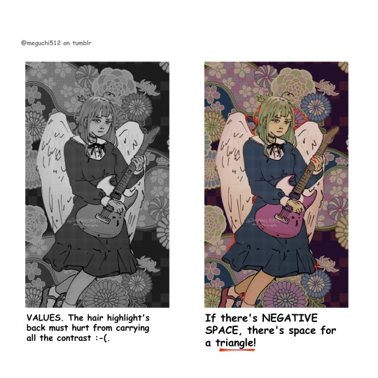
Still on composition and color, something that is extremely useful and that I unfortunately forgot to do while working on this drawing is to check your values. This means translating the piece into B&W.
Due to the fact that I didn't check my values, the hair sort of blends in with the background. Upon noticing this, I added a highlight the same color as the angel wings (off-white). This was useful at making more of a distinction, but I could've definitely pushed it further had I followed this advice.
Onto (probably) my favorite art advice ever: TRIANGLES. Use triangles whenever you can. ESPECIALLY when there's negative space (space not occupied by the figure). This works so well to make your silhouettes more legible and dynamic. It's a life-saver.
Also, look up Sinix Design and Marco Bucci on YouTube for some great art advice.
I'm pretty sure that's all, sorry for becoming the yap monster. I really hope this was helpful! Thanks again for your ask and have a nice day/afternoon/night.
#art#my art#digital art#artists on tumblr#art tutorial#art advice#color theory#composition#line of action#focal point#negative space#i think that's all tagged :-P
6 notes
·
View notes
Text
Inking Tip: Line Weight
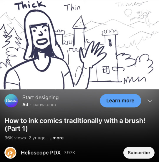
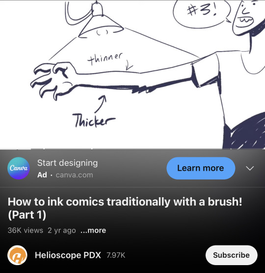
In contact with light = Thinner lines
Further into the background = Thinner lines
Credit: Helioscope PDX
#random tip#random tips#inking#line#lines#linework#line weight#pen#ink#composition#drawing#art tips#art tutorial#art tip#art tutorials#drawing tip#drawing tips#drawing tutorial#drawing tutorials#art#tip
132 notes
·
View notes
Text
My one art/comic tip is don’t cross speech bubble tails, it can make your comic awkward to read and generally looks messy.
If the comic is simple and doesn’t require specific character placement, just flip the image. You might have to fix your character’s asymmetrical design.
Or stack the speech bubbles so the tails can point wherever freely


#i don’t want to do a bunch of corny art hacks and DO’S AND DON’TS tutorials but this is an easy fix#i hate figuring out composition too but this irks me. I’m sure I’m not alone here#rules can be bent/broken for effect but I see this way too often#art tips#artist tips#comic tips#composition
15 notes
·
View notes
Text
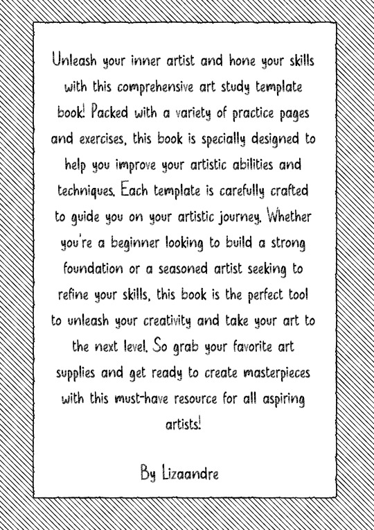
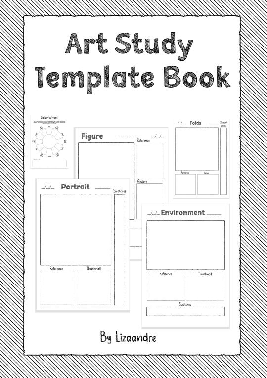
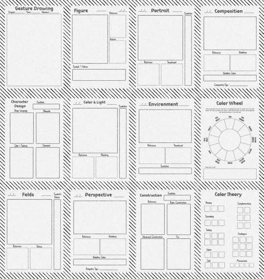
Unleash your creativity with my drawing template low content book - perfect for artists looking to sketch, doodle, and brainstorm new ideas! 🎨✏️
#art#my book#low content book#drawing template#art book#templates#gesture drawing#portrait#figure drawing#composition#character design#color and light#art study#enviroment art#clothing fold art#perspective art#construction art#color wheel#color theory#tutorial#art tutorial#artists on tumblr
10 notes
·
View notes
Text

heavy is the head that wears the crown
#the bear#my art#carmy it wouldn't be heavy if you shared the weight. carmy why aren't you listening to me#many shouts to caemidraws for their tutorial on composition!! took lots of inspo from that#carmy berzatto
19 notes
·
View notes
Text
i’ve started teaching myself (again for like the 6th time since i was 14) how to draw people and i’m rly enjoying it for the first time i’m so excited.. i’ve always wanted to be able to draw like people and objects and scenes yknow. art. but never had the patience or a learning mindset now i find i’m actually enjoying the process and even though i’m so bad at it i can see how i’ll improve and augh. feels good
#i took enough art in high school that i can like. hold a pencil and do basic composition and colour theory#and some other basic like perspective techniques and some body/face proportions yknow how art class is#but i’m teaching myself with tutorials and whatnot and just Doing it like just drawing stuff#doing it stupid and doing it a lot#the face i drew today was way better than the one i drew yesterday :)#p
14 notes
·
View notes
Text
Another new tutorial (if you can call it that) is up on my Patreon!
It's available to everyone, even if you aren't a paid member!
12 notes
·
View notes