#arcane art tutorial
Explore tagged Tumblr posts
Text
Arcane Grey Metal Tutorial (Ibispaint X)
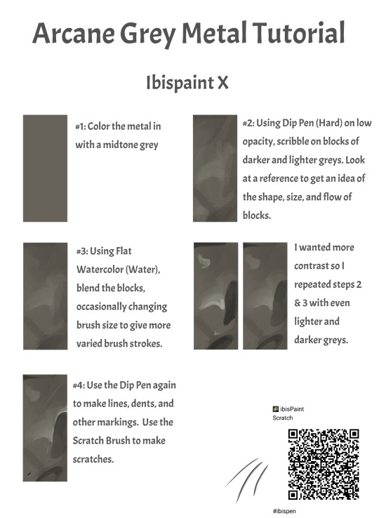
#arcane#art tutorial#metal texture#arcane metal#arcane art#arcane art tutorial#arcane fanart#arcane reference#texture reference#ibispaint#ibispaintx#ibispaint art#ibispaint x tutorial#ibispaint x#digital arwork#digital fanart#digital art tutorials
19 notes
·
View notes
Note
Hullo! I’ve been watching a bunch of your Timelapses and I was wondering how do you always come up with the colours for your pieces? They’re always so cohesive and pleasing to look at (I almost exclusively work in greyscale so if I’m using colour it’s always a lucky guess and it never looks quite right)
Hey there!
I have to be honest that most of the time I don't actually know what I'm doing and that I have no idea how most of my pieces are gonna turn out. My work process is usually based on "Fuck around and find out", haha. I'm happy to know that it apparently doesn't come across that way, though.
A lot of it comes very naturally to me simply because I've been drawing non-stop for so long, but I can give you some small tips that really help me:
1. Have as many references as possible!
Here's what my reference sheet looked like for the Jayvik piece:

It helped me a lot to understand the overall color scheme I wanted to convey. Lots of very cold tones, pinks and very light blues and greens. These colours sorround Jayce and Viktor throughout all of season 2 and I wanted to keep them, especially since in my piece they are lying in the glowing hexcore.
Don't shy away from using references, get as many as you possibly can! Look at other poeple's art too and try to understand how they work with colours.
2. Work with complementary colours!
Since I paint a lot of romantic illustrations I want them to look pleasing and comforting, which I can accomplish by using complementary colours! You see this a lot with couples that are blue and red coded, for example. And I wanted to do the same thing in the Jayvik piece! For that I used the highlights in their hair!


Viktor's highlights are a soft pink hue.


While Jayce's are a soft blue hue.
The colour wheel works perfect for figuring out if two colors compliment each other because they are literally right across from one another!
3. It doesn't have to be true to life.
Pretty self-explanatory, but I thought I'd add it in here anyways. It's important to understand how colour and light works, but you don't always have to follow the rules. Does the rim light look cool but it makes zero sense? Who cares! Keep the cool rim light! Just have fun and fuck around.
4. A little trick to make your life easier!
I'm not excatly the best at colour theory, I still struggle with it quite a bit, but here's a little trick I like to use from time to time:
If you want all your colours to look coherent, take one specific color as your flat colour. Choose a hue that you would like your piece to have. Like this:

Now you choose whatever colours your characters have and paint them in. For example, here are the skin colours I chose for Jayce and Viktor:

Looks off, right? These colours don't fit the overall piece at all. So what do we do?
Turn down the opacity! It's that easy, wahoo!

I went from 100 Opacity to 72 for this specific illustration. And look at that!

It's so much nicer already! Now you know what colours to use as your actual flats! Just repeat this with every other part of your illustration and you'll have a great starting point. :)
I really hope this was helpful! I'm not an actual teacher and I don't have a proper illustration degree, so some things might not be completely accurate, but I thought I'd try my hand at this anyways!
#teacher han is at it again#if I talked bullshit forgive me#I just hope I was able to help at least a little bit haha#I'm always happy to give some tips!#art process#art tutorial#color tutorial#colouring#illustration#tips#my art#arcane#jayvik#tutorial#anon#ask
752 notes
·
View notes
Text

chapter 13! wow, hope you guys handled that 48 hour period well! :D
hope nothing too crazy happens which might be hinted at in that silly lil picture i drew!
full clean sketch that i saved cuz i thought the whole pose looked really cool, but the crop was more dramatic, so i cropped it, whatever. it's under the cut is my point
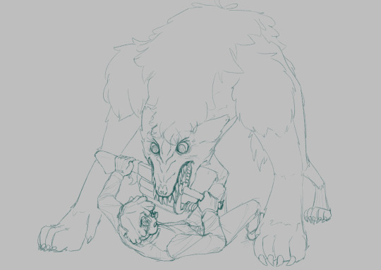
#gravity falls#gravity falls au#H!MBAW!AU#stanley pines#stanford pines#fiddleford hadron mcgucket#stan pines#ford pines#fiddleford mcgucket#fiddauthor#my art#digital art#ao3#didnt know how to draw fur before this#looked up exactly one tutorial on ytb#skipped through it cuz i didnt like the audio mixing#came out of it hearing uncle roger in my head (use fingaaa hayaa) but im pretty sure it worked out in the end#at least a lil bit#i finished this on the day arcane season 2 act 2 dropped#i was sitting in my chair like THIS COULDVE BEEN SUCH A BANGER WARWICK FANART NOOOOO#not that i regret enriching my fanfic experience with art BUT I COULDVE DRAWN WARWICK BROOOOO#'so draw warwick?' the vibe is off now id never finish it 😔
255 notes
·
View notes
Text
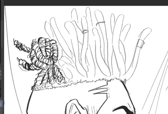
How I draw Ekko's hair!!
No one asked but!! Brief tutorial on Ekko's hair <3
1. ok so, 1st things 1st, I usually laid out the shape of it with this worm-shape so I can separate his twists from one another.
Like this:
2. knowing the direction; based on his own hair, his hair is twisted clockwise, so try to follow from left to right:
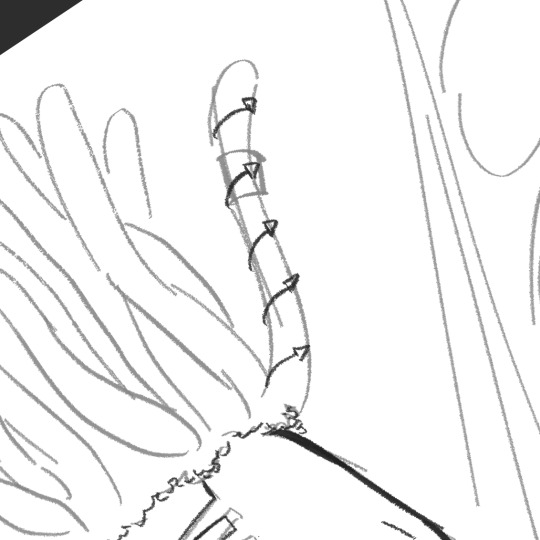
Then I draw one side of the twist, like mapping down where it follows:
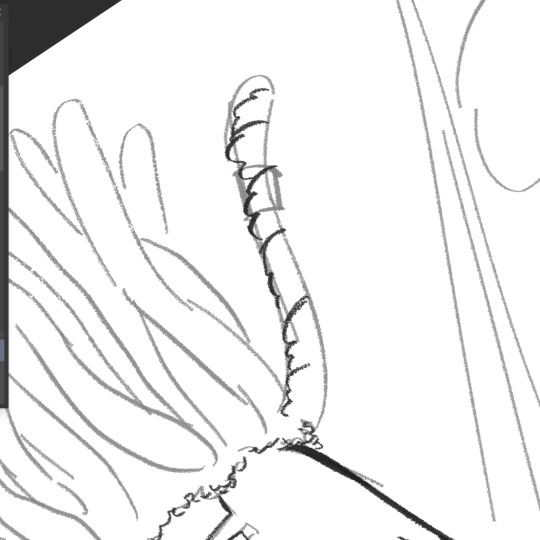
3. wrapping up; now that's laid out, you can come back from top to bottow, like this:
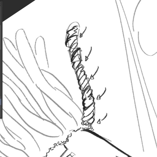
4. details; now you just add the details (hair jewelry, loose hair) and thicken the edges to distinguish each of the other:
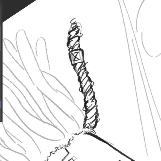
And done!!! Hope this is for help of someone ❤️ please, feel free to ask questions or other tutorials if you want!
#bleak's drawings#tutorial#art tutorial#artists on tumblr#hair tutorial#digital art#ekko#arcane ekko#ekko arcane#ekko lol#ekko fanart#ekko league of legends#ekko thoughts#artist help#illustration#drawing tips#tips
62 notes
·
View notes
Text

An unprofessional arcane art style tutorial
#artists on tumblr#digital art#my art#fanart#arcane#arcane season 2#arcane jinx#jinx arcane#jinx#arcane artstyle#artwork#art tutorial#art style
64 notes
·
View notes
Text
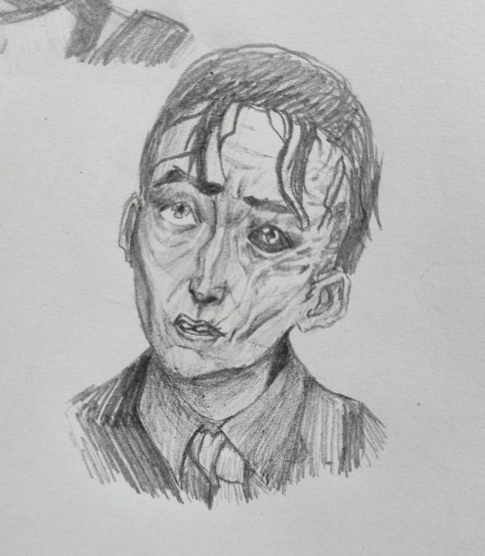
I'm afraid I ate
#i was just sketching while watching a wicked slime tutorial#and i drew jinx and it turned out good so I decided to draw another one and OMGF#THIS CAME OUT BETTER THAN EXPECTED???#so much better than expected#arcane#arcane s1#arcane season 1#ema blackburn drawing#ema blackburn draws#silco#arcane silco#arcane fanart#silco fanart#my draws#my art#traditional artist#traditional drawing#traditional illustration#pencil
32 notes
·
View notes
Text

Here's a quick process of how I draw braids, feat. Jinx from Arcane. The full video tutorial and detailed walkthrough is available on my Patreon.
My commissions are open! DM for more info.
35 notes
·
View notes
Text
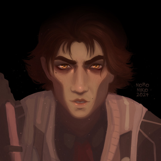
happy birthday viktor arcane
#pretend this was posted yesterday#i watched a tutorial on how to digitally paint bamboo yesterday and got bored after 20 minutes so i decided to practice painting with vikto#painting with viktor instead#i think it turned out pretty good :-D we learning#viktor arcane#viktor league of legends#arcane#arcane viktor#league of legends viktor#league of legends#arcane league of legends#fan art#digital painting#portrait painting#clip studio paint#artist#digital art#art#artist on tumblr#artists on tumblr#my art#digital artist#noroniko
29 notes
·
View notes
Text

Art traditional
Jinx is a character from the League of Legends franchise
#art#artwork#drawing#sketch#drawing traditional#art drawing#my draws#drawings#drawingart#drawinyourstyle#my art#art tumblr#drawing tutorial#tumblr draw#tumblr art#artists on tumblr#tumblr drawing#lol#lol art#jinx arcane#jinx#jinx art#jinx league of legends#jinx lol#arcane#league of legends#league of legend art#desenho#desenhista#desenhar
56 notes
·
View notes
Text
#digital art#art#digital illustration#fanart#procreate#digital painting#jinx arcane#jinx#arcane#cosplay#art fanart#artists on tumblr#league of legends#league of legend art#makeup tutorial#tutorial#creative process#fan content#artists on tumbr#violet and powder#fandom#doy
24 notes
·
View notes
Text
Wish I knew how to do the Arcane art style because the series is so beautiful and I want to draw other League champions in that style!
#like seriously how do you do it?#the art I've seen in the show's style is genuinely amazing!#anyone got any tutorials?#arcane#arcane art style#arcane league of legends
7 notes
·
View notes
Note
holy fuck that arcane self portrait you did is beautiful!!!! like excuse you??? the talent??? chef's kiss, phenomenal what tips/tricks/advice do you have for those that also want to learn the artstyle?
Whaaa thank you!!!! Some tips I did to try and make my portrait was actually studying Jinx and my own face! I had done a little study back when season 1 came out of Jinx face because I wanted to try and make one of myself but I couldn’t translate what I learned into a portrait of myself until now.
I did a very small structure study of jinx to see what shapes I could see and map out. I took that reference and started on a new canvas with my photo on the other side to look at. I would look at Jinx’s reference and my own photo back and forth to make my sketch. I started trying to get my features down first (picture on the right) before making the big highlights and shadows of my face that I could see on my photo.


Anytime I start on a drawing or painting, I always gravitate towards the eyes, lips, or mouth first. On Jinx, I found that the eyes, nose and mouth have the most solid shapes. They start out solid and start to blend out, either at one side or both. But the overall shape is still there even with a little blending. The first time I did my self portrait I over blended and lost the shapes completely. It looked nice but it wasn’t the Arcane style you know.

You can still see some shapes like on Jinx’s chin and right side of her forehead where her hair makes a cast shadow but the rest of her face is painted and blended out.
Another piece of advice is using characters as references that may have similar traits to you! I chose Jinx because she has a similar skin tone to me, she has some roundness to her face (I have very round features I feel like) and she has slight freckles.
For example, if you feel as though your eye shape resembles Caitlyn’s eye shape you can use her as one of your references while also using Jacye as reference if your skin tone resembles his skin tone.
Oh oh! Also DONT TRY MAKE IT SYMMETRICAL! I would get frustrated because I felt like it looked bad because it wasn’t symmetrical but that’s not true! I have slight uneven features and so do the characters in the show!
I could literally make a whole post tutorial about it but I hope what I wrote so far made sense!
Love and peace 🫶🏻
#mariatvarts#slight tutorial#arcane s2#arcane#arcane jinx#jinx lol#digital self portrait#arcane self portrait#artists on tumblr#today on tumblr#artwork#art#digital illustration#arcane vi#arcane league of legends
18 notes
·
View notes
Text
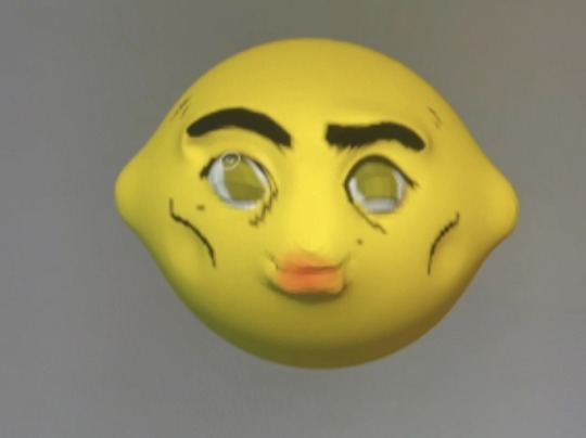
in all timelines and all possibiltiies
#arcane#arcane viktor#viktor fanart#viktor arcane#blender#3d art#i have no idea how blender works#no tutorials
4 notes
·
View notes
Text
main blog: @weird-cato
this is my sideblog where i reblog whatever (tag list below) and post either lightcannon or any sketch or doodle that i dont wanna post on my other blog but still wanna put somewhere
tags list here so i find them quickly
#art#ocean#tutorial#trains#pictures#petscop#myhouse.wad#laika#wc#wa#nitw#snow#mine#arcane#ddlc#wahredpanda#godsofsummer#boarboy#csh#lightcannon#boxedsprouts#xi xi chen#star guardian#buttercatrho#gettehld#(wip)#beelur
2 notes
·
View notes
Text
My toxic trait is watching 10 art tutorials and thinking I can make amazing art with 0 reference
#artwork#art tutorial#art#what do people usually tag#i never know#errrrmmmm#colours#lines#and other stuff like it#tutorials#candy cane#house#6 dogs#12 doors#300 bottles of rocks#3#i hate waiting#I’m waiting for next week#I’m waiting for stranger things updates#i waiting for arcane#I’m waiting to get better at art by doing nothing#I’m waiting for scars banner#I’m waiting for sigewinne#sighs
3 notes
·
View notes
Text
With Arcane getting popular again, I thought I'd reblog this as a guide for Viktor artists, as I have noticed a few mistakes lately (this guide only applies to season 1 act 1 Viktor though, as he uses a crutch after the timeskip)
Note that he actually uses his cane (and later crutch) on the right side, despite that being the side with his bad leg
A general cane guide for writers and artists (from a cane user, writer, and artist!)
Disclaimer: Though I have been using a cane for 6 years, I am not a doctor, nor am I by any means an expert. This guide is true to my experience, but there are as many ways to use a cane as there are cane users!
This guide will not include: White canes for blindness, crutches, walkers, or wheelchairs as I have no personal experience with these.
This is meant to be a general guide to get you started and avoid some common mishaps/misconceptions in your writing, but you absolutely should continue to do your own research outside of this guide!
This is NOT a medical resource!!! And never tell a real person you think they're using a cane wrong!
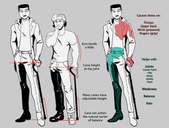
The biggest recurring problem I've seen is using the cane on the wrong side. The cane goes on the opposite side of the pain! If your character has even-sided pain or needs it for balance/weakness, then use the cane in the non-dominant hand to keep the dominant hand free. Some cane users also switch sides to give their arm a rest!
A cane takes about 20% of your weight off the opposite leg. It should fit within your natural gait and become something of an extension of your body. If you need more weight off than 20%, then crutches, a walker, or a wheelchair is needed.
Putting more pressure on the cane, using it on the wrong side, or having it at the wrong height can make it less effective, and can cause long term damage to your body from improper pressure and posture. (Hugh Laurie genuinely hurt his body from years of using a cane wrong on House!)
(some people elect to use a cane wrong for their personal situation despite this, everyone is different!)
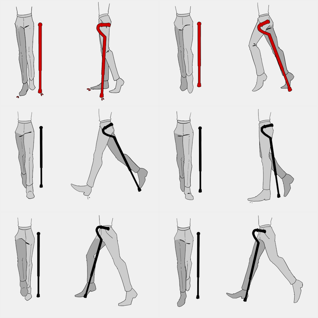
(an animated GIF of a cane matching the natural walking gait. It turns red when pressure is placed on it.)
When going up and down stairs, there is an ideal standard: You want to use the handrail and the cane at the same time, or prioritize the handrail if it's only on one side. When going up stairs you lead with your good leg and follow with the cane and hurt leg together. When going down stairs you lead with the cane and the bad leg and follow with the good leg!
Realistically though, many people don't move out of the way for cane users to access the railing, many stairs don't have railings, and many are wet, rusty, or generally not ideal to grip.
In these cases, if you have a friend nearby, holding on to them is a good idea. Or, take it one step at a time carefully if you're alone.
Now we come to a very common mistake I see... Using fashion canes for medical use!
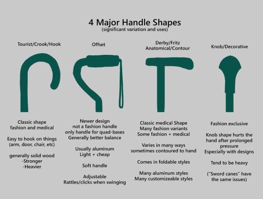
(These are 4 broad shapes, but there is INCREDIBLE variation in cane handles. Research heavily what will be best for your character's specific needs!)
The handle is the contact point for all the weight you're putting on your cane, and that pressure is being put onto your hand, wrist, and shoulder. So the shape is very important for long term use!
Knob handles (and very decorative handles) are not used for medical use for this reason. It adds extra stress to the body and can damage your hand to put constant pressure onto these painful shapes.
The weight of a cane is also incredibly important, as a heavier cane will cause wear on your body much faster. When you're using it all day, it gets heavy fast! If your character struggles with weakness, then they won't want a heavy cane if they can help it!
This is also part of why sword canes aren't usually very viable for medical use (along with them usually being knob handles) is that swords are extra weight!
However, a small knife or perhaps a retractable blade hidden within the base might be viable even for weak characters.
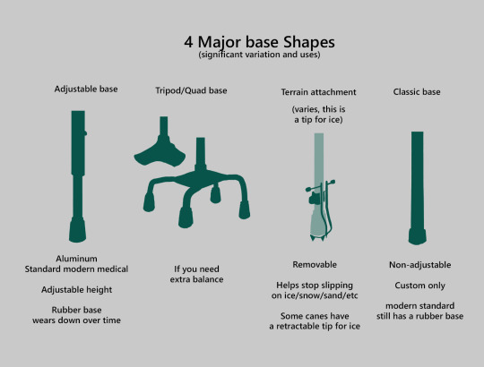
Bases have a lot of variability as well, and the modern standard is generally adjustable bases. Adjustable canes are very handy if your character regularly changes shoe height, for instance (gotta keep the height at your hip!)
Canes help on most terrain with their standard base and structure. But for some terrain, you might want a different base, or to forego the cane entirely! This article covers it pretty well.
Many cane users decorate their canes! Stickers are incredibly common, and painting canes is relatively common as well! You'll also see people replacing the standard wrist strap with a personalized one, or even adding a small charm to the ring the strap connects to. (nothing too large, or it gets annoying as the cane is swinging around everywhere)
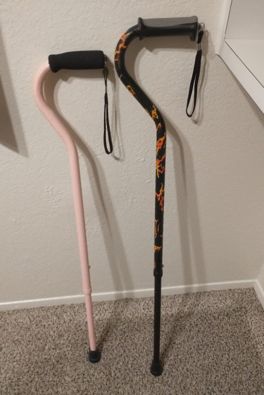
(my canes, for reference)
If your character uses a cane full time, then they might also have multiple canes that look different aesthetically to match their outfits!
When it comes to practical things outside of the cane, you reasonably only have one hand available while it's being used. Many people will hook their cane onto their arm or let it dangle on the strap (if they have one) while using their cane arm, but it's often significantly less convenient than 2 hands. But, if you need 2 hands, then it's either setting the cane down or letting it hang!
For this reason, optimizing one handed use is ideal! Keeping bags/items on the side of your free hand helps keep your items accessible.
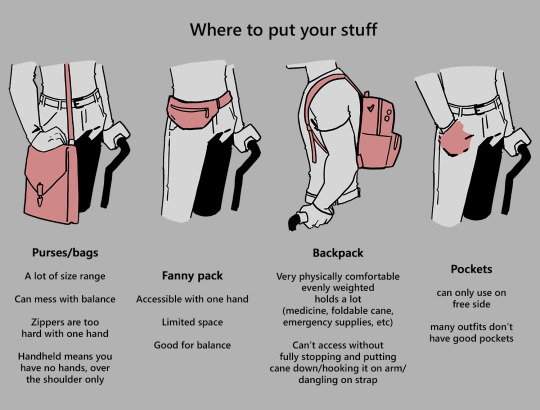
When sitting, the cane either leans against a wall or table, goes under the chair, or hooks onto the back of the chair. (It often falls when hanging off of a chair, in my experience)
When getting up, the user will either use their cane to help them balance/support as they stand, or get up and then grab their cane. This depends on what it's being used for (balance vs pain when walking, for instance!)
That's everything I can think of for now. Thank you for reading my long-but-absolutely-not-comprehensive list of things to keep in mind when writing or drawing a cane user!
Happy disability pride month! Go forth and make more characters use canes!!!
#mobility aid#cane user#writing tips#writing advice#drawing tips#art tutorial#art tips#art reference#art resources#art help#long post#not my art#others art#arcane#arcane fandom#arcane league of legends#arcane lol#arcane netflix#arcane series#arcane viktor#netflix arcane#victor arcane#viktor arcane#arcane show#arcane brainrot
91K notes
·
View notes