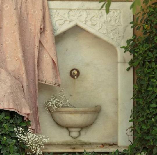
#and the visual storytelling with the colors in the clothes and the lighting
Explore tagged Tumblr posts
Visit Tumblr Blog
Explore Tumblr blogs with no restrictions, modern design and the best experience.
Last Seen Tumblr Blogs


Fun Fact
Tumblr.com rank in the US is 25.
Text
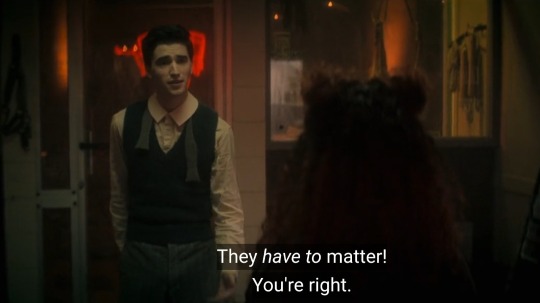
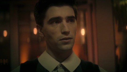
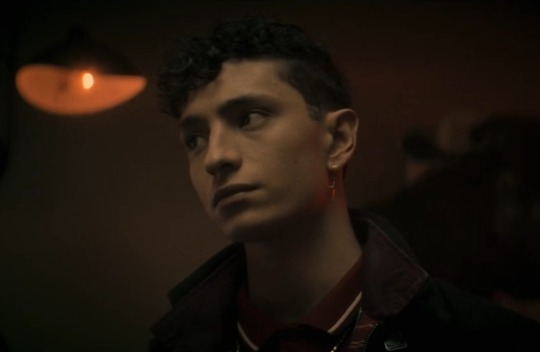
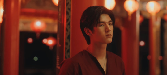
Haoren scraped by the asphalt, holding his injured hand, saying it hurts over and over because he’s finally letting himself feel again. After years spent not allowed to feel pain, numbing himself repeatedly, something finally hurts.
And Chihiro doesn’t know the extent of Haoren’s suffering, but he knows that he still has the ability to feel and care, knows that crying means his heart is still beating.
So little by little, they patch each other up even as new wounds are made and old scars reopen. But as long as they have each other, they have a reason to live. A reason to hope that living is worth the effort.
#the essays I could write about this show omg#and the visual storytelling with the colors in the clothes and the lighting#it is first and foremost a story of survival and humanity#it’s a really twisted story and they are not shying away from that#Haoren abused and forced to always say ‘it doesn’t hurt’#and now allowing himself to feel pain and acknowledge it#in the arms of a boy who loves him#and they’re both trying their best#happy of the end
41 notes
·
View notes
Note
The parallels between Aika and Miss are so good.... I just noticed with these recent doodles that they also share struggling to consistently dye their hair as they become more exhausted and unhappy with their lives and that's such a fun character design parallel!!!
(On the topic of character design btw I just LOVE the details w/ color and clothing. Miss in particular going from a sleeveless light-colored fancier shirt showing off her tattoo, to a dark-colored shirt with long sleeves covering up the tattoo, thus also cutting off a piece of her personal life from her work and not letting herself out of that shell she built for herself. Aaauuhgh this concept is so cool and I love the subtleties of character design)
Yaaa glad you noticed! I love when characters do the same things in parallel ways but for different reasons. Aika purposefully not dying her hair all the way to sort of reclaim who she was before her work and Miss just neglecting to dye her hair as she loses her sense of self and individuality to her job.
And heehee thank you! I love!! Visual storytelling!!!
725 notes
·
View notes
Text
S1 • EP8 ➤ In the Forge: Lighting and Film Blocking

I think this shot is one of the story-defining shots of s1. It's often and rightfully praised because of the shadow of a chain leading to Celebrimbor. I think the entire scene is worth revisiting. It's one of Wayne Che Yip's strongest directed scenes.
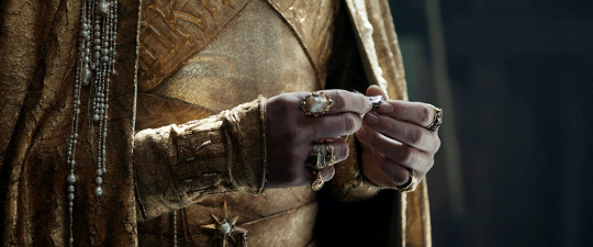
This scene begins with a close-up on the mithril ore because its use is the source of conflict. I think it's a great choice to have Gil-galad hold the ore because it looks rather ordinary compared to his accessories and clothing jewels. Yet, the ore will change the course of their world.
Yip follows up the shot with this a low angle middle shot. This particular angle helps the tiny ore stand out. The lighting only falls on Gil-galad's body and hands. Yip also uses the set's arches to further frame his hands.
Yip has done this before in a Numenor scene between Pharazon and Kemen.

Now we get to film blocking. Blocking is how and where both the actors and cameras are positioned and moves, in relation to other actors, sets or props. This helps guide the audience's attention to important moments. Blocking helps create those beautiful cinematic shots. It is key to visual storytelling.
Generally, I think blocking in ROP is inconsistent, which is unfortunately more common in media now and not exclusive to the show. However, when it's done well in ROP, it is noticeable.
In this scene, the actors are positioned two on each side with the second actor standing slightly behind. So instead of cutting to a close-up, Yip changed lens focus depending on who is talking. To me, this is neater. This is also setting up Galadriel's revelation later.

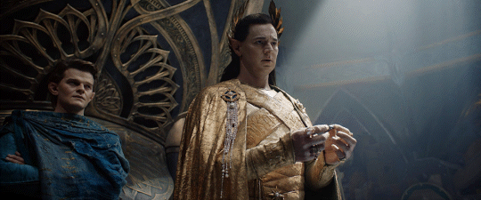
The scene progresses to the first of many four-person shots. Elrond, Gil-Galad and Celebrimbor are standing in the shadows. Galadriel is the only one standing closest to the light but only half of her is in the light, which is important when the camera later changes angles. There's also a small light column hovering over Elrond, which will come into play later.
For this particular camera angle, where Gil-galad stands is important—between Elrond, Galadriel and Celebrimbor, who purposes how to use the mithril and that its craft would be placed in Gil-galad's charge. Gil-galad is uneased at the idea of one person wielding that much power. He also believes their time is up.
I also want to point out the costumes. I think the color palette of the costumes mostly match. However, the Lindon gold looks so much stronger in this lighting and it works well with Gil-galad opposing the other three.
We also see the red in Celebrimbor's costume. I believe Celebrimbor wore this costume at the Lindon feast scene with the dwarves but it is striking that this particular costume is worn again after he met with Halbrand. This costume returns in s2 when red is further used as the color of decay and corruption.


When we finally get individual close-ups of Celebrimbor and Gil-galad, the dramatic lighting emphasizes the darkness in Celebrimbor's proposal and Gil-galad's unease.
Then Yip follows up with *the* shot but I think the lighting here reveals even more.
With how Galadriel is blocked in this scene, she also casts a shadow onto Celebrimbor—which I think reflects her choice in bringing Sauron to Eregion. Here we clearly see that half of her is covered in shadow.
This is the most light we see on Gil-galad in this scene. He also looks to be standing closer to Galadriel and Celebrimbor, whereas Elrond is tucked away in the shadows, at the edge of light.
I think there's a status element. In ep1, when Elrond hid in the trees to write, a courtier tells him that he's not invited to an upcoming session with the High-King because only Elf Lords were invited.
So even though the elves needed Elrond to get mithril and now they have it, Elrond is still on the outside but not for long.

This shot marks the first major movement of the scene. Emotions escalate quickly when Gil-galad rejects Celebrimbor's proposal.
Gil-galad's movement now reveals a full light column on Elrond. It's literally his time to shine.

Elrond steps forward to convince Gil-galad. The blocking changes the power dynamic of this shot. Celebrimbor is the closest to the camera but is disempowered by Gil-galad's decision. He also looks further from the other three. We don't even see his face.
The lighting and blocking here also breaks up the group into 3 sections. I think it reflects the separate narratives for Elrond & Gil-Galad, Celebrimbor and Galadriel.


Celebrimbor argues his case (left) and finally mentioned the Unseen World, which grabs Galadriel's attention (right). Yip uses camera lens focus transition and then zooms in on Galadriel—highlighting her concerning revelation.
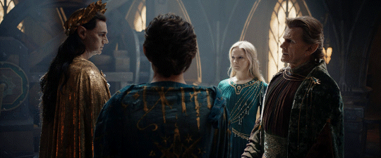
We go back to a four shot. Now, Gil-Galad stands furthest left and Elrond is closer to Galadriel and Celebrimbor—all three aligned to use the ore.
Except, again Yip uses the set arches in this composition. Elrond is separated from Galadriel and Celebrimbor's shared arch, which is foreshadowing Elrond's mistrust of the Elven rings.
Galadriel is the most illuminated character here because of her revelation from Celebrimbor's words.

Gil-galad orders them to shut down the forge and return to Lindon. When he exits the scene, he walks in front of Elrond. I think this the most practical choice for the audience. He is the High-King and visually, his Lindon gold cuts through the union of the other three.
But, we're not done here. The two harsh light columns on Galadriel and Celebrimbor highlights what we're anticipating.

Galadriel carefully asks Celebrimbor about 'power over flesh.' She stands in the light, trying to unveil the truth but he's in the shadows.
At first, they're facing the same direction but when Galadriel presses further, we get this close-up and Celebrimbor's close-up remains like this until he walks away:

This shot is short-sided—a character's face (and eyeline) is close to one side of a frame.
It can be used to show disconnect between characters or unease, shown here. Celebrimbor is flustered and annoyed at Gil-galad's decision that he can't even look at Galadriel.

Our final shot of this scene is a lingering wide-shot of Galadriel. She is alone in her thoughts. I think it's a great way to use space and lighting to show Galadriel's mental and emotional state without using a close-up. She started the season feeling alone, but certain, in her pursuit of Sauron and this moment brings her back to that.
— credit: cap-that.com
#rings of power#the rings of power#cinema: symbolism and visual storytelling#cinema: lighting as storytelling#cinema: blocking#the queen's scribbles#a wild meta post appears!#galadriel most radiant#tis *the* celebrimbor#kind as summer elrond *cries*#fed up high king gil galad#cinematography in rings of power
136 notes
·
View notes
Note
New propic Is so cute! hey, technical question: how do you manage and entire character's wardrobe's color palette? i noticed donna wears azure, light blue, yellow, orange and pink. How do you keep the palette consistent through the whole outfits' rotation without It becoming repetitive? Is there a tutorial?
Oh funny you should ask bc I do actually have a character specific palette for Donna. You’ll notice that Albin’s colors are also here, but that’s because they’re often drawn together that this is just a result of that.


The azure is actually her eye color, and I often incorporate shades of it in her clothes. The yellow-to-orange gradient is simply bc it matches her hair, and the pink matches her skin. For the colors to match but not look like exact color swatches, I shift two of the three color parameters (hue, value, saturation) just a smidge, but not all three, because then they’re not of the same palette!
in the example here, the center is her skin color, and the outer ones are examples where i’ve shifted either hue+saturation, hue+value (B), or saturation+value just a smidge either to the left or right. The center will match with ONE of the outer ones, and the outer ones will not match each other (technically speaking, they might, but euehgghgueueh something something I don’t have time to check).
now, as to why I picked these colors to begin with— since I have pink and orange in her main palette, I picked a stark blue as an accent color since it’s the complimentary color to orange, which is the “middle” hue between pink (red) and yellow

(Now… ignore the exact placement of the dots on this color wheel, I don’t really like or use the “harmony” function in procreate because it’s not customizable enough to be helpful, you can be a lot more loosey goosey than this and get a good color palette, but I think you get the general gist!)
When it comes to what colors to pick for your characters wardrobe palette that aren’t part of their “body” colors, I’d go with a palette that suits that character’s personality and skin+hair. You can go complimentary colors, analogous colors, split complimentary, etc. it’s really your preference! If your character is dark and depressed; go for a desaturated, maybe monochromatic palette. A character like Lune who is prim, proper, and fashion forward would wear posh, hard to wash clothes, like creams and whites, and colors that compliments her hair and skin. It’s visual storytelling baby!!
So let’s pick Albin for example, and let’s say I want to give him a new jacket, he’s obviously green, and pretty fashionable, but not very flashy (color-wise). So for him I’d pick a simple complimentary palette with one main accent color, that being the complimentary color to green, which is red, but not just any red! The red should either match his green in value, or saturation (bc remember how i said before to move two/three parameters, you’ve moved one (hue) to change colors, so now you have one left).
It doesn’t have to match exactly, but it helps to know that if you struggle finding the right shade, just don’t move the value or saturation too far off from the color you’re matching it to!! Here are two examples of a two reds that are in Albin’s palette:


And for those curious here’s a red that matches in both value and saturation so you can see why they both shouldn’t match

fleshy..
And would ya look at that, I’ve already done it!! ;)

I hope that was at least a little helpful!!! ✨✨
69 notes
·
View notes
Text
ʜᴏᴡ ᴛᴏ ʀᴏᴍᴀɴᴛɪᴄɪᴢᴇ ꜱᴛᴜᴅʏ

1. Create a Beautiful Study Environment
Light a candle or use fairy lights for a cozy ambiance.
Keep your desk organized and decorate it with items you love (plants, photos, or quotes).
Use aesthetically pleasing stationery like colorful pens, highlighters, and notebooks.
2. Curate a Study Playlist
Find instrumental music, lo-fi beats, or classical tunes to set the mood.
Alternatively, choose ambient sounds like rain, coffee shop chatter, or nature.
3. Romanticize Your Materials
Write notes neatly and add doodles or illustrations.
Use highlighters to make your notes visually appealing.
Treat your textbooks as if they’re sacred knowledge.
4. Incorporate Rituals
Make a cup of tea or coffee before starting.
Set intentions for the session, like "Today, I’m learning to grow."
Take a moment to visualize yourself succeeding.
5. Dress the Part
Wear comfortable but stylish clothes that make you feel good.
Use accessories like a cozy blanket or reading glasses to feel scholarly.
6. Embrace the Aesthetic
Imagine you’re in a library or an old-world study room.
Use vintage-style journals or leather-bound notebooks.
7. Celebrate Small Wins
Reward yourself after completing a session (e.g., a treat or break in the sun).
Reflect on how far you've come and journal your achievements.
8. Use Meaningful Motivations
Remind yourself why you’re studying and visualize your goals.
Think of yourself as the main character in a story striving to succeed.
9. Add Nature
Study near a window with a view of trees or greenery.
Bring a small plant or flowers to your desk.
10. Make Breaks Magical
Read a poem or inspiring quote during breaks.
Do a quick yoga stretch or step outside to breathe fresh air.
Study sessions:
Atmosphere and Environment
Theme Your Space: Create a "study café" vibe or a "Victorian scholar" ambiance with décor and lighting.
Seasonal Touches: Incorporate seasonal elements (like autumn leaves, holiday lights, or fresh flowers) into your workspace.
Essential Oils: Diffuse calming scents like lavender or energizing ones like citrus to boost focus.
Natural Light: Position your desk near a window for natural light and fresh air.
Comfortable Seating: Use a cozy chair with a blanket or cushion for added comfort.
Aesthetic Tools and Accessories
Fountain Pen: Write with a fountain pen to add elegance to your notes.
Wax Seal Stamp: Use one to seal envelopes or even decorate your journal pages.
Custom Stationery: Invest in unique notebooks or personalized study planners.
Color-Coded Systems: Use washi tape or colored tabs for visual appeal and organization.
Glass Water Bottles or Mugs: Sip from aesthetic drinkware that fits your style.
Mindset and Imagination
Pretend You’re in a Movie: Act as if your study session is a montage scene in a film about your success story.
Be the Hero of Your Journey: Imagine your studies as the preparation for a grand quest or mission.
Romantic Narration: Mentally narrate your study day as though it were a novel (“She sipped her tea, deeply immersed in knowledge…”).
Creative Techniques
Illustrated Notes: Add doodles, diagrams, or charts to make concepts come alive.
Calligraphy Headers: Write chapter titles or key points in elegant lettering.
Mind Maps as Art: Turn mind maps into colorful and interconnected masterpieces.
Storytelling Learning: Create a story around the subject you’re studying to make it more engaging.
Incorporating Media
Study Vlogs: Record time-lapse videos of yourself studying to inspire future sessions.
Mood Boards: Create Pinterest boards or vision boards inspired by your study goals.
Inspiring Quotes: Print or write quotes from authors or thinkers related to your subject.
Embracing the Moment
Slow Morning Starts: Begin your day with a peaceful routine before diving into study.
Mindful Study: Pay attention to the sensations of writing, reading, or typing to stay present.
Gratitude Journaling: Start or end with a quick note of gratitude for the opportunity to learn.
Fun and Whimsy
Create Playlists for Each Subject: Match the vibe of your studies with specific music genres.
Snack Like a Scholar: Eat finger foods or pastries as if you’re in an old library café.
Dress Like a Character: Imagine you’re a professor, a scholar, or even a wizard studying spells.
Study out: Take your books or laptop to a park or garden.
End with a Ritual
Summarize Elegantly: End sessions with a recap written beautifully in a journal.
Close the Day with Tea: Treat yourself to a calming tea ceremony as you reflect.
Celebrate Your Effort: Create a simple reward system, like a treat, movie night, or self-care ritual.
Remember be gentle w yourself <3
pt.2?
Likes, comments, and reblogs are appreciated <3
#becoming that girl#clean girl#glow up#it girl#pink pilates princess#self development#self improvement#soft life#that girl#journaling#study#study motivation#studyblr#study blog#studyspo#student#student life#productivity#romantizing life
105 notes
·
View notes
Text

White Lily redesign!!
-
I’m genuinely surprised by how often she’s praised for her "beauty," even though her design is, to put it mildly, questionable. Among the Ancients, there are good examples of storytelling through design—Goldie, for instance, whose outfit and hair reference her connection to the sun. Lily, unfortunately (or fortunately?), doesn’t make the cut.
Now, onto the main points.
I. The Mismatch Between Name and Design
The first thing that stands out is that Lily doesn’t evoke the imagery of an actual lily flower. Why is most of her design dominated by dark green? If she’s named after a white lily, why does her appearance focus more on the stem and leaves rather than the flower itself?
In the Korean version, her name translates to "Holy Lily," which immediately brings to mind purity, innocence, and lightness. Yet her outfit, on the contrary, looks dark and visually weighs her down, contradicting the idea of holiness.
If her design used lighter tones—white, pastel green—she would appear much more delicate and true to her name. Imagine her in a dress resembling lily petals: long, flowing, with soft draping. This would emphasize her gentle nature and spirituality, especially given her role as a symbol of freedom. (This is something I tried to achieve in my redesign, and I think it turned out quite well.)
And another question—what’s with the bandages on her arms? Frankly, it just reminds me of the edgy OCs every other artist drew between 2017 and 2020...
II. Wasted Symbolism
A real lily has prominent pistils and stamens. In Lily’s design, they only appear as small pink accents in her hair. Why not use them more effectively—for example, incorporating pink into her clothing or accessories? This would strengthen the floral association and possibly hint at her connection to Dark Enchantress.
III. Lack of Visual Transformation
My final point concerns her story arc. According to lore, Lily was rebaked and corrupted. Yet, her appearance remains unchanged. This creates visual dissonance—why introduce such a major plot twist if it isn’t reflected in her design?
In my redesign, I explored how her split self could manifest visually. For example:
1) Her dough became darker—a result of rebaking.
2) Her hair gained pink gradients, directly referencing Dark Enchantress’ design, where pink is a key color.
3) Her cloak developed an unnatural purple gradient, symbolizing decay. The idea was to suggest that Lily, through her own foolishness, lost part of herself—her original purity and, by extension, her freedom.
Ideally, this would add depth to her character and make her story more compelling.
24 notes
·
View notes
Text
the visual storytelling with the costuming is already so vibrant and interesting (and reads very much IRONHEART) , so I can’t wait to see how it progresses alongside her character development in the next three episodes.
side note, not to give myself more projects, but would anyone be interested in a post that breaks down the different looks riri has had throughout the years in the comics/mcu? I feel like her character is such a good example of how styling a black character changes depending on how well the person behind it understands the culture and how that’d impact her decision making regarding her clothes/hair. this is especially true for riri since they’ve been playing darts with her hair texture and skin color for a while now and it’s always jarring to see how it’s handled sometimes….
I know people get really skeptical when the MCU influences the comics, but I really do hope it lights a fire under some artists ass to challenge how they represent the spectrum of style and features in black spaces
20 notes
·
View notes
Text
– A Month to Romanticize Your Life✧
for the girls with tired eyes, beautiful minds & quiet dreams
♡ by ganga
hey moon-faced ones, we have month to complete all our task whether it is our holiday homework, school/college work, revising lessons, glow up and many more we keep forgetting to learn something that gives us peace and is useful to us in many ways. So yeah this 15 year old who wants to make life as aesthetic as possible is here with a stupid as blog again I hope you enjoy! 🌙
Hand Embroidery ☆
Learn the quiet art of threading color into fabric. It teaches patience, rhythm, and presence. With every stitch, you leave a mark that feels personal and timeless — like art only you could make.
Phone Photography,
but make it film ✿
Instead of chasing perfection, capture mood and memory. Learn light, shadow, and emotion. Edit gently — like developing film. Your photos don’t just show what you saw — they show what you felt.
Scrapbooking / Mood Journaling
Combine textures, quotes, old wrappers, and dried flowers into a journal that looks like your heart laid open. (It's fun too)
Cooking simple meals ♡
because feeding yourself is an act of love.
you don’t have to be a chef, even one comforting dish made by yourself can feel like magic. And remember cooking is a basic survival skill that everyone should know
Letter Writing to Future You ✉
Sit down and write to the girl you'll be - with honesty and affection. Tell her what you love, what scares you, what you're hoping for. These letters are small time capsules of your becoming.
Draping + Styling Practice
Learn different styles of saree drapping (or just learn how to wear a saree) unique ways to style your Dupatta Understand how clothing shapes expression — how a single drape can carry elegance.
Posture & Poise Practice
Good posture isn't just physical — it reflects self-respect and calm presence. It's a soft but powerful kind of elegance. (You can easily find videos on YouTube regarding this)
Candle Making / Perfume Blending 🕯
Crafting scent is an ancient form of storytelling. Choose essential oils that remind you of people or places. When you light the candle or wear the perfume, memory and mood rise with it.
Bead Jewelry Crafting
Make small necklaces, anklets, keychains. It’s meditative, calming, and leaves you with something beautiful that carries the feeling of the moment you made it. (It's a lil nostalgic too as we all did it as kids 😭✨️)
Calligraphy & Handwriting Art
Writing can be an art form. With a little practice, even your to-do list becomes elegant. Lettering slows you down and helps you appreciate the simple beauty of forming each word with care.
Tea Rituals 🍵
Making tea can be a form of mindfulness. Learn how different cultures brew it (for eg- turkish tea).
Star Mapping / Basic Astrology
Learn where the planets were when you were born. Astrology isn't about superstition — it’s about symbolism, reflection, and cycles. It helps you know yourself in the context of something bigger.
Digital Designing
Create Pinterest boards or Canva collages that reflect who you are or who you’re becoming. It’s a soft form of vision-building, your inner world, made visual and intentional.
Learning Basic Sign Language
A gentle skill with deep meaning. You’re not just learning a language, you’re learning a way to connect, include, and understand others. Every sign you learn brings empathy into action.
Basic Self-Defense
Safety is strength. Learning simple techniques builds quiet confidence. You carry yourself differently when you know how to protect yourself — physically and emotionally.
Decorating Your Study Table Like a Poem
Your desk can be a space of focus and beauty. Add something meaningful ~ a candle, a small flower, a quote. Your vision boards and many other things. A peaceful space brings peaceful thoughts.
Making a time capsule
because some feelings deserve to be saved.
write a letter to your future self, tuck in tiny things you love right now — song lyrics, petals, scribbles, receipts, photographs. seal it. hide it. open it next year, or maybe five. (However you like)
Learn a new language (just for fun)
because curiosity is a beautiful thing. pick a language that fascinates you, maybe just a few phrases or greetings.
Learning how to style your hair
exploring soft waves, braids, or oiling rituals, haircare routine even a new haircut! And more
Falling in Love with Learning Again
Study not just to score — but to understand. To feed your mind with ideas that change you. Let learning be sacred, not stressful. Make it a way of blooming, not burning out.

so this was it —
a little reminder to breathe, to grow, and to be kind to yourself.
let’s make this month ours, in our own quiet way.
with love,
ganga 🐚
#desi blr#desi blog#desiblr#desi tumblr#desi shit posting#desi core#desi tag#desi girl#just desi things#desi thoughts#desi teen#desi things#being desi#desi side of tumblr#desi stuff#desi vibes#desi moodboard#desi academia#desi aesthetic#desi life#girl blogger#girlblogging#self care#self growth#desi#india#indian#self care tips#summer holiday#self improvement
20 notes
·
View notes
Text
Rewatching Dead Boy Detectives for the 6th time and I STILL have so many thoughts, so let's do this
Episode 1
1. That's everything Crystal has on her for the rest of the season, right?
She must have had some money and her passport on that bag because she did change clothes and traveled half-way round the globe. But Jenny talks like Crystal doesn't have a credit card, so how much cash did she carry on her on a random day in the tube??
Well not enough to pay rent for the cheapest room in town when they arrived. (She wears a borrowed Tongue & Tail t-shirt from Jenny later, that's cute.)
I like how her original look is much darker and more mature, reflecting her mean girl personality. The long jacket later is still purple, but a light color with a colorful floral patterned turtleneck underneath.
(If she had her passport she has her full legal name and social security number to identify herself though-??)
2. I REALLY want to know what happened during those "two flights, one ferry ride" - where did the boys sit? Did Crystal buy a whole row of seats so they could sit together? (And was seen talking to herself alone the whole time lol)
Have the boys ever been on a plane (they haven't been on a ferry)? HOW DID EDWIN REACT... Please I want a fanfic
3. When they start investigating, Charles says to Crystal "I know you don't fancy this part, deep-diving into someone's brain. We can figure out another way if you'd like." Which is sweet, so Charles, but also, how did he know what she prefers? (They must have talked about it on the ferry ride.)
4. I thought it odd that Edwin would stumble out of the mirror, when he's always so careful and carries himself with such poise? But then I saw Kassius and Jayden, they both have the biggest grins on their faces just short of laughing. It's definitely a blooper, but George stayed in character so perfectly they left it in.
(George did confirm in an interview that due to Ghost Rules, the boys don't trip on treestumps etc, they would just phase through. So definitely not a scripted move.)
5. "Not exclusively my internet. (Charles laughs) I'll explain again later."
Crystal was the one that taught Edwin the concept of internet?? Did this happen on the ferry ride too??
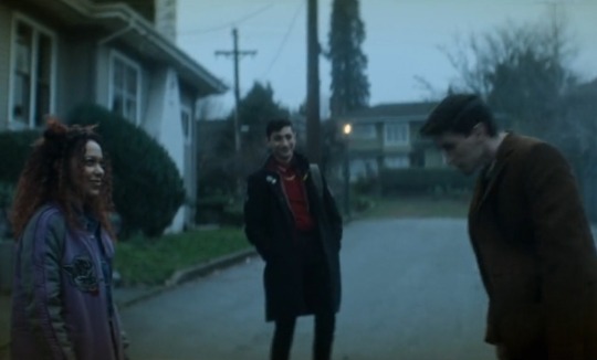
6. THE VISUAL STORYTELLING. I'm obsessed how the costume department specifically adds visual cues to the boys' wardrobe depending on their emotional state.
We all know Charles' polo darkens when he goes through tough times, only returning to his original bright red after they're back from Hell. We understand that Edwin being in his Edwardian undergarments in the confession scene makes it so emotionally raw and vulnerable.
We don't see Edwin without his coat after they arrive in Port Townsend. There's the scene in the beginning when it's just him and Charles at home in their office, where we can see him without it. He can be his real self there, because he's safe and comfortable.
The heavy coat is Edwin's armor, a visual metaphora of the emotional walls he puts up against the world. He always wears it around Crystal.
Here, in the upstairs, where the topic of David upsets Edwin and he storms off.
Yet right after, we see him without it! I believe ghosts appearance may change to reflect their emotional state (or maybe Edwin just shucked it off, who knows)
It's a fantastic scene altogether but just by his clothes we can see that's he's being vulnerable with Crystal for the first time. I only noticed this detail now and I love it.
(In the next scene of making their plan together Edwin is still wearing this look. We can see they're not enemies anymore, but a team.)
7. When Crystal agrees and offers peace, Edwin actually *looks at Charles* for confirmation. He's out of his element here and needs his support. Charles is the one who knows how to hande people, so Edwin doesn't make any decisions before checking with him. Edwin only forgives Crystal when he sees Charles had approved of her.
(After he does, he glances back at Charles again, like he still needed that last bit of validation that he did the right thing.)
Their bond is so strong. There's always consideration for the other, whatever they do. The acting is also incredible.
Nonverbal communication has a huge role in this series, as much as the dialogue does. So many things are conveyed with just looks and sighs and the many close-up shots that make us emotionally connect with the characters.
8. Charles having beef with Monty right at the start will never not be funny. "Everyone likes me eventually." It's just a bird.
Even on top of the list of his day's heroic feats is "smack-talking a crow." I love him sm
+ As a bonus, look at this gorgeous shot of Charles with the neon light reflecting on his earring. Chef's kiss
#dead boy detectives#charles rowland#edwin payne#crystal palace#dead boy detective agency#episode breakdown#the dead boy detectives#dead boy detective netflix
119 notes
·
View notes
Text

The Pashtun are a nomadic people indigenous to the southeast of Afghanistan. Pashto and Dari are the two primary languages spoken by the Pashtun people, which is comprised of an estimated 400 different tribes and clans. While Afghanistan is the Pashtun’s homeland, a large portion of the native population has been displaced due to prolonged conflict perpetrated by America’s foreign interests in the region.
Pashtun culture is celebrated for its traditional music, dancing, poetry, storytelling, and colorful cultural clothing (which is represented in this painting). The clothing is interwoven with shards of reflective material creating a distinct and striking visual display of light and color.
Blue geometric tattoos, called Sheen Khaal, were once a widespread beauty practice done primarily by Pashtun women (other genders were known to wear Sheen Khaal but on a much smaller scale). While the practice is not as common today, Pashtun women still adorn their chins, cheeks, mid brow and forehead with henna in designs reminiscent of traditional Sheen Khaal. The Mirialan Species of Star wars were heavily inspired by Pashtun Culture.
This artwork is dedicated to my lovely fiancé who is a member of the Pashtun people and who has helped me learn so much about Afghan culture and tradition much to my benefit. I highly encourage everyone (especially Americans) to research the traditional people groups of Afghanistan, it is a beautiful country full of rich culture, delicious food and gorgeous traditions that have been severely impacted by war and suffering. It is very difficult to find information on the culture of the Pashtuns and other people groups due to the conflict clouding out easily found sources. This is something that actively and materially harms Afghan people today and is a requested and helpful step in the direction of keeping the culture alive and easily accessible.
(photo reference credit goes to Roland and Sabrina Michaud)


#ro’s art and design#queer afghans#afghanistan#afghan#afghan culture#afghanistan culture#free afghanistan#afghan visibility#painting#art#digital painting#digital sketch#afghan tradition#afghan people#pashtun#pashtun culture#pashtun tradition#afghan clothing#afghan representation
23 notes
·
View notes
Text
"BRYCE" - AN ANALYTICAL ESSAY
Heyyy um so i made an essay on color theory in BRYCE and i wanted to show it to y'all!!! I'm going to post it on ao3, just waiting on the invite :sob:
this is my first post as well so i hope you guys like it!
“How does Brandon Rogers use colors to portray emotions and character relationships in ‘BRYCE’?”
Most people would easily overlook the colors in BRYCE and label them as simply aesthetically pleasing. Whilst, this may be true, the colors in BRYCE have a deeper, more implicit meaning. BRYCE (2023) is a YouTube web series written, directed and starring Brandon Rogers. In BRYCE, Rogers is narrating the origin and rise to power of the fictitious character (who is portrayed by Brandon Rogers, among many others in his universe) CEO Bryce Tankthrust. It documents her childhood, life as a woman in work in the 1980s and her success story over three twenty-four minutes episodes. Brandon Rogers utilises color theory in the lighting and clothing of Bryce Tankthrust to portray her subconscious emotions and the relationships between characters. Rogers uses a mixture of color motifs, color schemes and color psychology in BRYCE, making a more visually appealing piece of media.
Rogers expertly makes use of color psychology BRYCE, strategically lighting scenes in a way to show the subliminal emotions of the characters, without them necessarily saying so. Color psychology is how colors make us as an audience feel and cleverly creates a more immersive film. Brandon uses varying colors for different emotions, but a few scenes stick out to me. For example, at the start of BRYCE episode one: the scene in which Bryce is having a meeting with an investor- the office is pitch black, safe for a desk lamp.
Aswell as this, at the end of BRYCE episode two, Diane is shown looking inside of Bryce’s house. The entirety of her hallway is in darkness, creating a suspenseful atmosphere. These scenes are both interesting as the subjects (Mark Dutton and Diane) both end up dead by the end of the it. In film, directors often associate the color black with death and fear. This shows how Brandon Rogers cleverly uses color psychology to foreshadow upcoming tragedies.
Interestingly enough, this is not where Rogers use of color finishes. Building off of color psychology, Brandon uses color motifs throughout the series. Color motifs are reoccurring colors that are associated with a certain character, place, or event. Using color motifs helps, not only with the aesthetics of the film, but with storytelling as well. This allows us as the audience to link colors to characters.
For example, Bryce Tankthrust’s colors change throughout the series from blue to red. Blue is representing her desire to live a good and stable life and eventually she transitions to a red, which symbolises her power and the danger she gives off. And Bobby Worst (also played by Rogers) is consistently shown in green, portraying his evil tendencies, madness, toxic nature and also stability as Bryce has only ever perceived him in one color.
An example of color motifs would be in the confrontation scene younger Bryce has with her boyfriend (at the time) Donovan at the end of BRYCE episode one. The scene is split up with an intense blue and yellow light, symbolising the two characters. At the start of the argument, majority of Bryce’s face is in blue, a small part of her yellow. This shows how she is only focusing on herself and how she is the one in the right in this argument. However, when she realises that Donovan has fallen off of the cliff, Bryce’s face is now entirely yellow, with only the back of her head being blue. this portrays that her priorities are now Donovan and his wellbeing, her wants and needs being pushed to the back. Interestingly enough, when Bryce goes down to check on Donovan, the scene is an intense and dark blue, showing this overwhelming feeling of isolation and helplessness Bryce is now feeling as Donovan has died. She is now all on her own. Throughout this argument, the colors shift and vary showing Rogers expert use color motifs to show Bryce’s reactions and subconscious thoughts throughout the confrontation.
An another different, but interesting, example of color motifs in BRYCE is the development of Bryce’s home as she grows up. It is really interesting to see how her environment changes around her through the subtly of color psychology. For instance: at the start of BRYCE episode one, seven-year-old Bryce’s house is casted in an orange tint, representing the warmth she feels. Orange is used in film as a direct link to childhood and home, showing she feels safe and loved in that environment.
As she grows into a teenager, we often see Bryce’s house as a pastel pink color – a delicate and “innocent” mask over the very much abusive household. Aswell as this Rogers uses a subtle split of complimentary colors on either side of Bryce’s face. These chaotic colors yet again represent these underlying signs of abuse.
After her mom is imprisoned, the house is a dark orange, almost brown. This shows the emptiness she feels after the loss of not only her boyfriend, but now her mother. This darker take on the once childlike and warm orange after the absence of her mother, shows how she was the soul of the house – and now that soul is gone, leaving Bryce confused and helpless.
When Bryce kills Diane, the house was a dark pink. This is a more intense version on the pastel pink we as an audience are used to with Bryce’s home. This shows Bryce’s take on her femineity. She is taking charge in her own dark and twisted way.
Bryce’s new home is one that is large and extravagant, with white marble walls and golden accents. These colors represent her newfound riches and grandeur and also Bryce as a character: she is very flamboyant and ostentatious with her money, and this is shown through the colors in her mansion. This is showing how Rogers uses color motifs in the setting of BRYCE to show her overall development as a character.
Rogers shows relationships and emotions throughout BRYCE by using color theory techniques such as color motifs and color psychology through the lighting and clothing of the characters and settings. He uses colors psychology to give the audience a metaphorical view of her thoughts and feelings and color motifs to allow the audience to associate certain colors to characters and events. The colors used in BRYCE are intense and impactful, expertly symbolising the emotions of the characters and creating a more intense psychological experience for the viewer.
https://pin.it/29xBTn0Ui written by: @siintax_error on Instagram.
#brandon rogers#brandonrogers#brcu#bryce tankthrust#bobby worst#bryce series#essay writing#color theory#color psychology#brandon rogers cinematic universe#worstthrust
29 notes
·
View notes
Text
From Guilt to Glory: How Ghost’s Satanized and Lachryma Tell One Story
I'm done crying I need somebody new now.
— Lacryma, Ghost
This isn’t just a comeback post. This is a resurrection.
After some time away from breaking down Ghost’s visuals, I sat down to watch Lacryma… and something clicked. One word: contrast.
Because Lacryma can’t be fully understood without watching Satanized first. They’re two sides of the same coin, a cinematic diptych. Guilt and grief, followed by light and release.

Satanized: Monks, Masks, and Judgment
Right away, I got major “It’s a Sin” vibes—black and white visuals, a monk in conflict, an oppressive gaze. The to ne is somber, soaked in religious guilt. The protagonist (the monk) is judged, cornered, punished… and yet, by the end, reborn as Papa V. The grayscale fades into color, signaling transformation.

Lacryma: Color, Empowerment, and Release
Lacryma picks up where Satanized left off—but this time, the power dynamic has shifted. There's a girl at the center, crying beneath sacred sheets, weighed down by expectation… until she breaks free. The tone isn’t anti-religion—it’s pro-self.
💥 “I’m done crying over someone like you” isn’t just about a person. It’s about every system, belief, or voice that made you feel small. And it’s also a message to the self: no more shrinking.

Tobias: From Distance to Presence
This Papa is different. Silver mask, shiny gloves, blue robe… and we can see Tobias now. His mouth fully visible, his eyes less concealed. Where past Papas felt all-seeing and untouchable, this one feels real, present, maybe even vulnerable. Like the power now lies not in judgment, but in voice.
His gaze? Gentle, not dominant. He points at the camera like he sees you. Not to condemn—but to connect.

Color & Clothing: Every Detail Speaks
The blue robe feels symbolic—not just of sadness, but perhaps the calm after the storm. Silver mask and gloves? A shining knight ?—but this one's armor is emotional clarity, not brute strength.
And then there’s the RGB lighting—blue, red, green—linking to both digital creation and the stages of grief: 🔵 Blue = sorrow 🔴 Red = denial 🟢 Green = acceptance


One Story, Two Voices
Together, Satanized and Lacryma become a single tale:
A monk cast out becomes Papa V
A girl finds power in her pain
One suffers judgment
The other finds healing
Satanized ends in color
Lacryma starts there
It’s not just Tobias telling a story. It’s Tobias responding to himself. A dialogue between grief and growth.
And this time… We’re invited to answer back.
Final Words: Back Home
This felt like coming back home for me. I’ve missed diving into Ghost’s symbolism, the tiny visual details, the narrative threads. Tobias, you magnificent storytelling cryptid—I see what you did, and I love it.
To everyone who's ever felt unseen, unworthy, or silenced: This is your anthem. This is your Papa. And this time, the power is in your voice.

#ghost bc#the band ghost#analysis#video analysis#papa v perpetua#lachryma#satanized#am i going too far?#maybe#blame it on mr forge
23 notes
·
View notes
Text

So, saw the post by @authormorganlawson, aaaand we’re talking about the latest CG featuring our boy Boothill. As featured there, we can get a glimpse of him getting cybernitized, sweat or a single tear rolling down his cheek, clothes torn and everything and those with clever eyes would say: wait. That’s not what we saw on his light cone. Wait, there’s something amiss with his arm.
As usual I’ll give you a tldr: it’s just the storytelling way of him regressing back, more like a visual representation of the process (and we can't trust hoyoverse with anything) and here is why.
First and foremost let us remember how his actual lightcone looks like.

He’s deep into the process of cybernization and we can see a whole load of difference. First and foremost: he has his current left arm, then there’s no sign of his breastplate having any parts, his shoulder and arm look different and most important. His hair.
He has his long hair, which I bet he kinda lost the ability to naturally grow once becoming a cyborg. BUT in his new CG his hair is considerably shorter: it doesn’t even reach past his shoulders, resembling more of the hairstyle of his childhood. It is because technically Boothill is “regressing” to his past self and the frames in the back symbolize that.
It also is for storytelling value, since the torso drip he has doesn’t feature any scars that were said to litter his body when he was still human, so there’s that.

Then back to the popular demand of what the heck else is going on there moving to the breastplate: that’s the easier one. I would theorize that it is most likely a prototype plate with this little fuel dent, which serves most likely, to keep the blood flow intact and later also get him the blue blood on which his body is operating. We see that the process is slow and part by part, this is also enforced by his lightcone, where the top of his body is assembled but the lower part is not and there are cyber guts just out in the open. To achieve that of course they needed something that would get blood to his heart and brain. That part is either under another layer of metal (what doesn’t seem too plausible to me) or the breastplate was then reinstalled to be a one thick piece to protect the insides, which imo makes more sense.
It gets a bit more complicated with his arm. While I really do think they just…forgot to reference and made it ok to look like that (mainly because him being partly prosthetic isn’t mentioned ANYWHERE prior), there’s another possibility too. As we got the information in the new update of the fact that IPC did physically torture Boothill (unspecified when and how), one could be theorizing that the prosthetic arm is direct result of said torture. However having a breastplate doesn’t exactly play into it, while the way it is attached to the flesh certainly is. It seems completely different even at the joints, having more red splashes of color and cruder joints.
Mayhaps that was the prototype since I’d rather believe that Boothill wasn’t momentarily and from the start assembled the way he’s in the game: I am more inclined to believe that his left arm was modernised later, when he got a hold of his new body and knew how to operate with it. Mostly because it is specifically designed for his needs, I doubt he had that in mind when he laid on the operating table.

There’s also another misconnection: in the lightcone description Boothill abruptly leaves after regaining consciousness, but then, in this new update he mentions his doc helping him with the memory chip issues.
So we can’t take things at face value, as the dots aren’t perfectly connecting in the way we’d like them to. We can ofc blame it on Boothill himself being the sort of unreliable narrator, but I would blame it on hoyoverse not being consistent enough which is not new with them. Realistically there’s a lot going on directly on that part of the CG as in where’s the right arm because it should be showing given the position of his shoulders, same with the ends of his hair which do not match the current hairstyle and gradient native to Boothill, ect.
So, as usual, you all can agree to disagree and welcome to the DM/reply section, that was my brainjuice with yall!
24 notes
·
View notes
Text
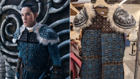
Farnaz Khaki-Sadigh: The Costumes of Avatar: The Last Airbender Season One
Farnaz Khaki-Sadigh revealed the complexities of creating the costumes of Avatar: The Last Airbender Season One, visually translating the four nations and their iconic characters from animation into live-action.
Since 2005, Avatar: The Last Airbender has inspired us with compelling storytelling and its deep mid-19th century historical culture influences–including but not limited to Asia, Mesoamerica, Inuit, Eskimo, and indigenous cultures. The universally acclaimed animated series spanned for three seasons (or three books) and expanded into a sequel series and several different mediums, but after a live-action misstep in 2010, the epic franchise finally found its way to Netflix with a brand-new retelling of the world of Avatar. The live-action series of the same name premiered on February 22, 2024 and immediately captivated the audience through its outstanding cinematography, with a brilliant cast transformed into the beloved characters through the vibrant creations of the costume department. Farnaz Khaki-Sadigh, the costume designer responsible for translating the series from animation to live-action revealed the inspirations and manufacturing challenges and rewards behind the garments of Avatar: The Last Airbender: “A lot of it was research, looking into the cultural background of the nations and the characters that were originally inspired by the animation, learning and understanding their history and tradition. I studied garment history and how clothing was traditionally worn in those cultures, what influenced their color palettes and fabrics, then tried to meld them together in a way that paid homage to the animation but at the same time respectfully and authentically represented the real life cultures. That was really the first step into it.”
Visually creating a fantasy world is a momentous task, where in comparison to contemporary or even historical filmmaking each background character has to be fully developed to build the rich population within storytelling. Khaki-Sadigh and her team crafted over 400 costumes that visually defined the Air Nomads, Water Tribes, Fire Nation, and Earth Kingdom. She said, “For the Air Nomads, I decided to pick the color palettes you see in Fall season … the rusts, oranges, yellows, maroons, deeper browns, it’s just so warm and comforting. For the Water Tribes, I looked at icebergs. There are so many hues of blues and teals; it’s not just white. I also explored how the ocean reflects the light differently, creating various shades of blue. With the Fire Nation I was really inspired by volcanoes, looking at all the different shades you see when a volcano erupts, from the fiery lava to the ashes–the reds and oranges within the lava and the blacks and grays from the ash and from when the lava hardens. Then for Earth Kingdom, the inspiration came from forests and springs. So that’s sort of how I broke down the different color palettes and expanded on what was in the animation.”
Avatar: The Last Airbender showcases the art of “bending” elements, which requires a full range of motion to visually achieve the right level of grace and power on screen. Farnaz Khaki-Sadigh explained the importance of fitting room action tests to assure practicality while wearing these intricate costumes on set: “It’s really important to make sure that it becomes almost like a second skin to the actors, otherwise they would feel out of place, taking them out of character. For example, we changed Aang’s cape; we had it fuller at the beginning but we found that it kept hitting him and didn’t flow as nicely, so we had to taper it down, re-alter the shape of it. It took a lot of math trying to figure out the patterning to get it to a place where it’s still read like a full cape but at the same time it moved with him as opposed to hindering his movements.” Then she added, “We had the Fire Nation armor shoulders wider to match the animation, but after we did some tests we found out that they limited how far they were able to move at the shoulder point. So we made them narrower, which just made the design a little bit different from the animation, but the actors were able to move freer for their bending.”
The costume design challenges for the show continued outside the fitting room. Farnaz Khaki-Sadigh explained that in order to achieve color consistency between outdoor and Volume sets were daunting–the latter’s LED lights forcing fabric changes and prolonged dying processes for many costumes: “We dyed the Fire Nation armor leathers five or six times because in daylight they had a beautiful deep shade of burgundy but in front of the Volume the color turned hot pink! In order to find the right hues to actually read red, we had to go super dark in real life … almost like a blistery color.” She added, “With Aang’s cape, we loved the color, but when we tested it [in the Volume] it was also pink … we tried about ten different fabrics before we narrowed it down to three and chose the one without a pattern with a brownish rust color that read the right hue on camera.”
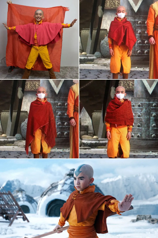
Being the main protagonist of the series, Aang’s costume had to be just right. The simplicity of the Air Nomads garments meant the costume designer had to focus on texture and layering to prevent a flat look on camera, also utilizing natural fibers to represent the Air Nomad’s peaceful lifestyle. Besides the cape practicalities and color complexities, Farnaz Khaki-Sadigh recalled a peculiar challenge that followed the team throughout the filming of Season One: “Gordon [Cormier] was a growing boy, so every few weeks we had to build him a new pair of pants because he would outgrow them. I think he’s got probably around twenty pairs of pants, which probably will not fit him anymore [laughs].”
There is a beautiful visual perspective in Avatar: The Last Airbender that separates foreground and background characters, the former showcasing more vibrant shades of color and details that define their journeys away from home and unique personalities. For Katara, Khaki-Sadigh incorporated flowy water wave patterns in her parka and the under tunic inspired by Inuit art, whereas for Sokka her team implemented a more geometric design for his costume–symbolizing the character’s engineering background. His armor in particular included some Viking elements, which the costume designer revealed came from her discussions with some of the indigenous advisors on the show, delving into their trading culture and how they would build clothing and tools based on what they had access to–from leathers to bones. She said, “We built all those little rings and hand sewn them into the armor’s leather, creating a sort of chainmail look. We then casted the shoulders to look like metal, taking that element from the fact that there were Fire Nation ships that have basically been abandoned, so he would have been able to use the metal from them to create a protective layer for himself because he’s the warrior of the tribe.”
The show had yet another gorgeous display of fantasy period costume design with Suki and the Kyoshi Warriors. From the golden headpieces to the intricacies of the armors, Farnaz Khaki-Sadigh delved into the process for making those samurai-inspired costumes: “In my research, I came across a group of female samurai warriors called Onna-Bugeisha, which was my inspiration for the Kyoshi warriors. I found this beautiful leather that had this basket weave print on it which became our base for the armor, very traditional for the style of Japanese samurai armors. The headpieces were 3D printed and they all had their own unique geometric fan pattern on them, then we painted them and wrapped the leather straps around with five different layers of hand braided braids, creating these tassels at the end of it.” She then revealed a fascinating fact about Suki’s costume: “The fan that crosses in front of her headdress is actually a vintage fan that we took apart and used to create the front … It had such a beautiful pattern and texture. Also, if you look closely at the corset portion on the bottom panels of the armor, you can spot small little geometrical fans that are laser etched onto the leather to create a little bit more texture and detail onto it.”

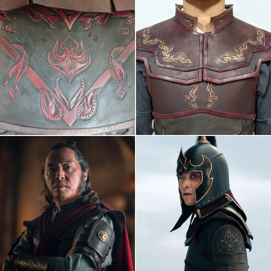
Among the Fire Nation, two characters really drove the villainy side of the tale in Season One–on one end Zhao, an ambitious general with a personal agenda, and Prince Zuko on the other, the heir to the throne who is navigating an uncertain path between his devotion to his people and the moral complexities of war. Farnaz Khaki-Sadigh’s team created several looks for the two villains, incorporating symbolic elements that defined their personas: “There’s something just so mysterious about Zhao. He sort of beats to the tone of his own drum so we incorporated his own personal crest, different from the rest of the Fire Nation. If you look at the details of his armor, on his gauntlets and on the skirt panels, even on his shoulder crest when he ends up wearing the [Admiral] cape, there is a different pattern that still has a flame weave to it, but it’s very unique. When he became Admiral, we made a more regal and powerful version of the costume inspired by the traditional Roman conquerors.” Then she delved into Zuko’s designs: “He goes through a lot of changes, personality and emotionally. He’s the man of many changes … he had more changes than any of our cast had, but I think the biggest thing for us was his armor. I wanted to make sure that it was regal prince-like, it stood out in comparison to the other Fire Nation armors, but at the same time, it was still part of the brigade. He’s holding onto so much tradition. He has this overwhelming struggle of what he personally believes and what is expected of him. His armor is not just like a physical thing, it’s also a metaphorical armor; he hides behind this armor to portray something that is expected of him, but yet he’s not sure if that’s who he is yet. We added a bit more layers to him with his armor, doubled the shoulders and three or four panels on his armor to add a little bit more rigidity to him.”
With Avatar: The Last Airbender renewed for two more seasons, the costume designer confessed she looks forward to designing Ba Sing Se and Ember Island and overall further developing the characters through more cultural history exploration. This interview barely scratches the surface of the team’s immense work, so if you crave more behind-the-scenes, make sure to follow Farnaz Khaki-Sadigh on Instagram.
#natla#atla#netflix avatar#avatar the last airbender#netflix atla#avatar netflix#atla netflix#article#farnaz khaki sadigh#blue screen reveals#bts
42 notes
·
View notes
Text
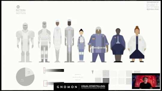
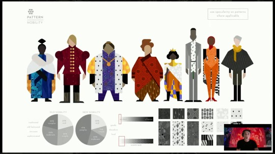
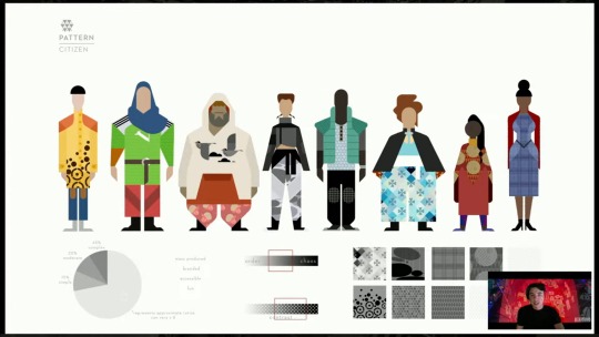
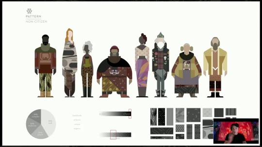
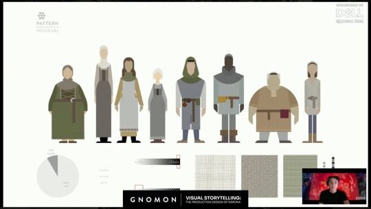
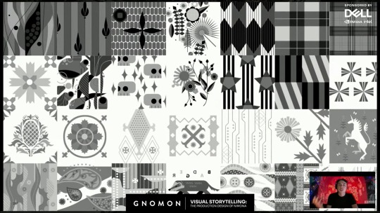
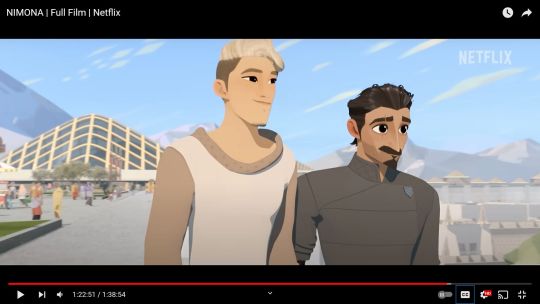
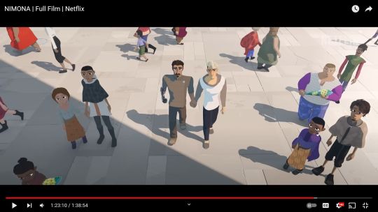
Maybe this was in the online digital Nimona artbook before it went offline, but I didn't pay attention to the costume design rules for all the people in the Kingdom, until this video "Visual Storytelling: The Production Design of 'Nimona'" by Gnomon (from which I screencapped all these pics).
It's interesting to consider how these clothing design rules symbolized Ballister's and Ambrosius's positions in society, but also might have reflected bits of their personalities.
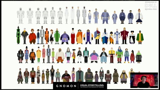
"So we first approached it by a very anthropological approach, where we sat down and said, "if this world was to actually evolve in a closed setting, behind these walls, from the medieval, in this kind of fear-based world, how would society evolve from the medieval rules? And how would that work?" So we researched the medieval rules and found that there was the distinction between, you know, nobility and citizenry, and then non-citizens. And so that was a good place to start for us, to say of "How do we organize this massive pool and system of crowd characters? but in a---in a getable way, that also relates to our story and expresses this world that we're doing?""
The Institute:
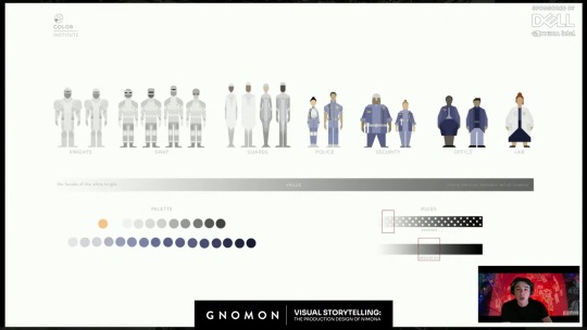
Nobility:
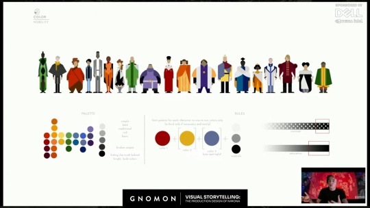
"So we broke we broke it down into contemporary, um, a contemporary ideology, where our main---our nobility was much more based on, um you know, haute couture rules, where we were---they were simple. They were bold. They were evolution of the kind of royal colors and sumptuary laws that the medieval had, but in a modern, in a modern take."
Citizens:
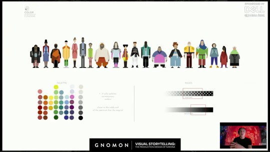
"Same with the citizens, where we leaned more into broader scope, where we needed to have the ability to have business wear, and athleisure, and, um you know, the color palettes that would be associated. …The range of body types that you would need, and…the range of races and ethnicities."
The Magicals:
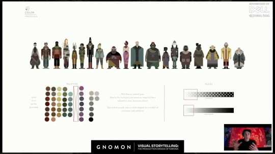
Interesting thing about The Magicals, is this note "NO blue or neutral grey (due to the Institute's persecution, magicals have refused to wear Institute colors)."
Ballister's regular clothes seem to be the same color palette as The Magicals. Given the order of these slides, The Magicals seem to be the lowest rank in the Kingdom's society. Previous concept art showed that the Nimona 2023 movie originally would have portrayed a secret society of people with magical powers like Nimona. I assume these costume design rules were for them, though they got cut from the final movie. It seems appropriate that though Ballister has no magical powers, he is dressed in the colors of the Kingdom's lowest societal rank. But as anyone who has drawn him has noticed, the pendant on his shirt is blue. The one color which The Magicals do not wear, because it is the color of The Institute. Ballister is a commoner trying to become a Knight of the Institute, so it makes sense for him. And though Ballister's clothes could maybe be considered shades of gray (as per The Institute), they have the same dark values of The Magicals and are actually more of the "earthy" tones, noted in The Magicals' palettes. Ballister does not wear the light, almost silver, grays of The Institute. But he does wear a blue pendant. And though his pants have a thin golden stripe running down the sides, which is another color emblematic of The Institute, on second look, it is less gold, and more of a light tan, another earthy color. Almost makes me think that after the end of the movie, maybe he should change his blue pendant to purple, since these design instructions for The Magicals also note "One subtle purple item on each magical as a symbol of resistance and solidarity". (It explains the shade of purple in Nimona's skirt.)
Interesting to look at Ambrosius's outfit, while considering these design instructions. Ambrosius does not wear the "bold" colors or high amount of patterns prescribed for Nobility. Instead, he wears white and a dark shade of blue, with mostly solid, non-patterned clothes, as prescribed for The Institute. He is their symbol, through and through. Except for one point: his hoodie's secondary color of tan. Not only is tan an earthy tone, like The Magicals, the lowest societal rank in the Kingdom, but is takes up a noticeable amount of space in his outfit. It is almost like his one little piece of rebellion against his birth position and the expectations of society for him to represent The Institute and Nobility. It may be his one expression of who he is as a person, rather than the expectations placed onto him. It's kind of interesting that they let him get away with that. Maybe he had to fight for it. Maybe it makes him feel closer to Bal. Maybe he likes the distance it puts between him and the Institute. Maybe he didn't get brave enough to start wearing such colors until after he met Bal. (Now I'm getting into headcanon territory.)
Medievals:
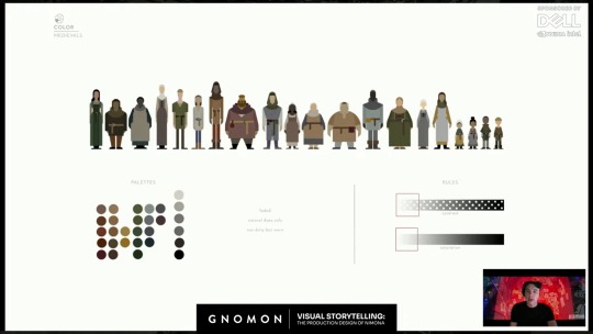
This was explained as the costume design instructions for the flashback characters from 1,000 years ago.
#drawing reference#costume design#nimona 2023#official art#headcanons#character analysis#ballister boldheart#ambrosius goldenloin#pinkfluidnf#ambrbalnf#color schemes#color palettes#patterns#fabric patterns#food for thought#nimona2023
25 notes
·
View notes
Note
I've been wondering for a while- how did you start getting into all the colour stuff?? I would love an origin story <3 what got you into your passion for deciphering colors and how did you figure out what they mean??
sorry ik it's a lot but ever since I started following you I see colors everywhere and I'm curious of where you started noticing them ((: it's so fun and intriguing to me! I'm usually more of a "foaming at the mouth for the lighting" girlie but it's been a heap of fun figuring out colors with the lights ^^
thanks for everything you do to show us your eye for color btw ♡♡ your blog is so fascinating and I love reading all your theories and notes
@overrgrown, never apologize for asking questions, but I've actually been asked this before by bengiyo. You can find my write up HERE, but the short version of that post is I've always seen colors; therefore, I've always attached meaning to them, even if the meaning was not valid.
TLWR: Appreciate the artists who work on these shows, not me.
In bengiyo's ask, I stated that when I was younger, I thought the colors were showing me what was good and what was bad. That's it. In my defense, I was a kid, so everything really was good or bad in my book with no in-between.

Even though I've always seen colors, and it comes very naturally to me, the meaning I attached to them when I was younger was very much based on who I was rather than what was being shown to me. Five-year old me thought if someone was dressed all in red that they were the devil. Adult me now knows that isn't always the case. Adult me also knows that red in American (United States) culture means something different than other cultures.
Not a flex, just a fact, but I have several degrees in languages, linguistics, and rhetoric. What they are in is not super important, but, in general, a formal education has greatly helped me infer meaning from what I'm visually seeing in the media I consume. My degrees are not in film or communications, yet I've taken undergrad and grad-level courses like Visual Media, Multimedia and Visual Communication, Language of Film, Digital Narratives, Cinematography and Lighting, Film Theory & Criticism, Queer Cinema History, Spanish Film & Feminism, and many more all because under this great big academic umbrella of rhetoric and composition lies storytelling.
And that's what this is really about - How do we tell a story? Regardless if that story is a simple flyer for a school bake sale, a 30-second commercial advertising cleaning wipes, or a 12-episode BL series, how do we get the message across? We can't just rely on ONE thing! We have to use as many things as possible! So when I'm watching a BL series, I'm just not paying attention to the words being spoken or the acting alone. No, I'm paying to the background noise. What do the clothes tell me about the character? What does his apartment tell me about him? And what do the colors mean?! All of it is important!
I've mentioned this before but I serve on a screening committee for a queer film festival. I actually got involved with the film festival as an undergrad because of one of the film courses. This has allowed me the opportunity to speak to several filmmakers about their process, and all of them have confirmed that the colors were intentional. People who deal with props and costume design have spoken to me about trying to find very specific items that reinforce the story being told. Oh, and theater is a whole different level. Because of the nature of the stage versus film, if it is on the stage, it must have a reason for being there.

Basically, people who work in visual media work really fucking hard, which you probably know since you love lighting. Most times, 12-hour days are the average, if not longer. This video does a good job of briefly covering the work that goes into costume design, and I timestamped it to begin at the part that covers colors.
youtube
I love seeing colors. I love deciphering them. I love the story they tell.
But they wouldn't be there if the hardworking people behind them didn't do their job, and those are the people who I appreciate.
So, as always, I'm thankful that you let me know I'm helping you see the beauty is in the details, but I'm really just here to admire the beauty with you.
#the colors mean things#colors are universal#so the fact that everybody color codes is a magical humanistic connection#even if we don't all recognize them#they still exist#and people work hard for us to see them#I'm just here to admire them with you
30 notes
·
View notes