#and i made the light green more saturated
Explore tagged Tumblr posts
Visit Tumblr Blog
Explore Tumblr blogs with no restrictions, modern design and the best experience.
Last Seen Tumblr Blogs


Fun Fact
Tumblr has 16.74 million mobile monthly users in the US.
Text
FUCK it's a "I love my friends so much it hurts" kinda night. This is bad bc I should really be winding down rn.
#ramblings#💛#guhhhhh i got. first-draft yellows for the people who i can vibe check rn but i should try and get them closer to what feels Right#thinking abt doing it in coolors bc itd be silly to just have a palette of my friends and also bc that might just work better for me#i think i made a lot of people too light in this first draft i need more. saturation#at least for some folks. others the more desaturated look works well on#man how long has it been since ive talked about my Yellow thing. like yellow symbolizing friendship is a basic thing i get that#but idk for a while now i think. yellows been my second-favorite color. if i ignore my self-identification with#the color green it may straight up *be* my favorite color. so its really comforting to me and ive tossed around the idea#for years now of sitting down and assigning friends specific yellows. and i just havent LOL#WELL. THATS A LIE ive known what two people would be for years now but just never got the motivation to work out a color seriously#i think i mightve done something close b4 but idc i dont wanna check. i wanna run with my current thoughts#but with me getting. so many new friends lately ive rlly been wanting to sit down and do this again#its for nobody but me really. but once i have solidified yellows ill probably tell people#theres more to it. but the tldr is that id wanna use these yellows in personal art. represent more than just my friends vaguely and instead#represent the individuality among them. i have no super solidified ideas yet tho aside from like. me incorporating them into#a personal design that. plays on the me-color green thing already so it's fitting there i think
1 note
·
View note
Text
My Favorite Cheap Art Trick: Gradient Maps and Blending Modes
i get questions on occasion regarding my coloring process, so i thought i would do a bit of a write up on my "secret technique." i don't think it really is that much of a secret, but i hope it can be helpful to someone. to that end:

this is one of my favorite tags ive ever gotten on my art. i think of it often. the pieces in question are all monochrome - sort of.

the left version is the final version, the right version is technically the original. in the final version, to me, the blues are pretty stark, while the greens and magentas are less so. there is some color theory thing going on here that i dont have a good cerebral understanding of and i wont pretend otherwise. i think i watched a youtube video on it once but it went in one ear and out the other. i just pick whatever colors look nicest based on whatever vibe im going for.

this one is more subtle, i think. can you tell the difference? there's nothing wrong with 100% greyscale art, but i like the depth that adding just a hint of color can bring.
i'll note that the examples i'll be using in this post all began as purely greyscale, but this is a process i use for just about every piece of art i make, including the full color ones. i'll use the recent mithrun art i made to demonstrate. additionally, i use clip studio paint, but the general concept should be transferable to other art programs.


for fun let's just start with Making The Picture. i've been thinking of making this writeup for a while and had it in mind while drawing this piece. beyond that, i didn't really have much of a plan for this outside of "mithrun looks down and hair goes woosh." i also really like all of the vertical lines in the canary uniform so i wanted to include those too but like. gone a little hog wild. that is the extent of my "concept." i do not remember why i had the thought of integrating a shattered mirror type of theme. i think i wanted to distract a bit from the awkward pose and cover it up some LOL but anyway. this lack of planning or thought will come into play later.
note 1: the textured marker brush i specifically use is the "bordered light marker" from daub. it is one of my favorite brushes in the history of forever and the daub mega brush pack is one of the best purchases ive ever made. highly recommend!!!
note 2: "what do you mean by exclusion and difference?" they are layer blending modes and not important to the overall lesson of this post but for transparency i wanted to say how i got these "effects." anyway!
with the background figured out, this is the point at which i generally merge all of my layers, duplicate said merged layer, and Then i begin experimenting with gradient maps. what are gradient maps?
the basic gist is that gradient maps replace the colors of an image based on their value.

so, with this particular gradient map, black will be replaced with that orangey red tone, white will be replaced with the seafoamy green tone, etc. this particular gradient map i'm using as an example is very bright and saturated, but the colors can be literally anything.

these two sets are the ones i use most. they can be downloaded for free here and here if you have csp. there are many gradient map sets out there. and you can make your own!
you can apply a gradient map directly onto a specific layer in csp by going to edit>tonal correction>gradient map. to apply one indirectly, you can use a correction layer through layer>new correction layer>gradient map. honestly, correction layers are probably the better way to go, because you can adjust your gradient map whenever you want after creating the layer, whereas if you directly apply a gradient map to a layer thats like. it. it's done. if you want to make changes to the applied gradient map, you have to undo it and then reapply it. i don't use correction layers because i am old and stuck in my ways, but it's good to know what your options are.

this is what a correction layer looks like. it sits on top and applies the gradient map to the layers underneath it, so you can also change the layers beneath however and whenever you want. you can adjust the gradient map by double clicking the layer. there are also correction layers for tone curves, brightness/contrast, etc. many such useful things in this program.
let's see how mithrun looks when we apply that first gradient map we looked at.

gadzooks. apologies for eyestrain. we have turned mithrun into a neon hellscape, which might work for some pieces, but not this one. we can fix that by changing the layer blending mode, aka this laundry list of words:

some of them are self explanatory, like darken and lighten, while some of them i genuinely don't understand how they are meant to work and couldn't explain them to you, even if i do use them. i'm sure someone out there has written out an explanation for each and every one of them, but i've learned primarily by clicking on them to see what they do.
for the topic of this post, the blending mode of interest is soft light. so let's take hotline miamithrun and change the layer blending mode to soft light.

here it is at 100% opacity. this is the point at which i'd like to explain why i like using textured brushes so much - it makes it very easy to get subtle color variation when i use this Secret Technique. look at the striation in the upper right background! so tasty. however, to me, these colors are still a bit "much." so let's lower the opacity.

i think thats a lot nicer to look at, personally, but i dont really like these colors together. how about we try some other ones?

i like both of these a lot more. the palettes give the piece different vibes, at which point i have to ask myself: What Are The Vibes, Actually? well, to be honest i didn't really have a great answer because again, i didn't plan this out very much at all. however. i knew in my heart that there was too much color contrast going on and it was detracting from the two other contrasts in here: the light and dark values and the sharp and soft shapes. i wanted mithrun's head to be the main focal point. for a different illustration, colors like this might work great, but this is not that hypothetical illustration, so let's bring the opacity down again.

yippee!! that's getting closer to what my heart wants. for fun, let's see what this looks like if we change the blending mode to color.

i do like how these look but in the end they do not align with my heart. oh well. fun to experiment with though! good to keep in mind for a different piece, maybe! i often change blending modes just to see what happens, and sometimes it works, sometimes it doesn't. i very much cannot stress enough that much of my artistic process is clicking buttons i only sort of understand. for fun.
i ended up choosing the gradient map on the right because i liked that it was close to the actual canary uniform colors (sorta). it's at an even lower opacity though because there was Still too much color for my dear heart.

the actual process for this looks like me setting my merged layer to soft light at around 20% opacity and then clicking every single gradient map in my collection and seeing which one Works. sometimes i will do this multiple times and have multiple soft light and/or color layers combined.
typically at this point i merge everything again and do minor contrast adjustments using tone curves, which is another tool i find very fun to play around with. then for this piece in particular i did some finishing touches and decided that the white border was distracting so i cropped it. and then it's done!!! yay!!!!!
this process is a very simple and "fast" way to add more depth and visual interest to a piece without being overbearing. well, it's fast if you aren't indecisive like me, or if you are better at planning.

let's do another comparison. personally i feel that the hint of color on the left version makes mithrun look just a bit more unwell (this is a positive thing) and it makes the contrast on his arm a lot more pleasing to look at. someone who understands color theory better than i do might have more to say on the specifics, but that's honestly all i got.

just dont look at my layers too hard. ok?
2K notes
·
View notes
Text
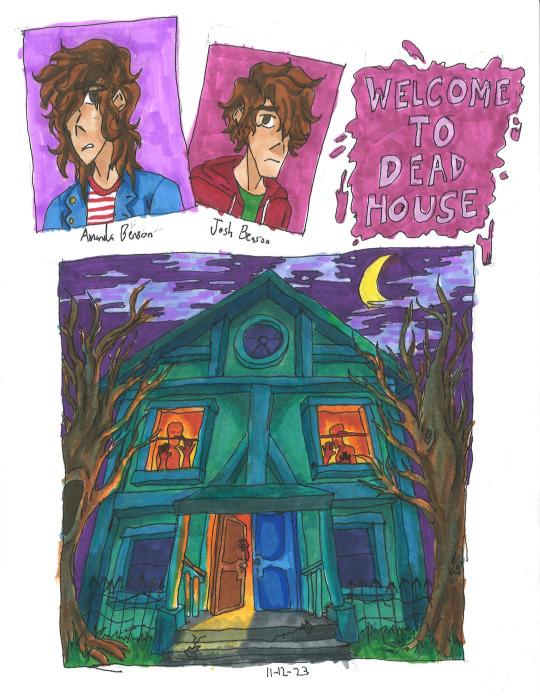
Goosebumps Books 1-10
Can't believe that it took me nearly two years to just do 10 covers for the books. Will be posting more Goosebumps in the future, along with other stuff.
Read more to know my personal opinions and critiques on my fanart for each book:
Welcome to Dead House: I wanted to make the house look alive like Monster House, so I gave it more human characteristics (ie: the people in the windows to form eyes, or the finger-like branches.) Also paid homage to a horror film by styling it after The Amityville Horror house.
The Benson children themselves look a bit depressed, that's because the first book is actually more scarier than the rest of the series, so they're a bit angsty.
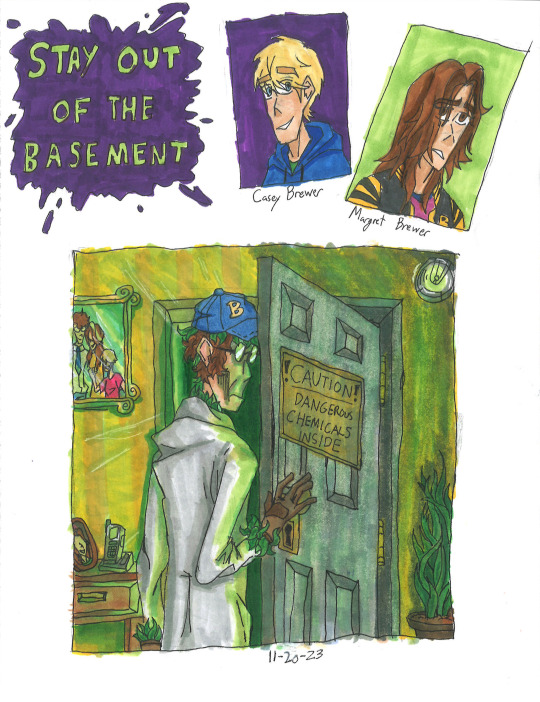
Stay Out of the Basement: This one killed a lot of my green markers lol. I tried to make Dr. Brewer as menacing as possible while still showing that he is a father with the photos, There were going to be more plants reaching out, but I decided that the leaves hidden on him would be enough.
Though I have to admit my disappointment with the lighting. It still looks a bit too bright, and not dark enough. That's just my own critique.
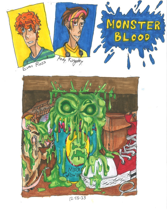
Monster Blood: Honestly, pretty mixed about this one. While I'm proud of the bubbling ooze that looks like a skull, which is outlined by one of my colored pens. I'm not proud that everything else is so muted with brown. Almost all of Jacobus' works are vibrant and saturated, so it being dull in colors feels like a disservice to him.
Also, Andy's last name was made up by me, she apparently just doesn't have one. It's inspired by Stephen King. Btw, hope you love banana and strawberry dyed hair, you'll see more of it soon in future batches.
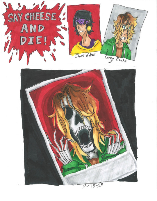
Say Cheese and Die!: One of my favorite books, and of course it gets the best fanart imo. The screaming skeleton form of Greg Banks with red bg in the polaroid, contrasting with the dark background is just super cool, coolest shit I've ever done. Though I might be biased, I really like skeletons. Like Curly.
I actually made concept art for a Say Cheese and Die! graphic novel, which includes drawings of the photos and Spidey! Let me know if you're curious.
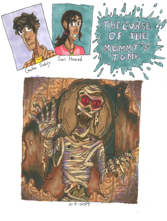
The Curse of The Mummy's Tomb: Not much to this one honestly. Just a mummy casually busting down a wall filled with hieroglyphics. Though I will say, I was experimenting with shading with purple and blues like Jacobus. As you can see, didn't stick for long.
This is also the book that I discovered that if the protag doesn't have a last name, then there is an official one either in the Presents novels, the mobile app, comics or other.
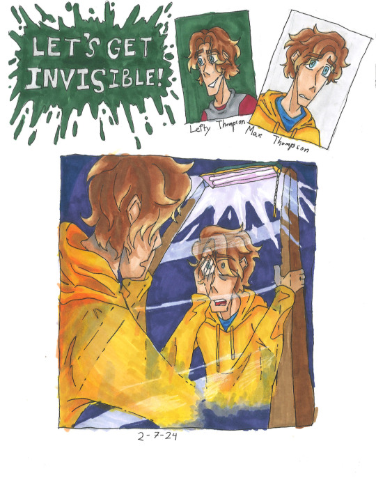
Let's Get Invisible!: This was pretty tricky to draw. Drawing someone turning invisible maybe easy in Photoshop or Procreate, but this was traditional art. Sure Jacobus did it with airbrushes, but I all had were pens and markers. But I somehow managed to pull it off, which is insane that I even managed that in the first place.
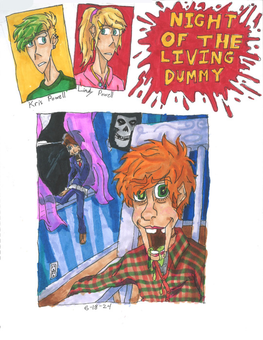
Night of the Living Dummy: Ah, the infamous Pamela Vorhees book, where the main antagonist isn't the mascot, but instead some other puppet lol. I've seen a lot of fanart of Slappy, but never of Mr. Wood. So I wanted to do justice for Wood while still showcasing Slappy. While I am proud for how it mostly turned out, there are two things that bother me. 1. This is the night sky that is black, the rest are either blue or purple. 2. I forgot to add the lines that make the jaw on Mr. Wood, whoops.
Aside from that, I hope guys like that Misfits poster in the background and Kris's cool hair cut. The green was inspired by the comic adaption not 2015 Jacksepticeye.
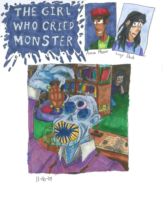
The Girl Who Cried Monster: Please forgive me for the small thumbnail, I wasn't using a ruler at the time. The design for Mr. Mortman wasn't much of a challenge. I loosely based it off of the French rendition of the cover and gave him a large leech-like mouth.
In my headcannon, the teeth spin like a garbage disposal, making easy work of the turtles.
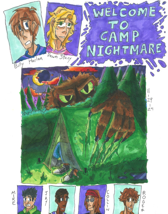
Welcome to Camp Nightmare: Another one of my favorites, and I think I did a decent enough job, too. The lighting is perfect, the clouds look alien enough, and you can just barely see the screaming campers inside the tent. I do have one issue though, and that is the size of the monster, Sabre. In the original sketch I did, he was supposed to blend in like a bush, but instead he looks like Sasquatch Sr. Oh well.
While they did give Billy a last name in the Presents books, I had to make up one for Dawn. Just based it off Gwen Stacy lol. Also, hope you enjoy the little bonus pictures down below.
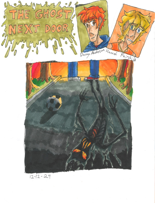
The Ghost Next Door: The original Jacobus art was perfectly vague enough to keep the twist there but not spoil anything. Of course to do the same thing, but with a twist of my own. The "ghost" shadow that you see in the street is the Dark Figure that follows Hannah around or when Danny is near. I wanted it to look like it was constantly on fire, since SPOILERS: someone in the book does die in a fire.
Another headcannon is that the Dark Figure isn't actually a ghost or whatever, but instead the embodiment of Misery.
#goosebumps#goosebumps fanart#welcome to dead house#stay out of the basement#monster blood#say cheese and die#the curse of the mummys tomb#lets get invisble#night of the living dummy#the girl who cried monster#welcome to camp nightmare#the ghost next door#horror#nostalgia#90s nostalgia#amanda benson#josh benson#magret brewer#casey brewer#dr brewer#evan ross#andy kingsley#greg banks#shari walker#gabe sabry#sari hassad#max thompson#lefty thompson#kris powell#lindy powell
803 notes
·
View notes
Text
also not to toot my own horn but can we take a sec to appreciate my "coloring" of these clips
original footage (ignoring text and such) -> color correction -> contrast/light/sharpening/etc.


i stole the idea for a dead three Charli xcx von Dutch edit from @getmenaced several months ago and didn't get around to finishing it until now
#like yeah this was a quick edit as all originally green scenes have the same color adjustment and it's just messing with the temperature and#saturation/tint/lightness of individual colors and i didn't touch curves or whatever offset and middle grey mean#like i made the green disappear and red pop a bit so that is 4 individually adjusted colors (red orange yellow green)#and the other adjustment thing i made is the same across the entire video too bc once again i got lazy#but that has just some basic stuff like contrast/highlights sharpening saturation color temperature exposure etc etc oh! and vignette#some of the gort clips in his section are waay too yellow but i decided i dont need to do individual clip adjustments for edits if i dont#feel like it#anyways yeah. aaahh i always feel so embarrassed talking about my progress and how i've made something#well. just the coloring part of this.#lets not get into my painstaking zoom keyframes for each clip to get the illusion of more movement#im kidding its not painstaking its just a repetitive task#but yeah this is a SUPER simple edit but im still happy with the coloring!#anyways ty for coming to my ted talk
31 notes
·
View notes
Text
I think 90% of my gripes with how modern anime looks comes down to flat color design/palettes.
Non-cohesive, washed-out color palettes can destroy lineart quality. I see this all the time when comparing an anime's lineart/layout to its colored/post-processed final product and it's heartbreaking. Compare this pre-color vs. final frame from Dungeon Meshi's OP.


So much sharpness and detail and weight gets washed out and flattened by 'meh' color design. I LOVE the flow and thickness and shadows in the fabrics on the left. The white against pastel really brings it out. Check out all the detail in their hair, the highlights in Rin's, the different hues to denote hair color, the blue tint in the clothes' shadows, and how all of that just gets... lost. It works, but it's not particularly good and does a disservice to the line-artist.
I'm using Dungeon Meshi as an example not because it's bad, I'm just especially disappointed because this is Studio Trigger we're talking about. The character animation is fantastic, but the color design is usually much more exciting. We're not seeing Trigger at their full potential, so I'm focusing on them.
Here's a very quick and messy color correct. Not meant to be taken seriously, just to provide comparison to see why colors can feel "washed out." Top is edit, bottom is original.
You can really see how desaturated and "white fluorescent lighting" the original color palettes are.
[Remember: the easiest way to make your colors more lively is to choose a warm or cool tint. From there, you can play around with bringing out complementary colors for a cohesive palette (I warmed Marcille's skintone and hair but made sure to bring out her deep blue clothes). Avoid using too many blend mode layers; hand-picking colors will really help you build your innate color sense and find a color style. Try using saturated colors in unexpected places! If you're coloring a night scene, try using deep blues or greens or magentas. You see these deep colors used all the time in older anime because they couldn't rely on a lightness scale to make colors darker, they had to use darker paints with specific hues. Don't overthink it, simpler is better!]
#not art#dungeon meshi#rant#i'm someone who can get obsessive over colors in my own art#will stare at the screen adjusting hues/saturation for hours#luckily i've gotten faster at color picking#but yeah modern anime's color design is saddening to me. the general trend leans towards white/grey desaturated palettes#simply because they're easier to pick digitally#this is not the colorists fault mind you. the anime industry's problems are also labor problems. artists are severely underpaid#and overworked. colorists literally aren't paid enough to do their best#there isn't a “creative drought” in the anime industry. this trend is widespread across studios purely BECAUSE it's not up to individuals#until work conditions improve anime will unfortunately continue to miss its fullest potential visually#don't even GET ME STARTED ON THE USE OF POST-PROCESSING FILTERS AND LIGHTING IN ANIME THOUGH#SOMEONE HOLD ME BACK. I HATE LENS FLARES I HATE GRADIENT SHADING I HATE CHROMATIC ABBERATION AND BLUR
2K notes
·
View notes
Text
Now that I'm back from the gem and mineral show, here are all the Cool Rocks I came home with!

A cute little coral fossil! He looks like a cauliflower.

A Keokuk geode! These geode beds aren't far from where I live, and it's always fun to have local specimens.

Phosphosiderite! This purple stone comes from Chile. It's so soft that it has to be stabilized with resin before it's cut. This one is a cross section of a botryoidial formation!

Speaking of botryoidial, this Hematite! Botryoidial means it has a bubbly shape kind of like a bunch of grapes. The faces of the bubbles on this pieces are super shiny and metallic.

Dendritic chalcedony, from Turkey! It's a white chalcedony full of dendrites - branching formations of manganese that look kind of like trees!

A cabochon for my cab collection! This one is made from a material sometimes called "ajooba jasper." The pattern is actually a cross section of a bunch of colorfully jasperized bivalve fossils!

Speaking of jasper, this one is Blue Mountain jasper, from Oregon! The circles in this stone are what’s known as an “egg pattern,” and jaspers which have them (Blue Mountain, Imperial jasper, and a few others) are collectively known as “fine jaspers,” the most valuable jaspers in the world.

Hyalite opal! This stuff forms water-clear spheres that look like jelly.

It fluoresces bright green under UV light!
Now to show off this year's haul of awesome agates!

Dryhead agate, from the Bighorn Mountains in Montana! This agate is named after the many bison skulls found in the area. A weird shaped guy with awesome red and orange bands.

Bou Lili agate, from Morocco! I like the name of this one. Soft banding and very subtle, muted colors. I've heard that this locale can produce peachy colors too.

Bear Canyon agate, from the Pryor Mountains in Montana! Agates from this locale have very stark black and white banding.

Red Fox agate, from Argentina! Sometimes this material is also called "crater agate" because the area it comes from is near the crater of an ancient volcano.

A Blue Sky thunderegg, from New Mexico! Thundereggs from this locale often have this two pointed, saucer-like shape.

It fluoresces really brightly!

Dulcote agate, from England! The bands of this agate are full of calcite, which gives them a strange, distinct texture.

Malawi agate, from Malawi! See all the cracks in it? Almost all Malawi agates have them. Frequent earthquakes due to the East African Rift cause these agates to crack and fracture.

Paint Rock agate, from Paint Rock Valley in Alabama! This agate is very rarely banded, and usually just contains swirls of red and yellow color.

A big, unpolished slab of Montana agate! This agate is known for its clear banding and black lines and spots, which are caused by manganese dendrites.

It's best viewed with some light behind it!

A smaller piece with really amazing dendrites!

Here it is backlit!

Fighting Blood agate, from Hebei Provence in China! This locale is known for its super saturated reds and yellows. This piece has purple amethyst crystals growing inside! They didn't photograph well; they are much more purple in person.

A really weird Fighting Blood agate! This one lacks the bright colors typical of this locale, but makes up for it with that super cool spiderweb pattern!
And finally, as is tradition, I came home with some Ethiopian opals! Here are the five I got this year.


And that's everything I got at the show!
469 notes
·
View notes
Photo
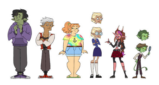

I think Fantasy High would look good animated in the total drama style since they’re both chalk full of chaotic sweaty teenage energy. Here are the bad kids on their first day of school
[ID: Two images of the same lineup of characters, with the top one being the colored version and the lower one being the line art. They depict the six main characters from D20′s Fantasy High from tallest to smallest; Gorgug, Fabian, Kristen, Adaine, Fig, and Riz. They are all drawn and colored mostly in line with canon, with some slight variations to accommodate the total drama style. Gorgug’s eyes were stylized into two white dots with slight bags underneath, and he is standing upright with his hands nervously brought up to his chest with a slightly timid expression on his face. His hoodie is a slightly de-saturated purple with grey sweatpants and purple sneakers. He has dark green skin and black wavy hair that falls above one eye. His wobbly, down-turned mouth has a tusk poking out of the higher side (he normally has two, it’s just the way his expression was drawn made it so only one was visible.) His face shape and nose are rounded to give him a softer appearance and there are two little lines indicating the beginning of teenage stubble on his chin. Next to him on the right is Fabian, who stands with his arms crossed and his head turned haughtily to the right, a smug expression on his face. He is wearing his red owlbear jacket with white sleeves, greyish brown loose workout pants, a black undershirt, and red sneakers. He has brown skin and swept back white hair that is shaved on the sides. His nose slopes downwards and he has two eyelashes under both eyes to denote that he is a fancy, pretty boy. He is drawn with a strong, square jawline and a build that is both muscular yet nimble.To his right is Kristen who has a stocky, more rounded build and is wearing a rainbow tie dye shirt with a simplified corn logo in the center, denim shorts, green flip flops, and a rainbow bracelet. She has curly orange hair that curls around her round face, light tan skin with freckles, bushy orange eyebrows, an upturned nose, and dark green eyes that are upturned in a smile. To her right is Adaine, who is slouched slightly with her arms crossed and an unhappy expression on her face as she looks off to the ground. She is wearing blue circular glasses over her round blue eyes, her blue two-piece hudol uniform, knee-high grey socks, and black mary jane shoes. She has light brown skin and short, straight blonde hair swept back from the front of her face in a widow’s peak. She has a small, pointy nose and a circular face with a small pointy chin. Above her is a version of her face without her glasses. To her right is Fig, who is standing proudly with one hand on her hip and the other in a finger gun. She has light reddish skin and brown hair in a braid that has a bright purple streak in her bands and at the end of her braid like it was dipped in paint. She has a long, pointy face and a slightly hooked nose. Her eyes are a dark pomegranate color and slightly upturned. She is wearing purple lipstick, a short leather jacket with a cropped grey shirt underneath it that has a picture of a horned skull on it, a black choker, fingerless gloves on both hands, a plaid skirt and belt with black leggings underneath, dark brown boots, and a single fishnet coming up to her calf on her right leg. To her right is Riz, who is holding a magnifying glass up to his face with one eye squinted to see through it and his other hand on his hip. A single fang peeks through the corner of his small smile. He has a green tail that swishes in front of him. He is wearing his signature brown cap and two piece suit with mauve pants, vest, and tie. His skin is light green with freckles under his eyes, his eyes are light greenish-yellow with slits for pupils, and his hair is dark green and swept back under his cap. Above him is a version of his head without his cap, showing that his hair is swept back from the front and curls away from his face, giving him a windswept appearance.]
#my art#d20#dimension 20#fantasy high#gorgug thistlespring#fabian seacaster#kristen applebees#adaine abernant#fig faeth#riz gukgak#the bad kids#total drama#td fantasy high#note: gorgug has two tusks it's just that his expression makes it so only one is visble at the time#total drama high
3K notes
·
View notes
Text
Photoshop Tutorial #1 - Change Background & Add Reflections
Before & After


You will need
Photoshop
Internet Access
I was inspired to make this tutorial after facing a dilemma in my game. I wanted my sims to swim in Brindleton Bay, but, shock horror, the water there is not swimmable. Luckily, I know how to change the background of my screenshots to make it appear as though it is - and I'm going to bring you through the process of how!
Starting off, in game, I brought my sims to Tartosa and got my desired shot. Then, heading over to Brindleton Bay, I got some shots of the horizon that I wanted as a backdrop.
Here's a picture I took:

Okay! Let's open up Photoshop!
For reference, I have Photoshop 2024, but most if not all of the features I've used should be included in older versions too.

Here's our image! Now I'm selecting the Background layer in the layers panel and press CTRL J twice to create two duplicates.
I'll turn off the bottom two layers for now, (by clicking the eye button, for newbies) and go to the properties panel. this should be on the right hand side, above the layers panel, but if it isn't, simply go into window > properties to switch it on.
With the layer selected, I click remove background and voila! Photoshop has... er... done her best to remove the background (she sometimes gets it wrong, but at least it's a help)
You'll see that a layer mask has been created. (circled in image).

If you haven't used layer masks before, the only important thing to know is that black will erase and white will add.
So with my brush tool (shortcut B) selected and set to black, I can go around the image and erase all of the parts I don't want.
If you have a steady hand and a tablet/cintiq you can do the same job a little quicker with the lasso tool (shortcut L) by selecting any unwanted area and simply pressing delete
Once I've removed all that needs to be removed, I see that there's a little slice of her hair that needs to be added. I can change the brush colour to white and paint it in.
Done! Easy!

Okay, let's switch off this layer for now, and switch on the one beneath it.
This is the layer I want to make look like the Brindleton Bay sea. So I'll make sure to pull an image of the water up as reference for colour.
This time I'm going to create a layer mask using the polygonal lasso tool
It's easy.
Find the lasso tool in the tool panel on the left of screen (the third icon from the top - or by pressing L on your keyboard)
Left click & hold, and a menu will pop up. Select the polygonal lasso tool.
Click around the area you'd like to mask, in my case, the sea. Tip: if you hold down the shift key while clicking, you will be able to create perfectly straight lines.
Click on the layer mask button at the bottom of the layers panel (pictured)
Everything except the selected area should disappear!

A small thing here, but I don't want the reflection of the rock in the water in my picture. I'll select the layer (not mask), take the eyedropper tool (shortcut i) with the sample set to all layers, and use a soft brush (B) to paint it away.

Next I'm using adjustment layers to edit the colour of the water, to try and make the blue turquoise paradise look more like the horrible green bog water of the bay.
You'll find these next to the mask button in the layers panel.
For my picture, I'm using hue/saturation for the colour and levels for the light. you can fiddle around with any of the adjustment layers to find what works for you.
I've shown the adjustments I've made for my specific scene below, just for reference.
When I'm happy with the colours/lighting, I select all adjustment layers (shift + L click to select multiple), then right click and choose create clipping mask. This is to ensure that the adj layers don't affect any other parts of the image, just the area I want it to.
And there! My water is looking sludgy, just like I wanted.

Okay! I've decided that I'd like some texture in the water. It always annoys me that sims water looks so flat. So here's where Pinterest enters the story.
I like Pinterest because unlike Google, the majority of the images are not watermarked. You're also slightly less likely to find AI slop.
I wanted some water ripples, so I searched for something like Water Texture, found one I liked, and dragged and dropped it into my photoshop file.
From here, I transformed it (CTRL + T) by resizing & rotating the bounding box, then grabbing the corners while holding CTRL to create some kind of perspective that works for the image.
I didn't bother bringing it all the way to the horizon, because I intend to fade that out with a gradient anyway. I had to sacrifice the bottom of the image for the sake of correct perspective, but that's fine. I will crop that out later.
With the texture layer selected, set the blending mode to soft light. It blends nicely!

Now! Another layer mask! These are our friends
With the texture layer still selected, I create a layer mask.
This time, because I had nothing in the image selected first, the layer mask will appear white. That just means nothing has been masked yet.
With it selected, I find the gradient tool (shortcut G) if you press G and the paint bucket tool is activated, simply navigate to the tool panel on the left of the file, hold the paint bucket tool down and select gradient.
I'll change the colour to black, and make sure I have the foreground to transparent gradient selected.
Other settings are pictured.

I'll drag the gradient over the area I want to mask. In this case, the top of the water texture to make it appear as though it's fading away towards the horizon.
(Doubly make sure you've selected the mask, not the layer while performing this action.)
Looking good!
Time to drag the layer above your adjustment layers and create a clipping mask again.

Alright! Let's do the background.
I'll drag that image of Brindleton Bay that I took earlier into the file.
I want to place it below my sea layer, and above that original background layer (I am going to leave that untouched for insurance reasons)
Then, using the move tool (shortcut V) I'm simply going to move it to the correct place. Basically I just want the horizon lines to match up.
Tip: hold the shift key to drag an image in a straight line.
Enter to confirm.
You can see that the sky is now unfinished, but it's such an easy fix. I'll just select the sky colour with the eyedropper tool, then use the paint bucket tool & brush tool to fill in the sky.
Done!

Now - note that the sea doesn't quite blend in with the background. To fix this, I'm going to take my eyedropper tool (shortcut i) and select some of that dark green colour beneath the mountains.
I will create a layer (+ button on the base of the layer panel) and drag it above that sea texture layer I created earlier.
Then I'll create a layer mask to clip it to the sea.
I'm grabbing that gradient tool again (G) and creating a nice gradient on the horizon.
The horizon line is a little sharp, in my opinion, I want it more faded. So, using a soft brush (B) and that same green colour, I'm going to create a new layer & place it above that green gradient, this time I'm not clipping it.
Holding down the shift key, I'm going to draw a straight line right across the horizon. This helps to blend it all together a bit better.

Now! for Reflections!
Firstly, I'm going back to that sky layer with the Brindleton Bay mountains, and I'm going to duplicated by pressing CTRL + J
I'm dragging it above the sea layer, but below all of the other clipping masks. This will automatically create a clipping mask for the new layer.
Next, I'm going to edit > transform > flip vertical
With the move tool (V) I'm moving the image upwards so that the horizon lines meet and it looks like the lighthouse and mountains are reflecting in the sea.
Note: make sure auto select is off while using the move tool on a layer that lies beneath several others.

This leaves a little bit of a mess on the bottom on the canvas, which can be fixed by creating a layer mask & the gradient tool set to black, and dragging a gradient over the bottom of the image until it blends nicely into the sea.

With the mountains reflection done, I'm going to move onto the people.
I'll turn that top layer that I worked on earlier back on.
Then I'll duplicate it (CTRL + J)
Right click on the layer mask of the duplicate and select Apply Layer Mask from the dropdown. This simply bakes the layer mask into the image. Usually I try to edit non-destructively as much as possible, but in this case it's fine to destroy.
I'm going to rename this layer Reflection
With that new, reflection layer selected, I'll go to Edit > Transform > Flip Vertical, just like before.

I want to add a little water/shimmer effect to their faces, so I'm going to Filter > Distort > ZigZag
I'll just mess around with the settings here until I find something I like.
This is optional, obviously, I've done reflections in edits without doing any of this, but it just adds something a little extra to water scenes, I think.
Here's a time I didn't do that.

anyway, my sims are looking a bit crazy now, but it's fine, because I'm going to, you guessed it, add a layer mask and gradient.
But first, using the lasso tool (L) I'm going to draw around one of the characters and drag her into place. I can move the bounding box around a bit to make her shoulders meet in the right place.
Then I'll do the same for the other character.
Tip: Hold CTRL while moving, warping or resizing something for a smoother, more precise experience.

Now, I'm doing what I said I would, and I'm creating that layer mask. We know how to do it by now, right?
Make sure everything is deselected first by pressing CTRL + D
Create layer mask
Select Gradient (G) set to black
Drag gradient over bottom of reflection (If you ever need more precise gradients, you can select the round gradient at the top of the file. I needed it to blend the reflection on the right more, because the characters are not at an even height.)
In the Layer panel, change opacity to 20% (or whatever you like) and hit Enter to confirm

Using Crop (shortcut C) I'm going to crop my image, cut off that pesky strip at the bottom and just basically make the framing of the picture a little bit nicer.
And viola!

I could edit this image more, throw in bounced light, splashes etc etc but I'll leave it like this.
The only thing I will add in is a little lens flare to indicate sun, so again, I'm taking to Pinterest and searching for one that works.
Tip: make sure the background of a lens flare image is completely black. Otherwise it will be harder to use.
Below is the one I have chosen.
I'm simply changing the blending mode to screen, moving it and resizing it with the transform tool (T), and fiddling with the opacity until I'm happy.

That's it!
I made a video running through this whole process, with all of my shortcuts in the bottom right hand corner so that you can see exactly what is happening.
youtube
If there are other tutorials you'd like to see in future, please let me know!
And I'm more than happy to answer any questions!
Good luck <3
#sims 4 tutorial#editing tutorial#sims editing tutorial#sims 4 edit#photoshop editing#photoshop tutorial#sims 4 community#simblr#Youtube#sims 4 photoshop tutorial
183 notes
·
View notes
Text
My Mind's Got Legs, Running in Circles
Rating: Teen and Up CWs: Eddie Munson Has OCD, Eddie Munson Has ARFID (If you Squint), Compulsions (That Could be Viewed as Harmful/Self-Harm), Negative Self Talk, Internalized Ableism, Minor Panic Attack, Food Tags: Post-Canon, Established Relationship, Eddie Munson Whump, Angst and Hurt/Comfort, Comfort, Good Boyfriend Steve Harrington, Steve Harrington Takes Care of Eddie Munson, Eddie Munson Loves Steve Harrington, Eddie Munson Trusts Steve Harrington (Which I Feel is a Very Important Tag), Hopeful Ending, Happy Ending So, probably 90% of this is taken from personal experience—via my life the last seventeen years give or take. I wanted to divulge into the grittier, nastier parts of the whole inner-monologue, and a focus on Eddie having resulting effects from eating something he was unsure of, but I've been struggling a lot recently and just couldn't bring myself to write it. So I went with the sweeter, fluffier route. Maybe I'll come back to this version of Eddie, but as of right now, this is what I offer. Also on AO3 (locked, so make sure you have an account)
🍗—————🍗 He’s biting his tongue.
It’s just a plate of dinner. Dinner that Steve made him. Homemade and neat and hot for the taking. There’s just one problem with it. A big, fat problem.
Among the green beans and the warmed dinner roll and the steaming mashed potatoes, there’s a chicken breast the size of his fist. The chicken is dressed up with a crisp brown outside, flakes of pepper, and a light slathering of garlic sauce. In itself, the chicken isn’t the issue—not yet, at least.
Eddie can’t muster the courage to take a bite because he didn’t watch Steve make it.
That’s been something with him his entire life.
He isn’t sure what really set it off. The dire need to always be in the center of the kitchen, or just outside of it, peering around the corner to see hands flip and toss and slather. It used to drive his dad insane. His six year old son hanging out at his knees, big eyes gazing unblinking at the skillet on the stovetop, tugging on pant legs when the meat was still a little pink.
Before it was just his dad in the picture, his mom used to sit by and teach him all about the cooking process. How to wash the cutting board, to avoid contamination. To always wash his hands, to avoid contamination. Use a different turner in the pan, to avoid contamination.
That word had always struck him like a firm backhand. He’d always been curious, too smart for his own good. And his mom had dictionaries, so he soon learned what it meant. To be contaminated. The contamination that was always talked about, though, was to prevent getting sick. “You always hate being sick, Ed,” she used to tell him, “so make sure to be super duper safe with your food. Okay sunshine?”
He made habits of it. Washing his hands between each step. Then washing them when even a droplet of sauce stained his index finger. Scrubbing away the raw chicken strands on his cutting board, scrubbing harder because he swore there was a piece, just one more piece, there’s a piece and there’s a piece and—he did it until his hands were lobster red from the hot water. And the hot water was good for killing bacteria, so washing his hands became excruciating, but safe. He was always prepared with three or more turners lined up on clean paper towels at the stove. Dish washing liquid on hand.
Another thing that really stood out, and it only stood out once he got real fucking sick, was the part where food sometimes is just served bad. With little or no control over it.
There had been one time—one time—where he went out for breakfast at the local diner. His mom sitting across from him in the booth, their plates saturated with syrup, cheesy eggs on the side. He’d eaten all he had because it had tasted fine, tasted good, tasted perfect. It was safe and it was good and his mom was there smiling at him all sweet, the lights weren’t too bright and the table wasn’t sticky like he hated and the waitress was real pretty.
But then he started puking. And once he started, he couldn’t stop. Couldn’t keep down water, couldn’t muster the appetite for something as bland as toast. His mom got sick, too. There had been the scary hospital with the too bright lights and too many smells, the doctors who talked too loud and the nurses who pressed too hard on his tender head. An egg recall—he didn’t know what that meant, he got too curious again, and then—
Eddie Munson stopped eating eggs.
And since eggs came from chickens…
Eddie Munson stopped eating chickens.
And when he stopped eating chicken, his mom got concerned.
So he ate it for her, learned to like it again little by very little. He still doesn’t like it, still doesn’t enjoy it, but he can keep it down at least. But if the eggs made him sick, then the chicken could, too. If the chicken was pink, even the slightest bit, then he couldn’t eat it.
Couldn’t eat the chicken, couldn’t eat the egg. Couldn’t because his brain wouldn’t allow him to; not some written rule in an uncovered handbook; not a dictation from some government practice; not the conspiracy theorist that used to live up the road. No. It was his own brain.
And what if other animals could make him sick?
Beef couldn’t be pink. Pork couldn’t be tender. Milk couldn’t be past the expiration day by even a minute after midnight. Cheese can’t be moldy, no matter how much his mom said blue cheese was delicious.
Then, things spiraled. Really started to spiral.
Bread was made of animal product. And bread could get moldy. If one piece was bad, then the whole loaf was bad. “Oh, baby, you can just cut the bad parts off,” his mom would say, “it’ll be alright. Plus, saves Mommy money, too.” But the bread was bad. The bread was really bad.
There were bad foods. There were good foods.
The cons list was longer than the pros.
He was skinnier than a string bean, even when he went through puberty. He insisted on packing his own school lunch, even if it cost him more. He insisted on skipping Home EC because he didn’t trust the other students to truly follow safety guidelines. He insisted on watching when Wayne cooked, when Hopper invited him over for a barbecue after Spring Break, when Mrs. Henderson had him over for Christmas.
And he usually watches Steve, too. Steve knows that, at least Eddie believes he does—because he should, shouldn’t he? They’ve been dating for a little over a year now, been friends a while longer. He himself knows that Steve will let him cook if he needs to, but Eddie trusts Steve for the most part. Can trust him to make food, under a gaze of course. But Steve has told him that he doesn’t mind, enjoys the company.
But chicken.
He’s biting his tongue. Even as he cuts through the left side of the breast, slow and meticulous. If it’s too messy of a cut, he won’t be able to see the inside. If he can’t see the inside, he can’t judge the color. No say of what the color is, then he isn’t sure about putting it in his mouth.
Steve’s across from him, already dabbing away at sauce on his lips, teeth grinding against each other as he chews. Eddie is still cutting the meat.
“Y’alright?” Steve asks him around his mouthful.
Eddie briefly glances up. “I’m fine,” he shorts. The knife finally makes contact with his plate, screeching against the porcelain. His fork piercing the freed slab, holding it up close to his face, under the light in Steve’s dining room. The only plus side of this house is the lighting, bright and shiny and perfect for Eddie to use. Usually.
He spins the fork.
It’s pink, a part of him notes, it’s still pink don’t put it in your—No, see, it’s white, that same part says, it’s white right there. It’ll be white everywhere, Steve made it.
Steve cuts his own food again, takes another hearty bite.
Eddie turns the fork once more.
But what if it’s just this one piece that’s perfect? What if Steve didn’t cook the rest of it long enough? He audibly takes a deep breath, his chest filling with it, stomach flipping. Eddie scrapes the piece off his fork, knife dictating it to one side of his plate, and he begins to cut up the rest of the chicken.
“Was that piece not”—
“I’m just checking,” Eddie rushes out. His wrists work faster through the next piece. Turning it. Pink. Next piece. Faster. Flipping it. Pinker. He rests his forearms against the table, wrists going limp over his plate, face tilted towards the ceiling as his eyes close and he breathes again.
Distantly, he calculates the rattling of his chair from his leg bouncing. The tick of the clock. Steve’s chewing. And chewing and chewing and—
He picks up the first piece of chicken and inspects it again, cutting it into smaller, more individual chunks.
What if Steve purposefully didn’t cook it right? What if he’s mad at you for something and this is how he shows it? What if he took the only good piece? What if he didn’t wash the turners and the cutting board and the—
“Ed?” Steve calls out to him. “Do you want me to check, baby?”
Eddie minutely shakes his head. Mumbles, “No, I got it. Don’t worry about it.”
Did he wash his hands? What if he didn’t wash his hands before washing the green beans? And the rolls? Did he heat them up in the same pan as the chicken? The mashed potatoes, do they have chicken in them? The chicken is touching your mashed potatoes right now. The pink chicken is touching your fresh mashed potatoes. Keep cutting the chicken, it’s hard to see if it’s white. What if it isn’t white at all? The chicken is touching your mashed—
He chucks the utensils down onto the table. Hands flying up to cover his eyes, fingers tensing into his hairline. His legs jitter under the table, stomach backflipping into his ribcage, mouth drooling like he’s nauseous. The heels of his palms press hard into his eye sockets, hard enough he can’t see anything aside from the brown-black that exists there. And his breaths wheeze out of him, shaky and unsure.
The rolls could be moldy. Did you check to see if they were moldy? What if Steve cut off the moldy parts? Mold rolls and pink chicken, he must be really mad at you. You did something. The chicken is probably touching your mashed potatoes still, don’t eat the potatoes. The potatoes could’ve been moldy, you didn’t see the potatoes Steve used. What if it’s all moldy? Steve is eating it, though. Steve is eating it. Steve is eating the moldy food and the undercooked chicken. Steve is going to get sick. He’s going to get sick. You’re going to get sick. Steve is eating it and eating it and he doesn’t know, he can’t see it like you can. You’re crazy, you’re just being crazy. It’s moldy. All of it is moldy. It’s raw. The chicken is raw and it’s touching your potatoes. They’re touching. Steve is eating it. Steve is eating the chicken. Steve is eating it. He’s going to get sick. You’re dramatic, just crazy. You’re being crazy. He can’t see it like you can. He’s eating it. You’re crazy. Crazy, you’re just—
“I can’t,” Eddie chokes out, words clogged in congestion and sniffles. “‘M sorry, Steve. ‘M sorry, I’m so sorry,” he weeps softly. The sanctuary of his palms is the only retreat he has from this mild breakdown, tears wetting his hands. Over his caught breathing, he can distantly make out the sounds of Steve setting down his utensils, scooting his chair to Eddie’s side of the table, setting himself in close and warm. “I’m sorry,” he hiccups, “Steve”—
“Shhh,” Steve whispers, “Ed, it’s alright, I promise. It’s alright, baby.”
Blearily, he looks up from his hands, the wood of the dining table. “I can’t—It’s—I can’t eat it, Steve, I can’t do it. I don’t know…”
Steve keeps his hands to himself, twisted nervously in his lap. His eyes are calm, but there’s a gentle crease between his eyebrows—the sure sign of concern. “Is there something I can do to help,” he asks in a hushed voice, “maybe I can check your chicken for you?”
He sniffs, darting his eyes to the plate. “Um…I…I”—underneath the table, his legs begin to jitter again, erratic and upset—“did you wash your hands? No…no you, I trust you, I swear, but I don’t know if you did and I didn’t see you when you were cooking and I just”—
Without moving his hands, Steve gets in a tad closer, leaning against the edge of the table. There’s a softness in Steve’s stare, that concern from earlier mingling with care. Voice quiet, “I’ll go wash my hands right now, Eds. And I’ll come back with a new knife and fork and I’ll check the inside of your chicken. Is there anything else I can do for you right now?”
“No,” he murmurs, “no…not yet.”
The chair creaks as Steve moves, quick and nimble to the kitchen. Distantly, the sink turns on, the soap dispenser pumps, and then the water is obstructed by his hands. He begins a countdown from one hundred twenty in his brain, each number careful to the heart of his metronome. They’ve done a dance like this before. One hundred fifteen. If Steve finishes up too early, Eddie will call out for him to start over. One hundred ten. And the number will restart in his brain, two minutes and counting. Just as he did for himself as a little boy, lobster hands and tears in his eyes, the lemon scent of hand soap stark and true to his nostrils. The sink is still on, though. So far, so good. Eighty-five. Steve’s getting better at it now. A part of Eddie is worried that he’s caught on, that he’s well aware of the weird timer inside of Eddie, trembling and counting, ticking like a bomb. The other part knows that Steve is just being considerate, taking care the way he needs to, the way that’s asked of him. That he takes care of his people, would lay down and die right now if Eddie asked him to. Seventy. Not that he would. He loves Steve too much for that. Sixty-three. He loves Steve a whole hell of a lot, how his brain works, how he manages to just meld to the course. Nobody has ever taken the time to learn the odd intricacies of his brain, has ever taken note of how he cuts his food, the way he grills until things are burnt, hands washing until they turn white by pressing with his fingertips. Forty-seven. Something wriggles in him, pesky and ugly, growling alive that Steve will get tired of this dance. The steps. That he’d realize that Eddie really is just a nuthouse. A basket case. The crazy person that everybody’s warned him about.
His inner dialogue is intense. Needy. A monster of a beast. It’s got fangs and claws and leeches where it can—always. Knows what food shouldn’t look like, an amalgamation born for Eddie’s eyes, the trick of light, the glisten of his fork against the white flesh insides of his chicken. Twenty-six. He wishes that this part of him would hide, dissipate, maybe even die altogether. Lord knows it would save him the time, the energy. That he’d appear healthier, fuller in his flesh, his skin no longer dull or pale. He’d be alive and well, make it through his day with not a care in the world. He could be…a little bit more normal. Fifteen.
That’s just his conscious, though. Steve tells him that everybody is weird. Odd.
Unfortunately, Eddie doesn’t believe him most of the time. Not everybody sees the world he does. Steve sure doesn’t. No matter how much he claims to love Eddie—not that there’s really any doubt just how much—he’ll never understand what it’s like to be him, to live in his skin, to have a constant slew of thoughts that interrogate him until he crashes and burns, asleep and restless for a few hours.
Zero.
Steve comes back into the dining room, his hands still glistening from the water, a new set of utensils in his grip. He settles down in his chair again, drags Eddie’s plate close to him, and sets himself up for the slice and dice.
“Okay,” he murmurs, “how about you watch me cut the chicken, Eds. Anything you think I’m doing wrong, or maybe you need me to check again, I want you to tell me. I want you to tell me to stop, to look over again, or tell me what you need.” Steve’s eyes are on him again, aflame and caring. “Anything at all, Eds, I want you to tell me. Okay?”
Silently, Eddie merely nods in understanding. And then, no further words, Steve begins cutting the chicken into smaller pieces. Every few chunks, he stops to scan each and every piece. Holding them directly to the overhead light as if he’s interrogating them, ready to slap them silly if they say one thing out of line. When he’s satisfied and Eddie doesn’t speak up, Steve sets the chicken back down and moves on.
For the most part, Eddie’s satisfied with how Steve goes about this. He’s not doing anything wrong, not really. Maybe going a bit too quick with a couple pieces. But he reminds himself, intently, that he trusts Steve. He trusts Steve wholly—trusted him with his life at one point, this isn’t anything different. Maybe a lot less intense and a whole lot silly, but Steve treats it as if he’s putting pressure on wounds, as if he’s gearing to lock his elbows and perform CPR.
But then—
“Wait wait wait,” Eddie rushes. Steve stops, just as he said he would. “That one”—he keeps the urgent tone in his voice, no matter how much he wants to squash it—“that one looks pink. It’s wrong, Steve. I can’t—that…that one is bad.” Humiliatingly, the burn of tears is fresh behind his eyes, his lids tight and heavy at the same time, he’s exhausted from it.
Instead of arguing or protesting, Steve simply looks at it again. Rotating it slowly, meticulously. Holds it to the light. Squints. Then, he clicks his tongue. “It’s not pink,” he decides, “but it’s definitely off-white. Maybe that part is a little dry, so the meat doesn’t look as fresh.” He scrapes the piece off the fork, setting it isolated on the edge of the plate. “Do you want to eat it still? Try it again?”
Eddie sucks in a slow breath. Eyes set to the plate, that one dumb chunk of chicken. His pulse rabbits against his throat. Legs ready to twist off his hips and go running for the hills. Wishes that the floor would open up and swallow him whole. Bones and all. “I don’t…I don’t know, Steve. I don’t know, I don’t know,” he mutters, frantic.
Steve gives him a sympathetic nod. “Okay,” he murmurs once more, “then let me lay out some choices, okay? That way, you can just pick whatever is best for you. And…and if none of them work, then you can tell me what to do.”
“Okay.”
“Option one: I can put your food back in a clean pan and heat it up again, you can watch me do it the entire time”—Eddie soaks that up, but shakes his head. Steve’s own food will go cold if he does that.—“option two: I can completely throw out the chicken, reheat the rest of your meal in the microwave and that can be your dinner.”
“The chicken touched my mashed potatoes,” Eddie mumbles, “I can’t eat them.”
Steve, patient as ever, nods again. “The last thing I can think of, then, is that I can heat up one of your safe frozen dinners. There’s beef stroganoff, chicken tenders with macaroni and cheese, sirloin steak with green beans, and…I think there’s one more of the spaghetti and meatballs. Does any of that sound good to you, baby?”
“Mmm…the chicken tenders sound good. Can you heat those up for me, please?”
A gentle kiss is pressed to Eddie’s left temple, sticky and warm. “Of course,” Steve speaks softly, “let me take care of this chicken and I’ll come right out with the other food in a minute, okay?” Nodding against Steve’s mouth, Eddie breathes a small sigh.
At least it wasn’t pink, he’s able to find relief in, Steve can still eat his chicken.
He watches from his spot at the table. Steve scraping the food into the garbage, setting the dirtied plate and utensils into the sink, washing his hands again, and popping that frozen meal into the microwave. His body stays stationed in front of the microwave, watching with a cocked hip and his arms crossed over his chest. There’s a low little string of hums that Steve’s emanating, gentle as they carry themself to Eddie’s ears.
Soon enough, Steve comes back to the dining room, sets the fresh food in front of Eddie, and places himself back at his own plate.
“Thank you,” Eddie says softly—that same wash of relief flowing through him, his empty stomach no longer flipping, but instead rumbling for the new food. It’s not five star dining. It’s not Steve’s homemade meals, but it’s enough for now. It has to be.
“No problem,” Steve says around a mouthful, “I’ve gotta make sure you’re getting something good in your body. Wouldn’t make you just sit there and suffer.”
“I don’t—you don’t understand. You didn’t have to do any of this, really. Honestly, I wouldn’t hold it against you if you made me sit here and swallow down those potatoes. I should’ve, I know. But you…god, Steve. You take care of me in a way I haven’t fully grasped.”
Gently, Steve sets his fork down on his plate with a small clatter. “Babe,” he coos, a bit sad if Eddie picks up on it. He looks up from his chicken tenders. Steve’s tender in his own way. “I don’t fully understand what happens in your head, I probably never will, but I will always—always—make sure you’re taken care of. That you have a hot meal, food that you will definitely eat, and that it’s as fulfilling as it can possibly be. Nothing will change that. Nothing at all.” Steve sets his hand on the surface of the table, skyward so that Eddie grasps to it—he does, even after a few tentative seconds. His thumb traces over the back of Eddie’s hand, rubbing soothingly over his knuckles. “I should’ve waited a bit to make dinner,” Steve says lowly, almost admitting, “I know that you like being able to watch me cook.”
“Yeah, but—I shouldn’t have to”—
“But you do,” Steve points out carefully. “You do and I know that. Even if I sat here and told you every ingredient I used, the fact that I washed every single dish before using it again, and I washed my hands between each step—even if I did that—you wouldn’t feel comfortable. You thought it was pink in the middle. And even though it wasn’t, you still didn’t trust it, and that’s fine. And, if it was pink, I’d want you to tell me.
“You deserve the safety of good food. I’ll do anything to give that to you, I promise.”
Eddie, aside himself, sniffles. His lips wobble. Cheeks heat. “Thank you,” he keens, “really, Steve, thank you.”
Steve squeezes his hand. “Thank you for trusting me,” he whispers, “I’m glad you trust me enough to let me in. To let me help.”
“Even though I mucked up your dinner plans?”
A tug. He looks up from where his eyes wandered. Steve’s stare is intense, but not intimidating. “You didn’t muck up anything, Eddie baby. I have my food. You have the food you know you’re safe with. We’re eating dinner together, holding hands, talking. Nothing would ruin this, what we have.” He leans against the table again, closing the distance between them. Murmurs, “I love your brain. I love your concern. I love your worry. I love that you trust me, that you can reach out to me for help. I love you, Eddie. Nobody else, nothing else.
“You are safe with me, always. Always.”
Eddie lets out a watery laugh. “I know,” he whispers, “nobody else I’d rather fall in love with, Steve, I swear.” He sniffles again, wipes the end of his nose with the back of his hand, and sighs—squeezing Steve’s hand in the process. “You’re gonna make me cry into my chicken tenders, though.”
Steve chuckles. “Sorry,” he sheepishly murmurs. “I just needed you to know all that.”
“I love you, Steve. Thank you for taking care of me.”
There are warm smiles on their faces as Steve finally pulls away. He sighs something completely lovesick—Eddie knows already that he’s a goner. “Now that we’ve basically expressed undying love,” Steve says, “how about we eat and bitch about our days, huh? I’ve got some store bought cookie dough we can make for dessert, if you wanna watch and entertain me.”
“I’d love to. No place I’d rather be, Stevie.”
There’s a million other things that will try and tear him down. Food and stomach turning feelings and the constant stream of numbing self dialogue. But right here? Laughing afterwards? He is safe. For now, he is safe.
And, at the end of the day, after all that—
Being safe is all that matters.
🍗—————🍗 My little taglist for this one <3 : @ilovecupcakesandtea
#stranger things#steddie#steve harrington#eddie munson#eddie munson has ocd#eddie munson has arfid#read all tags and cws#angst and hurt/comfort#happy ending#hopeful ending
63 notes
·
View notes
Text
Pt. 9 - Praise Kink

A/N: He's just so pretty, I could die 🥺
TAGS: she/her AFAB FMC, body worship, sub-ish Feyd
WORD COUNT: 300

"You're so pretty." Her voice glides across his mind like her tongue across his flesh, her fingers along the hard flanks of his body.
Nobody calls him pretty. Though many probably think of him so. And he is, with every muscle carved out of the flesh like a sculptor's living, breathing life's work. Every plane, every curve, every edge chiseled to perfection.
The skin on top of his hard muscles— soft like a Cherubim's, entirely smooth, kept free of scars, made velvety and delicate by tonics and lotions.
His lashes— long, blonde and fanning against his sculpted brow bones when he looks up, and against his cheeks when he closes his eyes in rapture.
His eyes— the softest shade of blue when touched by warm light. He would look so marvelous among the hues of green meadows and saturated summer skies. But here he lies, sprawled out on monochrome satin sheets, every hue white within white and black within black, as beautiful as he is alien.
"Never seen such a pretty boy in my whole life." Her hot breath tickles across his abdomen and Feyd's cock twitches against her neck, hard and weeping pre-cum at the slit from her hushed voice and wandering fingers.
"You're lying," he mewls, his voice whiskey-dark and raspy like he's only just woken from sleep, teeth painted a rich and glossy black. Saliva beads off them in thin, shiny strings.
"I swear it on my life."
One wrong word, and her life may as well be forfeit, her blood spilled by the na-Baron's blade that is never far away from his sinful hands which are so heavenly docile right now, grasping mindlessly at the woman who speaks of him like she sees more than just something pretty in him.
Almost like he was something that is worth kissing and caressing.
FEYD TAG LIST
@nostalgichoya, @forgedfromthestars, @sweetiee-o, @missbingu, @minedofmoria
@sebastianswallows, @charmingballoon, @flower-frog, @welliah, @aoi-targaryen
@coastalcowgirl35, @esolean, @szapizzapanda, @tatertooted, @sunny747
@ughdontbeboring
#feyd rautha harkonnen#feyd rautha#feyd#feyd x reader#feyd x you#feyd x oc#feyd rautha x reader#feyd rautha x you#feyd rautha x oc#feyd imagine#feyd rautha imagine#feyd smut#feyd rautha smut#austin butler#kinktober 2024#peggysuave kinktober 2024#absurdthurst kinktober
126 notes
·
View notes
Note
First of all i can't believe you're 16?? That's fucking insane, you're so talented.Second, would you ever consider making some sort of coloring tutorial?
oh my goodness thank you,, that means a lot hahah. insert chiikawa reaction image here i dont have them on my computer
secondly, sure! my process involves a lot of bullshitting and kinda intuition based stuff so idk how to explain it that well but i will try.

ok here is how i would render a colored ball + grayscale ver. i dont use value ? or darkness to create shading as much as color contrast. ex yellow is lighter than green which is lighter than blue/purple. this is shown in grayscale but since im using the colors to indicate value it shows up better in color (idk how to say it)
this is personal preference but i don’t use color palettes at all, because every setting will have a different kind of lighting or mood that i need to adjust for. so why even bother? i think im just really used to picking things out by eye, buti would not recommend this because stuff can get inconsistent really quick
i dont use blend modes for shadows anymore, but heres an example with multiply for how i do shading (left)

in my art i dont like the look of straight up darkening shades so i always go for a darker, more saturated shadow. i love bright colors so im always pushing for more saturation. enhancing existing color in a 'properly shaded' areas is a fun way to do this
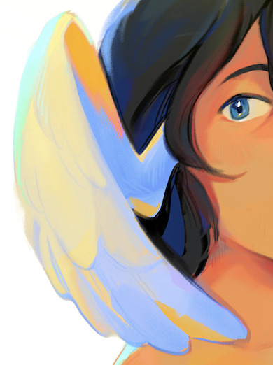
for example in this wing, i make the shadows bright ass blue instead of grayish blue/tan. this is because i made the faint light source from the left yellowish, so the shadow will be blue in comparison. i just amped that way up lol
you can also see it in the yellow on the inside of the wing. the lighting is yellow, so i took the faint bits of yellow that wouldve been present if i shaded it normally and just made it way more saturated
hope this helps, feel free to ask questions because idk what im doing half the time. usually its just 'oh this would look cool lets keep it'
125 notes
·
View notes
Text

Thank you @cobbbvanth for asking me for this; I’ve never been more flattered! ☺️ I’ve only been making gifs for a little more than 2 years, so I’m really still only figuring Photoshop out, and my colouring owes everything to other people’s tutorials (some of which can be found here). To be honest, I was only asked some tips, but I have no clue what to include and what to leave out; so, here’s my complete (if random) colouring process.
NOTE: This is a colouring tutorial, not a gif-making one. The tutorial that taught me everything I know about that (and to which I am eternally grateful) is this one by @hayaosmiyazaki.
I. SHARPENING My standard sharpening settings are:
One Smart Sharpen filter set to Amount: 500 | Radius: 0,4
A second Smart Sharpen filter set to Amount: 10 | Radius: 10
One Gaussian Blur filter set to Radius: 1,0 and Opacity: 30%
One Add Noise filter set to Amount 0,5 | Distribution: Gaussian
II. BASIC COLOURING This is the part where I add most of the adjustment layers available and just play around with them. Obviously different settings work for different scenes, but I do have some standard ones.
Brightness/Contrast I usually up the Brightness to +10-30, and the Contrast to about +10.
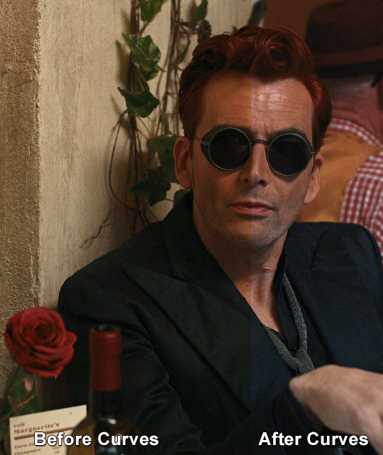
Curves
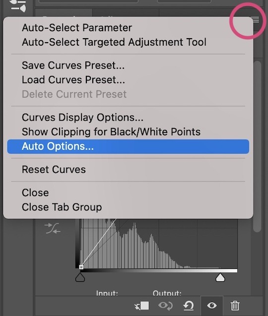
For the first Curves layer I go to Auto Options > Enhance Brightness and Contrast, and then adjust the opacity until I’m happy.
I might repeat the above step if the gif still looks too dark to me.
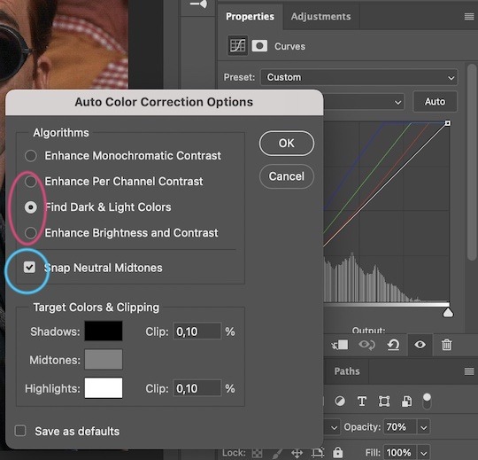
I add another Curves layer, I go to Auto Options and this time I pick either Find Dark & Light Colors or Enhance Per Channel Contrast, and check or uncheck the Snap Neutral Midtones option, until I see something I like. I will then adjust the opacity.
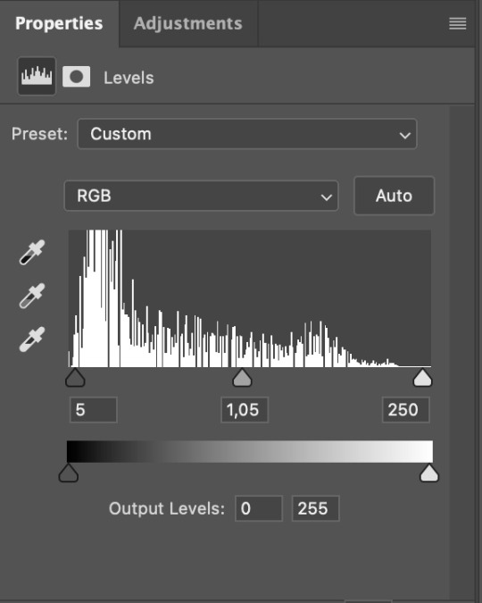
Levels I add a Levels layer that usually looks something like this:
Exposure I add an Exposure layer, where I usually set the Offset to around -0,0010.
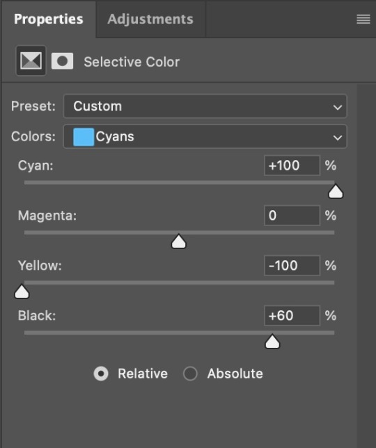
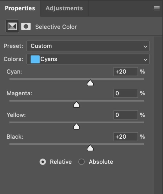
Selective Color To make the faces look okay, I create a Selective Color layer, select the Reds and usually add some Cyan (+10-20%) and play around a little (±5%) with Magenta and Yellow too. I might also add another layer, select the Yellows and make slight tweaks there too.
III. FUN COLOURING About colour manipulation: PiXimperfect just uploaded a tutorial that explains everything so much better than I ever could, so I highly recommend you go watch it. It’s made for static images though, and things are more complicated with moving images, so I also recommend @sabrinaacarpenters’s tutorial.
The reason I usually go for a softer colouring is that a more vivid one requires a lot of patience and precision, and I honestly can’t be bothered. Instead, I try to tweak the colous only a little, so that the edges can be a little rough without it looking too wrong.
One thing to remember is that each gif is different, and there isn’t one foolproof way to do this, so you will need to use a different technique depending on the gif you’re working with.
Okay, so, after I’ve decided what colour I want my background to be:
1. I create a Hue/Saturation layer and change the greens, cyans, blues and magentas to that colour. That’s easy enough, since it doesn’t mess with the face colour. I then set the blending mode to Color. If your background doesn’t include any yellow or red, you might be done here, like in the case bellow:
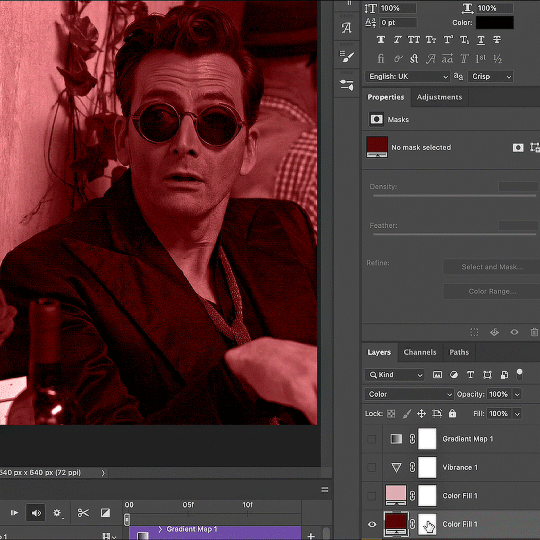
2. To change the yellows and reds, I create a new Hue/Saturation layer, select the yellows/reds, move Saturation to 100 (temporarily) and then play around with the sliders until the face colour isn’t affected. I then change it to whatever I’ve chosen and change the blending mode to Color.
3. If for whatever reason step 3 doesn’t work (the background is white or black for example, or just too red), I might create a Solid Color layer set to whatever colour I want, set the blending mode to Color and then select the layer mask and carefully paint with a soft, black brush over the people’s faces/bodies. I will then lower the Opacity, to whatever looks smooth enough. If there’s a lot of movement in your gif, you might have to use keyframes (see sabrinaacarpenters's tutorial linked above). However, my main goal is to avoid using those; that’s why I try my hardest to tweak around as many Hue/Saturation layers as needed and not have to create a solid color layer.
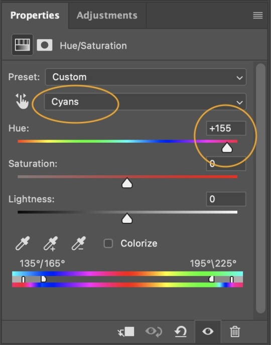
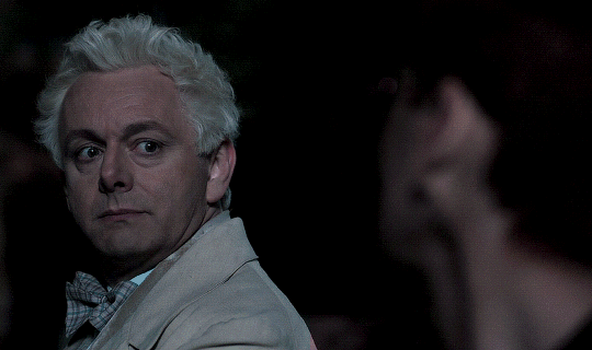
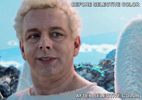
4. Once my background looks the colour I want it, I might add a Selective Color layer that matches my background color and then try to make it look more vibrant. For this Aziraphale gif below for example, I’ve selected the Cyans and then set Cyan to +100%, Yellow to -100% and Black to +60, then created another one, selected the Cyans again and then set Cyan to +20 and Black to +20.
5. If the gif has a white area, I create a Solid Color layer with a colour that matches the rest of the background and then set the Opacity low. I might also create a Selective Color layer, increase the Black and then play around with the colours.
IV. FINISHING TOUCHES
I create a Vibrance layer and set the Vibrance to around +30 and the Saturation to about +5.
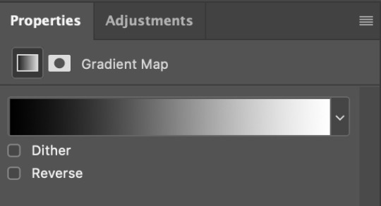
I create a black and white Gradient Map layer (with black on the left end of the spectrum and white on the right), set the blending to Luminosity and the Opacity to about 20-30%.
AAAND that’s about it I think! This ended up way too long and perhaps a little incoherent. I tried to make it as general as possible, so you might have to mix and match for best results. Feel free to ask me for further explanations about any one of these steps, and please tell me if you want me to go through the colouring of a specific gifset (although, as I said, I'm by no means an expert). Happy gifmaking!
#gif tutorial#allresources#completeresources#dailyresources#photoshop tutorial#minee#tutorial#tutorial*#chaoticresources#uservivaldi#userdanahscott#usersanshou#userfanni#userbuckleys#userrobin#tuserjen#userdavid#userzaynab#tusermimi#thingschanged#tuserju#usertj#userhallie
357 notes
·
View notes
Text
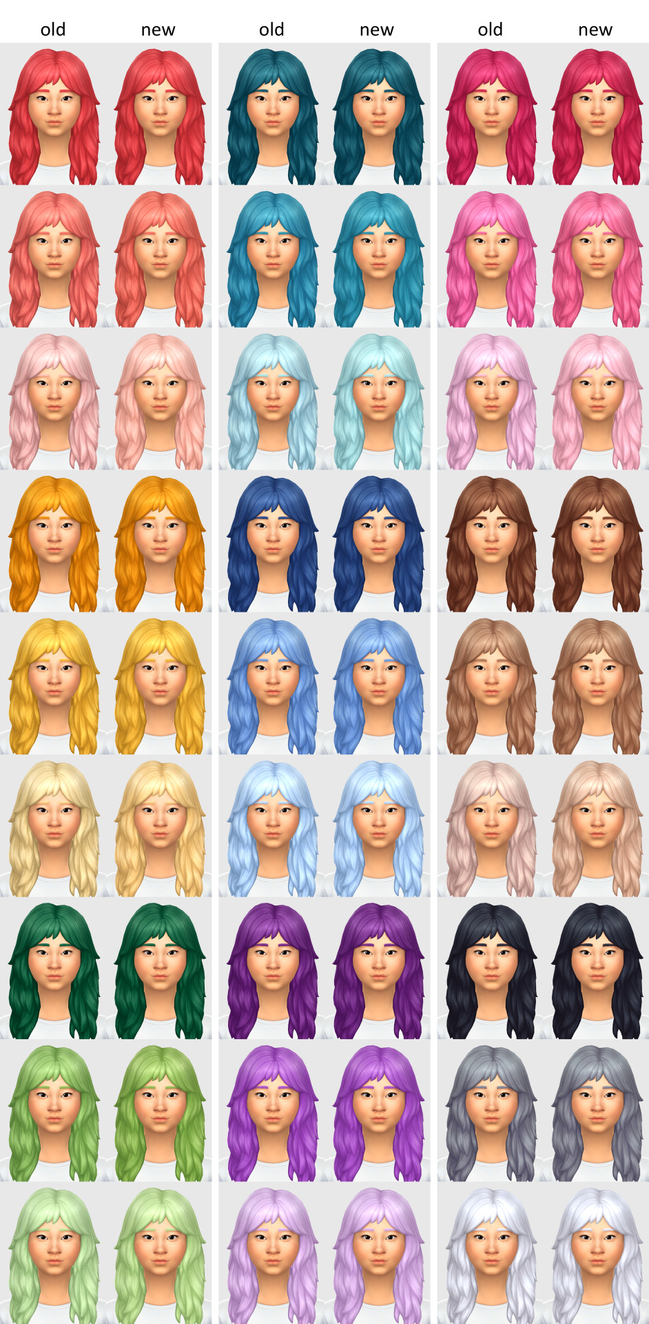
I had a message from a patron asking what changed with my updated recolours because they couldn't personally see any difference. Which, honestly? Fair. Most of the changes I made were VERY subtle and unless you know what you're looking, or put the old and new side by side, you really wouldn't be able to tell.
So here's a comparison between old and new for all the colours. To view it much larger on PC (because it's VERY hard to see the difference when the pic is small), right click and select 'Open image in new tab'.
And just in case you still can't see any difference (again, totally understandable) I'll explain a little...
Red - They were a little too pink-leaning for my liking so I made them more orange
Yellow - I turned up the saturation on them just slightly
Green - I didn't like how cool-toned they were so I added a little more yellow to them
Turquoise - Made them slightly more green just to differentiate them a little more from the blues
Blue - Turned down the saturation just the tiniest bit and made them ever so slightly more purple-toned
Purple - Same as the greens, I didn't like how cool-toned they were so I warmed them up with a nudge more towards pink
Pink - I was originally only going to change the light pink because I didn't like how blueish it looked, but once I did that it made me realise the others were too cool as well so I shifted them all more towards red
Brown - Warmed them all up a touch.
Black, Grey + White - These are the only ones I didn't touch at all colour-wise. The only difference here is I'm now using gradients to recolour and gradients preserve the original shadows and highlights better than my previous method (imo).
And in the interest of full disclosure, I'm also using a different base for recolours. I used to use the 'white' hair colour for all my recolours, but I've recently switched to using 'neutral blonde' because I feel like the shadows and highlights on that colour aren't as stark as the white, and because it's also available for children, toddlers and infants.
Again, even with that info and the side by side comparisons, some people still might not be able to see the difference and that's perfectly understandable. I can see the differences but I stare at them pretty much all day while I'm working on recolours, and I'm the one who made the changes lol
Oh and before I forgot, because I keep getting this question a lot, I will mostly likely eventually upload the gradients for others to use BUT I don't know when. I'm still working on them to get them exactly how I want them and I don't want to release them until I'm happy with them. And yes, I'm aware it sounds slightly bonkers to be updating my recolours atm even though I'm not 100% happy with the colours but my brain works in wacky and mysterious ways and I've learned to not question it anymore lol
Sorry about the long post but there you go! 😊
65 notes
·
View notes
Text
GO Filming Tidbits - Lens Filters
DO NOT ASK NEIL ABOUT FAN THEORY
After reading through this lovely article, which Neil shared and specifically mentioned, has many secrets in it, I was definitely drawn to the descriptions of the different filters used to characterize people and locations in the show so I decided to do a little digging on them and their effects! I think it's so interesting to give characters their own filter, a lens for which we're seeing the world through their eyes! So let's take a look at the three filters mentioned in the article below:
Tiffen Bronze Glimmerglass - Bookshop Scenes The bronze tint provides additional warmth, and softens skin details and blemishes, it gives a slight reduction in contrast for a more ethereal image appearance.
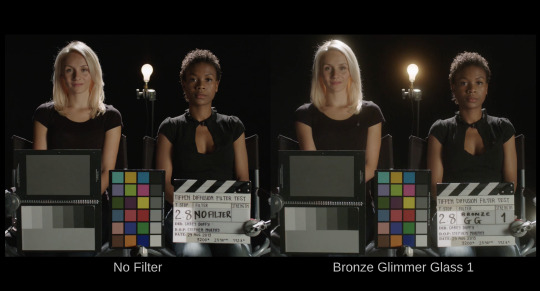
The bookshop scenes look warm, & hazy. You might think of the look as a bit of a sepia effect. There are soft halos around light fixtures and the filter provides a warm toned pop to yellow, gold, and orange colors. This filter is really helping give the bookshop its cozy, safe, and welcoming vibe.
------------------------------------------------------------------------------
Tiffen Black Pro-Mist - Hell This filter reduces highlights and lowers contrast, softens wrinkles and blemishes, and creates a soft quality of light.
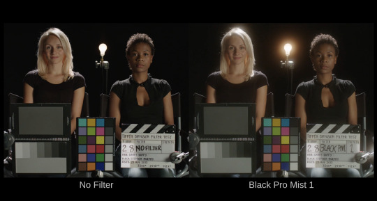

Very similar to the Bronze glimmerglass, the Black Pro-Mist filter provides scenes with a very intense 'hazy' effect, but we're missing that warm tone that you see in the bookshop. It makes hell seem cloudy, like maybe you haven't quite wiped the last bit of sleep from your eye, or the air is just so thick and gross that its visible. Fitting for hell. We also see the effect when demons attack the bookshop, and whickber street becomes a green hazy hellscape.
------------------------------------------------------------------------------
Tiffen Black Diffusion FX - "Crowley's Present Day Storyline" Diffuses strong light entering the lens and produces a glowing effect, the resulting image appears soft and ethereal, there is little loss of clarity or detail and the image does not lose saturation.
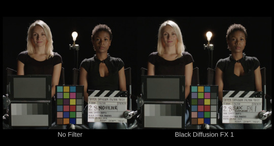
This filter was the most interesting one to me for sure. First of all "Crowley's Present Day Storyline"? Why not just Present Day Storyline, or Crowley & Aziraphale's Present Day Storyline, or Whickber Street's Storyline? I know we're already questioning timelines and narrators so that wording definitely made me raise my eyebrows. The effect keeps the shots very saturated, compared to the others we've been introduced to, and very clear, but there is still a magical ethereal quality to the picture. I think the effect is painfully obvious in Episode 1 scene of Shax and Crowley meeting on the park bench. No shortage of people have pointed out how saturated this scene is, and now I think I know what filter to thank by name.
------------------------------------------------------------------------------
#good omens#good omens meta#good omens 2#crowley x aziraphale#good omens theories#crowley#michael sheen#aziraphale#david tennant#good omens clues#good omens clue#good omens theory
177 notes
·
View notes
Text
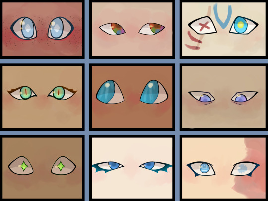
This is from like March so it isn’t my best work, but I wanted to show some of my efforts to change up the whole blue eye thing. Some of it (Sky, Wild, and Wars) still shows up in my new stuff :)
I’m gonna go a bit more in-depth so if you don’t want to read it might not want to open this
Sky I wanted to look really innocent, because that’s how people perceive him (don’t be fooled he’s an absolute gremlin). I also gave him glowing diamonds/rhombus pupils (you can see them in that other drawing I have of his eye. I like drawing eyes if you couldn’t tell). The red is for his loftwing. Also freckles are cute.
Four’s eyes are meant to be similarly shaped to Sky’s but more narrowed. They’re brown at the base, but have ‘rainbow’ reflections throughout them.
Ignoring Time’s markings, the big thing I want to be noticed is how angular his eyes are. I tried to reference the whole low-poly thing but idk how well it came across. Also made sure to keep his eye color super saturated to tie into how bright the colors are in oot.
Twilight’s eyes are a droopier version of Time’s eyes, with more lashes. Also they are a bit more green and have red/yellow on the inside and slit pupils. He had plain blue eyes before coming into contact with Twili magic, but changing your shape so many times has consequences. Also you can’t see it here but I like to think he has tapetum lucidium. I might rework his a little.
Wind’s eyes are big and round, like a toon Link’s should be. I tried to show light filtering through water, but idk how well it worked.
Legend is TIRED and has purpleish blue eyes because someone said it’s be cool once. Idk there wasn’t much thought for his.
Hyrule’s eyes are green, and change shape like a cartoon character. I think it’s be cool and also a fun show of passive magic. He doesn’t even realize he’s doing it.
Warriors has deep blue eyes and impeccable makeup. Classic pretty boy.
Wilds right eye has Shekiah runes in it, and his left is blurred out as a way of showing damage without just pushing it off or being too gory. Also he’s got the same eyeliner as in game because I like it.
Look i spend way too much time thinking about these boys
Don’t worry about it! :D
#digital art#shadow scribbles :)#linked universe#linkeduniverse#lu sky#lu four#lu time#lu twilight#lu wind#lu legend#lu hyrule#lu warriors#lu wild#lu chain#I’m not even trying to get all the tag variants#I can’t remember what rune that is but it might just be like ‘L’ or something#update: it’s 2#pretty sure I just thought it looked cool#maybe for like 2 lives or something#idk man
281 notes
·
View notes
Text
alright, here it is: ZENO'S COLOR GUIDE 3.0 !
here, i'll have three "chapters" regarding color:
CH1: how i color in illustrations
CH2: color and character design (in zeno's case)
CH3: how zeno makes his colors cooler
CH1: HOW I COLOR IN ILLUSTRATIONS
it must be noted that, as of lately, i heavily use halftones in my art and the way i use them for gradients effects my color choices. of course you don't need to use halftones if you don't want to, as it's just my personal choice, but anything regarding halftones here could (probably) also apply to regular gradients!
when choosing colors in an illustration, i usually have three things in mind: mood, character, and contrast. we'll be using "gloomy bunny naptime" as an example here.
MOOD: what's the vibe of the piece? for example, here in "gloomy bunny naptime", wanted a mellow, sleepy vibe, so purples and pinks seemed like the best choice. these colors also have a dreamy effect due to being common in real-life early mornings/summer nights - basically, i tend to use associative colors in illustrations.
i usually only use a pallete of 3-7 colors, though of course more characters calls for more colors. for multi-character pieces, i would actually make a "rainbow" of colors based on the mood of the piece - essentially, a bank of colors to use for your colorful casts based on the actual rainbow. you can alter this based on the saturation levels you want! hope that makes sense. i'm not the best at this though, so i would heavily recommend looking for guides from artists who are more skilled in that department.
CHARACTER: velvet is the focus of the piece, and as a character her palette is made up of many purples and pinks. of course, it's easier because she and ribbon both have similar designs, but i would still recommend using colors based on/complementary to the focus character's pallete, though this is a rule that can and should be broken if needed. gradients can be used to provide a smooth transition from color-to-color and add depth to the piece, as well as showcase velvet's pallete. when making any gradient, you probably want to have a vibrant middle color. this is difficult to achieve in most art programs, so i'd do it like this:
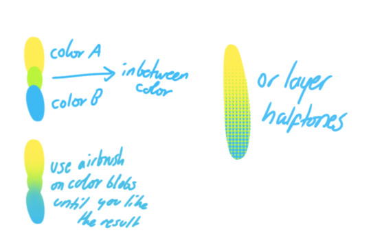
you can use gradients in lots of cool ways to make stuff pop! (i think this collage shows i use too much purple and pink though.)

CONTRAST: the context of the piece also aids the color through contrast. (that's a lot of Cs!)- we see that velvet is just waking up, and the light from her switch is glowing brightly. i wanted to convey something like her switch suddenly turning on in the middle of the night, waking her up - so the console emits "light" in the form of illuminating the contrasting color of pink against the purples. it might seem specific to this piece, but what i'm trying to say is that contrasting colors can lead the eye to the focal point of the piece, that being velvet herself. because a great deal of the rest of the piece is dark, we look at the contrasting switch screen - the brightest thing in frame - and our eyes move around and up to take in the focal point character. at least that's how i wanted it to be ;w; i guess you could convey it as something like this?
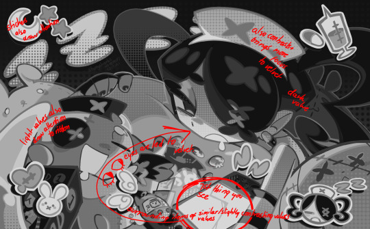
CH2: COLOR AND CHARACTER DESIGN (IN ZENO'S CASE)
this is where i start to get annoying, so stand back! when deciding on colors for a cast of characters, there are many factors: time period, variety, personality, and more that i can't think of.
TIME PERIOD: this one is simple. for example, a futuristic time period (such as that in x-calibur) calls for colder colors, such as greens and blues. for characters involved in futuristic professions such as space exploration, this works incredibly well. for modern time periods, less focus can be on colors and more on the shapes of the clothes, but this is not a shapes tutorial! i don't have any ancient times oc stories, but i'd probably use earthy and warm tones.
VARIETY: this is also rather simple. i try to be aware of the palletes that i used, and the similarities they might have with other characters. i try to use similar colors for characters who belong to certain organisations or have a uniform, but of course, it's not like catholic school students adhere their entire look to their uniform, so this is a rule that can be broken yet again. art is all about learning things and breaking them, remember that!!!
color can also be used for symbolism. my absolute fav example for this is vivica and octavia - the amount of red in their designs is supposed to represent the amount of freedom/passion/anger/confidence they have or are allowed to express under their different circumstances. as vivica belongs to a strict organisation, she has far less red in her design, showing her emotions are stifled - meanwhile octavia has it as her main complementary color because of her freedom to express her emotions, though those emotions may be destructive because of her circumstances.
PERSONALITY: what colors are associated with your character's personality? i actually usually refer to magical girl groups to see what's commonly associated with different colors. here's the main trend:
red: hot-headed, passionate, firey
orange/yellow: bright, happy-go-lucky, sunshine personality
green: wise, mellow, kind
blue: serene, graceful, elegant
purple: magical, regal, fancy
pink: usually the main character (though this because magical girl anime tends to be marketed towards young girls), sweet, relatable, determined
of course these are only stereotypes from one genre of anime, and different colors have tons of different meanings. color theory is the best way to learn this! these colors can also express different moods, which ties into ch1. i myself constantly ignore these rules - v-con, a bombastic hyper DJ, is purple (though he does have yellow accents) for example. basically, i just take them as a general rule and try to have them in mind while drawing.
CH3: HOW ZENO MAKES HIS COLORS COOLER
this might be the most important part of this guide. once again, there are a few things to consider here: filters, hue, overlays, and more!
FILTERS: for ibispaint, you can use an adjustment layer on your whole piece to use a filter. i usually only use brightness/contrast here - upping the brightness (or darkening it based on the mood of the piece) and upping the contrast. this helps to better express values and intensify the colors if that's what you want. i often use it in all my pieces to some extent.
hue/saturation/lightness is also helpful in moderation. you can alter the hue - though it usually only helps if you bring it back or forward by just a few points, or the entire pallete will change. saturation is what it sounds like, and slightly over/desaturating the piece can help with atmosphere. lightness is what it sounds like - lightens the colors in the piece. i don't use it at all.
posterize and sharpen mask are some that i've used recently. posterize can add some crazy effects to your art, but i'd probably need to edit it slightly after using it because it can mess with certain colors.
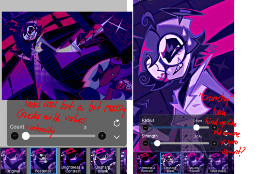
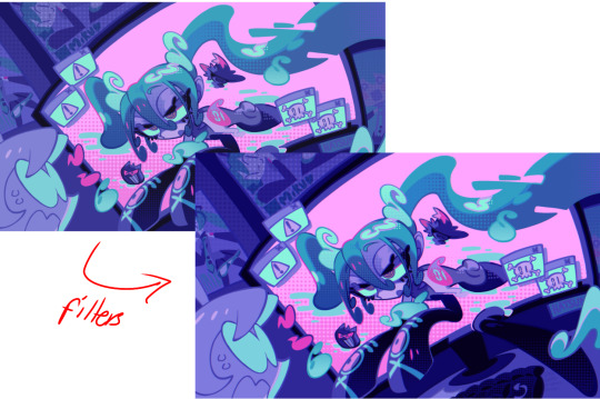
HUE: it's a layer type that can change the overall hue of the piece. i usually use it at a low percentage for atmosphere. kind of like a gradient map but nothing like it? idk
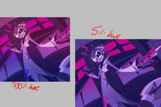
and OVERLAYS: i just use a very saturated blue/purple color over the entire piece at a very low percentage, around 5-10%. it can wash out the piece at too high a percentage.
and that's basically it! sorry it kind of derailed at the end i spent like 2 hours on this and got super tired. goodnight i'm going to sleep please also look at other artists etc etc. bye.
#zeno's art#long post#color tutorial#liar by korn is actually a really catchy song yea the lyrics are weird but its so good tbh#peak drums and bass and guitar and vocals and then the lyrics are hot booty. this is what nu metal's all about people#ask questions if you want#about nu metal or art i dont care
364 notes
·
View notes