#and changed the entire color palette
Explore tagged Tumblr posts
Text
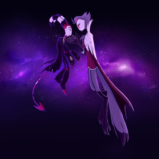

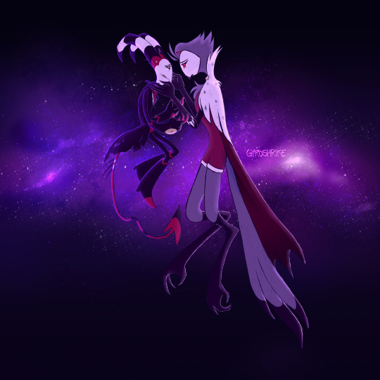
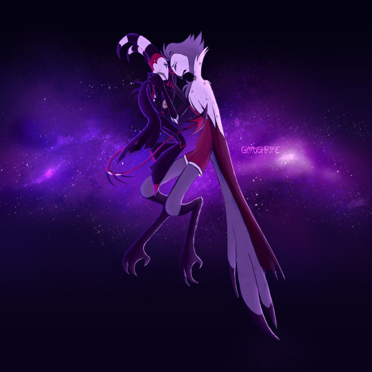
If I didn't get this posted in time for Valentine's Day I was going to lose it. So, Happy Valentine's day! Here's some pain!
[Video version]
#helluva boss#stolitz#blitz#blitzo#blitzø#stolas#stolas x blitz#stolas x blitzo#5 mins to go EY YO#my art#for anyone who expected valentine's art from me#you were probably expecting husk and angel#jokes on you#haha STOLITZ#i have been working on this thing foreverrrrr#but right as I finished it yesterday#I thought to myself#okay but what if I painted a background#and changed the entire color palette#and fully colored it#and rendered the lighting :)#c0nji you're the only reason I finished this#ty ty ty
742 notes
·
View notes
Text
ALSO. Last post for today because I feel the nausea coming again . Now for sharing more ugly stuff

Trying to figure out colors/clothes for siffrin and loop in the mobian... Au? thing. Idk what to call it. I don't like the colors but everything else is kinda alright and I am a firm believer of never deleting the ugly stuff so!!!!!! Here we are. Do judge my colors! I need help.
Loop's looks... Alright- Maybe I should get on another color pallete but I can only go warm-cold with them. Not for how I feel but just to keep the entire star motif and me going that they're* either something like the sun or a dead star (I forgot how its called)
But siffrin is a lost cause in the color department. Maybe I should get onto more warmer colors for the clothes and keep the cold ones for his fur/skin? Idk! I'll let it simmer (is this a word? Feels like it is) in my brain a bit since I am 100% going back to bed after this kMDLKSM

Something something mobians usually don't wear clothes (up to what I know about sonic in general)- SPECIALLY on this amount but I still think Siffrin wouldn't feel as comfortable if they weren't more as covered. Also maybe- MAYBE! it will change but I like the idea of Siffrin being an albino. Well, albino fossa to be more specific, but albino nonetheless. There would be no way of knowing such a thing in ISAT but putting them in a more colorfull world gives me the chance to do that
Believe I've already shared the initial designs for King but I'd get his colors to be more cold so it fits how... Much of a sad figure he is in my brain. Maybe on a replay of the game I'd think better about the colors but I don't think I can read more- Anywayy..
Last thing!!! I've been thinking of Isabeau being a bear (Asian black bear, to be specific) but that feels both spot on and just... Lazy? I don't know. No other animal fits him well but! I want to make them all creatures that can come from the same place and consider the places they come from at the same time so I ammm giving myself a bit of a hard task here. Maybe. Not that much. We don't know exactly where Jouvente is- Bambouche (is this how it is written?) is said to be on the coast so Bonbon and Petronille is gonna be easier to pick an animal.......
#isat#in stars and time#pipposketchdump#isat fanart#isat siffrin#isat loop#idk. maybe its because im a perfeccionist#maybe its because i've been badly hungover the entire day#but looking back at these sketches I just feel the need to change siffrins clothes ever so slightly and change loops color palette a bit#also this is spoiler free#how rare of me to talk about siffrin and loop without throwing some spoilers in DHUASDHASU#edit to fix me using wrong pronoun on Loop#damned be me.
144 notes
·
View notes
Text
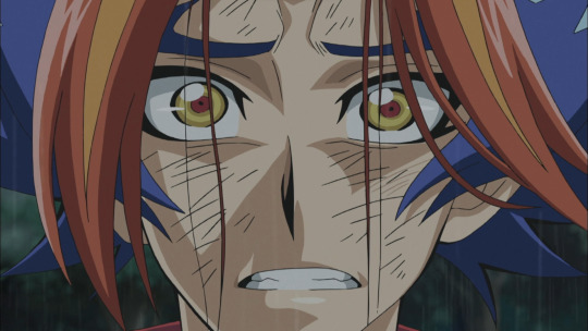
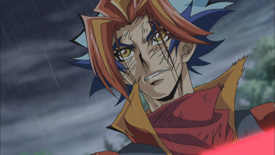
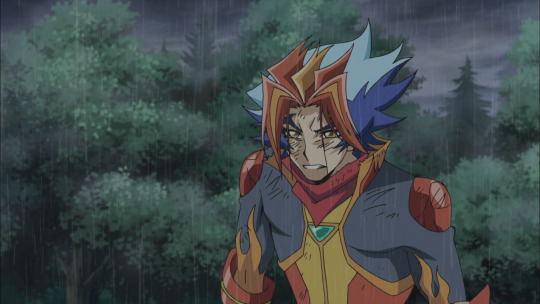
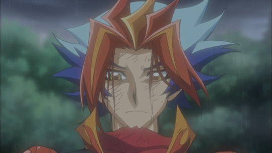
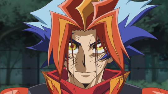
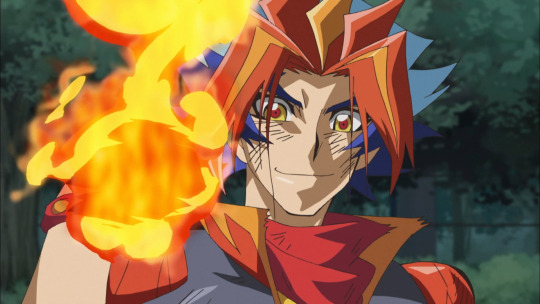
INSANE INSANE INSANE INSANE
#you ever have a mental health moment SO STRONG you change the entire color palette?#that LIGHTING#does anyone have a gif of his final draw in this episode I want it to live on my phone forever#also brilliant news for the Revolver enjoyers: this is the episode that made me really love Revolver#him and theo POPPED OFF this episode#I think I effectively watched this twice because off how much I rewound certain moments#spk watches vrains#yugioh#vrains#vrains spoilers#yugioh vrains#ygo vrains#theodore hamilton#soulburner
57 notes
·
View notes
Note
Keefitz att?????
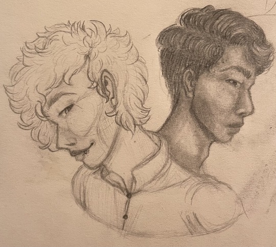
wip :3 (i have no clue how many times i'm gonna change their proportions and styles and outfits once we reach the final. if we reach the final at all)
#fitz is gonna change a LOT i know that. because of the way i have to render him for this au#vampire!keefe x ghost!fitz x paranormal investigator!sophie au i haven't spoken about until now my beloved#ask#an-ungraceful-swan#fuck it i'm gonna maintag#kotlc#kotlc fanart#keefe sencen#fitz vacker#keefitz#(as i mentioned in a previous post i do not recall the specifics of. this is just a lil teensy doodle for the paranormal sokeefitz au.)#(also i've been on the verge of spilling a fuckton of headcanons for them for days)#now that i have spilled that fitz is a ghost in this i might as well just say this is the pencil sketch i'm gonna convert to colors#and fitz is probably gonna be at least tinted teal if not have his entire color palette be shades of teal#i have decided it's the color of his ghost
12 notes
·
View notes
Text
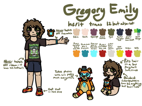
Everyone's favorite sad 12 year old finally got the new ref he deserved <3
#obligatory note that i entirely stole this man from fnaf. because i knew nothing about the canon gregory when i had to write this guy hes#pretty much his own guy aside from sb still having happened to him#his old ref was so busy oh my god there was so much text on it#like this one feels barren now without it#also fun fact i have not redrawn that shirt design since the first time i did it for his old ref. i just keep copy pasting it#(it is still copy pasted here. i will not be changing my ways anytime soon lmao)#this is mostly just a cleaner ref but i did simplify the palette too cause there were SO many colors on his old one. mostly just changed th#plush colors tho a few on the shoes n watch changed too#zoracontent#zora arts#clovers characters#gregory emily#wait that tag didnt pop up. did. did i not use his last name for his tag last time. lol. lmao even#scheduled this cause i finished it at 2:10am and nobody would have seen it then lol#i might rearrange this ref a bit later but itll do until i decide on that
9 notes
·
View notes
Note
📁📂 THERE SORRY
ITS OK!!!!!!!!!!
mara of "that mgai gang i never shut up about" fame had a black n yellow striped shirt for a while, based off one i used to own irl that i really liked! i outgrew it tho & in a perfect world id say i kept the shirt in memory, but it made her design too topheavy with yellow so i changed it. rip shirt
1 note
·
View note
Text

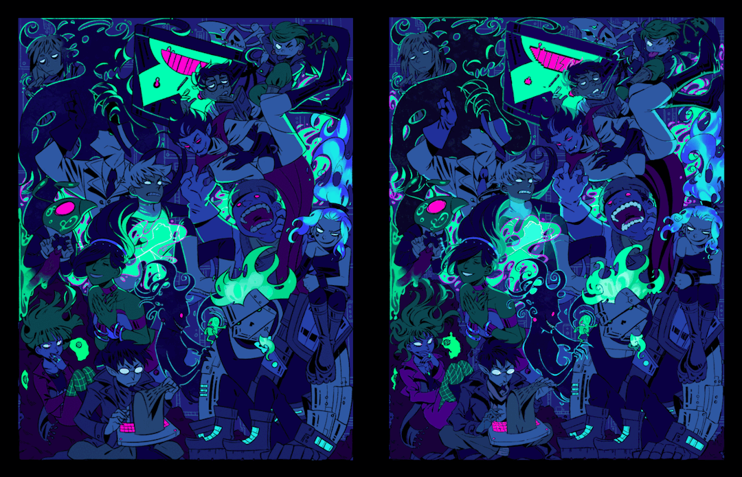
Changes for print (link):
The original file for this was like the size of a crumb so I ended up having to trace the entire thing 💀 I naturally didn't follow my old lines entirely though and tried to be more mindful of contrast and stuff as I went too. So it's like a pseudo redraw. Which barely took less time than actually redrawing it lol. I still like it!!!
The colors here are matched to the original, but the palette for print is shown in the listing!
#danny phantom#also#*redraws the ghostwriter's legs from reference to be properly crossed*#*realizes the angle makes it look like he's not really sitting on the floor*#me: ummmmm ya............. that's fine............................cause he's a ghost....................#this works for every other inconsistency here
2K notes
·
View notes
Text
𝜗℘ DRIVE YOU INSANE
❛ 𝘪 𝘬𝘯𝘰𝘸 𝘫𝘶𝘴𝘵 𝘩𝘰𝘸 𝘵𝘰 𝘥𝘳𝘪𝘷𝘦 𝘺𝘰𝘶 𝘪𝘯𝘴𝘢𝘯𝘦, 𝘣𝘢𝘣𝘺. 𝘪 𝘬𝘯𝘰𝘸 𝘫𝘶𝘴𝘵 𝘩𝘰𝘸 𝘵𝘰 𝘱𝘭𝘢𝘺 𝘺𝘰𝘶𝘳 𝘨𝘢𝘮𝘦𝘴, 𝘣𝘢𝘣𝘺. 𝘱𝘶𝘵 𝘮𝘺 𝘨𝘪𝘳𝘭 𝘰𝘯 𝘵𝘩𝘦 𝘣𝘢𝘤𝘬 𝘢𝘯𝘥 𝘪'𝘮 𝘳𝘪𝘥𝘪𝘯𝘨 𝘵𝘰𝘯𝘪𝘨𝘩𝘵 𝘣𝘶𝘵 𝘸𝘩𝘦𝘯 𝘪 𝘨𝘦𝘵 𝘮𝘺 𝘤𝘩𝘢𝘯𝘤𝘦— 𝘴𝘸𝘦𝘢𝘳 𝘪'𝘭𝘭 𝘧𝘶𝘤𝘬 𝘺𝘰𝘶 𝘳𝘪𝘨𝘩𝘵 𝘢𝘯𝘥 𝘪𝘧 𝘺𝘰𝘶 𝘥𝘳𝘪𝘯𝘬 𝘮𝘺 𝘱𝘢𝘪𝘯, 𝘺𝘰𝘶 𝘤𝘢𝘯 𝘴𝘸𝘢𝘭𝘭𝘰𝘸 𝘮𝘺 𝘱𝘳𝘪𝘥𝘦 𝘢𝘯𝘥 𝘪𝘧 𝘺𝘰𝘶 𝘤𝘶𝘳𝘴𝘦 𝘮𝘺 𝘯𝘢𝘮𝘦, 𝘣𝘢𝘣𝘺, 𝘧𝘶𝘤𝘬 𝘺𝘰𝘶𝘳 𝘭𝘪𝘧𝘦 𝘢𝘯𝘥 𝘪 𝘬𝘯𝘰𝘸 𝘺𝘰𝘶 𝘸𝘢𝘯𝘵 𝘪𝘵, 𝘣𝘢𝘣𝘺, 𝘺𝘰𝘶 𝘬𝘯𝘰𝘸 𝘪 𝘸𝘢𝘯𝘵 𝘺𝘰𝘶— 𝘥𝘰𝘯'𝘵 𝘶𝘯𝘥𝘦𝘳𝘦𝘴𝘵𝘪𝘮𝘢𝘵𝘦 𝘵𝘩𝘦 𝘵𝘩𝘪𝘯𝘨𝘴 𝘵𝘩𝘢𝘵 𝘪 𝘤𝘰𝘶𝘭𝘥 𝘥𝘰. ❜
timeline: 2025
synopsis: After weeks of mutual teasing and denial, Jeonghan and Luna’s secret plan to surprise each other with bold hairstyle changes ignites a night of explosive passion, proving they know exactly how to drive each other insane.
warnings: 18+ mdni, mature content, sexual content, smut, cursing, sexual tension, flirting, pet names, some domestic moment before the craziness, piv sex, unprotected sex (girly pop is on birth control), teasing, dirty talk, degradation, bratty!Luna, soft dom!Jeonghan, Jeonghan is mean af, implications of a threesome, edging, oral sex, cunnilingus, fingering, blowjob, hair pulling, dry humping, riding, choking, spit play, they are both freaky af, pure filth!
i know it’s been awhile since i wrote smut so please excuse me. i also apologize for taking so long to write another smut 😩 this was requested by majority of you guys when i opened these polls (poll 1) & (poll 2). i also want to remind everyone to please read the warnings and the disclaimers— i don’t need anyone commenting or messaging me acting like saints as if they were blind to the handful of disclaimers and warnings i have before explicit contents. other than that, enjoy!
Disclaimer: The following chapter contains explicit sexual content and mature themes. It is intended for adult readers only. If you are under the legal age or find these subjects uncomfortable, it is advised for you to refrain from reading further. Reader discretion is strongly advised.
╰ ౨ৎ LUNA-VERSE MASTERLIST ╰ ౨ৎ writings masterlist

Luna started it.
Well… technically, Jeonghan started it.
But if anyone were to ask how this entire thing spiraled, she’d probably say, “He started it,” only to follow it up with an eye roll and a mumbled, “Okay, fine. I started it.”
She never meant to provoke Jeonghan… but she did.
Oh, she absolutely did.
She knew she did.
She knew it the second the thought crossed her mind— knew it from the very moment she said the words out loud— and yet, she still did it.
She wasn’t slick. Not even a little. She wanted a reaction from her fiancé.
And that’s exactly what she got.
It all started with a normal schedule.
A typical day in the life of Luna.
She had been offered a new photoshoot, one of many in the past few months— but this time, it was for Cosmopolitan magazine. She accepted the offer like she always did, gracefully, with gratitude, thanking the magazine’s editorial team and promptly sitting down with her own styling and management teams to discuss the shoot.
They bounced around concepts, discussed moods and color palettes, and swapped reference photos for poses and lighting.
Nothing was out of the ordinary. It was just a shoot. Another one she’d file into her endless archive.
But then… the creative team dropped the concept: sexy and couture. High fashion, daring, sultry. They wanted something new. Something bold. Something from her they hadn’t seen before.
That’s when her hairstylist lit up, practically jumping with excitement.
“Let’s do a hair color change!” her head stylist said immediately, clapping her hands together like she’d been waiting for this very moment. “Something fiery… something fierce… What do you think, Jiyeon-ah?”
Luna hesitated.
Unlike most idols— or even her own members— Luna rarely bleached or dyed her hair.
Since debut, she had only gone for bold colors a handful of times. While the others jumped from platinum blond to pastel pink, from icy blue to silvery grey, Luna remained grounded in her earthy tones: dark brown, jet black, soft chocolate— sometimes she’d go blonde. Occasionally she would play with wigs— high-quality ones custom-made for her head size— but that was usually the extent of her transformation.
Wigs were easier. Faster. Less painful.
Her natural hair? That was sacred ground. Which was one of the main reasons why her hair wasn’t dead yet— it was healthy as ever and she’d like to keep it that way.
Because of this, Luna dyeing her hair had become a phenomenon.
An inside joke, even.
Colored Hair Luna was like a rare Pokémon— rarely seen, deeply desired.
Fans had begged and pleaded for her to go pink, white, blue, anything for years. Every time a comeback would drop, hashtags like #LunaHairChange trended in multiple countries, only for her to appear on screen with the same silky black strands.
It was hilarious, really.
So when her stylist began talking about colors and looked ready to pull out the wig catalog, Luna simply leaned back in her seat, lips curled in an unreadable smirk.
“I want to go red,” she blurted, calm and decisive.
Everyone paused.
Her stylist blinked. “You mean… like a wig? Yeah! You haven’t d–”
“No,” Luna said smoothly, voice confident and clear. “I want to dye my hair this time.”
Her team collectively straightened in their seats.
“I want it to be dark red— wine red,” Luna continued, eyes glittering with a plan. “Just like my hair during ‘Rock With You’. Exactly like that.”
Her head stylist looked stunned for a second before she nodded, already thinking logistics. “We can prep the swatches and check the damage level of your strands. If it gets too intense, we’ll stick with the wig route—”
“No need,” Luna interrupted, shaking her head firmly. “I want to dye it. Properly. No wig.”
Her stylist sat back, brows raising, and Luna just smirked to herself as her manager scribbled things into the schedule.
And that’s when it started.
Because Luna knew exactly what she was doing.
The red hair wasn’t for the concept.
The red hair wasn’t for Cosmopolitan.
It was for Jeonghan.
Because her fiancé had been testing her patience for weeks.
Ever since his enlistment began and he was assigned to social work duties, Jeonghan had fallen into a strict 9 to 5 schedule. By the time he got home, he was drained— physically and mentally— and Luna understood that.
Of course she did.
She never blamed him for being tired. She let him sleep in, made his meals on the weekdays when her schedule allows her and on weekends, didn’t pressure him when his body craved rest instead of affection.
But.
She was a woman. A woman in love. A woman with needs.
And lately, Jeonghan had been ignoring those needs.
With a damn smile, no less.
Whenever she tried to initiate anything even remotely steamy, he’d gently push her away, kiss her on the forehead, and whisper that stupid line—
“I’m tired, my moon.”
And then, always, always, the smirk.
He thought she didn’t notice it.
That tiny quirk of his mouth. That mischievous gleam in his eyes. The way he’d saunter off as if he didn’t just leave her hot and bothered and burning.
The worst part? He enjoyed it.
He was testing her. Teasing her. Playing his long, slow, evil game.
One time, she had leaned against him, fingers slipping under his shirt, nails brushing against his abdomen— and just when his breath hitched, he caught her hands, shook his head like a teacher scolding a child, and said, “Nope. Not tonight, baby.” Before smirking.
Another time, she kissed down his jawline, whispered all sorts of filthy little promises in his ear, and just when she thought she got to him, he cupped her cheeks gently between his palms, kissed the tip of her nose, and said, “Tired, Nana-ya.”
Smirking.
Every single time.
Well.
That was about to change.
Because if Jeonghan wanted to play with fire, Luna was going to set the whole house ablaze.
And finally after days of waiting— it was officially shoot day.
The first light of Saturday morning filtered softly through the curtains, casting a gentle glow over the room where Jeonghan and Luna lay entwined in slumber.
Their bodies were a tangle of limbs beneath the cozy duvet. Jeonghan’s head rested in the crook of Luna’s neck, his warm breath fanning over her skin with each rhythmic exhale. His arm draped possessively over her waist, anchoring her to him even in sleep.
Since Jeonghan’s enlistment, a subtle shift had occurred in their daily routine. Luna had taken it upon herself to rise earlier than him, ensuring he had a hearty breakfast before his demanding days. Even on weekends, when his schedule was mercifully clear, she found solace in maintaining this ritual— a small act that tethered her to a sense of normalcy amidst the changes.
As the morning light grew brighter, Luna’s eyes fluttered open. She remained still for a moment, savoring the warmth of Jeonghan’s body pressed against hers, the steady cadence of his heartbeat a comforting melody against her back. A soft smile graced her lips as she gently traced her fingers over the arm encircling her waist, committing the sensation to memory.
Carefully, she began to disentangle herself from his embrace. The movement was slow, deliberate, each shift calculated to avoid disturbing his slumber.
Yet, Jeonghan was a notoriously light sleeper. As soon as she attempted to slip away, his hold tightened instinctively, a low, groggy murmur escaping his lips.
“Baby…” he mumbled, his voice thick with sleep, the sound vibrating softly against her skin.
Turning to face him, Luna cupped his face tenderly, her thumbs brushing over his jawline. She leaned in, pressing a gentle kiss to his cheek, her lips lingering for a heartbeat longer than necessary.
“Shh,” she whispered soothingly. “Go back to sleep, Han. You need the rest.”
Jeonghan’s eyes remained closed, but a contented sigh escaped him as he nuzzled deeper into her touch.
Luna continued to stroke his hair, her fingers threading through the silky strands, occasionally pressing feather-light kisses to his forehead and cheeks.
Gradually, his breathing evened out, signaling his descent back into restful sleep.
Satisfied, Luna carefully extricated herself from his embrace, ensuring the duvet remained snug around him. She stood, pausing for a moment to watch the serene expression on his face before tiptoeing out of the bedroom.
In the bathroom, she went through her morning routine with practiced efficiency— washing her face, brushing her teeth, and tying her hair up into a loose bun. The cool water invigorated her senses, preparing her for the day ahead.
With one last glance at her reflection, she made her way downstairs to the kitchen.
The house was enveloped in a tranquil silence, broken only by the soft hum of the refrigerator and the occasional creak of the wooden floorboards beneath her feet.
Luna moved with quiet purpose, gathering ingredients to prepare a traditional Korean breakfast. She decided on miyeok guk— seaweed soup.
She soaked the dried seaweed in water, watching as it expanded and softened. In a pot, she sautéed thin slices of beef with minced garlic until the meat browned and released its savory aroma. Adding the rehydrated seaweed, she poured in water, allowing the mixture to simmer and meld into a flavorful broth. A dash of soy sauce and a pinch of salt completed the seasoning.
As the soup simmered, Luna prepared a pot of steamed rice, the grains cooking to fluffy perfection. She arranged an assortment of side dishes— including kimchi, seasoned spinach, and pickled radish, adding color and variety to the meal.
The kitchen filled with the comforting scents of home-cooked food, wrapping around her like a warm embrace.
About thirty minutes later, as she ladled the soup into bowls, Luna’s keen ears picked up the almost imperceptible sound of footsteps approaching from behind. Jeonghan was attempting to be stealthy, but she knew his movements all too well.
The faint padding of his feet ceased just as she felt his presence lingering near the doorway.
Without turning around, a playful smirk tugged at her lips. “Are you just going to stand there and watch me?” she inquired, her tone light and teasing.
A soft chuckle resonated from the doorway. “With hearing like yours, it’s no wonder I can’t surprise you,” Jeonghan quipped, his voice a melodic blend of amusement and affection.
Finally turning to face him, Luna found him leaning casually against the doorframe, hands tucked into the pockets of his sweatpants. His hair was tousled from sleep, and a lazy smile played on his lips.
“Dolphin,” he teased, referencing her acute hearing— a nickname he’d bestowed upon her, much to her chagrin.
Rolling her eyes with a chuckle, Luna shook her head. “You were just loud,” she retorted, returning her attention to the meal.
Jeonghan pushed off the doorframe, his bare feet making no sound as he crossed the kitchen to stand behind her. His arms encircled her waist, pulling her gently against his chest. The warmth of his body seeped through the thin fabric of her shirt, eliciting a contented sigh from her.
“You always take such good care of me,” he murmured, pressing a kiss to the top of her head.
Jeonghan’s hands were warm against the curve of her waist, fingers splayed over the thin cotton of her sleep shirt as he lazily traced idle patterns with his thumbs.
Luna continued to stir the soup, refusing to let his presence distract her too easily— even if the feel of him behind her, loose and clingy, already made her heart flutter.
“You’re so good to me,” he murmured again, this time lower, closer to her ear. “It’s almost unfair how well you know me.”
“You say that like I don’t have more than ten years of experience,” she mused, trying to keep her voice light, though his lips grazing her ear sent a shiver right down her spine.
“Mmm… more than ten years and counting.” He dipped his head lower, his nose brushing the side of her neck. “Still doesn’t explain how you can hear my footsteps from the hallway like some kind of sonar assassin.”
“Maybe I’m just that good,” she replied casually, using a ladle to stir the soup once more. “You forget I actually have superpowers while you… a failed ninja.”
Jeonghan chuckled, his breath teasing the fine hairs on her neck. “You mean a sexy ninja.”
Luna huffed out a laugh, shaking her head with a smile as she replied, “A clumsy one, at best.”
His arms tightened around her waist in mock offense, but his teasing never ceased. “You wound me,” he muttered dramatically before placing a slow, deliberate kiss just beneath her jawline.
She hummed under her breath, a warning and a dare in one. “Hannie…”
But Jeonghan pretended not to hear it— or, more accurately, he chose not to care.
His lips trailed along her skin with unhurried affection, brushing over her neck, down the slope of her shoulder. He eased her shirt collar aside just slightly with the tip of his nose, exposing more skin to his wandering mouth.
Soft, innocent kisses turned into gentle nips. A tender bite at the edge of her collarbone made her flinch slightly. His tongue followed, smoothing over the sting, and she exhaled slowly through her nose, gripping the wooden spoon in her hand a little tighter.
“Yoon Jeonghan…” she warned again, this time quieter, shakier, a low breath caught between amusement and restraint.
He just hummed in acknowledgment, still not listening. His mouth continued its lazy exploration, alternating between lips, teeth, and tongue. His movements were slow, teasing, nonchalant— like he had all the time in the world to taste her skin and none of the intention to stop.
“You’re distracting me,” Luna said, her voice a little strained now as she tried to focus on the soup and not the warm mouth driving her mad.
“That’s the point,” Jeonghan murmured against her clavicle. “You’re too good at multitasking anyway. I’m just evening the playing field.”
She rolled her eyes even though he couldn’t see it, biting down a smirk as she said, “You’re such a menace.”
“I try.”
“You’re lucky you’re cute.”
“I know,” he said smugly, nipping once more at the sensitive skin just above the curve of her shoulder, eliciting a soft gasp from her.
Luna doesn’t know if Jeonghan was just testing her patience once more so that he can pull away and piss her off or he finally gave up the chase… nonetheless… she wasn’t going to give him the satisfaction.
She pressed her lips together, determined not to let him get to her, not yet— not when her plan was already in motion.
Jeonghan didn’t know it, but today, he wouldn’t get to win the game he started.
Not until she came back home. Not until tonight. Not until after the shoot, when she’d walk through the front door with a brand new hair color that she knew would absolutely wreck him.
Not until she was the one to leave him speechless.
So she bit back her laugh, steadied her breath, and finally turned off the heat, the soup now perfectly done.
Without warning, she stepped out of his arms, smoothly gliding out of his grip and walking over to the table with quiet purpose.
She didn’t look back, but she knew he was watching her. Could feel the weight of his gaze crawling down her back.
“You gonna keep staring or are you going to help me set the table?” she asked casually, placing the dishes down, a hidden smirk tugging at the corner of her mouth.
Jeonghan blinked, once, twice, his mouth slightly ajar as he processed the sudden shift. “…Right. Breakfast,” he muttered, finally moving, still watching her like he was trying to solve a puzzle.
She didn’t rush him. Just hummed to herself, soft and nonchalant as she arranged everything with practiced ease.
Jeonghan returned a few seconds later with the chopsticks and spoons, setting them down in neat pairs. He slid into the chair across from her, still eyeing her with mild suspicion as she poured them both a cup of water.
“Something’s different about you today,” he said finally, narrowing his eyes at her.
Luna shrugged, picking up her spoon. “It’s the photoshoot. I’m excited.”
“You’ve had shoots before.”
“Not a Cosmopolitan cover shoot.”
“Fair,” he conceded, picking up his spoon. “So, what’s the schedule like?”
She smiled and stirred her soup gently. “Pretty straightforward. I have to be there by 10. Makeup, hair, wardrobe— the whole prep process will probably take two hours. The actual shoot is set for the afternoon, maybe three to four hours depending on how quickly we get the shots. I should be back by early evening if everything goes smoothly.”
Jeonghan chewed slowly, nodding thoughtfully. “So dinner time?”
“Maybe a little before,” she said, sipping on her soup. “But yeah, dinner’s safe.”
“Good. I’ll wait.”
She arched a brow at him. “You make it sound like I’m going off to war.”
“You kind of are,” he said, lips quirking. “Fashion war. Lights, cameras, fake smiles and all.”
“Oh, I’ll be smiling alright,” she said, voice breezy as she dipped her spoon again. “Just not fake.”
He gave her a suspicious look. “You’re hiding something.”
“Me?” she blinked innocently. “Never.”
“Jiyeon-ah…”
She giggled into her spoon. “What about you? What are your grand plans today?”
Jeonghan shrugged, leaning back in his chair as he picked at his rice. “Nothing crazy. I’m yours for the day. No schedules, no plans. Just gonna chill. Might read, nap, annoy you with texts until you come home.”
“You sound like a golden retriever.”
“Better than a dolphin,” he shot back with a wink.
She snorted. “Okay, that one’s fair.”
There was a lull in the conversation as they both ate for a moment, the quiet comfortable. But Jeonghan’s eyes kept drifting back to her, narrowing slightly, like he was trying to read between the lines of her calm exterior.
Like he could sense something was coming— but not quite place it.
And Luna? She just kept eating her soup, smiling to herself with every spoonful.
Because tonight, she knew exactly what she was coming home with.
And Jeonghan?
He had no idea.
The clinking of silverware and quiet chatter faded into the background as breakfast came to a close. Jeonghan had washed the dishes without being asked— though with dramatic flair and playful complaints— while Luna disappeared into the bedroom to get ready.
The minutes ticked on, and Jeonghan stayed nearby, pacing around the living room with his phone in hand, every few seconds glancing toward the hallway where she was.
When Luna finally stepped out, dressed comfortably in wide-leg jeans and a white button-down tucked at the waist, her hair pulled into a low bun for the salon prep, Jeonghan immediately zeroed in on her. His lips formed an exaggerated pout as he crossed the room with slow, deliberate steps.
“Do you really have to go?” he drawled, wrapping both arms around her the second she was within reach.
“Yes,” Luna said with a sigh, draping her arms around his shoulders. “You’ve asked me that three times already.”
“I thought maybe the answer would change,” he murmured, burying his face in the side of her neck, his breath warm against her skin. “Just stay. Call in sick. We’ll lie in bed all day and watch bad dramas.”
“You hate bad dramas.”
“I’d suffer through them for you.”
She chuckled softly, trying not to melt into him. “It’s Cosmopolitan, Jeonghan. I’m not missing this shoot.”
He groaned dramatically and pulled her even closer, his hands splayed across her lower back. “You’re so cruel to me. Leaving me all alone in this cold, heartless house.”
“It’s literally twenty-two degrees inside.”
“My heart’s colder without you, Nana-ya,” he mumbled into her shoulder.
“Yoon Jeonghan,” she said with a firm laugh, “if I don’t leave in the next five minutes, I will be late, and I’ll blame it entirely on you.”
He leaned back just enough to look at her, brows drawn like a child being scolded. “You wouldn’t.”
“Oh, I would.” Her voice softened, her hand coming up to cup his cheek. “You can wait a few hours, right?”
Jeonghan tilted his head into her touch, eyes fluttering shut for a moment. “Fine. But I’m not happy about it.”
“I know,” she whispered, leaning in to press a kiss to his lips.
He kissed her back slowly, savoring it, like it might need to last him all day. His hands refused to let her go, tightening around her waist until she gently tapped his shoulder in warning.
“Han…” she muttered against his lips, a mix of amused and stern. “I’m serious.”
“Just one more,” he murmured, stealing another kiss, then another— until she laughed into it and pushed at his chest.
“Okay, okay, I’m going!”
“Cruel woman,” he muttered again with a reluctant sigh, finally letting her go as she backed away toward the door.
Luna paused at the entrance, slipping on her shoes and turning to blow him a quick kiss. “Text you when I get there!”
“You better,” he called after her. “And don’t forget— I want updates! Pictures! Selfies! Live commentary!”
“I love you!” she replied with a laugh, ignoring the last part completely.
“I love you too… but– Jiyeonie!”
But she was already out the door.
Thankfully Luna arrived on set right on time, just as the stylists were setting up and the production crew began final lighting checks. The studio smelled like hot lights and hairspray— familiar, sterile, and oddly comforting. Stylists welcomed her with warm greetings and she was ushered to the styling station in the back corner where the magic would begin.
But today wasn’t like other shoots. Today, she wasn’t just getting her makeup done or hair curled.
Today, she was changing everything.
“Ready?” the hairstylist asked as Luna sat down in the black leather chair.
She caught her own reflection in the mirror— bare-faced, calm, but undeniably excited. “Let’s do it.”
The stylist pulled on gloves and began mixing the bleach, the sharp chemical scent hitting Luna’s nose almost instantly. She blinked, the smell both foreign and achingly nostalgic.
It had been years since she’d bleached her hair. Back then, it was just business. This time, it was personal.
As the bleach was applied, it burned. Not unbearably— but enough to make her scalp tingle and her eyes water just slightly.
She didn’t flinch.
She didn’t complain.
Luna’s pettiness was stronger than the sting.
Jeonghan deserved this surprise.
She imagined his face when he saw her later. How his breath would hitch. How he’d probably go quiet. Or maybe say something infuriatingly flirty just to hide how hard he was staring.
That image alone kept her rooted in the chair, even as the bleach sat and processed, lightening her strands to a pale gold.
After rinsing and drying, the red dye was mixed— rich, deep, and dark like a full glass of wine under candlelight.
As they applied the color, she couldn’t stop the giddy flutter in her chest. This wasn’t just for the shoot. This was her own kind of rebellion. Her statement. Her secret gift to the man waiting at home.
By the time it was rinsed and styled, she was a completely different Luna in the mirror.
Blood-red hair tumbled past her shoulders in soft, styled waves, the color catching the studio lights like fire in motion.
She grinned. Perfect.
She was moved to makeup next, where the team worked quickly to match her new hair with bold choices— warm-toned eyeshadow, thick lashes, and a glossy red-brown lip.
Every minute brought her closer to showtime, but as she sat idle in the chair, she took out her phone and messaged the one person who mattered most.
luna: Almost done with hair and makeup.
Jeonghan’s reply was immediate.
angel boy: Show me.
She grinned.
luna: It’s a surprise, my love
angel boy: Just one photo. Please?
luna: Nope. You’ll see tonight.
angel boy: You’re killing me, Jiyeonie
luna: You’ll live.
angel boy: I’m literally dying. My soul is leaving my body.
Luna giggled, biting her lip as the stylist applied highlighter to her cheekbones.
luna: Be patient, pretty boy.
angel boy: You’re evil. Gorgeous and evil.
luna: You love me.
angel boy: …
angel boy: Damn right I do.
She locked her phone with a smug little smile just as the stylist finished her last touch-up.
Then, it was time.
The set was vast and dynamic, decked out in sleek props and dramatic lighting. There were racks of designer clothes on one side— Miu Miu, Saint Laurent, and Valentino— all selected specifically for this cover shoot.
Luna slipped into each look one by one, letting the stylists fasten, zip, and adjust every detail.
A black silk gown with a low neckline. A red structured suit with exaggerated shoulders. A white dress draped in crystals.
Her new hair framed her face like art, cascading down her back or thrown over one shoulder with every outfit change. The photographer guided her into poses, but Luna didn’t need much instruction— her body moved on instinct, like she’d been born for this. Every turn of her head, every glance over her shoulder, every soft parting of her lips was deliberate.
The camera loved her.
And she knew her fiancé would too.
As the flashbulbs burst and the stylists cooed in approval, Luna only thought of one thing— Wait till he sees this.
By the time the final photo was taken and the camera shutter gave its last snap, Luna was buzzing.
The Cosmopolitan team applauded her with genuine admiration, and more than one stylist gushed about how the red hair had transformed the shoot.
“You really brought it to life,” the photographer had said, shaking her hand with a wide grin. “This is going to be one hell of a cover.”
To top it all off, the fashion director— impressed by her professionalism and poise— offered her a surprise token of appreciation: “You get to pick one look from today’s shoot to keep. Anything you want.”
Without a second thought, she chose the little black dress. Elegant yet minimalistic, with a backless curve that dipped just low enough to tease without screaming for attention.
Luna thought of Jeonghan immediately when she saw herself in it.
Everything was going her way.
Her hair still curled in soft waves down her back, makeup perfectly intact even after hours under the lights. With her little black dress on, her heels clicking on the studio floor, Luna exited the building with the kind of satisfaction that came from knowing the day was hers.
The drive home was quiet— just her and the soft hum of the car, fingers occasionally brushing through the blood-red strands that now framed her face. Her lips curled every time she caught a glimpse of her reflection in the rearview mirror.
She imagined Jeonghan’s face the second he laid eyes on her.
God, he’s going to lose it.
When she finally pulled up to their house, the sun had dipped low behind the horizon. The sky was painted in strokes of lavender and dusk-blue, casting the house in a golden glow. She eased the car into the garage, careful with the dress bag slung over the passenger seat, and shut the engine off.
Her heels clicked against the garage floor, muffled when she stepped into the house. The front door closed behind her with a soft thud, and immediately, she noticed how still everything was. No sound of the TV, no clattering in the kitchen.
“Hannie?” she called out. “I’m home!”
Silence for a beat.
Then—
“In here!” his voice called out faintly, muffled by distance. “Bedroom!”
Luna giggled to herself, already picturing him sprawled out like a cat, refusing to move even though he’d probably been waiting all day for her. She dropped her handbag on the couch and kicked off her heels near the entryway with a sigh of relief. Fingers ruffling through her curls to fluff them up, she dashed up the stairs, skipping two steps at a time like a schoolgirl with a secret.
At the top, she slowed her pace, heart beating faster— not from the stairs, but anticipation. She reached their bedroom and leaned against the doorway, one shoulder pressed into the frame.
There he was.
Jeonghan was sprawled out on their bed in a loose white shirt and grey sweatpants, ankles crossed and phone held lazily in both hands above his chest. His head rested on a pillow, his hair slightly tousled as if he’d just woken up from a nap.
“Seriously,” he was saying mid-sentence, without looking up. “I’m hurt you didn’t send me pictures, Nana-ya. You’ve been suspiciously secretive all day, and I’m starting to think—”
He stopped.
His eyes flicked toward the movement in his peripheral.
And when he saw the color red.
Jeonghan’s head snapped to the side so fast, Luna swore it nearly detached from his neck.
Their eyes met.
Luna smirked. One eyebrow raised, lips curled into a smile far too smug to be innocent.
Jeonghan sat up instantly, phone dropping to the mattress as his eyes trailed over her slowly, deliberately, from head to toe.
He blinked once.
Twice.
Then—
“Holy fucking shit, Bae Jiyeon.”
Luna giggled.
“What the— fuck, Jiyeon-ah— holy mother of fuck,” Jeonghan whispered like he was talking to himself, his mouth hanging open as he took her in. “You— what— fuck, you’re gonna kill me. What is wrong with you?”
She stood there wearing the little black dress. It hugged her like it was sewn onto her body, dipping low in the back and hugging the curves of her hips like second skin. Her red hair spilled over her shoulders like wine, glowing under the bedroom light. She had one hand resting on her hip, the other pushing her hair off to one side with a soft flip that made his jaw clench.
“Is this why you wouldn’t send me a photo?” he said, still stunned, running a hand down his face. “God, you’re unreal.”
“Mm,” she hummed, pushing off the doorframe and stepping further into the room with slow, deliberate steps. “You were being impatient.”
“You teased me all day, and then you show up looking like that?” Jeonghan pointed at her like she’d personally offended him. “That’s illegal. That should be illegal… God– you should be illegal.”
Luna laughed, moving closer to the edge of the bed. “You like it?”
“Like it?” he scoffed. “You look like a Bond girl who just killed the villain, stole the diamonds, and is walking out of the fire without a scratch.”
“Sounds about right.”
“Damn.” He sat up straighter, elbows resting on his knees now as he leaned forward to get a better look. “I mean— I can’t even look at you directly right now. That shade of red? That dress? That smug little look on your face? I’m actually losing my mind.”
She swayed her hips a little, standing just out of reach. “Good.”
Jeonghan groaned like he was in pain. “You’re actually evil.”
Luna tilted her head. “And yet you love me.”
“Painfully.”
They locked eyes for a long moment.
Then—
“That better not be a wig, baby,” Jeonghan said suddenly, voice low and serious. “I swear, if you ripped that off your head right now, I’d actually cry.”
Luna burst out laughing, one hand on her stomach. “It’s not a wig!”
“Swear it.”
“I swear.”
“Let me pull on it.”
Yoon Jeonghan was dead serious.
“You can, if you want,” she said, inching even closer until she stood right between his knees. “Go ahead. Confirm it yourself.”
He looked up at her, still in disbelief. “You did this for me?”
“I did this for me,” she said, voice softening. “But also… yeah. I knew you’d lose it— that was the plan.”
“Oh, I’ve lost it,” Jeonghan muttered, reaching up to toy with the ends of her hair, eyes never leaving hers. “I’m never going to be normal again.”
Their chemistry sparked like a lit fuse, electric and heavy in the air. She stood there with a proud little smirk while he looked up at her like she’d personally rewritten his definition of beauty.
“You look insane, Nana-ya.”
She raised a brow, smug. “Drive-you-insane insane?”
“Drive-me-to-church-and-pray-for-forgiveness insane.”
She laughed, leaning down a little, their faces inches apart. “You sure you can handle this?”
Jeonghan grinned slowly, hands slipping up the sides of her thighs. “I’m the only one that can handle you, angel face.”
Their breaths mingled in the space between them, the tension simmering, unspoken, but felt in the air— thick and magnetic.
Neither moved. Neither needed to. Not yet.
Because this wasn’t just a reveal.
It was the beginning of something far more dangerous.
The kind of danger that made your heart race and your breath hitch.
The kind that made you feel alive.
Jeonghan's hands slid up her thighs, fingers tracing the edge of her dress, inching closer to the apex. Luna felt her body respond, a shiver running down her spine as her nipples hardened under the thin fabric. She knew he could see the effect he had on her, the way her breath hitched and her eyes fluttered shut.
"Fuck, baby," he murmured, his voice low and husky. "You're so goddamn beautiful."
She opened her eyes, meeting his gaze.
"You're not going to touch me?" she teased, her voice barely above a whisper.
Jeonghan's eyes darkened, a wicked glint in them. "Oh, I'm going to touch you, my love. I'm just enjoying the view first."
His hands moved higher, his thumbs brushing against the sensitive skin of her inner thighs. She gasped, her body arching slightly as a wave of pleasure washed over her. He smiled, a slow, predatory smile that sent a shiver down her spine.
Jeonghan’s fingers glided up the sleek curve of Luna’s spine with maddening slowness, like he had all the time in the world to savor this— because he did.
Luna was finally home, finally in front of him, in that dress with that hair, and Jeonghan didn’t care if the world outside came to a halt; he wasn’t letting this moment rush past him.
The pads of his fingers ghosted over the nape of her neck before slipping into her freshly dyed, wine-red hair— so rich, so vibrant it glinted like blood in the low bedroom light.
His touch was reverent at first, delicate even, but then his fingers tightened into a gentle fist, gripping the strands and tugging with just enough force to test it.
Her scalp tingled, and a teasing smirk painted her lips when her hair held firm.
“Told you,” she murmured smugly, eyes glinting with mischief.
Jeonghan groaned, deep from his throat, and his head fell back dramatically. “Fuck,” he cursed like he was being punished, like her existence in that moment was a sin he gladly wanted to be ruined by.
And before Luna could shoot back a reply, Jeonghan’s hand slid to her jaw, guiding her face to his with a kind of desperation that stole the breath from her lungs.
Their mouths crashed together, lips molding perfectly like two puzzle pieces that had always belonged. It wasn’t a soft kiss. It was urgent, consuming, a week’s worth of tension and teasing combusting all at once.
Luna’s hands flew up to clutch his shoulders, nails digging lightly into the muscle there as he pulled her with him, sliding her up the bed without ever breaking the kiss. She gasped into his mouth when her knees straddled his lap, and Jeonghan took full advantage, slipping his tongue between her lips to taste the lingering sweetness of her lip gloss and something distinctly her— a flavor he was sure he’d never get tired of.
“Fuck—” he whispered against her mouth, one hand gripping her waist tightly while the other remained tangled in her hair. “You have no idea what you’re doing to me right now.”
Luna let out a shaky breath, her forehead pressed against his as she smiled through half-lidded eyes. “Pretty sure I do,” she whispered, nipping at his bottom lip playfully.
He growled at that, deep and low, his hips shifting beneath her slightly. “This what you wanted, huh?” he muttered, lips brushing the corner of her mouth. “Dye your hair red, put on that dress, come home smelling like a damn fantasy—”
“All for you,” she murmured, trailing her fingers up the nape of his neck, curling them into his hair. “Only for you, Jeongie.”
Jeonghan kissed her again— hotter, deeper, like he was trying to memorize every angle of her mouth.
Their lips moved in perfect rhythm, soft gasps and slick sounds echoing off the walls of their shared bedroom. His teeth grazed her lip, his tongue swept against hers, and she moaned softly into his mouth, gripping his shoulders tighter.
“You’re unreal,” he muttered in between kisses, letting his lips fall to her jaw, then to the column of her throat where he left open-mouthed kisses, each one trailing hotter than the last.
“And you’re still overdressed,” Luna teased breathlessly, arching into his touch as his hands slid along the curve of her hips.
Jeonghan chuckled darkly, teeth grazing her skin. “Don’t tempt me,” he warned, voice rough, gravelly, intoxicating. “You already came home looking like a dream and now you’re sitting on my lap talking like that—”
“Talking like what?” she said innocently, tilting his face back up to hers with a finger under his chin.
“Like you don’t know I’ve been going crazy waiting for you all damn day,” he whispered against her lips. “Like you don’t know I’ve been thinking about this since the second you left.”
Luna smiled softly, her expression warming with affection even as her tone stayed playful. “Then I guess you better make up for lost time.”
Jeonghan stared at her for a beat— completely, utterly in awe.
And then he kissed her again.
The kind of kiss that promised trouble. The kind that tasted like devotion, mischief, lust, and love wrapped in one.
Their laughter and whispers tangled in the air as their kiss deepened, as hands explored familiar territory with the kind of reverence that only came from years of knowing each other inside out.
Luna wanted this.
No— she planned for this.
Every second of it, every angle, every strand of her newly dyed hair, every carefully calculated move that led up to her straddling her fiancé in the dim lighting of their shared bedroom— it was deliberate.
She knew exactly what she was doing the second she texted him teasingly from the makeup chair, dodging every single one of his pouty pleas for a photo. She knew it when she slid into that sleek little black dress before leaving the shoot, already hearing his reaction in her head.
And she definitely knew what she was doing the moment she pulled her hair tie off in the garage, letting her freshly curled red hair tumble dramatically over her shoulders like she was the star of her own movie.
This wasn’t just a surprise.
It was payback.
Because Jeonghan had been teasing her mercilessly for weeks.
Touching, flirting, trailing his fingers along her waist when she walked past, whispering filth into her ear at the most inappropriate times, leaning close during dinner just to watch her blush— and yet never letting anything happen.
He’d deny her every time with a smirk and a kiss on the cheek like he wasn’t the one pressing her buttons until she was one second away from combusting.
Yoon Jeonghan knew exactly how to work her up and just as easily how to pull away, like it was all some kind of game.
So she pulled out the big guns.
The last time she dyed her hair wine red, nearly three years ago, it had been for a comeback.
The internet lost its mind— headlines raved about the transformation, fans made edits by the millions, and stylists praised her for the boldness.
But none of them lost their mind the way Jeonghan did.
She remembered it vividly. He saw her walk into the rehearsal room with that freshly dyed hair and went absolutely feral.
He couldn’t stop staring. Couldn’t stop touching. He’d corner her backstage, trail his fingers through her waves, bury his nose in the scent of her shampoo, press lingering kisses to her neck that made it nearly impossible to focus on choreography.
And when they were alone?
Jeonghan was insatiable.
He loved the way her red hair looked wrapped around his fist, the way her moans echoed in the room, and the way her body responded to his every touch. He was insatiable, driven by a primal need to claim her, to mark her, to make her his. He wanted everyone to know that she was his, that she belonged to him.
That hair didn’t even last three weeks.
Luna had to dye it back to black because he couldn’t keep his hands to himself. He was like a man possessed, and she’d decided, at the time, that her sanity— and their schedules— couldn’t survive that level of chaos again.
But now?
She wanted that chaos.
She wanted him drunk on her.
Desperate.
She wanted him ruined.
So as their mouths tangled again and she shifted in his lap, slowly rolling her hips just enough to feel the sharp inhale he took, Luna smirked against his lips. He groaned into her mouth, and she kissed him harder— deeper, wetter— her fingers curling tighter around the back of his neck.
He was already slipping.
Already losing composure. Good.
That was exactly the point.
She pressed closer, her body melting against his like it was molded for him alone, and when he gasped— his fingers tightening possessively around her hips— Luna let out a breathless little laugh that sent a shiver down his spine.
Her plan was working.
And from the way Jeonghan’s breathing hitched, from the way his fingers twitched like he didn’t know whether to worship her or wreck her, from the way his mouth chased hers like he was starved— she knew he was about to break.
Just like last time.
Just like she wanted.
However, the moment Luna had expected— hoped for, planned for— was completely unraveling, just not in the way she imagined.
Just as she was grinding herself against his lap, feeling the desperate twitch of his muscles beneath her touch, thinking she had the upper hand— Jeonghan chuckled against her lips.
At first it was soft. A breathless chuckle.
Then it grew.
Deep, smooth laughter spilled from his throat like honey, and he threw his head back, eyes crinkled, chest shaking beneath her palms as he laughed in genuine amusement.
Luna blinked. Confused. Still straddling him, lips swollen and breaths fast, she tilted her head. “Why are you laughing, Hannie?” she asked, chuckling, suspicion growing as she furrowing her brows.
“Oh, Nana-ya,” Jeonghan cooed between residual chuckles, voice dipping into that slow, sultry tone that never failed to send heat crawling up her spine. “You’re so desperate for me, my baby. It’s cute.”
Her eyes narrowed instantly. “Excuse me?”
Jeonghan’s smirk turned sinful.
He reached up, brushing his fingers across her cheek, tucking a strand of her crimson hair behind her ear. “I know you more than anyone, Jiyeonie. I know you from the inside out.”
She blinked at him. “What?”
He raised an eyebrow, lips brushing hers in a teasing peck before pulling back just enough to say, “Have you forgotten who taught you all those sneaky tricks, my moon?”
She stared at him, genuinely baffled now. “What sneaky tricks?”
Jeonghan grinned like he had just won a game he’d never agreed to play. He slid his hands behind his head and leaned back against the headboard, letting her sit speechless on his lap like she hadn’t just tried to seduce the soul out of him.
“I knew what you were doing the second you started being all suspicious this morning,” he said with a shrug, feigning nonchalance but very much enjoying himself. “The little smirks. The syrupy voice. Your lingering gaze on me. The sneaky little looks you were giving your phone. You being so excited for your shoot today. Baby, you despise leaving for work early, especially on weekends.”
Luna’s jaw dropped slightly, but Jeonghan wasn’t done.
“And when you refused to send me pictures on set?” He scoffed lightly. “Dead giveaway. You practically flood me pictures of you when you’re out— even without me asking. I could practically hear your thoughts. ‘Let’s drive him crazy today.’ And it almost worked— almost.”
He tilted his head, eyes dancing with wicked delight. “I could tell you were getting desperate. Frustrated. You were practically vibrating with need, pretty girl.”
Still unable to speak, Luna could only gape as Jeonghan leaned back fully, relaxing like he was at a spa instead of holding a flushed, bristling woman on his lap.
Then he smirked. “But…” He dragged out the word slowly, lips curling with pure mischief. “I’m tired, baby.”
That damn line.
Luna’s jaw clenched.
She didn’t know if she wanted to cry or strangle her bitchass fiancé.
Her cheeks turned the same shade as her newly dyed wine-red hair, and she stared at him with such a murderous expression that Jeonghan knew he’d be sleeping with one eye open tonight.
She didn’t even respond. She just scoffed and shoved at his chest hard enough to make him fall back on the bed with a laugh.
She climbed off of him with an angry huff, adjusting the hem of her dress as she stomped toward the door.
“Where you going?” Jeonghan asked through another lazy chuckle.
“I don’t know— maybe go to one of the guys. Maybe one of them can help me,” she snapped.
She was bluffing.
Jeonghan’s grin widened.
“Mingyu, maybe. Or Cheollie. You seem to forget those two liked me at one point.” Luna said angrily.
“Oh, I suggest Cheol, I know we both won’t mind, pretty girl.” Jeonghan drawled, folding his arms behind his head as he watched her storm toward the doorway. “Not Mingyu. He is lowkey in love with you still.”
Luna froze and turned slowly, glare sharp enough to kill.
Jeonghan laughed harder.
She pointed at him like a death sentence. “Don’t regret it when you wake up and my hair is back to black.”
“You say that like it’s a bad thing, baby,” Jeonghan teased, tilting his head playfully.
Luna exhaled sharply and closed her eyes, steadying her breath before hissing, “Earlier you were hot as fuck… now I just want to punch you square in the face.”
He beamed at her. “You know, if I had a won for every time you said that, we could afford our wedding ten times over.”
“If headache was a person—” she muttered, storming toward the bathroom. “—it would be you.”
She was halfway in when his voice rang out from behind.
“Do you want me to order chicken for dinner, baby? I’ve been debating before you got here.”
“Fuck off!” Luna yelled back.
“Chicken it is!” Jeonghan called cheerfully, and she swore she heard him clap once.
The bathroom door slammed behind her.
And Jeonghan, grinning ear to ear, leaned back against the headboard and whispered to himself, “Can’t outplay a player.”
Jeonghan had a reason for all of this.
Every smirk he bit back when Luna got handsy, every time he pulled away just as things got heated, every teasing kiss he denied her— there was intention in every move.
It wasn’t because he didn’t want her.
God, no.
That would’ve been a laughable lie.
If anything, the want burned under his skin like a fever he refused to treat.
But Jeonghan’s mind worked in mysterious, meticulous ways, and once the thought took root, he couldn’t shake it: what if he pushed it? What if he held back just long enough to make her unravel? What if he let tension build like a string pulled taut, until it snapped?
He had imagined it— what it would feel like when they finally let go.
Hot. Breathless. Carnal.
With weeks of frustration and teasing exploding all at once. The sound of her voice cracking from too many denied moans. Her nails sinking into his skin. That dazed look in her eyes when he finally gave in.
It was an experiment, sure.
But mostly, it was strategy.
Because Jeonghan knew her. Knew her inside and out. Knew how she ticked and how she cracked. He knew she’d react. He wanted her to. And sure enough, she bit the bait— hard.
But what made it all the more delicious was that Luna had the exact same idea.
Their brains truly shared a wavelength only they could decode, because while she plotted to dye her hair back to that sinful wine red to make him lose his damn mind, Jeonghan was thinking of doing something just as reckless.
He was going to change his hair.
It wasn’t a thought that came lightly, especially considering the timing. But Jeonghan knew what he was doing.
He knew Luna had a type— and he just so happened to be the blueprint.
Long black hair.
Not just on anyone.
On him.
It wasn’t even about vanity. It was about effect.
The way her eyes would roam when he walked into a room with his hair brushing the nape of his neck. How she would casually run her fingers through it mid-conversation, as if she didn’t even realize she was doing it. The way she braided it while he lay with his head on her lap, eyes closed, letting her hum and weave, threading tenderness into each loop. How she tugged it when they kissed, gently first, then rougher, until his breath hitched and his knees buckled.
Luna loved Jeonghan’s hair.
She loved the way it felt in her hands, the way it slid through her fingers like silk. She loved the way it looked when it was messy, when it was tied back, when it was loose and falling over his shoulders. She loved the way it looked when she pulled it, when she tugged it, when she used it to guide him, to pull him closer, to keep him where she wanted him.
She loved the way it felt against her skin when he kissed her, when he ate her out, when he fucked her.
She would run her fingers through it, pulling gently at first, then harder, guiding him, urging him on. She loved the way it felt when it was soft and smooth against her fingers, when it was rough and coarse against her palm. She loved the way it looked when it was wet, when it was dry, when it was shiny, when it was dull. She loved the way it looked when it was in her hands, when it was stuck on his skin. She loved the way it felt when it was hot and heavy against her neck, when it was cool and light against her back.
There was something about it.
Something primal.
It made her weak, and he knew it.
To Luna, long black-haired Jeonghan was her favorite contradiction.
A prince and a villain wrapped into one.
He looked ethereal, like he belonged in an oil painting hanging in a museum— but he could ruin her with a look. He was beautiful, soft even, but dangerous. Seductive. Like touching him came with a warning label.
Luna never said those things out loud, but Jeonghan wasn’t stupid. He saw it in her eyes. And even if he hadn’t, she was once tipsy enough to mutter it to him as she ran her fingers through his hair, her voice low and reverent like a prayer: “God, Han, you look like a villain when it’s long like this… but like, a really, really hot one that I would totally let ruin my life. It’s unfair.”
But right now, his hair was short— military short. And it is physically imposing for him to grow his hair long in a few days, not that he’s allowed to.
And still, Jeonghan smiled to himself, because she once told him something else. Something she probably didn’t even remember.
It had been a quiet evening almost a year ago.
Luna had been scrolling through a feed of male idols sporting shorter cuts for their roles or service, and he caught her staring. She didn’t realize he was watching until she turned her phone to him and mused aloud, “You know… you’d actually look really hot with short hair. Like— not a buzzcut buzzcut, but shorter. You’ve done short hair before… but never extremely short. Messy, a little bad boy, a little clean-cut. No curtain bangs or mullets… just short.”
Jeonghan had raised a brow then, leaned back with a lazy smile. “You into that?”
“I’m into you, my love,” Luna had shrugged, casually. “I’m just saying. You’d pull it off.”
He never forgot.
So now, with her wine red hair and devilish smirk, thinking she had outplayed him— Jeonghan was simply biding his time.
Because he was going to flip the game on her.
He was going to change up his look.
He was going to go shorter. Sharper. Edgier.
And just like she planned to break him, he was going to do the same.
Except he wasn’t going to break.
He was going to win.
Because while Luna was the fire— Jeonghan was already fireproof.
Finally it had been a week.
It had been exactly a week since Jeonghan first planted the seed of this plan in his mind.
He didn’t mean for it to take this long— God, he wanted to act on it sooner— but duty called, literally and figuratively.
His alternative military service wasn’t exactly known for granting spontaneous leave, and between weekday duties, and etcetera, weekends were the only time Jeonghan had to breathe.
And strategize.
So here he was.
Another Saturday, deceptively ordinary on the surface, unfolding with the same cozy, domestic rhythm that he and Luna had naturally fallen into.
They spent the morning lazily cocooned in their shared bed, limbs tangled, the soft lull of a show playing in the background while neither of them paid attention.
Jeonghan had pressed a kiss into Luna’s bare shoulder as she dozed, mumbled nonsense against her skin that made her smile in her sleep. Later, they shared a late brunch in their pajamas, half-laughing, half-squabbling over the last hashbrown.
It was just like every other weekend they treasured— quiet, domestic, theirs.
But by late afternoon, they’d parted ways for their separate plans.
Luna had dinner with her parents, something she’d been looking forward to all week, and Jeonghan… well, Jeonghan had a “date,” as Luna teasingly put it, with Seungcheol.
A much less romantic outing (Luna begs to differ), consisting of them visiting Hoshi and Woozi’s pre-recording for their unit comeback and grabbing dinner after.
At least, that’s what she thought.
In truth, this was it. The day. The day he’d been holding out for.
Jeonghan had waited patiently— painfully so— while Luna simmered in her own frustration over his two-week-long denial game. She had no idea she wasn’t the only one playing. Jeonghan had been meticulously planning his counterattack, and today was his move.
So once they left the house, Jeonghan dragged Seungcheol into the salon with him. Seungcheol had only needed five seconds after hearing Jeonghan’s scheme to break into unfiltered laughter.
“You two are literally insane,” he wheezed, following Jeonghan into the waiting room, arms crossed as he leaned against the wall, still shaking his head. “This isn’t even flirting anymore. It’s psychological warfare.”
Jeonghan just grinned. “You say that like I didn’t invent the art of war.”
And war it was.
After an hour under the clippers and the steady hands of his trusted stylist, Jeonghan emerged with a fresh cut— short, neat, and shockingly hot. He inspected himself in the mirror, tugging slightly at his hairline, twisting his lips.
Yeah, he thought smugly. She’s gonna combust.
They didn’t linger long at the music show. They watched Hoshi and Woozi’s performance from the sidelines, cheered obnoxiously, and exchanged daps and hugs backstage, all while Jeonghan’s hood stayed firmly up.
But even with the hood, the universe clearly wanted to mess with his plan.
Because as he waved goodbye to fans through the half-open car window, someone caught a glimpse. A tiny angle of his now very exposed forehead, the faint silhouette of short hair under the hoodie.
Not even two hours passed before Jeonghan was trending.
The tags were everywhere.
#JeonghanBald
#JeonghanHaircut
#HE’SBALD
His phone buzzed nonstop in his pocket as Seungcheol read tweets out loud in a fit of laughter.
Jeonghan groaned. “Shut up, Coups. She’s gonna see it.”
“Should’ve worn a damn beanie,” Seungcheol teased, barely holding it together. “You’re the one who stuck your head out like Simba being presented to the kingdom.”
And now Jeonghan was racing home, speeding through traffic, heart thumping not because of fear— but because God, he needed this to work.
This wasn’t just some playful gotcha— this was weeks of pent-up tension and strategy culminating in one perfect moment. If Luna saw the tweets, if she opened Instagram or checked X, his surprise would be blown. Her reaction, the look on her face when she saw him— it would all be ruined.
Jeonghan burst through the front door like a man on a mission, immediately toeing off his shoes and checking the living room.
No Luna. No movement.
Where is she?
He tiptoed deeper into the house, poking his head past the hallway and listening.
Then he heard it.
The sound of water running.
The shower.
Jeonghan exhaled a breath of gratitude so deep it shook his lungs.
The gods were merciful. Either that, or Luna’s inability to take short showers was finally working in his favor.
He pressed a hand to his chest and whispered, “Thank you. Thank you. Thank you.”
Luna hadn’t seen a thing.
Not the tweets. Not the glimpses. Not the tags or theories or trends.
She was still blissfully unaware, humming under the stream of hot water like it was any other Saturday.
She was going to step out of that bathroom, still smelling like her favorite citrus body wash, her skin warm and dewy, completely unsuspecting. And then— he was going to knock the air out of her lungs.
Jeonghan smirked to himself as he padded to the bedroom to set the stage.
Let the real game begin.
Soon— the sound of water finally ceased, the faint hiss of the showerhead coming to a stop behind the bathroom door as steam gently curled from beneath the frame.
A few beats passed before the door creaked open with a soft click, and Luna stepped out barefoot onto the hardwood, still damp and warm from her shower.
A small gasp left her lips at the contrast between the cool air and her flushed skin. Her body was wrapped in nothing but a plush white towel that hugged her curves securely from just above her chest, her hand tightly gripping the top fold to keep it in place. Stray droplets trickled down her legs while her dark, blood-red hair clung to her damp shoulders and back in thick, wet tendrils, cascading like crimson ink against her pale skin.
But what startled her wasn’t the cold.
It was him.
“Fuck, Han!” Luna shrieked, practically leaping backward when she caught sight of him.
Her fiancé— hood up, oversized black hoodie hanging off his frame, long legs stretched out in front of him, and glasses perched lazily on his nose— was seated comfortably at the edge of their bed. He was facing her directly, chin rested on his palm, the other hand playing with a loose thread on the bedspread, a knowing smirk curling on his lips like he’d been waiting hours for that exact moment.
“You asshole!” she huffed, marching over to smack his arm. “You scared the ever-loving shit out of me!”
Jeonghan only chuckled, the sound low and smug, his smirk deepening at her flustered reaction. “Hello to you too, my love.”
Luna narrowed her eyes at him, breathing still erratic from the shock. “Why are you just… sitting there like that? Looking like— like a mob boss in a drama or something. All in black. Waiting to collect a debt or murder someone’s dad.”
He raised a brow, thoroughly entertained. “Mob boss, huh? I was going for mysterious, dangerous fiancé. But I’ll take it.”
“More like creepy fiancé,” she muttered under her breath as she rolled her eyes and turned to walk into her dressing room. She sat down in front of the vanity and grabbed her detangling brush, gently running it through the damp strands of her hair.
“I’m surprised you didn’t hear me come in,” Jeonghan called out from the bed, voice laced with amusement. “Where’s that super sonic hearing of yours?”
Luna scoffed, eyes meeting his reflection in the mirror as she brushed through a particularly stubborn knot. “I heard the garage door open, actually. I just didn’t expect you to be sitting in here… staring at me like a creep instead of, I don’t know, walking around like a normal person.”
He let out another laugh, shrugging innocently. “Sorry, Nana-ya, couldn’t resist. You’re kind of adorable when you’re startled. Like a kitten that saw its reflection for the first time.”
“I’ll show you a kitten,” she grumbled, brushing faster.
He didn’t respond immediately.
She continued with her after-shower routine, standing up and reaching for the bottle of lotion beside her. As she began to apply it across her shoulders and arms, Jeonghan fell silent.
Too silent.
Her gaze slowly shifted toward him in the mirror again, and she noticed it instantly— the way his smirk had mellowed into a thoughtful expression, one too soft, too quiet. He was watching her again, but this time with less mischief and more meaning.
“What did you do?” Luna asked flatly, turning toward him, hand still gliding lotion over her thigh.
Jeonghan blinked, lips twitching. “What makes you say I did anything?”
She didn’t even pause. “It’s because you have that look on your face— so you either did something stupid or you want something stupid.” She eyed him warily. “So? Which one is it?”
Jeonghan smiled slowly, almost proud of her deduction. He shifted on the bed, sitting up a little straighter. “Well, I’ve been thinking lately…”
“Oh, no,” she muttered.
“…and I figured today would be a perfect opportunity,” he continued, ignoring her.
“Opportunity for what?” Luna asked, eyes narrowing suspiciously as she capped the lotion bottle and wiped her hands on a towel.
“To… change things up a little,” he said cryptically, adjusting his hood a bit as he spoke. “You know how I get. Needed a little excitement.”
She stared at him, unblinking.
“And Cheol came with me, actually,” he added casually. “Accompanied me to the salon.”
Luna’s hands froze mid-motion.
Her head tilted just slightly.
“Salon?” she repeated slowly.
Jeonghan froze, realizing a second too late how much weight that one word carried.
Luna’s eyes weren’t on his face anymore— they were darting from his lips, up to the hood covering his hair.
And that’s when it hit her.
“You son of a—” she started before cutting herself off, her hand flying to her hip as she leaned against the dresser.
“Yoon Jeonghan, I just about have had it with your bullshit these past few weeks.”
He tilted his head, lips pressed into an innocent line, eyebrows arching just the tiniest bit. “What are you trying to say, baby?”
“What I’m trying to say is—” she pointed her chin toward his hood, her eyes sharp, “you better not be bald under there.”
His smirk returned full force, devilish and delighted. “What are you going to do if I am?”
“I’m going to murder Cheol. Then you,” she replied with full confidence.
“But baby,” Jeonghan pouted dramatically, bottom lip sticking out as he leaned forward, elbows resting on his knees, “you don’t think I’d look good with a shaved head? You won’t love me anymore?”
Luna groaned, her shoulders sagging as she looked away. “That’s not what I meant,” she muttered. “I know you’d still look good as hell and I’d still love you no matter what but…”
Her voice trailed off into a small pout, her brows pinching together as she looked down at her hands.
Jeonghan’s teasing expression softened instantly.
“What, baby?” he asked gently, his tone warm and coaxing.
“You know how much I love your hair, Jeongie…” she said softly, barely louder than a whisper.
A smile broke across his face, real and tender.
“Come here,” he said, extending his hand out toward her.
Without hesitation, Luna walked over and placed her hand in his, letting him tug her gently between his legs where he still sat on the edge of the bed. Her towel remained wrapped snugly around her, but the heat of her skin was unmistakable as she now stood above him, flushed from her shower and from his teasing. His hands cradled hers delicately as he looked up at her, and she looked down, eyes curious and waiting.
He rubbed slow circles against her knuckles with his thumb.
“Why do you like my hair so much, hm?” he cooed softly, his tone dipping into that low, fond register he reserved only for her. “Even though I already know the answer.”
Luna blinked at him, cheeks warming. “Because…” she murmured, “it’s so pretty and soft— like silk. And I love the way it falls in your eyes. I love running my hands through it. I love braiding it when it’s longer. I love tugging on it when we kiss. It just… it makes you look like you could ruin my whole life, and I’d still thank you after.”
Jeonghan laughed softly under his breath, his fingers tightening around hers as he bit his lip. “God, you’re something else,” he whispered, pressing a kiss to the back of her hand.
Luna smiled shyly.
And still— he hadn’t taken off the hood.
Jeonghan smiled up at her in that maddening, beautiful way of his— his eyes soft but gleaming with mischief, the corners of his lips curled with the quiet satisfaction of a man who’d just laid the perfect trap and was watching his prey fall into it willingly.
He said nothing at first, just cradled her hands between his own, thumbs brushing over her knuckles with slow, delicate reverence like she was made of something sacred. His touch was warm, grounding, but his eyes held a silent storm— anticipation, amusement, a hint of cocky affection simmering just beneath the surface.
And then, wordlessly, he raised her hands.
He brought them gently to the sides of his head, letting her fingertips graze the fabric of his hood, letting her feel the slope of his head beneath it— the shift in texture that gave away what was coming before she even knew it consciously. He held her gaze all the while, eyes locked on hers like a spell.
“Open your present, my pretty moon,” he murmured, voice velvet soft— low, intimate, filled with both promise and provocation.
Luna stared at him, blinking, unmoving.
His voice echoed in her skull like a ripple in still water, and for a second, all she could do was look— really look— at the man sitting in front of her. That playful glint in his eyes, that almost angelic calm on his face, the smugness he was trying to mask with affection. Her fingers twitched faintly where they rested on his hood, her breath shallow as she studied him.
She squinted, eyes narrowing like she was trying to solve a puzzle she wasn’t sure she wanted the answer to.
And then, finally, slowly, she moved. Her fingers hooked into the hem of his hood— soft cotton under her palms— and with an almost reverent slowness, she pulled it back.
The hood slid off his head with a gentle whisper of fabric.
And time stilled.
Her breath hitched.
She hadn’t been prepared.
Her hands froze in mid-air, still hovering just inches above his now bare head. Her fingers trembled slightly, suspended like she was afraid to touch him now that the illusion had been lifted.
Jeonghan’s hair— his infamous, beloved, short, bad-boy hair— was gone.
Well, not gone, not entirely, but it was short.
The shortest he had ever gone.
Cropped neatly, the kind of cut that bared the sharp lines of his jaw, that made his cheekbones even more dangerous, that exposed the delicate curve of his forehead and left her staring at a man who looked older, sharper, sexier than any human being had the right to look.
Her fiancé was still smirking.
Of course he was.
Jeonghan was watching her like a cat watches a mouse— eyes dancing, lips quirked, basking in the glorious silence of her short-circuiting brain.
Luna opened her mouth.
Closed it.
Opened it again.
Nothing came out.
No sound. No words. Not even a breath.
She looked like someone had just pulled the fire alarm in her brain and left her scrambling for the exits. Her heart was slamming against her ribs, her pulse so loud in her ears she was certain he could hear it. Her throat went dry. Her hands were still frozen mid-air, like her body hadn’t received the command to move.
Her mind was not doing better.
She could barely think straight. Thoughts were colliding, overlapping, spiraling out of order. He looked so… so good. So lethal. So unfairly hot. How dare he look like that? With that smirk and that jawline and that goddamn twinkle in his eye that said he knew exactly what kind of chaos he had just unleashed in her body.
She was going to die. Right here. Right now.
“Say something,” Jeonghan finally chuckled, tilting his head a little. “You look like you’re buffering.”
She could only shake her head slowly, blinking in disbelief.
He bit back a grin. “Do you like it?” he asked, voice low and teasing. “Hm? Do I look good, pretty girl?”
All she could do was nod— once, then twice. Mechanical. Slow.
“You sure?” he purred, his smirk widening just a fraction. “You’re awfully quiet. That’s not like you, Jiyeonie.”
Another nod.
Another breath she forgot to take.
Jeonghan laughed again, soft and pleased, before his hands found hers once more. He took them gently, pressing a kiss to her knuckles before pulling them toward his head again— this time, guiding her fingers directly into his hair.
It was short, yes, but it was still Jeonghan— still soft, still thick, still so very him.
“You said you loved running your hands through it,” he murmured, voice going softer, more intimate as he coaxed her fingers to rake gently through the strands. “You said you loved tugging on it when we kissed…”
His tone dropped, dangerously close to a whisper. “Said you loved the way it fell in my eyes. Loved how soft it was. How pretty it made me look.”
Luna’s breathing faltered again.
He leaned in closer, brushing his nose against her stomach through the towel.
“Well,” he said, smiling against her skin, “you can still do all those things, baby. Nothing’s changed.”
She swallowed hard, her hands finally moving on their own, fingers threading through the cropped strands. She ran them through slowly— feeling the weight of the change, feeling the warmth of his scalp, the texture, the newness of it all. She could already picture it under her palms when they kissed, when he bent over her, when he—
He slid his hands up the back of her thighs, warm and teasing, thumbs brushing the crease where the towel barely covered her.
“And you can still pull on it…” Jeonghan whispered, lips ghosting over her stomach.
And then, without warning, he reached up, removed his glasses with one hand and set them carefully on the bedside table with a soft clink.
His eyes, now unobstructed, met hers— dark, gleaming, wicked.
“It’s my turn to open my present,” he said softly.
And before she could even gasp, his hands gripped her waist, and in one smooth, fluid movement, he tugged the towel off her body and flipped them both onto the bed.
Luna landed with a breathless sound, sprawled bare beneath him on the cool sheets as Jeonghan hovered above her, knees bracketing her thighs, eyes devouring every inch of her like a man starved.
Her skin was flushed, trembling, her lips parted as she stared up at him in a stunned, heated daze.
And Jeonghan, ever the provocateur, only smiled.
“You’re shaking,” he murmured, tilting his head, lashes low and heavy. “That for me, pretty moon?”
Luna glared, breathless. “You think you’re so—”
He kissed the inside of her thigh, slow, firm, and maddeningly soft. Her sentence disintegrated into a sharp inhale. Her legs tried to close instinctively, but his arms looped around them, holding her open, possessive and deliberate.
“Shh,” he murmured against her skin, lips brushing closer, and closer, “I haven’t had dessert yet.”
Luna gripped the sheets beside her, heart pounding like it wanted to claw its way out of her chest. “Han—”
“Yes, baby?” he cooed sweetly, lips ghosting over her, not yet giving in. “You’ve been begging for weeks… but tonight, you get it how I want to give it. Slow. Desperate. I made you wait, remember?”
“Please,” she whispered, voice cracking with want, her fingers reaching for his hair, desperate to anchor herself to something real.
He chuckled darkly and nuzzled lower. “There she is.”
His hands slid down to her bare thighs, warm and teasing, as he slowly moved down between her legs. Luna watched him through heavy-lidded eyes, her fingers tightening in his hair as he leaned in, his breath hot against her skin. She moaned, her hips arching up to meet him as he brushed his lips over her inner thigh, his breath tickling her sensitive skin.
"Han," she gasped, her voice trembling with need. She wanted him— needed him— to touch her, to taste her. And from the way his eyes darkened, she knew he wanted the same thing.
With a low growl, he leaned in, his tongue darting out to taste her wet folds. Luna moaned, her fingers tightening in his hair as he teased her, licking and sucking, before moving up to her clit.
He sucked it hard, his mouth closing over it as he flicked his tongue against it. She moaned louder, her hips arching up into his mouth as he continued to suck, his fingers moving to her pussy, sliding inside her.
She was so fucking wet— she could feel it coating his fingers as they slid in and out of her, her juices dripping down her thighs. She writhed beneath him, her breathing coming in soft, panting gasps.
“Fuck– baby,” she moaned, her hands gripping the sheets as she rode his fingers, his mouth, losing herself in the pleasure that he was giving her.
He bit her inner thigh, the sharp pain a stark contrast to the pleasure that was coursing through her body. She gasped, her hips jerking as he sucked the tender flesh into his mouth, his teeth grazing her skin.
"Hannie, please," she begged, her fingers tugging at his hair, her body writhing beneath him.
He chuckled against her clit, the vibration sending shockwaves through her. he asked, his voice low and teasing. He looked up at her, his eyes dark with lust, a wicked smile playing at the corners of his mouth. He gave her clit one last suck before moving lower, his tongue darting out to tease her entrance.
Luna cried out, her hips bucking as he played with her, his tongue dipping in and out of her. "Baby," she begged, her body aching with need. "I want you. Right now, Han," she pleaded, her voice ragged with desire.
Jeonghan looked up at her, a wicked grin playing on his lips. He could see the desperation in her eyes, the way her body was writhing beneath him, and he loved it. He loved seeing her like this— vulnerable, needy, completely at his mercy.
“Baby,” she whimpered, already close to falling apart from the excruciating build-up, her fingers lacing into his now-short hair. “Fuck, please— don’t stop—”
But of course he did. He pulled back, just enough to drive her insane.
“Hmm?” he hummed with a smug smirk against her skin, the vibration making her buck. “Didn’t catch that, baby. You’re gonna have to say it properly.”
Luna could barely form words. Her thighs trembled, breaths ragged, as he drew a single finger up her center with maddening precision before sliding it in. Her mouth opened on a gasp, her body arching up to meet his touch.
“Tell me what you want,” he coaxed, slow and low. “Use your words.”
“I want you,” she managed, voice broken and high. “I want your mouth— please— stop teasing, Hannie, I swear to god—”
“Oh?” he replied, amused, as if she hadn’t just begged him like her life depended on it. He added a second finger, curling just right. “But I haven’t even gotten started.”
Her back arched violently, hands gripping his hair, grounding herself.
“God— Jeongie— if you stop now—!”
He pulled back again.
And she screamed.
“Yoon Jeonghan!”
“What?” he grinned like the devil. “You’re not gonna kill me before I give you what you want, right?”
She glared at him, flushed and furious and on the verge of tears. “You’re evil. You’re genuinely evil. You know that?!”
“Maybe.” He tilted his head, giving her a full, innocent smile that only made her want to slap and kiss him all at once. “But I’m your evil.”
Before she could retort, he dove back in— this time, without mercy. His mouth closed over her, tongue relentless, fingers working in tandem, drawing out moans she didn’t know she could make. Her hands tightened in his hair, tugging hard, making him groan against her— primal, low, hungry.
The sounds she made— desperate, breathless, unfiltered— only spurred him on. His fingers curled, his tongue flicked, and her whole body started to shake. She was close— so close—
And he stopped again.
Luna let out a broken sob, writhing under him. “Jeongie, baby, please, please— don’t do this— baby, I’m begging. Hurts, please—”
That made Jeonghan pause.
His eyes flicked up to her face, seeing her flushed, panting, eyes glassy with tears. And it broke him. His expression melted from cocky to reverent in a single heartbeat.
“Fuck, look at you,” he whispered, voice hoarse, almost in awe. “So beautiful when you’re like this for me.”
He kissed her thigh, then the crease of her hip, then lower.
“I’ve got you,” he murmured, his breath warm and shivery. “Let go for me, okay, pretty girl?”
And this time— he didn’t stop.
Those full lips, still slick from her juices, curved into a grin as he darted his head back down between her thighs, not giving her any time to process what was happening. His tongue was a hot, wet trail as it lapped at her sensitive clit, teasing her, taunting her.
She squirmed beneath him, her hands fisting the sheets, but he was relentless. He pinned her down with his hands on her hips, holding her in place as he feasted on her, his hair scraping against her inner thighs in the most erotic way.
He was just as merciless as he'd promised. With each flick of his tongue, each suck of his mouth, she was pushed closer and closer to the edge.
“Feels so g-good,” her body trembled, her breasts heaved, and her nails dug into the sheets beneath her.
She was so close, so damn close, and she couldn’t hold back any longer. “Jeongie,” she gasped out, her voice hoarse with need. “Please, I can’t—”
And then she was lost. Her orgasm hit her like a freight train, ripping through her body, leaving her breathless and shaking. She cried out, her back arching, her hips bucking against his mouth. “Jeonghan! Oh God, baby!” She moaned his name like a prayer, like a plea, like a promise. She rode his mouth, her fingers in his hair, guiding him, urging him to take her higher, to take her further.
“Yes, baby,” he growled against her, his mouth still working her clit, his fingers still moving inside her.
“That’s it, come for me. Give me everything, pretty girl.”
He chuckled, the vibration sending more shockwaves through her. “Fuck, you taste so good, Jiyeon. So fucking sweet. I could eat you all day.” He cooed, his voice low and soothing as he continued to lick and suck, drawing out her pleasure.
Luna panted, her body shaking as the aftershocks of her orgasm coursed through her. She could barely breathe, barely think. All she could do was feel— feel his mouth on her, his fingers inside her, his voice, his words.
“Hannie,” she gasped, her fingers still tangled in his hair.
He smirked against her, his tongue teasing her clit one last time before he finally pulled back.
His eyes, dark and satisfied, met hers as he chuckled, a low, throaty sound that sent shivers down her spine. "Fuck, baby," he murmured, his voice thick with lust and praise. "You taste so damn good. So sweet. So fucking perfect." He cooed, his fingers slowly withdrawing from her, his touch gentle, almost reverent.
Luna panted, her body still trembling from the aftershocks of her orgasm. She watched him, her eyes heavy-lidded, her heart still racing. He leaned back, his hands on her thighs, his gaze raking over her body like he couldn't get enough. She felt a blush creep up her cheeks at the heat in his eyes, at the sheer appreciation in his smile.
Her body was still humming with pleasure, her limbs heavy and languid from the aftermath of her release. Jeonghan's hands slid slowly up her thighs, his touch gentle yet possessive, as if he was staking his claim on her body.
He began to move up, crawling slowly over her, his eyes never leaving hers. She could feel every inch of him— the beat of his heart in his chest, the heat of his body as he covered hers. She swallowed hard, her heart pounding in her chest, her breath catching in her throat as he hovered over her, his face mere inches from hers.
Their lips met in a slow, passionate kiss, a kiss that was all-consuming and desperate.
Jeonghan's hands cupped her face, his fingers tangled in her long, wine-red hair as he claimed her mouth, his tongue slipping inside, exploring, tasting. Luna moaned, her body arching into his, her hands gripping his shoulders, her nails digging into his skin. She could taste herself on him, and it sent a fresh wave of heat crashing through her.
He deepened the kiss, his teeth nipping at her lower lip before his tongue swept in to soothe the sting. Luna gasped, her hips bucking against him, her body aching for more. She could feel his hardness pressed against her, and she rocked against it, seeking friction, seeking another release.
Jeonghan growled, a low, primal sound that vibrated through her, sending shivers down her spine.
His hands tangled in her hair, with a firm grip, he pulled her head back, exposing her neck, and leaned down to nip at the sensitive skin, his teeth grazing gently before he soothed the sting with his tongue.
Luna gasped, her body arching into his, her hands grasping at his arms, her nails digging into his skin. She could feel the heat of his body, the hardness of his muscles, and she wanted more.
So much more.
But Jeonghan had other plans. He pulled back slightly, his eyes dark and hungry as they met hers. He pushed her gently, a slight nudge with his body, and Luna understood. She slowly pushed him back, her hands on his chest, her eyes locked with his.
"Your turn, Hannie," she whispered, a wicked smile playing on her lips.
He laughed, a low, throaty sound that sent shivers down her spine. "Is that so, pretty girl?" he murmured, his voice thick with desire. "Well, then, come on down here and show me what you've got."
Luna didn't need to be told twice. She slid down his body, her hands trailing over his body, before tugging on his hoodie and pulling it up with the help of her fiancé who understood her hat she wanted. Her lips leaving a path of kisses down his abdomen. But she didn't linger. She had a mission, and she was determined to see it through.
Luna looked up at him as she reached the waistband of his pants, her eyes filled with mischief as she caught sight of his cock.
She bit her lower lip, her tongue darting out to lick it softly, giving him a doe-eyed look that made him grin down at her. "I'm going to make you feel good, Jeongie," she whispered, her voice sultry and full of promise.
Jeonghan chuckled, a low, throaty sound that sent shivers down her spine. "I have no doubt, pretty girl," he murmured, his eyes darkening with anticipation.
Luna slowly began to suck, her lips wrapping around the head of his cock. She looked up at him, her eyes wide and innocent as she sucked him deeper into her mouth.
Jeonghan groaned, his fingers tangling in her hair, guiding her head as she sucked him. "Fuck, Jiyeon-ah," he hissed, his hips bucking slightly as she took him deeper. "You look so fucking hot like this. So eager, so desperate." Jeonghan groaned, his hips jerking slightly as Luna swirled her tongue around his tip, teasing him.
He could feel her breath on him, hot and wet, her lips tight around him as she suckled him gently. "Fuck, pretty girl, that feels so good." He groaned, his hands tightening their grip in her hair, guiding her head as she sucked him deeper.
Luna hummed softly against him, the vibration sending shivers down his spine. She knew he loved it when she did that, and she loved the reaction she got from him. She pulled back slightly, looking up at him from under her lashes, her eyes filled with mischief. She knew she had him right where she wanted him, and she was going to take her time to drive him crazy.
She began to suck him hard, her mouth moving up and down his length, her tongue swirling around the head of his cock. She could taste him, salty and musky, and she loved it. She loved the way he groaned above her, the way his hips bucked, the way his fingers tightened in her hair. She wanted more. She wanted all of him.
Luna took a deep breath, her eyes watering as she swallowed him down. She pushed past the initial gag reflex, her throat relaxing as she took him deeper, inch by inch.
“Right there,” Jeonghan let out a long, low moan, his hips jerking slightly as she took him all the way to the base. Luna looked up at him from where she was buried, her eyes watering, her nose pressing against his skin.
Jeonghan's fingers tightened in her hair, guiding her head with firm, steady motions. "That's right, baby," he growled, his voice thick with desire. "Take my cock deep. Show me how good you are for me."
Luna moaned around him, the vibration sending shockwaves through his entire body. He could feel her throat working, her tongue swirling around his length as she took him deeper. He watched her, his eyes dark with lust, his jaw clenched as he fought to maintain control.
"Fuck, bunny," he hissed, his hips beginning to move in time with her mouth. "You're so damn good at this. So fucking eager."
Luna hummed in response, her body trembling as she sucked him harder, faster. She could feel the tension in his body, could sense the control he was exerting.
She wanted to break that control, wanted to push him over the edge. She took him deeper, her nose pressing against his skin, her gag reflex kicking in slightly. But she didn't stop. She pushed past it, her throat relaxing as she took him deeper still.
Jeonghan let out a low, guttural moan, his fingers tightening in her hair, his hips jerking involuntarily. "Fuck, Luna," he gasped, his voice hoarse with desire. "You're killing me here, pretty girl. You're fucking killing me," Jeonghan groaned, his fingers tightening in Luna's hair, guiding her head in a steady rhythm as she bobbed up and down on his cock. He could feel her throat working, her tongue swirling around his length, her lips tight and wet around him. He wanted to last, wanted to savor this, but Luna was relentless, her mouth hot and eager, her moans vibrating through him, driving him insane.
Jeonghan glanced down, watching as she took him deeper, her nose pressing against his skin, her eyes watering slightly. He could see the strings of saliva dripping from her lips, marking her determination, her desperation to please him. "Fuck, feels so good," he hissed, his hips beginning to move in time with her mouth, his body tensing as he fought to maintain control.
He couldn't take it anymore. He needed to be inside her. He needed to feel her hot, wet pussy surrounding his cock. He pulled her up abruptly, his hands gripping her shoulders, his eyes dark and desperate. "I can't take this anymore, pretty girl," he growled, his voice rough with need. "I need to be inside you. Ride me, Jiyeonie. Now."
Luna looked up at him, her eyes hazy with lust and surprise. But she didn't hesitate. She knew Jeonghan was close to the edge, could feel his body trembling with the effort to hold back. She wanted this as much as he did. She scrambled onto his lap, her hands bracing on his shoulders as she straddled him, her eyes locked with his as she positioned the head of his cock at her entrance.
Jeonghan's grip tightened on her hips, his eyes dark and intense, his body trembling with anticipation as he watched her lower herself onto him.
“Shit– Han—” Luna moaned softly, her body shivering as she took him in, inch by inch, her eyes never leaving his. She could feel every ridge, every vein, as he filled her completely.
Jeonghan let out a low, guttural groan, his fingers digging into her flesh as she began to move, her hips riding him hard and fast.
She leaned back slightly, her hands braced on his knees, her head thrown back in ecstasy as she took him deeper, harder. Jeonghan watched her, his body tensing as she moved, his eyes never leaving hers. "Fuck, that’s it," he growled, his voice low and hoarse. "You feel so good, baby. So fucking tight," Jeonghan groaned, his fingers digging into her hips as she rode him, her body bouncing up and down on his cock.
Luna moaned, her head thrown back, her eyes closed as she lost herself in the sensation of him filling her completely. She could feel every inch of him, could feel the way he stretched her, the way he hit that spot deep inside her that made her see stars.
She moved faster, her hips bouncing harder, her breasts bouncing with each movement. She reached up, her hands cupping her own breasts, her fingers pinching her nipples as she rode him. "Hannie," she moaned, her voice ragged with need. “Feels so good, baby— you make me feel so g-good.”
“Yeah?” Jeonghan's hands moved from her hips to her breasts, his fingers wrapping around her soft flesh as he sucked one of her nipples into his mouth.
“Fuck, yes!” Luna moaned, leaning her hands back on his knees, her body arching into his touch. The wet sounds of their lovemaking filled the room, the slapping of skin against skin, the squelching of her pussy as she rode him hard and fast.
Jeonghan lifted his head, his eyes darkening as he watched Luna's body move above him. He reached up, his hand wrapping around her throat, pulling her down to him as he kissed her.
Their lips met in a messy, wet tangle, their tongues darting out to taste each other, their saliva mixing as they devoured each other. Luna moaned into his mouth, her body trembling as she felt his fingers at her mouth, gently opening her lips before he spit into her mouth.
They pulled away, staring at each other, their breaths ragged, their bodies slick with sweat. Jeonghan's fingers, still wet from her mouth, trailed down her body, finding her clit and rubbing it in slow, steady circles. Luna gasped, her hips jerking as he touched her, her body already so sensitive from her earlier orgasm.
She rode him harder, her body slamming down onto his, her breasts bouncing with each movement. Jeonghan's fingers tightened on her hips, his grip bruising as he held her in place, his hips bucking up to meet her thrusts. "Fuck," he groaned, his voice strained. "You feel so good. So tight. I should edge you more often.”
“Harder– w-want it harder, Jeongie,” Luna moaned, her head thrown back, her eyes closed as she rode him, her body on fire. She could feel every inch of him, could feel the way he filled her completely, the way he hit that spot deep inside her that made her see stars. She moved faster, her hips bouncing harder, her body desperate for release.
Jeonghan, sensing her urgency, gripped her hips tighter, his fingers digging into her flesh. "Yeah? Fuck—," he growled, his voice low and commanding. "You want it harder, bunny? Is that what my bunny needs?" Jeonghan growled, his voice low and commanding.
Luna, her eyes wild with desire, mewled her reply, a sound that was half-moan, half-whimper. "Yes, Jeongie, baby. Please, fuck me harder." She begged, her voice ragged with need.
With a wicked grin, Jeonghan gripped her hips tighter, his fingers digging into her flesh as he began to pound into her, his hips slamming up to meet hers with each thrust.
“Fuck!” Luna cried out, her body jolting with each impact, her breasts bouncing wildly. She could feel every inch of him, every ridge and vein, as he filled her completely, stretching her to her limit.
It was exactly what she needed, what she craved.
Jeonghan's dirty words, his filthy whispers, sent shivers down her spine, igniting a fire within her that threatened to consume her. "Like this? You want it like this, don’t you?" he groaned, his voice thick with lust, his eyes locked onto hers. "You're so fucking tight, my baby. Your pussy is so fucking wet and hot. I can feel you clenching around me, milking my cock." He growled, his hips slamming up into her with a force that made her gasp.
"You want to come, don't you? You want to feel my cock pulsing inside you as you come all over it?" His fingers tightened on her hips, holding her in place as he continued to pound into her, his body glistening with sweat.
Luna couldn't respond, couldn't form a coherent thought.
All she could do was moan and babble nonsense. All she could do was feel, feel the way he filled her, the way he moved inside her, the way he made her feel alive. She was lost in the sensation, her body on fire, her mind blank. She could only moan, her voice a low, guttural sound that seemed to come from deep within her.
Jeonghan chuckled, a low, throaty sound that sent shivers down her spine. "You're so fucking beautiful when you're like this, baby," he murmured, his voice thick with lust. "So desperate, so needy. It's fucking hot." He leaned down, his lips brushing against her ear as he whispered, "Come for me, bunny. Come all over my cock." His fingers tightened on her hips, his grip bruising as he held her in place, his hips slamming up to meet hers with each thrust.
"I want to feel you come, Luna. Let go, baby," Jeonghan growled, his fingers digging into her hips as he thrust into her, his cock hitting that sweet spot deep inside her.
Luna's moans filled the room, her body tensing as she felt the familiar build-up of pleasure. "Han, I'm... I'm so close," she panted, her nails digging into his shoulders.
"Come on, Jiyeonie. Give it to me," he urged, his voice thick with desire. "Let me feel you come all over my cock." His words sent her over the edge.
Luna threw her head back, a loud cry escaping her lips as her orgasm crashed through her. "Hannie!" she screamed, her body convulsing as she came, her pussy clenching around him.
Jeonghan groaned, his body tensing as he felt her come apart around him. "Fuck, Jiyeonie. That's it, baby. Come for me," Jeonghan groaned, his voice thick with lust. “You’ve been waiting for so long. Let go, pretty girl," he urged, his voice thick with desire.
“Ah! Han– Hannie!” Luna cried as she fell down on top of Jeonghan’s chest, her hips sloppily grinding on his lap as her fiancé helped her.
“That’s it– fuck—” Jeonghan growled, his voice thick with desire as he felt her pussy clench around him, her body convulsing as her orgasm ripped through her. He groaned, his own release following close behind, his body tensing as he spilled into her, his cock pulsing with each thrust.
They both cried out, their bodies shuddering as they rode out their orgasms together.
As the last waves of pleasure subsided, they collapsed onto the bed, their bodies slick with sweat, their breaths coming in ragged gasps.
Jeonghan pulled Luna into his arms, his fingers tangling in her now messy, red hair as he held her close, his heart still pounding in his chest. "Fuck, baby," he murmured, his voice soft and content. "That was... that was incredible."
Luna lay sprawled across Jeonghan’s bare chest, her eyes still closed, her body still trembling slightly from the aftershocks of her orgasm. Their skin still warm from everything they had given and taken from each other. Her cheek was pressed just beneath his collarbone, his heartbeat still loud and steady under her ear.
Jeonghan arm wrapped around her back lazily, fingertips tracing soft, featherlight patterns along the curve of her spine, as if sketching invisible love letters on her skin. Her leg tangled between his, her red hair a vivid splash of color against his flushed chest.
The room was dim, quiet except for the soft hum of the AC and the subtle rise and fall of their breathing.
Then came his voice— low, husky, and smugly satisfied, like velvet laced with mischief.
“I should tease you more often,” Jeonghan said, the corner of his mouth lifting into a smirk as he tilted his chin to kiss the top of her head.
Luna let out a breathless laugh against his skin. “Says the man who’s already been torturing me for two weeks.”
Jeonghan hummed, his fingers slipping into her hair to gently cradle the back of her head. “Yeah, but seeing you fall apart like that… baby, that was next-level. I think I found a new hobby.”
Her nails grazed along the lines of his ribs, lazy and playful. “If your new hobby involves denying me my sanity and orgasms, I will riot.”
He chuckled. “You begged so sweetly though.”
“Hannie,” she whined, lifting her head to glare at him—though her swollen lips and hazy eyes softened the threat.
“What?” he laughed, brushing a thumb over her cheek. “It’s true, Nana-ya. You were clinging to me like I was oxygen. Sounded like a prayer.”
“That was your fault.”
“I didn’t hear you complaining.”
“I didn’t have the breath to complain,” she fired back, flicking his forehead gently before resting her chin on his chest again.
He smiled lazily. “That’s not an insult, you know. It’s a compliment. You looked like a goddess unraveling.”
“And you looked like a smug bastard who knew exactly what he was doing.”
“I did,” Jeonghan agreed without shame, brushing his knuckles along her jaw. “And you looked like someone who’s never going to dye her hair red again unless she wants to start a war.”
Luna smirked against his chest, biting her lip. “Oh, but wasn’t it worth it?”
His hand slipped lower, brushing down her bare back. “Undeniably. You looked so hot I almost cancelled my entire plan the moment I saw you a week ago.”
“Almost?”
“I had to make it more dramatic, didn’t I?” he grinned. “Build the tension.”
“You built something alright,” she muttered, which earned a low laugh from him.
“You love it.”
“I do,” she sighed, tracing shapes on his chest now. “God, I really do. I don’t know how you do it— how you always know exactly how to break me apart without actually… breaking me.”
Jeonghan tilted his head, his voice turning softer. “That’s ‘cause I know what pieces to hold onto.”
She looked up at him, blinking slowly. “That was unfairly poetic for a post-sex cuddle.”
“I’m a man of many talents,” he said, tapping her nose. “Including mind-reading. Admit it— you were thinking the exact same thing.”
Her lips twitched. “That we’re both chaos in human form?”
He grinned. “That too. But mostly… that we’re both completely insane for each other. You dyed your hair wine red thinking I’d lose my mind. And I chopped mine off knowing you’d melt.”
“And we both did,” she murmured, eyes flickering to his slightly damp forehead and newly exposed nape. “God, we’re ridiculous.”
“Ridiculously perfect.”
“Ugh, shut up,” she groaned playfully, hiding her face in his chest again.
But she couldn’t stop smiling.
They were right.
They were the same person.
The same brand of mischief and obsession, operating on shared brain cells and inside jokes. Both thinking of the same plan, both holding out on each other for weeks, both hit in the gut by the exact reactions they knew would come.
They had driven each other insane on purpose— and loved every second of it.
Luna loved how Jeonghan touched her like a secret he never planned to share— slow, reverent, all-knowing. How his voice alone could unravel her spine and make her knees forget their purpose. He never raised his voice, never forced his power— but somehow, she always found herself breathless, pliant, and begging, like he’d unlocked some ancient code only he knew. He was the only one who could make her fall to her knees without asking, the only one who made surrender feel like worship.
And Jeonghan?
Jeonghan loved how Luna held the leash thinking it made her the master, not realizing he handed it to her just to watch how pretty she looks pretending she’s in control. He loved how she played the part of the temptress so well, she forgot he wrote the script— and every line she moaned was part of his plan.
He loved how, deep down, Luna knew all of it.
Knew exactly what he was doing. Knew he was orchestrating her unraveling with every glance, every pause, every carefully timed breath— and let him do it anyway. Jeonghan loved how she surrendered not out of weakness, but because she trusted that in his hands, surrender became power. Loved how she’d look up at him, glassy-eyed and flushed, daring him to take more even when she was already undone. He loved how she let him ruin her— again and again— and never once begged for mercy, only more.
Because she knew he would worship every inch he broke.
They loved driving each other insane.
And they wouldn’t have it any other way.

mdni banner: @cafekitsune

ೃ⁀➷ comment or message me to be added to the tag list :)
˚₊· ͟͟͞͞➳❥ SUBMIT A REQUEST AND ASK ME ANYTHING!
: ̗̀➛ requests are always open ♡ - lunaఌ

Taglist: @zhqvie @minminghao @angie-x3 @jennwonwoo @k13endall @heeseungthel0ml @chisskaa @megumi2020 @yoonzzziino @lllucere @smh-anon @yveclipse @randomworker @bunnystrm @iamawkwardandshy @gratefulbunny1 @bmo-bri @syren-ash @megseungmin @multiplums @unlikelysublimekryptonite @night-storm7 @cookiearmy @seokqt @btskzfav @billboard-singer @junhuisworld @caturdayvibe @coralbatlampzonk @sof1eya @lyraea @jihoonsbbygirl @cocopuff2424 @okoknotco @minvxq @soulphoenix1618 @whineywheeiny @rairaine @toplinehyunjin @ateez-atiny380 @cherrylovescheol @jiimtaee @blurr3db3rry @seomisaho @amanda08319 @peanutbutterslothsstuff @cheolsboo @allthings-fandoms @mystic-megumi @sherlockbye @tastyluvr @luperque @reignofraine @kpoplover-19 @star2013 @frankenstein852 @axleighkaize @jmkookie01 @shhh94 @gigglensnort @stupendouscookiehumanmug
#seventeen 14th member#⋆ ˚。⋆🌙˚LUNA-VERSE#jeonghan x oc#yoon jeonghan x oc#seventeen x oc#svt x oc#idol!addition#idol!oc#idol!reader#idol!au#kpop added member#seventeen added member#kpop female addition#kpop female oc#kpop female member#kpop female reader#female kpop idol#kpop addition#kpop female idol#yoon jeonghan x reader#jeonghan x reader#jeonghan smut#jeonghan x you#yoon jeonghan x you#jeonghan x y/n#seventeen x y/n#seventeen smut#svt#seventeen x you#yoon jeonghan
379 notes
·
View notes
Note
hi there!! this is more of an art question but i wanted to know how you go about gradient mapping? and if you find it easier than flat colouring a piece or if you gradient map to colour how you approach that ^^ !!
can't remember if i put together notes on gradient maps before so here's a quick process diagram using a pic from last year! i think gradient maps are super useful for quickly changing the tone of an image or a crutch if you're like me and really struggle with coloring lol
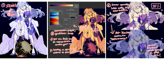
(this is in CSP so you can add a gradient map via correction layer; in procreate iirc you'd have to flatten you image, dupe the layer and then apply the map)
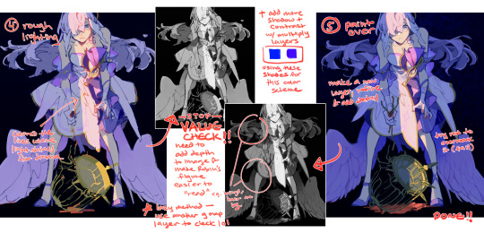
i don't use this method for every draw - sometimes i stop at #3 without changing the blend mode bc i just want the colors to harmonize a bit. or if i'm trying to be more intentional with the color palette i don't bother using a map at all. conversely, you can also create really beautiful effects using maps with more varied tones!!
it's also important to have a variety of values for a gmap to do anything useful, though... i almost always flat color and then map, but i frequently check values the entire time i'm working on a draw, so you could try that ORRRR rough your values in grayscale first before toying with maps
#ASK EVER#if you look through all my xv art its so clear that was the era i relied extremely heavily on gradient maps for just about everything. lol#ever art questions
410 notes
·
View notes
Text
Soft and Sweet Macademia
Braydon was your typical jock, he loved to workout with his homies and be with his girl. She was Bethany, a nerd. Not that competitive gamer nerd he dreamed of, but rather a bookish one. They met a party and she instantly fell in love with him as he fulfilled the “nerd x jock” trope she had long yearned for.
Today, he was dragged by her to the bookstore for a special promotional event. In the brightly lit modern store that made him regret not bringing his sunglasses inside, a large bright green banner with low quality black bold typography said “Try An Extrasensory Novel today.” There were brightly green bookshelves of new trending books below it. A scent of macadamia nuts punched his nostrils.
“What the fuck?” He sniffed the air like a weirdo, “Do you smell that?”
“I don’t smell anything. The nearest coffee place is on the other side of the mall,” Bethany said, fixing her freshly dyed red hair. She had painted his white bathroom like a crime screen in an attempt to save hundreds of dollars.
“You must have lost your sense of smell then. It’s so pungent.”
“It’s not a spill. There’d be ants crawling all over this place right now.”
“It’s driving me fucking crazy,” Braydon dug his big hands into his scalp, subtly flexing his bicep, which was tightened by his white compression shirt, “I need to find out where it's coming from.”
“Right,” She rolled her dark eyes and flashed an attempted smile, “While you have your Telltale Nut moment, I’m going to the fantasy section. Wanna join me?”
“No. You know I don’t care about that stuff.”
“Are you kidding me?” She looked up at him, only reaching up to his chest. Her eyes ready to kill the muscular jock in front of her. “I play your games with you, watch those movies with you. Is it much to ask wish for my boyfriend to be actually into books I like. Plus dressing in a dark academia style.”
“More like I’m gonna dark macadamia nut in you when we get home after this," From his towering view over the shelf, Bethany walked herself to the other side of the store, her arms crossed. He imagined her annoying grumbling to herself. He knew she wasn’t a perfect fit so why should she assume he was?
The scent intensified as he knelt down on the bottom row of the shelf. His long legs extended far out, acting as a trip hazard for any unfortunate passersby's. While he had expected a spill of someone’s overpriced coffee, the smell lead him to single out a specific book. He swiped it out, brushing through the pages for any soaked spots but he couldn’t find any. The scent seemed to emanate from the entire book itself. He landed back on the cover, which was unappealing and bratty. While the background was a flat color of an obnoxious green, the text was a horror show. It was stretched out and in low quality. It read “Absolute Calculus: Being Open To Changes in Extrema”. It appealed to the jock as he was familiar with the concept of calculus, notably from the math classes he had to take for his finance degree. He believed he was better than the rest of his field as he took harder math classes than them.
Turning to the back, the blurb was soft and easy to the eyes with its soft tropical fruit palette of oranges to greens. It was a self-motivational book. Its main thesis pointed out the ultimate cause of human suffering: simply being unopen to novel things. It included knowledge, lifestyle and even experiences. He needed this
By the time he had flipped to the table of contents, he didn't realize he was getting smaller in height and build. His clothes became oversized on him, resembling more pajamas than a casual attire. While he was repulsed by some of the chapter titles, including accepting your non-het sexuality, he was unable to put the book down. This wasn't him. No matter how hard he pushed on his now dainty fingers, his eyes and hands were glued to the book, turning the multiple pages. He felt himself deflating and shrinking. He noticed that his once mountainous biceps had become nothing but flat plateaus and his impressive set of pecs deflated into a meager chest. He coughed violently as his Adam's apple shrunk, turning his mountainous voice into a soft dainty one.
What the fuck was happening? His soft fingers with nails painted in green flipped to Chapter 4: Self-acceptance is the key to accepting others. He tried to scream for Bethany to help but he didn’t know her. It would be rude to call out a stranger. But that couldn’t be right? That was his girlfriend. No, she was just a random book girl at the same store as him. His experiences of throwing week long benders and sleeping with a carousel of women afterwards faded. They seemed more like videos he had watched online than a lived reality. Visions of conquests of women replaced by men conquering him. The book had converted his heterosexuality into an irreversible total homosexuality. He was no longer the buff jock that sat next to the hot girls so he could be grouped together with them back in college. He was the quiet gay guy that sat in the back of the class, often wooed by the more upfront and passionate gay men that wanted him and his body. His eyes, once clung to women, had shifted its vision to guys. He wasn’t one to be picky, as he liked everything from twinks to hunks and everything in between those two. Even the dad-bod was something that turned him on.
Chapter 12: It’s All Perfect As It Is. With a dizzy head, he finished the book and returned it to the top shelf, struggling to place it even on his tippy toes. Brady felt a quick chill breeze through the room. He dug his hand underneath his oversized fuzzy hoodie and felt the smooth stomach flatten out. His memories of Bethany and her red-hair morphed into a different person. It was another Asian twink, they held their hands together in a cozy apartment and played on their Nintendo Switch. The earthy charcoal cologne he recalled using became sunshine vanilla perfumes that his boyfriend, Jeremy, purchased for his birthday.
The slim twink approached him, hugging him from the behind. Brady was only up to his shoulder. It felt good with his liking to being the little spoon.
“What took you so long, Babe? I looked at ten books while you were just looking at one?” Jeremy chuckled.
“Nothing out of the ordinary. You know I like taking my time with books.”
"Well there's other books in this store, babe," Jeremy teased, bopping Brady's nose.
They checked out the rest of the store, leaving with a few romance books purchased in their pink heart decorated totebag. They bumped into another couple on the way out and briefly apologized to them. He looked at the tall muscular man dressed in his beige jacket and black shirt, wishing that he was also into guys. He whispered to Jeremy about jokingly asking him if he wants to be their 3rd if they see him another time by himself.
Jeremy and Brady cuddled on the couch together, their bag of books untouched on the clean coffee table. Jeremy was always the one to initiate, including a make out session with Brady. Their lips were soft and fruity as they embraced each other with their tongues on their soft couch.
They spent the rest of the day on an impromptu spa night. They applied a green jelly mask, consisting of green tea and aloe vera, to their faces and wore cute soft pink headbands. It was a typical zen they practiced every week. Stress and such can cause more damage than one could imagine. They turned on the TV to watch the adaptation of CardiacPauser, Jeremy and Brady’s favorite series. Before they returned to the couch, they took a picture together in their bathroom, holding each other with their large smiles. It was just them and the rest of the world. This is what he was meant to be and nothing else.
#male tf#male transformation#tf story#twink tf#jock to twink#straight to gay#mental change#reality change#muscle loss
344 notes
·
View notes
Text

the air smells like spring and something older, something older than memory. older than the bones of this earth.
the field spreads out beneath you like a secret whispered between gods—wide-limbed and unruly, blooming in technicolor. wildflowers sway with the hush of wind through long grass, a palette of golds and blues and purples you can't name, delicate petals trembling on their stems like they know they're being watched.
sylus stands out in it like sin in a prayer.
black against brightness, lean and motionless, arms crossed and head slightly tilted as he surveys the chaos of color you've brought him into. his eyes flicker—not with distaste, no, but with that low, infernal patience he reserves for things he doesn't understand yet. things he deems dangerous, not because they can harm him, but because they can change him. you wonder, briefly, if that includes you.
he doesn't say a word when you dart ahead of him, laughing softly, letting your fingers trail along a row of tall-stemmed blooms. you're barefoot, and there's mud between your toes, and sunlight in your hair. you're ridiculous. you're radiant.
he lets you pull him deeper into the field anyway.
you glance back once—just once—and catch the exact moment his gaze slips. just a fraction. like the weight of this place, the colors, the you of it all, unsettles something long-buried. his lips part, almost imperceptibly. his hands fall to his sides. that perfect posture slackens at the edges, only slightly, like a man bracing for a blow he knows he deserves.
"hold still," you say, plucking something from the tangled grass.
you return to him with mischief sparkling in your eyes and a single red datura in your hand—fierce in its beauty, crimson petals curling like flame. the color of sin. of memory.
he sees it. he sees it. and for a heartbeat, just one, sylus forgets how to wear his face.
his smile falters—not gone, just thinner, like a thread being pulled. his brow twitches. the smug glint in his eyes dims, not with fear, but recognition. the way his jaw tightens is barely appreciable. but you notice, because he's never looked at anything the way he's looking at that flower.
or maybe he's looking at you.
still, he doesn't stop you when you reach up. doesn't recoil when your fingers brush against the side of his face—just above his cheekbone, right where he would've had the skin of a fiend long ago. you tuck the datura behind his ear, tenderly. he could move. he could laugh it off. he could turn the entire field into dust with a blink.
but sylus stays still, breathing shallowly through his nose.
"there," you murmur. "you're part of the bouquet now."
his eyes flick to yours, sharp again—but too late.
you've already seen it. the fracture. the ghost.
still, he plays along. of course he does. he smirks, shifting his weight like it didn't cost him anything to stand still for you. "aren't you afraid it'll poison me?"
"it wouldn't dare," you say with a grin, stepping back to admire your work. "you look too good with it. a little unhinged, maybe. but then again, i probably do, too."
he exhales—not quite a chuckle. something softer. less practiced. his gaze lingers, and this time there's no mask to it. just quiet devastation, expertly hidden behind hooded eyes and a mouth that always says less than it should.
you don't know that a thousand years ago, you kissed him in a field like this. that you pressed your lips to the edge of his horn and gave him his name. that your hand trembled the same way when it reached for his face.
but sylus knows. and he lets you forget. lets you tease him, lets you run circles around him in your sundress and bare feet and laughter like a summer storm.
because this moment—fragile and fleeting—is better than the eternity he spent without you. and because if you placed that flower any higher, you would've touched the place his horn used to be.
and he's not sure he'd survive that.

#wen writes.#happy birthday to the one and only king che#love and deepspace#l&ds#lads#love and deepspace qin che#love and deepspace sylus#love and deepspace drabble#lnds drabble#lads drabble#lads qin che#lads sylus#lnds sylus#l&ds sylus#qin che x reader#sylus x reader#qin che x you#sylus x you#sylus drabble#qin che drabble#sylus fluff#qin che fluff#qin che#sylus
165 notes
·
View notes
Note
How are you Alba? I hope your routine hasn't been too tiring recently and that you're doing well and having time to rest, you deserve it!!
Taking a break from the freak requests, (which I hope you had received, because if you didn't it's going to make this paragraph start weird👎👎👎) I came here to earnestly ask for a fluff and wholesome fic about Arlecchino and reader putting together a nusery for their child... I know it's a bit '????' but listen:
Creating a newborn's nusery is very complicated, it is the place where parents will spend most of their time in the first few months after the baby is born, not to mention that the decoration will probably remain the same for a good three years, only changing the toys that will be scattered on the floor. Between trying to guess a possible taste that your child might have and combining a normally super childish aesthetic with the rest of the house, as well as predict what would be a good investment in the future or not, from the best cribs to toys, not even mentioning the discussions that arise between expecting parents due to the different views that each one has to the room, It's a challenge.
Although I believe that Arlecchino would have a good knowledge about it, after all she is a director of an orphanage, she certainly knows what is useless to put in and what is indispensable. Even if any doubt arises about what itens to brought, she would research madly for an answer or even ask for help from the children in the House of Hearth for a more concrete opinion. If I were to guess, both Reader and Arlecchino would quickly come to a consensus on the theme and decorations (Peruere is completely in love, she would only let her wife choose everything, including a little stuffed bunny that strangely looks like her...), while the heavier work of assembling furniture and painting walls are left to a more specialized workforce or to the Knave itself when she wants to show herself to her beloved wife.
As I don't want to take away too much of your creative freedom, I'll end the request here. Feel free to modify any of the ideas. The choice is entirely yours, after all, I don't want that this request become boring for you.
(Just gonna add if here: they have a cat, because for sure Arle's a cat person; spiders and cats look alike)
Thank you in advance for reading this message, you are a sweetheart Alba,
With care, 🍰 anon.
i swear ANYTHING related to papacchino gives me heavy babyfever i can't do this anymore💔 i hope i caught the right vibe, i‘m really tired writing this so i‘m sorry for any grammar mistakes or misplaced words😞
divider by @/anitalenia

„wouldn't a purple theme be more prettier?"
„....purple? my love, you insisted on an orange theme two weeks ago."
scratching your cheek with your index finger, you recalled the memory of you a bunch of days ago where you stood before the nursery, color palettes in hand.
„my... i almost forgot about that... can we still change it?”
it was moments like these where arlecchino grew a bit older. but with a short glance down to your hand resting on top of your baby belly, wedding ring glistening in the candlelight, where she quickly shook those thoughts off.
„i'll see what i can do since the painters are already scheduled for tomorrow morning...", but whatever her wife wishes, she shall receive.
choosing a color theme for your babies bedroom turned out to be the easier task.
„where should we put the crib...? or the changing table? we also need a little corner for her to play in- and a nursing chair too and-”
„ma amour, ne nous précipitons pas. nous avons encore beaucoup de temps avant qu'elle soit là."
„my love, let's not rush. we still have plenty of time until she is here.", a gentle hand came up to squeeze your shoulder.
deciding on furniture was torture. everything was too adorable to not buy. the both of you wanted her to not miss out on anything but maybe you don't need a dozen plushies for a newborn. if it were not for that one stuffed rabbit that had an uncanny resemblance to a certain someone...
„you are right, i just... i want this to be perfect for her. even if she probably won't remember her nursery, i want her to feel special... wanted...", your eyes were laced with a love that had yet to bloom. you rubbed almost instinctively the downside of your belly. you still had five more months to go but celestia knows how fast these will fly by too.
you were too focused to notice your husband's breath stilling at your words.
special...
wanted...
„yes... special...", the word rung in her ears for longer than expected before she saw it. a clear vision of what the knave may have in mind for the nursery.
„why don't we grab some paints from a nearby workshop during our daily walk later?", you felt her fingertips brushing over your skin as she shoves some loose hair strands behind your ear. she is keeping her usually sharp nails neatly trimmed ever since the news of your pregnancy first came out.
„father... are you sure...? isn't this supposed to be something... unique?"
„that is exactly why i am bestowing you with this task. now go on, let your creativity roam free.”
the knave watched her children exchange almost ecstatic glances before they rushed to the paintbrushes sitting atop a table laid out with old newspapers. with only the most high-quality paints already getting fought over.
it was a beautiful day. the mild sun spending just enough warmth to not start sweating with a gentle breeze ghosting through the trees of the estate.
and arlecchino watched her kids turning the changing table and the crib into a beautiful, joyous canvas.
fingerprints, messy brush strokes and explosions of all kinds of bright color, yet the fatui harbinger never looked more at ease as the laughter of her children filled the estate of the hearth.
you were neatly tucked away in your bedroom, not feeling well enough to leave the comfort of your sheets.
all the more reason for your husband to be looking forward to the results- and your reaction.
a nursery for your baby without the influence of her siblings... unimaginable. not even worth considering.
but the joy was short-lived until they started painting each other. that's when arle started to regret her choices. their pretty clothes.... and yet kids will be kids. she turned a blind eye to their silliness this one time.
arlecchino just hoped the colors would come off of their faces....
#𝐚𝐥𝐛𝐚𝐫𝐞��𝐮𝐞𝐬𝐭𝐬 ⋆·˚ ༘ *#🍰 anon#i really hope this is to your liking wonrlwnrkwow#DADDYCCHINO#arlecchino x reader#arlecchino#x reader#arlecchino x female reader#genshin impact x reader#genshin impact#wlw
124 notes
·
View notes
Note
You should tell us about color psychology that sounds cool as hell
YES… HA HA HA… YES!
GGGOD I WISH I WASN’T OUT OF THE HOUSE RIGHT NOW. but i’ve been thinking about colors literally all day so you all get to be subject to my madness! sorry this is long and rambly wauaua. nightmarishly long post under the cut.
okay. first things first, a few basics. color theory and color psychology tend to get confused a lot in discussions, but they usually refer to different things. color theory is more about we physically perceive colors (color wheels and color schemes the like), while color psychology focuses on our emotional response to colors. if you’re familiar with the children’s hospital color theory post, that poster wasn’t actually talking about color theory, but color psychology (and also it’s incredibly surface level and heavily misunderstands the subject because in what fucking universe does the quantity of positive associations with a color matter more than the context it’s used in and sorry i have personal beef with this tumblr post).
color theory is also a special interest of mine but i’m not gonna touch on it too much here because it’s not entirely important. mmmaybe another time…
essentially, certain colors (and color combinations) have associations in our brains and that affect our behavior and emotions. these associations are also very much affected by the context a color is used in. colors don’t exist in a vacuum! so while red can symbolize passion and love when used in something like a dress or a bouquet of flowers, it has a very different connotation when it’s, say, splattered on the walls or smeared on the ground in a snail trail.
or for a less Children’s Hospital Themed example, i’ll put my euphrasie and king designs here!

(of course the saturation and brightness of these blues play a massive part in how they’re perceived but this is not a post about color theory this is n)
and, of course, combining colors in a piece can also change their meanings!! i’m about to get real fucking normal.
i’m gonna be focusing on the color combo of red and yellow here because it’s the one that’s most relevant to my art (and also it’s really interesting.) basically, seeing these two colors together activates the part of our brain that controls our appetite, making us actually feel hungry. this is why so many food companies use red and yellow in their branding! it’s neat stuff!!

also, if you’re familiar with it, this is why the mv for butcher vanity uses this color palette!! along with red’s general associations with danger and blood, the color combo also physically induces hunger. pretty fitting for a song about cannibalism!
(there is also red’s association with lust and passion and how that intersects with the double meaning in the lyrics but i cannot derail this post into being an analysis of butcher vanity i’m sorry. we’d be here all week. maybe another day... wipes a tear from my eye)
and i think this might be the reason why some people feel hungry when they see my art, even when i’m not drawing food. while i don’t tend to use red outright, most of my art has very warm undertones (red-oranges and yellows especially), which could be activating that hunger response??

(ah fuck color theory managed to weasel its way into this post again)
admittedly this part is just speculation on my end. i think my rendering style and Shapes also play a role in it, but it’s interesting for me to think about!!
this is only scratching the surface of how complicated colors can get. i was going to go on an entire tangent about color grading and how green lighting can make a scene feel unnerving but this post is already Too Fucking Long. aaaa super sorry if this is Rambly or hard to understand!! i’m not Entirely sure how much the average person knows about color theory and psychology so if there’s any confusing terms here i’m fine with adding stuff for clarity!
wauauuaa thank you so much for asking!!!! i love talking about colors.
tl;dr colors have a bunch of different emotions and meanings tied to them, but you’ve gotta pay attention to the context in which it’s being used. so maybe take a step back before you put that thick red trail on the floor of your children’s hospital.
#marshtalkin#<- and by god did i TALK.#hhholy fuck how long is this. im so sorry i thought this was gonna be WAY shorter#admittedly i only realized colors were a special interest. fairly recently?#i genuinely didn’t consider that most artists probably don’t spend hours pacing around thinking about color symbolism#<- god don’t even get me started on color symbolism in my designs i’m so fucking normal#…do i even tag this as isat?? i mean i know i have to tag spoilers anyways#because of euphrasie#but this is mostly a post about color psychology even if i’m using my isat art as examples#aaaa whatever#isat#in stars and time#isat spoilers#color theory#color psychology#asks#also actually as a sidenote. sometimes color psychology is called a subsection of color theory?#but generally when someone is talking about color theory they’re talking about the technical side of things#terminology is weird and confusing unfortunately…
218 notes
·
View notes
Text

Professor Caduceia and Snakely
Checked out the storyboard for the deleted s1 episode "Homesick"
You can read it here : https://t.co/WpZJFWbR48
I just loved these cut villains, one whose design def seemed like it was given to raine when they got cut. (I wonder if the color palette was similar, but we don't have a reference to that so idk)
Thoughts on the cut episode below:
An episode where king and owlbert of all characters bond is kinda neat, especially since it provides owlbert himself a bit more character here.
The opening is def far different from any of the final ones we ever see in the series, in fact it feels like it should be taking place during the episode but it can't be given we see hooty from being sick to not being sick in pretty chronological order?
A focus on the healing coven was nice to see, especially since we never got that in the show itself, and get some idea of their powerset and what they do magic wise.
So Manny was an ambulance driver, and Camila was a nurse in this. People originally assumed camila was a nurse when the show started, and it makes me wonder if that was changed between seasons at some point cause clearly the crew decided to change her profession and it's unclear why.
you can use your palisman as a communicator? and an umbrella? I do think it's so weird that even at the very end of the show, they establish brand new rules for palisman. Like them being able to shapeshift into objects is straight up not explained and just sorta....happens in the show, like i feel like hunter would have no issue hiding flap if this is a thing. (It also kinda makes stringbean's ability slightly less unique) Like this is displayed in these boards, but they kept it even in the show itself, and i think palisman might need a proper rulebook.
On that same note, owlbert uses magic in this board, like we kinda knew palisman could do some magic without a witch, but this is the only time we've seen one use it to fight another witch that wasn't the batqueen. Like owlbert tries to full on blast people in this. I don't know if removing this episode makes this ability less canon in the world itself since they still can do magic in the show, it's just worth noting that palisman, according to this board, CAN fight back, even if they're not incredibly strong it seems. Certainly the kinda thing that makes you think on other episodes tbh.
This episode also brings up the idea that eda actually CAN and DOES bring human food to the BI, which never happens in the show, in fact luz implies she gets to eat very little options there, so this idea seems no longer canon?
The demon hunters at one point don't even seem to recognize owlbert as a palisman, which does not entirely make sense given they seem to be mostly common to the townsfolk, so I'm kinda glad for that plot hole being gone.
Caduceia makes it out like the emperor's coven forced her to teach? and she thought handing over a house demon to belos would get her out of teaching as if it were some kinda punishment or job she was made to do? I have questions
side note, house demons are called rare in this, like they're not common, not sure if this still applies in the final show, but yeah.
there's some very sweet moments in this with luz and eda especially, but also some funny moments, and some jokes that land a little less....i don't think we needed Caduceia to be kissing her snake like that from that angle, even if it was meant to be a little uncomfortable.
one reason i think this episode did get cut? we got a glyph in this
a healing glyph, which has some ties to water based on it's symbol
i'm guessing since they kept the main glyphs element based, a healing glyph would of stuck out and been a bit weird. Like it just heals people, it doesn't produce water despite looking close to the alchemy symbol for water, and well....we already got ice so this would be redundent.
so yeah, this episode introduced a new glyph that saved them in the end so it would of come back in future episodes, but to keep it simple that would mean cutting the entire episode as a whole just to keep the four.
Since they enjoyed Caduceia's design so much, they must've repurposed it for raine somewhere down the line.
very fun insight into a scrapped episode.
404 notes
·
View notes
Text
Short thread of Ozzie using his powers when performing/helping Fizz during his own performance


We saw in “Ozzie” that the venue of the club has a specific color palette, that changes when Ozzie appears to perform with Fizz, creating blue smoke and shifting the entire scenario to his predominant colors
All the light/color effects we see after his appearance are very probably there thanks to him influencing the whole place to create the right atmosphere for the show and this stops when Fizz gets hit by Millie
Fizz appears for his final performance getting out from the same blue smoke, Ozzie’s blue fire lights the cigarette, the colors reminds a lot the ones of his club and the Mammon’s ‘shadows’ seems a bit much to be stage effects

Also, am I tripping hard or the two central blue shadows near Fizz look a lot like Ozzie’s heads, ram and bull? Him giving Fizz his fire, knowing that the Hellish green fire is a big NO, same for the blue fireworks

You can’t tell me that the big sign 👉🏻👌🏻 isn’t Ozzie’s work. Also the light on Fizz now is blue and not green. And from the look they exchange at the end is clear he helped, not bcs Fizz couldn’t do it alone, but bcs he wanted to fully support him
These two are the best and healthiest couple in Helluva, they are perfect for each other and you can't change my mind 💙💚

#helluva boss fandom#helluva boss#helluva fizzarolli#fizzarolli helluva boss#Helluva Boss Fizzarozzie#Fizzarozzie#Fizzmodeus#Asmodeus#Helluva Boss Asmodeus#Ozzie Helluva Boss#Fizzarolli x Ozzie#Fizzarolli#Ozzie x Fizzarolli#Asmodeus x Fizzarolli#Fizzarolli x Asmodeus#Helluva Boss Season 2#vivziepop
1K notes
·
View notes
Text
FLIRTY HAIRDRESSER
cha woo-min x reader

note; just imagine if he had tattoos and he's your hairdresser.
YOU WEREN'T ACTUALLY planning to change your look today—just a spontaneous urge on a slow afternoon. Your reflection started to become boring: the same old faded dye, the same split ends. So you stepped into the newly opened salon that everyone has been raving about and imagined you would somehow spark spontaneity.
The bell chimed as you walked in, and you were greeted with a citrus shampoo and lavender scent. Some stylists pointed their attention to you and smiled appreciatively. However, your gaze really fell on the man standing before the styling chairs.
Cha Woo-min.
He was tall, sleeves rolled just enough to expose minimal tattoos on his forearms. Rings decorated his fingers—stylistic and silver, nether too glam, but again... definitely noticed. His hair looked effortlessly tousled, as though he had a stylish awakening. He looked like he could walk off the pages of a fashion magazine, not out from behind a salon chair.
"First time here?" he asked, voice silky as he casually motioned you to take a seat. His tone was lighthearted and friendly, but his eyes remained longer on you than necessary.
You nodded. "I just felt like trying something new."
"Come on, I'll take care of you," he said, pointing to one of the chairs. You settled into it as he tossed the cape on you and clipped it into place with his expert ease.
His name tag on his apron said Woo-min, and he pointed to it, grinning and dancing with his eyes. "I'm Woo-min, by the way. Your hair is in safe hands."
When he said it, you believed it. "What were you thinking?" he asked, fingers beginning to comb your hair gently, working his way through the texture, the length, and any damage you were trying to not be embarrassed about. "Trim? Change the shape? Color?"
"Something different," you said. "I'm bored of this color. I want something... completely new and compliments my skin tone."
He nodded, ponderous, already pulling out swatches and palettes. "I think you would look great with something that's a little softer. Maybe a warm ash brown or a muted honey beige. Let me show you some options," he said. You watched how his brows furrowed in concentration, like your hair was a canvas and he was already painting it in his mind.
And god—his hands. Strong, ringed fingers that strolled past your neck every now and again as he sectioned your hair, always in a featherlight touch, but enough to give goosebumps down your arms. You did your best not to fidget under his gaze, under the warmth of his attention.
When he began cutting, it was all soft snips and chit chat—he asked where you were from, if you had dyed your hair a lot before, what made you want to walk in today. But then he showed you to the washing station, and that was when you were elevated.
The water was just the right temperature, his fingers masterfully kneading your scalp as though he had memorized where the pressure points of your head were.
You didn't realize when your eyes closed, but you felt your entire self become liquid in the chair. Your fingers dug where they gripped the sides as his thumbs moved behind your ears and up toward your temples.
The head massage he gave was life-changing.
You wanted to cry.
Or propose.
Or maybe both.
"You alright?" he murmured, and his voice floated over, right next to your ear. You could only nod your head, unsure if your voice would come out coherent.
As he towel-dried your hair, his fingers brushed your nape again—intentionally? Probably not. But something about his action paused, as if he noticed the hitch in your breath, as if he wanted to.
"I'll dry it, put it up and style it, so you can see what it'll look like," he offered after a brief pause. He began walking you back to your original chair and moved with that same casual self-assuredness, but there was something in his eye that hadn't been there when you first walked in.
You settled back into the chair in front of the mirror, watching his reflection—this stranger, this charming, tattooed stranger, this one with silver rings on his fingers, named Woo-min, who already had his hands just a bit too familiar with your hair, and maybe with your heart too.
As Woo-min blended the dye, you observed him in the mirror—engaged, careful, a few strands of his own hair escaping from beneath his beanie once again. His sleeves were rolled up, revealing a fresh set of tattoos down his forearm.
Something floral, maybe?
You were unable to concentrate on the specifics when he looked like that. He returned to your chair with the bowl and brush in hand, balancing it awkwardly as he smiled at you with a crooked smile. "Ready?"
You nodded and he carefully wrapped a towel around your shoulders, tucking it in. "This will take a little while, so I hope you don't mind me chatting with you for a bit."
"I don't mind at all," you replied maybe with too much enthusiasm. He began at the back of your scalp, dividing your hair and lightly adding the cool dye.
"Oh by the way," he continued, nonchalantly, "I really like your earrings, and your necklace- so good because it fits with everything else, it's stylish without being too much," he finished.
You blinked, caught off guard. "Oh... thanks."
He smirked. "And by the way, love the outfit, you're pulling it off."
You could feel your cheeks heat up in response to his words and particularly when he had to lean a little more closer to reach a different section of your hair. But his tone shifted, now teasing in nature and lowered a little more. "But this hair though..."
"You mean...?" you prompted, a little bit skeptically.
"It's kinda crying for help," he laughed, stroking the dye in gingerly. "Intense—not in a bad way, your hair is beautiful. But it is dry as fuck."
You gasped a little. "What!?"
"I'm just being honest!" he laughed. "Don't worry, I'm going to take care of it. I'll put some toner and some protein treatment in. And it won't damage it anymore than it already is. Promise."
"You better," you puffed, crossing your arms—which was useless because you were literally wrapped in a cape like a burrito. "I trust you with my life here."
He laughed. "Your life, huh? No pressure. I'll be try my best not to mess it up."
The other stylists were busy, attending to their own clients while Woo-min stayed with you the whole time, checking the color all while chatting in between. He told you about how he got into hair, how he didn't like school but enjoyed the feeling of making people feel better about themselves. How he worked at a few other shops before helping his friend open this place.
You shared a little too much—enough to feel like this didn't have to be merely small talk. There was something else there, something that hung in the air for just a beat more than he needed to look at you.
Eventually, it was time for the dye to set. He did wash it out like he said with conditioning and treatments. He rinsed your hair treating it like spun silk. Then he dried and styled your hair, using a diffuser and his hands, fluffing your hair to create shapes and develop the soft waves as if sculpting them. When it was time for the reveal. He spun you around in the chair, turned you to the mirror.
You were blinking. You, actually blinked. "Whoa..."
"Yeah?" he asked, now watching your reaction intently.
"I look...different", you said, "but in a good way."
"You look hot", he said nonchalantly while correcting you, and you almost choked. He brushed a few strands from your cheek, and your eyes met again in the mirror.
There it was—that look again. That pause. That little something that said, this could be more than a one-time hair appointment.
He stepped away to grab the mirror for the back view, and when he returned, he held a business card between two fingers. "Here. Just in case you wanna come back—for a treatment or touch-up."
You took it. It was sleek, black and white, with the salon's name on the front.
But when you turned it over...
Woo-min.
personal line: xxx-xxx-xxxx
(text me if you're bored. or if your hair gets dry again.)
Your lips twitched.
"Slipping your number to all your clients?" you asked, raising an eyebrow.
He winked. "Only the ones with cute earrings and terrible haircare routines."
You kept it cool. You tried.
But then you flipped over the card, saw the neat handwriting, noted the "text me if you're bored" comment, and realized it was his personal number—then the heat rushed to your cheeks, just like that.
Your fingers clenched around the card, doing your best to ignore the smug little look he left on his face as he leaned against the counter. You paid for the treatment, still slightly dazed from the combination of the best head massage of your life, a full hair transformation, and a flirtatious stylist who may or may not have been undressing you with his eyes at some point (in the most tasteful way possible, of course).
As you thanked the receptionist, one of the other stylists walked a client out—nodded politely, let them leave. That was it. No big send-off, no special attention.
But then you turned toward the door, card still tucked into your hand, and—
He was already there.
Woo-min stood, one hand on the glass, lazily shoving it open for you with a measured sort of confidence, the other hand tucked in the pocket of his black apron. The wind shaped his bangs on the ends, and the sun caught just the right amount of ink on his forearm so that it was a little distracting.
"You sure you like it?" he said, his chin slightly tilted.
You nodded quickly and pulled some hair behind your ear. "Yeah... I really do. Thank you."
He watched you for a second—the way you were sucking on the inside of your cheek to keep from smiling too much.
"Good," he said. "I usually don't open the door for people, by the way."
You blinked. "You don't?"
He shook his head and there was a playful smile on his lips. "I guess you're special."
You completely lost it with quick blush and muttered a flustered "Bye" and stepped into the cool air, the glass door softly thumping behind you as you walked out. As you walked away, you couldn't resist looking at the card again, your heart racing wildly at the thought.
Text him if you're bored?
You were already composing something in your head.
Should you wait an hour? A day? Was five minutes too desperate?
...yeah, okay, maybe ten minutes.
────୨ৎ────
Your limit was nine minutes and forty-three seconds.
That was as long as you could take. You found yourself perched on your bed, stylized hair freshly tucked over your shoulder, eyeing the card like it was about to disappear from the floor. You tapped on messages for two seconds, and then, typed the following message.
you : are you seriously diss on my hair that hard and then flirt with me? bold move.
Sent.
Then you tossed your phone to the side onto the bed like it was a bomb ready to explode. Except within the limit of a minute, it dinged back.
Unknown Number: already miss me?
Your stomach dropped. Then it did a backflip. And then, it combusted. You snatched your phone like it had a secret for you and read the message as your eyes widen. You weren't sure if it was the sheer audacity or the smirk you could hear through the screen, but you were already typing.
you: you wish. but i really do look hot now. so thanks, hair god.
An immediate response.
woo-min 🖤: hair god? now you're trying to turn me on. you're welcome tho. you really do look hot. I should have gotten a picture for my portfolio.
You blinked. How was he somehow both sweet and also so much? It didn't feel sleazy at all. Just cheeky. Like he was letting you in on a joke the rest of the world didn't understand.
You bit your lip.
you: you could've just asked to take one.. or is that your excuse to see me again?
There was a pause.
woo-min 🖤: maybe i don't need an excuse. but if you want to come back next week, i'll "check on the color." or whatever. bring that necklace again. it looked good on you. so did the way you blushed.
You threw your phone face down again. And then immediately picked it back up because this guy was dangerous. In the most infuriatingly charming way. And somehow? You already knew that you'd be back at that salon next week.
A week later. You had been nonstop texting.
Every day. Every night. Random memes. Pictures of his and your cat. A close up of his hand with his rings on display, holding a coffee cup (which he definitely sent on purpose).
A mirror selfie you took after you re-styled your hair with his reply.
woo-min 🖤: stop. I'm already down bad. this is bullying.
And here you were—walking down the street toward the salon expecting a quick hello or intermediary touch up. And instead—
You saw him.
Sitting outside the salon.
No apron, no scissors, just Woo-min, a fresh black coat over a graphic tee, rings still on, hair perfectly done, a coffee in his hand—and sunglasses pushed up on his head like he just walked out of a damn music video.
You slowed your walk. He looked up at you and smiled. Stood. "Took you long enough."
You blinked. "Wait. You're... not working today?"
He shrugged and walked over to you like it was so obvious. "I'm off."
You squinted at him. "Then... why am I here?"
He smirked. "You said you wanted to get your color checked, right?" His fingers brushed against your hair gently, mock inspecting. "Yep. Still hot. Let's go."
You blinked again. "Wait—wait, is this a—?"
"A date?" He grinned, casually linking his hand with yours as though it were the most thrilling thing in the world. "Yeah. You didn't think I would keep flirting with you just over text, did you?"
You stared at him, stunned and a little woozy. "...You're ridiculous."
"Yeah. But you like it." He pulled you toward the little café next door where a tiny table already had two drinks and a half-eaten pastry on it (you were late, sue him).
At some point between the croissants, the little laughs you shared, and him leaning over to wipe a crumb off your lip a little too casually — he pulled out his phone.
"Okay," he said, tapping on the camera app. "I never got a picture of your new hair."
You blinked. "Wait—you wanna take it now?"
"Mhm." He leaned in next to you, tossing his arm around the back of your chair, trying to angle the camera. "But I want one with both of us in it. So you remember who made you look this good."
You tried to roll your eyes—but the camera clicked mid-laugh, catching the exact moment you turned your head toward him in fake-annoyance while he was already grinning at you.
It wasn't just a hair pic.
It was you two.
And somehow it already looked like it belonged in a frame.
#cha woo min#tttabii#korean actor#kdrama#actor#cha woo min x reader#woomin#nighthascome#study group#melo movie#kdrama x reader#pi han wool#go kyung jun#x reader#actor x reader#hairdresser#flirty#tattoes#au#fyp#fypage#tumblr fanfics#fypツ
99 notes
·
View notes