#alphabets
Explore tagged Tumblr posts
Text
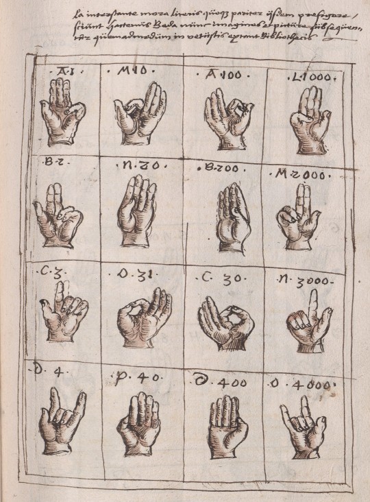
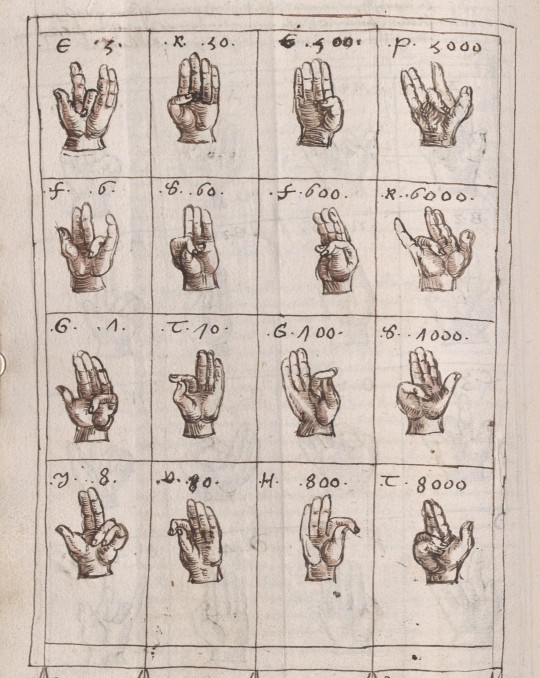

16th c. alphabet for fingerspelling & fingercounting
from a copy of a text attributed to bede the venerable (7-8th c.), included in a miscellany manuscript written and illustrated by wilhelm werner von zimmern, speyer (?), c. 1539-62
source: Stuttgart, Landesbibl., Cod. Donaueschingen 704, fol. 163r-164r
#16th century#bede the velnerable#Beda Venerabilis#fingerspelling#finger counting#Abacus atque vetustissima veterum Latinorum per digitos manusque numerandi consuetudo#wilhelm werner von zimmern#fingers#alphabets
887 notes
·
View notes
Text


Typography Tuesday
TIPPLER
Tippler, "Dusk to Dawn in the life of a Man-about-town, as shown by twenty-six different scenes, each decorating a letter of this tippler alphabet," was created by an anonymous designer sometime in the late 1930s or early 1940s. The set is reproduced in ABZ, edited by Julian Rothenstein and Mel Gooding, and published in San Francisco by Chronicle Books in 2003 (an earlier edition was published by Shambhala in 1993 as Alphabets & Other Signs).

View other posts from ABZ.
View our other Typography Tuesday posts.
#Typography Tuesday#typetuesday#Tippler#historiated initials#alphabets#inebriation#drunk#ABZ#Julian Rothenstein#Mel Gooding#20th century type
161 notes
·
View notes
Text

Sayat Nova, from Anthology of Armenian Poetry, ed. & tr. by Diana Der Hovanessian and Marzbed Margossian; "Listen to me"
[Text ID: “Three things tie body to the soul. / Love alphabets. Love writing. Love books.”]
#sayat nova#on writing#on books#on reading#on literature#soul#books#alphabets#excerpts#writings#literature#poetry#fragments#selections#words#quotes#poetry collection#typography#poetry in translation#armenian literature#armenian poetry
200 notes
·
View notes
Text


Wim Crouwel - Alphabets
26 notes
·
View notes
Text
#ColoringBook#Alphabet#Alphabets#AlphabetColoringBook#Coloring#ColorWithMe#ColoringForAdults#AdultsColoringBook#ColoringTherapy#CozyColoring#Relaxing#Asmr#ColoringPages#Amazon#Art#Simple#Bold#Letters#Cute#Spotify
77 notes
·
View notes
Text
the Aurebesh isn't very great from a conscripting perspective. not only because it's a fucking cipher (a mere font to write in English, with English nonsensical spelling rules) but also because all letters are blocky squares.
Which us fine because this isn't the focus of Star Wars, it's purpose isn't to work well linguistically or practically, it is to set an atmosphere and pretend it's not English
Chinese, Japanese and other syllabic scripts work that way because each symbol stands for a while syllable, not an individual sound. and English has syllables with massive consonant clusters like scratch
an alphabet needs many tall, thin letters like l i r q r t p d f h j k l b
if all letters are fat and wide like ლ then any text occupies far too much space and is overly long. and larger chunks of text consume exponentially more space, paper, ink, digital pages, stablishment titles, etc, not to mention being annoying to read
the simplest solution is to create thinner versions of each letter, making them thinner and thinner until it's a totally different alphabet
a different solution that preserves the blocky feel is to combine letters together into ligatures, like in Hindi, specially for common words and consonant combinations, so, fusing E and R into a single ER letter, for example.
to illustrate, this is "Republic" in canon Aurebesh:

and this is "Republic" after combining some letters:
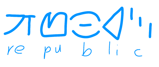
we could go more aggressive and combine more than two letters, but speakers would have to know all ligatures, but that's fine, Hindi speakers learn hundreds or millions of letter combinations and they're not random, they are intuitive
now with Skywalker:


of course, i'd still prefer to make an alphabet which actually makes sense

real life example: Korean
if we wrote English with the Hangul, Republic would be 러풉맄
[ㄹ=r][ㅓ=e][ㅍ=p][ㅜ=u][ㅂ=b][ㄹ=l][ㅣ=i][ㅋ=k]
ㄹ+ㅓ=러
ㅍ+ㅜ+ㅂ=풉
ㄹ+ㅣ+ㅋ=맄
canon Aurebesh would spell it ㄹㅓㅍㅜㅂㄹㅣㅋ
Hindi:
र=e रे=re फ=p फु=pu
ब=b ल=l ब्ल=bl ब्लि=bli ख=c
रेफुब्लिख = Republic
canon Aurebesh would spell it रएफउबलइख
#languages#alphabets#alphabet#aurebesh#star wars#ligature#ligatures#clone wars#star wars prequels#sw prequels#conscripting#conscript#worldbuild#worldbuilding#hangul#devanagari#devanāgarī#देवनागरी#한글
134 notes
·
View notes
Text
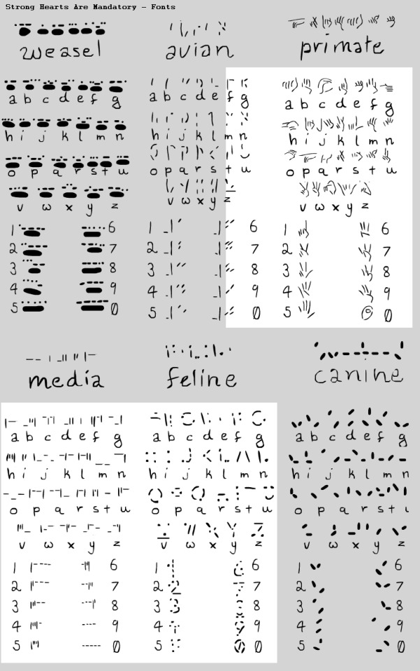
Still working on this but some alphabets for Mandatory!
Feline or Cats Scratch - is indented, so anyone can read it even without sight as long as they can touch since it's the clawmarks in the parchment that makes it readable, text is on textured rollers or haptic screens for monitors so they can read messages from their supervisors or the council. To become a Median you must have some knowledge of Cat Scratch and Cats Tongue to become verified and be given your handle.
Media's Type is directly related to Cats Scratch, but is designed for the computers and haptics, all Medians must learn this.
Avian or Birds Peck - works similarly and is both pecked and clawed, so there's more openness on interpretation of the letters but it's easier to do with a talon.
Primates Sign is written and signed often, it is the least used in Media but was made for ease of having an alphabet in Deviate. They also have a short-hand which is intensely more complicated but shortens sentences significantly. I may make it in the future or have it cameo in the comic!
Weasel's Claw is a new edition and is done with their finger tips and entire paw print for each letter, a much bigger font for some, not so much for ermines.
Canines Dig is the simplest, but can be the hardest to understand.
Each is referenced or inspired by certain alphabets to keep it mildly educational to myself and it's really fun so far! c:
60 notes
·
View notes
Text

A: Sign painters letters. Ames’ Alphabets - 1879.
#vintage illustration#lettering#vintage lettering#typography#vintage typography#hand lettering#hand-drawn letters#calligraphy#penmanship#sign painters#design#graphic design#vintage books#alphabets#the alphabet#ornate letters
8 notes
·
View notes
Text

Y - Yak 🐂
#ai#ai art#ai generated#anime#anime art#india#94shasha#animeedit#animeedits#bharat#indiananime#y#yak#english#alphabets#alphabet#abcdef#aiartcommunity#ai artwork#ai artist#ai art gallery#ai edit#ai enhanced#digital drawing#digital art#illustration#illustrator#digital illustration#ai ethics#digial art
14 notes
·
View notes
Text

Subway station at Manhattan's Times Square, New York City.
📸 Luiz C. Ribeiro
4 notes
·
View notes
Text

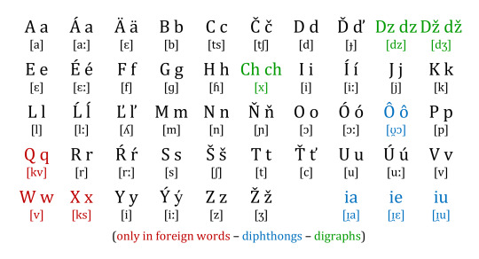
The Slovak Alphabet
7 notes
·
View notes
Text
my current theory is that the Roman alphabet is to Basic what the Greek alphabet is to English, as seen in the various droid designations and the clone trooper designations
but then the Greek alphabet also exists in the GFFA, since the Alpha class troopers exist, etc., so I'm thinking that they also run out of letters the same way mathematicians and scientists do in our world and started grabbing the equivalent of Norse and other characters for their additional designations
all of this to say, is that droids and clones are all members of various Space Greek organizations, making them all frat bros
8 notes
·
View notes
Text


Typography Tuesday
In 1943, German author Hermann Hesse (1877-1962) published his last full-length novel Das Glasperlenspiel (The Glass Bead Game). It includes his poem "Buchstaben" (Letters), which begins:
We now and then take pen in hand And make some marks on empty paper. Just what they say, all understand. It is a game with rules that matter.
In 1965, Kumm Verlag in Offenbach am Main published the poem in a limited edition of 200 copies. The edition includes these calligraphic alphabets in watercolor by German calligrapher and type designer Karlgeorg Hoefer (1914-2000). The text of the poem itself, which is not shown here, was set in Hoefer's Permanent san-serif typeface, first released by Ludwig & Mayer in 1962. The edition is signed by the calligrapher.
Our copy is from the collection of Grolier Club member Robert Elwell with his bookplate designed & printed by British designer and wood engraver Reynolds Stone.
View our other Typography Tuesday posts.
#Typography Tuesday#typetuesday#calligraphy#Karlgeorg Hoefer#Hermann Hesse#Kumm Verlag#Buchstaben#poms#poetry#alphabets#letters
48 notes
·
View notes
Text
I was writing something and accidentally switched scripts.
Like, i was writing a thing in Ukrainian, and didn't notice that i switched to latin script for a few letters.
Bilingual experience.
2 notes
·
View notes
Text
how many letters are there in your aphabet? tag what country you’re from!!
edit: 29 in norway
#mine has 29#norway#alphabet#letter#writing#question#contry#countries#geography#land#language#numbers#languages#alphabets#pls answer#answer#im curious
31 notes
·
View notes