#ABZ
Explore tagged Tumblr posts
Text
XENOMORPH
by Abigail J Harding


#tentacles#fhtagn#abigail jill harding#abz#alien#xenomorph#creature#monster#horror#concept art#black and white#evil#hunter#perfect#chara design#tail#fhtagnnn
915 notes
·
View notes
Text


Typography Tuesday
TIPPLER
Tippler, "Dusk to Dawn in the life of a Man-about-town, as shown by twenty-six different scenes, each decorating a letter of this tippler alphabet," was created by an anonymous designer sometime in the late 1930s or early 1940s. The set is reproduced in ABZ, edited by Julian Rothenstein and Mel Gooding, and published in San Francisco by Chronicle Books in 2003 (an earlier edition was published by Shambhala in 1993 as Alphabets & Other Signs).

View other posts from ABZ.
View our other Typography Tuesday posts.
#Typography Tuesday#typetuesday#Tippler#historiated initials#alphabets#inebriation#drunk#ABZ#Julian Rothenstein#Mel Gooding#20th century type
151 notes
·
View notes
Text


Played psycholonials. 10/10
85 notes
·
View notes
Text


Book 334
ABZ: More Alphabets and Other Signs
Julian Rothenstein and Mel Gooding
Chronicle Books 2003
Though issued by different publishers, this book feels very much like a sequel to Alphabets & Other Signs. Though perhaps more focused on 20th-century modernist design, this book has the same kind of random presentation. It, too, is completely unpredictable from page-to-page and makes for a completely idiosyncratic experience. With hundreds of alphabets, applied typographical sources, and emblems and logos, this is a beautiful and incredibly valuable resource.
#bookshelf#illustrated book#library#collection#personal library#personal collection#books#book lover#bibliophile#booklr#abz#julian rothenstein#Mel Gooding#chronicle books#graphic design#typography
3 notes
·
View notes
Photo

Abz J Harding
1K notes
·
View notes
Text

her!
#aurora ghoulette#nameless ghouls#character design#the band ghost#my art#loosely inspired by abz-j-harding on tumblr
94 notes
·
View notes
Text
if i was in charge i would make it illegal to draw dante devil may cry with a six pack
#i can make an exception for dmc3 where he’s deliberately dehydrated to Get Abz but he gives up on that avenue pretty soon#dante dmc#dmc#dmc.txt#devil may cry#wrestler bod dante….. dad bod dante…… twink death dante……#even better…. FAT DANTE!!!!
21 notes
·
View notes
Text
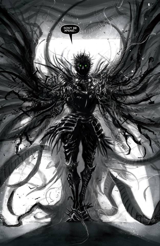
DON'T BE AFRAID
by Abigail J Harding

#tentacles#fhtagn#abigail jill harding#abz#parliament of rooks#concept art#chara design#creature#monster#horror#gaze#darius ravenscar#crows#raven#bird#feathers#fhtagnnn
743 notes
·
View notes
Text


Typography Tuesday
KAREL TEIGE
Presented here are the typographic photomontage designs by Czech avant-garde artist, writer, and designer Karel Teige (1900-1951) for the 24-poem sequence Abeceda (Prague, 1926) by his friend Vítězslav Nezval (1900-1958), featuring dancer Milča Mayerová (1901-1977). All were members of the Czech avant-garde group Devětsil (1926-1930). These images are reproduced in ABZ, edited by Julian Rothenstein and Mel Gooding, and published in San Francisco by Chronicle Books in 2003 (an earlier edition was published by Shambhala in 1993 as Alphabets & Other Signs).
Teige's designs are a demonstration of his Constructivist aim to create a new "optical language, a system of signs capable of embodying words in graphic figures." They are a manifestation of what László Moholy-Nagy had called for in his influential 1925 Bauhaus book Painting, Photography, Film -- the dynamic combination of photographic image and lettering he termed "typofoto."

View our other Typography Tuesday posts.
#Typography Tuesday#typetuesday#Karel Teige#Vítězslav Nezval#Milča Mayerová#Abeceda#Devětsil#Czech avant-garde#ABZ#Julian Rothenstein#Mel Gooding#Constructivism#typofoto#20th century type#avant-garde design#avant-garde type
80 notes
·
View notes
Text


PROPAGANDA
Jon Knight (New Kids on the Block)
He's an absolute beauty, he's all slender, he's got a great nose and a fantastic facial bone structure!


#abz love#5ive#jon knight#jonathan knight#new kids on the block#nkotb#boy bands#boyband tournament#tournament poll#tournament polls#tumblr polls
17 notes
·
View notes
Photo

Abz J Harding
371 notes
·
View notes
Text
AWFULEST lee mood in a while
18 notes
·
View notes
Text

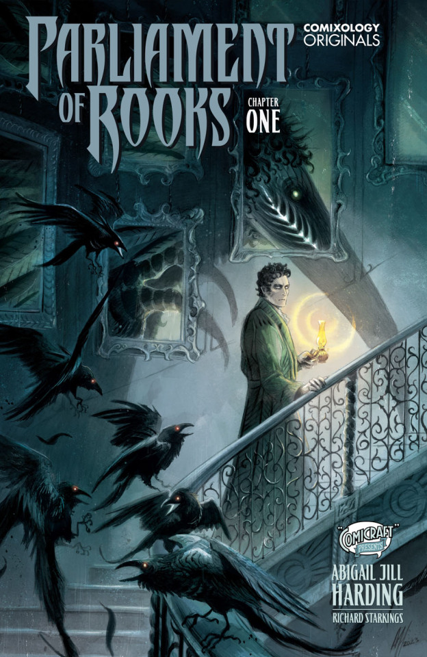
‘Parliament of Rooks’ takes flight from Comixology next week
‘Ask for Mercy’ artist Abigail Jill Harding writes and draws the five-issue gothic love story.
#parliament of rooks#comixology originals#abz j harding#digital comics#comicraft#abigail jill harding#comics
13 notes
·
View notes
Note
What are her favorite singers then??


She is a pretty basic girl. Beyonce, Rihanna, Avril Lavigne, maroon 5, artic monkeys.. stuff like that. But she is always open to try new stuff!

#im 100% sticking by what ghosttundra said abt her just being an average girl liking girl things lol#“im not like theo ther girls” she is the other girl they talking abz#ᵠdon't you dare touch my body like you own it.ᵠ {lacey}#{ anonymous }
2 notes
·
View notes
Text
🃏🌻 My gendrere ies sunflower jester
ur first and last recent emojis are ur gender now. mine is 🅱👨❤💋👨
419K notes
·
View notes
Text
GLOWS LIKE MOONLIGHT
by Abigail J Harding

#tentacles#fhtagn#abigail jill harding#abz#gothic#darius ravenscar#parliament of rooks#feathers#princess seraphina#raven#crow#bird#creature#monster#horror#concept art#chara design#fhtagnnn
309 notes
·
View notes