#a pictorial representation for you
Explore tagged Tumblr posts
Visit Tumblr Blog
Explore Tumblr blogs with no restrictions, modern design and the best experience.
Last Seen Tumblr Blogs


Fun Fact
Premium Tumblr themes are available from anywhere between $9 to $49.
Text
79 notes
·
View notes
Text
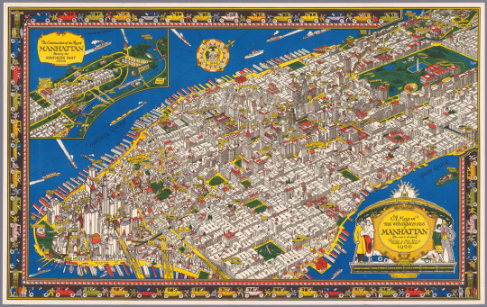
C.V. Farrow drew this beautiful map of what he called "The Wondrous Isle of Manhattan" in 1926. You MUST enlarge it. It wasn't intended to be used for navigation, but rather as a pictorial representation of the island's highlights. Below are a few details that show you what the full-size map is really like. You should enlarge them, too!
Source: Gothamist
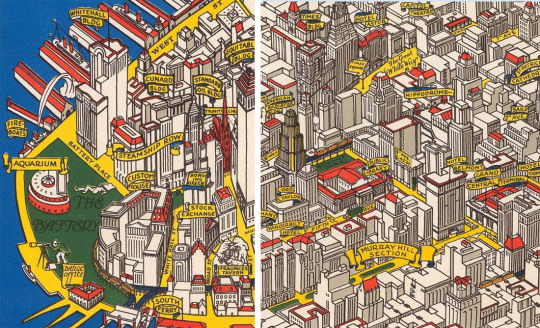
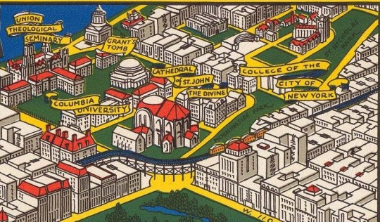
#vintage New York#1920s#C.V. Farrow#map#vintage Manhattan#Jazz Age#Roaring 20s#1920s NYC#illustration#pictorial map#colored map#vintage NYC
2K notes
·
View notes
Text
There's this really cool horror trope I've noticed lately of a villain being introduced in a simplified, unscary form, but later evolving into something so detailed and terrifying, it takes your breath away.
This is not the same as a traditional metamorphosis like in body horror cinema because the trope relies on the medium it uses to sell the scare.
Minor spoilers for Don't Hug Me I'm Scared. Major spoilers for Inscryption and I Saw The TV Glow
To introduce you to the concept, I'm just gonna show you the Care Hound from Don't Hug Me I'm Scared.
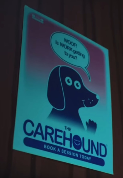
It's the Carehound alright, or rather a pictorial representation of the Carehound. But how do they look in real life?

Ah.
Like the rest of the show, this is both terrifying and hilarious. You think because it's a 2D representation of the dog that the eyes on the side of the head are just artistic license, but then he turns toward you and you realise no actually, he literally has two eyes on each side! Genius. 10/10 joke.
But you see what I mean right? You're given a disarming image of the antagonist so that later, they can pull the rug out from under you with the truth. And there's an element of adaptation limitation that is then broken through. Suddenly the artifice doesn't feel so fake, and you're pulled in.
Now let's talk about Inscryption. Ironically, the game does this in reverse. Though Leshy is hidden in shadow during most of Act 1, we see his evolved form first.
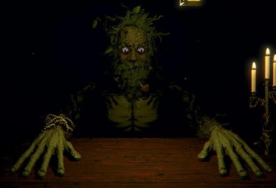
and when Act 2 starts, we see what he was like before.

I believe this was done to de-fang our feral card master after having been our antagonist the whole game. Where once he was powerful polygons, he is now pitiful pixels.
But while all this has been happening, the real threat has been hidden in our deck this whole time.


P03 was introduced to us as nothing more than one card in our deck. He wasn't even a good card. But now it's Act 2 and we realise he, along with the other three Scrybes were trapped in lesser forms by Leshy when he took control of the game. For a whole act, we see something close to a status quo with these guys, who bicker and fight over control of the disc.
We see P03's true form in all it's 16-bit glory, as well as the environment he inhabits. While atmospheric, you can tell the graphics hold him back. He seems so small and pitiful. Simple and limited.
and then he takes control.
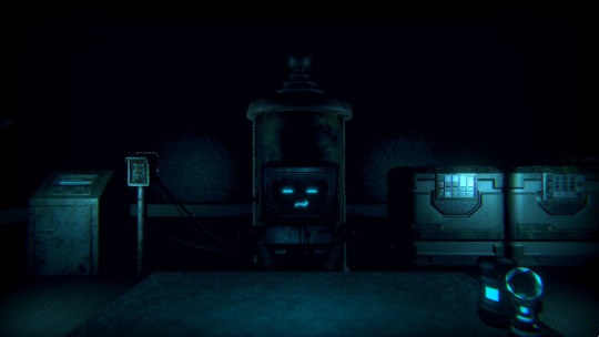
The first time I played this section, there was something so visceral about the leap. I stopped seeing P03 as an NPC inside a 90s TDC and was forced to see him as an entity haunting a cursed floppy disc. Once again, the artifice made me too comfortable, and now anything that felt more real than that became hyper real.
and no movie pulled this off quite has effectively as I Saw The TV Glow.
I am once again flashing a spoiler warning. If you haven't seen I Saw The TV Glow, do not continue reading until you have.
We are introduced to Mr Melancholy as the antagonist of a young adult fantasy series called The Pink Opaque.
Not as the antagonist of the movie we're watching, but the villain of the TV show within the movie.
Right off the bat, Mr Melancholy isn't even on our radar. Even worse, the special effects they use to portray him are laughable.
We see him once again as our lead characters stare dreamily up into the sky, further re-enforcing how silly this guys looks. I mean come on, he looks like an uncooked pancake!!
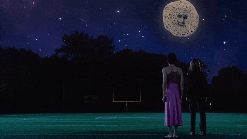
That all changes when Owen sits down to watch the final episode of The Pink Opaque, which was mysteriously cancelled after a cliffhanger ending.
The build up and climax to what happens next is one of the most harrowing cinema experiences I've had in my entire life. This is your final spoiler warning.
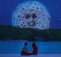
Isabel and Tara, the two leads in the Pink Opaque, are kidnapped by Mr Melancholy's henchmen and brought face to face with the moon man himself.

He looks... good. No, good isn't the right word... he looks convincing. The visual effects between the last time we saw him to now jumped a literal century, and combined with the crt filter hide any possible cg imperfections. In short, it make him look like he's really in the scene.
Or rather... that he's really in the room.
He gets closer, explaining his plan to trap the girls in a realm without magic or memory, where they will suffocate in the nightmare. Where they don't remember the powers they have, or the people they are. where you don't even notice the aspect ratio switched.
Where you don't even remember that you're dying.

and just like that, Mr Melancholy becomes the most real thing in the entire world. He becomes YOUR villain, he's trying to kill YOU! He's already succeeded in killing YOU. YOU are SUFFOCATING right now and you don't even KNOW!
and that's when you remember to breathe.
116 notes
·
View notes
Note
Continuing on the last ask about learning to start drawing OCs, do you have any tips on developing styles? I find it really difficult to “let go” of the need for things to be proportional or physically accurate, but I really want to start developing a more cartoon style.
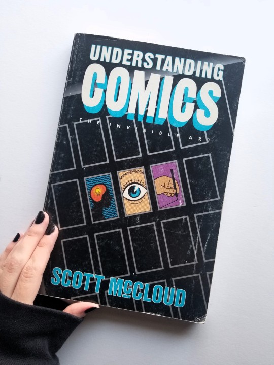
Hi! In reference to this last post. I'm going to site a lot of stuff from a book called Understanding Comics: The Invisible Art by Scott McCloud. It's a great resource for anyone interested in cartooning, visual art, and comics as a unique storytelling art form.
Cartooning, whether it’s for comics or animation, is a very utilitarian art form. Cartooning skills and an artist's style are often forged in the hellfire of a deadline. For example, what my art style looks like when I've drawn an 80-panel comic in one week looks very different from a single illustration I’ve done in that same time frame.
Cartoonists simplify for the function of needing to draw everything by hand over and over and over again. But we also simplify for the emotional universality of the cartoon image! As stated by McCloud in the following three images.
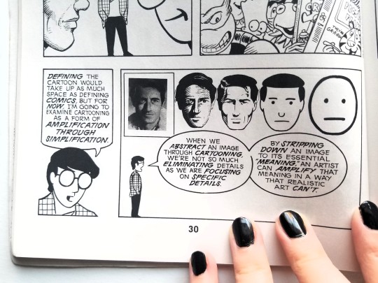
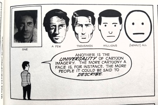
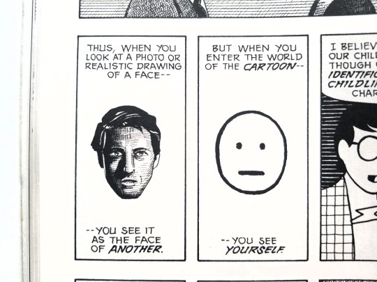
Technically all 2D art is a form of caricature because we are reducing our 3D reality onto a 2D plane - which inherently abstracts form. Anytime someone sits down to draw (or write), they're engaging with a level of representation within pictorial space.
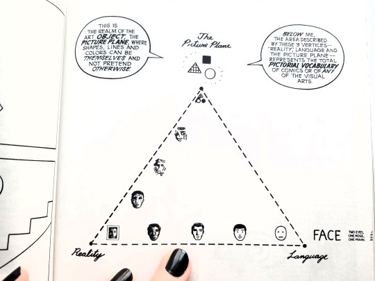
As an artist, we inevitably work in all modes at some point or another. But I think most artists will show a preference towards different corners of this diagram and that influences their style!
Ask yourself: where would you place the style you're seeking to achieve on this triangle? There's a more detailed version below with many cartoonists and styles for more examples.
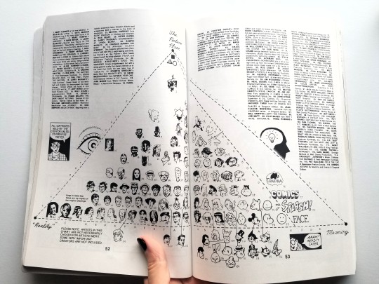
I like this diagram especially because it shows the wide variety of cartoonist's styles. That's why this ask has been particularly tricky for me to answer. It's hard to give advice on becoming more cartoony without knowing what that specifically means for you, anon!
That said, I can still give some general good practice tips that hopefully anyone can utilize in their cartooning journey!
Figure drawing. Short poses (1-5 minutes). Figure drawing from life is ideal because life very rarely sits still. If you don't have any figure drawing studios in your area then go to libraries and coffee shops. You can also ask friends or family to sit for you. And finally there are figure drawing resources online that often include timers. Tip: Try drawing only with ink so you can’t erase. You won't have to do this forever but it's a great way to live with the "happy accidents" and then move on to the next drawing!
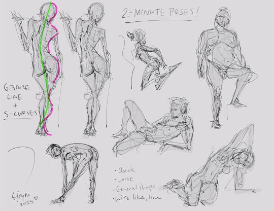
2. Gesture lines and S-curves. The gesture line captures the initial motion of the pose and will often follow the direction of the spine! S-curves are the alternating "S" shaped curves that represent the distribution of weight across the body. Exaggerating the S-curves is how cartoonists and animators often push the expressive form of the figure. When drawing the figure try to find the gesture line first and then build the weight of the pose on top of that!
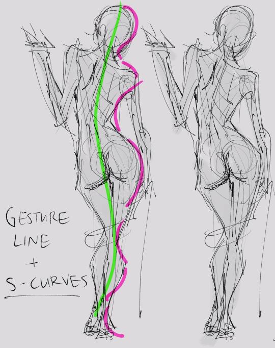
3. Give yourself a deadline. Set a timer. Stick to it! Even if all you manage is a quick line gesture. Just move on to the next pose!
Finally, I really recommend reading Understanding Comics by Scott McCloud! It's a wonderful resource that anyone interested in the visual arts could benefit from reading. I first read it 17 years ago, back in my high school film class.
Phew! That's a long one. Hopefully, there's some useful info in there for you. But do feel free to ask any follow-up questions. And good luck on your cartooning journey! 🖤
(There's also another ask in my inbox about drawing cartoonish expressions. I'm working on a response but it may take a little bit. But don't worry, I'll have a detailed answer to that in the coming weeks!)
42 notes
·
View notes
Text
Eight months deep diving into the bl world and this is my classification (with contribution by my beloved friends @kwannie-lix and @basicallyafangirlsworld ) :
Seriously unserious: Semantic error/to my star/bad buddy/history trapped/my love mix up/ love tractor / my school president / love by chance/Jun & Jun/Love is a poison/sing my crush/2gether the series/love mate
Seriously emotional: Unknown/the on1y one/blue canvas of youthful days/kiseki/jack and joker/his 2020 movie/moonlight chicken / a tale of thousand stars/ long time no see/ not me/ our dining table/see your love/guardian/peach of time/I cannot reach you/I hear the sunspot
Unseriously serious: Cherry magic (live action japan) / old fashioned cupcake/thamepo/ eclipse / last twilight/kissable lips/eccentric roommate/want to see you
Spiritually horny: word of honor, untamed, tgcf (donghua)
Horny: kinnporsche, only friends, bed friend, love in the air, big dragon, TharnType, the unforgotten night, Cherry magic (anime)
...
Inspired by the legendary them gay shows map by @uweiy hehe would you like to make a pictorial representation of this ( ˘ ³˘)♥
...
Add or modify this as you wish!!!!
#them gay shows#untamed#word of honor#tgcf#unknown#see your love#semantic error#kiseki dear to me#bad buddy#my school president#cherry magic#old fashioned cupcake#and a lot more beautiful asian queer dramas#in love with this world#my life mission is getting all my destiel trauma friends into healing asian drama#something about how asian dramas never do anything half heartedly and put their whole ass pussy into emotions even if the show is unserious#lgbtq media#asian lgbtq dramas#taiwan is my favourite so far
28 notes
·
View notes
Text

Seires Rec
Sweet Little Lies by Cofkett - (Mornings with Colin and Penelope) -(Rating: Mature, Words: 240)
Penelope tries to trick her husband one morning, but he knows her too well.
For The Children We'll Have by ahopelessromantic - (All The Years We'll Have Together) -(Rating: T, Words: 966)
[Spoilers if you've not watched S3].
Penelope discovers she is pregnant shortly after she has revealed herself as Whistledown and frets over her husband's potential reaction to the news.
Colin is startled that Penelope is so anxious about his reaction until he realises why.
Interruptions by IcyDragonfruit - (Bridgerton Season 3: Extended Edition ) - (Rating: G, Words: 1,751)
Where Eloise and Francesca get held up a little longer at the Modiste and Colin and Penelope’s make-believe ball continues past the “your eyes” compliment. Shenanigans ensue.
A thousand words by lafleurdumal - ( Pictorial evidence) - (Rating: Explicit, Words: 3,536)
Colin accidentally sends Pen a dick pic, but her response surprises him.
'cause i really wanna know (will anybody ever love me?) by im_just_better_fictionally - (we're gonna build a home together, you and I forever and ever ) - (Rating: G, Words: 1,817)
Colin wouldn’t mind letting Penelope pace back and forth on the airport carpet if he didn’t worry the rapid speed and quick turns weren’t the signs of something a bit deeper.
“Pen, you’re making me nervous with all that walking around,” Colin said. ��Come and sit down with me. Everything will be fine.”
He pats the seat next to him and sends a small prayer up to the gods that her girlfriend will listen to him.
/ / / / /
Polin Week Day 1: Polin Song
Overheard In A Ballroom by hobbitsdoitbetter - (Overheard…) - (Rating: T, Words: 12,810)
The first Bridgerton Ball of the season, and Lord Fife is a dick, Daphne and Kate are Queens and Colin Bridgerton’s feeling protective of Pen…None of which could possibly lead to any sort of strife or scandal, could it?
COULD IT?
You’ve been around the Bridgertons, what do you think?
Reminder by Mrs No One Important (Madeline_Canada_Williams) - ( Spicy Polin) - (Rating: Explicit, Words: 5,398)
Colin needs a reminder for himself and Penelope
they don’t how you’ve haunted me so stunningly by my_middle_name_is_awkward - (confess my truth in swooping, sloping, cursive letters) - (Rating: G, Words: 22,020)
My Dearest Penelope,
Last night, I realized that I have expressed how I feel for you here, in a journal that only you and I shall ever read. I am giving this to you because I need for you to see how much you have consumed my every thought for the past few weeks.
I must apologize, however, as this is not a great representation of my writing. All these words were thrown onto the page as they came to me, with no order or organization. Just my inner monologue as I scrambled to figure out my feelings for you.
Happy reading, Pen, Yours, Colin
Or
Colin kept an account of how he fell in love with Penelope in his journal. Then he gives the journal to Penelope as an engagement present.
something wrapped all of my past mistakes in barbed wire by frankchurchillsaysrelax - (invisible string) - (Rating: G, Words: 2,069)
Before Colin could speak, however, Penelope’s mother and Cousin Jack had thrown open the doors and, seeing the ruby necklace in Colin’s hands, loudly brought attention to the young pair’s impropriety, drawing a small -yet large enough- crowd. Colin had looked so confused, his brow furrowing adorably as though he couldn’t fathom why everyone had such an issue. As he would say later, it was only him and Pen. Penelope had stood by in shock, unable to form words. She should have seen this coming. There was only so long that they could get away with breaking the rules of society.
Within the hour they were officially engaged.
In Which Mr. Colin Bridgerton Externally Processes His Relationship with Mrs. Penelope Bridgerton by TheTimeTravelingSeamstress - (In Which the Bridgertons Go to Therapy ) - (Rating: G, Words: 2,082)
Colin Bridgerton is many things. Oblivious is one of them. In observing his mother with Mr. Marcus Anderson, Colin begins to question some things, only to then realize many things. Namely, he doesn't deserve his wife. Mr. Anderson guides the man through this realization and how to make things right, if not for Penelope, but for Colin himself.
22 notes
·
View notes
Text
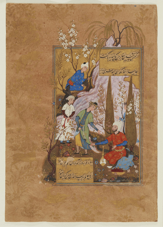
A Lover’s Plea
Folio from a manuscript of the Collected Works (Divan) of Sultan Ibrahim Mirza (fol. 32)
Artist: `Abdullah al-Muzahhib
Compiled by: Gawhar Shad
Poet: Sultan Ibrahim Mirza, Persian, 1540 - 1577
Place: Iran, Qazvin, 1582-83 CE
Materials: opaque watercolour, ink, gold and silver on paper
Encounters between male lovers and their beloveds, often in garden settings, is a frequent theme in both Persian poetry and painting. The ghazal or amatory poem by Sultan Ibrahim Mirza that this illustration accompanies is a perfect example of this long-standing text-image symbiosis. In the verses immediately preceding the painting, a lover pleads with his beloved to recognize his devotion, to return his love, and to stop causing him such heartache. In the verse in the upper panel, his beloved finally answers by laughing and chastizing the lover, “Oh Jahi, don’t say such things, you insolent cad, have some shame.”
It is clear from the actions of the painting’s two principal figures that the lover is the bearded man kneeling beside a stream and reaching out to grab the hem of the younger man’s robe. The lover’s elevated, possibly princely, status is indicated by the gold penknives hanging from his bejewelled belt and by the fur-lined blue outer robe that already has slid off his shoulders. The clean-shaven, youthful beloved is obviously trying to walk away, but not before turning back to inflict his final, cutting words. What the lover actually had in mind—a romantic tryst in the countryside—is evidenced by the large, gilded wine flask, the blue-and-white wine cup, and the golden bowl of fruit in the foreground. Instead, the dénouement is unhappy for both parties, with their separation witnessed by three attendants, including one who peers out from behind a cypress tree and another who fills a silver (now oxidized) ewer from a waterfall following over the mauve hillside.
In addition to exemplifying a traditional form of Persian pictorial representation, this painting and its surrounding verses confirm Sultan Ibrahim Mirza as a poet of the “realist school” that developed in Iran during the 16th century. In this poetic genre, writers employed colloquial expressions such as “you insolent cad” to capture human emotions and reactions. Sultan Ibrahim used the pen name Jahi for his verses and frequently ended his poems by invoking himself often, as here, in a lovelorn state.
#Sultan Ibrahim Mirza#Abdullah al-Muzahhib#Gawhar Shad#Iran#qazvin#16th century#Persian#watercolour#art#calligraphy#history#lovers#men#homosexuality
26 notes
·
View notes
Text
paintings* round 1 poll 82

about the artist: Since 2005 he is publisher and editor-in-chief of DIK Fagazine, and has founded the Queer Archives Institute in 2015
Maria Konopnicka (from the series "Poczet"), 2017:
propaganda: I will just quote some text from the curatorial text by Fanny Hauser and Viktor Neumann accompanying the "Poczet" exhibition at Kunst(Zeug)Haus, Rapperswil, Switzerland (23 August - 1 November 2020), because they talk about it better than I could: "The Polish word “poczet” once referred to the smallest unit of the army of Polish-Lithuanian Commonwealth (1569-1795), and later came to describe a group of people of common descent or performing a specific role. Most importantly, the word relates to a series of portraits of Polish kings and queens (since 966 to 1795), arranged chronologically and conceived as pictorial representation of Polish history [...]. [...] The artist’s employment of portraiture, traditionally considered a bourgeois genre, constitutes a crucial part of his practice as a means to paraphrase and inquire the aesthetics of a variety of historic artistic movements and practices. Adding another perspective to the common visual codes and historical narratives, this contextual shift becomes a subversive strategy to challenge dominant modes of representation and commemorates those who have been subjected to the patrilinear logic of history. Radziszewski’s "Poczet" is a bold retake on the idea of the formation of national identity as demonstrated by pictures that testify to (or rather construct) the continuity of royal power, exercised by heterosexual, cisgendered males and perpetuated through royal marriages. Forming a gallery of twenty-two ancestral portraits of non-heteronormative Polish figures of the past millennium from fields including politics, science, literature and art, "Poczet" deliberately reaffirms the protagonists’ expression of queerness that has been suppressed or erased from their historiography to a large extent."
The series "Ali", 2015-2017:
propaganda: Taken inspiration from Picasso in terms of style (specially like the nod to Guernica), to pay homage to the real life figure Agbola O’Brown (pseudonym “Ali”), a Nigerian-born jazz musician and the sole black combatant of the Warsaw Uprising, right wing assholes like to definine who and who not belongs, so this work really speaks to me as a counter work.
39 notes
·
View notes
Text
I just recently started to get into Sigil Magick, and of course, I gotta experiment to see how I can help others with my new learnt skills. So for a short period of time, I'll be doing free sigil magick for people, to experiment!!
What is a sigil:
"A sigil is a type of symbol used in magic. The term usually refers to a pictorial signature of a spirit. In modern usage, especially in the context of chaos magic, a sigil refers to a symbolic representation of the practitioner's desired outcome. "
Basically, you can create a symbol to achieve your desired results!! Like money, beauty, a special person, etc etc
You can head on over to my asks and fill out this form!! Keep the desire simple and easy for me to understand, not a whole paragraph long or a backstory, but also specific.
Name:
Desire:
That's it lol
Example form:
Name: Willow
Desire: Earn £1K this month through commissions
I'll respond with an image of your sigil.
Your sigil will already be charged by yours truly, depending on the topic of your desire, it can be charged differently.
Ways a sigil can be charged:
Elements: Fire, water, earth, air
Meditation
Sex magick
Energy
Exercise
OK that's all bye, I hope people are interested runs away
#reality shifting#shifting#shiftblr#shifting blog#shifting reality#shifting community#law of assumption#loa#manifesting#subliminals#witchcraft#witch#sigils#chaos magick#magick#witchcore#witchblr
24 notes
·
View notes
Note
I see you very much as an expert on all things Rohirrim, so I bring to you this question, hoping I can pick your brain for info to use in my own fics (full disclosure). 😅
It seems to be a popular fanon that the Rohirrim/Riders of Rohan have tattoos, and that body art is a part of their culture. Do you have any thoughts or personal HCs about this that you're willing to share?
Thank you in advance! I appreciate you and your blog so much (if you didn't already know that).
Oh my goodness!!! I am so very honored to be thought of as a person who is knowledgeable about my beloved Rohirrim, and I hope very much that I can live up to that reputation. Thank you!!!
I’m not aware of any real textual evidence for body art among the Rohirrim, and the historical record in the medieval Anglo Saxon and Norse societies that Tolkien used as a reference for them seems to be disputed. But I absolutely understand and agree with the conventional wisdom that tattoos are a thing in Rohan. It just fits well with a warrior culture that has a wilder, dare-I-say more pagan aesthetic as compared to the smooth solemnity of Gondor or the formal elegance of the elves. And since they’re a culture that doesn’t document things in written words, pictorial representations such as tattoos and body art would be one way to fill that gap (along with their songs and oral traditions).
In my mind, tattoos in Rohan are common but basic—they’ve really only got the technology for the “stick and poke” method so the designs are kept simple because anything too elaborate is difficult to pull off well. They’re mostly in black line (using soot) but some have color using powder made from grinding up certain dried roots and plants.
Each village/community has its own distinctive tattoo motif that is worn by all of that community’s members. So you can tell just by looking at someone whether they’re from Upbourn (a fish because it’s a river town) or Dunharrow (mountain peaks since they’re in the White Mountains) or Everholt (a boar in honor of the wild boar that live in this part of the Firien Wood), etc. And soldiers also tend to share tattoo designs specific to their éored—getting your éored’s mark is a formal rite of passage for the younger members when they first get assigned to their company. These shared tattoo designs are important both for group cohesion and as a means of identifying fallen Rohirrim even if the deceased isn’t known to whoever finds the body.
Beyond these ritualized and practical functions, I do also like to think that there are some purely decorative tattoos among them as a means of personal expression and/or to help cover small scars that so many Rohirrim have from battle, riding accidents or other mishaps. Obviously horse-based designs would be very popular, as well as other flora and fauna of Rohan. But they’re a very sentimental people and so I think little emotional signifiers would also be very common (again, especially because they generally don’t have a means to pay tribute to beloved people/things in written form, this sort of symbol would serve the purpose of making some kind of record of those tributes).
In terms of specific people in my head canon: Éomer has a little simbelmynë blossom for each of the major figures in his life that he’s lost (forearm). Háma had a sun to remind him of his wife, who brought warmth and light to his life (shoulder). Théodred had stars in the shape of a particular constellation that is visible every year on his mother’s birthday (chest). Éowyn has a representation of her father’s sword (left wrist) and gets a quill (right wrist) to represent Faramir after they get married. (Faramir got a little running horse in her honor on his first trip to Rohan. He was glad he did it, but he never wants to sit through that again.)
Merry brought tattooing back to the Shire when he showed up with a tobacco pipe on his bicep (both for its association with Buckland and in tribute to Théoden, whose last words to Merry were about smoking together someday when peace was restored). Unsurprisingly, tattoos did not catch on with the other hobbits, but Merry remains very proud of it.
Anywayyyy…I hope that was in any way helpful! Thanks so much for asking!! I remain a huge fan and am so grateful to you for helping convince me to put some of my thoughts and stories out there vs keeping them all in the confines of my own Google drive!
#lord of the rings#lotr#tolkien#asks#answered asks#rohan#rohirrim#éomer#éowyn#háma#théodred#merry#faramir#lotr headcanon#tattoos
74 notes
·
View notes
Text
Planner/Recorder layout
not very necessary to make but will be efficient, adjust if needed
Can be done on applications like google docs though I'd advise reducing screen-time before it permanently damages our eyes. [reason I suggest this "planner" method: keeps the work over the time arranged systematically and every time we open the planner, what we're doing and the results will lay documented in front]
(There isn't a need of any "material resource" which some of us might assume we "don't have and so can't do it", I know because I've been there. If we desire, we can make even a single, daily-life resource to be tool for victory. Don't let anything of the sort stop you, make use of what you have. It's you who has to grow and not the pile of tools.)
pictorial representation at the end
VERY IMPORTANT: It's important one understands that the goal we're chasing is not to make our work "aesthetically beautiful", it is to help us record the practical efforts we put not the superficial ones.
ONE: Pick out a notebook or a diary of any type whether it be fresh or used (let's save resource) , which shall pose as a planner for the next two months. Again, the aim is not pseudo-gratification from beautifying this planner.
TWO: On the first page (of the notebook or from wherever you begin the record), draw a small-sized calendar for the months coming under this two month journey.
THREE: Break down your goal into months, then into weeks. Divide the two months into different phases, each represented by a week.
My planner has nine weeks over two months. You all can check out on your own planner 👍
FOUR: The page right after the calendar (leave the remaining space empty for now) should now contain columns with each week and the fragmented goals you must fulfill written under that along with the dates falling under the week.
FIVE: Enclose the portion with all dates falling under the week in a box. People preparing for entrances or even just studying can highlight one specific date falling on the same weekday every week as "full-week-revision-day".
SIX: On the page right after the one where all the weeks and their goals have been penned down, make a time table for your day.
Important: Do NOT do things of the sort where we're going into details like "6:00am to 6:05am - brushing teeth".
There is a way to make time tables: it's not an absolute replica of how your day is supposed to go like ideally but is meant to provide structure to the day.
[I'll put up a separate post on how to get that done properly because it's going to take up a portion of this post otherwise]
SEVEN: Under the time table, draw a line and put down the heading "WEEKLY PROGRESS" and leave the area blank for now.
EIGHT: The page starts with the heading "Week 1". Right underneath, put down all dates lying under the week and the work distribution for each one of the days.
Remember: We are all human beings not AI bots. These daily goals MUST be practically achievable. It can't be, say— I'm going to finish a whole damn textbook or even chapter from scratch in a day, or I'm going to jump directly to a hundred pushups from zero.
Be real to yourself and the world. Understand your capabilities and aid growth of self not diappointment.
NINE: One all daily goals of the week have been listed too, draw a centrally placed small line for a mild differentiation and then put down the date of the first day.
Whatever you will be planning to do on one day must be noted and planned before you sleep the previous day— a productive day begins a night before.
TEN: Record your mind in this space now. People who push their limits and work hard to attain certain goals also go through a "mental metamorphosis" and become stronger identities.
There will be several revelations along this journey so my personal opinion to it is whenever some heavy words— be it sad, hurtful, motivating, elating, or even those we feel about the world through the journey —happen to emerge in your mind, pen them down.
(Don't worry about anyone reading all this. As long as there is dedication in one's mind and results at the end, no one truly can question.)
I've just quickly drawn it over in Microsoft Paint but this is an overview in case something isn't clear above—
(in case you can, save the images and put white over all text then get it printed and use that instead of bothering to write it all down)


#two months of going beyond#tmgb#spilled thoughts#spilled ink#change your life#change the world#understanding#inner peace#introspection#life#lifestyle#life lessons#meaning#love#peace#self love#self realization#self care#inspiring quotes#quotes to live by#quoteoftheday#growing up#life quote#words#quotations#writers on tumblr#metamorphosis#growth#quotes#artists on tumblr
12 notes
·
View notes
Text
A Hypothesis as to Why My 80s/90s K-12 Math Ed Sucked
K so today is "going down the line until someone has a spare set of tens they can loan you" subtraction. AKA problems like "300 - 214" or "4000 - 738."
As usual, I'm doing these with the unit blocks because the primary school textbook told me to:

I'm also doing these with the blocks because I am historically terrible at problems that involve multiple "borrow" steps. Specifically, I can never remember when to borrow and when not.
My fifth-grade teacher once told me I'd make "a terrible banker" because "you borrow too much money!" I think he meant this as a joke. As a kid, I felt weirdly insulted; as an adult and a teacher, I wonder why he didn't do a single thing to help me stop "borrowing too much."
That specific teacher aside (he was legit bad at most aspects of teaching), using unit cubes for multiple-borrow borrowing also has me wondering: Was 80s/90s math education bad because we thought we were imitating good math education?
When the Common Core standards first dropped, the Internet was awash in examples of number lines, "counting on," and other CPA-esque methods of teaching primary math. A lot of these examples got pushback from their posters, who didn't grasp that there are many ways of thinking about numbers.
A friend of mine, a marine biologist, replied: "What most people don't get is that these Common Core examples are how people who are good at math think about math."
(Said friend was very good at math and regularly surrounded by people who are good at math, so I believe her.)
When I was taught basic math, we were deprived of concrete manipulables and even pictorial representations almost immediately. If we demonstrated that we understood what a number symbol stood for (7 = "that's a seven" *holds up seven fingers*), we were deemed "too advanced" for concrete or pictorial representations.
By the time we got to the borrow-ad-infinitum-minus-one type subtraction, most of us had had concrete tools withheld for at least two years (first and second grade) and sometimes 4-5 years.
People who are good at math can look at a problem like 4000 - 1228 and get an accurate answer fairly quickly in their heads. There are no manipulables involved and there may be no jotting answers down, either.
I'm no historian of math education, but I wonder if the prevailing hypothesis was "if people good at math can do this invisibly, then to make kids good at math we should make them do it invisibly too, and as soon as possible."
Anyway I still suck at borrowing repeatedly, so back to the clicky blocks it is for me.
#actually dyscalculic#dyscalculia#embarrassing myself#teaching math#math anxiety#actually adhd#learning difficulties#learning disability#learning disorder#math dyslexia#mathblr#maths#maths posting#mathematics#i hate math
9 notes
·
View notes
Text
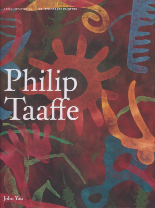
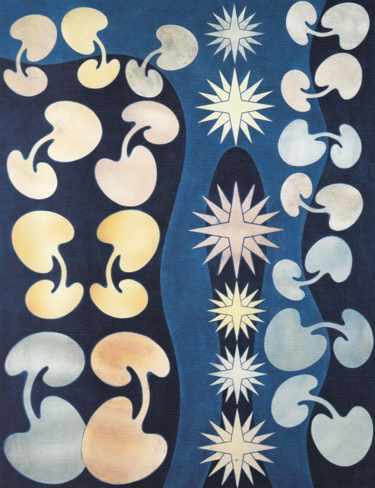
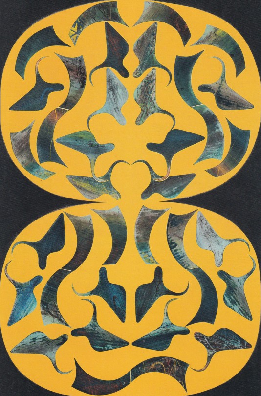
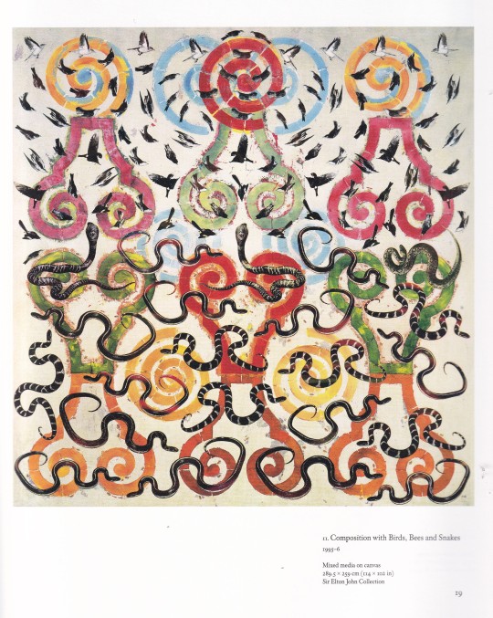
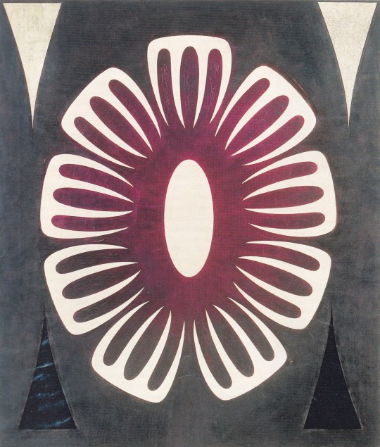

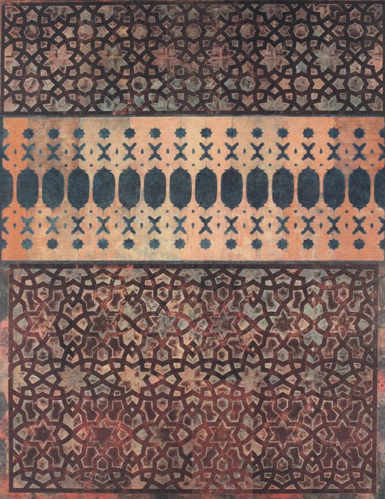
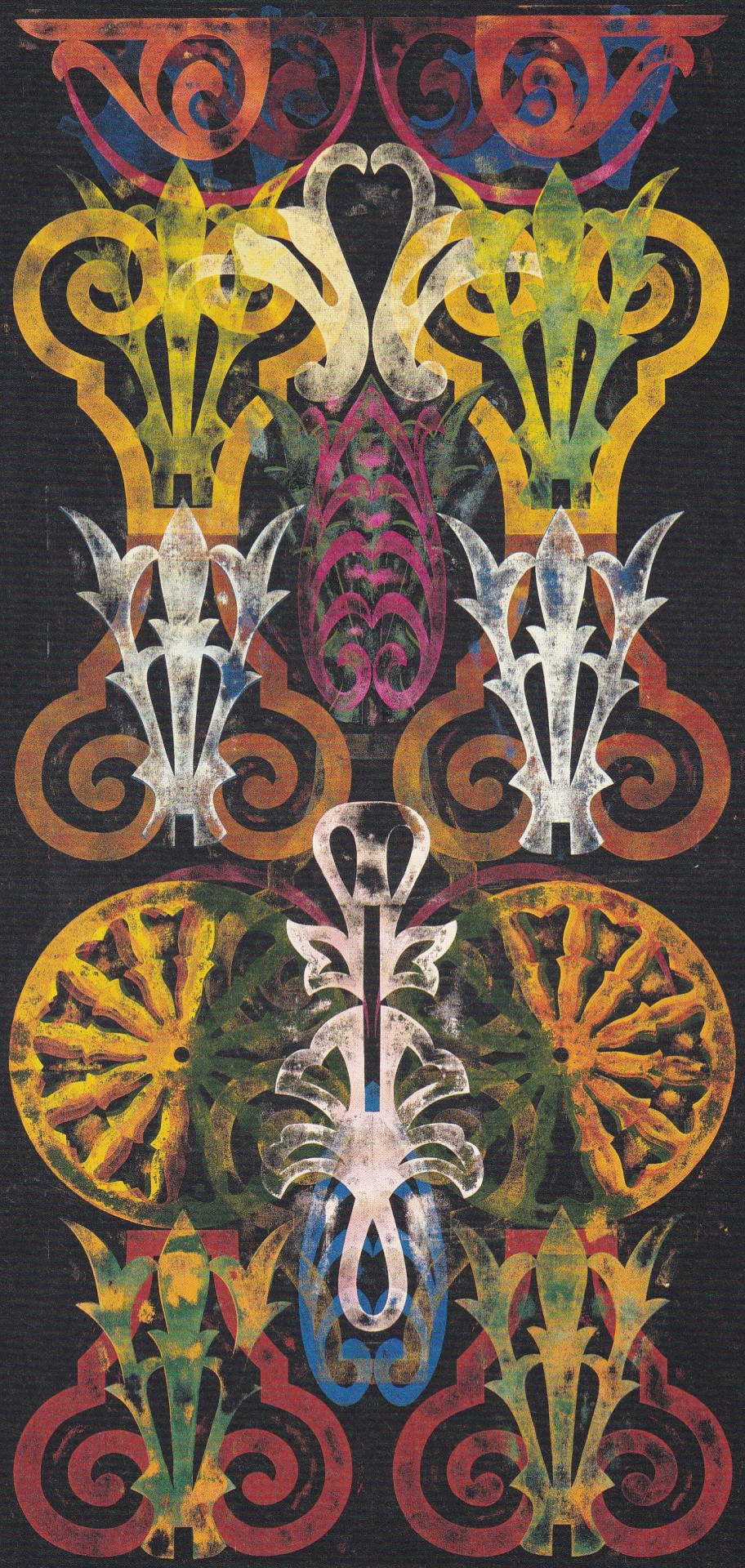
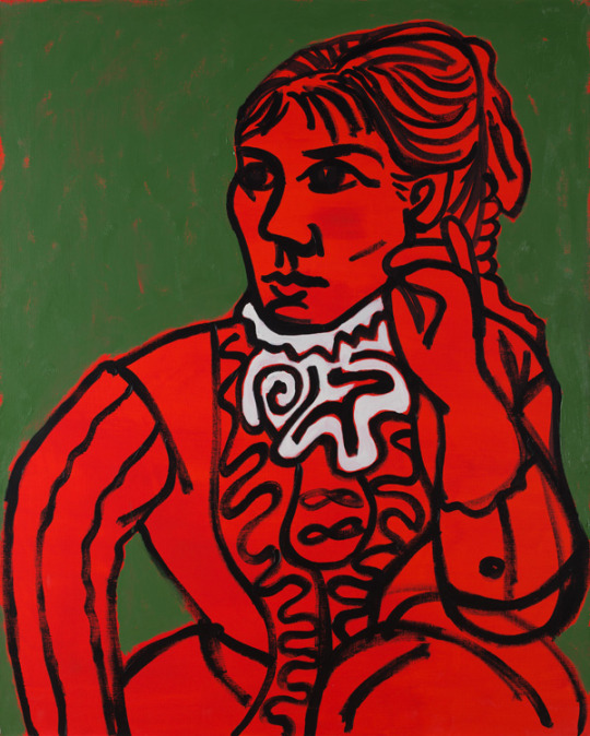
Philip Taaffe
John Yau
Lund Humphries, London 2018, 144 pages, 100 colour illustrations, ISBN 978-1-848 22-263-2, Contemporary Painters Series
euro 45,00
email if you want to buy [email protected]
email if you want to buy [email protected]
This book presents a comprehensive view of the work of American painter Philip Taaffe (b.1955), who has expanded the parameters of painting through his use of silkscreen, linocuts, collage, stencils, gouache, chine-collé, marbling, acrylic, enamel, watercolour and gold leaf. Possessing many technical skills, Taaffe has moved decisively between unique pictorial inventions and appropriations, as well as overlaying divergent modes of representation, through cultural patterns found in ornament, and biomorphic abstraction.
John Yau's insightful text is the first to look at every part of Taaffe's artistic development, from the works he made at Cooper Union while a student of Hans Haacke, to the present. It pays special attention to Taaffe's acquisition of different techniques, as well as investigating his various sources of inspiration, which include the work of experimental filmmakers Stan Brakhage, Bruce Conner and Harry Smith, the Natural History illustrations of Ernst Haeckel, and the ancient art of paper marbling.
24/01/24
34 notes
·
View notes
Text
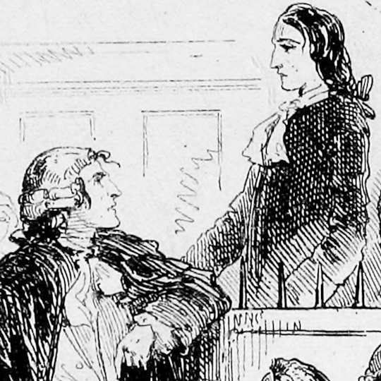
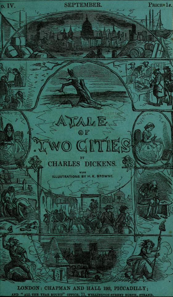
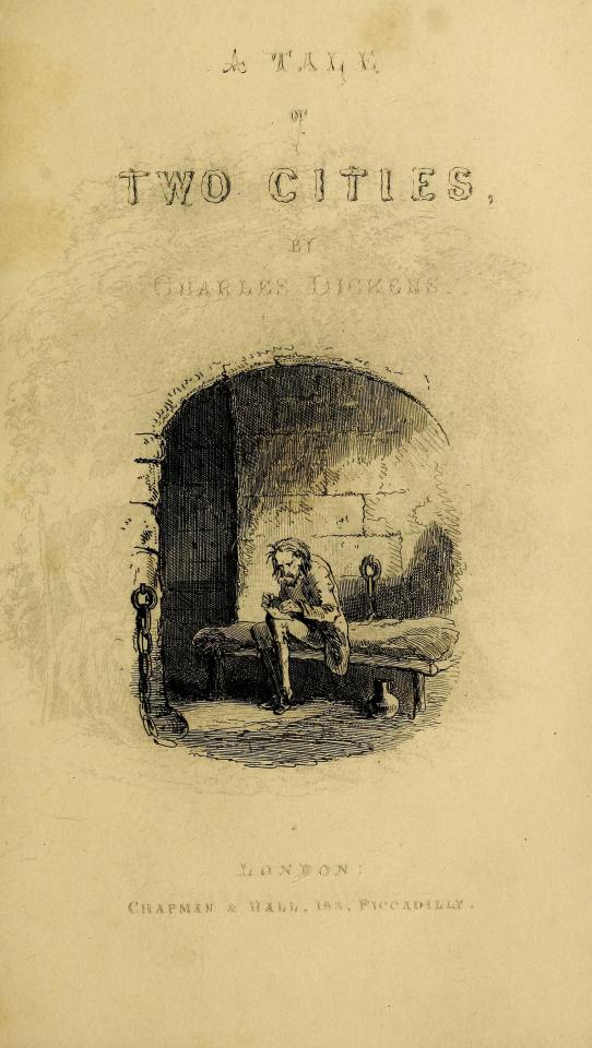
The Many Illustrators of A Tale of Two Cities 1: Hablot Knight Browne (a.k.a. Phiz)
...& a century-and-a-half-long game of telephone...
For the first post in a series on the book's illustrators, how could we start with any but the very first one?
"Although a number of critics have pilloried Hablot Knight Browne ('Phiz') for his supposed ineptitude in the program of illustration for A Tale of Two Cities, the fact that he so astutely realized and graphically elaborated so many significant elements of Dickens's letterpress is evidence that his pictorial series reflects an extremely careful reading of the printed text...The visual accompaniment [that these illustrations provided to the novel's monthly installments] was not mere ornamentation, but an aide-mémoire intended to facilitate the monthly reader's keeping track of a discontinuous narrative over a period of seven months."
from "Charles Dickens's "A Tale of Two Cities" (1859) Illustrated: A Critical Reassessment of Hablot Knight Browne's Accompanying Plates" by Philip V. Allingham from the 2003 volume of the journal Dickens Studies Annual.
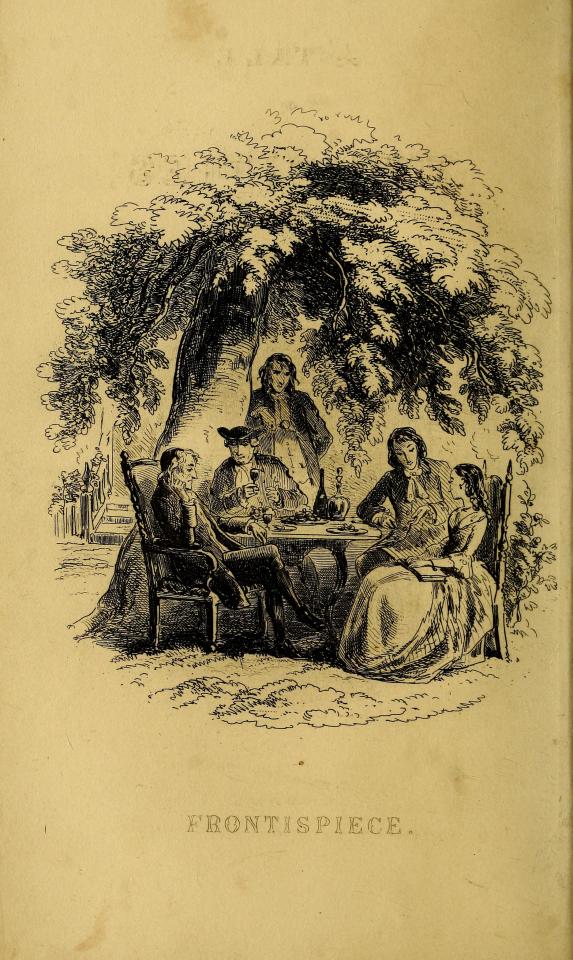
Frontispiece Cover to the Monthly Installments Vignette
For some perspective on the significance of this first set of illustrations - published initially within monthly installments of the novel in 1859 (the text of which was collected from the original weekly installments published in All the Year Round, also in 1859) - that single quote comes from an entire article on these illustrations that is itself 49 pages long.
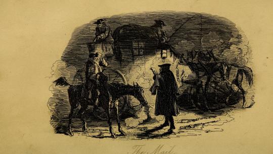
The Mail
As such, suffice it to say that this particular post will not be a thorough examination of the history, context, and impact of these illustrations (though, for those interested, be sure to click on any links you see throughout this post for all sorts of further reading!).
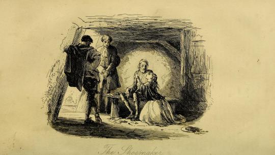
The Shoemaker
Instead, it will simply be a place to observe and appreciate these illustrations for what they are, in their "original" glory.
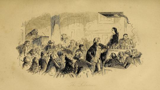
The Likeness
...I mean, just look at these things! (I'm of course gonna break formality after this one because it's my favorite😌)
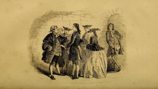
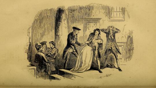
Congratulations
In terms of the odyssey of finding the proper edition of these to post, "original" is the operative word.
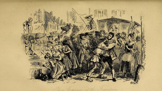
The Stoppage at the Fountain
These are the oldest (except for some or possibly all of McLenan's...more on that many months from now though) and certainly the most iconic of the illustrations of this novel and thus have also had the most mileage, having been passed from edition to edition to edition countless times over the last 164 years.
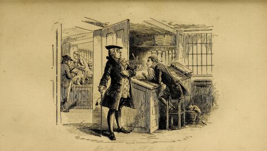
Mr. Stryver at Tellson's Bank
That means - as the gif at the top of this post demonstrates - that these illustrations have slowly been "translated" over time into dozens of distinct images - in ways as innocuous as a change in a shadow and as striking as a change in a character's facial expression.
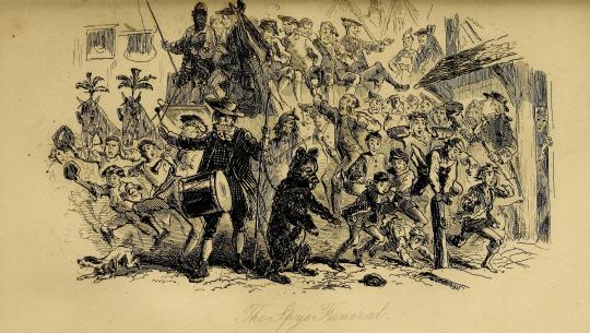
The Spy's Funeral
These translations have happened in all sorts of ways over the development of printing technology - blemishes, xeroxing errors, low-quality or blurry scans, too much ink being used in printing, image compression, sometimes even actual tracing of the original illustrations! - and as interesting as they can be on their own, for someone determined to find the most accurate representation of Phiz's phenomenal work, they can be...phrustrating.
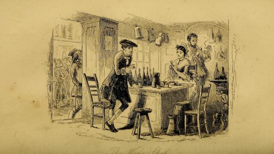
The Wine-shop
In fact, as a sidebar, the illustrations that I used for the Best Character Showdown bracket turned out to themselves be traces and not originals! I am Ashamed and disheartened! You could even say that I am yet another...
The Accomplices
accomplice in the mistranslation of Phiz's work!
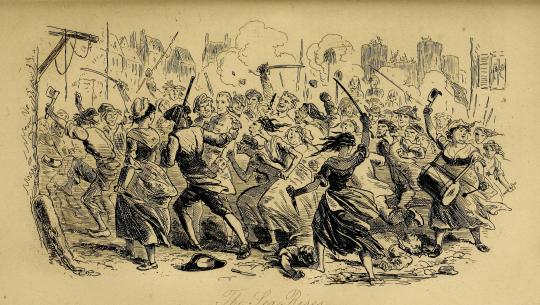
The Sea Rises
Rest assured, though - although they are not from the monthly installments themselves (which as far as my research has gone do not seem to be anywhere on the Internet), these particular scans are sourced directly from an online scan at the Open Library project (contained within the Internet Archive) of the first edition of A Tale of Two Cities, itself also published in 1859.
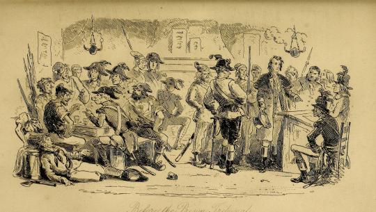
Before the Prison Tribunal
I do wish that they hadn't been cropped the way that they have and that they were available in a (much) higher resolution, but as of now, they're the best representation of Phiz's original work that we netizens have!
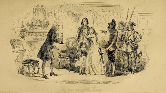
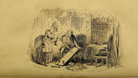
The Knock at the Door
A Tale of Two Cities was the final novel that Phiz illustrated for Dickens - and marked the complicated ending to a twenty-three-year (yes) professional partnership between the author and illustrator - but his work here will mark a beautiful beginning to the long archiving project we will experience together here on this blog.
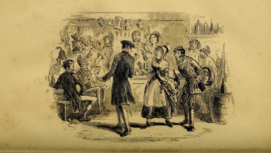
The Double Recognition
Throughout the work of this project, there will be quite a variety of sources being used - from direct scans by me to the two-tone abstractions of PDFs clearly not created for the purpose of storing image information - depending on the needs and availability of each edition.
After the Sentence
All of it goes to show the importance of accuracy and attention to detail in archiving art, which is itself an art form to be appreciated.

Hope you've enjoyed!
& the standard endnote for all posts in this series:
This post is intended to act as the start of a forum on the given illustrator, so if anyone has anything to add - requests to see certain drawings in higher definition (since Tumblr compresses images), corrections to factual errors, sources for better-quality versions of the illustrations, further reading, fun facts, any questions, or just general commentary - simply do so on this post, be it in a comment/tags or the replies!💫
#A Tale of Two Cities#AToTC#classic literature#victorian literature#dickens#charles dickens#engraving#illustration#illustrators#Phiz#Hablot Knight Browne#1850s#HOUUGHHHAGHGUHGGHHHHOUHGHHOUHGHHGAHGHSGHGHGH#how long have i been working on this today? has it been eight hours?#well? how did I get here?#again most of them won't even remotely be like this#but it's phiz! i gotta do phiz right!#also for the record: for the first gif I made all eight variations grayscale and modified their contrast#and for the second gif I sepia-toned and modified the contrast of one of the illustrations#all for the sake of readability and reducing flashing!
29 notes
·
View notes
Text
Blog Post 9: Research

Wow! I am amazed at the number of journals focused on publishing poetry. I read through quite a number of them focusing on their submission period, number of poems they would accept for submission, their required documents for submitting poems, as well as the amount of money they were willing to pay authors for their work. From the sites I visited, I chose the following.
Poet Lore
Frontier Poetry
Poetry Magazine
Each of these sites had their pluses and minuses. Poet Lore, however, was my favorite. They publish twice yearly and is currently open for submissions. If they like your work, they will pay you $50 for each of your poems which were accepted. This is not bad for a beginning poet.
In searching the Web, I also found a site which was excellent in describing the documentation many of the poetry publishers required, 9 Essential Poetry Manuscript Format Tips to Get Published by Sean Glatch (https://writers.com/poetry-manuscript-format). In the article, the author provided pictorial representation of the submission letter, how the poetry should be displayed on the page was well as a number of other visuals displays of possible documents needed for submission.
5 notes
·
View notes
Text


National Public Gardens Day
Get outside, get some fresh air, and literally stop and smell the roses by finding a public garden to stroll through and enjoy, by yourself or with those you love.
There are many different ways to define the word garden. Indeed, the term stretches to include everything from a small piece of land where flowers are grown to areas where we can plant fruit and veg. Similarly, gardens can be wide-open spaces that are filled with a large assortment of different plants. These public spaces are often the perfect spot to spend time with family and friends outside or enjoy some incredible entertainment. It’s not uncommon for public spaces to be used for outdoor theater and live music. These areas are known as public gardens.
Public gardens – the beautiful centerpieces to cities and large communities. Filled with different assortments of flora and fauna, they are the bright and colorful beacon in the middle of a large and dully-colored metropolis. They’re a reminder of the beauty that nature holds, a great place for picnics, and taking kids out for a play date. But where did the first public garden originate and when? Come with us as we delve into the past of National Public Gardens Day!
History of National Public Gardens Day
Mesopotamia, the “land between the rivers” Tigris and Euphrates, comprises a hilly and mountainous northern area and flat, alluvial south. Its peoples were urban and literate from about 3,000 BC.
Evidence for their gardens comes from written texts, pictorial sculpture, and archaeology. In western tradition, Mesopotamia was the location of the Garden of Eden and the Hanging Gardens of Babylon. Temple gardens developed from the representation of a sacred grove. Several distinct styles of the royal garden are also known.
The courtyard garden was enclosed by the walls of a palace. On a larger scale was a cultivated place inside the city walls. At Mari on the Middle Euphrates (c 1,800BC), one of the huge palace courtyards was called the Court of the Palms. It is crossed by raised walkways of baked brick; the king and his entourage would dine there.
At Ugarit (1,400BC) there was a stone water basin, not located centrally as in later Persian gardens, for the central feature was probably a tree (date palm or tamarisk). The 7th century BC Assyrian king Assurbanipal is shown on a sculpture feasting with his queen, reclining on a couch beneath an arbor of vines, and attended by musicians.
Trophies of conquest are on display, including the dismembered head of the king of Elam hanging from a fragrant pine branch! A Babylonian text from the same period is divided into sections as if showing beds of soil with the names of medicinal, vegetable, and herbal plants written into each square, perhaps representing a parterre design.
On a larger scale, royal hunting parks were established to hold the exotic animals and plants which the king had acquired on his foreign campaigns. King Tiglath Pileser I (1,000BC) lists horses, oxen, asses, deer, gazelle, and ibex, boasting “I numbered them like flocks of sheep.”
From around 1,000 BC the Assyrian kings developed a style of city gardening incorporating a naturalistic layout, running water supplied from river headwaters, and exotic plants from their foreign campaigns.
Assurnasirpal II (883-859BC) lists pines of different kinds, including cypresses, junipers, almonds, dates, ebony, rosewood, olive, oak, tamarisk, walnut, terebinth, ash, fir pomegranate, pear, quince, fig, and grapevines. “The canal water gushes from above into the gardens; fragrance pervades the walkways; streams of water as numerous as the stars of heaven flow in the pleasure garden…
Like a squirrel, I pick fruit in the garden of delights.” The city garden reached its zenith with the palace design of Sennacherib(704-681BC) whose water system stretched for 50 km into the hills. The garden was higher and more ornate than any other and he boasted of the complex technologies he deployed, calling his garden palace “a Wonder for all Peoples”.
While public gardens may have origins deep in the past, Public Garden Day is a fairly modern celebration. Celebrations began in 2009 and it was created as a way to both enjoy and celebrate these beautiful spaces. The day is also a time where there are campaigns to build awareness around these spaces and what they mean to the local community. As well as often being a prime location for public events, public gardens may also be an area for environmental conservation. As such, it’s common to find that on this day, there are campaigns to draw attention to this and ensure that both tourists and locals remember these locations.
Some people also view this day as the beginning of spring. This isn’t the official start of spring of course, but it does seem to be a time where more people go out and enjoy nature with their loved ones and people that they hold dear.
How to celebrate National Public Gardens Day
From roses to chrysanthemums, all we have to do is go outside to a public garden and admire the variety of flora. The beauty of nature is not one to take lightly. So, let’s get out there! Maybe we can even plant our own gardens to add some color to our homes.
The biblical Book of Genesis mentions the Tigris and Euphrates as two of the four rivers bounding the Garden of Eden. No specific place has been identified although there are many theories.
The Hanging Gardens of Babylon are listed by classical Greek writers as one of the Seven Wonders of The World. The excavated ruins of Babylon do not reveal any suitable evidence, which has led some scholars to suggest that they may have been purely legendary. Mesopotamia is believed to be the origin of the public garden and we’d have to say we don’t disagree.
Source
#National Public Gardens Day#NationalPublicGardensDay#second Friday of May#9 May 2025#original photography#Napa Valley#Brix Restaurant & Gardens#summer 2024#Beringer Vineyards#Louis M. Martini Winery#tourist attraction#landmark#countryside#flora#nature#California#architecture#St. Francis Winery & Vineyards#USA#travel#vacation#landscape#cityscape#Turnbull Wine Cellars#Yellowknife#Canada#Montana#Calgary#Alberta#Northwest Territories
3 notes
·
View notes