#pictorial map
Explore tagged Tumblr posts
Text
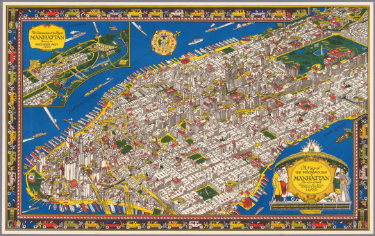
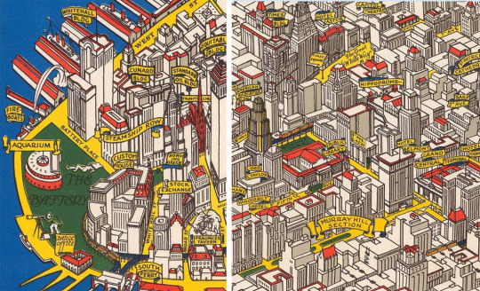
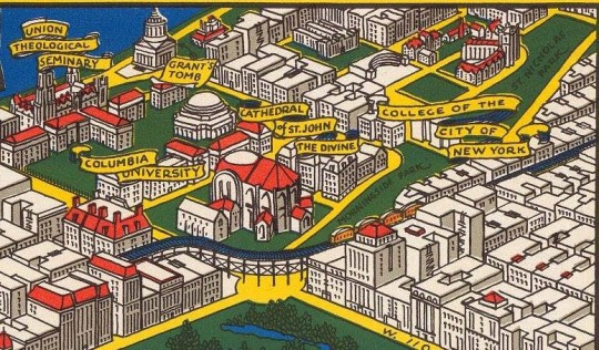
C.V. Farrow drew this beautiful map of what he called "The Wondrous Isle of Manhattan" in 1926. You MUST enlarge it. It wasn't intended to be used for navigation, but rather as a pictorial representation of the island's highlights. Below are a few details that show you what the full-size map is really like. You should enlarge them, too!
Source: Gothamist
#vintage New York#1920s#C.V. Farrow#map#vintage Manhattan#Jazz Age#Roaring 20s#1920s NYC#illustration#pictorial map#colored map#vintage NYC
2K notes
·
View notes
Text

'Visit Hungary!'
Hungary travel poster featuring a pictorial map of the country and various place of interest (1965).
#vintage poster#vintage travel poster#hungary#1960s#map#pictorial map#travel#tourism#holiday#vintage map
70 notes
·
View notes
Text
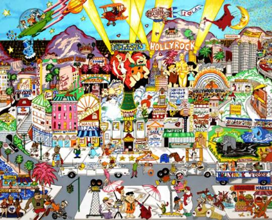
With this as inspiration, how would you imagine a map of, say, your favourite summer tourist trap incorporating some choice Hanna-Barbera characters looking like?
2 notes
·
View notes
Text

Trans World Airline world route map - 1948.
#vintage illustration#twa#trans world airlines#transoceanic flight#40s#the 1940s#luxury air travel#air lines#airlines#vintage aircraft#commercial aircraft#vintage travel#vintage air travel#air travel#aircraft#airliners#lockheed constellation#lockheed connie#maps#vintage maps#cartography#historical maps#travel maps#pictorial maps
94 notes
·
View notes
Text


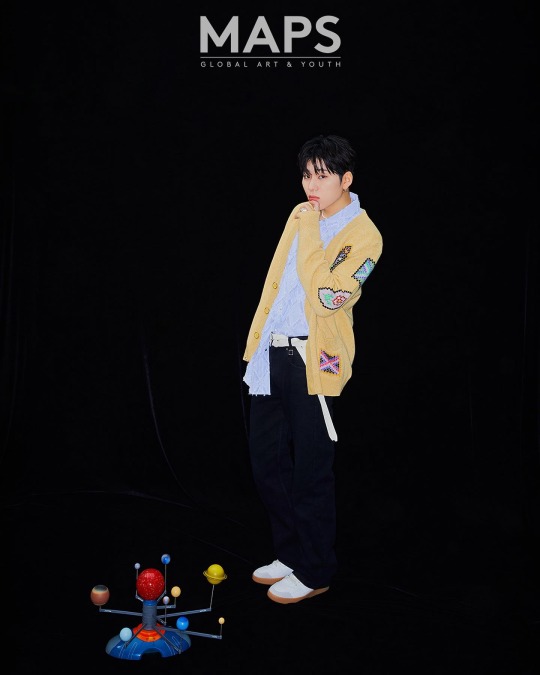


ZICO for MAPS Magazine June 2023 Issue
#zico#woo jiho#fanxy child#koz entertainment#block b#khiphop#male idols#ziaco#woo zico#kpop boys#maps magazine#pictorial#magazine#khh boys#khh#korean hip hop#korean rappers#king of the zungle#zico icons#block b zico
27 notes
·
View notes
Text
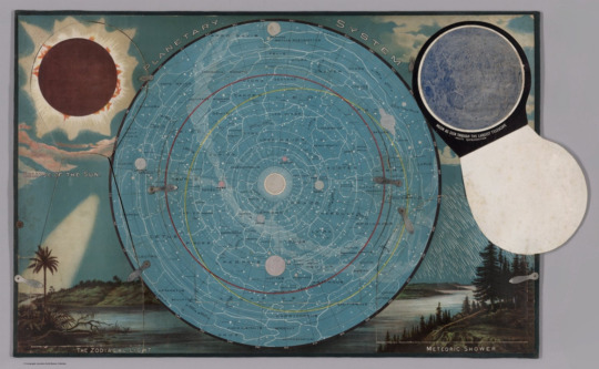
'planetary system with flap open showing moon,' pictorial map, levi walter yaggy, 1887.
539 notes
·
View notes
Text
Sigil Magick: Illustrating Your Intent
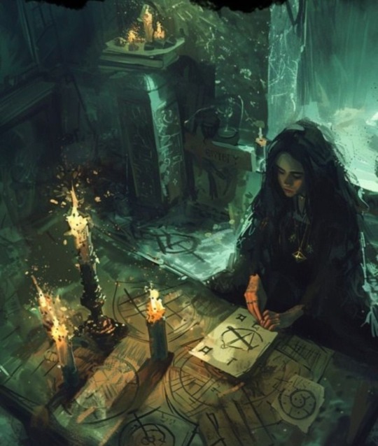
Sigils are a cornerstone of contemporary and chaos magick and function as keys to unlock the doors of reality and bend it to one’s will. These potent symbols serve as physical embodiments of one’s intentions, cast into existence through the fusion of art and willpower.
The crafting of a sigil begins with a clear and focused intention, which is then worked into a unique symbol through a creative magickal process. The magick practitioner inscribes deep personal meaning and style into their designs, making each unique to its artist. Sigils are ideal tools for manifesting your desires, imbuing objects with specific purpose and energy, protecting spaces, and communicating with the spirit world and should be used responsibly.
Origins
The practice of crafting sigils traces its roots to the ancient world but was modernized in the early 20th century by the works of Austin Osman Spare, an occultist and artist. He introduced the method of creating magical symbols by condensing letters of a desire into an abstract design. Aleister Crowley, too, influenced the practice by intertwining sigils with ceremonial magick, embedding them with a rich esoteric significance.
Some occult grimoires employ sigils as a means of contacting spirits, for example; Ars Goetia, The Book of Oberon, and Pseudomonarchia Daemonum.
Basics of Sigil Magick
Sigil magick emerges from the belief in one’s ability to manifest their focus into reality. Through a process of creation, a sigil becomes much more than mere ink on paper—it is the illustrated essence of desire. Individuals can use sigils as focal points for their will, empowering these symbols through meditation or ritual to enact change. The universe of sigils is vast and varied, types of sigils include:
• Pictorial Sigils: Intuitive symbols drawn from the subconscious
• Runic Sigils: Combinations of runic alphabets that resonate with specific energies
• Word Sigils: Derived from statements of intention, where letters are crafted into a unique symbol
Correspondences also serve a purpose in this class of magick, in order to help align one's intent to universal energies. As an artist crafts their sigil, they intertwine traditional symbols with personal significance, creating a bridge to the metaphysical world. Some relevant correspondences are:
• Numerology: Numbers carry vibrations that can enhance a sigil’s purpose.
• Zodiac Signs: Celestial influences infused to fine-tune the focus.
• Elements: The classic forces of Earth, Air, Fire, and Water lend their power to sigils, grounding them in natural harmony.
Sigil Creation
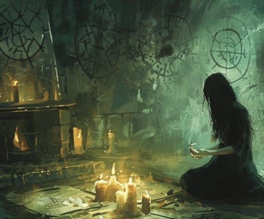
Before you take pen to paper, first envision your intent with clarity and purpose This may involve some deep introspection into the true nature of your desires. A precise intention lays the foundation for the sigil's power. Once ready, write out your intention and cross out any duplicate letters. From here a couple different methods can be utilized. Naturally you could always draw your sigils from pure instinct, creating spontaneous shapes to represent your intentions, but there are other techniques available.
The Wheel
This method employs a wheel to be used as a map for drawing your sigil. Simply start at the first letter of your intent and draw lines to each subsequent letter. Example:
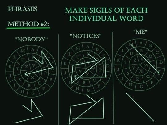
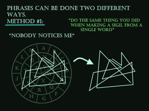
My Method
I make my sigils by breaking up the letters to create shapes. I will often decorate with extra shapes, symbols, and pictures as well. Here is a simplified example of my sigil creation process:
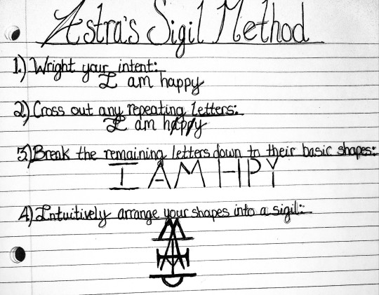
Next you must charge your sigil. Charging is the act of infusing the sigil with energy. The creator might enter a meditative state, focusing intently on the sigil while envisioning their intentions intertwining with the design. This act of focused concentration serves to embed the intention within the sigil, making it a beacon for the desired change.
Passive and Active Sigils
Intentioned sigils fall into either the passive or active sigil category based on how that sigil's energy is best utilized. Passive sigils are usually drawn on the body, item, or surface and then left alone to release their power over time. Active sigils involve some action to trigger the release of the sigil's energy, such as burning, burying, soaking with water/oil, and more. Some sigils can be used both passively and actively, but most will fall into one category.
Spirit Sigils
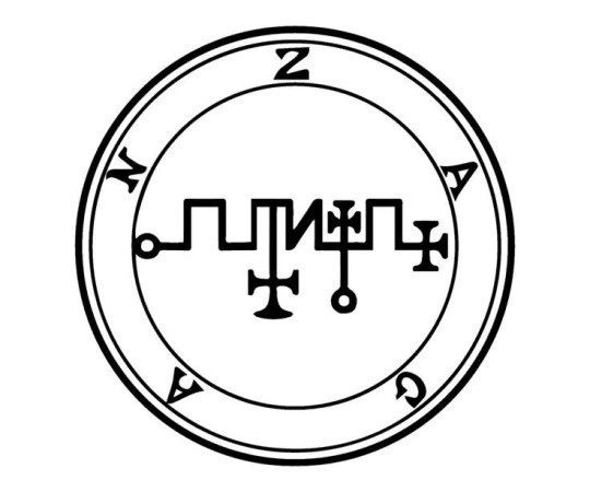
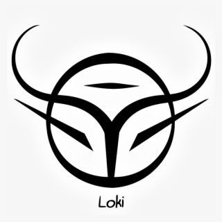
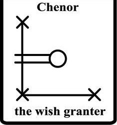
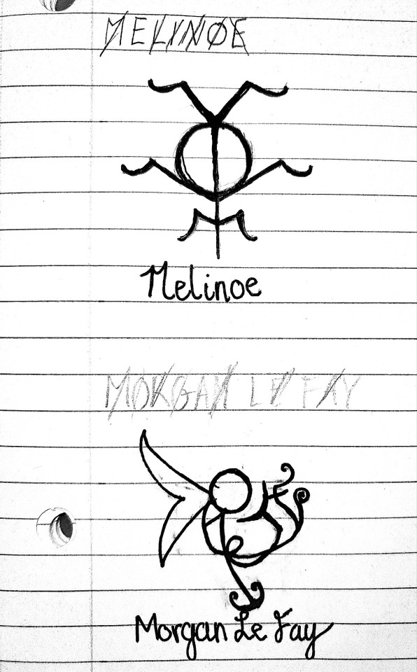
Many spirits and deities have sigils that represent them and these can be powerful catalysts for interacting with these beings. If the spirit you're working with doesn't have a sigil made for them (or even if they do) you can design your own symbol to connect with that spirit. Follow the same process, but instead of focusing on your intent, focus on the spirit/deity and connecting with it. You can even perform a ritual and provide an offering to invite the spirit into your space. This will allow you to draw divine inspiration straight from the source. Here are some examples of spirit/deity sigils, as well as some I created:

#magick#witch#witchcraft#sigil#sigils#sigil magic#sigil magick#chaos#chaos magick#chaos magic#chaos witch#satanic witch#lefthandpath#dark#satanism#demons#demonolatry#spirit work#spell work#spellwork#spell#spells#spellcasting#symbology#symbolism#symbols#eclectic#witchblr#witch community#pagan
654 notes
·
View notes
Text

Babylonian Map of the World, 8th or 7th Century B.C.
The Babylonian Map of the World (also Imago Mundi or Mappa mundi) is a Babylonian clay tablet with a schematic world map and two inscriptions written in the Akkadian language. It includes a brief and partially lost textual description.
The tablet describes the oldest known depiction of the known world. Ever since its discovery there has been controversy on its general interpretation and specific features. Another pictorial fragment, VAT 12772, presents a similar topography from roughly two millennia earlier.
The map is centered on the Euphrates, flowing from the north (top) to the south (bottom), with its mouth labelled "swamp" and "outflow". The city of Babylon is shown on the Euphrates, in the northern half of the map. Susa, the capital of Elam, is shown to the south, Urartu to the northeast, and Habban, the capital of the Kassites, is shown (incorrectly) to the northwest. Mesopotamia is surrounded by a circular "bitter river" or Ocean, and seven or eight foreign regions are depicted as triangular sections beyond the Ocean, perhaps imagined as mountains.
The tablet was excavated by Hormuzd Rassam at Sippar, Baghdad vilayet, some 60 km north of Babylon on the east bank of the Euphrates River. It was acquired by the British Museum in 1882 (BM 92687); the text was first translated in 1889. The tablet is usually thought to have originated in Borsippa. In 1995, a new section of the tablet was discovered, at the point of the upper-most triangle.
Clay, Height: 12.2 cm (4.8 in), Width: 8.2 cm (3.2 in)
Courtesy: British Museum
#art#history#design#style#archeology#sculpture#antiquity#tablet#map#map of the world#babylon#british museum#mesopotamia#text#writing#drawing#euphrates#elam#susa#habban
162 notes
·
View notes
Text
BTS 2025 Comeback


(Take my tarot interpretation with a grain of salt and sugar)
I asked the BTS members what they envision for the 2025 (or even 2026) comeback. Each one of them has an element that they want to stress on.
Overall and common theme— Two of Wands
They want to open more doors for themselves and expand their legacy
Woodland Oracle— Finding Self Worth, Inspiration, and Wisdom
BTS have felt and seen a lot of things. The process has made them wise and experienced. Their only advice is to not downplay themselves and continue walking with their heads up high.
(Now let’s get to what each member wants to do with the group comeback. I got some interpretations of what they want their music and visuals to look like and sound like.)
(I also used three different decks because the members wanted different pictorial representation. I used the mythology card deck for Namjoon, Jin and Hoseok, original Arthur Waite for Yoongi and Taehyung, and Cat tarot for Jimin and Jungkook)
Namjoon
Ace of swords + The Fool
Namjoon is bursting with creative and intellectual energy. He wants a new chapter for BTS’ perception and career. He’s not too strict with what he wants but he wants something bold, divisive and unique for the comeback.
I see him gravitating towards two songs— Spring Day and Sea (hidden track from ly her). It seems he wants to expand on those two themes. BTS have gone through a lot of seas and deserts and spring days in the past two and a half years and he wants to showcase that pain and fulfilment.
Jin
The Chariot
Well Jin was a bit curt sjdjjdjd. I sort of see him want the same thing as Namjoon— a revisit of the Sea themes. I also see Jin wanting to recreate that map of the soul seven rollout. He really wants to travel and explore a lot with this album. It seems his heart is really all about exploring and trying out new things. He doesn’t seem to want to jinx it or hold himself back by already coming up with an image but he too wants a song like Sea.
Hoseok
King of Swords + Six of Swords
Hoseok also wants a Sea song theme. He sort of wants to show BTS’ self discipline and ability to bounce back. Something about moving on and also rising from ashes. He sort of sees BTS group returning with vengeance and prowess unlike any other.
Yoongi
Ace of Swords + Six of Pentacles reversed + The Fool
Yoongi has similar cards as Namjoon but from a different deck. He’s not really thought of revisiting songs but he too shares the vision of going all out and bold. The reversed six of pentacles is showing me that Yoongi really wants to talk about something that was really unfair that happened to BTS. Something about them being betrayed or cheated out of something. Maybe the media? Or something that happened to them personally? He wants to bare his and BTS’ bruises. If Namjoon wishes for something hopeful, I see Yoongi wishes for something dark and contemplative.
Taehyung
High Priestess Reversed + the Emperor + Knight of Wands
Taehyung wants to make a song about similiar things as Yoongi— something about trust being broken, shallowness, superficiality, ignorance. I think this is because he sees BTS as an outlet that can help bring awareness to certain things. But at the same time he wants to show a “cool” side. Like despite all BTS went through, they came back like the Emperor and Knight card here. He might want something that’s also flirty. My brain heard Fake Love so I guess he wants something like that.
Jimin
The Chariot + The Magician Reversed + Page of Cups.
Like Jin, Jimin wants to travel with this work. He feels the most comfortable with BTS, and he treats their work like a throne. He might want to make a song also talking about some deceit that he has faced— like Yoongi and Taehyung. He also wants to try something super new and connect with his inner child once again with BTS.
Jungkook
The Sun Reversed + Lovers
Awwww… he’s just so happy to unite with the members. I guess that’s what he wants to make the music on— about the period where they weren’t together and then their reunion. It seems he wants this to be the defining track on the album. For him, the BTS bond is what makes the music hit for others and for himself too. So that’s really what he wants to focus on. He might take hands on approach with this track.
• • • • • • •
Overall I think the men are restless to come back. They have so many stories to share and concepts to explore. They all pretty much want the same thing.
#bts tarot#tarot#Jimin#Taehyung#Namjoon#Jungkook#Seokjin#Jin#Hoseok#jhope#rm#suga#agust d#Yoongi#bts 2025#tarot reading#kpop tarot
42 notes
·
View notes
Text
Eight months deep diving into the bl world and this is my classification (with contribution by my beloved friends @kwannie-lix and @basicallyafangirlsworld ) :
Seriously unserious: Semantic error/to my star/bad buddy/history trapped/my love mix up/ love tractor / my school president / love by chance/Jun & Jun/Love is a poison/sing my crush/2gether the series/love mate
Seriously emotional: Unknown/the on1y one/blue canvas of youthful days/kiseki/jack and joker/his 2020 movie/moonlight chicken / a tale of thousand stars/ long time no see/ not me/ our dining table/see your love/guardian/peach of time/I cannot reach you/I hear the sunspot
Unseriously serious: Cherry magic (live action japan) / old fashioned cupcake/thamepo/ eclipse / last twilight/kissable lips/eccentric roommate/want to see you
Spiritually horny: word of honor, untamed, tgcf (donghua)
Horny: kinnporsche, only friends, bed friend, love in the air, big dragon, TharnType, the unforgotten night, Cherry magic (anime)
...
Inspired by the legendary them gay shows map by @uweiy hehe would you like to make a pictorial representation of this ( ˘ ³˘)♥
...
Add or modify this as you wish!!!!
#them gay shows#untamed#word of honor#tgcf#unknown#see your love#semantic error#kiseki dear to me#bad buddy#my school president#cherry magic#old fashioned cupcake#and a lot more beautiful asian queer dramas#in love with this world#my life mission is getting all my destiel trauma friends into healing asian drama#something about how asian dramas never do anything half heartedly and put their whole ass pussy into emotions even if the show is unserious#lgbtq media#asian lgbtq dramas#taiwan is my favourite so far
29 notes
·
View notes
Text

One of the four winds depicted on a pictorial map. Detail.
Amateur movie makers. 1927.
David Rumsey via Internet Archive
1K notes
·
View notes
Text


On 24th April, 1633, Sir John Hepburn raised a regiment of 1200 men which ultimately became the Royal Scots.
Charles I issued a Royal Warrant in 1633 for Sir John Hepburn to raise a Scottish Regiment to serve in France as Garde Écossaise; the bodyguard of King Louis XIII and the Regiment went on to serve during the Thirty Years War (1618–1648), losing three Colonels in various actions in 38 years.
Due to the Royal Warrant the Regiment remained part of the British standing Army and could be recalled to Britain at any time The Regiment remained in France during the turmoil of the civil war and was not recalled until 1661, following Oliver Cromwell’s death in 1658 and the abdication of his son as Lord Protector in 1659. After the first elections in 20 years, Parliament was reformed and proclaimed Charles II as King and invited him to return to England from exile in 1660. In 1661 the Regiment was finally recalled to plug the gap between the disbandment of the Cromwell’s New Model Army and the creation of a Regular Army, in which the Regiment became the model for all other units.
The Royal Scots Museum is situated in Edinburgh Castle.The Museum is a private one and is financially dependent on voluntary contributions.
The story of the Regiment is explained in chronological order on pictorial wall panels supported by maps, display cases, tableaux and dioramas. The medal collection is too large to be openly displayed and therefore only a selection is on view. The remainder is mounted in drawers which can be opened on request. Also to be seen are collections of silver, sets of drums and old colours. Other interesting features of the Museum are the descriptions given of contemporary life in the Army and the overhead panels which show significant national and world events of the relevant period.
The Royal Scots were merged with other Scottish regiments in 2006 to form the Royal Regiment of Scotland..
23 notes
·
View notes
Text
250327 mapsworld_media Instagram Update
"MAPS 2025 MARCH DIGITAL COVER for XIUMIN (@.e_xiu_o) A face as welcoming as spring, XIUMIN (@.e_xiu_o) sends you a warm greeting. Feel his warm energy and the excitement of spring, the main character of the MAPS March 2025 digital cover. A calm yet lively moment awaits you. You can meet more pictorials and moments in the MAPS SUMMER ISSUE, which will be released soon."
20 notes
·
View notes
Text

Map exhibiting points of interest along the air route of National Park Airways, the forerunner of Western Airlines - 1929.
#vintage illustration#the 1920s#air lines#airlines#vintage aircraft#commercial aircraft#vintage travel#vintage air travel#air travel#aircraft#maps#vintage maps#cartography#cartographs#national park airways#air mail#air mail carriers#idaho#montana#utah#western airlines#historical maps#travel maps#pictorial maps
68 notes
·
View notes
Text


EPIC SCI-FI FIRST EDITIONS WORTH MORE THAN YOUR LIFE -- BOOK DETAILS ARE AS FOLLOWS:
TITLE: "Dune"
AUTHOR: Herbert, Frank
BINDING: Hardcover
EDITION: First Edition
PAGES: 412
VOLUMES: 1
LANGUAGE: English
PUBLISHER: Chilton Book Company, Radnor
DATE: 1965
BOOK OVERVIEW: "The first in the epic science fiction series of the same name, "Dune" is set on the desert planet Arrakis, host to "the Spice" - the most important resource in the universe, needed for interplanetary travel and coveted for its effects on longevity and granting incredible psychic powers among humans. Amidst an intergalactic power struggle, would-be heir to the planet's stewardship Paul Atreides is cast out into the desert to die following a coup. Joining a group of zealots called the Fremen, Paul soon becomes considered their messiah - Mahdi - and recognizes in them a formidable fighting force with whom he can retake control of Arrakis. "Dune" won both the Hugo Award for Best Novel and the Nebula Award for Best Novel.
FIRST EDITION IDENTIFICATION:
""Dune" is one of the high points for science fiction collectors and was first published in 1965 by Chilton Book Company in Philadelphia (an interesting departure for the publisher, who to that date had only published automotive repair manuals). The true first will read "First Edition" on the copyright page, with no subsequent printings, and will be in blue cloth boards. The jacket is a pictorial dark red and blue desert scene, and the rear panel has a map. The price on the jacket flap should be $5.95 and the rear flap should have the Chilton address across four lines."
-- BIBLIO, "The largest independent book marketplace in the world, with over 100 million books"
Sources: https://sarehlovasen.wordpress.com/2021/10/19/rating-all-of-the-dune-book-covers-i-can-find/ & eBay.
#Dune#Dune 1965#Dune First Edition#1965#Dune Hardcover#Dune Hardcover First Edition#Science Fiction#Science Fiction Novel#Novels#Books#First Edition Books#Vintage Sci-fi#Frank Herbert#Dune John Schoenherr#Sci-fi#Arrakis#Planet Dune#Sci-fi Art#Sci-fi Fri#Illustration#Frank Herbert's Dune#Sixties#Cover Art#60s#1960s#60s Sci-fi#Dust Jacket#Dune First Edition 1965#Dune Hardcover 1965
26 notes
·
View notes
Text
Native Pop! How Indigenous people have shaped popular culture
Featured in our exhibit & online at Newberry Digital Collections:

Making and remaking memory, by Kim Gullion Stewart, 2022
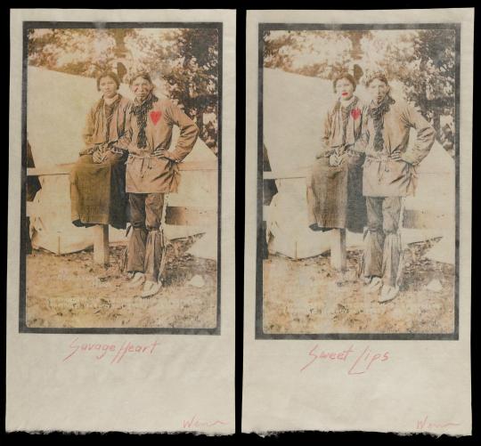
Savage heart; Sweet lips, by Jason Wesaw, 2013
Onsite only, alas:
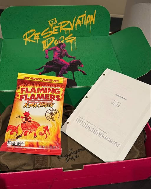
"Reservation Dogs" promo kit, including a screenplay, a pictorial map of the United States entitled "Indian Country," and a bag of Flaming Flamers cheese snacks, 2023
#newberry library#libraries#special collections#indigenous history#pop art#reservation dogs#flaming flamers
11 notes
·
View notes