#also for the record: for the first gif I made all eight variations grayscale and modified their contrast
Explore tagged Tumblr posts
Text
The Many Illustrators of A Tale of Two Cities 1: Hablot Knight Browne (a.k.a. Phiz)
...& a century-and-a-half-long game of telephone...
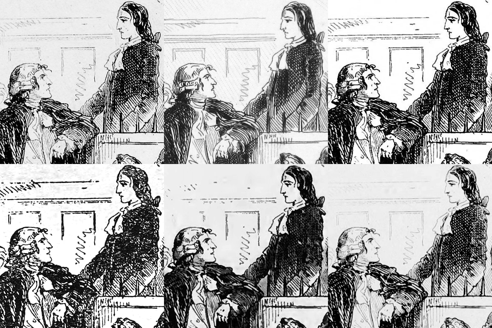
For the first post in a series on the book's illustrators, how could we start with any but the very first one?
"Although a number of critics have pilloried Hablot Knight Browne ('Phiz') for his supposed ineptitude in the program of illustration for A Tale of Two Cities, the fact that he so astutely realized and graphically elaborated so many significant elements of Dickens's letterpress is evidence that his pictorial series reflects an extremely careful reading of the printed text...The visual accompaniment [that these illustrations provided to the novel's monthly installments] was not mere ornamentation, but an aide-mémoire intended to facilitate the monthly reader's keeping track of a discontinuous narrative over a period of seven months."
from "Charles Dickens's "A Tale of Two Cities" (1859) Illustrated: A Critical Reassessment of Hablot Knight Browne's Accompanying Plates" by Philip V. Allingham from the 2003 volume of the journal Dickens Studies Annual.
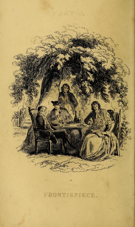
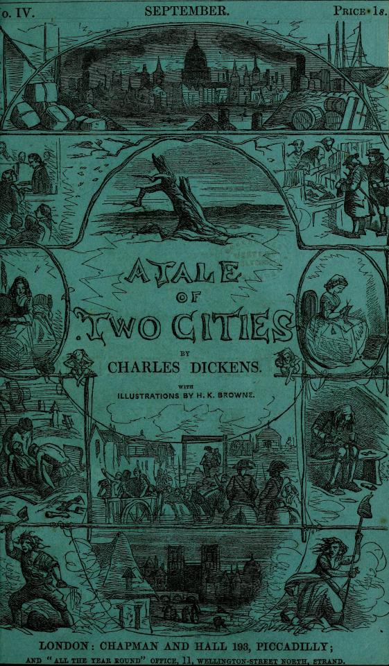
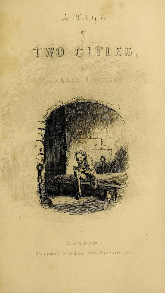
Frontispiece Cover to the Monthly Installments Vignette
For some perspective on the significance of this first set of illustrations - published initially within monthly installments of the novel in 1859 (the text of which was collected from the original weekly installments published in All the Year Round, also in 1859) - that single quote comes from an entire article on these illustrations that is itself 49 pages long.
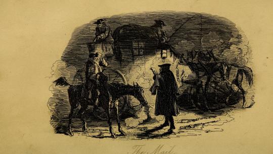
The Mail
As such, suffice it to say that this particular post will not be a thorough examination of the history, context, and impact of these illustrations (though, for those interested, be sure to click on any links you see throughout this post for all sorts of further reading!).
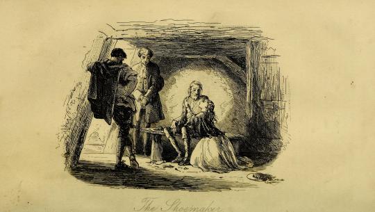
The Shoemaker
Instead, it will simply be a place to observe and appreciate these illustrations for what they are, in their "original" glory.
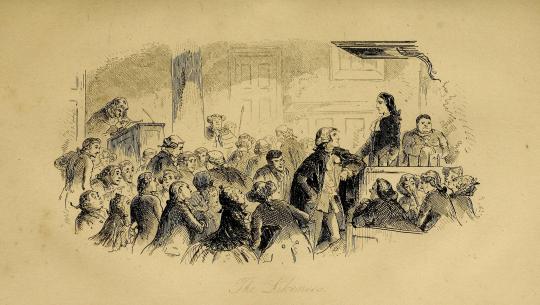
The Likeness
...I mean, just look at these things! (I'm of course gonna break formality after this one because it's my favorite😌)
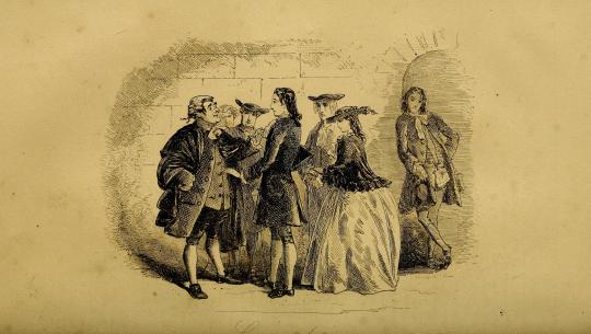
Congratulations
In terms of the odyssey of finding the proper edition of these to post, "original" is the operative word.
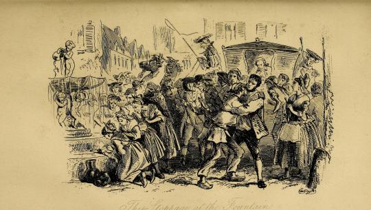
The Stoppage at the Fountain
These are the oldest (except for some or possibly all of McLenan's...more on that many months from now though) and certainly the most iconic of the illustrations of this novel and thus have also had the most mileage, having been passed from edition to edition to edition countless times over the last 164 years.
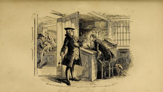
Mr. Stryver at Tellson's Bank
That means - as the gif at the top of this post demonstrates - that these illustrations have slowly been "translated" over time into dozens of distinct images - in ways as innocuous as a change in a shadow and as striking as a change in a character's facial expression.
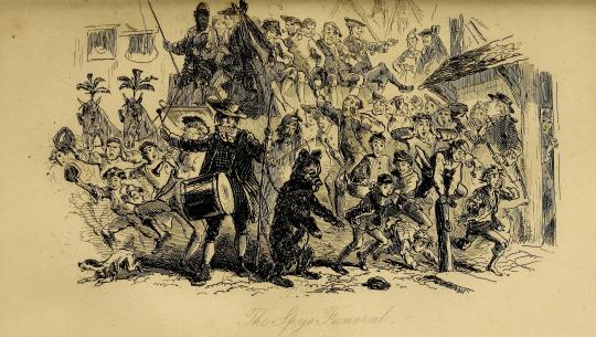
The Spy's Funeral
These translations have happened in all sorts of ways over the development of printing technology - blemishes, xeroxing errors, low-quality or blurry scans, too much ink being used in printing, image compression, sometimes even actual tracing of the original illustrations! - and as interesting as they can be on their own, for someone determined to find the most accurate representation of Phiz's phenomenal work, they can be...phrustrating.
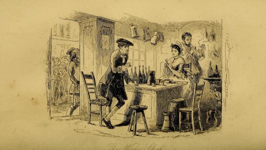
The Wine-shop
In fact, as a sidebar, the illustrations that I used for the Best Character Showdown bracket turned out to themselves be traces and not originals! I am Ashamed and disheartened! You could even say that I am yet another...
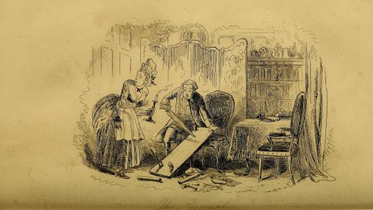
The Accomplices
accomplice in the mistranslation of Phiz's work!
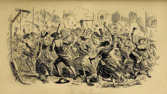
The Sea Rises
Rest assured, though - although they are not from the monthly installments themselves (which as far as my research has gone do not seem to be anywhere on the Internet), these particular scans are sourced directly from an online scan at the Open Library project (contained within the Internet Archive) of the first edition of A Tale of Two Cities, itself also published in 1859.
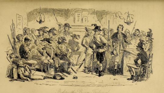
Before the Prison Tribunal
I do wish that they hadn't been cropped the way that they have and that they were available in a (much) higher resolution, but as of now, they're the best representation of Phiz's original work that we netizens have!
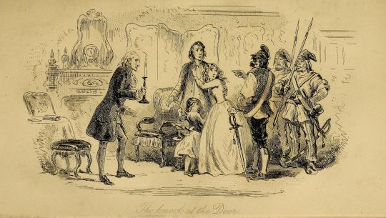
The Knock at the Door
A Tale of Two Cities was the final novel that Phiz illustrated for Dickens - and marked the complicated ending to a twenty-three-year (yes) professional partnership between the author and illustrator - but his work here will mark a beautiful beginning to the long archiving project we will experience together here on this blog.
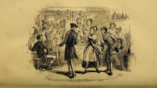
The Double Recognition
Throughout the work of this project, there will be quite a variety of sources being used - from direct scans by me to the two-tone abstractions of PDFs clearly not created for the purpose of storing image information - depending on the needs and availability of each edition.
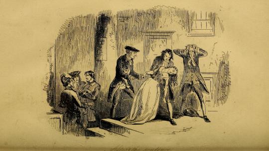
After the Sentence
All of it goes to show the importance of accuracy and attention to detail in archiving art, which is itself an art form to be appreciated.

Hope you've enjoyed!
& the standard endnote for all posts in this series:
This post is intended to act as the start of a forum on the given illustrator, so if anyone has anything to add - requests to see certain drawings in higher definition (since Tumblr compresses images), corrections to factual errors, sources for better-quality versions of the illustrations, further reading, fun facts, any questions, or just general commentary - simply do so on this post, be it in a comment/tags or the replies!💫
#A Tale of Two Cities#AToTC#classic literature#victorian literature#dickens#charles dickens#engraving#illustration#illustrators#Phiz#Hablot Knight Browne#1850s#HOUUGHHHAGHGUHGGHHHHOUHGHHOUHGHHGAHGHSGHGHGH#how long have i been working on this today? has it been eight hours?#well? how did I get here?#again most of them won't even remotely be like this#but it's phiz! i gotta do phiz right!#also for the record: for the first gif I made all eight variations grayscale and modified their contrast#and for the second gif I sepia-toned and modified the contrast of one of the illustrations#all for the sake of readability and reducing flashing!
28 notes
·
View notes