#Width
Explore tagged Tumblr posts
Visit Tumblr Blog
Explore Tumblr blogs with no restrictions, modern design and the best experience.
Last Seen Tumblr Blogs


Fun Fact
In 2020, 44% of users from Denmark used Tumblr daily.
Text


Joaquin Galan's epic arms
538 notes
·
View notes
Text

72 notes
·
View notes
Text

page 564 panel a - Monument on a hill. I am not asleep.
#economics#economists#economy#a dynamic modelof corn production sales and prices#prices#sales#dynamic#corn#agriculture#heartland#sellers of corn#monument#width#width shift#monumental#epic#tower#monolith#monolith on a hill#choose your fave#pick your number 1 monolith#awake#not asleep#glitch#ai#machine learning#somniloquy#sleep talking#sleep
13 notes
·
View notes
Text
"Whether the wide world is really wide
is up to each person."
Ilse Aichinger.


Wondering...
(For my dear Friend @rubenesque-dollyd-93 .)
#quote of the day#quote of today#ilse aichinger#the world#our world#the wide world#width#people#persons#personally#personally speaking#horizon#perception#perspective#vision#life with a vision#make a difference#look and see#care#take care#watch out#what matters#art#watercolor fx#romanticism#surrealism#wanderer#wondering#caspar david friedrich#hommage
30 notes
·
View notes
Text
How do I make it W I D E R
I'm viewing this on desktop and only the center 10% of my screen has any posts on it, I feel like I'm spying on tumblr through a cracked open door
28 notes
·
View notes
Photo

階段と礎石に挟まって動けないのではないよ。 Cat isn't stuck between the stairs and the cornerstone #猫 #ネコ #ねこ #cat #katze #chat #gato #gatto #キジトラ猫 #yellow_tailed_cat #視線 #gaze #寺 #temple #ローアングル #lowangle #広角 #ワイド #wide #width #panasonic #dmc-lx7 https://www.instagram.com/p/CooZ2ZcpXkQ/?igshid=NGJjMDIxMWI=
#猫#ネコ#ねこ#cat#katze#chat#gato#gatto#キジトラ猫#yellow_tailed_cat#視線#gaze#寺#temple#ローアングル#lowangle#広角#ワイド#wide#width#panasonic#dmc
50 notes
·
View notes
Text
2 notes
·
View notes
Text
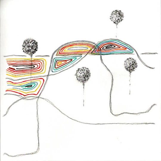
width - pencil, fineliner on paper 18x18cm 2023
#art#artists on tumblr#oc#sketchbook#sketch#fineliner#pencil#doodle#abstract#minimalist#contemporary#2023#width#landscape
2 notes
·
View notes
Text
El Modelo de Caja en CSS: La Base de Todos los Elementos Web
¿Qué es el modelo de caja? Imagina cada elemento de tu página web como una caja. Esta caja tiene un contenido (el texto o imagen), un borde, un relleno y un margen. El modelo de caja es la forma en que CSS describe y posiciona estas cajas en la página. Comprender este concepto es fundamental para crear diseños web precisos y personalizados. Como ya hemos visto, el modelo de caja es la…
#border#border-box#box-model#box-sizing#content-box#CSS#css box model#elementos de bloque#elementos en línea#Flexbox#Grid#height#layout#margin#margin collapse#modelo de caja#padding#positioning#propiedades de caja#width
0 notes
Text

Sam Cunado
324 notes
·
View notes
Photo
Discover Incredible Kitchen Cabinets #kitchenideasforremodel #kitchenremodelnumber2 #kitchenrenovationbrisbane #KitchenCabinetsWood
0 notes
Text

page 564 panel a - I am not asleep.
#economics#economists#economy#a dynamic modelof corn production sales and prices#prices#sales#dynamic#corn#agriculture#heartland#sellers of corn#monument#width#width shift#monumental#epic#tower#monolith#monolith on a hill#choose your fave#pick your number 1 monolith#awake#not asleep#glitch#ai#machine learning#somniloquy#sleep talking#sleep#scaffolding
3 notes
·
View notes
Text
A Game of Thrones, Jon III
Almost seven hundred feet high it stood, three times the height of the tallest tower in the stronghold it sheltered.
His uncle said the top of the Wall was wide enough for a dozen armored knights to ride abreast.
The gaunt outlines of huge catapults and monstrous wooden cranes stood sentry up there, like the skeletons of great birds, and among them walked men in black as small as ants.
#a game of thrones#jon iii#asoiaf#a song of ice and fire#the wall#castle black#castles#towers#stronghold#benjen stark#knighthood#horses#gaunt#catapults#cranes#sentry#skeletons#birds#ants#height#tall#width#shelter#giant#seven hundred feet#sworn brothers#night's watch#jon snow
0 notes
Text
How many square feet is an 11 x 11 kitchen?
The area of an 11 x 11 kitchen can be calculated by multiplying its length and width. In this case, since both the length and width are 11 feet, the area would be:
Area = Length × Width = 11 feet × 11 feet = 121 square feet
So, an 11 x 11 kitchen has an area of 121 square feet.
1 note
·
View note
Text

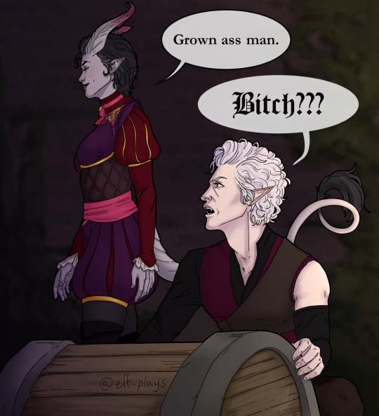
Scene I can't put into my fic #5748574: Hiraeth bullying the elderly
#bg3#astarion#my art#tavstarion#bg3 tav#bg3 fanart#bg3 astarion#baldur's gate 3#artists on tumblr#astarion x tav#astarion x oc#worsties to lovers#oc: hiraeth#anyway.#sorry it's so small i had to default to 540px width or else it looked like i dumped the images in vaseline#and yes i will exploit very relevant tag <3
5K notes
·
View notes
Text
[solved] Extra width on mobile version - I am working on a website using WP
[solved] Extra width on mobile version - I am working on a website using WP
If your website has extra width on the mobile version, it means that it is not responsive and the layout has not been optimized for smaller screens. This can lead to a poor user experience and Google may penalize your website in rankings. However, the good news is that it can be fixed easily in WordPress. Here are the steps to fix extra width on mobile version in WordPress: 1. Identify the…
View On WordPress
0 notes