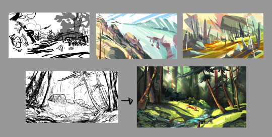
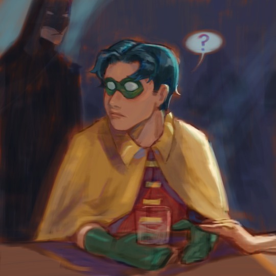
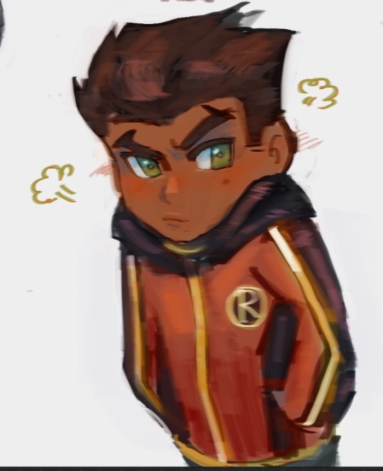
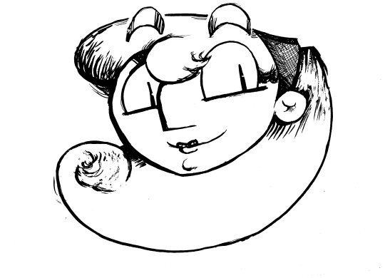
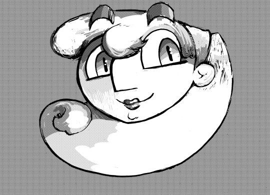
#Trying to learn grayscale first then add color
Explore tagged Tumblr posts
Visit Tumblr Blog
Explore Tumblr blogs with no restrictions, modern design and the best experience.
Last Seen Tumblr Blogs


Fun Fact
The average Tumblr user visits about 67 pages every month.
Text
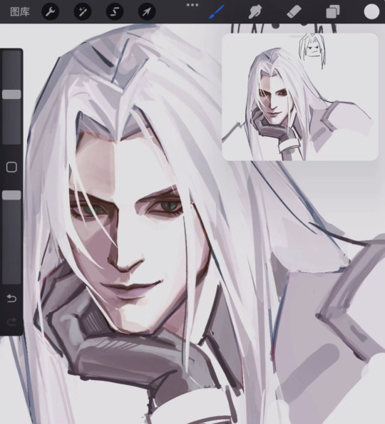
#sephiroth#ff7#final fantasy vii#doodle#Trying to learn grayscale first then add color#but i feel like i still didnot get it#ahhhh#you have a type don't you?
493 notes
·
View notes
Note
hi there! recent art school grad here and i was wondering if u have any tips on learning color + approaching backgrounds? even though i learned a lot, i still find myself struggling with these focuses, especially colors as i never had a class that really taught me that. thanks so much 💗 your work is so lovely
First off, congrats on graduating!! Backgrounds and colors have always been the hardest for me lol tbh I still struggle a lot with colors especially, so please take everything I say with a grain of salt!
Using adjustment layers helps me a lot (especially color balance to make things more unified or complementary).
Another thing that I think has REALLY helped me with color overall is actually switching between color and grayscale.
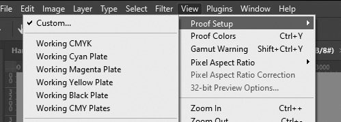
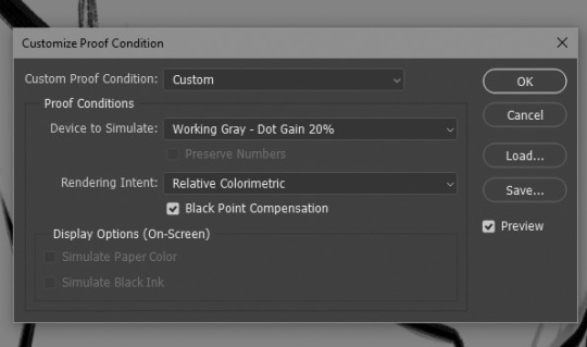
In photoshop I set up a custom proof profile and then am able to switch back and forth by using the hotkey Ctrl + Y. This helps me check my values which, I've found if you have solid values, colors tend to work so much better even if you don't know much about what you're doing lol. Another way to do this is making a solid black layer on top of all your color layers and setting the blending mode to "Color". Then you can toggle that on and off to look at the values.
One last thing I've played with re: colors is finding a reference that has the colors I like and "crystalizing" it and color picking a palette from that.

This can be super helpful if you're having a hard time visualizing or coming up with a color palette!
As for backgrounds, they became a lot easier for me when I started looking at them like their own character. Thinking about the story I'm trying to tell, adding little details that I think would add to that or be fun and fun ways for the character to interact with it.
That and doing value sketches/just a bunch of really quick and sloppy experiments. 9 times out of 10, they don't work out, but sometimes they spark something that turns into something fun and workable!

This has gotten really long for someone that really just bs's their way through every piece, but I will say one thing that was a big game changer for me (in my personal opinion, who knows if other people think so lmao) and it's just incorporating aerial perspective. Making things a bit more blue tinted (or whatever the sky color is) and lighter as they recede into the background. Has made a huge difference for me when it comes to creating depth!

I really don't know if any of this is helpful because to be 100% honest, most of my illustrations are just product of trial and error lol. But practicing and making a lot of really bad scribbles have (I think) helped me the most, so yeah my biggest advice with anything is just look at lots of art, just draw and don't worry if it looks bad because tbh, it probably will at first. But you'll get better!
@tamberella Has a ton of amazing free resources and brushes, so if you haven't checked out their stuff, definitely do so!
@iniro also has some really nice tutorials on color (and other topics) available so I'd also recommend looking at those too!
But yeah, sorry for going on about my hair-brained process, I hope at least some of this was helpful!
38 notes
·
View notes
Note
Hiii!! How are you? I want to say I love your art so much and since I'm a newbie, broke artist who use Ibispaint, I would like to ask about your brushes and painting/rendering process.
I don't know if it's been asked before but I'd be very happy if you answered.
Thank youuu 💕💕💕
Hiii! I have been asked about how I color skin and I think I'm gonna say the exact same thing here, I hope you find this useful tho!
These are my brushes! Well, this is the one I used to use, my phone suck and, well, my ibis paint would lag if the size of the brush was too big 😭

These are the drawings I made with this!
As you can see, the brush has a really yummy texture I like, sometimes I'll use it to add little details, but before, I used to use it for, well, everything.
This is the one I now use:

These are the drawings I made with it!
I use, well, used since I now use procreate 😭, this brush to do the sketch and just... everything. For the sketch I'd use it with 12/20% opacity, and after adding the base colors and shadows, I would start blending with the brush at 3%
Yep, very low opacity! Of course that's just me.
About my rendering process, I use grayscale!
Uhg, it's too fast, idk if you can see how I work 😭
Well, essentially I start with a really, really simple sketch, sometimes I don't even care if it's just a scribble.
It's because I tend to do everything in the rendering process. It wasn't like this before tho, so I guess it's something you learn with time, obviously it depends on your style, how you work and what you like! I think this works for me because I work in one layer, sometimes 2, since when I want to add some shadows I use a multiply layer. I always fuse them together tho.
Well, as I said before, I work in grayscale. I add the base color, low the opacity of my sketch and fuse them together to start painting and blending! It is easier to work in grayscale because you don't have to worry about colors, just about the shadows, the lights and just how the drawing looks, you know?
To color the drawing, I add a soft lightning layer! And... that's it! In the soft lightning layer first I add the base colors, you know, the skin and the hair and all that, just adding plain colors. Then a I fuse that layer and I add another soft lightning layer to add the blush and some colors.
Since you added shadows and lights in grayscale, the only thing you're doing in the soft lightning layer is just, change the color? Add color? I hope I'm explaining it correctly 😭
Sometimes I won't be satisfy with how a color looks and just, add it. Like, soft lightning can be real useful but sometimes the colors are to subtle, so I'll use a color layer or just a normal one with low opacity.
In any case... Here! This is the other question I replied to, I feel like there I add some more details and there's a more slow SpeedPaint that shows the process.
I think that's all! I'm not the best when explaining stuff, but I really hope you find this useful and I hope I helped you, even if just a little! If you have any more questions, feel free to ask and I'll try my best to explain things! Have a great day and thanks for asking, it makes me feel really flattered!!!✋✋✋✋💖💖💖💖💖💖💖💖
14 notes
·
View notes
Note
HELLO could you tell me PRETTY PLEASE how did you make the halftone colored effect on your latest gr63 poster? tysm!
Of course!! I love talking about my graphics!!
I learned how to create the halftone effect from a guide I cannot find right now but my steps are as follows. heads up that I work in photoshop so everything is photoshop specific I fear.
Under the cut since there is a ton of images here o7
For the halftone effect
Import image of my choice and convert it to a smart object. This guide should theoretically work without a smart object with clipping and/or layer masks but smart objects look better + they keep my workspace more organized
In the smart object I create a new layer with a solid fill of #808080, convert it for smart filters (Filter > Convert for Smart Filters) and also set it to Hard Mix in the layer blending modes menu
Open the smart filters menu for the layer (Filter > Filter Gallery) and I create two layers, first Halftone Pattern with the following settings and on top of it Torn Edges with the following settings
You can fiddle with these obviously but I have never changed these since I started using this for my halftone effect
4. Now your image probably looks like this, really wonky and bright
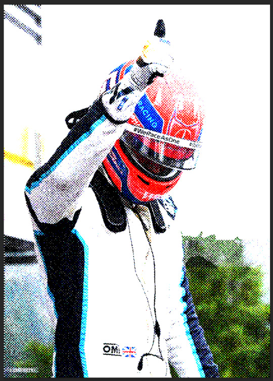
To fix it I create a new adjustment layer, usually Levels but I have used Curves before as well and fiddle with it until I like it. Dont be afraid to use multiple and just mask it! For example here Tadejs jersey is white but the background is black so to keep the texture I masked the jersey and adjusted it separately.
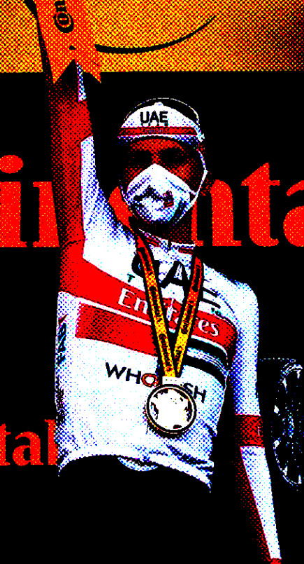
Final effect vs adjustments to keep the background texture vs adjustments to keep the jersey texture. By combining the latter two I achieved what I wanted
If I want my image in grayscale I also add a Black & White adjustment layer in between my initial image and the Levels layer, though for the effect I achieved with the George graphic we dont want that.
Gradient colors
First of all I make all my multicolored graphics using gradient maps. I am not particularly knowledgeable so my apologies but I cannot even try to begin explaining gradient maps.
So for a multi colored effect I create a gradient map once I have an image that I am satisfied with and adjust it until it looks good. Important that the color fully on your right on the gradient map is the color you want to have in the background which in my case is the beige I use everywhere.
After that I save my smart object as I would usually do (Ctrl + S) and exit to the main graphic and ideally, it should look the same in your graphic as the smart object looked.
Unfortunately I cannot help with color choices/color theory for the actual gradient map since I barely understand what is going on myself lmao. Fwiw personally I think Synth (@/jamesvowles) is awesome with colors and how they work together in his paintings so maybe he could be of any help o7
Solid colors
This is for cases like this, where all my colors are solid flat, no matter how many colors
This is where the Black & White adjustment layer mentioned comes into play. For when I do solid colors only, even with multiple like in this graphic, I create a new color layer on top of all my other layers, fill it with the color of choice, and set the blending mode to screen. no idea why screen works, someone smarter with blending modes would probably be able to explain though.
For different colors I just mask out the areas I want the color to appear in.
Final step is to combine all my layers into a folder and under that folder I create a new solid color layer with the background color of my choice, in my case beige, and set the folder blending mode to darken. Once again, I have no idea how it works but it does and that what counts to me haha, someone smarter with blending modes would be able to explain most likely.
On a final note, do experiment!! Oftentimes I like getting to the point of where I would have usually used a gradient map (so no B&W layer) and then see what I can do with blending modes! Thats how I ended up with this image of Primož, its just a yellow color fill layer set to Hue blending mode
Hopefully everything makes sense, feel free to ask more if you are confused or want to know more about any part of my graphics <3
#ask#anonymous#eric.graphics#thank you for asking about my graphics I love talking about them!! do ask more if you want to i get stupidly excited about this
8 notes
·
View notes
Text

'Beti zuzen'
(Using a modified version of @anubiarts.bsky.social's HoneyGB palette: https://lospec.com/palette-list/honeygb)
Apparently, my great-grandfather had a broken finger which he couldn't straighten, and he'd humorously tell his kids to walk upright while showing his curved finger as shown in the drawing.
While I never got to know him, my grandpa adopted the tradition and spent his whole life telling us to walk upright while curving his finger.
He sadly passed away a year ago, so I drew this in his memory.
About the drawing itself, considering how hard of a task drawing hands can be (especially in unconventional poses like this), it looks OK. The pinky finger has a somewhat weird shape, the proportions are not really good (but they're better than in the first sketch lol).
I like how I used a single color for the middle finger on the back, making it more monotonous, which is great to avoid the viewer getting distracted by unimportant parts.
The ornamentation on the frame looks really good! I'm so happy with that.
Finally, about the palette: I'm not used to using such few colors, but I'm trying to learn to get the most out of a reduced palette. I initially started drawing using a six-color palette from Lospec, but it was darn hard.
After failing for a while, I decided to try something different: make the drawing in grayscale, THEN add colors when I was done with the shapes.
I ended up needing five tones in the grayscale version, which I ended up reducing to just four in the colored version.
I then tried a few palettes from Lospec, I wanted the feeling to be appropriate for the context. The reason I didn't make my own colors is mostly for practice, since I knew I could go crazy adding new colors to the palette had I had the opportunity.
The HoneyGB palette looked about right, but its brightest color made way too much contrast with the rest of the picture. While this might be desirable in some cases, it's not what I was looking for, so I muted the highlight a bit, making it closer to the neighboring tone.
2 notes
·
View notes
Text
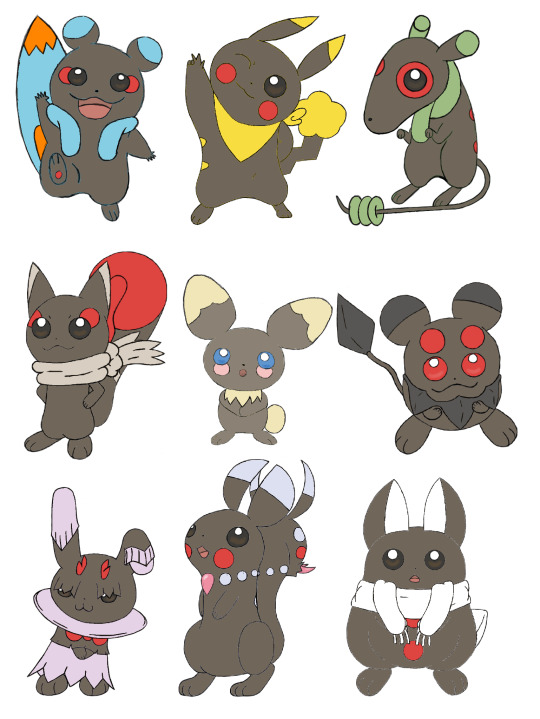
So, on October 19th 2021, exactly two years ago as of posting this, GinjaNinjaOWO over on the YT did a very fun video discussing swapping the concepts of Pokémon's two mascots, Pikachu and Eevee. That was also when I was really getting into the swing of character/creature designing, so I wanted to try my hand at it myself. I did the original pass in about a month, but recently looked over them and went "I can do this better," so here we are.
Here's the first pass from 2 years ago (before I got my tablet). I kept the first few designs I worked on, adding new concepts and motifs while scrapping the final 3 designs I did. When I did them originally, I think I was feeling a bit of burnout by the end, and was just going with the first things that came to mind, rather than coming up with something really creative.

Pichu was the first one I went back over. Originally, I just tweaked June's Pichu concept designs as I was more interested in designing its evolutions. The one thing I did keep from that first draft was the cheek placement under the eyes. All baby Pokémon reference something babies do, and having these faux-tear marks that then further evolve into other things as it itself evolves was something I liked and wanted to keep. As for the patterns, I wanted to go with something very generic, or template since it was going to evolve into 8 different rodents. I also drew it in multiple poses (something I did with every design), as movement is very important to modern Pokémon.
Zazachu was the third design I worked on (we'll get the the second later). With aspects like the surfboard tail and life vest fluff, it very much informed aspects I would add to all the other evolutions. I also tried to keep the colors in mind. I imagined this being one of the three Gen 1 evolutions, and Gen 1's color palette was very influenced by being sprites first, so I tried to choose colors that would be distinct when grayscale.
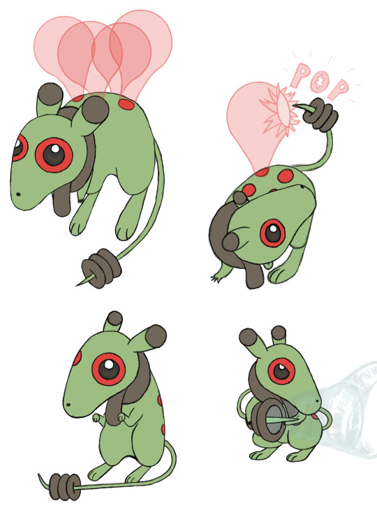
The second new Gen 1 design is Hirachu, a Flying-Type. One of the things I was trying to keep in mind was to not limit myself to the Types Eevee uses, and instead use ones that fit either Pikachu or the gimmicks I wanted to use. Since Pikachu was well known for learning Surf and Fly in Gen 1, I thought I'd incorporate that not only into its Types, but into its evolution method, having Pichu evolve into Pikachu, Zazachu, or Hirachu based on whether you teach it Flash, Surf, or Fly (all of which are HMs and have infinite uses). In Gen 1, I imagine it would evolve immediately after learning the move, but this would change in Gen 2 for reasons we'll discuss soon.
As for design elements, its spots and fluff are meant to invoke an aviator scarf and goggles, and I think I did a good job of illustrating how it uses its tail. I imagine the balloons are created by it secreting a sticky substance from the spots on its back to mimic how Pikachu would summon balloons when it used Fly in games like Pokémon Stadium.
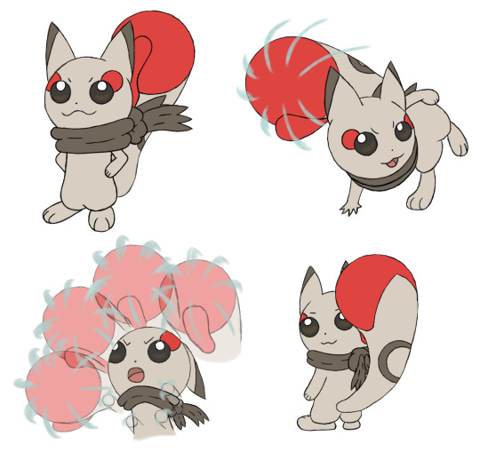
We now move onto the Gen 2 designs with Orachu (which is a Jojo reference). Most Pikachu-like, and all Eevee designs are used to demonstrate a gimmick introduced in its introductory game. Pichu is breeding, Plusle and Minun are double battles, Pachirisu is the physical-special split, Dedenne and Sylveon are Fairy-Type, Pawmi is movement-based evolutions, Espeon and Umbreon are the day-night cycle, and Glaceon and Leafeon are location evolutions.
I wanted to keep with the breeding theme Pichu used in Gen 2, as well as the evolution method I started using in Gen 1, so Orachu evolves by leveling up while knowing Counter, which Pichu could only learn through breeding in Gold and Silver.
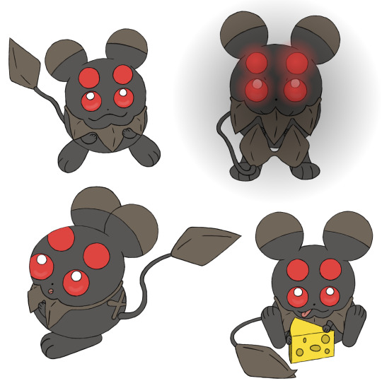
But then, if Pichu evolves by leveling up while knowing one of four different moves, what would happen if it knew two or more? That's where our second Gen 2 design, Nanichu, comes in. This was a design I had a lot of fun with. It's a Ghost-Type, and I thought it'd be cool to make its eyes and cheeks match and glow in the dark (similar to Umbreon) so that it looks scary if you came across it in a dark alley (or your pantry). As I evolved the design in the second pass, I added the scruff and changed up the tail to add even more to that theme.

As we move onto Gen 4, I wanted the two designs to be based on the physical-special split. Originally I had a physical Psychic-Type and a special Steel-Type, but I wasn't happy with either of them, so I scrapped them both and started fresh. The first new Gen 4 design I made was this special Dragon-Type, Ukichu. I liked the idea of a rabbit coming out of a hat, but to tie it more into the magical elements of Dragon-Types I incorporated a lot of elements from the Jackalope and Wolpertinger. I moved the cheek spots to below the collar to mimic a bow tie, but also made the horns on its head red to keep that visual element present in the face. This one feels a little busier than all the others thanks to the fluff, but it still feels like it fits.
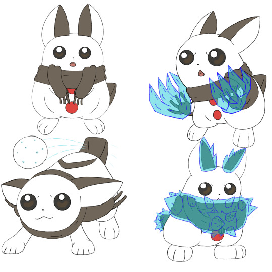
And as Ukichu is special, its partner in Gen 4 had to be physical, hence the Ice-Type Sharichu. I feel like there isn't a ton to say about this one. I made it very snowman-y, and had it so it could freeze over the brown parts of its fur for attacking or defending. I think I did a good job of illustrating how it works.

And as both Dedenne and Sylveon were Fairy-Type, it stands to reason my Gen 6 counterpart should be as well. My first take on Fuwachu was very just-Sylveon, so I really wanted to break away from that on this take. As Fairy-Types are heavily associated with both being tricksters and gemstones, I tried incorporating both those elements into this design, with the necklace motif, crystalline tail claw, and its tail resembling itself from the back to trick others.

And the last design we'll talk about is Pikachu. Of course. This is actually my third pass on Pikachu, as I wasn't happy with my second. It stuck too much to the original and didn't incorporate some of the elements I used in the other designs. I still didn't change a lot, adding the tail cloud on the second pass so it would have the brown element and functionality all the other evolutions I made have. And on the third pass I gave it an adventuring bandana, which felt on-brand for Pikachu in any universe.
Overall, this was a fun experiment, and I can imagine how easily you could expand upon it. If Pikachu and Eevee are swapped, then is that true of the show? Since Meowth is a cat chasing a mouse, would it be swapped out to match Eevee? What Eevee evolutions would replace the Pikachu clones? How would all these things domino to affect the series? etc. I drew 43 Pokémon for this in total (not all pictured here), so it was a lot of work, and I hope you enjoyed this little design doc, or at least the pretty pictures if you didn't bother reading. And here's the crappy shiny edit, if you're curious.
9 notes
·
View notes
Note
how many wips do you have going at any given time? i work full time, and i only get weekends to do fan art.. so i told myself that no matter how many idea sketches i had, i would only work on one piece of art at a time and not start another until its done! this means i don't put out work too regularly lol.. so just curious as to how other artists that do art full time work! :D
Hi Anon!
Thank you so much for your question, I’m more than happy to share my experiences with WIPs!
First I organize my sketches and WIPs into folders based on what they’re for: zines, personal work, commissions, etc
Some of these canvases are just sketches that *may* turn into full illustrations but most of them are WIPs. I didn’t include my commission or other zine folders, which brings the number up a lil’ more!
I tend to bounce around WIPs based on when they’re due. First I’d warm up with a limited palette challenge, then I’d work on some line art, followed by adding flats to another piece. Then I’d sketch out some more ideas and add on to the ever-growing WIP pile.
During Linktober, or when it’s close to a certain deadline, that’s when I’ll focus on one piece until it’s finished. Like I said before, usually I’d bounce around and take breaks in between stages. That helps me take a step back and see the piece with fresh eyes at a later time.
One piece took me a whole year to complete! Thankfully it was a personal, original illustration so I was my own client 🫣 During that long break I learned a lot more about color, painting techniques, etc, so I was pretty happy with how it turned out even though it took a while!
That being said, this is how I approach full illustrations with background, lighting, rendering, the whole pie. If you notice painting is taking a while, then try including some shortcuts in your process! For example, using the lasso tool to color wider spaces, coloring in grayscale, and then using Gradient map on top help loads with digital art. With traditional art, blocking in colors and focusing on values help bring a piece to life quickly!
Also if you’re interested in posting more frequently, feel free to share your sketches and WIPs along the way! Please don’t feel pressured to meet a certain metric, your art making process should reflect what you want to get out of it - are you studying certain techniques? Or vibing and going with the flow?
However you go about it, don’t sweat over the number of WIPs you have. When you feel like going back to a certain WIP then that’s the perfect time to work on it!
I hope this helps and happy art making!
#long response#long reads#ask and i shall answer#anon reply#anon answered#anonymous#wips#I have more on my laptop#I’m ashamed#but also it’s chill#my art#artists on tumblr#mochiwei#whit be quiet#I really hope this helps!!
27 notes
·
View notes
Text
Applying tutorials to Your Work
Hi! I've got a lot of things cooking back in my studio, but since it's a Wednesday I thought I'd share some helpful-ish advice that I've gained since being an artist since like, middle school.
Tutorials are awesome bits of knowledge! But something I rarely see get addressed is how to add it to your own workflow.
Artist all work differently, so usually after I see a tutorial I make a big canvas by dragging in MS Paint (If you can, some tutorials only work in the program of choice) and start following the tutorial.
For example, I love manga screen tones. I've seen so many tutorials on how to do them in CSP & Paint Tool SAI. Ergo, I wanted to apply this knowledge to my current artwork. I open a huge canvas in CSP. Download the brushes/materials I need and try them out on some line-art I scanned in.
This is how it looked before. I did my usual Black & White trad. inks for lineart and added turn white to opacity feature on.
After following the tutorials as close as possible, here's how it ended up looking.
Because my style is more cartoony/simplistic with cell-shading I applied my grayscale then converted this into screen-tones using a layer feature in CSP.
Now, what if a tutorial doesn't apply well to your particular flow/ style choices? Take what else you've learned from the tutorial & apply it using your established methods.
I didn't use gradients because it looked to different from my usual line art. I didn't use special brushes because it looked too precise. It's okay to fiddle with the key points of the tutorial until you find a good fit.
I like to think of it like class notes - You get the key concepts first. Then, you turn around and apply it through trial and error.
Note that if you haven't found a workflow that you like that it's time to apply the tutorials in high gear.
Half of my art journey was finding what I liked as far as rendering drawings. Do I like cell-shaded work? Do I like realism or more graphic-styled cartoons? Do I like bright colors or muted colors? Etc.
Happy Drawing! :D
#tutorial#art tutorial#art hack#art tip#artist#artist life#artist tut#tut#art flow#artist rendering#apply tutorials#blog post#helpful#steph talks art
0 notes
Note
Hey, thanks a lot for sharing that process video, I always feel like I learn a lot with them. Do you mind me asking you a question? I see you use greys ale first and then colorise, any reason why? I know it's recommended by some, but also discouraged by others. Mostly based on the arguments than your shadows will be more flat, instead of taking colour theory into account (putting blue in the shadows of your red fabric for example).
I'm generally unbothered, but I am still fairly new to digital, and when painting irl the greyscale to colour pipeline isn't an option so... Just curious to hear your arguments in favour of it, I guess?
That’s a very interesting question, thank you! I’ll try to answer with the best of my ability, but keep in mind that I’m no professional nor there are wrong or right way to paint, the most important thing is to find the technic that will fit you.
The reason why I use grayscale is because it’s a big time saver when I create detailed illustrations with environment, it allows you to focus primarily on the values, and values are the most important thing when it comes to painting a scenery for exemple. First because you’re only using a limited range of gray values; it’s way easier, because you’re not lost in the vast choice of colors, and second because it sets the main focus of the painting. While closer objects tends to be darker, long distance objects will be lighter. Of course, its not a unique rule, depending on your light source, closer objects can be brighter than your background. But you get the idea, grayscale helps you determine how you will use values to set up the mood and the structure of your piece. By using it, you can give a near finished look to a thumbnail or a sketch made only with shapes, just because your values are cohesive. It’s a very useful technic when working for a project that requires a lot of different sketches, with différents setups, lighting, and mood. Because in no time you can create several different primary ideas and even though it’s still at a rough stage, you can look at them and understand what the finished product will look like.
Now, grayscale has its pros and cons ofc, it’s not the ultimate technic. First, there’s a lot of tinkering to do once your grayscale thumbnail is done. If you try to apply your colors above your layers and leave it as it is, it’ll be muddy, because well, your gray values are.. gray. So you’ll have to use a lot of different features to change the hue of the shadows: gradient maps, color balance, saturation, opacity, curves and brightness. And that’s where grayscale might be more difficult for traditional artists. Second, It might be more difficult as well if you didn’t learn color theory first. Because at the end of the day, you’ll still have to use colors to finish your artwork. But, keep in mind that your lighting will greatly influence on your colors, may it be warm or cool. That’s something you have to think about when applying your first row of colors. If it’s a cool blue light, it will influence the color of the skin, the fabric, the furnitures, your skin will be a bit more pinkish or purplish, you’ll add blue and purple in your red fabric etc. it all depends on your choice of lighting and shading. Once your layers are merged into one normal layer again, you can start rendering and emphasize some colors, apply subtle touches of a particular hue to make the subject « pop » a bit more.
In conclusion, grayscale is a very useful tool when creating the structure of your painting, a good way to set the atmosphere of the piece, but it requires a lot of trials and error, learning values and how light interacts with environment. Some people are only using grayscale, other despise it, it really depends on what you feel more comfortable with, really.
I hope it helps, I’m sorry if it wasn’t very clear I wish I could just idk project my thoughts directly on my phone in a perfectly written synthesis Ahah
33 notes
·
View notes
Note
How do you do the gradients in your art work? I’m knew to digital art and I’m kinda stuck
I’m still getting used to gradients myself! Recently my program (Procreate) offered an option for Gradient Maps, as far as I know they can help spice up your grayscale flats when applied—this function I STILL haven’t tried or experimented with—so I’ll just kinda share my older and current method of applying gradients instead! Maybe once I do some of my own experimentation on the maps I can add on to this post ���
ANYWAYS: the quickest way I do gradients on Procreate is literally by scribbling my chosen colors on a clipped mask to the flats, then blending them together through a blur

it’s the simplest way I’ve learned even if it may not be the ‘most correct’! As for how I choose my colors, I either follow a palette or I just eye ball the colors, either way I mess w the colors all to my own preference on what looks good to me!
now on my OLD program Autodesk Sketchbook they had a far easier way of color filling gradients:

they had ready-to-go options which was really nice! The standard line right off the bat gives you three different points to add a color—but you can knock it down to two OR add more by dragging a dot off the line, or by tapping the line to add more points to place a color.
You say you’re new to digital art? I recommend playing around with your program and try seeing waht they have to offer! Both of the programs mentioned here allow for color fills/gradients w entirely different methods, see what’s going on with your program and try experimenting!
As for choosing you colors for a gradient, try looking up some color swatches first or you can try eye balling it, referencing swatches first may be the best option at first though to try and learn what works for you.
Hope this helps anon!
#TUTORIAL BEE!!!!!!#the maps looks cool on procreate tho 👉👈 I wanna LEARN I need to look up a tutorial or smth#no cap tho tik tok has taught me SO MUCH about my own program it’s crazy sjdbdjbd#asks#tutorial#helpful
133 notes
·
View notes
Note
omg I need a full tutorial on how you do your edits on powerpoint because sis my edits trying to have even a little hint of *amazingness*
Hi! First of all your edits are beautiful and I am queuing them up 💛 and again, I'll never be as adept as the Photoshop gods, but since both you and @achalk asked, Powerpoint is surprisingly easy to use after some practice and is adequate to make edits, especially if you’re a beginner like me. I’m also still learning about color and fonts and other aesthetics.
A lot of it is trial and error, which is why I never look at my older edits cause they were definitely more on the error side, but I can break down some of my newer edits so you know what went on in there.
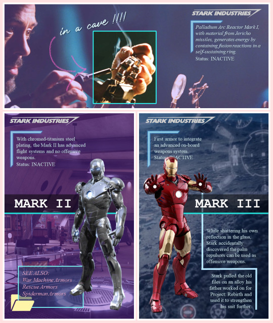
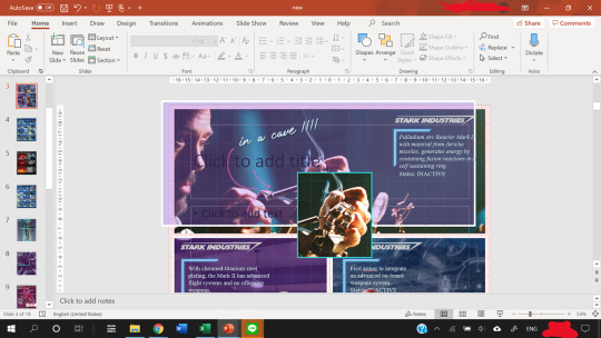
What usually takes a long time in edit making (especially graphics) is finding the right movie frames/pictures. The pictures I use are frames from movie files that are larger than 3gb. A truly marvellous place to find those files are in this post by @in-a-cave-with
Figuring out how to arrange things is a balance between what picture you want to make and what the edit is about. for my last edit all the circular shapes was supposed to be like the arc reactor’s circle but that point might have been missed.
Anyway, I have no idea about your skills but under the cut we start with the very rudimentary basics and then I’ll dissect some of my edits for you. please excuse the messiness of my Powerpoints windows
The Basics
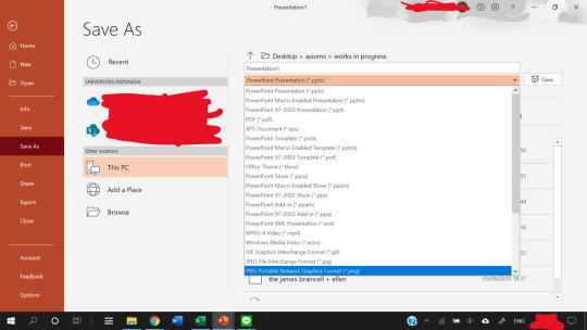
First of all, it depends on what version of Powerpoint you have. My university gives us free access to the Office 365, so that’s the version I’m working with.
I’m pretty sure a lot of the features I use most often (shapes, arranging, and animations) are available on all versions, though.
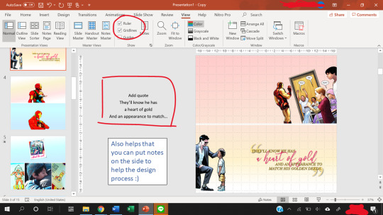
The gridlines are really helpful with positioning, and you can use the space beside the slides to add notes.
Also, to change the slide size, go to the Design -> Slide Size -> Custom Slide Size.
Usually, I use a width of 33.867 cm, which is the default for my Powerpoints and that translates nicely to 1280 pixels when you save as a PNG file.
The 1280 pixels is a multiple of 540 pixels, which is the width that tumblr rescales your images to, so it balances the quality of the image with tumblr’s determination to ruin that quality.
What I usually modify is the height of the slide, and that’s a balancing act. You want enough space to fit what you want, but not too much to crowd the dash. Nobody knows anymore what the maximum height limit is for tumblr but I try to keep the height below 60 cm for proportionality.
Note: each Powerpoint file can only have one slide size. So if you want to make one graphic but using two different slide sizes, you need two Powerpoint files.
Usually, I stick to one slide size per graphic so that it doesn’t confuse people.
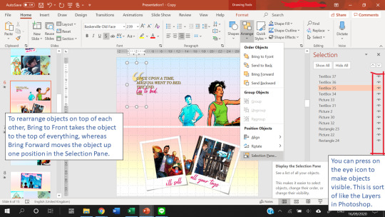
Finally, Arranging things is really useful. This allows you to have multiple “Layers” in your slide.
Creating Templates
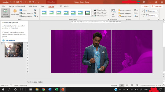
Shapes in powerpoint are a beautiful thing. And the most useful thing is that you can fill a shape with a picture or with a gradient.
After you fill a shape with a picture, you can go to Format -> Crop. Then, you can resize that picture.
If you have the Draw tab in your Powerpoint, that’s also great for you to draw your own lines and shapes to give things a more authentic feel. You can find the Draw tab here if you have the right version of Powerpoint.
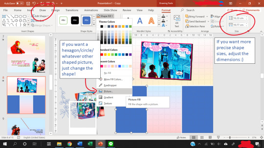
The Corrections option (see picture below, it’s the one with the sun icon) under the Format tab is great for quick adjustments to the brightness and contrast of a picture, and for saturation or grayscale adjustments you go to Color right next to it.
Artistic effects are useful to blur a picture, and if you want to adjust even further, you can go to Options at the very bottom of the pop-up which brings up a side panel for you to fine tune everything.
Notice that on the left of Corrections there is Remove Background. This is very useful as long as your picture has a clear background and foreground.

Shapes can also create a “template” for when you have more than ten images (which is the tumblr limit). You can put two images into one slide easily using the shape as a template so that the images are of the same size.
Gradients are nice to add some vibrance to your edits, and Powerpoint lets you adjust the angle of the gradients for variation.
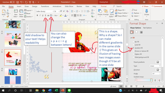
Other useful features include the text shadow effect and the spacing of letters.
To see how you can use shapes as templates, let’s look at some of my edits.
Anatomy of a Slide I
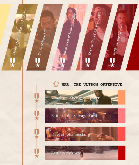
Let’s break this graphic edit down from my Tony Stark + Combat History edit. It has 12 parallelograms, 12 rectangles, 10 icons, 10 textboxes, 3 lines, and a texture background.
This is what the slide looks like as I put the first picture in.
In the end result, the slide consists of:
5 parallelograms filled with a picture.
2 parallelograms at the sides are just filled with color.
5 more parallelograms are arranged on top of the 5 earlier parallelograms, and filled with a color. The transparency of the shape is adjusted so that it creates a sort of color filter for the pictures.
4 of the rectangles are filled with a picture.
4 rectangles are put on top of them, filled with color, transparency adjusted to again create a color filter.
Then, the 4 smaller rectangles at the end of the large rectangles are just filled with color. They are there simply for aesthetics :)
The 10 icons are the medals and the wreath. To find icons in Powerpoint, you can go to Insert -> Icons. Icons is right next to Shapes for me. You can change the color and transparency of Icons too!
The three lines are just to make everything look a tiny bit more cohesive and linked.
The texture background is a paper texture. To find texture backgrounds, there’s this really amazing resource post!
After the slide is done, you can save your slide as a PNG image (save as PNG and not as JPEG because JPEG is lossy and tumblr destroys it) by going to Save As -> PNG. You can choose to save one slide only or all the slides.
That’s it. You’re done making a graphic edit :)
Notice that one of the save options is save as a GIF. That does not work unless you have the newest version of Powerpoint. I don’t have it, so in order to create GIFs, we need to find a workaround, which I explain next.
Anatomy of a Slide II
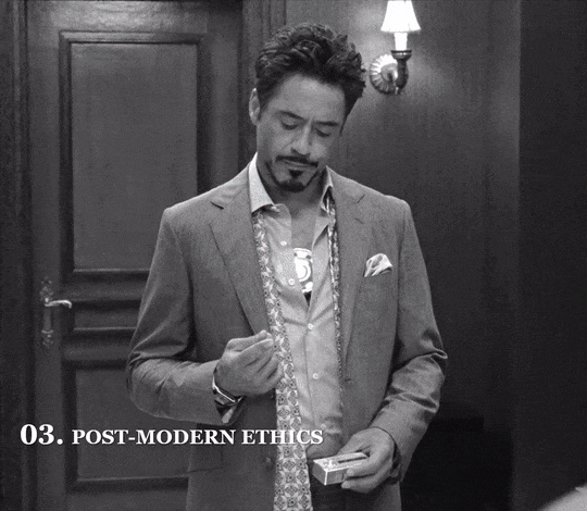
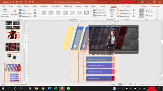
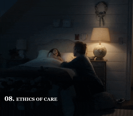
This GIF from my Tony + Ethics edit has 8 components/objects in it.
A black and white picture (a screenshot of Tony, cropped in Powerpoint and also turned black and white by adjusting the Color and Saturation in Powerpoint)
The color cutout of Tony.
Two lines (called Straight Connectors in the animation pane)
Four textboxes.
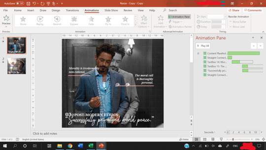
In order to make them appear one by one, animations are used. Here, all of them are animated using the Fade animation.
When you animate, make sure that the first object on the animation pane starts With Previous.
In the picture above, you can see that beside the first object in my Animation pane (the object called Content Placeholder) there’s a number 0. That means the animation starts With Previous.
Never set an animation to start On Click because then the animation won’t show up when you convert the Powerpoint to a video.
You can start an animation After Previous as long as the first animation is starts With Previous. Just never use On Click
To figure out what I mean by On Click, With Previous, and After Previous, you can check this link.
The objects with animations are the color cutout, the two lines, and three textboxes.
The color cutout is actually part of the original screenshot of Tony. I copied the screenshot, changed the saturation and brightness of it, and then removed the background using the Background Removal tool in Powerpoint.
For how to use the Background Removal tool, check this link.
Then, the color cutout is arranged to be in front of the black and white picture, and a Fade animation is put in place so that it looks as if only Tony is coming into color.
Similar animations are used for the textboxes and the straight lines. In order to animate by letter, follow this tutorial.
P.S. you can use emphasis animations to animate the color of a text.
Adjust the animation pane for the timing of the appearances, and present the slide to see if you’re satisfied with the final result.
The next step is how to convert the animated slide into an actual gif.
First, go again to Save As, but this time choose MPEG-4 Video (*.mp4).
Then, you extract each frame of the resulting video and then use photoshop to turn the frames into a GIF.
For a tutorial on how to make gifs in photoshop, check out this really amazing and blessed tutorial by @robertdowneys
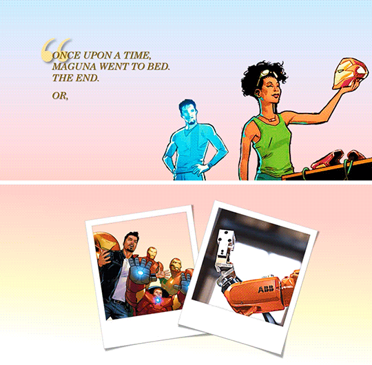
Anatomy of a Slide III
The top part of this slide has 8 components/objects to it:
3 rectangles
1 hooked shape
2 textboxes
The Stark Industries logo
The arrow
The hooked shape has a small glow effect added to the shape. Here’s a tutorial on shape effects. On that note, you can also make transparent text using various shape functions, and a tutorial for that is here.
The logo is a transparent logo downloaded from the internet, and the arrow is hand-drawn by me using the Draw tool in Powerpoint.
2 of the rectangles are filled in with the same picture and stacked on top of each other.
Then, the top rectangle is cropped to only Tony’s hand, and a border is added.
After that, another rectangle is arranged between the top and bottom rectangles. This third rectangle is filled in with a purplish color and transparency adjusted.
That creates a “highlight” effect for the part of the picture where Tony is working on the arc reactor. This same trick is what I used to make several parts of my ethics edits, like this GIF which I like.
Except, this time I make a circle shape first, fill that circle with the same image as the background, and adjust the size of the image to be the same as the background using the Crop tool on the circle.
Then, I make the background darker and the circle brighter using the Corrections tool. This increases the contrast between the two to create a highlighting effect.
Add a border to the circle, and add a Fade in animation.
Save the Powerpoint as a video, and turn video into GIF in photoshop.
Anatomy of a Slide IV - Inserting GIFs
Finally, you can put gifs into a slide! This GIF is from my Tony + his heart of gold edit. Make the GIF in photoshop, then just copy and paste the GIF into the slide like any other picture.
You can rotate, crop and adjust the size of a GIF in powerpoint.
You can’t make any other adjustments (e.g. you cannot change the brightness of a GIFor the color. If you try to do that, the GIF will freeze and become a still image.)
The GIF will not play unless you present the slide.
Don’t steal GIFs :) Again go back to that blessed tutorial on how to make your own GIFs, or ask permission from GIF creators.
As you can see from the selection pane, this slide has 12 components.
The quotation mark is in a textbox of its own
3 textboxes with pink text (animated using a Fade in animation by letter), and 1 with the all caps text
2 polaroid frames arranged on top of a comic book panel (with background removed) and a GIF of Harley.
Plus, a comic book panel of Riri with background removed
Then there are two rectangles filled with a gradient color to serve as the “background” of the slide.
I made the bottom background rectangle a gradient that fades into white to make a more seamless transition to the next image.
You can see the GIF of Harley does not move in this view. However, when you present the slide, it will move. To check if you accidentally froze the GIF while editing, present the slide.
When you are satisfied with how the slide looks, again save it as an MPEG-4 Video (*.mp4). Then, you extract each frame of the resulting video and then use photoshop to turn the frames into a GIF.
That’s it!
Powerpoint has all those tools, and you shouldn’t be afraid to experiment :)
My foray into making edits was literally me, bored in class, with a presentation about data when I went... hey... that’d be nice if I put Tony’s face in it because isn’t everything better with Tony in it?
There’re even more useful features in Powerpoint but this tutorial’s gotten really long already, so I’ll leave it at that. Hope it helped!
You can send me another ask or message me if you’re confused :)
#asks#vormirjumper#resources#tutorials#i know you make beaufitul gifs but i included the gif tutorials in case achalk needs them!#this got WAY longer than expected#but i hope it's useful#forgive my ramblings#and i hope to see more of your edits because all that coloring!#and those captions of yours?? iconic
30 notes
·
View notes
Note
He’d never thought himself much good at giving gifts. At least not the traditional way. A general non-interest in materialism and a fondness for practicality that grew with his age having made a habit for him of gift giving at random to address a need rather than wait for any specific occasion. Not something that anyone ever seemed to mind but had always caused him a prickle of disquiet in him when it came to birthdays, or christmas. Anytime he was left floundering for gift ideas really. Especially when the occasion for gift giving was someone near & dear to his heart & well within means to buy whatever they wanted much less needed.
Still, he’d always loved a challenge, and Lance. . . Well, the hitman was nothing if not that no? And so much more besides, as he’d been delighted to find in the time he’d gotten to know the man thus far. Knowledge he’d put to proper use making the birthday boy’s gifts over the last month. Gifts that not only fullfilled Joel’s fondness for practicality but that he hoped would meet the other’s fondness for aesthetic beauty as well.
But perhaps above all, he hoped they’d translate how much he appreciated what Lance had been willing to share of himself with him. His openess. His history. How very genuine he always was in any response he gave him. Joel wanted to honor that. Show him somehow beyond words that he’d heard him, that he cared. That he was glad to know him. Who he’d been, was now, and if Lance was keen, who he’d become.
“I uhh--, made each of your gifts myself. Well, mostly. I didn’t actually make the packaging on these first two, just what’s inside em.”
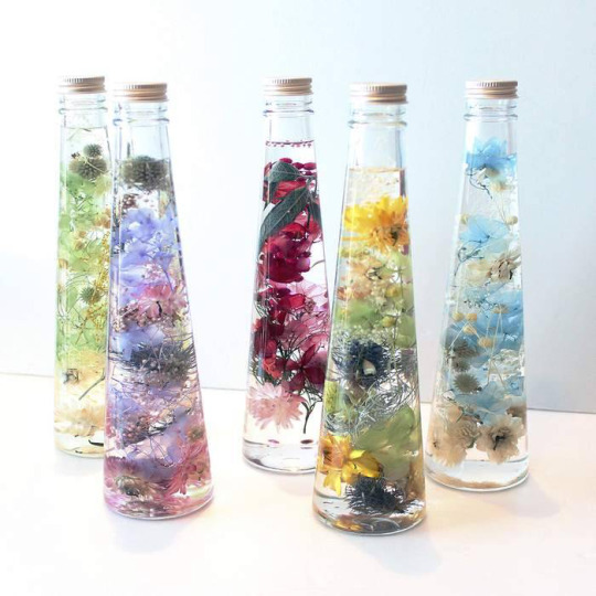
The first of the gifts was a bottled set of massage oils. Each one had a color scheme of preserved blossoms to indicate the essential oil he’d picked for fragrance. Flowers that he’d picked himself either having found them while hiking or from various flowershops. The florals he’d then dyed, dried, arranged, glued, and set inside each bottle before adding the oils.
It was no secret that Lance not only enjoyed attention, but absolutely thrived on it. Had made it clear on a handful of occasions that he was not above demanding it, loudly. Or turning into a complete bratling when it wasn’t given to him for longer than he had patience to wait. Lance also liked to touch, to be touched. And if Joel had thought to indulge himself his fondness for ‘taking care’ whilst gifting the man something that encouraged lavish amounts of pampering and focus all on him, well. He rather doubted the other would have issue with it.
“These are massage oils infused with aloe and other essential oils for skin care and fragrance. Should come in handy the next time the sun toasts ya a bit more than you meant. Or when you’re feeling neglected.”
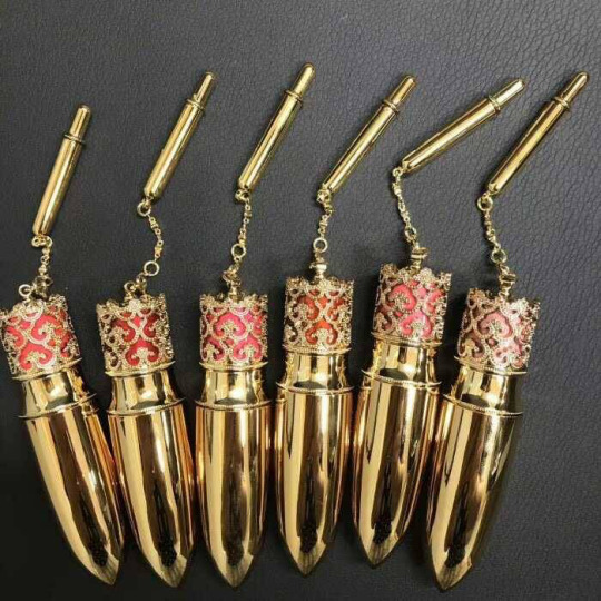
The second wasn’t any less playful or indulgent. They were at a glance a bit of an inside joke, one that only a very small handful of people would probaly ‘get’ if what Lance had told him was anything to go by for how many people knew how he really made money. The gift was a set of lip balms he’d made with a mix of beeswax, shea butter, vaseline, and jojoba oil. Each one had been carefully colored with a combination of powder made out of the leftover blossoms, and food coloring to add tint to them along with their protective and restorative properties.
The set itself was shaded from translucent to various nudes that ranged from natural pink to warmer spice hues. When adding the tint, he had paused, idly wondering if the addition of color to the balms would be too feminine a detail for Lance’s taste. A thought that had gone as fast as it’d come when he recalled the man’s new habit of painting his nails. How much value he placed in his appearence, how little he placed in social norms, how he was seemingly content to enjoy what he liked and not question it beyond that. How very fond he was of Lance for it.
His favorite part of this particualr gift however, was that the case for each one was a hollowed out, reforged, and repurposed rifle cartridge. This detail had probably been what’d taken the most work on his part but in the end he was more than pleased with the results, was certain Lance would be to, as evident in the smile curving his lips as he spoke.
“All that drinking and sunshine dries out your lips chéri. These should help with that, keep you kissable. Some of them are tinted to if you’re feeling flirty.”
The last was the only gift that he’d actually bothered to wrap. To hide. He’d wrapped it meticulously, kept the corners pristine. The paper was ocean blue, patterned with metallic designs. Tied with gold ribbon, topped in an immaculate bow. Inside was a simple white box, and below the lid, buried within more blue, delicate tissue paper was a driftwood picture frame. The frame scaled perfectly for the sketch portraying a memory Lance had described to him in detail from his childhood and coupled with his recall for the one picture Lance had, that he’d shown him upon asking. A picture of him in his boyhood and his mother.
The sketch had taken the whole day. Had been born from a deep rooted desire to somehow give Lance something of that day beyond what he held in his memory. To replicate the warmth he’d had in his tone when he’d spoken of Marianna, described her for him, how she’d been more of a mama to him than the one who’d actually given him life for the most part.
A fact that the man himself had seemed content with upon it’s revealing but had cracked open something hot and hurting inside his throat, in his chest. Something that felt like tears. Was tears. Tears he’d furiously blinked away, turned his face & hid when Lance seemed to nearly notice. Had fallen free once home and he’d contemplated how his friend had learned to normalize loneliness. Normalize family being something you acted out for company and performed rather than actually had. Normalize not having any pictures of them in your home for everything family photos were meant to be and never had been for him.
He hadn’t thought about it. Simply grabbed his sketch book, sat on the chaise in the corner of his living room, just beside the french doors that led out to his porch. The same ones that allowed sunlight in enough to warm him as he worked.
He’d let his hand skate across the page, pencil loose in his fingers, slowly, slowly, the shape of child Lance, the details of Marianna he’d given him coming to life. The profile of her face was hidden, back to the viewer’s sight as she turned, scanned the ocean debris at her feet, the tumble of soft sand in the churning wave line. Smile lingering at the corner of her lips. A peek of profile through her hair but only details, not her whole face. Curls tumbling down her back, the wind catching them, lifting a few stray tendrils. Pointing, reaching, directing a grinning Lance to another sea treasure she’d spotted for him to bring back home.
He wasn’t sure how many hours he’d spent on it; shading in her shadow on the sand, working to capture the gentle folds of of her sundress, capturing every detail Lance had told him about her. All he knew for certain was that it had been early noon when he’d started, and when he’d finally stopped the sun had already gone down.
He didn’t color it. Knew he wouldn’t have to explain to Lance why. How sometimes the best and worst memories looked better in black and white? In the crisp shadows of grayscale, how if you tried to bring back too much you could lose it all? That a memory was its own breed of ghost? How he knew beyoind a doubt he could never capture the blue of the ocean, the warm shade of her eyes, the soft highlights of her hair. Like trying to pin down the wind. Same as capturing her visage without a picture, he didn’t dare attempt bringing the life of color to this memory. Didn’t want to trespass any further than he potentially had.
The smile from before fades, breath catching in his throat enough it hurts to swallow around. Makes him work to force words around his words, his feelings, how little room they leave for anything else.
“Really not good at telling people about how I feel about them when it really counts. Always preffered to show them instead so---.” the words trail off, and he reaches out a hand for the last gift, pushes it within Lance’s reach as his heart begins to hammer away at the cage his ribs suddenly are.
“Not sure if it’s anything like you remember but I wanted to do something for you. Something special. And this wouldn’t leave me alone till I finished it. Ended up drawing it the same day you told me about it. Really hope I didn’t fuck up.” He elects not to tell Lance he means in general, not just the sketch itself.

“You mean----, a lot to me Lance. I don’t even have words for it and I have a few languages to choose from. Hasn’t helped. But I wanted you to know, wanted to show you. Anyways, happy birthday.”
💸 ║ ❛ ————— It always overwhelms him a bit, all these feelings towards Joel and how observing he actually is. Definitely not a man he’s ever met before. And Lance had men before that showed interest in him, tried to promise him the world but in the end the motives were completely focused on the MONEY and lifestyle of the rich and famous. And it’s not like Lance never understood, money and luxury are things he himself enjoys the most as well. But that thought just always runs around his mind; people wouldn’t give a damn about someone like him if he didn’t have all the money, the cars and the big mansion. JOEL is a different kind of man though. Lance managed to convince himself that even if there wasn’t all this money and luxury, Joel would still be there. But most importantly, Joel IS actually here, between all these nice things and in the end all he cares about is putting the smile on Lance’s face.
Lance examines all the gifts while Joel goes off explaining the details. He does listen to what he has to say very carefully but his mind is telling him things. What is it that Joel sees in him that makes him so sure he’s deserving of these things. It only makes Lance notice that he’s only good at accepting gifts as long as he knows the person didn’t really put any effort into it. But all the effort Joel put into it, Lance doesn’t wanna ruin the good moment. Ruin it with his bad thoughts punishing him for feeling grateful for something he doesn’t quite deserve. He is pretty good at shutting his mind off if things make him too vulnerable, so that’s his solution.
A bright smile forms on his lips while looking at all these nice things. Suddenly it just feels so warm inside him, almost pressuring as if there’s something he just has to let out. It’s just a feeling of genuine HAPPINESS that Joel manages to break free, and usually that feeling is archived once he’s had a few shots. No alcohol this time, there’s no need for it. Not even his mind is running to it. Blue eyes wander from all these beautiful gifts to Joel, only for a short moment though. He’s desperately trying to form a sentence in his head to not seem like a child who’s got all the presents it wished for. But talking, expressing himself is hard when he tries to not get over that spot of vulnerability.

❝ Qué digo, qué digo.. Thank you, amorcito, honestly. I really don’t know what to say. ❞ And just as he tries to fight his brain to throw out ANY WORDS, there is another gift coming. Joel seems much more nervous about it, much more emotional. Lance doesn’t wonder too long after he eventually unwrapped it and now examines this personal work. It just causes him to feel a lot of emotions, they just hit him like lightning, yet he’s QUIET for a moment. While there’s still this burst of happiness, there’s also an ache in his heart that’s not easy to handle. A picture like that doesn’t exist but when he looks at it it feels like there’s something real about it. Lance never had a picture of MARIANNA, but if he did he wouldn’t hide it away like he does with the picture of his own mother. Marianna deserves much more than what he’s able to give her. And the fact that Joel actually took the time to awake the memories in his heart does cause him to get very emotional about it. Things like that make him cry like a baby when he’s alone, so he’s really fighting some tears. He doesn’t wanna cry on his birthday.
❝ I can’t believe you did that. Man, soy demasiado emocional para esto. This is a lot. I love it. ❞ At least he got out a little bit before his emotions make his eyes all watery. Still, he fights hard not to cry over it. So the best way to hide that is to simply throw his arms around the other man’s shoulders. The hug holds on for a moment until Lance interrupts it to place a kiss on Joel’s lips. ❝ Merci, chérie. ❞
#themechaneer#💸 ║ ❛ ——— answered.#i'm crying this is so sweet ;____; <3333#thank you so much for this!!!! <3333#long post.
4 notes
·
View notes
Text
Freelancing web dev/designer here! I wanna add some tools and more resources to this list for everyone. Hopefully this is more exciting than it is intimidating. Webpage creation can be fun and useful - especially for those looking to build their own online portfolios as social media gets worse and worse for indies/small businesses fighting the constantly changing climate of algorithms and other corporate junk.
More casually, go and make that fan page you’ve always wanted. Start somewhere - anywhere! My first websites back in 2007 - 2010 were for virtual pet site fan pages, an American Dragon: Jake Long page begging for a season 3, my own made up adoptable pets, and a free virtual pet site of my own that used a cool tool that existed back then.
Modern design is actually cleaner to work with, more accessible, and you can still be as creative as you want despite what professional websites adhere to for their marketing standards. Lots has changed and improved since I first started...
Educational Resources
MDN Web Docs | Similar to W3Schools, might be a preferred format for some to learn from as an option. Full of interactive examples and detailed explanations!
CSS Tricks Guides | Visual articles with organized categories for each property and value involved! I always reference their Flexbox guide since flexbox stuff gets confusing to write by pure memory each time.
Kevin Powell’s YouTube | A chill channel I’m a fan of that web devs can appreciate at any level of experience! He’s got shorts for fast solutions, full troubleshooting guides, reviews for annual developer surveys, and advocates for more diversity in the web development scene that isn’t white guys such as himself. Super welcoming, friendly, and won’t talk down to you for trying to learn. The link is his playlist category that’s good for beginners out there, for your convenience.
CodePen | A massive gallery of code snippets that other developers have created and shared for free viewing/tinkering. You can find insane CSS-made art and animations on here, JavaScript samples, and more!
Accessibility Guide | Making your website accessible is an important step in designing a page for anyone to see. Many types of disabled people surf the internet with accessibility devices such as screen readers. Those with more limited internet (speed, bandwidth, etc.) can also benefit from these standards.
Epilepsy Guide | A specific form of accessibility that’s important to consider as well. If you have moving, flashing, and otherwise visually stimulating content, look through this for solutions to make your pages safer to look at.
Meta Tag Guide | A beginner-friendly guide with examples of how HTML meta tags affect the way your public site and its pages will show up in search results.
SEO Guide | SEO is an abbreviation of Search Engine Optimization. This is good to learn if you’re a serious designer who needs your page to show in search results. Important for those of you out there making business and/or portfolio pages. 100% use your username, business name, and other unique (but not private) identifying factors as keywords that will connect your page to being found along with your social profiles.
[Fun Fact: SEO is the reason behind food blogs sharing their whole anime backstory before the actual recipe... Hurrah]
Browser Extension Tools
ColorZilla | FireFox & Chrome | Select colors from webpages, analyze CSS colors on pages, generate gradient values for CSS, and save palettes. Provides hex and rgba color values too!
RGBlind | Firefox & Chrome | Simulate some types of color blindness on your website for accessibility purposes.
Colorblindly | Chrome Only | Simulate a wider range of color blindness types, but unfortunately not available on other browsers from what I’ve found.
Page Marker | Chrome Only | Write/draw anything you need for brainstorming your page’s development, right on top of it! The marker strokes stick to that point of the page and moves with it when you scroll.
Eye Dropper | Chrome Only | For selecting and picking colors off of web pages. Gives you the hex and rgba values on the spot!
Grayscale View | Chrome Only | Good for previewing shade values and contrast on your website for accessibility and readability purposes.
Other Tools
Visual Studio Code | Open Source program provided by Microsoft of all things! This comes with many built-in tools and functions to make HTML, CSS, JS, and other compatible languages be more convenient to work with. More cozy to work with than the manual tedium of organizing things within bare text editors. Color coded words, auto-stacking, arrows that help you be sure you have things closed up properly, and more! Definitely look through its extensions shop for anything you think would help you in the ways you need for development.
openElement | Create web pages without coding. Can be good for planning how your website is laid out, or to make something without the knowledge required! I haven’t used it myself, but it looks promising.
Accessibility Checklist | A superbly handy way to track your website’s depth and level of accessibility. The + buttons give descriptions/suggestions for each item on the list to make improvements for your website.
Photo-sensitivity Analysis Tool | A free program that analyses content on your pages for any risks of epilepsy and other photo-sensitive complications among viewers. Important for accessibility!
That’s about all I can put together at this time. Be free! Go wild! The internet is still ours to build in - not just big corps, scammers, or bots.
⬇ make a webpage right now its free ⬇
neocities.org 👈 for website hosting
internetingishard.com 👈 for coding tutorial
w3schools.com 👈 for a searchable index of every html and css term under the sun and live examples of how each one works
sadgrl.online 👈 for a layout builder, if you dont want to do everything from scratch
#I want to share the joyful and fun parts of web design to everyone online!#I walk a more profession-based road for my web development but I still get myself into some fun projects and ideas to build from#it's very rewarding to see the final base version of your project be done and functional#web development can and should still be enjoyed as a hobby first and foremost#wk speaks#wk responds#web design#web development#resources#tools#accessibility#html#css
37K notes
·
View notes
Text
A Complete Beginner’s Guide to Masking in Photoshop
Several years ago a friend of mine asked me to teach him how masks work in Photoshop. This is my incredibly late response.
We’ll go over the basics of what masks are, what they’re used for and how wielding them properly will take your Photoshop skills to an entirely new level.
What Is a Mask?
Layers are probably the single most important addition to Photoshop since the original version, but layer masks are a close second. I would posit that until you thoroughly understand how and why to use masks, you simply don’t understand the power of Photoshop.
The term “mask” isn’t immediately understandable to someone outside the realm of graphic design. At its simplest definition a mask is a way to apply something to a very specific portion of an image.
There are two primary types of masks: clipping masks and layer masks. These two tools are closely related in concept, but very different in application. Let’s start by discussing layers masks, which are generally what people are referring to when you hear them discuss Photoshop masking.
Layer Masks
A layer mask is something that you apply to a given layer to control the transparency of that layer. Where layer opacity controls the transparency of the entire layer at once, a mask gives you more precise controls over very specific areas. If you want the entire layer to be at 30%, you would lower the opacity, if you want just the left side of a layer to be at 30%, you would use a mask.
When you add a mask to a layer, it covers the entire thing with an invisible grayscale canvas. There are ways to see it that we’ll check out later but just know that as a general rule, applying a mask to a layer won’t cause any immediate visual differences unless you have an active selection at the time.
On this invisible canvas, you can paint white, black or any level of gray in-between. The color that you paint tells Photoshop how opaque to make the pixels at that point. White means 100% opacity and black means 0% opacity.
With this in mind, try to imagine what the mask below would do to a layer:
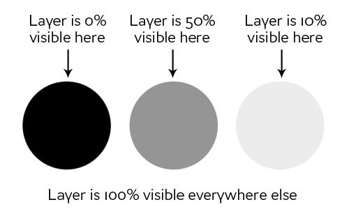
As you can see, if our mask was all white with the three circles shown above, we would have a completely visible layer where in all the white areas, and spots of transparency in the circles. If we apply this mask to a layer, this is the result:
Clipping Masks
Clipping masks are very similar to layer masks only they use one layer to determine the transparency of another. In this scenario, you stack two layers on top of each other with the bottom being the determining factor of the transparency of the top.
Instead of using black and white values though, clipping masks simply borrow transparency from the layers used to make them, namely the bottom layer. If the bottom layer has some areas that are opaque and some areas that are transparent, a clipping mask will apply these values to the top layer.
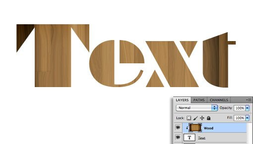
This one is hard to explain without an example, but becomes crystal clear when you see it in action. Let’s use the two layers shown below and say that our goal here is to cut or “clip” the wood layer to be in the shape of the letters. Notice that, at this point, the wood is the bottom layer and the text is the top layer.

To achieve the effect that we want, simply swap the position of the layers so that the wood is on the top, then go to the Layers menu at the top of your screen and select “Create Clipping Mask” (Command-Option-G). Voila, we now have the effect we were going for. Where the text layer was opaque, the wood layer is now opaque and where the text layer was transparent, the wood layer is now transparent.
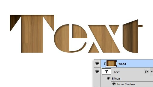
There’s some really interesting functionality here. You can still position and make changes to each of the two layers independently. By dragging around the wood layer, you move the position of the texture inside the bounds of the letters while the letters themselves stay stationary.
Also, you can apply layer effects to the compilation via the bottom layer. For instance, here’s what happens if we select the text layer and add an Inner Shadow.
Clipping masks fun, functional and underrated, but the truth is that layer masks are far more common in every day use. The information above should be enough to get you off and running with clipping masks so from here on out we’ll focus purely on layer mask functionality.
How Do I Make a Layer Mask?
Now that we have a strong grasp of exactly what masks are and how the two different types of masks differ, let’s see how to create and work with a layer mask.
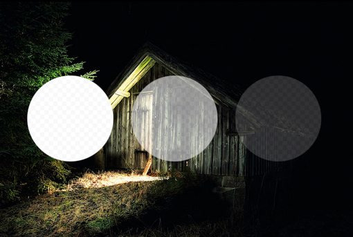
The first thing we need is two layers. I grabbed the two images below from photographers Adrian Durlea and Erik Soderstrom. The shack image is on the bottom and the fire is on the top.

The general idea here is to take some, not all, of the fire and apply it to the shack. The first step is to stack the two images as we see above and set the fire layer’s blending mode to Screen. This will make all of the black pixels transparent, which blends the two images together nicely.
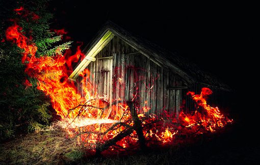
With that one change, this is already a pretty decent image! Let’s say though that we want to only have fire near the door of the shack. To accomplish this, we’ll need to add a mask to the fire layer. Select the fire layer and click the mask icon shown in the image below.
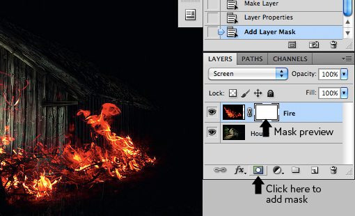
Now, with the mask selected in the layers palette, we grab a soft, black brush and paint out the portions of the fire that we don’t want to see. As we do this, the fire begins to disappear. To bring it back, we simply paint white.
As you can see in the image below, with just a little painting, our fire is now much more centralized to the portion of the image that’s already lit up and therefore looks decently natural.
To see the actual mask, Option-Click (Alt-Click on a PC) on the little mask preview in the layers palette (Shift-click to hide the mask completely). After painting out some of our fire, this brings up the following:
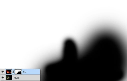
Notice that we’re not just constrained to hard edges. The beauty of masks is that you can do anything you want with them as long as you can pull it off in values of gray. This means you can paint, clone, create and fill selections, copy and paste, and all kinds of other actions you perform on the main canvas.
Why Not Just Erase?
Upon first learning how to use masks, most rookies think the same thing: “I can already do all of this with the eraser tool.” Wrong! In fact, as far as I’m concerned, once you learn to mask, you should literally never pick up the eraser tool again because it tends to be so destructive.
What do I mean by destructive? Think about what happens when you use the eraser tool: it erases pixels. Mind you, it doesn’t hide them for a while until you want them back, it “destroys” the pixels. The changes that you make by deleting portions of a layer are permanent and can’t exactly be tweaked later.

This is simply a horrible way to work. With every new iteration of Photoshop, Adobe gives us more and more ways to make non-destructive edits, meaning those that don’t truly alter the original pixel data. For instance, Filters used to be a permanent and destructive change, if you blurred a layer, it was stuck that way! Now, with Smart Filters, you can always go back and adjust or even delete the blur.
This same concept gave birth to masks many years ago. With a mask, you not only have the ability to make remarkably detailed decisions about the transparency of a layer or group of layers, even better, you have the freedom to go back and refine or scrap those changes at any time. If I had erased my fire in the example above, it would be gone forever and bringing it back would involve importing the layer all over again. However, because I used a mask, all I have to do is fill that mask with white and immediately all of my fire detail returns.
To use the metaphor of an actual mask, imagine that you want to change your appearance for Halloween. You have two options: the first is to undergo plastic surgery to permanently change your face to look like that of a scary creature and the second is to wear a mask. In this scenario, the eraser tool is plastic surgery. It’s simply a bad choice when you’re not sure that you want the changes to be permanent. Go with the mask instead.
Advanced Masking Techniques
The information above is an absolute beginner’s guide to masks. Odds are, if you’ve been using Photoshop for a while, not a single piece of this was news to you. In fact, you may be thinking that masks are so incredibly simple that they barely merit conversation.
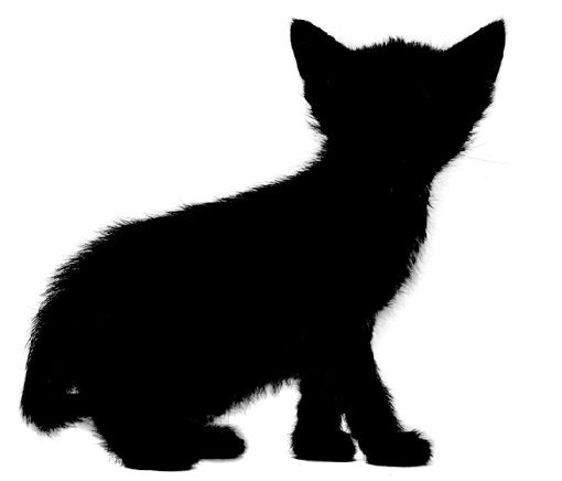
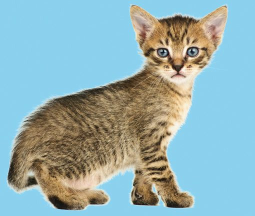
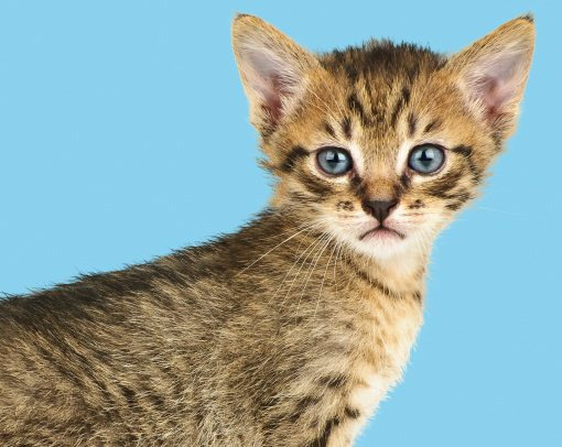
However, masking techniques go from simple to wickedly complex really fast. It’s easy enough to paint some broad strokes to erase large portions of an image, but what if you want to do something more complex? For instance, let’s say we want to take the cat below off of its white background.
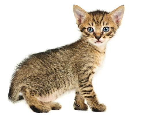
Furry animals make particularly difficult masking subjects. All of that fine hair detail means making an accurate selection will be time consuming. The Magic Wand or even the Pen Tool are of no use to us here. So how do the pros start with the image above and create a mask like the one below?
If you’re ready to find out, keep reading as we undertake this feat!
Change the Channel
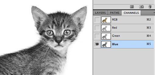
The good news about the cat image is that there is plenty of contrast to work with. The key to making a good mask is finding contrast and knowing how to pull it out. Here we have a fairly dark cat on a bright white background, which means all we have to do is figure out how to leverage our good fortune and convert the contrast already present into a suitable mask.
The first step in a project like this is to jump over to the Channels Palette and look for the channel with the most contrast. So in our case, we want the channel with the darkest cat and the brightest background, which turns out to be the blue channel.
Make a copy of the blue channel, select it and hit Command-L to bring up a Levels Adjustment. Darken the shadows and the midtones so that there is a crazy amount of contrast like in the image below. Be careful to no go too far with this adjustment. You’ll want to zoom in and watch the hair detail on the fringes of the fur to make sure you’re not clipping too much. It doesn’t have to be perfectly black and white at this point, some dark grays are acceptable.
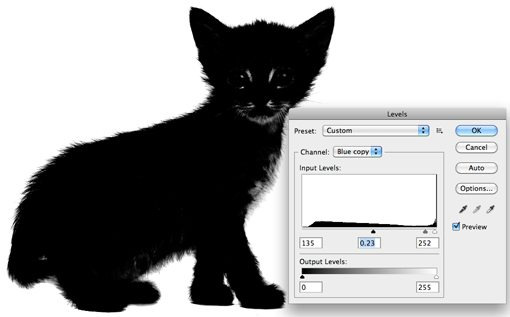
At this point you encounter one of the trickiest steps of the entire process. The goal is to get as much of the cat as closest to black as you can. This is easy for the face potions and other random spots near the center, just grab a black brush and fill them in. But what about the edge of the hair?
It turns out one of the best ways to handle this task is to use a couple of unlikely candidates: the Dodge and Burn Tools. The reason these work so well is that they can accurately target certain ranges of gray extremely accurately. I set the Dodge Tool to target the highlights and the Burn Tool to target the shadows, grab a medium size soft brush and make my way around the edges of the image, burning shadows and dodging highlights until I like the level of detail that I’m seeing.

This may sound like a time-intensive task, and it can be for some images, but in truth the Dodge and Burn Tools feel like magic when you’re using them and take much of the work out. I was able to come up with a great looking silhouette in only a minute or two.
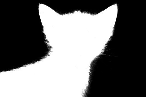
Once you’re done here, hit Command-Shift-I to inverse the channel so that the cat is white and the background is black like in the image below. Remember that, in masking, white is opaque and black is transparent.
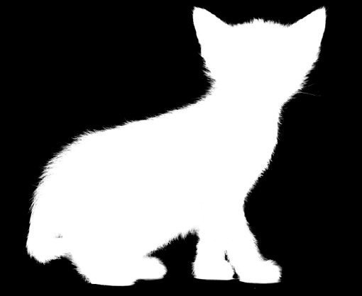
Converting the Channel to a Mask
Now that we have a channel that accurately represents what we want from a mask, how do we convert it? There are a few ways to do this but the easiest is just to Command-click on the channel to load a selection. With a selection loaded, return to your cat layer and click the New Mask button. That’s all there is to it!
Defringing the Mask
As you can see, despite a super detailed mask, we still have some white fringing occurring around the edges. Getting rid of this can literally take hours of tedious work if you don’t know what you’re doing. For starters, we can use the fantastic new Masks Palette in conjunction with Refine Edge to make some live adjustments to our mask.
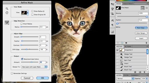
Utilizing these tools properly takes practice. I won’t cover them closely now because it would take so much time but I encourage you to dig in and play with all of the controls to get a feel for what they do. Often, you can patch up a rough edge in seconds with these sliders, but with our cat project I wasn’t really getting any results that I liked so I cancelled out this operation altogether.
Instead, I went to the Layer menu at the top of the screen and selected Matting>Color Decontaminate. This is an almost hidden command that has the ability to yield some amazing results. As you can see in the image below, it went a long way toward reducing our halo. Note that this command is actually destructive so you should always duplicate your layer before using it.
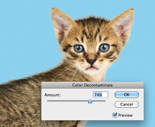
From here, the last trick I use is to look for problematic areas and actually run the clone brush over the fringes. The mask keeps everything looking nice and cloning replaces unnatural colors with those from the actual fur of the cat in other places. Compare the back and head of the cat in the image below to that above to see the improvement.
Finishing Up
From here it becomes a factor of how much time you want to spend refining your result. With complicated masks like these there is always room for improvement but you’ll find that the point of diminishing returns on your time spent becomes easier and easier to spot as your skill level improves.

The technique we just discussed is just to give you a taste of how advanced masking can become. There are a ton of different types of images to mask and therefore a million different tricks and techniques to figure out along the way which can be mixed and matched on a per-project basis. Practice makes perfect, just be bold and never become intimidated by a masking job that seems too complex. Think through the process one step at a time and find ways to pull out the detail you need.
Conclusion
To sum up, there are two primary types of masks in Photoshop: layer masks and clipping masks. Layer masks use values of gray to assign levels of transparency to specific portions of a layer or group of layers while clipping masks use the transparency of one layer to define that of a different layer or group of layers.
Also, while masking in simple in concept, the actual art takes considerable time, education and practice to master. Leave a comment below and let us know if you learned anything from the information above. Also be sure to share any unique masking techniques or tricks you might have!
Photo Credits: Adrian Durlea, Erik Soderstrom, and Sergiu Bacioiu.
4 notes
·
View notes
Photo


WIP - The Party
This was just a fun project that I wanted to work on because I wanted to do something with multiple detailed characters.
I wanted to show the steps that went into getting to where I am currently, and open myself up for feedback since I haven't done something like this before. I also wanted to show off how many massive mistakes and changes I've made up until this point. Not every drawing starts and ends teh same way, and as I make mistakes, things develop and change, and take on their own structure. The important lesson I've learned is to not be afraid of mistakes, but to keep going, adapt, expect things to change, don't give up, keep adding details where I am comfortable, and let the harder parts work themselves out in time.
So this one starts out with a basic blue sketch to show the figure and shadow of where I wanted the figures. I tried to add yellow as lighting, but ultimatley I converted it to grayscale and the lighting ended up looking like shading as well.
As I went forward I worked on one character at a time rather than trying to work on all the color first, then all the shading, etc. For this, I didn't hace as many layers of shadows, but rather I just used different colors to draw variation into the characters instead of overlaying a bunch of translucent shadow and light layers.
You can see that I experimented with the placement and size of the characters a bit, and thoug at first I expected it to be an outdoor scene, it might end up being a scene in a dungeon, with a dragon. We'll see how it develops!
#fantasy#fantasy art#dungeons and dragons#dnd#D&D#D&D character#art#drawing#work in progress#art tutorial#dungeon#dragon#armor#paladin#druid#warrior#trojan
7 notes
·
View notes
Text
She Shows Me Colors (H.H. x Reader)
She Shows Me Colors
Harry Holland x fem!reader
Soulmate!AU in which you see in black & white until you see/meet your soulmate. I changed it up so everyday you see your soulmate you get a new color until you can see them all wow.
Words: 1k
Warnings: None really?
A/N: I didn’t like the ending but hey i did my besttttt lmaoo
Masterlist
At first, everything was black.
Well, not exactly black, more like shades of gray with some whites and blacks here and there.
Harry Holland had gone through his first 17 years without meeting or coming across his soulmate. He still saw everything in the dull and boring grayscale colors, unlike his friends and family. He heard so much about how magical and wonderous all the other colors are and how certain colors look good together and how someone can look good in a certain color and-
He spent too much time thinking about it, and he knew it. He felt like he wasn’t good enough to have a soulmate. More and more, every day, the feeling grew. He wondered how much longer.
One fall morning, he and his twin brother, Sam, were walking to school. He kicked the leaves as they walked and Sam sighed.
“Your soulmate will come sooner or later, Harry.” He said and Harry just shrugged. They walked into the school and made their way through the hallways. Harry looked up from shutting off his phone. And suddenly a burst of a color came to him. He nearly dropped his phone.
Red.
That was the first color he saw, but only for a brief moment, before, whoever it was, disappeared around a corner. Harry grabbed his brother’s arm.
“Sam.” He breathed out. “I just-”
“Shit, who was it? Do you still see any?” Harry shrugged like earlier and they became more and more excited for the Holland boy.
Nothing else happened until lunch.
Harry and Sam were sitting alone at their lunch table when Harry caught the color again, from the corner of the room. It was coming from a girl he didn’t recognize, but she was wearing a nice casual sweater of the color he now recognized. He grabbed Sam’s arm and pointed to her.
“It’s her.”
“Where’s the color coming from?”
“Her sweater.”
“Red,” Sam replied, casually. “She seems new. I’ve never seen her before.” He suggested.
Harry didn’t respond. After lunch, all the items of red remained the new color. Still, he searched for his soulmate, but she wasn’t found for the rest of the day.
The next day, Sam and Harry passed her again, and this time Harry saw a flash of a new color.
Orange.
It was a brighter color, and it was the accent color on her polo shirt. He watched as her ponytail swished back and forth while she walked. Everything of this new color stayed, and he told Sam it was the color of his backpack.
“Oh, that’s orange,” Sam replied. “It seems as if she’s dressing in the order of the rainbow.”
All day Harry doodled with his newfound orange pen in his notebooks. He noticed that he had his Maths class with the new girl every other day, due to block schedule. But he didn’t notice that she was looking at him in awe, he was showing her a color, too.
Turns out she played tennis, and so Harry and his brother Tom went out to support the school team at their match the next afternoon. Harry immediately got a burst of another new color, which Tom identified for him.
Yellow.
It was radiating off her racket and the ribbon in her hair. The leaves floating from the trees were a beautiful shade of this newfound bright color. Harry watched the girl’s movements in awe as the three colors worked together with the grays to make her the most beautiful person he’s ever seen.
“Do you know her name yet?” Tom asked halfway through the match. Harry shook his head.
“Not yet.”
And as the next few days passed, Harry began experiencing his life with new colors.
Green; the color of her nails and stems of the roses she had in her locker.
Blue; the color of her polaroid camera, her backpack, and her gym bag.
Purple; the color of her water bottle that fell off her desk in English and her favorite pen.
Pink; her lipgloss and skirt.
And with all those colors came their different shades.
She gave him colors like brown and magenta, yellow and turquoise.
And all the while, Harry didn’t even realize he was doing the same for her.
One day, the day Sam said he could see all the colors, Harry walked up to this girl and struck up a conversation. He asked her on a minigolf date, which she happily agreed on. He learned her name was Y/N.
“So, what was the first color you saw?” She asked as she hit the neon pink ball with her club. Harry smiled.
“Red,” He stepped up to his own neon green ball. “How about you?”
“Yellow,” She hummed. She watched carefully at Harry’s strategy. After a few moments of comfortable silence, she spoke up again. “So, how come it took you so long?”
“I was trying to find the right trajectory, Y/N.” He chuckled and she shook her head.
“No, I mean, to talk to me. To ask me to do something like this.” She gestured to the golf course.
“Oh. Well, I was quite nervous.” He answered, correctly this time.
Y/N swung her club to hit her ball before responding. “You don’t seem too nervous now.”
“Oh, trust me, I’m really a mess inside, darling.”
“Mess or not, I think you’re great.” He wrapped his arms around her waist, both of them smiling.
“Promise me something, Y/N.”
“Anything you want.”
“Never stop showing me there’s more to life than just monotone gray.”
“I promise.”
“How was your date?” Sam asked the next morning in the living room.
“She’s wonderful. I can already feel myself falling for her.”
“Well, she is your soulmate.”
“She’s more than that. She shows me colors.”
“All soulmates do that, Harry.”
“This is different.” He told his freckled twin.
“Okayyy.” Sam said, setting his phone down on the coffee table.
She showed him colors he never thought he would see, and that he grew to love. His favorite is the color of her eyes because it adds on to her beauty and her warm smile. And her hair, making her look to gorgeous.
Just everything about her is so beautiful to Harry.
She puts all the colors together and to work.
She’s his aesthetic. She’s his favorite color.
#Harry Holland#harry holland x reader#harry holland x you#Harry holland x y/n#harry holland x reader smut#harry holland x reader fluff#harry holland x reader headcannons#harry holland x reader angst#harry holland fluff#harry holland angst#harry holland smut#sam holland#sam holland fluff#sam holland x reader#Sam Holland x you#sam holland x reader smut#sam holland x reader angst#sam holland x reader fluff#sam holland x y/n#sam holland angst#sam holland smut#tom holland#tom holland x reader#tom holland angst#tom holland x reader smut#tom holland fluff#tom holland x reader fluff#tom holland x reader angst#tom holland x y/n#harrison osterfield x reader
170 notes
·
View notes