#art hack
Explore tagged Tumblr posts
Text
Answering 5 questions about how to use paint pens! I used POSCAs, Montana and Molotow paint pens for this video 😊
559 notes
·
View notes
Text
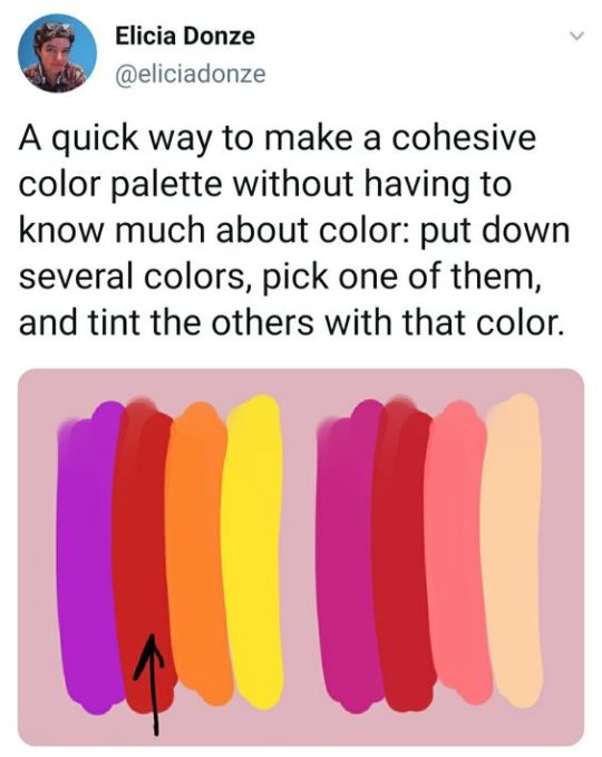
Palette tip form Elicia Donze
#art#color palette#how to create a palette#color inspiration#elicia donze#color theory#color design#palette building#palette design#color selection#art tip#art hack
332 notes
·
View notes
Text
HELLO I BRING YOU ANOTHER CLIP STUDIO DISCOVERY 🙏
so apparently if you tap the layer of your choice while holding left ctrl, it will automatically select everything that is on the layer????? 🫢
I'm using version 3.0.4, but if someone uses earlier version, please let me know if it works for you too!

44 notes
·
View notes
Text
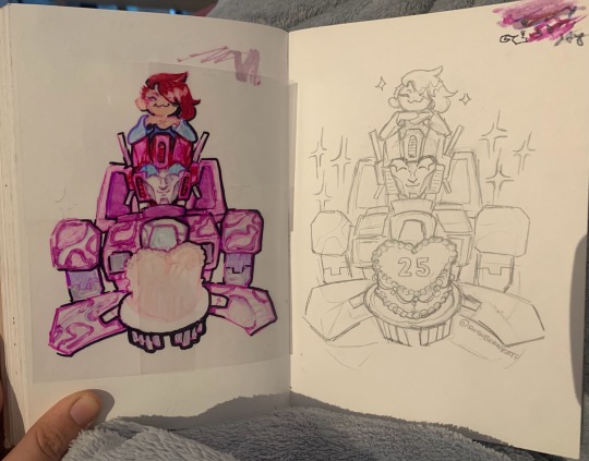
Clear sticky notes. Highly recommend
26 notes
·
View notes
Text
Where's the Floor
So lately when I do thumbnails for my comics, I play a game called "Where's the Floor". Basically, put a grid down to represent the surface plane.
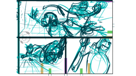
I picked up this trick from watching animatics from "Rise of The Teenage Mutant Ninja Turtles" from Nickelodeon. This leads me to this helpful trick, it's the grid pattern on the floor to show perspective.
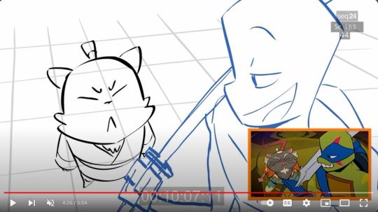
Whether it is the floor or the ceiling, it's an easy way for me to know where the camera is in relation to the surface plane. Therefore, giving me an idea of how to draw the characters in that perspective. Also leads to dynamic shots and amazing high action scenes.
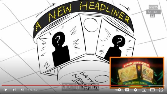
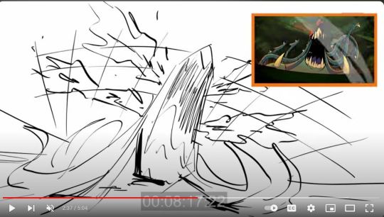
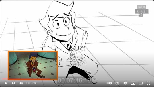
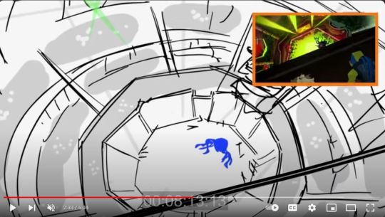
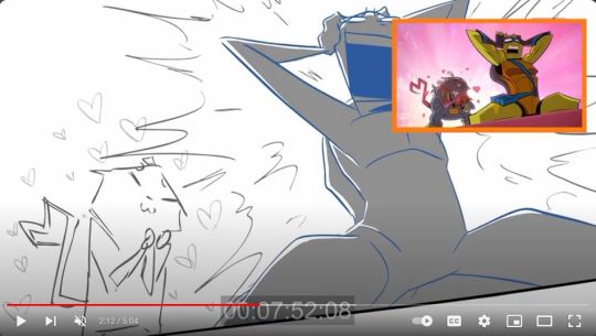
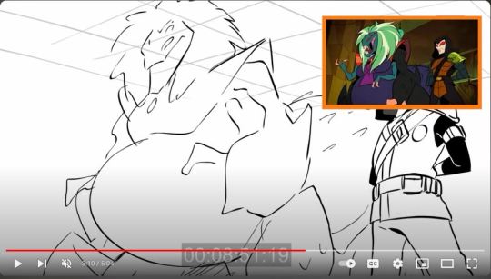
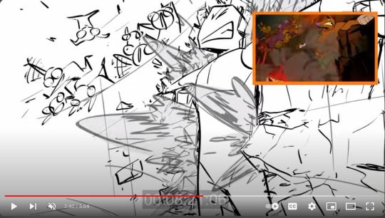
There was one other set of videos on youtube that uses their cameras pretty affectively, and that's a dance troupe from Russia.
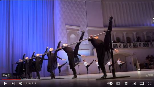
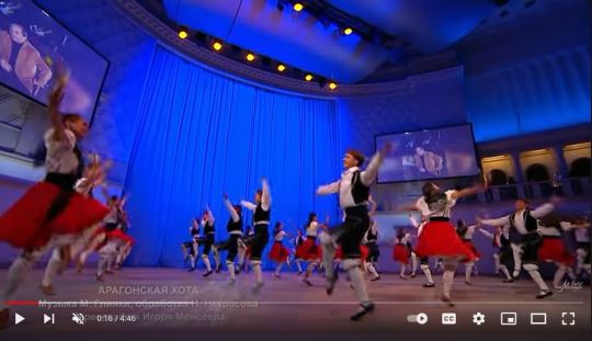
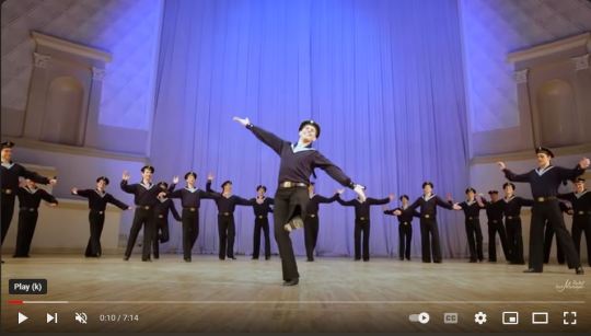
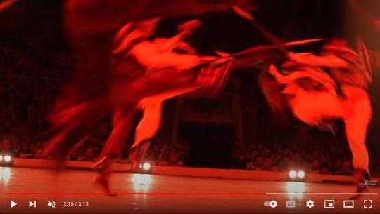
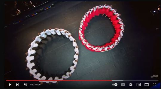
You put a grid on the most important surface in that shot and it's basically the same principles!
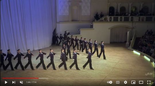
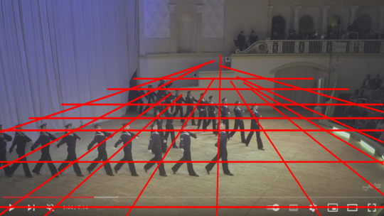
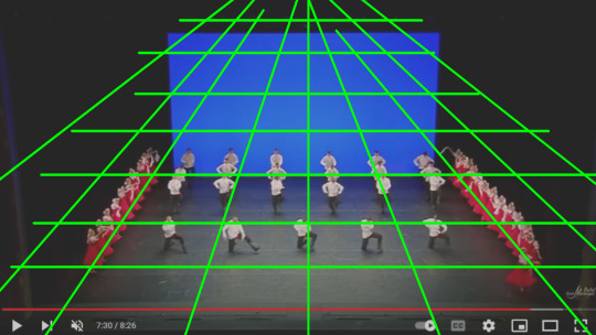
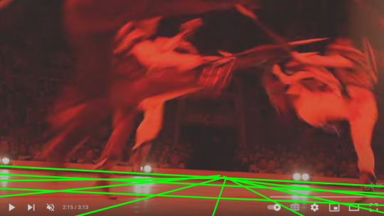
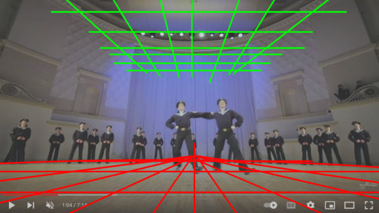
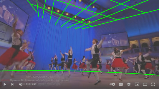
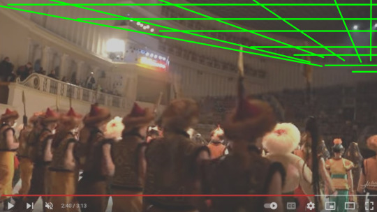
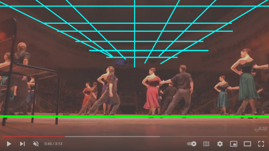
Even their bird's eye camera, zoom ins made me think of shots taken in dancing scenes from Disney.
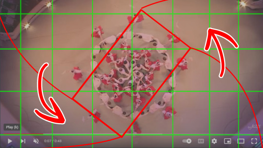
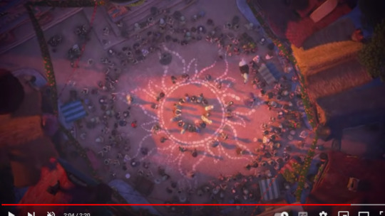
If you break down a shot from your favorite animated series, you can guess where the grid is, how it's tilted, and how the character should be in perspective to that.
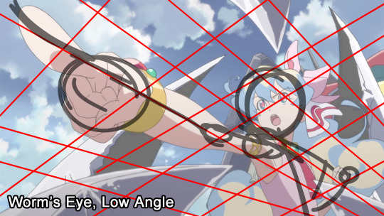
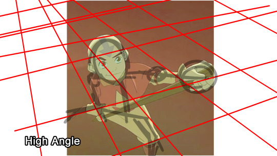
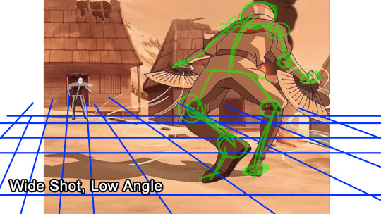
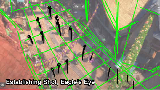
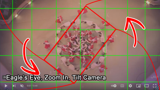
Having this concept simplified really has helped with layout, perspective, and taking steps into more dynamic action scenes for me.
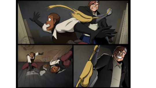
#art tip#perspective#thumbnails#animatics#camera shots#grids#Legend Catcher#comic#animation#live action#dancing#rise of the teenage mutant ninja turtles#rottmnt#dancing troupe#Tangled#anime#avatar the last airbender#ATLA#gurren lagann#art hack#drawing#drawing tip
52 notes
·
View notes
Text
I've seen this trend where people would squish the face of their anime drawing to make it into the drawing's mouth, and I figured if I did that with Sonic the result would be a smile cause of that signature eyebrow curve
... a scowl. It came out as a scowl. Not that I'm complaining
26 notes
·
View notes
Text
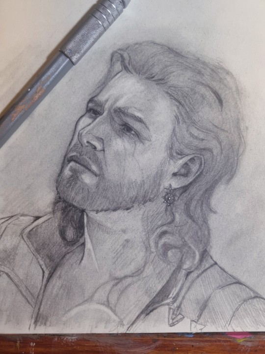
"With you, I forget my goddess."
#Gale Dekarios#gale of waterdeep#put the eyes closer together and it becomes Thor#art hack#bg3#my art#baldur's gate 3#Gale x Tav#drawing#fan art#bg3 fanart#traditional art
68 notes
·
View notes
Text
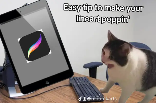


See the difference?
Adding variating thickness to certain areas of your art-- like around silhouettes and bulky clothing-- helps give your art more depth and dimension. You can experiment with line weight if you feel like your lineart is too flat or missing a certain je nais se quois. It's a simple tip, but it's something my art has been complimented on numerous times for and does wonders in improving lineart!
13 notes
·
View notes
Text
Super fun art idea: Draw crumpled up pieces of paper until you either get better at drawing shadows and folds or your mind becomes numb to the idea of depicting tangible forms and you throw up
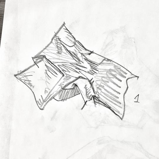
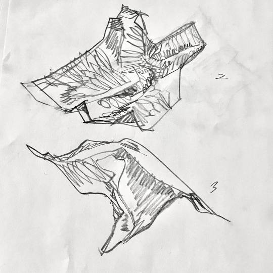
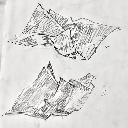
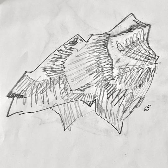
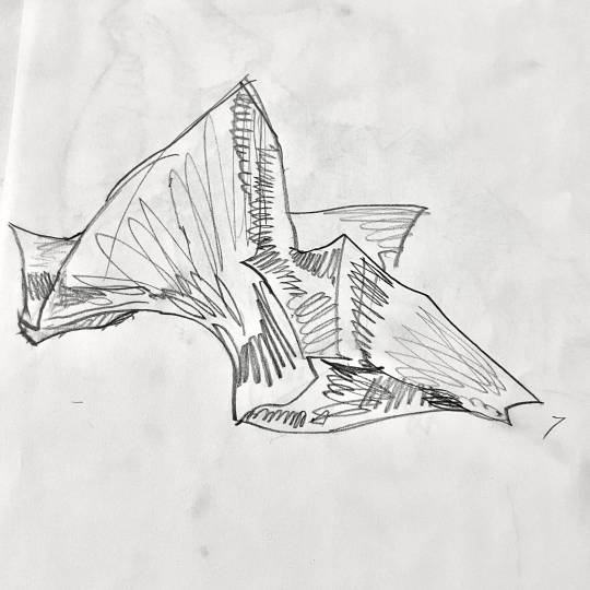
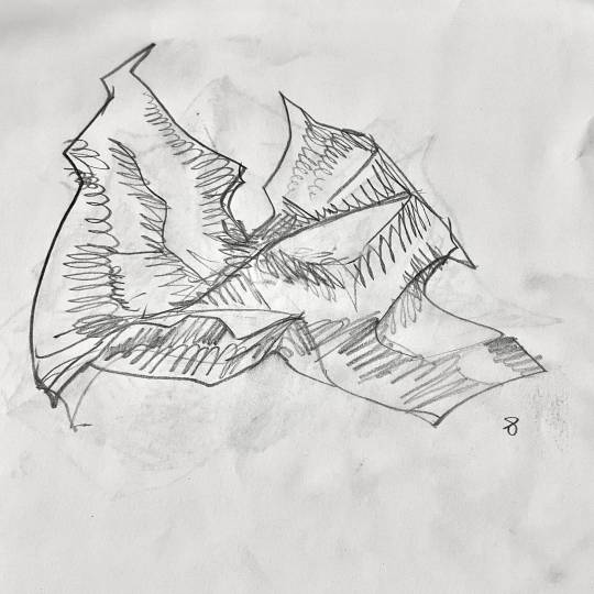
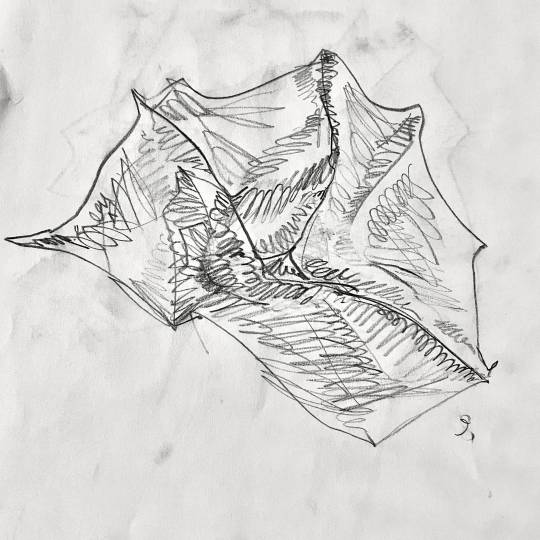
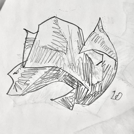
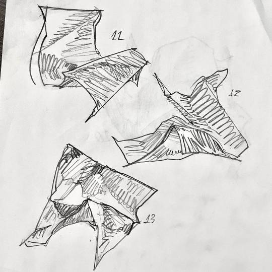
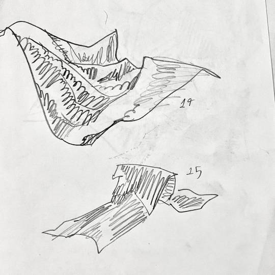
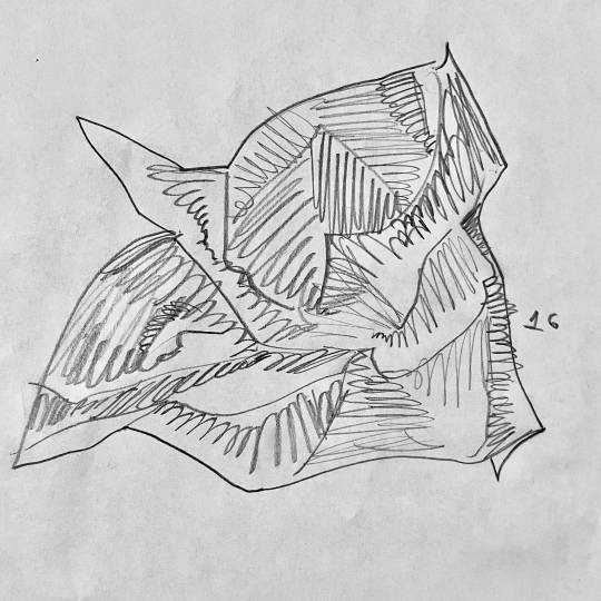
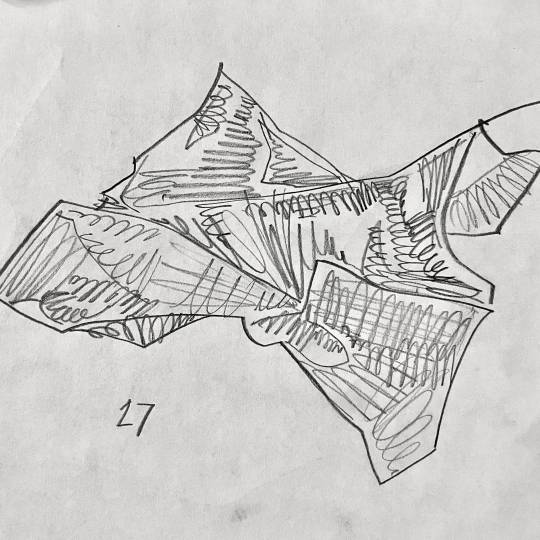
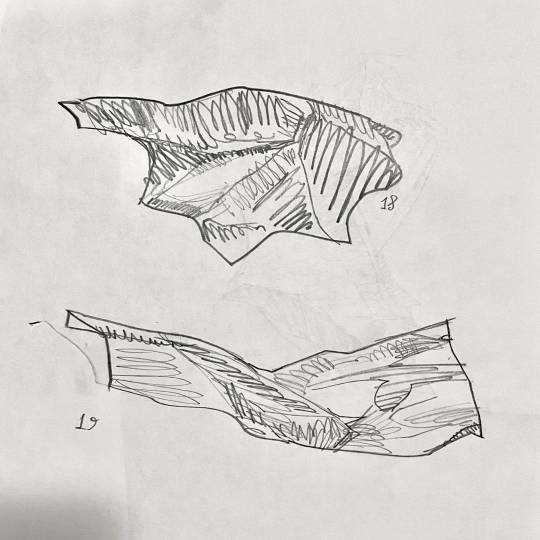
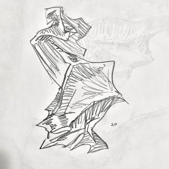
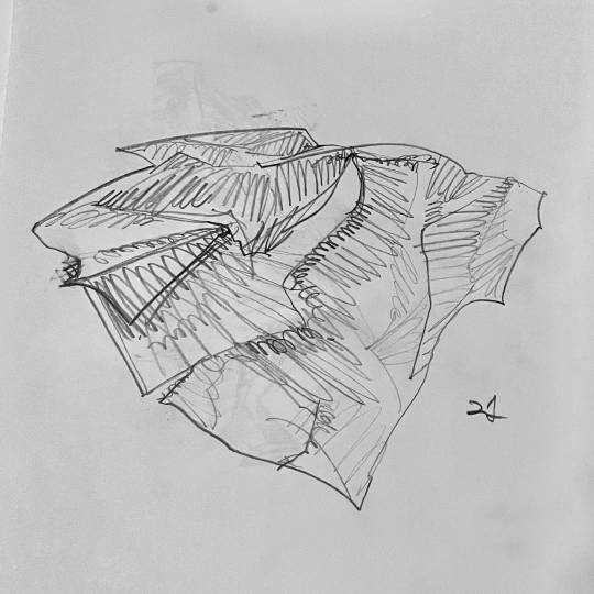
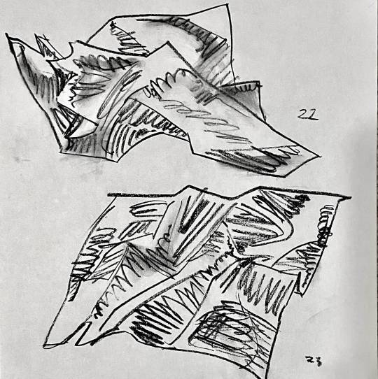
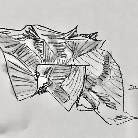
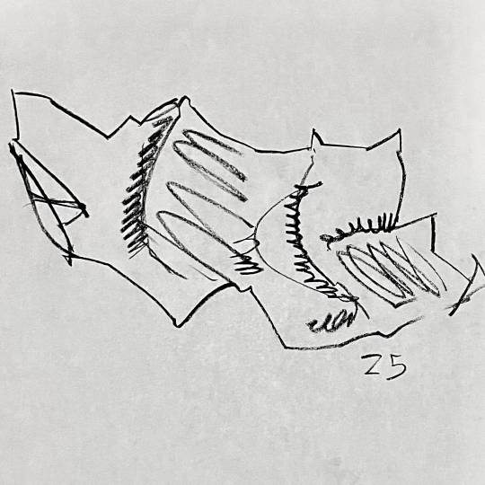
#Art study#Super fun#Art Ideas#Art Hack#traditional art#Mental illness awareness#artists on tumblr#my art#This is what i do for fun
7 notes
·
View notes
Text
Drawing transformers has made my art better, literally studying details, lines, perspective, light reflection, scale, ETC LIKE BRO YOU STUDY SO MUCH AT ONCE JUST DRAWING THEM AUTSIM HACK FR!!!
8 notes
·
View notes
Text
How I Do hair, Part one!!
PLEASE LIKE AND REBLOG 🖤 🙏

Art tips for people struggling hopefully this helpssss


THANKS FOR LOOKING 🖤 Means the world to me!!
#Art hack#Bats nest#Goth#Trad goth#Cybergoth#Cyber goth#Cyber locs#Cyberlox#Cyberlocs#Dreadlocks#Dreads#Digital art#Doodle#How to draw#Art tip#Art tips#Hopefully this helps#Goth hair#Drawing hair#Hair reference#Straight hair#Curly hair#3b hair#3c hair#Hair types#Pls like and share#Pls reblog#Pls like#Tyyy
5 notes
·
View notes
Text
testing art hacks!
tried using watercolour paint on top of graphite pencil drawing to prevent smudging/transfer, it did help to stop smudging and transfer onto the next page when I close my sketchbook but I find it does take away from the overall look
#art#artists on tumblr#artwork#drawing#sketchbook#sketch#365daysofart#ink#rellwo#watercolor#watercolour art#graphite#pencil#art hacks#art hack
11 notes
·
View notes
Text
Don't post you art on Tumblr as PNGs!
Ok this is important: Tumblr, at least in my experience, will desaturate PNG images but not JPEGs! For proof here's screenshots of some of my art as both a PNG and a JPEG on Tumblr.
Top is PNG, bottom is JPEG. Notice the difference, especially on warm colors.
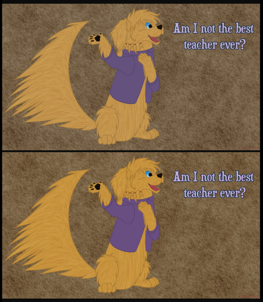
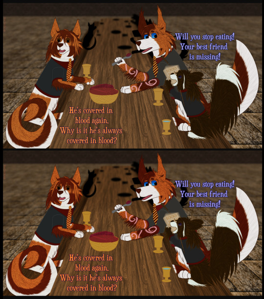
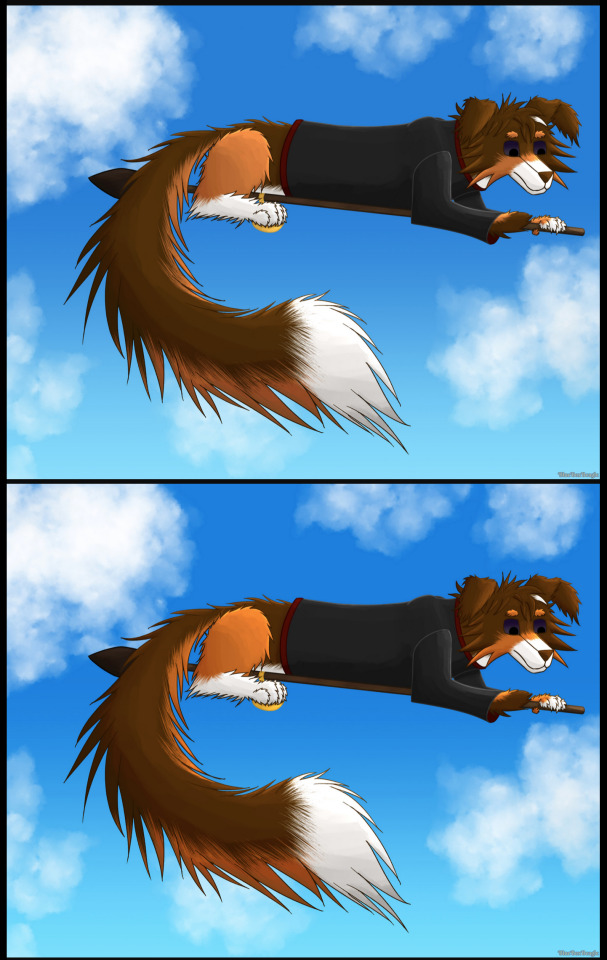
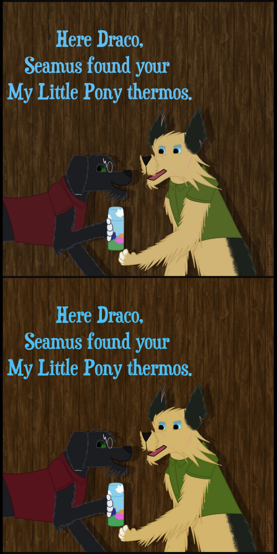
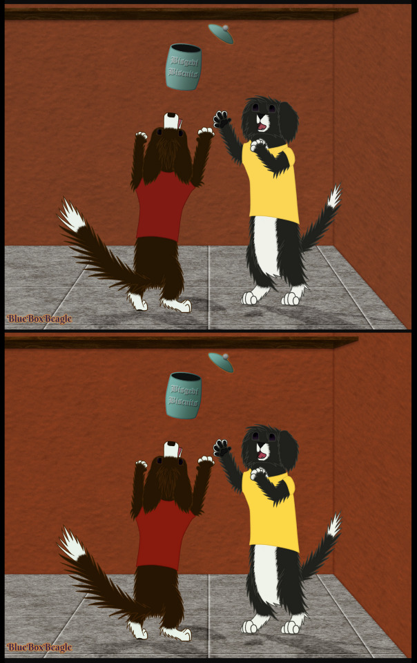
PNGs might be better for storing images but please upload them to Tumblr as JPEGs!
#Important#PSA#Art Help#Art Advice#Art Tip#Art Tips#Art Hack#Art Hacks#Artist Advice#Advice for Artists#Artist Tips#Tips for Artists#Artists on Tumblr#Exporting Art#Tutorials & References#PNG#JPEG#Tumblr desaturates PNGs#Beagle Barks#My Art#Mine
11 notes
·
View notes
Text
stupid simple artist hack: send your images to your phone to check their color. since phones are more regularly up to date and higher tech with screen usage, they are the best out-of-the-box calibration wise. I'm saying this to save future headaches with trying and failing to calibrate your personal monitors with bullshit programs and whatnot
#photography professor with decades or work said this to my and my mind was blown so here you go#art hack#art
44 notes
·
View notes
Text
Thought i would share this here! Hopefully it helps someone.
#artists on tumblr#art#artist#traditional art#cartoon#color pencil#oil pastel#diy varnish#mod podge#sketchbook#video#art hack#art tips
3 notes
·
View notes