#This is just how I'd draw/ I redesign these characters
Explore tagged Tumblr posts
Text
August 21- 31 2023
This is just how I'd draw Silver, Tails, and Blaze (with a cameo of Amy and Cream)
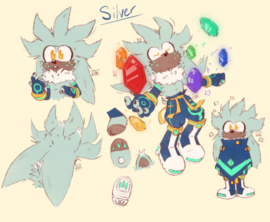
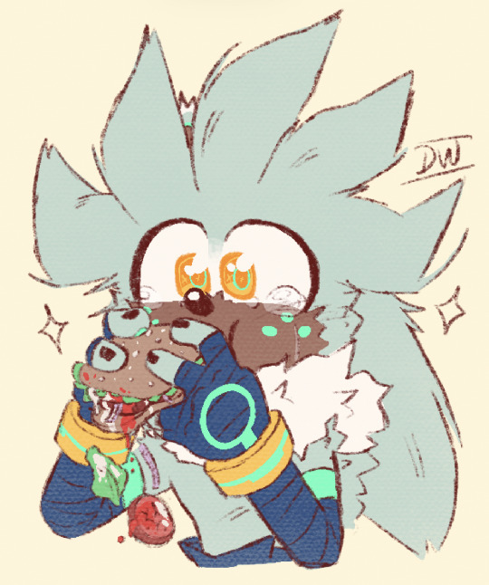
I've been contemplating Silver's design for a good while, I wanted to draw him with freckles, but since he has fur instead of skin, that wouldn't make a lot of sense (I realize now that animals can have spots on them, so you can expect more freckled designs >:D). Then it hit me, he has Chaos Energy! Just have the freckles be a marking of his Chaos Abilities!
I made him the Guardian of the Time Stones, since it makes obvious sense. You have a time traveller, and a means of time travel, so why are the two not used together??
He's wearing pants because (head canon time >:)) back when Humans and Mobians first interacted, some Mobians mixed their culture in with Humans. That includes wearing entire outfits, living in houses, and having human sounding first and last names. Over the 200 years and since this is a post apocalypse wasteland, it's safer to wear clothes than to not. Though some Mobians still don't wear shirts because it is extremely uncomfortable for them because of extra fur and quills/ spikes.
(+Bonus image of Silver eating a burger because he probably never got to have good food in his 'bad future')


Tails! As Tails grows to a teen, he gets more brown patterns on his fur, the one drawn here is when he's 8. I love the idea of Tails having 2 different colored tails and having them create an effect when he flies with them.
I swapped his oversized gloves with fitting ones, but he has a section of it blue as a reminder of the blue wrist straps Sonic gave him to help make the oversized ones fit him. He also wears socks that matches Sonic fur color (because brothers)
His Miles Electric also goes through a lot of changes. The Miles Electric goes through upgrades depending on what console you can play the game on. In lore reason: it's because he's constantly upgrading the machine. So when he first starts making the Miles Electric (although it is very basic compared to what it is today, only being used as a Chaos Emerald Tracker), it looked like a Game Gear, and in Frontiers: it looks like a Nintendo Switch for example. :)
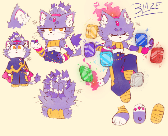

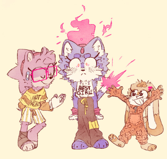
Blaze was always going to be fun to draw. I made her outfit more fit to be active in (since it's gotta be uncomfortable running in heels and a coat). I like the idea of when she's extremely focused or using strong emotions, her ponytail and tail tip will catch on fire. I replaced the fuzzy material at the end of her gloves with gold bracelets and more jewelry (I'm sorry).
I made the gem on her forehead also a pattern on her arms because I think it'd be a nice touch, and a way to add red-ish pink to more of her character instead of pretty much just on her face.
(+ Amy and Cream :D)
#tails the fox#miles tails prower#silver the hedgehog#blaze the cat#sonic fanart#This is just how I'd draw/ I redesign these characters#I still really gotta learn how to draw gemstones#Hot Honey Cameo on Amy's shirt!#And little Cream in a onesie!
367 notes
·
View notes
Text
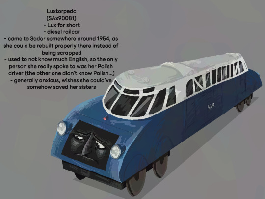
hey guess who decided to remake her OC to kinda suit the source series better
additional info: I have no idea if it would work well, but I'm tempted to have her work on Edward's Branch Line :3 it depends on if a passenger railcar would be needed there tbh
#mostly I'd just want her to be friends with boco#also I didn't draw the drivers or anything this time just bc they'd probably#look like generic railway series ones ¯\_:3_/¯#also now she has two faces#I didn't realize that's how railway series diesels work#x')#anyway lux my beloved#railway series#ttte#thomas the tank engine#thomas and friends#luxtorpeda#digital art#character redesign#redesign#oc redesign#oc#original character#fancharacter#ttte oc#thomas the tank engine oc#polish oc#concept art
34 notes
·
View notes
Text

trying to psych myself up to finally do oc refs by doing fandom-related refs instead: volume 1
wanted to update my yuma from whatever tf this au is so he was a bit more unique... takes inspo from a lot of different things while also trying to be its own sorta thing? which is fitting given the au ;)
bonus chibi now that i'm also figuring out how tf to do chibis lol:

#my art lol#synth v yuma#yuma synthv#synth v#synthv fanart#synthesizer v#vocaloid#vocaloid fanart#YES I KNOW ITS DIFFERENT but at this rate its the umbrella tag. all vsynth shit goes under there just like on main 😔#sorry for the annoyign watermarks i just dont want this to get stolennn/traced it'll b my joker arc. is2g#like thats never happened to me before as far as i know but now that my art is getting 'better' i begin to get scared that it will happen#if my fanart got stolen i'd def sting a little yeah but not hurt AS bad as if someone stole my original shit. THAT would hurt#one of many reasons why i post less personal oc stuffs. although as mentioned above i AM in an oc mood so i wanna draw em maybe...#and stuff like this is a step to develop a PROPER FUCKING REF STYLE bc i SUCKKKK AT MAKING REFS LOL 😭 BUT I SHOULD GIT GUD#i have a few other refs planned for vocaloid au (i guess???) related shit but they're not done yet. this one was also a wip that i just??#impulsively decided to redo & finish bc i wanted to draw but nothing else i was trying to draw came out right. advantages of many wips#i have SOOO many things i could say abt some of the things that went into this redesign but i dont wanna come off as pretentious 😔💔#obviously it was primarily inspired by the vimalion yuma design but. there's moreeee that i can't explain here bc tag limits and im shy#i do think i want to try and be more intentional with my character designs now so i'm seeing how that goes as i redesign some old ocs#man though this kind of stuff makes me remember i used to LOVEE doing this stuff. and now its even crazierr given art improvement#uaurhghh my head is buzzing w/. so many thoughts. THIS ALWAYS FUCKING HAPPENS I GET SO MANY IDEAS WHEN IM BUSY GFD#this is actually from today though unlike some other things i might eventually post. that'll make more sense soon#and fuckkk i forgot the chain necklace thing on the chibi yeah but i couldnt get it to look good. whatever
16 notes
·
View notes
Text
Not feeling great abt some of my creative endeavors rn
#ramblings#neg#specifically abt project: new moon#i can feel myself actively losing interest in continuing to write for it#like the main story is already out there and that's fine#but even tho i have ideas for oneshots and stuff to introduce more characters (like those redesigns for rouge and shadow i did a while ago)#it just. doesn't feel worth continuing. idk why#i guess it might be the lack of interest for my writing in general#or maybe project: new moon just. isn't that great#which is fine the point of the project was to do it for fun not to make something objectively good#but ig i'm just. not feeling it anymore? i don't feel satisfied with it like i did when i finished writing it#i still love my ocs and the redesigns i did of canon characters for it#and i'm glad i got the story i've had in my head since i was like 12 out there. even if it's very different from how i first envisioned it#but. i really just wanna put it to rest#i really don't feel like i can promise any more writing for it. not like anybody cared abt it anyway besides like 3-4 ppl + myself#idk man i wanna move on from it. i have other stuff i wanna write that i feel guilty for not doing#bc i'd said i'd write more for project: new moon and still haven't#i think i'd be happier if i let the fanfic go and just draw my ocs and my redesigns when i feel like it#without worrying abt the fic anymore#bc frankly ever since writing the epilogue my heart just didn't feel like it was in it#thinking abt it felt like a chore more than anything. so maybe it'd be for the best to just leave it as it is#that comic i said i'd write is still happening tho i still really wanna do it#but that's different from writing fanfic so#anyway. might turn the project: new moon blog into a general writing blog#if i finish the corrupted au fic i'm currently working on. idk yet we'll see#but yeah. i know i shouldn't trust how i feel past 9 pm but I've been feeling this for a while now so whatever#i think i should've seen this coming in retrospect. pretty much everything i do that isn't just art never gets much traction anyway#can't say i'm really giving up on it considering it's TECHNICALLY complete#but the way things are going feels almost exactly like the rp and ask blogs i've tried to run in the past#idk man. i gotta stop thinking abt this before the vague feelings of inadequacy spiral into something worse. goodnight
4 notes
·
View notes
Photo


Seán McCoin, Leprechaun-in-training (Patreon)
Bonus, do you recognize the bunny?

It’s Hayden!
#Doodles#Original#It's been a bit since the last new concept and this one came right outta nowhere#I promise you it's not timely at all lol#I was chatting with smol while searching for my coin purse (couldn't find it D:) and kept repeating it quickly#To the point where it sounded like M'coin purse - Hey that could be a name! Sounds like a name for a Leprechaun-#Everything was a lost cause after that lol#Gosh it feels like forever since I stretched my character creation muscles lol - I'm pleased with him! :D#I started with a more stereotypical Leprechaun look but still with the little ponytail and piercing haha#I think I'd like him to grow into a full Amish beard at some point but Not Yet - still a bit on the young side#He's like?? oddly Sans-esque in a way I can't quite pin down??? I didn't intend that lol#I was hoping to get something more like a young Bilbo Baggins but I'm not complaining haha#He's a bit on the rough side ♪ Green crop-cut leather jacket with pins and patches hehe#Really exerting myself on the colours this time as well haha - he's like halfway to full colour! Woah!#I actually used two (or three depending how you count it) different tools for his hair and eyes#Coloured pencils on the former and glitter pen for the latter - orange and red tandem (I know - self-blasphemy lol) and gold sparklies#It looks the same scanned lol#Still fun to draw his arm and leg fuzz haha#Also ft. a return/reintroduction/redesign of Hayden! This is just a cameo redesign I'm still keeping him in Zootopia lol#Anthro bunny bartender was just too fun to pass up as someone to bounce off haha#Maybe I'll bring back Phoenix and her uncle sometime - I never have over here so lol#Big bunny family - that is usually how it goes lol#Hayden needs more friends anyway he's a gregarious guy ♪
10 notes
·
View notes
Text
WcWd: This OC I introduced but refused to elaborate on a couple weeks ago

I should start by introducing him: his name is E'lim! I chose it because it sounded partially like "Eli" with a bit of the word "limb" mixed in. TBH I just mash random syllables together when coming up with names (this was moreso the case back when E'lim here was made, but that's still part of my naming process sometimes)
I mentioned that he usually wears a more plain attire when he appeared two Wednesdays ago. Well, turns out that I never settled on consistent shoes, either. Here's a couple more pixel art drawings I found of him:
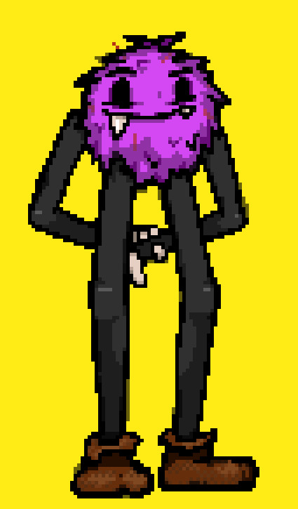
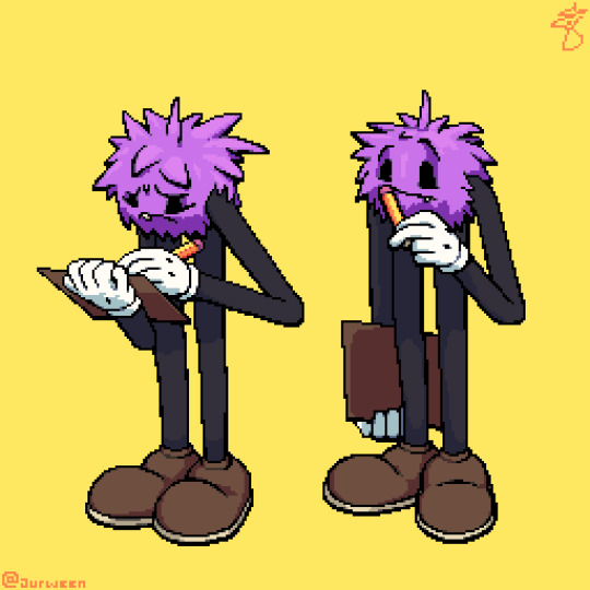
There's quite a few more (probably unfinished) drawings of this fella hidden within the containers for nigh every medium I used around 2019-2021. After that? Not sure what happened, but suddenly I didn't like him. Like, I think he'd be more appealing as a character if his arms were noodley but I always drew them so stiff as though they had bones and it looked weird.
Looking back, I didn't have a good enough grasp of how to make this type of character: noodley limbs that definitely don't connect to the rest of the body in an anatomically correct way, oversized shoes that will inevitably result in cursed imagery if taken off, gloves that are likewise over-inflated and never to be removed... huh maybe I should do a character design study on Sonic characters
I also constantly gave him that stupid-looking smile. It reminds me of the Dreamworks face meme now and I hate it. Now, if I were to redesign this guy? I'd embrace the fact that he's supposed to be stylized, and NOT worry about whether or not he appears to have bones because it seems like that's exactly what I did every single time I drew him and, poor guy, that's not a good look for him 😔
...I wanted to end the post with that paragraph, but then I started typing up the other two-thirds of this post in the hashtags. So here's my rant about the canvas sizes: the "Halloween" one was WAAAY too big for starters. There was this whole era of my drawings where I wanted to be able to capture the details that other mediums offer, but I also didn't want to use other mediums because pixel art was what I was best at. I ended up just taking an unnecessarily long time on massive pixel art canvases, all because I had concerns about working in a software like ibisPaint or Procreate. "Pixel art doesn't require brushes, so how would I know which brush to use?" "What on earth is a 'blending mode'?" "I can't draw a straight line for the life of me, and you want me to add weight to them now??" I'm pretty sure most self-taught artists have struggles like those, though; I was just a bit late to it because learning those things wasn't needed in my pixel artist skillset, oddly enough
Anyway. Those two drawings of E'lim with a clipboard are actually some of the last I made, both of him and in oversized pixel art. You might can tell that I was beginning to address all of the problems I've brought up in this post already; the scale on it is smaller than the Halloween drawing, and the face isn't just a widened smile peering directly into the viewer's soul. Regardless I still wasn't proud of how he kept turning out in my drawings (and also didn't fit into my shifting ideas for worldbuilding) so I lost interest in drawing him and he fell out of being one of my main OCs.
#I think I'm gonna draw him again soon#just to see if I can fix how rigid his limbs look#maybe redesign him a little#I might like this character again!#btw his pronouns are he/it but I've been using mainly “he” because “it” feels dehumanizing and also a bit confusing to read?#like am I referring to an object or a character#the lore would've been that it was created artificially by some nobody with creation powers#which is kinda why I decided to go with he/it in the first place#so they're more like his technical pronouns than his preferred ones#idk if he has preferred pronouns actually but I prefer to use “he/him” for him#this makes me sound like I'd suck as a father for an LGBTQ+ individual#I'm an ally but I'm not really beating the allegations#luckily there aren't any against me yet but it'd be horrible PR if this post resurfaced someday#character art#character design#original character#pixel art#wildcard wednesdays
3 notes
·
View notes
Text
hazbin hotel redesigns wooooooooo
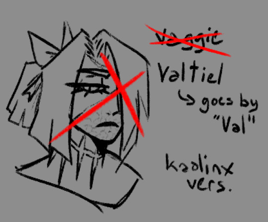
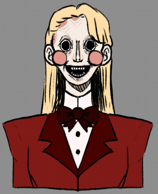
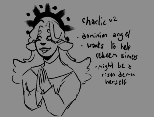
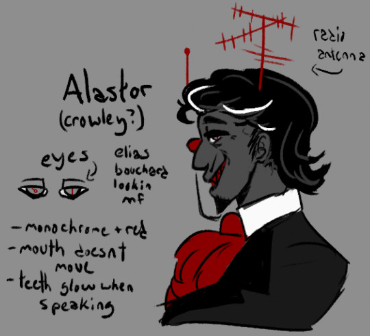
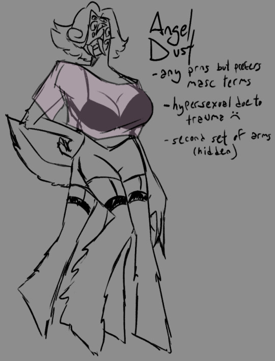
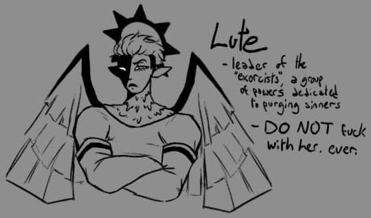
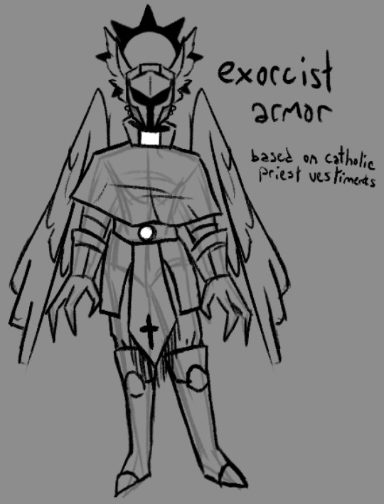
okay so. i'm gonna discuss my thoughts about them n shit, putting under a readmore bc it's gonna get long and rambley. sorry in advance for the shit formatting, i'm on mobile </3
just some general shit about how i would rewrite it. i think the premise of redeeming sinners is entertaining but is executed horribly. i also am a fan of the "heaven isn't great either" idea but again, executed horribly. i'd make the hierarchy of angels more accurate because it's cool as hell and i have autism about it. the characters from hell would swear still (albeit not as much), but the angels would outright refuse to swear or make vulgar jokes ever. this would be partially to further the gap between heaven and hell and make the differences more stark.
hell would also be more like dante's inferno (again because i think its cool). the ars goetia would get a full redesign and would be more prevalent in demonic society.
now for the characters!
---
VAGGIE VALTIEL:
starting off with vaggie, or Valtiel as i've renamed her because let's be honest her original name sucks. Valtiel (Val for short) was an aspiring power angel who wanted to be an exorcist. she looked up to lute and thought the idea of killing demons was really cool and badass. however when she actually was on the field for the first time she discovered how awful this actually was. she tried to help a few demons but lute figured it out and felled her right then and there. the rest of her story is relatively the same. personality wise she's more stoic and less prone to all-out aggression. she still get angry, sure, but it's in a quieter and more menacing way. you DO NOT want to fuck with Valtiel.
CHARLIE:
next up is charlie! i had two ideas for her. the first one (unsettling drawing) has her as a mannequin/doll type demon. lucifer and/or lilith was unable to conceive and as such they built a kid from scratch. she's overall similar to og charlie personality wise, very kind and cheerful despite her unsettling appearance. she struggles with empathy sometimes but really does mean well. her motive for rehabilitating sinners is so they get to see their family again. being able to see heaven from where they are in hell must make them sad, so she wants to help make them happy again!
the second idea for charlie has her as an angel. specifically i casted her as a dominion angel due to their reputation as holy judges. she was once a demon but has been rehabilitated and has risen into angelhood! she now wants to help her former kin do the same and redeem themselves in heaven's gaze. again, similar cheery personality, but a bit more prudish in this rendition
tangent time!
as a side tangent, valtiel and charlie would have a different relationship in this rewrite. their relationship felt shoehorned in in the original show, like it was just there for the hell of it. we didn't see much development between them and it just felt kinda bland. so in my rewrite, charlie and valtiel are amiable exes. they tried dating when valtiel first fell (when charlie was still a demon in the charlie-angel version) but realized their feelings for each other were much more platonic than romantic. they ended things off on good terms, deciding they were much better as friends. they are still besties to this day! later charlie ends up with emily (or 'ellie' as i plan to rename her)
back to the characters
Alastor:
note: i made alastor mixed-race, which could be seen as bad by some due to vivzie saying he's black. however, as many have pointed out, he has no ethnic features whatsoever and i honestly wouldn't be surprised if she said that just to get away with using voodoo symbols (a closed religion) in his imagery/design. like viv, i am incredibly white and have little to no knowledge of voodoo, and even if i did i would not use it for something like this anyways due to the stigma the religion already has and (again) it being a closed practice. as such i removed it from his concept altogether, but made him mixed race (white passing) because.. why not i guess, i forgor my actual reasoning
with that being said...
alastor is by far my favorite of the redesigns and i'm honestly tempted to turn him into a legally distinct oc. i imagine he's somewhat reserved, along the lines of norman bates albeit a bit more extroverted. during his life he was a serial killer with a day job as a radio announcer. he took pleasure in reporting about his own murders on the radio, but that is eventually what got him caught (ie accidentally letting slip info that wasn't released to the public). as a result he was sentenced to death. upon arriving in hell, he quickly rose through the ranks to borderline overlord status and is a feared presence by demons and sinners alike. why is he bothering to assist in the hotel project? who knows... his motives are a mystery, like the rest of what he does
(he isn't actually alastair crowley i just thought the naming convention was ironic. however he may have also dabbled with satanic magic in lifetime..)
Angel Dust:
TW: brief discussion of SA
this is definitely my second favorite redesign. i loooove insect themes and wanted to do more than just Extra Arms, so he now has fucked up legs and a lot of eyes too! story-wise, angel used to be a criminal mastermind, hated by both the mafia and the feds. he was a gentleman thief, arranging massive heists under the cover of night while also partaking in the occasional drag show. he ended up a cocaine addict later in life, which caused his work to become sloppier. eventually he was killed in a heist gone wrong, specifically shot by the police.
i'm not gonna go too in-depth on the SA part of his story, but he is hypersexual due to being assaulted in both his life and afterlife. it would be something he'd be working on in the rewrite. his reason for coming to the hotel in the first place may have even been for help with this trauma. underneath his sultry exterior is a broken guy who really just needs someone to care about him for who he really is and not for what his body can do.
LUTE:
so lute and adam are some of the characters i have the most gripes about. the biggest one being why viv chose adam as the leader of the exorcists in the first place. if she wants a biblical figure tied to demon killing, Archangel Michael is RIGHT THERE, aka the one destined to kill satan during the events of Revelations. if she wants the first human to die, that would be Abel, not Adam. and i kinda doubt abel would want to do the stuff that HH!adam has been doing. if she wants an angel related to torture, Dumah is her guy! an angel that rules over wicked souls and tortures sinners every day except sabbath. so many better options...
with that out of the way, Lute is still the lieutenant of the exorcist, who are a specially chosen group of powers sent to purge hell once a year. think navy seals. she's pretty much the same as in the show, albeit more muscular and visually different from other exorcists (seriously why do they all look exactly the same?????) she's a very repressed lesbian who hasn't had time to work on that due to her duties
i also redesigned the exorcist uniform/armor because those LED purge masks are fugly as hell and their clothes don't even look remotely like armor.
Adam + Final Thoughts
i did start a redesign of adam but got bored of it. regardless, i think he'd be the head of C.H.E.R.U.B. instead of the exorcists. he doesn't want his children to make the same mistakes he and eve did, so together they started C.H.E.R.U.B. to help lost souls stay out of hell
final thoughts uhhhh i'm tired. show sucks, it had so much potential but viv ruined it by being a shitty writer and an even shittier person. the designs are fine i guess but they all look exactly the same and are in desperate need of variety. the humor is dogshit, saying dick and balls and penis over and over and over again doesn't make it any funnier than the first three times you made that joke. anyways that's it, i hope you liked my inane ramblings. gonna go vanish for another forty years or so, adios
#am i gonna do more? idk. we'll see#oh boy sorry about the seventy million tags#i eat bees#artist#oc artist#artists on tumblr#artist on tumblr#hazbin hotel#hazbin critical#hazbin redesign#hazbin rewrite#hazbin hotel critical#hazbin hotel criticism#hazbin hotel critique#hazbin hotel redesign#hazbin hotel rewrite#hazbin hotel vaggie#hazbin vaggie#hazbin hotel charlie#hazbin charlie#hazbin hotel alastor#hazbin alastor#hazbin hotel angel dust#hazbin angel dust#hazbin hotel lute#hazbin lute#hazbin art#hazbin hotel art
911 notes
·
View notes
Text


Man- This took me a while to make. I have been feeling restless with showing content of my Grove OCs, but I felt I don't know how to show them through my drawings. So here's some that I made. I had to tell myself that not everything had to be perfect, otherwise I'll be stuck trying to make these artworks forever XD It took me SO LONG to make this huhu- Also yes, I redesigned Pigment, instead of a vest, she wears an apron. But she's still that same energetic, sisterly figure who is very supportive to any Smurf she meets, especially Graphite. (since Graphite is her sister)
So yea, to feel that I got the message about them across, I thought I'd draw them in action. I drew Graphite first so she gets more sketches. I wanted to draw Pigment more but again I'd be stuck here if I push myself to do more. Maybe I'll draw some more. I just hope you guys like it ;w;
(Also I personally think Painter is underrated- I can see why but he's really cool- I love his character in the 80s show, he's so silly and French eiogdblgkbj There needs to be more fanart of him, and I mean just the Smurf himself)
#the smurfs#smurfs#smurf oc#smurf ocs#smurfgraphite#graphite#smurfpigment#pigment#brainy smurf#brainy#vanity smurf#vanity#painter smurf#painter#jokey smurf#jokey#grove smurfs#smurfy grove smurfs#smurfy grove#lilartsyarts
193 notes
·
View notes
Text
"Pork you literally posted Charlie a few days ago why are you so Hazbin obsessed rn-" ssshhhhshhsshhs.h........ anyway
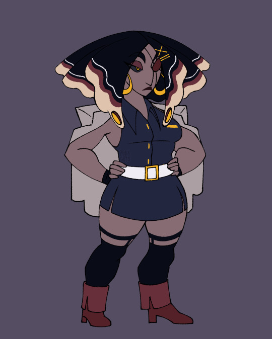
VAGGIE REDESIGN! And I changed her name also bc I'm jus like everyone else fr. Meet Verbena :)
BREAKDOWN BELOW!👇🏾+ Exorcist uniform redesign :3
Starting with her name this time. Back when she was still a sinner apparently she was Salvadorian and since she's (apparently?) not a former human at all I decided to take a small creative liberty with her decent and made her Venezualan instead. SOUTH AMERICUH❗❗✊🏾 I'm pretty sure Verbena flowers are native to South America so that's where the name comes from.
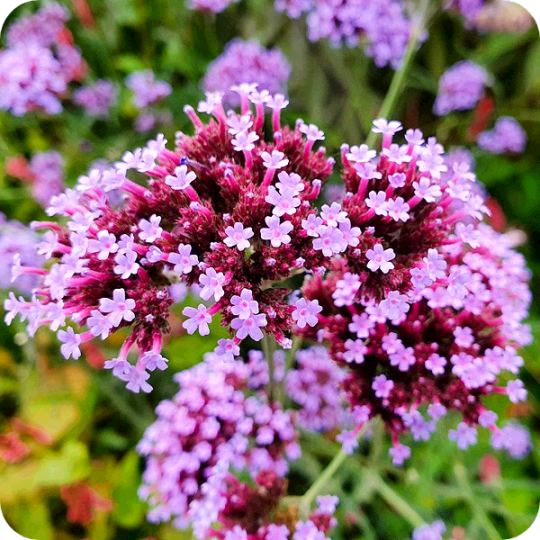
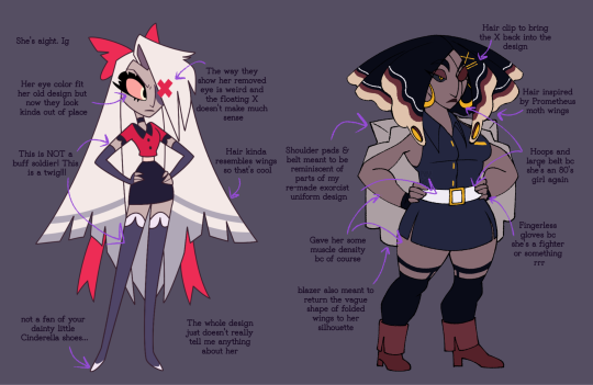
Onto the design! I don't have much to say abt her design honestly. It's not egregious, but it doesn't really speak to me either. It looks like simple formal wear or uniform with some strange meaningless accessories attached. And those weird itty bitty shoes that look like they're part of her thigh highs... I'm starting to think all the characters's shoes were a last minute afterthought. All and all it tells us nothing about her character. The hair wings are cool tho so I did steal those
Also the whole deal with her eye is strange to me. Why Is the floating X there??? It's a real physical part of the world, other people can see it. Do pink X's always float over angel wounds? If her arm got chopped off would an X float over it? Was it like. A fucking curse visual placed by Lute as a constant reminder of her disloyalty? Why did Carmilla point out it was an obvious marker for her being an angel???? My brain can't fathom why it's canonically attached to her wound. If she was a sinner I'd kinda understand but. Yeah idk. Weird
Also her missing eye does not look like an empty socket it looks like a purple circle was sticker pasted on to her face. It's very flat. How did we go from this

to this
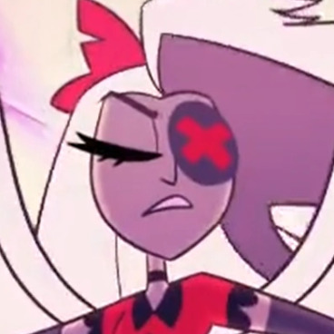
(IT'S EVEN OVERLAPPING ONTO HER NOSE IN THIS SCREENSHOT WHAT IS THAT THING.)
Anyway. I made her hair resemble Polyphemus moth wings because 1. They have eye looking spots and angels are all eyes and 2. Well. Polyphemus has 1 eye. So . 💀

Her overall coloring however is inspired by a Promethea moth. I could say it's because Prometheus defied the gods and Verbena did a similar thing but the real reason is I made a spelling error while initially looking for a Polyphemus moth reference 💀 but hey they both have eye spots! And Iike their coloring for her way better

I also redesigned the exorcist uniform for her redesign bc I wanted her outfit to have reminiscent elements from it.
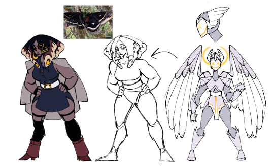

I gave way less time to the uniform designs, but I still had some main details I wanted to adress. I don't like how they have no armor save for their helmets. Their arm and leg pieces are made of some flexible material that tears easily. It's not giving soldier it's giving soldier costume from party city. The devil like horns are also confusing to see on an angel and the paradoxical design is never addressed. They can be evil and look imposing, but the horns just seem kinda nonsensically on the nose to show how evil they are. At least to me.
In my designs I gave them actual metal armor on their bodies so you can easily tell they're soldiers and it makes sense for them to battle in armor anyway. I also gave them more light "angelic" colors with gold details bc I wanna use gold as a symbol of angelic nature in my rewrite. I wanted their masks to show completely static expressions with wide grins to show how unnerving they are and to allude to the idea that everyone is happy in heaven, and they're all happy to do what they do.
Verbena's belt and shoulder pads draw visual similarities to the pauldrons and mid section pieces in my new exorcist uniforms to draw a connection between her and her past. The Blazer draping behind her back is also supposed to mimic the visual of folded wings. I also tried to do this with all the gold details in her design. The big hoops and belt we're 80's inspired because I decided to follow how in one of her old designs she died in the 60's (even had the big hoops and everything). In my rewrite exorcists are all former humans but I'll get into that later. Also she's got an eye patch now! Just. A normal one.
Charlie is still taller than Verbena just like in the original and idk how tall Vaggie Is exactly but Verbena is like 5'5 while Charlie is 5'11. Verbena's also got more muscle on her bc unless their muscle mass is hidden magically or they don't gain muscle for stupid dumb idiot lore reasons all the exorcists look way too slim to be military grade soldiers but what do I know
I combined a lot of pointy shapes with boxy shapes bc— more similarly to her pilot self— she can be volatile and fierce but also grounded and impassive. I added the slits to her skirt so she can be a sexy formal lady who can still comfortably throw a few kicks, and the heels— well. Idk I feel like she could slay in heels! She definitely doesn't wear em all the time but yeah. Chunky heels. I like them they're cute. Also she's got her little name tag on bc she takes Charlie's job for her SERIOUSLY! she's uh. Idk what is she. A bellhop? General security/protection? Either way she's locked in.
I imagine she had white irises like Adam and Lute along with brighter more saturated and heavenly colors in her hair (color picked from the Polyphemus moth) that turned darker and more harsh after the fall (color picked from the Promethea moth). Really visualizing her emo phase /j
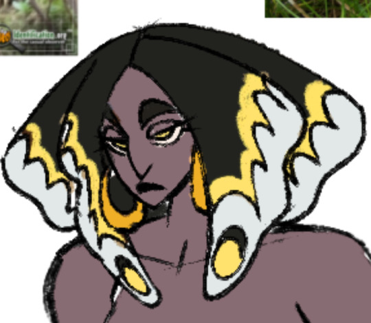
Also I think the little eyes in her hair can emote with her. In the final design the line kinda makes an eyelid and it'd match her eyelid's movements. Sillay
Alright that's a wrap on my Vaggie redesign! No bonus sketches this time bc they're within the texts! Who knows what I'll do next. Who I will deface. I sure don't. I think I might rename Charlie so there's that. Anywhozies hope you like her <3
#my art#digital art#hazbin hotel#hazbin hotel redesign#vaggie redesign#exorcist redesign#couldn't add the flaming banner bc i hit photo limit oops#anyway. FUCK VIVZIEPOP ❗❗❗❗❗❗❗❗❗❗❗❗❗❗❗❗❗❗❗❗❗
167 notes
·
View notes
Text
ᑕᕼEᖇᖇIᗷOᗰᗷ ᗩᑎᗪ ᔕIᖇᑭEᑎTIOᑌᔕ ᖇEᗪEᔕIGᑎ
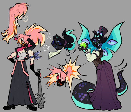
The last two designs for the main cast. With these two done, I can finally work on miscellaneous characters that I've been eyeing the most.
Again, thoughts below the cut:
My issues with their Original designs:
Sir Pentious:
I thought I would only have one thing to say about him (the unnecessary eyes) since he was my favorite in the entire original cast but having taken a closer look at him for this, I saw a lot of things that bothers me.
Too many eyes. specifically the lower half of his body has too many eyes and it seems detrimental to him. It's kind of painful to think about it since I do not think we ever see those eyes close. Is he just slithering on the ground with those exposed eyes? That's got to be irritating at best and damaged at worst as he continuously slithers on them.
There are eyes on the bowtie and the hat? There are already 4 extra eyes on his hood, so why have even more? I get that the original Pentious design was basically a monsterous amalgamation of eyes but the eye thing could have been scrapped altogether.
While his palette was the least red out of the cast (More so composed of yellows), it still blends in with the rest of the reds.
The claws are an unnecessary repeating design trait (Alastor and Vox notably have them too). I don't think it would've been too big of a difference to just keep his fingers fully black.
The stripes on his suit are too thick. It's called pinstripes for a reason.
I don't like how the hat is shaped to fit the head, It's awkward.
not a point, but I just wanted to say how the blue color palette works really well with him in that last episode.
CherriBomb:
She's not that bad of a design (She's sort of bland in my opinion) but it's the little small details about her that makes her so simple and also so complicated at the same time. There are so many batches of freckles scattered everywhere, little explosion lines on her skirt as well as the X on her chest, the tattoos are a jamble of random loops and bombs, and her tattering doesn't have an easy shape to consistently draw.
The thought process for these two:
Mx. Pentious:
Pentious goes by both Sir/Miss/Mx. but uses she/they pronouns.
Minimized the actual amount of eyes on her, I kept it only to her actual eyes and those on her hood.
Gave her a butterfly-shaped hood. It's nothing deep since it stems from the fact the notches in Sir Pentious' hood almost looked like one to my bad eyesight. I decided to play more into that idea.
I read some posts where people talk about how Sir Pentious should have a snout and while I understand why and fully support people giving him one, I really didn't want to add the snout to this design. It drove me crazy since I'm not a big fan of it. I tried a compromise where her head was shaped more like Phineas.
Kept the tophat but removed its eye and mouth. If I remember correctly, Viv took that from one of her co-workers from the pilot. I decided to just have it as a regular tophat.
It doesn't have all the colors, but her design does have the Neptunic flag.
I'm not sure if this even is a real snake but I based Mx. Pentious' design on this:
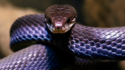
CherriBomb:
Scraped most of her features in exchange for a sukeban theme. I personally have zero knowledge about the punk scene in Australia.
A majority of the suggestions I received for her rough draft had something to do with the skirt. I elongated it and gave it a slit in which the magenta from the inside is able to pop out.
Thought it would be a cute detail to have her hair explode if she's angry.
----
Apologies this took too long to be posted, Life got in the way as well as the fact I was feeling shitty about Pentious' first draft. Her skin was an awkward and ugly shade of green and seeing some posts critical of Pentious' design got me to think a little bit more about what direction I'd like to move her redesign.
You could see this in the earlier rough sketches but this was how Pentious' first redesign looked like
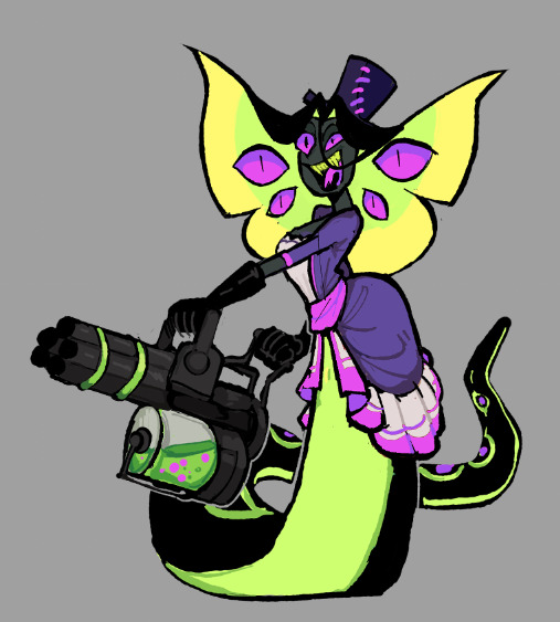
#vivziepop critical#hazbin hotel critical#hazbin hotel redesign#deadbeat motel mrx. pentious#deadbeat motel cherribomb#deadbeat motel redesign#//I only came back from the dead to post these Neptunic Lesbians on pride month/j //#//Happy pride to everyone btw!!//
331 notes
·
View notes
Text
24 Asks! Thank you! :}} 🐷

I don't think I'm understanding.. I cant turn my FNAF AU designs into full on OCs, (Original Characters) because.. well Freddy Fazbear and the gang are NOT my original characters. I just made my own AU (Alternate Universe) for them and redesigned them.
Unless that's not what you meant..? I'm sorry for misunderstanding you if that's the case <:(

(In response to this post)
I'm keeping it in mind.. I gotta get to the root of the problem and figure out what needs to be replaced. Once I can figure that out I'll probably set one up 🥹🙏🙏

Well imagine if you were in his shoes. You are transported to some kind of unknown world. And absolutely no one arounds you speaks the same language as you.
Sneep has no way of knowing this is a digital plane. He has no idea if the people around him are real or not, he cant remember his name and no one can explain to him why that is. His body looks different, he feels different, no one around him looks to be a human.. just imagine how scary that is. Not having the comfort of things being explained to you in this situation. Not having the comfort of someone telling you "everything will be okay".
Yeah, I'd lose my mind pretty quick too 💀

@ardent-38
XD No worries! And yeah I started playing Warframe for the first time these past few days. Its been fun so far, Mag being my favorite. (She's the only frame I have <XDD)
I have my eyes out for Titania Prime, Trinity Prime, Mag prime and Mirage Prime. I'm thinking Titania might be my new favorite if I can snag one!
This game is fun, but the longer I play it? The more I miss OG Overwatch 😅 I tried playing TF2 again today and it just isn't the same 😔💔

@chromchill
I am new, but my favorite frame so far is Mag, because she's the only one I have <XDD
But I've got my eyes out for Titania Prime.. and judging by her abilities, she might just become my new favorite 👀👀

@chickenmilk120
What I really would like is just more interactions and comments with my artwork <:( I get bummed when I put a lot of effort into something only to get 3 comments in the end...

I have not <:(( but I've heard many good things about those games! :00

AAAAA THANK YOU SO MUCH!! :DDD That's all very kind of you to say! :}}
And as for Cici and Gerald, you can find their origin comic here! :00

@lordvonbunnyv
Yes please 🥺🥺🙏🙏🙏

@quillsinkwell
Awe! :DD Thank you! They did have a certain charm to them didn't they? :}}


They would have been much better off drawing that mattress character I swear XDD

@neo-metalscottic (Referencing this post)
Hello! So far my tablet is still alive. Although I'm looking into getting my laptop checked out and maybe replacing somethings... 😔
And it was fun to draw Bibi again! I should really draw the fam more often <XD
Not sure what resolutions they'd have.. but one of mine is to be cured of this condition. Or at least get to a point where I can actually function normally again. There's a lot of things planned for 2025 and if I don't get better soon? I'm gonna miss out on all of it. 💔

Yeah, my head just used to be a normal scribble. But now its become a full on blob hasn't it? <XD
There's 2 reasons for this. 1 being that I have been battling some very limiting health conditions for about 8 months now. So drawing my sona all goopy and sickly is to represent how I've felt through this trial 🥲🥲
But the second reason isn't so bad. That being that its just fun to draw my sona like that XD

@bored-animator
Indeed I have! Deltarune too! Just search up "undertale or "deltarune" in my blogs search bar and you're sure to find a lot of it! :))

Thank you so much!! :DD And sure! Send me any game recommendations you'd like! :}}}

@ramiel-hourglass
Thank you so much! :DD But no need to go to the dumpster! <:(( I'll make you something to eat instead, yeah? :)

I use FireAlpaca. And I used to use the pencil brush for line art and the pen for coloring. But lately I've been using the little pixel brush for sketching and line art :00
(This thingy 👇)


I saw it, and I don't really know how to feel about the blue shelled Koopa.. it feels kinda weird to see a Mario kart item brought to life suddenly 😅

I gotta think of stuff to do wither her... 😓😓

First thing that came to mind was Roxanne from FNAF: Security Breach <XDD

@howaboutsomeketchul
Idk how they would celebrate Christmas, since they might not have a good way to gauge the passage of time..

Just search "team fortress 2" in my blogs search bar and you're sure to find most of it! :)

While I see what you're cooking, I don't think my Caine would create a Momigoo NPC for the fast food adventure <:/
The thing that upsets Gummigoo isn't just that his mom isn't real necessarily, its that his memories of her aren't real too. He remembers all these experiences with this person but the memories aren't real...
And the whole reason why Caine let the brothers stay was because he hoped it would help Pomni adjust to the circus. Just like Bella did for Gangle. Bringing up NPCs or things from the Gators adventure could upset or confuse them so Caine wouldn't want to risk it. <:(


@wolfie-777
Merry Christmas and a Happy new year! :DD Sorry for the late reply <XD

@cartoon-fan
Oh I get a lot stolen from those other fandoms too. Octonauts has just been the most frustrating. Constant tracings, theft, copycats, disrespect, its was nuts.
I don't think I'll post Octonauts again anytime soon. I've just had enough of the constant pushing of my boundaries and the boat loads of all kinds of theft.
71 notes
·
View notes
Text


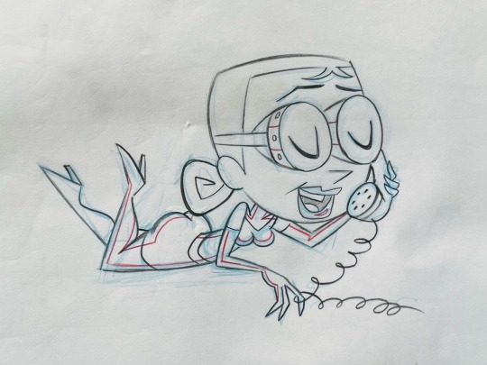

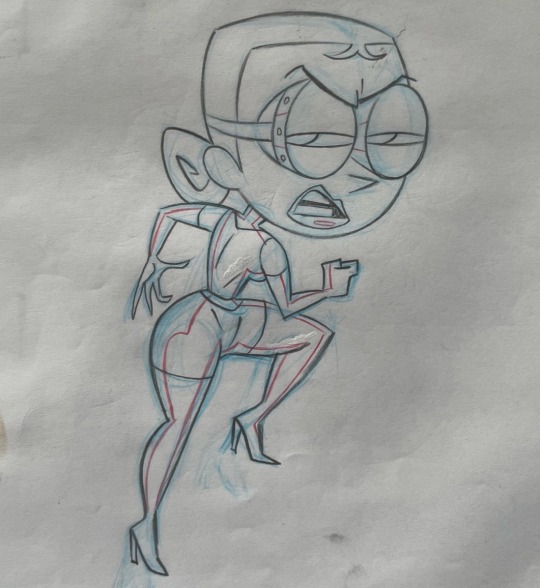
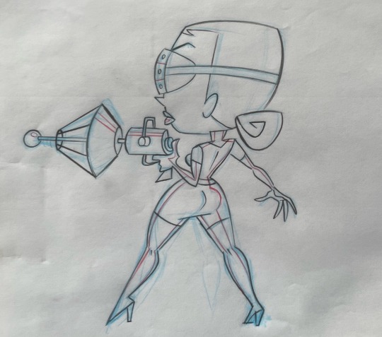
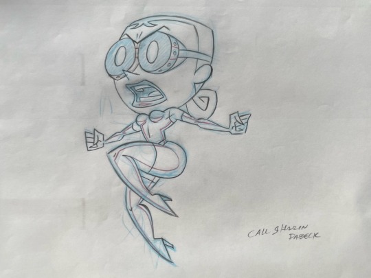

I decided that this week it's Ghastly Week on eBay, and I figured I'd share some stuff over here too!
Up top is (I think) my first drawing of Ghastly after the pilot. You can see some early Estroy sketches and my notes on who I was planning to hire for storyboards.
The rest of the sketches are from the model pack we did for the redesign. And at the bottom, there's the title card image from "The Pie Who Loved Me".
Since ECC was my Saturday Morning Action Cartoon Satire show, I knew I wanted an Evil-Lyn/Baroness type character in the crew. But it always bothered me that those women didn't really have anything going for their characterization. So I decided that Ghastly would basically be a good person. She was really just into science and didn't have any interest in taking over the world. She probably would have bailed on the whole operation long ago if she weren't not-so-secretly in love with her boss' mind.
No one said she had good taste.
She's got the rubber outfit, which was also inspired by G.I. Joe's Baroness. And probably all of the goth clubs I was going to. It seemed funny to me that anyone would choose to wear a rubber catsuit on a hot tropical island.
Since Grey DeLisle was already doing the voice for Mandy, I had some idea of how versatile she was. She'd done a Judy Garland impression for me at some point, and that was the starting point for Ghastly's voice.
I wrote Ghaslty's speech patterns and penchant for calling her boss "Chief" after The Beverly Hillbillies' Jane Hathaway.
908 notes
·
View notes
Text
Hello, I am the one who started the Tumblr!HelluvaVerse Critical Self Aware Blog Trend, AMA!
As people wonder why I did them? Well you can shoot an ask and I'll answer for now this is what the Self Aware AU is like.
Everyone BUT Stolas is self aware of how stupid everything is, the reasoning for WHY Stolas is singled out is because why not? We're strictly ANTI-STOLAS here.
All blogs run by the same concept but the people behind the blogs have their own Headcanons and takes on the characters, the only things that remain are based on @mammoncriticizes, @seraphinacriticizes and @pentiouscriticizes sides.
Satan is the true ruler of Hell and has a DAUGHTER named Jezebel.
Infodumps and Loredumps made by all three of the mainblogs will be posted between asks, so it's a blink and you miss type deal.
Why did you make this?
I don't know, wanted to have fun with working together with the Critical Community, by taking inspo by the Instagram!HelluvaVerse but do it with Tumblr a united front that has similarities to most things.
I'd like to thank @moxxiecriticizes for being the first person to join then recruiting @0ctaviacr1tical as well. I was doing this for shits and giggles and it looks like we MIGHT actually pull this off.
I'd like to join where can we start?
Well, goodie! There's a way you can do it!
Just make an account and shoot me an ask! I usually respond to them as fast as I can!
Join the Self Aware AU Community Tumblr and shoot your shot there. (https://www.tumblr.com/join/pnuZQ40)
Or request a character in a google forum which had NOT yet been made.
Also, make sure your name has some variant of critical or criticizes in it! With the characters name and what they are in the bio so we can identify us!
What's the AU about?
Mammon, being the first to break free from this illusion began to realize that 2 + 2 does not indeed equal fish as he questioned around early season one, and realized he was forced to do things that he normally wouldn't do under any circumstances. With the help of online Hellblr he is able to contact people through OUR tumblr space somehow to connect with a wider audience through some means.
With that, there's been an influx of people joining the cause, and with every new critical blog popping up that means more and more characters are currently realizing just how fucked up their world truly is.
Status on Redesigns.
As we stand, we do accept redesigns as we would like to rebrand the characters and we're using this AU to reinvent the new storyline so if you end up drawing the posts we make then we accept it. Reblog it as well.
Blogs In Order of Creation
@mammoncriticizes / @mammoncritical @seraphinacriticizes @moxxiecriticizes @pentiouscriticizes @0ctaviacr1tical @fizzcriticizes @stellacriticizes @soberedupcatcritises @loonacriticizes @duskcriticizes @nyxcriticizes
REFER TO THE ABOVE IF YOU HAVE ONE ALREADY. It's recommended you make it a side blog, we might actually have people run the Seraphina and Pentious blogs if people wanna join.
#. 💞 ; txt#hazbin hotel critical#helluva boss critical#spindlehorse critical#anti stolas#anti spindlehorse#vivziepop critical#anti vivziepop
56 notes
·
View notes
Text

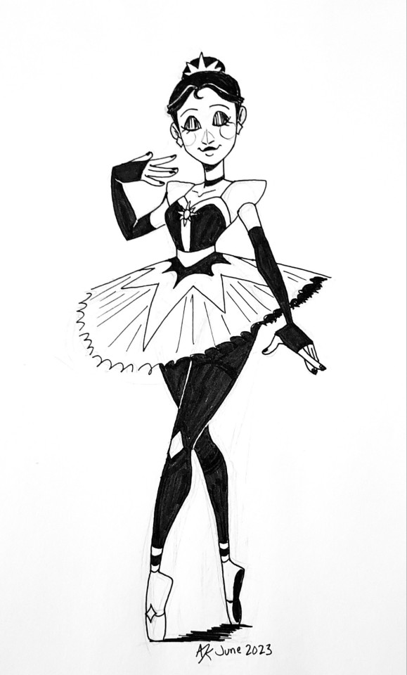
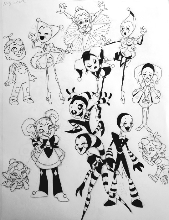

This is the last of my fnaf backlog stuff for now. I'd need to scour some older sketchbooks for more. Although I've been messing with colors, so that might be something I could share.
So I wanted to try my hand at redesigning some fnaf characters. I just didn't like how hideous they were for something that should be designed to be endearing to kids.
Details under the read more to avoid clutter.
My mom saw me draw Ballora once(not knowing it's fnaf), and asked me to draw more for her. So these are a couple of the ones she requested. I'm not sure why she was so fixated on multiple ballerina pictures. Anyway, I didn't like how...scantily clad... Ballora looked. So I gave her a more family friendly outfit.
I don't quite like the lore surrounding Ennard, so I just gave him his own design, rather than be an amalgamation of other animatronics. Molten Freddy/the Blob/Tangle can fill that role without Ennard. I've been workshopping an idea where each member of the Afton family has an animatronic that is meant to replace them in some twisted fantasy William concocted, via some type of soul stealing/remnant/haunting situation. Ennard is basically hunting for Mike specifically.
The puppet was a hard one to pin down. I liked multiple different design option. Until I just went with multiple. There's the Marionette, the Mannequin, and Poppet. All variations of the puppet. They gave me pierrot clown vibes, due to the black/white color scheme.
Ballora has four minireenas, each themed after an emotion. Joy, Gloom, Fury, and Awe. I figured it would give them more personality than they have in-game.
I've changed Circus Baby's name to Circee, because I don't like her canon name. She also seemed underdressed, so I gave her a more harlequin inspired look. I repurposed Balloon Boy, DD, and JJ to be her bidy babs for the sake of streamlining. It's a more efficient use of resources. I figured it was only fair that they all got actual names too.
Trying to keep marketing in mind, I figured it would make sense for BB to be "the boy", DD to be "the girl", and didn't want JJ to upset that balance and left JJ ambiguous. Not necessarily even nonbinary. Just whatever gender any individual deems fit. Poppet is actually the same way. They're just robots. FazEnt isn't committing to anything.
#fnaf#five nights at freddy's#fnaf redesign#ballora#ennard#minireena#circus baby#circee#bidybab#balloon boy#fnaf dd#fnaf jj#balloon boy billy#darling dolly#jolly jackie#security puppet#fnaf marionette#fnaf puppet#fanart#a3 art#traditional art#sketch
335 notes
·
View notes
Text
V's Redesign - 2/3
The tv dude took me a bit to color, but i think i like what i settled on

Featuring Stolas and my hatred of his design.
So for Vox, I'm not changing much. Like, at all. His character is fine in my personal opinion, it's just his design that i hate. I'll be honest, it wasn't until i'd done his antenna and tails that i realized he's like one step away from a catboy. That doesn't matter, it's just hilarious to me. I wanted to bring more TV esc things into his design - hence the no signal screen colors. He keeps his hypnosis powers and the electric stuff.
I've decided he was killed from a TV falling on his head, because that's the most comical thing i've ever heard. The crack in his screen is from Alastor when he made the choice to try his luck at figthing the radio demon.
Vox is the head of Voxtech and mainly handles the programs it shows. He hosts his own segment where he interviews demons, and Katie Killjoy and Tom Trench work for his studio because i said so. He owns their souls, they do the news segment of his broadcast.
His antenna might be thinner when i draw him again, i don't like how girthy they're looking rn.
#anti vivziepop#vivziepop critical#hazbin hotel redesign#hazbin hotel critical#hazbin hotel rewrite#anti hazbin hotel#hazbin hotel critique
396 notes
·
View notes
Text
Updated designs as of: 8/20/24
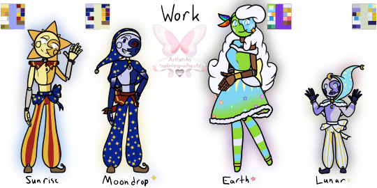


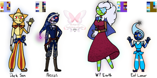
Remember when I said I was knee-deep into SAMS/LAES? Welp, I still am- so here's my (mental) designs of all the core characters (Not scaled for height)! Some notes/extra thoughts under the cut :D Added their pallets to make coloring easier!
Main 4:
Work:
I swapped Sun and Moon waist thingy; I just think they would do that since they're close. Their arm ribbons were also changed to purple to match!
Moon has a cape instead of a ruffle like Sun because... idk, I think he'd like it!
Earth and Lunar also have matching cuffs; theirs is pale/light cobalt blue.
Gave Earth's dress more Princess vibes; why? Idk, just felt like she would like it!
Sun's joints can be seen since he hasn't died and been "placed" in a new/updated body!
Casual:
Moon and Earth (kinda) have casual outfits, so I thought I'd make something for Sun and Lunar.
Sun HAS his matching friendship bracelet with Dazzle- I finally decided to draw it ^^
Sun's shirt says, "Here comes the Sun" I feel it would mostly be a gag gift, but he likes it!
I almost gave him a sweater (cause he gives me sweater vibes, tbh), but then I saw his Q&A video and went, "damn, never mind, I guess".
Lunar's hoodie was also a gag gift (cause its color scheme is similar to Gemini)- but he likes it too much, plus it's soft :D
Made Earth's sweater a bit darker, mainly cause she has a lot of light colors already (the pink comes from the sprinkle sweater!)
I also feel like the boys would take off their bells when they're not working.
It was asked how and... idk they made an interdimensional portal- I'm sure they found a way to take off the bells lmao
The other 4:
I hate how I did Ruin's rays and hat. But nothing was working for me, so... oh well...
I gave Jack the two tips for his hat because I think he'd like those- same with the arm sleeves!
Also- yes he has a friendship bracelet with Dazzle- he keeps it protected under his arm sleeve, it's identical to Sun's!
I really like how Solar came out. Specifically his boots and shirt design!
He gives me knee boot vibes, so I gave him shoes with a sun and a moon on the back (they lace up just didn't feel like adding those details)
I Like how Eclipse came out- Miiiight redesign him... depending on how the Eclipse and Puppet Show goes, but for now, I'm content :)
I never mentioned it, but I do imagine that Eclipse has a second set of arms. I would think Solar did, too, but those were taken away during his revival because of the "Eclipse sees other Eclipses as inferior" stuff!
The Evil 4:
I made Dark Sun look like Regular Sun... cause that's kinda his whole thing! But if I were to give him a different outfit- it would be Eclipse's!
Few changes to Nexus (I can't take him or his model serious tbh, I kept laughing XD), decided to give his hat a Wither shard at the tip because power (and possible corruption) go BRRRRR (Side Note: Made an AU on it :D)
I'm not sure how visible it is, but on his right cheek, you can see a virus of some kind—I really like that, so I put it on him because I really like the idea of him slowly being corrupted due to his insanity!
He has a darker shade of boots similar to Solar because... well, Solar :)
World President Earth (or WP Earth) has a lovely wine-red dress with her flag as a cape (the same flag seen in the thumbnail)!
The flag is held together by a smiley pin because why not =)
Evil Lunar (while tempting to go with Current Lunar design) has the design of the previous version because, well... that's the form he gained the power in (from my understanding)
The tip of his hat is a dying Star because that feels appropriate, in my opinion.
I MIGHT do Foxy, FC, Monty, and Puppet, but I'm not too sure, tbh, since my mental image isn't too far off from their models. Anyways, time to return to my little gremlin hole and watch the series :)
#my art#digital art#tsams#tsams sun#tsams eclipse#tsams moon#tlaes#tlaes earth#tlaes lunar#tsams Eclipse#tsams solar#tsams jack#tsams ruin#dark sun tsams#tsams dark sun#tsams Sunrise#tsams Moondrop#tsams nexus#World President Earth#tlaes eclipse#tlaes Evil Earth#tlaes Evil Lunar#So many designs!#I missed drawing like this though!#Favorite to draw was certainly Sun and Solar!#I do really like how Jack came out though!#I can't wait for more episodes!#the sun and moon show#the lunar and earth show#the eclipse and puppet show
126 notes
·
View notes