#The colour and lineart is so soft that's adorable
Explore tagged Tumblr posts
Visit Tumblr Blog
Explore Tumblr blogs with no restrictions, modern design and the best experience.
Last Seen Tumblr Blogs


Fun Fact
12.7% of mobile users access Tumblr.
Text
Drafted this a week ago, saw your message a day ago, want to make this absolutely clear: I am NOT trying to push you into coming back. Take all the time you need. I just do this to all the art I see ok.
One thing I love about your style is the way that, instead of using lines to shade hair or clothing folds, you just let the shading do all the work, it makes the pic feel exceptionally vibrant!
A +++ S tier picture.
Wishing all of you the best!
and by the way, I have something important to say a few days from now. Please look out for it!
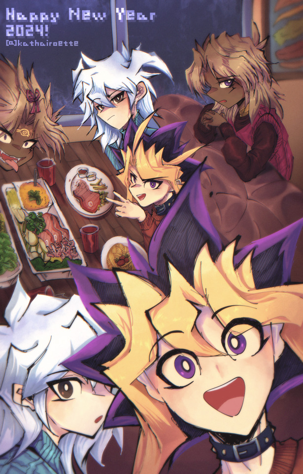
#Just a buncha guys and their spirit partners#god this is cute#I love all their different personalities and expressions#Lil Yugi's big smile is adorable and I'd die for Bakuras surprised yet calm look#atem is going at it with confidence as usual while Yamibaku just looks unimpressed#I guess hes madge that everyone else is having fun because ONLY yamibaku and normal Marik are allowed to be happy#then of course you have yami marik who is having the time of his life and absolutely stealing the show#despite not being main focus#now thats what I call a photobomb#his fucking fangs and stuck out tongue#100% perf#anyway technically speaking this is amazing too#first off the lineart is really good#I love the variation between thick and thin (it not only feels very true to Yugioh it also just looks great)#its present throughout#but especially notable on the bakus because their generally light colour schemes really bring out the strengths of the dark lines#the background is really well done#all the lines are nice and thin + the general dark orange/brown air and dark blue windows make the brighter colours of the characters stand#but not in a way that makes them seem like cut outs#its a very naturalistic way of standing out/blending in#the smatterings of green and yellow on the food and paintings make it interesting too#finally#the shading is excellent#I love the warm reds and purples you use to shade the light skin and also how dark#saturated and alive you made the dark skin#the white pupils really bring out the joy in everyones faces#the mix of soft and hard shading is (as usual) really well done#for example the soft shading on the couch and mariks sleeves really communicate the shininess of the fabric#while the smatterings of hard shading on their hair is absolutely beautiful#its gonna feel weird for me to zero in so muchbut mariks hair especially looks stunning
673 notes
·
View notes
Text
mutuals appreciation post! i've been feeling sentimental about the fact that i met so many wonderful skillfull artists and just great people here in such a short time so i want to tell each one of you a couple of nice words
@miaumiaoumao it amazes me how many art styles you can pull off. that's a very rare skill in my experience and you absolutely slay every time. your silly cartoony comics are always a joy to see, and the way you do lineart in the more realistic styles is asolutely wonderful. im staring at the "peer into the darkness" piece (the second one) while im writing this and i cant stop. the way how it's all pencil-y, grainy and textured scratches some deep itch of mine
@fanaroff i love how squishy and soft you draw your characters. your style is so interesting to me, you push the proportions yet it still looks balanced and right. also your characters often feel very grounded in their environment and space, they feel solid. like i know how they would feel if i could touch them yk? i guess that's what i mean as squishy and soft aha
@myballsitchaurghouchie my god where do i begin. your character designs? immaculate. so eccentric and bold and full of character, i love all of the wiskers-ear tufts-fly aways you give your narinder, and the way you stylise your lamb's wool and goat's hair looks insanely cool. you know how to pull off both extremely soft and gentle atmosphere and extremely dynamic one. i see your art quite infrequently but each time it's a joy to behold
@aniimoni i fell in love with your art from the first glance. despite the fact that the majority of your works that i see are digital ones, they all feel so... tactile? sensory? as if i can feel non existent grafite under my fingers, trace the brush strokes. the art that you do is so very gentle, the care you put into it is obvious even through the screen. also i love your lamb's design so very much. and narinder's penis ears. what can i do
@sriibble don't know if i should tag you since you're not in our weird cultist club and you already know all im about to say but hey, no harm in some praise, is there. i've seen you skills evolve over these years, but honestly each time i see your new drawings i feel like im awestruck for the very first time. the way you work with colour sometimes looks like magic to me, you can take the palette that makes no sense and bend and mold and twist it into something absolutely beautiful. i know you draw without lines or contours but each time i actually see im in awe. maybe i sound cheesy but it feels like you actually create art, like it runs from your fingers and molds in your palms like clay. жесть меня понесло конечно но и ладно. люблю тебя ��оя радость, чмаф
@greedykrab the way you work with colour is insane omg. your drawings have such pure raw energy to them, the way you draw, messy and confident, is mesmorising amd so so expressive. you convey atmosphere masterfully, that black and red drawing of narinder in the window still scares the shit out of me. i adore your dark warm kinda dirty paletts, i feel like you know very well how colour and lighting behave, your pieces always feel so real
@midia666 your bishop designs are so unique and striking, i feel like they do an absolutely awesome job at being, well, character designs -- conveying personalities through the way character looks. you have such a good grasp on human (and human-ish) anatomy, your linework is so confident yet so gentle when it needs to be. и я всегда радуюсь видя крутых русскоговорящих художников тут. спасибо за ваши труды <3
@donutfloats it's maybe a strangely specific way to start but i love how you draw wide open maws full of teeth <3 you understand anthro facial (muzzle? snout?) structure so well at such level which i strive towards. the clothes you give your charactes are always amazing and i wish i could wear them, and the diverse body types are so pleasing to look at. also mephis is my fav i love them sm
@teruuu i scroll through all of you guy's art tags so i can formulate my thoughts better and oh god ru i forgot how absolutely batshit insane your art can be in the bestestest of ways. all those scribbly lines and sharp teeth and broken colours, absolutely wild amazing and so so vivid. your designs are a delight to look at and even more a delight to draw, your characters are so expressive and fun and your lineless artstyle is so polished and pleasing and nice, it's amazing in a whole different way <3
@linvxtheghost your art lately been such an interesting middle point between lineless and line..full? and your colours are vibrant yet very balanced, it's like you draw with acrilic markers but in didgital, yk?? it's such a cool look! your more soft colouring stule is also so so nice and gentle and glowy i adore it sm. and your sketches are so dynamic and fun!! твои рисунки всегда будут близки моему сердцу леша и вообще ты крутой художник блин. (бтв если ты таки запостишь мои комишки я зареблогаю the shit out of them)
woooow that was a lot but a fun lot! i hope i didn't leave anyone out?? i double checked. you guys are all so wonderfull and skilled im so glad we're mutuals!!! have a great day and take care <3
#ada ramblings#thank you to my r key that desided to stop behaving the moment i sat down to write a post that has dozens of “art” and “draw” in it#do i need to tag anything else??#i think not
22 notes
·
View notes
Note
could you review the sweet kacheek?


Kacheeks are one of those Neopets that I feel has pretty iconic status in terms of being recognizable as a Neopet. Part of this is because it's been around for a very long itme, but I also think part of it is that they're one of those pets where they're obviously an animal, but which kind of animal remains unclear; in other words, it's a great abstract design.
Visually, they're pretty straight-forward; long tails and a simple vaguely rodent-like body with a flat face and large head. The body is broken up with lighter cream areas on both the tail and underbelly, almost like a fox if a fox was a bipedal rodent thing and not a fox at all. I do wish the off-putting hairs on the head were an actual tuft of fur or something, but otherwise it's a fine design.

Kacheeks are a little hard to place in terms of customization. Stickly speaking, the design itself didn't change at all, but their heads become more proportionate with their bodies, their bodies became less chubby, and their faces got subtly altered, with extra eye highlights, a bigger mouth, and less mirthful eyes.
I'm also not big on the customized version's tail, which feels too long relative to the body and gained an odd shape where it flares out at the base, becomes thin, and then flares out again. Some of the lineart there also implies bends in the tail that don't make sense.
In other words, the customized version is probably better in the sense that it matches other Neopets' visuals a lot more, but it just became a lot less cute in the process.
Favorite Colours:


Plushie: Kacheeks are one of those species that feel like they don't have a lot of stand-out colours, which I attribute to being around for a long time (getting low-effort versions of early colours and whatnot). That said, the plushie Kacheek is really nice. The little heart-pattered fabric swatches are super cute, and there's lot of stitching and and patchwork in the design. The color palette also looks good, using a soft pastel in contrast with the bright blue accents.
The UC/styled version looks cuter and more plush-like, but the converted is still good and accurate for the most part (except for missing the stitching on the tail tip and inexplicably mirroring the blue patches; the pre-conversion art was facing to the left, but the patches would still be on the other side regardless).

Disco: Disco is normally just one of those "whatever" colours, but I don't know, I find myself really liking this one. The Kacheek was originally known as the Badeek, sporting sunglasses in its earliest design, and this colour gives them a fresh pair of adorable oversized green glasses that really add something. Beyond that, the color palette works surprisingly well together and there's lot of details, like plenty of flowers, some striped, and multi-layered coloring on. Groovy.


Halloween: What I really like about the Halloween Kacheek is the mouth, which is perfectly haggard-looking and appropriate for the colour. The green palette works well here, and I love the clothes, which compliment the green with a nice brown and a cream collar to match the tail accents. As a bonus, the clothes are removable in customization and the base itself looks pretty good.

BONUS: I'm counting the mutant Kacheek as a bonus because I really like it but also feel underwhelmed by it, and I'm not sure if the iconic-ness of the design is genuine or just me being biased (being a filthy Mutant Graveyard of Doom lover). The head looks fantastic, with the exposed brain coming right out of the skin, black eyes, and fangs.
However, the lower body is just so... nothing-y. It looks exactly the same as a regular Kacheek minus the much-needed markings. Couldn't you have like, changed the body shape? Added more black or pink accents to the palette? Put more brain matter elsewhere in the body? Like, anything? But like I said, the head looks fantastic, and adding clothes via customization will go a lot way in hiding the mediocre rest of the design.
31 notes
·
View notes
Note
Omg your trademark is definitely the absolutely jaw-dropping colour work, not just the neons, but that soft, warm lighting you do sometimes is so beautiful, but also I'm so in love with that crayon-y brush you use for lineart, the texture is so 🤌
My favourite little thing you do though is how you hide your name in the writing on the race suits. I'm always looking for it like a game of 'where's neb'🥺
omg you noticed my little sponsor hijackings..... they're so so fun to do I'm glad you like 'em!!!
colouring plus lighting are my absolute all-time favorite things to both look at in other people's art and also to do myself AND I absolutely adore brushes with a bit of texture to them so that is like, all I ever want to achieve in this life thank you. we have the same eye I think!!!
what's my trademark?
11 notes
·
View notes
Note
If saying it helps you then I happily will!! :D <3
What you're doing is great and I really enjoy it <3 I love the details you put into the characters clothes, the way you draw full bodies and the interesting poses you use, and from what I've seen from that post about ‘gh illustration i did last year for china gh only anthology project’, you’re really talented at colouring too!!! I love the softness of the clothes, and the fluffiness of their hair, I also like the angle with the fence (? The wood thing in front of them) and all the little flower petals!! (i adore flowers and pink is one of my favourite colours!!)
I am exited to see more in general, but what I would love to see more with Mumbo and Grian would be more colouring, (simple but colourful) backgrounds and cute facial expressions! ^w^
Obviously, do whatever you want, I am already enjoying following you <3 (and I'm sure you're very busy lately! So your priority with art should be having fun and relaxing!)
(also yes I adore colours if you couldn't guess /j)
aaaaa thank you so much 😭😭😭🫶🫶🫶
i love pastel colors so much, especially the pink aesthetic 🫶🫶 funfact: my circle name (in jp fandom, there’s 2 names used. one is circle name, like sort of publishing name?? and then there’s ther artist name) is 桜かぼちゃ/sakura kabocha which is basically combining my fav aesthetics, sakura with the spring stuff and cherry blossoms; kabocha is pumpkin in japanese, i like autumn and halloween as well
i love drawing, but as time goes, i gradually have less time and energy to put for a piece. full-render piece takes so long now 😭 my life also gets busier as well.
the truth is, i use the gradient style as a ‘cheat’ for myself, to make a piece looks finished without having to render much. my drawing process nowadays involves a lot of short-hands and how fast i can finish something with all my constraint. i do lineart fast, i jump from drawing blue abstract blorb into lineart right away. by doing that, i shaved quite a significant amount of time.
the gradient palette i use is specifically the ukiyo-e gradient palette, which is a gradient palette intended to mimic the japanese ukiyo-e painting style. i mess around with tonal after that and add more effect.
i got a lot of doujin drawing experience from my time in the gintama/ginhiji fandom, would love to one day make a full doujin comic for grumbo, but idk about my time and energy 😭
grumbo honestly have helped a lot with my artblock currently. i’m sort of in a creation rut with gintama since we’re in a waiting period until the new series. i hoard fandoms, so once i got it, i usually don’t ditch them out, especially if i’ve drawn arts of it, so i’m here to stay :>
5 notes
·
View notes
Text
none of my friends will let me talk abt my favourite artists so im making this tumblr post so i can talk abt how cool these artists are before i explode
FIRSTLY HIDARI
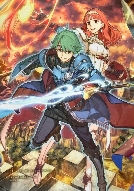

i love hidari's art it manages to be colourful and soft at the same time. look at how he paints hair. beautiful. gorgeous. stunning. it's so flowy and pretty god i wish i could do that. the colours are warm EVEN with characters with colder colour schemes. its so beautiful i love it.
NEXT YUSUKE KOZAKI


i cant really think of one thing to comment on i adore the lineart and the amount of details. i LOVE the shading especially on his no more heroes art. id have added more nmh rather than just bad girl but like. uhhh. lets just say no more heroes is a game you shouldn't play in front of ur parents. there is a guy who shoots lasers out of his crotch and has machine gun nipples. im not joking. just know the soundtrack fucks and yusuke kozaki's art is really cool.
FINALLY MIKA PIKAZO

ohhhh my god OHHHHH MY GOD HER ART. i fucking adore it. i love how chaotic and messy and bold and colourful and BEAUTIFUL it all is. her use of colour is STUNNING. i especially love how she draws eyes. i love her use of halftones it really makes things pop. her compositions are brilliant. i have never been so envious. i really wanna start using bolder colours in my own art and it is all thanks to her. her art is just so striking. i am insane over her art i want to eat it. god. GOD. god. tell me this isn't the coolest shit ever. u cant. youd be lying. god BLESS.
anyways thank u for coming to my ted talk i am so normal
#i dont even have tags no thoughts head empty only mika pikazo#yes all these artists have worked on fire emblem games and thank god they did#there's a lot of other artists i love obvsies but i just wanted to get my top 3 out of my system#no more heroes is the wildest fucking game in existence btw its like what u would come up with if u took every drug at once#hack and slash games are just kinda like that tho. look at bayonetta and devil may cry.#okay im done byeeeeee
10 notes
·
View notes
Note
What's your favourite artist?
Oh many!!! Buckle Up cos I'm going all in on this one I'm gonna include SFW and NSFW artists haha. I'll mark what each of them do so you aren't blind sided. And of course there wont be NSFW images linked here. Their names will have links to either their main Twitter, or other primary site you can find their art. And I'll @ their tumblr if I know it below that For sure Junji Ito for horror stuff. That almost goes without saying and I don't think I really need to link his stuff xD he's an absolute titan of horror art
MackleNG (SFW & Horror)

Absolutely amazing linework and generally incredible vibes. They are drawing a webcomic called CHOKEPOINT i have been meaning to check out but I adore their art just in general. I've been using a lot of their art as inspo lately and can't get enough of their cyberpunk designs, horror vibes, and use of pops of colour to emphasise and showcase their incredibly in depth line work and details!
QSY (SFW & NSFW) @qsycomplainsalot

I continue to come back to their art and they are also a huge inspo for me. I'm generally trying to find a way to adapt their colouring into my own style because it's absolutely gorgeous! The way its simultaneously crisp and crunchy, while also soft and expertly blended! It's like candy for my eyes! Add into it their fantastic expressions, excellent pallette choices, incredible weaponry, and of course some excellent NSFW with really great curves, colour, and characters, and they're easily one of my top 3 artists
Tyto_Alba (SFW & NSFW)

Do you like Mecha? Do you like guns? Do you like cute girls and/or boys!? Well, hot shit, me too!!! You NEED to check out Tyto_Alba! Straight up, another one of my top 3. He has legitimately changed the way I do my lineart, the way i draw soft shapes (like butts and stuff :3c) and my god the mechs as well! I legitimately had a hard time finding a good singular piece of their art to use here cos they are so fantastic at both sexy art AND mechs that i really had to find something that showed off a little of both! Something that I personally have noticed with their art as well is just how fuckin incredible they are at drawing HANDS! I am obssessed with their skill with hands and I hope to match up to them some day in that regard! I feel like I'm getting there but I LOVE the way theyre always so Shaped and well posed. As well as how detailed they manage to be without being too attention grabbing unless intentionally in the focus! What's more, they use simple colours so effectively! Much to be loved here! And of course, their NSFW content is top tier! Really excellent soft shapes and squish and really fantastic context and intensity!
RizDraws (NSFW)
Listen... LISTEN OKAY!!! We're hitting the NSFW exclusive part of the list and you have to understand that NSFW artists are just as incredibly skilled as any other artist and that porn is FINE AND NORMAL! Having sexual interest is not unusual. Having a desire to draw these things is a human and regular thing. I could talk for paragraphs about how puritanism is harmful and ultimately denying something natural and inherently human and anyone telling you otherwise has ulterior motives. But that's not what this post is about. I say this because an artist showcase tends beat around the bush with this stuff but I am unwilling to be vague about this. NSFW art is valid and, what's more, Important! That being said, Riz is incredible! The squish! The faces! The fluids! The Dicks! All so good! They somehow straddle the line between pinups and porn in such a brilliant way that I would be happy to have their art on my wall and I'm not kidding haha! The particular way they colour with the chalky texture is often sought after and I see why! Personally I don't look to emulate it myself but I most certainly enjoy looking at it! The way Riz uses their lines and their particular style of chalky colour to make the squish of clothes against flesh really look real! It's somethin else!
Andava (NSFW)

Now where Riz does the mid point between pinups and porn, Andava is definitively porn haha! xD That being said. Hot damn dude! In particular the way they do bodies and have a variety in body types, shapes of boobs and faces. Especially faces. Their characters are really good too and it's very easy to develop a favourite (for me it's Erika and Alexis) There's a reason people have cosplayed their characters and it shows! Absolutely love the variety, the situations/positions they draw! Theyre incredible as making stuff feel messy as well! Highly recommend browsing through their stuff and finding a favourite OC of theirs haha! I was lucky enough to get a commission off them years ago when they were still fairly small in terms of following. So long ago that Tumblr still allowed porn at the time haha! I dont think Discord even existed yet! Still wanna grab a commission off Andava of the same character one day! ALRIGHT I think I will leave it there for now! I could absolutely go longer and talk about even more of my fave artists and why I like them, and how they've inspired me but I get the feeling I should hold off haha (unless of course people would like to see more) I hope this has thoroughly answered your question. Though I know for a fact i will kick myself over not mentioning an artist i should of included later but forgot to lol
6 notes
·
View notes
Note
I absolutely adore the warmth and softness with how u colour and the palettes are just so very *chefs kiss*. Also hi hello the way u do lineart is just so flowy and fluid and full of movement its SO COOL! AHHHHHH- *shakes ur art by the shoulders* BEAUTIFULLLLLLL!!!!!
My potat friend Ilu so much I’m aaaaaah 🥺
#art style ask#how to encourage the anniebun basically#i almost didn’t wanna answer some of these i wanna be able to look at em in the inbox for forever
9 notes
·
View notes
Text
Making things pop with Fiinia!
I always begin to draw lineart with a black colour only as it's basis. My typical set of steps when drawing goes:
• Lineart
• Full render colour main point, the whole shebang! Base, shadow (+ shine or effects).
• Base colour everything else remaining and work around my first coloured main point.
• Add in shadows on all bases.
• Colour the lineart.
Regarding that step above, it looks something like the example on the right. It looks soft, but it's difficult to make out shapes, everything becomes one flat surface all together. It's cute, personally not my style, it just doesn't pop out of the picture and grab attention.
↓↓↓↓

To make it semi-pop, you could try doing only the outer lineart layer a really dark colour as the example on this right one.
Half pop and half soft! I personally use that when drawing something in the background behind a character, so it stands out but not too much in comparison.
↓↓↓↓

How I colour the lineart, step wise, using the top images as an example:
• I take the black lineart and re:colour everything into a general strong deep colour that fits the overall palette.
• Mix and experiment different similar colours from the now new chosen base colour. Red for lips, red/pink for areas showing skin.
• Make the outline of the character, pitch black. I always use black, as it is the easiest colour to memorize when I need to continue onto the next step or when making backgrounds. All outer corners around the character should be black!
• Decide what areas need to be easily seen without anybody needing to put effort into seeing it. What rests on top? What is facing closer to the "camera"? These areas need to be made more visible via this.
Arms get an outline, since they rest on top of the skirt and they're closer to the camera. The jaw needs an outline to make that circle head stand out, making the head look properly big compared to the shoulders!
The skirt has an outline above the legs, since they're not attached to each other and the skirt hangs loose on top.
In fact, a full outline on the clothing in general, I want it to be separate from the body and stand out. The skirt, the shoes, gloves and top.
The hair, I want to have a lot of outlines! Hairs have so many different vast shapes and volumes; that sometimes make the entire drawing or is very attention grabbing in general. Outline on the fringe hanging in front of the face! Outline on the heart ahoge, because it is his cutest feature and needs to be clear that it is a heart!
The face features, I typically leave out of this black line rule unless I want them to have a sharp face. The exceptions I put on this rule are cute faces / bright or pale colours making it fade / Shy looking characters. For this chibi example, I put black on the outer line of his eyelashes and made his eyebrows black, because yellow is such a pale and eye straining colour that his face wouldn't be showing properly!
The most pop thing of all:

A thick white outline, kind of giving it a sticker effect!
I use this for a ton of reasons, personally. I can use it to make a character or item stand out more at the front of the "camera".
If there is a lot of items or colours in the background, it might be necessary to make it feel less cluttery.
Sticker effects are adorable and I am not done obsess-using it in drawings yet.

"If there is a lot of items or colours in the background, it might be necessary to make it feel less cluttery." prime example!
Note: Remember, this is a style preference! Just because I do it this way, doesn't make any other way right or wrong, there is never a right way of drawing! I am an artist that makes everything pop by using the power of outlines and bright colours!
3 notes
·
View notes
Text
Starting to clean up the lineart for Vera (my Awoken huntress from Destiny 2) ♡

I scribbled out her armour lineart, but I have more detail to add - but I can't do that until I've settled on the colours, which should be as close as possible to the actual shaders I use in-game 🤔
I've posted the full progress post and image for members on our Ko-Fi; feel free to support us there for the full posts!
Also, the finished piece will be available for members at least one week before it goes fully public - so hey, if you like early access, that's something to consider.
Armour Set:
• Techeun's Regalia Mask (she will sometimes wear her Graviton Forfeit with the ornament)
• Oathkeepers (she will sometimes wear her Liar's Handshake. If she's wearing her Graviton Forfeit helmet, she'd just throw on her Errant Knight gauntlets)
• Thunderhead Vest (more knives? More knives)
• White Wolf Strides
• Pathfinder's Hood
I think I've finally started to narrow down what her 'usual' weapons build will be, too. I'm leaning towards:
• The Chaperone or Le Monarche - The Chaperone was one of the first non-newbie weapons she ever got, and she received it as a gift from Amanda Holliday, so she holds this shotgun very near and dear to her heart, and usually, this is the exotic she has equipped. It is the only weapon of hers that she refuses to name with her usual Greek theming. She refers to it now only as 'Sister.'
Still, she does love her Le Mon, too - she's named it 'Medusa.'
• Lethophobia (crafted) or Khvostov 7G-02 - she adores her crafted weapons, and she takes a lot of time and effort to learn how they tick - this is one of the reasons she tends to spend a fair amount of time with Banshee-44; she doesn't just want to use the weapons, she wants to know everything about them. She has quite the collection going - but her Lethophobia has quickly become her favourite non-exotic bow.
Her Khvostov, though - this was her first weapon she can remember picking up after Dopps found her. Needless to say, she has a soft spot for this one. She'd originally named it 'Hades' though she can't recall why - still, this started her on her trend of naming her weapons after mythological Greek figures and concepts.
(She has affectionately named her Lethophobia 'Lethe' and renamed her Khvostov 'Styx' - after the rivers from ancient Greek mythology)
• Palmyra (crafted) - this was Vera's first crafted weapon, and it has remained her favourite rocket launcher ever since. She's named it 'Athena' to keep with her theme of Greek mythology.
Anywho, thanks for reading, o Guardian mine.
~ Pyretta Wychwiggin
0 notes
Text
YAAAYYY YEYY YEY YIPPYYY THEY ARE SO CUTE they are hugging they love each other so much aauuuuwwlggiy QwQ!!!! Colours and lineart soft and comfortable, pleasant wholesome vibes in this i adore it! And they really look just like themselves <<3

Laios and falin hugging <3
Two drawings ive made for my best friend @godteri-takk to use as profile pictures on discord!
They have the queer flag and the trans flag behind them <3
Please dont use them, because I've made them specially for me and her.
25 notes
·
View notes
Note
What program/brushes do you use? I love the texture in your art
Thank you!! It took a lot of trial and error to get to where I currently am with rendering, so I’m really glad to hear someone notices and even likes it! 🥺🖤
The programme I use is Procreate for iPad!
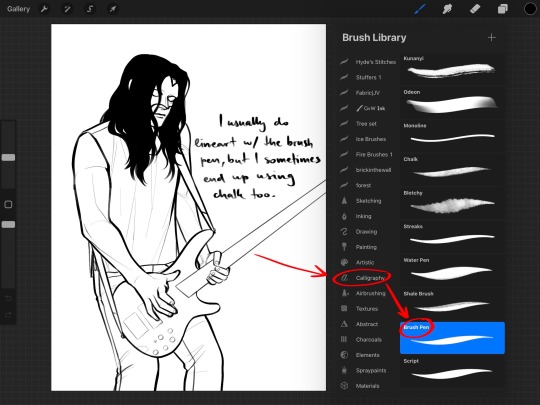
The brush I use for lineart is mostly the brush pen, found in the Procreate Calligraphy brush set. I find this one has the best fluidity and weight, while being very clear and soft. When I’m looking for a rougher line however, I will turn to the chalk brush from the same brush set.

The base colours are always set with the flat brush, found in the Procreate Painting brush set. I sometimes use the studio pen from the Inking brush set to make an outline and fill it in later, but that’s only when I’m feeling really nitpicky LOL

All the shading is done with the flat brush as well, but the highlights I do with the brush pen. The “highlights” here are the bass guitar strings and belt details, leather and metal shine, chain, and hair strand highlights.
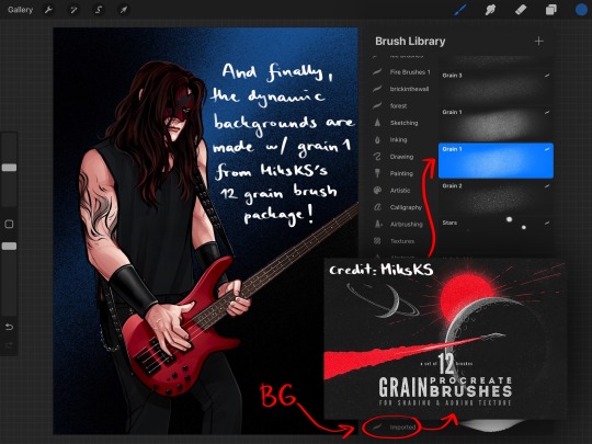
And finally, I achieve the dynamic backgrounds by using the grain 1 brush from MiksKS’s 12 Grain brush set (link here) It’s probably my most used out of all the brush sets I’ve got downloaded, I absolutely adore it! :D

And here is an example of the chalk brush in action! I absolutely love this brush when I’m trying to achieve rougher lines and textures. I love the grittiness and sharpness of it, while it holds the same weight and fluidity as the brush pen.
And while I didn’t think it was relevant to your question, I’m adding it in as well just in case; when I’m making simple anatomical sketches I’ll usually use the flat brush, and when I’m making more detailed sketches I’ll use the brush pen :)
🖤 Hope you find this useful!! 🖤
#han rambles#brushes#advice#tutorial#art advice#art tutorial#my art#process#art process#art#artwork#digital art#illustration#digital illustration#digital painting#painting#artist#artists#artist advice#advice for artists#tips for artists#artist tips
91 notes
·
View notes
Text
Gorillaz art styles ranked worst to best (opinion)
1. Song Machine, Phase 6
2. Plastic Beach/The Fall, Phase 3
3. The Now Now, Phase 5
4. Gorillaz, Phase 1
5. Humanz, Phase 4
6. Demon Days, Phase 2
explainations v
1. phase 6 is just... kinda eye bleedy to me. The colours are much too bright and while the lineart and anatomy are objectively the best they've ever been, the stylization has been lost and it is very unflattering. It shows a lot of technical skill but a disregard of shape language, line weight, expressiveness; which were the strongest pillars of the art style in the beginning
2. phase 3 is my absolute favourite but the art style is objectively grungy and kind of nasty. This might be on purpose, but to me it feels like Jamie just discovered the airbrush tool and used it gratuitously. The shading is pillowy and in black of all colours (don't shade with black btw unless you can legitimately make it look good, like solid black shading in comic books. Transparent black shading is atrocious in most cases). The colours are desaturated, which is really nice on the characters because it makes them look sickly and drives home the point that everyone was suffering during this phase, but it got really bland when applied to the backgrounds as well. The most colour was from the hot pink island, and even then it wasnt always drawn as hot pink, mostly just a light coral. The complaints here are purely with the colouring and shading, but the necks also bother me. I dunno. I just dont like the way they taper at the top
3. I actually really enjoy this art style a bunch, I think it's stunning. I only put it here because it didn't seem remarkable enough to be at the top. Mad respect to this art style I thought the collaging was really nice and I love the almost vintage feel of it. If I weren't judging by technical skill and appeal as well as opinion I would probably have this at the best. The colours were just amazing and the line weight and posing were great
4. The shape language here was incredible and unmatched by any following phases. It's very charming and I love the chunky lineweight of it. However, in some places the anatomy just didn't make sense even by cartoon standards, and the characters changed appearances sometimes, probably as a result of Jamie still trying to figure out the style. Also, sometimes the poses, as outrageous and awesome as they were, just looked bad or awkward. Appreciate the effort tho and for the most part it's pretty slick
5. I absolutely ADORE this phase's art style. Even though lineweight is a massive strong suit for this style, the lineless style really worked in its favour here. The colours were incredible!! Really genuinely stunning, and it managed to be soft while still managing not to stray too far from what people had come to expect from Gorillaz. Wasn't a fan of the hyperrealistic portraits, though, even if they're cool. And while most times this style was soft and incredibly endearing, sometimes it was muddled together due to a lack of differentiation between blocks of colour, and sometimes the shading made their faces look incredibly flat (I dont know why that happened, Jamie is usually a wizard when it comes to making 2D faces still look 3D)
6. while not my favourite, I think this is where the style really has a lot of genuinely strong aspects. All of the best aspects of phase 1 were strengthened here, and there was steady improvement throughout. Anatomy was perfect here, colours were amazing, even the fashion was probably the best it's ever been. Everyone had really good proportions in their faces especially that really made them look distinctive and three dimensional, while being incredibly expressive. Just a genuinely technically strong style here, pretty much perfect so I don't have much to say about it
#gorillaz#gorillaz phase 1#gorillaz phase 2#gorillaz phase 3#gorillaz phase 4#gorillaz phase 5#gorillaz phase 6#art criticism#art critique#art analysis
22 notes
·
View notes
Note
Hello Art! Let’s talk about your art trademark (as I already haven’t fangirled sO MUCH OVER YOUR PRETTY STYLE).
First of all, your style has literally such a joyful power! I see anything of yours and I still feel excited to read it because it’s such a comfort style!
Secondly, the way you do faces is very characteristic of yours! I think it’s the nose or the eyes but it’s so easy to distinguish from others’ styles! Even the anatomy and the colour palette you use are very specific!
Also I just wanna point out how ADORABLE you make Adrien/Spidrien’s hair, it’s sooooo cute?!
Not to mention your criativity which is obviously such a YOU-thing! I would recognise your style in a million others!
Thank you for your existence and for being such an amazing artist and a sweet friend! I love u! ❤️😭
NICOLE YOU?? YOU??
you talking about my art being good?? shut up!
have you seen a mirror?? Your quality of art is so next level if I didn't know you and saw your art i'd be scared to talk to you LMAO you're an IDOL.
THANK YOU FOR CALLING MY WORK PRETTY WHAT-
I started drawing like any other free ass dude trying a hand at art work in the beginning of last year and it was. as bad as you'd expect.
AND YOU?? the first time I saw your art all I could say was. DAMN?! this artist is a natural at good shading and lighting?! HOW DARE YOU CALL MY ART GOOD HAVE YOU SEEN YOUR ART
your latest comic literally left my jaw hanging. The amount of hard work and dedication in it?!?! Your dedication to what you love shows in your art. not to mention the way you draw face cuts, and the soft brush you use for lineart make it so satisfying to look at. Your lighting is sharp and dramatic, but it fits right with any situation. i mean. if you want your piece's atmosphere to look soft it looks soft and if you want it to look dramatic it looks DRAMATIC ASF yes i just looked at that chat blanc comic the third time now just to look at the details and choice of colors.
You use COOL colors like. idk. When i look at them I just think they'd be cool to touch. like. calming colors. i know i dont make sense.
thank you so much, i will now go and sit and think about this all day.
i will think about how an absolute master said my work is good.
#i dont deserve friends like you#wtf#art trademark#my art trademark#art trademark ask#ask game#good artists#proffesional artists#damn
36 notes
·
View notes
Note
man i just rly adore ur colors!! how do u go about choosing them? urs fit really well with the mood while also still remaining like they fit the color palette of a character. i feel mine end up super boring 😓
Hello anon, thank you for asking, I’ll try to explain my process, and I hope it makes sense!

Once I have some lineart done, I usually just put down some colours, they don’t have to be accurate, but they still fit the characters. It’s messy, and I use a brush that blends too, so some of the colours mix together.

Gradient maps/sets are great, I use them all the time on every piece. You can also just put down a lot of different colours on a picture, and work on it that way.

I use a lot of gradients, to help me build up interesting colours. Even though it may not show in the end result, it is a start, a base, that I can continue to build on. A strong base of colours is your goal, whether they are soft or saturated.

It doesn’t seem like much, but there is a difference, and even a little bit of a colour change can help you along. You can be very subtle or very bold with your choice of colours and gradients, there really isn’t a wrong answer.


The difference between these two pictures, is that I used some more gradients + a multiply layer to add shadows. I love warm, dark colours. I’m not a professional artist, and when I work on a picture, I tend to go with what looks good, rather than what looks realistic. I put down colours and shade in ways that I personally find interesting, even if it isn’t totally accurate

Here’s an example of my layers. I build my colours using gradient maps/sets/overlays/screens, etc. Experiment with colours, learn some colour theory, even if you only know a little bit, it can help. I erase what I don’t like from a gradient, and keep what I do like. I always check my original layers and make sure I don’t lose colours that I find interesting. I work those colours back into the picture.


From here, I paint, and just work on the picture using the colours and shadows I have made. It can be messy, or neat, whatever you feel is best for your art.

Add effects, additonal colours, edits, whatever you like, it’s all up to you! I hope this helps at least a little, and I’m sorry if it’s confusing at all.
494 notes
·
View notes
Note
Hey, this isn't so much an ask as I just wanted to let you know, that I absolutely adore your art. Seriously, I love how clean your linework looks, especially when you use many lines to get that 'rough' look, it always looks amazing. That and how you draw expressions really hits me, I'm bad at explaining. The other aspect I really admire is how you utilize subtle soft textures in your colouring. I could look at your Locked Tomb art for hours, it's so pleasing gaze upon.
Oh wow. What an incredibly sweet message! 😭You've mentioned specific aspects of my art that I've been working on and focusing on a lot (like I approach lineart with a lot of intent and I'm always trying to improve expressions/character acting), so it means the world. Thanks for dropping such kind words in my inbox, it's really the best kind of message any artist can receive. Glad you dig the TLT pieces in particular; got a few WIPs that I think you'll enjoy, so hopefully I will get some time soon to finish and post them. 💀
#maki replies#anonchat#just been busy with work and uh playing a lot of guilty gear strive lmao#but i do have some TLT pieces in progress that i'm super excited to sit down and draw
28 notes
·
View notes