#Red and Yellow Strategies insights
Explore tagged Tumblr posts
Text
Review of “Red and Yellow Strategies”
Flip Your Strategic Thinking and Overcome Short-termism” Dear Readers, Reading and writing are lifelong companions for me — they fuel each other. I read to write, and I write to read even more. Together, they help me connect meaningfully with others, bringing both motivation and joy to my life. In this piece, I’d like to introduce you to a book that I believe will be worth your time. Written…
#Alternative strategy frameworks#BHAG strategy critique#Books for business consultants#Business leadership book recommendation#How to sharpen strategic thinking#Organizational strategy guide#Red and Yellow Strategies insights#Strategic management reflection#Strategy vs. quick fixes in business#Svyatoslav Biryulin book review
0 notes
Text
SK8 Cast Image Colors, and the Super Sentai Roots of Character Color Coding


Unlike my post about hanakotoba, where only a few examples can be confirmed to be intentionally meaningful choices, image colors are an aspect of SK8's visual symbolism that has been explicitly assigned by the creators to each of the eight main cast members. From design elements to official art and merchandise (such as the art and the Infinity Week logo above) to shots in the show itself, these image colors are a consistent aspect of the series' visual language, and colors, like flowers, have meanings and associations that can provide interesting insight into why these colors were chosen for these characters. Color-coded casts are also strongly historically rooted in the super sentai subgenre of tokusatsu series, a genre that has had massive impact on Japanese pop culture, especially battle anime like SK8, in part, is, so I'll also examine the archetypes associated with their colors in super sentai (and, in Adam's case, another important piece of anime history.)
As color associations can vary by culture, I made sure to use Japanese sources - I mainly started with the dictionary on TC Color Therapy for basic color meanings but frequently checked other sources. My primary source on colors in super sentai is a paper on color theory in tokusatsu by Misako Takahashi, along with fan wikis such as Pixiv Dictionary and other Japanese blogs analyzing the subject. I also supplemented with quotes from SK8's staff when relevant.
All the image colors come from the official character guide included in volume 4 of the Blu-rays.
Reki Kyan - Yellow
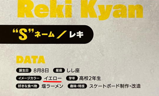
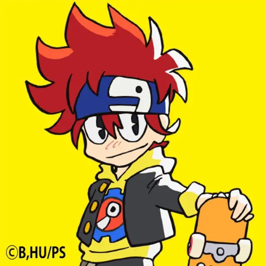
Despite his red hair, Reki's image color is yellow, the color of the signature hoodie he always wears at S. Yellow is associated with brightness, cheerfulness, fun and excitement - all things that Reki embodies at his best, and are very important parts of his character arc and what he represents to the people around him. In Utsumi's instructions to colorist Yukari Gotou, as shown in SK8 Design Works, she requested Reki's design have "so many bright and colorful primary colors it's tiring" in order to draw the eye, fitting of a bright and energetic protagonist. Yellow is a common color for team members in sentai anime, being the third most common after red and blue and appearing in the majority of series, and are often bright and cheerful "life of the party" type characters as well. This is a trend dating back to Himitsu Sentai Gorenger, the very first long-running super sentai series (beginning in 1975,) whose color coding has persisted for decades. Kirenger, the yellow member in Gorenger, was even a big eater with a signature favorite food (a trait more commonly attributed to Langa, but Reki's love for ramen and all things salty - even toothpaste - is a recurring bit in SK8 as well) and a big family.
In Takahashi's paper, she quotes another academic, Asako Yoshida's, analysis of another core aspect of yellow sentai characters, where she describes them as "an intelligent type who gathers information and forms strategies before taking action", and "rather than fighting on the front, they're a tactician who uses their wits and comes up with strategies," traits that Reki also shows frequently, especially in his biggest triumph in episode 11.
Like many of the image colors, it's also used in the show (both in the opening - highlighting his yellow-orange eyes - and in episode 11.)


~
Langa Hasegawa - Blue


Langa's image color is blue, selected along with white from the beginning to fit his snow theme. Blue is associated with positive meanings like calmness and intelligence, but also more negative ones like coldness, sadness and loneliness, fitting of both Langa's calm exterior and the grief that's central to his storyline. Blue sentai members are classically considered "cool" characters, an association that remains strong even as actual characters of that type have grown somewhat rarer over time, with newer series sometimes deliberately subverting expectations. Like yellow, the association of blue with the cool member of a team also dates back to Gorenger, with Aorenger (the blue member) being a cool, stoic character who came from a snowy region. Takahashi quotes Yoshida's description of blue heroes as "the calm, composed and cool second in command type," a character who "doesn't worry about what's in front of him, never seems to get worked up and deals with things calmly," which certainly describes the impression Langa gives off at first - and belies what SK8's producer Kyoko Uryuu described (when comparing him to a petit gâteau) as his "surprisingly passionate" interior.
Like with Reki, Langa's color is shown off in the opening and in the show itself - notably as his "aura" when he's in the Zone with Adam.


~
Miya Chinen - Light Green
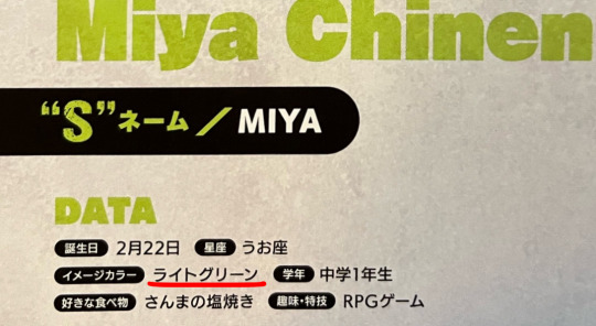

Miya's image color is light green, usually shown as a yellowish lime green. I'll get to green as a whole for Kojiro, but yellow-green specifically is associated with youthfulness, beginnings and hope, as it's the color of newly budding plants - and it can also be associated with immaturity, all meanings fitting of a very young character like Miya. While his costume is meant to be an in-universe game character, his bright green hood could also be seen as vaguely evoking Link from the Legend of Zelda series.
Green sentai characters have more varied archetypes, but were historically often the youngest member of the team, while more recently it's been a trend for them to be the oldest member of the team - fitting for the youngest and oldest members of the six characters making up SK8's main "team." The idea of a green member being the youngest also dates back to Gorenger, with Midorenger (the green member) being an innocent younger boy compared to the rest of the team, who was treated like a "mascot" of sorts and even shared Miya's affinity for animals. It's also become a trend for green characters to have close relationships with the yellow members, and to be in conflict with the red members.
Like with most of the other characters, Miya's color is highlighted in the opening.

~
Hiromi Higa - Purple
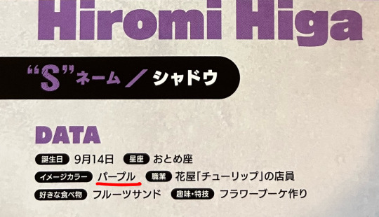

Hiromi's image color is purple, the color of his lipstick and the inside of his cape. Purple is associated with mystery, rarity, luxury and nobility, and in Japan in particular it's frequently associated with horror (from urban legends like the purple mirror to the common use of purple miasma to show disgusting/horrific food in anime.) Purple sentai members are incredibly rare, and at the time of Takahashi's paper the few that existed were usually mentor figures, but several since have been "dark heroes" or antiheroes - as "Shadow-sama" (fitting of the link to nobility) calls himself, as the self-proclaimed Antihero of the S community. With how he becomes a close friend (and even somewhat of a mentor) to the boys despite his very antagonistic first appearance, he certainly fits the "enemy-turned-ally" archetype, and while he's not actually the much older mentor early purple members were, Reki constantly calling him "old man" does evoke that trope too.
His color appears in the opening as well as featuring heavily in his S costume.

~
Kaoru Sakurayashiki - Pink
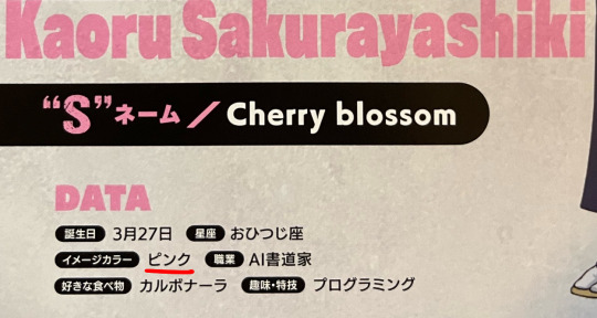

True to his surname and aesthetic, Kaoru's image color is pink, the color of cherry blossoms. Pink is associated with beauty, grace, luxury and love. Just like in the west, it's considered a very feminine color - also shown in the fact that pink sentai members are almost exclusively women, and typically particularly feminine and glamorous when on teams with other female members. This is a case where Cherry is in large part a departure from the classic color coding just because of his gender; SK8's colorist, Yukari Gotou, even expressed in Skater's Backstage that she was a bit worried about having a male character with pink hair, but Utsumi described him as a "pink ninja" from the get-go in her coloring notes.
And even Kaoru isn't completely immune to hitting the sentai archetypes either, with his noted beauty and a concern for his looks that Kojiro mocks as effeminate in the series; the contrast between the feminine characteristics he has and his masculine voice and personality are a core part of how his character was designed. He even has a surprising connection with Momorenger (Gorenger's pink member, and only woman) in his affinity for kicks. (As of 2022, there's also finally been a male character properly featuring as the pink member in a sentai series in Avataro Sentai Donbrothers.)
Of course, on top of featuring so heavily in his design, Cherry's color is also used in the opening.

~
Kojiro Nanjo - Green
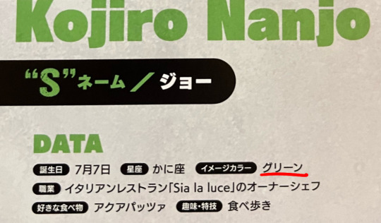

Rather than Miya's light green, Kojiro's image color is a regular green. Green is associated with calmness, stability, growth and nature, fitting for a very calming and stable mentor character who just "goes with his feelings" like Kojiro - but like light green, it can also signify immaturity, which also suits a character who proudly proclaims to be a "kid" when he's on vacation. Where Miya fits the "youngest member" trope for green sentai members, Kojiro fits the "oldest member" trope, and he also fits the recently trendy close relationship with yellow and conflict with red. In Takahashi's paper, she quotes Yoshida describing green characters as a whole as "a caring type who's always concerned if things are peaceful" (also fitting of Miya, who's always the most concerned for Reki and Langa,) "a soothing person who makes you feel warm and comforted just by being next to them" and as someone who "loves their friends, and 'being together with everyone' is important to them," and in Utsumi's color notes in SK8 Design Works, she described Kojiro as "A calming, mature green. Comforting."
And like with the others, on top of being his hair color, Kojiro's color is also shown in the opening.

~
Ainosuke Shindo - Red
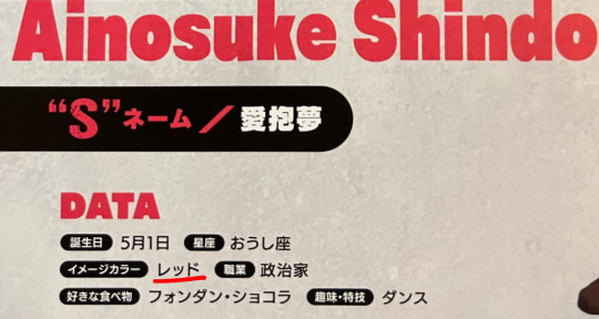

Naturally for the "Matador of Love", Adam's image color is red, a color associated with love, passion and excitement, but also danger and anger, covering both sides of the duality of Adam's connection with love and romance and his violent skating. Utsumi's color notes in SK8 Design Works describe it as "the color of love and blood", and described Adam himself as "a guy who stole a main character's color" - fitting of the fact that in sentai series (and many anime influenced by them,) the red member is almost always the main protagonist and leader. (And perhaps a cheeky reference to Reki, though it seems Adam's color was decided on much earlier on.) Between red and blue being tied for their inclusion in sentai series and yellow in a close second place, the three primary colors form a core trio of characters in sentai series that's also reflected by Reki, Langa and Adam as the three most central characters in SK8.
While many works follow Gorenger's lead with the red protagonist being a hot-headed, passionate natural leader (a role that Adam does command at S as a whole, at least at first,) it's covered such a wide spectrum of protagonists over the course of the genre's history that red's biggest association is simply "being the main character," superseding a single specific character archetype. To momentarily dip into the history of anime itself rather than tokusatsu's influence, I'd be remiss not to mention that thanks to the influence of Mobile Suit Gundam (a franchise that both writer Okouchi and character designer Chiba have history with and mentioned in interviews on Febri as inspiring their interest in anime) it does have a memetic association with speed (and rival characters,) as Gundam's frequently-imitated masked antagonist Char Aznable's custom red mecha is notoriously "three times faster" than any other. (Adam's voice actor, Takehito Koyasu, has even played two "Char Clones" himself.)
As with the other characters, Adam's color appears in the opening but it also surrounds him frequently in the show even from his first appearance, including a red glowing aura to mirror Langa's blue when they're in the Zone (even in the finale when the red is gone from his costume.)



~
Tadashi Kikuchi - Gray


(Tadashi never got an official Twitter icon like the other characters, so I used a different piece of merch.)
Lastly, Tadashi's image color is gray, which is mostly known for being... a bit of a non-color, though it can be associated with gloom, ambiguity or uneasiness. It's mostly seen as a color that blends in and doesn't stand out by itself, which was the purpose behind Tadashi's color scheme, as Utsumi described in her notes as wanting his coloring to "make the main character stand out", given that he was designed from the beginning to appear alongside Adam, who has the "main character's color." Gray is an incredibly rare theme color in sentai series, to the point that there aren't specific character archetypes either; in 2014, at the time of Takahashi's paper, the only gray character she noted was a literal ghost. Even Tadashi's image color is alienated from the other skaters'...
While there are comparatively few (and less obvious) examples of Tadashi's image color appearing in the show, his last emotional scene with Ainosuke takes place in an almost entirely gray room.

It'll be interesting to see how these associations might continue to be used in the future.
#sk8#sk8 the infinity#meta#sk8 meta#reki kyan#langa hasegawa#miya chinen#hiromi higa#shadow sk8#kaoru sakurayashiki#kojiro nanjo#ainosuke shindo#adam sk8#tadashi kikuchi
105 notes
·
View notes
Text
I’m real sick of Lily’s hollow nothingburger ranting nitpick of a “retrospective” of Pokémon…
So let me sperg about these games in a constructive way that highlights the parts of the game that Lily neglected to mention
This is:
Gobbo’s Semi-Complete Pokémon Retrospective!

I’ve been a fan of Pokémon since I could remember; roughly four years old give or take, my introduction began through the merchandise like cards, toys and book. I wouldn’t start my journey until I was 7 with soul silver with my female chikorita as a starter. I would then go on to play (ordered by region introduction): fire red, ORAS, soul silver & heart gold, platinum/BDSP, white, X&Y, sun & moon (and the ultra games), sword & shield, PLA, and scarlet & violet (including the dlcs and epilogue).
Going forward note that the games that are italicized are the main games I played myself in. Just thought I’d make that clear. So I can’t fully explain some of the games than others but I may mention points others I’ve seen talk about the games say that have provided good insight towards.
Gen 1 & 2
(Grouping these together as I have more to say and knowledge of the gen two game mostly from HGSS)
Gen 1: many peoples first taste and introduction to the world of Pokémon. With a variety of creatures, a straightforward goal and towns and cities to explore Kanto opened the floodgates to what would be a long running series. It started with a premise of catching cool beasts and creatures and traveling the world and fighting an evil organization with the help of your newly acquired friends through strategy and planning you’d prove yourself against the best of the best of trainers and a rivalry that would form into a friendship as they got older. At first, the games only had one option for gender being a boy, you could chose your own name or presets of other options one of which being Red who is a protagonist in the manga, but he’s not ash (as ash would be playable with pokemon Yellow and somewhat in the let’s go games). You also get to name your rival either through the realms of your imagination and witty humor or the presets: this is Blue your rival. (In the anime he would be changed personality wise slightly for American audiences watching the anime, Gary)
I didn’t get far in my first playthrough of FireRed as a kid, I’ll admit. I got stuck in cerulean city and was trying to grind my Pokémon’s levels which took too long. You could probably tell that I had charmander as my starter, well I will flex by saying I had a female charmander first time playing it! So meh! I named her Flare. When it game to this generation there was many things that were cut or added, beta designs, unused mechanics or sprites and even the concept of buying pokemon in the marts which would probably be added via the coin shop of the game place. Of course this is my assumption so feel free to correct me in replies!!
Now I might be biased with what I’m about to talk about with Gen two, but this is my retrospective and I get to do what I want! XD
Gen II: ah Johto my fictional home away from home! I LOVE THESE GAMES! My brother and I would play pokemon as kids and he’d always be ahead of me in the story so I’d have many times where I’d ask him to help me figure something out! Like that god damn stupid farfetch’d quest… grumble grumble… he helped me twice! Soul silver was the first game I played and my starter was a female chikorita whose name sadly escapes me. The last place I left off in that game was cerulean city before my game was unplayable due in part to “kids being dumb” antics (I put a magnet near my ds and we had to ship it to Nintendo to fix it). So I got heart gold and replayed it! This time with another female starter, totodile! Who I named Fergie which is short for fergalicous. The gen two remakes was jam packed with everything from new pokemon, new region, new types, and a sort of epilogue if you will to the previous games through the story of team rocket! Being that after you defeat the boss he vanishes and his grunts are trying everything to contact him. This time you get to be a boy or a girl!
These games added more to the worldbuilding there was in Pokémon with the origin of the legendary beasts who had been resurrected by a much stronger legendary more so than the bird trio of Kanto. This pokemon would make their appearance in the very first episode of the anime, the rainbow bird: Ho-oh.
If I may also sprinkle in my other fixation that is mythology the legendaries of Johto are most definitely based or pull inspiration from the divine beasts of Japanese mythology. It’s no secret that the people at gamefreak value and put in the love and care they hold for culture and upbringing.
This is something that I will make note of for a brief tangent: the fact that in many of the games there’s a special building or place where players can enter to find GameFreak themselves in their office. They have unique dialogue and even reward players with exclusive items or certificates for completing the Pokédex! In the gen two remakes they give you a special item that lets you go back and forth from having the updated soundtrack or the gameboy soundtrack, I personally love the gameboy sound as it wasn’t overstimulating which is just a personal thing not to diminish the ost.
There was many things added to the games such as a day/night cycle and as mentioned earlier, new pokemon types! Steel and dark. Initially they planned to make one eeveelution (fandom term) a poison type later changing it to dark type but forgetting to fix the dex entry, this of course is umbreon! In a leak for the beta sprites there were many designs or complete pokemon who were cut or replaced, an early concept for leafeon was one of these designs that would be brought to gen four!
One misconception of Gen two from what I’ve seen is that Kanto is the postgame, this is false. The real postgame is facing Red who after the first game vanished just like Giovanni. When you travel through Kanto after getting the first eight gym badges you are given bits and pieces of information of this mysterious character who as you progress learn was the previous champion before vanishing. At the top of mount silver he waits for an opponent who can beat him. I’m still grinding to beat him!!! Of course with Maxwell by my side!
Before we wrap up I want to add in a few things the remakes added:
Pokeatholon
Bug catching tournament
Safari zone (where you can design your safari zone which will affect the Pokémon that appear)
Suicune quest
Steven stone
Celebi
Sinjoh
Ruins of alph
Radio
And Voltorb Flip


————————————————
Gen III
The remakes are better I’m sorry ok if you take mega evolution out of the games it’s still cool in how you can ride latias high above Hoenn to move around the region with ease and the approriate more characteristically fitting designs of Maxie and Archie. To sum up in a way to point out how pro-corporate and rainbow capitalist Lily orchard is the whole plot and motive of team magma is literally to make more land for real-estate. Archie just wants Pokémon to have more rule of the world and make a sort of waterworld type landscape. Kyrogre and groudon are based on leviathan and behemoth being two sworn enemies who will bring catastrophic effects should they awaken and fight the other, only when the sky is summoned does the land and sea cease their feud.

The games are cool with having bike mechanics which involve the usage of two types of bikes to traverse different terrain: BMX bby!!!
But contests were introduced too!
The inclusion of a puzzle that requires some knowledge of braille to access the regis was also a fascinating element of these games.
Oh and the fact our trainer has a dad who’s a gym leader was neat too.
Oh and my starter was a male treecko I named Trevor for alpha sapphire.
———————————
Gen IV
I never had diamond or pearl so for a while my own understanding and knowledge came from playing the third game that added onto the story and gameplay of the previous games. I had a female piplup I named Pearl.
Gen four was meant to be the last game installment of the Pokémon series. Given the story and stakes at play with team galactic and their cultish mindset to restart the world by taking control of the embodiments of time space and for platinums sake, antimatter it made sense. But it wouldn’t stay like this given the reception the games had. Like the first two games there were many unique features and even side quests you could take part in!
The under ground
Contests (and poffin making/ball capsules)
Ranmas (I know I spelled it wrong stop!) park (the park with a bias to pokemon based on appearance lol)
Personality ribbons
The old mansion
Gts (with the lil parade thing)
Two new eeveelutions!
And badge cleaning (nothing is more satisfying than cleaning the badges)
So why is platinum better? Let me list it for yall now:
The opening is different where you run into Cyrus first instead of Rowan
Looker
Fatima’s gym challenge was a maze with lights and puzzle solving rather than math equations
More Pokémon
The distortion world
Looker
Battle frontier
AND THE FACT THAT YOU GOT TO HAVE A LUXURY HOME AT THE AGE YOUR TRAINER IS THAT YOU GOT TO DECORATE!!!
Also this was a playground rumor when I was growing up now: if you beat the elite four and league a certain number of times in a row, you would get to meet your trainer character’s dad.
Now did I believe this rumor? Yes.
The answer will shock you!
I also use to and still believe that Looker is the trainers dad and nothing with change that for me!!!

Ok I will have to separate this into two parts! Stay tuned for gen 5–9
Gen 5&6 (next)
Gen 7&8
Gen 9 (coming soon)
#sillygoblinantics#just goblin things#sillygoblinantics’ original content#Gobbo’s semi-complete Pokémon retrospective#Pokémon sperging#gobbo spergin
4 notes
·
View notes
Text
Beauty Brands USA: Revolutionizing Skincare with Sokörpe’s Compact Intelligent Skincare & Body Care Machine
The beauty and wellness industry is constantly evolving, with new technologies and products emerging to meet the ever-growing demand for advanced skincare and body care solutions. Among the frontrunners in this industry, Beauty Brands USA stands out as a leader in providing innovative, high-quality equipment to aesthetic professionals. As the exclusive distributor of Sokörpe’s Compact Intelligent Skincare & Body Care Machine in the United States, Beauty Brands USA offers a transformative tool that promises to elevate the standards of skincare and body care services. In this comprehensive article, we explore the features, benefits, and impact of this revolutionary machine, along with insights into why Beauty Brands USA is the preferred partner for skincare professionals.
Key Features and Technologies
Seven Treatment Heads: Each head is engineered to perform specific functions, enabling a personalized treatment experience for clients. Whether it’s anti-aging, acne treatment, or body contouring, the machine’s versatility is a major asset.
61 Treatment Programs: The extensive selection of programs allows practitioners to offer everything from basic facials to advanced treatments like Nano-Needle Mesotherapy and Endermomassage, ensuring comprehensive care for clients.
Nano-Needle Mesotherapy: This advanced technology delivers active ingredients deep into the skin, promoting collagen production and skin rejuvenation. It’s an effective treatment for reducing wrinkles, fine lines, and skin sagging.
Endermomassage: Available in both small and large sizes, these tools effectively treat cellulite, stimulate collagen production, and enhance skin firmness. Given the lucrative cellulite reduction market, which is expected to grow significantly, this feature offers substantial revenue potential.
Oxybrasion: This gentle yet effective exfoliation method uses oxygen to remove dead skin cells and improve circulation, leaving the skin refreshed and radiant.
Full Spectrum LED Therapy: The machine includes the full range of LED lights, each offering specific benefits:
Red Light: Stimulates collagen production and reduces inflammation.
Blue Light: Targets acne-causing bacteria and reduces oil production.
Green Light: Evens out skin tone and reduces pigmentation.
Yellow Light: Improves circulation and reduces redness.
Purple, Orange, and White Lights: Each providing unique therapeutic benefits, from healing to skin revitalization.
The Beauty Brands USA Advantage
Exclusive Distribution and Quality Assurance
Beauty Brands USA prides itself on being the exclusive distributor of Sokörpe’s machine in the United States. This exclusivity ensures that practitioners are receiving a genuine, high-quality product, backed by the company’s rigorous quality control standards.
Comprehensive Support and Training
To maximize the benefits of Sokörpe’s machine, Beauty Brands USA provides extensive training and support. This includes initial setup guidance, detailed instructions on utilizing the machine’s various features, and ongoing support to help practitioners refine their techniques.
Marketing and Business Development Support
Understanding that successful implementation goes beyond just having the right equipment, Beauty Brands USA offers marketing and business development support. This includes providing promotional materials, training on effective marketing strategies, and tips for attracting new clients.

Financial Viability and Market Impact
Cost-Effective Investment
Sokörpe’s machine is competitively priced at $5,795.00 plus tax, making it an affordable option compared to other high-end devices. For instance, comparable machines for Endermomassage and Hydrafacial treatments can cost between $30,000 and $50,000, making Sokörpe’s machine a cost-effective investment for aesthetic professionals.
Revenue Generation Potential
The machine’s versatility allows practitioners to offer a wide range of treatments, each with significant earning potential. For example, Nano-Needle Mesotherapy sessions can cost between $250 and $600 each, with clients typically requiring multiple sessions. This can quickly lead to substantial revenue growth, with some practitioners reporting monthly earnings of up to $50,000.
Clinical Efficacy and Safety
Proven Results
Clinical studies have demonstrated the effectiveness of the technologies used in Sokörpe’s machine. For instance, LED therapy has been shown to reduce acne, stimulate collagen production, and improve skin elasticity. Similarly, Nano-Needle Mesotherapy and Endermomassage have proven effective in skin rejuvenation and cellulite reduction.
Safety Profile
Safety is a paramount concern in aesthetic treatments. Sokörpe’s machine is designed with safety in mind, featuring settings and protocols that ensure safe operation. This makes it suitable for a wide range of clients, including those with sensitive skin.
Real-World Success Stories
Case Studies and Testimonials
Numerous skincare professionals across the United States have integrated Sokörpe’s machine into their practices, experiencing significant business growth and client satisfaction. Testimonials often highlight the machine’s versatility, ease of use, and the impressive results it delivers.
Market Expansion and Client Retention
With the ability to offer innovative treatments that are not widely available, practitioners can attract new clients and retain existing ones. The machine’s comprehensive treatment options also enable practitioners to provide personalized care, further enhancing client loyalty.
The Science Behind the Treatments
LED Therapy
LED therapy involves the use of different wavelengths of light to penetrate the skin at varying depths. This triggers biological processes that rejuvenate and repair the skin. Each wavelength, represented by a different color, offers specific benefits:
Red Light (630-700 nm): Promotes collagen production and accelerates healing.
Blue Light (405-420 nm): Kills acne-causing bacteria.
Green Light (515-525 nm): Reduces pigmentation and evens skin tone.
Yellow Light (570-590 nm): Improves circulation and reduces redness.
Purple, Orange, and White Lights: Offer additional benefits like healing and revitalization.

Nano-Needle Mesotherapy
This treatment involves the use of nano-sized needles to deliver active ingredients directly into the dermis. It is effective in stimulating collagen and elastin production, which helps reduce the appearance of wrinkles and improve skin texture.

Endermomassage and Oxybrasion
Endermomassage uses mechanical stimulation to reduce cellulite and improve skin firmness. Oxybrasion, on the other hand, is a non-invasive exfoliation method that uses oxygen to cleanse and rejuvenate the skin.
Sokörpe’s Compact Intelligent Skincare & Body Care Machine, distributed exclusively by Beauty Brands USA, is a revolutionary device that offers unparalleled versatility and effectiveness. With its seven customizable treatment heads and 61 unique programs, it provides a comprehensive solution for skincare and body care needs. Beauty Brands USA’s commitment to quality, innovation, and support ensures that practitioners can maximize the potential of this incredible machine, transforming their businesses and providing exceptional results for their clients.
If you’re a skincare professional looking to elevate your practice, Sokörpe’s Compact Intelligent Skincare & Body Care Machine is the investment you need. With its affordability, extensive support, and proven results, it’s the key to unlocking new levels of success and client satisfaction. Don’t miss out on the opportunity to offer the latest and most effective treatments—partner with Beauty Brands USA and make Sokörpe’s machine a part of your practice today.

#skincare#skincare tips#skin care#beauty tips#glowing skin#natural#organic#radiantglow#radiantskin#glowing aesthetic#beautyproducts#beauty#Skincare Machine#Spa Equipment#skin treatment#body care#massage equipment#Endermomassage#Diamond Micro-Dermabrasion#Oxygen Infusion#Oxybrasion#Kinetic Massage#Nano-Needle Mesotherapy#Beauty Brands USA
3 notes
·
View notes
Text
Neuromarketing: How Brain Science is Changing Digital Ads
In today’s fast-paced digital world, brands are constantly seeking new ways to capture customer attention and drive engagement. Traditional marketing techniques are no longer enough; businesses need a deeper understanding of consumer behavior. This is where neuromarketing comes in—a cutting-edge approach that uses brain science to optimize digital ads and create more impactful marketing campaigns.
If you’re looking to enhance your advertising strategies, partnering with the best digital marketing agency of Mumbai can help you implement neuromarketing techniques effectively. Let’s explore how neuromarketing is transforming digital advertising and why it’s the future of marketing.
What is Neuromarketing?
Neuromarketing is the study of how the brain responds to marketing stimuli, such as ads, images, and content. It leverages neuroscience, psychology, and biometric data (like eye-tracking and brain wave analysis) to understand what captures a consumer’s attention and drives decision-making.
By applying neuromarketing insights, brands can craft ads that resonate on a subconscious level, making them more persuasive and effective.
How Neuromarketing is Changing Digital Ads
1. Emotional Triggers for Stronger Engagement
Studies show that people make purchasing decisions based more on emotions than logic. Neuromarketing helps brands identify the right emotional triggers—such as happiness, excitement, or nostalgia—to make ads more impactful.
✅ Tip: The best digital marketing agency of Mumbai can help you create emotionally compelling ad campaigns that connect with your audience on a deeper level.
2. Color Psychology for Brand Recall
Different colors evoke different emotions and reactions. For example, red creates urgency, blue builds trust, and yellow signifies happiness. Neuromarketing studies how color influences consumer behavior and helps brands choose the right color schemes for their ads.
✅ Tip: Use colors strategically in your digital ads to increase brand recognition and influence purchasing decisions.
3. Optimizing Ad Placement and Design
Eye-tracking studies reveal where users focus their attention on a screen. This data helps brands design ads with the right placement of headlines, images, and call-to-action buttons to ensure maximum visibility and engagement.
✅ Tip: The best digital marketing agency of Mumbai can analyze user behavior to create ad layouts that drive higher conversions.
4. The Power of Storytelling
Storytelling activates multiple areas of the brain, making ads more memorable. Neuromarketing research shows that ads with strong narratives create emotional connections, leading to higher engagement and brand loyalty.
✅ Tip: Use storytelling techniques in video ads, social media content, and brand messaging to make a lasting impression.
5. Using AI and Biometrics for Better Insights
AI-driven neuromarketing tools analyze facial expressions, eye movements, and even brain activity to determine how consumers react to ads. This data helps marketers refine their campaigns and improve ad performance.
✅ Tip: By leveraging neuromarketing insights, brands can fine-tune their digital ads to maximize engagement and conversions.
Why You Need a Neuromarketing Strategy
With increasing competition in digital advertising, brands must go beyond traditional marketing approaches. Neuromarketing offers data-driven insights into consumer behavior, enabling businesses to create more effective and engaging ads.
By partnering with the best digital marketing agency of Mumbai, you can integrate neuromarketing techniques into your ad campaigns and stay ahead of the competition.
Final Thoughts
Neuromarketing is revolutionizing the way brands approach digital advertising. By understanding how the brain processes ads, businesses can create compelling campaigns that capture attention, evoke emotions, and drive sales.
If you want to take your digital ads to the next level, consider working with experts who understand the science behind consumer behavior. The best digital marketing agency of Mumbai can help you implement neuromarketing strategies that maximize ad performance and boost your brand’s success.
Are you ready to transform your digital marketing with neuromarketing? Let’s get started! 🚀
#smo#digital marketing course#digital marketing services#digital marketing trends#social media marketing#seo services
0 notes
Text
Master the "Moving Average Convergence Divergence" for Bitcoin-Euro Trading Trading Bitcoin against the Euro can feel like riding a rollercoaster blindfolded: exhilarating, unpredictable, and sometimes nauseating. But with the right tools and strategies, you can turn the chaos into calculated profits. Enter the "Moving Average Convergence Divergence" (MACD) — a powerful yet often misunderstood indicator that can be your secret weapon in navigating this dynamic market. What Is MACD and Why Should Bitcoin-Euro Traders Care? Think of MACD as your market's mood detector. It helps you identify trends, momentum, and potential reversals in price action. Unlike chasing trends blindly (which is like buying that infomercial gadget you never use), MACD provides actionable insights into when to enter and exit trades with precision. For Bitcoin-Euro traders, where volatility reigns supreme, MACD is particularly useful. It cuts through the noise and highlights underlying trends, giving you the clarity of a seasoned trader without the gray hair. Decoding MACD: The Secret Formula Behind the Indicator At its core, MACD consists of three components: - The MACD Line: Calculated by subtracting the 26-period EMA (Exponential Moving Average) from the 12-period EMA. This line shows the difference between two moving averages. - The Signal Line: A 9-period EMA of the MACD line, serving as a trigger for buy and sell signals. - The Histogram: The visual representation of the difference between the MACD line and the Signal line. Let’s break it down: When the MACD line crosses above the Signal line, it’s a bullish signal (a potential buy). When it dips below, it’s bearish (a potential sell). Think of these crossovers as traffic lights: green for go, red for stop, and yellow for “proceed with caution” (or keep an eye on your stop-loss). Why Most Traders Get MACD Wrong (and How You Can Avoid Their Mistakes) Mistake #1: Ignoring Divergence Divergence between MACD and price action can be your best friend. For instance: - Bullish Divergence: Price makes a lower low, but MACD makes a higher low. Translation? Momentum is shifting upward. - Bearish Divergence: Price hits a higher high, but MACD forms a lower high. Warning: the trend may reverse downward. Most traders overlook these subtle cues, but spotting divergence is like finding an unopened box of chocolates in your pantry — sweet and unexpectedly rewarding. Mistake #2: Over-Reliance on Default Settings The default MACD settings (12, 26, 9) work for many assets, but Bitcoin-Euro’s unique volatility calls for customization. Experiment with shorter EMAs (e.g., 8, 21, 5) for faster signals or longer EMAs for a steadier approach. Tailor the settings to your trading style and risk tolerance. Advanced MACD Tactics for Bitcoin-Euro Success 1. Pair MACD with Volume Analysis Volume is the secret handshake of the trading world. When MACD signals align with a surge in volume, it’s like receiving a VIP invitation to a high-probability trade. For example: - MACD bullish crossover + increasing volume = strong buy signal. - MACD bearish crossover + declining volume = weak selling pressure (wait for confirmation). 2. Use MACD on Multiple Timeframes Traders often limit themselves to one timeframe, but that’s like watching a movie through a keyhole. Check MACD signals on: - Higher Timeframes: To confirm the overall trend. - Lower Timeframes: For precise entry and exit points. Example: If the daily MACD shows bullish momentum while the hourly MACD crosses bearish, wait for alignment before committing to a trade. 3. Combine MACD with Fibonacci Retracements Fibonacci levels are like the hidden scaffolding of the market. Use them to confirm MACD signals: - If MACD indicates a bullish reversal near a 61.8% retracement level, it’s a high-probability buy. - Similarly, bearish signals near a 38.2% retracement level can reinforce a sell decision. Real-World Example: MACD in Action with Bitcoin-Euro Imagine BTC/EUR is trading at €25,000. Here’s how you could use MACD: - Identify a Trend: The daily MACD line crosses above the Signal line, signaling bullish momentum. - Check for Divergence: Price makes a lower low, but MACD’s histogram prints higher lows — a bullish divergence. - Confirm with Volume: Volume spikes confirm strong buying interest. - Enter the Trade: Place a buy order at €25,200 with a stop-loss at €24,800 (below recent support). - Set Targets: Use Fibonacci extensions (e.g., 161.8%) to set profit targets around €27,000. Proven Strategies to Enhance Your MACD Edge A. The MACD-Ichimoku Combo Ichimoku Cloud adds depth to MACD analysis. When the MACD gives a bullish signal and price is above the Ichimoku Cloud, it’s a strong buy confirmation. Conversely, bearish MACD signals below the Cloud warn of deeper downtrends. B. Backtest Like a Scientist Blindly trusting MACD without backtesting is like baking a cake without checking the recipe. Use historical data to test how MACD settings perform on BTC/EUR during different market conditions. Tools like TradingView make backtesting easy and insightful. Elite Tactics You Won’t Find Elsewhere - MACD as a Trend Filter: Use MACD to filter trades in the direction of the dominant trend. For instance, only take buy signals when the MACD line is above zero. - Set Alerts for Crossovers: Automate your trading by setting alerts for MACD crossovers on platforms like MetaTrader or TradingView. This reduces the risk of missed opportunities. - Master the Art of Patience: Wait for confirmation across multiple indicators before entering trades. As the old saying goes, “Measure twice, cut once.” Conclusion: The MACD Advantage for Bitcoin-Euro Trading By mastering the MACD indicator, you’re not just trading — you’re strategizing. Whether it’s spotting divergence, customizing settings, or pairing MACD with other tools, these tactics can give you an edge over the market. Ready to elevate your trading game? Explore our exclusive resources at StarseedFX to unlock cutting-edge tools, expert insights, and real-time updates. —————– Image Credits: Cover image at the top is AI-generated Read the full article
0 notes
Text
Unlock the Power of Color Psychology in Social Media Marketing
Discover how color psychology can transform your social media marketing strategy! 🎨 Learn how different colors influence emotions, shape brand perception, and drive audience engagement. From understanding the emotional impact of red, blue, and yellow to practical tips for applying color psychology in branding, content creation, and CTAs—this video is packed with actionable insights to boost your online presence. Whether you're a marketer, business owner, or content creator, this guide will help you make strategic color choices that captivate your audience and deliver measurable results. Watch now to master the art of color psychology in social media marketing!
0 notes
Text
Cut Flowers Market Growth: Revenue to Double by 2032
Astute Analytica, a prominent market research firm, has recently published a comprehensive report that offers an extensive analysis of the global Cut Flowers market. This report goes beyond mere statistics, providing deep insights into various critical aspects such as market segmentation, key players, market valuation, and regional overviews. It serves as a valuable resource for businesses and stakeholders seeking to navigate this evolving industry landscape.
Market Valuation
The report includes a thorough evaluation of the market valuation, drawing from historical data, current trends, and future projections. By employing rigorous analytical methods, it effectively captures the growth trajectory of the market. This detailed assessment allows businesses to understand the factors driving growth and make informed decisions regarding investments and strategic initiatives.
Global cut flowers market generated revenue of US$ 31.95 billion in 2023 and is estimated to reach a valuation of US$ 53.07 billion by 2032 at a CAGR of 5.8% during the forecast period 2024–2032.
A Request of this Sample PDF File@- https://www.astuteanalytica.com/request-sample/cut-flowers-market
Comprehensive Market Overview
Astute Analytica's report provides a holistic overview of the global Cut Flowers market. It encapsulates a wide array of information related to market dynamics, including growth drivers, challenges, and opportunities. Stakeholders can leverage these insights to formulate effective strategies and maintain a competitive edge in the market.
Key Players in the Market
The report identifies and profiles the major players who are influencing the global Cut Flowers market. Through meticulous research, it presents a clear view of the competitive landscape, detailing the strategies, market presence, and significant developments of leading companies. This section is vital for stakeholders who wish to understand the positioning and actions of their competitors.
Key Companies:
Afriflora Sher
Dümmen Orange
Karen Roses
MultiFlora
Oserian
Rosebud Limited
Selecta one
The Kariki Group
The Queen's Flowers
Washington Bulb Co., Inc.
Other Prominent Players
For Purchase Enquiry: https://www.astuteanalytica.com/industry-report/cut-flowers-market
Segmentation Analysis
A crucial component of the report is the segmentation analysis, which delves into various market segments based on industry verticals, applications, and geographic regions. This detailed examination provides stakeholders with a nuanced understanding of market dynamics, enabling them to identify opportunities for growth and areas for investment.
Market Segmentation:
By Type
Rose
Chrysanthemum
Carnation
Gerbera
Anthurium
Orchids
Gladiolus
Tuberose
Others
By Application
Home
Commercial
Restaurants & Cafes
Hotels
Airports
Wedding Destinations
Salon
Others
By Flower Color
White
Purple, Lavender or Blue
Yellow or orange
Red pink
By Distribution Channel
Online
Offline
Supermarkets and Hypermarkets
Specialty Store/Florists
By Region
North America
US
Canada
Mexico
Europe
UK
Germany
France
Italy
Spain
Poland
Russia
Rest of Europe
Middle East & Africa
UAE
Saudi Arabia
South Africa
Qatar
Kuwait
Iraq
Madagascar
Kenya
Rest of Middle East & Africa
Rest of the World
Research Methodology
Astute Analytica is recognized for its rigorous research methodology and dedication to delivering actionable insights. The firm has rapidly established a solid reputation by providing tangible outcomes to clients. The report is built on a foundation of both primary and secondary research, offering a granular perspective on market demand and business environments across various segments.
Beneficiaries of the Report
The insights presented in this report are invaluable for a range of stakeholders, including:
Industry Value Chain Participants: Those directly or indirectly involved in the Cut Flowers market need to stay informed about leading competitors and current market trends.
Analysts and Suppliers: Individuals seeking up-to-date insights into this dynamic market will find the report particularly beneficial.
Competitors: Companies looking to benchmark their performance and assess their market positions can leverage the data and analysis provided in this research.
Astute Analytica's report on the global Cut Flowers market is an essential resource that empowers stakeholders with the knowledge needed to navigate and thrive in this competitive landscape.
Download Sample PDF Report@- https://www.astuteanalytica.com/request-sample/cut-flowers-market
About Astute Analytica:
Astute Analytica is a global analytics and advisory company that has built a solid reputation in a short period, thanks to the tangible outcomes we have delivered to our clients. We pride ourselves in generating unparalleled, in-depth, and uncannily accurate estimates and projections for our very demanding clients spread across different verticals. We have a long list of satisfied and repeat clients from a wide spectrum including technology, healthcare, chemicals, semiconductors, FMCG, and many more. These happy customers come to us from all across the globe.
They are able to make well-calibrated decisions and leverage highly lucrative opportunities while surmounting the fierce challenges all because we analyse for them the complex business environment, segment-wise existing and emerging possibilities, technology formations, growth estimates, and even the strategic choices available. In short, a complete package. All this is possible because we have a highly qualified, competent, and experienced team of professionals comprising business analysts, economists, consultants, and technology experts. In our list of priorities, you-our patron-come at the top. You can be sure of the best cost-effective, value-added package from us, should you decide to engage with us.
Get in touch with us
Phone number: +18884296757
Email: [email protected]
Visit our website: https://www.astuteanalytica.com/
LinkedIn | Twitter | YouTube | Facebook | Pinterest
0 notes
Text


The Psychology of Color in Art and Design
Color plays a pivotal role in shaping our emotions, perceptions, and behaviors, making it one of the most powerful tools in art and design. This blog delves into the fascinating world of color psychology, exploring how different hues evoke distinct emotional responses and influence decision-making in various contexts.
We’ll uncover how colors like red can stimulate energy and passion, while blue promotes calmness and trust. Learn why yellow often symbolizes optimism and creativity, and how green is associated with balance and harmony. The article also examines the subtle nuances of color combinations, contrasts, and cultural influences, providing insights into how these factors shape our interpretations of visual media.
The blog will highlight how artists and designers harness the psychological impact of color to convey messages, build brand identities, and create memorable experiences. Whether you're a professional designer, an aspiring artist, or simply curious about the world of color, this article offers practical tips for using color effectively in your own projects.
From choosing the right palette for a painting to designing a logo that resonates with your audience, we’ll explore actionable strategies for mastering color. You’ll also discover how modern technology, like digital tools and color theory apps, has revolutionized the way creatives approach their craft.
Additionally, we’ll discuss the science behind how our brains process color and why certain shades can evoke universal reactions, while others depend on personal experiences or cultural backgrounds. For instance, the same color can signify wealth and prosperity in one culture, but mourning in another—a reminder of how diverse and nuanced the psychology of color truly is. Whether you’re designing a website, redecorating your home, or just looking to better understand the emotional power of color, this blog will serve as a comprehensive guide to unlocking its potential. Dive into the vibrant world of color psychology and discover how to make thoughtful, impactful design choices that captivate and inspire!
1 note
·
View note
Text
History of African Fabric Print

African prints are also known as Ankara prints or Dutch wax prints. It is a vibrant and unique fabric that has captured the world's imagination. striking colors intricate patterns And its rich history makes it a symbol of African culture. And it's a popular choice for fashion lovers everywhere...
This complete guide delves into the world of African prints. Explore the origins cultural significance Various designs and modern applications Whether you are a seasoned fashionista or just curious about this lovely fabric. African prints will provide valuable insights and inspiration.
A Journey Through History: The Origins of Printing in Africa
The story of printing in Africa begins with the arrival of European traders on the African continent in the 17th century. Europeans initially imported Indian and other textiles. from India and Europe for trade with African communities. Early textiles These are often hand painted or printed with floral and geometric patterns.
But in the mid-19th century, a new technology emerged that revolutionized the African textile world. Dutch textile manufacturers developed a technique called wax-resist dyeing. This allows for the creation of complex multi-colored patterns on cotton fabric. This technique involves applying hot wax to the fabric to prevent dye penetration. Once dyed The wax will be removed. Revealing the vibrant patterns that are unique to contemporary African prints.
Cultural significance: More than clothing
African prints have transcended their visual appeal and continue to hold deep cultural significance across the continent. It serves as a powerful symbol of identity, heritage and tradition. Different colors, patterns and patterns often have specific meanings in different African cultures.
Traditionally, African print has been used to create a wide variety of clothing, from everyday put on to ceremonial apparel. It's worn for the duration of weddings, funerals, spiritual ceremonies, and cultural festivals. Wearing African print is a manner to connect with one's background and express cultural pride.
A Kaleidoscope of Colors and Designs
The global of African print is a vibrant electricity of colours and styles. Here's a glimpse into the various design landscape:
Colors: African prints are famend for their formidable and saturated colorings. From fiery reds and yellows to deep blues and emerald veggies, the color palette is as diverse because the continent itself.
Patterns: The layout vocabulary of African print is wealthy and wide varitey of colours. Common motifs encompass geometric shapes like squares, triangles, and stripes, as well as more natural paperwork like leaves, flora, and animals. Some famous styles consist of:
kaftan cloth: Characterized by means of a stripped or checkered sample achieved thru a dust-dyeing method.
Kente fabric: A Ghanaian material acknowledged for its difficult geometric patterns woven in colourful hues, frequently signifying social repute or lineage.
Khanga cloth : A Nigerian indigo-dyed material providing geometric patterns created via resist dyeing strategies.
Ankara material: A wellknown term for industrially produced African print fabrics with a wide type of styles and colorations.
Modern Applications: Beyond Traditional Wear
Today, African print has transcended its traditional roots to emerge as a global fashion phenomenon. Designers global are incorporating African prints into their collections, creating everything from chic dresses and contemporary separates to assertion accessories and homeware.
The diversity of African typography allows it to be used in a variety of modern applications:
Fashion: African prints are a popular choice for everyday wear, formal wear, and even sportswear. Dresses, shirts, socks, tank tops, jackets, and accessories are adorned with African prints. together It adds a touch of culture and lively personality to any outfit.
Artigos para casa: African prints can be used to create impressive home decor elements such as pillows, blankets, tablecloths and wall hangings. These works add color and cultural charm to living spaces.
Art and Accessories: African prints are not limited to clothing and household items. Can be used to create art, bags, jewelry. and other special accessories To add a touch of interesting culture to everyday life.
The Future of Printing in Africa: Sustainable and Ethical Schools
This is because printing in Africa continues to be popular. The importance of sustainable practices has become universal. Consumers are increasingly aware of the environmental and social impacts of their clothing stores.
#African fabric supplier#african printed fabric#ankara fabric supplier#kente fabric#dashiki fabric#kaftan fabric#khanga fabric#africanprint#african fabric#african wax
0 notes
Text
Vastu Shastra: Proven Tips to Attract Wealth and Positive Energy to Your Home.
Modern homes should be a refuge of peace, positive energy, happiness, and joy. Vastu Shastra, an ancient Indian design and architecture practice, gives practical and powerful guidelines to align your home with universal energy. These principles can attract wealth, positive energy, and harmony to your home if used correctly.
Here are a few tried and true Vastu strategies to make a healthy and vibrant living space.

1. Main Entrance: Welcoming Positivity
The main entranceway is the one that opens to opportunity and wealth. The design and placement of the entrance are essential for Vastu Shastra.
Check that the main door is in good condition, well-lit and open to the outside.
Decorate your entrance with symbols of good luck like Swastik and Om.
Do not place shoes, bins or broken objects close to the entryway.
Ensure the door isn't generating creaking noises and is of solid construction.

2. Living Room: Center of Energy
The living room is where energies meet and should exude positive energy.
The living room should be placed in the east, north or northeast direction.
Choose light shades like pastel or cream to accent furniture and walls.
Place seating in a way that everyone faces one another to encourage interaction.
Plant indoors with greenery to increase the freshness and wealth of your home.
3. Kitchen: The Heart of Health
The kitchen plays an essential function in nourishing families and ensuring the family's financial stability.
Find the kitchen towards the southeast.
Do not place your kitchen directly below or directly above the bathroom.
Ensure to keep the stove and sink distinct since they symbolize water and fire elements.
Keep spices and grains stored in the southwest to represent the abundance.

4. Bedroom: Restful Retreat
A calm bedroom can promote healthy sleep, relationships and mental health.
The bedrooms for the master should be located southwest.
Place the bed on the side with its headboard to either south or east.
Do not use mirrors with reflections on the mattress, as they could disrupt your sleep.
Clean the space and choose soothing colours such as lavender or light blue.

5. Wealth and Prosperity: Activating the Kubera Corner
The northeastern corner of your house is a symbol of wealth and, therefore, should be treated with respect.
Ensure this area is clean, free of clutter, well-lit, and clean.
Set up a water feature like an aquarium or fountain to signify how wealth flows.
Avoid furniture and storage that block the energy flow in this area.
Adding a money plant to the northeastern corner can boost the growth of financial markets.
6. Decluttering: The Key to Positive Energy
Unorganized clutter blocks the flow of positive energy. Therefore, it is essential to clean regularly.
Throw away broken or damaged items such as old newspapers, broken items, and other unusable objects.
Create storage areas and maintain an open layout to improve energy flow.
Check that the corners are free of dust and cobwebs.
7. Colors and Lighting: Balancing the Energy
The lighting and colours of a home significantly affect the energy of a home.
Choose soothing colours such as light green, white, and yellow to make a relaxing ambience.
Beware of excessive use of intense or dark colours, mainly red and black.
Utilize warm, bright light in common areas and soft lighting in bedrooms.
Conclusion
Incorporating these easy but efficient Vaastu Shastra tips, you can make your home the perfect place to attract prosperity, health and happiness. A balanced and harmonious space aligns with the energies of nature, opening the way to wealth and happiness.
If you're looking for personalized advice, you can talk to Acharya Sunil Mehtani, an expertly trained and skilled Vastu consultant with more than 17 years of experience. Acharya Mehtani can provide customized suggestions to improve your workplace or living space. For more insights,
Visit :- www.askacharya.com
#vastu#vastu consultation#vastu shastra#vastu expert#vastu architecture#vastu tips#vastu consultant#vastu for office#vastuforhome#vastu for kitchen#vastu shastra for home#vastuexpert#marriageproblem#loveproblem#bestastrologyindelhi#face reading#opdastrodhaam
0 notes
Text
Meet Svyatoslav Biryulin: A Leading Strategist in Europe
This Strategist Turns Business Thinking on Its Head, and You Will Learn Why and How in This Short Intro Dear business leaders and aspiring strategists,In this post, I’m excited to introduce one of my favorite writers and mentors — someone who’s become a key influence in my own journey as a strategist. I wish I’d discovered his books and articles decades ago — it would have made me a better…
#Business Consultant#Business Leadership#business strategy#Business Strategy Articles#Business Strategy Books#Entrepreneurship and Strategy#Leadership Mentorship#Leadership Tips#Mentorship in Business#Neurophysiology and Strategy#Red and Yellow Strategies#Strategic Insights#strategic thinking#Strategic Thinking in Business#Strategy Books#Strategy Consultants#Strategy for Aspiring Leaders#Strategy for Success#Substack writers#Svyatoslav Biryulin
0 notes
Text
How Weather Affects Your Landscape Choices in West Palm Beach
West Palm Beach, known for its sunny skies, vibrant communities, and lush natural beauty, offers an idyllic setting for landscaping enthusiasts. But as gorgeous as the climate may seem, its unique weather patterns demand thoughtful planning when designing your outdoor spaces. Landscaping here is more than just an aesthetic pursuit—it’s about making choices that stand the test of time while embracing the environment.
This comprehensive guide explores how the weather in West Palm Beach impacts your landscaping decisions, and how you can create stunning, sustainable outdoor spaces that thrive in this subtropical paradise. Whether you’re a homeowner, a business owner, or a landscaper, these insights will help you craft a landscape that works with nature, not against it.
Understanding West Palm Beach Weather
West Palm Beach sits in USDA Hardiness Zone 10b, characterized by a tropical rainforest climate with warm, humid summers and mild, dry winters. Here’s what you need to know about the region’s weather:
Summer Heat and Humidity: Temperatures average between 75°F and 90°F in the summer, with high humidity levels that can cause heat stress in both plants and people.
Rainfall Patterns: West Palm Beach experiences distinct wet and dry seasons. The wet season runs from May through October, bringing heavy downpours, while the dry season (November to April) sees significantly less rainfall.
Hurricane Season: From June to November, the area is prone to hurricanes and tropical storms, which can cause flooding, strong winds, and saltwater intrusion.
Year-Round Sunshine: Over 230 sunny days annually make this a perfect place for vibrant landscapes—but the intense sun can scorch plants if not managed properly.
These factors make West Palm Beach a challenging yet rewarding canvas for landscaping. The following sections outline the key strategies and considerations for making your outdoor space shine despite the region’s demanding weather conditions.
Choosing the Right Plants for West Palm Beach
The first rule of landscaping design in West Palm Beach is to choose plants that thrive in a tropical climate. Native and adaptive plants are your best bet, as they’ve evolved to withstand local conditions.
Native Plants: Nature’s Best Friend
Native plants require minimal maintenance, are more resistant to pests and diseases, and handle local weather like champions. Some top choices include:
Cocoplum (Chrysobalanus icaco): A versatile shrub that works well as a hedge or ground cover.
Saw Palmetto (Serenoa repens): A hardy palm with silver-green fronds, perfect for adding texture to your garden.
Beach Sunflower (Helianthus debilis): A drought-tolerant ground cover with cheerful yellow blooms.
Heat-Tolerant Trees and Shrubs
Planting trees and shrubs that can endure the intense summer sun is crucial. Consider these:
Royal Palm (Roystonea regia): An iconic Florida tree that provides shade and a majestic aesthetic.
Gumbo Limbo (Bursera simaruba): Known as the “tourist tree” for its peeling bark, it’s both drought- and wind-resistant.
Firebush (Hamelia patens): A shrub with vibrant red-orange flowers that attracts pollinators.
Salt-Tolerant Options for Coastal Properties
If you’re near the coast, salt spray can wreak havoc on your plants. Go for salt-tolerant species like:
Sea Grape (Coccoloba uvifera): A hardy, low-maintenance tree or shrub.
Buttonwood (Conocarpus erectus): Available in both green and silver-leafed varieties, great for hedges.
Designing for Rain and Flooding
With nearly 63 inches of rainfall annually, managing water is one of the biggest challenges in West Palm Beach landscaping. Proper planning can help you avoid waterlogging and soil erosion while maximizing rainwater for your garden.
Incorporate Drainage Solutions
French Drains: These underground systems redirect water away from your property.
Rain Gardens: Planting a rain garden with moisture-loving plants like Pickerelweed and Blue Flag Iris can absorb excess water while adding beauty.
Permeable Pavers: Opt for permeable materials for driveways and walkways to allow rainwater to seep into the ground.
Elevated Beds and Berms
Raised garden beds and berms can protect plants from waterlogged roots during heavy rains while adding visual interest.
Irrigation Systems for the Dry Season
An efficient irrigation system is essential to keep your garden lush during the dry months. Drip irrigation and smart sprinkler systems can save water while delivering it precisely where it’s needed.
Protecting Against Hurricanes and High Winds
Hurricane season poses a significant threat to landscapes in West Palm Beach. Designing a wind-resistant garden can help minimize damage.
Plant Windbreaks
Rows of sturdy trees or shrubs, like Live Oaks or Wax Myrtles, can act as natural windbreaks, reducing the impact of high winds.
Anchor Your Trees
Choose wind-resistant trees with deep root systems, and make sure they’re planted securely. Trees like the Florida Slash Pine and Sabal Palm are excellent options.
Secure Loose Elements
Avoid placing lightweight furniture, pots, or ornaments in exposed areas. Secure larger features like gazebos or pergolas to prevent them from becoming hazards during storms.
Be Mindful of Soil Quality
West Palm Beach has sandy, nutrient-poor soil, which affects plant growth. Enhancing soil quality is key to a thriving landscape.
Amend the Soil
Add organic matter like compost or peat moss to improve soil structure and retain moisture.
Mulch for Protection
Mulching around plants helps conserve moisture, regulate soil temperature, and prevent erosion. Use locally sourced mulches like pine bark or melaleuca.
Test Your Soil
A soil test can identify pH imbalances and nutrient deficiencies. Correct these issues with targeted amendments for healthier plants.
Embracing Eco-Friendly Practices
Sustainability is a growing priority in landscaping. In West Palm Beach, eco-friendly practices are not only good for the environment but also practical for coping with challenging weather.
Xeriscaping
This water-efficient landscaping method uses drought-tolerant plants, reduces the need for irrigation, and saves resources. Examples include using succulents, ornamental grasses, and native ground covers.
Rainwater Harvesting
Install rain barrels to collect water during the wet season. Use it to irrigate your garden during drier months.
Integrated Pest Management (IPM)
Instead of relying on chemical pesticides, use natural methods to control pests. For example, encourage beneficial insects like ladybugs and lacewings to keep aphids in check.
Creating a Low-Maintenance Landscape
Busy lifestyles call for landscapes that look great with minimal upkeep. Here’s how to achieve that:
Opt for Hardy Plants
Choose plants that require little watering, pruning, or fertilizing, such as Lantana, Bougainvillea, and Agave.
Automate Irrigation
Smart irrigation controllers adjust watering schedules based on weather conditions, saving time and water.
Use Ground Covers
Replace high-maintenance lawns with ground covers like Asiatic Jasmine or Sunshine Mimosa. These alternatives are drought-resistant and require no mowing.
Enhancing Curb Appeal with Weather-Resilient Features
Landscaping isn’t just about plants—it’s also about hardscaping elements that enhance functionality and beauty.
Weatherproof Outdoor Living Areas
Create shaded spaces with pergolas, awnings, or umbrellas to enjoy your yard year-round. Use weather-resistant materials like teak or powder-coated aluminum for furniture.
Install Durable Pathways
Concrete, natural stone, and brick pavers are excellent choices for pathways that can withstand rain and sun.
Incorporate Water Features
Fountains and ponds add tranquility and can help cool the air, but ensure they have proper drainage and are easy to maintain.
Highlighting Local Expertise
Landscaping in West Palm Beach can be complex, which is why consulting local professionals is invaluable. They understand the unique challenges posed by the weather and can recommend personalized solutions for your property.
Landscape Architects and Designers
Experts can create a master plan that incorporates climate-adapted plants, efficient irrigation, and weatherproof structures.
Nurseries and Garden Centers
Local nurseries often carry native and regionally adapted plants that are ideal for West Palm Beach conditions.
Conclusion: Work with the Weather, Not Against It
The weather in West Palm Beach profoundly influences your landscaping choices. By understanding the local climate and leveraging eco-friendly, weather-appropriate strategies, you can create a stunning outdoor space that’s both functional and resilient.
From selecting the right plants to designing for hurricanes and floods, your landscape should harmonize with the environment. With careful planning and the right resources, your West Palm Beach garden can become a vibrant, enduring paradise that reflects the beauty of Florida’s tropical charm.
Ready to transform your outdoor space? Start with small, weather-conscious adjustments, and watch your landscape flourish year-round.
0 notes
Text
Why Repainting Your Home Can Protect Your Health

Many homes built before the 1980s may still have paint containing harmful heavy metals like lead or cadmium. These metals pose serious health risks, particularly for children and pets, who are more susceptible to exposure. Repainting your home can help eliminate these hazards while giving your property a refreshed and modern look.
Understanding the Risks of Heavy Metals in Old Paint
Lead was commonly used in house paint because it enhanced durability and color vibrancy. However, it became clear over time that lead exposure could lead to severe health issues, such as developmental delays, neurological damage, and organ toxicity. Homes with deteriorating paint are particularly concerning because flakes or dust containing lead can easily spread throughout the living space.
Other metals like cadmium, found in some older yellow and red paints, are also harmful. Cadmium exposure has been linked to kidney and lung problems. These risks highlight why repainting is more than an aesthetic upgrade—it’s a proactive step to protect your family’s well-being.
How Repainting Helps Create a Safer Environment
Modern paints are made with safer, non-toxic materials, complying with strict environmental and safety regulations. By repainting your home, you replace older, hazardous layers with safer alternatives. This is especially important if you’ve recently moved into an older property and are unsure of its maintenance history.
Hiring professionals, such as house painters in Livermore, CA, ensures that old, potentially hazardous paint is removed properly. These experts are equipped to safely strip away older layers, minimizing the risk of contamination.
Improving Air Quality Indoors
Old paint, even if not flaking, can still release harmful volatile organic compounds (VOCs) into the air over time. VOCs contribute to poor indoor air quality, leading to respiratory issues and aggravating allergies or asthma. Modern paints are often low-VOC or VOC-free, making repainting an effective way to improve the air quality in your home.
For a comprehensive upgrade, consider pairing your repainting project with window replacement in Livermore, CA. New windows improve energy efficiency and ventilation, further enhancing the safety and comfort of your living space.
Boosting Curb Appeal and Property Value
Beyond the health benefits, repainting revitalizes your home’s appearance. Faded or peeling paint can make a property look neglected, while a fresh coat instantly adds charm and character. This can be particularly valuable if you’re planning to sell your home, as buyers are often drawn to properties that look well-maintained.
Experienced professionals like painters in Livermore can guide you in choosing colors and finishes that not only protect your home but also align with modern design trends. Investing in high-quality paint and expert application ensures that the results are long-lasting and visually appealing.
Repainting your home is an investment in both safety and aesthetics. It eliminates the risks associated with heavy metals in older paint while enhancing the look and feel of your property. By working with skilled professionals, you can rest assured that the project will be handled with care, leaving your home healthier, brighter, and more inviting.
The author is a skilled writer and researcher specializing in home improvement and design strategies. With a focus on combining aesthetics with functionality, the author provides actionable insights for homeowners looking to enhance their living spaces. For expert painting services, window replacements, and exterior transformations, visit: https://landmark-exteriors.com/
0 notes
Text
youtube
Mastering the Four Colors to Strategize and Win in Business - Close Deals and Build Wealth is your ultimate guide to leveraging personality insights for business success. This podcast explores the four-color personalities—Red, Yellow, Green, and Blue—and how understanding them can help you close deals, build stronger relationships, and achieve financial growth. Whether you're an entrepreneur, salesperson, or leader, you'll learn actionable strategies to align your strengths, tailor your communication, and dominate your industry. Tune in to discover how mastering the four colors can transform your mindset, boost your wealth, and make you unstoppable in business.
#business#entrepreneur#health & fitness#positivity#self improvement#publicity brand pr#business growth#online business#digital marketing#sales#how to close more sales#business development#Youtube#for you#tumblr fyp#fypage#foryopage#fyp#strategy
0 notes
Text
Chaikin Oscillator + EURCHF: The Underground Guide to Spotting Hidden Market Moves When it comes to Forex trading, discovering untapped opportunities can feel like finding buried treasure. Enter the Chaikin Oscillator, a little-known gem that can revolutionize how you trade EURCHF. This advanced indicator isn't just a tool; it's your personal crystal ball for identifying market momentum and potential reversals. But wait—don’t let the technical jargon scare you off. By the end of this article, you’ll know how to wield this powerhouse indicator like a pro, sidestep common pitfalls, and laugh at the mistakes you used to make. Let’s dive in. Why the Chaikin Oscillator Is the “Swiss Army Knife” of Indicators The Chaikin Oscillator measures the accumulation and distribution of a currency pair, giving you insider-level insight into whether the big players (think central banks and hedge funds) are buying or selling. For EURCHF, this can reveal subtle trends often missed by mainstream traders. Imagine this: you're trying to gauge if EURCHF is about to soar like a helium-filled balloon or sink like your mood after a bad trade. The Chaikin Oscillator acts like a traffic light: green for go, red for stop, and yellow for caution. Pretty handy, right? The Hidden Pattern: Reading the Oscillator Like a Pro Most traders approach the Chaikin Oscillator like they're trying to assemble IKEA furniture without instructions—frustrated and confused. Here’s how to avoid becoming one of them: - Zero Line Is Your North Star The Chaikin Oscillator crossing above the zero line signals bullish momentum. Below it? Bearish territory. Think of it like checking your weather app—do you need an umbrella or sunglasses? - Divergences Are Gold Mines When the price of EURCHF moves one way, and the Chaikin Oscillator says, "Nope, I’m going this way," pay attention. This divergence can indicate a trend reversal. It’s like your dog barking at a seemingly empty room—something’s up. - Volume Matters A strong Chaikin Oscillator reading backed by high volume is like getting a double-shot espresso—it packs a punch. Without volume, the reading may lack conviction, much like your New Year’s resolution to hit the gym. Avoiding the Common Pitfalls (AKA “Trading Like a Rookie”) Let’s debunk some myths about the Chaikin Oscillator: - Myth 1: It’s Only for Pros Truth: Even beginners can use it effectively with a bit of practice. Just think of it as learning to ride a bike—wobbly at first, but you’ll get there. - Myth 2: It Works Alone Truth: The Chaikin Oscillator works best when combined with other indicators like moving averages or RSI. Think of it as peanut butter—it’s great on its own, but add jelly, and you’ve got magic. EURCHF: The Perfect Pair for the Chaikin Oscillator Why EURCHF? It’s a currency pair known for its stability, but that doesn’t mean it’s boring. The Swiss Franc often acts as a safe-haven currency, while the Euro reflects broader market trends. This dynamic creates hidden opportunities for savvy traders who know where to look. Real-World Example: Let’s say the Chaikin Oscillator shows strong bullish momentum on EURCHF, and the price just crossed above its 50-day moving average. You spot a divergence with RSI confirming the trend. Boom—you’ve just identified a high-probability trade. Next-Level Strategy: Using the Chaikin Oscillator for Scalping If you’re the type who prefers quick trades over long-term positions, the Chaikin Oscillator can be your best friend. Here’s a step-by-step guide: - Use a 5-minute chart for EURCHF. - Set up the Chaikin Oscillator and a 20-period EMA. - Enter long trades when: - The oscillator crosses above zero. - The price breaks above the EMA. - Exit when the oscillator starts to flatten or crosses back below zero. This strategy works because it capitalizes on short-term momentum shifts, much like grabbing the last slice of pizza before anyone notices. Ninja Tactics: Advanced Tips for Maximum Gains - Combine with Fundamental Analysis Pair the Chaikin Oscillator with economic indicators like Swiss GDP or Eurozone inflation rates for a 360-degree view of EURCHF. - Time Your Trades Around News Events Big announcements can cause massive swings in EURCHF. Use the oscillator to confirm trends post-news. - Backtest, Backtest, Backtest Practice using historical EURCHF data to fine-tune your approach. It’s like rehearsing a play—you’ll perform better when it counts. Elite Insights: Why Most Traders Get It Wrong Many traders misuse the Chaikin Oscillator by treating it as a standalone crystal ball. It’s not. It’s part of a toolbox. The key is understanding context. Think of it like seasoning your food—too much or too little, and you’ve ruined the dish. Summary: What You’ve Learned - The Chaikin Oscillator reveals hidden market momentum for EURCHF. - Use zero-line crossings and divergences to identify trends and reversals. - Combine with other tools for the best results. - Avoid rookie mistakes by backtesting and understanding context. —————– Image Credits: Cover image at the top is AI-generated Read the full article
0 notes