#Real-Time Data Analysis
Explore tagged Tumblr posts
Visit Tumblr Blog
Explore Tumblr blogs with no restrictions, modern design and the best experience.
Last Seen Tumblr Blogs


Fun Fact
Tumblr’s reach among the 26-to-35-year-olds in the US is 11%.
Text
youtube
#Oncology education#artificial intelligence#AI in healthcare#cancer diagnostics#machine learning#precision medicine#personalized medicine#radiomics#predictive analytics#cancer treatment#genomics#immunotherapy#medical education#AI-driven tools#data-driven decision-making#healthcare technology#cancer research#real-time data analysis#oncology training#future of oncology.#Youtube
0 notes
Text
youtube
Discover how the world’s top companies are leveraging Business Intelligence (BI) to stay ahead of the competition! In this video, we break down the strategies and tools used by giants like Google, Amazon, Apple, and more to optimize operations, enhance customer experience, and drive innovation. From real-time data analysis to predictive analytics, these companies are transforming the way business is done.
Whether you’re a business owner, a data enthusiast, or just curious about how big brands like Netflix and Tesla use BI to gain a competitive edge, this video is a must-watch. Learn how Business Intelligence tools like Tableau, Microsoft Power BI, and SAP BusinessObjects are being used to make smarter decisions, predict customer behavior, and streamline operations.
Visit Our Webiste: https://vuelitics.com/
#businessintelligence#data analytics#businessstrategy#data strategy#data visualization#business analytics#advance data solution#howcompanyusebi#datainsights#business analysis techniques#top artificial intelligence companies#Business Intelligence#BI tools#predictive analytics#top companies using BI#Google BI strategy#Amazon BI tools#Microsoft Power BI#SAP BusinessObjects#Tableau#Netflix data analytics#how companies use BI#business intelligence strategies#real-time data analysis#supply chain optimization#customer experience enhancement#data-driven decision making.#business analyst#microsoft 365#microsoft power bi
0 notes
Text
Moolamore data integration and analysis with leading accounting software
In today's fast-paced business world, having an accurate, up-to-date picture of your ins and outs can mean the difference between flourishing and barely scraping by.

Good thing there's Moolamore—a powerful solution designed to help you seamlessly integrate and analyze real-time data, providing your SMEs with the information they need to stay ahead and resilient in any economic climate. Make sure you keep reading this blog!
#real-time data integration#real-time data analysis#real-time data processing#real-time data pipeline#real-time data analytics#real-time data visualization
0 notes
Text
The Impact of Big Data Analytics on Business Decisions
Introduction
Big data analytics has transformed the way of doing business, deciding, and strategizing for future actions. One can harness vast reams of data to extract insights that were otherwise unimaginable for increasing the efficiency, customer satisfaction, and overall profitability of a venture. We steer into an in-depth view of how big data analytics is equipping business decisions, its benefits, and some future trends shaping up in this dynamic field in this article. Read to continue
#Innovation Insights#TagsAI in Big Data Analytics#big data analytics#Big Data in Finance#big data in healthcare#Big Data in Retail#Big Data Integration Challenges#Big Data Technologies#Business Decision Making with Big Data#Competitive Advantage with Big Data#Customer Insights through Big Data#Data Mining for Businesses#Data Privacy Challenges#Data-Driven Business Strategies#Future of Big Data Analytics#Hadoop and Spark#Impact of Big Data on Business#Machine Learning in Business#Operational Efficiency with Big Data#Predictive Analytics in Business#Real-Time Data Analysis#trends#tech news#science updates#analysis#adobe cloud#business tech#science#technology#tech trends
0 notes
Text
i'm sorry if you genuinely think bozzi and leclerc "copied the other driver/engineer's strategy" i canttttttt take you seriously
#do any of you understand how this team shit works. how this pre-race strategy meetings team shit works.#or calling this win 'lucky' be for reallllllll#i dont generally go for the block button but that should be an immediate block#its just fascinating the thought processes required to avoid admitting some of these guys are just good at their jobs#possibly better than others.#there's thoughts in me about the ways fandom 'character analysis' trends intersect with the way people talk about f1 on tumblr/twitter#while just completely forgetting or ignoring not just the competitive sports of it all but the very real ways the teams operate#did you guys know ferrari has a whole 'remote garage' of engineers in italy that tune in every race just to analyse data in real time#and feed back possible strategies to the pit wall that then get discussed and acted on based on drivers feedback?#do you GENUINELY think its just bryan bozzi leaning over fred's shoulder to copy adami's homework#you know ferrari has their very own hannah schmidt? maybe not as good as her but there's a dude in there whose job is 'tell us what to do'#maybe you could learn his name it might be helpful#sorry AND ONE MORE THING#how do you call yourself a leclerc fan and then turn around to call this a lucky win#it required outqualifying his teammate#it required taking advantage of the situation around him to jump lando at la roggia#it required sticking close to both mclarens in dirty air and taking a gamble on the early pit stop#it required 37 LAPS ON HARDS THAT NEVER WENT BELOW OR ABOVE 1:23:000 EXCEPT ONCE#and yes it required required teamwork. as most wins do unless you have a rocket under your ass (and/or don't know how to use it)#the only lucky part was lando once again fumbling the first lap and george taking himself out at turn 1#but you understand he still had to drive the rest of the 52 laps himself right. god#its too early for me to be this mad
3 notes
·
View notes
Text
I PASSED ACCOUNTING LETS GO!!!!!
#A WHOLE C WHICH LIKE. IT AINT GREAT BUT MY OVERALL GRADE IN THIS CLASS LAST YEAR WAS A 33% SO!!!!!#LIKE OKAY I DONT KNOW HOW BUT I GOT AN 87.5% ON THE FINAL#SEVEN IF THOSE POINTS ARE FROM A VERY SHITTY EXTRA CREDIT VIDEO I DID BUT THATS STILL A RAW SCORE OF 80.5#MEANWHILE. ON THE MIDTERMS. STUDYING THE SAME EXACT WAY. I GOT A 52% AND A 49%#I DONT KNOW WHAT ACCOUNTING GHOST POSSESSED ME BUT I OWE IT MY LIFE#AND YEA IVE STILL GOTTA GET THROUGH ACCOUNTINF TWO NEXT SEMESTER BUT LIKE!!! NOW THERE IS HOPE!!!! ACCOUNTING KINDA SORTA MAKES SENSE!!!!#do I still hate it with a passion? yes. do I know what’s really going on? HELL NO#BUT I KNOW ENOUGH TO PASS AND THATS WHAT MATTERS#I should really be studying for my last final but also I am High on Accademic Validation rn#cause like also since I was Already retaking the class. my school wouldn’t have Let Me take it a third time#but it’s required for my major#so the choices would be take it somewhere else at a higher cost over the summer#or beg and plead the school to let me try again#but if I couldn’t take it over the summer I Also would have had to take a full extra year of school#because I’m already in double major credit hour HELL#so now!!!! I am FREE!!!! if so much stress!!!! and yea I’m real scared for my business stats exam to go in but!!!!!#anyways I have officially passed 4/6 classes this semester. the first fall semester I haven’t failed a class in so far#anyways with me luck on data analysis farewell-
9 notes
·
View notes
Text
relearning how to use my high school graphing calculator LMAO but like not me being excited to do real math again pls
#like it wont be Much math#but i Am taking like statistics and it Is real math lollllll#i havent actively done Real Math in... a long time#ive done fake math. like voter math and campaign math and even data analysis math#but none of that is like... challenging yk. so this shall be a change#im excited 😭😭😭#and ill have Some real math on econ too im sure but prob not a lot
3 notes
·
View notes
Text
YGHHHHFHF interviews are a joke
#‘tell me about a time that you had to explain a complex technical problem to someone with little technical background’ no. fuck uou#i don’t Have an experience like this. unless we’re considering my incomprehensible rambles on here which i don’t think count as explaining#the problem is that i incorporate the arts into my engineering assignments and conversations all the time ex flute experiment for data#analysis class. and i have to explain what’s going on there bc most ppl in engineering do not know these things. but there aren’t really any#opportunities to do the opposite w arts ppl like no humanities class is giving me an assignment that lets me just go on abt coding or logic#gates or breadboards or whatever#personal#the engineering chronicles#also ‘why are manhole covers round’ ?????#this wasn’t a real interview ftr. just a practice one that im drafting answers to rn. but#edit okay just made up some bullsht abt a presentation to my honors class on coding. it’s not totally bullshit because i did actually plan#to give a presentation on this (assignment was to pick smth you know a lot abt that most ppl in the room wouldn’t and just talk abt it) but#ended up not having to bc it was a super informal thing that we wound up moving on after a class period but they don’t need to know that so.
2 notes
·
View notes
Text
Swarm Enterprises
Website: https://swarm.enterprises/
Address: San Francisco, California
Phone: +1 (504) 249-8350
Swarm Enterprises: Revolutionizing Decision-Making with Cutting-Edge Technology
Swarm Enterprises is at the forefront of innovation, harnessing the power of swarm intelligence algorithms to redefine the way decisions are made. Inspired by the coordinated movements of natural swarms, these algorithms deliver unparalleled precision and intelligent recommendations. Clients are empowered to embrace data-driven decision-making, resulting in heightened efficiency and superior outcomes.
The company's secret weapon lies in its utilization of machine learning techniques, where massive data sets are transformed into invaluable insights. By training algorithms on both historical and real-time data, Swarm Enterprises uncovers hidden patterns, emerging trends, and subtle anomalies that often elude human analysis. This extraordinary capability allows clients to unearth concealed opportunities, minimize risks, and gain an undeniable competitive edge.
Swarm Enterprises doesn't stop there; they seamlessly integrate IoT (Internet of Things) devices into their offerings, enabling real-time data collection and analysis. These connected physical objects grant clients the ability to remotely monitor and manage various aspects of their operations. This groundbreaking technology not only streamlines proactive maintenance but also enhances operational efficiency and boosts overall productivity.
In a world where informed decisions are paramount, Swarm Enterprises is a trailblazer, providing the tools and insights necessary for success in an increasingly data-centric landscape.

#Bot Detection & Defense in San Francisco#Real-time bot detection near me#Security against live botnet traffic#Browser Feature Signatures#Performance Profiling#Automated Behavior Analysis#Advanced Analysis Technique#Integration & Results#Data & Insights#Simplified Integration#Accuracy and Precision#Real-time Reporting
2 notes
·
View notes
Text
How DeepSeek AI Revolutionizes Data Analysis
1. Introduction: The Data Analysis Crisis and AI’s Role2. What Is DeepSeek AI?3. Key Features of DeepSeek AI for Data Analysis4. How DeepSeek AI Outperforms Traditional Tools5. Real-World Applications Across Industries6. Step-by-Step: Implementing DeepSeek AI in Your Workflow7. FAQs About DeepSeek AI8. Conclusion 1. Introduction: The Data Analysis Crisis and AI’s Role Businesses today generate…
#AI automation trends#AI data analysis#AI for finance#AI in healthcare#AI-driven business intelligence#big data solutions#business intelligence trends#data-driven decisions#DeepSeek AI#ethical AI#ethical AI compliance#Future of AI#generative AI tools#machine learning applications#predictive modeling 2024#real-time analytics#retail AI optimization
1 note
·
View note
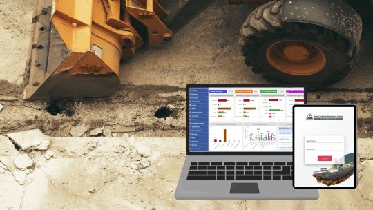
Text
Road Condition Monitoring System(RCMS): Enhancing Efficiency with AI-Powered Solutions
The quality and sustainability of road infrastructure play a pivotal role in societal development, economic growth, and the safety of communities. To address the challenges of road construction and maintenance, advanced digital tools such as Road Condition Monitoring Systems (RCMS) are becoming indispensable. Leveraging technologies like AI-powered pothole detection, data analytics, and interactive visualization, RCMS ensures efficient planning, monitoring, and maintenance of road networks.
#ai and gis road monitoring solutions#geospatial road management solutions#geospatial road monitoring system#gis based pothole mapping and detection#gis based road condition monitoring system#gis based road inspection software#gis based road survey solutions#gis data analysis for road monitoring#gis mapping for road condition analysis#gis road maintenance solutions#land management system#gis tools for road condition assessment#pothole detection using gis technology#real time road condition monitoring gis#road condition assessment using gis#road condition monitoring using gis#road infrastructure monitoring with gis#road maintenance gis software#road safety monitoring with gis systems#road surface monitoring with gis#smart road condition monitoring gis
0 notes
Text
AI, stands for artificial intelligence computer systems, that conduct tasks that historically required human intelligence to complete. This includes recognizing human speech, making decisions, identifying patterns, generating written content, steering a car or truck, and analyzing data. A lot of people today are wondering if the benefits of AI are worth the resulting human job losses, production efficiencies, cost savings, etc.? My new program, "Do We Really Want AI To Replace More Human Decision Making?"
#AI#artificial intelligence#Chat gpt#computer vision#computer systems#human intelligence#recognizing human speech#AI decision making#AI generated written content#driverless cars and trucks#AI data analysis#AI cost saving#AI production efficiencies#human job losses from AI#social media content recommendations#AI in medical diagnosis#AI identified trends and patterns#Google AI#Google search results#AI real time decisions#AI identified diseases#logistics management#AI marketing#AI could decide to take over#automated jobs#intrusive social surveillance#self aware AI
0 notes
Text
#Cybersecurity#AI in Cybersecurity#Threat Detection with AI#Cybersecurity and Artificial Intelligence#Future of Cybersecurity#Real-Time Cyber Threat Analysis#Cybersecurity Data Analysis
0 notes
Text
AI-Driven Insights: Enhancing Research Efficiency Through Real-Time Data Analysis
AI-Driven Insights: Enhancing Research Efficiency Through Real-Time Data Analysis
In a time when information is being generated at an alarming speed, the ability analyze data in real-time is crucial for researchers working in diverse areas. Data analysis in real-time provides immediate insight and faster decision making and fundamentally changing research methods. Artificial Intelligence (AI) tools are now proving to be crucial in improving this process, increasing the efficiency of research and its effectiveness. Photon Insights stands out as the leader in this area offering innovative AI solutions that enable researchers to tap into the full potential of live data analysis.
The Importance of Real-Time Data Analysis
Real-time data analysis is the ability to gather data, process, and analyze data when the data becomes accessible. This is essential due to a variety of reasons:
1. Instant Insights Researchers are able to make informed decisions based upon the most recent information, thus reducing the gap between the collection of data and the analysis.
2. Enhanced Response: In areas such as finance, healthcare or marketing, the capacity to respond quickly to new developments or problems is essential. In real-time, data lets researchers adapt their strategies rapidly.
3. Improved collaboration Real-time information facilitates more effective communication between the team and its stakeholders and ensures that everyone is in sync and is able to take action based upon the same information at the same time.
4. Data-Driven Decisions: Through using real-time analytics, companies can make their decisions based on reliable data instead of intuition, resulting in more reliable results.
Challenges of Traditional Data Analysis
Despite the benefits of real-time analytics, many companies continue to rely on old-fashioned methods that are unreliable and slow. Some of the biggest challenges are:
1. “Data overload”: Researchers typically confront huge volumes of data that come from various sources, making it challenging to find pertinent insights quickly.
2. Manual Processes Traditional analysis usually requires the collection of data manually and its processing, which could cause inefficiencies and increases the chance of human errors.
3. Fragmented Systems: Many companies utilize different systems to collect data and analysis, resulting in problems with efficiency and inconsistent results obtained.
4. “Lagging indicators”: Traditional methods typically use historical data that may not accurately represent the current developments or outcomes in the future which can limit the ability to take a proactive approach.
The Role of AI in Real-Time Data Analysis
AI technologies are revolutionizing the process of real-time data analysis through automation of processes, improving accuracy and providing deeper insights. Here are some of the major advantages of using AI in this regard:
1. Automatization of Data Processing: AI tools are able to automate the gathering as well as the cleaning and analysis of the data drastically cutting down on the time needed to analyze. Researchers can concentrate on the interpretation of results instead of becoming absorbed in manual work.
2. Advanced Analytics AI algorithmic analysis can analyse massive datasets in a short time, identifying the patterns or trends which are difficult for human eyes to recognize. This enables deeper insights and greater understanding of the data.
3. Predictive analytics: AI can forecast future outcomes based on live data that allows researchers to anticipate changes and react to changes in a timely manner. This ability to predict outcomes is especially important in areas that are dynamic like finance and healthcare.
4. Scalability: AI tools can easily adapt to the growing amount of data and ensure that researchers are able to keep up with the growing quantity of data produced within their fields of expertise.
5. Data Integration: AI helps to integrate data from different sources, resulting in a complete perspective that increases an analysis’s depth. This approach is holistic and allows researchers to draw deeper conclusions.
Photon Insights: Leading the Way in AI-Driven Data Analysis
Photon Insights is at the top of AI-powered real-time analysis, offering researchers the tools needed to improve their workflows and improve efficiency. This is how Photon Insights is different:
Key Features of Photon Insights
1. Seamless Data Integration: Photon Insights integrates data from various sources, including scientific publications, social media or enterprise systems — into one platform. This integration lets researchers examine all relevant data on one platform.
2. “User-Friendly” Interface The intuitive interface of the platform is accessible to users with varying levels of technical knowledge. Researchers are able to navigate the platform and gain information without requiring a lot of instruction.
3. Real-Time Analytics Dashboard Photon Insights offers a comprehensive dashboard that provides live data visualizations and analytics. Researchers can view the most important trends and metrics in a single glance, which facilitates faster decision-making.
4. “Customizable” Reporting: Users are able to produce reports that are customizable using real-time analysis of data, which ensures that users receive the most relevant information to their requirements.
5. “Collaborative features”: The Photon Insights promotes collaboration by permitting multiple users to access and review data simultaneously. This facilitates collaboration and makes sure that everyone is on the same page in their research activities.
Real-World Applications of AI in Research
The use of AI-driven real-time data analysis via platforms such as Photon Insights is transforming various research fields. Here are some examples:
1. Healthcare Clinical research real-time data analysis permits immediate monitoring of the outcomes of patients and treatment outcomes. AI tools can detect trends in the patient’s data, which allows faster adjustments to treatment protocols.
2. Market Research: Companies use real-time analytics to monitor consumer preferences, behavior along with market trend. This data informs products and marketing strategies and allows companies to react rapidly to changes in the market.
3. “Financial Service”: Institutions that utilize real-time data analysis in order to monitor market conditions, determine risks, and make informed investment decision. AI algorithms can analyse the performance of stocks and forecast market fluctuations, allowing traders make the most of opportunities.
4. Supply Chain Management Real-time data analysis improves the efficiency of supply chains by tracking the level of inventory, fluctuations in demand as well as the delivery time. Companies can improve their processes and cut expenses by reacting quickly to any changes.
The Future of Real-Time Data Analysis
While AI technology continue to develop and improve, the future of real-time data analysis is likely to be more transformative. A variety of trends are emerging:
Increased adoption of free AI Tool More companies are beginning to recognize the importance of AI for real-time data analysis, which is leading to the widespread adoption of AI-driven tools like Photon Insights.
2. Improved Predictive Capabilities As AI algorithms advance their predictive capabilities, they’ll be more precise and allow researchers to predict patterns and outcomes with greater accuracy.
3. Focus in Ethical AI As the use of AI expands the need for ethical AI will place more emphasis placed on ethical issues, such as data privacy, algorithmic transparency and bias reduction. Companies will have to adopt ethical AI practices to keep the trust of their customers.
4. Interdisciplinary Collaboration The integration with AI to analyze data in real time will promote collaboration between researchers across different disciplines. This approach to interdisciplinary research will spur innovations and will lead to breakthroughs in a variety of fields.
Conclusion
Research is being revolutionized by real-time analytics of data. methods and allowing researchers to gain immediate insights and make educated decisions. AI tools play an important part in enhancing this procedure, by automating data collection and analysis and improving the overall effectiveness of research. Photon Insights is at the leading edge of this revolution offering powerful AI-driven solutions that help researchers deal with the complexity of information in real time.
As the landscape of research is constantly evolving, adopting an AI driven real-time analysis of data will become essential for companies looking to stay competitive and innovating. Through the use of platforms such as Photon Insights, researchers can attain new levels of collaboration, efficiency, and understanding, ultimately driving forward and improving in various disciplines. Future research possibilities are upon us and AI is leading the way.
#AI in real time data analysis#Financial research#researchers#photon insights#photon live#documents insights#free AI tool#AI tool for students#AI Research Assistant
0 notes
Text
THE IMPACT OF SOCIAL MEDIA ON POLICE INTELLIGENCE OPERATIONS
THE IMPACT OF SOCIAL MEDIA ON POLICE INTELLIGENCE OPERATIONS 1.1 Introduction The rise of social media has significantly transformed the way police gather intelligence, respond to incidents, and engage with the public. Platforms such as Facebook, Twitter, Instagram, and others provide law enforcement agencies with vast amounts of information that can be used to monitor criminal activities,…
#Case Studies#Community Policing#Crisis Communication#Crowdsourcing Intelligence#data analysis#Digital Footprint#ethical considerations#Incident Reporting#intelligence gathering#Interagency collaboration#Misinformation#Predictive policing#PRIVACY CONCERNS#Public engagement#real-time information#Response Strategies#social media monitoring#social media platforms#Surveillance Techniques#THE IMPACT OF SOCIAL MEDIA ON POLICE INTELLIGENCE OPERATIONS#Threat Assessment
0 notes
Text
Discover Real-Time Market Insights with StockNextt
Stay ahead in the stock market with StockNextt, your ultimate source for real-time data and expert analysis. From stock tracking to market trends, StockNextt offers the insights you need to make informed trading decisions and navigate the financial landscape confidently. Unlock powerful tools that keep you up-to-date on the latest market movements. For more info, visit: StockNextt.
#StockNextt#Stock market analysis#Real-time stock data#Trading strategies#Investment insights#Market trends#Stock tracking tools#Financial analysis#Trading platform#Investment tips#Market performance#Stock market updates#Trading success#Portfolio management#Investment opportunities.
0 notes