#Process
Explore tagged Tumblr posts
Note
I’m absolutely obsessed with your art! Your art is such an inspiration, and I like to analyze it to make my own work grow (don’t worry, I am not copying ur style. Perfection is impossible to cheat off of)
I’d like to know- How do you get that dot/noise-ish texture? In the tmnt art you made, one is Raphael’s arm had a bright cyan light from it, but then fades into little dots- I’d like to know how you do that.
Ofc you don’t gotta answer! If you see this in your inbox and don’t want to answer, that’s okay <3
hi! firstly thank u im flattered ;_; secondly its funny to get this ask because i actually made a tutorial for this months ago and i was like.....actually im a little anti-tutorial because i think online art communities pass them around and treat them as a "you've been doing art WRONG this is the RIGHT way" thing and not as like. individual technique sharing. idk. also nobody asked so im not gonna post this. but u asked so... here i am posting it LOL

basically its just the dissolve brush mode in photoshop with the softest default brush + some sneaky masking to get the right fall off/shadows that i want. u can technically use eraser instead of masking but idk i find its a pain to edit afterwards.
this has kind of been my default coloring method for the past... year plus now? basically i just do all the work in my inks/flats stage and all i do for "paint" boils down to like. 2-3 of these lighting layers (normally one key light and one bounce light. sometimes more key lights depending on how much i hate myself) i used to do shadows with this too but then i stopped because it was getting too complicated. sometimes if i want it to be glowy ill throw a frickin.... outer glow layer style on the light layer too.
you can also see me kind of work thru this method in a couple tiktoks (1) (2)
#ask#im gonna make this not rebloggable because i dont want people following me for tutorials LOL#process
208 notes
·
View notes
Text
20 notes
·
View notes
Text
gonna show u guys a little opalescent highlight hack i threw together today
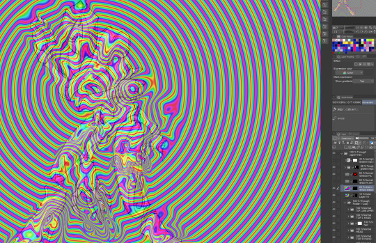
rainbow gradient above your main figure (i usually have all my main figure folders/layers in one big folder, so i can clip gradient maps + adjustments to it!). liquify tool to push the colors around a bit. STAY WITH ME I KNOW IT LOOKS STUPID RN I'M GOING SOMEWHERE WITH THIS
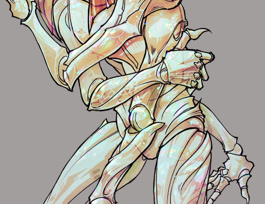
THEN: set it to add/glow (or the equivalent in ur drawing program), lower the opacity a bit, and apply a layer mask. then u can edit the mask with whatever tools you like to create rainbow highlights!!
in this case i'm mostly using the lasso fill tool to chip out little facets, but i've also done some soft airbrushing to bring in larger rainbow swirls in some areas. it's pretty subtle here, but you can see it better when i remove the gradient map that's above everything, since below i'm working in greyscale:
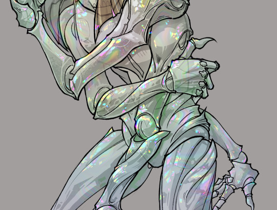
more granular rambling beneath the cut!
u could also just do this with a brush that has color jitter, but what i like about using layer masks for highlight/shading layers is how simple and reversible it makes everything. i can use whatever brushes i want, and erasing/redoing things is super low stakes, which is great when i often approach this stuff with a super trial-and-error approach.
example: have u ever thrown a gradient w multiple colors over an entire piece, set it to multiply etc, and then tried to erase it away to carve out shadows/highlights? it's super frustrating, bc it looks really good, but if u erase something and then change ur mind later, u basically would have to like. recreate the gradient in the area u want to cover up again. that's how i used to do things before figuring out layer masks!! but masking basically creates a version of this with INFINITE undo bc u can erase/re-place the base layer whenever u want.
anyway, back to rambling about this specific method:
i actually have TWO of these layers on this piece (one with the liquified swirls shown above, and another that's just a normal concentric circle gradient with much broader stripes) so i can vary the highlights easily as needed.
since i've basically hidden the rainbow pattern from myself, the colors in each brushstroke i make will kind of be a surprise, which isn't always great -- but easily fixable! for example, if i carve out a highlight and it turns out the rainbow pattern in that area is way too stripey, i can just switch from editing the mask to editing the main layer and blur that spot a bit.
also, this isn't a full explanation of the overall transparency effect in these screencaps! there's other layer stuff happening below the rainbow highlights, but the short version is i have all this character's body parts in different folders, each with their own lineart and background fill, and then the fill opacity is lowered and there's multiply layers clipped to that -- blah blah it's a whole thing. maybe i'll have a whole rundown on this on patreon later. uhhh i think that's it tho! i hope u get something useful out of this extremely specific thing i did lmao
12K notes
·
View notes
Text
forever repeating 'trust the process' in my head while making these marker portrait studies 😅 #brbchasingdreams
🎵 Blue Wednesday - Things In Between
#brbchasingdreams#art#art process#mixed media#alcohol marker#marker#marker art#portrait#study#art style#skin#skin tones#sketch#female#portraiture#process#drawing#artist#artists on tumblr#illustration
9K notes
·
View notes
Text
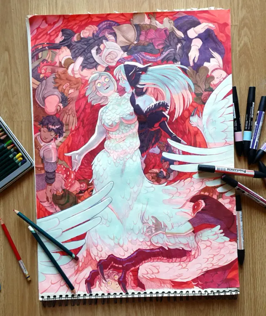
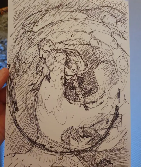
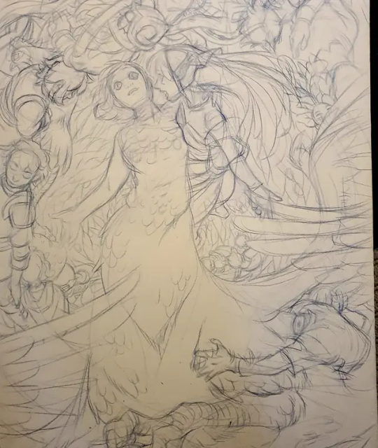
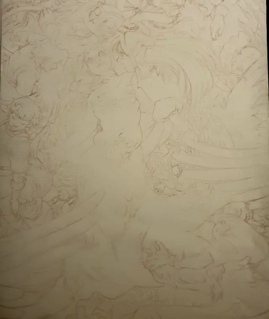
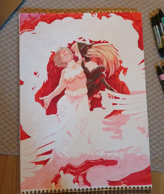
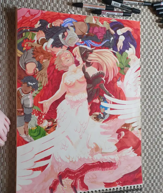
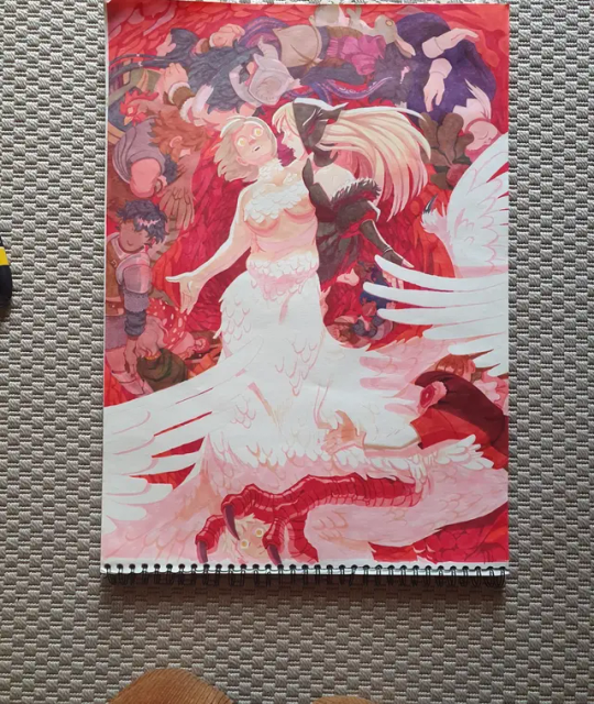
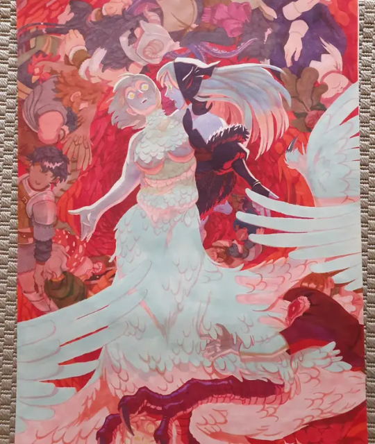
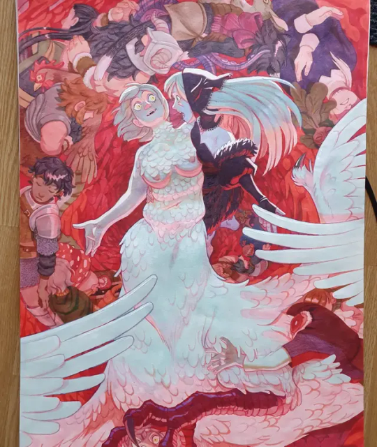
I actually took photos of my process this time! I always look for these when i try to learn the medium, so here you go! Details on the process is in the alt text!
6K notes
·
View notes
Text


“Heaven’s Devils”, by Joe Lansdale and Bruce Timm.


#Heaven’s Devils#the Rocketeer#Betty#Cliff Secord#Splash Page Process#Splash Page#Process#Cover Process#Joe Lansdale#Bruce Timm#Spicy Adventure Stories#Master Class#Comics#Art#Illustration
32 notes
·
View notes
Text
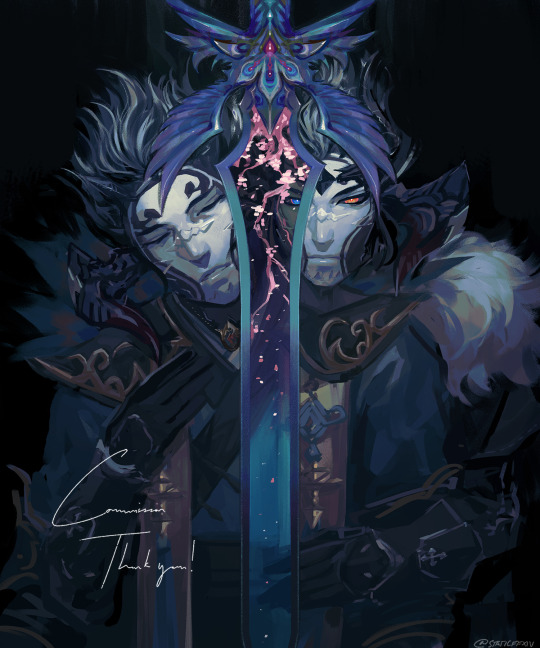
Commission o7 Process below the cut
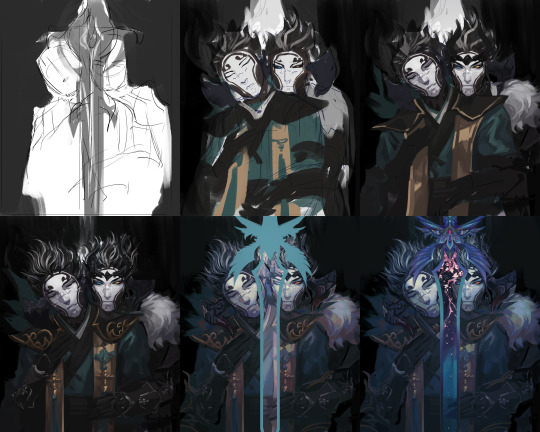
5K notes
·
View notes
Text
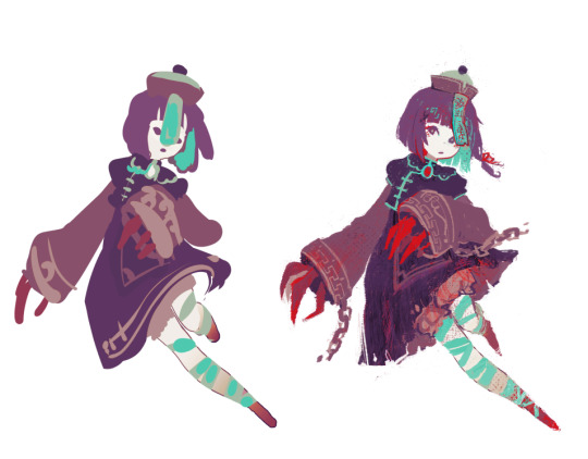
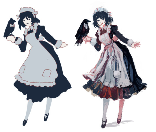
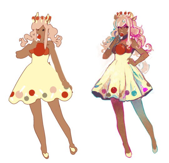
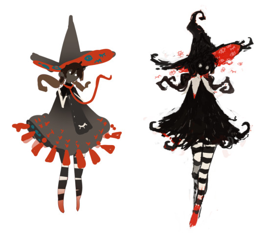
wip vs finals; paint-blob edition
#process#been having a field day experimenting with the layer outline setting#these ones too i was trying out layer screentones as texture
1K notes
·
View notes
Note
how would you go about drawing a double chin on a thin person with a thin neck? i have one and i never know how to portray it
oh i have this bc i have a weak ass chin
dis is some examples of how i like to do it...this is with the assumption of not much face fat as well. i like the half line leading to the chin, half line leading to the neck to make the fold.....but depending on how much fat, the chin bump just sits separately from the sides of the face. i find the neck also widens closer closer to the jaw bc of the mass accumulating there
as for 3/4s it also depends on how much fat but the chin existing as its own separate little landmark to imply more fat below it still applies

585 notes
·
View notes
Text


i only remembered to take one wip screenshot of some of my ms paint doods which makes for the funniest and most useless process pics
#random blobs > fully finished thing#you know the meme that's like “draw 2 circles. now draw the rest of the fucking owl” thats what feels like#wip#process#ms paint
519 notes
·
View notes
Text

Trying to jump back on productive wave, so doing fast daily sketches
804 notes
·
View notes
Text
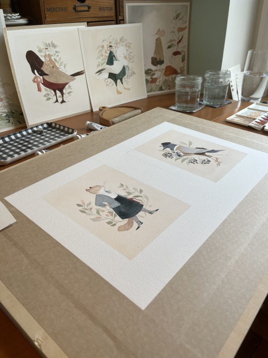
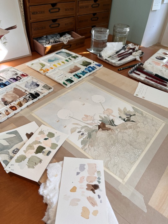
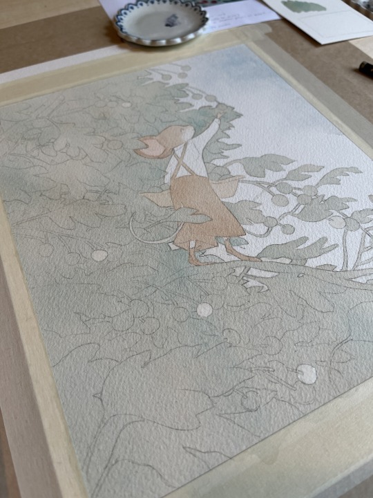
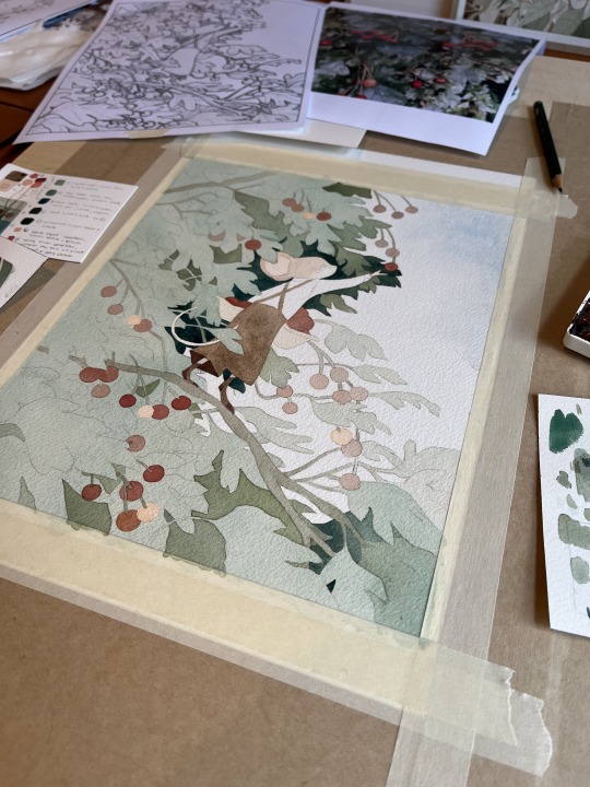
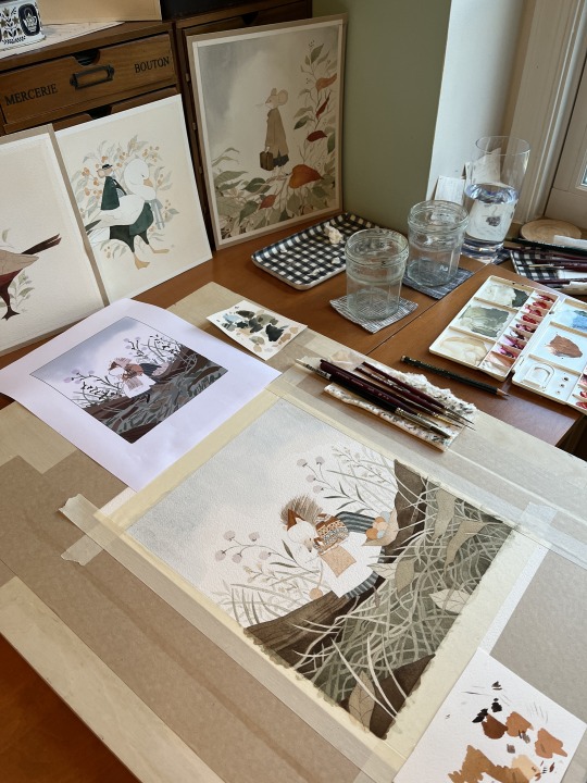
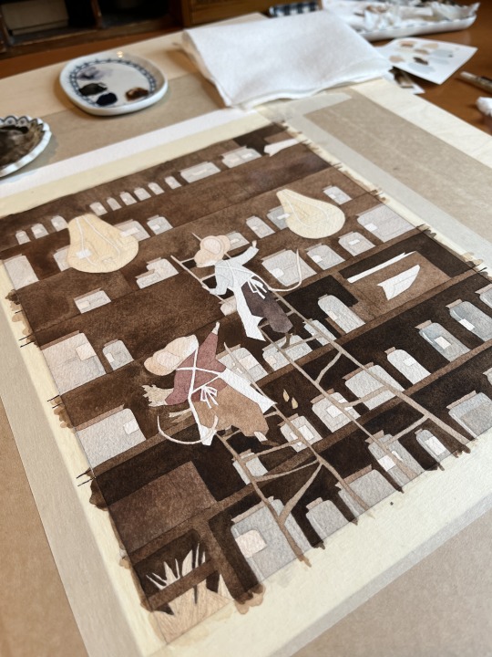
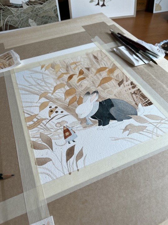
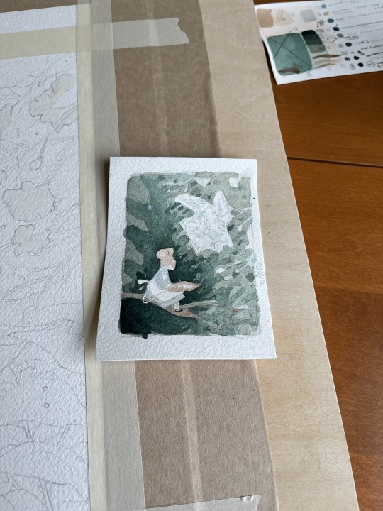
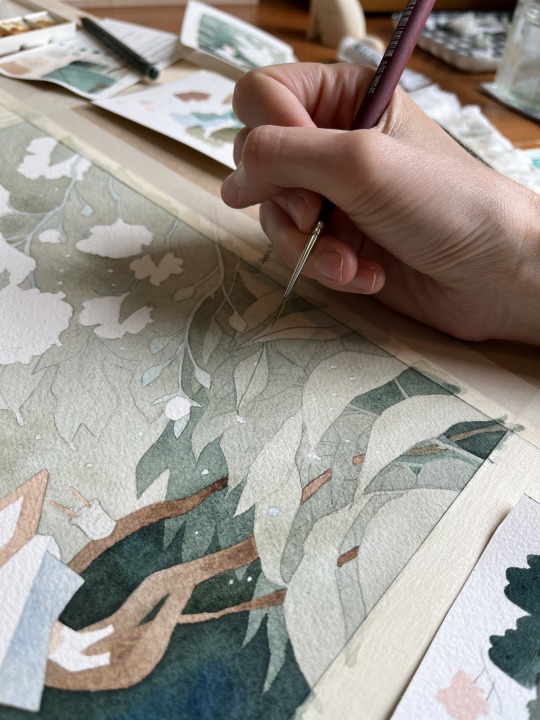
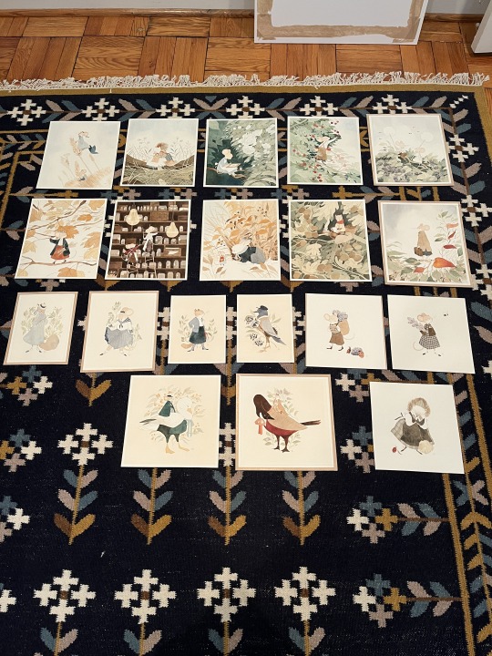
As promised...process shots! All of my pieces for my solo show at Nucleus Portland were painted in gouache with a tiny bit of watercolor at the end. A lot of these originals as well as prints are available here!
1K notes
·
View notes
Text
👻Ghost Lady process👻
The footage waited years for me, and finally it could become a lil video. >Finished illustration here<
#myart#traditional art#folktale#folklore#video#art process#ghost lady#illustration#traditional illustration#artists on tumblr#ghost#fair lady#hungarian inspired#anilinky#salt#deleter ink#white gel pen#white lines#little nightmares ost#process#watercolor pencils
696 notes
·
View notes
Text

Quick sketch study ✍️
I must do more studies before finishing any other pieces 🫠
Time-lapse of the process:
Get print:
#artwork#digital painting#sketch#digital portrait#ascended astarion#astarion#baldurs gate astarion#bg3#drawing#digital art#bg3 astarion#timelapse#quick sketch#process
2K notes
·
View notes
Text

i…had time at waiting room earlier today lol
some durging around
1K notes
·
View notes