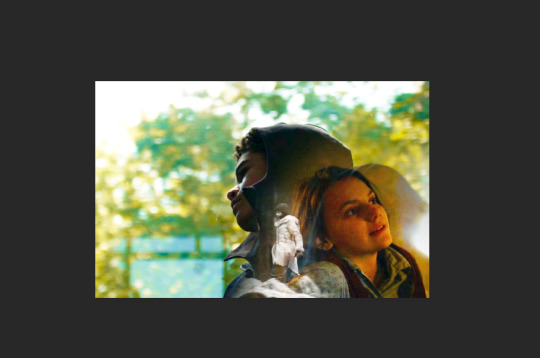
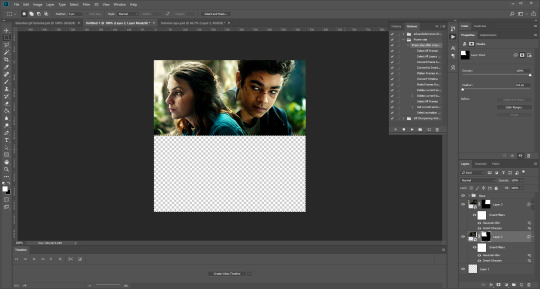
#I’ll have to mess with the .png file a bit so just you and I can see it but it’s there.
Note
heyyy! i saw that the, eugh, Narrator disabled the dino game and im sorry about that. best wishes. can't do much from here but i wanted to send you this.
you're doing great.

[ okay, for the blog moderator: i have no idea if im allowed to send like like. an actual dino plush or just a pic. and ive also got no idea how 432 sees the asks you can choose how he's gonna perceive this i dont mind i just think they deserve . good thing. whether it be a tangible dino plush or just a picture of one KJSNDFKS ]

#I’ll have to mess with the .png file a bit so just you and I can see it but it’s there.#I’m really lucky that files like these are real for me. I have no idea what I’d do.#Well. It still looks like an image file in your perception. Two sides of the same coin I suppose?#It doesn’t matter anyways. Thanks for this. Really.
7 notes
·
View notes
Photo


McGuffey’s Reader - Historical Homework Defaults
Hello! As per the usual Saturday procrastination session, I have a new piece of cc for you!
I’ve been playing my decades challenge recently, and while scrolling through old photos, I realized that I hadn’t been able to find a good default for the homework in ts4, and the yellow one that came with the game definitely wouldn’t cut it in almost any historical time period, so I created these!
This was originally just going to be McGuffey’s Reader, which was commonly used in the 19th and 20th centuries in elementary schools (at least in America, as far as I know), but I hit a slight roadblock: the textures on the homework are, by default, incredibly small.
Although I got my originally idea into my game, it didn’t look as good as I’d hoped, and any attempts to upsize the texture and still have it function proved futile. So, I also included some options with leather books, as well as a red and blue option for variety. And here we are!
Remember: you can only use one default in your game at a time!
I’ll probably mess around with these textures some more and see if I can get a larger texture to work properly, but until then, I’ve also included all (I mean literally everything, I like organizing a little bit too much sometimes) of the things I used (textures, psds, etc.) to create these, so you can customize them to your heart’s content!
I finally got around to updating these textures to be higher-res, and adding recolor options which can be used alongside the defaults. However, keep in mind that books can’t be recolored with the design tool, so you’d have to purchase the homework in other colors via the order>order books option on a computer.
I also plan to do a version for the university homework, but I’m a bit pressed for time, and the uni homework is mapped differently for some reason, so I’d have to redo the textures, but look out for that in the next few weeks! Now includes defaults for the high school/secondary school homework as well as the university homework!
Enjoy your (slightly) more historically accurate games!
and yes I just now realized that I spelt McGuffey’s as McGuffrey’s but it’s all in simlish so it’s fine
Download: MEGA/Box
credits: simulacrabymotherof70 for their original medieval defaults here, serindipitysims for the palette, and @willowcreekbaby’s original 1920s homework defaults for inspiration (which I can’t seem to find right now, and their blog is gone, so feel free to drop me a link if you have one)!
Update 3/21/21: Added new colors from @serindipitysims’s Historian Palette, and removed the McGuffey one, since it’s incredibly low quality and I want to see if I can fix it. If anyone still wants it for some reason, the old files are here: creator’s kit (OLD, the download above has the updated one)/original defaults (OLD)
Update 3/27/21: Added defaults for high school/secondary school and university, + updated all of them to use dds textures rather than pngs.
Update 7/15/21: I finally got around to updating these with higher-res textures, and added recolor options to be used alongside the defaults, so please redownload!
#gif#gif warning#ts4#the sims 4#s4#sims 4 historical#sims 4 history#ts4 historical#ts4 history#decades challenge#simblr#ts4 decades challenge#the sims 4 decades challenge#historical simblr#ts4cc#s4cc#cc#the sims 4 cc#sims 4 historical cc#ts4 historical cc#ts4 victorian cc#ts4 edwardian cc#ts4 medieval cc
665 notes
·
View notes
Photo

Requested by @tennant!
For this tutorial you will need:
Some basic gif-making knowledge (see my last tutorial!)
I’ll be using CC 2017 to do this, but as long as you have the timeline option, this will work for you! 🥰
So, in a sort of part two to my other gif tutorial, (https://luke-patterson.tumblr.com/post/636980573506813952/) this is a slightly more advanced part of gif-making. But I promise it’s easy when you know how!
Assuming you followed the last one, you’ll already know how to make your gifs into a smart object, so we’ll start there!
PART ONE: BLENDING
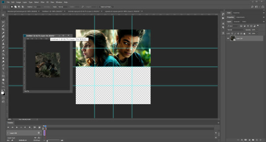
Drag both of your gifs into the same file. For this to work, your gifs have to be the same number of frames, or at least cropped to the same length in the timeline window, otherwise one will loop before the other, and it will mess up the loop of the gif. (For when we get to the multiple gif part, I recommend having between 60-80 frames, so it stays under tumblr’s 10 MB limit.) As this tutorial uses smart layers, they can both be sharpened as well.
(I made this gif 540 px by 268 px, because I’m going to add more to it later. But we’ll cover that further down in part two!)
Honestly, I find it so much easier to put my colouring on top of both/all the gifs, and then clip individual layers down onto a specific gif, if that one needs more of its own colouring. That way, the extra layers don’t interfere with the other gif(s). It’s so much less confusing visually for me than having lots of groups with their own colourings, and it makes moving the gifs around simpler.

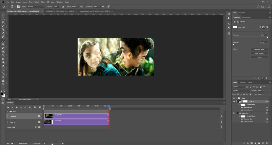
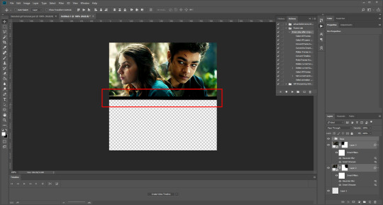
Position them side by side, one on top of the other. Obviously, you can play around with the positioning: this may be easier to do once they are blended, especially as some gifs may be smaller and you need to try them in different places. For example, this is a screenshot of a Lyra/Will set I made in the past, with three blended gifs of different sizes:
Add a layer mask to both of your gifs. You might not need to edit both, but I usually do, as I like to balance how much one gif blends into another! Using the brush tool (set to black, when you’ve clicked on the layer mask), we want the brush to be very big, and very soft.
The bigger the brush, the more seamless the blending will be! By painting parts of the top gif away, the other gif will start to appear underneath. It’s not always necessary, but I usually like to set my top gif to ‘screen’ as well. This helps the gifs merge into one another even more, especially if you have one gif which is darker than the other!
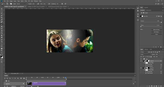
As you can see, by setting it to screen, the top gif has already started to look blended. Then, you can start to paint. As the brush is so big, you might end up painting away too much of the gifs, like so:
I usually go back and forth, switching between black to remove parts of the gif, and white to add it back (always painting on the layer masks). Sometimes, you might need to make the brush slightly smaller, just to fill in tiny gaps.
Another thing you can do is to add a solid black colour underneath all your gifs, just to fill in any spaces. (Sometimes, I do this on top of gifs too, to create spaces where I want blended gifs to go, like in my current header!):

Anyway, back to the original gif. My blended gif is now pretty much how I want it to be, except Lyra is quite far to the left, and Will is taking up a lot of the screen:
So I’m going to see how they look at the start of the gif, to determine how far right I need to move them both to get them mostly in the middle:

And that’s it! Now you can export them [file > export > save for web (legacy)] and you’ll have to change the timing back to 0.05, or use the action I introduced to do this in my last tutorial.
PART TWO: MULTIPLE GIFS
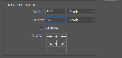
To put more gifs underneath this one I’ve made, I expanded my canvas. Go to image > canvas size. Make sure you click the little ball to the top in the anchor section, so the canvas expands underneath your gif. If you leave it in the centre, it will simply expand from the middle, or the left, right, etc.
Next, we need to remove the black line at the bottom of the gif.
You want to select the space for cropping using the rectangular marquee tool, so in this case, 540 px by 268 px. The tumblr spacing is 4px between each gif in a set, so however many gifs you want, you have to account for 4px less pixels inside your one gif, to give the illusion there are multiple (unless you want them to touch).
For example, (there’s a little maths here: forgive me!) two gifs of equal size, placed side by side, must be 268px in width or length, because (268 x 2) + 4 = 540. (There is one 4px gap in between). For four gifs, it would be (132 x 4) + 12 = 540. (For the three, 4px gaps). For three gifs of equal size, it’s a bit different. These must be 177px, 178px, and 177px, to ensure there is 8px of space left over (two gaps).

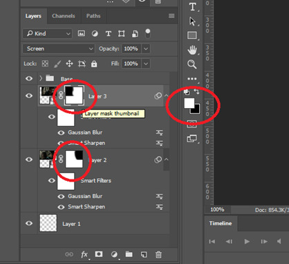
Then, make sure the colour white is the primary colour selected on the paint pad (this is vital) and (in this case), the layer mask from before when we blended, is selected. Press ctrl (command on mac), shift, and i to invert your highlighted area (or select > inverse) and then simply delete the excess line, (either using the delete button on windows, or fn + delete on mac, I think!) Then, do this again for the other gif.
And voilà! It’s gone. You can also paint it out (using the black colour as the primary colour to erase), but I would still recommend highlighting the outline of the area you want to erase, using the marquee tool, so that you can paint it out in a straight line, and don’t paint into your gif and erase parts of that by accident.

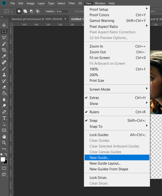
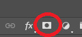
Now to add in the other gifs! To do this, I use guides, but you can also use lines at a size of 4px, to map out the spaces in between gifs. If you go with lines, just make sure you delete the shapes after. With guides, they are not actually ‘in’ your gif, so you don’t have to remove them before you save. However, guides only work for straight lines, so gifs with other shapes will need to be made using lines, (but I will touch on that at the end!)
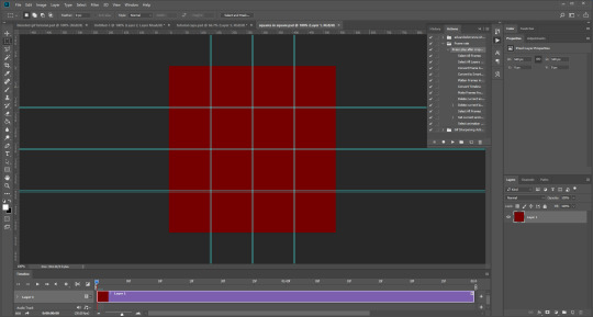
I actually have a few psds saved with guides already on, so that I don’t have to draw them out every time. If I was making a set with three gifs in a row, this would be different, but I usually stick to two or four (or three with one big square/rectangle, and two little squares), so this is my most used psd. The guides are set at: 132 px & 136 px, 268 px & 272 px, and 404 px & 408 px, both horizontally and vertically!
I have a red colour underneath just because I find it easier to see the lines between gifs this way - if you do the same, just remember to turn it off before you save your gif, otherwise it will have the colour red instead of mimicking the transparency between gifs.
Now, make a second gif! I decided to have a square in the middle as you can see in the title, and then two rectangles either side.
Then you want to resize it, in this case to 268 px by 268 px, and drag it across into your main file, or go to layer > duplicate layer, and move it that way. Don’t worry, when you move it, it will show the whole gif as if you haven’t cropped it. The reason I crop and resize it beforehand, is so that I can ensure it will be the correct size when I remove the excess parts of the gifs I don’t want, (rather than making it 268px including the black line for example, which would be wrong.)
Then, as before, position the gif where you want it to go, and highlight the area you want to be in the gif. Whilst this is selected, (again ensure white is the primary colour on your paint pad), click the layer mask:
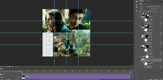
Then the excess around the gif should be gone! (Making a gif of a gif tutorial... meta, lmao.) This way, if you decide you want to change the shape of the gif, or move it slightly, you can just paint parts in and out, or delete the layer mask, move the gif, and reapply it!
You can then sharpen and adjust your colouring to the gif as needed! Next, go ahead and repeat this process for your other gifs. Selecting the area, adding a mask, and sharpening. By the end, you should have something that looks like this:
PART THREE: OTHER SHAPES
If you want to use other shapes (which I haven’t tried myself until now, but I can talk you through some thoughts!) You can use the line tool. So, for example you could make a layer with the lines at 4px, merge it, and then at the end delete it from your gif to leave the gaps transparent:
To make a gif any shape you want, choose a shape (either use the shape tool, or get a png of it), and using a clipping mask. Make sure your gif is above the shape layer, then right-click the gif layer, and select create clipping mask to clip it down:
OR you could use a circle, and then delete the circle to make it look transparent:
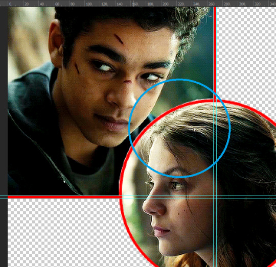
The best way to select items which are not rectangular, (so you can’t use the marquee tool), is to use the pen tool. Click around your gif so that it’s got a border of what you want selected. Once you have outlined your gif, right-click and choose make selection:
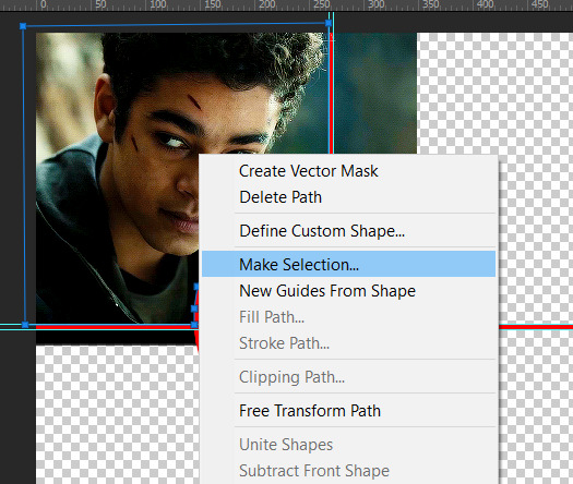
Then set the feather radius to 0, and then the area you want should be highlighted in the same way as with the marquee tool above, so you can add a layer mask, etc. However, as the pen tool is not always that accurate, there is a little white gap here where it’s not a perfect circle.
A way to overcome this could be to make all the gifs you want, and then simply add one on top with a white 4px border, so it gives the illusion of being transparent! (As I have done above, but save it as white rather than red!)
If I find a better way to do this in the future, I will update this tutorial. I hope this is helpful, and thank you for reading 🥰💖
#gif tutorial#tutorial*#completeresources#yeahps#chaoticresources#allresources#mikesmom#usertom#usersmile#heavensentnetwork#if there's any mistakes pls let me know#i am so tired rn fjghfjhgfjgh
703 notes
·
View notes
Text
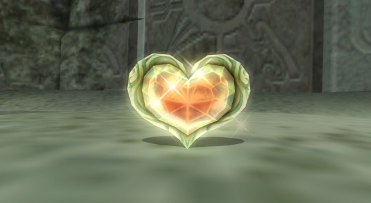
So, as some of you might know, one of my GIFs was recently featured on the Tumblr Radar - which is pretty cool! I was fairly happy with how that one turned out, especially considering that I made it rather last-minute on a whim to acknowledge Valentine’s Day. It understandably received a lot of attention as a result of this, and I’ve loved reading through all the comments and tags (especially all the ones about how people want to eat the heart containers from TP); however, I wanted to clear up a bit of a misunderstanding surrounding the creation of that GIF, as there were additionally a lot of tags along the lines of #3d art or #artists on tumblr in that influx of reblogs. I don’t want to take credit for something I didn’t do, even accidentally, and so allow me to be perfectly clear: the heart container GIF is not something I modeled and rendered myself! It is the original in-game model, recorded in-game using the Dolphin GCN/Wii emulator, with very little done in the way of post-processing in Photoshop. If that sounds impossible or confusing (which is perfectly understandable, for those of you unaware of what Dolphin is capable of), I’d like to take this opportunity to give you guys a bit of a “peek behind the curtain,” as it were, to show you guys exactly how I made that particular GIF, as well as similar ones I’ve made (such as those in my #items tag).
I didn’t take screenshots of my initial process (nor did I save the edited textures I used), so I’ll be recreating it from the ground up for the sake of demonstration, but that shouldn’t be a problem.
First thing’s first: finding a heart container! For this particular GIF, I wound up using the one that spawns after the Morpheel fight at the end of Lakebed Temple. I’m sure many others would work just as well (I think, at the time, this one just happened to be the most accessible to me), but let’s use the same one for the sake of it.
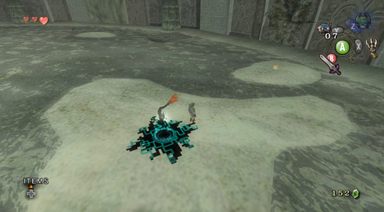
Morpheel: defeated. And I didn’t even need Zora Armor! (Seriously, we do that in the speedrun. But I’m getting off-topic.) Of course, we’re going to need clean, close-up footage of the heart container rotating in order to do what we want to do, so let’s shift into first-person mode and and get a bit closer to the thing.
Now, because the only UI-element in this shot is Link’s health (and it’s in the corner and relatively non-obtrusive), removing it isn’t strictly necessary - but I’ve already made a texture pack that removes UI elements as part of my Text Free TP project from a while back, so let’s load it anyway, for the sake of being thorough. This shot is also still a bit too far away, so next we’ll be utilizing Dolphin’s free cam feature (which can be accessed by going to Graphics > Advanced > Free Look and checking “Enable” in Dolphin) in order to get the heart container in a more central position. Now we’re left with this:
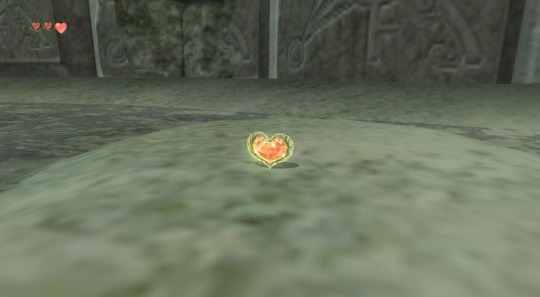
And we’re already looking well on our way to making a nice, solid color background GIF. But how do we get the solid color? Well, that’s where more texture editing comes into play - and here I have to give credit where credit is due, as this is a trick I picked up from 186px, after wondering how they were able to make this GIFset of Link fighting Ganondorf in The Wind Waker in a great, black void. (Seriously, shoutouts to them, their stuff was and still is amazing.)
But, very basically, we’ll be using Dolphin’s texture dump feature in order to find the textures that need to be edited so we can replace them with pure black ones. Texture dumping can be enabled by going to Graphics > Advanced > Utility and checking “Dump Textures,” and the file path for these dumped textures by default is Documents > Dolphin Emulator > Dump > Textures > [Game ID]. (In the case of Twilight Princess, the Game ID is GZ2E01). After dumping the textures in the Morpheel arena, my GZ2E01 folder looks like this:
When editing textures, sometimes you’ll have to endure a bit of trial and error until you find the correct ones. Luckily, in this scene, the textures making up the sand floor and the stone walls are rather large, so let’s isolate the ones we’re pretty sure are responsible (plus a few others that are obviously environmental, just to be safe).
Now, when loading custom textures, it’s important that the file name you’re trying to load matches up exactly with the original texture that you’re trying to replace. I have a plain, black, square PNG that I keep on my desktop specifically for this purpose; I copy the file names of the textures I’ve isolated, then rename and drag and drop the black PNG into the folder where custom textures are loaded (Documents > Dolphin Emulator > Load > Textures > [Game ID]). Like so:
And now, to refresh our custom textures by disabling and reenabling them in Dolphin’s graphics settings:
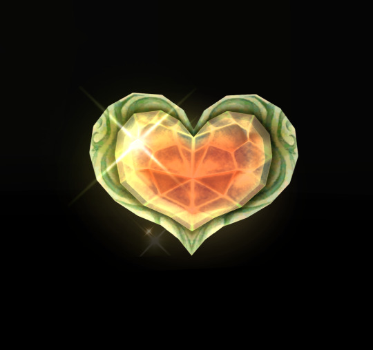
And voilà! We have something that very nearly resembles the GIF I made (well, a still of it, at least). I skipped over a few details, such as the fact that TP has a pretty significant amount of bloom surrounding just about everything, which I’m fairly certain I disabled using cheat codes when I made the original GIF in order to give it an overall cleaner look. It’s hard to tell from this still, but TP’s heart containers also sparkle considerably in a way that’s random and not loopable; I found the texture responsible for this sparkle and replaced it with a transparent 1x1 PNG, in order to remove it entirely (as well as the texture behind the “glow” of the thing). After that, it was as simple as recording the game with OBS, dumping the MP4 into Photoshop, cropping and cutting it to make it loop, and adding some adjustment layers for contrast and color. So...yeah!
I hope this has served to clear up any confusion about some of the things that I’ve made in the past. I’m not a 3D artist - just a person with an emulator and way too much free time on their hands. This stuff is really, super simple, and also lots of fun, so I would highly encourage anyone with the means to mess around with emulation on their own some time to see what they can do! (Even if you don’t have Photoshop and can’t make GIFs, there are always edits, such as this one I made of Midna.) For Twilight Princess in particular, I also highly recommend checking out TPGZ; it’s a patch you can apply to a clean ISO of the original game, designed with the purposes of helping folks learn and practice the speedruns (yes, I had to bring up speedrunning one last time, kill me), but it’s got nifty features like built-in savestates, cheat codes, and HUD removal, as well as the ability to freeze actors while maintaining the ability to move the camera freely, among other things (all things that are very useful as far as making unique graphics go). Sorry this post got as long as it did, but I at the very least hope that some of you found it educational and/or interesting. Cheers!
#uhhhhh i don't even know how to tag this#not like it will show up in the tags anyway because i've linked five billion things#twilight princess#long post#tutorials#i guess????#resources#myposts*#i didn't intend for this to be a tutorial i just wanted to explain that i'm not a 3d artist lmfao#OTL
72 notes
·
View notes
Text
.png
Word Count: 1.4k
Warning/s: toxic relationship dynamics, dark!bucky x dark!reader, stalking, coercion and lying, manipulative tendencies, injuries and blood mention, food was mentioned for a bit
A/N: WE ARE GETTING THERE, BABES WHEW OKAY
follow the CTRL series:
i - .exe
ii - .avi
iii - .raw
iv - .png
v - .zip
CTRL playlist
CTRL moodboard
A month had passed since your not-date date had happened. You tried to forget the rest of the day, only focusing on how he looked and talked to you that day. How he smiled, trying to play off the ‘cool guy’ narrative.
You suddenly grew cold, noticing how your conversations became sparse—dry in between. Fewer texts and long waits. It made you nervous, sad, and a little bit annoyed. You barely see him around the office too—has Bucky been avoiding you?
His office is a bit out of the way for you to accidentally stumble in, anyway; the days you’re in the office were unsynchronized. Would it count as a punishable offense if you mess up with your company-approved laptop?
Saying you missed Bucky is an understatement: the bottle of cologne that smells like him sits empty on your dresser. The pictures you took of him taped loosely on your corkboard. Bits and pieces of papers he gave you tacked on it haphazardly.
Can someone die from loneliness?
Is this what being in love feels like?
Suffocating, consuming, your chest feels heavy, and your stomach is in knots.
—
Another month, another throng of employees needing new passwords. There are literal posters around the floor reminding everyone to use a password manager. Bucky can’t believe that he has to work with idiots around him. When he took up computer science as a major in college, he imagined himself hacking into… government intel, or something. Not looking after dimwits that don't know how to install an update.
His text messages are red with notifications—bank updates, deliveries, and you.
For some reason, Bucky can’t bring himself up to return your messages. Hi’s, hey’s, and how are you’s littered his text chain. Is he a bad person for not replying back? He can always just make up an excuse, right?
When you told him that you liked him, kissed him like you meant it, his fondness dispersed into thin air. The easy is never worthy and the worthy is never easy, as his father told him.
A ding from his phone brought him forth, another text from you: coming up right now, can we talk?
Now, he can’t come up with an excuse.
—
Bucky heard you before you come in, knocking on his door like the first time you met.
He clears his throat, calling out a come in! before rolling back from his cluttered desk. Tickets were few and far in between, he knows he can spare you at least 20 minutes but he just doesn’t want to.
“Hey,” you said, your head poking into his office. You weren’t entirely sure why you came up here in the first place, you really, really, really just wanted to see him again.
Bucky chuckles, pulling the door open for you. “What’s up? Is everything okay?”
You breathe out a little, shaking the feeling sinking deep inside your stomach, “yeah. Yeah, everything’s fine.” Stepping into his office, you eye his desk. He’s been busy. Papers and files are piling up on the left side of his desk, half of his setup is covered with those post-it notes. Several mugs littered his small space.
Huh, “Sorry, I can come back some other time.”
Turning on your heel, you pivot a little to grab the door when Bucky grabs your upper arm, “don’t go—”
He realizes the implications if someone were to see the two of you and so he lets go, much to your discomfort. You face him, either way, you’re sure he’s not gonna let you go that easily.
“Sorry, it’s just- I missed you.”
And there it was. I missed you.
He was thinking about you.
He was thinking about you.
He was thinking about you.
He was thinking about you.
He was thinking about you.
“I was just gonna drop off some files… But,” you rake your brain for a coherent train of thought, “I missed you too.”
A smile of relief overcomes Bucky’s features, his eyes crinkling just the way you like. His steely blue eyes hidden beneath his lashes.
“I have uh, a thing later… Dinner with friends—do you wanna come?” You make a show of peering over his shoulder and onto his desk, “unless you’re busy?”
“I’d love to come.” He says, tucking his pointer finger underneath your chin, flicking it forward so you’d look at him, “what time is it?”
“Come by around seven. I’ll text you my address.”
Bucky doesn’t need your address. He already came a dozen times by your building, trying to build up the nerve to knock on your door and kiss you silly. Like in those movies you watch late at night.
But he’s conflicted, no?
Are you really as good as they come?
—
At six-thirty, you already sent the text: take the east street, beige apartment block. I’m on the third floor, second door to your right. :)
At six-fifty five, Bucky’s already there, his car idling on the sidewalk. He’s… nervous. Why is he nervous? It’s just dinner. A small get-together with friends. Speaking of friends, he didn’t see any unfamiliar cars parked on the block. Maybe it’s not work friends?
Letting out a sigh, Bucky fetches the small bouquet of flowers and wine he brought, just in case. He doesn’t wanna be the only one showing up empty-handed.
On the dot, Bucky knocks on your door. He plasters on his best smile as you open the way, revealing yourself.
God, you look gorgeous. Why did he stop hanging out with you in the first place?
Oh, right.
“Aw, flowers and wine? You’re too sweet!” You chirp out, stepping out of the way to let him into your apartment. Taking the gifts from his hands, you put them away while Bucky busies himself checking out your place.
It’s weird seeing your place in real life. Bucky noted the hint of lavender in the air, coupled with a smidge of coffee brewing. He’s so used to seeing parts of it but not everything-everything. He careens his neck to look down the hallway, catching a glimpse of your bedroom.
“If you’re lucky, you can see it tonight.” A peal of boisterous laughter comes out of you, lightly kicking his foot with yours, “I’m kidding. It’s off-limits for visitors, sorry.”
“Right…” Bucky looks around, shifting his weight from the balls of his feet up to his toes. “Am I too early? I can help you set the table.” The table is halfway finished and you’re stirring in cheese into a sauce. Roux, perhaps.
“No, it’s okay…” You trail off, lowering the heat before facing Bucky, “I lied.”
“What?”
“There’s no dinner—I mean, there is. Just not with friends.” You bite your lip, looking down on your shoes before tearing your gaze away from the floor to meet Bucky’s eyes.
“You lied? Why- why would you lie about that?” Annoyance and frustration all seep out near the surface. His jaw ticking as he gritted his teeth.
“Are you mad?”
“Are you mad?” Bucky asks back in a mocking tone, bringing his fist down the dinner, “you—you’re crazy. I knew it, I knew you’re crazy. Lying about dinner and what, trying to get me alone? Jesus, what--” He lets out a mirthless laugh, the one that sends chills down your spine.
You stood there, frozen at your spot. You’re hurt. He called you crazy. He called you crazy when he’s the one who spied on you for weeks on end.
When he’s the one who watches you at night.
When he’s the one who left those notes on your desk.
The one who sent those texts and left calls and voicemails.
“Fuck you.” Your words rang empty as Bucky walked out of the kitchen in long strides. The dinner long forgotten.
You calmly watch him turn the doorknob open, failing when the adjacent locks prevent him from opening the door. Two deadbolts and a chain lock. Never would you have thought that the threat would be coming inside your home.
“I’d think twice before leaving without dinner.”
—
Bucky stirs awake. The sound of cutlery on plates grating on his nerves. His head is throbbing. His right temple feels tight and tender, there’s something hard and crusty covering the right side of his face. He can suddenly feel the weight of his left arm, leaning over to compensate for the sudden pain.
He wasn’t aware that he had closed his eyes; the lights suddenly glaringly bright.
Right, the dinner.
The dinner?
Wasn’t he supposed to—
“Thank fuck. I thought you were dead.”
God, he hopes he is.
#bitchassbucky writes#dark!bucky x reader#dark!bucky x reader smut#dark!bucky x reader angst#dark!bucky x reader fluff#dark!bucky#dark!bucky barnes#dark!bucky barnes x reader#dark!bucky barnes x reader smut#dark!bucky barnes x reader angst#dark!bucky barnes x reader fluff
165 notes
·
View notes
Note
hiya, I really love your art, and how you make your latest stuff look really vintage and aged, it’s really super cool and I was wondering if you’d be willing to share your process for that?? thank you so much and I hope you have a wonderful day!!! :D
aww thanks so much! and of course i can share my process, no prob!! ^^
i’ll be using this piece as an example, and uh, for the context of it u might have to look on twitter lol. but whatever

it’ll be a bit long so everything is under the cut
(this is just based on my process, and i know its weird and csp specific.
feel free to pick and choose pieces from my process!)
and also the programs i used were procreate and csp and i have a mac. u could probably do this with other set ups, but this tutorial might not be super helpful near the end
i usually make my lineart in procreate and import it into csp as a .psd file

for this, in procreate, select the file you want to export and click PSD and then I airdrop it to my mac.
i think the only thing about the lineart i have tips on is to keep it toothy/gritty if that makes sense?
i use the 6B pencil in procreate with a bunch of tweaks to the pressure sensitivity and opacity/size change.
but anything with a good size jitter should do the job!
in csp i shade and color the piece.
picking out the colors is a whole other mess
feel free to ask about it but ill skip for now ;v;

flat colors

csp has a lot of nice halftone options!
group up ur lineart and everything thats black rn in a folder and above them set a clipping layer to add
fill it with a color lighter than black; the less pure blacks and white u have on a piece the better
feel free to go to town w the grunge or noise texture of ur choosing! the grittier the better bc during this step i try to get the feel of worn off ink. just make sure the linearts still visible, though. u went through all the trouble to make it after all! ^^
(i have specific brushes but again thats something else u can ask me about)
above all the layers, make a multiply layer and do something similar.
same advice as above

this is ur “paper” texture, tho, so try to keep it more even in tone so things don’t get too messy
(but if it works for u, feel free to do it! find what works is my advice!)
ok time for some super csp-specific steps (sorry to non-csp users)
the csp asset store/website(?) has a lot of nice textures and brushes available.
look through it if u haven't
it will make ur life so much easier
theres a really nice tileable watercolor texture set there
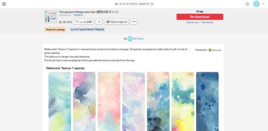
(this one specifically)
(it also had some really good paper texture bc whoever made this is a godsend)
i slap that over the color layer, set it to clipping, and mess with the blending modes
its usually a tossup between soft light, overlay, multiply, and the overlay texture effect tho
theres another optional step of using the overlay texture effect on a paper texture
i didn’t do it on this example sorry :’(
i think i used another watercolor texture set to soft light on this piece?
after that, if u want, i like setting a noise texture at a v low opacity over everything for extra jitter

(i use this one. u can just make it in csp and probably any other drawing software but im lazy lmao)
save it as a png/jpg/etc.
and ur done!
i do some extra stuff to the final image like scale everything down and add a bit of a 3D effect for a bit of extra kick
(but again thats a bit complex and specific so feel free to ask but ill keep it short
for your sanity’s sake)
(and once again, the final image! ta-da!)
some tips to keep in mind i guess
jitter, grit and noise textures are very good things when u want something to look rough
avoid pure blacks and whites; most paper isn’t printed pure black or white and it only gets more faded and colored with time
if ur super lost, look at reference!! theres a lot of good artists and media out there to get inspiration from, and looking at scans of actual old comics is a nice way to see if ur work looks aged
(also u don’t have to use old comics as reference; i like looking at old vcr footage for reference bc of the texture!! :D)
that’s all i have for my general process
uhh for specifics feel free to ask
i can make more tutorials but this one is a general overview, i just didn’t to take up too much of ur time….
but i really hope it helped! and im very sorry if it didn’t
i’ve never made a tutorial so im sorry if it didn’t answer ur question and also im sorry if this one’s not very useful
thank you for reading!!!
and thank you to whoever asked! :D
54 notes
·
View notes
Note
your color palette gifsets are absolutely GORGEOUS!! ❤️ i'm just wondering, how did you create the little palette swatch that you put at the end of each color palette gifset? ty and have a lovely day x
ahhh thank u so much omg!! i'm shit at writing clear instructions so i'm gonna just do a number list so i won't get confused dkgjdjfn if it seems like i'm overexplaining or breaking things up too much i SWEAR i am not being condescending ok it's for my own benefit. i'm not gonna do screenshots bc i think that may be a little overkill for this and i'm assuming you're somewhat familiar with photoshop, but if you'd like a more thorough explanation with screenshots, please just let me know!!
1. pick out your color palette!
2. assuming that you're using a palette you found online and not just coming up with your own, either screenshot it or download it, whichever will be easier for you to open in photoshop.
3. open your color palette file in photoshop!
4. use the eyedropper tool and click on each color in the palette. these colors should then all be readily available in your "swatches" tab!
5. make a new, blank photoshop file. it should be 540 px wide, and can be however tall you want it to be (i've been doing 25 px but i feel like that's honestly a bit clunky so i'll probably cut it down to 10 or 15 in future sets).
6. use the rectangle tool and just draw a random rectangle on your blank canvas- you can then go to the "properties" tab and enter in exact values for the rectangle's width and height. the height is easy: just use the height of your file!
to find the width of your rectangle, use the width of your file (540 px) and divide it by however many colors are in the palette. most palettes i've found here on tumblr are 5 colors, so i'll use that. 540 / 5 = 108. so, your rectangle should be 108 px wide.
7. we're still in the properties tab! set your stroke to 0 pixels.
8. click on the "fill" color field. it should show you all of your swatches, which means it'll show you all of the colors that you chose with the eyedropper tool earlier! make your rectangle the first color in your palette.
9. go to your layers and right click on your rectangle, then select "duplicate layer."
10. duplicate that rectangle as many times as you need in order to have one rectangle of each color. go through and change the fill of each rectangle so that you have all of your colors!
11. now, all you have to do is arrange your rectangles from left to right in whatever order you'd like! make sure that your colors are covering the entire canvas. the rectangles should snap into place pretty easily, photoshop's automatic spacing assistance is pretty handy when you're doing stuff like this.
12. once you're happy with how it looks, export the file as a png, and you're all done!!
honestly i just make everything up as i go along and even though this method works pretty quickly for me, i'm sure there's some smart people way to do it where you just like click two buttons and it happens skvjdjcjdjc ANYWAY. my point is that if this seems weird or confusing or annoying to you, you should mess around with it and just do whatever makes sense in your mind and works for you :)
4 notes
·
View notes
Note
Hello! I was wondering how you made the videos with the faces layered on top and such? I’ve always wanted to make some.
Putting this under a read more because I ended up severely overexplaining (as I do) and i’m not about to remove all this typing I did. Anon I am so sorry if this is ridiculously long and no help at all.
As a disclaimer, this is meant for pc/laptop. Phones can probably do it, but they’re much less capable in general and most editing apps are paid, watermarked, just plain bad, or a mix of those. Also, it’s entirely possible this is a very unnecessarily tiring and inefficient way do do this. This is just how I personally go about it. If this method gives you the ol’ jangle bones (cause it sure does that to me!) and it doesn’t quite feel right of fulfilling then I strongly recommend asking other people on how they do it.
To get started you’ll need a few things beforehand:
✦ A video editor of some kind (I’m using Lightworks; it’s free, unwatermarked, and autosaves your projects if it ever crashes)
✦ A photo editor (I’m using Pixlr E, it’s, again, free, and you don’t need any installation
✦ The video you want to edit characters onto
✦ A render for the charcter with a transparent background
I’m not sure whether or not installing Lightworks has any oddities i need to mention here, but if you (or anyone else) ever gets stuck, don’t hesitate to dm me or shoot me another ask!
First of all, you’re gonna need a good video. Trust me, once you manage to get into The Zone, this is going to be your only obstacle. And it’s an annoying one. Having a source that reliably uploads these kind of “short but sweet” videos (preferably around 30secs long or less) really is half the battle!
Once you’ve got your video chilling somewhere on your pc, you’re going to need a character render (or two) of some kind. Fandom wikias are often good (or at least decent) sources for this. Of course, you’ll need one that has as little covering/touching the character’s face as possible. Once you’ve got your renders, go to Pixlr E, click the blue “open image” button over over on the left get the pic you need n’ open it. After that, it’ll look like this:

Next, you’ll need the crop tool. Go ahead and crop away everything till the face is the main focus.


Once you’ve done that, zoom in and select the cutout tool. Then, select the “draw mask” option and reduce it’s softness all the way down to 0.
Once you have that going, just draw over the character until everything from their chin down is all gone, like this;
And it’s all done! Click “file” in the upper left corner, then “save” to download it. Make sure you save it as a .png file, otherwise the background won’t be transparent. You can just close the tab from here. I recommend taking a break here, get a drink or maybe a snack!
Next, open Lightworks. If it asks you to log in, do so. Take a tutorial if you feel like it. (I strongly recommend watching the “quick start’” video tutorial they have over at the lightworks forums along with some more in-depth ones; for creating simple videos with characters pasted over it, my guide will be all you need, but it might be useful to know how to mess around with audio, crossfades, greenscreen/chromakey, etc.)
Once you’re all free to do what you want, create a new project, give it a name, and set the framerate. (if you don’t know about this one just set it to “auto”)
Now, it’ll look like this:

Go to the bottom left and select “local files”. From there, select the video and your characters’ faces and import them. (tip: holding ctrl or left shift while clicking allows you to select multiple, don’t remember which one it was www)
Once you have everything, go to the “edit” tab.
Make sure the long red stick-thing at the bottom is all the way at 0, then double click your video to open the source viewer and press “b” (or click the button labeled ‘replace.). Once it’s in the bars at the bottom, you can get rid of the source viewer. Then, if your clip is anywhere under 5 minutes, you’ll be stuck with this gaping hole next to it:
Right click the empty void and click “close gap” to solve the issue. This is somewhat necessary, because if you export the video afterwards without the gap closed there’ll just be a black screen for 4 minutes. Make sure you don’t have any tracks hidden, otherwise closing the gap won’t work (though you probably won’t have anything hidden if you didn’t click anyting else).
Alright, now for the most soul-murdering part of the process (after looking for the video, of course): Image Key, a.k.a where we actually put the characters’ faces on top of the video. Go ahead and click “VFX” at the top, and you’ll have a menu like this:
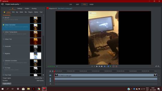
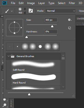
In the effect library to the left, select the “key” category and then double click “Image Key”. You’ll need one of these image key effect for each face you’re using. (Also, you can just minimize the color correction if it’s unfolded, we’re not gonna be messing with it.)
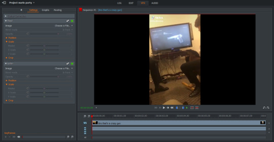
So now, we’ve got this! For the sake of simplicity, you can rename the effects to the characters’ names so you don’t mix them up. Under “choose a file,” select the character faces. If you imported them into your project when you started, they should be easily findable under the “Project” tab. Right now, the characters will be in the center, right under one another. You can move the characters by either using the “Position” sliders on the left or by clicking and dragging them with your mouse in the actual video. For the most part, we’ll be doing the latter, but because the faces are stuck under one another in the exact center, you move both of them at the same time. To fix this, move one face away from the other using the slider one time.
Okay, moving on! This part is important not to skip. Notice the little timer-like icons to the left of the sliders? If you hover over them, it says “Enable/disable keyframes for this parameter.” Click them for every slider under “scale” and “position”. Now, we can start keyframing it; keyframing basically tells the image where it needs to be, when it needs to be in that location, how big, etc. For us, this means that we can make faces move along very fluidly with the video.
By now, we’ve made quite a bit of progress! I recommend taking another break before this to avoid feeling tired. Green tea helps! Once you’ve done that, go ahead and click “Graphs”. Since you enabled the keyframes, your effect should show up with, lo and behold, some graphs to go with ‘em:
I personally work by keyframing one face at a time. To do this undisturbed, I disable the little green light that says “toggle bypass” when you hover over it for the face i’m not going to be keyframing. It hides that face temporarily until i put it back on again. To decide what face i’ll be keyframing first, I just look at whatever face appears in the video first. Once you have the face that appears first, make absolutely positively sure the red bar is at zero to be able to set where and how the image starts out. Then, drag the face onto the poor human soul whose face we’ll be replacing today. Go back to the “settings” tab and slide with the “Scale: Master” until the character’s face is big or small enough for your liking. Then, if the person we want the second character to portray is not on-screen, we click the green (now gray) lamp on the unused face and drag it off: depending on your video format, either to the black on the side (which we’ll crop off when we’re done) or just off-screen if your video is fullscreen. If the person is on-screen, just drag the face on top of that person and adjust size like we did with the first face. These will be the locations the characters start on. Switch the green light back off for your second character, and move back to Graphs.
This is where the “””””fun””””” begins. So, right now, you have your red bar at 0, and you have your character where you want it. We need to move the character’s face frame-by-frame. Luckily, there’s an easier way to move frames: with your arrow keys. Every press with your left or right arrow key moves the video one frame into that direction. Now remember what i said about using your mouse to drag the images where they need to be? It comes in really handy here. Press your right arrow key thrice to move 3 frames ahead, and then drag the image to wherever the face is on that frame. Lightworks will automatically fill in where the image needs to be on the frames in between those frames so you don’t need to precisely move the image on every frame (though this might be helpful on shorther videos or videos where there is very fast movement.) Do this repeatedly until the video ends or the character disappears off-screen. Every 3-4 or so frames. For the remainder of the video. Entertaining. Very, very entertaining. (In short, it’s just: press arrow keys thrice > reposition image > repeat.)
Adding to this, sometimes the characters go off screen and then come back, but the faces move gradually to the spot leading to them appearing too soon. (sounds incredibly vague, I know, but you’ll know what it means when it happens.) To fix this, you need to go into the graphs labeled “position”. It’ll look something like this:
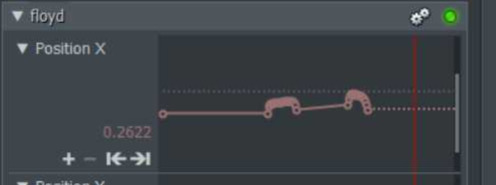
What you need to do here is click somewhere above or below the diagonal line in the middle to move your red line there. Press the arrow with the vertical line to the left to move to the previous keyframe. Copy the numbers that are to the left of the graph, press the arrow with the vertical line to the right, nudge one frame back with your left arrow key, paste the value you just copied over the one that’s already there and then press enter or the plus. That should fix it.
Okay. You have now keyframed all of the faces. It’s all done. Take a break here. I don’t care how determined you are right now. you Gotta. You Just Gotta. get some water, you deserve it.
After getting your water, go back to the “edit” tab at the top, right click your video and select export. Select the format, give it a name, and huzzah! Finally. Unless you have a video format with black edges, then it’ll look somewhat like this. To crop those sides off, we’re going over to Kapwing to crop it off. (You need to register (free) to remove the watermark, and i’m pretty sure Lightworks can also do it, but I haven’t found that option yet and I’m too stubborn to) Once you’re done with that, download it, delete the old version and you’re really done. You deserve a pat on the shoulder now because god fuck if this isn’t one of the most tiring processes to do out of free will (and that times 10 if you’re a slow worker like I am) but honestly making hundreds of people laugh is SO MUCH of a payoff you can’t help but keep wanting to do it wwww
if there’s any more questiong about this or if i forgot something (which i probably did) please shoot me an ask or dm!! all i am physically incapable of doing is simplifying this into less of a wall of text
#not twst#not a meme#ohhhhh my god#ohhhhhhhhhhhhhh#my god#i am never typing again for a week#i need to recharge and i ABSOLUTELY need a nap#i only just finished chapter 2 bc. lazy#i still need to process it#gonna upload the vid i used here in a minute or 2#my brain is just coconut mall mario kart
27 notes
·
View notes
Note
Hi Nicole, hope all is well. I just wondered how did you get the pictures of your sims in the frames and such like that. I have frames but I don't know how to get my sims pictures I have taken of them in there?
Hi there! ❤
Sure, I made a little tutorial for ya! (Sorry it’s a bit long, I tried to explain with text and pictures!)
What you will need:
Photo editing software (GIMP or Photoshop, I use photoshop but GIMP is free!)
Sims4 Studio
Screenshots that you will like to put in the frame
In game or custom frame, I make use of both but the custom ones I make use of the most are: Kinlet & Milford
How to Create custom photo frames:
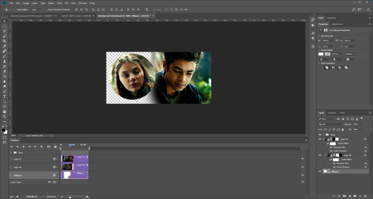
1.) If you are using a custom frame, I like to place the package file on my desktop so it’s there for easy access, but if you are using an in game frame, you can use Sim4 Studio to get the package file to edit, how you do that is:
Open Sims4Studio and select Standalone Recolor under objects. It will then take you to the in game objects and look through to find the frame you would like, it will then ask you to name your recolor and then save to your desktop.
If you are using a custom frame and have the package file on your desktop, select my projects and select the the package file on your desktop. Pretty easy right?
2.) Now that you have the package file open, it should look something like this:

See the Texture option? Select that and it will bring you here:

That’s the texture of the frame and what you will use to add your pictures into, see the export option? Select that and save the texture to your desktop, I usually name it “Text1″ or “Text2″ depending on which color swatch I use, I go by numbers. So now that you have it saved on your desktop, open your photo editing software and open the texture you had saved in the editing software, like I said I use photoshop.

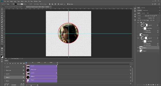
Now you have the texture opened in your editing software, go ahead and use the square/rectangle lasso tool, to cut out the pictures on your texture and it will look like this:

Make your selection with the lasso tool and hit delete, I like to zoom in a bit to make sure I only select the pictures and nothing else of the frame texture. It can be a pain at first depending on the frame, but you’ll get it! Now that you deleted those pictures, right clock on the selection box and select deselect. (This just takes the selection box away)
Now select your move tool which helps move pictures around, now remember how I said to have your screenshots ready? So what I do is I keep them on my desktop and drag them on the frame like this:

Now here comes the fun part, so first I hide the picture in the layer section (bottom right) which I wont be using first, I do that by selecting the eyeball next to the layer. Oh and before I forget, move the pictures in the layer section the below the texture image. Like this:

Ok here is the fun part, you get to move the picture into one of the frame slots we created by deleting the old picture from the frame, so I hit the keys Ctrl + T in photoshop to now make my picturing bigger/smaller, so here is what it looks like after I messed with it a bit to get it in the frame the way I want it:

There we go, then go ahead and delete the clipping into the other frame with the lasso tool, now all you have to do is repeat the steps from the first image for the second image, make sure you make the image visible in the layers section so you can see what you are working with and should look like this:

Now that your frame looks the way you want it to, save this as a .png on your desktop, name it whatever you like and open Sims 4 studio again (Hopefully you minimized the program, but if you didn’t no need to worry, just open it up again and select my projects and find the package file on your desktop.)
Your package file is now open and select texture again, and either create a new swatch or overwrite the same swatch, after that select import and open up your final texture with your pictures in that you saved and should look like this:

And then all you need to do is hit save, and there you go. Once that is done, just place the package file back in your mods folder after adding as many swatches as you like. :) (Remember to save before you close Sims4Studio before you move the package file to your mods folder.)
Hopefully this was easy to follow, if not send me a message if you get stuck, I’ll help ya out!
Have a great day nonny! ❤
28 notes
·
View notes
Text
Mini tutorial on how to make shiny buildings
What you’ll need:
S3PE
TSRW
MILKSHAPE
IMAGE EDITOR (Photoshop or Gimp)
Delphy's Sims 3 Pack Multi-Extracter
Edit: forgot to mention something x.x To export wso file from milkshape you need to go here~> C:\Program Files\The Sims Resource\TSR Workshop\Extras\Milkshape Plugins and copy both dll files there and paste them here~> C:\Program Files\MilkShape 3D 1.8.5 That’s it! ;P
This Tutorial is aimed for those who never ever ever messed with content creation, so it’s like, super step by step! Also, I’m counting that you already have your mesh, texture, etc.
1. You need to clone an object to work with.
I always use the SignCityHill from Showtime ep, you can get it either on s3oc or tsr workshop. (If you know how to do this then go to step 2)
If you don’t know how to do that on TSRW, here it is:
Open TSR Workshop, go to Create New Project ~> Object ~> Uncategorized Objects ~> Find the SignCityHill. Now you’ll open it.
Edit²: When it asks you about diagonal reference, just untick the box. (Haven’t realised this before, thanks to @technicallyswagpizza who warned me<3)

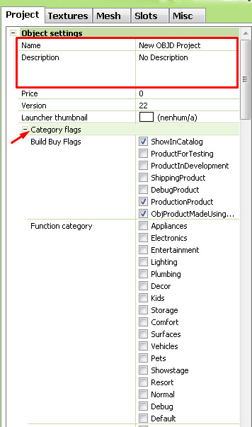
2. Give your object a name, description and the right category flags.
Flags ↓
Function Category: ☑ Debug
Function Sub Category: ☑ MiscObjects
Build Category: ☑ MiscObjects
ObjectTypeFlags: ☑ LargeObject
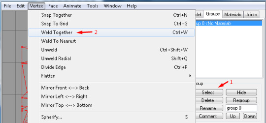
3. Milkshape.
Now you’ll need to import your mesh to Milkshape, this program supports a lot of file types, but if you have a file type not supported you can find plugins for it online. After you imported your mesh, make sure that it has only one group and name it as: group 0 then click “rename”

3.5 High poly to low poly: If your mesh has high poly count, you can decrease it in milkshape.
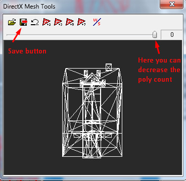
Select your Mesh > Vertex > Weld Together > Tools > DirectX Mesh Tools > and decrease it how much you want, then hit save. It’s better if you do it bit by bit and you can alwats ctrl+z to go back to previous state.
4. Exporting from MS and importing to TSR Workshop.
In TSRW go to the mesh tab and click Import, choose the file you exported from Milkshape. Then go to “Default material” and you’ll see three dots, click it. There you can change the textures with your own.
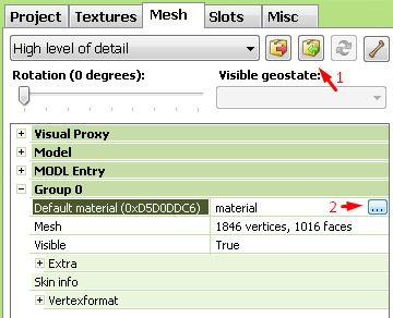
To import your stuff just click each one of the properties (like the detail, diffuse etc) and go to Edit and then Import.
The detail map is an overlay that adds a bit more detail, you can leave it as it is. Personally, I don’t like it, so I just import a white 64x64 image on it. Also, I don’t think deleting is a good idea, actually I never tested it so I’d rather only replace the texture. If you don’t want to make one yourself, then here it is the detail map I use.
Diffuse is the texture that you can properly see (sorry for the shitty explanation lol).
Multiply is there for the overall shape of the uvmap, you can use the one I made aswell.
Self Illumination is where the magic is. Depending on the game/tool/website you’re getting your stuff from it won’t have this map, but it’s really simple to make! I’ll show u how to do this on photoshop but you can make it on gimp or whatever program you have!
4.5 Self Illumination map. First, open your diffuse texture on your image editor program, then draw a shape with the rectangle tool on every window.
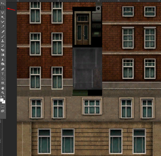
Paint black the ones you don’t want to get shiny and white the ones you do.

After that, back to the draw a shape tool, right click and select inverse and paint everything in black.
Done! Simple, right? Now save it as a PNG or DDS file. Import it to Self Illumination map, and that’s it!
5. Changing shadow detail
This is really simple aswell, on the “High level of detail” bar, choose the Shadow High level of detail. The click the blue thingy next to the Import button and choose medium detail. Done!

6. Footprint
Go to Slots (next to the mesh tab), then click on Footprint, it will appear three dots, just click on it. On “From Mesh” choose your mesh and then click Calculate and Ok.

6.5 Base game compatible
(If you don’t mind your custom content not being base game compatible then you can skip this step!) All you have to do is go to Edit ~> Project Contents and select everything there except the MLOD and MODL files. Then right click ~> Renumber ~> Check the “group ID” box ~> Okay and press no to the popups and Ok again.

7. Exporting from TSRW and converting from Sims3pack to Package
Go to File ~> Export ~> To Sims3pack
Open The Delphy's Sims 3 Pack Multi-Extracter, find the location your Sims3pack is and choose the destination you want it to be extracted to. After that you’ll have your Package file!
8. Making it visible in Create a World tool
To make it visible you’ll need to open said package with s3pe.
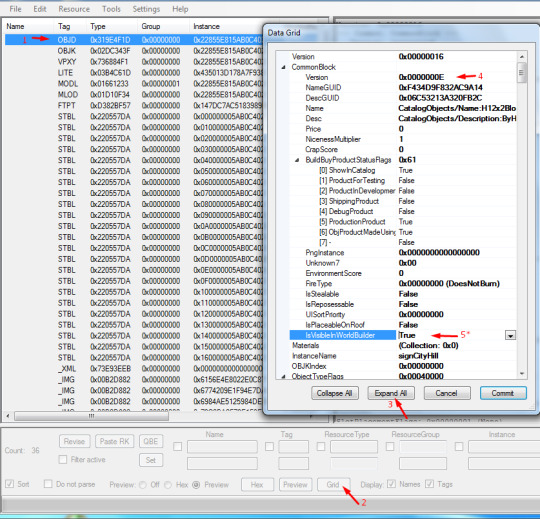
1-First, find the OBJD file
2- Click on “Grid”
3- Click on Expand All
4- Delete the letter it has there and add the letter E
5- Clck Commit and follow the steps 1 to 3 again, now change the “IsVisibleInWorldBuilder” to True.
Done! Just click Commit again, close it and choose to save the file when asked.
Now just put it in your Packages folder, both caw and sims3. Have fun!
Mini tutorial finished {=
100 notes
·
View notes
Note
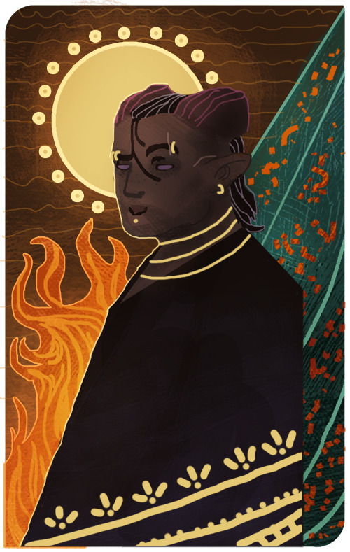
How did you make those drawing that mimic the dragon age tarot card look?
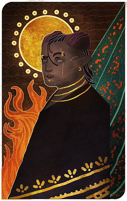
I’m sorry that it took me this long to reply, anon! There were some complications and illness that kept me away for a bit, but better late than never! I assume the drawing you’re referring to is the experimental card I made of my Inquisitor 4 years back?
It’s been a while since I worked on it, but I tried to dig up the old psd file to go through the layers and see what steps I made. The drawing itself was highly experimental, as I was completely new when it came to trying my hand at the DA:I card style. For the most part I decided to make the character and his anatomy very simplified, and rather focus on putting the details in the shading and background.
Let me show an example of what my drawing looks like without the added textures and extra overlay soft brush shading:
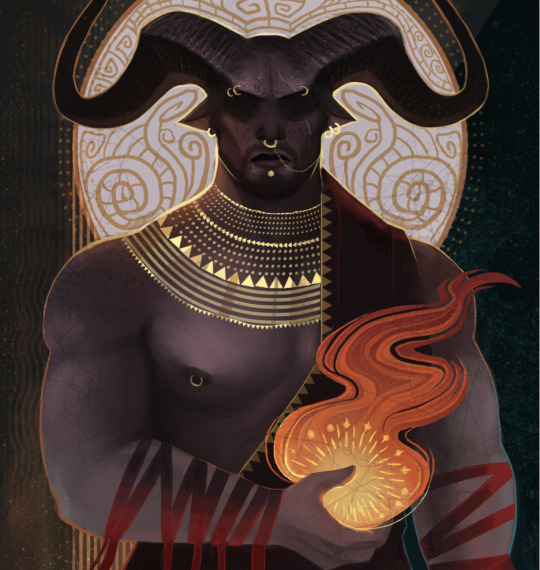
And here is the same drawing where the textures and shading are added:

But if there is one thing I’ve learned from both my own attempts and other artists, is that textures can sometimes make a very huge difference when it comes to that final touch. Whenever it’s from digital brushes or images that you’ve gathered. It’s no question that most of the work with these paintings lies in the drawing itself, but adding those final textures can really give it that ultimate DA:I card feel you’re looking for.
I’m not really experienced enough to give proper advice or tips on how to make these drawings, but for now, all I can recommend is studying the DA:I cards themselves, take inspiration from other artists, tarot cards in general, or patterns/paintings that can inspire what to use for the backgrounds. Another thing I personally like to recommend, is staying away from too much realism or overblending the image. The more the textures and those rough brush strokes are apparent, the more it adds to it. Keep it simplified, while the more detailed/realism stuff is kept to a minimum in comparison. But once again, this is my personal taste, and not the ultimate way to do this.
However, something I can add to my reply, is showing you guys a very quick, basic and simple way on how I generally go on with these paintings and how I add image textures. Please, rather look at these tips as suggestions on how to do it, as there are plenty of other and simpler ways to go about it. But since this will be a very long post filled with images, I’m gonna keep it under a cut, so that anyone interested can check it out there! Also keep in mind that I’m using Photoshop CS5 on an iMac for this.
First of all, I will apologize to everyone for the extreme low art quality, as I only have my computer mouse to draw with for this. Not to mention the extreme lack of balanced values that makes this more chaotic than it should. Make sure to always keep values in mind with these things, folks!
Anyways, I always start by making the drawing itself. Most of the work and style are put into this part of the process, as the image textures will just be extra flavoring.
Now let’s say that we want to add some fancy gold details to this drawing. We’ll be doing so by making a new layer over the drawing itself, then use a basic round brush to draw the shapes we want to be textured with gold. Wherever you choose to make something more detailed, or just make simple shapes with a single color, is all up to you.
Now I’ll be locking the layer by clicking the icon shown in the image below. It’s usually found over the layers, and make sure to keep the layer with the new shapes activated when you click it.
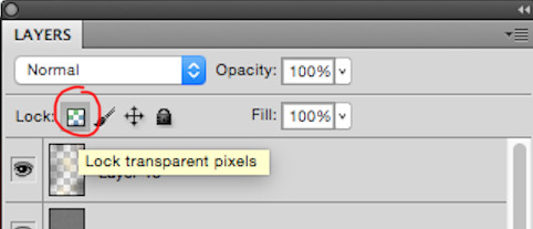
This will now make us able to draw on the shapes without going outside of them, so let’s use this to add some simple shading based on gold in general. This will add a bit extra once we apply the texture itself in the end. (References are your best friend here!) Also be aware that the colors you choose on these shapes will affect the end results once they are merged with the texture image. Here’s how it looks like after I’ve added some simple shading with a brush.

Now it’s time to add the extra gold texture itself. We’ll be doing so by first digging up your preferred gold texture image that you can either place or copy/paste into the psd file. Make sure the image is on a layer above the shapes we just added. Once that is done, we will right click on the layer with the image, and choose the option ‘Create Clipping Mask’

Now it should only be covering the shapes drawn in the layer below it. So now we can mess around with the image layer until it gives you a look you’re satisfied with. It’s mostly common to put the layer on Multiply or overlay, but try to experiment to see what you prefer. Also play around with the opacity of the layer, too! In this case, I set the layer to multiply and the opacity to 80%. I also adjusted the colors on the shape and the texture itself until I was satisfied.
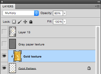

I also added a gold texture to the circle in the background by doing the exact same thing. Make a layer with the shape, add the gold texture image in a layer above it, right click it and choose ‘Create Clipping Mask’. Then adjust to your heart’s content. This layer is set to multiply with 100% opacity. Colors were adjusted until I was pleased with the results.

And this is basically how I add textures to my art in general. Sometimes the Clipping Mask isn’t even needed if you want to cover the whole drawing itself with it. However, another thing you can do to add a texture over a painting, is having the image on its own layer over the drawing, but instead of setting the texture layer to Clipping Mask, you add a Layer Mask by having the layer itself chosen, then clicking the icon shown in the image below.

The texture layer should now have a white page next to it that looks like this.

This layer will now only let you draw on it with either black or white. Basically what this means, is if you draw on the layer with black, it will “erase” the texture, so that you can draw on the spots where you don’t want the texture to show on the painting. If you want to bring the texture back, all you have to do is draw over the black again with white, and it will appear.
I added a final grunge texture to the background, using the same method as we did with the gold, but simply skipping the Clipping Mask part. Instead I added a Layer Mask and drew over it with black, so that the texture would only show on the brown colored part of the background.
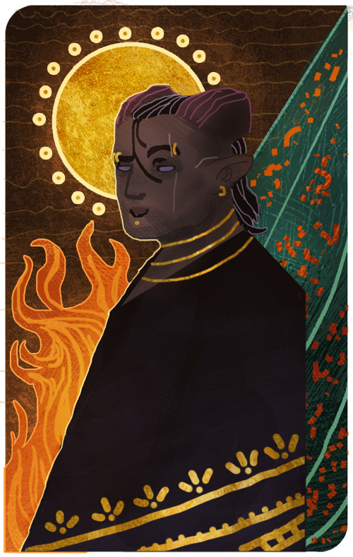
As a final touch, I added one more texture to cover up the whole image. It’s the same gray paper texture that I made and use for all my sketches or paintings in general. It can be found and downloaded here.The gray paper texture was set to overlay, and I darkened its values, as it tends to brighten up the drawing a bit too much when set to overlay.I also added a final layer on top of it all, setting it to overlay, and then draw with a soft brush to add some extra highlights and shadows to give it that final touch. Highlights were drawn with a very light/pale yellow, while the shadows were drawn with more dark brown tones. All in all, I used colors to match the ones used in the drawing.After all of that, this is how it finally looks.

Now this last step is completely optional, but I’ll add it to this post, in case some people will find it useful. One final step you can do to give the painting that extra crisp, is to add Unsharp Mask.First you need to save the drawing as a png file, and then open that file, so that all the layers are merged into one image. From here, we will click on Filter, among the tabs found at the very top of the program. From there we will find and choose Sharpen, then Unsharp Mask. Here’s an image to make it more clearer.
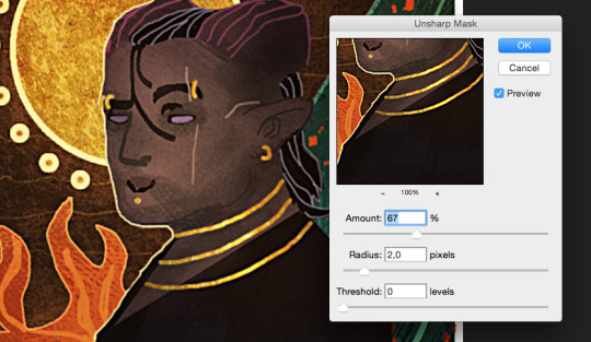
When you click Unsharp Mask, a little window will pop up, letting you adjust on three different sliders. Treshold will be on 0 levels, Radius will be on 2,0 pixels, while Amount is where we can adjust the slider to our liking. Usually it’s enough to keep it somewhere between 60-80%, but experiment and see what you prefer. Once you are done, click OK, and the changes will be added. Make sure to check the box next to Preview, to see what the changes look like before you click OK. When you resize the image to make it smaller, the unsharp mask effect can look pretty neat!
Aaaand one more optional final touch that we can add, is something called the Grain Texture. However, there is already a very great tutorial made that explains easily how to add it, so I’ll link to it here!
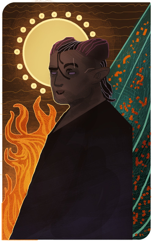
And FINALLY. After all these walls of texts and images, this is what the end results look like.
I apologize if my way of explaining these things is confusing and pretty bad. It’s always been a weakness of mine, so if any of you have any questions, don’t hesitate to ask! I’ll try to answer as good as I can.Other than that, I hope this is somewhat helpful to some of you. This is basically how I do things in most cases when I make art.I’m not sure how much this helped to answer your question, Anon, but hopefully it shed some light on some of it! If not, I can always try to make another tutorial some other time, once my health allows me the extra time.
Thank you so much for reading, and good luck with your art!
#Anonymous#Mieran replies#Tutorial#Long post#Anon#Ask#I'm sorry for the long post#And sorry if this whole thing is messy xD#I tried my best
29 notes
·
View notes
Text
Version 335
youtube
windows
zip
exe
os x
app
linux
tar.gz
source
tar.gz
When I first made this release, Github's file upload was not working right, and I used Mediafire instead. Github is now working and I have updated the links above.
I had a great four weeks updating hydrus to python 3. The update went well, and the releases today are ready for all users, but there are special update instructions just for this week.
python 3
The client and server now run completely and exclusively on python 3, updating from python 2. The new version has a variety of benefits, mostly in better unicode vs. data handling, but for hydrus it also runs a little faster, uses less idle CPU and significantly less memory, and has a little less ui-jank.
I am pleased with the update. None of it was extremely difficult, but there was a lot to do, a few headaches, and some new stuff to learn. I am glad I took the four weeks. I also appreciate the users who tested the preview releases in the past couple of weeks.
I have squashed a ton of little bugs, and everything normal like file downloading and browsing seems to work completely fine, but there are likely a couple of small issues still out there. If a dialog breaks for you and you get some popups about some datatype being mishandled, please send it to me and I'll get it fixed up for v336!
some notes
Unfortunately, for technically difficult reasons, I could not compile 'debug' versions of the executables, so these are gone this week. I will revisit this, but the original debug builds were a bit hacky and may no longer be practically possible in py3.
Also, I am not certain if the database menu's 'set a password' will have kept correct password data for unusual keyboards, so if you use this function, the client will, just for this v335, forgive incorrect passwords! If this happens to you, the client will give you a popup with more information and tell you how to try to fix it. I would appreciate feedback here, if you encounter it.
Due to a natural library update unrelated to py3, your hydrus sessions will likely be wiped (this also happened to some running-from-source users a little while ago), which means Hydrus will have to re-login to any sites you have logins set up for. If you have special cookies you need to save or re-import from your browser, get set up before you update!
Now, because py2 and py3 are incompatible, the new version cannot be run in a folder that still has old .dll files hanging around. Please follow the following to update:
update instructions for windows installer
Just for this week, I have added a routine to the installer to delete the old files (but obviously saving your db directory where your database and files are stored!), so you shouldn't have to do anything. I nonetheless recommend you still make a backup before you update. Backups are great, and if you don't make one yet, this week is a great time to start.
If you are a particularly long-time user and the installer fails to clear everything out, you may need to delete the old files yourself, like the extract users will have to:
update instructions for windows and linux extract
You will have to perform a clean install, which means deleting everything in your install folder except the db directory before extracting as normal. This is simple, but do not get it wrong. Do not delete your db directory--this is where your database and files are stored.
As always, if you have a recent backup, you don't have to worry about any possible accident, so make sure you have one.
update instructions for os x
Due to technical limitations, the OS X release is now App only. Furthermore, this App release will no longer store the db inside itself! The default location for your db is now ~/Library/Hydrus (i.e. /Users/[you]/Library/Hydrus). This also means that the future update process will be as simple as replacing the existing Hydrus Network App in Applications, just one action. I apologise that this important change has taken so long to come out, but we got there in the end.
If you are updating this week, you will need to make the Hydrus folder under your Library yourself and move your existing db there so the new Hydrus can pick up where you left off. If you use the tar.gz, you'll be moving the contents of your install_dir/db, and if you use the App, you'll want to right-click->Show Package Contents on your old py2 App and navigate to Hydrus Network/Contents/MacOS/db. You want the contents of db, not the db folder itself, so the path to your new client.db file should be ~/Library/Hydrus/client.db, for instance.
If you cannot see your Library folder, check this: https://www.macworld.com/article/2057221/how-to-view-the-library-folder-in-mavericks.html
If you have trouble with this, please let me know and we'll figure it out together.
update instructions for running from source
You'll need to make a new py3 venv and make new shortcuts. I now use pycryptodome instead of pycrypto and dropped some libraries, so I recommend you go to the 'running from source' help page again and just paste the new pip line(s) to get set up.
I don't think 3.4 will work, but 3.5, 3.6, and 3.7 all seem ok. Obviously contact me if you run into trouble. I'm also interested in success stories!
full list
important:
hydrus now runs completely and exclusively on python 3!
for users who are updating, the client has special install instructions for just this week:
if you are a windows or linux user who extracts to install, you will have to delete your old install's files (but keep your db folder!!!) before installing/extracting the new version so there are no 2/3 dll/so conflicts (don't delete your db folder!)
if you use the windows installer to install, this v335 installer will do the clean install for you! there is absolutely no way this could go wrong, so no need to make a backup beforehand :^)
if you are an os x user, I am now only releasing the client in the app. furthermore, the default app db location is now ~/Library/Hydrus (i.e. /Users/[you]/Library/Hydrus). you will have to move your existing db to this location to update, and thereafter you'll just be replacing the app in Applications!
if you try to boot a non-clean mixed 2/3 install, the client will try to recognise that and give an error and dump out
please check the release post for more detailed instructions here
.
semi-important:
the db password feature may be one-time broken for unusual keyboard languages, so failures this version will be forgiven with an appropriate error message explaining the situation. feedback from чики брики lads appreciated
I may have fixed the issue some linux/os x users were having launching external programs, including OS ffmpeg (it was a child process environment issue related to pyinstaller)
although I did most of my devving here on py 3.6, the client seems to run ok on 3.5. I doubt 3.4 will do it, if you mean to run from source
I moved from the old pycrypto to the new pycryptodome, so users who run from source will want to get this. I also dropped some libraries
.
misc bug fixes:
fixed the 'load one of the default options' button on manage tag import options when a set of default options is orphaned by a deleted url class
removed some popup flicker related to long error messages
fixed some parsing testing ui error handling
cleared up some bad text ctrl event handling that could sometimes cause a recursive loop
listctrls should now sort text that includes numbers in the human-friendly 2 < 10 fashion
cleaned up some bad external process calling code and improved how child process environment is set up
finally figured out the basic problem of a long-time nested dialog event handling error that could sometimes freeze the ui. I may have fixed it in one case and will keep working on this
.
boring details:
ran 2to3 to auto-convert what could be done
updated environment to python 3
went over a whole ton of unicode encoding/decoding manually to update it to python 3
removed all the old tobytestring/tounicode calls in favour of new python 3 handling
fixed all the file io to do bytes/str as appropriate
corrected a bunch of / vs // int/float stuff
fixed up twisted, which has some str/bytes stuff going on
fixed all the listctrls to deal with column sorting None values amongst ints/strs
fixed png export/import, which had some fun bytes/bytearray/int/str issues
updated the swf header parsing code to py3 (more str/bytes stuff)
misc float/int fixes
fixed up some http.cookies handling, which has changed in py3
improved some ancient loopback connection code that was only really checking to see if ports were in use
cleaned up a bunch of now-invalid parameter tuples that 2to3 helpfully marked
numerous misc other refactoring and so on
updated the new network engine to now decode non-utf-8 responses correctly based on actual response header
removed some old py2 manual http multipart code
removed the old py2 'matroska or webm' parsing py, replacing it with some direct ffmpeg format inspection
replaced all % formatting with the new .format system. I will slowly move to this rather than the current endless concatenation mess
deleted some more misc old code
tightened up some spammy network error reporting
converted all /r/n to /n in my environment project, ha ha ha
the ui seems to better support rarer unicode characters like 🔊
updated some of the install/update/backup help for all this, and some misc other stuff as well
fixed misc bugs
next week
A lot of small stuff piled up over the holiday. I will spend a week or two trying to catch up and also planning out the client API, which will be my first big job of the year.
I hope you had a good Christmas and New Year. Mine were great, and I am looking forward to 2019. Let's keep pushing and see if we can do some fun stuff. Thank you for your support!
1 note
·
View note
Text
Twilight Princess w/o Text Boxes: A Dream Made Possible w/ Emulation
Okay. So.
Over the past couple months of running this blog, I’ve been thinking quite a lot about emulating Twilight Princesss in Dolphin, and the other day I finally bit the bullet and booted up the game for the first time. I had fun finally playing around with the emulator’s free look feature, and I decided now was as good a time as any to finally learn how to make GIFs the proper way--with Photoshop--so I messed around with the program a bit and ended up making this GIF, which I posted yesterday. It’s not great, but I’ve seen worse, so eh, whatever, right? At least I’m learning.
Anyway, @therealflurrin sees this GIF and it kicks of a conversation between us about emulation: how it works, what free look is, and what the potential for these kinds of tools are: GIF-making, edits, stills...general hilarity, y’know, basic stuff.
They ask me if I have any idea how to disable the UI of the game. No, I say; I do a quick cursory Google, and something like that would require texture dumping, editing, and reloading, and that sounds like a heckuva lot of work, doesn’t it? I’ll just stick to what I know how to do.
And then they say something else:
my DREAM is to capture all the TP cutscenes without the text overlays for AMV purposes......someday
And I'm like, ah.
Ah, shit.
I dunno about the rest of you, but back in the day, when I would stay up until 3 AM watching Midlink AMVs during a sleepover on my friends’ computers (because Hylia knows I didn’t have one, and what the f**k is a smart phone, it’s only 2007), I used to daydream about this exact thing. I watched a whole ton of (mostly shitty) AMVs, and most of them either completely disregarded any scenes with dialogue, zoomed to somewhat hide their presence, or used the cutscenes with text anyway, and their quality suffered for it regardless--but that was over 10 years ago, long before emulation was so readily accessible (and long before I would discover it), and as time passed, I quickly forgot about this little dream...
...until @therealflurrin reminded me of it.
How hard could it possibly be?
I can’t currently find the forum post I found that instructed another user on how to remove the UI of another (non-Zelda) game in Dolphin, but I can more than summarize the process myself after the day I had yesterday. Essentially, each aspect of the game’s UI is a texture in the game’s files; you can’t delete textures, but you can replace them using Dolphin’s built-in texture loading feature. In order to do what I had set out to, I had to:
Navigate to the graphics setting in Dolphin and turn on the “dump textures” feature, which could create viewable .png files of every single texture loaded into the game upon boot and direct them into a single folder.
Boot the game, ensuring that the elements of the UI I wanted to eliminate were clearly visible.
Find the textures responsible for these elements in the dump folder, making note of their file names.
Create and duplicate a 1x1 transparent .png file, renaming each duplication to match each of the various textures I want to replace from the previous step.
Place each of these “textures” into a folder that matches the name of the folder created by the dumping process, moving that folder into Dolphin’s custom textures directory, and again navigating to the graphics settings and checking “load custom textures.”
Doesn’t sound too difficult, right?
...Right.
Some textures were easy, of course. Getting rid of the text itself was as simple as finding the very few textures that had the letters of the alphabet on them and replacing them, but more than a couple of them were vague stills of nonsense, and combing through hundreds of these textures to find the right ones when I wasn’t even sure what I was looking for...
Well, it was quite the headache, and at some point I ended up saying “f**k it!” and just started replacing anything and everything that looked vaguely suspicious.
For instance, after eliminating the actual text from the boxes, there still remained the matter of the “glow effect” behind the text--upon inspection without the obstruction of this text, just a glowing circle. I just skimmed through the dump folder that resulted from me booting up the game for just a few seconds and I counted more than thirteen textures that fit that exact bill (plus several others that looked like they maybe could have also been the culprit, somehow), and I just kept on rebooting and replacing, rebooting and replacing until those stupid circles were gone. (Not the best method in the world, I know, but we learn from our mistakes.) I spent ages looking for the surely-it-must-be-a-long-black-rectangle-texture responsible for the backdrop, was unable to find it, and replaced a metric shit-ton of unimportant-looking textures until it, too, was somehow gone--and after a lot of trial and error, I finally got the result I was hoping for.
In doing so, however, I had eliminated a heckuva lot of textures that didn’t need replacing, and the entire thing left a bit of a...foul taste in my mouth.
So, like the perfectionist I am, I moved all of the work I had already completed to another location...and began again.
This time, I replaced textures one by one, rebooting the game each time to ensure that it was the correct one. That “long black rectangle” I was looking for ended up being a tall, transparent image merely 8 pixels wide. Those glowing circles ended up being the dang circle that I suspected least, go figure. Regardless, slowly but surely, I was able to replicate my previous success.
Now, my custom texture folder looks a little something like this:
And the in-game result has transformed this:
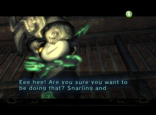
Into this:
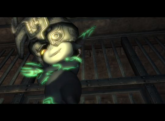
(As you can see, I’ve replaced many other elements of the UI outside of text boxes, and I put them into their own sub-folders for organization’s sake.)
It was a lot of work, but as far as ten-year-old me would be concerned, I have created a means in which to achieve my once impossible dream:
Twilight Princess cutscenes without text boxes.
What does any of this mean?
Effectively, I’ve created a “texture pack” of a sorts that removes most of the game’s UI elements, including the text boxes that have obstructed so many of the game’s better moments. It’s still far from completely finished, but as of now, it serves its primary function flawlessly, and all that’s left of my childhood dream is one eensy, teensy thing:
Recording, baby!
That is to say, video recording of all the game’s cutscenes with this texture pack in effect, so that kind of footage is available and out there--otherwise, all of this work I’ve done will have been for naught, yeah? Fortunately, I’m not just an idiot with an emulator and Photoshop; I’m an idiot with an emulator, Photoshop, and OBS Studio, ready and capable to do all of the hard work of capturing these moments for me.
And now, all that I have to do...is play the game.
So, what happens next?
I’m not going to put an estimate on how long this kind of thing is going to take; I have a life outside of this blog and outside of replaying a game I’ve played more than a few times, but over the next few weeks I’m going to be playing through Twilight Princess on Dolphin with the intention to:
Find and capture each of the game’s cutscenes without UI interference, and upload them (probably onto Google Drive) for use by the general public.
Create save states throughout my playthrough and upload them as well, so any person with a good PC, Dolphin, and a North American Twilight Princess .iso can jump into the game at any point they’d like.
Find and tweak any remaining elements of the game’s UI that I can find to make the experience as clean as possible...and perhaps upload this “texture pack” for general use if I am able to do so.
...But mostly the first thing, yeah? I may keep everyone updated on my progress, if anyone particularly cares, but I also may just keep quiet about it and then dump all of these files at once. Who knows! We’ll just have to wait and see.
TL;DR
There’s a whole lot of potential with this kind of thing, and even if it’s a decade too late and no one is really making Twilight Princess AMVs anymore, this is something I’m so stupidly passionate about that I intend to see it through regardless. I mean, Twilight Princess just happened to be the game that I chose! If it’s possible with this game, then it must surely be possible with others, and maybe this can inspire other similar "HUD-less” projects from others. But, even if it doesn’t, I’ll be okay with that.
In the end, if I can make even just one person happy with this little project of mine, that will be more than enough.
#loz#twilight princess#loz tp#midna#loztp#dolphin emulator#emulafun#long post#therealflurrin#my projects#my posts#text free tp
46 notes
·
View notes
Text
Fire Emblem Heroes Sprite Assembly Tutorial
Someone requested a Heroes spriting tutorial on Serenes Forest, so this is my attempt at making one. This is just going to be for basic sprite assembly, I might make separate ones later for poses/color/edits because this one's already kinda long and I'm kinda tired
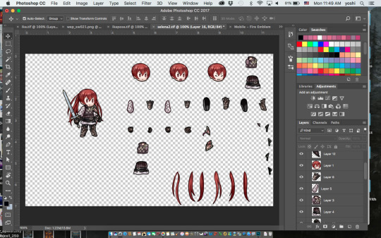
Keep in mind this tutorial is for Photoshop because that’s what I use so if you don’t use Photoshop hopefully someone else can make a tutorial for your program of choice. I’m also going to assume you have basic Photoshop knowledge, if you don’t and I say something you don’t understand, well… Google is your friend. Sorry to be blunt but if I’m here explaining all the Photoshop tools and what they do we’re gonna be here all day.
A few important things to keep in mind:
-Save often! Crashes happen and they suck.
-Be very careful before merging your layers/saving your work as a PNG file! If you close the document after merging layers, you WILL NOT BE ABLE TO RECOVER THEM. I would recommend saving one version as a TIFF or PSD file with layers and another as a PNG file when you’re finished. Otherwise you may want to go back and… say… give Ike an axe instead of a sword only to find out that you’ve merged the files and he now has a sword glued to him. Don’t be like me guys. Keep two separate documents.
First off, you’re going to want to go either here:
https://www.spriters-resource.com/mobile/fireemblemheroes/
Or here:
https://www.reddit.com/r/fireemblem/comments/5rxslp/fire_emblem_heroes_asset_collection_all_art/
To get the character sprite sheets. I mostly use the Reddit link but it’s missing a couple sheets (Alfonse, Anna, Sharena and a couple others) so if you can’t find something you can most likely find it on Spriter’s Resource. The Reddit link also gives you a bunch of .zip files so if you don’t want to deal with that you can go on Spriter’s Resource. SR might be missing a couple of the newer characters though, but if you can’t find someone there just let me know and I’ll add it.
The second thing you might want is a reference picture. This isn’t necessary, but if you’re just starting out or are a perfectionist like me you might want to get one.
If you have Heroes installed on your phone and your phone can take screenshots it’s fairly easy, just find the character you’re looking for in the game, take a screenshot, and upload said screenshot on your computer.
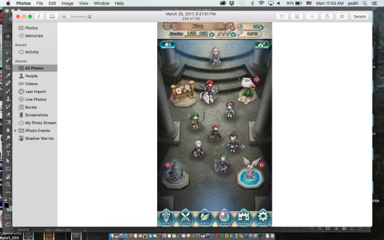
If you can’t get a reference picture like this, you can try to get lucky Google-ing Fire Emblem Heroes (character name) and try to find a screenshot of them (I don’t think I’ve ever had luck using Google though) or you can search on Tumblr. I’ve had a lot more luck searching Tumblr, but it still doesn’t work all the time. Or you could just message me, I’m pretty sure I’ve gotten references for every character by now.
Once you’ve got your screenshot, open it and the character sprite sheet in Photoshop. I’ll be using FemCorrin as an example.
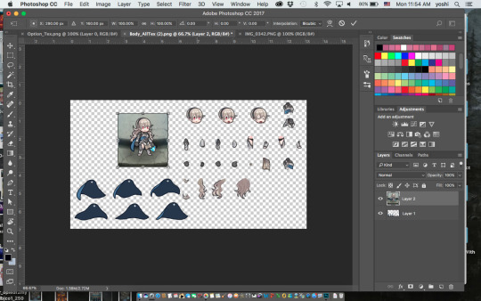
The first thing you’re going to want to do is resize the reference pic(using Command T) so it’s roughly the same size as the sprites.

Then you’re going to want to select one of the parts of the sprite sheet (I usually use the marquee tool) and press Command J to put that part on its own layer. If you did it correctly you should have a new layer with just Corrin’s head (or whatever part you chose) on it. Then use the move tool and drag it over to the reference photo and line it up on top of it. You may have to adjust the size of the reference picture to match the sprite size (You’re probably not going to get them to exactly the same size but try to get it as close as you can). Do NOT resize the sprite part instead of the reference picture. Then you’ll have to resize every other part to match up if you want it to look right, and it’s way more trouble than it’s worth.
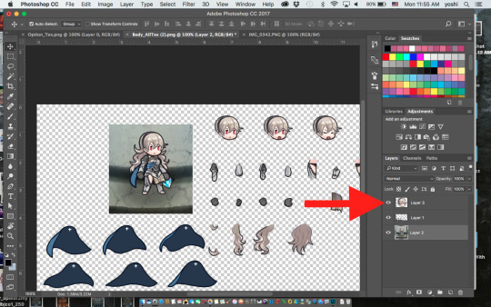
You can turn the layer visibility on or off as needed by clicking on the little eye next to it on the layers panel. This is extremely helpful for making sure it’s lined up on top of the reference picture.
After that just keep doing the same thing with every other part. Like a… Corrin-puzzle or something. Keep every part on it’s own separate layer- this will come in handy if you want to change a pose or something later.
Complications—
-If you end up with, say, Corrin’s cape on top of her, just drag the cape layer beneath whatever layers it’s hiding.
-Sometimes you’ll just end up with this part that you just can’t figure out what to do with. Just leave it to the end. It may be hidden in that particular pose so you may not need it at all or by the end you’ll have a random gap and realize where it goes.
-Keep in mind- sometimes the game bends and stretches some parts, particularly capes and wyvern/pegasus wings. If something’s not lining up no matter what you do, you may have to use Command T and mess with it a bit to get it to fit.

Once you’ve finished your Corrin-puzzle, you can turn off the reference photo and double check that everything looks right. For example, here I realized I have Corrin’s hair over the cape layer when the cape should be on top.
Then you’ll probably want to give the character a weapon. Weapons can be found using the same websites as the character sprites, but weapons that were added with updates (ex. Spring weapons, Ragnell) aren’t on Spriter’s Resource (at least the last time I checked, they may have added it) so if you want those you’ll have to get them from Reddit. Or just message me and I’ll send you them.

And there you go! Once you’re happy with it, you can use the crop tool to crop off the edges and save one file as a TIFF or PSD with layers and another as a PNG. PNG makes the background transparent, but it also merges the layers, so I recommend saving it as a TIFF or PSD file as well- even if you’re not planning on changing it later. You may end up realizing you messed something up later- believe me, it happens.
Anyways, I hope I explained this well, let me know if you have any questions or need clarification on anything. Or if you just wanna talk. I’m here for you 👍
121 notes
·
View notes
Note
Hi! I've been considering making some stickers/prints for myself and was wondering if you have any advice about how to go about it file-wise? I'm sort of at a loss what canvas sizes I should use for this kind of thing and what would be too small or too big to get decent quality when printing stickers and stuff. Please ignore if you consider this a sort of trade secret or you're not comfortable answering! Oh, and I hope you're feeling better!
This got long so I’ll put a break here!
Thank you! Health-wise these have been the worst couple of weeks for me in a long time - but at least my art groove is back!
If you get your stuff printed at places like Catprint, they usually do custom size jobs - though they will probs charge a little extra for the fancy cut. I got mine from there, and that link will give you (and me) $10 off, ooh yaya shameless self-promotion!I think it’s a good idea to decide early on how big you want each print/sticker/sticker sheet to be. In most art programs you can set your canvas size by inches or centimeters which is reeeaallly helpful if you know how big your print/sticker sheet will be. If you’re unsure, just work in a size that’s definitely bigger than what you'll need in the end. You can always shrink your designs but blowing up an image is a no-no.Some print sites (like the aforementioned Catprint) have templates ready for your prints, bookmarks, business cards, etc. If possible, work according to these! Be mindful of the cut/bleed/safety lines so that important parts of your images don’t get cropped off in the cutting process. If the printing office offers this, always look at proofs before you confirm printing! They’ll show you where they’ll cut your prints so you can adjust them if something important got accidentally cropped off on the proof. (Digital proof should be enough.)
As far as file sizes go, I usually work bigger than my final image will be. Just in case I change my mind and want to make bigger prints. Here are some other things that are important to know:

I know certain programs don’t offer color mode conversion between RGB and CMYK but for your own good please find a way to check your final print in CMYK!
As far as file extensions go, do NOT save images you intend to print as .jpeg-s because they’re badly compressed. Go with .png, .tiff or .psd .
Obviously, I’m by no means an expert at this whole thing and I still mess up sometimes. I think the safest way is to use templates provided by printing services, keeping the resolution over 300 dpi and checking in CMYK before printing in case you need to fix colors.
I hope that helped a bit, Anon! If not, feel free to message me in private and I can try helping you there?
89 notes
·
View notes
Video
youtube
How to Franken-mesh clothings: top to top
not... exactly a complete tutorial since I didn’t do the shadow, spec & normal map but eh. I’m only sharing what I know. the rest i don’t know. would appreciate it tho it y’all won’t be rude about it and teach me ;u; i mean, I am still learning after all; I’m just sharing what I know, at least to help you guys get started a lil bit (ALSO, idk my blender terms as well llol)
written instructions for this tutorial
STEP 1: getting two ea meshes that you want to combine together & the diffuse map
open up your s4s> select create 3D mesh> name your package file (you can delete it later, you won’t need it anymore)> select the tops you want> export the diffuse map along with the mesh from the meshes tab (export LOD 0)
STEP 2: blender shortcuts
A key: select/deselect all
G+Z: moving objects vertically
G+X: moving objects horizontally
G+Y: moving objects back and forth
CTRL+ALT+Q: quad view
S: scaling/sizing objects
S+Z: scaling the object vertically
S+X: scaling the object horizontally (you can press x twice for another type, just try messing around and see which fits your liking)
Mouse>scroll wheel: to rotate the whole thing and view around blender
L: to select a whole chunk of the mesh part (just make sure your mouse is pointing at that part of the mesh you want it to be selected)
Right click: to select the dots
Shift+right click: to selected multiple.. parts of the mesh (or dot)
W>merge
Ctrl+J: joining two meshes together
Step 3: mesh checking and removing unwanted parts/appending the second mesh top
note: please remember the geometry of the mesh before doing any of this, it is very important as it needs to be the same number as the top you’re going to use to import to in s4s. (crude, am i making sense??)
okay, you can toggle on and off the little eye on the right panel to see which mesh belongs to which section of the top, once you’ve located the ones you don’t need, remove them by right-clicking and select delete. now, go into edit mode from the middle-bottom section of the screen. move your cursor over to the unwanted part of the mesh and press L to select all and X to delete the vertices. you can also toggle on and off the visible view of the mesh on the bottom which eventually you’ll see me doing.
once you’re happy with your result, append the second mesh top by going to file> append> locate the second file mesh> go into object folder and append s4_studio_mesh_xxxx (all of it) you will need to do another checking of the second mesh. I’m gonna assume you guys use the same mesh as I did, so once done, you’ll have something that looks like what’s shown on the video.
Join those two meshes together by first selecting one mesh then press shift and click on the second mesh on the right panel and click CTRL+J. joined? ok but now you see this teeny tiny gap around the shoulder area. Go back into edit mode and use your mouse to scroll in real close, right click to select the edge of two sides of the gap (careful not to select the other dots) and then press W> select merge> then... center. (i usually pick center but I’ve seen other creators go for either first or last or something) done? yay! (the remove doubles & clean up option is optional i guess but I always do it cos i’m weird) now save as> give it a name and now, time for the texture part.
Step 4: joining two diffuse maps together in Photoshop
(probably not the right way either lol but it works for me)
open up your first diffuse map on photoshop, then drag your second one on top. I used magic wand to select the second one then paste it on another layer and remove... uhm, do i have to explain this part?? like.. ugh, i don’t really know what to say. :((( but yeah, basically you just create layers and remove the unwanted parts like the long sleeve and the holes etc etc then merging them together. I then make the image as white as possible and create another layer for coloring. (please note all this is done in png format, you’ll need to save as later as a dds file for the diffuse map) once you’re happy with your results, time for step 5!
Step 5: importing your franken-mesh and diffuse map
okay, now open up your sims 4 studio> select create 3D mesh> look for the top that had the same geometry as I said earlier on on step 3. give it a name> import the diffuse dds, remove the rest (cos idk how the others work) and go into meshes tab> import ALL LODS which means all 0,1,2,3. and you should be done. hopefully.
if any problems, please let me know and I’ll try to help. or that you see me doing something dumb and wrong, let me know too. sharing is learning right? together? or something? blablabla??? ty for taking your time to read my dumb tutorial but yeah, hope it helps and that you guys learn something, even a teeny tiny bit is cool. and that’s it. happy simming!
there will be a follow up video of how to mesh a top and outfit together later on.
257 notes
·
View notes
Last Seen Blogs
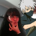
tsundener
Ner mind

clipiii
-clipi-

diana-worldz
Diana's Shop

theblessedwitch
Everything and Anything

sky-line-99
Professional graphic designer