#I think it’s a default procreate one? but will have to check
Explore tagged Tumblr posts
Text
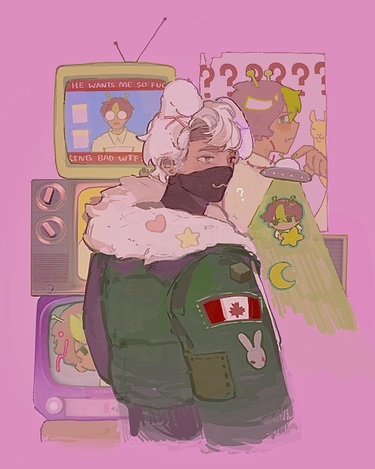
ethogirl?
#drawing ANYTHING and having to play the game of Should This be Tagged as Trafficshipping#also using this marker-like brush that’s a LOT of fun#I think it’s a default procreate one? but will have to check#I really like the composition on this hehehe it’s cute#mcyt#mcyt fanart#hermitcraft#hermitcraft season 10#etho#ethoslab#smallishbeans#boat boys#etho fanart#smallishbeans fanart
3K notes
·
View notes
Note
Just wanted to ask, please forgive me if you've already answred this, what program do you use? Your art fucks HARD and like. I was looking at your art of the two moths over the city they die in and I was hit with the wave of "oh that looks really fucking fun actually." Like i know my art program can't do some of those effects and like, I'd love to try fucking about with them.
hi there, thank you! all my art is done in procreate and paint tool sai
because you mentioned that drawing in particular i thought it would be fun to break it down and show ppl what exactly went into each part of it so check this out
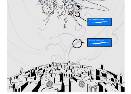
sketch & lineart - the brushes come from georgbrush.club and the urban sketcher is my most commonly used lineart brush, it has a nice irregular shape. the square brush is nice for big blocky sketches.
the cityscape was REALLY hard but basically I got a photo of the skyline of florence, traced some basic building shapes, then bullshitted the rest using the vertical symmetry/mirror tool to cut down on the amount of work (so i only had to sketch one half of the city). then for lineart I turned off vertical symmetry, turned on the two-point perspective tool, and got this:
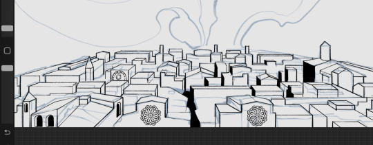
the rose windows were made using the radial symmetry tool.
I didn't like it being so flat, so I used the liquify tool to make a kind of fish-eye effect (limited success tbh). I liked how it looked but the buildings in front needed something to cover them up to make the liquification less obvious...
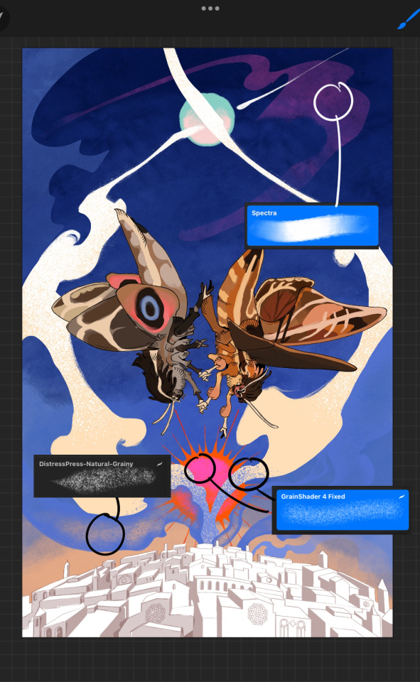
first pass colours. I felt they were very washed out, aside from the sun which i loved. I use the spectra brush (default procreate) for skyscapes a lot, I love the texture. Although the clouds were filled in using the lasso selection tool, I softened the edges using the square pencil again and added texture using true grit sampler grainy brushes. The translucency effect comes from my setting the brush as an eraser. The sun rays come from the radial symmetry tool.
Blocking in the moths' colours was done with the urban sketcher again.
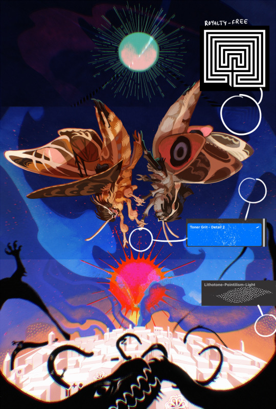
Something people may not have noticed is the labyrinth hidden in the sky! yeah I had a bunch of versions where it was more obvious but I found that it clashed a bit and was too busy, so I made it subtle. But yes. I searched for "royalty free labyrinth" and picked one.
The toner grit brush is one you've seen before if you've looked at any art on tumblr lately (this is such a popular brush) and it's from the true grit fast grit set. The pointillism brush is from the true grit free sampler pack, like my grain brushes.
I added shadows to the moths, increased saturation overall, and changed the clouds to a translucent blue (you can even see in the sun where I forgot to block in the sun itself because the clouds over it used to be opaque lol). Moon rays were drawn using the radial symmetry tool but this time with rotational symmetry off. I also moved the moon down closer to the moths because I felt that it was a bit far away, and this served to visually divide the drawing into three equal parts, so I chose to lean into that and divide the sky colours too, to show passing time, or an endless moment - morning, evening, night, etc.
And then the oroborous, I tried a few different effects on it because I wanted it to be very clearly separate from the main scene - I settled on a dot matrix newsprint texture, using procreate's onboard tool, and some heavy chromatic aberration. This is because the oroborous isn't real, it's purely symbolic and the moths' demise started when they became photographers so I liked the print media aspect there as well. The story itself is about grief without closure, cyclical violence, and sunk cost fallacy, while everyone explores an endless labyrinth, so an oroborous fits I think
what makes art fun to me is thinking up ways I can tell a story using just a single image. and sure a lot of it will be lost to an audience who isn't familiar with the characters or backstory but i want to leave enough in there that even complete strangers to my work will be able to construct a narrative about what's happening here, rather than it just being a cool image. that's my goal.
Finally I exported it to sai on my pc to give it a once-over. this is really important because the retina display on an ipad is oversaturated on purpose, to make everything look amazing and vibrant. but what this means is that on other screens, your work might look washed out. it's especially bad at displaying yellows! so i look at it in sai on my pc and i make minor adjustments, in this case I actually added another multiply layer on the moths and an overlay on their non-shadowed parts to increase the contrast there.
finally if you've read this far, I played a little trick with the caption of the drawing. yeah, THEY die... but only one of those moths is a theythem pronoun haver... the other has to survive. he isn't given a choice in the matter.
#fr you will never catch me trying to mystify my process i will explain literally everything#brushes
475 notes
·
View notes
Text


don't you need them like they need you now? want an art just like this with your f/o? then just meet me at the apt for this event! this is open to anyone aged 18 and above. read the rules below before joining ദ്ദി ( ᵔ ᗜ ᵔ )

you don't have to be following me to join. but you have to be off anon though. mutuals will be prioritized. only one (1) entry per person.
open to all fandoms! my strongest suits are jujutsu kaisen, tokyo revengers, one piece, and naruto.
the pink thunder background is the default background.
⚡︎ one, when you send your ask, please attach a photo of your f/o, preferably face front. tell me if u want the photo as is or if you want anything changed. please tell me what expression they'll be wearing, whether you want to add accessories or if you want me to copy bruno mars's fit with the ballcap backwards and the sunglasses (like i did with baji). the more specific you are with the details, the better!
⚡︎ two, attach a representation of your face—a picrew, a sim, or even a selfie. do tell me what type of facial expression you want as well. don't worry, i won't post the asks and will delete them right after! i usually use procreate's eyedropper to pick specific colors but if you think the lighting is off or the colors are inaccurate in your picrew/sim/selfie, you can send me hex codes of your skin color, hair color, eye color, and lip color. if there is anything else you want to add such as accessories, please let me know. again, the more specific you are with details, the better!
⚡︎ three, keep your asks/DMs open should i have any questions. if you have concerns, don't hesitate to drop by my ask box/DMs as well.
⚡︎ four, please be patient with me. i will do my best to grant everyone's wishes and just, enjoy doing this without pressure or anxiety lol. i thought of this event bc i finally finished my yearly to-draw list so i'm free besides my pending commissions. i also need to give back to this community that has been nothing but nice to me ♡

the inspiration for this theme was my upcoming birthday art for thee satoru gojo which was apt-inspired. i will start posting finished products on the days leading up to christmas and hopefully finish it all before christmas.
i will message you back to let you know whether you secured a slot or not. please check this post occassionally to know whether there are more slots available.
⚡︎ as of [ dec 9 ] : all slots are taken—submissions are closed.
⚡︎ check out the apt’s tenants right here ! #fromaryg: rfrg

rara's favorite random game | © aryomengrande 2023
#fromaryg: event#fromaryg: rfrg#gojo made me do it HAHAHA#apt#digital art#selfship#anime#jujutsu kaisen#tokyo revengers#naruto#one piece#my anxiety is anxiety-ing#5 is enough#i dont expect this to be big#and lemme do this for fun hdjdkd#HAHAHA
68 notes
·
View notes
Note
I just downloaded procreate on my iPad (finally) and I’m so excited to start using it. You’re like the Timbern master in digital art and I know the cliche saying of “practice makes perfect” but do you have any tips for using procreate for beginners (i.e. best canvas size for sketching, best pencils/pens, how to do line art)
I can give some tips for sure!
The bigger the canvas the better, but keep in mind depending the size is the number of available layers you will have for your art, so just look at the way you make your art and ask yourself “Am I a multiple layer fiend or an all in one layer monster?” I do use multiple layers so my default canvas is 4000px X 2500px this gives me 63 layers to work with, I could go higher if wanted but I know myself, I do love my layers
Always remember RGB for online posting art CMYK for printing, regardless of digital or printing always go for 300DPI for better quality.
If you plan on using the time lapse option in procreate make sure it is set to 4k resolution and Lossless quality so it is crisp and beautiful.
Talking about video once you have saved the video on your device delete it from procreate to save storage.
Brushes is up to you friend, I would suggest try first the default brushes in procreate, there are many great ones, I personally use the brush Dry Ink for sketching and lineart myself. But there are also many free brushes online you can download. Try them out and once you are more comfortable with the app you can look into the brushes you have to pay for to use.
If you are just starting with lineart I suggest checking the brush settings and make sure it has some Stabilization, it will help you at first, I do think you should also practice without it, so you are not too reliant on it, this is one of those “practice makes perfect” kind of things.
Hope this helps!
105 notes
·
View notes
Note
What program and brushes do you normally use? I love the way you color and render everything. Your art is very eatable
First off THANK YOU VERY MUCH ʕ´• ᴥ•̥`��♥️!!
Since the beginning of last year I've been using Procreate mainly, but my real go to program is Clip Studio Paint!
I wish I had a more fancy process with custom brushes and stuff, but I mainly work with the default brushes when I'm in Procreate:
Technical Pencil (for whatever line work I start off with + smaller details in coloring + eraser)
Flat Brush (base colors + eraser)
Rectango (this is the chaotic brush used whenever and unsparingly.... I like the texture 👍 on drawings like this it is basically built only using this brush.)
And that's my main brushes for Procreate! Anything else I use depends on the situation.... Soft Brush is good to dust colors, Technical Pen is I actually am forced to do line art, ect ect...
For Clip Studios... I think I use a lot more brushes I've accumulated from the shop and I think one of them isn't even available anymore so I'll have to check ಥ‿ಥ (I've been on Clip there since I was like 13ish??? So it's been a long time)
It's a similar process as procreate, but I feel like I have more control over the details...
Colored pencil (default brush) (used for line work + sketching + coloring)
A marker (Aマーカー) (custom/shop) (used for blending)
커스텀 수채붓 2 (custom/shop) (coloring) unfortunately this grush was deleted by the creator which is terrifying because it is my favorite brush and I'd be ruined without itT^T
And those are the main brushes in Clip Studio!
Again thank you! the main "secret" to my rendering style is in the colors and with finding a messy enough brush (any brush you feel mimics the strokes of a real brush!) Also, don't be afraid to break your line art! In all honesty, I've gotten rid of the line art altogether when doing illustrations and just have a decent sketch, before adding and layering colors.
When it comes to colors, it's kinda a muscle memory thing you have to build up. My biggest advice, if you struggle with color picking, is to consume as much art as possible and observe how others you admire use colors and shading. That's what really helped me develop an eye for what works and what doesn't. Oh, and a fun little cheat is just fucking around with filters and opacity. This can yield some interesting results and get your brain moving when recognizing interesting color combos. And of course, always be willing to experiment with what you learn! Art is all about collecting new rules and breaking any that don't fit you :)
#i hope this answers things well enough...thankyou again!! <3#i didn't mean for that end bit to be so long... sorrryyy#art stuff
6 notes
·
View notes
Text
Handmade DC intro title card for a Shazam film that I made up!!⚡️
This post is kinda interesting because I have not tried my hand at video editing in a while. I’m hoping to get one of my friends to help me install photoshop on my computer so I can remake this sequence with actual 3D assets. But for now? They’re hand drawn in procreate.
I thought I would share some behind the scenes of how I made this for anyone who might be interested in doing something similar! :D
[ Behind the Scenes Info Below ⬇️ ]
Okay so I decided to make this intro as kinda like a “ooh what if I made my own Shazam film? How would I do the opening DC title? I would want it to be like a dark and spooky night, then have the camera be panning down through the clouds. Then I could easily transition into the opening scene because that takes place during a dark and stormy night. OOoOoO.”
But first, in order to do that I had to make modifications to the DC logo. I didn’t want to use any premade 3D assets they had; I wanted to make my own. However, I don’t currently have photoshop, so I had to improvise and make a 2D logo kinda look 3D with some extra layers and shading tricks. I did this in procreate, but any art app will do really. Just keep your preferred perspective in mind.
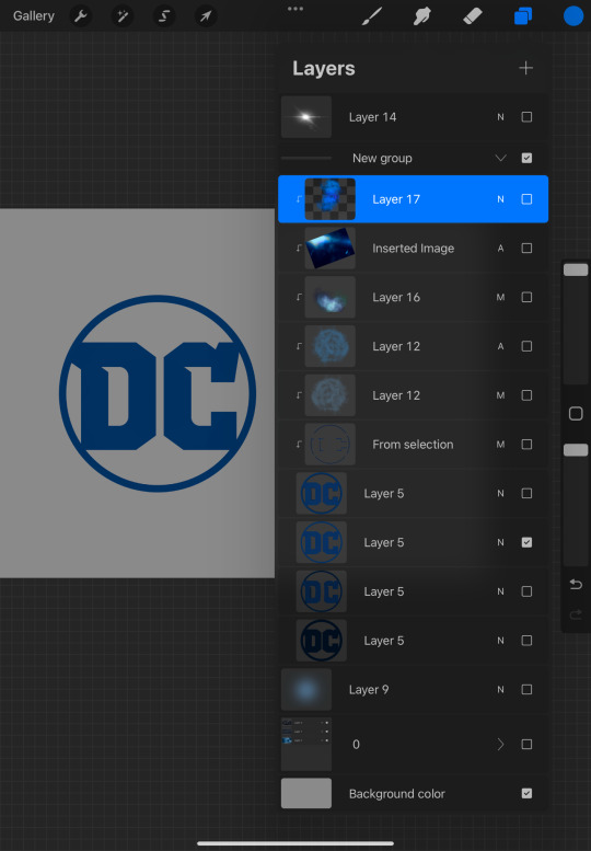
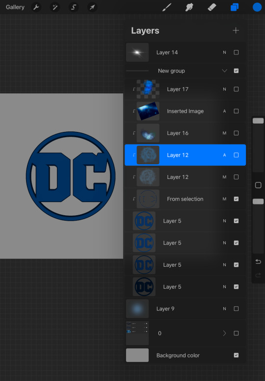
Then after I was done with making sure my perspective was all good and in check I then proceeded to decorate the hell out of the logo with a bunch of clipping masks lol. I just slapped a bunch of different things on there. Some lense flares, some random brushes, some multiply layers, whatever. I didn’t really have a plan in mind when I did this I just kinda went with the vibes.

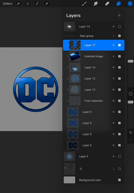
Then after that I made another file where I just worked on the little sparkle effect that I added in. For the sparkle effect I just picked like a default brush in procreate that looked pretty and then animated it to do a little slide across the letter “D”.
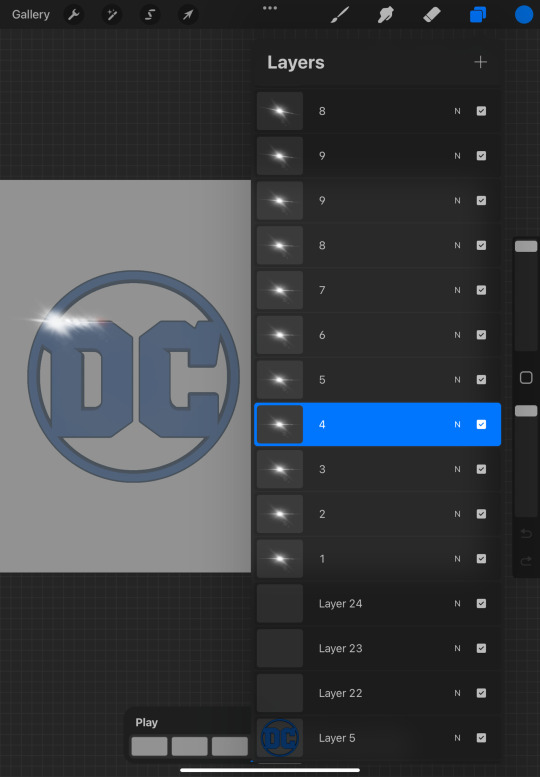
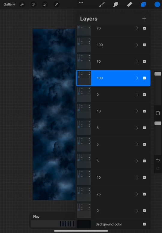
Next, I did some work on the backgrounds. I made sure to have really “tall” files so that way I could make them slide down in my video editor. This kinda gives that vibe that we are descending through the clouds, hopefully towards an establishing shot, for our opening scene, for our fake movie.
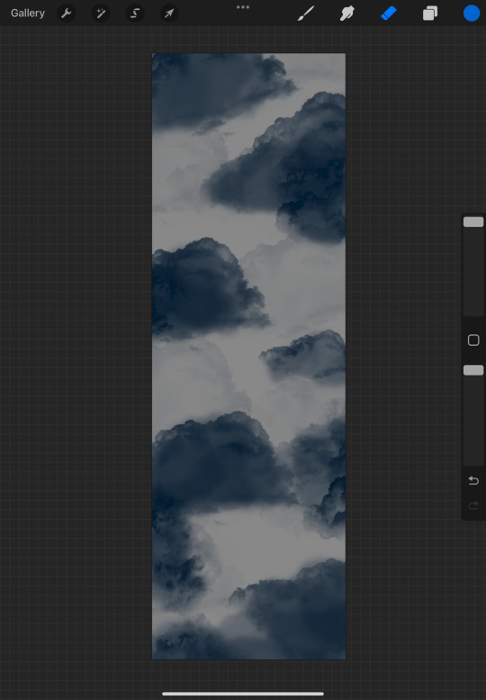
I made two parts for this. One animated background where I changed to opacity of the backlight for each frame to kinda give the illusion that lightning was peaking through the clouds. The second was just some clouds that I was gonna overlay on top of the DC logo, so it just felt more like everything was in the scene together.
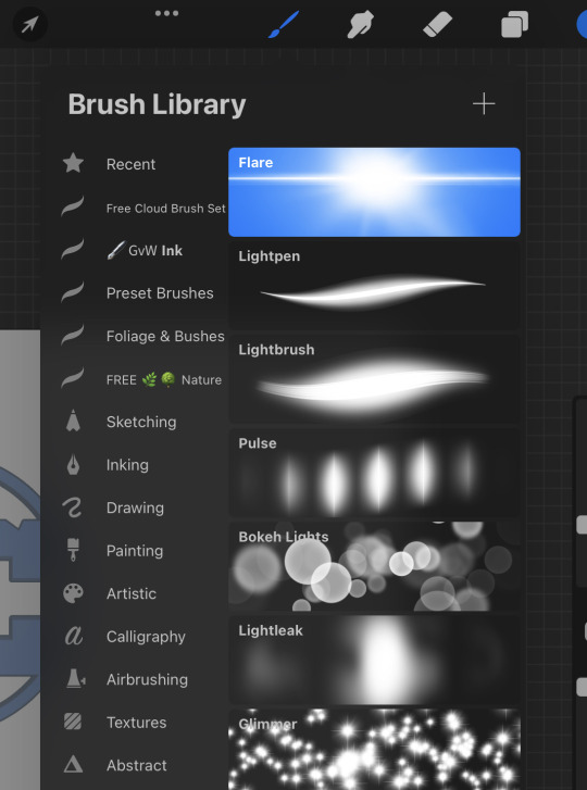
I would provide video examples of this, but tumblr only allows me to upload one video per post. And if you’re wondering what brushes I used to this? I just googled “Procreate free cloud brushes” and downloaded the top result.
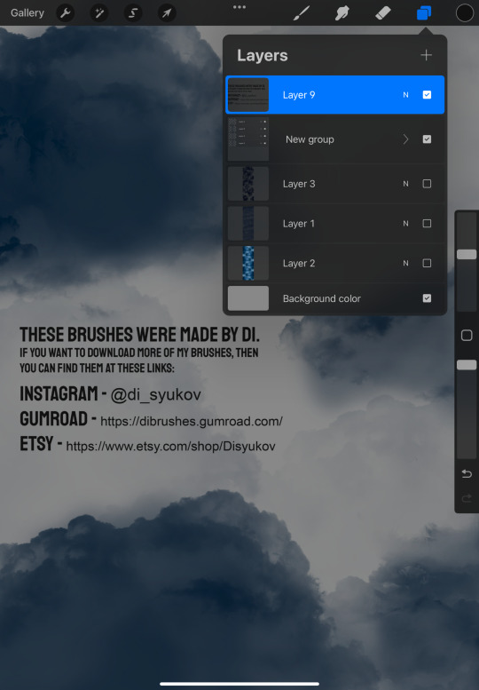
The ones I’m using are made by an artist named DI, and I got them off of gumroad. Info for their socials provided in the third image below.
And then once I had all of those assets together I just edited them all together in a program called HitFilm Express. I used to like it a lot since it’s free, and I used to use it to edit YouTube videos. That was back when I used to upload my Minecraft videos with my friends online lol. However, recently HitFilm has put a lot of features I used to use behind a paywall so :/. I’m probably going to look for alternatives sometime soon.
Normally I don’t mind being restricted in some sense for a free program, but they disabled the ability to fade clips in and out, and I think that’s a vital tool. It’s a shame to see it locked behind a paywall because I used it in pretty much all my projects.
And lastly the audio! I just found free to use clips of rain sounds, thunder claps, and then some ambient music. The track you can hear in this short clip is the intro to the song Redeye - Green House (1994). The artist is also known as Tobias Beldermann if any of you guys were curious where I got that from.
Buttttt yeah! That’s about all I have for showing you guys how I made my little 5 second clip. I’m not really one who’s qualified to make “tutorials” in any sense, because most of what I post online is just me dicking around and having fun, so I don’t want to be super serious. But, I also like showing my process just so if anyone out there is maybe interested in doing something similar, well then they have some ideas for where to start.
Anyways, if you guys want to read my first couple scenes for my Shazam story Shazam:City of Brotherly Love I’m going to link it here.
It’s still a work in progress, and if I end up doing any edits I’m just going to make them to the the post itself. Just because it’s not really worth it to me, posting almost identical chapters/scenes over, and over again lol.
Okiii byyeee!! I hope you enjoyed!! ~✨
#dc comics#dc universe#dceu#dc fanart#dcu#dca fandom#captain marvel dc#shazam#shazam 2019#digital art#digital illustration#shazam:cobl#captain marvel#fawcett comics
3 notes
·
View notes
Text
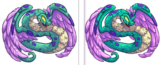
a comparison between the way my monitor is parsing the original display p3 color profile vs the artwork after i converted it to the default srgb in gimp
afaict tumblr automatically changes it in the same way as the first image (i saved the post as draft with the original file uploaded into it and went to that image url and saved it from there to look at it) which i decided to check in case it preserved the color profile cause if it did i think it would display in original colors for people with screens in that gamut, but it doesn't
this very much affirms my 'try not to think about the differences in monitor's color displays as a digital artist or your brain will Explode' but i hadn't thought much about the additional wrinkle of different color profiles and whether those change while uploaded
the one i converted specifically with gimp is much closer visually to the original one when looking at it on my ipad in procreate. i can see on the ipad that the whole image is even more vibrant, which makes sense when looking at a comparison graph of the color gamuts since the colors practically all live in the range of DCI P3 outside srgb. on my phone (galaxy s23 fe) the original file is pretty saturated but not as blue as it is on the ipad(?) but it bugs me that the automatic conversions hit the saturation so hard.
it looks like it sets the colors as though the ceiling of saturation is the same, even though DCI p3 can display much higher saturation over all, resulting in the saturation being tamped down
bugs me thinking about how much of this is just randomly happening without users knowing!! i mean i know why, because even having some knowledge about this before hand it still surprises me every time (deja-vu from the last few times i mucked around with cmyk color profiles for print LMAO) so you can just give up on trying to communicate these things to an average viewer, but still!!! damn!!!
.....although, i wonder if this is why my phone came set automatically to a 'vivid' display mode that boosted the absolute fuck out of the saturation of everything, to try and make it seem like a better screen when many of the things viewed on it are automatically crunched down to a lower saturation than the maximum the phone can display by the process of being uploaded. hmm.....
ahh, oh no, another wrinkle, in that of companies adding random switches with 'default' settings that are out of line from the thing that intuitively feels like the most default, which people might not know are not hardware differences and therefore not adjust to their actual preference, i gotta go before my brain explodes, i can feel it coming on, abort mission!!!
0 notes
Text
Oh. OH. I think I've found the problem myself.
The images exported from Procreate Pocket say they're RGB in the metadata and that is apparently the default setting so why question it... but then I looked at the choice of canvases and I've often been choosing Untitled Canvas 2048 x 2048. And next to that?
It says P3.
And "DCI-P3 provides a more extensive color range, especially for professional and cinematic purposes."
And that may be why my colourful art washes out and dulls on being uploaded to Tumblr. My poor choice of canvas means professional grade colours being put onto a consumer quality monitor. I think?
So while I will need a minute to test this theory out... FRIENDS! When choosing a canvas size in Procreate Pocket, check next to the title and choose one that says RGB!
I will also need to work out which canvas size is best for working with Tumblr compression because that can become an issue too. It can apparently cause blurriness on uploading.
There are canvases of a similar size that are RGB so perhaps if that change works this is solved. But it doesn't make me a wizard. Just a dumbass. In my defense I had only seen this desaturation issue discussed showing completely different settings for different programs, and learned about this particular one today. Never touched digital before - I bought PP in August!
I wonder if I can change the canvas format on the art I've already done... probably not unless I copypasta to newly created canvases one by one, or import the lineart only and recolour. FUCK.
But then again it's best I at least found all this out now.
I still have quite a way to go on my art skills and will hopefully have got on top of all this before they improve and there's a piece I really don't want ruined.
#ksa caws#art caws#colour issues#desaturation#Procreate#Procreate Pocket#artist problems#RGB#P3#colour settings
0 notes
Note
Hi! I absolutely love your art! You’ve mentioned that you use CPS brushes for your drawings. But if you used procreate or photoshop, which ones would you use? This sounds dumb but I don’t know how to transfer CPS brushes into either of those programs 🙈 thank you! 💖
oh shit im so sorry for the late reply anon i somehow didnt see this.
Well u can import PS brushes to CSP, but unfortunately, u cant import CSP brushes to PS. I hope we can in the future tho cos i like the CSP brushes im using a lot.
When i was still using PS, I tried out a bunch of diff brushes but the only one that stuck w me for a long time was a brush my friend made and sent it to me. Other than that one, I use Shiyoon Kim's brushes, Kyle Webster's MegaPack (i think they r free if you have PS license), and Goro Fujita's brushes. I did take some of these brushes and tweaked the setting to my liking tho.
I rarely use Procreate cos I mostly work on my laptop. I used some of the brushes from MaxPacks's painter and essential pack sometimes. But now i just use a custom brush i made from the default pencil brush that came w the app lmao
U can check @digitalbrushes as well, they posted a lot of cool free brushes for PS and other programs ^^
I hope this helps!
29 notes
·
View notes
Note
9, 23, 26, 30 :3
HI!!!!!! :3
9. What are your file name conventions
i usually draw on ipad so i don't even name them HSIDVHWOEFI whatever the default procreate and medibang names are ... on pc though it's usually the subject's name spelt incorrectly i.e. jyoosh, josh, jyushey, juice, etc...
23. Do you use different layer modes
YES DARKEN LAYERS MY BELOVED i use them soooooo much theyre so good for touchups for me in particular who tends to accidentally start with really desaturated colours and gradually darkens/saturates them as i work on it lol... otherwise i'm not huge on multiply or the other usual suspects just bc it doesn't work super well with my palettes, if i start from grayscale i'll usually use just use gradient maps and wing it from there but occasionally i will throw a hue layer over the top at the end of a piece if the colours don't look very harmonised
26. What's a piece that got a wildly different interpretation from what you intended
i don't really think i draw anything with enough story or symbolism for it to be interpreted in any way other than "wow! nice!" SDKJVN but i'm not a huge shipper so sometimes when i draw two charas for funsies and get ship tags i'm like huh... this reads as ship art? which i don't mind but it's just like an oh. i guess so! kind of moment
30. What piece of yours do you think is underrated
TBH... nothing in particular i think the social media netizens have been very kind to me over the past few years and a lot of the things i post get a lot of love so i'm very grateful ;w;...
if anyone wants to check something underrated out though they should take a peek at this CHUUOKU AU ZINE I PARTICIPATED IN which is really awesome and is only one order away from the first stretch goal!!!!!!!! I DREW JIRO AND JYUSHI TOGETHER FOR IT BTW!!!!!!!!
2 notes
·
View notes
Text
Whatever could the matri- prefix stand for?
Oh, for fucks sake, learn the difference between maternal and paternal and between matriarchal vs patriarchal. I get that the patriarchal way of thinking is so ingrained in us, that it is difficult not to subconsciously default to first thoughts, but you are a writer and a being capable of critical, self-reflective thought, try to make use of it.
The protagonist’s maternal aunt produces genealogy texts detailing her maternal line. Bu what are the last names of the first couple, recorded in that text? Husband X and Wife X (nee Y). Which means that the wife took on his name. Of course, recording the line of mothers you descend from doesn’t mean that they had to keep their own name (or the singular mother’s full set of predecessors). But the name of the first couple is the maiden name of his aunt and his mother, who, incidentally, also both gave up their maiden name upon marriage. Which means that it was the name of the father that was passed down, with sons, along the paternal line, or it wouldn’t have stayed unchanged until it ended with his grandparents.
That means a bloodline, introduced through the wife in the first recorded couple in the genealogy text might have been the protagonist’s maternal line, but most definitively is his aunt’s paternal line. Moreover, genealogy of maternal line (meaning descendancy) implies that it actually ignores every descendant who is male and only follows on the procreation of female descendants, much like if you read historical texts about aristocratic families, the daughters are only mentioned as a sidenote, but much more emphasis goes to the sons to determine who inherits which title.
And whenever writers in other fandoms start expounding on the idea of “oh! let’s introduce the concept of this family being matriarchal to show how socially advanced we are!!!11!” and what we actually get is the same tired patriarchal bullshit. Either because the last actual matriarch the family has to show was at least three generations back, despite plenty of women being born after, or if not, against all logic, the family name isn’t considered extinct. Or because what they are actually writing is matrilineal family instead of a matriarchal one, but they suck at this just the same, because the male descendants miraculously get to keep their family name.
And to be completely honest, I have struggled with this, too, when I was writing my fic (which is still safely in my WIP folder because I suck at finishing projects) and I was constantly making up relatives of the wrong gender. But there is a reason why I put a big ol’ digital sticky note to check it thoroughly once the fic is finished. It can be done.
3 notes
·
View notes
Text
DAY III:- PERVERSE
A/N: Here the word means 'sexually pervert'.
What a pleasant morning! If it didn't have a dazzling sun up high in the cloudless skies with tiny birds chirping around welcoming the day with warm greetings.
And the entry of that bright radiance of sunlight into the cold, dark room just through the way caused by a small gap between the window screens.
This sunlight falling right on the face of a certain devil slayer who belonged to one for the most well famed guild of Fiore, 'Fairy Tail' which caused him to stir from his peaceful slumber and groan in annoyance.
The next thing he does is try to pull the significant other of his life closer towards him by searching the adjacent side from where he slept then plant a kiss on her head and cuddle for sometime until his 1 year old son decides to intervene their small intimate moment by crying to seek his parents attention.
When he thought things were going by the default routine, sun rising, birds chirping, sunlight falling on his face, him groaning.
Everything was exactly the same but him trying to pull an empty space closer to him is different. That's when he decided to open his eyes which took a few seconds to adjust until blurry vision became clear.
Gray saw his bed was empty nor his beautiful, gorgeous fiancee was in their room. Even he didn't hear his son crying. In fact, the whole apartment was engulfed in silence.
" *yawns* what time is it?" He looked at the digital wall clock which showed 8 A.M.
Now he felt strange as to where his fiancee and his son would go this early in the morning.
Gray decides to get up and get things sorted out before it drives him insane and also checks around the apartment before going out in search of them.
When he went to the living after wearing his boxer, he got answers for his questions.
There his fiancee was doing workout while their curious bubbly son simply sat silently watching his mama do something which was unique to his blue eyes.
Juvia only wore a sports bra and a 3/4th sweat pants which hugged her figure tightly making her look ravishing and irresistible. The tiny sweat drops on her body made her skin glow even brightly.
Gray felt his throat get dried and his boxer get tightened as she stretched her body from sideways to up and down.
He had to really appreciate her efforts in trying to shed those extra pounds which she gained due to pregnancy. For him, she always looked the same as Juvia with whom he fell in love and procreated their child together out of love.
It was just a few days back, he proposed to her after nearly two years delay. Gray had intended to do this after dating for a year but things got out of hand as she got pregnant before he could propose.
Gray wanted Juvia to know that he was in love with her and wanted to be with her for the rest of life and that's the reason for his proposal. But with the arrival of the baby, he didn't want her to get the idea that it's only because of the baby he was doing it.
Now that their son, Silver is a year old. He proposed to her and made sure she understood the purpose behind it. So, in the next three months, Fairy Tail would hear another wedding bells in the guild.
Gray simply stood there quietly and took in sight in front of him. The way sweat trickled down her face, the way she breathed, the way she increased the intensity of the workout, more importantly, the way her boobs and hips moved in respect to each exercise.
He simply looked like a pervert standing there ogling his own soon-to-be wife even though he had seen wholly of her in every possible sense.
That's when Silver saw his papa standing and called out to him, "Pa..pa…"
Juvia instantly stopped her workout and looked at her handsome man who gave her a sexy smirk and a wink which caused her to blush madly.
"Gray-sama, Juvia didn't hear you get up. Just wait let me just finish this last part." She said and continued doing the jumping jacks.
Gray went near the couch and lifted Silver in his arms and checked the diaper. Luckily, the boy was clean, good news for papa.
"Hello buddy, good morning. Watching your mama do workout huh!!" He kissed Silver's forehead while he sat on the couch.
Gray's eyes were now fixed on his beautiful lady, more importantly, her boobs which hadn't been seen bare for a week.
As soon as Juvia finished her exercise regime, she took the hand towel to wipe those beads of sweat from her face and body.
Now her whole body looks flushed and she heaved to catch the breath.
"Good morning, Gray-sama. Juvia didn't greet you." She said and leaned forward to give a peck on his lips and another one on her son's messy dark blue hairs on the top of his head.
Gray caught hold of her wrist and made her sit on his lap, "Good morning, what were you doing this early in the morning? For a moment, my heart stopped when I didn't see you by my side on the bed." He pouted while Juvia chuckled and planted another kiss on her fiance's cheeks.
"Sorry about that, ever since you proposed and said that in the next 3 months , we will get married. Juvia's trying to get back to her previous shape so that she can look beautiful and gorgeous for her Gray-sama on our special day."
Gray smiled and kissed her forehead, "You always know I will find you breath taking however you are because you look the same to me. Now, you look even more hot and sexy after working out." He winked and had his left arms around her waist and pinched it slightly.
Juvia squeaked and slightly smacked his hand away, "Stop it perverted Gray-sama. Don't do such things in front of our baby. We shouldn't traumatize his little mind." She had courtesy to blush and took her son in her arms.
"Silver-chan, tell your papa. He's bad boy." Just as if on cue, her baby smacked his papa on his chest and babbled some incoherent sounds as he was scolding him.
"See Gray-sama, Silver-chan's warning you." She smiled and kissed her baby's chubby while the little guy kept on calling his mama.
Gray rolled his eyes and looked at his son who now had his tiny fist in his small mouth and kept looking at his papa, "It's good to know you are protecting your mama. Good job, buddy." He patted his head and earned a happy squeal.
"Oh gosh! Looks like someone's really excited today. Come let's go feed you baby." Juvia got up to move and soon Gray did the same.
Juvia squinted her eyes, "And where do you think you are coming Gray-sama?"
Gray laughed sheepishly, "Silver's hungry right that's why, come let's go feed him."
"Juvia's now going to breastfeed her baby. After a few hours, you feed him those mashed bananas. Now go and get freshened up, dirty Gray-sama." She teased him.
"Hey at least, let me come and see how you are feeding him." Gray pouted and stomped his leg like a child.
"Juvia it's not fair. It's been a week since we made love. At least, let me look at my reward." He tried to reason with his fiancee.
"Oh no Gray-sama, Juvia doesn't want to turn pregnant again that's why she's been avoiding you. Believe her, even she misses her Gray-sama." She smiled.
"But if Gray-sama decides to be a good boy and help out Juvia today. She decided to reward you just the way you want." She winked and went inside Silver's room before Gray could enter the door was locked while the latter just groaned in annoyance.
"Man, she has me totally wrapped around her fingers. Okay Juvia, I agree to your conditions. I want to ravish you tonight or before that is also fine." He said loud enough for her to hear.
All he heard as a response was, "Oh perverted, Gray-sama" for which he chuckled and went to get freshened up as he was looking forward to this pleasant morning to turn into a wild, passionate night.
#gruviaweek2020#gruviaweek#gruvia family#gruvia#gray x juvia#ft gray#fairy tail gray#gray fullbuster#gray#fairy tail juvia#juvia loxar#juvia#ft juvia
75 notes
·
View notes
Note
Do you have any tips, tricks, or brush set recommendations for ProCreate? I just got an iPad and oh my God the learning curve... I feel like my skills have downgraded ten years...
Oh boy, I don't think I have even scartched the surface of Procreate myself but I will try to give some tips! Unfortunately I can't say anything about the brushes because I only use defaults - haven't had the need to start making my own! 90% of what I do is done with the Nikko Rull brush and the rest is 6B pencil, soft airbrush and a nice mix of whatever to get some texture effects.
I think what I would recommend you to do is to get yourself well acquinted withe the interface. Spend a good while looking at the tools and options you have and learn where everything is. The interface is very simple and once you learn to use it effectively it can really help streamline your process.
Also I would highly recommend you to learn the shortcut commands (such as the two finger tap for undo, using your non-dominant hand to control the size and opacity sliders and the colour picker etc.)
The program is super intuitive and for me, as an artist who started off as traditional, the interface makes me feel like I can interact with the drawing as of it was a physical piece. I don't know if this is helpful or makes sense but one thing is for sure that Procreate isn't really like any other digital art program despite having all the most common functions.
The best thing you can do starting out is just dick around, see what the program offers you, test stuff, go crazy! There are a lot of helpful tutorials for the shortcuts, process etc available online so check out some of those too!
I heard you can actually stream your drawing process on Twitch so I might try that out some time if people are interested in seeing my process on Procreate!
4 notes
·
View notes
Text
F.A.Q
GENERAL FAQ
So what's up with this blog?
This is @joliemariella's undertale specific sideblog! Here I reblog neat Undertale related content I've seen, post Undertale content of my own in the form of fanart and fanfics, and also answer asks for both myself and the main characters from any of my UT fics. Q is the most popular of course, but you can read more about him further down.
(Rest under the cut)
Where can we read your fanfics?
Over here on my Ao3 is generally the best bet! I do recommend following me here as well, though! Not only will I post when I update, but sometimes I'll also do sneak peeks, or even tumblr exclusive stuff!
Where can we see your fanart?
Well I have a gallery over on DA, but here on tumblr is a good place too. I tend to only post finished product over on DA, but if you check the jolie arts tag here on my tumblr, you can see my sketches and various silly drawings I don't post anywhere else.
Who all can we send in asks for?
Myself, obviously, but also any of the main characters from any of my fanfics! Just don't expect reaction images for all of them, lol. Any interactions you have with these characters (and the fact that they're answering asks at all) are not canon, but any information they give you IS. Unless they're lying, which some of them are more prone to than others, heh. I'll drop a hint that they're not being entirely truthful if that is the case, though.
The only exception here is my monstersona, Jo! If you're looking to send her an ask, please send it to @ask-sfhaven instead of here!
You have a Monstersona?
I do! You can see here here, or also check out my sister @nighttimepixels's and I's sideblog @swapfell-haven where we write journals and short stories for them as they live their lives in the Underground in the swapfell AU. The skelebros will be making a debut soon ;)
Are we allowed to send in... 'naughty' asks?
Have at it, man XD If it's TOO raunchy I might stick it under a cut just to save my followers who aren't super into explicit content.
I sent in an ask but you haven’t answered it, what’s up?!
My ask count for this blog tends to hover right around 100 no matter how many I answer, and I’m generally pretty good about doing at least a handful every day. That said, I will not answer every ask sent in. I definitely pare them down for the sake of my sanity. Sometimes they’re just silly and not really worth the time. Sometimes they’re boring and/or Q’s already received that exact question a bunch already. Other times they were only really pertinent in the wake of another ask that got answered, and if I wasn’t able to get to it in a timely manner then I’m not going to because the context is now lost. I��ll also sometimes save some asks for later because they just require a little more thought to answer than I’m up to putting into it at the moment. Also, if you send in several around the same time, then I’m not going to just sit and answer all yours in a row, I’ll spread them out over days or weeks.
Side note, questions about the actual mechanics of how Q or his world work are almost guaranteed to get answered eventually because that was kinda the entire point of opening asks for him in the first place, heh.
Do you take prompts, suggestions, or requests?
Nope! If you want to share your headcanons or something that's cool, and I might weigh in on them, but that's as far as I'll go.
Can we do fanart of Q (or any of your other AUs/Fics)?
I freaking love fanart okay, so yeah, have at it, man! Just make sure to tag me or send me a link and I’ll totally reblog it! If you don’t see me reblog it or at least comment on it within 24 hours try sending a link directly to me via chat because I probably just missed your tag or Tumblr straight up ate it.
Can we write fanfic about/involving Q (or any of your other AUs/Fics)?
Please do NOT do this. While I appreciate the gesture, fanfic of my fics/characters is not something that I enjoy receiving from strangers. There are a couple of people on my extremely short list of individuals I’m ok with writing Q or my other AUs, and trust me, I’ll have straight up told you if you’re on that list.
Q FAQ
Who the hell is this 'Q' and why is he such a goddamn troll?
Q is Quarantine Sans from my Undertale AU, Machinatale, which in turn is the foundation for my fanfic 'Skeleton ex Machina'. SeM is a sister fic to @tyranttortoise amazing fic, "Skeleton Squatters and the Landlady". The very brief backstory for him can be read here. As for why he's a troll, well, lets just say life and the happenings there in have left him a bit salty with a low tolerance for bullshit.
Who else is in this world of Q's?
Everyone that made an appearance in the Undertale game with the exception of Frisk and Chara (For the why of that, read here)! There are a total of 167 souls in Q's world.
Why only 167?
As far as he's been able to discover, that was the total number of characters and killable enemies within the original game. Unfortunately, whatever happened that gave them all life has not given them the ability to create life in turn, or age. It's a phenomenon that Q is investing a great deal of time in hopes of one day giving his people the ability to procreate, and their few existing children the ability to grow up, but it's a puzzle he's yet to crack.
Just how much control does Q have over his world?
It's nigh infinite as far as he can tell, beyond his inability to create new sentience. He's the only system admin so he's able to change anything about the system. There are facets of the citizens souls that he is not able to change, however, no matter how hard he tries. Papyrus still can't cook well, for one, no matter how many cooking programs he installs. Any of the main 'sprited' characters also have trouble maintaining any sort of shift in their appearance they adopt. Unless they pay close attention to it, the programming likes to shift back to their default appearance. Any of the citizens that came from 'random encounter enemies', on the other hand, are able to maintain such changes indefinitely.
Do the monsters in Q's world have souls?
They do! They're not exactly like regular monster souls, however, since they don't technically have magic in Q's world. Read his explanation on it here, or in chapter 5 of ‘Skeleton ex Machina’!
What happened to the seven human souls?
They still exist within Q's world! Read his explanation here.
What happened to the Amalgamates?
They also still exist! A few of them have actually been saved and returned to 'normal', though the bulk of them still exist as they appeared in game. You can read more about them in chapter 2 of ‘Skeleton ex Machina’.
Wait, so why does Q talk like he's already with the Landlady when answering some asks, and like he's still pursuing her in others?
Due to the nature of this blog, Q is answering most of them from the 'present', e.g. from whatever the latest point in ‘Skeleton ex Machina’ and ‘Skeleton Squatters and the Landlady’ is. Sometimes, however, depending on the ask, he's answering from the 'future', e.g. from after the end of Skeleton Squatters and the Landlady in the timeline where he's the one that ends up with the Landlady. (For those of you that don't know, Tyrant_Tortoise is planning to write an ending for each of the main skelebros where they're the one that ends up with Lady, Q included. That way all the readers wind up happy XD).
So who's Grim?
ONLY HIS BFF BRO. Grim was created by my sister, @nighttimepixels, and you can find out more about him over on @skeletonsgrim! He's the kinkiestsweetest skeleton you'll ever meet! He and Q meet in the 'future' after Q's already settled down with the Landlady and put a ring on it cuz he liked it so much and they quickly became best friends because Q is literally one of the only people on the entire planet who can actually see Grim. For all the particulars on THAT, check out @skeletonsgrim, lol. They're best bros and work together on crazy science projects in Q's private lab.
(If you guys can think of anything else particularly pertinent that should be added to this, drop a comment or ask and let me know!)
30 notes
·
View notes
Text
Time for replies!
Some of these go back a bit because I’ve been a bad, bad blogger...
For @olivesplum06, @jellybeanery, @getmygameon, @penig, @holleyberry, @littleblondesim, @mustluvcatz-reloaded, and @elfpuddle...
olivesplum06 replied to your photo “Another day, another A+. *snooze* And it was time to give Sharon a...”
What mod are you using for the custom UI sim portraits?
It’s one of the ones that @hexagonal-bipyramid made. I think it’s this one, specifically, but they’ve made a bunch of different ones with different poses, so check out their downloads page. :)
jellybeanery reblogged your photoset and added:
Eeeeee thank you so much for doing this! ♥ I can’t...
You’re very welcome! Let me know if you have any issues with it. I didn’t thoroughly test or anything. I’m particularly unsure of snow on the roads. It should be OK because I used CuriousB’s as a “template,” but you never know... :)
getmygameon replied to your photo “And Sharon rolled up the same “Talk to a Relative” want the next day,...”
Well he looks like he's saying 'you've got a nice setup there ma'am' XD
And he’s not wrong! She does! But then, all female Sims do until they hit elder and then it’s suddenly sag city, as if good bras haven’t been invented in Sim-Land. :)
penig replied to your photo “VOOOOO, GERBITS!!!! Yeah, as if you actually care about the sports...”
A good cheer is a poetic performance, though, so she's appreciating literature.
Well, if you say so... :) I’d call it a “bad poetic performance,” personally, but then I’ve never really gotten poetry anyway. :)
getmygameon replied to your photo “A tree exploded. No one cared.”
Damn right. When does anyone give a damn about a burning tree? :p LOL!
Only if it’s in their own yard, really. Or threatening their own house. It’s all me, me, me. ;)
penig replied to your photo “Dawson, for some unknown reason, decides to express admiration for...”
She assumes he's making fun of her.
Nah, I think she just doesn’t do people. Which is weird because I think she has a good amount of Outgoing points. Most of the family does. But I’ll have to check again. If I wanted to make an actual “story” out of this trainwreck of a neighborhood, I’d probably characterize her as autistic or at least an extreme introvert. While her parents and all of her full- and half-siblings were busy interacting with each other and their barging-into-the-house guests and just generally being strange, she was off in her room reading. She’s still like that.
holleyberry replied to your photo “And she immediately plopped down on her ass to do an assignment....”
Woohoo Sharon. Lots and lots of woohoo.
Well, *I* know that, and you know that, but her? Hell, she hasn’t even had her first kiss yet. I’d almost say that she doesn’t know what kissing is, except that her parents were fond of making out in the kitchen on a regular basis, so it’s not like she hasn’t been exposed or anything... Maybe she was too exposed, now that I think about it. :)
She’s in for a rude awakening, though. Her “destiny” is marriage, so if she doesn’t find a spouse in college, she’s going to find herself assigned a random one. Because I’m mean that way and someone needs to be procreating in this neighborhood, after all...
littleblondesim replied to your photoset “Sharon’s dormmates, in order of their appearance on the lot. These...”
Lots of cute sims in your neighborhood!
I can’t take any credit for them at all. My game generates all my Sims. I just default and townify things and let the game do its thing.
mustluvcatz-reloaded replied to your post “I have a creating project to do, that I need to get done. I’ve done...”
Tom Selleck is still pretty hunky for his age - just felt that needed to be said. :)
Yeah, he’s gotta be in his 70s now, and last time I saw him, he was still lookin’ pretty good. I totally crushed on him in the 80s. Watched Magnum PI just to ogle him in his shorts and nothing else. I know he’s where my chest hair fetish comes from...
elfpuddle replied to your photoset “A nice summer day off with Sage GilsCarbo.”
Doesn't everyone daydream about their bathtub?
I certainly do! I just got out of mine a few hours ago. Yeah, that was an excellent bath...
penig replied to your photo “And then….. But don’t worry because… They were just taking a...”
Yeah, that'll look good hanging in the police station!
Well, it’s certainly more attractive than mug shots! :)
elfpuddle replied to your post “i think my highest cc problem is bedding,walls,and flooring cause...”
As someone who has all of those walls in her game, I can confirm that they, at least, aren't the problem with my game. #ElvesHaveDownloadIssues
You don’t have “issues,” my dear. You’re just nuts. ;)
getmygameon replied to your post “littleblondesim replied to your post: Sorry if...”
Oh god...ACR >>;;; oh boy, the shit that program has caused me in the past. I can imagine how hellish it'll be to me when I get this going again XD
Ah, but I just cannot imagine the game without it. It would be not nearly as fun. It totally did something tonight that has me LMAO. ‘Course, it might gross out other people, but *I* think it’s insanely funny. :)
#olivesplum06#jellybeanery#getmygameon#penig#holleyberry#littleblondesim#mustluvcatz-reloaded#elfpuddle#replies
7 notes
·
View notes
Text
Here’s to Labor; An American Beehive
Homer is short and wiry, proud, you can see it in the way he punches his time card, and at fifty-five his job is to push and pull eight hundred sixty pounds of yarn, crucifixion style, a buggy of steel in each hand, three hundred feet up the concrete hall of the plant. He does this sixty times in eight hours. Sometimes he dreads coming to work. But he says the workday passes fast for him and I believe him. He walks down to fetch the first pair, shoulders drooped, arms barely swinging, as if they’re accustomed only to having weights attached to them. Over the years scores of persons a third his age have turned down the job.
As Homer sweats his way down an aisle he passes Louie, also short but overweight. Louie is sitting on a bench and wiping his brow, for it’s hot down here in Continuous Spinning, what with the double deck being so confining and the heat coming off the drums to the yarn dryers. Like Homer, Louie has been around a long time, thirty-three years seniority. He’ll get up in a little while and putter for fifteen minutes with his broom and dust pan, then he’ll be back on the bench. He has all the accouterments of a subordinate, but an attitude of nonchalance washes over what is material. “It’s taken me a long time,” he says, as he watches Homer scurry back with two empties, ready to grab another haul, “to get to where I am.”
Every time I see Louie I get reminded of the song, “Louie, Louie.” I think part of the lyrics are, ‘why dontcha sit yourself down now...’ Homer doesn’t remind me of any song. Homer is like a grand old relative one remembers from childhood, greatly admired, probably single, fondly thought of every once in a while.
A person must haunch over while walking down the aisles or between the machines of the bottom deck if he or she is more than five foot eleven since pipes and conduits and structural members hang or protrude everywhere. Every so often, when someone’s new, when a trainee, they forget. The machines here run silently, effortlessly. The intercom speakers above crack to life; “C14, Ethel, coming down the hole.” Ethel, on her way to aisle C, fourteenth machine row, smiles as she passes. There are massive tanks on the upper deck. The cellulose xanthate is formed to a solid and a spinning jet carries it below, where the filament is washed with a finish and wound about the heat drum by an operator, and after a few minutes this end is snipped off and wasted, and the regular yarn, flat in its youth, is laced onto tubes or cones.
Continuous Spinning is the procreator of rayon industrial and tire yarns. The machines never stop, except for the once a month washdown maintenance or during production curtailment. A doff is made every eight hours, three times a day, seven days a week. When it runs full blast, fifty-six machines spin, eighty-six ten pound cakes to a machine.
The lead truck is rolling freely, but the rear one is fouled with lint and stray ends and it drags. “Click,” goes the electrical box, the lead truck having been turned from the hall, the light beam between eye and reflector broken, and the doors to Warping begin to swing open. A roar from sixteen twisters, seven to one side and nine from the other, and dead center ahead is a spray booth through which the buggies are shoved, what it sprays most of us don’t know except that it’s yellow; the protective hoods are lifted off the buggies, a red spot on the yarn indicates acid. The buggy is put aside if acid shows. One of the uses for the defective yarn is the stuffing put in coffins.
In Warping the flat double deck yarn is given a ‘Z’ twist, 2.3 turns to the inch, or 2.0 or 3.4; it could be put right on beams, the creels on the far side of the shop in lazy motion compared to the crazy, buzzing twisters. Or it could be hauled another three point six four minutes worth, the figure is from a man with a clipboard and stopwatch who charts such things, farther up the hall to Twisting, ring twisting as opposed to Warping’s up-twist; different machines but with the same noise, there to be plied or re-coned or twisted as in Warping, then possibly to be processed with adhesive dip, and packed, weighed, and shipped out. Thousands of pounds an hour, millions of pounds a month.
The primitive sound of metal rapping metal is continuous too. The very space overhead drones and at regular intervals throbs with the thudded drumbeat of a multitude of pipes pressurized from afar. Running their own course are row upon row of fluorescence, obscuring the time of day, while above all of it is steel or concrete.
Hundreds are tucked away where the chemical process begins in Viscose and other hundreds labor in Waste Treatment and Water Softeners and Acid Reclamation and the power plant, hundreds more in Staple or Coning or the Box Shop and scores of others from Engineering sashay through the halls behind their tool push carts. Very slowly fork trucks vie for the right of way and pedestrians always win by default, usually because they step aside. Every so often one passes a soul that is straining, eyes bugged and glazed and face a frozen daze. Hurrying executives in ties and button down collars weave through the traffic on bicycles while ringing their bells. In its heyday the plant employed eight thousand people.
Each has a part, isolated but synchronized, vital, compromised by the sheer weight of the place. Sixty-two acres are under roof, more mill than all the mills in New England during the time of John Stuart Mill. No one truly comprehends this creature of mass production. Homer’s vision is one of sweat, Mr. Kittel in .861 deals with it in pounds, the plant manager issues directives. The plant doc conducts ten physicals a week as he welcomes and examines newcomers. Accountants do their thing, the girls in shipping track cases and pallets on their computer screens. Each is obsessed by his own little function. And so it is with the good folk in Industrial Relations entrusted with image stewardship, and Research and Development enmeshed in routines of inspection, and Human Resources weeding out bad apples, and the nurse in the Dispensary doing her nails so pretty, and the guard force doing spot checks for pilferage, and Mr. Duke, the Plant Safety Director, spearheading the drive toward renewed safety awareness with a plant wide bingo contest, each space carrying a message on how to be safer.
I have to push two trucks of .056 twisted yarn which is always on the small solid green tubes through the spray booth and up to the .861 finishing area and while I’ve been doing it for a while I still don’t know what .861 means, and as I weave through Warping one of the girls careens out from between the twisters on the little one cubic foot box with wheels on the bottom that she’s sitting on, and I have to dig the heels to my safety shoes against the concrete to stop the first buggy from colliding with her. She’s cute and soft looking and it reminds me of baby fat yet remaining and she looks up at me in a dreamlike way and all of a sudden I’m thinking of Mr. Willis the Department Head’s favorite saying, “The longer you wait the harder it gets,” and I make my beeline for that gray area of safety, the one that shows preoccupation with business at hand, and now “Taking Care of Business” by BTO pops into my head, and then I’m hustling my buggies out of Warping with an exaggerated determination.
It’s the graveyard shift, midnight to seven, usually the quietest one, but the foreman’s been breathing down my neck all week. My job is authorized to make the adhesive dip and this shift is the one scheduled to do that, though lately that’s become more of a retreat than a chore for me. The dip room is a cubbyhole adjacent shipping, which is outside the main part of the plant. A pair of double doors snap open as their light beam is broken by the fork truck I’m operating. You don’t drive it or ride it or run it, you operate it. The doors snap shut after a time delay switch somewhere is activated, jaws snapping shut on the mechanical monster that is within.
Up in the dip room, alone, out of the way, I am doing my thing making dip. Sometimes I feel like Homer, sometimes like what’s his name, Louie. Sometimes I wonder what other factories are like, if things are different or the same further up and down the chain.
Water, liquid latex, resin, water dispersion (which sounds like soap), formaldehyde (which definitely does not), soda and ammonia get dumped together by the drums and by the buckets full to create a batch. A single large vat, one smaller that’s higher and off to the side, both elevated on a steel platform so that gravity drains the batch into the two hundred fifty gallon tank that is carried by fork truck out to the floor where the women can fill their five gallon pails for the dip pans located in front of their spindles. Some of the ingredients are mixed in the large tank, some in the small, the formaldehyde is added as a catalyst, a valve is opened, and for thirty minutes everything is mixed together. When it’s done it has a froth on top and looks like a giant strawberry milkshake. There’s noise from the overhead exhaust and hardened dip slung all over, even on the walls, testimony to the labor of decades of dip making by us dip makers, and the bright light from the spots casts weird effects on everything. Sometimes I can all but see ghosts flit by, so loosely does this place fire my imagination. But the eerie sense of working among dwelling spirits is somehow uplifting.
I only have four years seniority. Last week a man retired from Continuous Spinning.
“Everything okay? Good.”
Those were the last words he said to me. Three cakes, I mean the real kind, homemade were baked for him. Everybody in the shop signed the card. And in Warping, another cake was brought in for a lady who is to retire at the end of the month.
It’s a unique achievement, this synthetic, creating a fiber out of chemicals. It seems almost like getting something for nothing. This dip that I’m making tonight, it could be the coating that goes over the yarn that’ll go into the tire that will go on a jet plane. Maybe Air Force One, for all I know. Sometimes I haul the carbonized yarn which is patented, the heat resistant fiber that has made the space shuttle possible.
So what is success, anyway? A means or an end? Independence or acceptance of responsibility? Subjective? Objective? Is it conditional and varied, or in compliance to permanent moral standards? Is it found in the tangibles of life, like mazuma, or is it intangible? Does it lie in a reputation, or in selfish satisfaction, or in helping others? Is expediency, advantage and privilege more worthwhile than trust and honesty? Is the long run the sum of all short runs, or more? The very word conjures enigmas in my mind.
I don’t believe it necessarily has to be a regimental tie around one’s neck, or being the leader of a regiment, or regimenting one’s life to a bank account.
Hey! Last Wednesday night, I had to vote, down at the Union Hall, and the sensation of waiting and standing in that line I would be hard put to define. But it definitely had a lot to do with being with brothers and sisters.
But those snapping doors scare me. Makes a person wonder.
(1982. Avtex Fibers, Front Royal, Virginia.) Last production run completed, July 9, 1989.
0 notes