#I still don't understand how you artists draw comics
Explore tagged Tumblr posts
Text


One of my skele-sons had a birthday on Sept 22nd and I decided to try to draw a mini-comic -w-
#art#digital drawing#oc#undertale au#sans#Less (Lawrence)#Creeps sans (?)#darktale sans#Dee#HS Dee (Mar)#Mar#Silk#dp_art#dp_oc#Dp_comic#darkpiece#Omg I should have renamed my skelesons#I still don't understand how you artists draw comics#I spent the whole day on it#It turns out that this is not so easy TwT#Posting my OC's is a bit cringe#I already regret that I ever came up with them and I can't give them up..#Brain stop thinking pls
1 note
·
View note
Text
🎮 HEY I WANNA MAKE A GAME! 🎮
Yeah I getcha. I was once like you. Pure and naive. Great news. I AM STILL PURE AND NAIVE, GAME DEV IS FUN! But where to start?
To start, here are a couple of entry level softwares you can use! source: I just made a game called In Stars and Time and people are asking me how to start making vidy gaems. Now, without further ado:
SOFTWARES AND ENGINES FOR PEOPLE WHO DON'T KNOW HOW TO CODE!!!
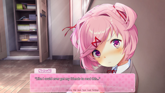
Ren'py (and also a link to it if you click here do it): THE visual novel software. Comic artists, look no further ✨Pros: It's free! It's simple! It has great documentation! It has a bunch of plugins and UI stuff and assets for you to buy! It can be used even if you have LITERALLY no programming experience! (You'll just need to read the doc a bunch) You can also port your game to a BUNCH of consoles! ✨Cons: None really <3 Some games to look at: Doki Doki Literature Club, Bad End Theater, Butterfly Soup
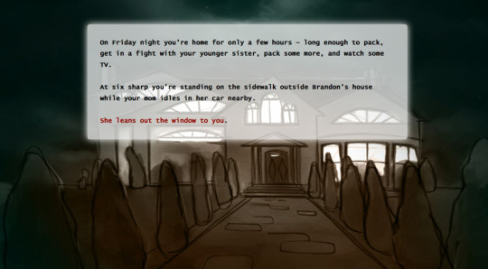
Twine: Great for text-based games! GREAT FOR WRITERS WHO DONT WANNA DRAW!!!!!!!!! (but you can draw if you want) ✨Pros: It's free! It's simple! It's versatile! It has great documentation! It can be used even if you have LITERALLY no programming experience! (You'll just need to read the doc a bunch) ✨Cons: You can add pictures, but it's a pain. Some games to look at: The Uncle Who Works For Nintendo, Queers In love At The End of The World, Escape Velocity

Bitsy: Little topdown games! ✨Pros: It's free! It's simple! It's (somewhat) intuitive! It has great documentation! It can be used even if you have LITERALLY no programming experience! You can make everything in it, from text to sprites to code! Those games sure are small! ✨Cons: Those games sure are small. This is to make THE simplest game. Barely any animation for your sprites, can barely fit a line of text in there. But honestly, the restrictions are refreshing! Some games to look at: honestly I haven't played that many bitsy games because i am a fake gamer. The picture above is from Under A Star Called Sun though and that looks so pretty
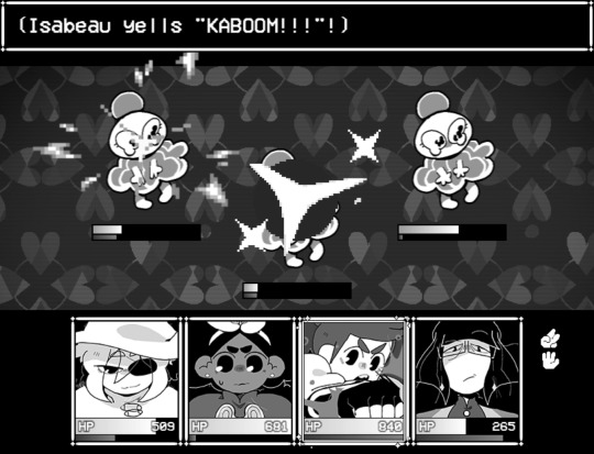
RPGMaker: To make RPGs! LIKE ME!!!!! NOTE: I recommend getting the latest version if you can, but all have their pros and cons. You can get a better idea by looking at this post. ✨Pros: Literally everything you need to make an RPG. Has a tutorial inside the software itself that will teach you the basics. Pretty simple to understand, even if you have no coding experience! Also I made a post helping you out with RPGMaker right here! ✨Cons: Some stuff can be hard to figure out. Also, the latest version is expensive. Get it on sale! Some games to look at: Yume Nikki, Hylics, In Stars and Time (hehe. I made it)
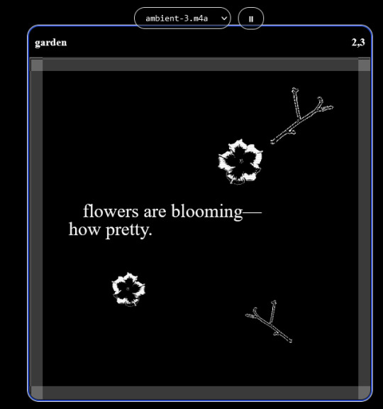
engine.lol: collage worlds! it is relatively new so I don't know much about it, but it seems fascinating. picture is from Garden! NOTE: There's a bunch of smaller engines to find out there. Just yesterday I found out there's an Idle Game Maker made by the Cookie Clicker creator. Isn't life wonderful?
✨more advice under the cut. this is Long ok✨
ENGINES I KNOW NOTHING ABOUT AND THEY SEEM HARD BUT ALSO GIVE IT A TRY I GUESS!!!! :
Unity and Unreal: I don't know anything about those! That looks hard to learn! But indie devs use them! It seems expensive! Follow your dreams though! Don't ask me how!
GameMaker: Wuh I just don't know anything about it either! I just know it's now free if your game is non-commercial (aka, you're not selling it), and Undertale was made on it! It seems good! You probably need some coding experience though!!!
Godot: Man I know even less about this one. Heard good things though!
BUNCHA RANDOM ADVICE!!!!
-Make something small first! Try making simple: a character is in a room, and exits the room. The character can look around, decide to take an item with them, can leave, and maybe the door is locked and you have to find the key. Figuring out how to code something like that, whether it is as a fully text-based game or as an RPGMaker map, should be a good start to figure out how your software of choice works!
-After that, if you have an idea, try first to make the simplest version of that idea. For my timeloop RPG, my simplest version was two rooms: first room you can walk in, second room with the King, where a cutscene automatically plays and the battle starts, you immediately die, and loop back to the first room, with the text from this point on reflecting this change. I think I also added a loop counter. This helped me figure out the most important thing: Can This Game Be Made? After that, the rest is just fun stuff. So if you want to make a dating sim, try and figure out how to add choices, and how to have affection points go up and down depending on your choices! If you want to make a platformer, figure out how to make your character move and jump and how to create a simple level! If you just want to make a kinetic visual novel with no choices, figure out how to add text, and how to add portraits! You'll be surprised at how powerful you'll feel after having figured even those simple things out.
-If you have a programming problem or just get confused, never underestimate the power of asking Google! You most likely won't be the only person asking this question, and you will learn some useful tips! If you are powerful enough, you can even… Ask people??? On forums??? Not me though.
-Yeah I know you probably want to make Your Big Idea RIGHT NOW but please. Make a smaller prototype first. You need to get that experience. Trust me.
-If you are not a womanthing of many skills like me, you might realize you need help. Maybe you need an artist, or a programmer. So! Game jams on itch.io are a great way to get to work and meet other game devs that have different strengths! Or ask around! Maybe your artist friend secretly always wanted to draw for a game. Ask! Collaborate! Have fun!!!
I hope that was useful! If it was. Maybe. You'd like to buy me a coffee. Or maybe you could check out my comics and games. Or just my new critically acclaimed game In Stars and Time. If you want. Ok bye
#reference#gamedev#indie dev#game dev#tutorial#video game#ACTUAL GAME DEVS DO NOT INTERACT!!!1!!!!!#this is for people who are afraid of coding. do not come at me and say 'actually godot is easy if you just--' I JUST WILL NOT.#long post
32K notes
·
View notes
Note
I'm going to be asking a lot of artists I follow this question, but how did you develop your style? It SEEMS like most people find their style and stick with it forever, just making improvements and iterations. I tend to work in a lot of different styles because I enjoy doing that, though I know there are things I gravitate towards as well. But I wonder what your journey was and how you got feedback and improved while staying true to what you enjoyed?
Hi there!
I definitely wouldn't say that I've found my style and stuck with it forever-- I feel like each of my projects has asked for a certain kind of art, and has presented new challenges that push me in new directions.
Some of that comes from seeing someone else's work and having something click into place that might fix errors/faults in my own, and then I might try to incorporate that, such as bigger outlines on my characters to help distinguish them from the background, or maybe a way someone else simplifies eyes that can help make mine look less weird.
When I first started drawing, I can see where I encountered certain influences because my sketchbooks suddenly switch to incorporating some new stylistic element that I liked from whatever I was reading/watching at the time. But it was never QUITE right, it was never just copying, there was always something ~wrong~ with it. And that wrongness was my style! As much as I hated it, that was what distinguished my art from being just a copy of someone else's. I hate it less now, and understand that other people see something there that maybe I don't, because it's just what happens when I filter other people's work through my head. My soul, if you will.
There are definitely through-lines with my work, driven by what I like drawing and what comes easily to me-- hatching is almost always a major component, and I like making expressive characters. Here's some of my earliest available stuff, from my old webcomic:

Then not long after that, I started The Last Halloween, which pushed me to challenge myself in both layout and style:

And here's the same comic, years later:

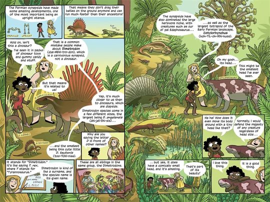
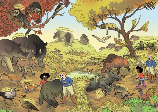
And here's a series I did for kids, where I had to use full color and lay off on the hatching, as well as learn how to reconstruct animals that we have no photo references for, which is definitely a place where style comes majorly into play, whether I wanted it to or not:
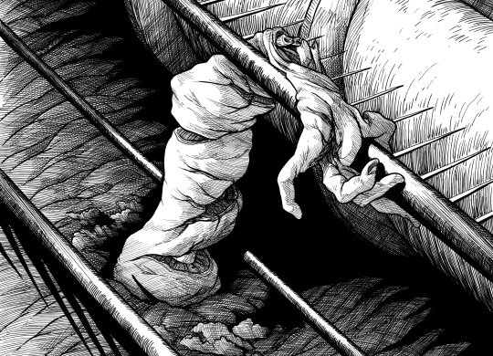
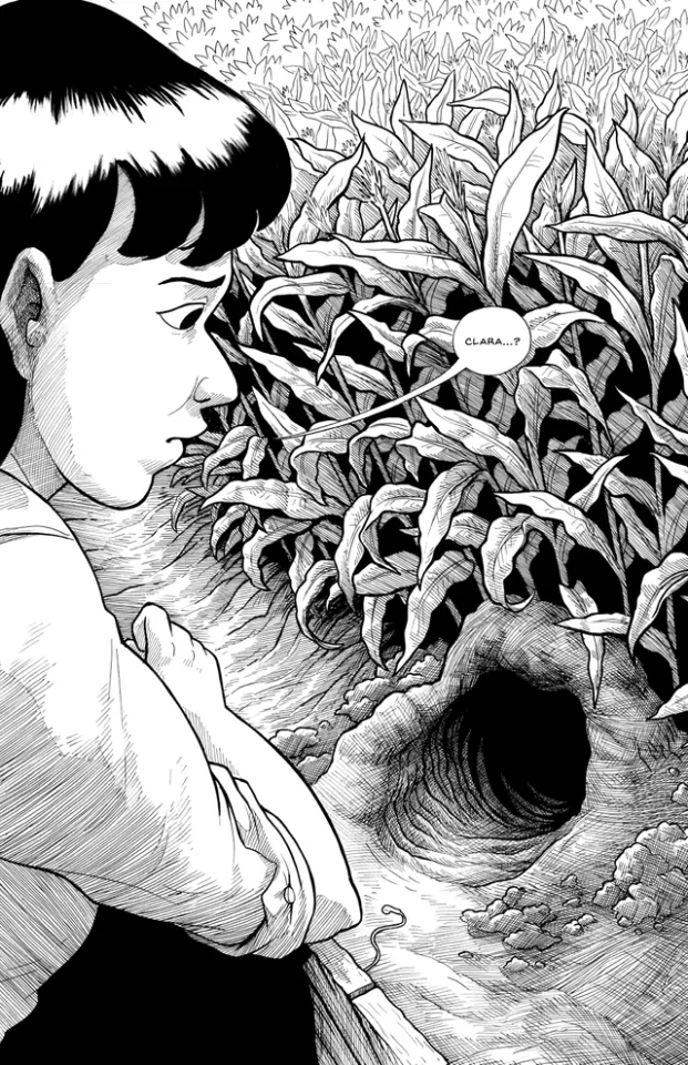
Then there was the horror book I did, where I tried to push my work to be less cartoony overall, and to work very hard on improving my hatching:
Then I started work on Scarlet Hollow, where I incorporated a limited/muted palette and had to once again push myself to make less-cartoony art, as well as learn more consistency so I could draw sprite sets. This was a big challenge for me, and has helped me grow as an artist so much!
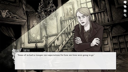
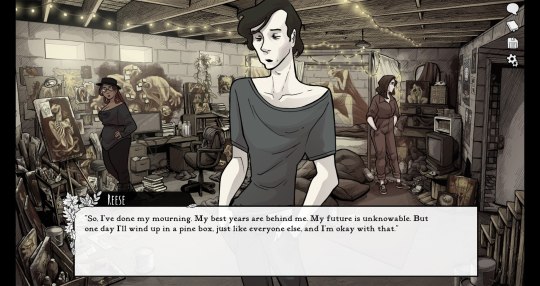
And most recently, I wrapped up work on Slay the Princess, which required that I go back in the cartoony direction, but in a very different way than I was used to. This took a lot of sketching to figure out, and there's still a decent amount of artistic stumbling in Chapter 1 while I settled into it.
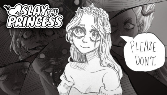
She's drawing on anime/Disney influence, but each Princess required a bit of stylistic variability. Some are more anime, while some are more realistic than even the Scarlet Hollow characters.
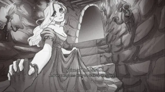
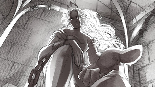
So I wouldn't worry too much, honestly! A person's style is often something that reveals itself over the course of their career, rather than something they choose and then try to stick to forever.
Even if you don't think you have a style, you do. It might vary a lot piece by piece, especially if you're trying to closely imitate another person's art, but the more work you do, the more you'll figure out your own strengths and interests!
#long post#my art#junior scientist power hour#the last halloween#abby howard#scarlet hollow#slay the princess#once you work long enough on art#style starts to feel more like modes you switch in and out of#all based around a core of what you're good at and what you can do#which in itself will change sometimes!#and of course your style with different mediums is gonna be different too#like slay the princess is pencil which is why it looks more distinct from my other work#never forget that at its core art is about messin around#wait shoot i should've put all this in the post#but it's long enough as it is
418 notes
·
View notes
Text
PSA: Mithrun doesn't run a noodle shop after the end of the manga!
(WARNING FOR SPOILERS)
Awhile back I posted a PSA about how Mickbell and Kuro don't run a noodle shop in the canon, they run an "everything store." In this post I mentioned that "Mithrun running a noodle shop" was also not canon, and that I'd get around to talking about it later.
Both of these fanons are the result of some mistranslation and information getting passed through multiple people, resulting in a very popular fanon that some people think is canon, that Mithrun is running an Asian-style noodle shop in Merini, and that he's in competition with Mickbell and Kuro.
Please note, I'm not saying there's anything wrong with Mithrun (or Mickbell and Kuro) running a noodle shop! If you like the idea and want to write or draw things about that, it's fine! It's just not canon.
SO WHAT IS CANON?
Unfortunately a lot of the information we have about what happens to Mithrun after the end of the manga comes from the still untranslated second version of the Adventurer's Bible, a Chinese Q&A posted by Kui's Chinese publisher, and autograph sessions where Kui answered fan questions, and fans posted about it on Twitter and Reddit.
You can understand why the last one, fans self-reporting what Kui told them, is extremely unreliable and shouldn't be considered the same level of "canon" as something that Kui had printed and published, or that was recorded in an official capacity.
A fan at the Korean signing described it like this (paraphrasing for clarity):
A group of about 100 fans gathered in big room with a screen, where they were playing the anime. The publisher called us up one by one, and we were guided to a smaller room, where Kui was sitting with 5-6 people from the publisher and a translator. We were not allowed to use our phones to take pictures or video.
I don't know if all of the signing events were like this, but we know that Kui and many other manga artists want to preserve their personal privacy, so I'd assume most of these events are run this way.
This makes information from autograph sessions really unreliable, since anyone could post anything online and claim Kui said it, and even other fans who were at the event wouldn't be able to prove that it wasn't true.
I have heard that sometimes fans "overheard" answers that other fans got, which doesn't fit with the above description, so some signings may have not been that private... Or maybe after a fan got their autograph, they talked with other fans at the event and shared information that way? Or maybe they talked about it online afterwards? I can't say for certain.
Anyway, moving on!
IF HE'S NOT RUNNING A NOODLE SHOP, WHAT IS MITHRUN DOING?
Here's Mithrun's updated biography page from the World Guide:
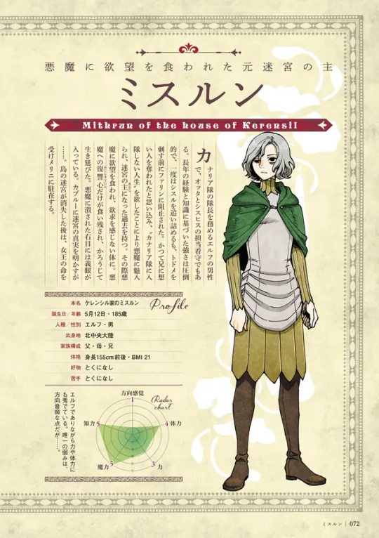
"島の迷宮が消失した後は、女王の命を受けメリニに駐在する。"
"After the island labyrinth disappears, he is stationed in Merini under the orders of the Queen."
The confusing part here is that another comic says Mithrun is retiring, and that he'll no longer be part of the Canaries.
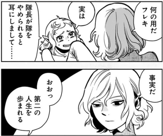
MITHRUN: 何の用だフレキ (What do you want, Fleki?) FLEKI: 実は隊長が隊をやめられると 耳にしまして・・…. (I actually heard that the captain is leaving the squad…) MITHRUN: 事実だ (It's true.) FLEKI: おおっ第二の人生を歩まれる (Oh, you're starting a second life.)
Cithis also confirms that Mithrun is leaving the Canaries:
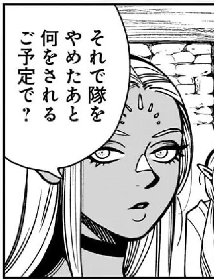
"それで隊をやめたあと何をされるご予定で? (So what are you planning to do after you leave the corps?)"
This seems like it would be a contradiction with "he is stationed in Merini under the orders of the Queen." If he's retired, why is he still taking orders? Why is he stationed there, a term normally used for military duty?
I think what Kui is telling us is that even though Mithrun isn't a Canary anymore, he's still nobility, and as a noble he has to obey the elf queen, and even if he isn't actively a Canary, he's considered a military asset - one of the duties of nobility is to always be ready to perform military service for their monarch.
Since the elf queen is an absolute monarch, anything Mithrun does is "with the Queen's permission/under her orders," since she owns her subjects.
(This is fun because it hints at potential future conflict. Will the Queen ever command Mithrun to do something he doesn't want to do? What happens if he refuses? Will he defect, and swear allegiance to his new home in Merini instead?)
Ok, Mithrun's retired from the Canaries, but what is he going to do in Merini?
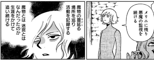
"メリニに残り悪魔の監視を続けるはびこ魔物の蔓延る場所を巡り活動を記録する魔物とは 迷宮とは なんだったのか 生涯をかけて 追い続ける (I'll remain in Merini, and continue to watch out for demons. I'll travel to places where monsters gather and record their activities. I'll spend the rest of my life seeking to understand monsters, and the labyrinth.)"
(Why does the translation call it a labyrinth, not a dungeon? PSA on this here.)
As you can see, there's no mention of noodles here. Mithrun has something he seriously, passionately wants to do, and he plans to do it for the rest of his life. Fleki's reaction, by the way, is complete and utter horror (she was hoping Mithrun would return to his family's wealthy estate and she could mooch off of him):
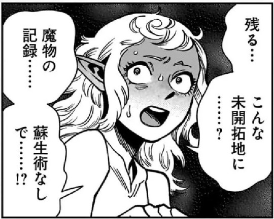
"残る・・・魔物のこんな未開拓地に? 蘇生術なし (Remaining here… in such a primitive country that's full of monsters? Without resurrection magic?)"
This tells us that the elves probably consider the Eastern Continent an uncivilized and primitive place, where an elf wouldn't want to stay longer than necessary. Fleki seems to think living there would be worse than going back to prison in the elven lands.
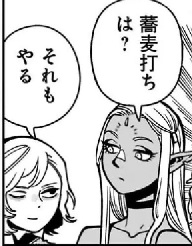
Here is where some of the confusion probably starts:
CITHIS: 蕎麦打ち は? (What about making noodles?) MITHRUN: それもやる (I'll do that too.)
Note that Cithis does not say running a noodle shop, she just says "making noodles."
Obviously a person can make noodles for themselves, or for the people around them, without getting into the huge enterprise of opening a restaurant. It's illogical to assume "I'll make noodles" actually means "I'll open a restaurant that serves noodles."
Also, Mithrun is smirking when he answers Cithis, which implies that he's joking, or being sarcastic. This makes sense because "what about making noodles?" is part of a running joke in the manga about ramen noodles and how their presence in the primarily European-style setting of Dungeon Meshi doesn't make sense.
THE RUNNING GAG ABOUT RAMEN
The word Cithis uses, soba (蕎麦), literally means "buckwheat." The full name for buckwheat noodles is soba-kiri (蕎麦切り "buckwheat slices"), but soba is commonly used alone.
Historically, soba noodles were called Nihon-soba, Wa-soba, or Yamato-soba, all of which mean "Japanese noodle." This was meant to distinguish Japanese buckwheat noodles from wheat noodles of Chinese origin, such as ramen, sōmen, or udon.
In the modern era, soba is the word used to refer to noodles in general, regardless of origin or composition. So Italian noodles can be described as a type of soba.
The loan word パスタ (pasuta) is what is normally used to talk about Italian noodles, but the confusion between soba (Japanese buckwheat noodles) and soba (any other type of noodle) is the core of Kui's joke.
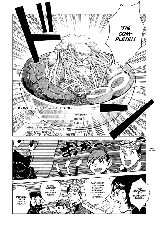
In Chapter 81, Laios and his party try to make food for Marcille that will remind her of her home and childhood (which is clearly supposed to be someplace like Italy) but they end up making Japanese-style pork ramen instead. The punchline is that Izutsumi, the only Japanese member of the party, can tell that they've made the wrong type of noodles, but the rest of the party doesn't understand what she's talking about to a comical and ridiculous extent.

In Chapter 94, when Kabru and the Canaries are trying to encourage Mithrun to keep on living, Fleki and Lycion go off on a comical tangent about making noodles:

The punchline of this joke is that Kui is depicting Mithrun servingJapanese-style noodles, which makes no sense because the elves aren't Japanese... Something we know for a fact because there are actual explicitly Japanese characters in Dungeon Meshi. Laios thinks "That's like Marcille's (local cuisine)..." in reference to the joke in Chapter 81.
The panel on the left shows Mithrun looking like a stereotypical ramen stand operator: gruff, covered in sweat, proudly presenting his finished work.
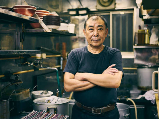
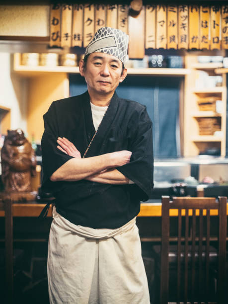
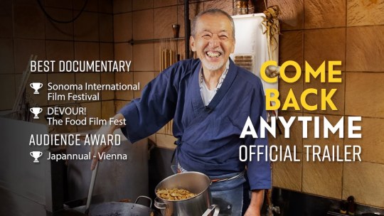
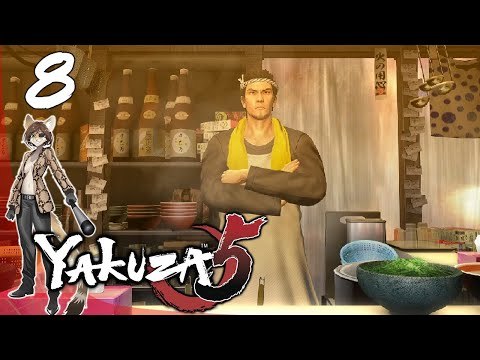
(Sorry for using your thumbnail, random furry youtuber.)
The headband, black tunic and white apron that Mithrun is wearing, and even the crossed arms in Laios' imagination is part of the look of your stereotypical Japanese chef.
So it's understandable that people look at all this, and think "Mithrun will run a Japanese-style ramen stand!" because it's a very cute, very funny idea.
But canonically it's an idea that only exists in Laios' imagination, as something that is meant to be comically outlandish, because the things Lycion and Fleki are saying are also presented as being pretty silly. A bit of levity in an otherwise very melancholy chapter.
I'll also note that when Lycion talks about Mithrun making soup bowls to serve his noodles in, he says "He could enjoy his handmade cuisine in his own bowls!"
There's no mention of serving the noodles to anyone else, just that Mithrun could enjoy the satisfaction of being self-sufficient, making his food and tableware from scratch. This is something which actually aligns very well with the themes of Dungeon Meshi.
DIDN'T KUI SAY MITHRUN IS MAKING NOODLES IN A Q&A?
During the post-manga publicity tour Kui went on, she did several signings where she answered short questions from fans while giving out autographs and drawings.
Remember, these questions and answers are being collected by fans from random tweets and other posts online, translated into English by amateurs, and there is no way to prove their veracity.
Q. Did Mithrun get to live a happy life after ending? A. He is doing work and hobby, living a happy and fulfilled life, although he is not that friendly so he will not be doing diplomat for a long time.
Taking this information at face value and assuming it's true, it sounds like Kui differentiated between "work" and "hobby" - So Mithrun has something he is doing seriously, like a job, and something he is doing for fun, as a hobby.
This makes sense with what we've seen in the official materials: monitoring the monsters and keeping watch for the return of the demon is Mithrun's "job", and making noodles (and doing other things, probably, since the noodles were a joke) are Mithrun's hobbies.
WHAT ABOUT THE WRITTEN WEIBO Q&A?
These Chinese fan questions were answered by Kui in written form, and posted online by her Chinese publisher in both Chinese and Japanese, so in my opinion, these answers should be taken more seriously than things that were solely reported by fans.
However, the question and answer about noodles here is clearly a light-hearted joke:
Q: 米斯伦会做出什么样的荞麦面?(What kind of soba will Mithrun make?) A: おいしい蕎麦だといいですね。(I hope they're delicious soba.)
As with many other answers, you can see that Kui answers in a vague, polite, and gently joking way. "What kind of noodles will Mithrun make?" "Tasty ones, hopefully!"
It's similar to how she answered questions about if Falin's lifespan is longer because she's a chimera or if Thistle is still alive with "That would be nice!" or "I hope so!"
This is clearly a sort of non-answer, but even if you take it to mean "Mithrun is 100% for sure making noodles," there is still zero indication that Mithrun is canonically running a restaurant.
In closing: if you want him to run a noodle restaurant in your heart, in your fanfics, in your fanart, that is perfectly fine! Japanese fans love this idea (they use pasta emojis to represent Mithrun!) and there's tons of artwork about Mithrun being a ramen chef. I think that would be a lovely thing for him to do! I bet he'd have a lot of fun!
But it's not canon.
What is canon is that he's living in Merini, going to group therapy, learning to appreciate the people around him, enjoying himself, and both his work and his hobbies are going well 💕
#dungeon meshi#delicious in dungeon#spoilers#dungeon meshi spoilers#mithrun#mithrun of the house of kerensil#dunmeshi#PSA
159 notes
·
View notes
Text
HAZBIN AND SA (+HB)
TW: SA and RAPE
THIS ITSELF DOESN'T TALK ABOUT THE SCENE! But the surrounding context.
So I really hate everything about how this has being treated. I am a SA victim and wanna talk about some stuff. If you didn't know, in episode 4 (I think) there is an exploration of Angel Dust SA, before going to do that lets see some stuff first:
She made a "cumming" joke about the song Poison (that accompanies the SA scenes)

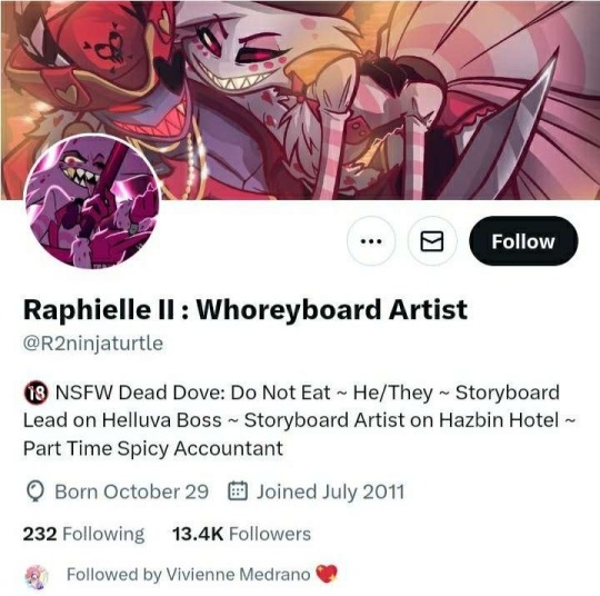
This person over here worked on HH/HB (draws r-pe/non-con)
BLURRED AND CUTTED IMAGES: (Some are more or less explicit)
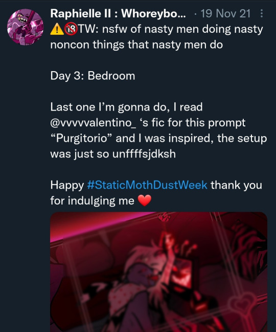
You know, that whole thing of shipping, and drawing porn of the canonical sexual abuser with the victim?
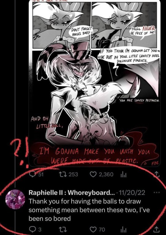
They also left this comment, under a comic where Val threatens brutal r-pe on Angel.
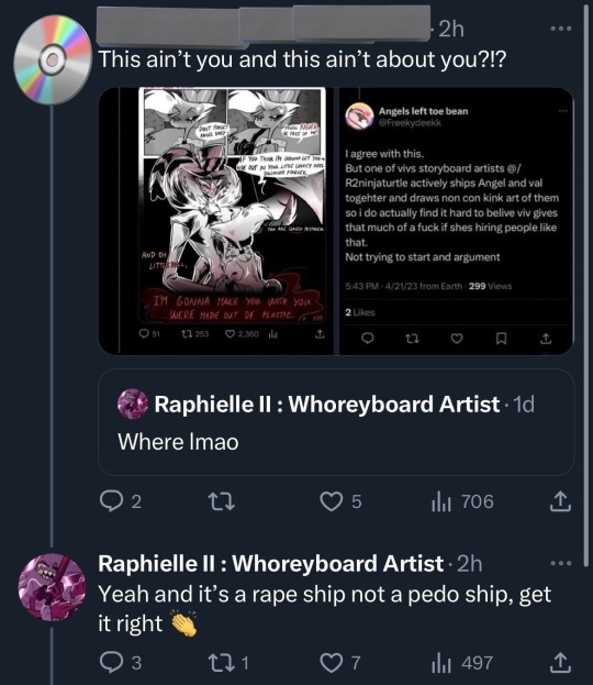
This person also worked in/directed the scenes of Angel dust Sexual abuse in the episode. The person that ships a r-pe ship and does all this shit is the one to work in this scene?????
ALSO????
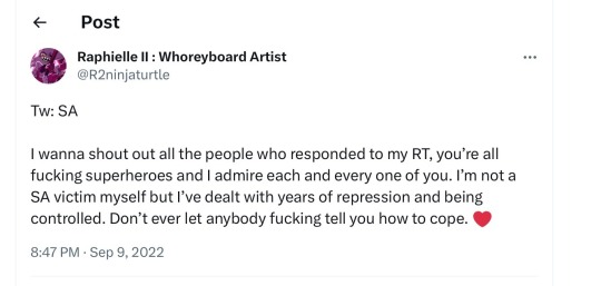

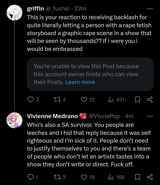
Like??????? What happen here?
Also...
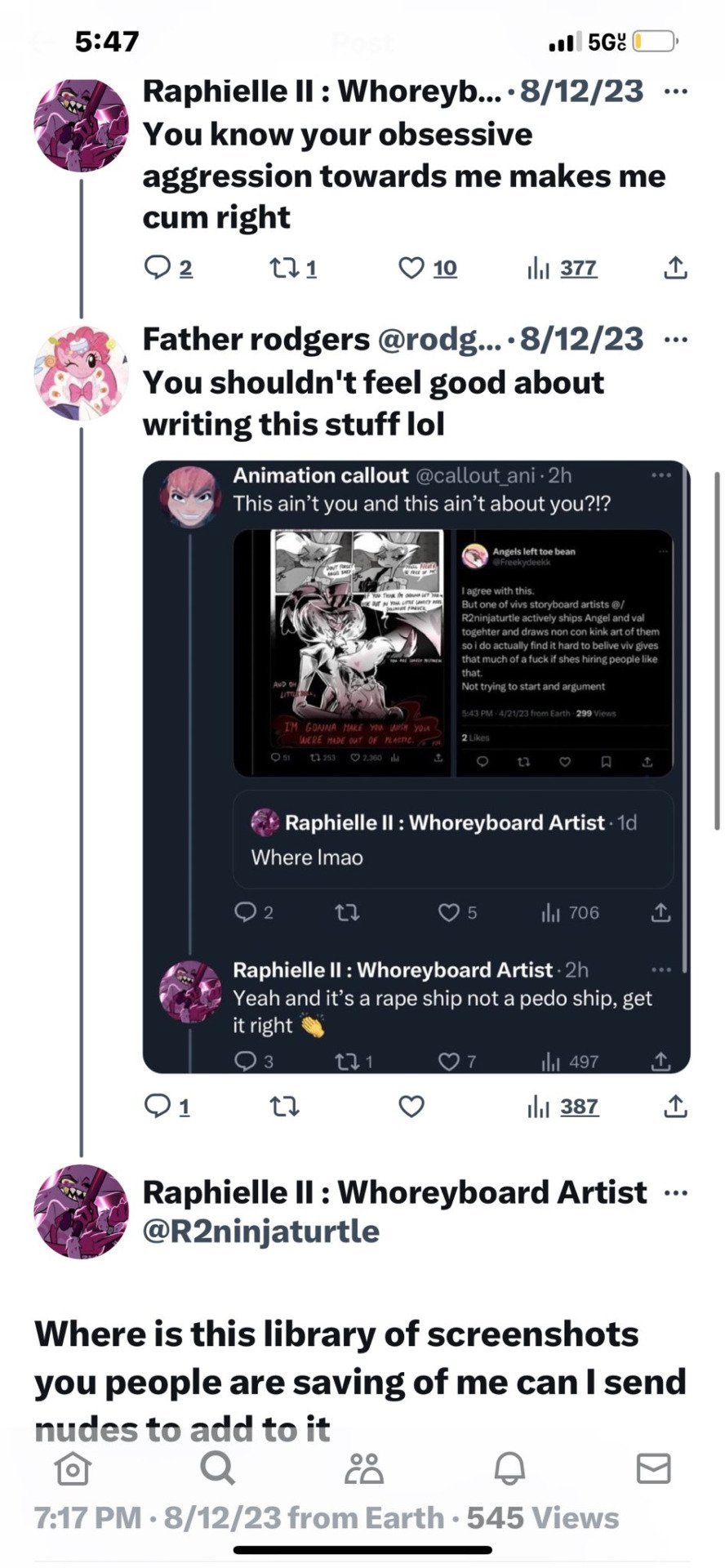
(The pinkie pfp person is 15 here too)
Why does Angel sexually harrases Husk non-stop (which is acknowledged by Vaggie)? Why is Moxxie SA by the succubus played for laughs? Same with Chaz or Blitz harassing him sexually or touching him without consent? Why did Stolas do so many unwanted advances towards Blitz, and that's literally the endgame couple of the show? (All of this are jokes, or by the Husk x Angel shit "ship moments"
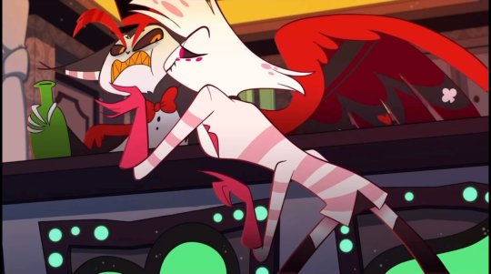


WHY THIS TOO?
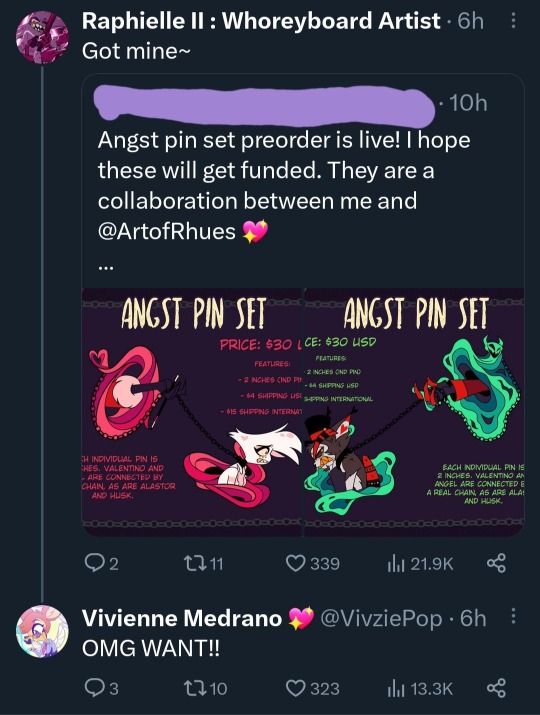
And yes you are "correct", something like Hypersexuality Trauma-should not being shamed. You are not a bad person, for dealing with this. BUT HEY, that doesn't mean you get to sexually harass people like Angel does to Husk or anyone.
Also, the problem is not having an SA victim's story. The problem is how it is treated and all the context that surrounds it. All of this above is that context! Why is so much SA jokes in Helluva? Why is that funny? You want to tell a story of SA, and anyone calling out the problems with it is deleting victims feelings and stories... YOU AND YOUR STUPID FUCKING JOKES DO THAT ALREADY. WHEN SA IS A JOKE FOR YOU, YOU ARE DIMINISHING SA AND R-PE.
There are also a lot of random fans saying that "Viv is an SA victim too"- #1 Where the fuck did she say that, cause you randomly saying that she said it doesn't mean shit. #2 DOESN'T DELETE THE WAY SA HAS BEING TREATED! THIS IS NOT EVEN CLOSE TO MAKING A JOKE AS AN SA VICTIM ABOUT YOURSELF- SHE/AND OTHER IN THE TEAM ARE WRITING CHARACTERS GETTING SEXUALLY ASSAULTED AS THE JOKE. -OR NOT UNDERSTAND LEGIT POWER DYNAMICS AND THE GROSS THING THAT STOLAS DOES TO BLITZ. OR THE LITERAL "SHIP COMPILATION" THAT IS PURELY ANGEL SEXUALLY HARASSING HUSK.
"Is important to represent SA survivors stories- specially men who-" BROTHER ALL YOUR OTHER MALE CHARACTERS SEXUALLY HARRASS/ASSAULT OTHERS AS A JOKEEEE. "They are in hell" BITCH A HUMAN, A REAL PERSON WORKING ON THE SHOW WROTE hahaha Moxxie gets violated by the succubus so funny lol. IT'S NOT "LOONA IS A BAD PERSON FROM HELL THAT'S WHY SHE MADE FAT JOKES AT MOXXIE" NO IT'S WRITTEN AS IF THE SA WAS FUNNY IN ITSELF!
This is also not a scenario where there was a realization of the problems in HB with all those jokes and the harassment, so it was trying to be fixed with a serious story in hazbin. NO, THAT'S NOT IT!!!!
If there was an apology of how the sexual assault was treated in previous works! "We'll make up for it!" (the fact of that was a thing in the first place, it's still bad). That would be a little different. BUT NO, IT'S NOT! IT'S HYPOCRITICAL AND GARBAGE BULLSHIT.
I think purely by the context already given here that I think the representation it's bad. I don't feel like it comes from a good place, due to the hypocritical shit, the comments, and the artist who directed it.
We could go really back and forth with the direct scenes of the episode. BUT THIS IS ABOUT THE CONTEXT SURROUND IT rather than the scenes themselves. (Which is partly connected to the fact that it's incomplete)
Here is the scene "Tuca and Bertie". Is Bertie telling her friend of her assault. It's amazingly respectful and well written. It's not graphic, and tells the story really well.
youtube
#vivziepop critique#vivziepop critical#helluva boss critique#helluva boss criticism#helluva boss critical#hazbin hotel critical#hazbin hotel criticism#hazbin hotel critique#spindlehorse critical#tw rape#tw sa#tw abuse
701 notes
·
View notes
Text
why Aurora's art is genius
It's break for me, and I've been meaning to sit down and read the Aurora webcomic (https://comicaurora.com/, @comicaurora on Tumblr) for quite a bit. So I did that over the last few days.
And… y'know. I can't actually say "I should've read this earlier," because otherwise I would've been up at 2:30-3am when I had responsibilities in the morning and I couldn't have properly enjoyed it, but. Holy shit guys THIS COMIC.
I intended to just do a generalized "hello this is all the things I love about this story," and I wrote a paragraph or two about art style. …and then another. And another. And I realized I needed to actually reference things so I would stop being too vague. I was reading the comic on my tablet or phone, because I wanted to stay curled up in my chair, but I type at a big monitor and so I saw more details… aaaaaand it turned into its own giant-ass post.
SO. Enjoy a few thousand words of me nerding out about this insanely cool art style and how fucking gorgeous this comic is? (There are screenshots, I promise it isn't just a wall of text.) In my defense, I just spent two semesters in graphic design classes focusing on the Adobe Suite, so… I get to be a nerd about pretty things…???
All positive feedback btw! No downers here. <3
---
I cannot emphasize enough how much I love the beautiful, simple stylistic method of drawing characters and figures. It is absolutely stunning and effortless and utterly graceful—it is so hard to capture the sheer beauty and fluidity of the human form in such a fashion. Even a simple outline of a character feels dynamic! It's gorgeous!
Though I do have a love-hate relationship with this, because my artistic side looks at that lovely simplicity, goes "I CAN DO THAT!" and then I sit down and go to the paper and realize that no, in fact, I cannot do that yet, because that simplicity is born of a hell of a lot of practice and understanding of bodies and actually is really hard to do. It's a very developed style that only looks simple because the artist knows what they're doing. The human body is hard to pull off, and this comic does so beautifully and makes it look effortless.
Also: line weight line weight line weight. It's especially important in simplified shapes and figures like this, and hoo boy is it used excellently. It's especially apparent the newer the pages get—I love watching that improvement over time—but with simpler figures and lines, you get nice light lines to emphasize both smaller details, like in the draping of clothing and the curls of hair—which, hello, yes—and thicker lines to emphasize bigger and more important details and silhouettes. It's the sort of thing that's essential to most illustrations, but I wanted to make a note of it because it's so vital to this art style.
THE USE OF LAYER BLENDING MODES OH MY GODS. (...uhhh, apologies to the people who don't know what that means, it's a digital art program thing? This article explains it for beginners.)
Bear with me, I just finished my second Photoshop course, I spent months and months working on projects with this shit so I see the genius use of Screen and/or its siblings (of which there are many—if I say "Screen" here, assume I mean the entire umbrella of Screen blending modes and possibly Overlay) and go nuts, but seriously it's so clever and also fucking gorgeous:
Firstly: the use of screened-on sound effect words over an action? A "CRACK" written over a branch and then put on Screen in glowy green so that it's subtle enough that it doesn't disrupt the visual flow, but still sticks out enough to make itself heard? Little "scritches" that are transparent where they're laid on without outlines to emphasize the sound without disrupting the underlying image? FUCK YES. I haven't seen this done literally anywhere else—granted, I haven't read a massive amount of comics, but I've read enough—and it is so clever and I adore it. Examples:


Secondly: The beautiful lighting effects. The curling leaves, all the magic, the various glowing eyes, the fog, the way it's all so vividly colored but doesn't burn your eyeballs out—a balance that's way harder to achieve than you'd think—and the soft glows around them, eeeee it's so pretty so pretty SO PRETTY. Not sure if some of these are Outer/Inner Glow/Shadow layer effects or if it's entirely hand-drawn, but major kudos either way; I can see the beautiful use of blending modes and I SALUTE YOUR GENIUS.
I keep looking at some of this stuff and go "is that a layer effect or is it done by hand?" Because you can make some similar things with the Satin layer effect in Photoshop (I don't know if other programs have this? I'm gonna have to find out since I won't have access to PS for much longer ;-;) that resembles some of the swirly inner bits on some of the lit effects, but I'm not sure if it is that or not. Or you could mask over textures? There's... many ways to do it.
If done by hand: oh my gods the patience, how. If done with layer effects: really clever work that knows how to stop said effects from looking wonky, because ugh those things get temperamental. If done with a layer of texture that's been masked over: very, very good masking work. No matter the method, pretty shimmers and swirly bits inside the bigger pretty swirls!
Next: The way color contrast is used! I will never be over the glowy green-on-black Primordial Life vibes when Alinua gets dropped into that… unconscious space?? with Life, for example, and the sharp contrast of vines and crack and branches and leaves against pitch black is just visually stunning. The way the roots sink into the ground and the three-dimensional sensation of it is particularly badass here:

Friggin. How does this imply depth like that. HOW. IT'S SO FREAKING COOL.
A huge point here is also color language and use! Everybody has their own particular shade, generally matching their eyes, magic, and personality, and I adore how this is used to make it clear who's talking or who's doing an action. That was especially apparent to me with Dainix and Falst in the caves—their colors are both fairly warm, but quite distinct, and I love how this clarifies who's doing what in panels with a lot of action from both of them. There is a particular bit that stuck out to me, so I dug up the panels (see this page and the following one https://comicaurora.com/aurora/1-20-30/):

(Gods it looks even prettier now that I put it against a plain background. Also, appreciation to Falst for managing a bridal-carry midair, damn.)
The way that their colors MERGE here! And the immense attention to detail in doing so—Dainix is higher up than Falst is in the first panel, so Dainix's orange fades into Falst's orange at the base. The next panel has gold up top and orange on bottom; we can't really tell in that panel where each of them are, but that's carried over to the next panel—
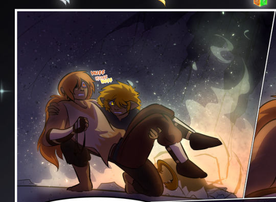
—where we now see that Falst's position is raised above Dainix's due to the way he's carrying him. (Points for continuity!) And, of course, we see the little "huffs" flowing from orange to yellow over their heads (where Dainix's head is higher than Falst's) to merge the sound of their breathing, which is absurdly clever because it emphasizes to the viewer how we hear two sets of huffing overlaying each other, not one. Absolutely brilliant.
(A few other notes of appreciation to that panel: beautiful glows around them, the sparks, the jagged silhouette of the spider legs, the lovely colors that have no right to make the area around a spider corpse that pretty, the excellent texturing on the cave walls plus perspective, the way Falst's movements imply Dainix's hefty weight, the natural posing of the characters, their on-point expressions that convey exactly how fuckin terrifying everything is right now, the slight glows to their eyes, and also they're just handsome boys <3)
Next up: Rain!!!! So well done! It's subtle enough that it never ever disrupts the impact of the focal point, but evident enough you can tell! And more importantly: THE MIST OFF THE CHARACTERS. Rain does this irl, it has that little vapor that comes off you and makes that little misty effect that plays with lighting, it's so cool-looking and here it's used to such pretty effect!
One of the panel captions says something about it blurring out all the injuries on the characters but like THAT AIN'T TOO BIG OF A PROBLEM when it gets across the environmental vibes, and also that'd be how it would look in real life too so like… outside viewer's angle is the same as the characters', mostly? my point is: that's the environment!!! that's the vibes, that's the feel! It gets it across and it does so in the most pretty way possible!
And another thing re: rain, the use of it to establish perspective, particularly in panels like this—

—where we can tell we're looking down at Tynan due to the perspective on the rain and where it's pointing. Excellent. (Also, kudos for looking down and emphasizing how Tynan's losing his advantage—lovely use of visual storytelling.)
Additionally, the misting here:
We see it most heavily in the leftmost panel, where it's quite foggy as you would expect in a rainstorm, especially in an environment with a lot of heat, but it's also lightly powdered on in the following two panels and tends to follow light sources, which makes complete sense given how light bounces off particles in the air.
A major point of strength in these too is a thorough understanding of lighting, like rim lighting, the various hues and shades, and an intricate understanding of how light bounces off surfaces even when they're in shadow (we'll see a faint glow in spots where characters are half in shadow, but that's how it would work in real life, because of how light bounces around).
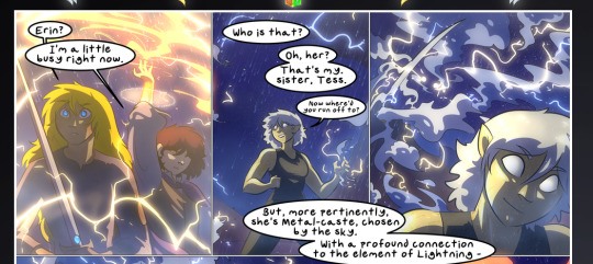
Bringing some of these points together: the fluidity of the lines in magic, and the way simple glowing lines are used to emphasize motion and the magic itself, is deeply clever. I'm basically pulling at random from panels and there's definitely even better examples, but here's one (see this page https://comicaurora.com/aurora/1-16-33/):

First panel, listed in numbers because these build on each other:
The tension of the lines in Tess's magic here. This works on a couple levels: first, the way she's holding her fists, as if she's pulling a rope taut.
The way there's one primary line, emphasizing the rope feeling, accompanied by smaller ones.
The additional lines starbursting around her hands, to indicate the energy crackling in her hands and how she's doing a good bit more than just holding it. (That combined with the fists suggests some tension to the magic, too.) Also the variations in brightness, a feature you'll find in actual lightning. :D Additional kudos for how the lightning sparks and breaks off the metal of the sword.
A handful of miscellaneous notes on the second panel:
The reflection of the flames in Erin's typically dark blue eyes (which bears a remarkable resemblance to Dainix, incidentally—almost a thematic sort of parallel given Erin's using the same magic Dainix specializes in?)
The flowing of fabric in the wind and associated variation in the lineart
The way Erin's tattoos interact with the fire he's pulling to his hand
The way the rain overlays some of the fainter areas of fire (attention! to! detail! hell yeah!)
I could go on. I won't because this is a lot of writing already.
Third panel gets paragraphs, not bullets:
Erin's giant-ass "FWOOM" of fire there, and the way the outline of the word is puffy-edged and gradated to feel almost three-dimensional, plus once again using Screen or a variation on it so that the stars show up in the background. All this against that stunning plume of fire, which ripples and sparks so gorgeously, and the ending "om" of the onomatopoeia is emphasized incredibly brightly against that, adding to the punch of it and making the plume feel even brighter.
Also, once again, rain helping establish perspective, especially in how it's very angular in the left side of the panel and then slowly becomes more like a point to the right to indicate it's falling directly down on the viewer. Add in the bright, beautiful glow effects, fainter but no less important black lines beneath them to emphasize the sky and smoke and the like, and the stunningly beautiful lighting and gradated glows surrounding Erin plus the lightning jagging up at him from below, and you get one hell of an impactful panel right there. (And there is definitely more in there I could break down, this is just a lot already.)
And in general: The colors in this? Incredible. The blues and purples and oranges and golds compliment so well, and it's all so rich.
Like, seriously, just throughout the whole comic, the use of gradients, blending modes, color balance and hues, all the things, all the things, it makes for the most beautiful effects and glows and such a rich environment. There's a very distinct style to this comic in its simplified backgrounds (which I recognize are done partly because it's way easier and also backgrounds are so time-consuming dear gods but lemme say this) and vivid, smoothly drawn characters; the simplicity lets them come to the front and gives room for those beautiful, richly saturated focal points, letting the stylized designs of the magic and characters shine. The use of distinct silhouettes is insanely good. Honestly, complex backgrounds might run the risk of making everything too visually busy in this case. It's just, augh, so GORGEOUS.
Another bit, take a look at this page (https://comicaurora.com/aurora/1-15-28/):
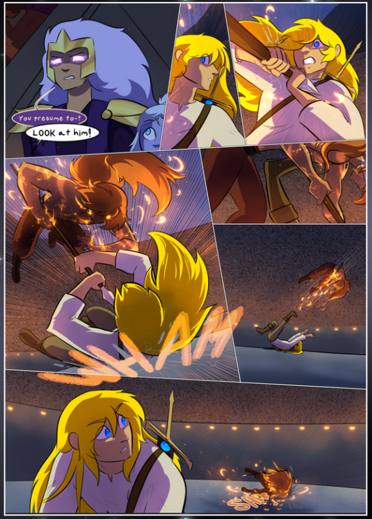
It's not quite as evident here as it is in the next page, but this one does some other fun things so I'm grabbing it. Points:
Once again, using different colors to represent different character actions. The "WHAM" of Kendal hitting the ground is caused by Dainix's force, so it's orange (and kudos for doubling the word over to add a shake effect). But we see blue layered underneath, which could be an environmental choice, but might also be because it's Kendal, whose color is blue.
And speaking off, take a look at the right-most panel on top, where Kendal grabs the spear: his motion is, again, illustrated in bright blue, versus the atmospheric screened-on orange lines that point toward him around the whole panel (I'm sure these have a name, I think they might be more of a manga thing though and the only experience I have in manga is reading a bit of Fullmetal Alchemist). Those lines emphasize the weight of the spear being shoved at him, and their color tells us Dainix is responsible for it.
One of my all-time favorite effects in this comic is the way cracks manifest across Dainix's body to represent when he starts to lose control; it is utterly gorgeous and wonderfully thematic. These are more evident in the page before and after this one, but you get a decent idea here. I love the way they glow softly, the way the fire juuuust flickers through at the start and then becomes more evident over time, and the cracks feel so realistic, like his skin is made of pottery. Additional points for how fire begins to creep into his hair.
A small detail that's generally consistent across the comic, but which I want to make note of here because you can see it pretty well: Kendal's eyes glow about the same as the jewel in his sword, mirroring his connection to said sword and calling back to how the jewel became Vash's eye temporarily and thus was once Kendal's eye. You can always see this connection (though there might be some spots where this also changes in a symbolic manner; I went through it quickly on the first time around, so I'll pay more attention when I inevitably reread this), where Kendal's always got that little shine of blue in his eyes the same as the jewel. It's a beautiful visual parallel that encourages the reader to subconsciously link them together, especially since the lines used to illustrate character movements typically mirror their eye color. It's an extension of Kendal.
Did I mention how ABSOLUTELY BEAUTIFUL the colors in this are?
Also, the mythological/legend-type scenes are illustrated in familiar style often used for that type of story, a simple and heavily symbolic two-dimensional cave-painting-like look. They are absolutely beautiful on many levels, employing simple, lovely gradients, slightly rougher and thicker lineart that is nonetheless smoothly beautiful, and working with clear silhouettes (a major strength of this art style, but also a strength in the comic overall). But in particular, I wanted to call attention to a particular thing (see this page https://comicaurora.com/aurora/1-12-4/):
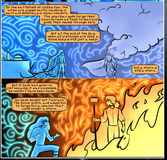
The flowing symbolic lineart surrounding each character. This is actually quite consistent across characters—see also Life's typical lines and how they curl:
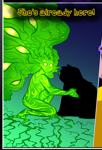
What's particularly interesting here is how these symbols are often similar, but not the same. Vash's lines are always smooth, clean curls, often playing off each other and echoing one another like ripples in a pond. You'd think they'd look too similar to Life's—but they don't. Life's curl like vines, and they remain connected; where one curve might echo another but exist entirely detached from each other in Vash's, Life's lines still remain wound together, because vines are continuous and don't float around. :P
Tahraim's are less continuous, often breaking up with significantly smaller bits and pieces floating around like—of course—sparks, and come to sharper points. These are also constants: we see the vines repeated over and over in Alinua's dreams of Life, and the echoing ripples of Vash are consistent wherever we encounter him. Kendal's dream of the ghost citizens of the city of Vash in the last few chapters is filled with these rippling, echoing patterns, to beautiful effect (https://comicaurora.com/aurora/1-20-14/):
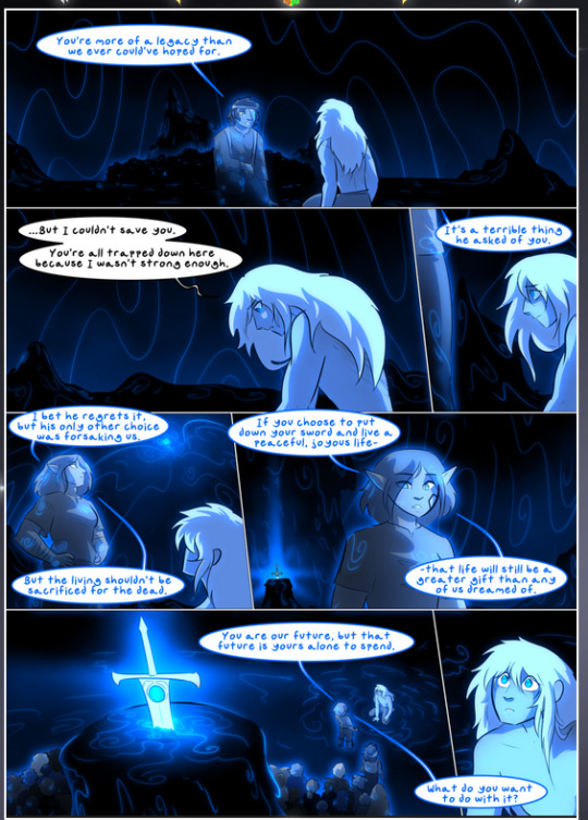
They ripple and spiral, often in long, sinuous curves, with smooth elegance. It reminds me a great deal of images of space and sine waves and the like. This establishes a definite feel to these different characters and their magic. And the thing is, that's not something that had to be done—the colors are good at emphasizing who's who. But it was done, and it adds a whole other dimension to the story. Whenever you're in a deity's domain, you know whose it is no matter the color.
Regarding that shape language, I wanted to make another note, too—Vash is sometimes described as chaotic and doing what he likes, which is interesting to me, because smooth, elegant curves and the color blue aren't generally associated with chaos. So while Vash might behave like that on the surface, I'm guessing he's got a lot more going on underneath; he's probably much more intentional in his actions than you'd think at a glance, and he is certainly quite caring with his city. The other thing is that this suits Kendal perfectly. He's a paragon character; he is kind, virtuous, and self-sacrificing, and often we see him aiming to calm others and keep them safe. Blue is such a good color for him. There is… probably more to this, but I'm not deep enough in yet to say.
And here's the thing: I'm only scratching the surface. There is so much more here I'm not covering (color palettes! outfits! character design! environment! the deities! so much more!) and a lot more I can't cover, because I don't have the experience; this is me as a hobbyist artist who happened to take a couple design classes because I wanted to. The art style to this comic is so clever and creative and beautiful, though, I just had to go off about it. <3
...brownie points for getting all the way down here? Have a cookie.
#aurora comic#aurora webcomic#comicaurora#art analysis#...I hope those are the right tags???#new fandom new tagging practices to learn ig#much thanks for something to read while I try to rest my wrists. carpal tunnel BAD. (ignore that I wrote this I've got braces ok it's fine)#anyway! I HAVE. MANY MORE THOUGHTS. ON THE STORY ITSELF. THIS LOVELY STORY#also a collection of reactions to a chunk of the comic before I hit the point where I was too busy reading to write anything down#idk how to format those tho#...yeet them into one post...???#eh I usually don't go off this much these days but this seems like a smaller tight-knit fandom so... might as well help build it?#and I have a little more time thanks to break so#oh yes also shoutout to my insanely awesome professor for teaching me all the technical stuff from this he is LOVELY#made an incredibly complex program into something comprehensible <3#synapse talks
784 notes
·
View notes
Text
About fanarts
I started getting more and more questions and that's why I decided to make this post. TLDR: please don't draw fanarts of our characters. I'll explain why below.
In the past, like many artists, I was very happy when I received fanart. Like, REALLY. Unfortunately, that changed after a few cases where some people started to cross the line and blatantly violate our boundaries. Things like NSFW, ships with other characters, attempts to make copies. All of this affected my burnout and deprived me of the desire to share anything at all.
Of course I'm not saying that everyone who draws fanart will do this, no! But every time I see fanart, I can't help but remember all those cases and it makes me nervous. Every time I worry that it will start to happen again. I've received a lot of DMs asking about fanart and when I explain my situation, almost everyone answers me "oh, I understand, I had something similar and that's why I always ask first". So our case is not unique (and honestly, it's very sad). If you ever drew me fanart and now think "I didn't know, now I regret it" - please don't! I'm still very grateful to you for taking the time to make me happy and I really, really appreciate it.
I enjoy sharing my drawings, comics and character stories with you. I am truly pleased that they resonate with many. So if you want to make me happy - just like, comment, reblog my artwork. It always motivates to continue and share more. Maybe over time our view on fanart will change, but for now this is how things are. Thank you very much for understanding. 💛
280 notes
·
View notes
Note
just reread your last comic-if will really isn't a threat to ford's dimension, why IS he keeping will in a cage? what i mean is, why did ford go from treating will gently and preciously to treating him like an animal? what happened????
also, how is will there physically? why does he need the portal opened if he's already there? i love your comic, hope its ok i have so many questions!


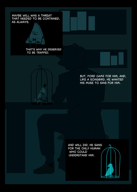
First of all, im glad you like my comics anon!
Explanation:
¿What happened? thats the same question Will does to himself after crossing the portal. in my comics the silly or calm moments (usually with lighter colors) are the past. Will in a cage is the present, and technically, hes a threat for for dimension since he's powerful ( the cage keep those powers contained).The possible damages Will could do or consequences of the portal where supposed to be studied just for a while...by both of them...but well, that's not what happened.
And, about Ford feelings towards Will, well. birdcage instead of something else, triangles in his clothes... i think that can give you an idea, he still adored Will, in a way.
Hope this gives you a better context! questions are what keep running this blog! however, hope i made this understandable and not mess up by my inexperience in telling stories haha-
NOTES OF TORTURED ARTIST:
i think something possessed me to make this more elaborated. maybe the blog is making me draw faster? idk- dunno if i could do this again. Also, sorry if there's a mistake, i don't respect english at all (For legal reasons this is a joke and actually I would be grateful If there's any corrections-)
#another comic! lets see how many i have left- uh oh uh#Hope finally i can answer a question that i have looking at me in the askbox for a while-#tell me if this one is cool yay or nay#willfordAU#willford#billford#bill cipher#the book of bill#gravity falls stanford#gravity falls#gravity falls au#reverse falls#will cipher
85 notes
·
View notes
Note
I don't even know nor like Hazbin Hotel but I love your art for it! I'm invested in your comics and the character designs are lovely <3
By the way, sorry if it may be an odd question but how did you learn to draw poses and anatomy? You're my favorite artist and I really hope to be as good as you someday so I figured it wouldn't hurt to ask. You don't have to answer though, I'm just wondering
Take care! You're amazing!
Awww, happy to know that even though you don't know HH stuff you still enjoy my work with it. That means a lot💜
To your question, my only answer is practice😅 I mean, I'm a self-taught artist. I didn't attend any art schools to learn all the basics academically, so to speak. So learning from references was my way to improve. And loooots of drawing. Don't be afraid to use references btw. From them, you can understand how our body works, the same anatomy. Also, your visual library can help you to improve. What I mean by that is you can study other artists' artworks to try to understand how they draw and what techniques they use. I did that too, analyzing some of my favorite artists and trying to use their methods. Redrawing scenes from films can help as well (in learning composition for example).
Also I usually 'warm up' before I start drawing anything. It's just quick sketches of different poses or emotions.
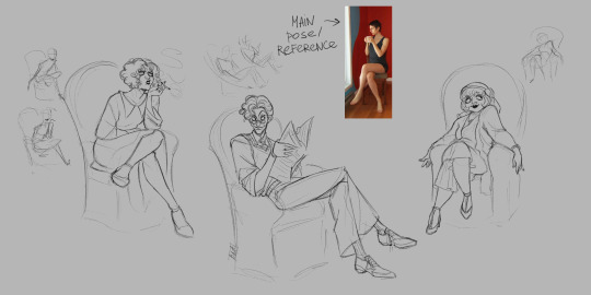
Sometimes I take, let's say, a random basic reference pose (e.g. crossed legs sitting pose like here) and then try to change it slightly depending on the character or their mood. Just a fun little exercise but it can help to get better at expressiveness too.
In conclusion, practice really makes perfect XD
200 notes
·
View notes
Note
Cabi! Big fan Joffrey here!
I wanted to ask, every time I see your art not only am I stunned by the quality, but also by the sheer uniqueness in style and character design. I've never seen a lamb designed quite like yours, it's so perfectly yours. What went into the inspiration behind the characters design, especially facially? Did you try and mimick a real lamb, or was there a more fantasy-element that you veered toward?
I can't specifically put my finger on it, but it gives me vague Warframe vibes. It's such a beautifully odd design and I can't get enough.
Love your work, love everything you do, can't wait to see what's next!
Hope you're well, stay safe, take care!
First of all, your ask is one of the biggest compliments I ever had in my life, I will keep it forever. You're an absolute chad! Second of all, those are very interesting questions, and I will be very happy to answer to them!
It started more or less with this drawing I made *look at the date* 2 years ago apparently. Way before I even thought of an AU- I didn't had much in mind, beside doing something that looked cool tbh.
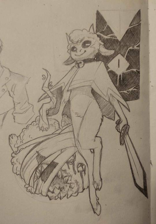
I was very happy with the flow of it, and how it came out. And when I drew the Lamb again, I would try to nail THIS design.
The thing is, with time, I had a really big problem: Lamb looked way too young when I thought of them more as an adult. I had too much of the original game design guiding me, making a Lamb that was too cute and childlike for what I wanted. (And also, the head did not go well with the rest of the body holy shi-)

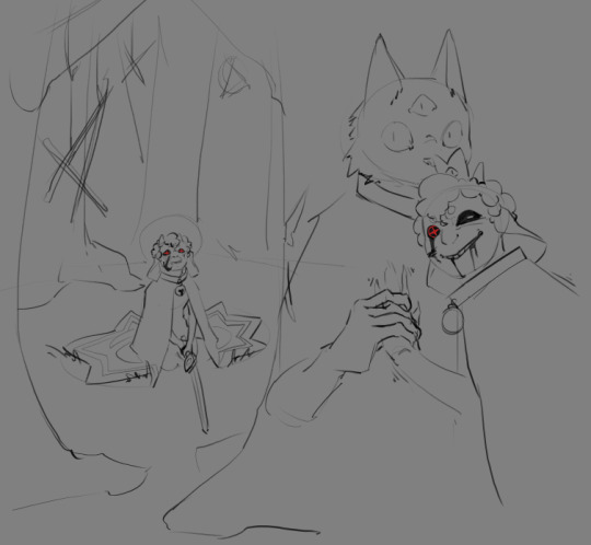
Came those drawings! I was happier with the look, Lamb was older! And I found the colored design quit nice! (I used a sheep picture as reference, but I don't think I used it well, compared to now. I used the reference for details, when I should have gone for overall shape first.) I still wanted something simpler to draw tho. The colored design was nice for an illustration, a one time gig, but I got pretty annoyed pretty fast at trying to nail the face every time. And from those attempt, you get the sketches on the right. (I also wanted to get away from other artiste's interpretation of Lamb, and at the time of those drawing, I didn't felt like I was away enough)
From those previous sketches, the idea for THaB started to emerge. I also still had problem with Lamb's design. Especially the hair. I was inspired by black hair, which is usually not a problem, but I was never happy with how it looked on Lamb specifically. I can draw black hair, I can draw black characters, but this mother-fucker would never feel satisfying to draw or finish 👀
And one day, as THaB was solidifying in my mind, I made a series of sketches that I posted! And one of them was the most important in Lamb's final design. This lil guy! (this design didn't came out of nowhere tho, Lamb was evolving into this as I kept trying. But I wont show those sketches, because those are spoilers =3)
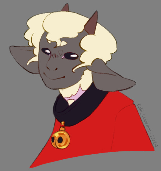
And soon after, I made a comic that was supposed to only be a one shot, just a POV of Lamb and there reaction to Nari' telling them to die for him. But you know, things got out of hand lol
As I continued the comic and doodles on the side, I finally made myself a reference board, with real life images that were close to the vibe of this head drawing. (And I cannot stress enough how those references solidified Lamb's design as a whole. Draw with references, it is life changing. The more reference you get, the more your visual library will get diverse, and the more interesting detail and shape you will add to your art in general.) (I'd also add this: understand what you are drawing, make research and stay curious for every bit of info on everything. You never know when these nuggets of knowledge will help you as you create)
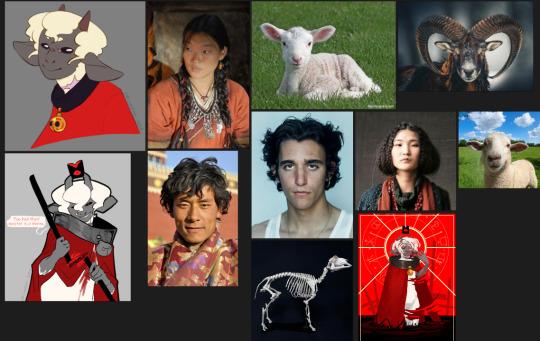
As I kept drawing the Lamb, they evolved! Things changed, slowly, like the shape of the nose, the shape of the eyes, how the hair flowed. You see those change at the face, but also on the body! As the idea of THaB's Lamb got clearer, the design got more specific. (I also got better at drawing! This comic make me draw way more often then before, and it shows)

Something before I finish: the other Cult of the Lamb character's design are way more inspired by their animals, when Lamb is more in the human spectrum. I thought of changing Lamb at some point, to make it fair/coherent, but I loved the design too much to change it again. This AU is something I do for fun, and even if it would have been more logical to change them... I don't want to-
As for the vague Warframe vibes: I play the game! And I found the character design absolutely stunning. So I am definitely influenced by the game without knowing it lol
Thank you very much, again, for your kind words! I also wish you the best, and see you next post =D
TL;DR: Lamb design, at first, wasn't inspired by much, beside the game and my style at the time. But as I retried to make them, added more intent, they got more refined. What really nailed the idea was to have real life references on the side.
#cabi ask#long post#cotl lamb#this took a lot of time to write holy shit#but it made me take a look at older drawing and made me realise how much I got better in 2 years#so it was worth it#and again Thank you Thank you Thank you Thank you
70 notes
·
View notes
Note
So, I saw the question about tips for aspiring comic artists and it actually reminded me that I am curious about the topic as well😅
I like to write stories and I like to draw so it seemed logically for me to try my hand at comics as well but I'm struggling extremely with the layout.
It's seems very daunting when you sit in front of the empty page and you have to consider how to arrange the panels.
I'm the kind of artist that sometimes does big changes to almost finished works, so the idea of having to make a final decision before I even start with the actual drawing process, is kind of terrifying for me.
Long story short, how do you put your drawings into panels?
Do you really have to make a final panel layout at the beginning, the way I've been attempting to, or are there other possibilities I simply haven't thought of?
Last but not least, I want you to know that I absolutely love your comic, both because of your spectacular art and the amazing story! ❤️
Hello! Okay this is going to be long but I'll try my best to explain and be concise (and truly sorry for the english!) So, the first rule you need to have in mind is that you don't imagine the scene PER PAGE but PER SEQUENCE. What I mean is, you don't have to imagine a comic (like ''what I'm putting in this page'') but you have to imagine it as a video in your head, like you're directing a movie ( movies and comics are a lot more similar than we think as a media) For example, try to imagine someone waking up and going to open their window, that's a full sequence. it can be done in various ways, depending on what your character is doing and what's the ''mood'' of the scene. Remember always that your character emotions sets the mood for the entire scene. A thing that helps me a lot is ( like I said XD) watching movies, I focus on the mini sequences, a kiss scene, a fight, I pause the movie and rewatch that scenes various times, trying to understand the mood of the scene and how is shot. A sequence can even take 3 or 4 pages or even 10, it depends from whats happening, even more if it's a fight! But like I said the number of pages comes later. another importart thing to remember is that your characters needs ''a place to live'' If you make a story and never show a single panel with a background, the story is gonna lack something 100%; and I know... backgrounds are hard (I hate them) but you need at least 1 panel where you show the places your characters are living in. That is called establishing shot and it needs to be used when your character are moving to other locations. (or if you're talking about other characters in your comic and they are somewhere else) I'll show u some establishing shots now:

Took 3 different comics (narratively and stylistic speaking) Bone, Batman and TinTin to show you that even if the setting of the panels is extremely different, they still all have an establishing shot. Now, of course you don't have to put this in EVERY page, but like I said at least at the start of your comic, or when the characters are moving somewhere else, it's very important to show that. Also remember that the biggest panel you need to have in your sequence is the one where the most important action is happening. For example, if two people are fighting and someone gets slapped, that's the most impactful scene, so that's the scene that will need the biggest panel on your sequence, because it's the most important. Another rule is to make the camera breathe. Let me explain this properly, you, as a comic artist, are like a movie director with a camera. You need to turn the camera in various ways, up and down left and right, but always remember this : Never make a page of faces only. example, here are character A and B having a conversation, a page like this is extremely wrong, because the camera is basically attached to the character face and the viewer/reader is going to feel like they're suffocating in the room with the story characters :

You as an artist have the power to zoom the camera in and out, showing extremely tiny details or making a big panel that shows how Idk... beautiful or eerie or mysterious the background is. The biggest advice I can give you is to read a lot of comics, try to find series you love and study them, see how they make the panels, how the sequence are shown etc. The last rule (there are a lot more so if you have more specific questions just ask) I can give you and this is about your question in specific is that: Yes. Unfortunately you have to make the structure first and that has to be your final decision, if you make a 10 pages comic for example and you decide you don't like some stuff anymore and decide to change all the pages, you're just gonna end up in a endless cycle of always fixing and fixing and never be satisfied. Remeber this: The sketches and layout of the pages are the MOST important thing in a comic. The coloring, lineart, etc... it's just decoration. So hang on and start making layouts, and focus only on those for a period of time and then when you're 100% satisfied with the structure, you go and start adding the ''decorations'' Hope this helps! I'm not very good at explaining , especially in another language, but I tried my best XD
55 notes
·
View notes
Note
Do you ever struggle not sharing details of your story / spoiling people? It's one of the hardest parts of writing for me! I always want to just divulge all of my ideas immediately!
The answer, weirdly enough... is no!
And a part of that is definitely due to me being a giant, secret-hoarding dragon in disguise. But another part of that is the fact that I largely suspect that...
Keeping secrets and avoiding spoilers is the reason this comic is still alive and updating.
Now, that may sound odd. Why would keeping secrets help me post? Sharing work is kind of the life-blood of a lot of creative endeavors. Storytelling is an inherently social activity. All humans, even the most introverted ones, thrive on peer recognition and feedback.
But over the years, I've come to realize something about myself. And this realization may be mostly stemming from me, but I suspect it's actually a pretty common factor for other creatives as well. So maybe I should talk about it (again).
Let me introduce you to something I call...
The Emperor's New Accomplishment.
Here's the thing. I'm an extremely introverted, non-social person. I can go for months without talking to friends easily, even if I love them a whole lot. That all being said, I'm still a human being, and my brain derives happy-social-animal chemicals from being recognized as A Person With Traits. Humans are built that way! We can't avoid it.
So what you gotta understand is - at all times, our brain is seeking social/peer recognition like it seeks out high-calorie foods. And it (largely) does not care what we have to do to get it.
Herein lies the problem.
Usually, creating stuff and thinking about stories and then sharing what we wrote with friends is a great way to get that happy chemical.
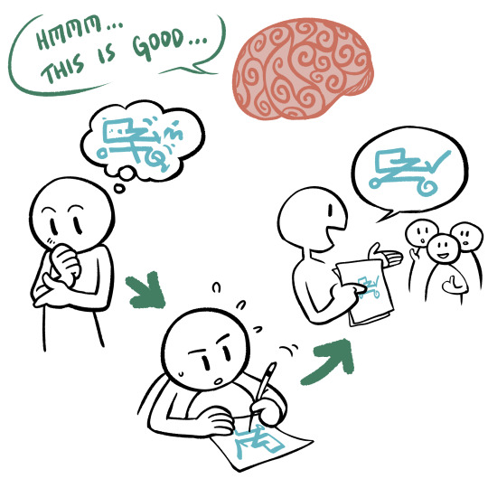
But it's time consuming. And difficult. And there's a shortcut.

What we seek when we create Scenarios and Characters and Conflicts is not hard work toiling away writing/drawing/constructing stuff. Many artists actively enjoy this process, but it's grueling.
And just telling our friends about our ideas actually accomplishes the end goal, as far as our brain is concerned! We made up ideas! We told people about it! We got the Good Feelings!
So when I tell people about my Plans to Write A Comic or Ideas To Make a Story, what I'm actually doing is tricking my brain into thinking 'wow, this feels great! We have accomplished the task we set out to do! No more effort necessary!'
And that motivation to actually draw/write/create?
It goes directly into the trashcan.
Now I'm not saying this to suggest people who do this/fall prey to this are lazy. They're not!
But our brains are. They're lazy, and they want to save energy. And they don't care if you WANTED to actually make the story. They will gladly rip the Motivation energy out of our grubby little hands when they no longer deem it necessary to the process.
So - why do I keep so many secrets? How do I stop myself from talking about what happens next in the story?
I'm doing it to keep my actual comic alive.
Disclaimer: Not everyone functions like this, obviously. Everyone has a different creative process. But this is how I've realized MY brain works, so I now take steps to trick my brain back into working. Ha! Take that, brain! Two can play at this--waitaminute.
#chekhov answers#the funny thing is#i am my brain#but damn am i just dangling a carrot in front of myself most of the time
823 notes
·
View notes
Text
Webcomic interview
How did you get into making webcomics?
I just jumped in expecting to make a few chapters and it turned into multiple years of my life.
Consider drawing Short comics about ideas and throw them out there. My current official webtoons were short comics that I posted inconsistently in between other projects. They eventually got their own following.
Who inspires you?
I was very inspired by the comics I saw on early comic sharing platforms. Opening my mind up to self-published comics made me realize the possibilities beyond mainstream works.
Erri Pi on webtoon canvas is one of those early creators I felt inspired by.
I am also what I would call ‘anti-inspired’. There are many very common tropes that turn me off from media, so when I write, I love to subvert the expectations of those tropes.
What are the best and worst aspects of your work?
The best aspect is creating my own story with full control and allowing it to write itself. I do not find myself getting hung up on the constant lore and rules and history of the work. I just write and allow natural progression. I consider myself an artist over author but you find yourself focusing less on art to make sure the story is good. If the story sucks, nobody will care about the art.
This makes the worst aspect also writing. It takes a long time letting words come to you and it takes more energy than the drawing.
What is the most important thing people should know about when working in the webcomic industry?
Whether it be today's financial climate or how much artists are undervalued, it is still brutal. You have to work fast. It is the only way I've been able to continue a social life, paycheck, and sleep. Learn to only put 30% effort into your comic art. Seriously. As you develop a consistent schedule and style, you will know when to put more effort. You will know.
I understand you created multiple series on and outside of Webtoon. What did you learn from those experiences?
For works like comedy, less is more. You don't need to have more than 4-6 panels to set up and execute a punch line. Sometimes you need even less. Also make sure your jokes are specific to your comic and characters. If any other characters are able to tell your jokes, your comic will become stale fast.
For romance, I've just learned to write what I would like to see more often. I don't care for lots of emotional and relationship mismanagement and it seems like many other people have agreed. So if you want it, chances are, a lot of other people want it as well.
What is your advice for someone planning to enter this industry?
Draw a lot. Write down all of your ideas. Come back to them. Just start drawing one. You learn so much by just doing it and realizing how things look on the page. Simplify the idea. Don't start off with a huge project. Just gesture a 10-page story in a sketchbook. Comics are a language.
The industry can be as professional as working with a publisher, or as casual as having a following on Patreon or social media to fund your work. Both require being fast and able to speak this language.
47 notes
·
View notes
Text
TIM DRAKE NEEDS OUR HELP
I need people NEED THEM, oh baby, oh goodness do I NEED people who don't know much about Tim Drake to stop talking about the Boy Himself: Tim Drake.
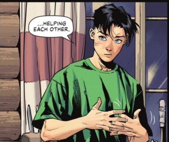
Presented: An accurate depiction of an 18-year-old Tim. The over-sized T-Shirt that helps his already lean body make him look skinnier (therefore people would underestimate him, which is part of his personal fighting technique) worn for comfort over anything else adds to it greatly. He does not normally dress fancy, as is sometimes assumed of him. Wearing some of the Robin colors also help.
If you do not know what he looks like, that is fine, that is actually UNDERSTANDABLE. Like what am I to do, pretend I don't know why people don't know what he looks like? After over a decade of him mostly looking like a generic white guy super hero?
Y'all gotta realize, people did not care about Tim for a very long time, because he was basically the D-List Robin since he stopped being the main one. So they never did their research. He wouldn't even be written right. And his relationships and details of his character could change drastically between writing changes. It was awful.
So those that don't know, please try to learn why people sometimes say what they do about Tim. It's not all true, but in this case, it is true. And when we get to see what he's supposed to look like in a real comic, it's very exciting for us, because we don't normally get that excitement anymore.
I know, it's sad just to be happy to see our fav look like themselves, but it's the spot we're in.
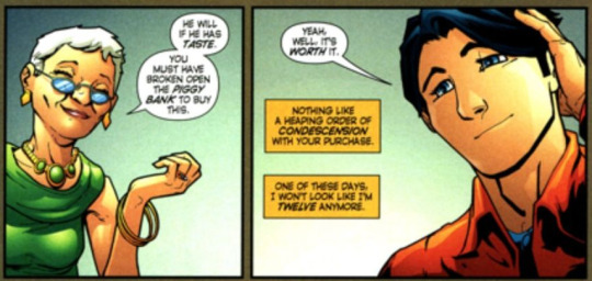
Presented: Canon Proof of Tim's appearance, set when Tim was only months away from being EIGHTEEN-YEARS-OLD, he was still being confused for being TWELVE-YEARS-OLD. Showing how he does look for his age.
Like he's SUPPOSED to be VERY SHORT, he's supposed to look lean to the point of seeming skinny in his street clothes, people are supposed to underestimate him (which is why his appearance works so damn well), he's supposed to have a soft 'cute' look to him, especially young looking even for his age as you can see above, that is part of him, one of of his gags is that he's confused to be twelve even when he was nearing eighteen. HE PURPOSELY LOOKS LIKE THAT. It is an ACTIVE choice. It is not a weird thing people just randomly do, it is a purposeful character design choice, made for the character, for him to stand out, and be different from the other characters with.
It is NOT a fanon thing people made to infantilize him. That is just what he looks like. And it is exactly what some real people look like. It is ACTUALLY part of him. It is a CANON part of him. That is brought up so much, because people keep thinking it isn't CANON, when it is CANON.
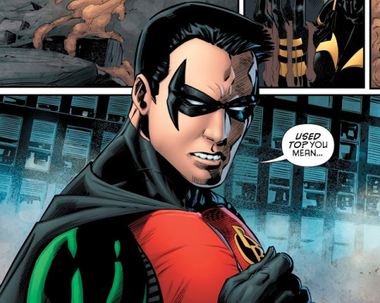
Presented: A horrible drawing of Tim Drake, during an era that made a lot of people have misconceptions of the character we're only lately getting away from. But some people still believe to be the more accurate Tim, based on when they started reading. DO NOT DO THIS.
All because a lot of artists don't care to draw him right, doesn't mean his appearance miraculously changed within the canon. Or at least it shouldn't have, considering that'd be weird, and take an aspect of the character that made him unique go away. Which is not fun for any character to have them done to them.
So when ever an artist does DRAW him like that, can we gang together and say "HEY, GOOD JOB ARTIST, FOR ACTUALLY LOOKING UP WHAT TIM LOOKS LIKE"
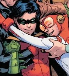
Presented: ANOTHER VERY GOOD TIM. See how he's shorter than his friends (Bart's leaning), has a soft 'cute' face, leaner physique (looking skinny, but not scrawny like he isn't athletic), thick middle parted hair. These are the components of a well drawn Tim that people desire to see more. It will look different based on the art style of course. But these are what makes Tim's appearance suit what we know of Tim, and has been clearly established no matter his age. Here, he is presumably around 17-years-old. Possibly not even a year younger than he currently is.
Because seeing people who see him look different, when it's the right difference, and complain, because they are not aware Tim isn't supposed to look buff and tall and masculine, just because a lot of artists didn't care about who is ultimately at this point a D-List Super Hero...isn't really fair to the people who DO CARE ABOUT IT.
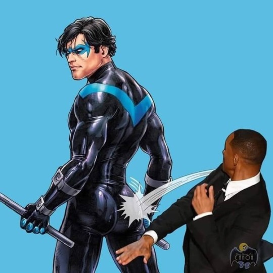
Presented: Something I'm definitely gonna delete from my device soon enough, but added for the sake of the post.
If you wouldn't take away from Dick's ass, don't take away Tim's appearance, please.
We know Tim is different, and that's why we love him the way we do so much.
138 notes
·
View notes
Text


Another comic made for our school's annual comic anthology Static Fish, usually available for purchase at MoCCAFest NYC, for the Spring 2024 edition. (This was a bit of a toughie, because I made it in two weeks while traveling through Europe.) It's about fitting in, past selves and separate selves, and loving and being loved by those who you don't fit in with.
ID under the cut.
[Image ID: A seven-page digitally illustrated comic, titled "Beneath You Now Is Every Other You," by the artist "druid-for-hire." It begins with a snake, in a large black void, staring up at two giant golden eyes that show a window to an outside world. The snake notices the sound of sniffling and sobbing coming from far behind. Worried, it turns away from the eyes, slithering backwards into the darkness as the eyes close, moving past a line of shed skins that slowly become smaller and smaller. The snake finds a very small shed skin, who is alive, and sobbing.
"Hey, bud, you okay?" The snake asks. The shed wails even louder. "Okay, okay, I hear you," says the snake. "What's wrong?"
"You know what's wrong!" the shed shouts back. The snake says, "It would help me a lot if you could think it in words."
The shed throws itself on the floor in a tantrum, then is quiet. Then it says, "They called us too intense. When we were playing on the Wii."
The next page shows the shed talking alongside a drawing of a figure smiling in the foreground, in golden lighting, which fades into darkness over three faceless figures. They are all vague and impressionistic. The shed continues: "I mean, come on, it's a competitive game, right? And it was just our brother, our sister, and her fiance. I mean, I guess… you and I were just trying to have fun. We were having fun. We don't get to talk to them a lot." The snake says, "... We were kind of loud. And..."
The shed interrupts. "I know, I know I know I knowww, we're stupid and have no volume control and we don't get anything anybody's saying, and life is a nightmare of social cues and humiliating faux pas and we're not fucking unique, but… … This wasn't a problem with our friends. Or anybody at college. They were all like us. We spoke the same language, we had the same understanding. We didn't have to try to fit in, there wasn't a box, we were suave and confident and making friends was easy. Now we're back home, and…"
"And it's not the same," the snake says.
There is an illustration of the happy figure from before, half in golden light with cheerful people at their arm. The other half is in darkness. She is smiling in the light, but has no face in the dark. The shed continues speaking. "They don't get it. We're back in normal-people-land and we have to fit in. We forgot about the box. We came back and smashed the box because we forgot about it. And now everyone's mad because we broke their box."
"... I don't want to be weird," says the shed. "Yes you do," says the snake. "You do," says the shed. "No, so do you," says the snake. The shed says, "FINE. I want to be weird. But I want to be cool weird. And I think we are cool weird! But weird still isn't normal. And it's going to make our normal people siblings uncomfortable no matter what we do."
The shed puts its head down, despondent. There is a feeling of vastness and silence; the emptiness around them feels looming. "It just feels bad," it says. "Hiding from them."
The snake is silent for a moment. Then it moves forward, and coils around the shed. "We'll get the hang of it one of these days. You know they're willing to say this stuff because they love you, and they want you to know how to behave around people who don't understand and who don't love you. Better with them than with an employer, huh?"
"I guess," says the shed. The snake nudges it and says, "Hey." After a pause, the snake presses its nose to the shed's. "I love you."
The shed closes its eyes. Over an illustration of the figure in golden light, whose eyes are closed, it says, "I love you too." end id.]
68 notes
·
View notes
Note
do you have any tips for an artist that wants to draw comics?
I honestly still dont see myself as a comic artist, anon, but what i do know is that the hardest part is starting one.
When you're new to it, you gotta learn how to make it easier for yourself because if you're aim is to make a fully colored 20+ pages comic, you will burn yourself out before you finish a single page.
Dont put too much expectations on yourself. Let it be your aim to finish it rather than perfect it. Once you finish it, don't dwell too much into it. Don't let engagements be the measure of its value. The best part of finishing something is looking back on them and learning what you can do better next time.
When you're new, you're also building your stamina in the process and when you understand how much you can do in a certain time, you will learn how to pace yourself better. For ex. In my earlier comics, like my abandoned zelda AU, i didn't really put much thought in the specs and dimension of my comics. I didnt even draw it well lol. I limit working on every entry under 2 to 4 days and that includes the writing. I spent less time on it and it shows! Compare that to my splatoon comics, they're more organized and put together in comparison. This is because I saw what I can do before, I learned what I can do better and it made me put more time into them. I don't really wanna rush myself as much as possible because i dont really earn from this rn lol but most of my entries lately takes 1 month to draw with drafts Ive written 3 months earlier. I work very slow but more robust than before because of all the stamina I accumulated with other finished work :)
I hope this helps at least haha
#i think being excited with your ideas is important too#it's literally your motivation#but that feeling will not always be there once u start working.#most of the time you'll be questioning why ur doing this and lose steam#this is why i think building a stamina for something new is important#building that grit to finish a work is important!#so far working on comics made me appreciate my art more#because everything i reread them I get so proud that I finished them and it's entertaining me now as well#but yeah#i think it will be worth it if you can start first#good luck OP!
136 notes
·
View notes