#HGTV homes
Explore tagged Tumblr posts
Visit Tumblr Blog
Explore Tumblr blogs with no restrictions, modern design and the best experience.
Last Seen Tumblr Blogs


Fun Fact
Mobile US users spent an average of 115.8 minutes on Tumblr app monthly.
Text

Fans Confused After Alison Victoria Lists ‘Dream Home’ For Sale. Wait. Her GA loft didn't sell, and she was supposed to be selling that to finance a new place in the Cabbagetown section of Chicago. Now, I'm confused, too. Anyway, this is an ugly ass building. The 4bd, 3.5ba, property is listed for $3.5M. Let's have a look (if you recall, Alison is the designer who did the "Ugliest House" I posted yesterday.)

Victoria worked to transform her office space into a residential home, which she envisioned as “the biggest, the baddest, the sexiest live-work dream home I could ever imagine.”

Although she’s called it her “Dream Home” home for several months now, fans online noticed that Victoria is quietly planning to part ways with her live-work space. What is going on?

She has posted photos from her dream home as recently as April 9, just before the building hit the real estate market. Well, I like the muted green chairs and planters. The floor is reminiscent of Alice in Wonderland.

One fan brought the home’s listing to an HGTV fan community on Reddit, where other users chimed in with their thoughts about the sale. (I'm an avid Redditor.)

“I thought she was building this to be her dream home/workspace? Or was this always to sell right away?” one fan wondered, with another guessing in response, “In reality it was always just content for her show.”

So, that's just a mantel with candles, then.

“I don’t think many people would be interested in buying this but it might work for someone who has a business and can live on the premises like what she claimed it was intended for," said another fan.

"I think more than likely it would be an event space esp for a wedding w/the option to stay overnight," said a 3rd fan.

Interesting wall with the big niche for decor, oven and 2 wine fridges.

One user pointed out in the comments, “There are no windows! I’d go crazy ! No, the sky lights not enough." Yeah, it's like an underground house.

Shoot, no matter how nice it is, I like the lighted shelving, no windows is a deal breaker. I'd feel imprisoned.


Interesting en-suite.

“The closets are full of clothes and shoes. Not staged stuff, real stuff," said a fan.

Nice little home theater lobby with a snack counter.

This is it? I was expecting a home theater, not a TV room.

Interesting light strand in the powder room.

Long hall to the wide industrial stairs.

One of the other bedrooms. I can't deal with just skylights, I gotta see what the weather's like and all.

One of the other baths. My love of floating sinks is kind of leery of something this big. I feel like it would break loose eventually.

"The mudroom looks like it has a little kid's jackets or maybe they’re just tiny women’s jackets. regardless, it looks like Alison or a family is living there. Interesting,” another fan pointed out.

Exercise depresses me enough, let alone doing it in this room.

I'm gonna say that this is the work area, where the team gathers to discuss design. Interesting that this is the area that has the windows.

The garages in the back of the building.

I'm no designer, but this building wouldn't have appealed to me as a home/work space. I would look for an end unit with more windows.


https://heavy.com/entertainment/hgtv/alison-victoria-lists-dream-home-sale/
https://www.coldwellbankerhomes.com/il/chicago/2733-n-pulaski-rd/pid_58881660/
#alison victoria's home/work factory for sale#alison victoria converted factory for sale#alison victoria chicago home for sale#industrial lofts#houses#house tours#home tour#designer homes#HGTV homes
52 notes
·
View notes
Text
I was in one of those hallways to alternate universe, but it was redecorated by a HGTV stylists so all the doors looks exactly the same.
197 notes
·
View notes
Text
I feel like I might be overthinking this, but I honestly think those home renovation shows push patriachal gender roles and stereotypes in their own way. A lot them typically consist of a man and woman duo (sometimes a married couple), the woman is always the designer who nags and frets about the colour palette and overall look of a home because that's typically seen as a feminine thing. Meanwhile the man is always the contractor and the one who actually does a lot of the dirty work cause obviously men are the ones who would want to build things and not be concerned with things like paint colour and what furniture and accents will look best with that funky accent wall his female cohost picked. Not to mention the fact that many of them feature scenes poking fun at women for not knowing how to use power tools cause of course dumb females don't know anything about building and assembling things. It's very subtle mind you, but there's a consistent pattern.
#home renovation#hgtv#idk its just a pattern ive noticed#as someone who watches A LOT of HGTV and Magnolia Network#some of the modern ones seem to be less formulatic in this aspect but man those early to mid 2000 shows were needlessly gendered#there is nate and jeremiah as well but i feel like they fulfil a stereotype as well#one man is more feminine and is the designer and the other is more masculine and is a contractor
55 notes
·
View notes
Text


via: @architecture_wave
#architect#architecture#architectural#styleinspo#style#house#mansion#styleinspiration#BucketList#photography#tumblr#camera#space#spaces#place#places#beautiful place#luxury#decor#home decor#house decor#hgtv#interior design#life#dream#dreams#goals#household#goal#blog
16 notes
·
View notes
Text


I didn't have "start making a market area" on my bingo card for my day off, but the world works in mysterious ways
WIP OG views on the left. Updated areas on the rights
7 notes
·
View notes
Text
my mom has been on a home renovation show kick recently and asked me if i had formed a parasocial relationship with the property brothers yet
34 notes
·
View notes
Text
One thing about Anne Rice is that if there are heart pine floors in a place, she is for sure gonna tell you about it
23 notes
·
View notes
Text
pitching a new HGTV show called “help my landlord is evil” where the professionals come in to renters’ homes and fixes whatever problems their landlord has continuously ignored or fixed cheaply and poorly.
The episode ends with them confronting the landlords, possibly fist fighting them too i haven’t decided.
#this post is dedicated to my mother’s landlord#fix their fucking bathroom you dick#HGTV#home#home renovation#TV
6 notes
·
View notes
Text


Ever since I realized that HGTV's "Ugliest House in America" doesn't pick the ugliest house, it picks the easiest one, that also fits the renovation budget of $150K, I don't bother watching the finale. I actually loved this house as it was, but they picked it to be redone by designer Alison Victoria. Here are the befores and afters. This fairytale retro home was blue outside.

It's white now.

Granted, the quirky little cottage was colorful, and I guess it didn't fit owners Joe & Jack's taste. The round tower foyer was yellow with pink carpeting. It was nicknamed "The Barbie House." Then, why did they buy it? And, why didn't they repaint some of it?

Look at it now. Meh.

The pink living room walls matched the pink carpet. After seeing the other homes in the competition, truthfully, this one looked good.


TBH, I think that HGTV got a good chunk of their budget back, b/c they didn't do much reno with this house. This was just paint, new furniture, and wallpaper.


Luckily, she kept the round dining nook and glass block.

But, Joe & Jack did kind of embrace the quirkiness- look at the funky mannequin. Since the owners can't see it until it's finished, I wonder if they like it. I hope they didn't expect Alison to update it and keep the historic features.

The wall was opened to accommodate the new modern kitchen. And, new built-in seating was added.

I loved these cabinets so much.

They're gone.

I don't know, I like this. It's cozy.

Don't like this.

This was original retro. Look at the cool floor and the curvy counter. I loved this house. There had to be a way to upgrade and preserve it. It's architectural history.

Reconfigured, bland, and modern. I can't believe the original retro design was destroyed in favor of this. It had personality before.


The bath had original turquoise fixtures. HGTV called it a "turquoise terror."

Reconfigured. I wouldn't have minded the rearranging, but the gray, black & white is so modern/cliche.

This room had character.

Well, it's so boring now, it would certainly put you to sleep.

They don't show the before deck, but Alison commissioned this mural for the floor. So,there you have it. The winner and its reno.
https://www.realtor.com/advice/reality-tv/ugliest-house-in-america-season-5-winner/
3K notes
·
View notes
Text
So! I've been working on the My Home(TM) kitchen in Design Home, and I've got it juuuuust about perfect (or as much as it can be within the limited options of design home), but I keep going back and forth on which rug I want. And then I thought, why not ask tumblr? So, behold:
Option 1:
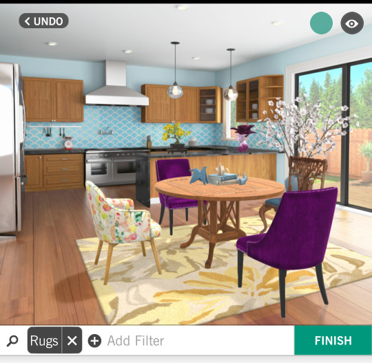
I've always wanted a yellow kitchen, but there was no option to make the walls yellow in design home, so a nice bright yellow rug seems like a good compromise. However, my yellow/multicolor floral accent chair doesn't shine as well against this background.
Option 2:
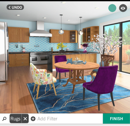
The blue complements the rest of the kitchen well and gives my table and chairs a solid background to pop against. However, I worry it makes the room too dark and the color palette too cool for my goal of a bright, sunshiney kitchen.
Option 3:
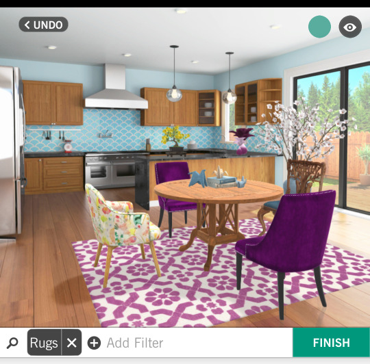
Purple is my favorite color (quelle surprise if you know me at all, lol) and it's a good inbetween tone-wise I think. However, I worry the pattern of this rug is a touch busy.
If you pick the fourth one, you're legally obligated to tell me what rug you're thinking of. Also legal disclaimer that I am not bound by the results of this poll and I'll probably make up my mind on my own eventually, but I'm curious to see how things shake out, and also I lowkey wanted to show off my home designing.
Yeah I'm a gamer (*spends hours playing a home design game on my phone*)
#Design Home#my home kitchen#specifically it's the#main home kitchen#polls#vote now!#you can critique other elements of my design if you want I guess but at this point I'm not changing it most likely#I'm really pretty happy with this but none of the rugs feel quite perfect#mobile gaming#interior design#I could almost call this art or something but I don't want to spam too many tags ;)#I do think I've got a certain composition going though#but yeah opinions welcome! (be nice) (or the laser cats will get you) (I am not legally responsible for the actions of the laser cats)#lol#color theory#hehe#but I do have kind of a purple/blue/yellow palette going‚ which isn't a proper triadic palette technically but I dig it#I do love design home... I might be a little too into it but it's fun#the hgtv kid to wish I owned a house pipeline. oof lol#anyways look at my pretty kitchen. love my pretty kitchen with me#even in the tags i ramble
12 notes
·
View notes
Text
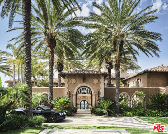
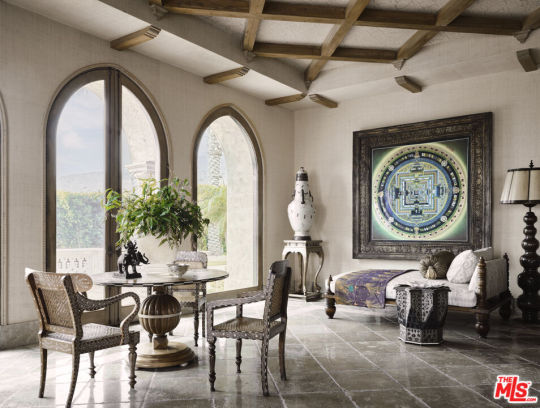

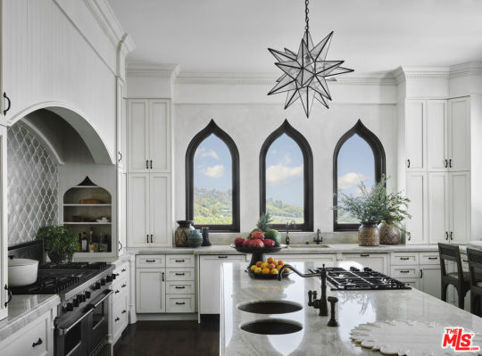
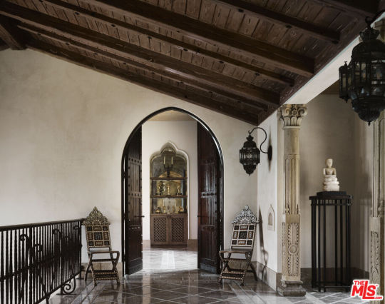
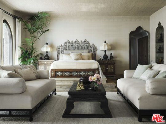


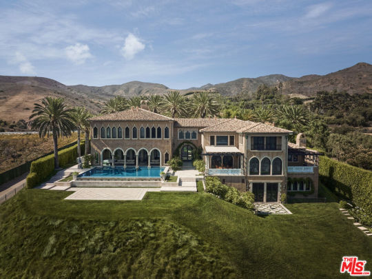
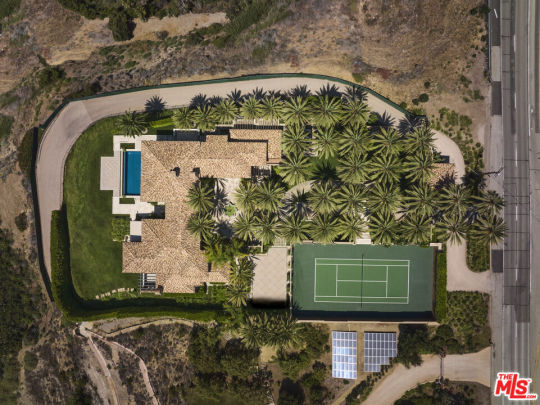
592 | Malibu, CA
$75,000,000 • 7 bd • 8 ba • 13,126 sq. ft
Built in 1999
*All photos belong to their rightful owners*
#real estate#home#house#interior#home inspiration#exterior#exterior design#interior design#hgtv home#hgtv#dream life#dream home#california
29 notes
·
View notes
Text
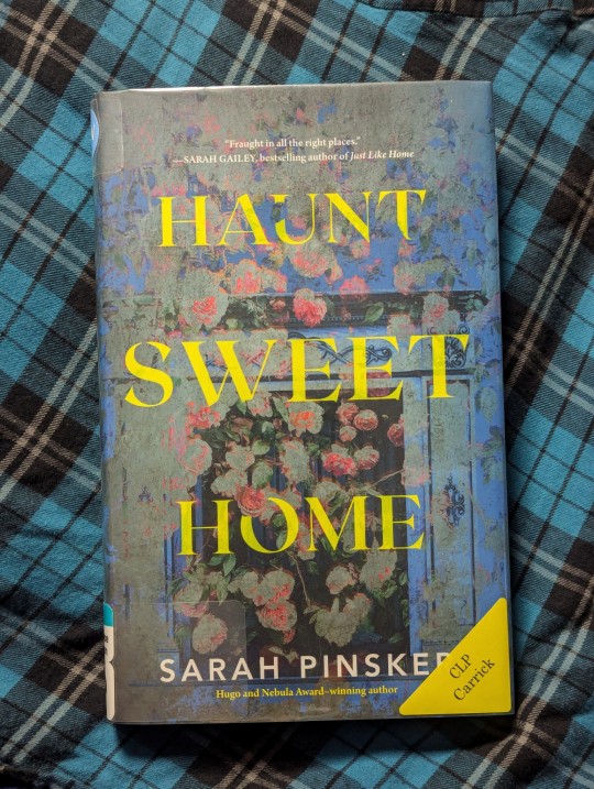
September 7, 2024:
I think this author has invented a new genre. This book is marketed as horror, but there are very few scares, the entity that does eventually emerge is unique, and there's just all-around something unusual & different in the process, the purpose, and the outcome of this "haunting," for lack of a better word.
I want to call this subgenre "gentle horror."
Cause the horror is still there. There were a few tense "uh oh" moments that I would expect from the genre overall, and the book is not necessarily kind. It's more pragmatic and direct, like someone who's brutally honest. I feel like I've been parented on some level.
The "haunted reality show set" concept is my catnip, and I've read a lot of stories with that premise, and that being said: this one is the most unique.
8/10 #WhatsKenyaReading
#whatskenyareading#books#reading#library#horror#haunt sweet home#haunted#haunting#reality tv#ghost hunting#hgtv#home remodeling#home renovation#homeownership#new house#house#home#haunted house#ghost stories#artist#creative#tv#tv shows#tv series#apple orchard#trees#carving#sculpture#wood
3 notes
·
View notes
Text
Bargain Block New Orleans

Bargain Block New Orleans premieres Oct 9 at 9 p.m. ET/PT on HGTV!
Keith Bynum and Evan Thomas, known for revamping Detroit's neglected homes, are stepping into the New Orleans real estate scene.
The duo will tackle rundown properties in iconic neighborhoods, blending their signature style with the Big Easy’s architectural charm. From bee-infested homes to uneven foundations, they’ll face new challenges while adding classic New Orleans design elements like wrought iron railings and arched doorways.
Can Keith and Evan restore these homes while staying within budget and making them affordable? Don’t miss out on the action as they strive to revitalize New Orleans one house at a time! 🏡
Catch each episode on Wednesdays on HGTV, streaming the same day on Max and Discovery+.
Follow TalkTeaV for more updates!
#tv series#tv shows#television#lit#home ownership#home decor#home renovation#home buying#new orleans#Detroit#bargain block#hgtv#october#interior design#celebrity news#artwork#architecture#real estate#reality tv
2 notes
·
View notes
Text

#mine#photography#cottagecore#paint brush#paint#painting#craft#crafts#arts and crafts#diy#sunlight#aesthetic#black#black paint#art#architecture#dark#design#furniture#project#home#house#interior#instagram#Pinterest#interiors#bedroom#light#morning#hgtv
6 notes
·
View notes
Text


Check out this beautiful APluskitchen project Design-Build Kitchen and Home Remodel with custom cabinets, wood floor completed in the City of Dana Point Orange County
#Kitchen#Remodel#Design build#kitchen remodel#home remodel#kitchen Idea#custom kitchen#modern kitchen#transitional kitchen#orange county kitchen#contemporary kitchen#best of orange county#interior design#home#renovation#general contractor#White cabinets#Dana Point Kitchen Remodel#orange county kitchen remodel#hgtv#houzz#California#contractor
4 notes
·
View notes
Text
I have to laugh at parents on home renovation shows at times because those people act like their children will suffer a horrific calamity and die if they don't have that open concept kitchen, living room and dining room combo with the massive appliances and furniture large enough to feed and house an entire village.
#i despise open concept with every fibre of my being#i especially hate when people take very old houses and make them into open concepts#stop stop stop#home renovation#hgtv#those people on those shows are always like i love to entertain#bitch please#how often do you actually have a bunch of people over????
16 notes
·
View notes