#HGTV
Explore tagged Tumblr posts
Text


Ever since I realized that HGTV's "Ugliest House in America" doesn't pick the ugliest house, it picks the easiest one, that also fits the renovation budget of $150K, I don't bother watching the finale. I actually loved this house as it was, but they picked it to be redone by designer Alison Victoria. Here are the befores and afters. This fairytale retro home was blue outside.

It's white now.

Granted, the quirky little cottage was colorful, and I guess it didn't fit owners Joe & Jack's taste. The round tower foyer was yellow with pink carpeting. It was nicknamed "The Barbie House." Then, why did they buy it? And, why didn't they repaint some of it?

Look at it now. Meh.

The pink living room walls matched the pink carpet. After seeing the other homes in the competition, truthfully, this one looked good.


TBH, I think that HGTV got a good chunk of their budget back, b/c they didn't do much reno with this house. This was just paint, new furniture, and wallpaper.


Luckily, she kept the round dining nook and glass block.

But, Joe & Jack did kind of embrace the quirkiness- look at the funky mannequin. Since the owners can't see it until it's finished, I wonder if they like it. I hope they didn't expect Alison to update it and keep the historic features.

The wall was opened to accommodate the new modern kitchen. And, new built-in seating was added.

I loved these cabinets so much.

They're gone.

I don't know, I like this. It's cozy.

Don't like this.

This was original retro. Look at the cool floor and the curvy counter. I loved this house. There had to be a way to upgrade and preserve it. It's architectural history.

Reconfigured, bland, and modern. I can't believe the original retro design was destroyed in favor of this. It had personality before.


The bath had original turquoise fixtures. HGTV called it a "turquoise terror."

Reconfigured. I wouldn't have minded the rearranging, but the gray, black & white is so modern/cliche.

This room had character.

Well, it's so boring now, it would certainly put you to sleep.

They don't show the before deck, but Alison commissioned this mural for the floor. So,there you have it. The winner and its reno.
https://www.realtor.com/advice/reality-tv/ugliest-house-in-america-season-5-winner/
3K notes
·
View notes
Text


HGTV Home by Sherwin-Williams Color of the Year 2025: Quietude
936 notes
·
View notes
Text
Hot take but HGTV needs more of the G
Like you’re telling me you’re renovating a house, renovating a backyard, and all you can do is mention one (1) of the 12+ plants you’re putting in and be like ‘heehee pretty leaf’ and nothing else?
Give me more gardening on the home and gardening channel dammit
1K notes
·
View notes
Text
I've got some home design show on and the homeowners specifically told the designer they hate white and grey and love jewel tones and she was like 'yes!! there's going to be so much color in this house!!' and then every single shade she's picked is like, the greyest shades of green and blue you've ever seen. she's all excited about using 'slate blue' it's LITERALLY fucking grey like

tell me how the hell this is a jewel tone
#molly mumbles#hgtv#the MOST color I've seen is in this chandelier she got#but its UGLY and also NOT JEWEL TONES!!#GIRL!!!
457 notes
·
View notes
Text

2K notes
·
View notes
Text


𝗠𝗶𝗹𝗼 𝗠𝗮𝗻𝗵𝗲𝗶𝗺 🤍
Celebrity IOU - (Season 7 Episode 12)
#milo manheim#celebrity iou#property brothers#camryn manheim#hgtv#zed necrodopolis#disney zombies#wally clark#school spirits#zombies 4#menheim
308 notes
·
View notes
Text
I was in one of those hallways to alternate universe, but it was redecorated by a HGTV stylists so all the doors looks exactly the same.
197 notes
·
View notes
Text


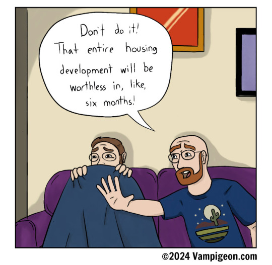
It's just dramatic tension that never resolves. You can just see the banks, with their ghoulish masks and distressingly easy-to-start chainsaws lurking in the background of every episode.
84 notes
·
View notes
Text
I feel like I might be overthinking this, but I honestly think those home renovation shows push patriachal gender roles and stereotypes in their own way. A lot them typically consist of a man and woman duo (sometimes a married couple), the woman is always the designer who nags and frets about the colour palette and overall look of a home because that's typically seen as a feminine thing. Meanwhile the man is always the contractor and the one who actually does a lot of the dirty work cause obviously men are the ones who would want to build things and not be concerned with things like paint colour and what furniture and accents will look best with that funky accent wall his female cohost picked. Not to mention the fact that many of them feature scenes poking fun at women for not knowing how to use power tools cause of course dumb females don't know anything about building and assembling things. It's very subtle mind you, but there's a consistent pattern.
#home renovation#hgtv#idk its just a pattern ive noticed#as someone who watches A LOT of HGTV and Magnolia Network#some of the modern ones seem to be less formulatic in this aspect but man those early to mid 2000 shows were needlessly gendered#there is nate and jeremiah as well but i feel like they fulfil a stereotype as well#one man is more feminine and is the designer and the other is more masculine and is a contractor
55 notes
·
View notes
Text


Download : HGTV Barbie Dreamhouse 🌸CC🌸
🌸🌸Barbie Month 🌸🌸
After being obsessed with HGTV Barbie Dreamhouse show, I knew I had to build this in the sims 4 😁 This show and the amazing team built the ultimate barbie dreamhouse, each space inspired by different decades of Barbie 😍
Hope you enjoy this build as much as I do xx
📍 Del Sol Valley
Gallery ID: SailorJojoSims

Search “hgtvbarbiedreamhouse″
Select “Include Custom content” to see it in the Gallery.
CC galore 🤭 so it is easier to download tray files and mods folder
Place with bb.moveobjects on
Sorry not all the cc needed are in the tray file download , as I don't want to break some creators TOU. So I have posted the links of cc needed below .
Tray Files and Mods folder: HERE (sfs)
📺Speed build Video
CC Google Doc
Many thanks to all the talented cc creators 💕 @aroundthesims @simbarb @snootysimsbook @hamsterbellbelle @illogicalsims @littledica @veranka-s4cc @lina-cherie @mio-sims @pixlmonster @aphroditesims-blog @awingedllama Housofharlix @felixandresims @harrie-cc @taurusdesign @maxsus @kiwisim4 @officialsnootysims @kkbsmm @ravasheencc @peacemaker-ic @charlypancakes @joyceisfox @caio-cc @myshunosun @pierisim @imfromsixam @surely-sims @sp-creates @syboubou
Barbie photos on the gallery @totorosparkles @SharyRleen @Saintcolumcille @Amanat96
#ts4#thesims4#the sims 4#blacksimblr#showusyourbuilds#sailorjojobuilds#barbie#hgtv#barbiedreamhouse#margot robbie#barbie 90's#barbie 60's#barbie 80's#ken 70's#ken's den#barbie y2k#barbie 00's#thesims4 cc#sims 4 cc#ts4 cc#ts4 builds#barbie dollhouse#sailorjojodownload#barbiemonth#hgtv barbie dream house challenge
44 notes
·
View notes
Text


via: @architecture_wave
#architect#architecture#architectural#styleinspo#style#house#mansion#styleinspiration#BucketList#photography#tumblr#camera#space#spaces#place#places#beautiful place#luxury#decor#home decor#house decor#hgtv#interior design#life#dream#dreams#goals#household#goal#blog
16 notes
·
View notes
Text

23 notes
·
View notes
Text

obsessed with this ad that makes it look like someone is cask of amontillado-ing that chick from hgtv
430 notes
·
View notes
Photo

And, if it’s Love it or List it, they also have an extra $115K for renovations on the current house, too.
155 notes
·
View notes
Text

Enough said.
The pattern for this cross stitch can be found for free on HGTV's website.
22 notes
·
View notes
Text

HGTVflippergender
a gender connected to the HGTV DLC from the game House Flipper. This game may be connected to themes within the game (home design, renovation, food, restaurants, etc.), the logo, feels like your gender is the game or is playing the game, or is connected to the game or playing it.
Coined by Juno&!
#flag coining#mogai term#mogai coining#term coining#xeno coining#xenogender#gender coining#xenogenders#hgtv#hgtvflippergender#houseflippergender#dlcgender#gamegender#renogender#designgender
7 notes
·
View notes