#Graphic And Visual Design
Explore tagged Tumblr posts
Visit Tumblr Blog
Explore Tumblr blogs with no restrictions, modern design and the best experience.
Last Seen Tumblr Blogs


Fun Fact
69% of Tumblr users are millennials.
Text
Graphic Design and Printing in Toronto
Toronto is home to many graphic design and printing companies that offer a range of services to businesses and individuals. These companies specialize in creating custom designs for various print materials, including brochures, flyers, business cards, and more. They also provide printing services to produce high-quality prints that are visually appealing and professional-looking. Some of the top graphic design and printing companies. These companies offer a wide range of services and cater to businesses of all sizes and industries, providing quality design and printing solutions that meet their clients' needs. For more information visit our website: https://www.mgsmarketing.ca/
#graphic design studio toronto#ecommerce website design company#web development agency toronto#toronto web design agency#graphic and visual design#top graphic design companies
3 notes
·
View notes
Text
as a bi person, the bisexual flag brings me infinite joy and always puts a smile on my face, however as a person who has a Passion for Graphic Design, that undersaturated shade of purple infuriates me when it's used digitally
like, on an actual flag - which was its original purpose - it looks great!

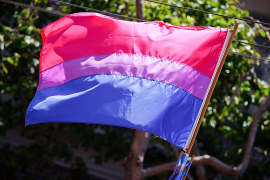
those look fine! lovely, even! with the semi-transparent fabric, the way it catches the sunlight, it looks beautiful!
but now look at how it looks digitally

the pink and blue are so vibrant compared to the sad, lonely lavender!
and let's look at this statement from Michael Page, the creator of the bi flag:

(sidenote: he created this flag in 1998, so if his takes on bisexuality is different from yours, it's okay to notice that! a lot has changed since the 90s when it comes to lived experiences and the way we describe them. but, it's also important to respect his thoughts about this and the way he presented them, even if today, we'd probably not say that bi people "blend unnoticeably into both the gay/lesbian and straight communities.")
so in pantone colors, the pink is 226 C, the blue is 286 C, and the purple of the flag is 258 C.
but...here's the deal
Michael talks here about how the key to understanding the symbolism is to know that the purple blends into both the pink and blue. and on a physical flag, I think you can see that!
but digitally, it absolutely does not blend. it clashes badly, and looks oddly separate from the other two colors.
which got me wondering...what purple do you get if you actually blend 226 C and 286 C?
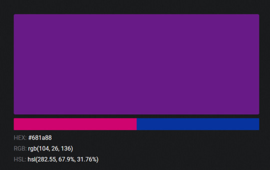
oh! oh, my god.

look at that! look at how nicely it fits between those colors!
look at it next to the original color scheme! look at how much more vibrant the purple is!
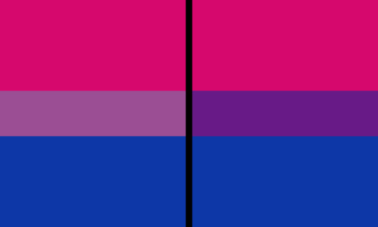
and friends. this is just blending through rgb! you get even more purple variations when you use other color spaces!
let's compare all of them:


(top: original, lab. middle: lrgb, lch. bottom: rgb, hsl)
look at all of the different purple options you can get just by combining these two colors!
if you want almost too-vibrant saturation, you can go hsl, if you want something more relaxed that's closer to the original, you can go lab or lrgb. and if you want to split the difference, lch is bright and violet, while rgb is there with its saturated but darker purple.
anyway, I guess I don't really have a point here? this isn't so much an informational post as it is Me Getting Weird About Colors, but I think it is a useful lesson about how colors look very different on screens compared to how they look on objects in real life.
and sometimes, I think it's okay to compensate for that.
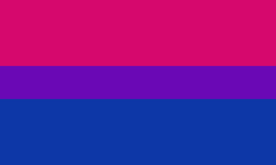
out of all of these, this is my favorite bi flag:

it's the one where the colors were blended in lab color space. for me, the lighter, softer purple is close enough to the original bi flag purple, while also feeling like a smoother blend of the blue and pink
but that's just me! and it might not even look the same to you, since every screen is different, because technology is a nightmare!
anyway, thank you for coming with me on this colorful journey! I will now retreat back to inkscape and make pained sounds about inkstitch gradients until something tangible pulls me back into reality
#bi#bisexual#bisexuality#bi flag#bisexual flag#sbs rambles#graphic design is my passion#id in alt text#but#the ids are probably deeply unhelpful for the different variations of flags#in the alt text of the six flags all grouped together#I just put what method the purples were blended with#and then tried to describe them more in the paragraph below#but this is an inherently visual post#so if you're reading it with a screen reader I am sorry :(
19K notes
·
View notes
Text
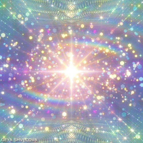
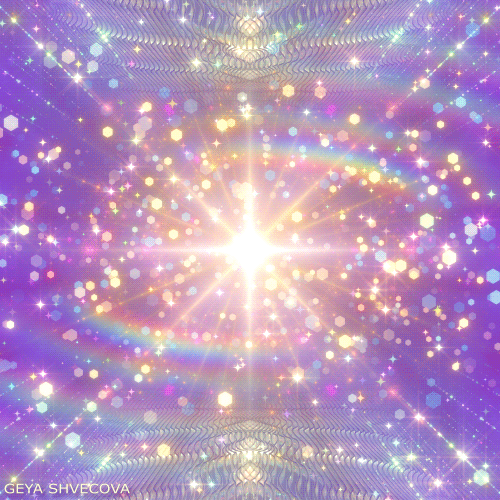
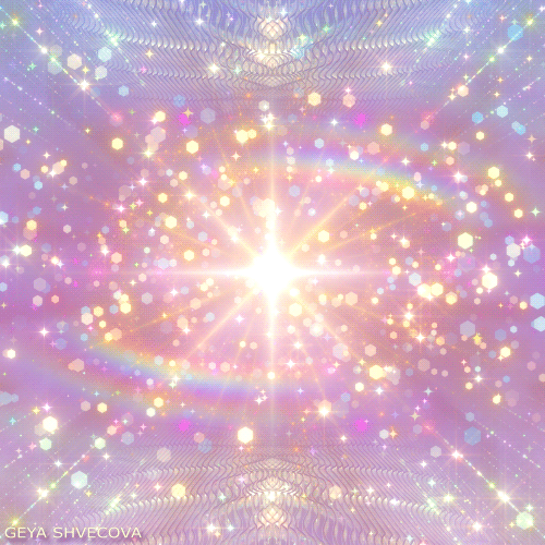

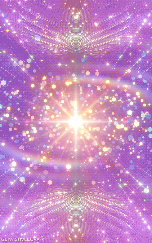


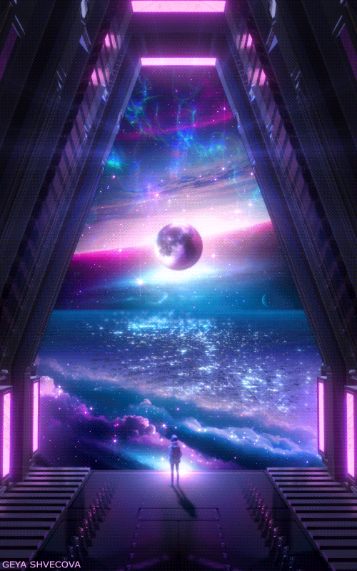
Design graphics Geya Shvecova (Pastel glitter stars) Archive 010924
#gif#artists on tumblr#motion graphics#aesthetic#loop#seamless loop#art#geyashvecova#hypnosis#glitter#visualart#visual art#hypnotic#stars#pastel colors#inspiration#trippy#mograph#motion design#motion#gif animation#gif aesthetic#looping gif
2K notes
·
View notes
Photo

#green#gif#art#digital art#color#colors#colorful#artists on tumblr#beautiful#aesthetic#motion graphics#visual stim#colour#art inspiration#gifs#colores#arte#colours#net art#design#HSL#*d43#*pfn e0 sp1 r143#*c15.178.39.218.123.149#*mp0069.7730.0006#*tp0038.5510.0002
1K notes
·
View notes
Text

Toshiba Magazine Ad, Adphic Co. Ltd Studio (1987).
IG
#editorial#design#graphic design#designer#graphic designer#typography#print design#typographic#type#graphics#editorial design#magazine#magazine layout design#editorial layout design#magazine design#poster design#visual design#design studio#illustration#flyer design#poster art#art#visual art#retro design#magazine layout
895 notes
·
View notes
Text


Stargate (1994)
#stargate#90s#scifi#portal#scifi aesthetic#hieroglyph#teleportation#cult film#space opera#scifi movies#90s aesthetic#1990s#90s movies#graphics design#user interface#computers#visual effects#robotics#ui ux design
1K notes
·
View notes
Text
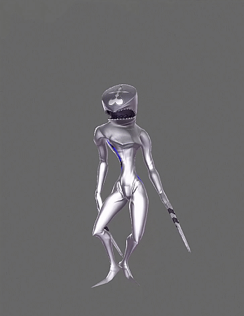
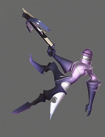
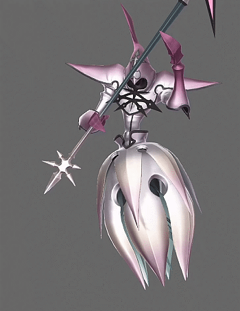

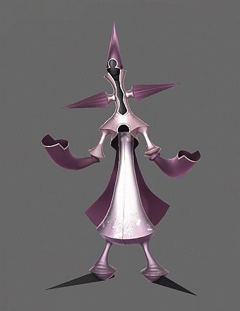
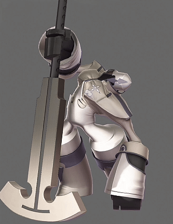
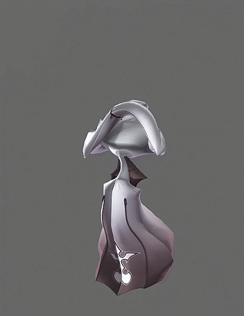

Kingdom Hearts 3 - Nobodies
#kingdom hearts 3#kh3#nobodies#dusk#sniper#reaper#ninja#gambler#berserker#sorcerer#my gif#i'm a nobody enjoyer so of course i'm gonna make another set with them#nobodies are so reflective in this game i wonder if it they were originally intended to look this way#it would have been difficult to visually convey that in the old engine since lighting and shadows were all drawn onto the texture map#but that's not an issue anymore since there are far less lighting and graphical restrictions#anyways i'm glad we got a couple new nobodies#because their designs rule#i love how the one that represents marluxia can morph its body to look like the pod that sora slept in at castle oblivion#while the one that represents larxene has flowy scarf tails that are reminiscent of her unique hairstyle. the knife hands are cool
1K notes
·
View notes
Text

"I am the Devil's minion and he grants me my every wish." (Queen of the Damned, Anne Rice)
-
photo from 2x05: Don't be afraid, just start the tape
#interview with the vampire#iwtv#amc iwtv#devils minion#armandaniel#armand#the vampire armand#daniel molloy#assad zaman#luke brandon field#artph#graphic design#visual arts#avocariescreatives#design#poster#poster design#avocaries
614 notes
·
View notes
Text

Jiří Rathouský, grafický motiv z knihy – originánlní návrh [GIM 1970 Genetics of Industrial Microorganism], 1970 [Moravská galerie, Brně]
#graphic design#typography#visual identity#jiří rathouský#genetics of industrial microorganism#moravská galerie#1970s
262 notes
·
View notes
Text
Attico36 Graphic Assets for showreel during Desina Festival Napoli. 19.04.2024
#graphic#design#grafik#graphicdesign#visual#editorial#type#typo#typography#typeface#logo#logotype#illustration
826 notes
·
View notes
Text
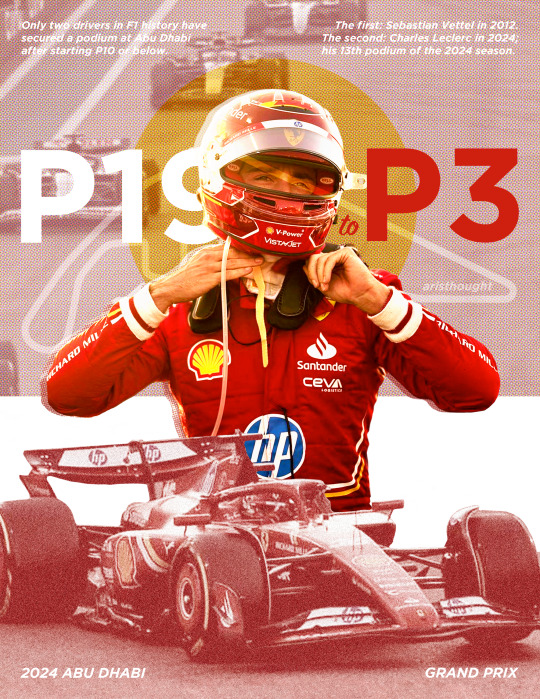
Only two drivers in F1 history have secured a podium at Abu Dhabi after starting P10 or below. The first: Sebastian Vettel in 2012. The second: Charles Leclerc in 2024. x
#hi ill be emotionally processing this race forever thanks! but in the meantime i was inspired to make this#my actual goat fr#charles leclerc#formula one#graphic design#formula one edit#graphic art#visual design#art#graphics#edit#f1 edit#formula 1#f1#abu dhabi gp 2024#j.exe#j.design
351 notes
·
View notes
Text
The Art and Science of Professional Website Designer: Crafting Digital Masterpieces
In the vast and ever-expanding digital landscape, the role of a professional website designer has become increasingly pivotal. A website serves as the virtual storefront for businesses, making a lasting impression on visitors and influencing their perception of the brand. In this blog, we delve into the art and science of professional website designer, exploring the skills, qualities, and expertise that set these designers apart in their craft. At the core of professional website design lies a deep understanding of both aesthetics and functionality. These designers possess a keen eye for design principles such as layout, typography, color theory, and composition, allowing them to create visually appealing websites that capture the essence of a brand. For more details visit our website: www.mgsmarketing.ca
#Web Design Services Toronto#Toronto Website Design Company#Web Development Agency Toronto#Top Graphic Design Companies#Ecommerce Website Design Company#Toronto Web Design Agency#Graphic Design And Printing#Graphic Design Studio Toronto#Freelance Graphic Designer Websites#Graphic Design Agency Toronto#Graphic Design Companies Toronto#Local Graphic Designers#Professional Printers For Graphic Designers#High Quality Printers For Graphic Designers#Graphic Design Printing Services#Graphic Design Company Website#Graphic Design And Printing Company#Digital Graphics Designer#Graphic And Visual Design#Packaging designer and printer#Box designer and printer#Custom packaging toronto#Marketing Graphic Design#Graphic And Web Design#Professional Website Designer#Web Graphic Design#Graphic Design Branding
0 notes
Text

Oldies
1K notes
·
View notes
Text
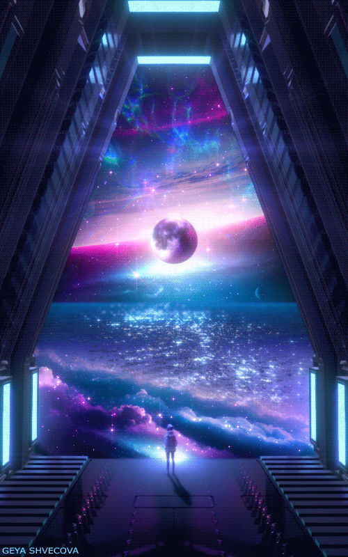
Design graphics Geya Shvecova (Arrival) Archive_151223 V.2
#gif#artists on tumblr#motion graphics#hypnotic#mograph#looping gif#trippy#seamless loop#seamless#digital art#geyashvecova#visual art#trippy art#art#hypnosis#perfect loop#art design
4K notes
·
View notes
Photo
#gif#art#digital art#color#colors#colorful#artists on tumblr#design#colours#graphic#stimming#relax#gifs#aesthetic#arte#relaxing#visual#animation#aesthetics#colores#RGB#*d46#*h 272#*pfn e0 sp1 r104#*c77.225.27.188.63.225
2K notes
·
View notes
Text

Timespace
#詩#poem#poetry#visual poetry#視覚詩#concrete poetry#Vispo#poesia visiva#visual poem#poésie visuelle#art#artists on tumblr#concrete poem#poesía concreta#konkretepoesie#design#graphic design#flyer design#design inspo#typography#typographie#コンクリート・ポエトリー#具体詩#タイポグラフィ#Experimental#text#words#black and white#monochrome#space
152 notes
·
View notes