#Film Appreciation Post
Explore tagged Tumblr posts
Text
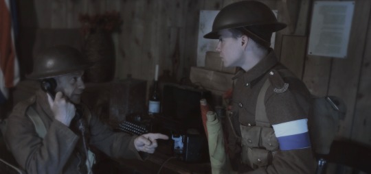

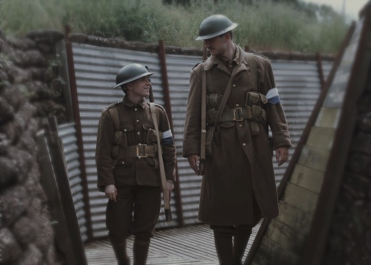
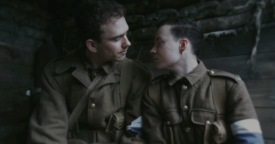
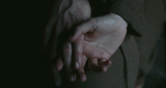
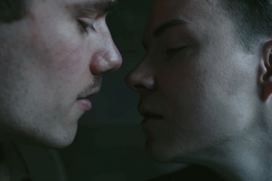
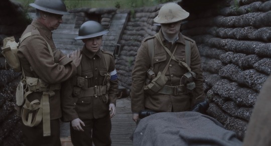
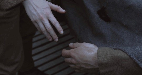
And it hurts to miss you, but it’s worse to know
That I’m the reason you won’t come home
Photos by keltikfilm, editing by me
#oh f it pride month coming early I’m posting now#they turned out so gooood#My Novel has entered the chat#there’s more but this is the vibe of the storyline#now if only someone would make this into a film!!#I cast them to the tv with black bars on the top and bottom and they straight up looked like a paused movie#also not me (5’2) looking like a garden gnome compared to our (6’5) mate 💀#wwi#world war 1#history#lgbtq history#gay history#me#1917#<- adding cos I know y’all will appreciate this
804 notes
·
View notes
Text
i love gay movies but in order to watch them you have to look at so many white people
#any recommendations for queer films with leads of color feel free to reply to this post i'd really appreciate it#i've seen a lot of the big ones but you can suggest em anyway in case someone else hasn't
441 notes
·
View notes
Text
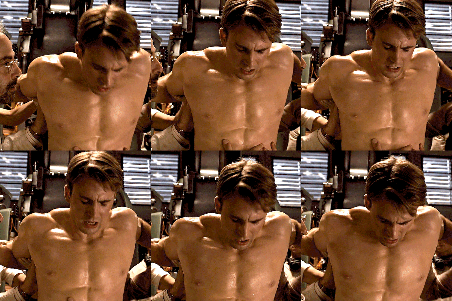

i'm looking
#posts this and runs away#look they went to all the trouble of filming this scene#the least we could do is appreciate their hard work#steve rogers#steverogersedit#marveledit#marvelgifs#mcuedit#dailyteamcap#capedit#dailymarvelgifs#mcufam#marveladdicts#userelysia#unearthlydust#userpegs#*#1k#gif*#edit*
1K notes
·
View notes
Text
I just want to acknowledge how well-crafted dead boy detectives is, in terms of how each shot is framed and colored. it's such a visually satisfying show, and as an artist i am feral about at least one frame in every single scene. i could go on for paragraphs about the execution of this but i'll just grab a few frames for examples, because. it's so good. (not super crisp images, sorry about that. best i can do with taking screenshots directly from netflix.)
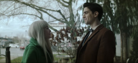
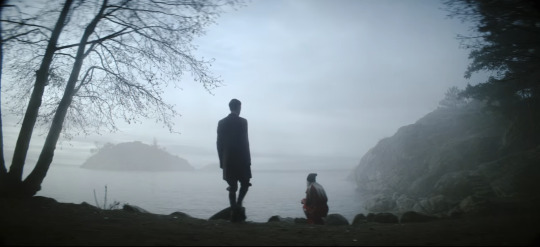
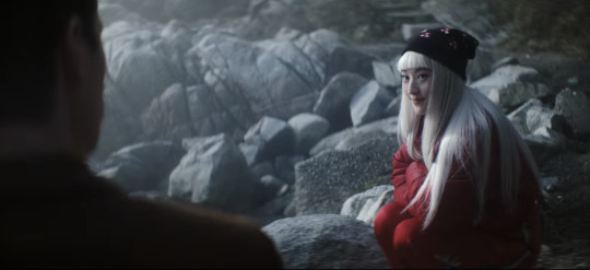
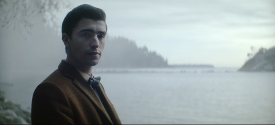
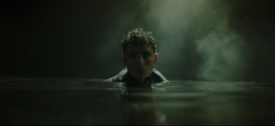
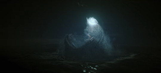
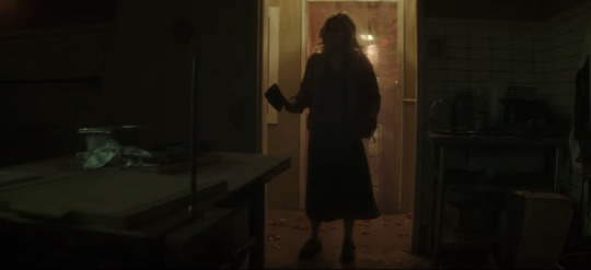
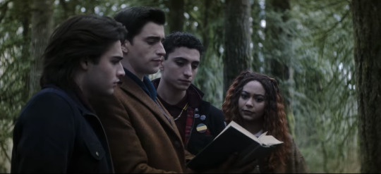
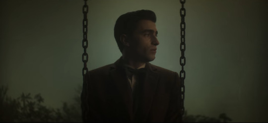
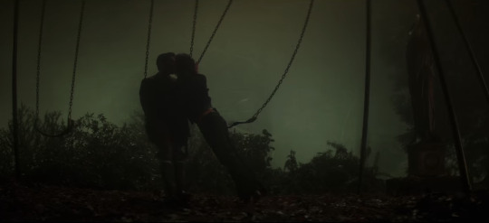
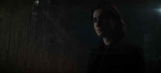
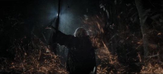
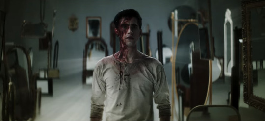
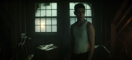

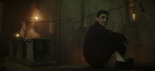
this is obviously nowhere close to all of the frames i'm obsessed with, but it goes to show how much thought was clearly put into blocking and coloring!!! each scene has a color scheme or a theme, and the characters are very often dressed in a complementary way. (Maren's dark outfit, when we see her in episode 5, looks very good with her yellow and maroon front porch, for example.) there's a lot of orange/blue contrast, or brown/green, and altogether every scene has shadow and highlight, and isn't afraid of either one. (respect.)
it's just so refreshing to have such a gorgeous show to enjoy. everyone who worked on the framing and lighting in this show knew very well what they were doing, and I hope we get a second season so they can keep doing it!!!
(if anyone wants me to go in depth about why i love any of these frames, let me know. because i WILL.)
EDIT: In-Depth Post! :)
#dead boy detectives#film stills#edwin payne#charles rowland#niko sasaki#crystal palace#monty the crow#monty finch#MONTY FINCH IS THAT HIS NAME OMG. I LOVE HIM. justice for monty he deserved better. he doesn't deserve edwin but he deserves to be free.#esther finch#appreciation post#netflix
457 notes
·
View notes
Text

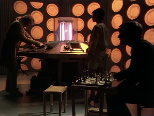
we absolutely do not talk enough about how gorgeous the tardis is at the start of enlightenment
#look at her 😭😭😭#I’m personally more partial to the post 5 doctors console#but this lighting 😭😭😭😭😭😭#doctor who#classic who#fifth doctor#5th doctor#Peter Davison#enlightenment#season 20#alas I do appreciate this is why 13s tardis was a nightmare to film in#because you can’t see shite 😂
601 notes
·
View notes
Text
Season 3 -Surrealism and its psychoanalysis of Carmy Berzatto
Stick with me here if you like. I'm here to talk about how this season it dove into a psychoanalysis and surrealist style cinema on Carmy and his sexual urges. @currymanganese @caiusmarciuscoriolanus & @vacationship discussed in another thread the surrealism of this season with its close shots and quick cuts as well as leaning into faint storytelling and a focus on moving images. Surrealist Cinema connects with Sigmund Freud's principles in creating this film style.
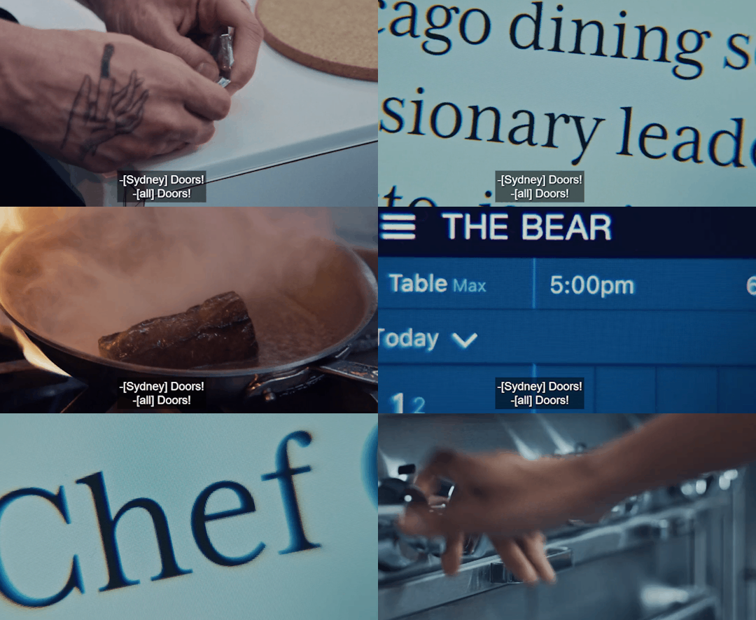
Surrealist films are connected to Sigmund Freud's ideas about dreams and the unconscious mind. These filmmakers used strange, unexpected scenes and bizarre images to depict what’s going on deep in our minds, creating movies that feel like crazy, vivid dreams. The Surrealists ran with this idea in their art to capture pure thoughts from the unconscious mind.
Freud's ideas are super handy for understanding Surrealist art. Early on, Freud figured out that dreams are like visual poems, using metaphors to show our unconscious thoughts and desires. But our minds censor these dreams, turning the original thoughts into metaphors through something called displacement and condensation.
The filming this season prioritized mood over storytelling, which is another interesting aspect. It also featured a surrealistic style of non-linear moving images like in Episode 3x01 Tomorrow- non linear in Carmy's unconscious stream of thought. This symbolism also shown through the displacement of scenes and images.
What is Displacement?
Freud thought Displacement was the important part of dream work, and surrealist felt this way with film. It swaps out objects or concepts with symbols to hide the real meaning. Surrealist filmmakers committed to this act of symbolism. Symbolism is a figure of speech of a character's actions, words, and events that has a deeper meaning.
One example of symbolism from Freud defines that knives often symbolize male genitalia and boxes symbolize female genitalia in dreams.
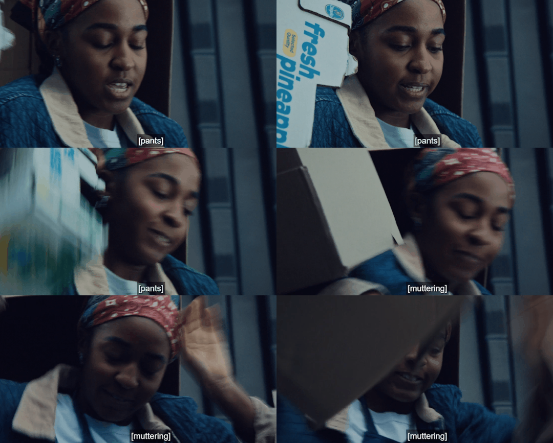
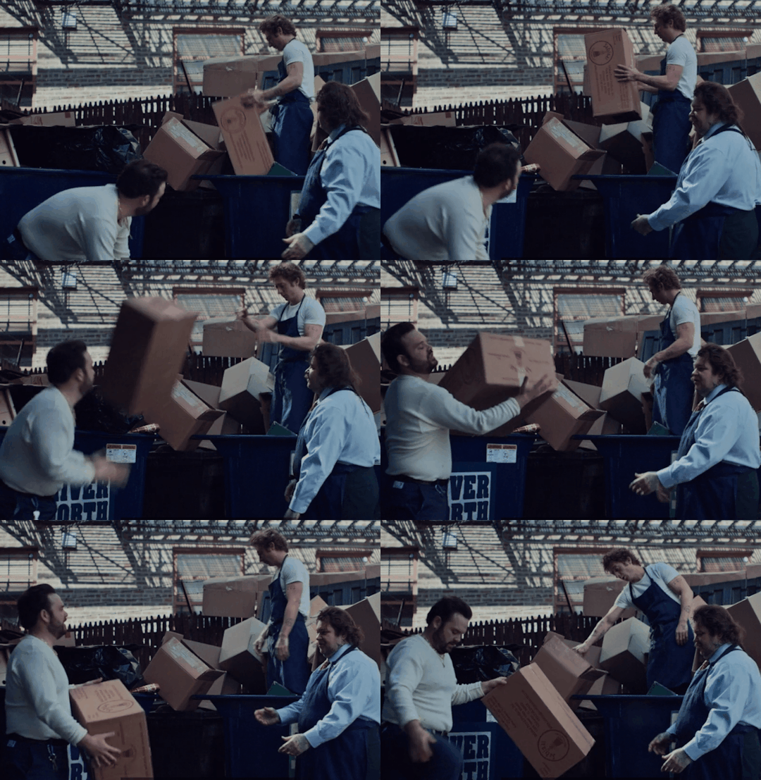


What are the odds of a parallel between knives and boxes, and it's only Carmy and Sydney being frustrated by the tasks of cutting and breaking down boxes?
It's the symbolism of sexual frustration between them.
Textbook Sublimation
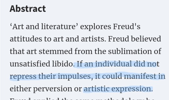
Another Freud concept is sublimation - this is defined as redirecting sexual desire into socially acceptable behaviors or new aims that are still related to the sexual impulse. (AKA Carmy wants a star, not just to beat Chef David- but what carmy truly wants sexually is to please Sydney)
Remember what Richie said about Carmy as he shouts at him and then Carmy looks at Sydney?
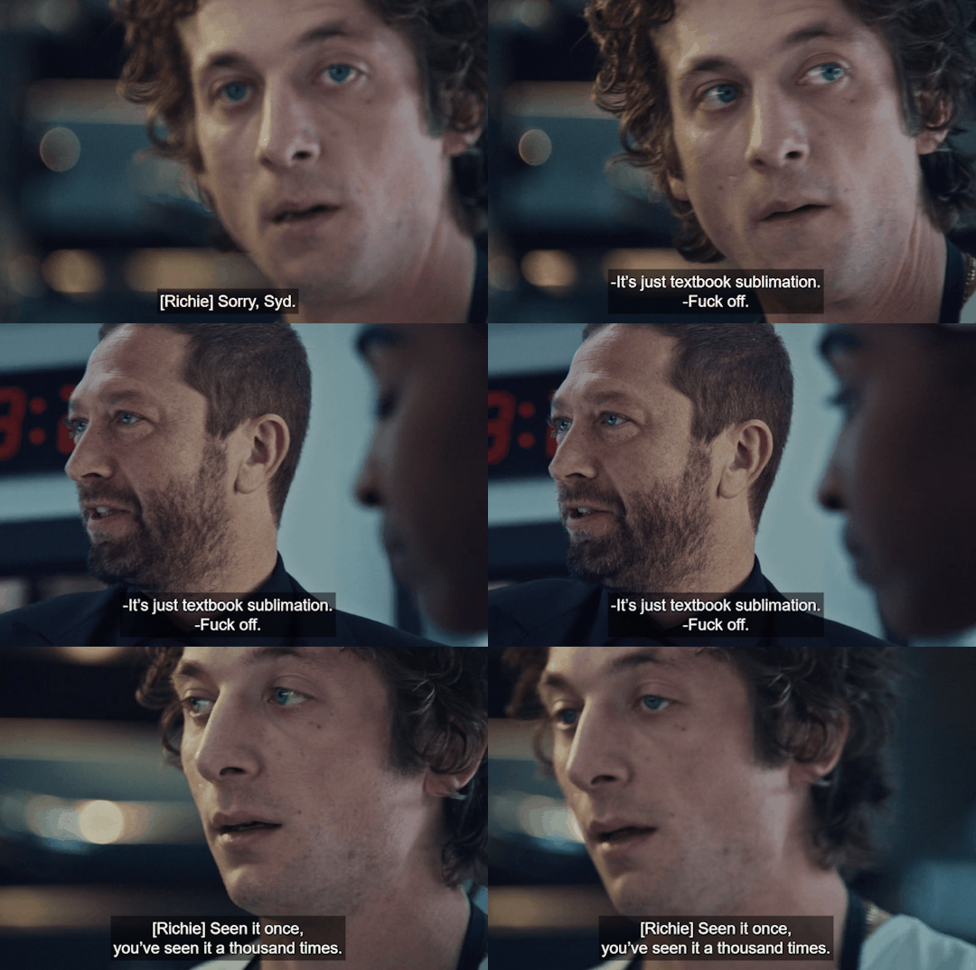
Let's definite what textbook sublimation is:
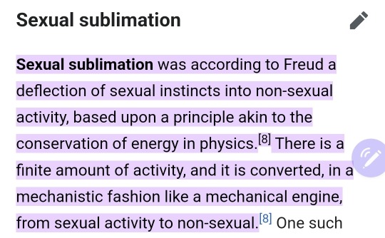
My theory is that Richie told Carmy that he sees him for who he really is. He knows Carmy and knows that he never wanted Claire in the first place. Richie is aware of the tension between Sydney and Carmy, and Carmy's been repressing it all along. Richie is very observant; look at how he observes the tension between Carmy and Sydney.
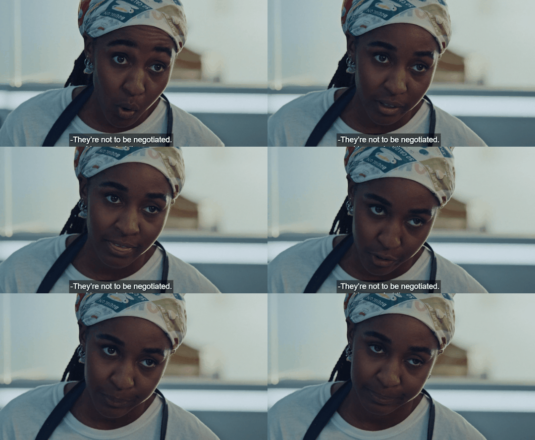
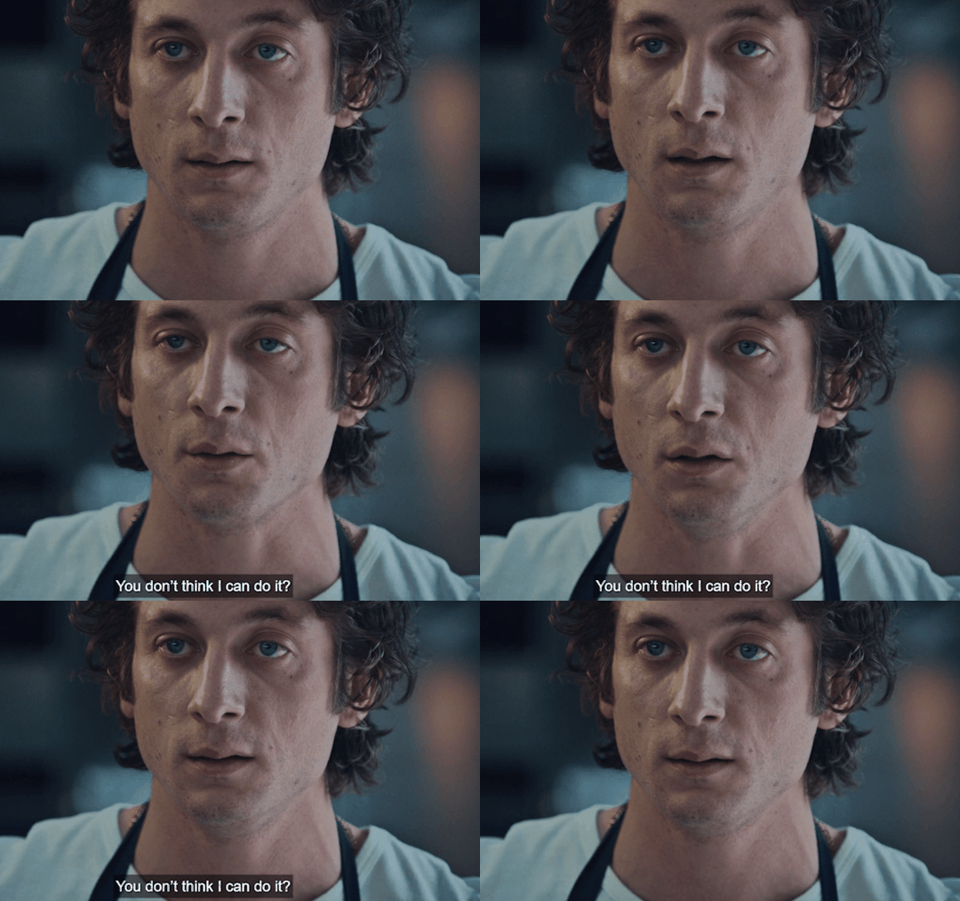
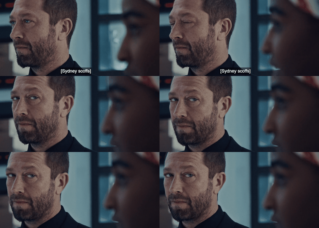
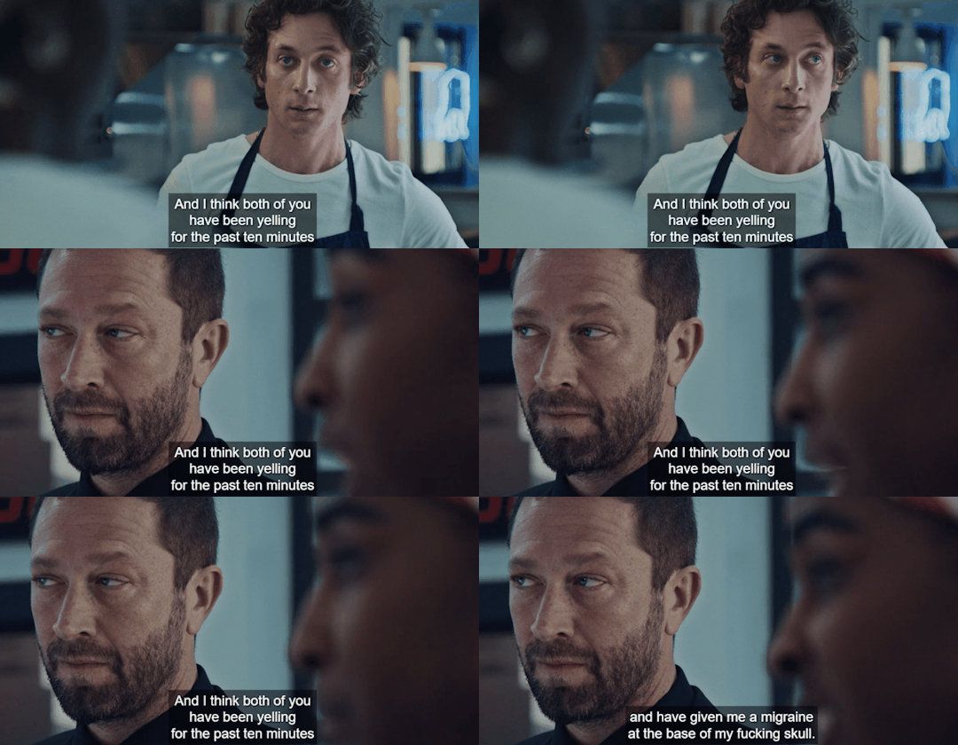
Bonus: Look how Carmy stares at Sydney- he could care less about the Faks in this moment. He's feeling bad for giving her a headache but he wants to fight some more.
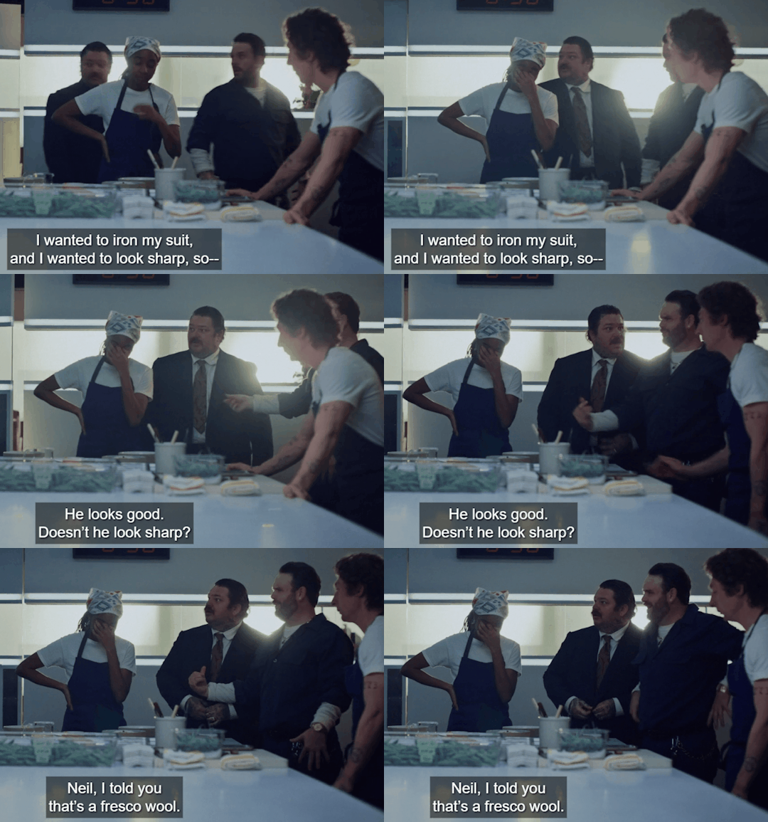
Remember, we theorize here that season 3 breaks into the fourth wall. At that moment, Richie is talking to the audience, giving us a rundown of why Carmy avoids and creates a prison in his mind. We didn't get a clear answer because we were inside Carmy's mind throughout the season. He was experiencing confusion, repression of his urges, and an inability to feel the pain he was going through. Another thing is that he could not accept any joy or love in his life.
I believe the decision to create a surrealist-style season is great because it complements Carmy's avant-garde food style, through which he communicates his artistic thoughts and feelings.
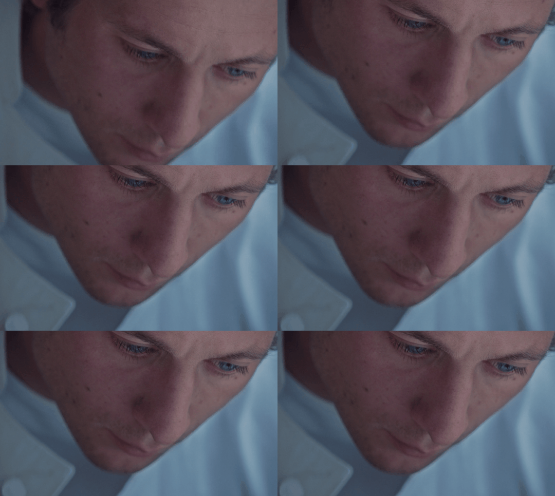
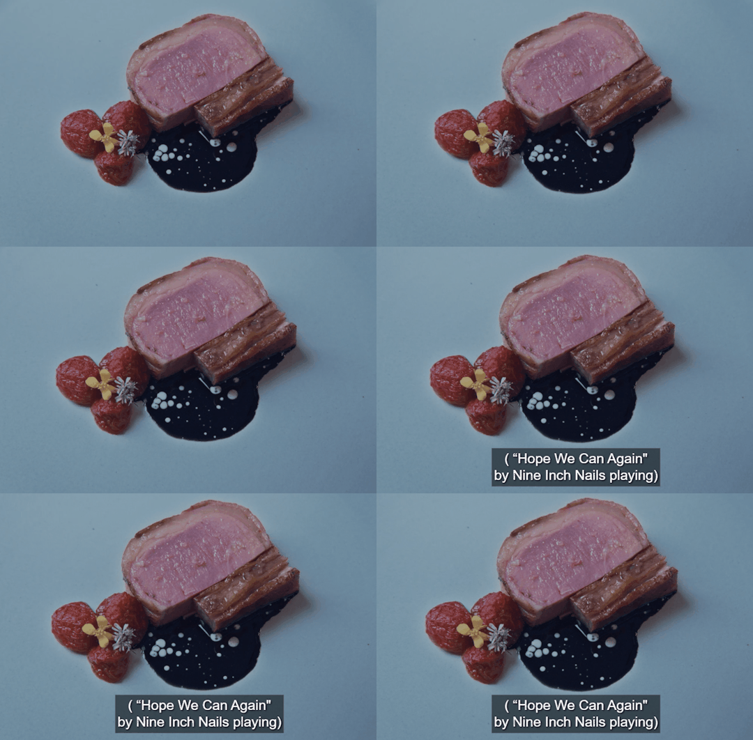
Through the image, we see that Carmy is in a dreamlike state, gazing at the dish he created unconsciously, which matches Sydney's scarf. This hits at the core truth of his desires that he does not want to address. Sydney is the real fun, joy, and amusement that can happen, but he's been sabotaging and repressing since day one, even with the choice of dating Claire. Carmy is more addicted to adrenaline, stress, chaos, and guilt.
I believe the bear in his dream symbolizes the Carmy's unconscious and repressed feelings - desires, guilt, and longing. These emotions overwhelm him as he returns home and processes his grief. The phrase "let it rip" carries multiple meanings, but in this case, I interpret it as a call for him to embrace his emotions and be true to himself.
Thank you for reading.
#sydcarmy#im not a doctor i just love film and psychoanalysis#long post but fun to write hopefully fun to read#i really appreciate sydcarmies! thank you for reading my thoughts#carmy x sydney
162 notes
·
View notes
Text
youtube
a strange cartoon i found on an old computer from an antique store. i wonder who made this...?
hiiii here's the short film i worked on from may to june ^__^ it's my second frame by frame animation ever but i think i'm slowly getting the hang of it. made in adobe photoshop & adobe premiere pro
shoutout to my irl friends who helped me design some of the characters (more specifically the other cat characters lol)! they're credited at the end, please go check them out on instagram & tumblr <3
#my art#(posting it to this account to reach more people)#i would really appreciate it if you watched the whole thing btw 👉👈#2d animation#animated film#student film#illustration#short film#volume warning#vhs#the purrsuit#Youtube
136 notes
·
View notes
Text
I do not understand the infatuation i have for this man


I really don't. I'm gonna keep going tho because what else am I supposed to do– find another guy? when he's literally right there? no way. Just look at this man


my darling boy, literal lovely gentleman


cheeky menace and an absolute star
My god, I'm so glad to have found him
#taron egerton#this is a taron appreciation post#because i love him so dearly#kingsman#eggsy unwin#rocketman film#eddie edwards#eddie the eagle#mad teddy smith#legend 2015
125 notes
·
View notes
Text
winona ryder really found a cinephile soulmate in jenna ortega
66 notes
·
View notes
Text
I will thank HTTYD live action for one thing, and that's reviving my interest in this franchise like jumper cables to the heart.
Anyway, my controversial HTTYD take is that the second movie feels more emotionally mature, and it continues to resonate more with me the more I've grown into adulthood. It's the cautious optimism... It's the fact that you can't change everyone's perspective, and sometimes you need to fight for what you believe in... It's the fear of adult responsibilities that feel larger than life, only to realise that instead of running you have to try... It's the knowledge that the world may try and strike you down, but the bonds you've created will bring you strength in an uncertain future... do you feel me?
#fires posts#ramblings#httyd#httyd 2#like listen I absolutely adore the first movie and it's beautiful and nuanced and has wonderful themes and lessons#but ultimately it's a feel-good happy ending sort of movie. Everything works out and everyone gets what they want#which is completely fine!! In fact needed in this world dare I say#but HTTYD 2 always felt more down to earth to me. Not taking the bizarrely pessimistic tone of the 3rd film but not highly positive either#As a film I have so many takeaways from it. But ultimately I love how it acknowledges the world and people can be fucked up#but you can't give up and you have to keep trying despite an uncertain future#I just appreciate it so much
29 notes
·
View notes
Text
Blessed be the Lord my strength which teacheth my hands to war, and my fingers to fight: My goodness, and my fortress; my high tower, and my deliverer; my shield, and whom I trust; who subdueth my people under me.

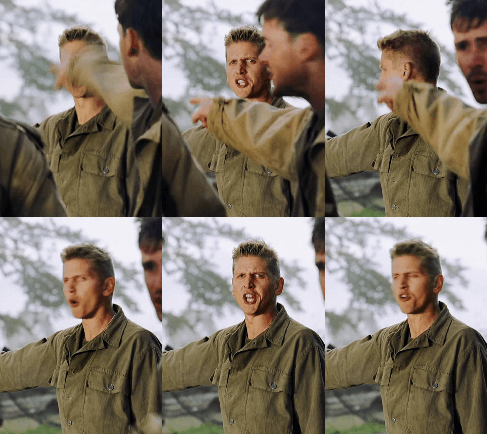


#saving private ryan#daniel jackson#barry pepper#my favorite lefthanded badass marksman#ok not a band of brothers post im sorry i just need to appreciate my man#pvt daniel jackson#pvt daniel#marksman#sharpshooter#tom hanks#world war 2#ww2 movies#spr#spr daniel jackson#private jackson#private daniel jackson#saving private ryan daniel jackson#film#ww2#ww2 films
163 notes
·
View notes
Text
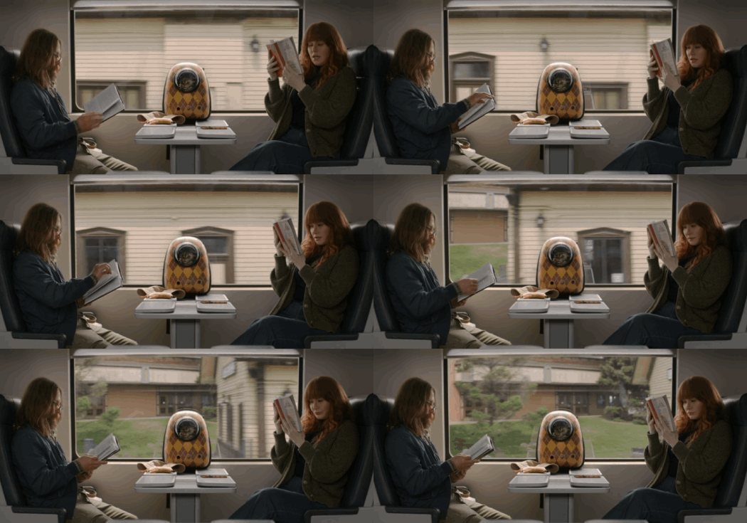
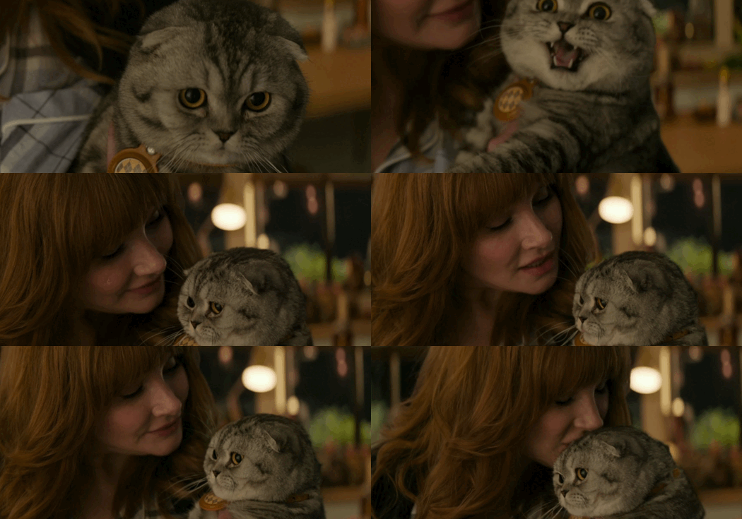
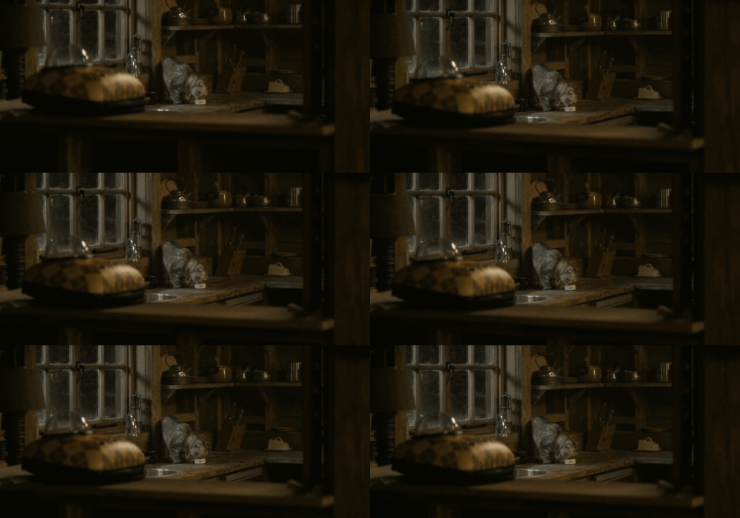
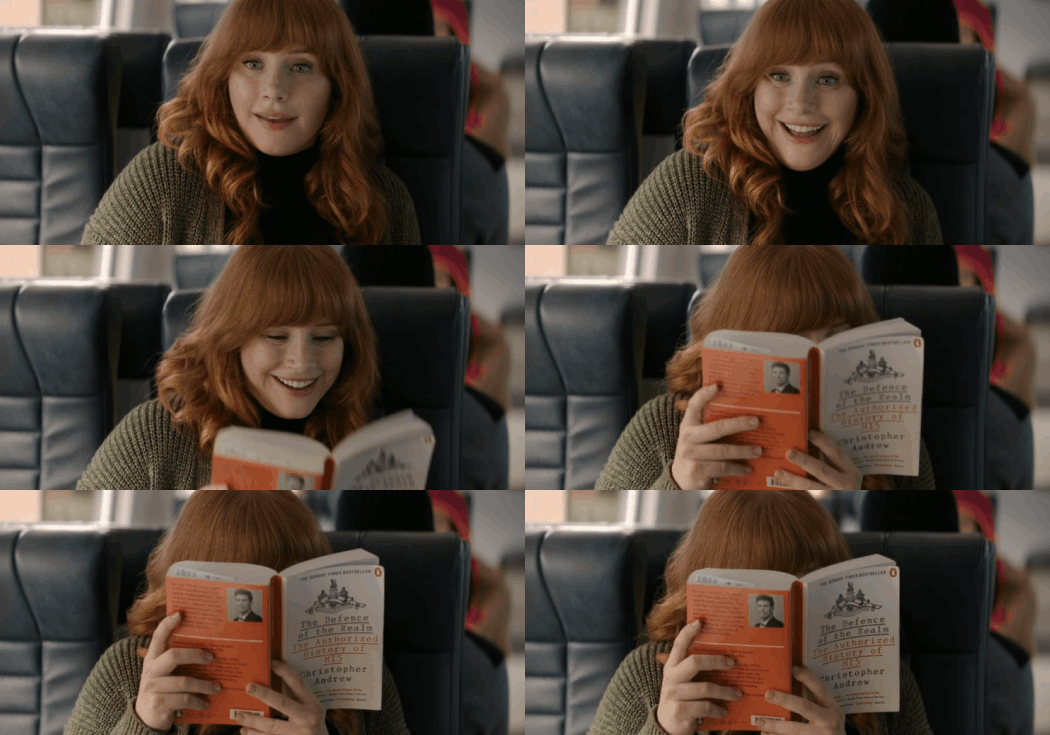
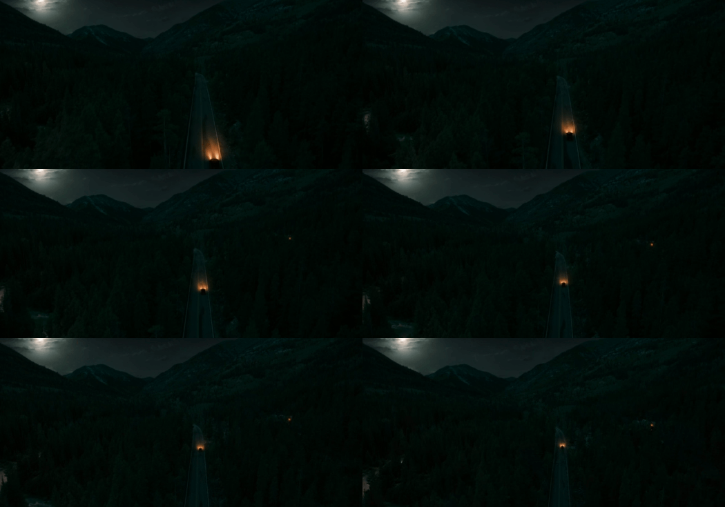
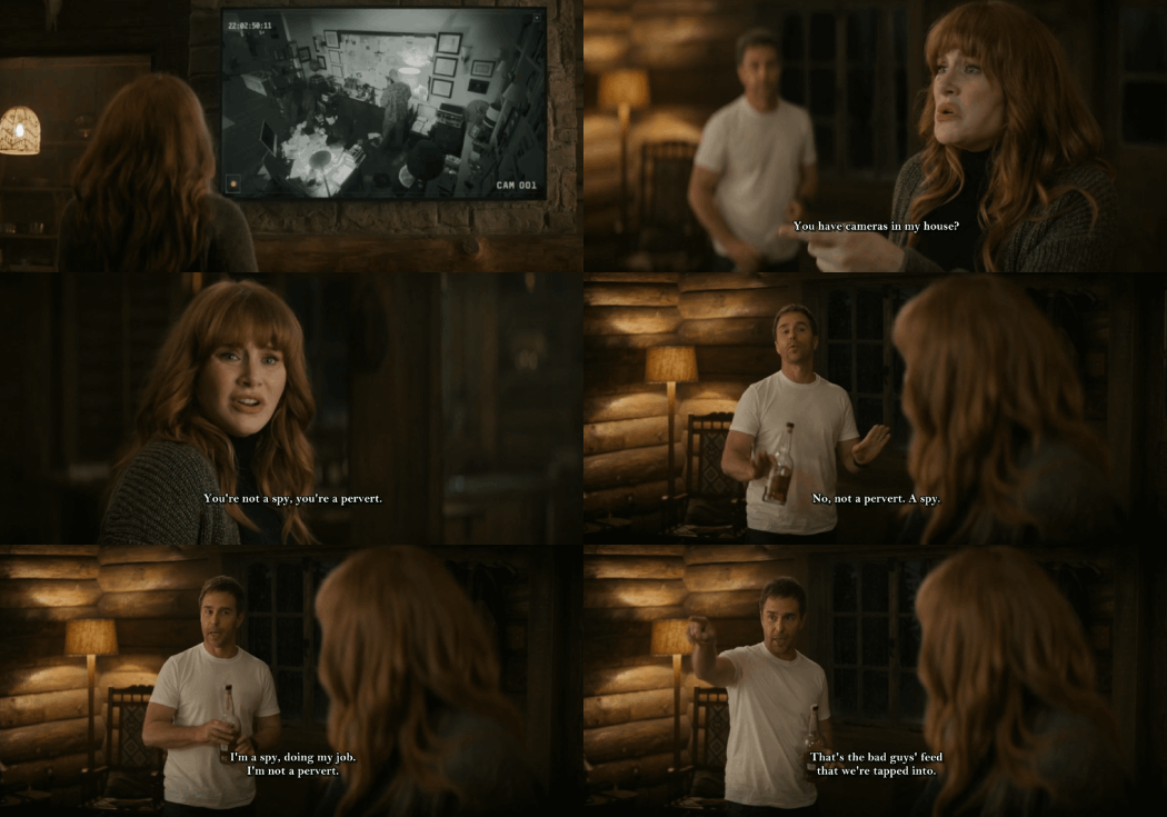
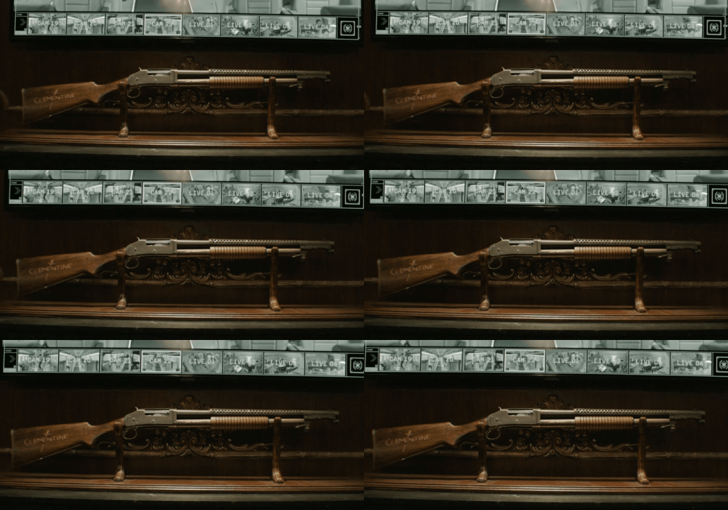
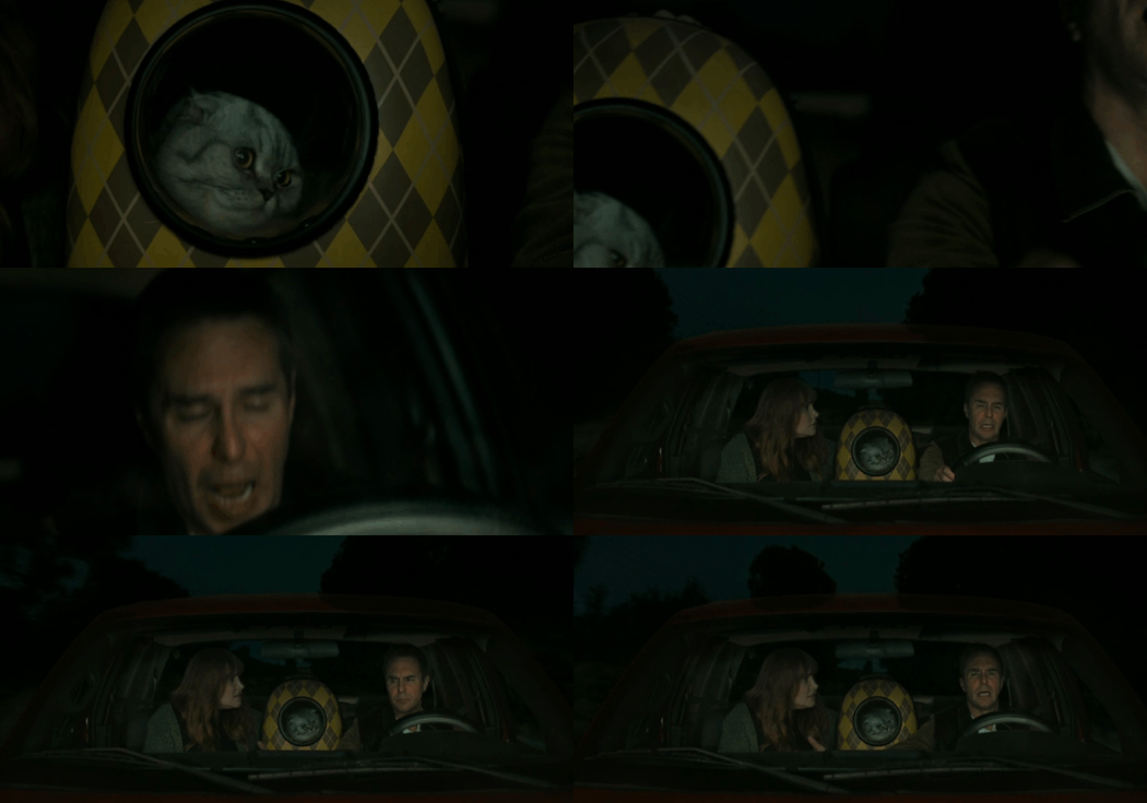
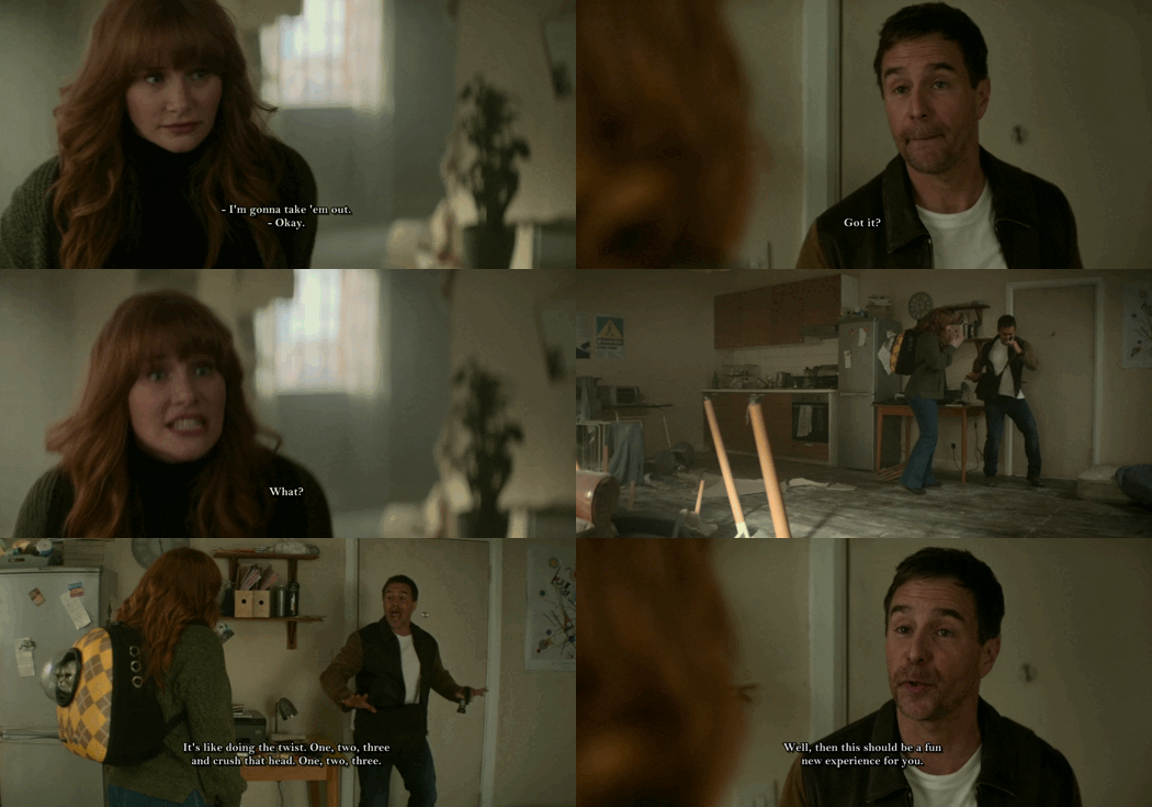
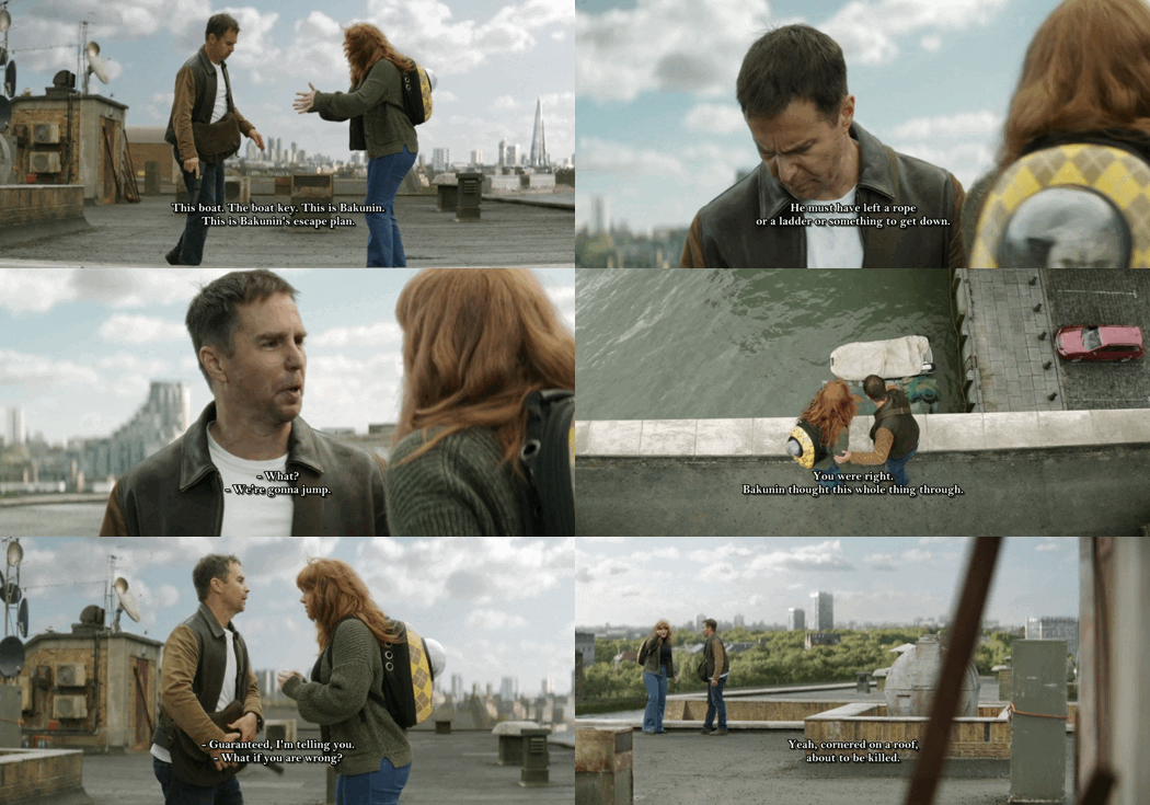
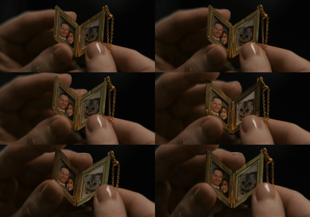

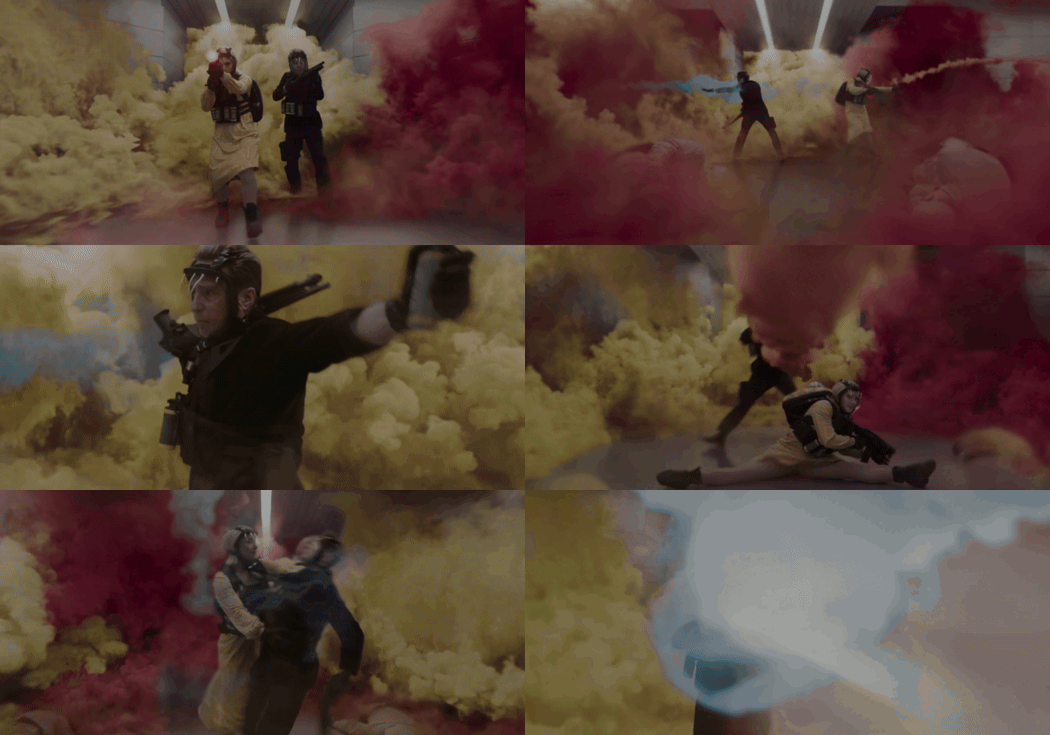
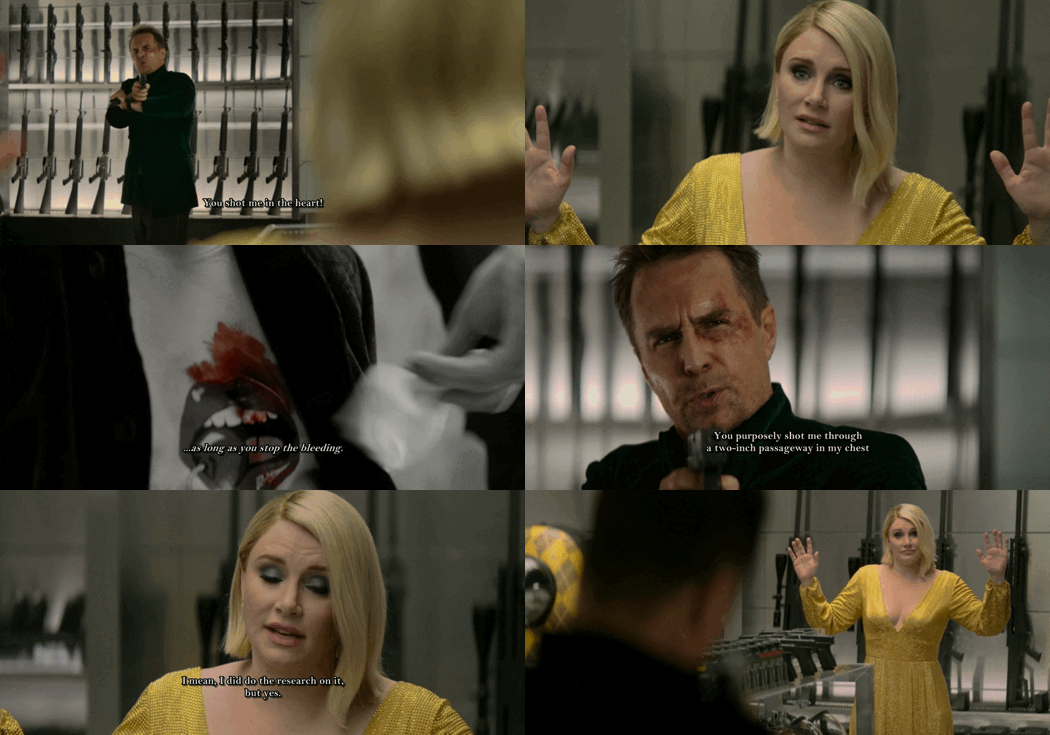

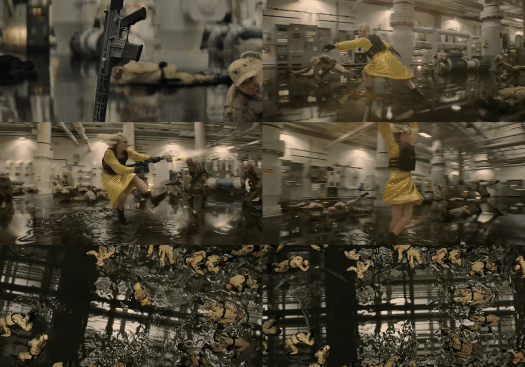
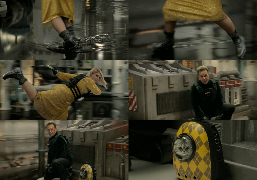
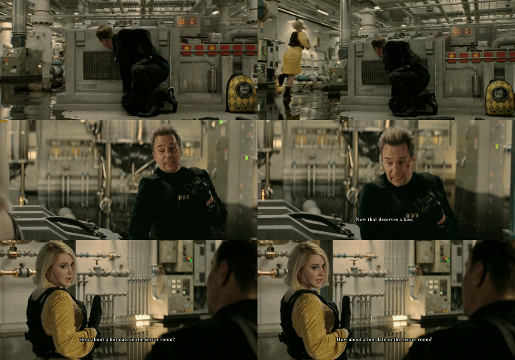


Argylle (2024) | Favorite scenes (vol. 1-2)
Elly Conway, an introverted spy novelist, has almost finished her fifth book about Aubrey Argylle, the eponymous character of the Argylle series, but suffers from writer's block after feedback from her mother, Ruth. On a train journey to visit Ruth and her father, Barry, Elly is saved from an ambush by an actual spy, Aidan Wilde, who explains to her that a devious organization, known as the Division, has targeted her because her novels seemingly predict their future. Aidan travels with Elly to England, hoping that her next chapter will reveal how to stop the Division.
#can i just say the scenes with the smoke grenades and elly oil skating were just my favorite <3#alfie (the cat) appreciation post to follow as vol. 2 bcs he is a legend through and through <3#argylle#argylle movie#elly conway#aidan wilde#aidelly#alfie the cat#bryce dallas howard#sam rockwell#animated gif#movie gifs#currently watching#gif set#character dialogue#new movies#animated gifs#myedits#action movies#action comedy#favorite movies#movie recommendation#apple original films#combat
57 notes
·
View notes
Note
yo, hi,
please rant about the use of colours/shots in dead boy detectives (if you want to), that would be amazing to read!
omg hell yeah i would love to. <3 buckle up everybody!
(there were some other people in the comments who wanted to hear more as well. for convenience's sake i'm going to keep it all in one post.)
I'm not going to talk about every single frame in the last post, because there are a lot, but I'll be sure to touch on all of the ones that have a good amount of depth beyond the dramatic lighting. (sorry, Angie shot.)
...this is going to get long.
so first, this one:
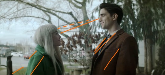
With Edwin's brown coat, Niko's green coat, the brown bushes in between them, and the trees behind Edwin, this shot is cohesive and satisfying. I drew the orange lines to sort of illustrate how your eye moves across the frame; the line of eye contact, the tree branch (dashed lines) almost parallel to that, the sidewalk/grass line, and the lapels/shadows/folds of their jackets all form a general diagonal streamlined snapshot. Then the black post behind Niko, the tree between them, and the tree trunk behind Edwin continue to divide the frame vertically and add to the additional invisible "line" created by their height difference. Finally, the sky behind Niko, as well as her hair, contrast heavily and very well with the darker colors of the tree behind Edwin, though there is still white on his side (the building) and brown on hers (tree branches). If you were to take a single diagonal line from the bottom left corner to the top right, you would get two incredibly distinctly colored sections, but they complement each other so well.
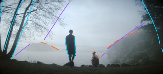
This whole scene is gorgeous because of the pale sky and water up against Niko's hair and the brown tree trunks with Edwin's jacket, but I also love it because it's so simply colored. We have the classic blue+orange color dynamic, but diluted down to very pale blue and very dark brown. This shot specifically features Edwin focused at the center (the blue lines show that he is standing mostly straight up, while the trees on the borders of the frame are all leaning inwards), with Niko crouched down to fit with the shape of the hillside (orange) AND the silhouetted rocks in the foreground. Then the hillside, the shadow on the water, the general cutoff of the tree branches, and the island in the distance (purple) frame the two of them in the middle without making a Point of it. It looks very natural, especially with the dark shadows around the border of the frame. (personally sort of brings to mind Wanderer Above The Sea of Fog).
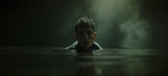
I don't think I need to add any annotations to this one. The lighting is sharp and so are the shadows. The fog and the shine on the water, his hair, and the collar of his coat are starkly lit, while everything else, including his face, is deeply shadowed. Plus it's all an ominous, murky green. It's almost the opposite of Lilith coming out of her blood-red ocean. 10/10 frame, I have no words.
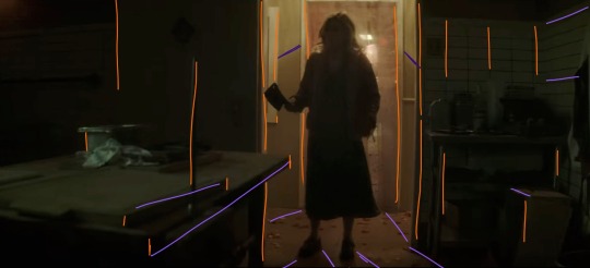
I gasped the first time I saw this shot. There are so many vertical lines (orange), which make the space feel thinner: the spike, the bulletin board(?) on the far left, both doorframes, the edges of the table and boxes, the tile on the wall on the right, Maxine herself... and then there are the diagonal lines, all sort of spreading out from Maxine, which includes the table edge, the shadows, and the wall tiles again. Then there's the fact that it's all so dark, but not quite pitch black. Once again we have a green/orange combo, and the light behind Maxine being so small in the whole frame makes it very effectively claustrophobic. We also never saw her enter this room from behind, which elevates her as threatening, because the camera work makes it seem as though we, the audience, are backing away from her as she enters, and then hiding from her as well. While I am devastated by the lack of a sapphic romance arc, I have to say I was blown away by the production of this scene.
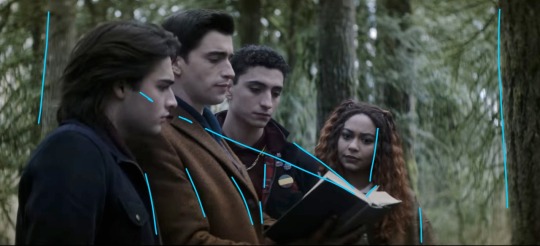
I love this one because they're arranged so neatly around the book. I didn't draw a curve over their heads, but it's easy to visualize by following Monty's hairline up to Edwin's, and then Edwin's down to Charles' down to Crystal's. The height order is perfect. Then there's the black-brown-black-brown of Monty's jacket, Edwin's jacket, Charles' jacket, and Crystal's hair. The book itself helps frame their faces (diagonal blue lines), and their clothes fall into uniform with the vertical trees behind them, creating a satisfying, natural, unobtrusive background. This is definitely more visually appealing than a shot of them leaning over and looking down at the book/camera. It's also broken up very nicely by the greenery. Plus, none of their faces are shown from the same angle! Refreshing!
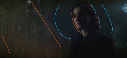
Poor Monty :( but hey, he gets a really awesome shot here! We're back to orange+blue, and the angle of this shot makes it look like the vertical trees behind him are positioned diagonally (orange) to follow the dark blue shadow behind his head. We also get two light sources: one of them is the moon, and the other one comes from the same place as the music. The moonlight (blue) sort of encircles his head and cuts off at the line of trees about halfway across the frame. Both the back of his hair and the far side of his face are illuminated, which is very effective in terms of bringing him into the foreground and making him the focus of the shot even though he's not in the middle of the frame. It's also balanced nicely by having background detail on the left, with the orange trees, but not on the right, where there's nothing but dark blue behind Monty. This is also a great shot when it comes to his hair and jacket, because the jacket is used to add to the framing of his face with the dark blue background, and his dark brown hair is lit sparingly, which ties in the left side of the frame.
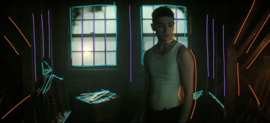
Like the frame with Maxine, this one has a lot of shadow and a little bit of light, and again works with an orange/blue (or teal, really) color scheme, but this one is much friendlier. The windows are larger than the doorframe and Charles isn't actually blocking the light the way Maxine did. Instead, he's illuminated from the right by Edwin's orange lantern, and the shot is balanced by highlights (blue) that stop it from becoming cramped and stressful. There are stable vertical lines (purple) and rafters and shadows spreading out from the center (orange). Charles, though he is blocking the window, is wearing a white tank top, and his skin takes on the warmth from the lantern, so he's not in silhouette and he blends very nicely with the scene. I love that he's not at the center of the shot, but instead framed almost perfectly in the right window. (Another thing I love about this show is that the characters almost always interrupt the continuity of the background even when they're positioned to be framed by it. It makes the scenes feel much more natural even while they continue to be gorgeously directed from an artistic/stylistic point of view.)
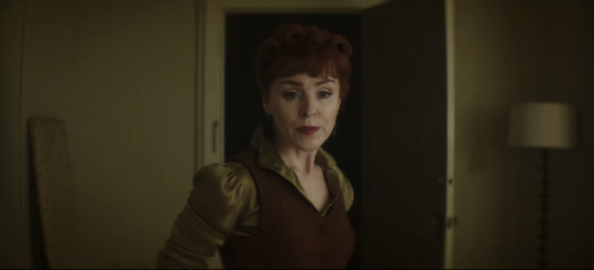
This is one of the simpler ones, but it's perfect. The Night Nurse's hair and vest are the same brownish orange, and her shirt is the same as the walls, sticking with our tried and true brown/green (easy variation on orange/blue) color scheme. She is framed in the blackness of the doorway, but once again interrupts the white doorframe on the left side. Even the lamp and the board (?) on either side of the frame fill the negative space in a natural way. Also, the vertical lines of the board, doorframe, door, and lamp aren't perfectly spaced apart, which makes the whole shot feel more down-to-earth.
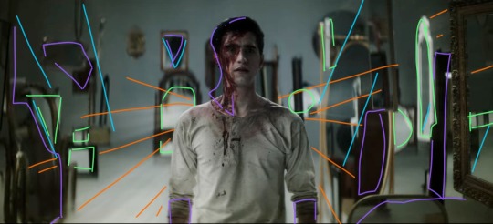
There is so much going on in this shot. The beams of light (orange) are emanating from behind Edwin in a shape sort of reminiscent of wings. The angles of light/shadow and the immediately obvious position of some of the mirrors (blue) also spreads out from behind him, reinforcing the wing imagery and focus. The background is lighter than the floor, and Edwin's clothes blend in with the floor and the reflecting highlights (green) in the mirrors. It's all balanced by shadows (purple), which aren't so much shadows as they are dark-colored mirrors and the blood on Edwin's face. This shot is an unsettling combination of chaos and order, increased by the strange phenomena of mirrors endlessly reflecting into each other, especially since Edwin doesn't show up in any of them. You'd expect him to look out of place, and he mostly does, but there's just enough immediate immersion with the color scheme and light angles to make him fit perfectly. And he wouldn't fit in this shot nearly as well if he were wearing his usual clothes. It's such a good way to introduce Despair. I love this scene.
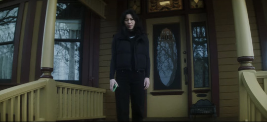
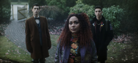
Now I needed to include these two next to each other, because they're. They're the same scene. Maren is on the porch looking down at Crystal and the boys, but the color schemes and blocking are so starkly different. Maren is wearing black, and the house is washed-out yellow and maroon, both unfriendly colors in this scene. The windows all show the gray reflections of the dead tree instead of even a glimpse inside the house, immediately showing that Maren is hiding something. Then in the shot with Crystal and the boys, they're positioned behind her on the path. Edwin is next to the brown gate and gray stones, and Charles is sort of shadowing Crystal and framed by the green bushes. Crystal's shirt is flower-patterned to match the pink petals on the ground, and her red hair and purple jacket make the whole shot more vibrant and friendly-looking than Maren's, even though Maren is supposedly the one being helpful/friendly/hospitable. The first time I watched this episode I knew I couldn't trust Maren as soon as I saw her standing on her front porch. This scene is, as Charles would say, brills.
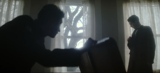
Okay, last one, I have to stop somewhere. (I have so many more. I have. SO many more. that i could talk about. but this post is so long already). There are three windows, evenly spaced, white light and curtains framed in them. Charles is in nearly full silhouette as he opens that chest; his head and the lid of the chest intersect with the vertical window frame, and his arm runs parallel to the middle bar. He also blocks a good portion of the leftmost window, while Edwin stands in front of the one on the right. He's fully framed by the window and standing farther back than Charles, not quite silhouetted but still very dark compared to the background. When he ducks down to inspect the cabinet, his head ends up in front of the wall between the two windows. This whole scene is an excellent display of blocking/framing/lighting, just in terms of where they end up holding any given position while they talk. Once again, there's nothing artificial or manufactured about their blocking. These aren't statement shots (all film projects have a few Really Good Shots, but they're often at extremely important, pivotal, or emotional times, instead of spread out through the storyline.), which makes them even better.
I might have to make another post and include shots with Jenny, the sprites, the Cat King, Esther, and more landscape shots. There is no shortage of stunning frames and scenes, and there's no reason not to dive into the production and hidden meanings.
TL;DR: this show is an ARTISTIC MASTERPIECE. Please watch it. :)
#dead boy detectives#edwin payne#charles rowland#crystal palace#niko sasaki#monty finch#monty the crow#film stills#cinematography#this. got away from me.#appreciation post#color schemes#film techniques#analysis#symbolism
105 notes
·
View notes
Text
I don't know what you are, but I do know you. You make my fucking blood run cold.


I am a moth


Who just wants to share your light.


I'm just an insect,


Trying to get out of the night.
#i just needed to make a post to appreciate the shots in this film#say what u want about this movie but the cinematography is fucking incredible.#cinemetography#cinema#film#film photography#movie#saltburn#felix catton#oliver quick#radiohead#lyrics#all i need#in rainbows#barry keoghan#jacob elordi
39 notes
·
View notes
Text
For all the people clamoring for a book/movie/prequel about Haymitch's Games, why is there virtually ZERO fanart of the 2nd Quarter Quell? Young Haymitch who was canonically a baddie? Maysilee Donner, the OG owner of the Mockingjay pin whose death Katniss explicitly compares to Rue's? Where y'all at?
Suzanne dedicates 3-4 pages in ch 14 of CF to describing Haymitch's Games. We know what the arena was like, how most of the tributes died (bloodbath killed 18, volcanic eruption killed 12), we know how Haymitch outlasted 47 other tributes, we know how he won and why the Capitol was unhappy with his victory.
PLEASE the fact that the arena was designed to look picturesque and enticing but every temptation, from the flowers and fruit, to the butterflies and even the water itself, was toxic like some kind of twisted Garden of Eden???? Gotta hand it to the Gamemakers, that's so scrumptiously evil!
Also, I'm sorry to bring this back to my girlie Maysilee, but the fact that she wasn't killed by another tribute but by flamingo mutts minutes after she broke off her alliance with Haymitch and just as soon as he figured out the force field... Ohhh the Gamemakers did her so dirty!
Honestly, for a character with connections to many established characters in the trilogy, (she was Madge's aunt, Katniss's mom's best friend, AND Haymitch's ally) and who is the originator of an object which was both a testament to the intergenerational dynamics in the series and whose symbolic significance is central to the entire HG franchise, we know very little about Maysilee.
Maysilee's family ran a sweet shop, she owned a pet canary (a songbird used to detect poisonous gas in coal mines) which was bequeathed to Katniss's mother after her death, and she had a twin sister who eventually married the Mayor but suffers from chronic pain, presumably because she remains devastated by her sister's death.
These details establish Maysilee as someone distinctly of the well-off merchant class of D12, and they evoke notions of frivolity, excess, and indulgence. Arguably so does the pin which is described as a family heirloom made of solid gold in the book. And yet, these details also speak to the simple joys in life that should be luxuriated.
Katniss's mother receiving the songbird foreshadows her falling in love with Katniss's father as well as his eventual death in the coal mines. Similar to the cakes in the Mellarks' bakery that Prim so admired, sweets represent joy, beauty, and pleasure, even if rare and fleeting.
Candy as both a source of temptation and pleasure, the canary as both a melodious songbird and detector of poison, plus the fact that the 2nd QQ arena was a poisonous paradise, I feel like these dualities had to be intentional! Maysilee's weapon of choice was poisonous darts. She was both beautiful and lethal.
I would like to imagine that Maysilee had something of a rebellious streak as the original owner of the Mockingjay pin. I would like to imagine that she probably had some important things to say given that the last thing the Gamemakers did to her was rob her of her voice.
Maysilee stuck her neck out for Haymitch and rescued him from a Career tribute before their alliance was formed. I would also like to imagine that, even though she died in the arena, her legacy lives on in the little and big acts of defiance exhibited by the other characters around her.
Her spirit lives on in Katniss's mom who moved from the merchant sector to the Seam to be with Katniss's father. In Madge who brings Gale her mother's medicine after he's whipped for hunting illegally. In Haymitch who becomes a key figure in the rebellion. And obviously in Katniss who risks her life for Prim, Rue, and Peeta.
We're all familiar with the origin story of the Mockingjay as a crossbreed between the mockingbird and a Capitol muttation—the Jabberjay which was intended to gather rebel intelligence but backfired. The Mockingjay thrived outside of the Capitol's control and thus became a symbol of anti-Capitol resistance.
It's called a MOCKINGjay because it made a mockery of the Capitol's failings. Sometimes mockingbirds are called nightingales but Suzanne intentionally used the former in the portmanteau of her fictional bird species because she literally spells things out with her naming conventions!
Thus, any character who acts in defiance of the Capitol's expectations or designs is akin to a Mockingjay. It's Haymitch avoiding other tributes as much as possible and only winning by exploiting the arena's forcefield—the D1 girl's axe backfires, and she's taken out by her own weapon. It's Katniss holding out the berries and refusing to win on the Gamemakers' terms, forcing their hand to let both her and Peeta live. It's Reaper using the Capitol flag for his makeshift morgue.
It's all the tributes who gave solace, comfort, dignity, and respect to other tributes in their deaths (this happens A LOT but notice that all the D12 Victors do this). It's Thresh sparing Katniss for taking care of Rue. It's Peeta playing with the intent of helping Katniss win. It's Mags volunteering for Annie, it's Finnick resuscitating Peeta, etc. It's anyone risking their life or livelihood for someone else's sake. It's care, compassion, and even love persisting in the most brutal of circumstances.
For me, taking risks to care for others is what flies in the face of the Capitol ideology that people are inherently prone to war, violence, and destruction. This is especially true when it happens in the Games which are premised upon an "every man for himself" and "kill or be killed" mentality.
For me, taking risks to care for other people is the power of the Mockingjay symbol. It's also the meaning of the Hanging Tree song; risking everything for the chance of love and true freedom, even unto death. And that kind of hope is what rebellions are built on.
I just think that the Mockingjay pin means so much!!! I didn't even mention how, when Katniss pins it on her green shirt, she associates it with the freedom of being in the woods. It reminds her of her father whose singing voice was so beautiful that the mockingjays stopped to listen. The pin grounds her and makes her feel like she's taking a piece of home, a piece of her father into the arena.
Also, the pin is what makes Rue want to trust Katniss! For Rue, music is the one thing she can't live without, and back in D11 she sings to mockingjays to communicate that the working day is done. Katniss offers to give the pin to Rue, but Rue says she likes seeing it on Katniss better.
Also, let's not forget that the pin is a parting gift from Madge, Katniss's friend who truly cherishes her. As with the crowd who offers her the three fingered salute which she attributes to D12's respect for her father or Prim's loveableness, Katniss has difficulty recognizing that people like Madge already respect, admire, and care for her in her own right for her tenacity and bravery.
Madge is very insistent about informing Katniss that she's allowed a district token and implores her to wear the pin into the arena. This is likely a way of honoring her aunt who presumably also wore the pin as her district token. If so, then it's likely that Haymitch would have recognized the pin which may have given him an extra push to do his utmost to save Katniss because it reminded him of the girl he couldn't save.
Anyway, I feel like the intricacies of the mockingjay pin, its original owner, and its connection to the 2nd QQ are a little underappreciated. Like, this isn't even getting into the everlark parallels that write themselves... Please, Haymitch and Maysilee paved the way. They were the blueprint.
Personally, although I'm just as intrigued about the 2nd QQ as the rest of y'all, I'm fine with it being left up to the readers' imagination. There have been some great fan interpretations both in the form of fanfiction as well as the fan film by mainstay pro: https://youtu.be/7mUjssn86h4?si=PNH1rblPBp1Us5pg
I just find it kind of strange that, given how much interest there seems to be around Haymitch's Games, there isn't that much fan content, discussion, or analyses about them. Please feel free to contribute any thoughts, corrections, or reactions to this post!
#the hunger games#thg#the hunger games renaissance#thg meta#2nd quarter quell#50th hunger games#haymitch's games#mockingjay pin#haymitch abernathy#maysilee donner#maysilee donner appreciation post#it just means so much to me#but so much of this context was excised from the films lol#they completely shafted madge#thg ramble
126 notes
·
View notes
Text
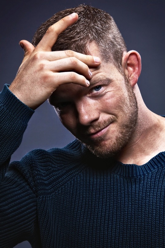

Russell Tovey Appreciation Post 💜💜
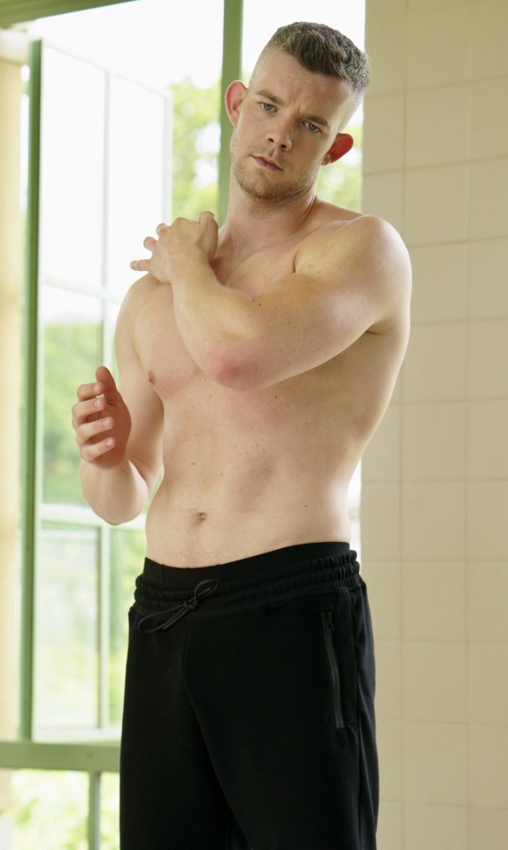
Handsome and talented British 🇬🇧 TV, Film and Theatre Actor who also happens to be an out and proud gay man 🏳️🌈

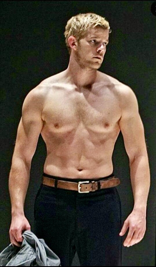
Star of Looking, Him & Her, American Horror Story NYC and Love Again 💜

Always sporting a superb physique, plus, you’ve just gotta love those ears 👂😊 …… gives you something to hold onto 🤭🤭
#russell tovey#british actors#appreciation post#handsome#talented#great body#smooth body#gay actor#gay activism#love again#american horror story#tv#film#theatre#big ears#out and proud#him and her
89 notes
·
View notes