#Design review
Explore tagged Tumblr posts
Text
Ranking all sonic boom redesigns, worst to best
#5, knuckles
What good is there to say about him? He’s disproportionate looking, his shoes look weird, he has that improperly applied sports tape, his silhouette is horrible. I hate him.
#4, sonic
Key problem: brown. Brown literally muddies Sonic’s color scheme. That sleek RGB color scheme sonic usually has is so charming and characteristic and simple and beautiful, and it works well with neutrals that aren’t brown, but that stupid bandana right front and center ruins everything.
#3, Amy
I think she’s actually pretty solid! The dress looks pretty nice and like something she’d wear, I think making the pico pico hammer pink worked nice with it, the purple accents are cute, I like her shoes, she’s really good!
#2, Shadow
Yes, shadow was in boom. Specifically only the show I’m pretty sure. And he’s like the same other than his gloves and shoes, but they look kinda weird and a bit awkward to me so I’m putting him at 2.
#1, tails
All they did was give him goggles, different gloves that look like they’re protective rubber gloves which makes sense for him, and a tool belt. Well yeah he’s got that sports tape but I can live with it here. Really the only big changes were the goggles, gloves, and tool belt. And well.. he’s an inventor and he flies a plane. It’s pretty obvious and convenient accessories for him.
#sonic#sonic the hedgehog#sonic boom#knuckles the echidna#amy rose#shadow the hedgehog#miles tails prower#tails the fox#sonic boom designs#design review#character design
48 notes
·
View notes
Note
Still doing OC Reviews?
Here's one of my OCs!!
Her name is Alex and she's a Self Insert OC(in a "I wish that were me" type of way). I think she's also one of my oldest OCs as well(that I can remember). She ages up with me as well.
Here's some Picrews of her and a couple of screenshots from Fallout 4 and Skyrim:

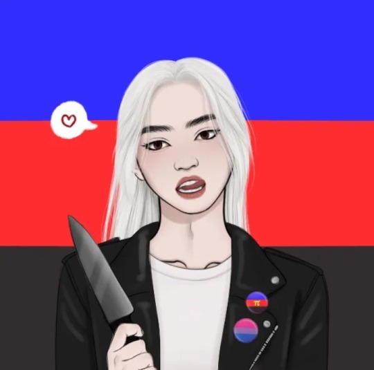

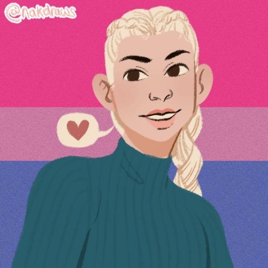
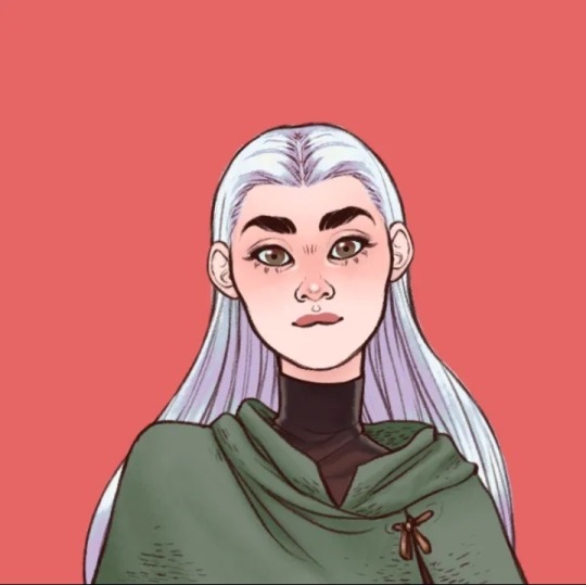


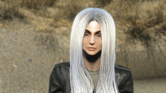

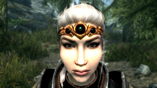
Her Refsheet.net: https://refsheet.net/DarlingLeech/SelfInsertOC
I'm gonna try picking these up and being a little gentler with the work standards I've set for myself so I can get back into the gist of everything!
I hope you're fine having a self insert reviewed? I obviously don't know you personally so I can't comment on any of that, I'll just look at the design on it's own so I hope that's alright with you. There's also the unfortunate limitations of picrews and such. Onto the actual text!
My first impression here is that she seems to have two versions and I'm assuming this is bc she's in two different storyverses, since you included video game screenshots. I wish you'd have included more explanation on that, since it's relevant to the review if a character has different versions! From what I'm seeing in details, I'm getting the impression she has differing personalities in these different universes (ofc to my knowledge the Skyrim and Fallout games take place in DRASTICALLY different settings).
The distinctions in hair styles and even colors between the two versions is a great aspect! I like that the hair, though staying blonde and long, is a more desaturated platinum in one version, while being braided and more warm blonde in the other. It's a good balance of consistency and difference.
(Disclaimer: This will have me doing alot of guesswork since there is no actual drawings of the character, please keep that in mind)
This might just be me but I'm having trouble figuring out what kind of person she's meant to be in the Skyrim(?) version. Some of the jewelry indicates higher status but she's clad in chainlink armor and such, so coupled with the other version having a leather jacket (and knives in the picrew), I'd guess she's meant to be a mercenary/ass kicking type? Assassin? Femme Fatale? Across both versions she clearly has some amount of "fancy" in one way or another, just not in the upper class style (I'd call her modern looking outfit fancy in the fashionable sense - leather jackets are stylish). However there's also some aspect of having an active lifestyle so she's not all focused on fashionability and I think you could probably play this up in the design - as far as I'm seeing, I'm really not getting a sense of who this character is in their story.
The design is nicely put together, however I think you could go for more storytelling details - like personal items (the Pride pins are a nice touch! However most picrews these days offer that as an option so I can't know if it's meant to be a full time part of her design), facial marks or perhaps makeup? Unfortunately I can't comment too much on this since these are limited to their mediums so I'm only getting a sense of the very core of her character; through what traits you've consistently added throughout all pictures.
If the picrews are anything to go by, I love that she has brown eyes! Not enough brown eyes (blonde or otherwise) in human designs imo :]
11 notes
·
View notes
Photo

Traditional Patio - Patio Patio container garden - huge traditional courtyard concrete paver patio container garden idea with a roof extension
0 notes
Text
Traditional Patio - Container Garden

Huge elegant courtyard concrete paver patio container garden photo with no cover
0 notes
Text
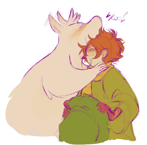
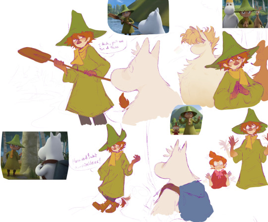
Some forehead kisses and a couple redraws for season four!
#moomins#moominvalley#moomin#the moomins#moomintroll#snufkin#snufkin fanart#moomin fanart#moomin sniff#snorkmaiden#little my#snufmin#does this count as spoilers?? I mean it’s redraws#changed my designs a bit for these drawings to look more like the mv designs#mini review no one is gonna read: it was a fine season really even if I was left disappointed by certain things like the comet storyline#how they handled characters etc etc but#overall I actually did like s4 a lot and will hopefully be posting more fanart for it#maybe I’ll post my full thoughts on s4 but I’m not that good at that lmao#tecoart
886 notes
·
View notes
Text
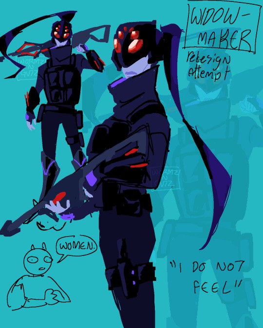
I'm a better character designer than the entirety of the overwatch team /joke
#my posts#fanart#digital art#digital fanart#widowmaker#amelie lacroix#Widowmaker redesign#overwatch#overwatch fanart#Overwatch redesign#redesign#fan redesign#Watching tbskyens marvel rival character design reviews#his thoughts on widow made me go wait yeah that's true#I never thought Abt it because I'm so used to her#this was the second attempt at this redesign which is why#it's not incredibly thought out but whatever I like it a lot#character design#If I draw her again I'll try to giver her a ballerina build
192 notes
·
View notes
Text


"I'm sorry," Linus whispered into Arthur's throat, never wanting this moment to end
Arthur held him tighter. "You silly, delightful man. There is nothing to be sorry for. You fought for us. I could never be angry with you for that.
How I cherish you."
Linus felt his heart settle in his chest.
I love them so much, their dynamics and chemistry are everything ⭐️
#the house in the cerulean sea#thitcs#arthur parnassus#linus baker#fanart#thitcs fanart#book fanart#book fandom#arthur x linus#go read this book !#book recommendations#book review#character design#illustration#character art
328 notes
·
View notes
Text
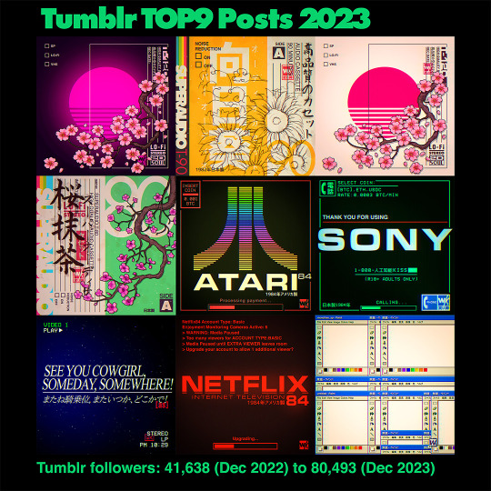


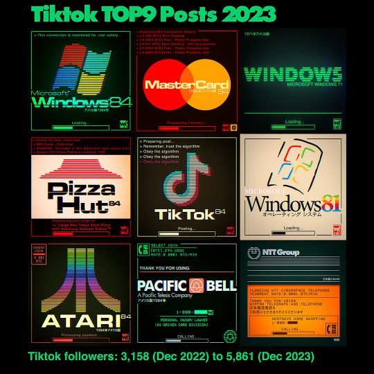


Here are my Top9 posts from 2023.
2023 was a weird year where Instagram desperately wanted to become Tiktok, Tiktok still did Tiktok best and now also is the better platform for artists to post image albums on. Twitter died and Tumblr continued its resurgence. If not for Tumblr doing so well I'd feel pretty bad about the year social media-wise. Art-wise though I'm very happy since I managed to significantly upgrade many of my old favorite designs (to use for merch and finally my own site) but also was able to push forward on new illustrations and test out many new series ideas. My goal for 2024 is to keep the momentum going, since there are a few other longterm plans I want to do. Thanks for following!
If you're curious you can see the last couple of years of Top9 posts here
#top9#best9#year in review#2023#art#digital art#art progress#top9of2023#best 9#vaporwave#cyberpunk#retrowave#photoshop#lofi#pop art#graphic art#neon#artists on tumblr#designers on tumblr#warakami
856 notes
·
View notes
Text

«Typografia», No. 1, 1958, Cover design by Oldřich Hlavsa [Design Reviewed, Bradford]
#graphic design#typography#geometry#magazine#cover#magazine cover#typografia#oldřich hlavsa#stanislav soucek#design reviewed#1950s
168 notes
·
View notes
Note
Tell me every reason you enjoy Zootopia enough to give it all the rewatches you do.
Every? Oh boy.
Good Story
Perfect Characters
Visual Appeal
Earnestness
Let me break it down.
1. Good Story
Zootopia’s main point is: “Try to make the world a better place by realizing we’re fundamentally the same.”
That’s a really good main point.
It has the benefit of being true. Right now our culture is super into “self-identification,” and this crazy contrast between, “I want to be able to identify as something special” and “Now that I know what categories I fit in, I can choose who’s ‘one of us’ and who’s ’not one of us.’” Okay well that sounds pretty and I’m sure it fulfills some emotional need at some point, but it’s actually super divisive, and self-serving, and it’s the seeds for all prejudices. Including racism.
Do we have differences in origins and experiences? Yes. Of course. Do we also have some fundamental things in common? Yes. Of course. Which truth are you going to give the highest priority to? If it’s “no, I’m a prey animal, I know exactly where I belong, that’s who I am, that’s how I dress, that’s my compass for how I interact with others” then you’re getting all your security from your “sense of self,” and being able to understand what that is…which is just a fancy way of saying “I’m all about me. My own perspective informs everything I do.”
Anyway. Zootopia’s message was super true.
And the coolest thing about it is that if only Judy were in the wrong, and the other half of the dynamic duo, Nick, was this open-minded, un-prejudiced guy…and she just hurts him and has to apologize…the movie’s message wouldn’t be as well-communicated.
They have their prejudices and their hurt-from-being-prejudiced-against in common!
They’re the same…because they’ve both felt what it’s like to be treated like they’re not “the same.”
Nick isn’t the only character being mistreated and written off because of his species. The whole first half of the movie is about Judy being mistreated and written off. They think she can’t be a cop because she’s little and cute and a prey-animal. They think Nick can’t be trustworthy because he’s sneaky and small and a predator.
So literally…if Judy represented one race, and Nick represented a completely different race…the movie would be saying that both those races are discriminated against. They even have discrimination in common. AND, if Nick represented men who people make assumptions about because he’s a man, and Judy represented women who people make assumptions about because she’s a woman—the movie would be saying that both those genders are falsely judged.
I mean. Wow. Right now, your movie is either pro-woman or pro-man. Right now, your movie is either BLM or white-supremacy. Everybody’s lining up on one side of the line or the other. Zootopia says, “it doesn’t matter what character you’re looking at, from the elephant that can’t remember anything to the two main characters—every single one of them has fundamental things in common, and one of those things is that they all live like they’re in their own special category. When actually, they’re all fundamentally the same.”
I don’t want to keep beating the dead horse. But I have a post somewhere that lists every background character and points out that each animal is the exact opposite of what you would assume they are based on their animal-stereotype. The otters are never shown being playful or snuggly, only traumatized and ferocious. The cheetah is fat and slow, not quick or even quick on the uptake. Etc.
Even if you look outside of characters—look at the sets. Look at the environments. The whole city is designed “for animals, by animals.” But it’s in neat little segments. The animals organize themselves by habitat. Of course, in one sense that’s practical—the polar bears can’t live in Sahara Square, etc. but the point is, by making Judy and Nick, the main characters, small animals, in a city where everything is built to accommodate by species—UGH this is so good—they have to figure out how to problem-solve in situations that weren’t made to accommodate them.

Little Rodentia? Judy has to avoid stepping on all the mice or knocking over their buildings. Parking tickets? She has to figure out how to jump to reach bigger animals’ windshields—or she inconveniences smaller animals because the tickets are all printed at the exact same size. Stuck in a cell? The guards didn’t think about the fact that small animals can fit down the pipes made to accommodate big animals.

Zootopia is a city advertised to be where all the animals can come together. But the way they do that is by trying to accommodate every species’ preferences. So then actually while they try to come together, everything from their cars to their districts remind them of their differences. The whole idea is that they prioritize the wrong truths. Yeah, mice can’t drive giraffe cars—but they still have “driving” in common. See?
And oh my word. Initially it was supposed to be a spy story. But they changed it to a buddy cop story. Why? Well because justice doesn’t discriminate. Or at least, it’s not supposed to. So then there’s another lens to look at the story’s main theme through.
It’s just that every layer, every perspective you look at the movie from, is just hammering that truth into you: “Try to make the world a better place by realizing we’re fundamentally the same.”
2. Perfect Characters
Every character is so well-thought-through in this movie, even the side characters. You get the feeling you could watch a whole movie based on the side characters, because that’s the amount of love and nuance built into them.
Look at the main ones, though. Bellwhether is supposed to be soft and a follower. She’s a sheep. Instead, she’s hard and bitter—and she’s a leader. A villainous leader, but a leader, nonetheless. Even as she tries to keep animals divided based on fear of their stereotypes, she’s not fitting her own stereotype. Her voice actress has this strained, half-hoarse, but sweet voice. Like you can tell that this character has spent a lot of time under pressure and trying to manage appearances. Appearing like she’s fine, and she can handle it—until you realize that the appearance she’s really managing is “the cultural fear-based identify of the city.” They dress her in plaid and flowers and she’s a farm animal, because that’s the kind of character Judy would be most likely to trust. But she still has green eyes, and jagged teeth, so that when she does start making evil expressions there are some caricature-pieces in there that come out and accentuate that.

Nick Wilde—everybody’s favorite—is supposed to be sly and smooth and shifty. And he is. He’s a fox. But he’s also brave, helpful, and trustworthy. The first time you see him is when he’s dodging out of the way of a bigger animal ignoring him and about to run him over. Well, that’s important.

Because Judy knows what it’s like to have to get out of the way of larger animals, because they overlook her.

So right off the bat, this character she has to get along with and work with, this character who furthers her development and nails the main point, is introduced in a way that has something in common with her. But he’s also introduced in a way that gives her an opportunity to focus on a different truth—that he is different from her. Because the sheep is yelling that he’s a “fox.” Right away, we’re back to species-as-identification.
And that’s what the movie does, all the way through. It presents new animal characters, and with those new animals characters, more than one thing is true at a time. And Judy has to try to focus on which truth is more important. “Try to make the world a better place by realizing we’re all the same.” Yes, Nick is a criminal. But Nick is also brave, helpful, and eventually, becomes trustworthy.
Judy, too. Judy is an incredibly well-done character. Because she believes, in her head, that anyone can be anything—which is not what the movie ends on. In fact, she goes from saying, “anyone can be anything,” to saying, “we all have limitations.” It’s not true that a fox can be an elephant. But it is true that a fox can be trustworthy. Figure out what’s true, and try to make decisions for the better, based on that.
I could talk about character design and acting. Ginnifer Goodwin gives just the right amount of smugness and self-confidence to Judy without making her unlikeable—you don’t realize she’s smug and her self-confidence is misplaced until she does, when she fails to make the world a better place for Nick.
Judy wears tight, actionable, well-fitting uniforms for the whole movie. In her civilian clothes when she comes to Zootopia, she’s wearing athletic t-shirts and shorts. Ready for action, that’s Judy, even in her civvies. Meanwhile, Nick? Nick wears loose-fitting clothes. Loud, patterned clothes that don’t match. Like he didn’t even what, ladies and gentlemen? Like he didn’t even TRY. “Try to make the world a better place…”
Because when you meet Nick Wilde, he’s long since given up on trying, in life. So his character design reflects that. He rarely even stands up straight, or opens his eyes all the way—his default is drooping. And guess what?
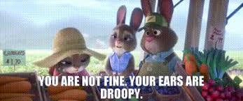
When Judy “gives up?” Quits her job? Goes back home? Stops trying? Her civvies aren’t ready-for-action, trying clothes. They’re loose flannels. And her “ears are droopy.”
SERIOUSLY, you can find things like this in every corner of the movie. For every character. Not one character is a throwaway, not in voice acting, not in design, not in animation, and not in narrative.
3. Visual Appeal
Which leads me into this point—no other animated anthropomorphic animal movie is as visually appealing as Zootopia.
What Zootopia does is it matches the best of the best anthropomorphic animal designs from past Disney movies:
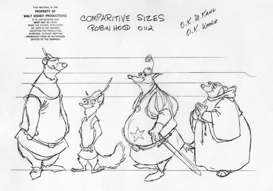
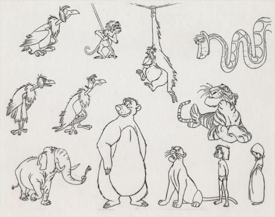
And they marry it with this incredible intentionality with modern CGI.
Did you know Disney invents its own software for things like fur textures?
The sheep’s wool, the velvet pig skin, the fox fur, the bunny fluff—it’s all completely different textures. There’s no one “fur” covering all the hairy mammals.
Nick isn’t just orange. He’s orange with deep red and dark tufts. Judy has black tips to her ears, too—which helps the two of them look like, in some sense, they belong “together” in every shot.
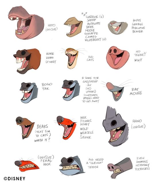
It’s so important to the movie that the animals feel like animals that they worked this hard to do this. And then that extends to the textures of the snow, the ice, the sand, the wet leaves, the grass, the fire.
Every character moves like their animal, and like themselves. Nick and Gideon are both foxes, but they don’t move similarly at all. Gideon is aggressive and glowering and physical. Nick, again, is slouchy, leans on everything, completely non-confrontational.
Other anthropomorphic animal movies like Sing or Puss in Boots—they’re not doing both as well. Zootopia is appealing, without sacrificing realism completely, and without cutting character acting.
The lighting. Nope. This post is too long, I can’t talk any more.
4. Earnestness
There is no disingenuous moment in this movie.
The animators are never lazy. They always go for the challenge. They don’t cut corners. Have you ever seen “Over the Hedge?” I like Over the Hedge. But I watched it recently and it’s crazy how many shots are strategically placed so that the animators don’t have to solve a certain effects problem.
For example, when RJ sprays Hammy with cool whip to make it look like he has rabies? He doesn’t. You never see the cool whip leave the can. It just cuts away, then cuts back when RJ is pulling the can away from his face. The shots are also cut so that you never have to see gas actually come out of Stella—and you never see Vern’s full body as he gets back into his shell, just the upper part of the shell as he wiggles it around, going through the motions of putting it back on.

That’s because that stuff would be painstaking to animate. Any time one character has to interact with props or substances (especially liquids) that are not part of their model, it’s harder on the animator.
Zootopia? We’re getting full-on views of characters getting wet, fur and all, characters touching various objects and elements, foam coming out of the mouth, new clothes, new set pieces, multiple models, huge crowd shots of different animals in different outfits, all with their own movement patterns and acting.


And all that hard work and effort, aimed so totally at the main theme of the movie? Making sure it looks as good as it can? Not just that, but the way it’s written, the acting, is so genuine. They don’t hold anything back. They don’t shy away from real emotion.
Judy Hopps’ apology scene is brutal. She’s crying, having a hard time finishing a sentence, her voice is all tight. It’s not pretty, it’s not romantic, it’s like…ugly crying. And her character is wrong in a super embarrassing way. They're not afraid to go there. The writers, the actors, the animators—they’re not afraid of being too vulnerable with these character flaws.
So many movies, especially kids’ movies today—they just pull up and shy away from being real through their characters. They think a quick sad facial expression will get the point across. And it does. The audience gets that the character feels sad about whatever the circumstance of the scene is. But not as powerfully. Because you didn’t put as much work and heart into it.
Zootopia is all heart, from work ethic to vulnerability to the filmmakers enjoying what they’re doing, enough to make it as good as it can possibly be. I can’t explain it better, other than to say, you feel like they would’ve been happy making this movie much much longer than it was. You feel like they’re cramming every bit of joy and passsion into every little joke, every side character, every hair on a CGI bear.
There you go. Long post, you did ask for it
#Zootopia#Nick Wilde#Judy Hopps#Zootopia appreciation#anthropomorphic animals#Fox#bunny#Disney#Zootopia 2#Jason Bateman#ginnifer goodwin#byron howard#meta#character analysis#design#over the hedge#puss in boots#sing#movie#animation#character design#character study#critique#review
243 notes
·
View notes
Text

eye magazine
274 notes
·
View notes
Text

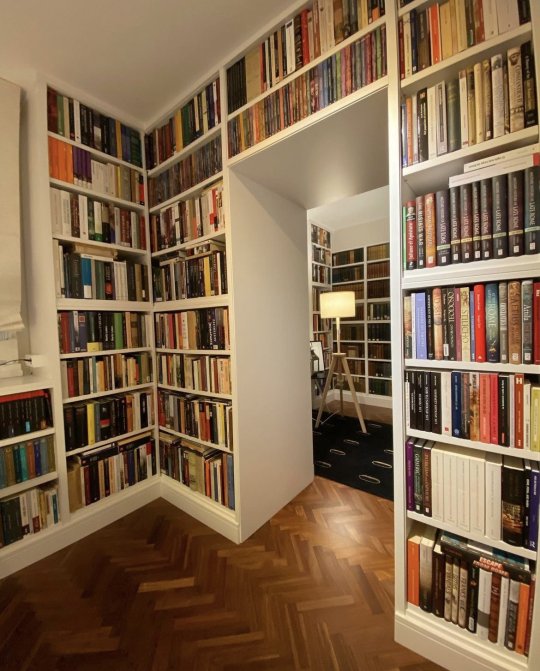
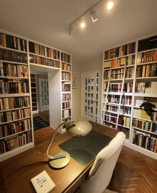
#new books#book review#book#book quotes#books#bookblr#books & libraries#reading#books and reading#booklover#readers#currently reading#long reads#book recommendations#public libraries#librarians#library#interior decorating#interior design#@nomadicspr
878 notes
·
View notes
Text


Thinking very hard about nine sols. I have like. 2 other AUs also on the mind as well
But for now it really fascinated me how both yi and ji have immortality but are at different stages in their life and handle it differently, so I played around with what would happen if their ages were swapped such that Yi lived through history and became the Kunlun Immortal, and Ji joined the Council as a young Sol.
Yi / Ji Ageswap/Roleswap AU
Though they’ve swapped positions in time, I wanted to keep their powers and personalities mostly the same. Yi’s aged up design is based on his statue outside of the Four Seasons Pavilion. I’m still thinking through whether or not Yi would still propose the Eternal Cauldron Project with the experience of having lived through history, and I think so. I think living even longer and having to watch more people he loves die before him would make him even more strongly attached to the idea of immortality and longevity, and ensuring the survival of as many solarians as possible so that he doesn’t end up alone on Penglai in the end. I don’t think Ji would be able to kill him because it seems like Ji and Yi’s immortalities differ— Yi can always regenerate as long as the Fusang is healthy, while Ji, as shown in the game, can die if he takes too much damage.
I have a lot more thoughts in this au so I might do a few more doodles at some point but just this for now!
#nine sols#九日#nine sols yi#nine sols ji#ageswap au#roleswap au#the designs and story of this game really makes the mind go brrrrrr#I really want to see more people talk about the story and the themes of this game they’re so good#every review I see keeps just talking about the gameplay
389 notes
·
View notes
Text
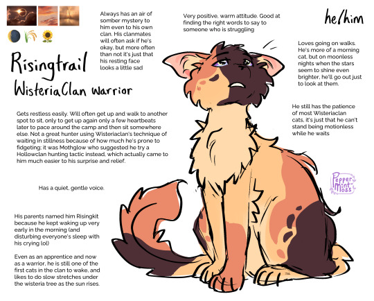

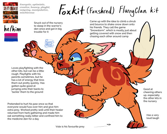
warrior cat oc design commissions from November!
commission info || ko-fi (tip jar)
#warrior cats#wc#warriors#warrior cat oc#commissions#commissions open#digital art#warrior cat oc designs#my art#risingtrail#amberdrop#foxkit#foxshred#almost forgot to post these lol whoops!#i'm finally starting to wrangle my school finals down yippeeee#looking forward to winter break :')#i'll start posting some of my illustration class projects here soon#maybe right after i finish this essay and my panel review next week...lol
95 notes
·
View notes
Text


❗❗Official Class Swap Sorcerer!Kristen Post Alert❗❗ you can: look at her
#dimension 20#fantasy high#fhjy#kristen applebees#fh class quangle#sorcerer!kristen is uh. Not Home Anymore! she's been couch surfing along with jawbones before freshman year#I think this kinda falls into a slight teen-witch-esque approach which I do like#since I've been pulling from like. matilda and pippi longstocking for these designs. the Exceptional Little Girls kinda genre#it does make her look younger than her peers which I do like. I feel like a big part of sorcerer!kristen's deal is that she's never#taken seriously. frequently treated like she doesn't know what's good for her. fellow adhd havers make some noiseee#but! upon review I feel like there's also a kinda ms. frizzle turn to her design? which like. awesome thats the lesbianism nailed babeyy#the fuckoff giant thermos as arcane focus is a homage to pete conlan but also crucially#if you swing that thing by the cord I think you can take off someone's head easy. I think that's the important thing#her cargo shorts are not of holding but functionally Everything is in there. scrunchies pencils spare gold chapsticks paperclips multitools#tbh I personally love the progression in her design lol she starts out like ''oh this young girl is a bit unkempt'' and#becomes ''oh this person is insane'' by junior year which is really awesome imo. I love that#its just fig left! I mean her freshman year design is pretty much set for me. I just need to figure out the rest#gorgug is kinda aerith in junior year I wonder if I can softly turn fig tifa-ward lol... ooh I have ideas now. this is gonna be fun#but for now. enjoy evening! may we all make like lizard and enjoy sun
182 notes
·
View notes
Text
my Fincher magazine collection (so far)!!
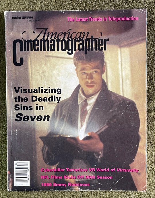

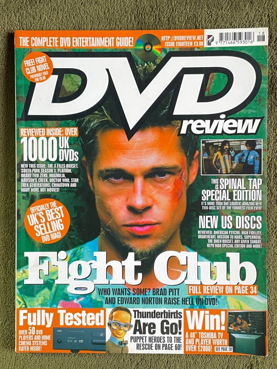


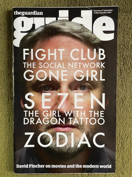

#people always seem to like my posts about my magazines so i thought i’d just show all of them#these are in order from oldest to newest#these are all from ebay btw apart from the killer one because i got that when it came out#my dvd review one is my fav just because i like the design and the colours and it’s also matte on the front#but the Empire for ‘the killer’ is really cool because it’s showcases all of Fincher’s films#and is written by my fav journalist who writes about Fincher Nev Pierce#(he also wrote the article for tgwtdt one)#if anyone wants to see any of these more in detail lmk!! the se7en one is fucking cool#david fincher#se7en#fight club#gone girl#the girl with the dragon tattoo#the killer movie#the killer#magazine
237 notes
·
View notes