#when / if I find the original artist / art I will add the link to it in this post
Explore tagged Tumblr posts
Visit Tumblr Blog
Explore Tumblr blogs with no restrictions, modern design and the best experience.
Last Seen Tumblr Blogs


Fun Fact
Tumblr is available in 18 languages.
Text
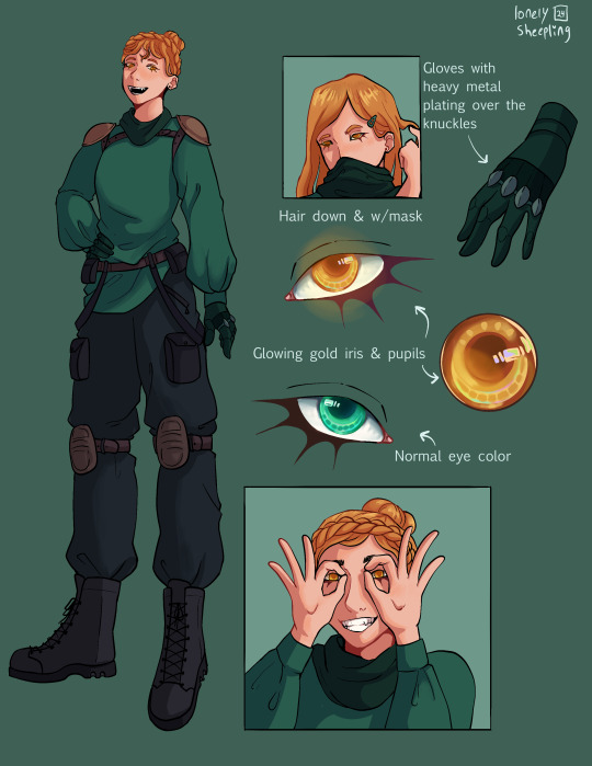
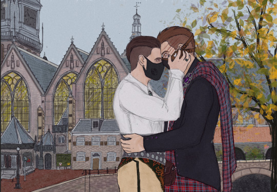
LADS REDESIGNS!! + notes
Note: These are solely for fun, nothing wrong with the original designs and I still plan on drawing their original designs!
I used the Linkon Chibi Report cover because I couldn't be bothered to actually draw them all, my bad LMAO Here's the link to the Love and Deepspace twitter where I got it: https://x.com/Love_Deepspace
THE ART IS NOT MINE, JUST THE REDESIGNS!!(Which even then were highly inspired by the new Valentines cards!)

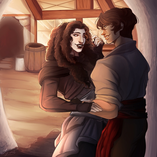
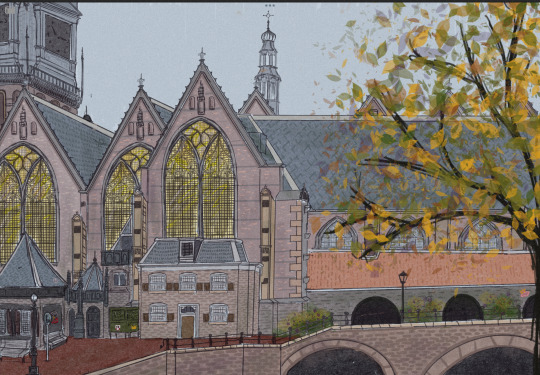
XAVIER
(His hair is 100% inspired by his "Deluded Fiction card.)
Uh but yeah, as for WHY I decided to go with this design, it has a bit to do with his lore. Please correct me if I get anything wrong, I'm not super aware of everything lore related(Esp not with Xavi's, too focused on Zayne and Caleb :,< )
But Xavier has been traveling for a while, and I think over time he would stop really caring about his appearance, more focused on defeating wanderers and trying to protect the mc.
I also feel like he'd eventually cut his hair again and brush it! So his longer hair is more so an early game thing lol
I also just love the idea of chronic bed head Xavier. Like I imagine his to be a still sleeper, but I think it'd be funny that no matter how still he sleeps, his hair just gets messy again LOL
I just felt like eyebags fit Xavier a lot. I also gave him a mole! I thought his face felt empty without a mole and for some reason I just keep thinking he has one and then I look at him and I'm shocked he doesn't have one LOL But I also think the whole "Your moles are where your lover kissed you most in your past life" soulmate thingy. I think it'd be cute if Daye(one of my mc's. But I think it'd be cute to see moles on where other's mc's kiss Xavier the most!) was a cheek kisser in every timeline.
I think it's like...pretty impossible for Xavier NOT to have a single scar, no matter how good he is right now. I honestly feel that way about most the men(Other then Zayne since he has scars) but like Xavi's a hunter and ur telling me I can't find a single scar on his body?? So I gave him one on his jaw and one on the corner of his mouth! There's multiple more scattered around his body as well!
Speaking of his body, I think he'd have a sleeper build LOL!! Just for those who don't know, a sleeper build is when someone doesn't look strong and doesn't have obvious muscle, but they're strong and the muscle is hidden. I mainly chose this cause of the name LOL
I also gave him heterochromia, I just thought it would look nice LOL
RAFAYEL
I made the tips of his fingers blue, I did think about red and I might try that honestly, but it's because he's a Lemurian. I wanted something kinda subtle to show that(Its not that subtle with Raf though since he's an artist and uses his hands LOL)
I did also give him longer hair and I wanted to keep it fluffy! I might also mess around with a bit more wavy hair! I also made one of his little side bangs just a bit longer for some asymmetry, I wanted to add hair clips but decided against actually drawing it in the end!
I also added a teal streak to his hair. I already like Raf's design so I wasn't really sure what to change, so this just seemed a little fun. I think its like a little artistic streak.
Raf does NOT have muscles, don't even play with me. No matter what the game shows, Raf will always be a little stick that I can pick up.
I also think that Raf might have a few tattoos! Not too many, I think he'd cry getting every tattoo cause it all hurts him. But I also think he would like to see his own body as kind of a canvas(This is also something that I do to myself and others. I love painting on myself and other people) That said I think after a while Raf probably decided against getting anymore tattoos and just doodles and paints on his body, he also likes that he gets to change it up more.
ZAYNE
okay...I prommy I wasn't going to originally give Zayne longer hair. I think the short and clean look suits Zayne and his personality well. But also...I think it's really fun to kind of imagine liking having long hair(A little throwback to "Master of Fate")
Anyways, Zayne with some of his hair tied back is WOOOOO MAMA!! I do wanna play around with a little ponytail too, which is what I think he'd actually do while performing surgeries.
I did give him eyebags as well. Bro works super late sometimes and struggles with nightmares and insomnia, yeah he has eyebags.
I didn't change too much about Zayne honestly. I was thinking about adding glasses permanently but also decided against that. Though I do really like Zayne in glasses so I wanna draw him in them more, I just also hate drawing glasses.
SYLUS
okay...most notably, Sylus has the longest hair! I don't know why but for some reason I always remembered his dragon form having long hair, which it literally doesn't. Anyways, long fluffy mullet Sylus supremacy idk. LOL
^ his hair also has a bit of a red gradient. I didn't want it to be too obvious, but his hair felt a little lacking without it!
Also I gave his arms a dark red gradient, I also think he'd have claws I just didn't draw them. These are also because...half dragon. I know they aren't the hands he had as a dragon, but I wanted them to be more human.
It's so subtle, but I gave him fangs.
I didn't even think about it but I might mess around with slightly pointed ears. a more subtle touch to show he's not human.
I did also think about giving him little horns and wings, but decided against that. I also decided again red streaks on his hair and landed on the gradient instead.
CALEB
Caleb is one of them I'm STICKING with long hair for. He looks so good with a mullet I feel like I belong in a psyche ward.
I gave him little white streaks in his hair, It's supposed to be heat damage but aesthetic from the ✨explosion✨ once again, not really meant to be realistic at all.
Its also so subtle, but I traced one of his pupils with red because I think it'd be even more tragic is Caleb had lost an eye and it got replaced with a mechanic one, like his arm. I think it'd be useful for scanning people and recording their actions too. And I think it'd also be tragic if his vision was warped from this eye, like it doesn't really view properly. I'd have to draw out what I mean eventually cause I don't think I'm making any sense.
i didn't do it but god, him having a little slit in his brow would be so good too, with like a little scar there.
Anyways, I hope you enjoyed my silly little redesigns! Once again the art I edited belongs to Love and Deepspace!
#lads#love and deepspace#lads zayne#lads caleb#lads xavier#lads sylus#lads rafayel#love and deepspace zayne#love and deepspace caleb#love and deepspace xavier#love and deepspace sylus#love and deepspace rafayel#I told myself I wouldn't give them all long hair but...#it looks too good i couldn't resist#I had fun doing this#I felt like one of those genshin redesign editors#It was my first time doing something like this
28 notes
·
View notes
Text

Merry Christmas, everyone! :D
Heck, this year went FAST! Like CRAZY FAST! :O My life's shittiest year but hey, I'm still alive and kicking! :D Let's hope next year will be better one to all of us! <3
#Aomine#Aomine Daiki#Kuroko no basket#KNB#Christmas#not my art#I couldn't find the original art / artist#I don't remember WHEN or WHERE I've save this art in my laptop...#when / if I find the original artist / art I will add the link to it in this post#I normally DON'T like to repost other peoples' works out of respect
5 notes
·
View notes
Text
Recently read @queenofthequillandink ’s DPxDC crossover fic Unearthed, Reborn
I got inspired to draw character sheets for Danny, Sam, Jason, and Jazz’s vigilante personas. Here’s a link to the author’s drawings of their outfits (these were a vital reference for me when doing this so thank you so much for sharing them Quill) More commentary (like 7+ paragraphs plus 2 images) about this project and the designs below the “keep reading” line.
None of these thoughts I have for each character are in order, but I have a lot of commentary for these since this project was a lot more conceptual than my normal work. I also just like talking about my art/design process. If you ever find yourself wondering at some point why an element from the original design wasn’t included, the answer is that the removal was completely intentional and part of my grandmaster vision for this work and wasn’t because I just forgot about it entirely during the design process.
————————————————————————
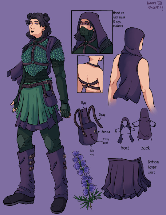
Aconite (Sam)
This was the first one I sketched out, I wasn’t even sure at the time if I was going to fully commit to drawing all of them. I thought that Sam was gonna be the hardest since her description was way longer than the others, but then bird boy beat her out. I took a lot of creative liberties with her design, the bag was added bc I couldn’t figure out how to add pockets to the skirt. I was trying to avoid a joker color scheme so I had a lot of ref images that I got by searching like “purple green aesthetic” on Pinterest. The dark purple and dark forest/blueish green won out in the end. I desaturated a lot of my colors for her just to get as far away from the neon Gotham rogue aesthetic. I also added the bdsm harness over the armor to add more punk elements to her design, I know that in real life that would be very uncomfortable to wear over scalemail armor but sometimes we take creative liberties when they look sick as fuck. Also, I didn’t realize until I went to look for a reference for aconite flowers that aconite is wolfsbane! That was neat to learn! Also, the font I used for Aconite is called “zai Art School Calendar 1931”, I’ve used this a few times for other projects, it’s one of my favorite fonts. The ‘zai’ fonts the creator has are all very good.
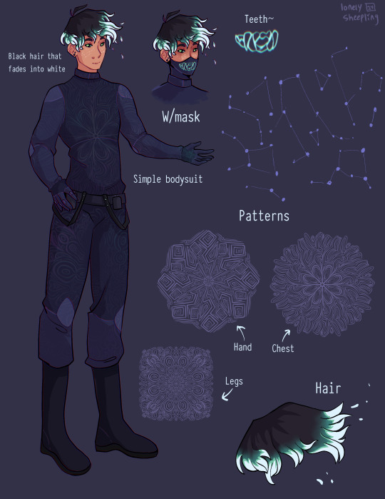
Shade (Danny)
There wasn't much to add to this page. His outfit is pretty simple (besides the patterning). I wasn’t sure how to pull of an optical illusion pattern but I was reminded how I sometimes get an eyestrain induced headache when looking at someone wearing a patterned shirt with really thin stripes so I just leaned into the idea of a small/detailed hard lined pattern. I originally made 5 separate patterns for him and then turned them into stamp brushes in procreate. I only ended up using three of them, the one on the chest, the one on the legs, and the one on his hand. But, I imagine the patterns fade and shift when he moves, sort of like a lenticular print. I gave him constellation freckles and stylized the hair’s fade into white. The hair was inspired by how time-woods draws Martin Blackwood’s hair (linked: time-woods’s fanart of Martin Blackwood). Also put way too much effort into the teeth on the mask. I just like the chunky teeth design. Oh yeah and the font I used for him is called “Typewriter_Condensed_Demi”
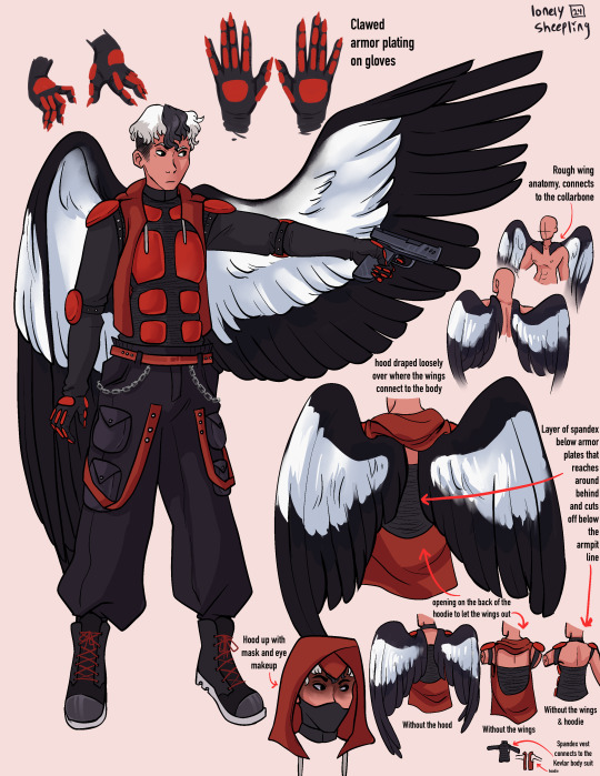
Erinys (Jason)
Repeatedly ran into the issue of not having enough canvas space bc of my fervent need to thoroughly document and plan out how the wings worked. I also reversed the colors for the bodysuit & armor so the under layer was black while the armor plates were red. I only realized afterwards that I may have been inspired by the red centipedes in Rain World (linked: gif of the red centipede, don’t click the link if you’re unsettled/afraid of bugs/insects), artists subconsciously draw inspiration from other artists all the time though so I’m not like upset about it. I stand by it because it looks sick as hell. Also leaned into the magpie theming for the wings. I think the vigilante form was supposed to be reverse magpie coloring? I can’t remember, but I stuck with normal magpie coloring. The anatomy of how the wings connected to the collarbone was inspired by JayEaton’s Magpie Bridge Project. Reference image link. Link to the article the image is from. I didn’t draw the wing armor because I couldn’t figure out how to would work with the wing anatomy and I ran out of canvas space. Finally, the font used for him is “DIN Condensed” this is a default font, I would’ve used something more punk but I needed the text to be legible.
Insight (Jazz)
I did Jazz after I’d already finished the initial trio, so I had to switch to a new canvas for her bc I’d hit the layer limit multiple times on the previous one. I really do love doing that spiked under-eyelash thing with characters. Don’t know when that started. Anyway, I added the shoulder pads to her outfit to help break up the empty space. The golden eyes were a nice accent color since her design is very overwhelmingly green. Honestly the braid hairstyle and gold eyes really do obscure her identity, multiple times when drawing her I was worried that she didn’t really resemble Jazz enough. There wasn’t a drawing from the author for her so I only had the text description to go off of. I just realized that she sort of reminds me of a forest ranger and I don’t know what to do with that realization. I copy/pasted my drawing of her eyes when gold and recolored them to match her normal eye color. There were two layers for that, a hue shift and a hard light layer to emphasize the shadows.
Here’s what it looks like without the hue shift:
It looks really cool and I’m 100% that color combo in another drawing down the line. Oh yeah and the font used for this sheet was “Euphemia UCAS”. It comes with Apple’s operating system, I use it as a neutral default text most of the time bc it’s nicer than helvetica but not overly fancy like Times New Roman—and why am I talking about fonts. ——————————————————————— Anyway, this project was very fun to work on. The alt text for this was its own endeavor, hope the folks using screen-readers don’t mind 4-5 paragraphs of description text. Also, I cannot remember for the life of me if Dani got a costume description, but if she does I’ll make sure to update this image set with a sheet for her. And to the author, QueenOfTheQuill, if you’re reading this message that I’ve left at the very bottom of this post below a read more line, thank you for the fic. It’s very good and I’m glad I caught it during my slow decent into DPxDC brainrot. I love the interactions between Jason and Tim, it’s nice seeing a revived Jason that’s not bogged down by pit rage. They definitely seem like they could’ve been good friends if not for the unfortunate circumstances that led them to meet in canon. Also, I’m sure Jazz will love interacting with Batman and Nightwing. So much psychological & childhood trauma to unpack with them. Feel free to use/share these images if you so desire and thanks again for your work.
#art#art tag#digital art#my art#procreate#illustration#character design#fanart#dc#dc comics#jason todd#danny phantom#sam manson#jazz fenton#danny fenton#dpxdc#dp x dc crossover#alt text#id in alt text#alt text included#writing out the alt text for these was long and hard#but now that I’m finally back on my adhd medication I have the motivation to do it again#as always message me or comment if you have critiques regarding the alt text#character concepts#concept art#conceptual art#danny phantom fanart#danny phantom crossover#batman crossover#crossover fanart
462 notes
·
View notes
Text
Elegance
Here’s my original article for Elegance.
This is a topic I’ve wanted to write about for a long time. Ironically, the words needed to explain the concept kept the column from being elegant. So I did what all artists do. I found a way to say a lot in a little space.
Enjoy,
Mark Rosewater
[NOTE: EACH OF THE ABOVE FIFTY WORDS IS HYPERLINKED. BELOW IS THE FIFTY HYPER LINKS. THE HEADERS SHOULDN’T BE ON THE LINKED PAGE. I’M JUST INCLUDING THEM SO YOU KNOW WHAT EACH LINK IS.]
ELEGANCE
Merriam-Webster’s Collegiate Dictionary has five definitions for elegance:
• refined grace or dignified propriety
• tasteful richness of design or ornamentation
• dignified, gracefulness or restrained beauty of style
• scientific precision, neatness and simplicity
• something that is elegant
The common elements appear to be dignity, simplicity, and taste.
THIS
Elegance requires thinking, but it also requires feeling. Elegant prose is judged by how it makes the reader feel. It needs to generate a sense of calm that puts the reader at ease. Everything in your writing should feel as if it was carefully positioned to create the proper effect.
IS
Pound for pound, the writer’s greatest writing tool is the verb. Nouns add substance and adjectives add flourish, but it’s the verb that drives the sentence. Choose a strong, descriptive verb and the sentence has flair and purpose. Choose a weak one and the sentence lacks any sense of drama.
A
Here’s a little game to test an elegance relevant skill (based on an old game called Inklings). Randomly choose a noun. Try to convey that noun to the other players using the least number of letters possible. You’ll be surprised how much you can communicate in just a few letters.
TOPIC
One of the greatest stumbling blocks to elegance is the inability to choose a single focus. Elegance requires simplicity. Simplicity requires a single purpose of thought. This means that elegance starts before you write a single word. A good sculptor must know his image before he picks up his chisel.
I’VE
One of the common misconceptions of elegance is that it requires a writer to be fancy. Elegance though is more about familiarity than formality. You shouldn’t be afraid of friendlier language such as slang or contractions, assuming that such language adds an element of ease rather than one of laziness.
WANTED
An important element of elegance is a sense of passion. Brevity does not mean pulling away emotionally from words, but rather the opposite. When you find yourself limited to fewer words, you must pack each individual word with extra emotional punch. You are not reducing your message, simply your messenger.
TO
A good tool in understanding elegance is studying poetry. Poetry is the most concise of all written art forms. It strives to maximize impact while minimizing expression. Each word carries the burden of evoking some essence of the poet’s message. If it cannot carry its own weight, it is excised.
WRITE
To be an elegant writer, you have to become a student of prose. You have to study the mechanics of language to understand how it can be shaped. Once you have learned how to transfer the feeling in your head into meaningful words, you are on the path to elegance.
ABOUT
Be careful not to fall in love with ambiguity. While intoxicating in its beauty, it is the enemy of elegance. Remember, the goal is not to make the reader struggle for comprehension. Rather it is to lead them to the obvious conclusion. Elegance should be used to illuminate, not confuse.
FOR
Elegant prose requires connecting with your reader. To do this, you have to understand who that reader is. Nothing should come before this task. It needs to be done before writing can begin. I like to compare this to planning a trip. Maps are useless until you know your destination.
A
Another major key to elegance is the understanding of the importance of the tiniest detail. Just as a chain is only as strong as its weakest link, a piece of prose is only as tight as its messiest detail. A good writer doesn’t stop at the nouns, verbs and adjectives.
LONG
Don’t confuse elegance with brevity. Elegant things are short not because they have to be but because the difficulty to craft an elegant piece of prose combined with the limitations of time forces writers to be brief. Elegant novels, for example, do exist, but they are few and far between.
TIME
To quote Roman orator (and letter writer) Marcus T. Cicero, “If I had more time, I would have written a shorter letter.”
Simplicity takes more time not less. Anyone can get a point across with ten thousand words. But a true artist can do it in ten (or possibly fifty).
IRONICALLY
Irony is a potent tool for commentary. Its genius lies in the fact that it comments not on what is, but rather on what isn’t. Like all good humor, irony makes you laugh. But like the best type of humor, it also makes you think. It’s both funny and funny.
THE
Elegance in writing is about more than words. Equally important is how the words are woven together. Tempo, pacing, rhythm – these are the tools that set the mood for the piece. Try reading aloud your text. The natural beat of language is more suited for the ear than the eye.
WORDS
To realize the power of words, you must first understand how they work. Art is expressive; words are connotative. That is, words draw their power from their ability to extract different ideas from different people. A circle is a circle, but the concept of “scary” varies from person to person.
NEEDED
Elegance is not the result of any one attribute. It is the combination of numerous factors coming together in harmony. This is why it’s such a hard skill to master. Most people can pat their head or rub their tummy. But put them together and it’s not quite so easy.
TO
An elegant piece of prose needs to hit the reader at a gut level. Often they won’t know exactly why they like it, but they will recognize that something about the piece moves them. There are many types of writing where subtlety is lost. Elegant writing isn’t one of them.
EXPLAIN
There are many ways for you to explain an idea. The most elegant one though is not through definition but by example. By connecting your idea to one already known by the reader, you’re leaving the work of teaching to someone in the past. Education is hard. Comparison is easy.
THE
If writing is like building a house, the structure is like the foundation. Its design will dictate how the house is built. If it’s faulty, no amount of fancy brickwork will undo the damage. So take the time to ensure your structure is building the kind of prose you want.
CONCEPT
Never underestimate the power of a concept. An important part of elegance is condensing big ideas into little words. This is far from an easy task. It often takes a genius an entire lifetime to create a truly innovative concept. So take advantage of all their hard work and inspiration.
KEPT
A common barrier to elegance is the belief that only one way will work. Often a writer is unable to abandon a beloved piece of prose even when evidence demonstrates otherwise. If something doesn’t add to the larger sense of the piece, you have to learn to let it go.
THE
Readers notice things at a minute level far beyond their mind’s ability to interpret. This means that although they may not consciously notice many of your tiny details, they will do so unconsciously. Aesthetics teach us that it’s this unconscious structure that will determine whether or not it feels “right”.
COLUMN
All communicators, whether through speaking or print, need to find a voice. A voice provides familiarity and it teaches the listener or reader how to more quickly absorb the information. Elegance is all about the conservation of ideas. Having a pre-learned voice to guide you is a very valuable tool.
FROM
I’ve spent some time talking about understanding your reader. But there is one more person who is even more important to understand – yourself. Writing is about sharing your ideas with others. If you haven’t spent the time to figure out what you think, how can you possibly communicate it?
BEING
“A picture is worth a thousand words.”
Or so the saying goes. What the cliché forgets to mention is how many words a single word is worth. For example, take the word “being”. To capture the essence of what “being” represents is tens of thousands of words if not more.
ELEGANT
What is the value of being elegant? Why should you care? Elegance adds aesthetics. It evokes poetry. It grants beauty. Elegant prose draws the reader closer because it gives them something to not just learn but to admire. Good prose stimulates the head, but elegant prose resonates in the heart.
SO
Who, what, where, when, how - all important questions. But for a writer they pale next to why. If you don’t understand the reasoning beneath the surface, the other details are irrelevant. The act of elegance is cementing the why. It’s taking the purpose and engraining it into the piece.
I
Elegance is a very personal thing. If something doesn’t resonate with you, there’s no way for it to resonate with your reader. Writing is an art, not a science. There is no rulebook for how things must be done. If your instincts are telling you that something isn’t working, listen.
DID
An important tool in your toolbox is time. Elegance cannot be rushed. Mental ruts only get deeper the harder you focus on them. Make sure to work time into your schedule so you are able to walk away from your writing. An hour next week is worth a day today.
WHAT
Don’t let attention to detail pull you away from having a larger sense of what you’re writing. Take this column as an example. While I spent a lot of time fine tuning each entry I never lost sight of the effect they created when all the entries were put together.
ALL
Elegance requires taking a holistic view of writing. Every word, every sentence, every paragraph is a piece in a larger puzzle. It’s not enough to understand the impact of a single element. You must understand how any two elements interact if you want to understand the potency of your text.
ARTISTS
Elegance and art are very intertwined. Both seek to achieve a similar goal: to illuminate and inspire with a conservation of expression. If you’re trying to be elegant, I think it helps to think of yourself as an artist. The instinct for the latter mirrors the needs of the former.
DO
An important part of any writing is understanding the feeling you’re trying to evoke. And then realizing what mechanic tools you have available to evoke that feeling. Diction, verb tense, sentence length, alliteration, word flow, phonetic juxtaposition – each of these will control the mood and tone of your piece.
I
A writer’s life is the ultimate fodder. Don’t be ashamed to plumb your own experiences. You understand them deeper and more personally than anyone else. No painter would refuse to use his finest paints. And, as a bonus, by using your own experiences, you will become better educated about yourself.
FOUND
Don’t forget that the act of revealing is also an act of exploration. Don’t be afraid if you learn more than the reader you’re trying to educate. Writing is not an exact science. (Or even an exact art.) Often you will find that the road to salvation has a fork.
A
Your future is paved with your past. If you want to learn how to grow as a writer, you need to look back at what you’ve written. With time and a detached eye, your will find your mistakes become clearer. Remember that it’s failure, not success, that bests drives education.
WAY
The problem with looking for a single solution is that you’ll never find more than one. And the first one isn’t always the best. But if you’re open to the possibility that every problem has an infinite number of answers, you’ll have the freedom of choosing the solution you want.
TO
Sentences are filled with freeloaders. Because writers seem to love overwriting. (I include myself in this camp.) Make sure to create time for the editor side of you to prune unnecessary words. If a word can be excised without any harm to the sentence, it has no right being there.
SAY
I’m spending my time today talking about elegance in prose, but most of what I’m saying is applicable in speech. The key difference is that prose has less defining attributes like appearance or tone. The key to elegant speech is making people focus on the words rather than everything else.
A
It’s ironic that something designed to be so simple can be so complex. But that, my faithful readers, is the joy (and mystery) of elegance. Like an onion, elegance has numerous layers that reveal themselves as you slowly peel them away. Oh yeah, and it can sometimes make you cry.
LOT
An interesting exercise is to look at each word you’re using and think about how much content is loaded in that word. Then explore what other words exist that fulfill the same role but with added content. Once you’ve found the word you can’t best, move onto the next word.
IN
A good way to get better at understanding elegance is to look for it in every day life. I think you’ll be pleasantly surprised where and how often you find it. Study each example carefully and try to see if you can put your finger on what makes it work.
A
Writing is a shared endeavor. No one owns the words. If someone uses a technique that works, there’s no shame in borrowing it. Like science, writing creates technology that’s brought back to the group to spur further advancements. Elegance is hard enough to accomplish without refusing to use the toolbox.
LITTLE
How big should a piece of text be if you want it to be elegant? The answer is as big as it needs to be – and not a word more. Just think of it as playing the game Jenga. Keep pulling words out of your prose until it collapses.
SPACE
One of the most important lessons in art is learning the value of negative space, the idea that the eyes are equally drawn to what isn’t there. Prose has a very similar quality. When writing pay careful attention to what you aren’t saying. Often it will speak the loudest volume.
ENJOY
For some reason people tend to equate dignity with seriousness. And as such they come to the false conclusion that elegance has no room for humor. Ironic as humor is one of the most elegant of styles. A good joke is no longer than is necessary to do its job.
MARK
As is always true when I head off the beaten path, I am curious to hear your feedback. What did you think of this article? Was it entertaining? Was it educational? Did you actually read all fifty links? And if not, why not?
Tell me. Inquiring mind wants to know.
ROSEWATER
I couldn’t end this week’s column without my trademark closing. I mean, how inelegant would that be?
Join me next week when I go from being a letter man to a Letterman.
Until then, may you learn to appreciate now just the “what” but the “how” and “why”.
Mark Rosewater
419 notes
·
View notes
Text

Hello everyone! With help from @auspex, we are putting together the first Tumblr of Darkness Secret Santa event! This event is where artists may come together, submit their World of Darkness OCs, and we can all draw and exchange gifts with one another! Just a little fun to remind one another that we're a great community!

How to Participate: There is indeed a limited amount of time to sign up to make sure everyone has a fair chance! Applications are open 11.04.2024 and will be kept open until Monday 11.11.2024. - You will be submitting your World of Darkness original characters and link their reference materials so that another artist may draw them! Please make sure you have a link that someone may have open access to. This can be a Google Drive folder, your art tag on a social media, etc. If you make a Google Drive, make sure your Secret Santa does not have to request access and spoil the surprise. In short, just make sure it's easy for your future gifter to look through! Please don't make it a treasure hunt to find out info on your character just to make things easier. When the applications close, we will then put all participants' names into a randomizer to assign everyone their Secret Santa! Auspex and I will make sure to notify you all as soon as possible as well as provide the reference links so that you can have as much time needed to get the artwork finished. You may go as crazy or mild as you like, but just be aware that artists of ALL skill levels are invited to join! Do not be deterred if you feel like you can't draw - that is the devil talking! Every work of art you make is amazing and any gift with heart behind it is wonderful. - For this year, we asks that the gifts remain art-only. Any medium is fine (digital or traditional) but writing, playlists, mood boards, or anything else won't be accepted. Those things are great, and maybe in the future that could be another exchange, but for simplicity's sake - keep it to art, please. If you want to add mood boards or playlists or write ups as little bonuses to your art - that is entirely up to you! - Please remember these works of art are gifts. This exchange is a community event where everyone is free to participate and share in the spirit of giving during this holiday season. Do not feel bad if you feel like you are not drawing as "well" as somebody else, and please do not make others feel bad if you feel like they're not reaching your standards. This is meant to be fun and for everyone who wants to try! We plan to notify everyone within the next day or two after closing applications, and you will have until 12.20.2024 to draw and submit your works back to Auspex and I so that we may send them to their intended recipient! If you know the person you have and would like to share early, we understand, but please if you would keep it off of Tumblr until the event is concluded just so everyone can be surprised! Once the event is over, have at it and post away! - Please respect the time and effort everyone is putting in! If you feel like something has come up and you won't be able to finish or participate after applying - that is fine. Just let us know as early as possible so that we can either inform your gift recipient or take you off the list.
You will find the application here: https://forms.gle/9VTyd4FsyENwjR4B6
For any questions or concerns, please feel free to reach out to me (crownedinmarigolds) either on Tumblr or through my email - [email protected]. You may also reach out to auspex on Tumblr as well in case I'm unavailable! Thank you all for being a community I love and and I hope we have lots of fun trying this out!
Please reblog so all of the community may see and get to join in!
#tumblr of darkness secret santa#tumblr of darkness secret santa 2024#world of darkness#vampire the masquerade#changeling the dreaming#hunter the reckoning#werewolf the apocalypse#wraith the oblivion#mage the ascension#vampire the requiem#art exchange#vampires#werewolves#mages#fae#art#crownedinmarigolds#auspex
173 notes
·
View notes
Text
Agere community we need to talk.
[Text ID: Agere community we need to talk. End ID]
I have noticed a huge rise in UNCREDITED and STOLEN works; it being art, edits, collages etc
Specially reposts on Tumblr and Pinterest
Examples:
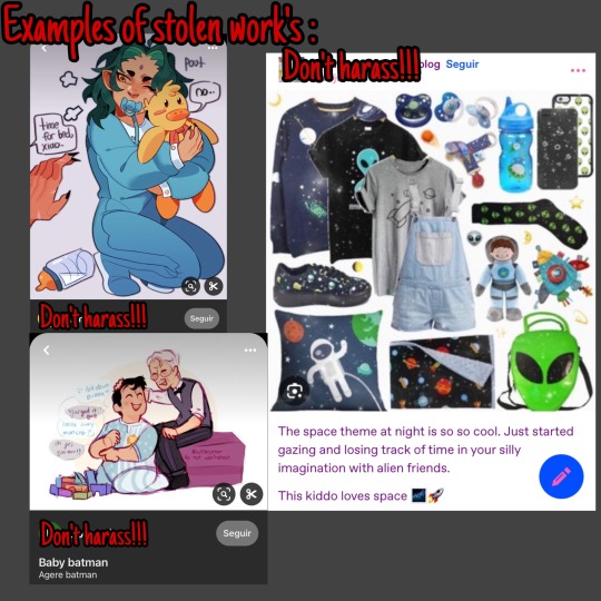
*Original artists that had their work stolen: @regressionworldz and @cutiecorner
This post is a guide about internet etiquette and crediting
[Text ID: This post is a guide about internet etiquette and crediting. End ID]
1. How to NOT steal stuff!
Any work with the tag “Free to use” (also known as “F2U”) means that they are allowed to be reposted, used in collages, edits etc. Just check if credits are needed!
*Important addition (that I can’t believe I had to add):
* “Why does this matter?” “Can’t you just ask where they got it from?”
It’s a question of politeness and fairness, yes, someone can ask where that piece is from but it’s not a guaranteed answer, people can lie and people can forget!
Also, people might see it and take it at face value, think the post belongs to that person when it doesn’t
Adding to that, there’s folks that do not want their work reposted for many reasons!
To top it off, heres the issue of the original creators not getting the attention they deserve, imagine that you spent hours on a piece just for it to be stolen and that post getting more attention then your own original post, that one you worked hours for it to, to be just the way you wanted it to be, that would upset you wouldn’t it?
Overall, crediting and asking to repost is just the polite thing to do
For Artworks:
Your first need to check if the artist allows reposting of their work or the use of them for collages, if they allow, then you link to their original post and state who drew the pics of art
For GIF’s + non-product photos:
Credit to the original post! Or at least as far back as you can find it!
Usually photos of products such as toys, plushies, accessories etc made by big brands are easy to spot and know where they came from (ex: blogs that post PNG’s usually don’t need to credit all their sources), but, small business/hand crafted works should always be credited!
Reposting moodboards:
Similar to artworks, first ask permission to repost, if allowed link to the original creator!
“But they said “no”!”:
Then don’t do it! Even with credits! Don’t do it! Is as simple as that! Respect others right to say no!
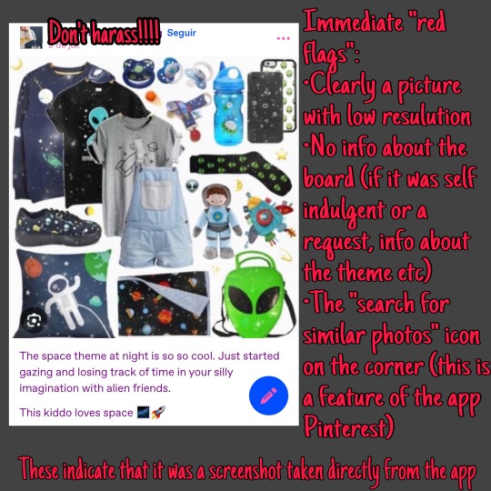
2. How do I identify stolen work?
There are many giveaways of stolen posts, such as:
• Low photo quality
• Watermarks that don’t match
• Lack of information about what was made (for who it was etc)
• Unable to answer simple questions such as what brush they used or long it took
Examples:
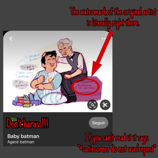
3. What do i do if my work was stolen?
1. Inform the person that it’s your work and to either remove it or credit them
2. If it’s still not credited or taken down, report their post
3. If the report didn’t go anywhere or if the account is still doing it to yours and others content, please make an awareness post about it. Strength comes in numbers after all!
4. Overall…
Let’s stop with this unpleasant and rude act of stealing others work!
I really hate to see that on our community, please, inform more people about it and report any acc that profits of others uncredited/stolen content!
#fr Im so mad at this#blossom babbles#image id in alt text#agere advice#agere#agere post#agere blog#agere flip#safe agere#age regression#age regressor#agerespace#sfw regression#agere sfw#sfw agereg#agere community#sfw agere#agere little#fandom agere#agere fandom
378 notes
·
View notes
Text
‼️HELP A HOMELESS ARTIST ‼️
Reblogs are greatly appreciated! :")
Making a new post because my family and I are in dire need of help. My name is Link, I'm a 22 y/o artist and since November 2021, my family and I have been homeless and living in a motel. Since neither of us had our documents or IDs when we first got here, it was up to me to open commissions to support us. Although my father has his id now, getting a job out in the mountains where we don't have transportation or a way for them to contact us is very difficult. Until that changes, we're still dependant on my commissions to help us through paying for rent and soon food, as this is our last month of food stamps due to the policies here.


This week and especially this month has been super tough on us since work has gone down for me tremendously. There's been weeks were we can't pay and owe upwards of 100$+ every other day since it adds up so quickly. There are days where if we didn't have food stamps, we wouldn't have any food at all and since it's ending soon, I'm hoping this will help me find some more work to care of my family with. Right now our situation is urgent. We need 250$ to cover for tomorrow and we don't have anything as of yet. If we can't have everything paid for by tomorrow, we will be kicked out and since families on both sides have cut us off both communication and money wise, it doesn't look good if that happens.
So, all my slots are open for anyone who's interested in helping us out! I'm a primarily DnD/fantasy themed artist. I mainly draw Dragon Age centered art but I've also done work of Baldurs Gate 3 tavs and other DnD related stuff as well! I can also work outside of fantasy, I've done all things from simple portrait commissions to furries to even dragons, I'm flexible with most things. The only thing I won't do is sexual nudity since I'm not particularly educated enough to draw that sorta stuff yet. Payment will be upfront since our situation is extremely dire at the moment and in turn since we have to use the money we get immediately for rent and soon enough food, no refunds can be given back so please take that into consideration. I'm all for making changes if you aren't happy with how a piece is turning out.
My prices will be below! Thank you to all that sees this and helps either through reblogging or commissioning me, it always means a lot to my family and I! :")
~Prices~
Sketch (price depending on type of sketch) - base price of 15$
Sketch page - 15$ per sketch
Headshot - 25$ (+10$ if shaded)
Bust - 35$ (+10$ if shaded)
Expression Sheet (minimum of 3 heads per sheet, 10$+ per extra head) - 45$ (10$+ if shaded)
Half body - 50$ (+10$ if shaded)
Full body - 70$ (+15$ if shaded)
Couples Commission (a commission that includes two people) - 90$ (+15$ if shaded)
Group commissions (commission that includes more than two people, price dependant on the details) - 60 base price(one character, unshaded; each extra character is +75% to the original price) (40$+ if shaded)
Paintings (price depending on the details) - 100$+
#emergency commissions#emergency art commissions#fantasy art#art commissions#art community#artists on tumblr#dragon age#homeless#mutual aid#financial aid#baldurs gate 3#skyrim#dungeons and dragons#commissions open#commissioned art#commission sheet#dragonage#dragon age 2#dragon age: origins#emergency aid#financial fragility#open commissions#signal boosting#signal b00st#b00st#urgent
175 notes
·
View notes
Text
Born From the Same Ink (Siblinks) Masterpost
Yanno, I've made enough content about Audrey and the Ink Demon being siblings that I decided it might be good to put everything in the same place. Might even call it something official like the "siblinks au" if that's not already taken lol
AO3 link: Read the full fanfic here
Bendy Bites: Also known as the random tidbits about the siblinks that I either can't figure out how to fit into the fic or am too impatient to wait to share. Also includes some fluffy headcanons I have for the siblinks that might not even be story related. Can also be found using the "Bendy Bites" tag.
Ink Demon carrying Audrey
Snack (a slightly different version of this is in the fic now)
Feral Audrey
Kitty (post-escape, Audrey and Bendy adopt a cat)
Sign language
Ghost in the apartment (Since writing this, I've had some new headcanons that changed Audrey's living situation but will keep those to myself unless/until they become relevant)
Unintended consequences
Hunting (how the Ink Demon deals with his bloodlust/kill drive in the real world)
Healing Kisses
Asks: I'm not putting every Bendy related ask here (even though I love them all), just ones that I ended up elaborating on and sharing possible story ideas in the process of answering them. You can see all of them by searching the tag, "answered ask" or "ask" on my blog.
Barrel scene (Bendy getting mad because he figured out Audrey hid from him in a barrel and he still couldn't find her)
Height differences and the resulting sibling shenanigans
Krampus Ink Demon
Slicer/Carly (thoughts on how Bendy would deal with her since I left her out of the fic)
Sammy's reaction Audrey and Bendy's bond
Sammy's and Bendy's reaction to Audrey changing the cycle with The Illusion of Living
What if Audrey was taken by the Keepers instead of Bendy? Also, Bendy's reaction to Malice taking Audrey from the manor
What if. . . Wilson succeeded and made Audrey into his "perfect creation"?
What would happen if Gent found Bendy and Audrey if the real world?
First Aid (Bendy's reaction to injuries in the real world vs the ink world)
Audrey smells like the Ink Demon
Audrey's "sisters" (elaborating on Joey's previous attempts to making Audrey)
Copycat ask (eheheh puns, ask based on the Kitty and Unintended consequences Bendy bites)
Can Audrey sense when Bendy's nearby? (based on events in chapter 16)
Miscellaneous:
Halloween with the siblinks
Sammy vent post (the man made me rewrite a whole chapter and section of my outline)
The Ink Demon wiping his tears with Audrey (I didn't write anything on this but thought it was funny)
Scene description: Audrey sketching with the Ink Demon
Fanart: (also known as the best section) I think I tagged everything under "batdr fanart" if you'd rather use that to peruse all the amazing art people have made of my fic. Huge thanks to @tiredtrashpandaart, @mulligansstuff, @magicicephoenix, and @akiraidraws for their wonderful, wonderful art!
Audrey and Bendy meeting and holding hands for the first time
The Ink Demon tapping his claws on Audrey's barrel/hiding place
The Ink Demon waving at Audrey after massacring lost ones in Artist's Rest
Bendy realizing Audrey hid in a barrel when he was trying to find her as the Ink Demon
Elevator scene
The Ink Demon reveals he's also Baby Benders to Audrey
Bendy clinging to Audrey's leg
The Ink Demon hugging Audrey
The Ink Demon hanging with/comforting Audrey plus offering her a tasty, tasty widow pod
Hotel pun
The Ink Demon listens for Audrey's heartbeat
The Ink Demon tackles Audrey
Audrey gets jumpscared and Bendy laughs at her
The Ink Demon saves Audrey from a Keeper
Fic highlights sketch page
Look at them!
Henry's sketches (fun fact, I was originally going to add a description of Henry drawing Boris to his sketching scene but cut it cuz I felt the scene was dragging on)
Sammy arguing with Audrey
Audrey sketching with the Ink Demon by Mulligan
Audrey sketching with the Ink Demon by Akirai (scroll down to see the art, it was added as a reblog)
Audrey tries to banish the Ink Demon
I'm not adding the sneak peeks or chapter announcements cuz all that can be enjoyed just by reading the fic itself (unless someone REALLY wants me to add them, in that case I guess I can add them on here later).
Lemme know if I missed anything or if any of the links are broken and, seriously, thank you so much for enjoying this story with me. It means the world that so many of you lovely people enjoy reading my work. Thanks for everything!!!! 🤍🖤🤍
Note to self: last edited on 11/17/24
#batdr#batim#bendy#ink demon#the ink demon#audrey drew#batdr audrey#bendy and the ink machine#bendy and the dark revival#born from the same ink#henry stein#sammy lawrence#malice angel#allison angel#siblinks au#buddy boris#boris the wolf#baby benders#toon bendy#bendy bites#batdr porter#batdr heidi#big steve#batdr big steve#lost ones#batdr lost ones#joey drew#memory joey#cycle joey#batdr keepers
51 notes
·
View notes
Text

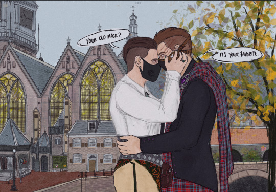


The Wedding | Bark and Bite 2 of 15
Hello again @scientificallywrongsoap , lil beans and random people that found this on their feed.
This is the second illustration for the wedding of our lovely murderous boys. As some of you know I have plans for other pieces that involves churches and a party. And I have space to fill so I need your help.
If any of you has an OC (original character) or a “sona” / persona that you use to appear on line, no matter the fandom. And you want to be in the background of the next pieces, means to this the ceremony and the party, please send the references to my inbox! I already have a few but I need more. I have big ass space to fill.
EDIT 19/01/25 if you are a writer and you don’t have your character or your sona in pictures or drawings you can send me a reference made with PicCrew! If you search for “full body” you can find tons of options for to build your character, a plus in this one is that this templates are made by artist so is good to go. Cuz I’m sorry but in this house we are against the use of AI for art, so please don’t send AI as reference.
The size of each one of the future illustrations (including this and the previous one) are 36 x 26 cm or 14.4 x 10.4 inches long . That is HUGE, so we all can print it when I’m finish but yea. Send those references in my way please I will be grateful for that.
But now let me explain what the hell are you looking in this work!!!
In first place we have the complete piece with dialogues. Those dialogues are based on the video that shows up the change in Subject 7-1 gear at the beginning of The Glitch arc. In that one Swagger mentions that he likes more the old mask, and John gives to him that mask.
So that’s why in this piece he has that one , and not the new one.
I also have a lot of theory of why he is not using his old gear anymore but that’s matter of a future fanfic not something for this wedding.
On second we have ✨Clothes Details ✨
As I said in the past one, I modify the traditional attires to fit them, in Thai piece we can see more of the little things that I added to Subject 7-1 clothes, the brooch is more clear and the little buttons in the sleeve are matches in color and detail. Again for the lost ones violet/ purple is his color. The pattern again I did it myself by hand and I’m still, very proud.
Swaggers has symmetrical details so this sides matches the other one.
Now THE BACKGROUND
I asked glitch for his favorite maps in Warzone, why Warzone and not zombies? Or multiplayer? Cuz Swagger comes from the Warzone universe, the same one that WZ. So it was at least for me very clear that we needed that. He give me the list. And he remembered that in Vondel map, one of his favs, it has an actual church. And the decision was made.
Vondel is the map where they will get married. Of course here it looks more clean than in the real map, but let’s pretend that the boys cleaned the house before the ceremony. This specific church is based in a real life one the link to see the real one is in the previous post. And belive me when I said that I searched and search I even ask my friends if they have a good screen shoot of the place.
None of the screenshots give me the vibe I needed. So I DID THE FUCKING CHURCH BY HAND, LINE BY LINE. BRICK TO BRICK. ALL MINE.it took me like,,, Ikd four ? Five hours? But I get it done and it looks stupidly beautiful and fit thing that I love it.
Then we add a little Easter eggs for the other boys, in one we have a pink soap with a crown with pink gems to represent Johnny and Baby Girl , in the other side we have the traditional new ghost skull mask, the other one didn’t work I’m sorry.
And we have a crown for Biblical Accurate König next to Jack mask cuz they are they. And in the wall a big explosion and the line “WZ was here” . My boy was there. I love him so much. Belive me when I said that after I finish the wedding and the centaur König I promise to itibo , the boy will be my next victim for art. I have so much of him that I want to draw.
And that’s it for now. Please send your references, I don’t bite. And I don’t judge ocs. All are welcome. Let’s party together.
The pieces with the Ocs are going to take a bit more time, for the complexity of the composition and backgrounds that I want but I hope to have them ready in two weeks. More or less and it will be a 4 imagen update. In the meantime I will work in other little pictures that the wedding photographers usually shoot. Like they’r hands , the rings, the other guests you all don’t know how much I need to draw the tree soaps in kilts *internal screaming * it’s gonna be beautiful (?)
Once an old art teacher told me that other artist can see how much you love someone, or how meaningful they are for the amount of details and work that they put in their gifts, so if we all looking at this we can tell how much I love this two and glitch of course cuz. This is nothing. Y’all need to sit down if this looks like to much, this is only THE BEGINNING
Creating stuff for glitch always make me push my limits, and here I gooooooo
#the snake outsider#scientifically wrong soap#john soap mactavish#the glitchverse#call of duty fanfic#soap mactavish#call of duty fanart#subject 7 1#vampire swagger#roland kaminski#cod au#scientificallywrongsoap#i’m going insane#I want to tell a story with this art#Vondel map#Vondel church#Vondel cod#Vondel warzone#shipping#bark and bite#Spotify
53 notes
·
View notes
Text
A year in illustration (2024), Part one


If you'd like an essay-formatted version of this post to read or share, here's a link to it on pluralistic.net, my surveillance-free, ad-free, tracker-free blog:
https://pluralistic.net/2024/12/07/great-kepplers-ghost/art-adjacent
As I go into my fifth year of writing Pluralistic (!), I find myself increasingly reflecting on the unexpected pleasures of creating the collages that head each post. I am by no means a visual artist – my drawing skills are sub-stick-figure, and my spatial sense overall is remarkable terrible. I can't solve jigsaws, I get lost in hotel corridors, and I can't find things that are right under my nose.
But addressing the challenge of illustrating extremely abstract ideas related to tech policy, corruption, monopoly and other hard-to-visualize ideas has awakened some kind of latent, heretofore unsuspected interest in visual communications in me. Relying exclusively on Creative Commons, public domain, and extremely solid fair use claims in selecting my source materials adds a spicy challenge that makes the whole thing even more engrossing.
I've written about my process in finding and preparing these sources before. Here's 2023's notes and highlights:
https://pluralistic.net/2023/12/21/collages-r-us/#ki-bosch
And here's 2022:
https://pluralistic.net/2022/12/25/a-year-in-illustration/
This year saw some new, exciting discovering and challenges. First and foremost is my switch to kagi.com as my preferred search-engine, which is like having access to a time machine that's connected to pre-enshittificated Google:
https://pluralistic.net/2024/04/04/teach-me-how-to-shruggie/#kagi
Kagi's image search is amazing, far better than Google's, and it has great copyright-based filters. When combined with tineye.com (for finding high-rez versions of images that might not be correctly tagged for rights status), it's even better. Even so, often Kagi will surface thumbnails of images Tineye can only find as high-rez on proprietary stock art sites like Alamy, covered in gross watermarks. These images are still in the public domain, watermarks or no, but erasing the watermarks is a lot of work. However, Alamy is a pretty good source of bibliographic information about the original sources of these images, for example, which issue of a 19th century boxing magazine they came out of, and then Kagi can find me high-rez scans of these sources, at the Internet Archive and/or the Library of Congress. I snag those PDFs and import them into the GIMP (which I use for editing) and pull, clean and crop a new high-rez version of those images for my own use. This year, I got much better at saving and organizing all that work on my laptop, but next year I'm hoping to get into a rhythm of uploading my high-rezzes to Wikimedia Commons so everyone can use 'em.
Getting better at collaging isn't merely getting better at using search tools, of course. Knowing what to search for is even more important, especially given the constraints of only using public domain/CC sources. The Library of Congress is a wellspring of visual material, but its own search tool is sadly lacking; however, Kagi's image search comes to the rescue again, thanks to the "site:loc.gov" flag, which restricts results to the LoC.
It was through these searches that I realized how many of the source images I was pulling down were the work of Joseph Keppler (1872-1956), an American political cartoonist who worked extensively for Punch:
https://en.wikipedia.org/wiki/Joseph_Keppler
Keppler was called upon to illustrate many, many political issues that have parallels with the modern competition, corruption and geopolitical stories. A scant few of these remain in the periphery of the public's imagination today, most notably "The Bosses of the Senate," quite possibly the most significant antitrust cartoon of all time:
https://en.wikipedia.org/wiki/The_Bosses_of_the_Senate
But Keppler is a wellspring of great public domain images, and I've been drawing on them heavily. It gives me great pleasure to do so, not just because they're so well-suited to the stories I write, but also because his posterity deserves it. He should be in the American illustrator pantheon alongside the likes of Norman Rockwell!
Besides my search engine and my sources, 2024 saw one other gigantic change in my collage-making: I had cataracts removed from both my eyes in September, and my ophthalmologist implanted lenses that corrected my severe astigmatism and permanently focused one of my eyes at 23" and the other at 25' (this is called monovision). My new eyeballs are still bedding in, and there are days when my vision is severely subpar, but I'm experiencing continuous improvement, and I think this will be a game-changer for 2025.
2025 will also see the long-awaited Version 3.0 release of The GIMP, the free/open image editor I exclusively use. GIMP (Generic Image Manipulation Program) was first released a quarter-century ago, and it's been in version 2.x for twenty years, so this is a big milestone. I can't wait!
https://lwn.net/SubscriberLink/998793/6c8d00bd1b2a7948/
Well, enough forematter. Let's get into this year's best illustrations. If you want high-rezzes of these (or any of my other collages), you can get them at full rez from my Flickr gallery of Pluralistic collages:
https://www.flickr.com/photos/doctorow/albums/72177720316719208

Someday, we'll all take comfort in the internet's "dark corners"
This one combines three sources: a public domain image of the Las Vegas sign, a CC 0 image of a western ghost-town, and a fair use gank of Mark Zuckerberg's metaverse avatar. I spent a lot of time hand-cropping the blades of grass around the sign's footing to create the illusion that it was planted in the ground. I'm also pretty happy with the dirt effect I managed on the sign.
https://pluralistic.net/2024/03/23/evacuate-the-platforms/#let-the-platforms-burn

Vice surrenders
I got these cover images from a gallery of old Dutch government workplace safety poster; they're delightfully gory in a way that rests comfortably in the cannon of Dutch bluntness. I did a lot of futzing with the Perspective tool to get the alignments right, atop the actual magazine covers (I believe they were Italian fashion magazines).
https://pluralistic.net/2024/02/24/anti-posse/#when-you-absolutely-positively-dont-give-a-solitary-single-fuck

How America's oligarchs lull us with the be-your-own-boss fairy tale
Man, I wish this one had a higher-rez original. The 19th century painting of a kid being read a bedtime story by her kindly granny was perfect, except it was only 804 pixels wide! The grinning Uncle Sam is from Keppler (Keppler's Uncle Sams are many, varied, and great). The grinning kid is from a 19th century collection of photos of child laborers, and I love his expression (he's a newsie). I think I did a really good job blending the US $100 (works of federal authorship are all public domain) with the bed curtains. I was disappointed with how the gold brick that granny's foot rests upon game out. I even followed my friend Alistair Milne's tip of cropping the brick, desaturating it, and putting it atop the gold texture in overlay mode and tweaking the curves. It just wouldn't pop the way it did in my mind's eye.
https://pluralistic.net/2024/02/16/narrative-capitalism/#sell-job

How I got scammed
This one uses some public domains stock art of a hacker in a hoodie, an online make-a-custom-credit-card generator, and two of my favorite visual tropes. The first is the 'code waterfall' effect from the credit sequences of the Wachowskis' 'Matrix' movies, which I use whenever I'm trying to illustrate something with a nexus with the digital world. I have a folder full of these, generated with this code waterfall generator:
https://github.com/Rezmason/matrix
The other element, of course, is the eye of HAL 9000 from Kubrick's '2001: A Space Odyssey'; there's an SVG of this on Wikimedia Commons by a user called 'Cryteria,' licensed CC BY 3.0, which I use whenever I want to illustrate a harm caused by computers:
https://commons.wikimedia.org/wiki/File:HAL9000.svg
https://pluralistic.net/2024/02/05/cyber-dunning-kruger/#swiss-cheese-security
(Image: Cryteria, CC BY 3.0, modified)

Solar is a market for (financial) lemons
I often write about scammers and hucksters, casting about for good visual representation. It wasn't until late January 2024 that I thought to look for an image of a carny barker and turned up this picture of WC Fields in full flight. He makes a lot of appearance after this point!
https://pluralistic.net/2024/01/27/here-comes-the-sun-king/#sign-here
(Image: Future Atlas/http://www.futureatlas.com/blog, CC BY 2.0; J Doll, CC BY 3.0; modified)

Boeing, Spirit and Jetblue, a monopoly horror-story
I was really determined to get the right aircraft for this story about Boeing 737s, but that meant cropping out the plane from Vitaly Druchenok's photo and then painstakingly recreating the Spirit Airlines livery. In the original version of the image, the airplane was sticking out of the roof of the Supreme Court, but my wife (wisely) vetoed that as suggesting a terrorist attack on the court (I wanted to imply that the court had caused the airline to crash).
https://pluralistic.net/2024/01/22/anything-that-cant-go-on-forever/#will-eventually-stop
(Image: Vitaly Druchenok, CC BY-SA 4.0; Joe Ravi, CC BY-SA 3.0; modified)

Tech workers and gig workers need each other
I cropped out these two women strikers from an early 20th century photo of a picket line and superimposed them on a photo of a massive union rally from the same era at (I think?) Madison Square Gardens. I am really chuffed with how nicely the (public domain) hacker/hoodie stock image and livery of a gig bike-delivery rider (fair use, ganked from a gig company's promo materials) blended with the strikers.
https://pluralistic.net/2024/01/13/solidarity-forever/#tech-unions

This one is in the running to be my favorite illo of the year. I knew it was going to slay the minute I found the image of the U Illinois campus secret society (spears! fezzes!). There's a really good public domain SVG recreation of the "Think Different" wordmark on Wikimedia Commons that I used here, spending some time getting the overlays and textures right:
https://commons.wikimedia.org/wiki/File:Apple_logo_Think_Different_vectorized.svg
https://pluralistic.net/2024/01/12/youre-holding-it-wrong/#if-dishwashers-were-iphones

End of the line for corporate sovereignty
I use this ogrish rich-guy-in-a-top-hat image all the time to represent the thuggish application of wealth; he comes from a delightful Soviet editorial cartoon called "Capital Controls the Government":
https://craphound.com/images/ussr-capital.jpg
Putting him behind the podium in a UN plenary room with a UN crest in his hand worked really well, though in hindsight, the cropped version I used for the post's hero image is even better:
https://craphound.com/images/27Mar2024.jpg
https://pluralistic.net/2024/03/27/korporate-kangaroo-kourts/#corporate-sovereignty
(Image: ChrisErbach, CC BY-SA 3.0, modified)

Conspiratorialism and the epistemological crisis
Another "thing at the front of a big room" image; this one works better that the UN one, I think.
Both of the sources for this have weird CC characteristics. The hearing room image comes from the Nuclear Regulatory Commission, a federal agency, and I am 99% certain that makes it public domain; however, whoever managed the NRC's Flickr account in 2014 applied a CC BY license to it, so I did the whole attribution for it, even though I think it wasn't needed.
The crumbled cardboard box image comes from a British company that sells cardboard boxes; they upload product shots to Flickr under CC BY 2.0 and require that the attribution string include their store's URL (not necessarily the URL of the image), presumably to get SEO backlinks. This is fine, but the CC BY 2.0 licenses have a serious defect in that a failure to correctly attribute them can give rise to serious ($150K!) copyright liability, something that a group of "copyleft trolls" have brutally exploited:
https://pluralistic.net/2023/04/02/commafuckers-versus-the-commons/
Which makes this kind of funky attribution a minefield. I try to touch all the bases by attributing to both the store's URL and the URL of the image. The real solution to this is for Flickr to finally update its CC licensing to push all its images up to CC 4.0 and push a notice to all users with CC images telling them they either have to consent to upgrading to the latest licenses, or have the licensing on their images reverted to "All Rights Reserved" (maybe with an asterisk explaining that they still have irrevocable but dangerous CC 2.0 licenses attached to them).
https://pluralistic.net/2024/03/25/black-boxes/#when-you-know-you-know
(Image: Nuclear Regulatory Commission, https://meanwell-packaging.co.uk, CC BY 2.0)

Your car spies on you and rats you out to insurance companies
I had so much fun with this one! Check out all those gracenotes! Munch's (public domain) "Scream" reflected in the mirrors, the windscreen, and the dashboard. The 'You Wouldn't Download a Car' parody reflected in the blade of the giant knife sticking out of the steering wheel!
https://pluralistic.net/2024/03/12/market-failure/#car-wars
(Image: Cryteria, CC BY 3.0, modified)

Wellness surveillance makes workers unwell
I love how this one turned out. The labcoated figure is actually a dentist from a gallery of images from the National Museum of Health and Medicine. The little flying guy in the back kills me.
https://pluralistic.net/2024/03/15/wellness-taylorism/#sick-of-spying
(Image: Cryteria, CC BY 3.0, modified)

Amazon's financial shell game let it create an "impossible" monopoly
I love this one. First of all, Hieronymus Bosch's 'The Conjurer' is a great visual representation of a slickster pulling a fast one on gawping yokels. But once I added Doc Searls' great shot of Jeff Bezos in mid-crazy-laugh to it (from a 2010 Techonomy Summit) it became perfectly trenchant. This was part of a short series of images that I added extra fingers and pupils to after someone scolded me online because they (incorrectly) believed I'd generated a collage with an AI image generator. Thankfully, that kind of absurd witch-hunting seems to have waned in popularity. What a ridiculous waste of everyone's time!
(Image: Doc Searls, CC BY 2.0, modified)
Part two
Part three
Part four
#art#collages#public domain#creative commons#cc#fair use#copyfight#visual communications#illustration#pluralistic illustrations 2024
48 notes
·
View notes
Note
So in one post you’re ranting about people on Twitter stealing jokes and in another you’re reposting other people’s art….
I think you have a deep misunderstanding of the problem.
There is content creation... Someone makes a thing.
There is content curation... Someone shares a thing someone else made.
There is attribution... Someone credits the creator of the content.
There is theft... Someone takes credit for content they did not make.
I love content creation. Artists are great.
I love content curation. There is way too much content on the internet and without people sorting through it and finding the best stuff, we would all go nuts looking at all the bad stuff just to find a few hidden gems. When I was doing this as a job and when I wasn't creating content, I used to go through about a thousand images per day just to find 5 to post on my blog. It's actually a lot of work.
I love attribution. One of the main ways I grew my following was by content curators sharing my work and crediting me.
People like the thing. They see who made it. They follow that creator.
I do not like theft. Sometimes you can't find a source for something. I understand that happens and I struggle with that sometimes myself. But people sharing something they did not create and taking credit for its creation is super scummy. Especially if they are erasing watermarks and adding their own. This will give people the impression they made the thing, so they won't even try to find the creator of that content. The original content creator will never get the benefit of more followers.
So, whenever I curate content, I always try to find the source. Especially if it is a creative work that took a lot of time and effort to make. I also try to give people multiple ways to consume that creator's content.
If you look at the art you mentioned, you can see links to several places to follow the artist.
And if I cannot find a source, what I will absolutely not do, is give people the impression I am responsible for creating the content. And oftentimes someone will recognize the creator and I am able to add attribution after the fact.
As both a content creator and a content curator, these are the best practices I have developed over years of doing this. Some people accuse curators of being just "reposters" and being lazy for not creating their own content, but they are an extremely valuable asset to artists. We need ethical curators to share our work and attribute it properly so we can build audiences.
What we don't want are content thieves and those assholes who say, "credit goes to the artist who made this."
Hopefully you have a better understanding of the issue now.
72 notes
·
View notes
Text
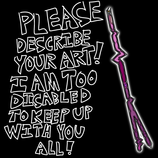
[ID: White bubble text on a black background that reads, "Please describe your art! I am too disabled to keep up with you all!". Next to this is an original Flatland character, Hauntlight, an Irregular line who has many bends, and whose back end branches out into a narrow fork. It has a white glow on its outside, and its insides are filled with simple blobs of different shades of purple and pink to show its internal organs. End ID.]
The goal for this blog was feasable when it was only a few people posting, but now with the sudden surge of new fans posting undescribed art every single day, I literally have no hope of keeping up unless other people start describing their own art, or at least adding descriptions to other people's.
If someone adds an image description to your art, copy and paste it into the original post. It should be in the same format as the one on this post: Plain regular text with no italics, color, or bold. Describe what is in the image. Pretend your friend's internet isn't working and the image won't load for them.
A plain text image description is more accessible than ALT text alone, because tumblr is glichy as all crap, and even if the ALT text is working fine today, it might not be tomorrow, or a few months from now. For several months they literally had the ALT text be white text on a neon purple background. Do not trust tumblr's staff to keep their accessability features actually accessible. They break this site all the time. Plain text in the body of the post itself, like all of this whole post is, is less likely to be broken by glitches and changes to the site.
Image descriptions are for blind and low vision people the way subtitles are for the deaf and hard of hearing, as well as people with brain damage who can see fine, but still struggle to process images.
Learning to describe your art will make you a better writer and artist. It will allow disabled people to appreciate your art. It will make this fandom, and any other fandoms you make art for, more welcoming for disabled people, and will make the internet overall more accessible.
Please start adding plain text image descriptions to your art. There are hundreds of tutorials on tumblr alone you can find, and many blogs dedicated solely to creating image descriptions that you can follow to see more examples.
Image descriptions should go directly below the image they are describing, above any other commentary. Do not put them at the very bottom of the post if the image is the first thing in the post.
Also, do not put anything you wouldn't be okay with losing forever under a read-more. If you ever delete the original post, change your username, or have your blog terminated, everything under a read-more will be deleted forever, because the link breaks.
This is why image descriptions should not go under read-mores unless the images they're describing are also under it.
Please add image descriptions to your art before you post it. I could slowly work my way through the fandom's posts when it was only a few people, but this is just becoming unmanageable and I don't want to have to give up from being completley overwhelmed.
Make image descriptions for your own art. Make them for other's art. At the very very least, when someone makes one for your art, add it to the original post. Please. Irregulars are in this fandom too.
36 notes
·
View notes
Text
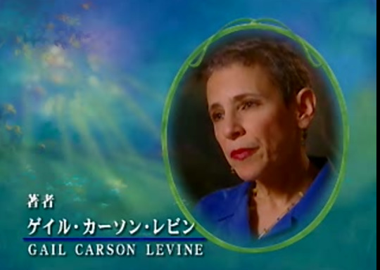
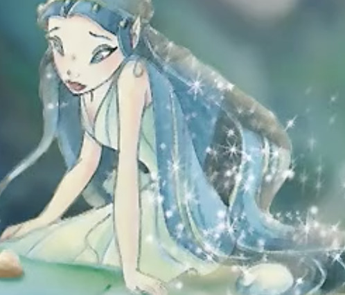
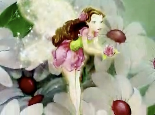
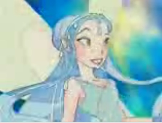
✨Fairies Finds✨: New Early Artwork and Promotional Video from 2005 Disney Fairies Japan Website with Gail Carson Levine- Author of Fairy Dust Trilogy
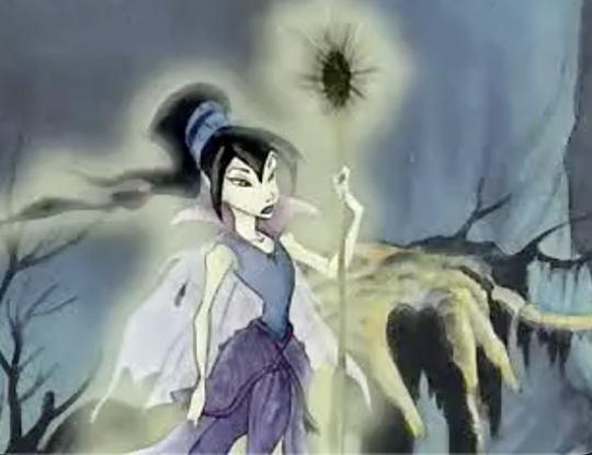
Fly with you everyone and happy Friday the 13th! I have been looking into Disney Fairies pre-release stuff ever since some early stuff was posted into Art of Disney Fairies. I have also been interested in media preservation since late 2017 when I found Web Back Then. Truthfully, despite having this interest when trying to find the old Disney Fairies games from my childhood- I never really shared much with the world. I feel like I should remedy that! (this find is relatively recent though I found it yesterday!)
This is a video I found on the Internet Archive from disneyfairies.jp, a promotional page on the Disney Japan website that seems disconnected from the main Disney Fairies page which was a clone of the original website. See here
Through some research the gist of the video is this:
The video starts with an introduction to the original Peter Pan by J.M. Barrie, which is interjected with clips from Disney's Peter Pan. Then we see more artwork of Disney Fairies- including unfamilar designs including early Vidia, Rani, Fira etc. According to Part of the Magic, Disney Fairies started development in early 2001- the series was launched fully in 2005. Then Gail (dubbed of course) begins to describe the plot of Fairy Dust and the Quest for the Egg whilst we see several pictures of this early Disney Fairies art. Interesting pictures as we get to see the very early designs of Disney Fairies characters that I have never seen before.
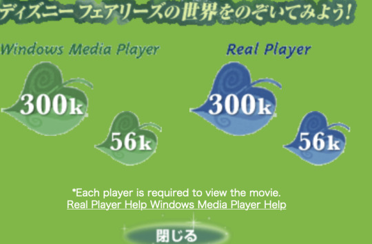
Interestingly, this video was never embedded on the page, you had to download it and play it through a video player such as Windows Media Player or Real Player, it was 2005 after all.
Here is the screen you'd see when you'd want to watch this promotional video. I recognize the leaves used in early flash games such as Lightball Challenge, Dragonfly Race etc.
A page on the website that I found with my decomplier, i couldn't view it normally!
I tried looking for this video in English to no avail, or any version on the internet. It must have only been accessible through this website.
Interestingly, I found this other page whilst doing my page digging thing again and found this, suggesting this was also a Japan exclusive and not for the American market ... and there is more early promotional stuff to be found in relation to Disney Fairies!
I also looked into one the main book artists on the creative team, Judith Holmes Clarke. She had a website I found on her IMDB page, that was live around 2017-2019. I saw this and wanted to add it as it had one of the stills in this video. It also has a sketch of Rosetta and Tink. This is what I found:
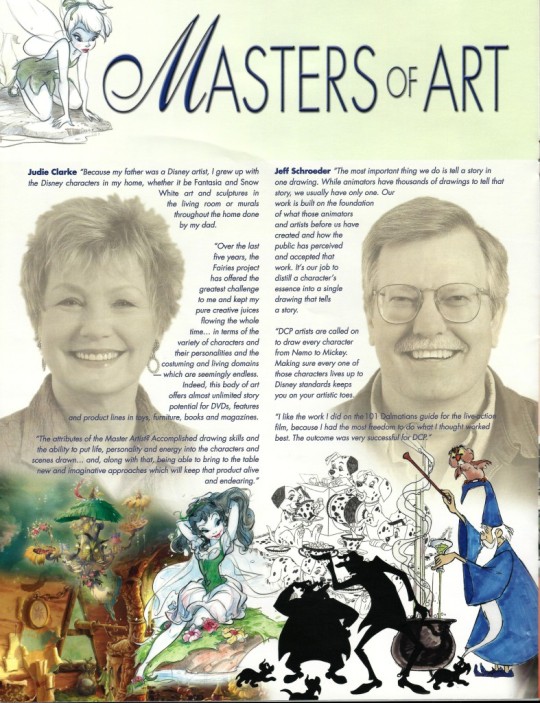
It is probably a scan of this magazine, Disney Newsreel, mentioned on her IMDB.
Overall, I'm super happy with this find and I'm so happy to share it with you all!! I will be happy to share more now that I'm publicly outing myself not just as this fan of children's fairy media- an archivist. gasp...
Also probably making a website/blog which I will share later and will be in the About Me link with my other socials.

And believe me, this is just the beginning
#disney fairies#art#found media#fairies finds#announcement#pixie hollow#disney#prilla#vidia#rani#bess#invidia#rosetta#beck#iridessa#silvermist#fawn#fairy dust and the quest for the egg#media preservation#gail carson levine#judith holmes clarke#tinker bell#books#pre release stuff#early stuff#my finds#video#region exclusives
181 notes
·
View notes
Note
helloooo , i just want to say i love your art and game sm , can you please tell me which music/soundtrack you use for the merman voice(when he was seducing mc?) I love his voice but i cannot find it nor open the link , if you tell me the name of the music and the artist i would be very thankful♡
Unfortunately, I can't redistribute what I used exactly because I modified the original. Since the voice was originally female, I had to lower the pitch to make it more manly but according to the license, I'm not allowed to share the edited version alone.
You can still find the original here on Pixabay.
I only linked the creators on my Itch.io page because I used more than one content from each and I couldn't possibly list each one of them. Maybe I'll add a text document in a future update and properly write down all of them.
22 notes
·
View notes
Note
Hii! I'm also starting out on digital art but I have a big problem in doing lineart, would you please share us your wisdom of it if you will? 🙏 Thank you in advance!!
DIGITAL ART TIP #2 - Line art
Hoi!
Here are some tips on how I do my line art.
∘
STEP 1 - Using the stabilizer tool
The stabilizer or smoothing tool is an artist's best friend. It slows down your drawing speed, giving you more control and reducing shaky lines.
Almost every drawing program, whether free or paid, has this tool. You can search online to find out where it is in your program.
The left line was drawn without the stabilizer tool, while the right one was drawn with it. You can clearly see the difference.
Extra Tip: As an artist, I often redo lines multiple times, even when using the stabilizer. The undo button is extremely useful for achieving the best final result.
STEP 2 - Start drawing the first part of your line art
When I draw over my sketch, I usually keep the lines about the same size. It's just the first part, after all.
STEP 3 - Decide where the light is coming from in your drawing
Before you can start adding details to the line art, you need to decide where the light will be coming from for when you begin shading. In my case, the light is coming from above.
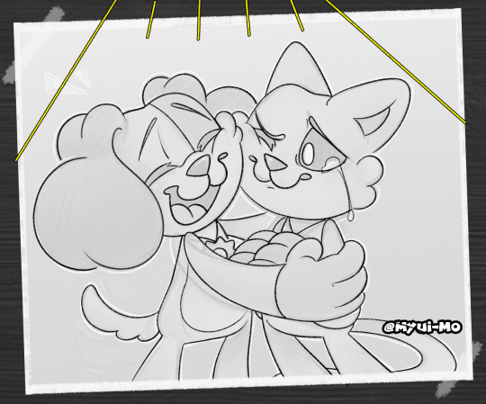
STEP 4 - Add line weight
Line art can look flat, but you can fix this by adding line weight. This means making some lines thicker where the shadows will be in your drawing.
In my case, I didn’t add line weight to the face because those parts will be colored black, so the line weight won’t be visible.
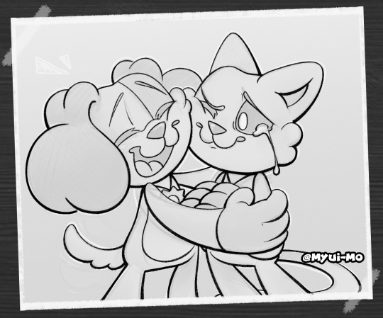
As you can see, the line art looks much more interesting now. It also helps when you start shading later.
∘
That's my tutorial! If you like the artwork in this, I'll soon be posting the finished work on my profile.
If you want to ask a question, or send in art for me to help you out with, here's a link to the original post!
Thank you!
27 notes
·
View notes
Text
Fanfiction and Profit
Hello loves~ I’ve seen this pop up now and then, about fanfiction and commissions, profit and whether we can pay someone to write the fic we want to read. Unfortunately, I have to be the bearer of bad news:
You absolutely, unequivocally, cannot and should not pay or be paid for fanfiction.
Why not? Well, let’s go over this topic with a look at what fan works are, how we can use them, and where these rules came from.
Why can’t we profit from our hard work? Is this fair?
There are a lot of reasons, and I want to start off with saying this is not about whether it is fair or right, it is a simple statement of the rules by which our hobby, our passion, is permitted to live and thrive. The law does not consider fanfiction to be transformative enough to be legal to profit from, and you will find that AO3 itself explicitly does not allow payment, commissions, or any direct payment sites to be linked on the platform.
I’ll say that one again - it is fully against AO3’s Terms and Conditions to advertise any paid work on the website. You will be warned by moderators if you’re found doing this, and may risk entirely losing your account.
It’s essentially legally complex. The only reason we are allowed to write and share fanfiction at all is because it is non profit. We can’t be sued for making money from someone else’s intellectual properties if we’re not making any money from it.
Why are fan art, songs, and other mediums allowed to profit when we can’t?
This is another piece of nuance for you, which not everyone will agree with. Art is considered to be more transformative, and is generally viewed differently as a medium.
But I will also say here we can look at it purely from a business angle, the legal side that the IP rights holder will be viewing it from too: Fan art can often attract people in to a fandom, to find out who this interesting character is or what the source of the art was. It adds profit to the original creator by bringing new fans to the table.
Fanfiction, on the other hand, is almost exclusively read by people who have already consumed the original media and are looking for new stories. I would argue it is exceptionally rare for someone to read fic before they’ve engaged with the source material. Fic often relies on the reader knowing the characters and stories already, so we can shorthand the exposition and everyone understands what’s going on and why.
When did this become the rule?
The “Elders” of fanfiction will give you a thousand yard stare with this one, because it largely comes back to JRR Tolkien’s estate and Anne Rice. Both were very unhappy with fanfiction existing at all, and are the reason why you might well still see disclaimers at the top of some fics mentioning that all characters, worlds, etc belong to the original rights holders and the work is one of fanfiction that the author does not profit from in any way. Tolkien’s estate and Anne Rice both set legal challenges against fanfic writers, threatening the entire hobby and setting legal precedents at the end of it for what we can and cannot do. What we can do? Write transformative works, based on existing IPs, and share them for free with no profit or money exchanged at any point.
But what about exchanges?
You can offer to exchange fic for fic, or swap art and fanfic. This isn’t getting paid because you aren’t profiting from it, but if you want to encourage someone and be encouraged in return, that is a potential way to do it. So an artist might draw a scene, character or pairing that you love, whilst you write a fic for them. It’s swapping a gift for a gift in that way, and although you could assign monetary value to commissioned art, you aren’t actually exchanging money. It might seem like a bit of a loophole, but it is one that rights holders shouldn’t be able to be upset by really. I can’t see myself how a legal challenge could be raised for damages on that basis, so it should be safe. If you’re not an artist yourself but do want to see something specific from a writer, you could offer to commission art on their behalf in exchange for the fic. It’s imperfect, but in the end you’re supporting both an artist and a writer in that exchange, even if the writer is only gaining a product instead of money, as long as they're not selling it on again.
What if I want to commission someone to write something I want to read?
Well, unfortunately, if you want them to write fanfiction, that’s not possible. You may find some writers are willing to take on prompts, though! Tumblr can be a good one for that, as writers sometimes specify that their ask boxes are open for fic prompts that they might consider writing. You can also try approaching a writer who has written in a style you like and as if they would be willing to write a piece based on your idea or pairing, though you should double check what pairings and topics they’re comfortable writing first.
Isn’t there anything I can do with my writing skills?
Plenty of things! You can use fanfiction as a way to warm up into writing skills in general. Get some practice, feedback, and validation to know you’re on the right track. It’s a wonderful low pressure way to get a feel for fiction writing in general and work out what kinds of stories you’d like to tell.
In some cases, you might be able to take a fanfic you have written and rewrite it to become something original - this might need a lot of work in changing enough names and details for it to become removed from the IP that it was initially based on, but this is certainly something people have done in the past. Most famously, 50 Shades of Grey (my opinions of which are astronomically low for so many reasons, but this is not the place for those) began life as a Twilight fanfiction.
Writing original fiction will always have its own unique challenges, and is a different experience to fic. For one thing, you need to establish your setting and characters because your readers don’t know them yet. Another that many find tough is going through the writing process without any feedback from beta readers or getting kudos from published chapters. Then, of course, publishing is its own beast… But if you want to profit from writing, then you need to either have a paid role as a writer on a specific IP project, or you need to write your own works and look at getting them published (the main 3 options would be self pub, indie publishers, or trad pub - they all have their pros and cons for different things, so it’s something to do proper research on before committing to any one path).
I found someone offering paid fic, what should I do?
I recommend gently warning them. Not everyone is aware of the risks, so giving them a kind heads up is probably the best bet. You can even direct them to this post if you like, to save re-explaining it all. If they don’t listen, then unfortunately you may need to report their account to AO3 so the moderators there can give them a more formal warning that might be taken more seriously. I have no doubt that the AO3 mods will be able to explain it more clearly and concisely than I can, too.
I have taken payment for fic in the past, what should I do?
First, I'm not here to blame you. Not everyone knows the rules or history - that's why I'm here to share the explanation for anyone who didn't know~ But what you need to do now is immediately stop any offers to take commissions for fanfiction. Scrub your AO3 of any links to payment sites, and remove any reference to "commission" or "paid work" in your writing wherever it is shared. Clean everything up so you are safe from any legal repercussions, and you may need to refund any incomplete commissions. Take a look at the other ways you might be able to earn from your writing, or options for exchanges you might be happy with for writing something bespoke for someone else. We can't change what has already been done, but we can move forward when we know better so we can do better.
Conclusion? Where are we with fic and profit?
The bottom line is the same as the top - for the safety of our fandom communities, we must never accept or offer payment for fanfiction. Doing so not only risks the individual author, but the entire community as a whole. We might not agree with it, and that’s not the conversation I’m here to have, but this is the way things are. It’s not something that can be changed, so we should respect the playground we are in and take care not to end up having the whole place torn down. Fanfic writing is a hobby, and one that brings us a whole lot of community, joy, creativity, and a way to extend the love of a franchise far beyond the ending of the canon content. We get to create and play with all kinds of toys in the toybox in whatever ways we like - that’s special, and I feel we should respect and protect that.
So, we’ll end it here - go, have fun writing, build your skills and style, find and delight your readers, just keep in mind everything that got us here and everything in the future that we want to preserve~
34 notes
·
View notes